
Graphical Design Material Drawn from: Designing Visual Interfaces (Mullet & Sano 1995) Visual...
87
Graphical Design Material Drawn from: Designing Visual Interfaces (Mullet & Sano 1995) Visual Explanations (Tufte 1997) Notes, J Canny, Berkeley John Kelleher, IT Sligo
-
date post
19-Dec-2015 -
Category
Documents
-
view
214 -
download
1
Transcript of Graphical Design Material Drawn from: Designing Visual Interfaces (Mullet & Sano 1995) Visual...

Graphical Design
Material Drawn from:
Designing Visual Interfaces(Mullet & Sano 1995)
Visual Explanations(Tufte 1997)
Notes, J Canny, BerkeleyJohn Kelleher, IT Sligo

2
design is…
About function: Good designs support user tasks
About form: Good designs should be a pleasure to use

3
design is…
About communication, not just about the medium It’s not abstract expressionism Art is valued for its originality and expressiveness Design is valued for its fitness to a particular user and task
“The designer is a visually literate person, just as an editor is expected by training and inclination to be versed in language and literature, but to call the former an artist by occupation is as absurd as to refer to the latter as a poet”Douglas Martin (Book Design)
Defuses tension between functional and aesthetic goals Always solves a particular real-world problem
4
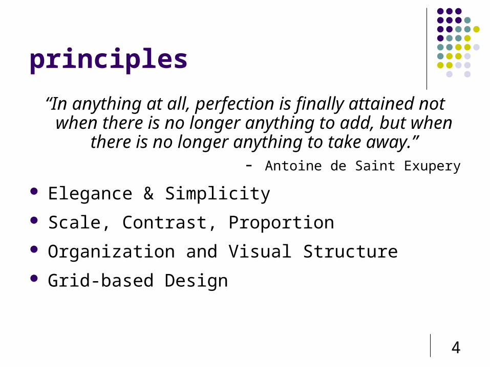
principles
“In anything at all, perfection is finally attained not when there is no longer anything to add, but when there is no
longer anything to take away.”- Antoine de Saint Exupery
Elegance & Simplicity
Scale, Contrast, Proportion
Organization and Visual Structure
Grid-based Design

5
mcDonalds sundial
Source: http://chicagobusiness.com/cgi-bin/news.pl?id=21278

6
elegance & simplicity Elegance – novel, economical solution Simple designs are usually the most effective
Clash with marketing of feature lists “Maximum meaning, minimum means” Benefits
Approachability rapidly apprehended and understood to support immediate use
Recognisability less visual information, more easily assimilated, understood,
remembered Immediacy
greater impact because they are recognized and understood without conscious effort
Usability improving approachability and memorability enhance usability

7
elegance & simplicity: principles
Unity Refinement Fitness
8
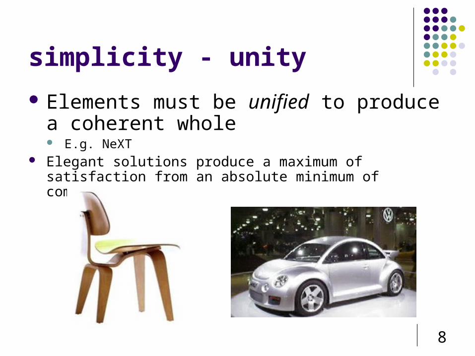
simplicity - unity
Elements must be unified to produce a coherent whole E.g. NeXT
Elegant solutions produce a maximum of satisfaction from an absolute minimum of components
9
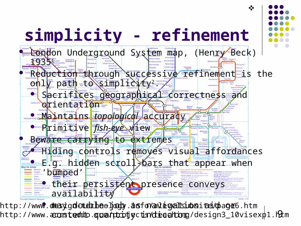
simplicity - refinement London Underground System map, (Henry Beck) 19351
Reduction through successive refinement is the only path to simplicity2. Sacrifices geographical correctness and orientation Maintains topological accuracy Primitive fish-eye view
Beware carrying to extremes Hiding controls removes visual affordances E.g. hidden scroll-bars that appear when ‘bumped’
their persistent presence conveys availability may double-job as navigation aid or content quantity
indicator
1http://www.design-technology.info/alevelsubsite/page6.htm2http://www.acrstudio.com/projects/teaching/design3_10visexp1.htm

10
Zurich Transportation System
Beck’s Legacy
New York Subway SystemLondon Underground (L: Original 1933, R: Modern day copy)

11
simplicity - fitness
How well a design solves a particular problem
Match the design to the capabilities of the technology and the user E.g. original MacPaint and MacWrite

12
simplicity - common mistakes
Clutter and visual noise

13
simplicity – common mistakes
Interference between competing elements

14
simplicity - common mistakes Using explicit structure as a crutch

15
simplicity - common mistakes Belaboring the obvious

16
simplicity - common mistakes Overly literal translation

17
simplicity - common mistakes Excessive detail and embellishment

18
simplicity - common mistakes Gratuitous dimensionality

19
simplicity - common mistakes All of the above

20
techniques
Reducing a design to its essence Regularizing the elements of the
design Combining elements for maximum
leverage
(TUFTE)

21

22
reduction Reinforce the message by removing non-essential elements Determine the essential qualities (typically a short list of
adjectives) that should be conveyed by the design, along with any fixed formal elements, such as a name or label, an essential control, or color, texture, pattern, or image.
Critically examine each element in the design and ask yourself why it is needed, how it relates to the essence of the design If you can't answer any of these questions, remove the element.
Try to remove the element from the design anyway. What happens? If the design collapses, either functionally or aesthetically, the element must be replaced.

23
regularising the elements
Establishing a pattern simplifies the design by moving the viewer's experience to a higher level of abstraction. Reduce information by repeating elements according to a discernable rule, principle, or rhythm
Reduce visual complexity and enhance structure and predictability Align or reflect elements along common axis Standardizing or repeating sizes and spacing Reducing components to basic geometric forms

24
regularising the elements

25
leverage Review the functional role played by each element in the design. Look for situations where multiple elements are filling (or partially
filling) the same role Question whether an element's role could be filled as well by an
adjacent component, possibly after minor modifications. E.g. Header for a window
label drag area place to put window management controls place to show which window has focus
E.g. Elaborate scrollbars perhaps showing thumbnails of pages Office mysterious buttons
Too much leverage can be bad - 70s LED watch with multiple functions controlled by 2 small buttons

26
graphical displays should… show the data induce the view to think about the substance rather than about
methodology, graphic design, the technology of graphic production
avoid distorting what the data have to say make large datasets coherent Encourage the eye to compare different pieces of data Reveal the data at several levels of detail, from a broad overview
to the fine structure Serve a reasonably clear purpose: description, exploration,
tabulation, or decoration Be closely integrated with the statistical and verbal description of
a data set
(TUFTE)

27
dr. John Snow (1813-1858)
British Anesthesiologist Discovered root cause of cholera epidemic in
London, 1854 Birth of epidemiology Overturned contemporary thinking

28

29

30
programs
A systematic approach to the design of many artifacts: web pages on a site documentation pages devices in a family
Programs are based: On repeated sizes and proportions (module) Or upon forms and ideas (theme)
Bring regularity and structure to user experience Through controlled variation

31
program

32
layout Grids: A Design Staple
Organization contrast to bring out dominant elements
E.g. SUN Microsystems logo grouping of elements by proximity show organizational structure alignment
Consistency

33
visual consistency
internal consistency same conventions and rules for all elements of the GUI unless strong
reason set of application-specific grids enforce this
external consistency follow platform and interface style conventions use platform and widget-specific grids deviate from conventions only when it provides a clear benefit to user
Counter-argument to consistency

34
Two-level Hierarchy•indentation•contrast
Grouping by white space
Alignment connects visual elements in a sequence
Logic of organizationalflow

35
Thinking Outside the Gridby Molly E. Holzschlag
grid-based design

36
IBM's Aptiva Communication Center
No regard fortask order; noorganization

37
Really!...

38
grid-based design
Grids can shape layout without over constraining it

39
Haphazard layoutfrom mullet & sano

40
Repairing a Haphazard layoutfrom mullet &sano
41
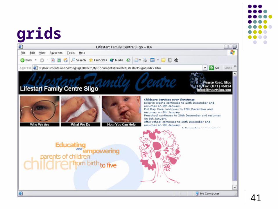
grids

42
grids
43

44
principles - focus Focus: the design should
highlight one or a small number of modular elements
Implied rhythm and regularity make the structure predictable and explicit Simplifies eye movement across the
display Permits skipping over uninteresting
portions when necessary Functions like a spatial map of
information domain E.g Musical scores
GUI toolkits should support such implied focus

45
principles - flexibility Flexibility: The program should
allow variation from a theme
Univers Font

46
principles - consistency Consistent application:
The program should maximize consistency in size, position, texture...
Common controls should be employed

47
principles - balance visual weight of design elements
balance one another

48
principles - balance

49
common mistakes Arbitrary
component positions
Arbitrary component dimensions
Random window sizes and layouts
Unrelated icon sizes and imagery
Inconsistent control presentations
Inconsistent visual language

50
techniques Reinforcing structure through repetition: Repeat design elements
across the program Powerful human tendency to perceive regularity Repeated structural elements serve as landmarks for navigation Stylesheets can help

51
techniques – modular units
Support maintainability and extensibility

52
repetition enforces unity
Massimo Vignelli Associates for the US National Park Service

53
techniques - canonical grid
An six-column basic grid with column separators and label templates
Can be implemented with HTML tables

54
sample canonical grid

55
canonical grid
Determine any size restrictions Define horizontal and vertical modules Develop a rough sketch of sizes, positions,
orientations Use the canonical grid to adjust sizes and positions
of control elements For dynamic layouts, figure out the minimum
workable size.

56
canonical grid

57
canonical grid
58
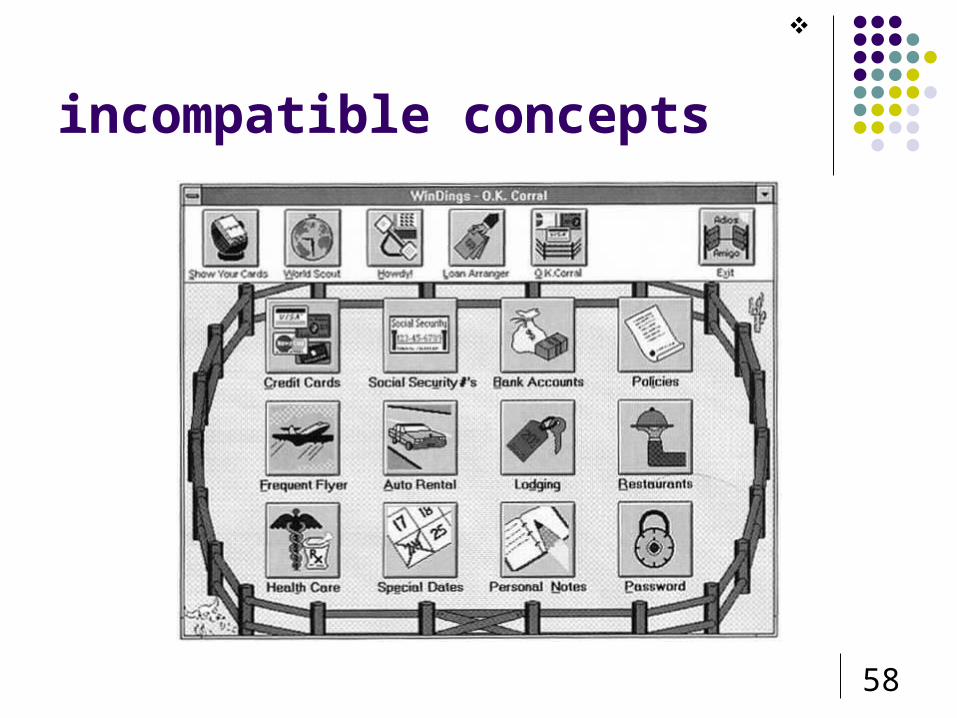
incompatible concepts

59
refinement through progressive abstraction
Abstraction is the process by which the essential qualities of the thing begin represented are separated from the actual physical object or event.
By removing superficial or idiosyncratic details, the designer helps the viewer see the formal qualities that tie the representation to its object.
Only a crisp message will be processed efficiently and interpreted correctly. Image refinement depends on a continuous process of
simplification, removal of extraneous detail, and regularization of irregular elements.

60
refinement through progressive abstraction
Understanding what a thing represents – as opposed to merely what it depicts – is a prerequisite for using a sign correctly

61
internal or external inconsistency
GUI applications are externally consistent when they adopt the same visual language and behavioral conventions used throughout the environment.
GUI applications are internally consistent if the same elements are used in the same way throughout the application itself.
Because applications depend heavily on services provided by the environment, however, they may not be able to achieve even internal consistency if they are radically inconsistent with the rest of the environment (see next).

62
internal or external inconsistency

63
small multiples
Economy of line Many similarities enable us to notice
differences

64
poor charting

65

66
layering

67
layering
“Pure, bright or very strong colors have loud, unbearable effects when they stand unrelieved over large areas adjacent to each other, but extraordinary effects can be achieved when they are used sparingly on or between dull background tones.”
‘Noise is not music … only on a quiet background can a colorful theme be constructed’
Windisch.

68
layering

69
layering
grid, silhouette and type compete rivers created between structure trivial task of dividing up the already free-standing
elements becomes the dominant statement of the display

70
layering

71
layering
revision extends the range of colour separating and layering the data in rough proportion to their
relevance gray background calms the contrasts with silhouettes and
emphasizes lamps, their position and motion lamp-glows are simplified and detail removed small spots of intense, saturated colour prove very effective

72
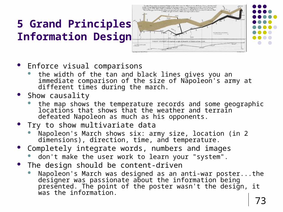
napoleon's march, 1812 (Charles-Joseph Minard's 1861)
73
5 Grand Principles of Information Design
Enforce visual comparisons the width of the tan and black lines gives you an immediate comparison of
the size of Napoleon's army at different times during the march. Show causality
the map shows the temperature records and some geographic locations that shows that the weather and terrain defeated Napoleon as much as his opponents.
Try to show multivariate data Napoleon's March shows six: army size, location (in 2 dimensions), direction,
time, and temperature. Completely integrate words, numbers and images
don't make the user work to learn your "system". The design should be content-driven
Napoleon's March was designed as an anti-war poster...the designer was passionate about the information being presented. The point of the poster wasn't the design, it was the information.

74
“Some space must be narrow so that other space may be wide, and some space must be emptied so that other space may be filled.”
Robert BringhurstThe Elements of Typographic Style
“Information consists of differences that make a difference.”
Edward Tufte Envisioning Information

75
optical adjustment

76
optical adjustment

77
gotti trial (1987)

78
quotes
“There are two industries that refer to their customers as users—computers and drugs. Libraries refer to their customers as 'patrons.‘”
[Tufte]

79
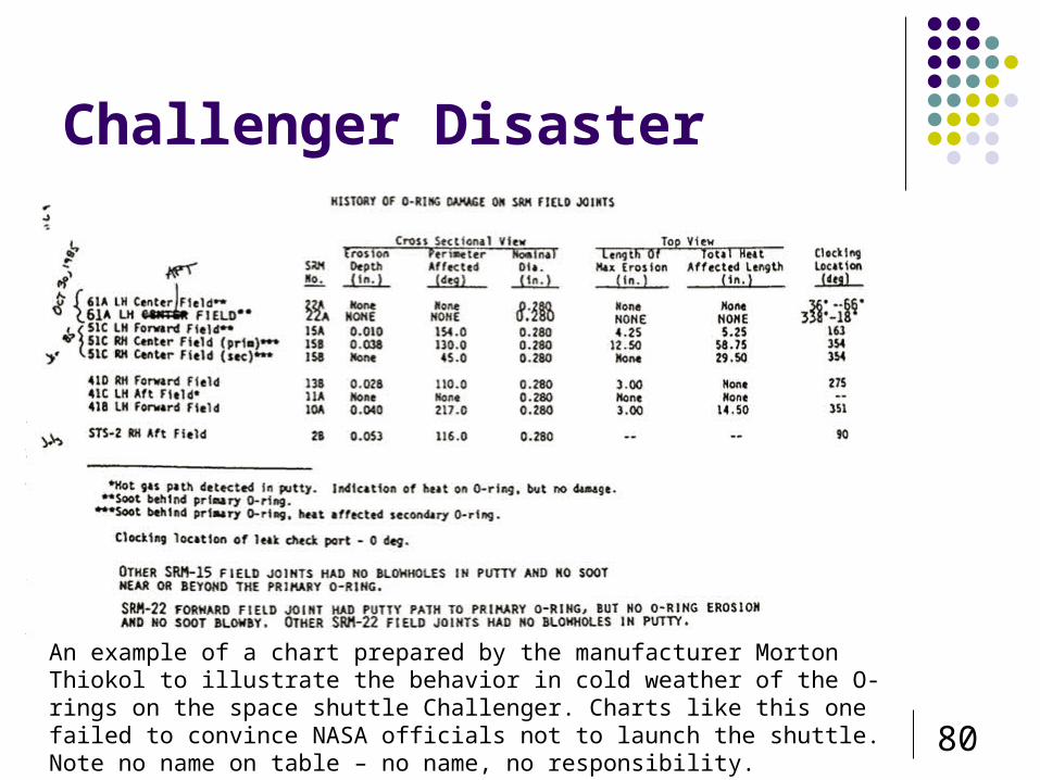
Challenger Disaster, 1986
O-ring failure due to low launch temperature O-rings manufactured by Morten-Thiokol,
Utah Transported in segments by road Segments joined by O-rings
Would be 1st NO-LAUNCH in 11 years
80
Challenger Disaster
An example of a chart prepared by the manufacturer Morton Thiokol to illustrate the behavior in cold weather of the O-rings on the space shuttle Challenger. Charts like this one failed to convince NASA officials not to launch the shuttle. Note no name on table – no name, no responsibility.

81
Challenger Disaster, 1986

82
Submitted Charts

83
Submitted Chart

84
Refined Chart - Tufte

85
Further Refinement

86
Visual Complexity: www.visualcomplexity.com Gallery of innovative visualisations
IDEO: http://www.ideo.com/portfolio/ Original Apple mouse,
Frog Design: http://www.frogdesign.com Cooper Interaction Design www.cooper.com Aaron Marcus and Associates www.amanda.com
SABRE redesign Don Norman jnd site
www.jnd.com In praise of good design
Places to go

87
readings
“Principles of Effective Visual Communication for GUI design” Marcus in Baecker, Grudin, Buxton
and Greenberg Designing Visual Interfaces
Mullet & Sano, Prentice Hall


![The Visual Display of Quantitative Information...Visual Display of Quantitative Information" by Edward R. Tufte [1]. Chapter 1 Graphical Integrity When looking up graphical integrity](https://static.fdocuments.net/doc/165x107/5f02fef07e708231d407062b/the-visual-display-of-quantitative-information-visual-display-of-quantitative.jpg)

