FINAL 4 txtlab images
14
streaming bias: studying music curation on Spotify Cheng Lin & Benjamin LeBrun May 2020 COLLABORATIONS
Transcript of FINAL 4 txtlab images

streaming bias:studying music curation on SpotifyCheng Lin & Benjamin LeBrun
May 2020
C O L L A B O R A T I O N S

Since its launch in 2008, Spotify has become the music industry’s largest driver of revenue. The streaming service attributes a large portion of its success to the assortment of playlists available on its platform; these playlists are collections of songs that can be centered around genres, moods, or artists, and users can opt to “follow” playlists that they enjoy. Moreover, playlists act as one of the primary means through which artists gain exposure—past research indicates that presence on some of Spotify’s top global playlists raises streaming revenue by up to $424,000 USD.
While Spotify generally seems to help new artists break into the music industry, evidence suggests that user engagement on the platform is dominated by a select group of creators. The top 10% of tracks on Spotify account for 99% of total streams, and in 2018, only 2% of the 600 most-streamed tracks were produced by women.
To our knowledge, there currently exists no available research on the playlist curation process on Spotify. In this report, we investigate differences between Spotify-curated and user-curated playlists across a dataset of 148 playlists and 20,017 songs. Our report presents preliminary findings of noticeable mechanisms in the platform's playlist curation, and how these patterns play out with respect to artist popularity, gender, and label representation. More specifically, we divide our analysis into three main topics:
Introduction
Overall, we find noticeable differences in the curation process for Spotify-curated lists and user-curated lists. While both top Spotify-curated lists and top user-curated lists favour artists with high popularity, Spotify-curated songs vary in age and popularity more than user-curated songs. In the case of gender representation, we find that men artists account for 76.6% of tracks in our dataset and are associated with more genres than women, but occupy a less equal space when it comes to playlist appearances. Finally, in regard to record labels, we find that the distribution of appearances per record label is heavily skewed towards the most popular labels, with evidence suggesting that some user-curated lists are curated by the record labels themselves.
1
How are playlist appearances distributed across artists? How do track and artist popularity affect addition to a playlist?
1. Artist popularity
How do the curation patterns of tracks by men artists and tracks by women artists differ?
2. Gender representation
3. Music label representationHow are playlist appearances distributed across music labels?
Men artists account for 76.6% of tracks in our dataset and occupy more genres
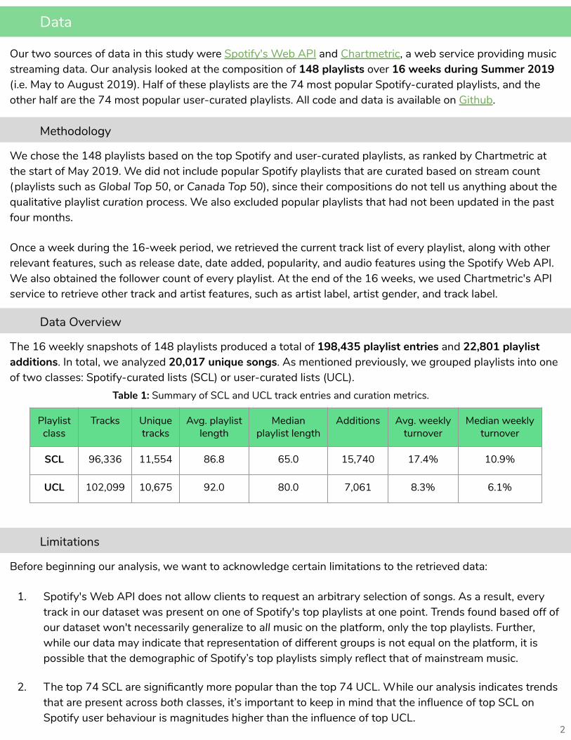
Our two sources of data in this study were Spotify's Web API and Chartmetric, a web service providing music streaming data. Our analysis looked at the composition of 148 playlists over 16 weeks during Summer 2019 (i.e. May to August 2019). Half of these playlists are the 74 most popular Spotify-curated playlists, and the other half are the 74 most popular user-curated playlists. All code and data is available on Github.
Data
2
Methodology
We chose the 148 playlists based on the top Spotify and user-curated playlists, as ranked by Chartmetric at the start of May 2019. We did not include popular Spotify playlists that are curated based on stream count (playlists such as Global Top 50, or Canada Top 50), since their compositions do not tell us anything about the qualitative playlist curation process. We also excluded popular playlists that had not been updated in the past four months.
Once a week during the 16-week period, we retrieved the current track list of every playlist, along with other relevant features, such as release date, date added, popularity, and audio features using the Spotify Web API. We also obtained the follower count of every playlist. At the end of the 16 weeks, we used Chartmetric's API service to retrieve other track and artist features, such as artist label, artist gender, and track label.
Data Overview
Limitations
The 16 weekly snapshots of 148 playlists produced a total of 198,435 playlist entries and 22,801 playlist additions. In total, we analyzed 20,017 unique songs. As mentioned previously, we grouped playlists into one of two classes: Spotify-curated lists (SCL) or user-curated lists (UCL).
Playlist class
Tracks Unique tracks
Avg. playlist length
Median playlist length
Additions Avg. weekly turnover
Median weekly turnover
SCL 96,336 11,554 86.8 65.0 15,740 17.4% 10.9%
UCL 102,099 10,675 92.0 80.0 7,061 8.3% 6.1%
Table 1: Summary of SCL and UCL track entries and curation metrics.
Before beginning our analysis, we want to acknowledge certain limitations to the retrieved data:
1. Spotify's Web API does not allow clients to request an arbitrary selection of songs. As a result, everytrack in our dataset was present on one of Spotify's top playlists at one point. Trends found based off ofour dataset won't necessarily generalize to all music on the platform, only the top playlists. Further,while our data may indicate that representation of different groups is not equal on the platform, it ispossible that the demographic of Spotify’s top playlists simply reflect that of mainstream music.
2. The top 74 SCL are significantly more popular than the top 74 UCL. While our analysis indicates trendsthat are present across both classes, it’s important to keep in mind that the influence of top SCL onSpotify user behaviour is magnitudes higher than the influence of top UCL.

The values in Table 2 indicate that while neither track nor artist appearances on Spotify are equally distributed across top playlist entries, playlist appearances are more evenly distributed across tracks than across artists. In other words, a select few artists disproportionately dominate our dataset more than a select few tracks by different of artists.
Furthermore, it’s interesting to note that the Gini coefficients are roughly the same between SCL and UCL. This need not necessarily be the case, as Spotify and user curated playlists (in theory) undergo independent curation processes. These similarities indicate that curation of top playlists in the two classes may either be dependent on each other, or dependent on the same factors (for example, streaming count of a song).
Artist Popularity
Economists use the Gini coefficient to measure income inequality. It assesses the degree to which a given population's income or wealth distribution deviates from an ideal 1-to-1 relationship, where each person earns the same amount. Values range between 0 and 1, with 0 representing perfect equality, since it corresponds to the case where there is no dispersion between the ideal and the actual distributions, and 1 representing perfect inequality where one person holds all the wealth. By way of example, in 2013, the Gini coefficient was .34 for Canada and .41 for the U.S.
Track and Artist Appearances Over Class
3
In this section, we investigate how popularity influences the exposure and engagement artists receive on the platform. While there is no formal measurement in our dataset for user engagement, we use a track or artist’s frequency of appearance on playlists and Spotify popularity score as two proxy measurements. Since playlists are a dominant way for users to discover artists, a greater number of playlist appearances by an artist indicates more exposure to users. Moreover, the popularity score of a song is a normalized score from 0 to 100 provided by Spotify’s API. All tracks begin with a score of 0 and accumulate popularity points as they receive streams. A higher popularity score indicates more streams, and thus more user engagement.
In this section, we study representation and popularity of Spotify tracks and artists in two ways. First, we look at how appearances on playlists are distributed across tracks and artists, comparing the values between SCL and UCL. Second, we look at the track and artist popularity scores at the time the entries are added to a playlist.
We use Gini coefficients to measure the distribution of appearances on playlists across tracks or artists. We calculate these metrics by totalling the number of times each track or artist appeared in our entire SCL or UCL dataset, where every weekly inclusion of a track or artist on a playlist counted as one appearance.
Tracks Gini Coeff. Artist Gini Coeff.
SCL 0.487 0.611
UCL 0.480 0.641
Table 2: Gini coefficients for track and artist appearances.

A preliminary analysis of our entire dataset reveals that the popularity scores of tracks are, on average, lower than the popularity scores of artists, as seen in Table 3.
Track and Artist Popularity at Addition
4
Knowing that the dominance of top artists in both SCL and UCL share similar patterns, we also investigated the overlap between the two classes’ datasets: are the most popular artists in SCL also the most popular in UCL? In fact, SCL and UCL only share 2,212 songs out of the roughly 10,000 unique tracks in each class. These 2,212 songs take up a disproportionate amount of space on the music platform. Despite only consisting of 11.1% of all the songs in our dataset, they occupy 31.0% of the playlist space.
We extend our analysis to the space occupied by the artists with the top 10% of playlist appearances. Across our entire dataset, we find that these artists occupy 54.7% of playlist entries. At a more granular level, the top 10% overall artists occupy 50.0% of SCL entries and 59.0% of UCL entries. We once again find that playlist appearances are not evenly distributed across artists, with UCL favouring top artists more than SCL.
The top 10 % of artists in our dataset occupy 54.7% of the space on playlists
Playlist class
Avg. track popularity
Standard deviation track popularity
Avg. artist popularity
Standard deviation artist popularity
SCL 52.9 19.7 68.1 18.4
UCL 45.7 22.4 62.4 21.9
Table 4: Summary of SCL and UCL track and artist popularity scores at addition.
To extend our analysis of how popularity is distributed across top playlists, we investigate the popularity scores of entries at the moment they are added to a playlist. Popularity scores at this instant are of particular interest to us because they can reveal trends about the “barrier to entry” of a top Spotify playlist.
As seen in Table 4, even when only looking at newly added entries, the average popularity of tracks is still lower than the average popularity of artists. In other words, while tracks being added to top playlists need not be of high popularity on average (a popularity score of around 50 indicates a middle-of-the-pack song), the artist of the song should be well-known. Since there are fewer high-popularity artists, this reaffirms our previous findings that a select few artists dominate the platform more than a select few tracks.
Playlist class
Avg. track popularity
Standard deviation track popularity
Avg. artist popularity
Standard deviation artist popularity
SCL 56.6 20.2 68.4 15.7
UCL 55.0 21.6 68.1 13.4
Table 3: Summary of SCL and UCL track and artist popularity scores of all entries.

To further investigate the lower average track popularity at addition, we plot a histogram of the distribution of popularity scores at addition for track and artist popularities in both SCL and UCL. While there exists a noticeable spike of low-popularity tracks in the histogram for SCL track popularity (Figure 1), this spike does not exist in the histogram for SCL artist popularity (Figure 2). A similar pattern may be found in UCL plots.
For each added playlist entry, we can plot the track popularity against the artist popularity to determine which types of additions contain low popularity tracks. Figures 3 and 4 contain these plots for additions of tracks that appear more than 10 times in the entire dataset. We filtered based on number of track appearances for readability, but the same plots containing all playlist additions show a similar pattern.
5
Figure 1: Histogram of SCL track popularity at addition.
Figure 2: Histogram of SCL artist popularity at addition.
Figure 3: SCL track vs. artist popularity at addition for tracks with >10 appearances.
Figure 4: UCL track vs. artist popularity at addition for tracks with >10 appearances.
As seen from the figures, SCL has a noticeable collection of additions with high artist popularity, but low-to-moderate track popularity (the group of points in the lower right of Figure 3). These types of additions are not present in the UCL plot of track and artist popularity. Although most additions in both classes are of high popularity artists, SCL additions involve tracks with a larger range of track popularities than UCL additions do.
We continue to explore the difference in the distributions of SCL and UCL track popularities by considering the time between a track's release and its addition to a playlist. As mentioned previously, Spotify's popularity scores change over time, and all newly released songs begin at popularity of 0. Because tracks gain popularity points over time, the days since a track has been released directly affects the track’s popularity score. The plots in Figures 5 and 6 (next page) show a significant difference between the age of tracks added to SCL and the age of tracks added to UCL.

As seen above, SCL additions vary greatly in days since release, whereas UCL additions tend toward newer tracks. In other words, SCL curators are more likely to curate old songs than UCL curators.
To quantify the difference in track age at addition between SCL and UCL, we can consider only the additions of songs that are more than 200 days old. We choose 200 days as our threshold because the average time since release for UCL tracks is 138 days, and we wish to only look at entries above the dark band of data points in Figure 6.
For both SCL and UCL, 64 playlists in each class had tracks added to them that were over 200 days old. In both playlist types, these 64 playlists ranged from throwback playlists like All Out 00's to mainstream playlists like Today's Top Hits. However, the proportion of old song additions differs greatly: 51.5% of SCL additions are of songs older than 200 days, whereas only 8.2% of UCL additions are. These values establish a stark difference in the age of songs added to top SCL and top UCL.
In conclusion, our findings for track and artist popularity at playlist addition indicate that SCL and UCL curation in top playlists similarly favour high-popularity artists. However, SCL curators add songs of varying ages and track popularity, while UCL curation adds mostly new songs with low track popularity.
6
Figure 5: Days since release vs. track popularity in SCL.
Figure 6: Days since release vs. track popularity in UCL.
Gender Representation
So far, we have used “representation” to measure user engagement with tracks and artists on the platform. In this section, we measure representation with respect to artist gender in order to assess gender-based differences in Spotify's curation patterns. To quantify this, we use a gender concentration ratio, which is the percentage of the total number of tagged artists that are a certain gender.
We separate this analysis into three parts. Firstly, we look at gender representation by class, assessing the similarities and differences across the distribution of artist gender in SCL and UCL. Secondly, we carry out a similar analysis on a per-genre basis. Thirdly, we attempt to assess whether artists of a certain gender are subject to different criteria when added to a playlist.
As a preliminary look into how men and women are represented on Spotify’s playlists, we assess gender concentration across our data set as a whole. We find that men artists account for 76.61% of all tracks and 69.69% of unique artists.

7
Using the same metric, we now separate our data by playlist class. Figures 7 and 8 compare the gender concentration ratios in SCL and UCL across the same two categories as above (all tracks and unique artists). In both cases, the results do not substantially differ across playlist classes.
However, we do notice a subtle inconsistency in SCL and UCL curatorial processes. Namely, the concentration of men artists across all tracks is lower in SCL (75.52% men) than in UCL (77.69% men). Yet, across unique artists, the concentration of men artists is greater in SCL (72.46% men) than in UCL (70.82% men). In other words, despite occupying less unique artist space, men occupy more space across all tracks in UCL. This suggests that the number of times men artists are included in a UCL is greater than that of women artists.
In fact, while women appear on multiple playlists at a relatively similar rate in SCL and UCL, a given man artist in UCL will appear, on average, nearly 10 more times than a given man in SCL. This offers an explanation as to why, despite a more equal unique artist distribution, the gender distribution across all tracks in UCL is more unequal than in SCL.
Gender Representation by Class
Figure 7: Gender representation across all tracks.
Figure 8: Gender representation across unique artists.
As a final comparison between SCL and UCL, we calculate the Gini coefficients for artist appearances by gender. Although more pronounced in UCL, Table 6 indicates that in both classes, the top men artists account for a larger portion of their gender’s appearances than the top women artists do. In other words, the space for men artists is less equal than the space for women artists on Spotify.
SCL UCL
Men 22.48 32.46
Women 19.17 22.63
SCL UCL
Men 0.702 0.737
Women 0.664 0.646
Table 5: Average number of playlist appearances for each gender.
Table 6: Gini coefficients for artist appearance by gender.

As another way of partitioning our dataset, we investigate gender representation by genre. We begin by looking at the gender concentration for each genre across all tracks, as visualized below.
Gender Representation by Genre
As we suspected, Table 7 illustrates that tracks from men artists are, on average, associated with more genres than tracks from women artists. These results not only offer an explanation for the difference between the concentration ratios across genres and the data set as a whole. As well, they suggest that, based on tags, women artists are represented on Spotify as less genre-fluid than men.
From this graph, it is easy to see that men are represented to higher degree than women in nearly every genre, with the exception of ”r&b and soul” (55.51% women). To examine the relationship between gender distribution and genre, we performed a chi-square test of independence, which measures whether there is an association between two variables. Unsurprisingly, we obtain a test statistic of 14,447.77 (p < .05, N=14), indicating that there is a significant relationship between genre and gender distribution.
As a way of exploring this relationship, we build a dataset by concatenating each genre’s set of tracks. Across this new dataset, we observe a gender concentration of 81.10% men artists. Interestingly, this concentration is greater than in our dataset of all tracks (76.61% men).
Importantly, tracks are bucketed into genres based on the number of artist genres associated with the track. As a result, a single track can be included in multiple genres. In this way, the discrepancy between the ratio of men artists across genres and in our data set as a whole suggests that tracks associated with men artists are bucketed into more genres than tracks associated with women artists.
8
Average # of genre tags Average # of genres
Men 4.66 2.04
Women 3.94 1.48
Table 7: Average number of genre associations by gender.
Figure 9: Gender concentration ratio by genre.
Note that number of genre tags indicates the number of genres Spotify associated with an artist's track, as obtained through Spotify's API. Comparatively, number of genres represents the number genres that a track has been bucketed into.
9
feature coef std error t P > |t| [0.025 0.975]
const 4.9409 0.876 5.639 0.000 3.224 6.658
gender_woman 2.6996 0.334 7.841 0.000 2.025 3.375
artist_popularity 0.6936 0.011 63.319 0.000 0.672 0.715
cos_sim -1.3928 0.449 -3.099 0.002 -2.274 -0.512
genre_sim -2.4372 0.533 -4.571 0.000 -3.482 -1.392
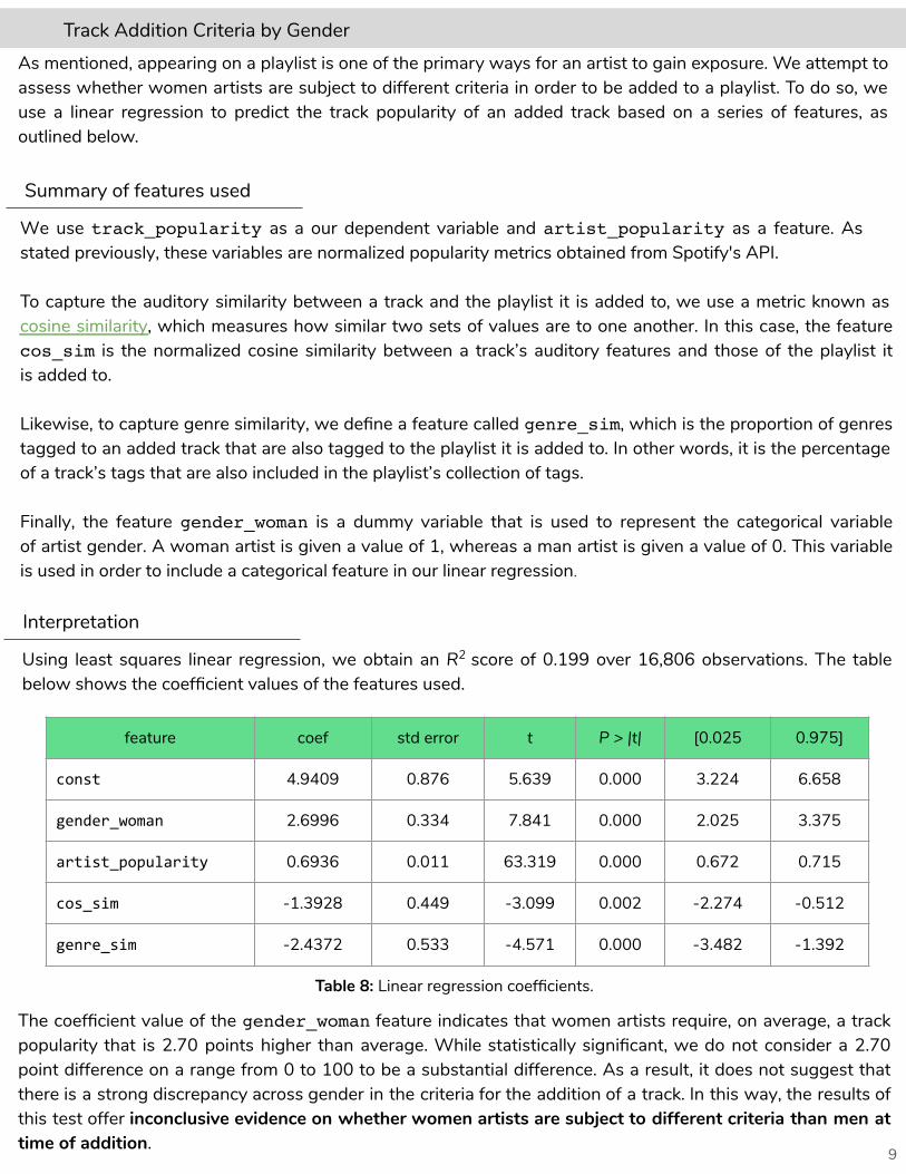
Track Addition Criteria by GenderAs mentioned, appearing on a playlist is one of the primary ways for an artist to gain exposure. We attempt to assess whether women artists are subject to different criteria in order to be added to a playlist. To do so, we use a linear regression to predict the track popularity of an added track based on a series of features, as outlined below.
Summary of features used
We use track_popularity as a our dependent variable and artist_popularity as a feature. As stated previously, these variables are normalized popularity metrics obtained from Spotify's API.
To capture the auditory similarity between a track and the playlist it is added to, we use a metric known as cosine similarity, which measures how similar two sets of values are to one another. In this case, the feature cos_sim is the normalized cosine similarity between a track’s auditory features and those of the playlist it is added to.
Likewise, to capture genre similarity, we define a feature called genre_sim, which is the proportion of genres tagged to an added track that are also tagged to the playlist it is added to. In other words, it is the percentage of a track’s tags that are also included in the playlist’s collection of tags.
Finally, the feature gender_woman is a dummy variable that is used to represent the categorical variable of artist gender. A woman artist is given a value of 1, whereas a man artist is given a value of 0. This variable is used in order to include a categorical feature in our linear regression.
Interpretation
Using least squares linear regression, we obtain an R2 score of 0.199 over 16,806 observations. The table below shows the coefficient values of the features used.
Table 8: Linear regression coefficients.
The coefficient value of the gender_woman feature indicates that women artists require, on average, a track popularity that is 2.70 points higher than average. While statistically significant, we do not consider a 2.70 point difference on a range from 0 to 100 to be a substantial difference. As a result, it does not suggest that there is a strong discrepancy across gender in the criteria for the addition of a track. In this way, the results of this test offer inconclusive evidence on whether women artists are subject to different criteria than men at time of addition.

Label Representation
10
As a way of measuring institutional representation, we assess the distribution of record labels on the platform. We use an economic measure called the concentration ratio, which is used to understand the concentration of a given industry, here, the proportion of “wealth” (track appearances) accounted for by the number of institutions. In the context of this analysis, we use the concentration ratio for the top two entities (CR2). This metric tells us the percentage of track appearances that the top two record labels account for.
Label concentration by class
We begin by exploring the distribution of record label appearances across SCL and UCL. The figures below show the number of appearances per record label (across all tracks, sorted in increasing order. In both cases, the distribution remains relatively flat until we reach the labels with the most appearances. The shapes of these curves suggest that in both SCL and UCL, the most popular record labels account for a disproportionately large share of total appearances. In other words, the distribution of appearances per record label is heavily skewed towards the most popular labels.
As a way of quantifying these observations, we calculate the Gini coefficient and CR2 score for both SCL and UCL. As expected, both coefficients suggest an uneven distribution of appearances per label. Comparing the two, they also indicate that the top labels in UCL account for a larger portion of track appearances than those of SCL.
Gini Coeff. CR2
SCL 0.7307 5.99%
UCL 0.8083 9.65%
Table 9: Gini coefficient and CR2 for label appearances.
Recall that the Gini coefficients for artist appearances are 0.611 and 0.641 for SCL and UCL respectively. Comparing with those for label appearances, we observe that the distribution of record label appearances is less equal than the distribution of artist appearances.
Figure 10: Number of appearances per label in SCL (sorted in increasing order).
Figure 11: Number of appearances per label in UCL (sorted in increasing order).
11
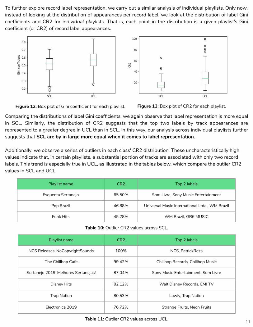
To further explore record label representation, we carry out a similar analysis of individual playlists. Only now, instead of looking at the distribution of appearances per record label, we look at the distribution of label Gini coefficients and CR2 for individual playlists. That is, each point in the distribution is a given playlist’s Gini coefficient (or CR2) of record label appearances.
Comparing the distributions of label Gini coefficients, we again observe that label representation is more equal in SCL. Similarly, the distribution of CR2 suggests that the top two labels by track appearances are represented to a greater degree in UCL than in SCL. In this way, our analysis across individual playlists further suggests that SCL are by in large more equal when it comes to label representation.
Additionally, we observe a series of outliers in each class' CR2 distribution. These uncharacteristically high values indicate that, in certain playlists, a substantial portion of tracks are associated with only two record labels. This trend is especially true in UCL, as illustrated in the tables below, which compare the outlier CR2 values in SCL and UCL.
Playlist name CR2 Top 2 labels
Esquenta Sertanejo 65.50% Som Livre, Sony Music Entertainment
Pop Brazil 46.88% Universal Music International Ltda., WM Brazil
Funk Hits 45.28% WM Brazil, GR6 MUSIC
Table 10: Outlier CR2 values across SCL.
Figure 12: Box plot of Gini coefficient for each playlist. Figure 13: Box plot of CR2 for each playlist.
Playlist name CR2 Top 2 labels
NCS Releases-NoCopyrightSounds 100% NCS, PatrickReza
The Chillhop Cafe 99.42% Chillhop Records, Chillhop Music
Sertanejo 2019-Melhores Sertanejas! 87.04% Sony Music Entertainment, Som Livre
Disney Hits 82.12% Walt Disney Records, EMI TV
Trap Nation 80.53% Lowly, Trap Nation
Electronica 2019 76.72% Strange Fruits, Neon Fruits
Table 11: Outlier CR2 values across UCL.

12
These tables depict a suspicious trend across outlier UCL. Whereas there are only three outlier SCL, none of which with a CR2 greater than 70%, there are six outlier UCL, each of which with a CR2 greater than 75%. Furthermore, the top two UCL have a CR2 either very close to or equal to 100%, indicating that two record labels account for every track included on the playlist. Considering the top two labels associated with each playlist, these CR2 values lead us to believe that, in certain cases, user-curated lists are curated not by users, but rather by the record labels themselves.
In addition, the level of transparency of each record labels curatorial processes varies from playlist to playlist. In the case of NCS Releases-NoCopyrightSounds, The Chillhop Cafe, and Disney Hits, the name of their playlists indicate that the corresponding labels are fairly open regarding their curatorial processes. Though, in other cases, such as Sertanejo 2019-Melhores Sertanejas and Electronica 2019, labels do not offer the user the same level of transparency. In fact, these playlists are associated with the Spotify accounts Filtr Brazil and Filtr Espana, which are maintained by the third party playlist service Filtr, a subsidiary of Sony Music Entertainment. Yet, there is no indication of this relationship on either of the account's Spotify profiles.
In certain user-curated lists, nearly all tracks are associated with only two record labels
In this paper, we have investigated representation and bias in Spotify's playlist curation processes. Over our 16-week period, we analyzed the playlist composition of over 20,000 songs across Spotify curated playlists and user curated playlists. Our findings reveal noticeable curation patterns across artist popularity, gender representation, and record label representation that indicate that the curation process for Spotify-curated lists and user-curated lists are subject to different mechanisms.
Indeed, for artist popularity, we find an uneven distribution of track appearances in top playlists, with both SCL and UCL favoring artists with high popularity. We also find that SCL curators add songs of varying ages and track popularity, while UCL curation adds mostly new songs. In the case of gender representation, we find that a unique man artist will appear at a much higher rate than a woman in UCL, unlike in SCL. Additionally, we find that men artists are both associated with more tracks than women across nearly every genre, as well as being represented as more genre-fluid than women. Lastly, in regard to record labels, our findings indicate that top-tier labels in UCL account for a larger portion of playlist appearances than those of SCL. We also find evidence of outlier UCL that may be curated by the record labels themselves, some of which who do so with little or no transparency.
This paper acts as a preliminary assessment of representation in Spotify's platform. We in no way suggest that these trends are indicative of those of the music industry as a whole. As a result, future research could focus on comparing representation in Spotify to other domains or platforms in the music industry.
Conclusion

13
“About." Filtr. Accessed January 10, 2020. https://filtr.com/us/spotify/about.
“Company Info." Spotify. Accessed April 31, 2019. https://newsroom.spotify.com/company-info.
“Get Audio Features for a Track." Spotify for Developers. Accessed December 28, 2019.https://developer.spotify.com/documentation/web-api/reference/tracks/get-audio-features/.
Krukowski, Damon. “How to Be a Responsible Music Fan in the Age of Streaming." Pitchfork, January 30, 2018.https://pitchfork.com/features/oped/how-to-be-a-responsible-music-fan-in-the-age-of-streaming/.
Luis Aguiar, Joel Waldfogel. Platforms, Promotion, and Product Discovery: Evidence fromSpotify Playlists; JRC Digital Economy Working Paper 2018-04; JRC Technical Reports, JRC112023
“Music Consumer Insight Report 2018." IFPI, October 9, 2018. https://www.ifpi.org/downloads/Music-Consumer-Insight-Report-2018.pdf.
“Registration Statement." United States Securities and Exchange Commission, March 23, 2018. https://www.sec.gov/Archives/edgar/data/1639920/000119312518092759/d494294df1a.htm.
“Smirnoff Equalised Playlist." Spotify & Smirnoff. Accessed January 11, 2020. https://smirnoff.withspotify.com/.
Spotify Usage and Revenue Statistics (2019)." Business of Apps, May 10, 2019. https://www.businessofapps.com/data/spotify-statistics.
Works Cited
This project would not have been possible without the generous support of many organizations and people. We would like to thank the McGill Centre for Social and Cultural Data Science for their generous research seed grant which funded the initial stages of the project and the Social Sciences and Humanities Research Council of Canada which also provided on-going support.
We would also like to thank the other .txtLAB research assistants and Professor Richard So for their invaluable insights during our lab meetings. Finally, we would like to thank Professor Andrew Piper for his support, guidance, and expertise throughout the process.
Acknowledgements