
Effective Use of Tree Maps - MSKTC
8
Purpose This tool provides guidelines and tips on how to effectively use tree maps to communicate research findings. Format This tool provides guidance on tree maps and their purposes, and shows examples of preferred practices and practical tips for tree maps. Audience This tool is designed primarily for researchers from the Model Systems that are funded by the National Institute on Disability, Independent Living, and Rehabilitation Research (NIDILRR). The tool can be adapted by other NIDILRR-funded grantees and the general public. Effective Use of Tree Maps 1 The contents of this tool were developed under a grant from the National Institute on Disability, Independent Living, and Rehabilitation Research (NIDILRR grant number 90DP0012-01-00). The contents of this fact sheet do not necessarily represent the policy of Department of Health and Human Services, and you should not assume endorsement by the Federal Government.
Transcript of Effective Use of Tree Maps - MSKTC

Purpose This tool provides guidelines and tips on how to effectively use tree maps to communicate research findings.
Format This tool provides guidance on tree maps and their purposes, and shows examples of preferred practices and practical tips for tree maps.
Audience This tool is designed primarily for researchers from the Model Systems that are funded by the National Institute on Disability, Independent Living, and Rehabilitation Research (NIDILRR). The tool can be adapted by other NIDILRR-funded grantees and the general public.
Effective Use of Tree Maps
1
The contents of this tool were developed under a grant from the National Institute on Disability, Independent Living, and Rehabilitation
Research (NIDILRR grant number 90DP0012-01-00). The contents of this fact sheet do not necessarily represent the policy of
Department of Health and Human Services, and you should not assume endorsement by the Federal Government.

Tree Maps
Tree Maps are primarily used to display data that is grouped and nested in a hierarchical (or tree-based) structure.
Example: There are approx 10-15 major categories of cause of death – Circulatory System Diseases, Cancers, Respiratory Diseases, External Causes of Mortality etc. Within each major category are sub-categories. Within Circulatory System Diseases are subcategories of Heart Disease, Cerebrovascular Disease (Stroke), Hypertension-Related, etc. Within the subcategories are even finer differentiations.
A tree map is one method to simultaneously display the magnitude of the major categories - as well as the magnitude of the larger sub-categories in one visualization.
Tree maps typically have the appearance of horizontally-oriented rectangles subdivided by size into the major categories and subcategories - so as to convey the part-to-whole relationships.

Tree Maps Cause of Death – By State and Year – Hierarchical Tree Map
Rectangle size is proportional to the number
of deaths in each category and subcategory
Source: CDC
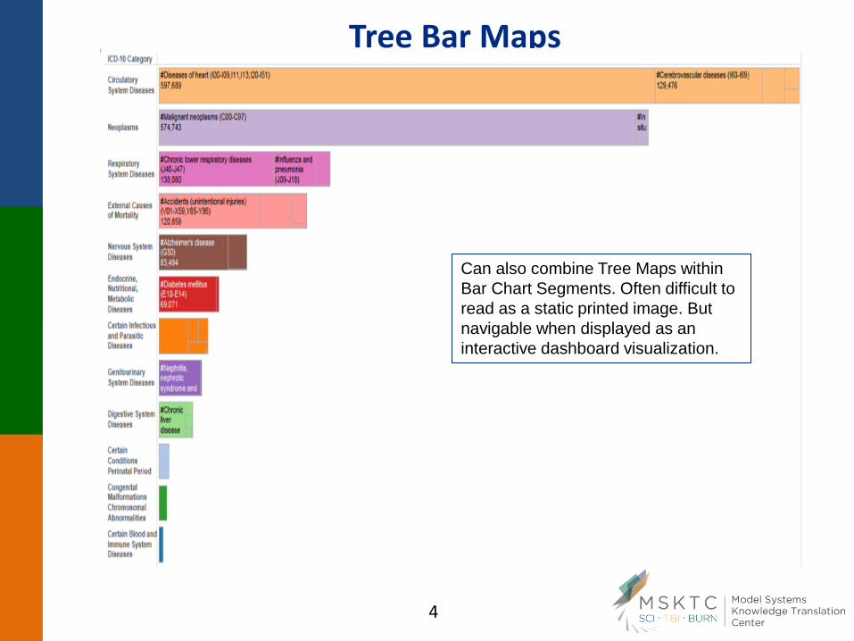
Tree Bar Maps
Can also combine Tree Maps within
Bar Chart Segments. Often difficult to
read as a static printed image. But
navigable when displayed as an
interactive dashboard visualization.

Tree Maps
Tree maps are not available in Excel.
Tree maps are available in most dedicated data visualization software packages (such as Tableau).
Tree maps are best utilized in an interactive format, in which a user can drill deeper into the various categories and subcategories of interest and enlarge and reduce the size of the visual display (and the amount of detail revealed) as desired.
Tree maps can be several layers to dozens of layers deep and can allow drill-down to hundreds of sub-categories.
Related categories and subcategories of a tree map are typically color-coded to match the highest-level parent categories. For example, all of the rectangles representing the Circulatory Disease deaths (from the top category to the finest subcategory) would be coded in the same shade of blue.

Tree Map – 2012 – Total Votes Cast for President – By State and County
Rectangles proportional to total votes cast
Source: The Guardian

Votes Cast for President – 2012 – Shaded by Percent Obama vs Romney
Source: The Guardian

Votes Cast for President – 2012 – Shaded by Percent Obama vs Romney - NC
Detail is revealed by drill down and by mouse-over any given rectangle


![AutomaticReal-TimeGenerationofFloorPlansBasedon ...downloads.hindawi.com/journals/ijcgt/2010/624817.pdf · maps approach [15] uses a tree structure to define how information should](https://static.fdocuments.net/doc/165x107/604ce6f1c1e8a3408061a815/automaticreal-timegenerationoffloorplansbasedon-maps-approach-15-uses-a-tree.jpg)


![BUBBLE TREE CONVERGENCE FOR HARMONIC MAPS ......Tian [5], Qing-Tian [13], and Chen-Tian [3]. 1. The bubble tree construction Fix a compact Riemann surface (Σ, h) and a compact Riemannian](https://static.fdocuments.net/doc/165x107/60e3df9a01acbc162b571fcb/bubble-tree-convergence-for-harmonic-maps-tian-5-qing-tian-13-and.jpg)