DragonCon Brand Book
33
DRAG NCON DRAG NCON
-
Upload
tim-murakami -
Category
Documents
-
view
218 -
download
1
description
Rebranding guides for Speculative Brand Book for DragonCon, an annual conference for fans of Sci-Fi and Fantasy. Art Direction - Meg Bucci & Jessica Gunston-Parks Copywriting - Tim Murakami & AJ Camorlinga
Transcript of DragonCon Brand Book
DRAG NCONDRAG NCON

Table of Contents
2 - 7
8 - 9
10 - 13
14 -15
16 - 17
18 - 19
19 - 20
22 - 23
24 - 25
Logo Symbol & Logo Type . . . . . . . . . . . . . . . . . . . . . . . . . . . . . . . . . . . . . . . . . . . . .
Logo with Tagline . . . . . . . . . . . . . . . . . . . . . . . . . . . . . . . . . . . . . . . . . . . . . . . . . . . .
Color Palette . . . . . . . . . . . . . . . . . . . . . . . . . . . . . . . . . . . . . . . . . . . . . . . . . . . . . . . . .
Type . . . . . . . . . . . . . . . . . . . . . . . . . . . . . . . . . . . . . . . . . . . . . . . . . . . . . . . . . . . . . . . .
Tone . . . . . . . . . . . . . . . . . . . . . . . . . . . . . . . . . . . . . . . . . . . . . . . . . . . . . . . . . . . . . . . .
Borders and Containers . . . . . . . . . . . . . . . . . . . . . . . . . . . . . . . . . . . . . . . . . . . . . .
Illustrations . . . . . . . . . . . . . . . . . . . . . . . . . . . . . . . . . . . . . . . . . . . . . . . . . . . . . . . .
Textures . . . . . . . . . . . . . . . . . . . . . . . . . . . . . . . . . . . . . . . . . . . . . . . . . . . . . . . . . . . .
Transparencies . . . . . . . . . . . . . . . . . . . . . . . . . . . . . . . . . . . . . . . . . . . . . . . . . . . . .
Putting It All Together . . . . . . . . . . . . . . . . . . . . . . . . . . . . . . . . . . . . . . . . . . . . . . . . 26 - 27
Enter a world where nothing is real and everything is acceptable. A place where you can see Harry Potter, Chewbaca and the Powerpu� Girls in the same location. DragonCon is an inclusive, exciting way to experience all realms of sci-� and fantasy.
DragonCon is the largest Multi-media pop-culture convention that focuses on science �ction, literature, gaming, fantasy, art, music and �lm. �e convention comes around once a year in Atlanta, Georgia, from August 30th - September 2nd. �e convention itself is what fans look forward to most, but the brand has such a following that there are year round events keeping the convention alive at all times. DragonCon prides itself on its vast array of acivities; as there is truly something for everyone at the event(s).
With this broad following, it seems as though it has been hard for the brand to form a solid identity, as it appeals to such a wide variety of people. From fairies to zombies, DragonCon must continue to appeal to all varieties of the make believe believers.
�is guide will help solidify the convention as a true brand by creating for it a unique, inclusive, friendly, fun and witty personality- just like the many walks of life who attend its events. DragonCon and its attendees are not pretentious, so it is important that this guide gives the Convention a sleek exterior, while still having the voice of a Trekkie who plays World of War Cra� while humming the Sailor Moon theme song. Yes, this combination is possible.
Enter the Dragon
22
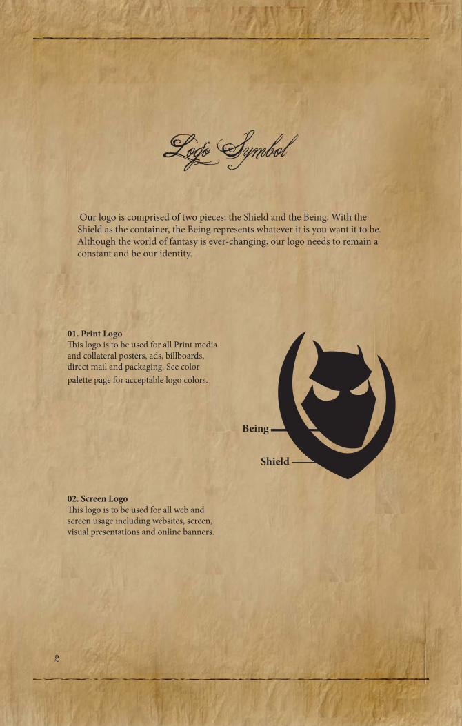
Logo Symbol Our logo is comprised of two pieces: the Shield and the Being. With the Shield as the container, the Being represents whatever it is you want it to be. Although the world of fantasy is ever-changing, our logo needs to remain a constant and be our identity.
01. Print Logo�is logo is to be used for all Print media and collateral posters, ads, billboards, direct mail and packaging. See color palette page for acceptable logo colors.
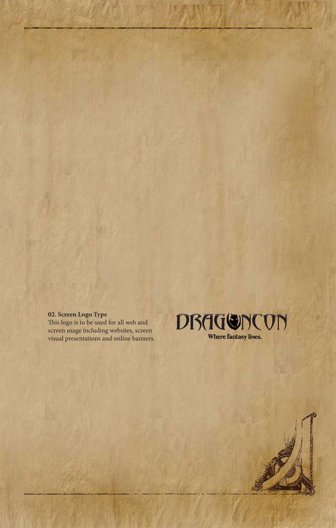
02. Screen Logo�is logo is to be used for all web and screen usage including websites, screen, visual presentations and online banners.
Being
Shield
01. 02.

24
To do or Not to do
01. Leave some space around our logo. It needs some room to breathe. See approved primary colors for logo on color palette page.
02. We understand there may be certain situations where our logo needs to sit on top of a colored box. If this happens, make sure it is our inverted black and white logos in a box.
03. Avoid placing our logo on bright saturated colors. Keep it subtle and only use muted colors from our secondary colors palette.
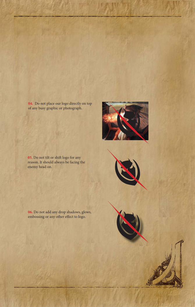
04. Do not place our logo directly on top of any busy graphic or photograph.
05. Do not tilt or shi� logo for any reason. It should always be facing the enemy head on.
06. Do not add any drop shadows, glows, embossing or any other e�ect to logo.
26
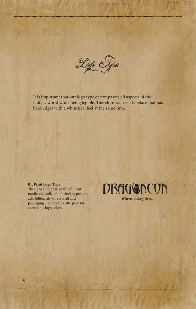
Logo Type
It is important that our logo type encompasses all aspects of the fantasy world while being legible. �erefore we use a typeface that has hard edges with a whimsical feel at the same time.
01. Print Logo Type�is logo is to be used for all Print media and collateral including posters, ads, billboards, direct mail and packaging. See color palette page for acceptable logo colors.
Where fantasy lives. DRAG NCON
02. Screen Logo Type�is logo is to be used for all web and screen usage including websites, screen visual presentations and online banners. Where fantasy livWhere fantasy livWhere fantas es. y lives. y liv
DRAG NCON
28
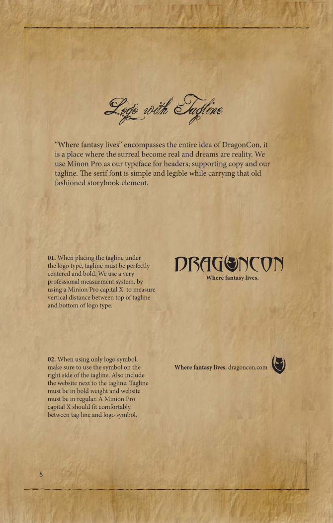
Logo with Tagline“Where fantasy lives” encompasses the entire idea of DragonCon, it is a place where the surreal become real and dreams are reality. We use Minon Pro as our typeface for headers; supporting copy and our tagline. �e serif font is simple and legible while carrying that old fashioned storybook element.
01. When placing the tagline under the logo type, tagline must be perfectly centered and bold. We use a very professional measurment system, by using a Minion Pro capital X to measure vertical distance between top of tagline and bottom of logo type.
02. When using only logo symbol, make sure to use the symbol on the right side of the tagline. Also include the website next to the tagline. Tagline must be in bold weight and website must be in regular. A Minion Pro capital X should �t comfortably between tag line and logo symbol.
Where fantasy lives. DRAG NCON
Where fantasy lives. dragoncon.com

03. Do not set tagline next to logo type, on either right or le� side.
04. Do not set tagline on saturated colored background or box.
05. Do not use multiple colors for logo and tagline together. �e two must always be the same color chosen from the primary color palette.
Where fantasy lives. DRAG NCON
Where fantasy lives. DRAG NCON
DRAG NCONWhere fantasy lives.
210
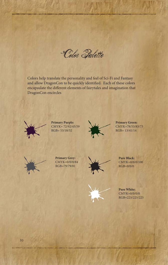
Color PaletteColors help translate the personality and feel of Sci-Fi and Fantasy and allow DragonCon to be quickly identi�ed. Each of these colors encapsulate the di�erent elements of fairytales and imagination that DragonCon encircles
Primary Purple:CMYK= 72/92/45/59RGB= 53/18/52
Primary Grey:CMYK=0/0/0/84RGB=79/79/81
Pure Black:CMYK=0/0/0/100RGB=0/0/0
Pure White:CMYK=0/0/0/0RGB=225/225/225
Primary Green:CMYK=78/53/83/73RGB= 13/41/14
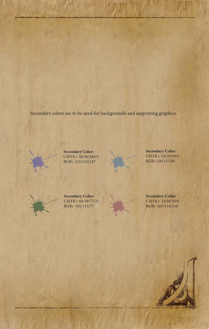
Secondary colors are to be used for backgrounds and supporting graphics.
Secondary Color:CMYK= 56/56/265/3RGB= 125/115/147
Secondary Color:CMYK= 54/39/39/4RGB=126/137/40
Secondary Color:CMYK= 60/39/77/21RGB= 101/115/77
Secondary Color:CMYK= 33/58/50/8RGB= 165/114/110
212
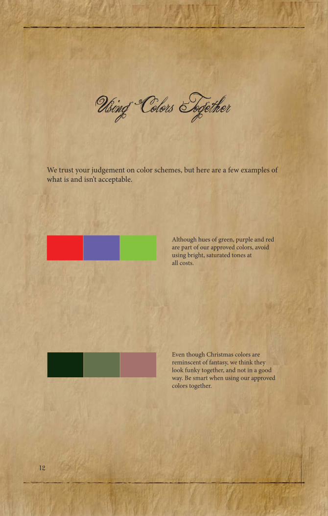
Using Colors Together
We trust your judgement on color schemes, but here are a few examples of what is and isn’t acceptable.
Although hues of green, purple and red are part of our approved colors, avoid using bright, saturated tones at all costs.
Even though Christmas colors are reminscent of fantasy, we think they look funky together, and not in a good way. Be smart when using our approved colors together.
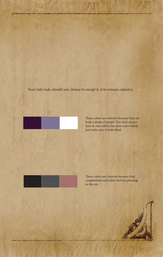
Your only task, should you choose to except it, it to remain cohesive.
�ese colors are cohesive because they are both a shade of purple. You don’t always have to stay within the same color family, just make sure it looks �uid.
�ese colors are cohesive because they complement each other and are pleasing to the eye.
214
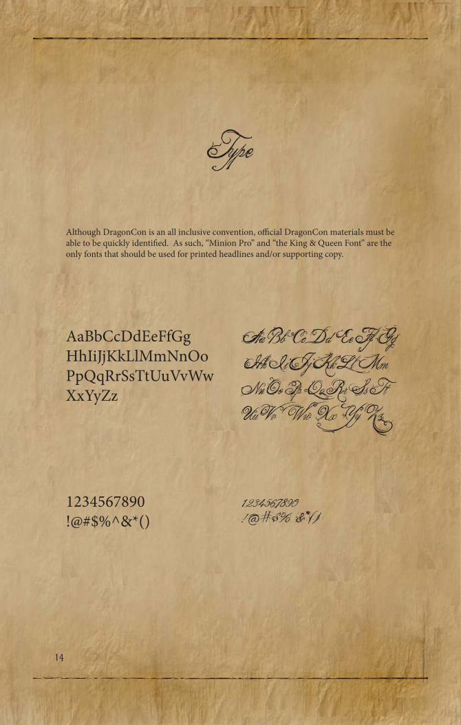
Type
Although DragonCon is an all inclusive convention, o�cial DragonCon materials must be able to be quickly identi�ed. As such, “Minion Pro” and “the King & Queen Font” are the only fonts that should be used for printed headlines and/or supporting copy.
AaBbCcDdEeFfGgHhIiJjKkLlMmNnOoPpQqRrSsTtUuVvWwXxYyZz
Aa Bb Cc Dd Ee Ff Gg Hh Ii Jj Kk Ll Mm Nn Oo Pp Qq Rr Ss Tt Uu Vv Ww Xx Yy Zz
1234567890!@#$%^&*()
1234567890!@#$%^&*()
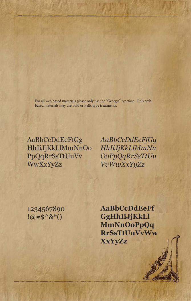
For all web based materials please only use the “Georgia” typeface. Only web based materials may use bold or italic type treatments.
AaBbCcDdEeFfGgHhIiJjKkLlMmNnOoPpQqRrSsTtUuVvWwXxYyZz
1234567890!@#$^&*()
AaBbCcDdEeFfGgHhIiJjKkLlMmNnOoPpQqRrSsTtUuVvWwXxYyZz
AaBbCcDdEeFfGgHhIiJjKkLlMmNnOoPpQqRrSsTtUuVvWwXxYyZz

216
Tone
Dragoncon is not a pretentious gathering, and because of this our tone should be light hearted, humorous and relevant to our fans. Our followers are what make these events possible, so it is important to keep this in mind while creating any piece of written material. When giving a direct piece of factual information, it may be helpful to sometimes break up the seriousness by squeezing a bit of fantasy culture into it. For example;
“�ere will be no parking provided at our events… unless you’re riding in on an Epic Mount. We’ll valet that for you.”
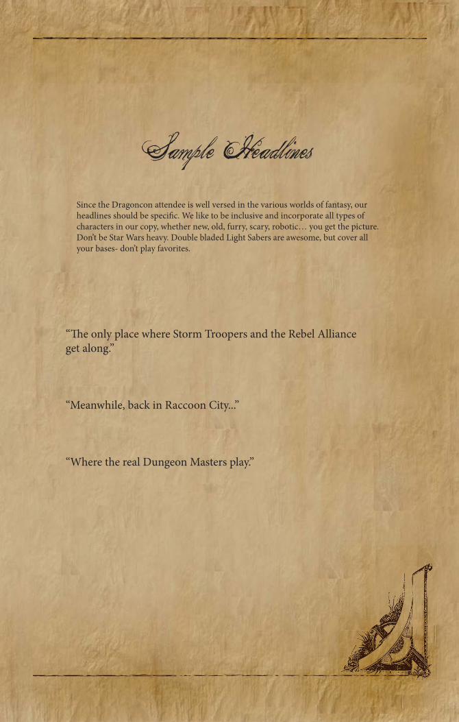
Sample HeadlinesSince the Dragoncon attendee is well versed in the various worlds of fantasy, our headlines should be speci�c. We like to be inclusive and incorporate all types of characters in our copy, whether new, old, furry, scary, robotic… you get the picture. Don’t be Star Wars heavy. Double bladed Light Sabers are awesome, but cover all your bases- don’t play favorites.
“�e only place where Storm Troopers and the Rebel Alliance get along.”
“Meanwhile, back in Raccoon City...”
“Where the real Dungeon Masters play.”
218
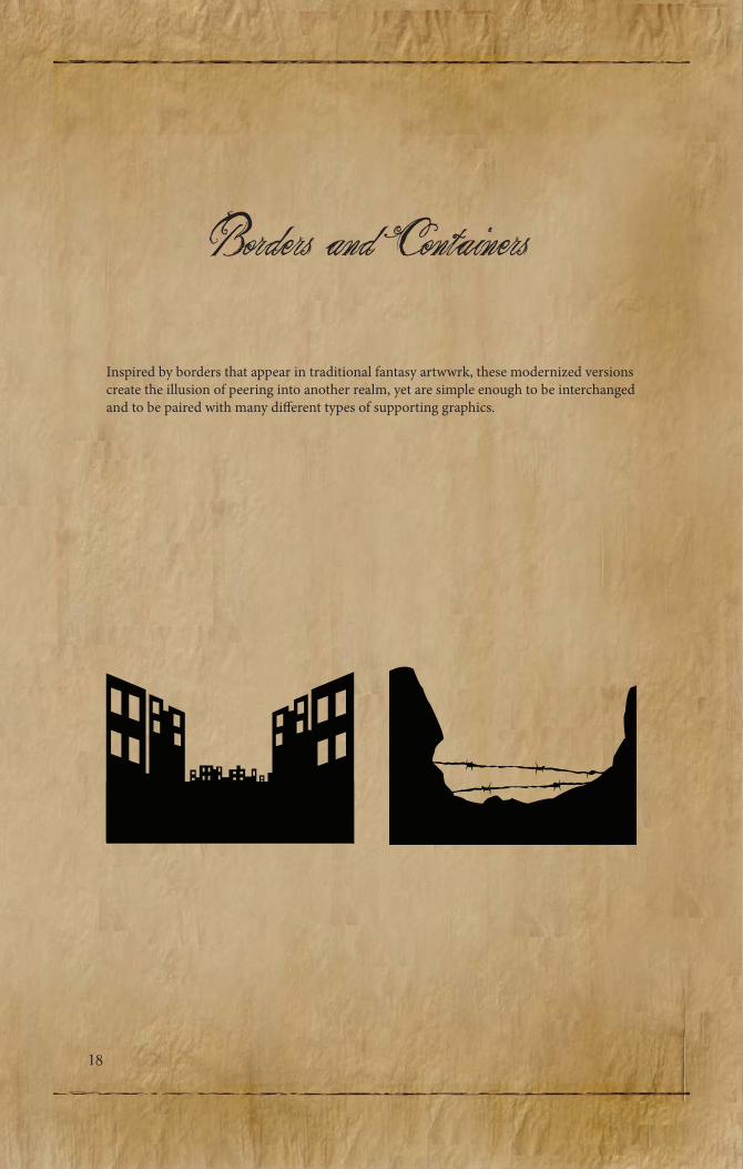
Borders and Containers
Inspired by borders that appear in traditional fantasy artwwrk, these modernized versions create the illusion of peering into another realm, yet are simple enough to be interchanged and to be paired with many di�erent types of supporting graphics.
220
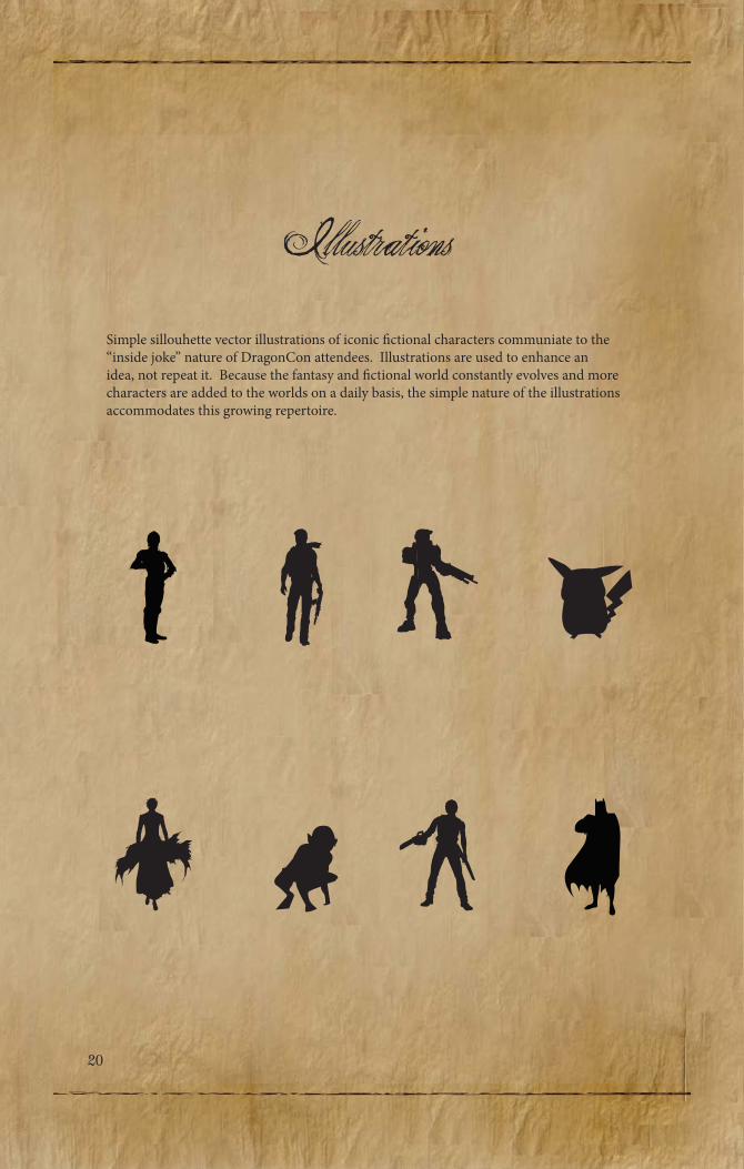
IllustrationsSimple sillouhette vector illustrations of iconic �ctional characters communiate to the “inside joke” nature of DragonCon attendees. Illustrations are used to enhance an idea, not repeat it. Because the fantasy and �ctional world constantly evolves and more characters are added to the worlds on a daily basis, the simple nature of the illustrations accommodates this growing repertoire.
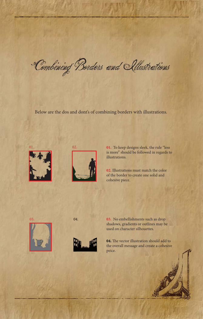
Combining Borders and Illustrations
Below are the dos and dont’s of combining borders with illustrations.
01. To keep designs sleek, the rule “less is more” should be followed in regards to illustrations.
02. Illustrations must match the color of the border to create one solid and cohesive piece.
03. No embellishments such as drop shadows, gradients or outlines may be used on character silhouettes.
04. �e vector illustration should add to the overall message and create a cohesive peice.
01. 02.
03. 04.
222
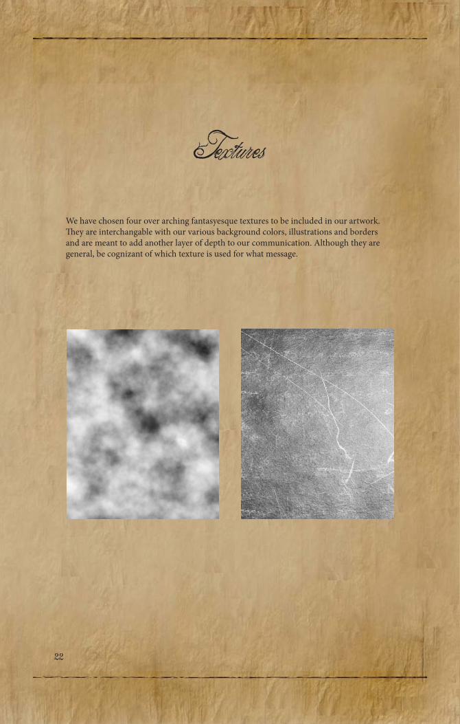
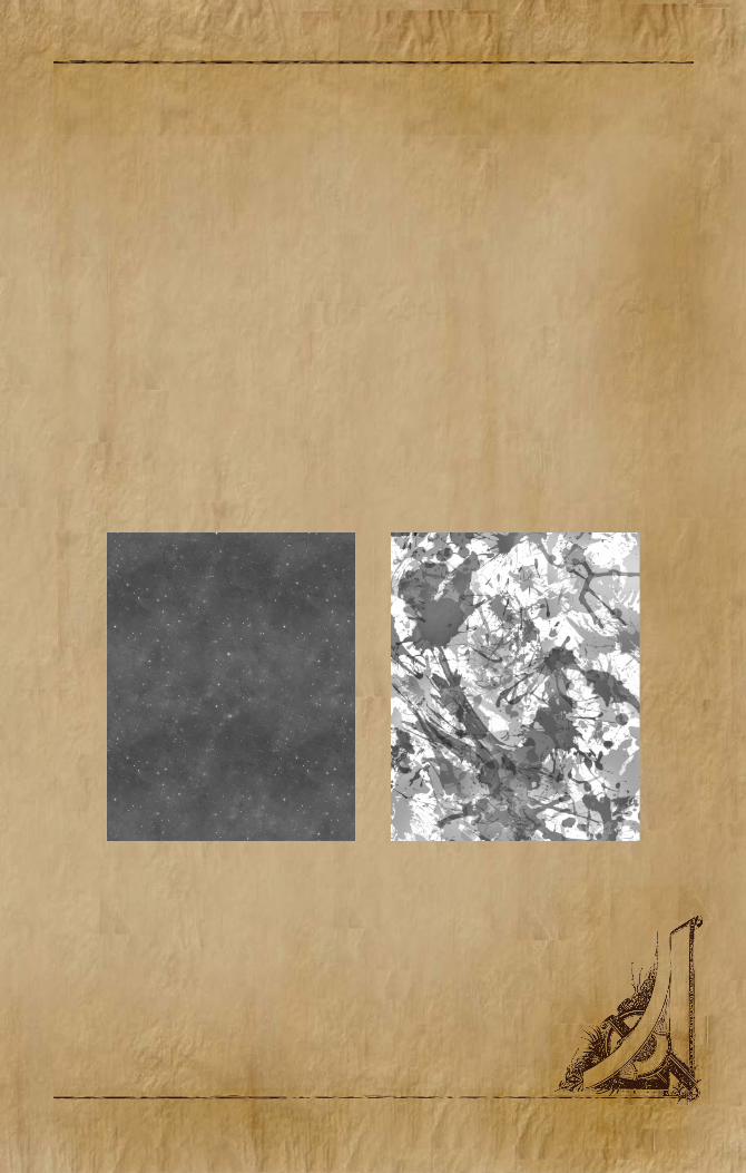
TexturesWe have chosen four over arching fantasyesque textures to be included in our artwork. �ey are interchangable with our various background colors, illustrations and borders and are meant to add another layer of depth to our communication. Although they are general, be cognizant of which texture is used for what message.

224
Transparencies
Texture set at 30% on top of background color.
�e transparencies are an important aspect to any DragonCon ad. �ey not only add another realm, but they also help unify and identify a DragonCon ad. Background colors must be chosen from the seconday color palette. When you are setting your selected textured transparency on top of the background color it must be set between 15%-30%. �e most imprtant thing to keep in mind, is that the background color should be visible through your textured transparency.
Background color from secondary color palette.
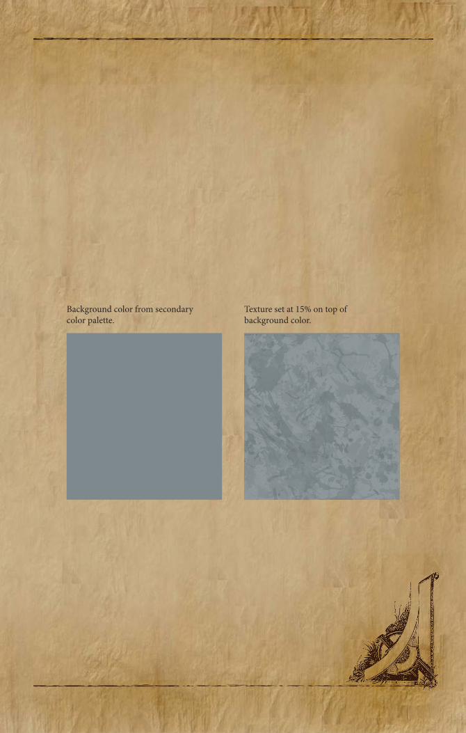
Texture set at 15% on top of background color.
Background color from secondary color palette.

226
Putting It All Together
Part 1: Part 2:
Part 3: Part 4:

Where fantasy lives. DRAG NCON
Master Chief is waiting.

2

The End