Brand Identity (brand book)
41
Crown Holdings, Inc. Identity Guidelines
-
Upload
byungjin-choi -
Category
Documents
-
view
517 -
download
15
description
Crown Holdings, Inc. is a leading manufacturer of packaging products for consumer marketing companies around the world. They make a wide range of metal packaging for food, beverage, household and personal care and industrial products and metal vacuum closures and caps.
Transcript of Brand Identity (brand book)

Crown Holdings, Inc.
Identity Guidelines

Crown Holdings, Inc.
Identity Guidelines

Shaping your brand’s future
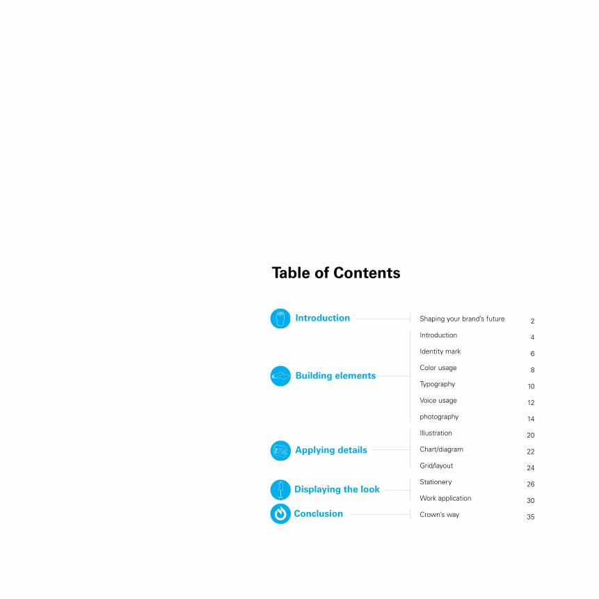
Introduction
Identity mark
Color usage
Typography
Voice usage
photography
Illustration
Chart/diagram
Grid/layout
Stationery
Work application
Crown’s way
2
4
6
8
10
12
14
20
22
24
26
30
35
Building elements
Introduction
Conclusion
Applying details
Displaying the look
Table of Contents
SHApInG your BrAnD’S fuTureWhen you face a new person, you would start to talk to him to know who he is. Before talking to him, however, you would first look at his appearance such as his clothing, his hair style and even his gesture while he’s talking. This could be another way that you perceive his personality. Therefore, one’s character can be determined by appearance. Crown is the company that builds other companies look and better appearance. We are a tailor making better and suitable clothes for other companies and their new brands.
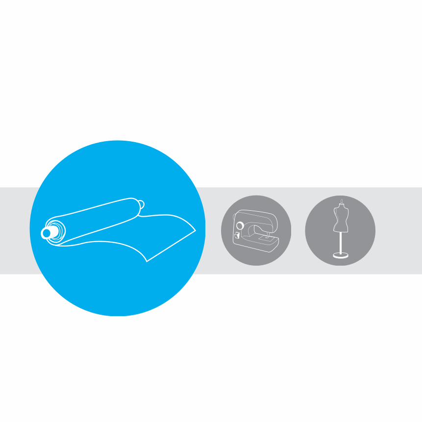
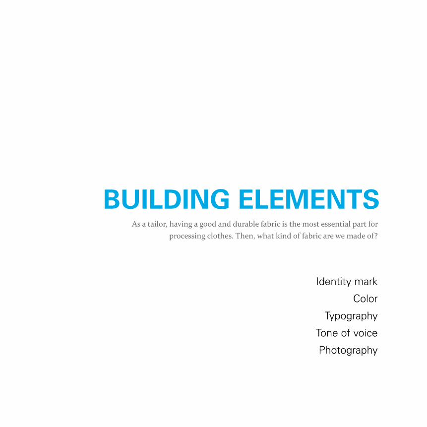
Identity mark
Color
Typography
Tone of voice
Photography
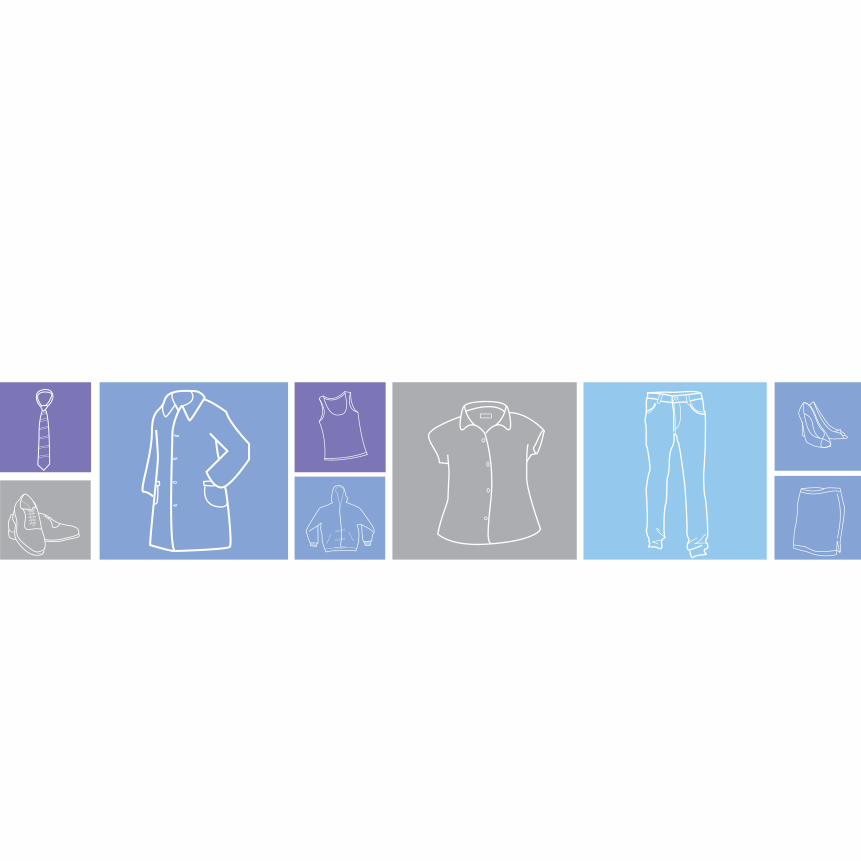
As a tailor, having a good and durable fabric is the most essential part for processing clothes. Then, what kind of fabric are we made of?
BuILDInG eLeMenTS
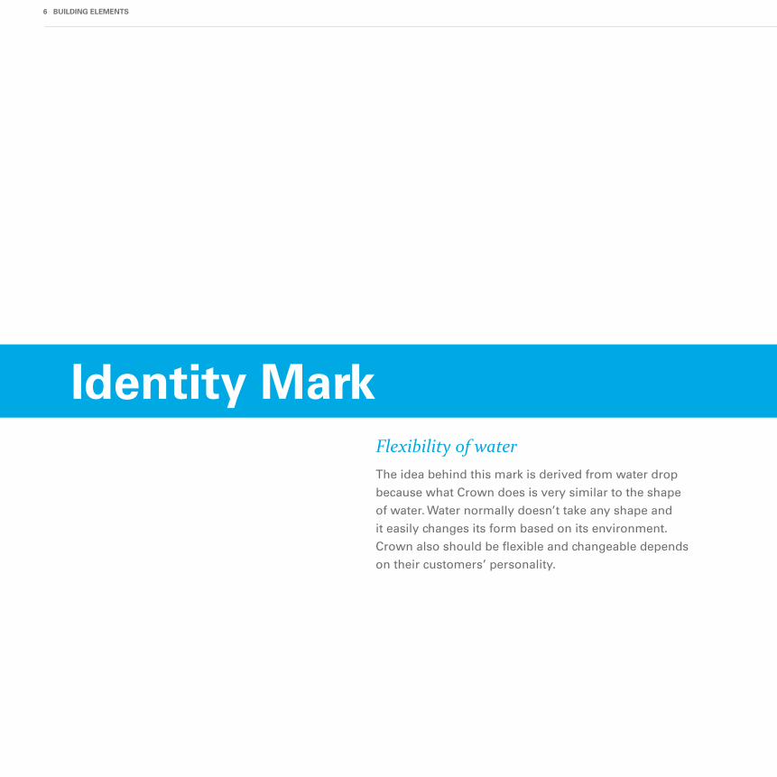
Identity Mark
The idea behind this mark is derived from water drop
because what Crown does is very similar to the shape
of water. Water normally doesn’t take any shape and
it easily changes its form based on its environment.
Crown also should be flexible and changeable depends
on their customers’ personality.
Flexibility of water
6 BuILDInG eLeMenTS
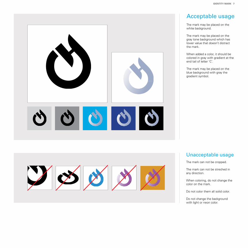
Acceptable usage
Unacceptable usage
The mark may be placed on the white background.
The mark may be placed on the gray tone background which has lower value that doesn’t distract the mark.
When added a color, it should be colored in gray with gradient at the end tail of letter ‘C’.
The mark may be placed on the blue background with gray the gradient symbol.
The mark can not be cropped.
The mark can not be streched in any direction.
When coloring, do not change the color on the mark.
Do not color them all solid color.
Do not change the background with light or neon color.
IDenTITy MArk 7
The color palette is comprised of variations of blues
and grays. Blue is basically represents the color of
water while gray is considered as the color of metal
and aluminum. Those are dominant and yet significant
colors for our strong industry and our highly
innovative technology and invention.
Harmony of nature and technology
8 BuILDInG eLeMenTS
Color usage
CMYK
CMYK
CMYK
CMYK
CMYK
CMYK
CMYK
CMYK
CMYK
CMYK
10090100
000
90
000
70
000
50
000
30
000
20
10070100
10050100
10030100
10010100
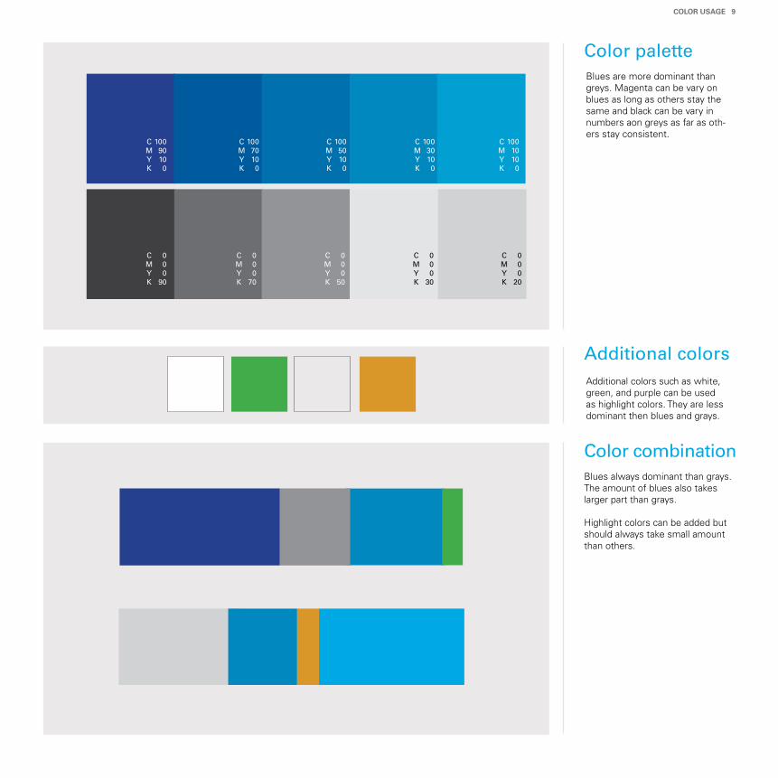
Blues are more dominant than greys. Magenta can be vary on blues as long as others stay the same and black can be vary in numbers aon greys as far as oth-ers stay consistent.
Additional colors such as white, green, and purple can be used as highlight colors. They are less dominant then blues and grays.
Blues always dominant than grays. The amount of blues also takes larger part than grays.
Highlight colors can be added but should always take small amount than others.
Color palette
Additional colors
Color combination
CoLor uSAGe 9
Simplicity and uniqueness
Customers have their own different needs. In order to
fulfill their needs, Crown should stand neutral and
discover their uniqueness as well as their characters.
Therefore, we should start with our simplicity and
develop customers’ uniqueness.
Typography
10 BuILDInG eLeMenTS
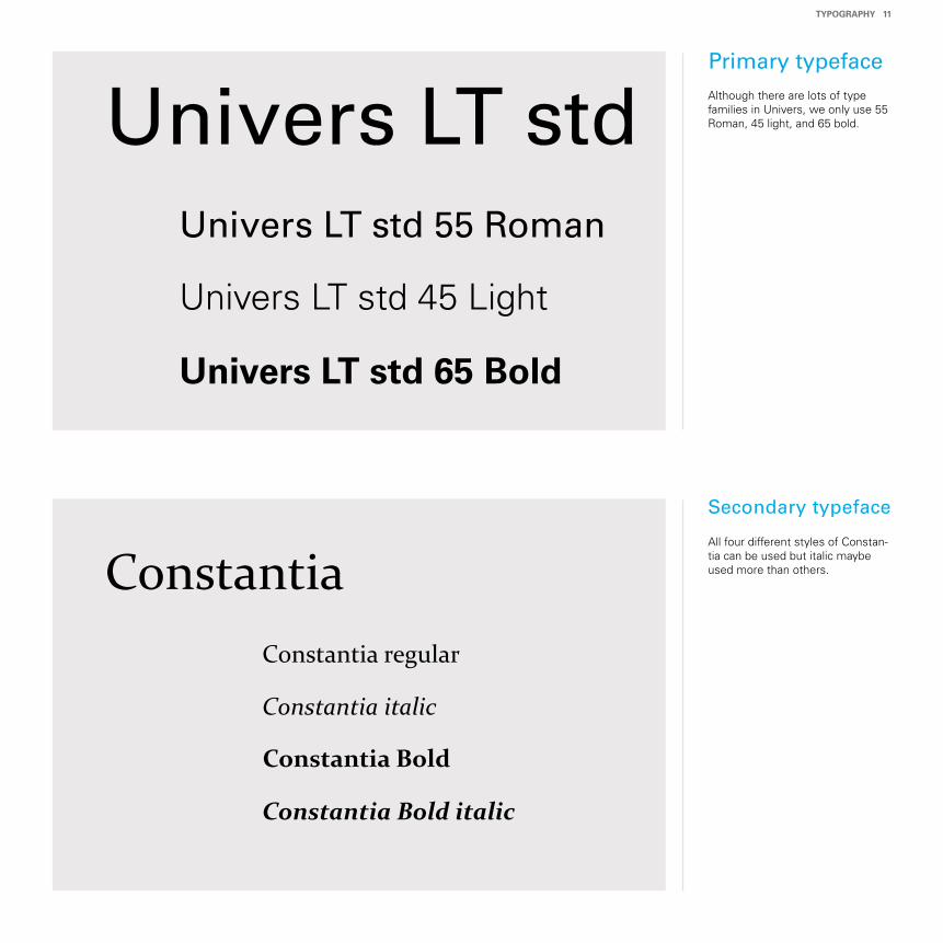
Univers LT std
Constantia
Univers LT std 55 Roman
Univers LT std 45 Light
univers LT std 65 Bold
Constantia regular
Constantia italic
Constantia Bold
Constantia Bold italic
Although there are lots of type families in Univers, we only use 55 Roman, 45 light, and 65 bold.
All four different styles of Constan-tia can be used but italic maybe used more than others.
Primary typeface
Secondary typeface
TypoGrApHy 11
Resonance of confidence
We are the company that builds other companies
brand and their images. This indicates that we are also
a part of customer’s brand and striving for the same
goal. We are responsible for their appearance.
Therefore, our voice should contain confident,
straighforward, and proud tones.
12 BuILDInG eLeMenTS
Voice usage
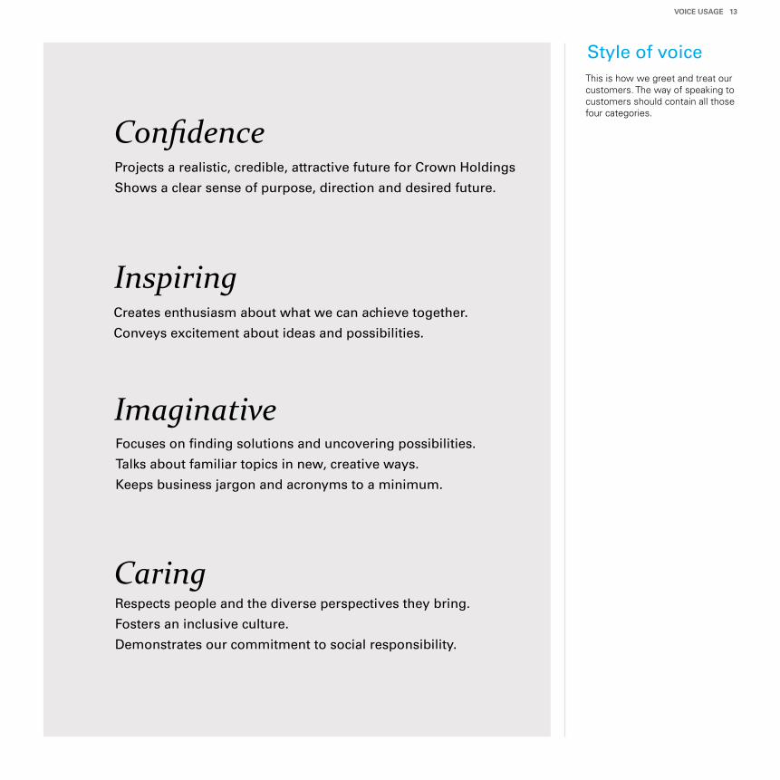
Projects a realistic, credible, attractive future for Crown Holdings
Shows a clear sense of purpose, direction and desired future.
Style of voice
Confidence
Inspiring
Imaginative
CaringRespects people and the diverse perspectives they bring.
Fosters an inclusive culture.
Demonstrates our commitment to social responsibility.
Focuses on finding solutions and uncovering possibilities.
Talks about familiar topics in new, creative ways.
Keeps business jargon and acronyms to a minimum.
Creates enthusiasm about what we can achieve together.
Conveys excitement about ideas and possibilities.
This is how we greet and treat our customers. The way of speaking to customers should contain all those four categories.
VoICe uSAGe 13
Maintaing exiciting moments
A dynamic motion will give you a confident feeling and reliable
impression. when you wear clothes that you wanted to have,
you would feel exicting and somehow want to show off your
look to people around you. Pictures which express dynamic
working environment, consumers who enjoy the products, and
our people working at the place at work would appeal to our
potential customers.
14 BuILDInG eLeMenTS
photography
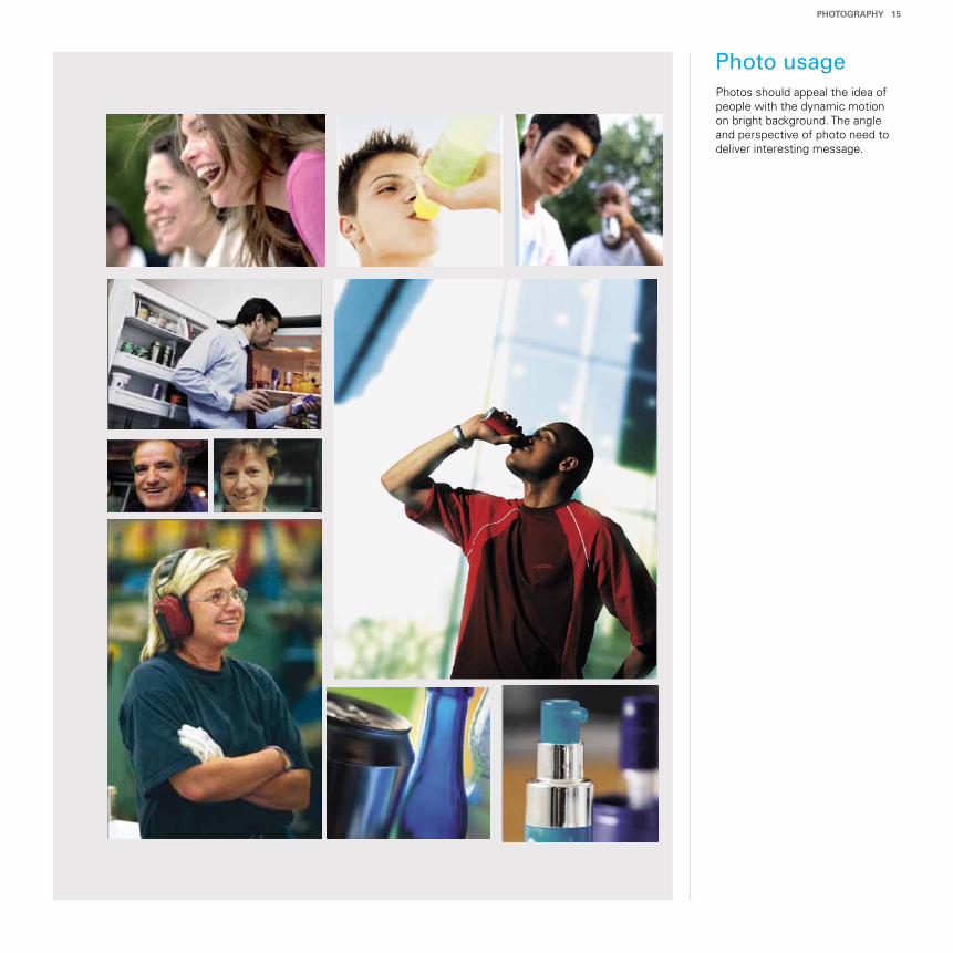
Photos should appeal the idea of people with the dynamic motion on bright background. The angle and perspective of photo need to deliver interesting message.
Photo usage
pHoToGrApHy 15
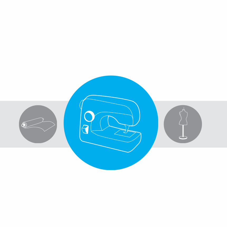
Illustration
Chart/Diagram
Grid/Layout
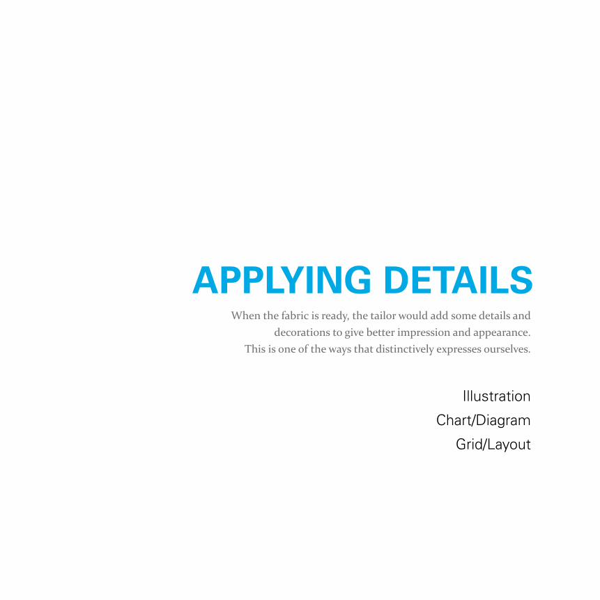
When the fabric is ready, the tailor would add some details and decorations to give better impression and appearance.
This is one of the ways that distinctively expresses ourselves.
AppLyInG DeTAILS
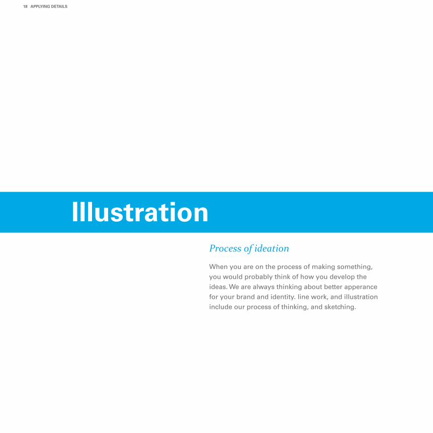
Process of ideation
When you are on the process of making something,
you would probably think of how you develop the
ideas. We are always thinking about better apperance
for your brand and identity. line work, and illustration
include our process of thinking, and sketching.
18 AppLyInG DeTAILS
Illustration
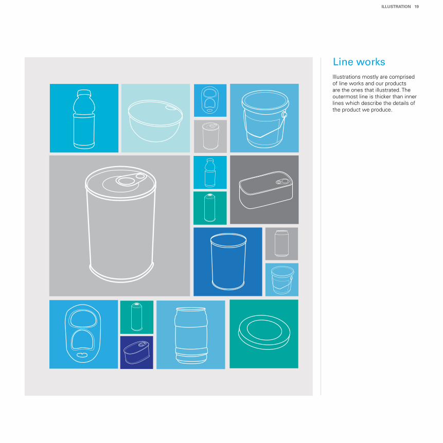
Illustrations mostly are comprised of line works and our products are the ones that illustrated. The outermost line is thicker than inner lines which describe the details of the product we produce.
Line works
ILLuSTrATIon 19
Measuring trends
Our diagrams and charts are based on the style of
illustration. They should have contain the simple
appearence by having hierarchy in emphasizing
elements, such as numbers and words.
20 AppLyInG DeTAILS
Chart/Diagram
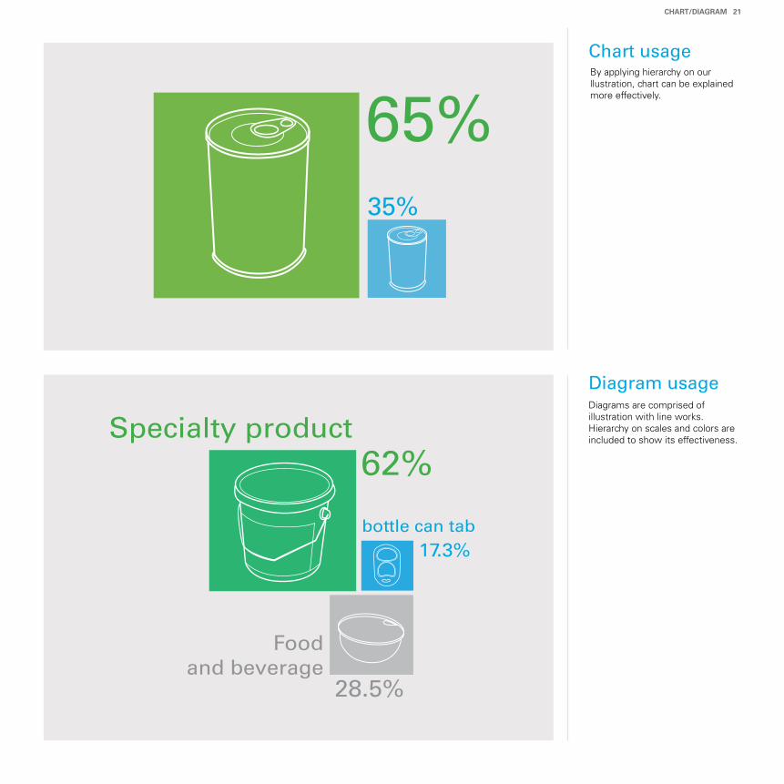
By applying hierarchy on our llustration, chart can be explained more effectively.
Diagrams are comprised of illustration with line works. Hierarchy on scales and colors are included to show its effectiveness.
Diagram usage
Chart usage
65%
Specialty product62%
35%
bottle can tab17.3%
Food and beverage
28.5%
CHArT/DIAGrAM 21
Treating with consistency
Well-organized layout and grid is required to show our
consistent and honest attitude toward our customers.
An effective and fucntional communication can be
delivered in consistent layout and grid system.
22 AppLyInG DeTAILS
Grid/Layout
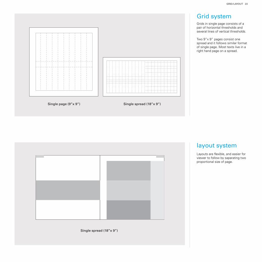
Grid system
layout system
Grids in single page consists of a pair of horizontal thresholds and several lines of vertical thresholds.
Two 9”x 9” pages consist one spread and it follows similar format of single page. Most texts live in a right hand page on a spread.
Layouts are flexible, and easier for viewer to follow by saparating two proportional size of page.
GrID/LAyouT 23
Single page (9”x 9”) Single spread (18”x 9”)
Single spread (18”x 9”)

Stationery
Work application
There are several ways to display our brand image and look. An effective exhibition would appeal shoppers to be a part of our customers.
DISpLAyInG THe Look
Spreading the message
Business card, letterhead, and envelope are the way that express our business
concept. In stationery, we are showing our potential to grow with our custom-
ers and the reliable corporate partnership.
26 DISpLAyInG THe Look
Stationery
Stationerycomponents
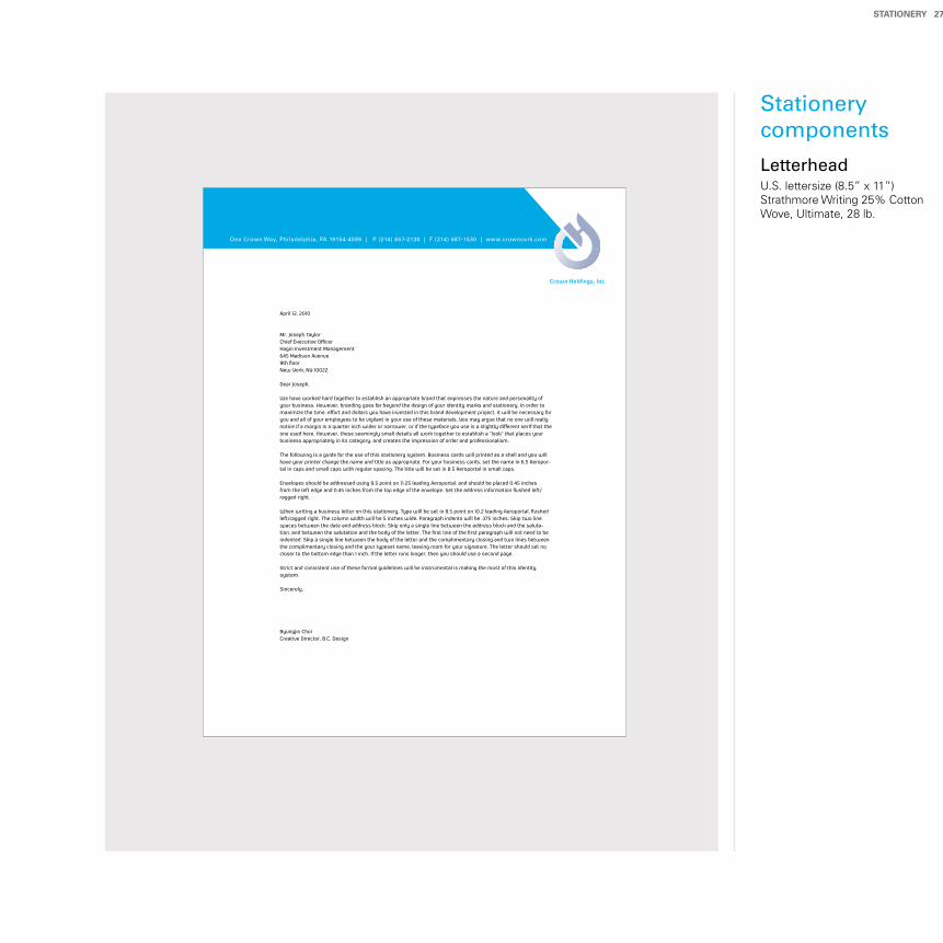
Letterhead
STATIonery 27
U.S. lettersize (8.5” x 11”)Strathmore Writing 25% Cotton Wove, Ultimate, 28 lb.
April 12, 2010
Mr. Joseph TaylorChief Executive OfficerHagin Investment Management645 Madison Avenue9th floorNew York, NY 10022
Dear Joseph,
We have worked hard together to establish an appropriate brand that expresses the nature and personality of your business. However, branding goes far beyond the design of your identity marks and stationery. In order to maximize the time, effort and dollars you have invested in this brand development project, it will be necessary for you and all of your employees to be vigilant in your use of these materials. You may argue that no one will really notice if a margin is a quarter inch wider or narrower, or if the typeface you use is a slightly different serif that the one used here. However, these seemingly small details all work together to establish a “look” that places your business appropriately in its category, and creates the impression of order and professionalism. The following is a guide for the use of this stationery system. Business cards will printed as a shell and you will have your printer change the name and title as appropriate. For your business cards, set the name in 6.5 Aeropor-tal in caps and small caps with regular spacing. The title will be set in 8.5 Aeroportal in small caps. Envelopes should be addressed using 9.5 point on 11.25 leading Aeroportal, and should be placed 0.45 inches from the left edge and 0.45 inches from the top edge of the envelope. Set the address information flushed left/ragged right. When writing a business letter on this stationery, Type will be set in 8.5 point on 10.2 leading Aeroportal, flushed left/ragged right. The column width will be 5 inches wide. Paragraph indents will be .375 inches. Skip two line spaces between the date and address block. Skip only a single line between the address block and the saluta-tion, and between the salutation and the body of the letter. The first line of the first paragraph will not need to be indented. Skip a single line between the body of the letter and the complimentary closing and two lines between the complimentary closing and the your typeset name, leaving room for your signature. The letter should set no closer to the bottom edge than 1 inch. If the letter runs longer, then you should use a second page. Strict and consistent use of these formal guidelines will be instrumental is making the most of this identity system.
Sincerely,
Byungjin ChoiCreative Director, B.C. Design
One Crown Way, Philadelphia, PA 19154-4599 | P (214) 657-2130 | F (214) 687-1530 | www.crowncork.com
Crown Holdings, Inc.
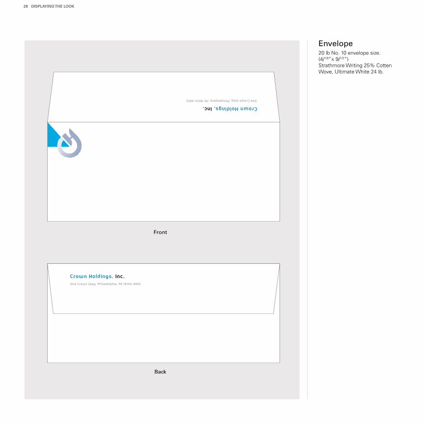
Envelope
One Crown Way, Philadelphia, PA 19154-4955
Crown Holdings, Inc.
One Crown Way, Philadelphia, PA 19154-4955
Crown Holdings, Inc.
28 DISpLAyInG THe Look
20 lb No. 10 envelope size.(4/1/8”x 9/1/2”)Strathmore Writing 25% Cotten Wove, Ultimate White 24 lb.
Front
Back
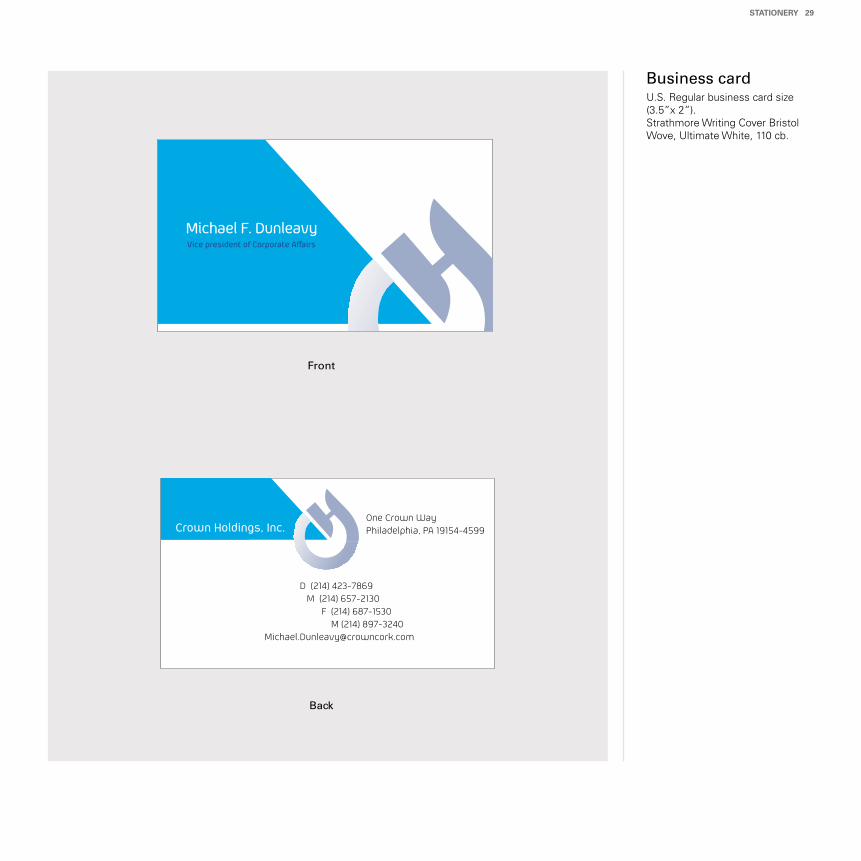
Business card
STATIonery 29
U.S. Regular business card size(3.5”x 2”).Strathmore Writing Cover Bristol Wove, Ultimate White, 110 cb.
Front
Back
Michael F. DunleavyVice president of Corporate Affairs
D (214) 423-7869M (214) 657-2130
F (214) 687-1530M (214) 897-3240
Crown Holdings, Inc.One Crown WayPhiladelphia, PA 19154-4599
Applying a new and better look
Showing ourselves with a new and better look will
refect the way how our customers see us. By applying our
concept on various aspects, we can be more hamonized
and also could appeal to our potential customers.
30 DISpLAyInG THe Look
Work Application
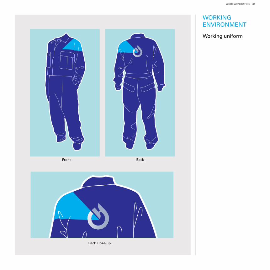
WORKINGENVIRONMENT
Working uniform
Work AppLICATIon 31
BackFront
Back close-up
32 DISpLAyInG THe Look
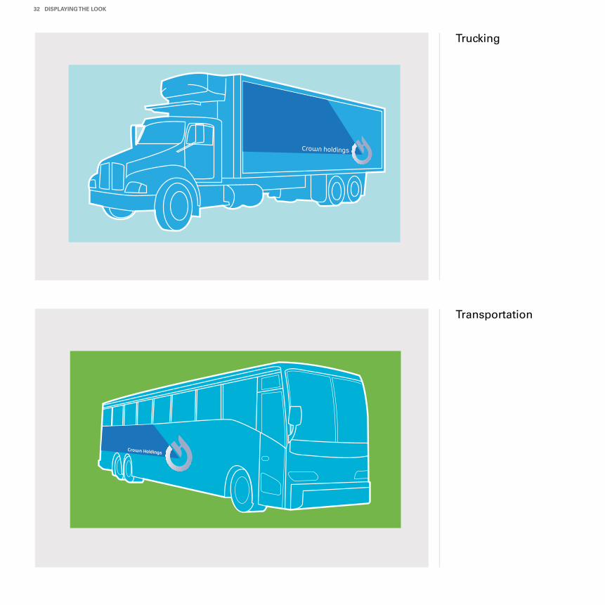
Trucking
Transportation
Crown Holdings
Crown holdings
Work AppLICATIon 33
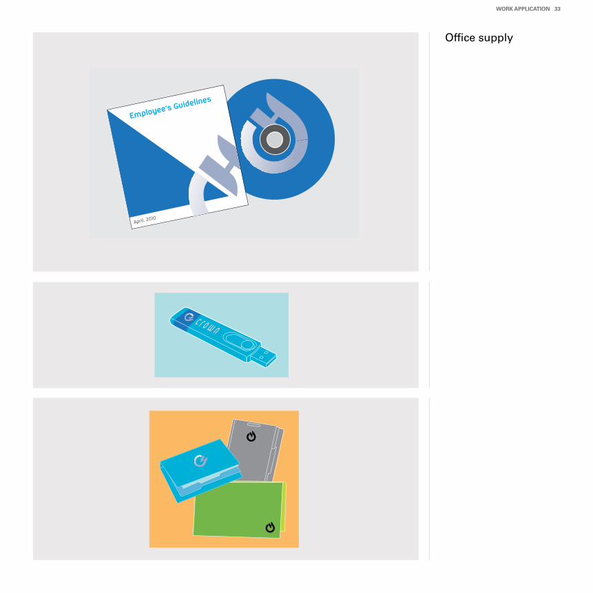
Office supply
Employee’s Guidelines
April, 2010
c r o w n
We are the company that dresses others nicely and attractively. When you wear nice and handsome clothes, you would get more attention than anybody else. This works the same on a product packinging. Consumers will pay more attention on a better and nicer packaging and it eventually makes them want to purchase and try it.
Our goal is to help launch successful new brands, to invigorate existing brands, and to drive business regionally and globally. Shaping a better future for other’s brand is Crown’s way.
CroWn’S WAy
Contact Information
Corporate Headquarters
Crown Holdings, Inc.One Crown WayPhiladelphia, PA 19154-4599 USAMain Tel: +1 (215) 698-5100
Global Investor Relations InquiriesThomas A. Kelly, Senior Vice PresidentTel: +1 (215) 698-5341Email: [email protected]
Global Media Relations InquiriesMichael F. DunleavyVice President of Corporate Affairs& Public RelationsTel: +1 (215) 698-5051Email: [email protected]
Americas Division Headquarters
Crown Holdings, Inc.One Crown WayPhiladelphia, PA 19154-4599 USAMain Tel: +1 (215) 698-5100
Asia-pacific Division Headquarters
CROWN Asia Pacific Holdings Ltd.10 Hoe Chiang Road #19-01/02Keppel TowersSingapore 089315Main Tel: +65 6423 9798
european Division Headquarters(includes Middle East and Africa)
CROWN Europe S.A.Le Colisée Irue Fructidor75830 Paris Cedex 17FranceMain Tel: +33 1 49 18 40 00