Diving into the Deep: Advanced Concepts Module 9.
41
Diving into the Deep: Advanced Concepts Module 9
-
Upload
victor-hodges -
Category
Documents
-
view
216 -
download
0
Transcript of Diving into the Deep: Advanced Concepts Module 9.

Diving into the Deep:Advanced Concepts
Module 9

Violation of Distributional Assumptions
• What distribution do the following charts assume?– i-Chart– Xbar-Range– Xbar-Sigma– p Chart– np Chart– u Chart– c Chart

Violation of Distributional Assumptions
• What distribution do the following charts assume?– i-Chart—near normal– Xbar-Range—near normal– Xbar-Sigma—near normal– p Chart--binomial– np Chart--binomial– u Chart--Poisson– c Chart--Poisson

Making your distribution normal:Trial and Error Steps
• Plot original data in histogram and on a probability plot of some kind.
• If skewed, try lower power (i.e., take the square root of each value).
• Make probability plot on transformed data.– If looks better, take even lower powers.– If looks worse, take higher powers.
• Continue until probability plot looks reasonably straight.

Ladder ofPowers
Cubic
Square
Identity
SQRT
Log
1/SQRT
1/X
1/Square
1/Cubic
This is yourraw data
Lower Powers
Higher Powers
Try thesetransformationsuntil you geta distributionthat looks likeit comes froma normaldistribution.

Average monthly number of preventable hospitalizations due to chronic disease in one IPC site, 2004-2005
02
46
8F
requ
ency
0 10 20 30 40Hospitalizations
of M
onth
s

Histograms of different power transformations.
01.0
e-05
2.0
e-05
3.0
e-05
4.0
e-05
5.0
e-05
0 20000 40000 60000 80000
cubic
05.0
e-04.0
01.0
015.
002
0 500 1000 1500 2000
square
0.0
2.0
4.0
6
0 10 20 30 40
identity0
.1.2
.3
2 3 4 5 6 7
sqrt
0.2
.4.6
1 2 3 4
log
02
46
-.6 -.5 -.4 -.3 -.2 -.1
1/sqrt
02
46
810
-.3 -.2 -.1 0
inverse
010
2030
40
-.1 -.05 0
1/square
050
100
150
-.04 -.03 -.02 -.01 0
1/cubic
De
nsity
HospitalizationsHistograms by transformation

Quantiles of preventable hospitalizations against quantiles of the normal distribution:
Dots are right on the line for normally distributed data
513
.540
010
2030
40H
osp
italiz
atio
ns
16.7917 34.8622-1.27882
0 10 20 30 40Inverse Normal
Grid lines are 5, 10, 25, 50, 75, 90, and 95 percentiles

Quantile Normal Probability Plots for Different Transformations
125
2470
.56400
0
-200
0002000
040
000
6000
080
000
11962.79 47721.51-23795.93
-20000 0 200004000060000
cubic
25182.
516
00
-5000
500
100015
002000
397.625 1246.94-451.6897
-500 0 500 1000 1500
square
513.5
40
0102
0304
0
16.79167 34.86215-1.278818
0 10 20 30 40
identity
2.2
3606
83.
673
604
6.3
2455
5
23
45
67
3.904662 5.9933441.815981
2 3 4 5 6
sqrt
1.6
0943
82.
602
003
3.6
8887
9
12
34
2.622609 3.7059711.539247
1.5 2 2.5 3 3.5 4
log
-.4
4721
36-.
272
3057
-.1
5811
39
-.6-.
5-.4-.
3-.2-.
1
-.2841066 -.122298-.4459152
-.5 -.4 -.3 -.2 -.1
1/sqrt-.
2-.
074
1758
-.0
25
-.3-.
2-.10
.1
-.0899905 .0218869-.2018679
-.2 -.15 -.1 -.05 0 .05
inverse
-.0
4-.
005
5096
-.0
0062
5
-.1-.
050
.05
-.0125318 .0251665-.0502301
-.06 -.04 -.02 0 .02
1/square
-.0
08-.
000
4098
-.0
0001
56
-.0
4-.0
3-.0
2-.0
10.01
-.0025449 .0098794-.0149693
-.015 -.01 -.005 0 .005 .01
1/cubic
HospitalizationsQuantile-Normal plots by transformationGrid lines are 5,10,25,50,75,90, and 95 percentiles
Which transformation is the closest to normally distributed?

Quantile Normal Probability Plots for Different Transformations
125
2470
.56400
0
-200
0002000
040
000
6000
080
000
11962.79 47721.51-23795.93
-20000 0 200004000060000
cubic
25182.
516
00
-5000
500
100015
002000
397.625 1246.94-451.6897
-500 0 500 1000 1500
square
513.5
40
0102
0304
0
16.79167 34.86215-1.278818
0 10 20 30 40
identity
2.2
3606
83.
673
604
6.3
2455
5
23
45
67
3.904662 5.9933441.815981
2 3 4 5 6
sqrt
1.6
0943
82.
602
003
3.6
8887
9
12
34
2.622609 3.7059711.539247
1.5 2 2.5 3 3.5 4
log
-.4
4721
36-.
272
3057
-.1
5811
39
-.6-.
5-.4-.
3-.2-.
1
-.2841066 -.122298-.4459152
-.5 -.4 -.3 -.2 -.1
1/sqrt-.
2-.
074
1758
-.0
25
-.3-.
2-.10
.1
-.0899905 .0218869-.2018679
-.2 -.15 -.1 -.05 0 .05
inverse
-.0
4-.
005
5096
-.0
0062
5
-.1-.
050
.05
-.0125318 .0251665-.0502301
-.06 -.04 -.02 0 .02
1/square
-.0
08-.
000
4098
-.0
0001
56
-.0
4-.0
3-.0
2-.0
10.01
-.0025449 .0098794-.0149693
-.015 -.01 -.005 0 .005 .01
1/cubic
HospitalizationsQuantile-Normal plots by transformationGrid lines are 5,10,25,50,75,90, and 95 percentiles

Probability of the observed distribution under the hypothesis of a normal distribution
ladder Hospitalizations
Transformation chi2(2) P(chi2)
cubic 16.36 0.000square 12.38 0.002raw 6.17 0.046square-root 2.01 0.366log 0.29 0.864reciprocal root 8.04 0.018reciprocal 18.25 0.000reciprocal square 31.62 0.000reciprocal cubic 36.56 0.000
The approximateprobability that theoriginal data arenormal.
The approximateprobability that the log of each datapoint is normallydistributed.
Which one would you use?
In STATA: Simply typein this command!
Results
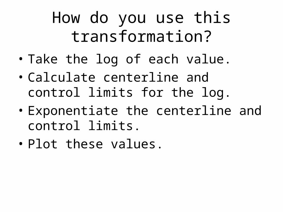
How do you use this transformation?
• Take the log of each value.
• Calculate centerline and control limits for the log.
• Exponentiate the centerline and control limits.
• Plot these values.

i-Chart assuming normal distribution of raw data.

i-Chart of the log of the number of hospitalizations.
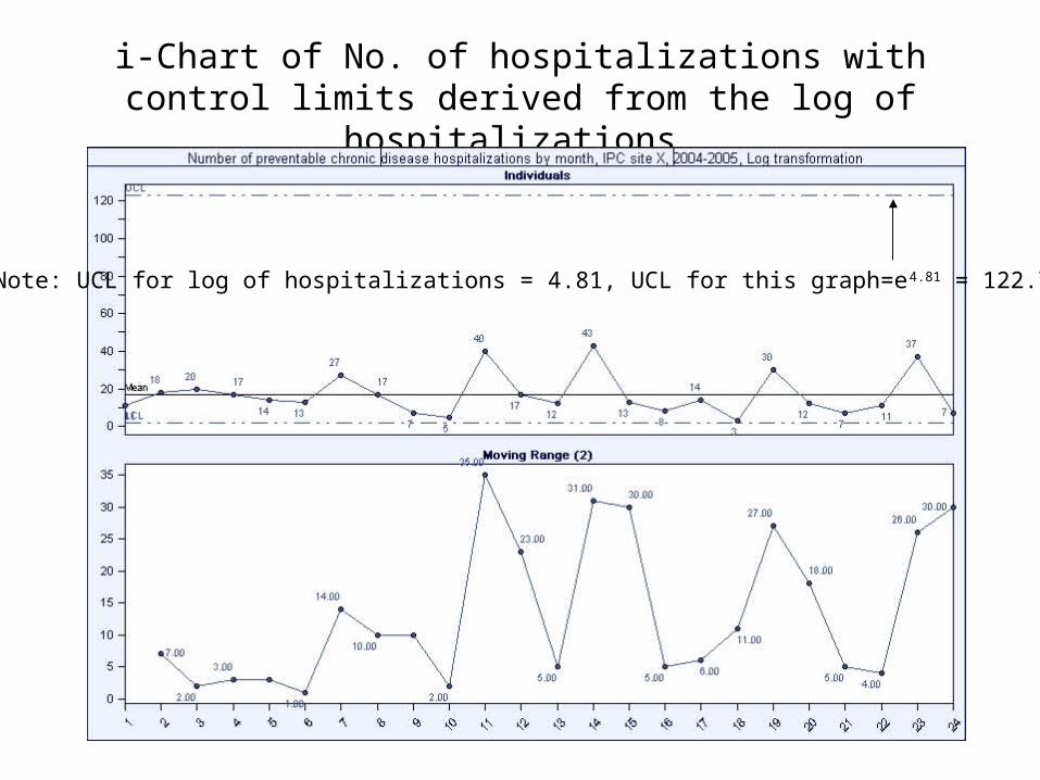
i-Chart of No. of hospitalizations with control limits derived from the log of hospitalizations.
Note: UCL for log of hospitalizations = 4.81, UCL for this graph=e4.81 = 122.74

But what about theCentral
LimitTheorem?
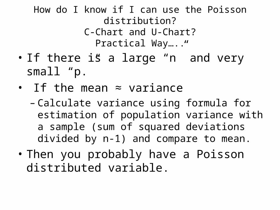
How do I know if I can use the Poisson distribution?C-Chart and U-Chart?
Practical Way…..
• If there is a large “n” and very small “p.”
• If the mean ≈ variance– Calculate variance using formula for
estimation of population variance with a sample (sum of squared deviations divided by n-1) and compare to mean.
• Then you probably have a Poisson distributed variable.

How do I know if I can use the Poisson distribution?C-Chart and U-Chart?
• You can get technical if you need to.– It is theoretically possible to compare the
distribution of units of area of opportunity (i.e., bed-days) over the range of possible events (0,1,2,3….50) to the distribution predicted by the mathematical formulae for the Poisson distribution.
• Save that for another course, please.

When can I assume the binomial distribution?
• If you have a situation where each observation can be classified as yes or no, 0 or 1, etc.
• If average p is not close to 0 or 1.
• If n*p*(1-p) >/= 5– THEN you can probably use the binomial, i.e.,
p-chart, np-chart.

What about sample size?
• Need 25 subgroups, more or less
• For p and np charts, n >/= 4/pBar
• For u and c charts, cBar >/= 4
• See Tables by Benneyan.

Extra-binomial & Extra-Poisson Dispersion
• Can occur when subgroup sizes are too large.
• Your observed points may be spread out more widely than predicted by the binomial or Poisson distribution.

Is this data over-dispersed?

How do we solve this?
• Use smaller increments of time.
• Check with subject-matter experts to be sure that there are no special causes.
• Then use the p’ method available in CHARTrunner 3.6.– Adjusts the control limits by combining within-
subgroup variation with between sub-group variance.

Notice the wider control limits with the p’ chart.

This method is available in CHARTrunner 3.6
• p’
• np’
• u’
• c’
Exercise E9
Enjoy

What did we learn from the exercise?
• Time intervals or subgroups can be “roped together”, i.e., not independent.
• This restricts their freedom to take on all possible values at any given time.
• This reduces the real sample size.• Control limits are then too narrow.
• Question: Are monthly measures on the same 50 patients for percent screened for cancer over the last year roped together? Autocorrelated?

What can we do?
• Separate the time between subgroups, e.g., sample once every three months.
• Change what you are measuring.• Use advanced charts to adjust for
autocorrelation (limited).• Switch to time-series analysis and model the
autocorrelation. (Usually need help here.)• Don’t worry unless autocorrelation is really high.• Use a run chart without run chart rules.

Hazards of Pooling Unlike Streams of Data
• Can we combine – Males with females? – Data from the private sector with the public?– Hospital A with Hospital B?
• Confusing the effect of time with the effect of another variable is the hazard.
• Confusion=Confounding

Example30
Day
Mor
talit
y fo
llow
ing
CA
BG
Hospital A
Hospital B.5
1
n=500
n=5250
n=10000
N=5250

Example: Pooled Hospitals A and B30
Day
Mor
talit
y fo
llow
ing
CA
BG
Hospitals A & B
.5
1
n=10500
n=10500
How is this possible?

Pooled Results
• Confused the effect of time with the effect of changing patient load of hospital A vs B.

Solutions
• Don’t combine unless there is no special cause between subgroups.
• Use indirect standardization.– See Hart and Hart, 2002, Appendix 2.

P-Chart comparing reporting sites on 1 executive order.

What is wrong with this comparison?

Needs Risk Adjustment
• When comparing outcomes sensitive to the severity of the patient’s condition, and
• When comparing across sites.• Risk adjustment not as important when
comparing the same patient population over time.
• Risk adjustment not as important for process measures that should be done regardless of severity.

Approaches
• Simple: Adjust for Age and Sex
• Complex: Age, Sex, Comorbidity, Other.– Requires many variables and proprietary or
government software.

Read about risk-adjusted control charts.

Converted into a system withits own software.

Other Risk Adjustment Programs
• CMS
• JCAHCO
• AHRQ

Problems and Solutions
• We don’t collect enough variables centrally to risk adjust.
• Solutions:– Collect more data and apply software.– Stratify/Restrict your comparisons
• Males, aged 65-74, diagnosed with diabetes 5 years ago.
– Compare over time (“percent improvement”)– Investigate case-mix as explanation for
difference.