
design implications for mobile user interfaces of internet services
108
TKK Dissertations 192 Espoo 2009 DESIGN IMPLICATIONS FOR MOBILE USER INTERFACES OF INTERNET SERVICES Doctoral Dissertation Helsinki University of Technology Faculty of Information and Natural Sciences Department of Media Technology Elina Vartiainen
Transcript of design implications for mobile user interfaces of internet services

TKK Dissertations 192Espoo 2009
DESIGN IMPLICATIONS FOR MOBILE USERINTERFACES OF INTERNET SERVICESDoctoral Dissertation
Helsinki University of TechnologyFaculty of Information and Natural SciencesDepartment of Media Technology
Elina Vartiainen
TKK Dissertations 192Espoo 2009
DESIGN IMPLICATIONS FOR MOBILE USERINTERFACES OF INTERNET SERVICESDoctoral Dissertation
Elina Vartiainen
Dissertation for the degree of Doctor of Science in Technology to be presented with due permission of the Faculty of Information and Natural Sciences for public examination and debate in Auditorium T2 at Helsinki University of Technology (Espoo, Finland) on the 20th of November, 2009, at 12 noon.
Helsinki University of TechnologyFaculty of Information and Natural SciencesDepartment of Media Technology
Teknillinen korkeakouluInformaatio- ja luonnontieteiden tiedekuntaMediatekniikan laitos

Distribution:Helsinki University of TechnologyFaculty of Information and Natural SciencesDepartment of Media TechnologyP.O. Box 5400FI - 02015 TKKFINLANDURL: http://media.tkk.fi/Tel. +358-9-4511E-mail: [email protected]
© 2009 Elina Vartiainen
ISBN 978-952-248-141-2ISBN 978-952-248-142-9 (PDF)ISSN 1795-2239ISSN 1795-4584 (PDF)URL: http://lib.tkk.fi/Diss/2009/isbn9789522481429/
TKK-DISS-2665
Multiprint OyEspoo 2009

ABABSTRACT OF DOCTORAL DISSERTATION HELSINKI UNIVERSITY OF TECHNOLOGY
P. O. BOX 1000, FI-02015 TKKhttp://www.tkk.fi
Author Elina Vartiainen
Name of the dissertation
Manuscript submitted 26.05.2009 Manuscript revised 10.09.2009
Date of the defence 20.11.2009
Article dissertation (summary + original articles)MonographFacultyDepartment
Field of researchOpponent(s)Supervisor
Abstract
Keywords Mobile user interfaces, user experience, Internet services, Web browsing
ISBN (printed) 978-952-248-141-2
ISBN (pdf) 978-952-248-142-9
Language English
ISSN (printed) 1795-2239
ISSN (pdf) 1795-4584
Number of pages 104+70
Publisher Department of Media Technology
Print distribution Department of Media Technology
The dissertation can be read at http://lib.tkk.fi/Diss/2009/isbn9789522481429/
Design implications for mobile user interfaces of Internet services
X
Information and Natural SciencesMedia TechnologyHuman-Computer InteractionProfessor Albrecht Schmidt and Professor Kaisa Väänänen-Vainio-MattilaProfessor Petri Vuorimaa
X
Internet services are becoming essential in people’s daily lives. In addition to accessing them on a PC, Internet servicesoffer functionality and content that are also relevant for mobile use. At the same time, mobile devices of today aretechnologically sophisticated enabling online access anytime, anywhere. The remaining challenge is to utilize thecapabilities of a mobile device in a way that offers people a positive user experience when they are using Internetservices on the go.
This Thesis belongs to the area of Human-Computer Interaction focusing on the use of Internet services on a mobiledevice. It considers the limitations of a mobile device in terms of user interface design and its goal is to define designimplications that assist in designing mobile user interfaces for Internet services. The design implications mainly aim togive guidance on how to design a mobile Web browser, but they are completed with research findings on designing amobile client application for an Internet service.
The research was implemented through user needs studies, user interface design, and user evaluations. The researchstudies focused on two approaches that support the use of Internet services on mobile devices: the Minimap Webbrowser and the Image Exchange mobile client application presented these two approaches.
The resulting design implications suggest that the following aspects should be considered when designing mobile userinterfaces for Internet services: content optimization, utilization of desktop and mobile usage patterns, full exploitationof device capabilities, compensation for device resources, and content updating. The possible differences incharacteristics of a mobile Web browser and a mobile client application are also examined. Finally, this Thesisdiscusses the latest developments that enable alternative ways to support Internet services on mobile devices in thefuture.

ABVÄITÖSKIRJAN TIIVISTELMÄ TEKNILLINEN KORKEAKOULU
PL 1000, 02015 TKKhttp://www.tkk.fi
Tekijä Elina Vartiainen
Väitöskirjan nimi
Käsikirjoituksen päivämäärä 26.05.2009 Korjatun käsikirjoituksen päivämäärä 10.09.2009
Väitöstilaisuuden ajankohta 20.11.2009
Yhdistelmäväitöskirja (yhteenveto + erillisartikkelit)MonografiaTiedekuntaLaitosTutkimusalaVastaväittäjä(t)Työn valvoja
Tiivistelmä
Asiasanat Kännykkäkäyttöliittymät, käyttökokemus, Internet-palvelut, Web-selailu
ISBN (painettu) 978-952-248-141-2
ISBN (pdf) 978-952-248-142-9
Kieli Englanti
ISSN (painettu) 1795-2239
ISSN (pdf) 1795-4584
Sivumäärä 104+70
Julkaisija Mediatekniikan laitos
Painetun väitöskirjan jakelu Mediatekniikan laitos
Luettavissa verkossa osoitteessa http://lib.tkk.fi/Diss/2009/isbn9789522481429/
Suunnittelusuosituksia Internet-palvelujen kännykkäkäyttöliittymille
X
Informaatio- ja luonnontieteiden tiedekuntaMediatekniikan laitosIhminen-tietokone-vuorovaikutusProfessori Albrecht Schmidt ja Professori Kaisa Väänänen-Vainio-MattilaProfessori Petri Vuorimaa
X
Internet-palveluista on muodostunut olennainen osa ihmisten päivittäistä elämää. Siksi on tärkeää, että palveluidentarjoamaa sisältöä sekä toiminnallisuutta pääsee tietokoneen lisäksi käyttämään myös kännykällä. Kännykkälaitteetmahdollistavatkin tänä päivänä yhteyden verkkoon milloin ja missä tahansa. Internet-palvelujen kännykkäkäytönhaasteena on kuitenkin se, miten hyödyntää kännyköiden teknisiä ominaisuuksia ja samalla tarjota käyttäjällepositiivinen käyttökokemus.
Tämä väitöskirja kuuluu ihmisen ja tietokoneen välistä vuorovaikutusta tutkivaan tieteenalaan, ja se tarkasteleeInternet-palvelujen käyttöä kännykällä. Väitöskirjassa käydään läpi kännykän asettamia rajoituksia käyttöliittymille japyritään määrittelemään suunnittelusuositukset, jotka auttavat suunnittelemaan kännykkäkäyttöliittymiäInternet-palveluille. Suunnittelusuositukset koskevat pääasiassa kännykän verkkoselaimen suunnittelua, mutta niitä ontäydennetty tutkimustuloksilla siitä, mitä tulisi ottaa huomioon suunniteltaessa erillissovelluksia Internet-palvelujavarten.
Tutkimus toteutettiin käyttäjien tarvetutkimusten, käyttöliittymäsuunnittelun sekä käyttäjäevaluointien avulla.Minimap-verkkoselain ja Image Exchange -erillissovellus edustivat kahta mahdollista lähestymistapaa, joilla tuetaanInternet-palveluja kännykällä.
Tuloksena saatujen suunnittelusuosituksien mukaan seuraavat näkökannat tulisi ottaa huomioon Internet-palvelujenkäyttöliittymäsuunnittelussa: sisällön optimointi, tietokoneen ja kännykän käyttötavat, kännykän kykyjen laajahyödyntäminen, kännykän resurssien kompensointi sekä sisällön päivitys. Tämän lisäksi väitöskirja käy läpiverkkoselaimen ja erillissovelluksen piirteiden mahdollisia eroja. Lopuksi väitöskirjassa käsitellään uusiakehityssuuntia, jotka tarjoavat vaihtoehtoisia tapoja tukea Internet-palveluja kännykällä tulevaisuudessa.

v
Preface
This Thesis is the result of the research work that I have conducted while working at
the Nokia Research Center between 2004 and 2009. My background is in computer
science with a special interest in user interface design and user research. When I
joined Nokia in 2004, I was fortunate to participate in the project developing the
Minimap Web browser. I stayed with the project for over 2 years and learned a lot
about the Web, user research, and user experience. In 2007, I moved to the Internet
Consumer Services team and participated in developing the Image Exchange service.
I gained invaluable knowledge about Internet services and was able to continue user
research in that context. During the years, I was able to take study leave and
concentrate on the Thesis with the help of two Nokia Foundation scholarships.
First, I would like to thank my professor, Petri Vuorimaa, who supported my stud-
ies already during my Master’s degree. Preparing a doctoral thesis in an industry
environment can be a lonely journey, but Petri encouraged and assured me that it
is possible. Furthermore, I was honored to have Professor Kaisa Vaananen-Vainio-
Mattila and Doctor Eija Kaasinen as the pre-examiners of my Thesis. Their insight-
ful and constructive comments helped in finding the scope of my research and gave
me a valuable lesson on argumentation.
I have been lucky to work with many talented people at Nokia. Guido Grassel
hired me to Nokia to the Minimap browser team and was also the team leader. He
encouraged me to develop my skills and fully supported my doctoral studies, and I
owe him an acknowledgment for it. Virpi Roto, who was the user experience expert
in the project, has been my teacher in conducting research and preparing a doctoral
thesis. She has definitely been the biggest help along the way and I truly appreciate
it. In the Minimap project, I was also honored to work with Andrei Popescu, Antti
Koivisto, Mika Rautava, Salla Myllyla, and Janne Kaasalainen. Great memories,

vi
cheers for that! I am really happy that we have continued to keep in touch even
though the work has taken us on different directions.
Tuomas Tammi has been my second team leader at Nokia during the Image Ex-
change project. He has always trusted in my judgment and also in the completion
of this Thesis even though I had my doubts sometimes. Thanks Tuomas, it has
been a pleasure to work in your team! Janne Kaasalainen continued working with
me in the Image Exchange project and has been together with my more recent col-
league Toni Strandell a valuable colleague and friend. I truly appreciate your (tele-)
presence! I am also thankful to the project manager Timo Pakkala and members
Carlos Quiroz, Oleksandr Kononenko, Davin Wong, and Hannu Mettala for letting
me share the experience of developing a great Internet service with you and follow
its journey in the real world. I also want to thank James Reilly, Mikko Honkala,
and Kari Pihkala for the guidance on my post-graduate studies.
I am grateful to my lovely friends, I cannot stress your importance enough. Es-
pecially, I want to thank all of my friends preparing their doctoral theses for the
peer-support. As said, conducting research can be quite lonesome and feel even
hopeless sometimes, but talking about it with your dear friends is the best support
you can have.
Lastly, I want thank my family (especially my little sis, Paula) for their love and
support throughout the years of studying. I am not sure if my parents meant 23
years of studying when they stressed the importance of a degree but still they have
always been there for me. I would also like thank Olle for his love and care, and for
making me laugh.
Helsinki, 10th of September, 2009
Elina Vartiainen
vii
Contents
Abstract i
Tiivistelma iii
Preface v
Contents vii
List of publications ix
Author’s contribution xi
1 Introduction 1
1.1 Focus and scope . . . . . . . . . . . . . . . . . . . . . . . . . . . . 2
1.2 Terminology and definitions . . . . . . . . . . . . . . . . . . . . . . 2
1.3 Research questions . . . . . . . . . . . . . . . . . . . . . . . . . . . 5
1.4 Research approach . . . . . . . . . . . . . . . . . . . . . . . . . . . 7
1.5 Overall results . . . . . . . . . . . . . . . . . . . . . . . . . . . . . . 8
1.6 Organization of Thesis . . . . . . . . . . . . . . . . . . . . . . . . . 9
2 Related work 10
2.1 User interface design for mobile applications . . . . . . . . . . . . . 10
2.1.1 Input and output capabilities . . . . . . . . . . . . . . . . . 11
2.1.2 Device resources and cost . . . . . . . . . . . . . . . . . . . 14
2.1.3 Mobile context . . . . . . . . . . . . . . . . . . . . . . . . . 15
2.1.4 Usage patterns on PC . . . . . . . . . . . . . . . . . . . . . 16
2.2 Mobile user interfaces for Internet services . . . . . . . . . . . . . . 17
2.2.1 Mobile Web browsers . . . . . . . . . . . . . . . . . . . . . . 17
2.2.2 Mobile client applications for Internet services . . . . . . . . 21
2.2.3 Mobile widgets . . . . . . . . . . . . . . . . . . . . . . . . . 23
2.3 Contribution of Thesis reflected to related work . . . . . . . . . . . 24

viii
3 Research and design methods 28
3.1 Human-centered design . . . . . . . . . . . . . . . . . . . . . . . . 28
3.2 Interaction design . . . . . . . . . . . . . . . . . . . . . . . . . . . 30
3.3 User experience design . . . . . . . . . . . . . . . . . . . . . . . . . 33
3.4 Research techniques . . . . . . . . . . . . . . . . . . . . . . . . . . 36
3.4.1 User needs studies . . . . . . . . . . . . . . . . . . . . . . . 36
3.4.2 User interface design . . . . . . . . . . . . . . . . . . . . . . 39
3.4.3 User evaluations . . . . . . . . . . . . . . . . . . . . . . . . . 40
3.5 Summary . . . . . . . . . . . . . . . . . . . . . . . . . . . . . . . . 42
4 Results 44
4.1 Solution of today: Minimap . . . . . . . . . . . . . . . . . . . . . . 44
4.1.1 User interface design . . . . . . . . . . . . . . . . . . . . . . 44
4.1.2 User experience evaluations . . . . . . . . . . . . . . . . . . 48
4.1.3 Summary . . . . . . . . . . . . . . . . . . . . . . . . . . . . 51
4.2 Solution of tomorrow: Image Exchange . . . . . . . . . . . . . . . . 52
4.2.1 User interface design . . . . . . . . . . . . . . . . . . . . . . 53
4.2.2 Benefits in contrast to mobile Web browsers and other state-
of-the-art solutions . . . . . . . . . . . . . . . . . . . . . . . 55
4.2.3 User experience evaluations . . . . . . . . . . . . . . . . . . 57
4.2.4 Summary . . . . . . . . . . . . . . . . . . . . . . . . . . . . 60
5 Conclusions 62
5.1 Answers to research questions . . . . . . . . . . . . . . . . . . . . . 63
5.2 Influence of the research . . . . . . . . . . . . . . . . . . . . . . . . 67
6 Discussion and future work 69
References 72
ix
List of publications
This Thesis summarizes the following publications, referred to as [P1]-[P6]:
[P1] Virpi Roto, Andrei Popescu, Antti Koivisto, and Elina Vartiainen. 2006.
Minimap: a web page visualization method for mobile phones. In Pro-
ceedings of Human Factors in Computing Systems conference (CHI), pages
35-44, Montreal, Canada.
[P2] Elina Vartiainen, Virpi Roto, and Andrei Popescu. 2007. Auto-update: A
concept for automatic downloading of Web content to a mobile device. In
Proceedings of the 4th international conference on mobile technology, ap-
plications, and systems and the 1st international symposium on Computer
human interaction in mobile technology, pages 683-689, Singapore.
[P3] Elina Vartiainen, Virpi Roto, and Janne Kaasalainen. 2008. Graphical
History List with Multi-Window Support on a Mobile Web Browser. In
Proceedings of the Third International Conference on Internet and Web
Applications and Services (ICIW’08), pages 121-129, Athens, Greece.
[P4] Elina Vartiainen, Janne Kaasalainen, and Toni Strandell. 2008. Design-
ing user experience for a mobile imaging application. In Proceedings of
IADIS International Conference Interfaces and Human Computer Interac-
tion, pages 197-204, Amsterdam, Netherlands.
[P5] Elina Vartiainen, Toni Strandell, and Janne Kaasalainen. 2008. Fully
service-integrated mobile application for photo-sharing. In Proceedings of
The 12th IASTED International Conference on Internet and Multimedia
Systems and Applications (IMSA 2008), pages 38-43, Kailua-Kona, Hawaii,
USA.
x
[P6] Elina Vartiainen. 2009. Improving the user experience of a mobile photo
gallery via supporting social interaction. International Journal of Mobile
Human Computer Interaction, 1(4), 38-52, October-December.

xi
Author’s contribution
This Chapter describes the contributions of the author in each paper. The Pub-
lication [P1] has previously formed part of Virpi Roto’s Doctoral Thesis. Other
publications have not previously formed a part of another Thesis.
Publication [P1]
This publication describes a Web page visualization method called Minimap that
was developed to solve the usability problems of Web browsing on a mobile device.
The publication also explains the user evaluations of Minimap. The author designed
and implemented the Minimap prototype together with Andrei Popescu and Antti
Koivisto and also participated in planning and executing the user study. The author
also took part in writing the article. Virpi Roto was the lead author for the user
study and the article.
Publication [P2]
This paper explains the concept of Auto-update, which was developed for download-
ing Internet content to a mobile device in an intelligent way. Auto-update lets users
control the data costs and device resources by means of high level profiles that hid
underlying complexity from users. The publication also presents the user evaluations
of Auto-update. The author designed and implemented the Auto-update prototype
together with Andrei Popescu, Mika Rautava, and Virpi Roto. She planned, exe-
cuted, and analyzed the user study with Mika Rautava and Virpi Roto. The author
held the main responsibility for writing the article.
Publication [P3]
This publication introduces a solution called Rolling History that was designed to
address the usability problems in back stepping and window management on a
mobile Web browser. The proposed user interface was targeted for mobile devices
xii
that provide 4-way navigation control and graphics acceleration hardware. The
publication also includes the results of the user evaluations of Rolling History. The
author designed the Rolling History prototype together with Janne Kaasalainen,
Virpi Roto, and Mika Rautava. She implemented the prototype by herself. The
author also planned, executed, and analyzed the user study with Mika Rautava and
Virpi Roto. The author took the lead in the writing of the article.
Publication [P4]
This publication describes the design process of a mobile client application for the
Image Exchange photo sharing Internet service. The goal was to guarantee a positive
user experience by utilizing the most essential use cases for mobile photo sharing
identified in user interviews. The author designed the mobile application of Image
Exchange together with Janne Kaasalainen and Toni Strandell. She was mainly
responsible for implementing the user interface of the mobile application. The author
also planned, executed, and analyzed the user study with Janne Kaasalainen. The
author was mainly responsible for writing of the article.
Publication [P5]
This publication introduces the overall design of a fully service-integrated mobile
client application for the Image Exchange Internet service. The target was to offer
a pleasant user experience via deep integration without requiring any configuration
from the user. The publication also includes initial user study results. The author
designed the client application of Image Exchange together with Janne Kaasalainen
and Toni Strandell. She was responsible for implementing the user interface of the
mobile application. The author was also mainly responsible for planning, executing,
and analyzing the user needs study and evaluation, and writing the article.
Publication [P6]
This publication explains the results of a user study, in which the mobile client ap-
plication of the Image Exchange photo sharing service was compared to a traditional
xiii
mobile photo sharing upload tool. The findings show that users were more socially
active when using Image Exchange, which indicates that better user experience en-
courages users to use social Internet services more actively. The author designed
the client application of Image Exchange together with Janne Kaasalainen and Toni
Strandell. She took the lead in implementing the user interface of the mobile ap-
plication. The author also planned, executed, and analyzed the user study. The
author wrote the whole text to the article.

xiv
1
1 Introduction
Thinking about the importance of the Internet in people’s daily life, it is easy to see
the Internet going mobile. The Internet will not be bound to Personal Computers
(PCs), but mobile devices will provide users with access to the Internet anywhere,
anytime. Mobile devices can be used for performing many tasks that were earlier
possible only on a PC. Especially, people are increasingly using Internet services on
the go, as their mobile devices are always with them and capable of offering access
to Internet services.
However, as the technological sophistication of a mobile device has grown, user
interfaces of mobile applications are becoming more complex to use. The mobile
device has a limited set of resources compared to a PC in terms of input and output
capabilities, processing power, connectivity, and memory. This means that the
user interface design cannot be directly transferred to a mobile device from a PC.
In addition, the mobile context can be totally different from the one where a PC is
used. When the user is using a mobile device, he might be on the move and have only
a limited and possibly fragmented time to spend on a task [109]. The fragmented
nature of mobile environment needs to be considered in interaction design for mobile
applications.
Today, mobile devices are starting to reach maturity in terms of new technologies.
The level of battery performance and Internet connectivity are satisfactory, and mo-
bile devices are small and light-weight. The latest models have various new input
mechanisms, such as touch and voice input. Hence, as the mobile devices have be-
come mass-market commodities, more emphasis is needed on the user experience of
mobile devices and applications: aesthetics, usability, utility, and emotional aspects
need careful consideration [101, 54, 65].
This Thesis is about defining design implications for mobile user interfaces of Inter-
2
net services. It covers the challenges and limitations of a mobile device and aims
to specify the design implications that give guidance on how to design mobile user
interfaces for Internet services to enable a positive user experience. The user inter-
faces should be designed for mobile usage, simple and enjoyable to use, and hide
unnecessary technical details from the user.
1.1 Focus and scope
The goal of my research work is to study how to design mobile user interfaces that
enable the use of Internet services. My research belongs to the field of Human-
Computer Interaction (HCI), which focuses on researching the interaction between
a human and a computer. My focus area is the interaction between a human and
a mobile device, in other words, whenever a human uses a mobile device to access
the Internet. By means of the research, I aim to define how the user interfaces
can be designed in a way that hides the technical details but offers a pleasant user
experience. The Thesis explores mobile user interfaces for Internet services via two
approaches: a mobile Web browser and a mobile client application.
1.2 Terminology and definitions
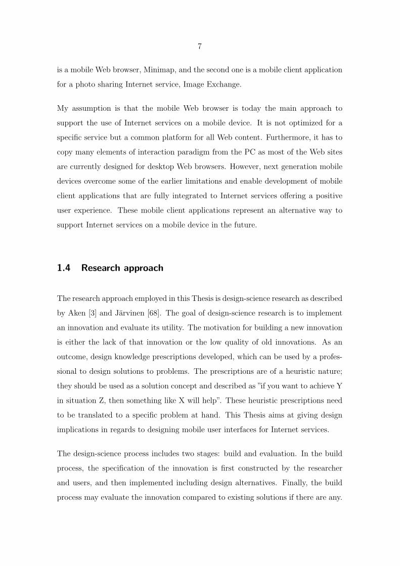
The term mobile device refers to a handheld device that includes a wireless data
communication channel, a display possibly with touch input, and/or a miniature
keyboard. A mobile device has traditionally been used for audio and textual com-
munication but nowadays they are increasingly equipped with cameras, larger mem-
ories, and fast data connections enabling capturing of photos, Web browsing, music,
and game playing. The research work described by the publications [P1-P6] has
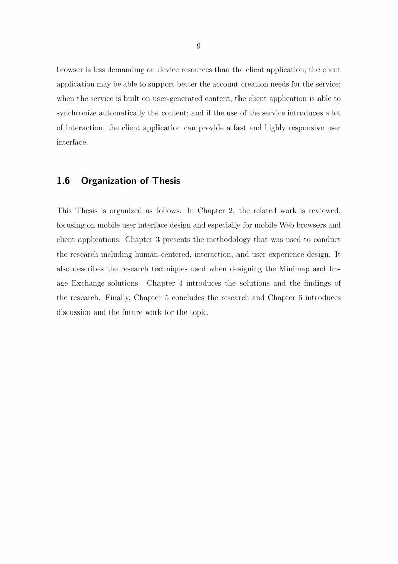
been based on the Nokia S60 platform. The user interface style on S60 offers a
5-way interaction with a joystick (4 directions and a selection) and two softkeys (cf.,
3
Figure 1.1). The S60 devices used in the research did not include a touch or pen
interface but all the interaction was done with the joystick and softkeys.
Figure 1.1: The user interface style of the Nokia S60 platform.
The term mobile application stands for applications that run on mobile devices.
When mobile applications are designed, the characteristics of a mobile device need
to be considered. For example, the input methods have a strong influence on user
interface design of a mobile application. The Nokia S60 platform supports the
installation of additional 3rd party mobile applications.
Web browser is an application that enables a user to display and interact with content
that is located on a Web page at a Web site on the World Wide Web (WWW). The
content can be text, images, music, and videos. Web pages can contain hyperlinks to
other Web pages and a user can navigate between Web pages via the links. Mobile
Web browser is an application running on a mobile device designed and optimized for
displaying Web content most effectively on a small screen device. The publications
[P1-P3] discuss the design and implementation of a mobile Web browser.
Today, most mobile Web browsers are able to display Web pages written in Hy-
perText Markup Language (HTML), Extensible HTML (XHTML) Mobile Profile
(also known as Wireless Application Protocol (WAP) 2.0), or Wireless Markup Lan-
4
guage (WML). WML was the first standard markup language for creating mobile-
optimized WAP sites that aim at enabling access to the Internet from a mobile de-
vice. XHTML Mobile Profile was the successor to WML and the most recent mobile
services specification created by the WAP Forum [42]. The goal of XHTML Mobile
Profile was to unite technologies for mobile Internet browsing as before WAP devel-
opers made use of WML to create WAP sites, while Web developers used HTML
and XHTML to build Web sites. In this Thesis, I use the term Internet services to
refer to services located in the WWW (including HTML/XHTML sites) and mobile
services to point to services in the mobile-optimized Web (including WAP sites).
The key concept in this Thesis is Internet service. An Internet service is a service
operating on the Internet targeted for an organization or an interest group. It can
be a content aggregate or a Web site including many Web pages that are covering a
specific topic or produced by a particular organization. In this Thesis, an Internet
service is considered as a Web site that enables its members to create, view, and
share content. The Internet service also offers an Application Programming Interface
(API) for client applications that can connect to the service and use its content. For
example, a mobile application can act as a client to an Internet service.
Mobile client application of an Internet service is an application running on a mobile
device that directly enables the use of an Internet service. A mobile client application
is designed specifically for one (or more) Internet service(s) and implemented to
run in the mobile device environment enabling an access to the device resources.
The publications [P4-P6] discuss the design and implementation of a mobile client
application.
Mobile widgets are interactive tools that are typically designed to offer an access
to a single-purpose Internet service including the latest news, weather information,
stock market data, or a calendar. Mobile widgets run inside a widget engine that is
installed on a mobile device providing the basic functionality common to all widgets.
The widget engine might also set the look and feel, and the interaction style of

5
widgets, while each widget provides a specific and dedicated functionality [96, 12, 22].
In other words, mobile widgets are restricted to use the functionality offered by a
widget engine, while, for example, mobile client applications can access directly the
device resources and define their own interaction style.
The formal definition of User experience is still work-in-progress in academia. This
Thesis considers that user experience describes the overall experience a person has
as a result of interacting with a particular product or service. As defined by Has-
senzahl, User experience is ”a consequence of a user’s internal state (predispositions,
expectations, needs, motivation, mood, etc.), the characteristics of the designed sys-
tem (e.g., complexity, purpose, usability, functionality, etc.), and the context (or the
environment) within which the interaction occurs (e.g., organizational/social setting,
meaningfulness of the activity, voluntariness of use, etc.)” [50]. Furthermore, as this
Thesis is about mobile user interfaces of Internet services, it especially focuses on
Mobile Internet user experience, which refers to how a person feels about using the
Internet on a mobile device [119].
Roto has defined the aspects of user experience related to mobile Web browsing
(Figure 1.2). As the list of aspects is quite extensive and some prioritizing is needed,
Roto states that the actual Web site delivers most of the user experience to the user
in the mobile browsing system. The other parts of the system are just enablers
for this experience. This Thesis focuses on researching an enabler, the mobile Web
browser, and particularly its user interface, to prepare the way for a positive browsing
experience. It is not in the scope of this Thesis to define how the Web site should
be designed to provide the most value to the user.
1.3 Research questions
The use of Internet services can be supported in two ways on a mobile device [72]:
First, on a mobile Web browser that is optimized for mobile use and considers the

6
Figure 1.2: The components affecting mobile Web browsing user experience [117].
limitations of a mobile device while enabling access to various available Internet
services; and second, on a mobile client application that is fully integrated with one
Internet service and optimized for the requirements and functionalities of the service
and mobile use.
The main research question of the Thesis is:
What are the design implications that need to be considered when de-
signing mobile user interfaces for Internet services?
As an answer to the main research question, this Thesis aims to define design impli-
cations that would entail the main aspects to be considered when designing how to
support Internet services on a mobile device in terms of user interface design. There
is also the following additional research question that this Thesis strives to answer:
What differences can be found in characteristics of user interfaces for a
mobile client application and a mobile Web browser?
This Thesis examines the research questions by describing two solutions that present
the approaches for supporting Internet services on a mobile device. The first solution
7
is a mobile Web browser, Minimap, and the second one is a mobile client application
for a photo sharing Internet service, Image Exchange.
My assumption is that the mobile Web browser is today the main approach to
support the use of Internet services on a mobile device. It is not optimized for a
specific service but a common platform for all Web content. Furthermore, it has to
copy many elements of interaction paradigm from the PC as most of the Web sites
are currently designed for desktop Web browsers. However, next generation mobile
devices overcome some of the earlier limitations and enable development of mobile
client applications that are fully integrated to Internet services offering a positive
user experience. These mobile client applications represent an alternative way to
support Internet services on a mobile device in the future.
1.4 Research approach
The research approach employed in this Thesis is design-science research as described
by Aken [3] and Jarvinen [68]. The goal of design-science research is to implement
an innovation and evaluate its utility. The motivation for building a new innovation
is either the lack of that innovation or the low quality of old innovations. As an
outcome, design knowledge prescriptions developed, which can be used by a profes-
sional to design solutions to problems. The prescriptions are of a heuristic nature;
they should be used as a solution concept and described as ”if you want to achieve Y
in situation Z, then something like X will help”. These heuristic prescriptions need
to be translated to a specific problem at hand. This Thesis aims at giving design
implications in regards to designing mobile user interfaces for Internet services.
The design-science process includes two stages: build and evaluation. In the build
process, the specification of the innovation is first constructed by the researcher
and users, and then implemented including design alternatives. Finally, the build
process may evaluate the innovation compared to existing solutions if there are any.
8
The evaluation process, in turn, measures aspects such as completeness, simplicity,
elegance, understandability, and ease of use of the innovation [94]. Both of the
applications described by this Thesis have followed the process of design-science.
The evaluation of the applications has been conducted as user tests with a special
focus on user experience and usability.
1.5 Overall results
The overall results of this Thesis define the design implications for mobile user
interfaces of Internet services. The design implications are mainly based on the
Minimap study but completed with the findings of the Image Exchange study. The
design implications suggest that the following aspects should be considered in the
user interface design:
• Content optimization
• Utilization of desktop and mobile usage patterns
• Full exploitation of device capabilities
• Compensation for device resources
• Content update
Image Exchange presents only one type of mobile client application and cannot
provide any general guidelines. However, it can give a glimpse at future solutions and
its characteristics outline the possible differences between a Web browser-based and
client-based mobile solution for Internet services in terms of user interface design:
the Web browser presents a more general solution, while the mobile client application
is an optimized solution for one Internet service; the client application may be able
to prepare and recover from offline use cases more extensively than the browser; the
9
browser is less demanding on device resources than the client application; the client
application may be able to support better the account creation needs for the service;
when the service is built on user-generated content, the client application is able to
synchronize automatically the content; and if the use of the service introduces a lot
of interaction, the client application can provide a fast and highly responsive user
interface.
1.6 Organization of Thesis
This Thesis is organized as follows: In Chapter 2, the related work is reviewed,
focusing on mobile user interface design and especially for mobile Web browsers and
client applications. Chapter 3 presents the methodology that was used to conduct
the research including human-centered, interaction, and user experience design. It
also describes the research techniques used when designing the Minimap and Im-
age Exchange solutions. Chapter 4 introduces the solutions and the findings of
the research. Finally, Chapter 5 concludes the research and Chapter 6 introduces
discussion and the future work for the topic.
10
2 Related work
Next Chapters will first cover the general findings and guidelines defined by the ear-
lier research on how to design user interfaces for mobile applications and what should
be considered. After that, the more specified research on different implementations
and user studies of mobile Web browsers and client applications is introduced in
addition to an overview of mobile widgets. Lastly, I will explain the current state
of the research on mobile Internet user and show the gap that exists in the related
work and explain how this Thesis aims to fill it.
2.1 User interface design for mobile applications
Internet services are mainly used via a Web browser on a PC. It is a convenient
way of accessing the services as they all can be accessed via the same application,
the Web browser. On a mobile device, the situation becomes more complicated.
The mobile device has a limited set of resources compared to a PC. Thus, it is
vital to consider the special characteristics of the device when designing mobile user
interfaces for Internet services instead of copying user interface style from a PC
[54, 65, 135, 117, 114, 37]. When a user uses Internet services on a mobile device,
the following limitations need to be considered in the user interface design:
• Input and output capabilities. A mobile device may not have a pointing
tool or a full keyboard. Also, the screen-size is relatively small.
• Device resources. A mobile device has limited resources such as disk space,
processing power, and connection speed compared to a PC.
• Cost. Downloading content via a cellular connection may be very expensive
for a user, if he does not have a flat fee agreement for mobile data traffic.
11
• Mobile context. In the mobile context, the user might be on the move
and have only a limited and possibly fragmented time to spend on a task.
Therefore, the user interface of a mobile application should be intuitive and
easy to use. The mobile context also introduces its own set of use cases:
on-the-go lookup and entry of information and quick communication.
• Usage patterns on PC. It is important to consider how to design a unique
user interface for a mobile device without displacing the deep-seated usage
patterns that people have found useful on a PC.
In the next Chapters, I will go through these limitations and introduce insights and
solutions that have been presented in earlier research.
2.1.1 Input and output capabilities
Mobile devices have limitations on the amount of information that they can present
at one time, as the screen is significantly smaller than on a PC. Thus, the user
interface design must create new ways to fit content and possible control objects
to the screen in a way that provides a good user experience. One solution is to
think about the content format and how that could be modified to better fit the
requirements of a mobile device and use [65]. On the graphical representation level,
there are many tricks that optimize the screen space, such as using semi-transparency
to show the content and control objects at the same time [74]. Also, icons can save
space and may provide users additional assistance, if they are well-designed and
coherent [135, 65]. Mobile user interfaces should be intuitive and descriptive, which
should be borne in mind when designing icons and other user interface components
[54].
Reading large amounts of information from mobile devices can require large amounts
of scrolling and focused concentration from the user [46]. Optimizing menus and
navigation can result in a significant reduction in the number of clicks, when the

12
user is interacting with a mobile application [129]. The optimization for menus and
navigation can be executed through multilevel or hierarchical mechanisms. However,
when using hierarchical menus a special attention must be paid on the classification
of the items to prevent user’s memory load from increasing [65]. It should be clear
how to navigate through the menus within the application, for example, by offering
feedback and guidance to the user [135]. The minimization of clicks should not be
the main goal but to make task flow and interaction as simple as possible to the
user [54, 65]. Today, the scrolling mechanisms in mobile devices are sophisticated
and vertical scrolling is acceptable to show a document that requires more than one
screenful [65].
A mobile application can offer a pleasing user experience, when special attention
is paid to how the user navigates within the application. Two parameters can
be identified that affect the user experience: engagement and transparency [77].
Engagement can be considered as an enhanced variation of feedback. A system
gives feedback to the user when it has received the input and is processing it. If
the feedback is given immediately and in a continuous and reversible way by using
transformation between application states, the user interface becomes more pliable
and the user more engaged. Transparency, in turn, involves the pleasure when a
user has a clear and unambiguous understanding on how the application works and
the interaction flows in the interface.
Text entry can be a laborious task on a mobile device. For example, user studies
on text input indicate that the need to enter text makes people slow down while
walking [100]. Text entry can be avoided by offering a list of pre-defined options
for the user in a selection list. However, this is not always possible, as the number
of options might be extensive. A more enhanced solution to eliminate the use of
a keypad for text entry is to attach a temporary keyboard to the mobile device
[130, 135]. In addition, there are studies exploring different text input methods that
aim to overcome the challenge of typing with the 12-key keypad [128, 136]. A stylus
can also be used to write input directly on the screen of the device by introducing
13
gesture recognition. Alternatively, virtual keyboards can be drawn to the screen
and each key is selected by clicking it with a stylus.
Alternative input/output modalities (such as audio, haptics, and gestures) can help
in overcoming the limitations of a mobile device. When modalities for a user inter-
face are designed, the presentation needs to be adapted to the cognitive requirements
of a mobile device: when the system wants to present data to the user that is impor-
tant to be remembered, the most effective presentation mode should be used; when
the system simply has to inform the user, the most appealing presentation mode
should be used [38].
User studies have shown that audio can help in minimizing undesired and intru-
sive interruptions. Sound output may continue to be a viable interface alternative
for mobile devices in the future, although there may be difficulties in presenting
certain visual information, such as maps or other graphics [130]. Especially, com-
monly identified sounds can improve intuitiveness, learnability, and memorability of
notifications [45], and be beneficial to overall usability [13], especially when com-
bined with gestures [15]. Also, audio feedback can enable users to interact with
a user interface without looking at the screen [91]. Audio feedback can be im-
proved via the use of an additional modality: combining audio and haptics seems to
enhance the perception of audio quality [25], while another user study showed signif-
icant usability improvements for the gesture/audio-based interface over a standard
visual/pen-based display [110].
Haptics has become a more popular output method, as many mobile devices today
include a touch screen. Tactile feedback has a key role to play in improving inter-
actions with touch screens [14, 56]. Initial work on tactile feedback already exists
covering the possibilities and needed enablers [93] and it suggests that tactile feed-
back is able to provide more effective, comfortable, and enjoyable interaction and
can result in an improvement on user performance [111]. Gestures such as tilting
operations [116] and wrist rotation [31] are gaining more momentum as an input

14
method for mobile interaction, and they used in many mobile devices already today,
for example, to detect the screen orientation. Using seamless feedback with gestures
leads to a more consistent user experience [85].
In the future, more advanced input and output methods will be available for mobile
devices further improving the interaction. Interaction might be more implicit based
on situational context, where devices can ”see, hear, and feel” without any explicit
input required from users [125]. Sensing techniques for mobile interaction can help
deliver devices that are simple and pleasant to use while still allowing direct control
when necessary [55]. Using human speech as an input method for mobile devices
will also become increasingly practical as voice recognition technology continues to
improve. Grasp-recognition has the potential to provide significant enhancement to
current mobile user interfaces by offering a unique and intuitive interaction method
[132].
2.1.2 Device resources and cost
Optimizing user navigation and inventing novel means of data input will result in
a reduction in the consumed device resources, such as battery power [129]. The
context (including time and place, situation, and interest level) and user input can
also be used to determine how to save on device resources and also take into account
cost considerations [36]. The format of the content shown in a user interface may
also help when optimizing disk space and processing power [65].
The mobile application and its user interface should also consider that the cellular
and wireless data connections are prone to failure [135]. Today and in the future,
there will be situations, where there is no coverage or the speed of the data transfer
is very slow. Examples of such situations are subways and rural areas. The mobile
application should prepare for these situations by being stable and recover after the
network goes back online.
15
Mobile data transfer often costs money. Cost and billing models of mobile data
traffic have an effect on how people consume online data, how satisfied they are
with the connection and services [5], and user experience especially in mobile Web
browsing [118]. Currently, it is hard for the users to know how costs cumulate, and
to follow and control them. Thus, problems in mobile data traffic costs are hindering
the use of Internet services on mobile devices. In addition, a mobile device may only
support limited types of content means, which may cause a situation that a user
retrieves information that is unusable on their device but he still needs to pay for it
[114].
2.1.3 Mobile context
People are likely to use mobile devices in distracting environments. Thus, the user
interface design for mobile applications should take into account the context of
use, which is the actual environment where the application is used. The best way to
prevent users from making errors, is to design the user interface in a way that makes
it almost impossible to make errors [54]. However, sometimes errors do happen and
user interfaces should allow users to make mistakes and be forgiving by offering, for
example, an ”undo” command [135].
The user interfaces should be consistent and intuitive so that users are not required
to learn new user interface paradigms every time and they are able to use the appli-
cation quickly, even immediately on a first attempt [54]. For mobile applications, it
is essential to consider time constraints in initial application availability and recov-
ery speed, as waiting a few minutes for an application to start in a mobile context
may not be in the user’s best interest [46].
When designing user interfaces for mobile contexts and split attention, using other
modalities than the visual modality may be very beneficial. For example, voice
output, and tactile feedback may work well in an environment, where a user has to
16
concentrate on many tasks and be aware of what is happening in the surrounding
environment as well [129, 46, 13, 111]. The context might also give hints about
modalities that would offer more natural way of communicating with the mobile
device [65].
The mobile user interfaces should also utilize the context as much as possible. The
context can be used to foresee what type of information the user needs next, provide
it at the right time [54, 65], and also modify the user interface accordingly. The
information can be retrieved in two ways: by pushing and pulling. When the infor-
mation is pushed to the user, the user’s mobile device will receive it automatically
(assuming that the user allows it). By pulling the information, the user actively
requests the information and it is pulled to the user’s device.
2.1.4 Usage patterns on PC
The terminology and processes can be retained from a PC to the mobile user inter-
face when they are appropriate for a small screen device [135]. Similar metaphors
can also be used as users have learned them while using a PC earlier. However, this
should not hinder creating new and innovative user interface designs specifically for
mobile devices [65]. Some interaction redesign is always needed, when a PC appli-
cation is transferred to a mobile platform. It might be that the use cases in a PC
and a mobile environment totally differ from each other.
On a PC, users have got used to manipulating objects by clicking them directly in
the user interface [135]. When using a mobile device with a joystick, the interaction
usually happens through menus and lists. This might lead to consequence, where
the user feels that he is not anymore in control. By enabling a cross-linking between
application areas or separate applications, it is possible to create an illusion, where
the user feels that he has similar freedom as when using a PC.
17
2.2 Mobile user interfaces for Internet services
There are two approaches to support the use of Internet services on a mobile device:
a mobile Web browser and a mobile client application. Recently, mobile widgets
have been gained a lot of interest in the mobile industry as they present a new
intermediate solution between the two approaches. Next Chapters describe the
earlier research on mobile Web browsers and mobile client applications for Internet
services and also introduce the current situation of mobile widgets.
2.2.1 Mobile Web browsers
People are increasingly using Internet services on their mobile devices, as their
mobile devices are always with them and capable of offering them with access to
Internet services on the go. In addition, earlier research work has found out that
more than half of the occurrences of mobile device Internet access took place in
locations where users had also access to a computer [107]. This indicates that a
mobile device is not only a backup solution to access the Internet for when there is
no computer available, but a tool that often provides quicker and more convenient
service than a PC.
Internet services might have mobile optimized content but they mainly offer the
same data as in desktop versions. This is important as history has shown with the
WAP that having a separate mobile Internet is not a viable solution. People want
to access all the content in the WWW on their mobile devices also, even though
the usability of WAP services might be better [69, 17]. Most of the Web browser
activities that users do with their PCs occur when they access the Web on their
mobile devices [33].
A lot of research has been conducted on how to support Web page viewing on
mobile devices as many of the Web pages are originally designed for PC screens.
18
There has not been a clear answer, whether the user interface style on a mobile Web
browser should be consistent or inconsistent with a PC Web browser and in which
circumstances [78].
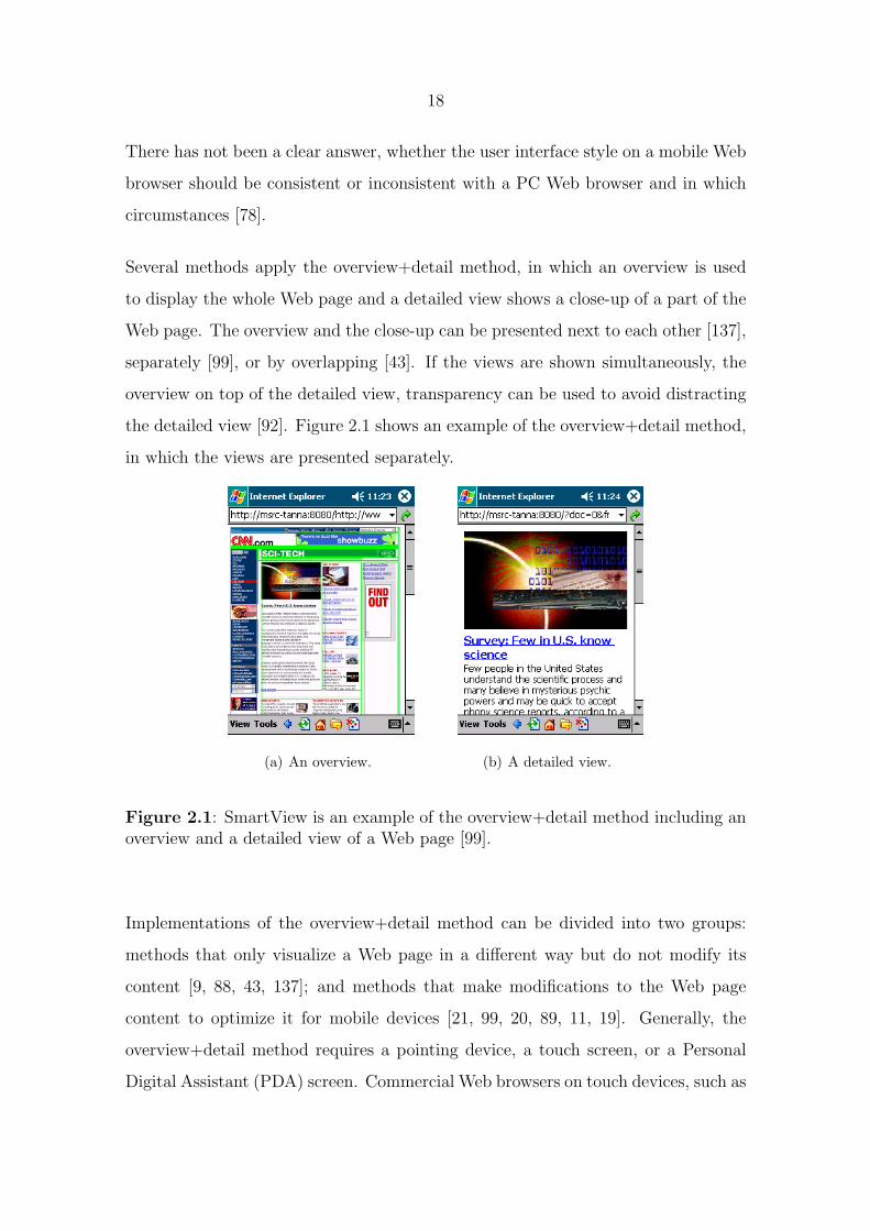
Several methods apply the overview+detail method, in which an overview is used
to display the whole Web page and a detailed view shows a close-up of a part of the
Web page. The overview and the close-up can be presented next to each other [137],
separately [99], or by overlapping [43]. If the views are shown simultaneously, the
overview on top of the detailed view, transparency can be used to avoid distracting
the detailed view [92]. Figure 2.1 shows an example of the overview+detail method,
in which the views are presented separately.
(a) An overview. (b) A detailed view.
Figure 2.1: SmartView is an example of the overview+detail method including anoverview and a detailed view of a Web page [99].
Implementations of the overview+detail method can be divided into two groups:
methods that only visualize a Web page in a different way but do not modify its
content [9, 88, 43, 137]; and methods that make modifications to the Web page
content to optimize it for mobile devices [21, 99, 20, 89, 11, 19]. Generally, the
overview+detail method requires a pointing device, a touch screen, or a Personal
Digital Assistant (PDA) screen. Commercial Web browsers on touch devices, such as

19
Apple’s iPhone 1 and Google’s Android phone 2, utilize the overview+detail method
and let users zoom between the views.
Besides the overview+detail method, one approach is to simply eliminate some of
the content without offering any possibility to view the page in its original form
[48, 57, 138, 34, 133]. By using this method, the layout and the content of a Web
page are modified for good and a user is not able to view the Web page as he would
on a PC.
Many commercial mobile Web browsers use Narrow Layout as a visualization method.
Narrow Layout reformats a Web page into one column that fits the width of a mobile
device display. This way, the need for horizontal scrolling is eliminated and the user
will see all the content just by scrolling down. However, Narrow Layout has several
drawbacks [120]:
• It often destroys the intended logical grouping of content, leading to situations
where users cannot recognize even familiar pages.
• It hinders users from realizing that they have proceeded to a new page after
selecting a link, because the first screen of the new page may look exactly
the same as that of the previous page.
• It forces Web pages into a one-dimensional layout, which may break pages
that rely on a two-dimensional layout, such as timetables and maps.
• It is not compatible with dynamic Web content, where client-side scripting
is used to modify the document.
To fix the issues of Narrow Layout, the mobile Web browsers using the method
also include functionality to show the Web page in its original layout, as on a PC.
1Apple iPhone, available at http://www.apple.com/iphone/. Accessed September 2009.2Google’s Android phone, available at http://developer.android.com/. Accessed September
2009.
20
This, however, introduces modes in the user interface, causing interaction to work
differently in different views, which in turn is difficult for the user to comprehend.
Rolling back to previously visited Web pages is one main activity for a Web browser
as more than half of Web page visits are to pages previously visited by the user
[95, 131]. However, this area has not been investigated much in the mobile context.
Instead, many studies have been focusing on desktop Web browsers and their func-
tionality for Web history [7, 53, 98]. The results have shown that a Back menu of
visited pages is more efficient than individual Back button presses for distant navi-
gation tasks [28]. Especially, thumbnails of Web pages can help users to identify the
correct page in the history [27]. Commercial Web browsers for touch-enabled mobile
devices have introduced graphical solutions for the Web history, where thumbnails
are utilized in the visualization (for example, The Iris Browser 3).
Another important use case for a Web browser is multiple windows management.
People encounter this functionality through opening a new window on purpose or
as pop-ups [51]. There has not been much research on this area, not even related to
a desktop Web browser. What has been found out is that people frequently move
between windows on PCs when they browse the Web, but they do not necessarily
remember which window the wanted page is in. Solutions designed for PCs are not
applicable to mobile Web browsers as they rely on having a big screen [75, 16]. Both
Google’s Android phone and Apple’s iPhone visualize multiple windows in a separate
view, where each window is presented as a thumbnail indicating the currently open
Web page inside a certain window. As iPhone and Google’s Android phone are
touch-enabled device, the tab view is designed to work with touch input.
In addition to the traditional Web pages, Internet service content can also be ac-
cessed by other means through a Web Browser: by Really Simple Syndication (RSS)
feeds, podcasts, and widgets. These tools show the trend of interesting information
automatically coming to the user, instead of the user fetching the content from the
3The Iris Browser, available at http://www.irisbrowser.com/. Accessed September 2009.
21
Internet. This pattern suits mobile use very well, as people often have some idle
time on the go to check the received content, but they do not like to wait for the
material to load or they might not have network coverage at all. The following
important aspects should be considered in prefetching:
• Prefetching content should happen often enough to have the latest content
ready on the device.
• Downloading content frequently via a cellular connection may be very expen-
sive for a user.
• Extensive content prefetching consumes the battery and disk space, which
may affect other, more important functions.
• New enablers are installed to mobile devices preparing the way for new con-
nectivity methods, such as WiFi.
Only few studies have been conducted to investigate prefetching of Internet content
to a mobile device. One solution is presented in [6], where the authors consider user
input besides the parameters of the network conditions and the device resources to
determine how the prefetching is done. This solution requires a server-side imple-
mentation, which may not be feasible when deploying a large-scale solution.
2.2.2 Mobile client applications for Internet services
As earlier defined in Chapter 1.2, a mobile client application is a separate applica-
tion installed to a mobile device and is directly connected to an Internet service. A
mobile client application is implemented to run in the mobile device environment
enabling the access to the device resources. It also requires an advanced device
and development and deployment of the software [122]. A mobile client application
is capable of optimizing, for example, network use and offering a more immediate
22
experience as it is directly connected to a corresponding Internet service and does
not fully rely on the request/response paradigm inherent in Web browsers and sites.
It can offer graphically rich and highly interactive experiences, in which focus in-
dication, screen transitions, and navigation techniques are specifically designed for
mobile [139]. Furthermore, a mobile client application can be used offline and the
information can be synchronized with the Internet service once the connection is re-
established. Examples of mobile client applications include Google Maps for mobile
4 and Facebook for Windows Mobile 5.
User studies have indicated that the role of a Web browser role may diminish in the
future because of the diverse user activities that the mobile Web supports [33]. The
future mobile interaction design should hide the unnecessary boundaries between
mobile and the Web, and streamlining user interaction with online content. A
seamless integration with Web-based information services increases the perceived
value of mobile applications, including an optimized user interface [97]. This may
lead to a situation, where it might be difficult for the user to distinguish what exists
on the mobile device and on the Internet service [79]. Thus, it is vital for the success
of an Internet service that its mobile user interface is well-designed [84].
Mobile image sharing has been an important topic in the research literature covering
the use of Internet services on mobile devices. The focus has been on how people
share images [82, 81, 61, 60, 108, 26] and how to improve the image sharing process
[2, 1, 30, 124, 127]. The mGroup project [64] studied the collective creation of
mobile media in terms of instantaneous messaging, while the Zurfer project [102]
concentrated on consuming and viewing shared mobile images. A pleasant user
experience has also been an important aspect of the design in these studies. In the
Flipper project, one of the design goals was to provide a minimal set of features, but
maintain focus on photo content [30], while the Zurfer project aimed at enabling
4Google Maps for mobile, available at http://www.google.com/mobile/products/maps.html#p=default.Accessed September 2009.
5Facebook for Windows Mobile, available at http://www.microsoft.com/windowsmobile/en-us/downloads/facebook.mspx. Accessed September 2009.

23
simple and easy access to the user’s own and their contacts’ photos. The design also
endeavored to be intuitive and have playful interaction with the content.
2.2.3 Mobile widgets
Mobile widgets offer a way to access a specific Internet service on a mobile device.
Mobile widgets are not independent applications nor traditional mobile or Web sites,
but they run inside a widget engine that may determine the rules for capabilities,
appearance, and interaction of mobile widgets. People, however, might perceive
mobile widgets as separate applications.
A widget engine can be implemented in different ways [96, 12]. The most common
solution is to use the Web browser as a widget engine and implement mobile widgets
with Web technologies such as HTML, JavaScript, and Asynchronous JavaScript
And XML (AJAX). Such solutions are currently provided by Apple iPhone 6, Nokia
7, and Opera 8 widgets. The providers usually offer extensions to existing JavaScript
libraries to enable access to platform resources and device data. Furthermore, the
libraries might include user interface components that are impossible or difficult to
implement with the basic Web technologies.
Another approach is to implement the widget engine as a proprietary system, where
mobile widgets are developed with specific tools and languages. In that case, the
widget engine is often written in Java as shown by examples of Plusmo 9 and Yahoo!
Go 10. The widget development can be automated to a level, where the developer
only needs to provide a Uniform Resource Locator (URL) for an RSS feed and
a mobile widget is created accordingly to show the feed data. However, if more
6Apple iPhone widgets, available at http://developer.apple.com/iphone/. Accessed September2009.
7Nokia widgets, available at http://www.forum.nokia.com/Resources and Information/Explore/Web Technologies/Web Runtime/. Accessed September 2009.
8Opera widgets, available at http://widgets.opera.com. Accessed September 2009.9Plusmo , available at http://plusmo.com/. Accessed September 2009.
10Yahoo! Go , available at http://mobile.yahoo.com/developers. Accessed September 2009.
24
complex interaction methods are needed, an API to access platform data and create
user interface components is required.
As mobile client applications, mobile widgets allow an easy and quick access to
Internet services. However, there are substantial issues with mobile widgets. The
standardization of mobile widgets is still work-in-progress [22] and each widget en-
gine offers different capabilities and features, which makes it difficult for developers
to design and implement widgets [96]. This may also introduce problems to users
as they cannot use the same mobile widgets with different widget engines. Widget
engines also entail different user interface and interaction styles, which forces users
to adapt their behavior each time they use another platform.
Mobile widgets have also many limitations compared to mobile client applications.
The development of mobile widgets should be as simple as possible to ensure a wide
developer base and selection of widgets. Widget engine APIs, however, tend to be
quite constricted compared to platform APIs and do not offer an extensive set of
tools for designing user interfaces within a mobile widget. As an exception, the API
for Apple’s iPhone widgets provides a wide range of methods to access platform
components and create rich interaction methods. iPhone widgets are based on the
Web technologies and the iPhone platform provides touch as an input method, which
fits better to the Web interaction style than a 5-way navigation control.
2.3 Contribution of Thesis reflected to related work
The research field of mobile Internet user experience is relatively young. The com-
mon research goal in the field is to make the use of the mobile Internet a pleasing
experience for billions of potential users [119]. A part of activities focus on designing
and developing an Internet service that would work nicely on a mobile device. The
research introduced by this Thesis also fits to this area. Other activities include in-
vestigating who, why, how, where, and when people use Internet services on mobile
25
devices to form relevant frameworks and theories. Researchers have identified four
improvement areas in the area of mobile Internet user experience [70]: understand-
ing the users and use of the mobile Internet better, improving services and service
discovery, improving device hardware and software, and improving infrastructures
such as connectivity, network proxies, pricing policies, guidelines, and standards.
This Thesis aims to give insights about the mobile use of Internet services.
As stated in Chapter 1.3, there are two approaches to support the use of Internet
services on a mobile device: a mobile Web browser and a mobile client application.
Currently, the mobile Web browser seems to be the most common approach to access
Internet services on a mobile device, but in the future the mobile client application
might become a more preferred solution due to a better user experience. The earlier
research has not addressed the task of giving guidance on a general level on how
to design mobile user interfaces for Internet services. Therefore, it is worthwhile to
define the design implications that could help in the user interface design and be
applied to both mobile Web browsers and client applications.
This Thesis also suggests what kind of differences the two approaches, a mobile Web
browser and a mobile client application, have in characteristics of user interfaces.
Related work has not addressed this comparison but it indicates that a mobile client
application has a superior performance over its Web-based counterpart: Ryan [122]
discovered that a mobile client application can optimize network use and utilize
client-side processing more extensively instead of requesting data from the server,
while Weiss [135] noted that mobile client applications can take advantage of the
rich user interface features of the mobile device without the limitations of mobile
device Web browsers. However, implementing a mobile client application for every
Internet service is a laborious, time-consuming, and non-scalable option. Mobile
widgets could offer a more economical solution but the development environment is
not mature enough to offer a feasible alternative [96].
The related research on mobile Web browsers has been mainly targeted to mobile
26
devices with a pointing device, a touch screen or a PDA screen. Thereby, solutions
introduced by those studies are not directly applicable for Nokia S60 devices, which
use the joystick and keypad as the input method. The commercial mobile Web
browsers have implemented versions for S60 devices as well, but as summarized
before, Narrow Layout incorporated in them has issues that make it difficult to use.
The earlier studies have neither introduced solutions for back-stepping, handling
multiple windows, nor accessing other Internet content in mobile Web browsers,
even though these are important use cases. They also require special consideration
in the mobile context, as the user interface design cannot be directly transferred from
a desktop Web browser. Altogether, the earlier research lacks in considering how a
user interface for a mobile Web browser should be designed to enable a positive user
experience.
As far as mobile client applications for Internet services are concerned, the related
research has been largely focusing on mobile services, only targeted to the mobile
use. There are also studies about using Internet services on a mobile device, but I am
not aware of any research on seamlessly integrating a mobile client application with
a corresponding Internet service and how that would affect the user experience.
The studies usually introduce tools, which share and download specific pieces of
content in Internet services, but they do not offer a seamless experience between
the mobile client application and the corresponding Internet service, which should
be one essential aspect in service design for mobile devices [69]. A good example
of this is photo sharing on mobile devices. People are today able to share their
mobile photos to photo sharing Internet services via upload tool applications. The
upload tool applications are add-ons to existing mobile gallery applications and
usually require account creation and configuration of settings before they can be
used. With a setup of this nature it is troublesome to offer a seamless and positive
user experience. Hence, research studies have shown that many people are not able
to share their mobile photos at all [115].
This Thesis does not make a stand on how Web pages should be designed for a

27
mobile Web browser as there have already been many studies and recommendations
on how to improve the user experience and usability of mobile Web sites [44, 23,
86, 87, 90, 4, 66, 114, 113]. Especially, mobile commerce has been the pioneer in
developing mobile services and earlier research has defined guidelines on how to
design mobile user interfaces for the services and applications. An example is seen
in Table 2.1. Mobile commerce applications are an intermediate form of how to
support Internet services on a mobile device similarly as mobile Web widgets: They
use the Web page user interface paradigm but are separate applications of a mobile
device.
Guidelines
Avoid scrolling, especially horizontal scrolling.
Use a flat hierarchy.
Design a navigation system consistent with a regular Web browser.
Design a ”Back” button functionality as it is in a regular browser.
Provide a history list.
Provide indication of signal strength and downloading progress on every screen.
Do not require users to remember items.
Limit the search scope to improve search efficiency.
Table 2.1: Design guidelines for wireless applications [24].

28
3 Research and design methods
Next Chapters introduce the research and design methods used in the research.
First, Chapter 3.1 introduces the Human-Centered Design (HCD) process that de-
scribes design activities throughout the life cycle of interactive systems. Chapter
3.2 gives an overview of the discipline of interaction design that defines the behav-
ior of products and systems that a user can interact with. After that, Chapter 3.3
presents user experience design that aims to impact positively the overall experience
a person has with a particular interactive system. The actual research techniques
incorporated when designing and implementing the Minimap and Image Exchange
solutions are explained in Chapter 3.4. Finally, Chapter 3.5 argues why Minimap
and Image Exchange were good study targets with regards to the research questions
defined in Chapter 1.3.
3.1 Human-centered design
ISO 13407 describes the HCD process (Figure 3.1), in which the end-user needs,
wants, and limitations are considered at each stage of the design process of a system
[39]. HCD can be characterized as a multi-stage problem solving process that not
only requires designers to analyze and foresee how users are likely to use the system,
but also to test the validity of their assumptions in regards to user behavior. We
have based our design process on these principles.
Contextual Design is a process that follows the HCD standard and defines explicit
steps and deliverables for each stage of the design process [10]. It is based on
observing how people work, and the data gathered steers all design decisions to
discover the optimal design for products. It also includes techniques for managing
the design process in a multi-disciplinary teams and keeping the focus on the data
gathered through the user observations. Contextual Design has the following parts:

29
Figure 3.1: ISO 13407: Human-centered design process [39].
Contextual Inquiry, work modeling, consolidation, work redesign, user environment
design and mockup, and test with customers. The Contextual Inquiry phase includes
contextual interviews with users, which are conducted in a real environment where
users use the particular system. In a contextual interview, the interviewer’s role is
to be an apprentice and learn from users how they use the system currently. Also,
the interviewer and the user form a partnership, in which the interviewer aims at
understanding the work practice. We have followed the process of Contextual Design
for user needs studies introduced in this Thesis, as it is a successful method in the
development of mobile devices [134]. However, we have used the more simplified
and efficient version of the process as described in [59] and Chapter 3.4.
Personas are a tool for enhancing engagement and reality in a design process [29, 47],
which is why we included them in our HCD process. They are a good method to
engage and communicate with real users in design, development, and testing to
proceed more effectively. Personas also help the design team and real users to
imagine the actions people would or would not take in the scenarios they are put in

30
[8] and facilitate innovation [126].
3.2 Interaction design
The goal of interaction design is to design interactive products to support people
in their everyday and working lives [112]. Thus, it follows the principles of HCD.
Interaction design is about understanding the goals that people want to achieve with
a certain technology [65]. It will lead to user interface designs that focus on more
detailed look and feel aspects of a product. This Thesis has utilized the process
of interaction design to create user interfaces for Minimap and Image Exchange.
Interaction design defines four basic activities to create interactive products:
1. Identify needs and establish requirements.
2. Develop alternative designs that meet those requirements.
3. Build interactive versions of the designs so that they can be communicated
and accessed.
4. Evaluate what is being built throughout the process.
Many researchers have defined design principles for user interfaces to guide what
should be provided and what avoided to making them usable. For example, both
Norman [106] and Nielsen [104] have defined a set of design principles to simplify
tasks in user interfaces. Nielsen’s ten principles for user interface design are listed in
Table 3.1 and they are consistent with Norman’s principles. These principles make
sure that the user can figure out what to do with the system and the user can tell
what is going on.
These principles for user interface design guide the design process to fulfill usability
goals that can be defined for interactive products. Preece defines the goals as follows

31
Principle Description
Visibility of system status Keep users informed about what is going on, through ap-
propriate feedback within reasonable time.
Match between system and
the real world
Speak the users’ language. Follow real-world conventions,
making information appear in a natural and logical order.
User control and freedom Support recovering from mistakes by offering functions for
undo and redo.
Consistency and standards Be consistent with and follow platform conventions.
Error prevention Aim at eliminating error-prone conditions or present users
with a confirmation option before they commit to the action.
Recognition rather than recall Minimize the user’s memory load by making objects, actions,
and options visible.
Flexibility and efficiency of
use
Support both inexperienced and experienced users.
Aesthetic and minimalist de-
sign
Contain only relevant information on dialogues.
Help users recognize, diag-
nose, and recover from errors
Error messages should be informative for users.
Help and documentation Aim at designing the system to be used without documen-
tation, but also provide help if needed.
Table 3.1: Design principles for user interface design [104].

32
[112]: The products should be easy to learn, effective to use, and enjoyable from the
user’s perspective. Similar objectives have also been defined for mobile user inter-
faces that emphasize that the aspects of the mobile context need to be incorporated
into the requirements [54, 135, 65]. These objectives include consistency, stability,
and designed to be used on the go.
When the interaction design process takes into account the principles and the us-
ability goals, the conceptual model of the applications should evolve into one, where
the user can predict the effects of his actions. Norman defines three aspects of a
conceptual model: the design model, the user’s model, and the system image as seen
in Figure 3.2. The design model is the model of the product that the designer has
in mind, while the user’s model is what the user develops to explain the operation
of the system. In an ideal case, these models are the same, but in reality, the de-
signer and the user communicate through the system image. To make the system
understandable and usable for the user, the conceptual model and its three aspects
must be consistent.
Figure 3.2: Three aspects of conceptual model [106].

33
3.3 User experience design
Researchers in the HCI community have developed meanings and models for user
experience that have aspired to understand people’s goals and actions when they
interact with a product [50, 54, 41, 76]. There have also been studies that focus on
interactions between individuals and products and the user experiences that result
from those [40]. In addition, some research studies describe the issues that must
be considered in the design and evaluation of a product to create a pleasant user
experience [67, 105, 63, 35]. Next, I will present the research methods that were
used when designing the Minimap and Image Exchange applications. They aim at
defining user experience and then describe the design guidelines and processes that
have been defined to create products with a compelling user experience.
Hassenzahl [49] has presented a model for user experience that takes into account
both pragmatic (individuals’ behavioral goals) and hedonic (individuals’ psycholog-
ical well-being) attributes of a product. Hassenzahl considers the model in a similar
way to Norman who identified the three aspects of a conceptual model of a product
(Figure 3.2): the key elements of the model can be seen from a designer’s perspec-
tive and a user’s perspective as seen in Figure 3.3. A designer defines a feature set
for a product that forms the intended product character. The feature set includes
content, presentation style, functionality, and interaction style. When a user starts
to use a product, he constructs a personal version of the product character, the
apparent product character, based on his perception of the product features. This
character consists of pragmatic and hedonic attributes. Moreover, using a product
with a particular product character in a particular usage situation has certain emo-
tional and behavioral consequences. These consequences may vary as the specific
usage situation is not always the same.
Roto and Rautava [121] have built on the earlier studies on user experience defini-
tions and have defined user experience elements that consider the brand promise of
Nokia. These elements are utility, usability, social value, and enjoyment, and they
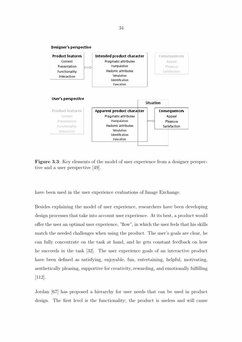
34
Figure 3.3: Key elements of the model of user experience from a designer perspec-tive and a user perspective [49].
have been used in the user experience evaluations of Image Exchange.
Besides explaining the model of user experience, researchers have been developing
design processes that take into account user experience. At its best, a product would
offer the user an optimal user experience, ”flow”, in which the user feels that his skills
match the needed challenges when using the product. The user’s goals are clear, he
can fully concentrate on the task at hand, and he gets constant feedback on how
he succeeds in the task [32]. The user experience goals of an interactive product
have been defined as satisfying, enjoyable, fun, entertaining, helpful, motivating,
aesthetically pleasing, supportive for creativity, rewarding, and emotionally fulfilling
[112].
Jordan [67] has proposed a hierarchy for user needs that can be used in product
design. The first level is the functionality; the product is useless and will cause
35
dissatisfaction if it does not contain the necessary functionality or cannot perform
the expected tasks. Thus, we need to have an understanding what the product will
be used for and the context of use. The second level is usability; once the product
has the required functionality, it should be easy to use. Finally, the third level
is pleasure; the products should bring emotional benefits for the user. Hiltunen
suggests a similar approach: when a technology is mature enough, more emphasis
should be placed on the user experience of a product [54]. Jordan proposes four main
stages to describe how pleasurable products can be designed and a set of methods
to achieve that goal:
• Understanding the people for whom the product is designed
• Understanding the practical, emotional, and hedonic benefits required from
a product
• Linking these benefits to the product design
• Evaluating design solutions
Norman defines three levels for product design that are based on the emotional and
cognitive system of the human brain [105]. The levels of brain processing are visceral,
behavioral, and reflective: The visceral level is the automatic, primitive layer, which
makes fast judgments; the behavioral level controls the everyday behavior; and the
reflective layer contains consciousness, feelings, and emotions. These three levels
of brain processing translate into three different kinds of design aspects. Visceral
design refers primarily to the initial impact of a product and its appearance. It is
mostly about the physical characteristics of a product. Behavioral design is about
look and feel and how the product is used - traditionally researched by usability
studies. Finally, reflective design is how one experiences the product afterwards,
how it makes one feel, and about the message it sends to others. Self-image and
culture are also important aspects of reflective design. These three levels can be
used to define and evaluate user experience of a product.

36
The following conclusions can be derived from the research related to user experience
design. First, it is essential to understand the people who the product is designed
for. Second, the products should be easy to use and useful to establish a firm ground
for a positive user experience. Third, we need to understand the emotional benefits
that are related to using a product to enable a pleasurable user experience. Fourth,
the designs need to be evaluated by real users.
3.4 Research techniques
Next Chapters explain the research techniques that we used for designing Minimap
and Image Exchange. The research has followed the design-science process. In
the building process, we first used contextual interviews to identify the user needs.
After that we created personas, scenarios, and user interface diagrams to design
the first versions of the user interface of the application and to communicate the
motivations of the design within the project team. In the evaluation process, the
prototypes were evaluated in user studies including methods such as field, expert,
and laboratory studies. The applications were further improved in an iterative
fashion. The timelines for the empirical studies of Minimap and Image Exchange
are presented in Figure 3.4.
3.4.1 User needs studies
The Minimap and Image Exchange projects have followed the design process of
Contextual Design [10, 59]. As described in Chapter 3.1, human-centered design
is based on human needs, and interviewing users gives us a realistic view of the
current needs and problems. With Contextual Design, we were able to find out
usage patterns, how and why users are using a product/service, and reasons behind
the worries and wishes of users.

37
Figure 3.4: The overall timelines of the empirical studies of Minimap and ImageExchange.
In both of the projects, the design process included contextual interviews conducted
in real environments, where the applications were used. The target was to observe
and identify real user needs related to user’s tasks. It was important to keep a focus
during the interview and concentrate on research questions that are related to the
project. We aimed at recruiting a heterogeneous set of users for the interviews to
represent different types of users.
In the Minimap project, the contextual interviews were organized in different parts
of the world: Helsinki, Boston, Tokyo, and London. 35 interviews were conducted in
total, 6-9 interviews per location. The focus of the interviews was on online access
on mobile devices, including mobile Web browsing and other types of online content,
such as RSS feeds and podcasts. The interviews were conducted in cafes, the home

38
environment or the work place.
While conducting research for the Image Exchange project, we ran contextual in-
terviews in Helsinki and Tokyo. Tokyo was selected to present the pioneer location
of mobile services, while Helsinki represented more of a mainstream audience. All
in all, 16 interviews were conducted, 8 per location. The aim was to gain an under-
standing of how people take photos and use photo sharing mobile/Internet services
with their mobile devices (mobile phone or PDA). The interviews were conducted
in the participants’ home environment or work place.
The reason for conducting the contextual interviews in different locations of the
world was to gather common knowledge how the applications were used in different
countries. Furthermore, some countries like Japan represent the pioneer in mobile
industry and are able to give new ideas for new features and applications. We did
not use the data to create variations of the applications for different cultures but to
design applications that could work well in many cultures.
The interviews started by going through a typical day related to the use of the
specific system. Also, users described the tools that they were using to complete
tasks. Next, we asked the users to explain their recent use cases with the system. In
some of the studies, we asked the participants to keep a diary during the week before
the interview to help them to remember the use cases. In the Minimap project, we
especially paid attention to how the mobile Web browser was used, the use cases
for mobile browsing, and how online information was accessed. When conducting
the interviews for the Image Exchange project, we focused on the mobile camera
and photo-sharing use cases. In both of the projects, we were interested in how the
connection speed and the cost of use affects the use and who pays the phone bills.
Finally, we asked the participants to list three wishes for their future online access
or photo sharing needs.
Once the observations were conducted, we interpreted the data collected in the
39
interviews within the design team. Key points of the data were captured into affinity
notes, which included interpretations of events, use of the system and artifacts,
problems and opportunities, questions, insightful quotes, and even design ideas.
We also built user profiles of the participants entailing demographic information.
Typically, we had 400-700 affinity notes per study.
As a next step, the affinity notes were grouped together and built into an affinity
diagram to see common themes in data. An affinity diagram is a hierarchical repre-
sentation of the user data that is built from the bottom up. It lets the data suggest
labels for groups of notes. We used three levels of category labels usually having
8-10 bigger themes arising from the study.
Finally, we organized a workshop within the project team to design a response to
the user data presented by the affinity wall. The study data was shared with all the
members of the team through the affinity wall, where everyone could see the original
user data and how it was analyzed into a hierarchical representation. Design ideas
and inventions were gathered during the workshop and used later when developing
Minimap and Image Exchange.
In the Image Exchange project, we also used the contextual interviews to modify
personas that we had created to communicate the user needs within the project
team. Earlier research has identified a potential for integrating contextual design
and personas in the design process [123, 10, 58]. Instead of creating the personas
after the contextual interviews, we gathered feedback on the validity of the personas
already in the user interviews and modified the personas later if we found them
contradicting the results of the interviews.
3.4.2 User interface design
The user interfaces for Minimap and Image Exchange were designed within a multi-
disciplinary team including interaction designers, HCI specialists, and developers.
40
The design process was not isolated from the engineering process to ”get the right
design” and ”get the design right” [18]. Having a design process running in parallel
with the implementation process enables a better user experience.
The design processes for both Minimap and Image Exchange used sketching as a
method for designing user experiences. Sketching is a very cheap and easy way to
design and explore many alternatives in user interfaces and get feedback at the same
time [18]. Its benefits include being quick, timely, and inexpensive. The sketches
are disposable and plentiful, meaning that many alternatives for the user interface
designs can be explored and tried out. They are also a good way to communicate
and provoke discussions within the team. Sketching incorporates various techniques,
of which we used drawings, animations, and paper interfaces in the design process.
In Image Exchange, we also used personas and scenarios to communicate and bear
in mind the most important use cases of the application. We wanted to keep the
focus and optimize the user interface to include only a minimal number of steps for
the most important functions.
The user interfaces for Minimap and Image Exchange were designed in an iterative
fashion: the sketches and more complete prototypes were evaluated with users and
improved according to the feedback. When a user interface is designed in an iterative
way, it evolves along with the user needs providing a satisfactory user experience
[62, 54]. Throughout the process for user interface design, we kept in mind the
heuristics and guidelines for user interfaces as described in Chapter 3.2.
3.4.3 User evaluations
To evaluate Minimap and Image Exchange, we conducted laboratory studies and
expert evaluations to find the critical usability problems and long-term field studies
to identify issues related to user experience. Usability testing in a laboratory envi-
ronment is sufficient when studying user interface and navigation aspects of a mobile
41
application [73], but also for contextual issues [83]. The expert evaluations also re-
veal potential usability problems of a product and are a quick and cheap usability
inspection method to test the system before engaging real users. Field studies are
more time-consuming but worthwhile when user behavior and experience are inves-
tigated in a natural context. Conducting field studies is especially important when
evaluating mobile applications as they are used in various environments and situa-
tions [54]. Field studies also help to identify the specific contexts, where a mobile
Internet service is used in real life, and focuses on usability problems occurring in
those contexts [80]. Also, problems related to cognitive load and interaction style
are identified more effectively in field studies [103].
The laboratory tests were conducted in a laboratory setting, where users were asked
to complete a set of tasks in a 2-hour session. With the laboratory tests, we aimed
to identify usability problems in the user interface of Minimap and its view for
Web history, called ”Rolling History” (one study is explained in [P3]). The users
were advised to think aloud during the session so that we could know the reasoning
behind their actions. After completing the tasks, we asked the users to fill out
questionnaires to give ratings to different aspects of use.
We used expert evaluations to find usability problems in Image Exchange in the
early phases of the user interface design process. The experts we used had 5-10
years of experience on the HCI field. The expert evaluations were conducted as
face-to-face interviews, where the expert could explore the user interface freely. The
interviews lasted 1-2 hours.
For both Minimap and Image Exchange, we arranged one comparative field study
(reported in [P1] and [P6], respectively), where users used two applications designed
for the same purpose one after the other. In the Minimap field study, we had 20
participants using the applications for 8 days each, while the field study for Image
Exchange, included two groups of five participants using the applications for 7 days
each. The participants executed daily tasks in addition to their own usage. We

42
gathered data about the usage with task feedback, diaries, questionnaires at the
end of the testing period, and focus group discussions. In the Image Exchange field
study, we also used logs to collect usage data.
Two other field studies aimed at exploring the user behavior when using Minimap
and Image Exchange for a longer period of time (described in [P2] for Minimap
and in [P4] and [P5] for Image Exchange). For Minimap, we had a 2-week period
for evaluating the Auto-update concept. Auto-update aimed to prefetch Internet
content such as RSS feeds or podcasts to a mobile device in an easy and care-free way
that saves data traffic costs, battery, and disk space. Participants performed tasks
every second day and they were also encouraged to use it for downloading their
own favorite Web content. After the test period, we arranged a group feedback
session, where the participants first filled in a questionnaire and later gave verbal
feedback in a focus group discussion. In Image Exchange, we launched a trial of the
mobile client application and Internet service to a closed group of people. A couple
of months after the launch, we organized a Web survey and requested the users
to answer the survey and give their feedback. 21 users replied to the survey. The
survey included rating questions, in which we tried to find out both the usability
but also user experience related issues of the application.
3.5 Summary
The goal of design-science research is to build innovations that can be improvements
to existing entities [68]. The objective is to develop technology-based solutions
to important and relevant business problems. As an outcome, design knowledge
prescriptions are developed, which can be used by a professional to design solutions
to problems.
Solution concepts are typically studied in the intended context of application to
explore its effectiveness and the influence of less well-known factors. Therefore, the

43
preferred research design is the multiple case-study [3]. The knowledge is built via
reflective cycles: first through alpha-testing, where the design knowledge prescrip-
tions are analyzed in the original context. The next step is beta-testing, where the
design knowledge prescriptions are evaluated and analyzed in other contexts. This
phase can give invaluable insights about the design knowledge prescriptions and
their application domain, and ideas for final improvements.
The Minimap Web browser and Image Exchange client application were selected
as the study concepts with regards to the research questions. They present the
two approaches, or ”cases”, for using Internet services on a mobile device. Both
Minimap and Image Exchange are solutions for relevant business problems as they
have been developed in a real business environment. Minimap is the solution of
today, while Image Exchange exemplifies a future solution, where the use of an
Internet service is supported via a connected client application. The resulted design
knowledge prescriptions are the design implications for mobile user interfaces of
Internet services. The prescriptions were tested with Minimap and Image Exchange
in the alpha- and beta-testing phase, respectively. Minimap formed the basis for the
design implications, while Image Exchange gave hints how the design implication
can be applied to and affected by future solutions.

44
4 Results
This Chapter introduces Minimap and Image Exchange that present two approaches
to support the use of Internet services on a mobile device. The design decisions of
the user interfaces are justified for both applications through the results of the user
experience evaluations.
4.1 Solution of today: Minimap
The Minimap mobile Web browser presents the most common approach to support
the use of Internet services on mobile devices (presented in [P1-P3]). We considered
the limitations of mobile devices (see Chapter 2.1) in the user interface design and
developed a solution that would enable a compelling user experience. Minimap and
its user experience were evaluated in 6 user studies during the development process.
4.1.1 User interface design
The first task in the user interface design was to tackle the limitation of a small
screen [P1]. This was particularly important when defining how to visualize Web
pages, as they are mainly designed for desktop screens. In addition, we needed to
outline a good design for the visualization of a Web history and multiple windows,
as they are important use cases on a PC [95, 131, 51] but have many challenges
when transferred to a mobile device.
For Web page visualization, we designed a method that scaled down the layout of
a Web page to fit more content to the screen (Figure 4.1). The method modified
the size of the text relative to the rest of the Web page contents and limited the
maximum width of the text paragraphs to the width of the screen of the mobile
device. Hence, the text paragraphs were at most as wide as the screen and the need
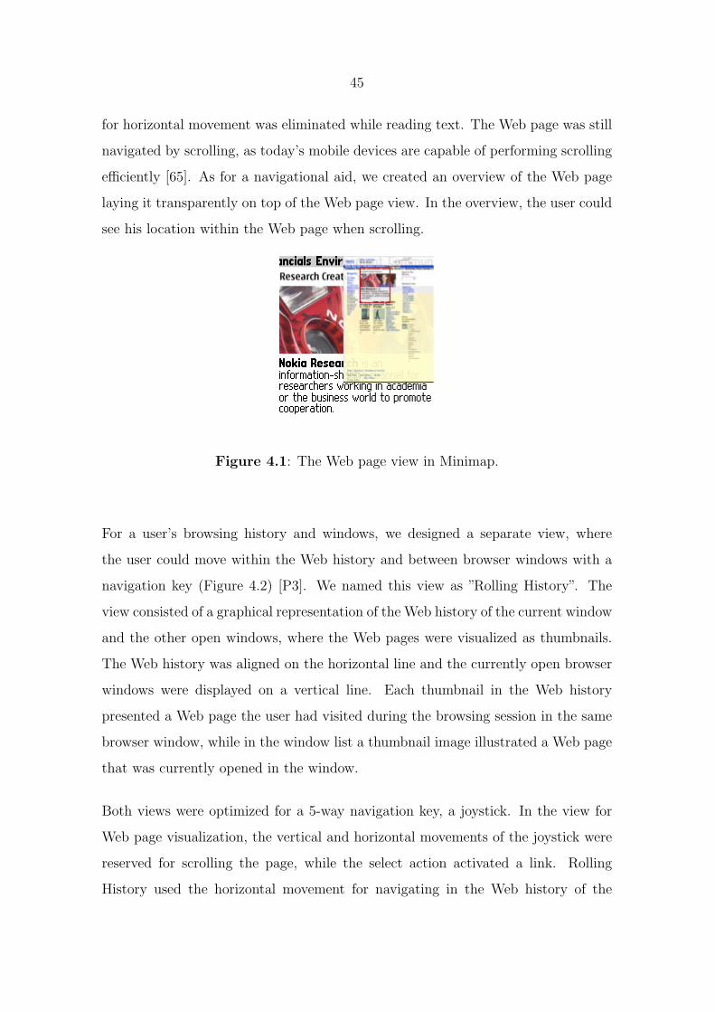
45
for horizontal movement was eliminated while reading text. The Web page was still
navigated by scrolling, as today’s mobile devices are capable of performing scrolling
efficiently [65]. As for a navigational aid, we created an overview of the Web page
laying it transparently on top of the Web page view. In the overview, the user could
see his location within the Web page when scrolling.
Figure 4.1: The Web page view in Minimap.
For a user’s browsing history and windows, we designed a separate view, where
the user could move within the Web history and between browser windows with a
navigation key (Figure 4.2) [P3]. We named this view as ”Rolling History”. The
view consisted of a graphical representation of the Web history of the current window
and the other open windows, where the Web pages were visualized as thumbnails.
The Web history was aligned on the horizontal line and the currently open browser
windows were displayed on a vertical line. Each thumbnail in the Web history
presented a Web page the user had visited during the browsing session in the same
browser window, while in the window list a thumbnail image illustrated a Web page
that was currently opened in the window.
Both views were optimized for a 5-way navigation key, a joystick. In the view for
Web page visualization, the vertical and horizontal movements of the joystick were
reserved for scrolling the page, while the select action activated a link. Rolling
History used the horizontal movement for navigating in the Web history of the
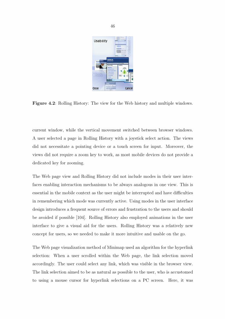
46
Figure 4.2: Rolling History: The view for the Web history and multiple windows.
current window, while the vertical movement switched between browser windows.
A user selected a page in Rolling History with a joystick select action. The views
did not necessitate a pointing device or a touch screen for input. Moreover, the
views did not require a zoom key to work, as most mobile devices do not provide a
dedicated key for zooming.
The Web page view and Rolling History did not include modes in their user inter-
faces enabling interaction mechanisms to be always analogous in one view. This is
essential in the mobile context as the user might be interrupted and have difficulties
in remembering which mode was currently active. Using modes in the user interface
design introduces a frequent source of errors and frustration to the users and should
be avoided if possible [104]. Rolling History also employed animations in the user
interface to give a visual aid for the users. Rolling History was a relatively new
concept for users, so we needed to make it more intuitive and usable on the go.
The Web page visualization method of Minimap used an algorithm for the hyperlink
selection: When a user scrolled within the Web page, the link selection moved
accordingly. The user could select any link, which was visible in the browser view.
The link selection aimed to be as natural as possible to the user, who is accustomed
to using a mouse cursor for hyperlink selections on a PC screen. Here, it was
47
beneficial to copy a usage pattern from a PC, even though other user interface
paradigms might be more effective. Rolling History also demonstrated how to design
a unique user interface for a mobile device without displacing the deep-seated use
patterns that people have found useful on a PC. It used the same paradigm for
multiple windows as on a PC, even though windows did not really exist on a S60
user interface style. People, however, need multiple windows on a PC in several
situations and having the functionality on the mobile device, improves the user
experience. Nonetheless, the user interface can be optimized for a mobile device,
although the paradigm would remain.
Rolling History also contributed to overcoming the limitation of restricted mobile
device resources. Getting a previous Web page back on the screen on a mobile device
may take a while due to the bandwidth and processing power and may also consume
battery and memory. Furthermore, some Web pages require non-cacheable content
from the Web so downloading content via a cellular connection while back stepping
may even add browsing expenses. Rolling History enabled a user to select only the
page he desired, as the page thumbnails were easily recognizable. Furthermore, the
user did not need to load all Web pages along the way if he needed to step multiple
pages back in the Web history.
The limitations of disk space, battery, and connection costs become fundamental
when people are accessing other types of content than Web pages in Internet services
with their mobile devices. Examples include RSS feeds and podcasts. An essential
aspect of Internet content is its timeliness: people should have the latest content
ready on the device, when they want to access it. We designed a concept called
Auto-update to be included in the Minimap Web browser to solve this problem
[P2]. Auto-update aimed to prefetch Internet content in a delicate way to a mobile
device. If a user had subscribed to RSS feeds or podcasts, the system tried to
save data traffic costs, battery, and disk space elaborately. The details were hidden
behind profiles: the user only selected, which profile he wanted to use and the system
took care of the rest. The user interface of Auto-update is presented in Figure 4.3.

48
(a) The main view for
profiles. It shows the
selected profile and
profile-independent
policies that the user
can modify.
(b) The view for se-
lecting profile. Auto-
update contained three
profiles with default val-
ues, but a user could
modify them to suit his
preferences.
(c) The settings view for
each profile. Each pro-
file contained policies for
device resources that the
user could modify.
Figure 4.3: The user interface of the Auto-update concept.
4.1.2 User experience evaluations
We organized 6 rounds of user studies to evaluate the user experience of different
functionalities of Minimap, as our ambition was to develop user interfaces in an
iterative fashion. After each study, we went through the issues discovered by the
study and further developed the solutions and their user interfaces. I will go through
the most essential user study results of Minimap in this Chapter.
Minimap’s method for Web page visualization was evaluated in two user studies:
First, in a laboratory test with 8 subjects; and second, in a field study with 20
participants [P1]. In the field study, Minimap was compared to a commercial Web
browser that used Narrow Layout as a method for Web page visualization. The
participants used Minimap and the other browser for 8 days each. Evaluation data
was collected through questionnaires, task feedback, diaries, and logs. We also
gathered qualitative data in focus groups, where the participants discussed Minimap
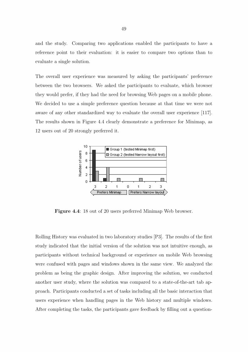
49
and the study. Comparing two applications enabled the participants to have a
reference point to their evaluation: it is easier to compare two options than to
evaluate a single solution.
The overall user experience was measured by asking the participants’ preference
between the two browsers. We asked the participants to evaluate, which browser
they would prefer, if they had the need for browsing Web pages on a mobile phone.
We decided to use a simple preference question because at that time we were not
aware of any other standardized way to evaluate the overall user experience [117].
The results shown in Figure 4.4 clearly demonstrate a preference for Minimap, as
12 users out of 20 strongly preferred it.
Figure 4.4: 18 out of 20 users preferred Minimap Web browser.
Rolling History was evaluated in two laboratory studies [P3]. The results of the first
study indicated that the initial version of the solution was not intuitive enough, as
participants without technical background or experience on mobile Web browsing
were confused with pages and windows shown in the same view. We analyzed the
problem as being the graphic design. After improving the solution, we conducted
another user study, where the solution was compared to a state-of-the-art tab ap-
proach. Participants conducted a set of tasks including all the basic interaction that
users experience when handling pages in the Web history and multiple windows.
After completing the tasks, the participants gave feedback by filling out a question-

50
naire. The overall user experience was again evaluated according to preference and
the results showed that most participants preferred our solution across all functions
as seen in Figure 4.5.
Figure 4.5: Rolling History was preferred by most users across all functions.
To evaluate the user experience of the Auto-update concept, we arranged two field
studies, in which participants used the system in their daily lives for two weeks [P2].
Both studies lasted for two weeks and we gathered evaluation data by task feedback,
questionnaires, and focus group discussions. Figure 4.6 summarizes the results of
the latter field study by presenting the average values of how each feature was
evaluated by the users. We used a 5-point Likert scale, 0 meaning that a user totally
disagrees with the statement and 5 that he or she totally agrees. The usefulness of
updating both RSS feeds and podcasts scored well in the study. The participants
understood based on the feedback that they would have saved a considerable amount
of money by, for example, fetching the feeds over WiFi connection. In addition, the
participants wanted to have control over the device resources according to their own
preferences.

51
Figure 4.6: Overall ratings of the Auto-update concept.
4.1.3 Summary
The Minimap Web browser presents a solution, where a user interface paradigm is
transferred from a PC to a mobile device in a way that preserves the familiar desktop
usage patterns but offers unique solutions in the mobile user interface design. The
user experience evaluations showed that the designed solutions to surmount the
limitations of a mobile device were successful and support the use of Internet services
on a mobile device.
The benefits of Minimap can be summarized as follows:
• It is optimized for a small-screen mobile device.
• It does not require a pointing device or a touch screen but makes good use
of 5-way navigation key.
• It does not present modes in the user interface.
• It utilizes the familiar desktop usage patters.
• It presents unique solutions for new usage behavior that the mobile context
introduces.
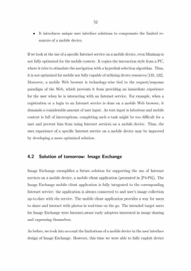
52
• It introduces unique user interface solutions to compensate the limited re-
sources of a mobile device.
If we look at the use of a specific Internet service on a mobile device, even Minimap is
not fully optimized for the mobile context. It copies the interaction style from a PC,
where it tries to stimulate the navigation with a hyperlink selection algorithm. Thus,
it is not optimized for mobile nor fully capable of utilizing device resources [135, 122].
Moreover, a mobile Web browser is technology-wise tied to the request/response
paradigm of the Web, which prevents it from providing an immediate experience
for the user when he is interacting with an Internet service. For example, when a
registration or a login to an Internet service is done on a mobile Web browser, it
demands a considerable amount of user input. As text input is laborious and mobile
context is full of interruptions, completing such a task might be too difficult for a
user and prevent him from using Internet services on a mobile device. Thus, the
user experience of a specific Internet service on a mobile device may be improved
by developing a more optimized solution.
4.2 Solution of tomorrow: Image Exchange
Image Exchange exemplifies a future solution for supporting the use of Internet
services on a mobile device, a mobile client application (presented in [P4-P6]). The
Image Exchange mobile client application is fully integrated to the corresponding
Internet service: the application is always connected to and user’s image collection
up-to-date with the service. The mobile client application provides a way for users
to share and interact with photos in real-time on the go. The intended target users
for Image Exchange were Internet-aware early adopters interested in image sharing
and expressing themselves.
As before, we took into account the limitations of a mobile device in the user interface
design of Image Exchange. However, this time we were able to fully exploit device
53
resources and user interface possibilities unlike with Minimap. The user experience
of Image Exchange was evaluated in two user studies.
4.2.1 User interface design
The Image Exchange mobile client application was developed for advanced mobile
devices equipped with an always-on, flat-fee data connection, longer battery lifetime,
and enough CPU power to run fast rich user interfaces. In addition, the application
was designed exclusively for mobile use, as on a PC Internet services are commonly
used on a Web browser. Therefore, the user interface design could exploit the
opportunity for unique mobile-specific solutions. We still needed to consider the
limited input and output methods and the mobile context in the design process as
those limitations remained.
The user interface of the Image Exchange mobile client application was designed by
identifying the essential use cases for mobile photo sharing [P4]. The use case defi-
nitions were formed and prioritized through user interviews and evaluations of other
mobile photo sharing applications. The results indicated that the most important
use cases were publishing images, having one’s entire image collection with him all
the time, and to be notified about new events on his and his friends’ images. Finally,
the use cases were used to define the requirements for the mobile client application.
The aim was to find a simplistic and pleasant user interface design that would offer
a positive user experience.
The main views of the Image Exchange mobile user interface are presented in Figure
4.7. When the application was launched, the main menu was displayed on the screen
and the latest captured image was shown full-screen in the background. A user could
access images through different categorizations in the main menu by using the 5-way
navigation key. Thus, the need for text input was eliminated. All selections in the
main menu item led to the image browsing view, which optimized the screen area
54
and displayed a specific image full-screen. The left and right arrow keys were used
to flip through the images in the image browsing view.
(a) The main menu. (b) The image menu. (c) The image browsing
view.
Figure 4.7: The user interface of Image Exchange.
The image menu was used to show functions that were available for the selected
image. We decided to create our own menu style instead of using the option menu
that is offered by the platform in many mobile devices. The reasoning for this was
that usually the options menu does no separate the functionality and the settings of
the application but has all of them presented in the same list. We wanted to make
a clear separation between the functionality that is available for a certain image
versus the application-wide settings. As we were developing an application that
would directly run on top of the platform, we could take a full advantage of the rich
user interface features, such as animations.
As the mobile context requires that people’s tasks on their mobile devices are quick
and simple to complete, we needed to make the interaction between the mobile client
application and the Internet service easy and fluent [P5]:
• To facilitate the registration process to the service, we decided to use the
identification number of the device as an initial user name for the Internet
service to minimize the effort. A user account was created without any user
input except for asking permission to use the network connection. By remov-
ing the need for any input, we lowered the entry barrier for the user to start
55
using the application.
• To enable people to share their images right on the spot, Image Exchange
transferred captured images transparently without requiring any user input.
As a result, a user could trust that his image collection was always present
on the device and in the service.
• To provide the user with a way to add additional data to the images, he
could modify the title and description and add comments through the image
menu with a couple of clicks. Whenever the user decided to change a title or
description or add a comment either on the mobile device or in the service,
the changes also appeared immediately in the other end.
4.2.2 Benefits in contrast to mobile Web browsers and other state-of-the-art
solutions
When a mobile Web browser is used for accessing Internet services, it requires at
least some amount of text input for registration and possibly for logging in. Typing
text on a mobile device can be a laborious task, especially when a task such as
a registration or login requires text entry without any typographical errors. For
Image Exchange, we were able to simplify and facilitate the registration process, as
the client application could access the device resources and make use of the platform
data. Similarly, when a Web browser is used for uploading content to an Internet
service, it usually requires filling out a form by inputting text. In Image Exchange,
we transferred the captured mobile images transparently without requiring any user
interaction. As a result, the user’s image content was automatically up-to-date
without any effort from the user.
When using the Web browser to access content on an Internet service, the user
might need to navigate through many Web pages and links until he can access the
latest content. In addition, the Web browser may need to send many requests to
56
the service and wait for the responses until it can show the content to the user.
Therefore, content browsing on a Web browser might not be fluent and immediate
from the user’s perspective. When the user started the Image Exchange application,
he could access the latest online photos by two clicks. This led the user to an image
browsing view, where he could browse online images with the left and right arrow
keys. The browsing between images occurred immediately without any waiting
periods, as the application fetched the latest online images published and cached
them to the device memory. The service would only send screen-size thumbnails of
the images to make the transfer fast and save network bandwidth. Still, the whole
screen area was used for showing the image.
Modifying content on an Internet service with a Web browser might also require
many link selections, filling out a form, submitting the form, and waiting for a
response. The Image Exchange application used a dialog activated directly with
a mouse click to enable modifying of image data, such as titles, descriptions, or
comments. The image data was up-to-date with the corresponding Internet service
without any need to specifically submit or update the information.
Nowadays, the state-of-the-art mobile client applications that people can use to
share their mobile photos (e.g., Facebook 11, Kodak EasyShare Gallery 12, Pictavi-
sion 13, Radar 14, Share Online 15, ShoZu 16, and Yahoo! Go 17) are upload tools for
specific Internet services. The applications are usually add-ons to existing gallery
applications offering functionalities for separately uploading and downloading im-
ages and the data linked to them. However, the image gallery application and the
user’s image collection are not fully integrated and synchronized with the service.
11Facebook, available at http://www.facebook.com/. Accessed September 2009.12Kodak EasyShare Gallery, available at http://www.kodakgallery.com/. Accessed September
2009.13Pictavision, available at http://www.pictavision.com/. Accessed September 2009.14Radar, available at http://radar.net/. Accessed September 2009.15Share Online, available at http://www.nokia.com/betalabs/shareonline/. Accessed September
2009.16ShoZu, available at http://www.shozu.com/. Accessed September 2009.17Yahoo! Go, available at http://mobile.yahoo.com/go/. Accessed September 2009.

57
Also, the upload tool applications require account creation and configuration of set-
tings before they can be used. In the mobile context, users who might be on the
move and have only a limited and possibly fragmented time to spend on a task
are unable to use a mobile application that is hard and slow to use and configure.
Furthermore, the upload tools might be developed by a different party than the
developers of the gallery application or the corresponding Internet service. This
might result in a mismatch between the available functions and features on the mo-
bile gallery application and the Internet service. Thus, the upload tool applications
cannot guarantee a deep integration of the gallery application and the service.
4.2.3 User experience evaluations
Image Exchange was evaluated in two field studies. First, we launched the mobile
client application and the corresponding Internet service to a closed group of partic-
ipants and conducted a small-scale user study to find out if the concept was useful
and fun in practice [P5]. The results showed that the integration of the mobile
application and the service was appreciated because of the automatic synchroniza-
tion of data and how the whole concept worked seamlessly. In addition, the user
interface and the user experience of the mobile application were positively rated by
the participants.
To evaluate Image Exchange more thoroughly, we conducted a field study of 2 weeks
to compare Image Exchange with a state-of-the-art gallery application combined
with an add-on tool for photo sharing [P6]. The earlier studies have shown that a
mobile client application offers a superior way to interact with an Internet service
compared to its Web-base counterpart [122]. That is why we decided to compare
Image Exchange to a state-of-the-art mobile client application, ”Gallery”, instead
of a mobile Web browser. In addition, Image Exchange could be used as an image
browser application to view user’s own image collection on his mobile device, so the
Gallery application presented a good point of comparison in that extent as well.
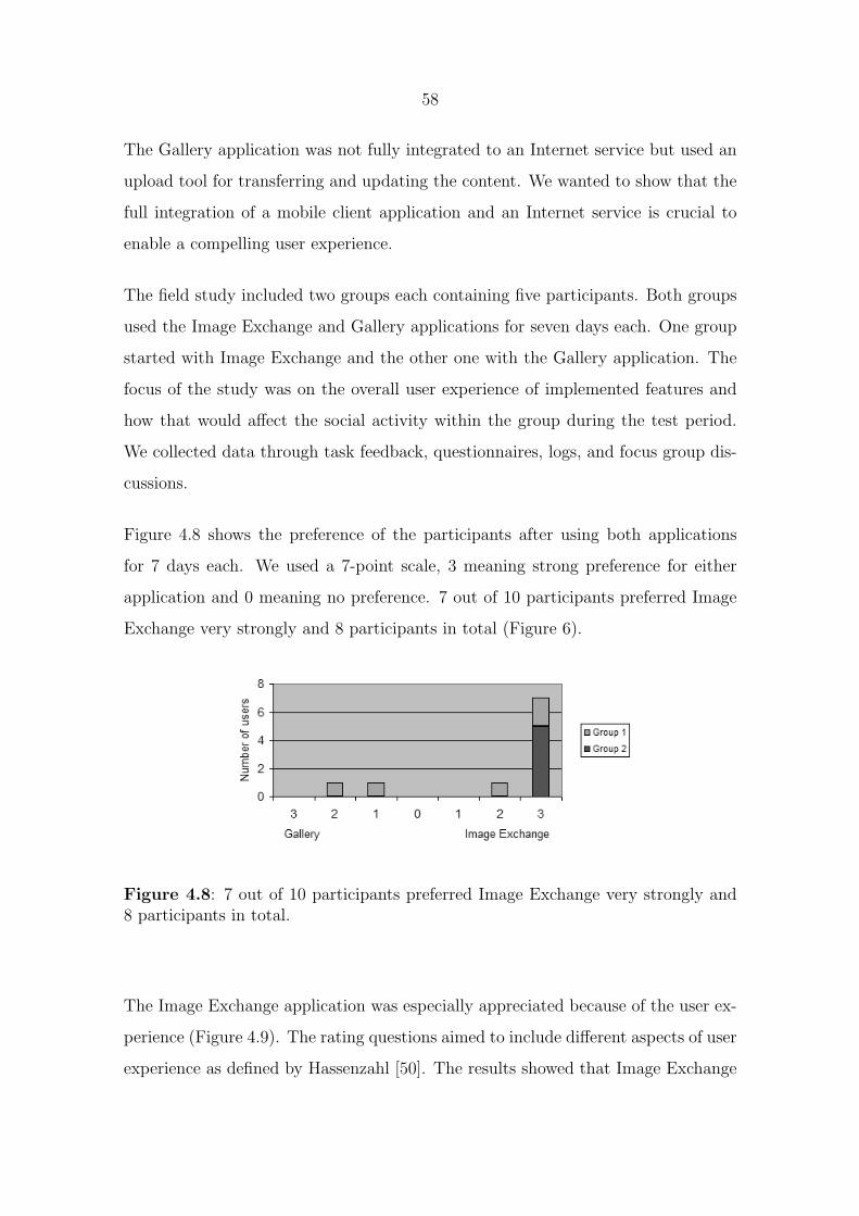
58
The Gallery application was not fully integrated to an Internet service but used an
upload tool for transferring and updating the content. We wanted to show that the
full integration of a mobile client application and an Internet service is crucial to
enable a compelling user experience.
The field study included two groups each containing five participants. Both groups
used the Image Exchange and Gallery applications for seven days each. One group
started with Image Exchange and the other one with the Gallery application. The
focus of the study was on the overall user experience of implemented features and
how that would affect the social activity within the group during the test period.
We collected data through task feedback, questionnaires, logs, and focus group dis-
cussions.
Figure 4.8 shows the preference of the participants after using both applications
for 7 days each. We used a 7-point scale, 3 meaning strong preference for either
application and 0 meaning no preference. 7 out of 10 participants preferred Image
Exchange very strongly and 8 participants in total (Figure 6).
Figure 4.8: 7 out of 10 participants preferred Image Exchange very strongly and8 participants in total.
The Image Exchange application was especially appreciated because of the user ex-
perience (Figure 4.9). The rating questions aimed to include different aspects of user
experience as defined by Hassenzahl [50]. The results showed that Image Exchange

59
scored better in 5 out of 6 questions. Particularly, the ease of use and the design
solutions attracted the participants and they listed the ease of use and simplicity
as the key design solutions of Image Exchange. The participants enjoyed the use so
much that they would even recommend it to an interested friend. Furthermore, the
participants considered Image Exchange to be excellent and support the self-image
that they want to show to the others. The participants explained that they highly
appreciated the look of the application and they described it as ”stylish”, ”mod-
ern” and ”beautiful”. Image Exchange also managed to surprise the participants
positively from time to time and they commented that the application was fun to
use.
Figure 4.9: The Image Exchange mobile application scored significantly betterin 5 out of 6 user experience evaluation questions. The results include standarddeviation.
The user experience evaluation also explained why Image Exchange was strongly
preferred by the participants compared to the Gallery application. The participants
took pleasure in using the solution even though they also got things done with the
Gallery application. Image Exchange enabled the participants to interact enjoyably
with one another in real-time on the go, while the Gallery application still required
the participants to take care of many tasks (e.g., uploading an image, synchronizing
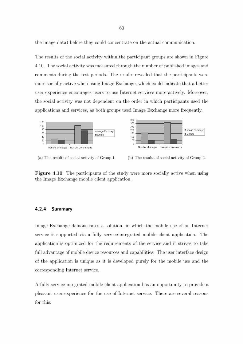
60
the image data) before they could concentrate on the actual communication.
The results of the social activity within the participant groups are shown in Figure
4.10. The social activity was measured through the number of published images and
comments during the test periods. The results revealed that the participants were
more socially active when using Image Exchange, which could indicate that a better
user experience encourages users to use Internet services more actively. Moreover,
the social activity was not dependent on the order in which participants used the
applications and services, as both groups used Image Exchange more frequently.
(a) The results of social activity of Group 1. (b) The results of social activity of Group 2.
Figure 4.10: The participants of the study were more socially active when usingthe Image Exchange mobile client application.
4.2.4 Summary
Image Exchange demonstrates a solution, in which the mobile use of an Internet
service is supported via a fully service-integrated mobile client application. The
application is optimized for the requirements of the service and it strives to take
full advantage of mobile device resources and capabilities. The user interface design
of the application is unique as it is developed purely for the mobile use and the
corresponding Internet service.
A fully service-integrated mobile client application has an opportunity to provide a
pleasant user experience for the use of Internet service. There are several reasons
for this:
61
• The mobile user interface can be optimized for the needs of the Internet
service: Navigation in the user interface can be simplified and the service can
send an update to the client without a separate request from the user.
• The mobile user interface can directly utilize device capabilities: Technical
details are hidden from the user and smart defaults can be offered to re-
move the need for modifying complex settings. Many functions can also be
automated and the need for user input decreases. Furthermore, the user
interface is able to offer an immediate experience and becomes more aesthet-
ically pleasing and fast as it can benefit from the rich user interface features.
Finally, the mobile client application can also be used when offline.
• The full integration with the corresponding Internet service improves the
user experience: The content is always up-to-date between the mobile client
application and the Internet service. There is no need for manual updating
thus fitting better to the mobile context of use.
In practice, developing a mobile client application for each Internet service is not
feasible. It requires a lot of design and implementation work, especially if it is
aimed to function on many platforms. Hence, in cases such as the deployment of
a new Internet service it may be more practical to concentrate on making the user
experience of the Web site of the Internet service as pleasing as possible and let
users access it with their mobile Web browser.
62
5 Conclusions
The Internet is going mobile. Mobile devices have become more technologically
sophisticated and they can be used to access the Internet anytime, anywhere. In
particular, many Internet services are relevant for people on the go, and people find
it meaningful to access them via their mobile devices. However, the user experience
of Internet services on a mobile device still requires improvement. Mobile devices
have many enablers to offer, but these have not yet been fully utilized in supporting
Internet services.
Today, there are two approaches to support the use of Internet services on a mo-
bile device. The assumption of this Thesis was that the main approach is currently
the mobile Web browser, which can generally support the use of several types of
Internet services in a similar way as on a PC. However, the mobile Web browser
is not optimized for any Internet service and thus cannot offer an optimal experi-
ence for a specific Internet service. Thus, a future solution to support the use of
Internet services may be a mobile client application that is fully integrated to the
corresponding Internet service. The mobile application is capable of utilizing the
platform capabilities and optimizing the user interface for the needs of the Internet
service. Hence, it has a possibility to provide a better user experience than the
mobile Web browser. Nonetheless, the development of a mobile client application
might be laborious and not feasible for every platform.
The related work has extensively identified the limitations of a mobile device. Fur-
thermore, general guidelines for mobile user interface design are available in the
literature proposing solutions to the limitations. Many research studies have also in-
troduced design guidelines in a specific scope, including the use of particular services
on a mobile device. However, what has remained to be addressed, is the definition of
design implications that would assist other practitioners and the mobile industry in
designing mobile user interfaces for Internet services. The design implications could
63
be applied to mobile Web browsers and client applications. Furthermore, there has
not been any research on exploring what differences can be found in characteristics
of a mobile Web browser and a mobile client application in terms of user interface
design.
5.1 Answers to research questions
The main research question of this Thesis was (as defined in Chapter 1.3):
What are the design implications that need to be considered when de-
signing mobile user interfaces for Internet services?
The focus was not to define how to design Internet services but to investigate how
to support them on a mobile device in regards to the user interface. As an answer to
the main research question, I have defined the following design implications drawn
from the conclusions of the Minimap study (Chapter 4.1.3) and completed with the
findings of the Image Exchange study (Chapter 4.2.4):
Content optimization. In the mobile Web browser, the Web content should be
optimized to match the output capabilities of a mobile device. It should at least have
a visualization method that modifies the content for the small screen (as presented
in [P1]). The mobile client application can optimize the user interface for the needs
of a specific Internet service including its content [P4].
Utilization of desktop and mobile usage patterns. The mobile Web browser
should utilize the familiar desktop usage patterns, but also introduce novel solutions
for mobile use [P1-P3]. The mobile client application can be uniquely designed for
a mobile device and mobile use [P4].
Full exploitation of device capabilities. The user interface of the mobile Web
browser should offer a pleasant user experience via a good use of the 5-way navi-

64
gation key, a small-screen, and a consistent interaction [P1, P3]. The mobile client
application can utilize the rich user interface features that a mobile device has to
offer including enhanced graphics and immediate feedback [P4, P5].
Compensation for device resources. The mobile Web browser should introduce
unique user interface solutions to compensate for the limited mobile device resources
[P2]. The mobile client application has an opportunity to fully utilize device capa-
bilities to hide technical details from user, offer smart defaults, automate functions,
and enable offline use [P4, P5].
Content update. The mobile Web browser is able to offer manual updating as
well as automatic downloading of Internet content. It should optimize the updating
in such a way that it is useful to the user [P2]. The mobile client application can be
fully integrated with the corresponding Internet service: It can provide an access to
up-to-date content without requiring manual updating [P5].
The design implications aim to give guidance to other practitioners and the mobile
device industry on how to support Internet services on a mobile device in terms of
user interface design. It needs to be noticed that Image Exchange presents only one
type of mobile client application and cannot provide general answers for other Inter-
net services and their client applications. Every Internet service is unique in terms
of content and user interaction, so each case should be considered separately. How-
ever, Image Exchange is able to provide hints about future solutions for supporting
Internet services on mobile devices.
As an answer to the additional research question ”What differences can be found
in characteristics of user interfaces for a mobile client application and a
mobile Web browser?”, the following initial findings can be outlined as a result
of the Minimap and Image Exchange studies:
Generalization vs. optimization. The mobile Web browser offers a general
support for Internet services on a mobile device. It is able to offer a good user
65
experience even though the interaction paradigm is not optimized for a 5-way navi-
gation key or the needs of a certain Internet service [P1]. Developing a mobile Web
browser requires design and implementation work but it needs to be done only once.
A mobile client application can be optimized for a certain Internet service and has
an opportunity to provide a good user experience for the service [P6]. However,
supporting many Internet services through client applications entails a considerable
amount of development work, especially if the target is to support many platforms.
Offline use cases. If the Internet service is useful in offline situations as well, a
mobile Web browser can prepare for those use cases by, for example, saving relevant
Web pages to the local storage of a mobile device [P2]. A mobile client application
may have even better possibilities to support offline use cases. It can record user’s
commands and update the Internet service, when it is reconnected to the service.
The mobile client application can also recover from connection errors.
Device resources. The mobile Web browser can run on many mobile devices
today as it mainly counts on a data connection that can be created as needed and
does not require other advanced device resources [P1-P3]. Thus, it seems to be the
most common way to access Internet services on a mobile device. The mobile client
application is able to take full advantage of always-on connectivity and it may also
rely on extensive use of other device resources [P5].
Cost of usage. Both the mobile Web browser and client application can reduce
the data connection costs with intelligent design solutions. For example, they can
download content from the Internet only when a free WiFi network is available [P2].
The mobile client application is able to cut down the data costs even further by
optimizing the amount of data sent to the service [P5]. When data is sent via the
mobile Web browser, the user is generally in charge of the submitted data.
Account creation. If the Internet service requires account creation, the user expe-
rience becomes better if the user does not need to carry out a complex registration
66
or login process on the mobile device [P6]. The fully service-integrated mobile client
application can optimize the registration process by utilizing the device data and
thus eliminating a need for text input [P5].
User-generated content. If the Internet service is built around user-generated
content, it is very convenient from the user’s perspective if the content is automat-
ically or with a little effort synchronized between the mobile device and the service
[P6]. Thus, the fully service-integrated mobile client application can help in this
aspect.
Amount of interaction. If the use of the Internet service requires a great deal of
user interaction, for example, for browsing the content, the fully service-integrated
mobile client application can provide a good user experience by having a fast and
highly responsive user interface [P6].
The Minimap study showed that interaction paradigms can be successfully trans-
ferred from a PC to a mobile device with clever user interface solutions, even though
the mobile device offers a more limited development environment. The Image Ex-
change study, on the other hand, indicated that the mobile client application is able
to offer a pleasant user experience when it is carefully designed for a mobile device
and mobile use. The mobile Web browser is less exacting on device resources and
can deal with the limitations of a mobile device with inventive user interface designs,
whereas the mobile client application aims to take full advantage of mobile device
capabilities and offer a compelling user experience via a delightful user interface.
The full integration to the Internet service is the key aspect in the design of the
mobile client application, as shown by the user evaluations of Image Exchange.
67
5.2 Influence of the research
Today, both Minimap and Image Exchange are publicly available for users of Nokia
devices. Both solutions have got a great deal of positive feedback in the public
and been described as pioneers in supporting Web browsing and the use of Internet
services and in creating unique user interface solutions for mobile devices.
A modified version of our original Minimap Web browser is installed to the latest
Nokia S60 devices. The first S60 devices including the browser came on to the
market in 2006. The productized Minimap Web browser includes all the main
features related to the Web page visualization and Web history. The support for
multiple windows and the Auto-update concept has only been implemented on top
of the Minimap Web browser in our research projects. According to a research study,
70% of Minimap browser users chose their Nokia phone partly due to the browser
[71] so it has clearly been a success. Also, in the academia, the research work has
had an effect on the work on defining user experience [117].
The Image Exchange photo sharing service was launched in Nokia Beta Labs in
December 2008 and it has many users worldwide. The mobile client and the Web
site are accessible in Nokia Beta Labs 18 19. As Image Exchange presents a new
type of mobile application for Internet services, it has also been an important novel
example in the research area of mobile Internet user experience [119].
Nowadays, Nokia is investing strongly in Internet services in addition to mobile
devices. It has launched a set of Internet services under the Ovi environment 20
including services for music, images, maps, and other personal content. Thus, it is
extremely important for Nokia to ensure that these services work seamlessly with
the Nokia mobile devices as it is Nokia’s biggest strength in the competitive area
18Nokia Beta Labs, available at http://betalabs.nokia.com/. Accessed September 2009.19Nokia Image Exchange, available at http://imageexchange.nokia.com/. Accessed September
2009.20Nokia Ovi, available at http://www.ovi.com/services/. Accessed September 2009.

68
of Internet services. The research work employed in this Thesis has aimed to build
the basis for creating a positive user experience for Internet services on a mobile
device. The work should continue as new services and new mobile technologies
are introduced continuously. As both projects, Minimap and Image Exchange, are
available for people, they will be able to gather input and help Nokia in designing
future solutions.
69
6 Discussion and future work
The research approach employed by this Thesis was design-science research and the
output was the design implications as presented in Chapter 5.1. The design impli-
cations were defined through two studies, Minimap and Image Exchange, presenting
the alpha- and beta-testing phases in the research process, respectively. However,
Image Exchange exemplifies only one type of mobile client application and is not
able to provide general guidelines. Every Internet service is a unique combination
of features, interaction, and content, and needs to be considered separately. More
work needs to be conducted and the design implications should be tested with al-
ternative mobile client applications in their contexts to continue the design-science
research process and form general design implications for user interfaces of mobile
client applications.
Additionally, it might be beneficial in the future to explore more deeply how two
approaches, a mobile Web browser and a mobile client application, compare with
each other. By designing and evaluating mobile client applications of different In-
ternet services, the design guidelines could be expanded to answer questions such as
when it is beneficial to develop a mobile client application for an Internet service and
when the support via a mobile Web browser is enough. For example, a fully service-
integrated mobile client application might be more demanding than a mobile Web
browser in regards to device resources as it may require a full integration with the
corresponding Internet service. Thus, the needed enablers should be evaluated when
charting whether it is sensible to develop and implement a mobile client application
for an Internet service. Such questions are relevant as developing a mobile client
application is not be feasible for all Internet services because it requires development
work and the software also need to be maintained.
Another topic for future research is to explore new enablers for mobile client appli-
cations. Today, Web technologies such as JavaScript and HTML enable the creation
70
of Web applications that may appear as separate applications in the user interface
of an operating system, but actually run on top of the Web browser and its engine.
The benefit of these applications is that they are platform-independent and can be
updated and maintained easily without software distribution or installation. The
client-side processing enables immediate experience that does not require the Web
page to reload after submitting information.
One use case for Web applications has been Web widgets. Many mobile device
platforms, such as Nokia’s S60 and Apple’s iPhone, support mobile Web widgets as
mentioned in Chapter 2.2.3. The mobile platforms commonly offer a JavaScript API,
through which widgets can selectively access device resources and utilize content
available on a mobile device. However, the widgets cannot freely utilize the device
capabilities but are restricted by the scope of the API. The tools for designing user
interfaces optimized for a 5-key navigation control are also still very limited. For
example, the only methods that Nokia Widgets provide related to user interface
design are for accessing the Options menu of the S60 platform. This results from
the fact that Web interaction is designed for a pointer as an input method. In
addition, mobile widgets are still platform-dependent, although the standardization
process has been initiated [22].
Mobile devices are also starting to support Flash as a method for creating rich Web
applications (e.g., Flash Lite 21 ). Flash applications require a plug-in support from
Web browsers but are also platform-independent as the more traditional Web ap-
plications. Flash enables richer interaction methods in the user interface than Web
widgets as it is not limited by the functionality that the Web browser offers. How-
ever, device platforms still restrain Flash applications from using all the capabilities
that they offer to mobile client applications.
Many Internet services nowadays offer a mobile Web site to support mobile use.
21Flash Lite, available at http://www.forum.nokia.com/Technology Topics/Web Technologies/Flash Lite/.Accessed September 2009.

71
People can access the Web site through their mobile Web browser. The mobile Web
sites are optimized for small screens and they aim to contain only information that
is relevant for mobile use. Thus, they are able to save on the amount of transferred
data and make navigating within pages faster. Google’s Android phone takes a full
advantage of the mobile Web sites and offers direct access to the Internet services
so that people do not even need to start their mobile Web browser. In that case,
people might not even realize that they are using a mobile Web site instead of an
application. This is an especially sensible solution when the device offers a touch
user interface as the Web interaction is designed for a pointer. However, offline
situations need to be carefully considered in the case of mobile Web sites and Web
widgets if they appear as traditional mobile applications from the user’s perspective.
Many parties have seen the opportunity in mobile Web widgets and sites and there
is already on-going work on how to enable offline Web applications, such as Google
Gears 22 and the HTML 5 specification and its APIs for offline Web applications
[52].
In the future, all these methods have a chance to serve as powerful methods for
supporting the use of Internet services on a mobile device. In particular, as mobile
devices are increasingly equipped with new input mechanisms, such as touch, it
gives an opportunity to create a positive user experience through more light-weight
mechanisms (e.g., Web applications) than through implementing a mobile client
application that runs directly on top of the platform. Moreover, the methods that
are capable of solving the interoperability issue of different platforms have a chance
to succeed in large-scale. Image Exchange is well suited for such experiments and
the future plan is to compare in more depth different technologies and modalities
for the user interface and their effect on the user experience. Internet services will
continue to be an important part of people’s online life and mobile devices have a
good chance to become the prime method to access them.
22Google Gears, available at http://code.google.com/apis/gears/. Accessed September 2009.
72
References
[1] Shane Ahern, Dean Eckles, Nathaniel S. Good, Simon King, Mor Naaman,
and Rahul Nair. 2007. Over-exposed?: privacy patterns and considerations
in online and mobile photo sharing. In: CHI ’07: Proceedings of the SIGCHI
conference on Human factors in computing systems, pages 357–366. ACM,
New York, NY, USA. ISBN 978-1-59593-593-9.
[2] Shane Ahern, Simon King, and Marc Davis. 2005. MMM2: mobile media
metadata for photo sharing. In: MULTIMEDIA ’05: Proceedings of the 13th
annual ACM international conference on Multimedia, pages 790–791. ACM,
New York, NY, USA. ISBN 1-59593-044-2.
[3] Joan E. Van Aken. 2004. Management Research Based on the Paradigm of
the Design Sciences: The Quest for Field-Tested and Grounded Technological
Rules. Journal of Management Studies 41, no. 2, pages 219–246.
[4] Michael J. Albers and Loel Kim. 2000. User web browsing characteristics
using palm handhelds for information retrieval. In: IPCC/SIGDOC ’00:
Proceedings of IEEE professional communication society international pro-
fessional communication conference and Proceedings of the 18th annual ACM
international conference on Computer documentation, pages 125–135. IEEE
Educational Activities Department, Piscataway, NJ, USA. ISBN 0-7803-
6431-7.
[5] Jorn Altmann, Bjorn Rupp, and Pravin Varaiya. 2001. Effects of pricing on
Internet user behavior. Netnomics 3, no. 1, pages 67–84.
[6] Trevor Armstrong, Olivier Trescases, Cristiana Amza, and Eyal de Lara.
2006. Efficient and transparent dynamic content updates for mobile clients.
In: MobiSys ’06: Proceedings of the 4th international conference on Mobile
73
systems, applications and services, pages 56–68. ACM, New York, NY, USA.
ISBN 1-59593-195-3.
[7] Eric Z. Ayers and John T. Stasko. 1995. Using Graphic History in Browsing
the World Wide Web. In: 4th International World Wide Web Conference,
pages 11–14.
[8] Katja Batterbee. 2004. Co-Experience. Ph.D. thesis, University of Art and
Design Helsinki.
[9] Patrick Baudisch, Xing Xie, Chong Wang, and Wei-Ying Ma. 2004. Collapse-
to-zoom: viewing web pages on small screen devices by interactively removing
irrelevant content. In: UIST ’04: Proceedings of the 17th annual ACM
symposium on User interface software and technology, pages 91–94. ACM,
New York, NY, USA. ISBN 1-58113-957-8.
[10] Hugh Beyer and Karen Holtzblatt. 1998. Contextual design: defining
customer-centered systems. Morgan Kaufmann Publishers Inc., San Fran-
cisco, CA, USA. ISBN 1-55680-411-1.
[11] Staffan Bjork, Lars Erik Holmquist, Johan Redstrom, Ivan Bretan, Rolf
Danielsson, Jussi Karlgren, and Kristofer Franzen. 1999. WEST: a Web
browser for small terminals. In: UIST ’99: Proceedings of the 12th annual
ACM symposium on User interface software and technology, pages 187–196.
ACM, New York, NY, USA. ISBN 1-58113-075-9.
[12] Fredrik Bostrom, Petteri Nurmi, Patrik Floreen, Tianyan Liu, Tiina-Kaisa
Oikarinen, Akos Vetek, and Peter Boda. 2008. Capricorn - an intelligent
user interface for mobile widgets. In: MobileHCI ’08: Proceedings of the
10th international conference on Human computer interaction with mobile
devices and services, pages 327–330. ACM, New York, NY, USA. ISBN 978-
1-59593-952-4.
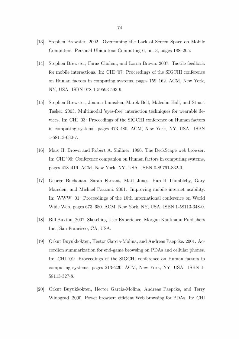
74
[13] Stephen Brewster. 2002. Overcoming the Lack of Screen Space on Mobile
Computers. Personal Ubiquitous Computing 6, no. 3, pages 188–205.
[14] Stephen Brewster, Faraz Chohan, and Lorna Brown. 2007. Tactile feedback
for mobile interactions. In: CHI ’07: Proceedings of the SIGCHI conference
on Human factors in computing systems, pages 159–162. ACM, New York,
NY, USA. ISBN 978-1-59593-593-9.
[15] Stephen Brewster, Joanna Lumsden, Marek Bell, Malcolm Hall, and Stuart
Tasker. 2003. Multimodal ’eyes-free’ interaction techniques for wearable de-
vices. In: CHI ’03: Proceedings of the SIGCHI conference on Human factors
in computing systems, pages 473–480. ACM, New York, NY, USA. ISBN
1-58113-630-7.
[16] Marc H. Brown and Robert A. Shillner. 1996. The DeckScape web browser.
In: CHI ’96: Conference companion on Human factors in computing systems,
pages 418–419. ACM, New York, NY, USA. ISBN 0-89791-832-0.
[17] George Buchanan, Sarah Farrant, Matt Jones, Harold Thimbleby, Gary
Marsden, and Michael Pazzani. 2001. Improving mobile internet usability.
In: WWW ’01: Proceedings of the 10th international conference on World
Wide Web, pages 673–680. ACM, New York, NY, USA. ISBN 1-58113-348-0.
[18] Bill Buxton. 2007. Sketching User Experience. Morgan Kaufmann Publishers
Inc., San Francisco, CA, USA.
[19] Orkut Buyukkokten, Hector Garcia-Molina, and Andreas Paepcke. 2001. Ac-
cordion summarization for end-game browsing on PDAs and cellular phones.
In: CHI ’01: Proceedings of the SIGCHI conference on Human factors in
computing systems, pages 213–220. ACM, New York, NY, USA. ISBN 1-
58113-327-8.
[20] Orkut Buyukkokten, Hector Garcia-Molina, Andreas Paepcke, and Terry
Winograd. 2000. Power browser: efficient Web browsing for PDAs. In: CHI
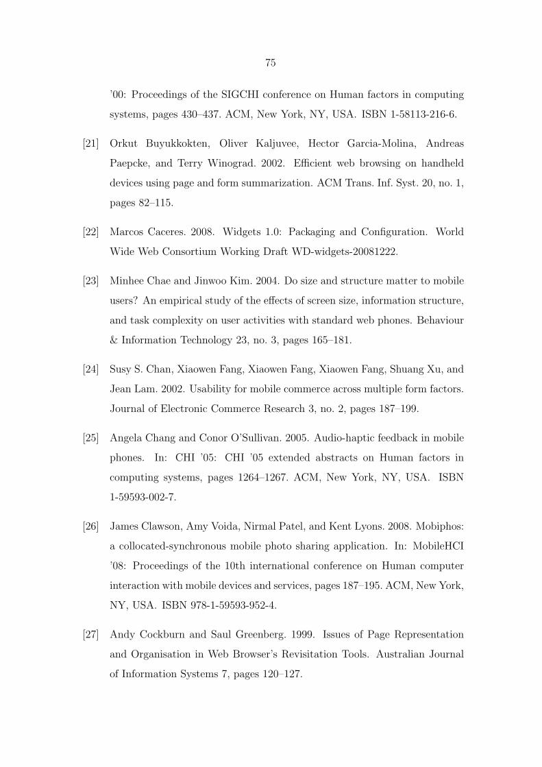
75
’00: Proceedings of the SIGCHI conference on Human factors in computing
systems, pages 430–437. ACM, New York, NY, USA. ISBN 1-58113-216-6.
[21] Orkut Buyukkokten, Oliver Kaljuvee, Hector Garcia-Molina, Andreas
Paepcke, and Terry Winograd. 2002. Efficient web browsing on handheld
devices using page and form summarization. ACM Trans. Inf. Syst. 20, no. 1,
pages 82–115.
[22] Marcos Caceres. 2008. Widgets 1.0: Packaging and Configuration. World
Wide Web Consortium Working Draft WD-widgets-20081222.
[23] Minhee Chae and Jinwoo Kim. 2004. Do size and structure matter to mobile
users? An empirical study of the effects of screen size, information structure,
and task complexity on user activities with standard web phones. Behaviour
& Information Technology 23, no. 3, pages 165–181.
[24] Susy S. Chan, Xiaowen Fang, Xiaowen Fang, Xiaowen Fang, Shuang Xu, and
Jean Lam. 2002. Usability for mobile commerce across multiple form factors.
Journal of Electronic Commerce Research 3, no. 2, pages 187–199.
[25] Angela Chang and Conor O’Sullivan. 2005. Audio-haptic feedback in mobile
phones. In: CHI ’05: CHI ’05 extended abstracts on Human factors in
computing systems, pages 1264–1267. ACM, New York, NY, USA. ISBN
1-59593-002-7.
[26] James Clawson, Amy Voida, Nirmal Patel, and Kent Lyons. 2008. Mobiphos:
a collocated-synchronous mobile photo sharing application. In: MobileHCI
’08: Proceedings of the 10th international conference on Human computer
interaction with mobile devices and services, pages 187–195. ACM, New York,
NY, USA. ISBN 978-1-59593-952-4.
[27] Andy Cockburn and Saul Greenberg. 1999. Issues of Page Representation
and Organisation in Web Browser’s Revisitation Tools. Australian Journal
of Information Systems 7, pages 120–127.
76
[28] Andy Cockburn, Bruce McKenzie, and Michael Jason Smith. 2002. Pushing
back: evaluating a new behaviour for the back and forward buttons in web
browsers. Int. J. Hum.-Comput. Stud. 57, no. 5, pages 397–414.
[29] Alan Cooper. 2004. The Inmates are Running the Asylum: Why High Tech
Products Drive Us Crazy and How to Restore the Sanity. Sams Publishing.
[30] Scott Counts and Eric Fellheimer. 2004. Supporting social presence through
lightweight photo sharing on and off the desktop. In: CHI ’04: Proceedings
of the SIGCHI conference on Human factors in computing systems, pages
599–606. ACM, New York, NY, USA. ISBN 1-58113-702-8.
[31] Andrew Crossan, John Williamson, Stephen Brewster, and Rod Murray-
Smith. 2008. Wrist rotation for interaction in mobile contexts. In: MobileHCI
’08: Proceedings of the 10th international conference on Human computer
interaction with mobile devices and services, pages 435–438. ACM, New York,
NY, USA. ISBN 978-1-59593-952-4.
[32] Mihalyi Csikszentmihaly. 1991. Flow: The Psychology of Optimal Experi-
ence. Harper Collins.
[33] Yanqing Cui and Virpi Roto. 2008. How people use the web on mobile
devices. In: WWW ’08: Proceeding of the 17th international conference
on World Wide Web, pages 905–914. ACM, New York, NY, USA. ISBN
978-1-60558-085-2.
[34] Oscar de Bruijn, Robert Spence, and Min Yih Chong. 2002. RSVP Browser:
Web Browsing on Small Screen Devices. Personal Ubiquitous Comput. 6,
no. 4, pages 245–252.
[35] Pieter Desmet, C. Overbeeke, and S. Tax. 2001. Designing Products with
Added Emotional Value; Development and Application of an Approach for
Research Through Design. The Design Journal 4, no. 1, pages 32–47.
77
[36] Anind K. Dey. 2001. Understanding and Using Context. Personal Ubiquitous
Comput. 5, no. 1, pages 4–7.
[37] Mark Dunlop and Stephen Brewster. 2002. The Challenge of Mobile Devices
for Human Computer Interaction. Personal Ubiquitous Computing 6, no. 4,
pages 235–236.
[38] Christian Elting, Jan Zwickel, and Rainer Malaka. 2002. Device-dependant
modality selection for user-interfaces: an empirical study. In: IUI ’02: Pro-
ceedings of the 7th international conference on Intelligent user interfaces,
pages 55–62. ACM, New York, NY, USA. ISBN 1-58113-459-2.
[39] International Organization for Standardization (ISO). 1999. Human-centered
design processes for interactive systems.
[40] Jodi Forlizzi and Katja Battarbee. 2004. Understanding experience in inter-
active systems. In: DIS ’04: Proceedings of the 5th conference on Designing
interactive systems, pages 261–268. ACM, New York, NY, USA. ISBN 1-
58113-787-7.
[41] Jodi Forlizzi and Shannon Ford. 2000. The building blocks of experience: an
early framework for interaction designers. In: DIS ’00: Proceedings of the
3rd conference on Designing interactive systems, pages 419–423. ACM, New
York, NY, USA. ISBN 1-58113-219-0.
[42] WAP Forum. 2001. XHTML Mobile Profile Specification.
http://www.openmobilealliance.org/tech/affiliates/wap/wap-277-xhtmlmp-
20011029-a.pdf.
[43] Michael Fulk. 2001. Improving web browsing on handheld devices. In: CHI
’01: CHI ’01 extended abstracts on Human factors in computing systems,
pages 395–396. ACM, New York, NY, USA. ISBN 1-58113-340-5.
78
[44] Jesse James Garrett. 2002. The Elements of User Experience: User-Centered
Design for the Web. New Riders Publishing, Thousand Oaks, CA, USA.
ISBN 0735712026.
[45] Stavros Garzonis, Simon Jones, Tim Jay, and Eamonn O’Neill. 2009. Audi-
tory icon and earcon mobile service notifications: intuitiveness, learnability,
memorability and preference. In: CHI ’09: Proceedings of the 27th interna-
tional conference on Human factors in computing systems, pages 1513–1522.
ACM, New York, NY, USA. ISBN 978-1-60558-246-7.
[46] Jun Gong and Peter Tarasewich. 2004. Guidelines for Handheld Mobile De-
vice Interface Design. In: Proceedings of DSI 2004 Annual Meeting.
[47] Jonathan Grudin and John Pruitt. 2002. Personas, Participatory Design and
Product Development: An Infrastructure for Engagement. In: Proc. PDC
2002, pages 144–161.
[48] Suhit Gupta, Gail Kaiser, David Neistadt, and Peter Grimm. 2003. DOM-
based content extraction of HTML documents. In: WWW ’03: Proceedings
of the 12th international conference on World Wide Web, pages 207–214.
ACM, New York, NY, USA. ISBN 1-58113-680-3.
[49] Marc Hassenzahl. 2005. The thing and I: understanding the relationship
between user and product. Kluwer Academic Publishers, Norwell, MA, USA,
31–42 pages.
[50] Marc Hassenzahl and Noam Tractinsky. 2006. User Experience - a Research
Agenda. Behaviour & Information Technology 25, no. 2, pages 91–97.
[51] Kirstie Hawkey and Kori Inkpen. 2005. Web browsing today: the impact of
changing contexts on user activity. In: CHI ’05: CHI ’05 extended abstracts
on Human factors in computing systems, pages 1443–1446. ACM, New York,
NY, USA. ISBN 1-59593-002-7.
79
[52] Ian Hickson. 2009. HTML 5. WhatWG Draft Recommendation 31 March
2009.
[53] Ron R. Hightower, Laura T. Ring, Jonathan I. Helfman, Benjamin B. Bed-
erson, and James D. Hollan. 1998. Graphical multiscale Web histories: a
study of padprints. In: HYPERTEXT ’98: Proceedings of the ninth ACM
conference on Hypertext and hypermedia : links, objects, time and space—
structure in hypermedia systems, pages 58–65. ACM, New York, NY, USA.
ISBN 0-89791-972-6.
[54] Mika Hiltunen, Markku Laukka, and Jari Luomala. 2002. Mobile User Ex-
perience. Cromland.
[55] Ken Hinckley, Jeff Pierce, Mike Sinclair, and Eric Horvitz. 2000. Sensing
techniques for mobile interaction. In: UIST ’00: Proceedings of the 13th
annual ACM symposium on User interface software and technology, pages
91–100. ACM, New York, NY, USA. ISBN 1-58113-212-3.
[56] Eve Hoggan, Stephen A. Brewster, and Jody Johnston. 2008. Investigating
the effectiveness of tactile feedback for mobile touchscreens. In: CHI ’08:
Proceeding of the twenty-sixth annual SIGCHI conference on Human factors
in computing systems, pages 1573–1582. ACM, New York, NY, USA. ISBN
978-1-60558-011-1.
[57] Ka Kit Hoi, Dik Lun Lee, and Jianliang Xu. 2003. Document Visualization
on Small Displays. In: MDM ’03: Proceedings of the 4th International
Conference on Mobile Data Management, pages 262–278. Springer-Verlag,
London, UK. ISBN 3-540-00393-2.
[58] Karen Holtzblatt. 2002. Personas and Contextual Design.
[59] Karen Holtzblatt, Jessamyn Burns Wendell, and Shelley Wood. 2005. Rapid
contextual design: a how-to guide to key techniques for user-centered design.
Morgan Kaufmann Publishers Inc., San Francisco, CA, USA.
80
[60] Nancy A. Van House. 2007. Flickr and public image-sharing: distant closeness
and photo exhibition. In: CHI ’07: CHI ’07 extended abstracts on Human
factors in computing systems, pages 2717–2722. ACM, New York, NY, USA.
ISBN 978-1-59593-642-4.
[61] Nancy Van House, Marc Davis, Morgan Ames, Megan Finn, and Vijay
Viswanathan. 2005. The uses of personal networked digital imaging: an
empirical study of cameraphone photos and sharing. In: CHI ’05: CHI ’05
extended abstracts on Human factors in computing systems, pages 1853–
1856. ACM, New York, NY, USA. ISBN 1-59593-002-7.
[62] Zahid Hussain, Martin Lechner, Harald Milchrahm, Sara Shahzad, Wolf-
gang Slany, Martin Umgeher, Thomas Vlk, and Peter Wolkerstorfer. 2008.
User Interface Design for a Mobile Multimedia Application: An Iterative Ap-
proach. In: ACHI ’08: Proceedings of the First International Conference on
Advances in Computer-Human Interaction, pages 189–194. IEEE Computer
Society, Washington, DC, USA. ISBN 978-0-7695-3086-4.
[63] Minna Isomursu, Kari Kuutti, and Soili Vaanamo. 2004. Experience clip:
method for user participation and evaluation of mobile concepts. In: PDC
04: Proceedings of the eighth conference on Participatory design, pages 83–
92. ACM, New York, NY, USA. ISBN 1-58113-851-2.
[64] Giulio Jacucci, Antti Oulasvirta, and Antti Salovaara. 2007. Active construc-
tion of experience through mobile media: a field study with implications for
recording and sharing. Personal Ubiquitous Comput. 11, no. 4, pages 215–
234.
[65] Matt Jones and Gary Marsden. 2006. Mobile Interaction Design. John Wiley
& Sons. ISBN 0470090898.
[66] Matt Jones, Gary Marsden, Norliza Mohd-Nasir, Kevin Boone, and George
Buchanan. 1999. Improving Web interaction on small displays. In: WWW
81
’99: Proceedings of the eighth international conference on World Wide Web,
pages 1129–1137. Elsevier North-Holland, Inc., New York, NY, USA.
[67] Patrick W. Jordan. 2000. Designing Pleasurable Products: An Introduction
to the New Human Factors. CRC Press.
[68] Pertti Jarvinen. 2004. On Research Methods. Tampereen Yliopistopaino Oy.
[69] Eija Kaasinen. 2005. User acceptance of mobile services - value, ease of use,
trust and ease of adoption. Ph.D. thesis, Tampere University of Technology.
[70] Eija Kaasinen, Virpi Roto, Kristin Roloff, Kaisa Vaananen-Vainio-Mattila,
Teija Vainio, Wolfgang Maehr, Dhaval Joshi, and Sujan Shrestha. 2009. User
Experience of Mobile Internet: Analysis and Recommendations. Interna-
tional Journal of Mobile Human Computer Interaction 1, no. 4, pages 3–20.
[71] Anne Kaikkonen. 2008. Full or tailored mobile web- where and how do people
browse on their mobiles? In: Mobility ’08: Proceedings of the International
Conference on Mobile Technology, Applications, and Systems, pages 1–8.
ACM, New York, NY, USA. ISBN 978-1-60558-089-0.
[72] Anne Kaikkonen. 2009. Mobile Internet: Past, Present, and the Future.
International Journal of Mobile Human Computer Interaction 1, no. 3, pages
29–45.
[73] Anne Kaikkonen, Aki Kekalainen, Mihael Cankar, Titti Kallio, and Anu
Kankainen. 2005. Usability Testing of Mobile Applications: A Comparison
between Laboratory and Field Testing. Journal of Usability Studies 1, no. 1,
pages 4–16.
[74] Tomonari Kamba, Shawn A. Elson, Terry Harpold, Tim Stamper, and
Piyawadee Sukaviriya. 1996. Using small screen space more efficiently. In:
CHI ’96: Proceedings of the SIGCHI conference on Human factors in com-
puting systems, pages 383–390. ACM, New York, NY, USA. ISBN 0-89791-
777-4.

82
[75] Eser Kandogan and Ben Shneiderman. 1997. Elastic Windows: a hierarchical
multi-window World-Wide Web browser. In: UIST ’97: Proceedings of the
10th annual ACM symposium on User interface software and technology,
pages 169–177. ACM, New York, NY, USA. ISBN 0-89791-881-9.
[76] Anu Kankainen. 2002. Thinking model and tools for understanding user
experience related to information appliance product concepts. Ph.D. thesis,
Helsinki University of Technology.
[77] Petter Karlsson and Francis Djabri. 2001. Analogue styled user interfaces:
An exemplified set of principles intended to improve aesthetic qualities in
use. In: M. D. Dunlop and S. A. Brewster (editors), Proceedings of Mobile
HCI 2001: Third International Workshop on Human-Computer Interaction
with Mobile Devices.
[78] Pekka Ketola, Heli Hjelmeroos, and Kari-Jouko Raiha. 2006. Coping with
consistency under multiple design constraints: The case of the Nokia 9000
WWW browser. Personal and Ubiquitous Computing 4, no. 2-3, pages 86–95.
[79] Pekka Ketola and Mika Roykkee. 2001. Three facets of usability in mobile
handsets. In: In Proceeding of CHI 2001, Workshop, Mobile Communica-
tions: Understanding Users, Adoption & Design Sunday and Monday. ACM,
New York, NY, USA.
[80] H. Kim, J. Kim, Y. Lee, M. Chae, and Y. Choi. 2002. An Empirical Study
of the Use Contexts and Usability Problems in Mobile Internet. In: HICSS
’02: Proceedings of the 35th Annual Hawaii International Conference on
System Sciences (HICSS’02)-Volume 5, page 132. IEEE Computer Society,
Washington, DC, USA. ISBN 0-7695-1435-9.
[81] Tim Kindberg, Mirjana Spasojevic, Rowanne Fleck, and Abigail Sellen. 2005.
I saw this and thought of you: some social uses of camera phones. In: CHI
’05: CHI ’05 extended abstracts on Human factors in computing systems,
pages 1545–1548. ACM, New York, NY, USA. ISBN 1-59593-002-7.
83
[82] David Kirk, Abigail Sellen, Carsten Rother, and Ken Wood. 2006. Under-
standing photowork. In: CHI ’06: Proceedings of the SIGCHI conference on
Human Factors in computing systems, pages 761–770. ACM, New York, NY,
USA. ISBN 1-59593-372-7.
[83] Jesper Kjeldskov, Mikael B. Skov, Benedikte S. Als, and Rune T. Høegh.
2004. Is It Worth the Hassle? Exploring the Added Value of Evaluating the
Usability of Context-Aware Mobile Systems in the Field. Lecture Notes in
Computer Science 3160, pages 61–73.
[84] Timo Koivumaki, Annu Ristola, and Manne Kesti. 2008. The perceptions
towards mobile services: an empirical analysis of the role of use facilitators.
Personal Ubiquitous Computing 12, no. 1, pages 67–75.
[85] Sven Kratz and Raphael Ballagas. 2009. Unravelling seams: improving mo-
bile gesture recognition with visual feedback techniques. In: CHI ’09: Pro-
ceedings of the 27th international conference on Human factors in computing
systems, pages 937–940. ACM, New York, NY, USA. ISBN 978-1-60558-246-
7.
[86] Lari Karkkainen and Jari Laarni. 2002. Designing for small display screens.
In: NordiCHI ’02: Proceedings of the second Nordic conference on Human-
computer interaction, pages 227–230. ACM, New York, NY, USA. ISBN
1-58113-616-1.
[87] Steve Krug. 2000. Don’t Make Me Think!: A Common Sense Approach
to Web Usability. Que Corp., Indianapolis, IN, USA. ISBN 0789723107.
Foreword By-Roger Black.
[88] Heidi Lam and Patrick Baudisch. 2005. Summary thumbnails: readable
overviews for small screen web browsers. In: CHI ’05: Proceedings of the
SIGCHI conference on Human factors in computing systems, pages 681–690.
ACM, New York, NY, USA. ISBN 1-58113-998-5.

84
[89] Heidi Lam and Patrick Baudisch. 2005. Summary thumbnails: readable
overviews for small screen web browsers. In: CHI ’05: Proceedings of the
SIGCHI conference on Human factors in computing systems, pages 681–690.
ACM, New York, NY, USA. ISBN 1-58113-998-5.
[90] Young Eun Lee and Izak Benbasat. 2003. Interface design for mobile com-
merce. Commun. ACM 46, no. 12, pages 48–52.
[91] Kevin A. Li, Patrick Baudisch, and Ken Hinckley. 2008. Blindsight: eyes-
free access to mobile phones. In: CHI ’08: Proceeding of the twenty-sixth
annual SIGCHI conference on Human factors in computing systems, pages
1389–1398. ACM, New York, NY, USA. ISBN 978-1-60558-011-1.
[92] Henry Lieberman. 1997. A multi-scale, multi-layer, translucent virtual space.
In: IV ’97: Proceedings of the IEEE Conference on Information Visualisation,
page 126. IEEE Computer Society, Washington, DC, USA. ISBN 0-8186-
8076-8.
[93] Joseph Luk, Jerome Pasquero, Shannon Little, Karon MacLean, Vincent
Levesque, and Vincent Hayward. 2006. A role for haptics in mobile inter-
action: initial design using a handheld tactile display prototype. In: CHI
’06: Proceedings of the SIGCHI conference on Human Factors in computing
systems, pages 171–180. ACM, New York, NY, USA. ISBN 1-59593-372-7.
[94] Salvatore T. March and Gerald F. Smith. 1995. Design and natural science
research on information technology. Decision Support Systems 15, no. 4,
pages 251–266.
[95] Bruce McKenzie and Andy Cockburn. 2001. An Empirical Analysis of Web
Page Revisitation. In: HICSS ’01: Proceedings of the 34th Annual Hawaii
International Conference on System Sciences ( HICSS-34)-Volume 5, page
5019. IEEE Computer Society, Washington, DC, USA. ISBN 0-7695-0981-9.

85
[96] Kristijan Mihalic. 2008. Widgetization of Mobile Internet Experience.
In: The 2nd International Workshop on Mobile Internet User Experience,
MIUX’08, in conjunction with MobileHCI’08 conference.
[97] Natasa Milic-Frayling, Martin Hicks, Rachel Jones, and Jamie Costello. 2007.
On the design and evaluation of web augmented mobile applications. In:
MobileHCI ’07: Proceedings of the 9th international conference on Human
computer interaction with mobile devices and services, pages 226–233. ACM,
New York, NY, USA. ISBN 978-1-59593-862-6.
[98] Natasa Milic-Frayling, Rachel Jones, Kerry Rodden, Gavin Smyth, Alan
Blackwell, and Ralph Sommerer. 2004. Smartback: supporting users in back
navigation. In: WWW ’04: Proceedings of the 13th international confer-
ence on World Wide Web, pages 63–71. ACM, New York, NY, USA. ISBN
1-58113-844-X.
[99] Natasa Milic-Frayling and Ralph Sommerer. 2002. SmartView: Flexible
Viewing of Web Page Contents. In: Poster Proceedings of the Eleventh
International World Wide Web Conference. Honolulu, Hawaii.
[100] Sachi Mizobuchi, Mark Chignell, and David Newton. 2005. Mobile text en-
try: relationship between walking speed and text input task difficulty. In:
MobileHCI ’05: Proceedings of the 7th international conference on Human
computer interaction with mobile devices & services, pages 122–128. ACM,
New York, NY, USA. ISBN 1-59593-089-2.
[101] Geoffrey Moore. 2002. Crossing the Chasm. HarperBusiness, New York.
[102] Mor Naaman, Rahul Nair, and Vlad Kaplun. 2008. Photos on the go: a
mobile application case study. In: CHI ’08: Proceeding of the twenty-sixth
annual SIGCHI conference on Human factors in computing systems, pages
1739–1748. ACM, New York, NY, USA. ISBN 978-1-60558-011-1.
86
[103] Christian Monrad Nielsen, Michael Overgaard, Michael Bach Pedersen, Jan
Stage, and Sigge Stenild. 2006. It’s worth the hassle!: the added value of
evaluating the usability of mobile systems in the field. In: NordiCHI ’06:
Proceedings of the 4th Nordic conference on Human-computer interaction,
pages 272–280. ACM, New York, NY, USA. ISBN 1-59593-325-5.
[104] Jakob Nielsen. 1994. Usability Engineering. Morgan Kaufmann Publishers
Inc., San Francisco, CA, USA.
[105] Don Norman. 2004. Emotional Design: Why We Love (or Hate) Everyday
Things. Basic Books.
[106] Donald A. Norman. 2002. The Design of Everyday Things. Basic Books.
[107] Stina Nylander, Teres Lundquist, and Andreas Brannstrom. 2009. At home
and with computer access: why and where people use cell phones to access
the internet. In: CHI ’09: Proceedings of the 27th international conference
on Human factors in computing systems, pages 1639–1642. ACM, New York,
NY, USA. ISBN 978-1-60558-246-7.
[108] Thomas Olsson, Hannu Soronen, and Kaisa Vaananen-Vainio-Mattila. 2008.
User needs and design guidelines for mobile services for sharing digital life
memories. In: Proceedings of the 10th international conference on Human
computer interaction with mobile devices and services, pages 273–282. ACM,
New York, NY, USA. ISBN 978-1-59593-952-4.
[109] Antti Oulasvirta, Sakari Tamminen, Virpi Roto, and Jaana Kuorelahti. 2005.
Interaction in 4-second bursts: the fragmented nature of attentional resources
in mobile HCI. In: CHI ’05: Proceedings of the SIGCHI conference on Human
factors in computing systems, pages 919–928. ACM, New York, NY, USA.
ISBN 1-58113-998-5.
[110] Antti Pirhonen, Stephen Brewster, and Christopher Holguin. 2002. Gestural
and audio metaphors as a means of control for mobile devices. In: CHI

87
’02: Proceedings of the SIGCHI conference on Human factors in computing
systems, pages 291–298. ACM, New York, NY, USA. ISBN 1-58113-453-3.
[111] Ivan Poupyrev, Shigeaki Maruyama, and Jun Rekimoto. 2002. Ambient
touch: designing tactile interfaces for handheld devices. In: UIST ’02: Pro-
ceedings of the 15th annual ACM symposium on User interface software and
technology, pages 51–60. ACM, New York, NY, USA. ISBN 1-58113-488-6.
[112] Jennifer Preece, Yvonne Rogers, and Helen Sharp. 2002. Interaction Design.
Wiley. ISBN 0471492787.
[113] Jo Rabin and Phil Archer. 2009. W3C mobileOK Scheme 1.0. W3C Working
Group Note 25 June 2009.
[114] Jo Rabin and Charles McCathieNevile. 2008. Mobile Web Best Practices 1.0.
W3C Recommendation 29 July 2008.
[115] Heli Rantavuo. 2009. Connecting photos: A Qualitative Study Of Camera-
phone Photo Use. Ph.D. thesis, University of Art and Design Helsinki.
[116] Jun Rekimoto. 1996. Tilting operations for small screen interfaces. In: UIST
’96: Proceedings of the 9th annual ACM symposium on User interface soft-
ware and technology, pages 167–168. ACM, New York, NY, USA. ISBN
0-89791-798-7.
[117] Virpi Roto. 2006. Web Browsing on Mobile Phones - Characteristics of User
Experience. Ph.D. thesis, Helsinki University of Technology.
[118] Virpi Roto, Roland Geisler, Anne Kaikkonen, Andrei Popescu, and Elina
Vartiainen. 2006. Data Traffic Costs and Mobile Browsing User Experience.
In: MobEA IV workshop on Empowering the Mobile Web, in conjunction
with WWW2006 conference.
[119] Virpi Roto and Eija Kaasinen. 2009. Mobile Internet User Experience: Intro-
duction to the Special Issue. International Journal of Mobile Human Com-
puter Interaction 1, no. 4, pages i–v.
88
[120] Virpi Roto and Anne Kaikkonen. 2003. Perception of Narrow Web Pages on
a Mobile Phone. In: Human Factors in Telecommunications.
[121] Virpi Roto and Mika Rautava. 2008. User Experience Elements and Brand
Promise. In: International Engagability and Design Conference (Idec4), in
conjunction with NordiCHIS08 conference.
[122] Caspar Ryan and Atish Gonsalves. 2005. The effect of context and application
type on mobile usability: an empirical study. In: ACSC ’05: Proceedings of
the Twenty-eighth Australasian conference on Computer Science, pages 115–
124. Australian Computer Society, Inc., Darlinghurst, Australia, Australia.
ISBN 1-920-68220-1.
[123] Asa Blomquist and Mattias Arvola. 2002. Personas in action: ethnography
in an interaction design team. In: NordiCHI ’02: Proceedings of the second
Nordic conference on Human-computer interaction, pages 197–200. ACM,
New York, NY, USA. ISBN 1-58113-616-1.
[124] Risto Sarvas, Antti Oulasvirta, and Giulio Jacucci. 2005. Building social
discourse around mobile photos: a systemic perspective. In: MobileHCI
’05: Proceedings of the 7th international conference on Human computer
interaction with mobile devices & services, pages 31–38. ACM, New York,
NY, USA. ISBN 1-59593-089-2.
[125] Albrecht Schmidt. 2000. Implicit human computer interaction through con-
text. Personal Technologies 4, no. 2-3, pages 191–199.
[126] Ben Shneiderman. 2007. Creativity support tools: accelerating discovery and
innovation. Commun. ACM 50, no. 12, pages 20–32.
[127] Ben Shneiderman, Benjamin B. Bederson, and Steven M. Drucker. 2006. Find
that photo!: interface strategies to annotate, browse, and share. Commun.
ACM 49, no. 4, pages 69–71.
89
[128] Miika Silfverberg, I. Scott MacKenzie, and Panu Korhonen. 2000. Predicting
text entry speed on mobile phones. In: CHI ’00: Proceedings of the SIGCHI
conference on Human factors in computing systems, pages 9–16. ACM, New
York, NY, USA. ISBN 1-58113-216-6.
[129] S. R. Subramanya and Byung K. Yi. 2006. User Interfaces for Mobile Content.
Computer 39, no. 4, pages 85–87.
[130] Peter Tarasewich. 2003. Wireless devices for mobile commerce: user interface
design and usability. Mobile commerce: technology, theory, and applications
pages 26–50.
[131] Linda Tauscher and Saul Greenberg. 1997. Revisitation patterns in World
Wide Web navigation. In: CHI ’97: Proceedings of the SIGCHI conference
on Human factors in computing systems, pages 399–406. ACM, New York,
NY, USA. ISBN 0-89791-802-9.
[132] Brandon T. Taylor and V. Michael Bove, Jr. 2009. Graspables: grasp-
recognition as a user interface. In: CHI ’09: Proceedings of the 27th inter-
national conference on Human factors in computing systems, pages 917–926.
ACM, New York, NY, USA. ISBN 978-1-60558-246-7.
[133] Jonathan Trevor, David M. Hilbert, Bill N. Schilit, and Tzu Khiau Koh.
2001. From desktop to phonetop: a UI for web interaction on very small
devices. In: UIST ’01: Proceedings of the 14th annual ACM symposium
on User interface software and technology, pages 121–130. ACM, New York,
NY, USA. ISBN 1-58113-438-X.
[134] Kaisa Vaananen-Vainio-Mattila and Satu Ruuska. 1998. User Needs for Mo-
bile Communication Devices: Requirements Gathering and Analysis Through
Contextual Inquiry. In: Proceedings of the First Workshop on Human Com-
puter Interaction for Mobile Devices, pages 113–120.
90
[135] Scott Weiss. 2002. Handheld Usability. John Wiley & Sons, Inc., New York,
NY, USA. ISBN 0470844469.
[136] Daniel Wigdor and Ravin Balakrishnan. 2004. A comparison of consecutive
and concurrent input text entry techniques for mobile phones. In: CHI
’04: Proceedings of the SIGCHI conference on Human factors in computing
systems, pages 81–88. ACM, New York, NY, USA. ISBN 1-58113-702-8.
[137] Jacob O. Wobbrock, Jodi Forlizzi, Scott E. Hudson, and Brad A. Myers. 2002.
WebThumb: interaction techniques for small-screen browsers. In: UIST ’02:
Proceedings of the 15th annual ACM symposium on User interface software
and technology, pages 205–208. ACM, New York, NY, USA. ISBN 1-58113-
488-6.
[138] Christopher C. Yang and Fu Lee Wang. 2003. Fractal summarization for
mobile devices to access large documents on the web. In: WWW ’03: Pro-
ceedings of the 12th international conference on World Wide Web, pages
215–224. ACM, New York, NY, USA. ISBN 1-58113-680-3.
[139] Dave Zuverink. 2008. Beyond Browsers: Taking Mobile Applications Online.
In: The 2nd International Workshop on Mobile Internet User Experience,
MIUX’08, in conjunction with MobileHCI’08 conference.

ISBN 978-952-248-141-2ISBN 978-952-248-142-9 (PDF)ISSN 1795-2239ISSN 1795-4584 (PDF)