CSA Branding Guidelines · 5 CSA Branding Guidelines Last modified: 5 January 2011 10:52 AM About...
21
CSA Branding Guidelines
-
Upload
truongtruc -
Category
Documents
-
view
216 -
download
0
Transcript of CSA Branding Guidelines · 5 CSA Branding Guidelines Last modified: 5 January 2011 10:52 AM About...

CSA Branding Guidelines

2 CSA Branding Guidelines Last modified: 5 January 2011 10:52 AM
Contents Introduction 3
AboutBranding 4
What Is Branding? 5
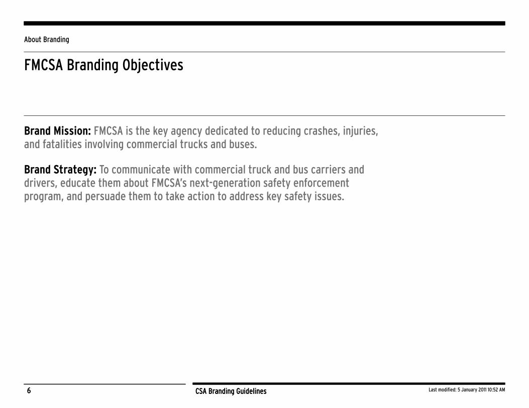
FMCSA Branding Objectives 6
BrandingIdentity 7
Logo Signature 8
Wordmark 9
Tagline 10
Clear Space 11
Color System 12
Background Control 13
Logo Misuse 14
Primary Typefaces 15
ExamplesofBrandingUse 18
FMCSA Users 19
Non-FMCSA Users 20
Resources 21

3 CSA Branding Guidelines Last modified: 5 January 2011 10:52 AM3 CSA Branding Guidelines
Introduction
The purpose of these guidelines is to help unify the CSA brand and to provide direction for moving it forward. For branding to be effective, audiences must share a clear idea of what CSA stands for, requiring that outreach and communications are presented in a distinct and consistent manner.
The brand emanates from a shared understanding of the challenges facing the agency and the application of that brand to a suite of useful tools, materials, and information. Particularly in a large, Federal agency, development of brand standards and the publication of guidelines is essential to preserve and enhance the dissemination of core messages.
The CSA logo is the graphic representation of the Federal Motor Carrier Safety Administration’s (FMCSA) new safety enforcement and compliance program, which is called Compliance, Safety, Accountability
(CSA). This document defines the core elements of the CSA brand and provides guidance for how to use these elements appropriately.
CSA is FMCSA’s new enforcement and compliance program initiative to improve large truck and bus safety and ultimately reduce commercial motor vehicle-related crashes, injuries, and fatalities. The CSA logo visually represents how FMCSA is moving forward. The four slanted, overlapping rings and three horizontal lines depict movement and progress. The identifiable letters “CSA” are to the right of the four rings and are also slanted and overlapping. Below this graphic is a three-word tagline that defines C-S-A; separated by two stars, it reads “Compliance, Safety, Accountability.” These three words epitomize the agency’s mission.

CSA Branding Guidelines
About Branding

5 CSA Branding Guidelines Last modified: 5 January 2011 10:52 AM5 CSA Branding Guidelines
About Branding
What Is Branding?
A brand is the intangible set of values and ideas that accompanies the new program.
Strong brands are simple, distinctive and elicit a common, universal response.
Branding is important because it simplifies decision-making.
It is the result of repeated perceptions and, if these are consistently positive, it is easier to support a brand.
6 CSA Branding Guidelines Last modified: 5 January 2011 10:52 AM6 CSA Branding Guidelines
About Branding
FMCSA Branding Objectives
Brand Mission: FMCSA is the key agency dedicated to reducing crashes, injuries, and fatalities involving commercial trucks and buses.
Brand Strategy: To communicate with commercial truck and bus carriers and drivers, educate them about FMCSA’s next-generation safety enforcement program, and persuade them to take action to address key safety issues.

CSA Branding Guidelines
Branding Identity

8 CSA Branding Guidelines Last modified: 5 January 2011 10:52 AM8 CSA Branding Guidelines
Branding Identity Components
Logo Signature The CSA signature is the key visual element in the CSA brand, representing the message
and values inherent within the brand ideology. The signature works at its strongest when
the wordmark and tagline function as a whole.
The blue logo with gold “S” is preferable with CSA branding
materials that use the blue, gold, and white palette.
The blue logo with red “S” works best when branding materials
are FMCSA-dominant, using the red, white, and blue palette.
For use on a whitebackground Logos for use on coloredbackgrounds
9 CSA Branding Guidelines Last modified: 5 January 2011 10:52 AM9 CSA Branding Guidelines
Branding Identity Components
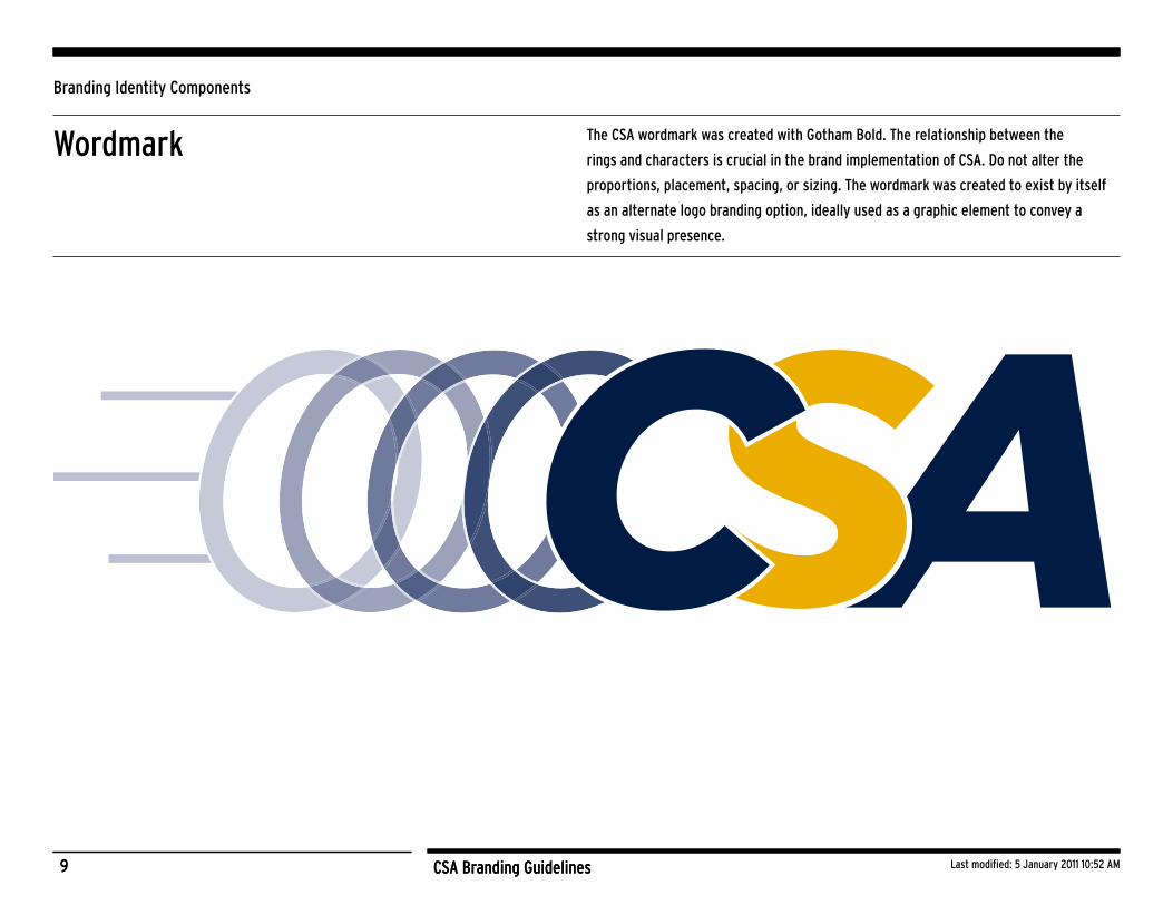
Wordmark The CSA wordmark was created with Gotham Bold. The relationship between the
rings and characters is crucial in the brand implementation of CSA. Do not alter the
proportions, placement, spacing, or sizing. The wordmark was created to exist by itself
as an alternate logo branding option, ideally used as a graphic element to convey a
strong visual presence.
10 CSA Branding Guidelines Last modified: 5 January 2011 10:52 AM10 CSA Branding Guidelines
Branding Identity Components
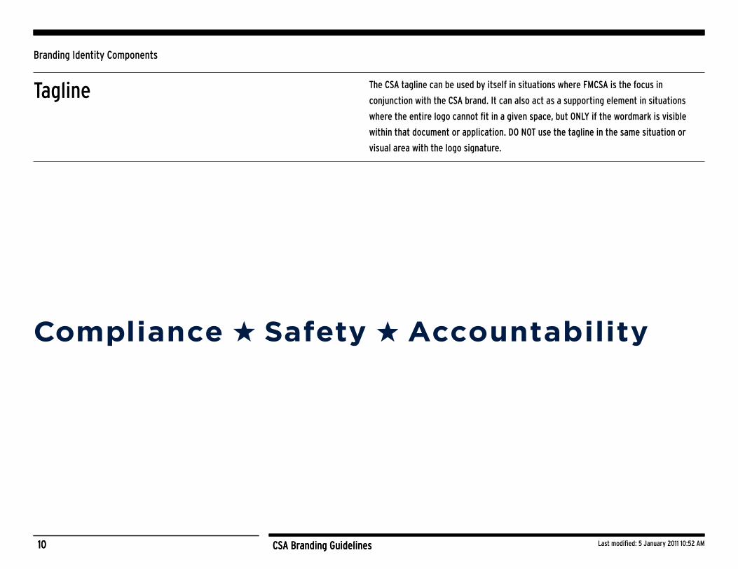
Tagline The CSA tagline can be used by itself in situations where FMCSA is the focus in
conjunction with the CSA brand. It can also act as a supporting element in situations
where the entire logo cannot fit in a given space, but ONLY if the wordmark is visible
within that document or application. DO NOT use the tagline in the same situation or
visual area with the logo signature.

11 CSA Branding Guidelines Last modified: 5 January 2011 10:52 AM11 CSA Branding Guidelines
Branding Identity Components
X 1/2
X 1/2
X
X
X
Clear Space Clear space rules have been established to make sure that other graphic elements do not
interfere with the brand elements visually. The minimum required clear space is defined
below by the established “X” measurement, based on the height of the letters “CSA” in
the wordmark portion of the logo. As the logo is reduced, the clear space maintains a
proportional relationship to the size of the logo.
X “x” height equal to the height of the letters “CSA”
1/2
12 CSA Branding Guidelines Last modified: 5 January 2011 10:52 AM12 CSA Branding Guidelines
Branding Identity Components
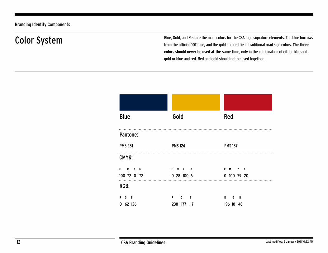
Color System Blue, Gold, and Red are the main colors for the CSA logo signature elements. The blue borrows
from the official DOT blue, and the gold and red tie in traditional road sign colors. The three
colors should never be used at the same time, only in the combination of either blue and
gold or blue and red. Red and gold should not be used together.
Pantone:
PMS 281 PMS 124 PMS 187
Blue Gold Red
CMYK:
C M Y K
100 72 0 72
C M Y K
0 28 100 6
C M Y K
0 100 79 20
RGB:
R G B
0 62 126
R G B
238 177 17
R G B
196 18 48
13 CSA Branding Guidelines Last modified: 5 January 2011 10:52 AM13 CSA Branding Guidelines
Branding Identity Components
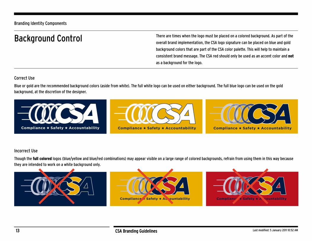
Background Control There are times when the logo must be placed on a colored background. As part of the
overall brand implementation, the CSA logo signature can be placed on blue and gold
background colors that are part of the CSA color palette. This will help to maintain a
consistent brand message. The CSA red should only be used as an accent color and not
as a background for the logo.
Incorrect Use
Though the fullcolored logos (blue/yellow and blue/red combinations) may appear visible on a large range of colored backgrounds, refrain from using them in this way because they are intended to work on a white background only.
Correct Use
Blue or gold are the recommended background colors (aside from white). The full white logo can be used on either background. The full blue logo can be used on the gold background, at the discretion of the designer.
14 CSA Branding Guidelines Last modified: 5 January 2011 10:52 AM14 CSA Branding Guidelines
Branding Identity Components
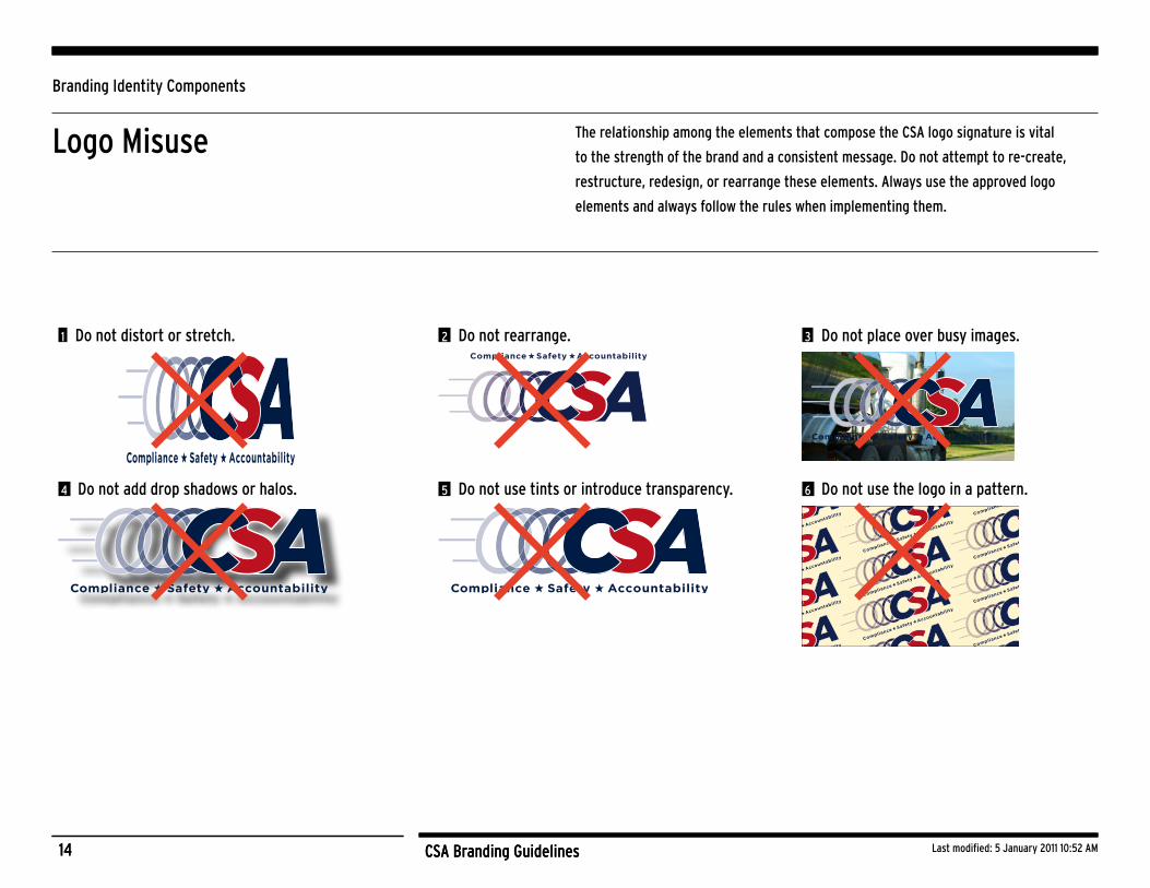
Logo Misuse The relationship among the elements that compose the CSA logo signature is vital
to the strength of the brand and a consistent message. Do not attempt to re-create,
restructure, redesign, or rearrange these elements. Always use the approved logo
elements and always follow the rules when implementing them.
1 Do not distort or stretch. 2 Do not rearrange. 3 Do not place over busy images.
4 Do not add drop shadows or halos. 5 Do not use tints or introduce transparency. 6 Do not use the logo in a pattern.

15 CSA Branding Guidelines Last modified: 5 January 2011 10:52 AM15 CSA Branding Guidelines
Branding Identity Components
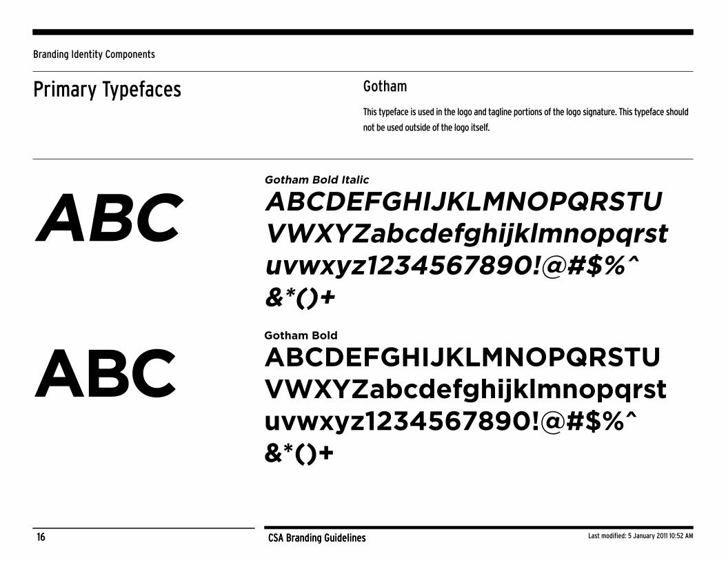
Primary Typefaces
Gotham Bold Italic
Gotham Bold
These typefaces are recommended to be used for CSA-branded materials: Gotham (used
in the logo), and Interstate (used for text). For web content, common system fonts such
as Arial, Helvetica or a standard San Serif are acceptable substitutions to ensure cross-
browser compatibility.
16 CSA Branding Guidelines Last modified: 5 January 2011 10:52 AM16 CSA Branding Guidelines
Branding Identity Components
Primary Typefaces Gotham
This typeface is used in the logo and tagline portions of the logo signature. This typeface should
not be used outside of the logo itself.
ABCDEFGHIJKLMNOPQRSTU VWXYZabcdefghijklmnopqrst uvwxyz1234567890!@#$%^ &*()+
ABCDEFGHIJKLMNOPQRSTU VWXYZabcdefghijklmnopqrst uvwxyz1234567890!@#$%^ &*()+
ABC
ABC
Gotham Bold Italic
Gotham Bold

17 CSA Branding Guidelines Last modified: 5 January 2011 10:52 AM17 CSA Branding Guidelines
Branding Identity Components
Primary Typefaces Interstate
This typeface is not used in the CSA logo signature. However, this typeface should
be used as the main text for CSA-related materials outside of the logo, such as ads,
collateral, and Web headlines, as it is a complementary typeface to Gotham.
ABCDEFGHIJKLMNOPQRSTU VWXYZabcdefghijklmnopqrst uvwxyz1234567890!@#$%^ &*()+
ABC

CSA Branding Guidelines
Examples of Branding Use
19 CSA Branding Guidelines Last modified: 5 January 2011 10:52 AM19 CSA Branding Guidelines
Examples of Branding Use
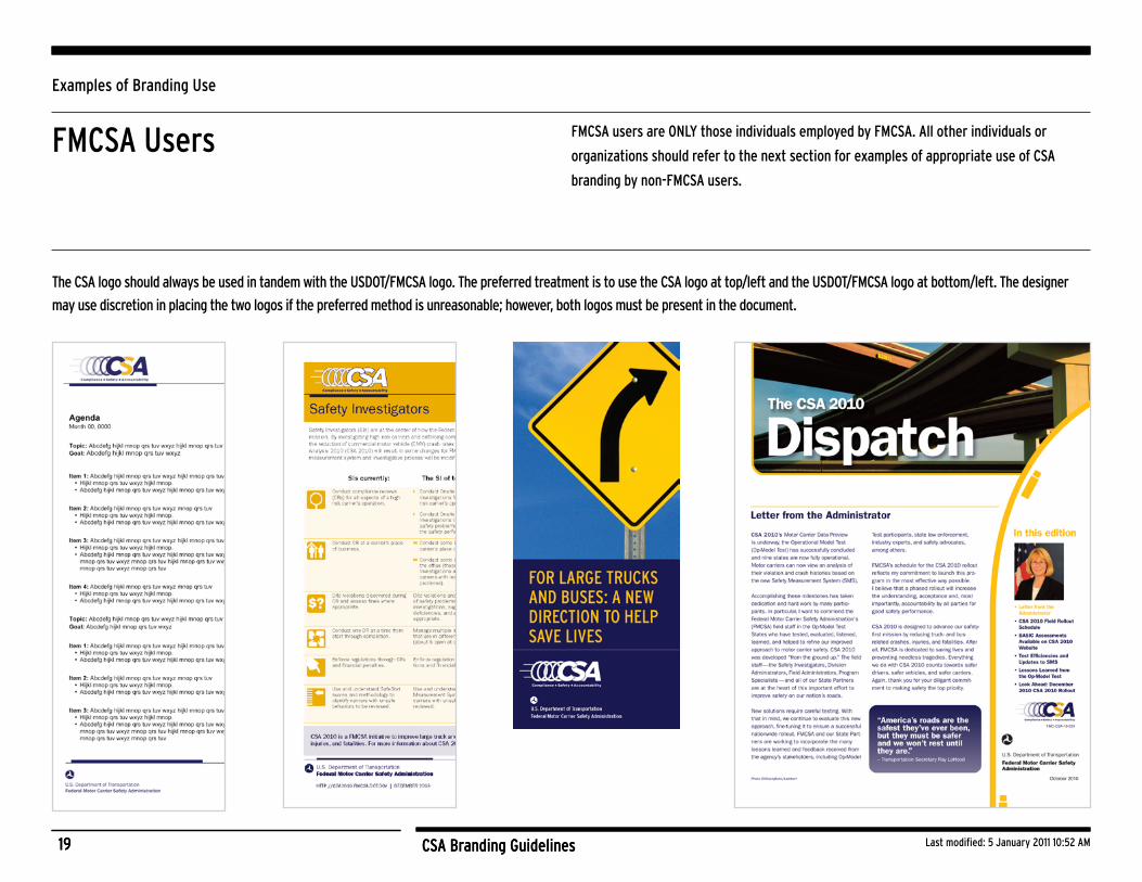
FMCSA Users FMCSA users are ONLY those individuals employed by FMCSA. All other individuals or
organizations should refer to the next section for examples of appropriate use of CSA
branding by non-FMCSA users.
The CSA logo should always be used in tandem with the USDOT/FMCSA logo. The preferred treatment is to use the CSA logo at top/left and the USDOT/FMCSA logo at bottom/left. The designer
may use discretion in placing the two logos if the preferred method is unreasonable; however, both logos must be present in the document.

20 CSA Branding Guidelines Last modified: 5 January 2011 10:52 AM20 CSA Branding Guidelines
Examples of Branding Use
Non-FMCSA Users Non-FMCSA users are any individuals or organizations not employed or part of FMCSA.
Only use the CSA logo signature or branding as specified below. If you are unsure of
any of these guidelines and would like clarification about how to use CSA branding
appropriately, please contact us at http://csa.fmcsa.dot.gov/CSA_Feedback.aspx.
HowtoUsetheCSALogo
Appropriate use of the CSA logo by non-FMCSA users is encouraged in order to further inform the public, truck and
bus carriers and drivers, and related industry stakeholders about CSA. Here are the key points to remember when
using the CSA logo:
Donotusethelogotoindicateendorsement.
The CSA logo cannot be used to indicate an endorsement of another initiative, brand, product, service, or
company without written consent from FMCSA.
Includethedisclaimer.
The CSA logo that includes the disclaimer statement should be used by non-FMCSA users (see below).
RefertoFMCSAastheownerofCSA.
Reference or acknowledgement should be given to FMCSA as the owner and author of CSA.
SampleCSAlogowithdisclaimerstatement:

21 CSA Branding Guidelines Last modified: 5 January 2011 10:52 AM21 CSA Branding Guidelines
Resources
FileFormats
Download this guidance as well as high- and low-resolution file formats of the CSA logo at http://csa.fmcsa.dot.gov/stay_connected.aspx
The following table presents file format recommendations for various purposes.
Destination Software FileType
Laser Printers PowerPointScreen Use
Microsoft Office,(Word, PowerPoint,Excel, Publisher)
PNG or JPG
Offset LithoLarge Output
Adobe Creative Suite, Quark Xpress
EPS
AdditionalQuestions?
http://csa.fmcsa.dot.gov/CSA_Feedback.aspx