CORA GINSBURG MODERN€¦ · CORA GINSBURG MODERN ... As a young girl in the late 1880s, she was...
17
CORA GINSBURG • MODERN
Transcript of CORA GINSBURG MODERN€¦ · CORA GINSBURG MODERN ... As a young girl in the late 1880s, she was...
CO
RA
GIN
SB
UR
G •
MO
DE
RN
CO
RA
GIN
SB
UR
G
• MO
DE
RN
A Catalogueof 20th & 21st century
costume & textiles2017
TITI HALLE
19 East 74th StreetNew York, NY 10021www.coraginsburg.com
tel 212-744-1352fax 212-879-1601
CORA GINSBURG LLC
by appointment
2
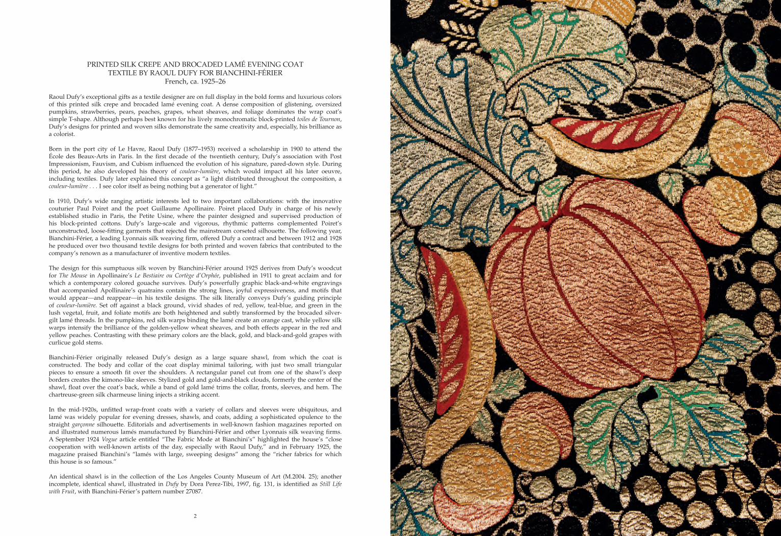
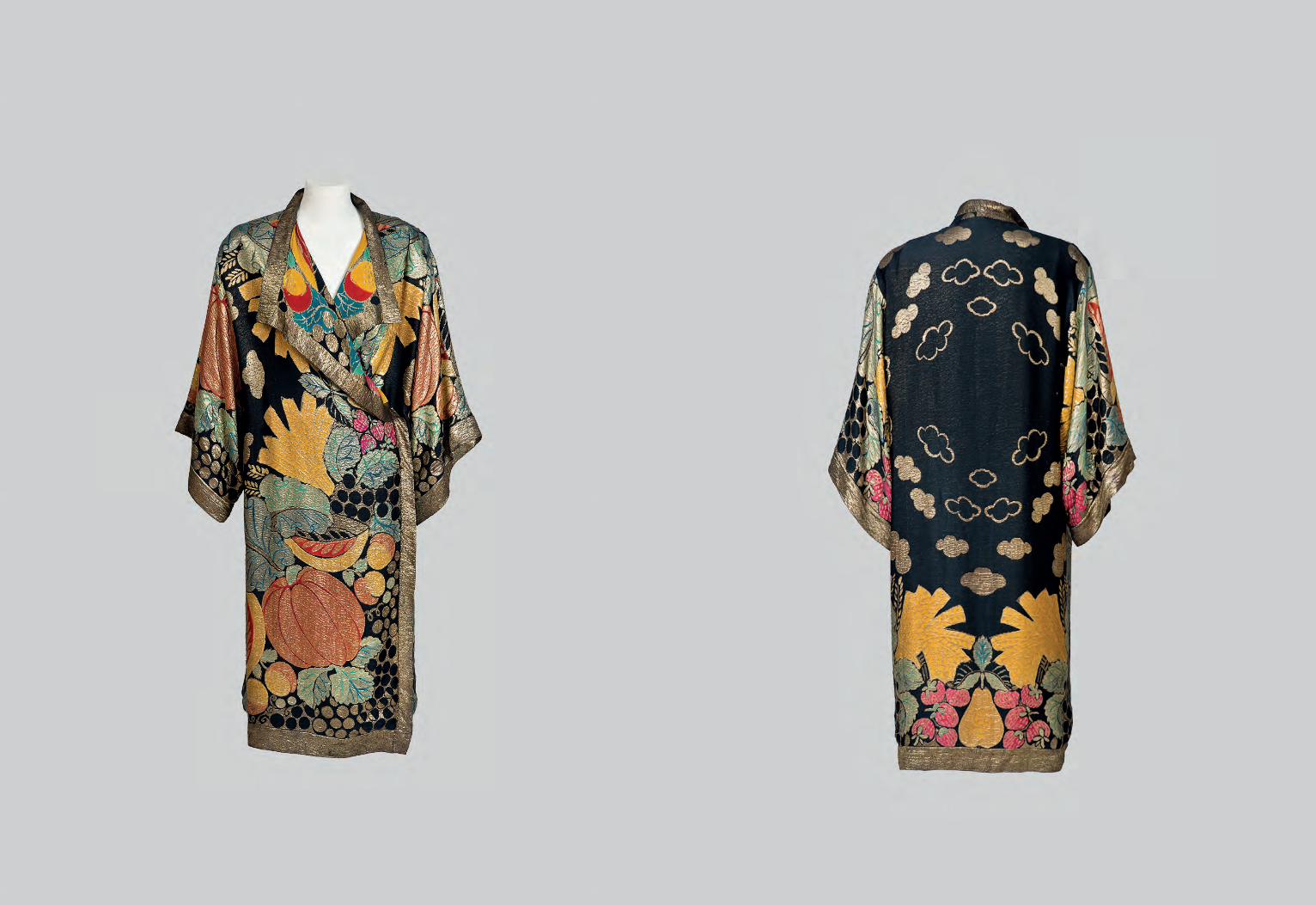
PRINTED SILK CREPE AND BROCADED LAMÉ EVENING COATTEXTILE BY RAOUL DUFY FOR BIANCHINI-FÉRIER
French, ca. 1925–26
Raoul Dufy’s exceptional gifts as a textile designer are on full display in the bold forms and luxurious colors of this printed silk crepe and brocaded lamé evening coat. A dense composition of glistening, oversized pumpkins, strawberries, pears, peaches, grapes, wheat sheaves, and foliage dominates the wrap coat’s simple T-shape. Although perhaps best known for his lively monochromatic block-printed toiles de Tournon, Dufy’s designs for printed and woven silks demonstrate the same creativity and, especially, his brilliance as a colorist.
Born in the port city of Le Havre, Raoul Dufy (1877–1953) received a scholarship in 1900 to attend the École des Beaux-Arts in Paris. In the first decade of the twentieth century, Dufy’s association with Post Impressionism, Fauvism, and Cubism influenced the evolution of his signature, pared-down style. During this period, he also developed his theory of couleur-lumière, which would impact all his later oeuvre, including textiles. Dufy later explained this concept as “a light distributed throughout the composition, a couleur-lumière . . . I see color itself as being nothing but a generator of light.”
In 1910, Dufy’s wide ranging artistic interests led to two important collaborations: with the innovative couturier Paul Poiret and the poet Guillaume Apollinaire. Poiret placed Dufy in charge of his newly established studio in Paris, the Petite Usine, where the painter designed and supervised production of his block-printed cottons. Dufy’s large-scale and vigorous, rhythmic patterns complemented Poiret’s unconstructed, loose-fitting garments that rejected the mainstream corseted silhouette. The following year, Bianchini-Férier, a leading Lyonnais silk weaving firm, offered Dufy a contract and between 1912 and 1928 he produced over two thousand textile designs for both printed and woven fabrics that contributed to the company’s renown as a manufacturer of inventive modern textiles.
The design for this sumptuous silk woven by Bianchini-Férier around 1925 derives from Dufy’s woodcut for The Mouse in Apollinaire’s Le Bestiaire ou Cortège d’Orphée, published in 1911 to great acclaim and for which a contemporary colored gouache survives. Dufy’s powerfully graphic black-and-white engravings that accompanied Apollinaire’s quatrains contain the strong lines, joyful expressiveness, and motifs that would appear—and reappear—in his textile designs. The silk literally conveys Dufy’s guiding principle of couleur-lumière. Set off against a black ground, vivid shades of red, yellow, teal-blue, and green in the lush vegetal, fruit, and foliate motifs are both heightened and subtly transformed by the brocaded silver-gilt lamé threads. In the pumpkins, red silk warps binding the lamé create an orange cast, while yellow silk warps intensify the brilliance of the golden-yellow wheat sheaves, and both effects appear in the red and yellow peaches. Contrasting with these primary colors are the black, gold, and black-and-gold grapes with curlicue gold stems.
Bianchini-Férier originally released Dufy’s design as a large square shawl, from which the coat is constructed. The body and collar of the coat display minimal tailoring, with just two small triangular pieces to ensure a smooth fit over the shoulders. A rectangular panel cut from one of the shawl’s deep borders creates the kimono-like sleeves. Stylized gold and gold-and-black clouds, formerly the center of the shawl, float over the coat’s back, while a band of gold lamé trims the collar, fronts, sleeves, and hem. The chartreuse-green silk charmeuse lining injects a striking accent.
In the mid-1920s, unfitted wrap-front coats with a variety of collars and sleeves were ubiquitous, and lamé was widely popular for evening dresses, shawls, and coats, adding a sophisticated opulence to the straight garçonne silhouette. Editorials and advertisements in well-known fashion magazines reported on and illustrated numerous lamés manufactured by Bianchini-Férier and other Lyonnais silk weaving firms. A September 1924 Vogue article entitled “The Fabric Mode at Bianchini’s” highlighted the house’s “close cooperation with well-known artists of the day, especially with Raoul Dufy,” and in February 1925, the magazine praised Bianchini’s “lamés with large, sweeping designs” among the “richer fabrics for which this house is so famous.”
An identical shawl is in the collection of the Los Angeles County Museum of Art (M.2004. 25); another incomplete, identical shawl, illustrated in Dufy by Dora Perez-Tibi, 1997, fig. 131, is identified as Still Life with Fruit, with Bianchini-Férier’s pattern number 27087.

4
ELFENBEINBLOCK-PRINTED COTTON BY MAX SNISCHEK FOR THE WIENER WERKSTÄTTE
Austrian, ca. 1928–29
Founded in 1903 by the artist-designer-architects Kolomon Moser and Josef Hoffmann, the Viennese collective Wiener Werkstätte is celebrated today for its rejection of revivalist traditions and its advocacy of a single aesthetic code governing all aspects of design, including furniture, ceramics, glass, apparel, and metalwork. Gesamtkunstwerk’s spirit, stemming from Secessionist exhibitions, permeated their interior decoration, and from the earliest years of the Werkstätte, furnishing textiles played an integral part in their domestic environments. In 1910, a formal textile workshop was founded, followed a year later by the creation of the fashion department under Eduard Josef Wimmer-Wisgrill. The bold, unconventional block-printed textiles that the firm produced between 1910 and 1932 are emblematic of the Werkstätte’s rigid design principles.
Despite attempts at more economical and less laborious means of production in the midst of financial hardships, the workshop continued to print with hand-cut woodblocks until its closure in 1932. Elfenbein (Ivory) designed by Max Snischek (1891–1968) in December 1927 and first printed in 1928, was produced until the firm’s closure in 1932. Its pattern, reliant on right angles, grids, and checkerboards, and a neutral palette enlivened by a splash of autumnal color, represents the moment when the collective moved away from foliate motifs in favor of pure geometric abstraction. Previously attributed to Lotte Hahn, Elfenbein is now proven to be by Snischek on the basis of two drawings, a color sheet, and a block-printed strikeoff preserved at the Museum of Applied Arts (MAK) in Vienna (KI 13086-1, KI 13086-2, KI 13086-3, and WWFP 213). The designer envisioned at least nine colorways, with this carrot orange, black, grey, and white version being the primary scheme, as his two drawings and the strikeoff reveal. It is unclear how many of the nine variations were produced, although the MAK also preserves two cotton samples printed in schemes not represented on the sheet.
Snischek trained at the Kunstgewerbeschule between 1910 and 1912 and worked for the Werkstätte from the mid-1910s as Wimmer-Wisgrill’s protégé. In 1922, he replaced his mentor as the fashion department’s director, alongside Maria Likarz Strauss. During the 1920s, he produced hundreds of designs for textiles and women’s fashions, many of which anticipated trends in abstract pattern design that would not be popularized until after the Second World War. Elfenbein closely relates, both in abstract motifs and palette, to textile designs undertaken by Snischek between 1927 and 1928, including Agana, Darling, Rennweg, and Turf.
Gustav Ziegler, the prominent Vienna-based firm that had printed the Werkstätte’s textiles since 1910, probably manufactured this length, though documents at the MAK record its continued printing by three other firms with whom the Werkstätte collaborated. While the Werkstätte had its own block-cutting division, Elfenbein’s blocks were outsourced to the premises of Franz Süß in Vienna.
Made at a time when the Werkstätte’s textile production focused on silks for apparel, Elfenbein was available as a crepe de chine and a cotton, demonstrating the envisioned versatility of their prints for upholstery and dress. Snischek intended it for a coat with contrasting cuffs as seen in a 1929 drawing (see Angela Völker, Wiener Mode + Modefotografie: Die Modeabteilung der Wiener Werkstätte, 1984, p. 232, n. 324), and a period photograph shows a model in a three-piece pyjama probably designed by Snischek, with top, pants, and jacket cuffs in the fabric (see Giovanni and Rosella Fanelli, Il tessuto Art Deco e anni trenta, 1986, n. 134). The silk was also marketed internationally, having been advertised in Women’s Wear Daily on January 4, 1929 as “an ingenious modern design in monochromatic gray.”
The fabric’s popularity as a cushion cover in both cotton and silk is evident from period architecture and interior design publications (see Das Schöne Heim vol. III, 1931–32, pp. 159, 193 and Moderne Bauformen vol. 31, 1932, p. 355), and promotional photographs taken around 1930 (MAK, WWKA 123-4-1). The MAK also holds patterns for two pillows designed by Mathilde Flögl intended to be covered with Elfenbein (WWKISCH 100, WWKISCH 104).
Lengths of Elfenbein are in the collections of the Art Institute of Chicago (2000.204), the Baltimore Museum of Art (2001.327), Los Angeles County Museum of Art (M.2006.88.11), the Minneapolis Institute of Arts (2000.63), Museum of Fine Arts, Houston (2000.204), the Royal Ontario Museum, and the Saint Louis Art Museum (47:2000).
44” H x 50” W
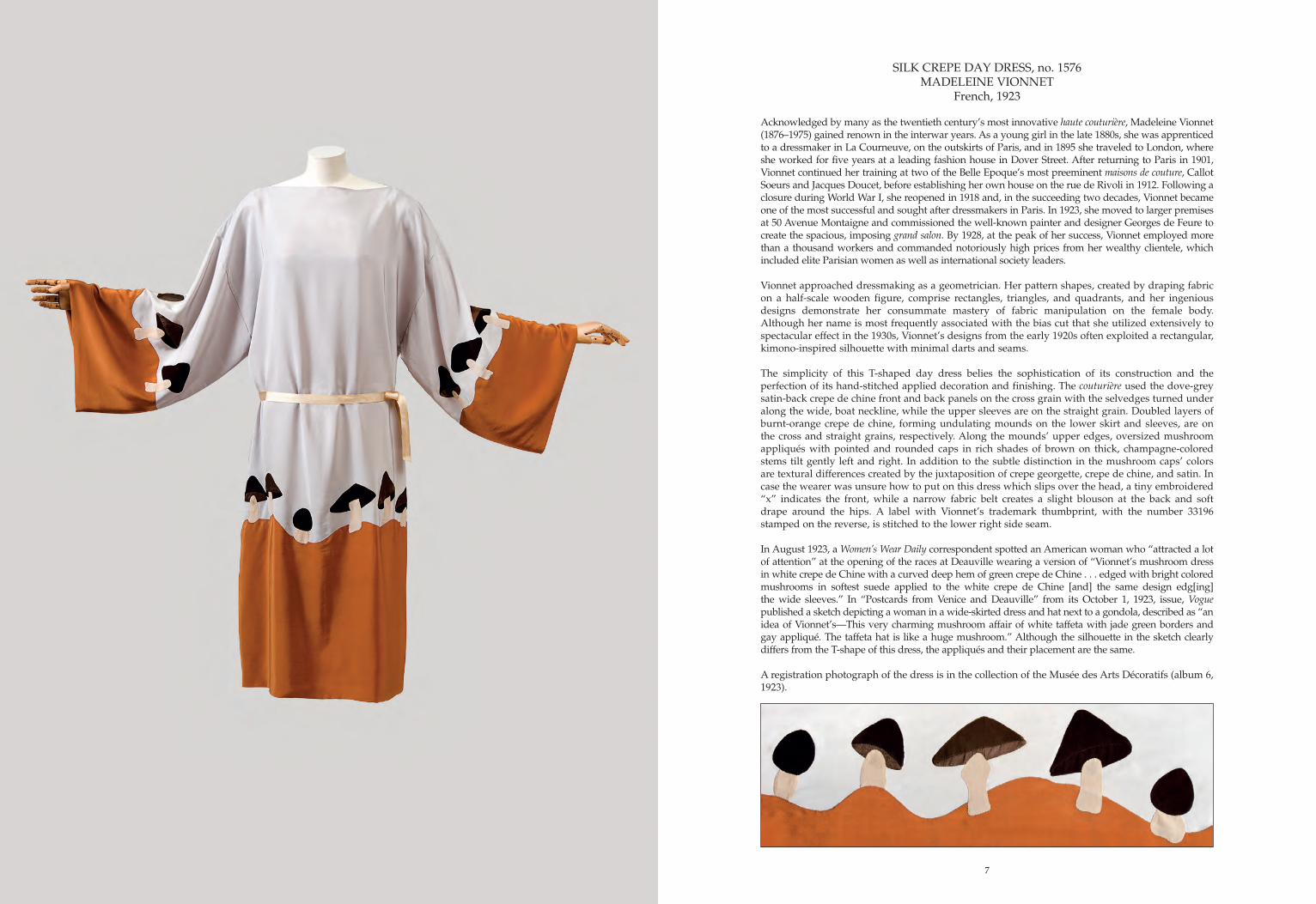
SILK CREPE DAY DRESS, no. 1576MADELEINE VIONNET
French, 1923
Acknowledged by many as the twentieth century’s most innovative haute couturière, Madeleine Vionnet (1876–1975) gained renown in the interwar years. As a young girl in the late 1880s, she was apprenticed to a dressmaker in La Courneuve, on the outskirts of Paris, and in 1895 she traveled to London, where she worked for five years at a leading fashion house in Dover Street. After returning to Paris in 1901, Vionnet continued her training at two of the Belle Epoque’s most preeminent maisons de couture, Callot Soeurs and Jacques Doucet, before establishing her own house on the rue de Rivoli in 1912. Following a closure during World War I, she reopened in 1918 and, in the succeeding two decades, Vionnet became one of the most successful and sought after dressmakers in Paris. In 1923, she moved to larger premises at 50 Avenue Montaigne and commissioned the well-known painter and designer Georges de Feure to create the spacious, imposing grand salon. By 1928, at the peak of her success, Vionnet employed more than a thousand workers and commanded notoriously high prices from her wealthy clientele, which included elite Parisian women as well as international society leaders. Vionnet approached dressmaking as a geometrician. Her pattern shapes, created by draping fabric on a half-scale wooden figure, comprise rectangles, triangles, and quadrants, and her ingenious designs demonstrate her consummate mastery of fabric manipulation on the female body. Although her name is most frequently associated with the bias cut that she utilized extensively to spectacular effect in the 1930s, Vionnet’s designs from the early 1920s often exploited a rectangular, kimono-inspired silhouette with minimal darts and seams.
The simplicity of this T-shaped day dress belies the sophistication of its construction and the perfection of its hand-stitched applied decoration and finishing. The couturière used the dove-grey satin-back crepe de chine front and back panels on the cross grain with the selvedges turned under along the wide, boat neckline, while the upper sleeves are on the straight grain. Doubled layers of burnt-orange crepe de chine, forming undulating mounds on the lower skirt and sleeves, are on the cross and straight grains, respectively. Along the mounds’ upper edges, oversized mushroom appliqués with pointed and rounded caps in rich shades of brown on thick, champagne-colored stems tilt gently left and right. In addition to the subtle distinction in the mushroom caps’ colors are textural differences created by the juxtaposition of crepe georgette, crepe de chine, and satin. In case the wearer was unsure how to put on this dress which slips over the head, a tiny embroidered “x” indicates the front, while a narrow fabric belt creates a slight blouson at the back and soft drape around the hips. A label with Vionnet’s trademark thumbprint, with the number 33196 stamped on the reverse, is stitched to the lower right side seam.
In August 1923, a Women’s Wear Daily correspondent spotted an American woman who “attracted a lot of attention” at the opening of the races at Deauville wearing a version of “Vionnet’s mushroom dress in white crepe de Chine with a curved deep hem of green crepe de Chine . . . edged with bright colored mushrooms in softest suede applied to the white crepe de Chine [and] the same design edg[ing] the wide sleeves.” In “Postcards from Venice and Deauville” from its October 1, 1923, issue, Vogue published a sketch depicting a woman in a wide-skirted dress and hat next to a gondola, described as “an idea of Vionnet’s—This very charming mushroom affair of white taffeta with jade green borders and gay appliqué. The taffeta hat is like a huge mushroom.” Although the silhouette in the sketch clearly differs from the T-shape of this dress, the appliqués and their placement are the same.
A registration photograph of the dress is in the collection of the Musée des Arts Décoratifs (album 6, 1923).
7
8
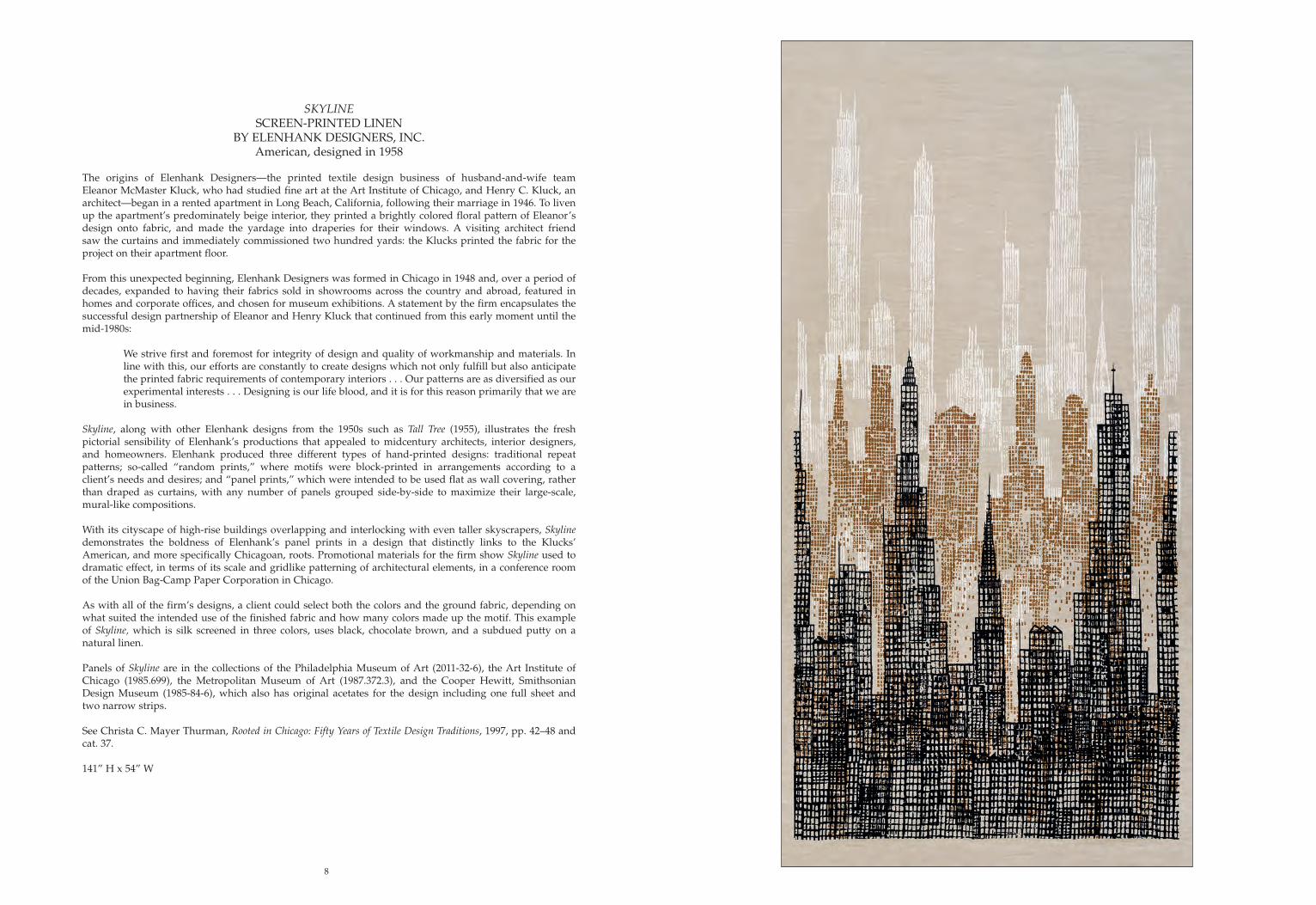
SKYLINESCREEN-PRINTED LINEN
BY ELENHANK DESIGNERS, INC.American, designed in 1958
The origins of Elenhank Designers—the printed textile design business of husband-and-wife team Eleanor McMaster Kluck, who had studied fine art at the Art Institute of Chicago, and Henry C. Kluck, an architect—began in a rented apartment in Long Beach, California, following their marriage in 1946. To liven up the apartment’s predominately beige interior, they printed a brightly colored floral pattern of Eleanor’s design onto fabric, and made the yardage into draperies for their windows. A visiting architect friend saw the curtains and immediately commissioned two hundred yards: the Klucks printed the fabric for the project on their apartment floor.
From this unexpected beginning, Elenhank Designers was formed in Chicago in 1948 and, over a period of decades, expanded to having their fabrics sold in showrooms across the country and abroad, featured in homes and corporate offices, and chosen for museum exhibitions. A statement by the firm encapsulates the successful design partnership of Eleanor and Henry Kluck that continued from this early moment until the mid-1980s:
We strive first and foremost for integrity of design and quality of workmanship and materials. In line with this, our efforts are constantly to create designs which not only fulfill but also anticipate the printed fabric requirements of contemporary interiors . . . Our patterns are as diversified as our experimental interests . . . Designing is our life blood, and it is for this reason primarily that we are in business.
Skyline, along with other Elenhank designs from the 1950s such as Tall Tree (1955), illustrates the fresh pictorial sensibility of Elenhank’s productions that appealed to midcentury architects, interior designers, and homeowners. Elenhank produced three different types of hand-printed designs: traditional repeat patterns; so-called “random prints,” where motifs were block-printed in arrangements according to a client’s needs and desires; and “panel prints,” which were intended to be used flat as wall covering, rather than draped as curtains, with any number of panels grouped side-by-side to maximize their large-scale, mural-like compositions.
With its cityscape of high-rise buildings overlapping and interlocking with even taller skyscrapers, Skyline demonstrates the boldness of Elenhank’s panel prints in a design that distinctly links to the Klucks’ American, and more specifically Chicagoan, roots. Promotional materials for the firm show Skyline used to dramatic effect, in terms of its scale and gridlike patterning of architectural elements, in a conference room of the Union Bag-Camp Paper Corporation in Chicago.
As with all of the firm’s designs, a client could select both the colors and the ground fabric, depending on what suited the intended use of the finished fabric and how many colors made up the motif. This example of Skyline, which is silk screened in three colors, uses black, chocolate brown, and a subdued putty on a natural linen.
Panels of Skyline are in the collections of the Philadelphia Museum of Art (2011-32-6), the Art Institute of Chicago (1985.699), the Metropolitan Museum of Art (1987.372.3), and the Cooper Hewitt, Smithsonian Design Museum (1985-84-6), which also has original acetates for the design including one full sheet and two narrow strips.
See Christa C. Mayer Thurman, Rooted in Chicago: Fifty Years of Textile Design Traditions, 1997, pp. 42–48 and cat. 37.
141” H x 54” W
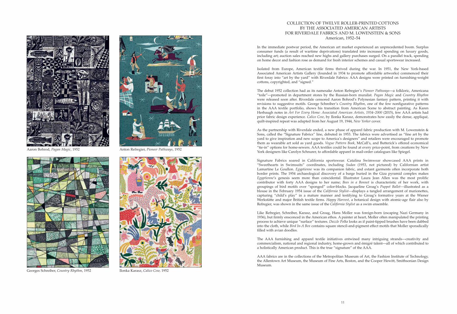
Aaron Bohrod, Pagan Magic, 1952
Georges Schreiber, Country Rhythm, 1952
Anton Refregier, Pioneer Pathways, 1952
Ilonka Karasz, Calico Cow, 1952
COLLECTION OF TWELVE ROLLER-PRINTED COTTONSBY THE ASSOCIATED AMERICAN ARTISTS
FOR RIVERDALE FABRICS AND M. LOWENSTEIN & SONSAmerican, 1952–54
In the immediate postwar period, the American art market experienced an unprecedented boom. Surplus consumer funds (a result of wartime deprivations) translated into increased spending on luxury goods, including art; auction sales reached new highs and gallery purchases surged. On a parallel track, spending on home decor and fashion rose as demand for fresh interior schemes and casual sportswear increased.
Isolated from Europe, American textile firms thrived during the war. In 1951, the New York-based Associated American Artists Gallery (founded in 1934 to promote affordable artworks) commenced their first foray into “art by the yard” with Riverdale Fabrics: AAA designs were printed on furnishing-weight cottons, copyrighted, and “signed.”
The debut 1952 collection had as its namesake Anton Refregier’s Pioneer Pathways—a folkloric, Americana “toile”—promoted in department stores by the Russian-born muralist. Pagan Magic and Country Rhythm were released soon after. Riverdale censored Aaron Bohrod’s Polynesian fantasy pattern, printing it with revisions to suggestive motifs. George Schreiber’s Country Rhythm, one of the few nonfigurative patterns in the AAA textile portfolio, shows his transition from American Scene to abstract painting. As Karen Herbaugh notes in Art For Every Home: Associated American Artists, 1934–2000 (2015), few AAA artists had prior fabric design experience. Calico Cow, by Ilonka Karasz, demonstrates how easily the dense, appliqué, quilt-inspired repeat was adapted from her August 19, 1944, New Yorker cover.
As the partnership with Riverdale ended, a new phase of apparel fabric production with M. Lowenstein & Sons, called the “Signature Fabrics” line, debuted in 1953. The fabrics were advertised as “fine art by the yard to give inspiration and new scope to America’s designers” and retailers were encouraged to promote them as wearable art sold as yard goods. Vogue Pattern Book, McCall’s, and Butterick’s offered economical “tie-in” options for home-sewers. AAA textiles could be found at every price-point, from creations by New York designers like Carolyn Schnurer, to affordable apparel in mail-order catalogues like Spiegel.
Signature Fabrics soared in California sportswear. Catalina Swimwear showcased AAA prints in “Sweethearts in Swimsuits” coordinates, including Sudan (1953, not pictured) by Californian artist Lamartine Le Goullon. Egyptienne was its companion fabric, and extant garments often incorporate both border prints. The 1954 archaeological discovery of a barge buried in the Giza pyramid complex makes Egyptienne’s genesis seem more than coincidental. Illustrator Laura Jean Allen was the most prolific contributor with forty AAA designs to her name; Bees in a Bonnet is characteristic of her work, with groupings of bird motifs over “sponged” color-blocks. Jacqueline Groag’s Puppet Ballet—illustrated as a blouse in the February 1954 issue of the California Stylist—displays a tangled arrangement of marionettes, capturing “child’s play” in a mature manner and testifying to Groag’s formative years at the Wiener Werkstätte and major British textile firms. Happy Harvest, a botanical design with atomic-age flair also by Refregier, was shown in the same issue of the California Stylist as a swim ensemble.
Like Refregier, Schreiber, Karasz, and Groag, Hans Moller was foreign-born (escaping Nazi Germany in 1936), but firmly ensconced in the American ethos. A painter at heart, Moller often manipulated the printing process to achieve unique “surface” textures. Dazzle Polka looks as if paint-tipped brushes have been dabbed into the cloth, while Bird In-A Box contains square stencil-and-pigment effect motifs that Moller sporadically filled with avian doodles.
The AAA furnishing and apparel textile initiatives entwined many intriguing strands—creativity and commercialism, national and regional industry, home-grown and émigré talent—all of which contributed to a holistically American product. This is the true “signature” of the AAA.
AAA fabrics are in the collections of the Metropolitan Museum of Art, the Fashion Institute of Technology, the Allentown Art Museum, the Museum of Fine Arts, Boston, and the Cooper Hewitt, Smithsonian Design Museum.
11
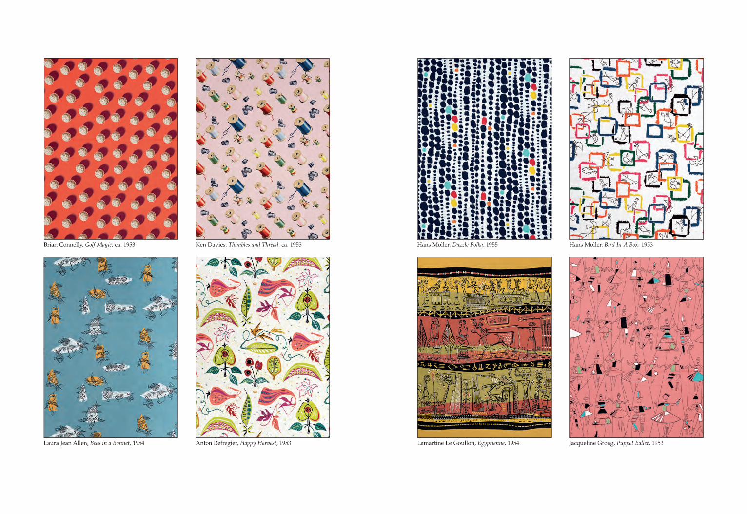
Brian Connelly, Golf Magic, ca. 1953
Laura Jean Allen, Bees in a Bonnet, 1954
Ken Davies, Thimbles and Thread, ca. 1953
Anton Refregier, Happy Harvest, 1953
Hans Moller, Dazzle Polka, 1955
Lamartine Le Goullon, Egyptienne, 1954
Hans Moller, Bird In-A Box, 1953
Jacqueline Groag, Puppet Ballet, 1953

12
INSIDE-OUTSIDESCREEN-PRINTED LINEN
BY SERGE CHERMAYEFF FOR L. ANTON MAIXAmerican (New York), 1950
Lawrence Anton Maix (1915–1999) was responsible for manufacturing some of the most influential printed textiles in the modernist idiom, though his name is little known today. Serge Chermayeff (1900–1996), on the other hand, was an architect and academic who is as renowned now as he was in the mid-twentieth century. Inside-Outside crystallizes a moment in time when the paths of a modernism marketer and a practitioner of the International Style intersected.
Maix studied at the New York Art Student’s League, and in the 1930s his interior design savvy and showmanship coalesced first in a sales position with the Miami branch of the Modernage Furniture Company, and then as a sales representative in New York for the Berkey & Gay Company. In 1938, he began work as a sales agent in a fledgling design firm that became synonymous with modern, commercial interiors: Knoll. Hans Knoll, a recent German émigré by way of London, had been in his family’s furniture manufactory in Stuttgart; in New York, Knoll and Maix would work together to promote the Knoll brand for a decade.
Chermayeff had been one of Knoll’s father’s major clients in England, and Hans Knoll was keenly aware of his sensibilities through Plan Ltd., a company focused on tubular metal furniture that Chermayeff headed. Born in Chechnya, Chermayeff was initially an interior designer with the Waring & Gillow firm in London. Despite no formal education in the profession, he established his own firm in 1930, designing clocks, radios, and furnishings for apartments. In the 1930s, Chermayeff collaborated on the interior scheme for the BBC’s Broadcasting House (1932) and the De La Warr Pavilion in Bexhill-on-Sea, England (1935). By 1940, however, the looming, double threats of war and bankruptcy spurred Chermayeff’s relocation to New York, where he refashioned himself as an educator, holding faculty posts at California Institute of Arts, Massachusetts Institute of Technology, Harvard, and Yale. From 1946–1951, he directed the Chicago Institute of Design (also known as the New Bauhaus).
As Alvin Lustig noted in his article titled “Modern Printed Fabrics” in American Fabrics (Winter 1951–52, Vol. 20), “Maix is not a designer, but has been active in merchandising and promoting good modern design for many years . . . he has sought far afield from the usual fabric designers . . . in his efforts to develop freshness.” Maix honed his talent-detecting skills at Knoll (where he must have met Chermayeff), and developed a network of professional contacts that allowed him to realize his principled artistic ambitions in which popular floral or historicizing patterns had no place. Maix’s roster of designers included Paul Rand, Erik Nitsche, Olga Lee Baughman, and Herbert Bayer, to name a few. Their eclectic designs were silk screen printed by hand on imported Belgian linen under the supervision of a master printer. Maix’s textiles were frequently chosen as winners of the Museum of Modern Art’s “Good Design” awards, inaugurated in partnership with the Chicago Merchandise Mart in 1950.
Inside-Outside is one of several designs contributed by Chermayeff. Whereas other Chermayeff designs for Maix reference indigenous cultural sources, Inside-Outside is an abstract pattern of his own invention. The New York Times described this colorway as “an imaginative abstract impression of a view from a skyscraper window” and also illustrated a photo of Inside-Outside drapery in a spread featuring other Maix designs in the midst of a “who’s who” of midcentury furnishing textiles. A scaled-down version of Inside-Outside was also available as a companion print.
In a 1985 interview, Chermayeff stated that Inside-Outside—specifically, this “pale yellow and blue” version—was designed for use as curtains in the dining room of the United Nations Headquarters in New York, constructed between 1948 and 1952. The U.N. Archives lacks photo documentation of the dining room’s original decor, but Chermayeff’s recollections, right down to the colorway, pattern unit, and fabric width, support this claim. L. Anton Maix textiles are in the collections of the Cooper Hewitt, Smithsonian Design Museum, the Los Angeles County Museum of Art, and the Cleveland Museum of Art. Designs by Chermayeff for L. Anton Maix are in the Metropolitan Museum of Art (2001.689.1-3), the Museum of Modern Art (754.2015), the Art Institute of Chicago (1999.571), and the Victoria & Albert Museum (CIRC.562-1954).
35” H x 51.25” W
14
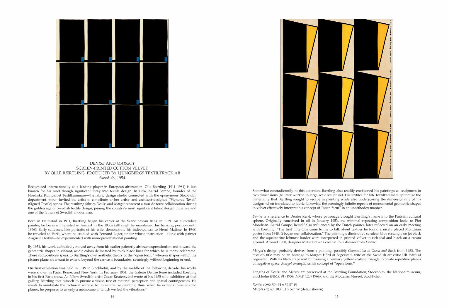
DENISE AND MARGOTSCREEN-PRINTED COTTON VELVET
BY OLLE BÆRTLING, PRODUCED BY LJUNGBERGS TEXTILTRYCK ABSwedish, 1954
Recognized internationally as a leading player in European abstraction, Olle Bærtling (1911–1981) is less known for his brief though significant foray into textile design. In 1954, Astrid Sampe, founder of the Nordiska Kompaniet Textilkammare—the fabric design studio connected with the eponymous Stockholm department store—invited the artist to contribute to her artist- and architect-designed “Signerad Textil” (Signed Textile) series. The resulting fabrics Denise and Margot represent a tour de force collaboration during the golden age of Swedish textile design, joining the country’s most significant fabric design initiative and one of the fathers of Swedish modernism.
Born in Halmstad in 1911, Bærtling began his career at the Scandinavian Bank in 1929. An autodidact painter, he became interested in fine art in the 1930s (although he maintained his banking position until 1956). Early canvases, like portraits of his wife, demonstrate his indebtedness to Henri Matisse. In 1948, he traveled to Paris, where he studied with Fernand Léger, under whose instruction—along with painter Auguste Herbin—he experimented with nonrepresentational painting.
By 1951, his work definitively moved away from his earlier painterly abstract expressionism and toward the geometric shapes in vibrant, acidic colors delineated by thick black lines for which he is today celebrated. These compositions speak to Bærtling’s own aesthetic theory of the “open form,” wherein shapes within the picture plane are meant to extend beyond the canvas’s boundaries, seemingly without beginning or end.
His first exhibition was held in 1949 in Stockholm, and by the middle of the following decade, his works were shown in Paris, Rome, and New York. In February 1954, the Galerie Denise René included Bærtling in his first Paris show. As fellow Swedish artist Oscar Reutersvärd wrote of his 1955 solo exhibition at that gallery, Bærtling “set himself to pursue a vision free of material perception and spatial contingencies. He wants to annihilate the technical surface, to immaterialize painting: thus, when he extends these colored planes, he proposes to us only a membrane of which we feel the vibrations.”
Somewhat contradictorily to this assertion, Bærtling also readily envisioned his paintings as sculptures in two dimensions (he later worked in large-scale sculpture). His textiles for NK Textilkammare epitomize the materiality that Bærtling sought to escape in painting while also underscoring the dimensionality of his designs when translated to fabric. Likewise, the seemingly infinite repeats of monumental geometric shapes in velvet effectively interpret his concept of “open form” in an unorthodox manner.
Denise is a reference to Denise René, whose patronage brought Bærtling’s name into the Parisian cultural sphere. Originally conceived in oil in January 1953, the minimal repeating composition looks to Piet Mondrian. Astrid Sampe, herself also influenced by the Dutch painter, later reflected on an early meeting with Bærtling: “The first time Olle came to me to talk about textiles he found a nicely placed Mondrian poster from 1948. It began our collaboration.” The painting’s diminutive cerulean blue rectangle on jet black and the aquamarine leftmost border were interpreted in printed velvet in rich teal and black on a cream ground. Around 1960, designer Mette Prawitz created four dresses from Denise.
Margot’s design probably derives from a painting, possibly Composition in Green and Black from 1953. The textile’s title may be an homage to Margot Hård af Segerstad, wife of the Swedish art critic Ulf Hård af Segerstad. With its black trapezoid buttressing a primary yellow scalene triangle to create repetitive planes of negative space, Margot exemplifies his concept of “open form.”
Lengths of Denise and Margot are preserved at the Bærtling Foundation, Stockholm, the Nationalmuseum, Stockholm (NMK 91/1954, NMK 120/1964), and the Moderna Museet, Stockholm.
Denise (left): 59” H x 52.5” W Margot (right): 103” H x 52” W (detail shown)
15
16
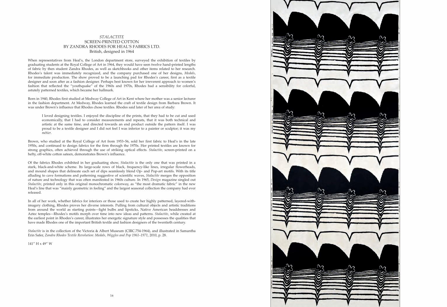
STALACTITESCREEN-PRINTED COTTON
BY ZANDRA RHODES FOR HEAL’S FABRICS LTD.British, designed in 1964
When representatives from Heal’s, the London department store, surveyed the exhibition of textiles by graduating students at the Royal College of Art in 1964, they would have seen twelve hand-printed lengths of fabric by then student Zandra Rhodes, as well as sketchbooks and other items related to her research. Rhodes’s talent was immediately recognized, and the company purchased one of her designs, Medals, for immediate production. The show proved to be a launching pad for Rhodes’s career, first as a textile designer and soon after as a fashion designer. Perhaps best known for her irreverent approach to women’s fashion that reflected the “youthquake” of the 1960s and 1970s, Rhodes had a sensibility for colorful, astutely patterned textiles, which became her hallmark.
Born in 1940, Rhodes first studied at Medway College of Art in Kent where her mother was a senior lecturer in the fashion department. At Medway, Rhodes learned the craft of textile design from Barbara Brown. It was under Brown’s influence that Rhodes chose textiles. Rhodes said later of her area of study:
I loved designing textiles. I enjoyed the discipline of the prints, that they had to be cut and used economically, that I had to consider measurements and repeats, that it was both technical and artistic at the same time, and directed towards an end product outside the pattern itself. I was proud to be a textile designer and I did not feel I was inferior to a painter or sculptor; it was my métier.
Brown, who studied at the Royal College of Art from 1953–56, sold her first fabric to Heal’s in the late 1950s, and continued to design fabrics for the firm through the 1970s. Her printed textiles are known for strong graphics, often achieved through the use of striking optical effects. Stalactite, screen-printed on a hefty, off-white cotton sateen, demonstrates Brown’s influence.
Of the fabrics Rhodes exhibited in her graduating show, Stalactite is the only one that was printed in a stark, black-and-white scheme. Its large-scale rows of black, frequency-like lines, irregular flowerheads, and mound shapes that delineate each set of dips seamlessly blend Op- and Pop-art motifs. With its title alluding to cave formations and patterning suggestive of scientific waves, Stalactite merges the opposition of nature and technology that was often manifested in 1960s culture. In 1965, Design magazine singled out Stalactite, printed only in this original monochromatic colorway, as “the most dramatic fabric” in the new Heal’s line that was “mainly geometric in feeling” and the largest seasonal collection the company had ever released.
In all of her work, whether fabrics for interiors or those used to create her highly patterned, layered-with-imagery clothing, Rhodes proves her diverse interests. Pulling from cultural objects and artistic traditions from around the world as starting points—light bulbs and lipsticks, Native American headdresses and Aztec temples—Rhodes’s motifs morph over time into new ideas and patterns. Stalactite, while created at the earliest point in Rhodes’s career, illustrates her energetic signature style and possesses the qualities that have made Rhodes one of the important British textile and fashion designers of the twentieth century.
Stalactite is in the collection of the Victoria & Albert Museum (CIRC.754-1964), and illustrated in Samantha Erin Safer, Zandra Rhodes Textile Revolution: Medals, Wiggles and Pop 1961–1971, 2010, p. 28.
141” H x 49” W

19
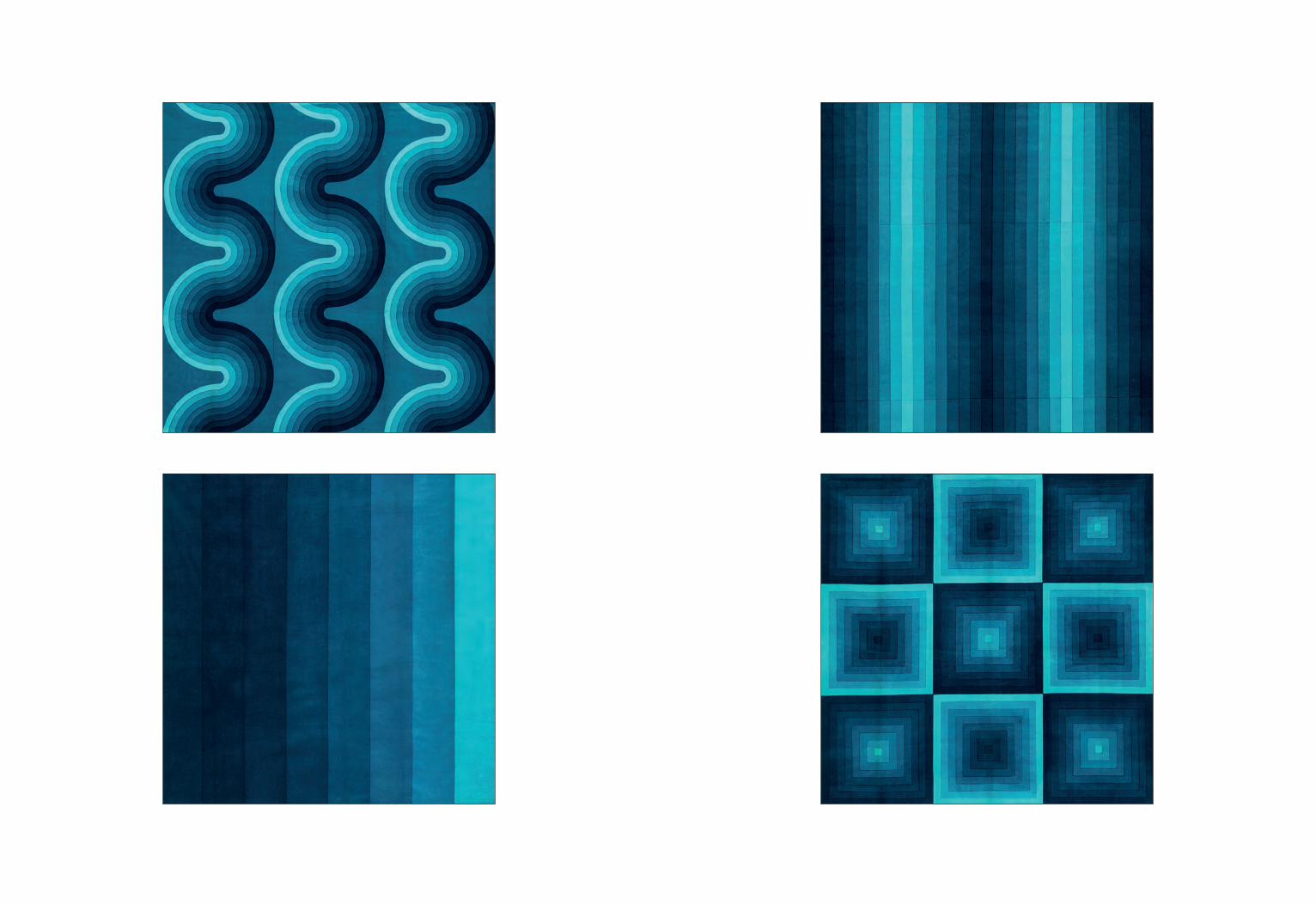
Collection of SIX DECOR I SAMPLES AND THREE CURTAINSSCREEN-PRINTED COTTON VELVETBY VERNER PANTON FOR MIRA-X
Danish, 1973–74
Verner Panton (1926–1998) is hailed today for expanding Danish design into avant-garde, and even utopian, territories through his use of color, geometry, optics, and new materials. Importantly, however, practicality remained central to his ethos, making his designs suitable for everyday use. Although criticized as too aesthetically minded—perhaps due to his reliance on Bauhaus, Constructivist, and Op Art principles—Panton pursued multifunctionalism and rationalism in his interiors, where he collapsed boundaries between ceiling, wall, and floor through the use of fabrics. While his S Chair has been canonized in design history, Panton’s striking geometric textiles demonstrate some of his most fundamental innovations, of which the so-called Mira-X Decor I series remains the most important.
Born in 1926, Panton attended the Royal Academy of Fine Arts in Copenhagen. During the 1950s, he assisted Arne Jacobsen and worked for various firms, including Fritz Hansen, Plus-Linje, Louis Poulsen, and Unika Vaev, leading to his decoration of the Astoria restaurant in Trondheim, Norway, in 1960. He gained international recognition in the 1960s with industrial designs for Herman Miller and his work as art director at the Swiss textile manufacturer Mira-X, which furnished several projects, including the Varna restaurant in Arhus, Denmark (1971), the German publishing headquarters of Der Spiegel (1969), and Gruner & Jahr (1973). Winning several awards (and eventually receiving the Cross of the Order of the Dannebrog), he continued to design into the 1990s, concurring with the renaissance of interest in his designs.
The Mira-X Decor I collection, which Panton designed in 1969, debuted in 1970 at the “floating” exhibition Visiona 2 commissioned by the German chemical company Bayer and held on a boat docked on the Rhine (he had also designed the inaugural Bayer Visiona 0 show in 1968). The psychedelic installation, which coincided with the Cologne Furniture Fair, showcased Bayer’s materials and promoted fresh ideas for residential decoration that even included lighting concepts and sound installations. Panton swaddled the walls and furniture in vivid, patterned cretonnes and velvets, complementing the show’s centerpiece, his cavernous seating area of the future, “Phantasy Landscape.” At the time of its retail release in 1971, Decor I was exhibited at the Heimtextil show in Frankfurt.
Panton saw the potential of a limited palette with myriad combinations as a vehicle for new modes of living; his concept for Decor I was that no hues could be mismatched. This “color system” referenced the modular teak and metal furniture systems of earlier Danish design but turned that tradition upside down by making color and textiles the primary elements to metamorphose a space. Decor I consisted of a collection of printed cottons and cotton velvets in eight colors: orange, bright red, deep red, aubergine, mauve, violet, blue, and turquoise. Each hue was then divided into eight levels of saturation, from 15 to 100 percent. Panton designed five patterns for this scheme—checkerboard, circle, curve, square, and stripe—each of which was scaled in three sizes at a ratio of 1:3:9, the largest running the width of the textile and the smallest repeating nine times. A ninth colorway utilized the entire octochromatic spectrum, where multi- and monochromatic tones push beyond the visual and into the optical, experiential, and psychological.
His most popular textile line, Decor I, appeared infinitely combinable and adaptable, which had the dual benefit of empowering the consumer with a part in the creative process and retaining the look and brand of Panton, Mira-X’s driving force and decorative spokesperson. Decor I was thus marketed as a total interior concept, whereby color dictated the mood of a room, from legibility of patterns to lighting temperature. Preoccupied with color theory throughout his life, Panton believed that it played “a greater role than form.” Decor I’s seemingly endless variety of mono- and multichromatic combinations could thus transform any location while also functioning in everyday home conditions.
In this set of six large turquoise square samples and three full-sized curtains, tonal, geometric shapes elide through draping. Labels on each sample suggest they originate from one of Mira-X’s satellite showrooms, and two of the three curtains retain their paper tags giving precise dates of production between October 1973 and February 1974. Except the single sample in the largest size vertical stripe, these reproduce the mid-scale versions of the five motifs.
Panels of Decor I in other colorways are in the collection of the Designmuseum Danmark, Copenhagen.
Samples: approx. 47” H x 49” W eachCurtains: approx. 103.5” H x 43.5” W each (see cover)
21
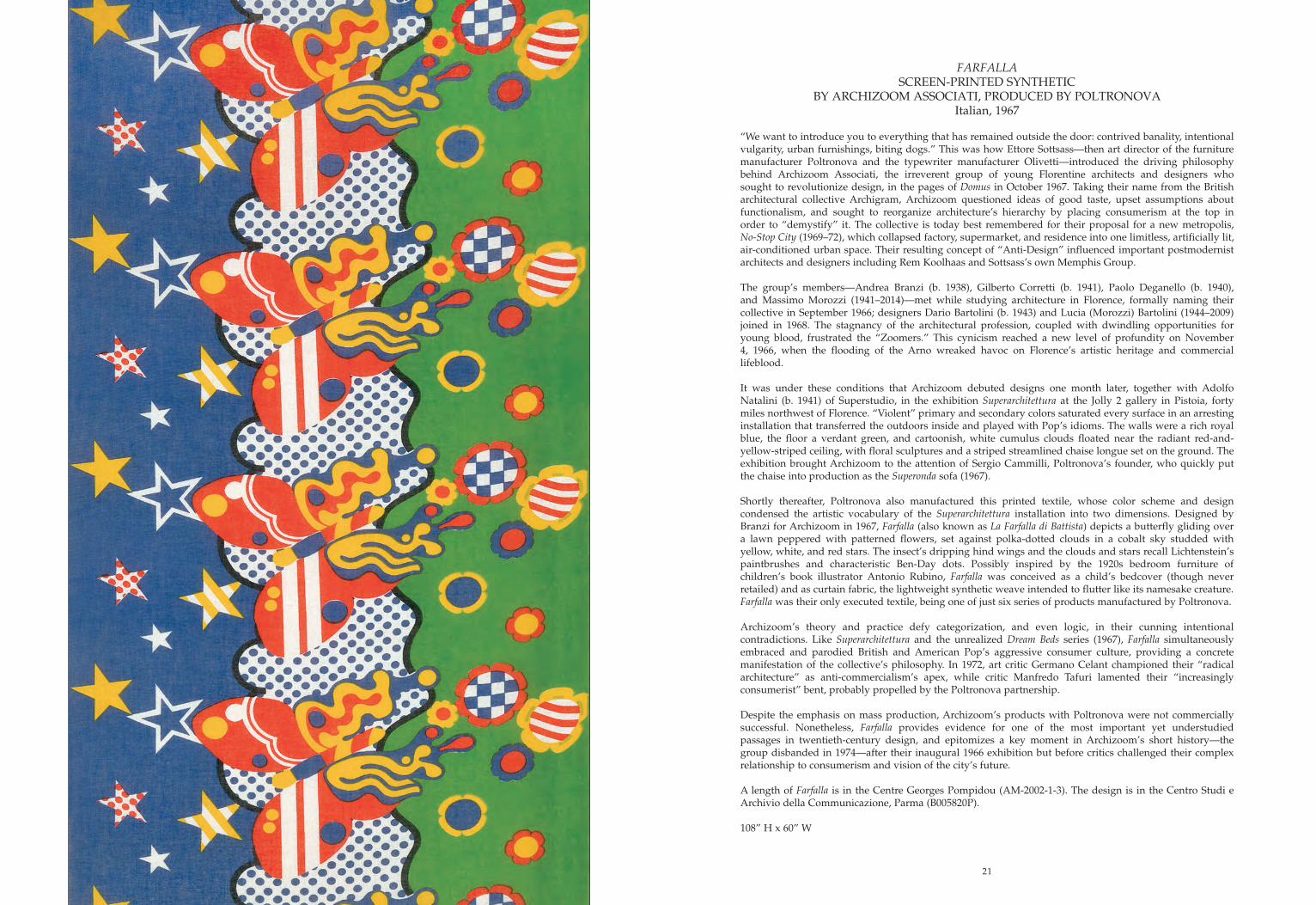
FARFALLASCREEN-PRINTED SYNTHETIC
BY ARCHIZOOM ASSOCIATI, PRODUCED BY POLTRONOVAItalian, 1967
“We want to introduce you to everything that has remained outside the door: contrived banality, intentional vulgarity, urban furnishings, biting dogs.” This was how Ettore Sottsass—then art director of the furniture manufacturer Poltronova and the typewriter manufacturer Olivetti—introduced the driving philosophy behind Archizoom Associati, the irreverent group of young Florentine architects and designers who sought to revolutionize design, in the pages of Domus in October 1967. Taking their name from the British architectural collective Archigram, Archizoom questioned ideas of good taste, upset assumptions about functionalism, and sought to reorganize architecture’s hierarchy by placing consumerism at the top in order to “demystify” it. The collective is today best remembered for their proposal for a new metropolis, No-Stop City (1969–72), which collapsed factory, supermarket, and residence into one limitless, artificially lit, air-conditioned urban space. Their resulting concept of “Anti-Design” influenced important postmodernist architects and designers including Rem Koolhaas and Sottsass’s own Memphis Group.
The group’s members—Andrea Branzi (b. 1938), Gilberto Corretti (b. 1941), Paolo Deganello (b. 1940), and Massimo Morozzi (1941–2014)—met while studying architecture in Florence, formally naming their collective in September 1966; designers Dario Bartolini (b. 1943) and Lucia (Morozzi) Bartolini (1944–2009) joined in 1968. The stagnancy of the architectural profession, coupled with dwindling opportunities for young blood, frustrated the “Zoomers.” This cynicism reached a new level of profundity on November 4, 1966, when the flooding of the Arno wreaked havoc on Florence’s artistic heritage and commercial lifeblood.
It was under these conditions that Archizoom debuted designs one month later, together with Adolfo Natalini (b. 1941) of Superstudio, in the exhibition Superarchitettura at the Jolly 2 gallery in Pistoia, forty miles northwest of Florence. “Violent” primary and secondary colors saturated every surface in an arresting installation that transferred the outdoors inside and played with Pop’s idioms. The walls were a rich royal blue, the floor a verdant green, and cartoonish, white cumulus clouds floated near the radiant red-and- yellow-striped ceiling, with floral sculptures and a striped streamlined chaise longue set on the ground. The exhibition brought Archizoom to the attention of Sergio Cammilli, Poltronova’s founder, who quickly put the chaise into production as the Superonda sofa (1967).
Shortly thereafter, Poltronova also manufactured this printed textile, whose color scheme and design condensed the artistic vocabulary of the Superarchitettura installation into two dimensions. Designed by Branzi for Archizoom in 1967, Farfalla (also known as La Farfalla di Battista) depicts a butterfly gliding over a lawn peppered with patterned flowers, set against polka-dotted clouds in a cobalt sky studded with yellow, white, and red stars. The insect’s dripping hind wings and the clouds and stars recall Lichtenstein’s paintbrushes and characteristic Ben-Day dots. Possibly inspired by the 1920s bedroom furniture of children’s book illustrator Antonio Rubino, Farfalla was conceived as a child’s bedcover (though never retailed) and as curtain fabric, the lightweight synthetic weave intended to flutter like its namesake creature. Farfalla was their only executed textile, being one of just six series of products manufactured by Poltronova.
Archizoom’s theory and practice defy categorization, and even logic, in their cunning intentional contradictions. Like Superarchitettura and the unrealized Dream Beds series (1967), Farfalla simultaneously embraced and parodied British and American Pop’s aggressive consumer culture, providing a concrete manifestation of the collective’s philosophy. In 1972, art critic Germano Celant championed their “radical architecture” as anti-commercialism’s apex, while critic Manfredo Tafuri lamented their “increasingly consumerist” bent, probably propelled by the Poltronova partnership.
Despite the emphasis on mass production, Archizoom’s products with Poltronova were not commercially successful. Nonetheless, Farfalla provides evidence for one of the most important yet understudied passages in twentieth-century design, and epitomizes a key moment in Archizoom’s short history—the group disbanded in 1974—after their inaugural 1966 exhibition but before critics challenged their complex relationship to consumerism and vision of the city’s future.
A length of Farfalla is in the Centre Georges Pompidou (AM-2002-1-3). The design is in the Centro Studi e Archivio della Communicazione, Parma (B005820P).
108” H x 60” W
22
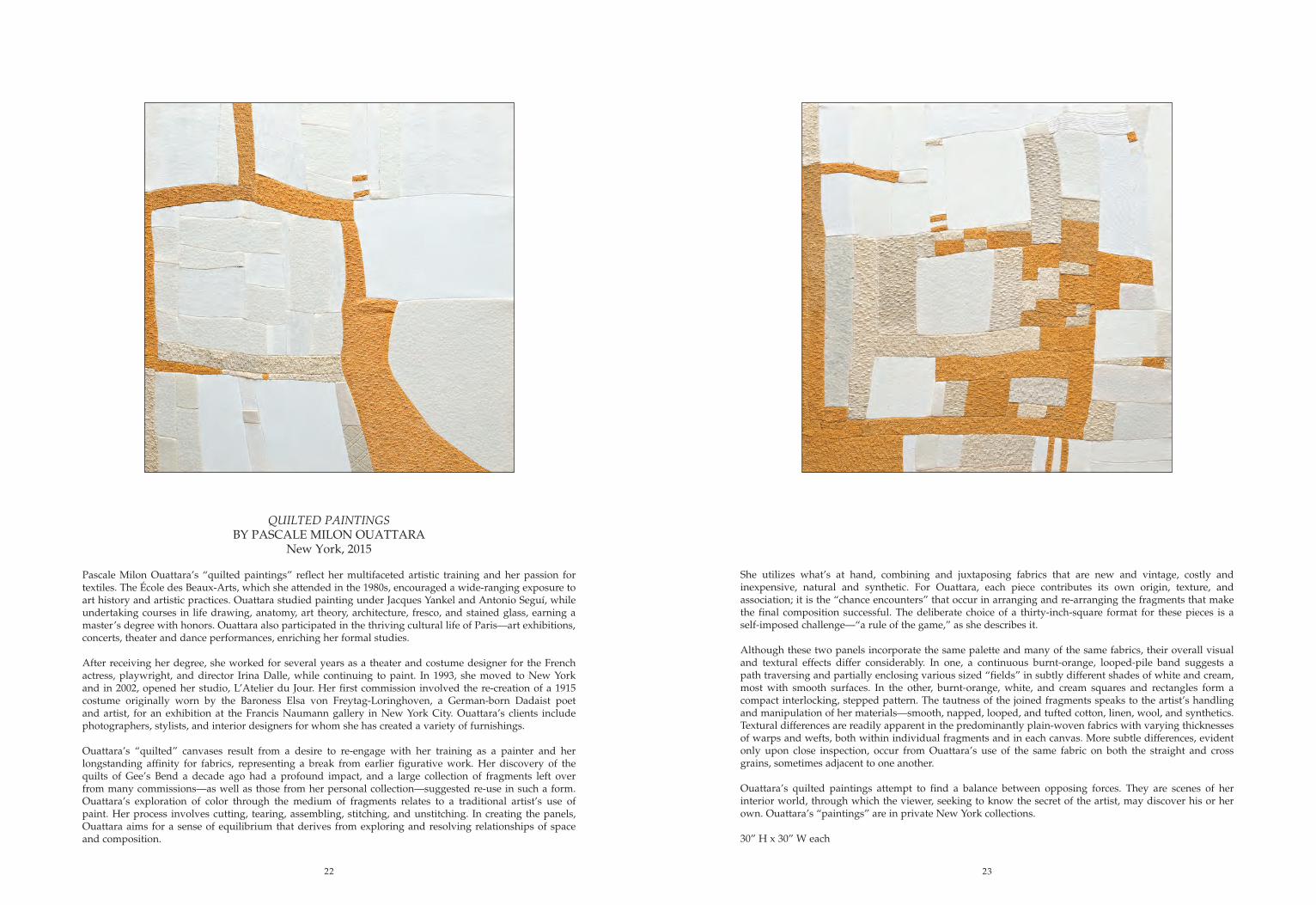
QUILTED PAINTINGSBY PASCALE MILON OUATTARA
New York, 2015
Pascale Milon Ouattara’s “quilted paintings” reflect her multifaceted artistic training and her passion for textiles. The École des Beaux-Arts, which she attended in the 1980s, encouraged a wide-ranging exposure to art history and artistic practices. Ouattara studied painting under Jacques Yankel and Antonio Seguí, while undertaking courses in life drawing, anatomy, art theory, architecture, fresco, and stained glass, earning a master’s degree with honors. Ouattara also participated in the thriving cultural life of Paris—art exhibitions, concerts, theater and dance performances, enriching her formal studies.
After receiving her degree, she worked for several years as a theater and costume designer for the French actress, playwright, and director Irina Dalle, while continuing to paint. In 1993, she moved to New York and in 2002, opened her studio, L’Atelier du Jour. Her first commission involved the re-creation of a 1915 costume originally worn by the Baroness Elsa von Freytag-Loringhoven, a German-born Dadaist poet and artist, for an exhibition at the Francis Naumann gallery in New York City. Ouattara’s clients include photographers, stylists, and interior designers for whom she has created a variety of furnishings.
Ouattara’s “quilted” canvases result from a desire to re-engage with her training as a painter and her longstanding affinity for fabrics, representing a break from earlier figurative work. Her discovery of the quilts of Gee’s Bend a decade ago had a profound impact, and a large collection of fragments left over from many commissions—as well as those from her personal collection—suggested re-use in such a form. Ouattara’s exploration of color through the medium of fragments relates to a traditional artist’s use of paint. Her process involves cutting, tearing, assembling, stitching, and unstitching. In creating the panels, Ouattara aims for a sense of equilibrium that derives from exploring and resolving relationships of space and composition.
She utilizes what’s at hand, combining and juxtaposing fabrics that are new and vintage, costly and inexpensive, natural and synthetic. For Ouattara, each piece contributes its own origin, texture, and association; it is the “chance encounters” that occur in arranging and re-arranging the fragments that make the final composition successful. The deliberate choice of a thirty-inch-square format for these pieces is a self-imposed challenge—“a rule of the game,” as she describes it.
Although these two panels incorporate the same palette and many of the same fabrics, their overall visual and textural effects differ considerably. In one, a continuous burnt-orange, looped-pile band suggests a path traversing and partially enclosing various sized “fields” in subtly different shades of white and cream, most with smooth surfaces. In the other, burnt-orange, white, and cream squares and rectangles form a compact interlocking, stepped pattern. The tautness of the joined fragments speaks to the artist’s handling and manipulation of her materials—smooth, napped, looped, and tufted cotton, linen, wool, and synthetics. Textural differences are readily apparent in the predominantly plain-woven fabrics with varying thicknesses of warps and wefts, both within individual fragments and in each canvas. More subtle differences, evident only upon close inspection, occur from Ouattara’s use of the same fabric on both the straight and cross grains, sometimes adjacent to one another. Ouattara’s quilted paintings attempt to find a balance between opposing forces. They are scenes of her interior world, through which the viewer, seeking to know the secret of the artist, may discover his or her own. Ouattara’s “paintings” are in private New York collections.
30” H x 30” W each
23
Published by
CORA GINSBURG LLC
RESEARCH AND TEXTMartina D’Amato
William DeGregorioDonna Ghelerter
Michele Majer
With special thanks Dario Bartolini, Karen Herbaugh, Julie Holyoke, Giles Kotcher, and Leigh Wishner
PHOTOGRAPHYMichael Fredericks
PRINTED BYPressroom Printer & Designer Ltd., Hong Kong
Copyright 2017 © Cora Ginsburg LLC. All rights reserved.Text: Copyright 2017 © Cora Ginsburg LLC
Images: Copyright 2017 © Cora Ginsburg LLC
by appointment
19 East 74th StreetNew York, NY 10021www.coraginsburg.com
tel 212-744-1352fax 212-879-1601