Contetns page covers analysis
3
Billboard Contents Page The logo of the magazine is on the right hand side of the column which gives the page more order and the audience can be reminded of what magazine they are reading. The colour scheme throughout the contents page is consistent (blue, yellow, white and black) The column on the left hand side has sub headings in a vibrant colour to make it stand out for the reader but also suggests that there will be a lot of information within the magazine. The main features within the magazine are in the optical centre which is where you eyes first look when hitting the page. The main features are also surrounded by images which helps readers notice them. The images used on the contents page are relevant to the features which will instantly bring the audience in as they can see they will be interested in something the magazine from images of the features. The images give the page more colour and make the layout look more eventful. The eye route for the contents page starts from the top and works the way down as there are a trail of images at the top and most of the text is in come sort of column. The left hand column with all the page numbers is not where my eyes are pulled to first but The text is consistent throughout the contents page and doesn't’t look messy. There is a consistent colour scheme however used a variety of colour’s content list. They have highlighted certain key features with bold text so that the readers pick up on what they are trying to promote.
-
Upload
marniaboyle -
Category
Education
-
view
256 -
download
0
Transcript of Contetns page covers analysis
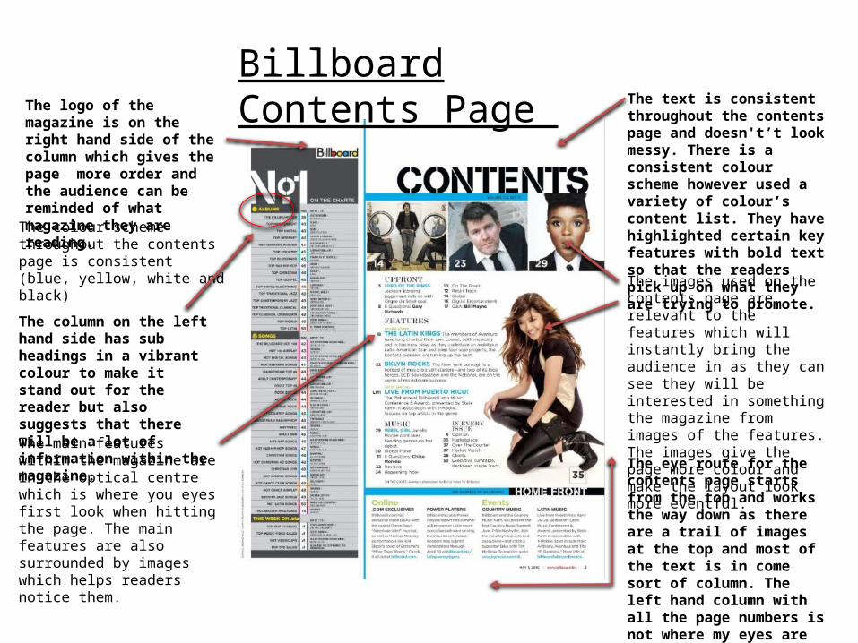
Billboard Contents Page The logo of the magazine is on the right hand side of the column which gives the page more order and the audience can be reminded of what magazine they are reading.
The colour scheme throughout the contents page is consistent (blue, yellow, white and black)
The column on the left hand side has sub headings in a vibrant colour to make it stand out for the reader but also suggests that there will be a lot of information within the magazine.
The main features within the magazine are in the optical centre which is where you eyes first look when hitting the page. The main features are also surrounded by images which helps readers notice them.
The images used on the contents page are relevant to the features which will instantly bring the audience in as they can see they will be interested in something the magazine from images of the features. The images give the page more colour and make the layout look more eventful.
The eye route for the contents page starts from the top and works the way down as there are a trail of images at the top and most of the text is in come sort of column. The left hand column with all the page numbers is not where my eyes are pulled to first but more as a thing on the side for readers to find a certain page.
The text is consistent throughout the contents page and doesn't’t look messy. There is a consistent colour scheme however used a variety of colour’s content list. They have highlighted certain key features with bold text so that the readers pick up on what they are trying to promote.
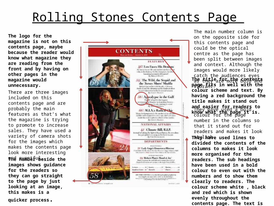
Rolling Stones Contents Page The main number column is on the opposite side for this contents page and could be the optical centre as the page has been split between images and context. Although the images would more likely catch the audiences eyes as they are more bold and vibrant.
The logo for the magazine is not on this contents page, maybe because the reader would know what magazine they are reading from the front and by having on other pages in the magazine would unnecessary.
There are three images included on this contents page and are probably the main features as that’s what the magazine is trying to promote to increase sales. They have used a variety of camera shots for the images which makes the contents page look more interesting and eventful.
The number beside the images shows guidance for the readers so they can go straight to the page by just looking at an image,
this makes is a quicker process.
The title for the contents page fits in well with the colour scheme and text. By having a red background the title makes it stand out and easier for readers to know what the page it is.
They have used a bold colour for the page number in the columns so that it stand out for readers and makes it look stylish.
They have used lines to divided the contents of the columns to makes it look more organised for the readers. The sub headings have been used in a bold colour to even out with the numbers and to show them clearly to readers. The colour scheme white , black and red which is shown evenly throughout the contents page. The text is consistent through out the page which shows it to be professional.
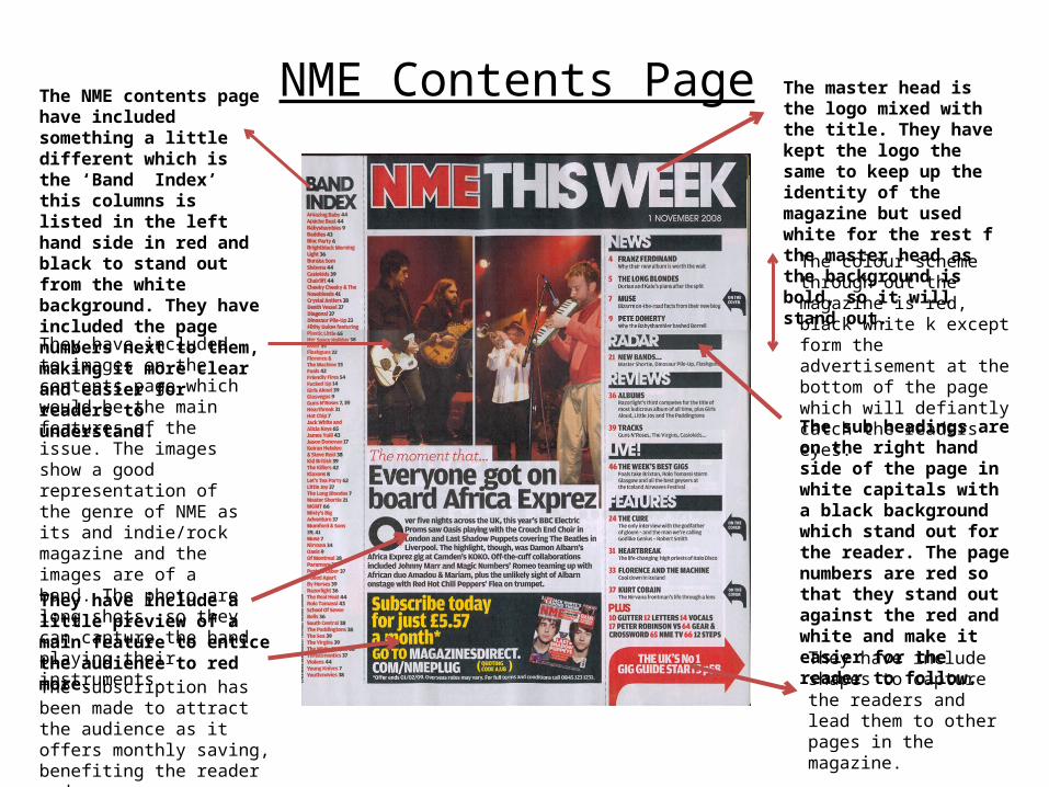
NME Contents Page The master head is the logo mixed with the title. They have kept the logo the same to keep up the identity of the magazine but used white for the rest f the master head as the background is bold, so it will stand out.
The NME contents page have included something a little different which is the ‘Band Index’ this columns is listed in the left hand side in red and black to stand out from the white background. They have included the page numbers next to them, making it more clear and easier for readers to understand.
The colour scheme through out the magazine is red, black white k except form the advertisement at the bottom of the page which will defiantly catch the readers eyes.
The sub headings are on the right hand side of the page in white capitals with a black background which stand out for the reader. The page numbers are red so that they stand out against the red and white and make it easier for the reader to follow.
They have included to images on the contents page which would be the main features of the issue. The images show a good representation of the genre of NME as its and indie/rock magazine and the images are of a band. The photo are long shots so they can capture the band playing their instruments.
They have include a little preview of a main feature to entice the audience to red more. The subscription has been made to attract the audience as it offers monthly saving, benefiting the reader and company.
They have include shapes to capture the readers and lead them to other pages in the magazine.