Chapter 11: Structuring Your Teams to Become a Content Driven Organization
Upload
darce-hessCategory
view
3.527download
0
Content Management and Page StructureBest Practices for Structuring Content for End Users
D’arce Hess – SPTechCon Boston 2016
@darcehess
https://www.linkedin.com/in/darcehess
D’arce Hess
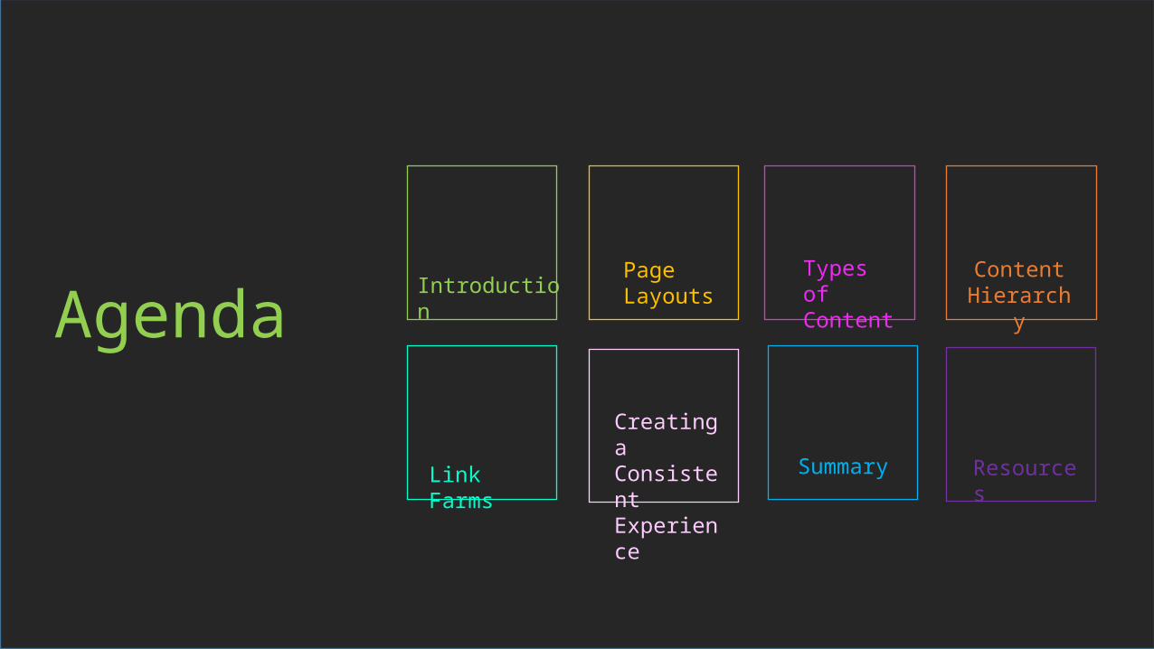
Agenda Introduction Types of Content
Page Layouts
SummaryLink Farms
ContentHierarchy
Creating a ConsistentExperience
Resources

Introduction
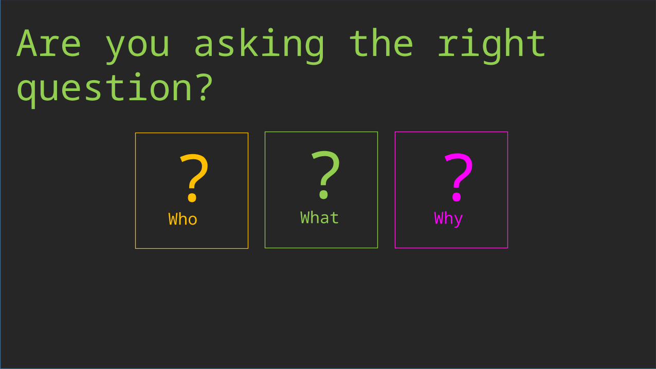
Are you asking the right question?
What WhyWho? ??

Who are they?Content Creators
Content Consumers
Content Administrators
Content Creators may not be site owners. They are responsible for uploading documents, changing information on list and may be a back up for a Site Owners or Administrator
Content Consumers are end-users who are navigating to a site to receive information only. They are not uploading or adjusting content
Content Administrators are Site Owners. They ultimately own where on the page content will live and what content will be there

What are they doing?
Collaboration Consuming Content

Why do they need consistency?
Easier to find content
Don’t have to learn a new skill set to work with
content
Transferred to a new/different department
Saves time

So how can WE help?

Page Layouts

Common Page Layouts
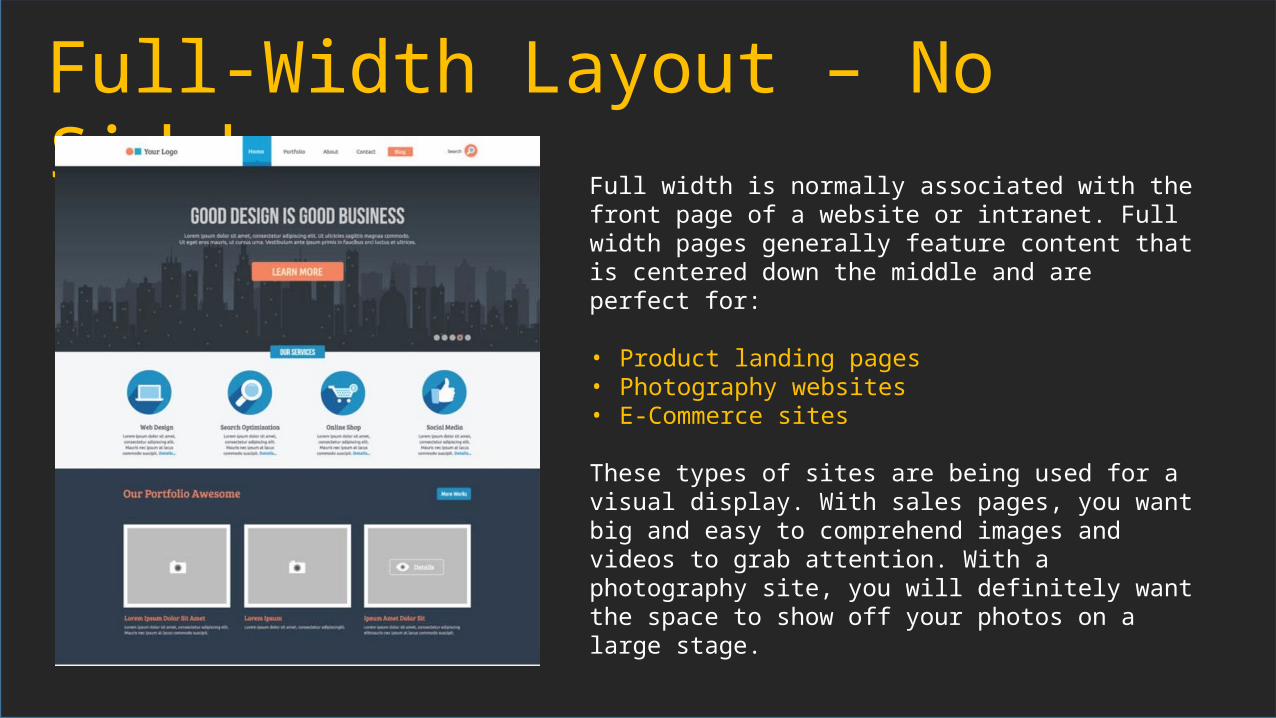
Full-Width Layout – No SidebarFull width is normally associated with the front page of a website or intranet. Full width pages generally feature content that is centered down the middle and are perfect for:
• Product landing pages• Photography websites• E-Commerce sites
These types of sites are being used for a visual display. With sales pages, you want big and easy to comprehend images and videos to grab attention. With a photography site, you will definitely want the space to show off your photos on a large stage.

Single Column LayoutSingle Column Layouts include a Left Navigation to help users get to categories of content. This layout offers a large variety of uses for:
• Article content pages

2 Column Layout–Right Sidebar Two Column Layouts provide a great
canvas for providing focus on specific content and allowing the sidebar to be used as a secondary focus. This layout offers a large variety of uses for:
• Department Home Pages• Landing Pages• Intranet Landing Pages• Content Pages
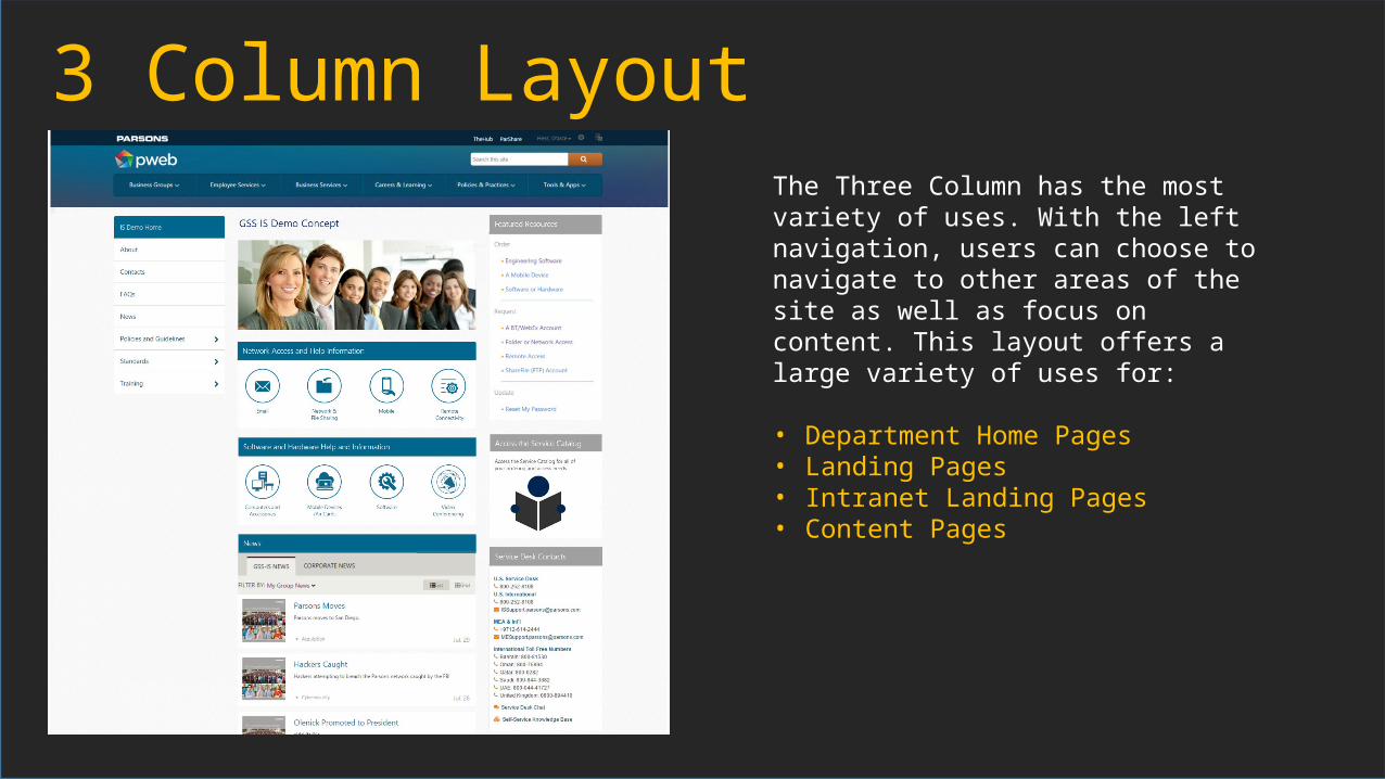
3 Column LayoutThe Three Column has the most variety of uses. With the left navigation, users can choose to navigate to other areas of the site as well as focus on content. This layout offers a large variety of uses for:
• Department Home Pages• Landing Pages• Intranet Landing Pages• Content Pages
Types of Content

So many options
• Lists• Libraries• Picture Libraries• Announcements
List• Surveys• Calendar• Task List• Asset Libraries

Where should the content go?• Is the content a wide list?• Is it the most important thing in the
page?• Does the content add value?• Will content become distorted if placed in
a small column?• Is the need to scroll a benefit or a
concern?

Content Hierarchy

It’s important to remember that hierarchy has not only to do with content and the words that you have on a page. The imagery you include in your designs, from photos through to icons, buttons and any other visual elements other than text, has a big impact on the hierarchy and perception of your website.

Think of the tone you want to set
Images in your design portray the tone of your website. If the style you want to display is professional, relaxed, casual, practical (or any other style) then you should ensure that your imagery reflects that.It’s important that you use imagery to enhance your site, rather than have to have images in place to help you explain what the user should do.
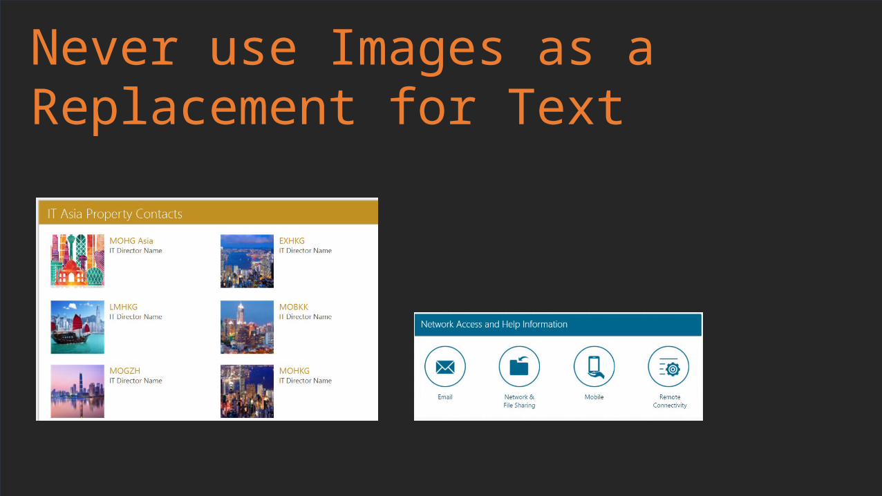
Never use Images as a Replacement for Text
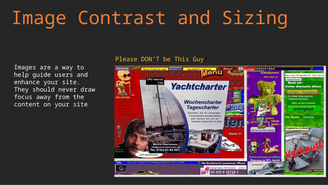
Image Contrast and Sizing
Images are a way to help guide users and enhance your site. They should never draw focus away from the content on your site
Please DON’T be This Guy!
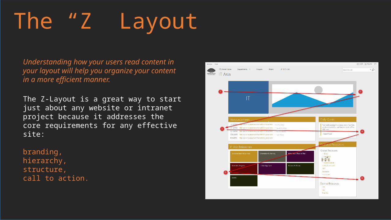
The “Z” Layout
The Z-Layout is a great way to start just about any website or intranet project because it addresses the core requirements for any effective site:
branding, hierarchy, structure, call to action.
Understanding how your users read content in your layout will help you organize your content in a more efficient manner.
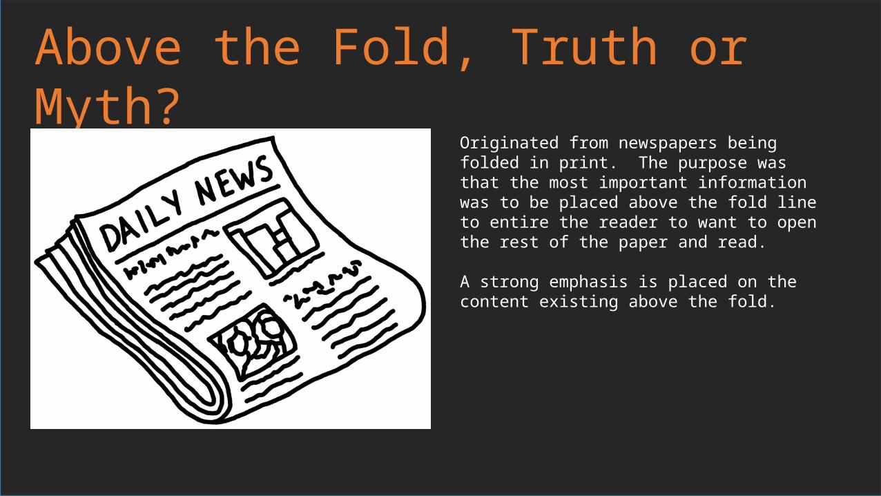
Above the Fold, Truth or Myth?
Originated from newspapers being folded in print. The purpose was that the most important information was to be placed above the fold line to entire the reader to want to open the rest of the paper and read.
A strong emphasis is placed on the content existing above the fold.
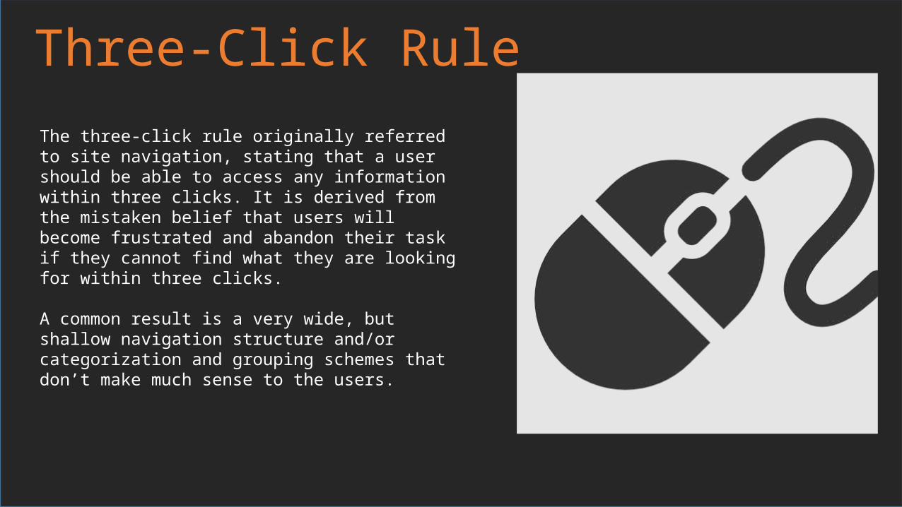
Three-Click RuleThe three-click rule originally referred to site navigation, stating that a user should be able to access any information within three clicks. It is derived from the mistaken belief that users will become frustrated and abandon their task if they cannot find what they are looking for within three clicks.
A common result is a very wide, but shallow navigation structure and/or categorization and grouping schemes that don’t make much sense to the users.
Three-Click Rule –The TruthPerception of Progress
Rather than artificially forcing every task to fit within three clicks, focus instead on making sure the task flow is clearly understandable and that each click results in obvious progress toward the user’s desired outcome.
Task Analysis
The task sequence should be based on the users’ perception of the task, not the developer’s sense of what is technically efficient.
Easy to Use is Hard to
Design
The designer needs to fully understand how users organize or group the various steps of a task flow and design to that flow. Doing analysis take more time, but will create a better experience.
Link Farms

Look Familiar?
The easiest solution to navigation was to add another link on the page. What happened in the end, was we had pages based of only links and couldn’t find the information we were looking for.
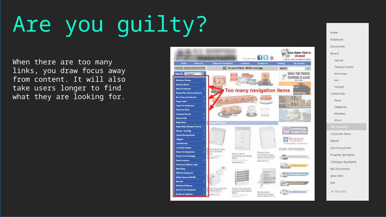
Are you guilty?When there are too many links, you draw focus away from content. It will also take users longer to find what they are looking for.

Lucky number 7
7 Seven links is the most that a short-term memory can remember at a time. Any more than seven and your brain will start to slow down in processing.

How can you present More than 7 links withoutCausing a bad experience?
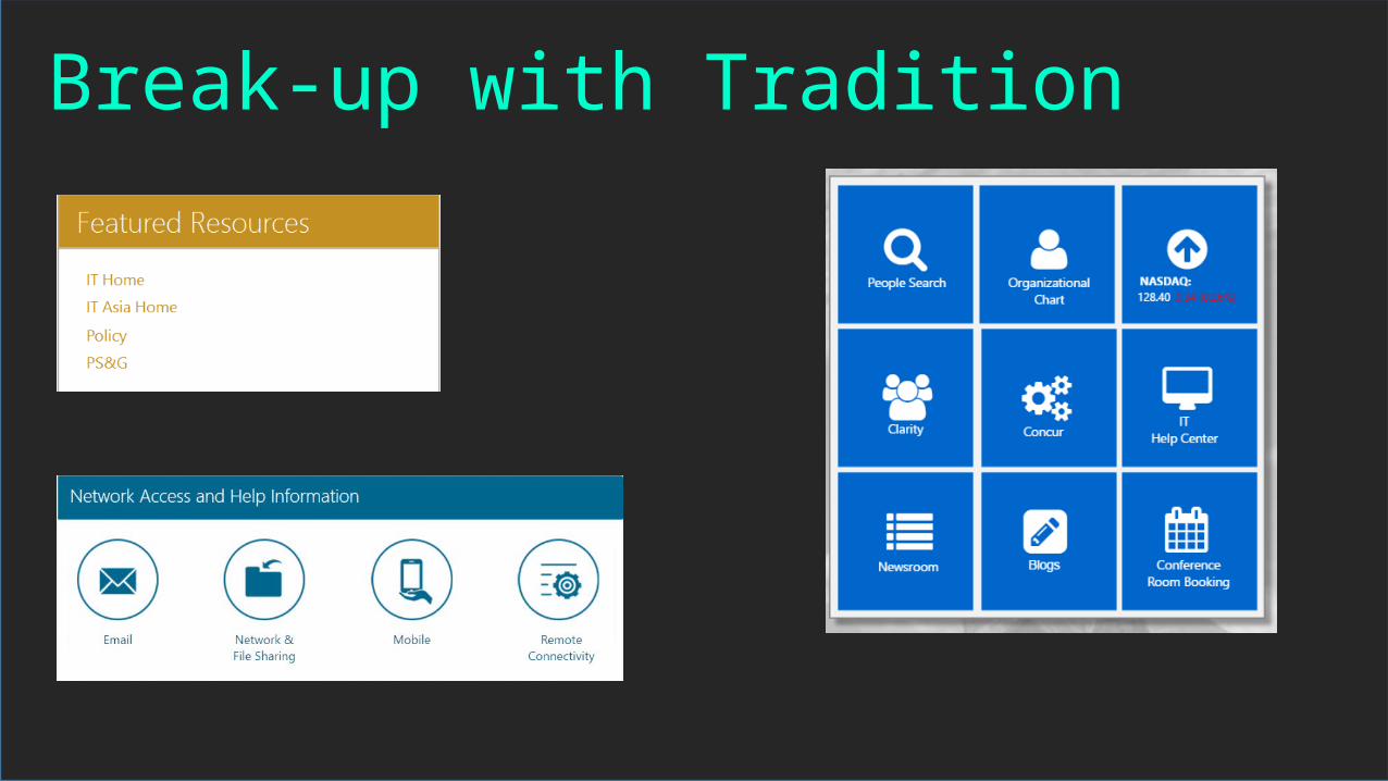
Break-up with Tradition

Use IconographyUsing Icons to help present a list or create an additional navigational structure will break up the presentation of a traditional links list and engage users.
Use Color to help differentiate functionality for icons.
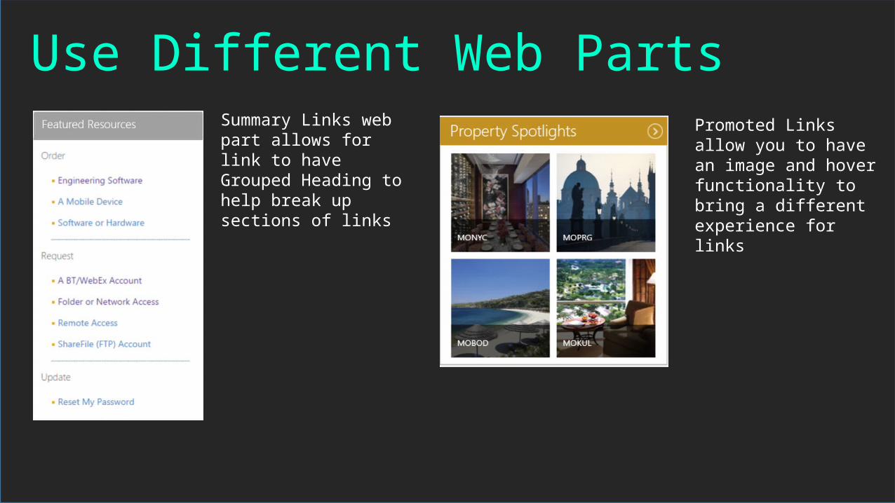
Use Different Web PartsSummary Links web part allows for link to have Grouped Heading to help break up sections of links
Promoted Links allow you to have an image and hover functionality to bring a different experience for links

Customize the List TemplateUsing Client-Side Rendering, you can use javascript to alter the traditional list template and be able to create custom experiences

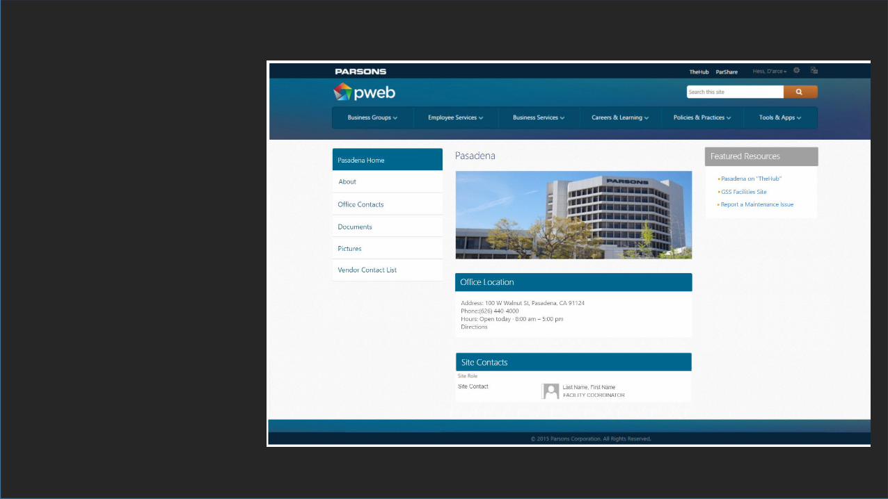
Creating a Consistent ExperienceA Case Study:


Summary
What did we learn?• Know who your user base is, what will help them be successful• With so many options for types of content, help choose consistent themes and
placement of content• Choose Page Layouts that allow users to easily find content in a structured
manner.• Images can both enhance and also confuse users. Let your content tell your
story. Every image should serve a purpose.• “Above the Fold” and “Three Click” methods are myths, but do serve as a good
reminder• Do not try to put all of your content on one page. It’s ok for users to go through
steps as long as they are progressing towards a goal.• Try not to have more than 7 links in an area.• Use Icons and different kinds of web parts to display different kinds of links

Resources

Psychology – Plus or minus 2
• https://www.canva.com/• https://teamtreehouse.com/
• https://articles.uie.com/three_click_rule/• http://www.uxbooth.com/articles/stop-counting
-clicks/• https://www.smashingmagazine.com/2009/09/
10-useful-usability-findings-and-guidelines/
Three Click Rule, Above the Fold
Iconography• http://iconion.com/• http://fontawesome.io/
• http://www.simplypsychology.org/short-term-memory.html
Learning Design Basics and Page Layouts

Thank you!