Comission Group Final Final
25
Exhibition Pitch Changing Faces Christy Brocklesby-Weller Emily Adams Cassie Foster Jaime McDonnell
-
Upload
christy-brocklesby-weller -
Category
Documents
-
view
222 -
download
0
Transcript of Comission Group Final Final

7/31/2019 Comission Group Final Final
http://slidepdf.com/reader/full/comission-group-final-final 1/25
Exhibition Pitch
Changing Faces
Christy Brocklesby-WellerEmily AdamsCassie Foster
Jaime McDonnell

7/31/2019 Comission Group Final Final
http://slidepdf.com/reader/full/comission-group-final-final 2/25
Our Concept…………
Our concept for our exhibition piece titled ‘Changing Faces’ focuses on
the destruction and insignificant nature of objects that were oncedeemed an important aspect of society but now have become irrelevant,left over time to waste away.
Their ‘face’ has changed.
So why an exhibition?
We felt our work fitted in with the style of the exhibition genre rather than anewspaper or magazine, as we thought that our images would not work as anarticle, rather installation pieces that worked on a common theme, as a singleimage that also worked as a group. We decided our target audience will be
people from our generation and slightly older (20-30) to make them aware of theissues in society relating to waste.
Why the Location?
We chose Fort Amhurst rather than the other two options, as it had a barren,isolated feeling to it that linked in with the our concept of a subject losing itsvalue and worth over time. Left to waste away.

7/31/2019 Comission Group Final Final
http://slidepdf.com/reader/full/comission-group-final-final 3/25
Group Roles
Christy Brocklesby-Weller•Paper/size of prints•Positioning of prints•Room sketches•Promotional poster
Emily Adams•Scale 3D model•Floor plan•Lighting•Budget
Cassie Foster•
Press release•Promotional Flyers
Jaime McDonnell•Gallery Labels•Lighting Research

7/31/2019 Comission Group Final Final
http://slidepdf.com/reader/full/comission-group-final-final 4/25
Location Choice
Entrance to Top Floor
Upper Floor corridor
2x Upper floor rooms(exactly the same size next to
one another)
At the top of the
stairs on the top level
The staircase fromupper to lowerfloor
Lower floor rooms(x2) and the corridor
The Entrance Hall
The extra room
7/31/2019 Comission Group Final Final
http://slidepdf.com/reader/full/comission-group-final-final 5/25
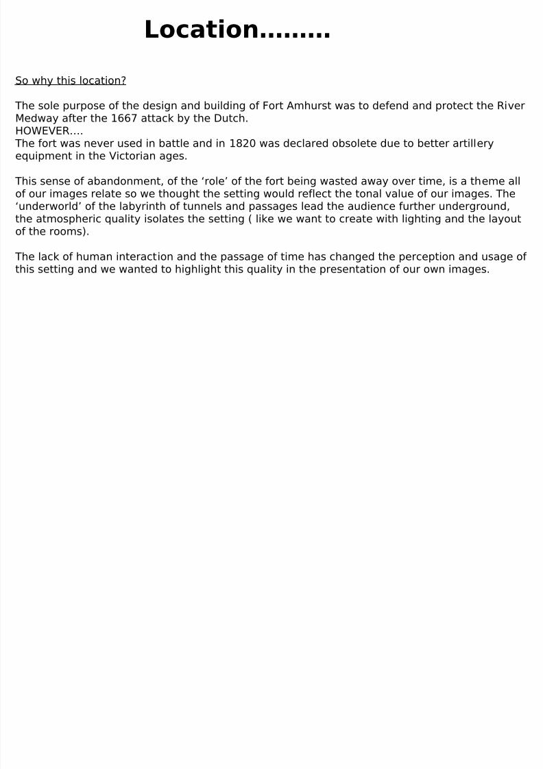
Location………
So why this location?
The sole purpose of the design and building of Fort Amhurst was to defend and protect the RiverMedway after the 1667 attack by the Dutch.HOWEVER….
The fort was never used in battle and in 1820 was declared obsolete due to better artilleryequipment in the Victorian ages.
This sense of abandonment, of the ‘role’ of the fort being wasted away over time, is a theme all
of our images relate so we thought the setting would reflect the tonal value of our images. The‘underworld’ of the labyrinth of tunnels and passages lead the audience further underground,the atmospheric quality isolates the setting ( like we want to create with lighting and the layoutof the rooms).
The lack of human interaction and the passage of time has changed the perception and usage of this setting and we wanted to highlight this quality in the presentation of our own images.
7/31/2019 Comission Group Final Final
http://slidepdf.com/reader/full/comission-group-final-final 6/25
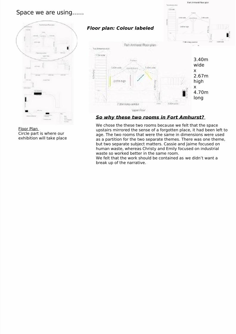
Space we are using……
Floor plan: Colour labeled
Floor PlanCircle part is where ourexhibition will take place
So why these two rooms in Fort Amhurst?
We chose the these two rooms because we felt that the spaceupstairs mirrored the sense of a forgotten place, it had been left toage. The two rooms that were the same in dimensions were usedas a partition for the two separate themes. There was one theme,but two separate subject matters. Cassie and Jaime focused onhuman waste, whereas Christy and Emily focused on industrialwaste so worked better in the same room.We felt that the work should be contained as we didn’t want a
break up of the narrative.
3.40mwidex2.67m
highx4.70mlong

7/31/2019 Comission Group Final Final
http://slidepdf.com/reader/full/comission-group-final-final 7/25
Sketches of ideas for room design
Before we started to look at references for our room design, Christy just sketched some quick
ideas about the layout of the room keeping in mind three things
Relatable to WasteConnect with the setting but with a modern, contemporary lookConnect with the overall theme of ‘waste’
7/31/2019 Comission Group Final Final
http://slidepdf.com/reader/full/comission-group-final-final 8/25
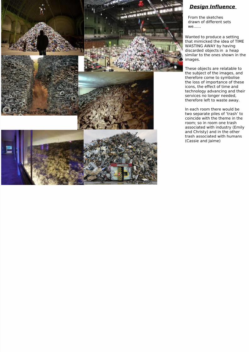
Design Influence
Wanted to produce a settingthat mimicked the idea of TIMEWASTING AWAY by havingdiscarded objects in a heapsimilar to the ones shown in theimages.
These objects are relatable tothe subject of the images, andtherefore come to symbolisethe loss of importance of these
icons, the effect of time andtechnology advancing and theirservices no longer needed,therefore left to waste away.
In each room there would betwo separate piles of ‘trash’ tocoincide with the theme in theroom; so in room one trashassociated with industry (Emily
and Christy) and in the othertrash associated with humans(Cassie and Jaime)
From the sketchesdrawn of different setswe……
Chris Jordan
Edward Burtynsky
Christian Boltanski

7/31/2019 Comission Group Final Final
http://slidepdf.com/reader/full/comission-group-final-final 9/25
Design Influence/Props
In the second room of the exhibition displaying the work of Cassie Foster and Jaime McDonnell, we wanted to create aninteractive space in which the audience could touch and see theelements which surround both series’ themes.
There will be a washing line kris crossing at different angles inthe room made out of shredded material, with the images beingheld by pegs.
The washing line and the pegs represent the content of Cassie’simages and further more represent the connection between theimages and the exhibition space.
Similar to the washing line representing recycling of clothesthrough second hand stores, we thought along the floor underthe photographs could be crumpled book pages that wouldrepresent Jaime’s theme of the waste of the human body andyouth in todays societies.
Props
Pick axeHelmet Coal Shovel ChainsRopesMakeupMirrorsHelmet lightsBird Cage

7/31/2019 Comission Group Final Final
http://slidepdf.com/reader/full/comission-group-final-final 10/25
We did look into different methods of framing but we found that contemporaryframes would not work in the space because of the context of the building. Wewill instead use spotlights to frame the images to demonstrate the sense of isolation and disregard.
Whereas the other two members of the group are placing their images on thewall, Cassie and Jaime liked the idea of using a washing line to hang theirimages from, as their themes of work focused on human waste (Cassie withthe disregard of clothes and Jaime with her theme that focused on the wastingaway of humans and youth)
SET DESIGN
Cassie’sphotographs
Jaime’sphotographs
Pile of discardedclothes andhuman hair thatis built up to thewall
Washing linemade out of
rope
Pile of rubbish.Placed upagainst the wall,spill out onto thefloor.
Christy’spictures
Emily’spictures

7/31/2019 Comission Group Final Final
http://slidepdf.com/reader/full/comission-group-final-final 11/25
Lighting
As a group, we decided that we wanted to usehard, directional spotlights as our main lightingsource on our images. Through this technique we
wanted to create an effect of isolation, of beinglooked over and discarded. Through this effect,these once anonymous subjects are exposed and
forcing the eye to look at thesubject, the detail, thecolour, the fixed focal point.
For a time these subjects arebrought back into theconscious, remembered untilonce again time moves onand they once gain getforgotten.
In respect to the lighting
used in the pile of litter, thiswill be lit at the base toshow the varying levels andtextures of the discarded,valueless pile of humanwaste

7/31/2019 Comission Group Final Final
http://slidepdf.com/reader/full/comission-group-final-final 12/25
Final Room Plan andLighting
Wall of broken glass:1.70m in at bothside- centre to the
back wall
Pile of rubbishfrom the wallof brokenglass out andscattered onthe floor
4 . 7 0
m l o n g
r o p e
f o r
w a s h i
n g l i n e
. U s e
h o o k
s t o
t i e r o p e
Middle picture– one we haveused inadvertising2.35 m in
Jamie’s
pictures
Cassie’
spictures
Key:
Come to astop at2.35m
Cometo astop at3m
Pile of rubbishfrom thewallcomesdown inheap and
scatterson thefloor
Christy’sPictures
Emily’spictures
P i c t u r e s : 1 . 6
m
a p a r t
P i c t u r e s : 1 . 6
m
a p a r t
3.40m long
Picturesatdifferentlengthsapart
cold:trulywaste
Warm:regeneration
Spotlights
fromabove
Baselit
Lit at basewith a normalspotlightUpwards
Spotligh
ts

7/31/2019 Comission Group Final Final
http://slidepdf.com/reader/full/comission-group-final-final 13/25
Christy’s Images –Left Wall
Cassie’s Images
Jaime’s ImagesEmily’s Images-
Right Wall The idea of psychologically damaging of your health or mind through substanceabuse or due to the modern age is a
very unclear subject
Layout of the Images (Left to Right- natural looking direction)
Document what happens to ourhousehold waste once it is taken from
our homes. She captures the peopleand the settings that deal with it.
1st room2nd Room
Regeneration of waste land
focusing on an old mine field
Produce a series of images that focusedon the decaying and wasteful nature of
the numerous vessels and boats that dot
the Medway Maritime shoreline.
7/31/2019 Comission Group Final Final
http://slidepdf.com/reader/full/comission-group-final-final 14/25
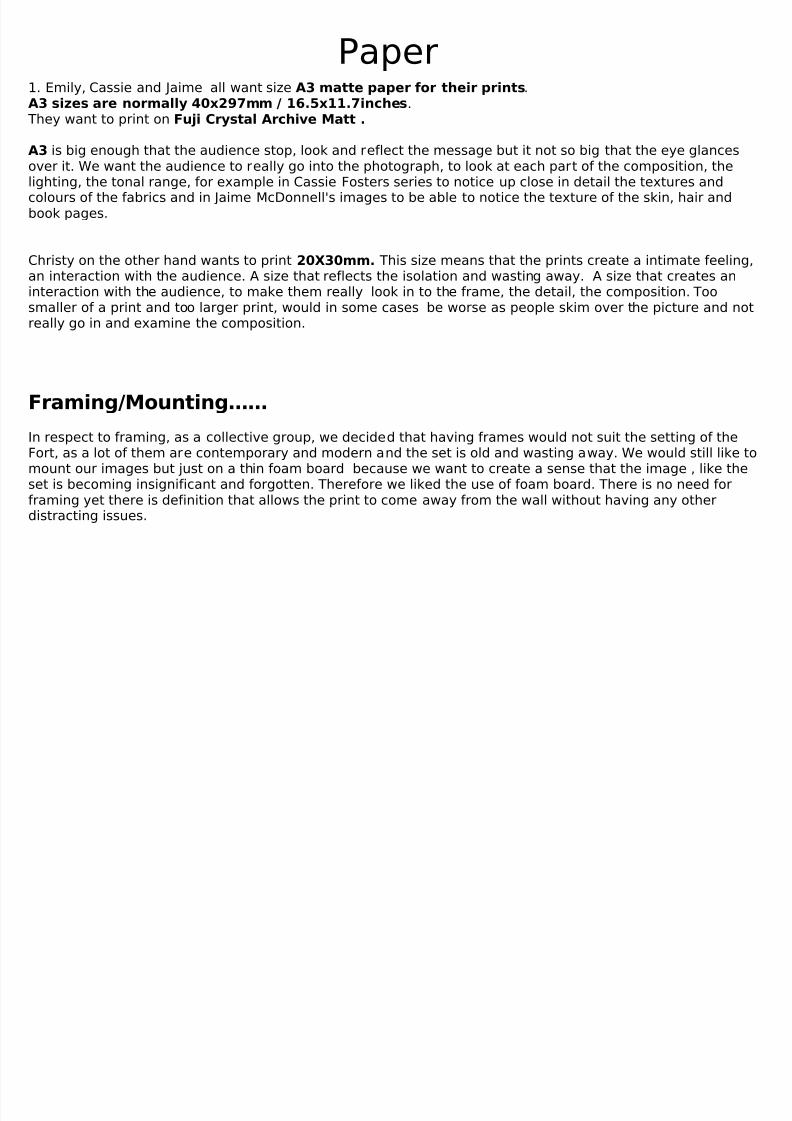
Paper1. Emily, Cassie and Jaime all want size A3 matte paper for their prints.A3 sizes are normally 40x297mm / 16.5x11.7inches.
They want to print on Fuji Crystal Archive Matt .
A3 is big enough that the audience stop, look and reflect the message but it not so big that the eye glancesover it. We want the audience to really go into the photograph, to look at each part of the composition, thelighting, the tonal range, for example in Cassie Fosters series to notice up close in detail the textures andcolours of the fabrics and in Jaime McDonnell's images to be able to notice the texture of the skin, hair andbook pages.
Christy on the other hand wants to print 20X30mm. This size means that the prints create a intimate feeling,
an interaction with the audience. A size that reflects the isolation and wasting away. A size that creates aninteraction with the audience, to make them really look in to the frame, the detail, the composition. Toosmaller of a print and too larger print, would in some cases be worse as people skim over the picture and notreally go in and examine the composition.
In respect to framing, as a collective group, we decided that having frames would not suit the setting of theFort, as a lot of them are contemporary and modern and the set is old and wasting away. We would still like tomount our images but just on a thin foam board because we want to create a sense that the image , like theset is becoming insignificant and forgotten. Therefore we liked the use of foam board. There is no need forframing yet there is definition that allows the print to come away from the wall without having any otherdistracting issues.
Framing/Mounting……

7/31/2019 Comission Group Final Final
http://slidepdf.com/reader/full/comission-group-final-final 15/25
So why Matte? The neutral tones of matte paper produce a finish that is subtle, natural looking and
does not reflect light. The ‘dull’ quality of the paper would work well with the settingof Fort Amhurst; the coldness, isolation and a sense of being forgotten works well withthe printing quality of the paper, it too through its subtle colours is sometimesoverlooked and therefore the little details become insignificant. The natural looking
paper would work well with the lighting and the wall texture, it looks clean yet a littlecontemporary with the slight shine, meaning the lighting wouldn’t produce a lightglare
So why Giclee paper (semi matte) paper?It has a professional quality, a refined and detailed finish that I think would workwith my images as the composition is made up of detail and depth, issues I want theaudience to really look closely at. The semi matte finish links in with the rest of my
group so there is a continuous narrative, also it links in with the idea that theseprints are forgotten and discarded.
7/31/2019 Comission Group Final Final
http://slidepdf.com/reader/full/comission-group-final-final 16/25
7/31/2019 Comission Group Final Final
http://slidepdf.com/reader/full/comission-group-final-final 17/25
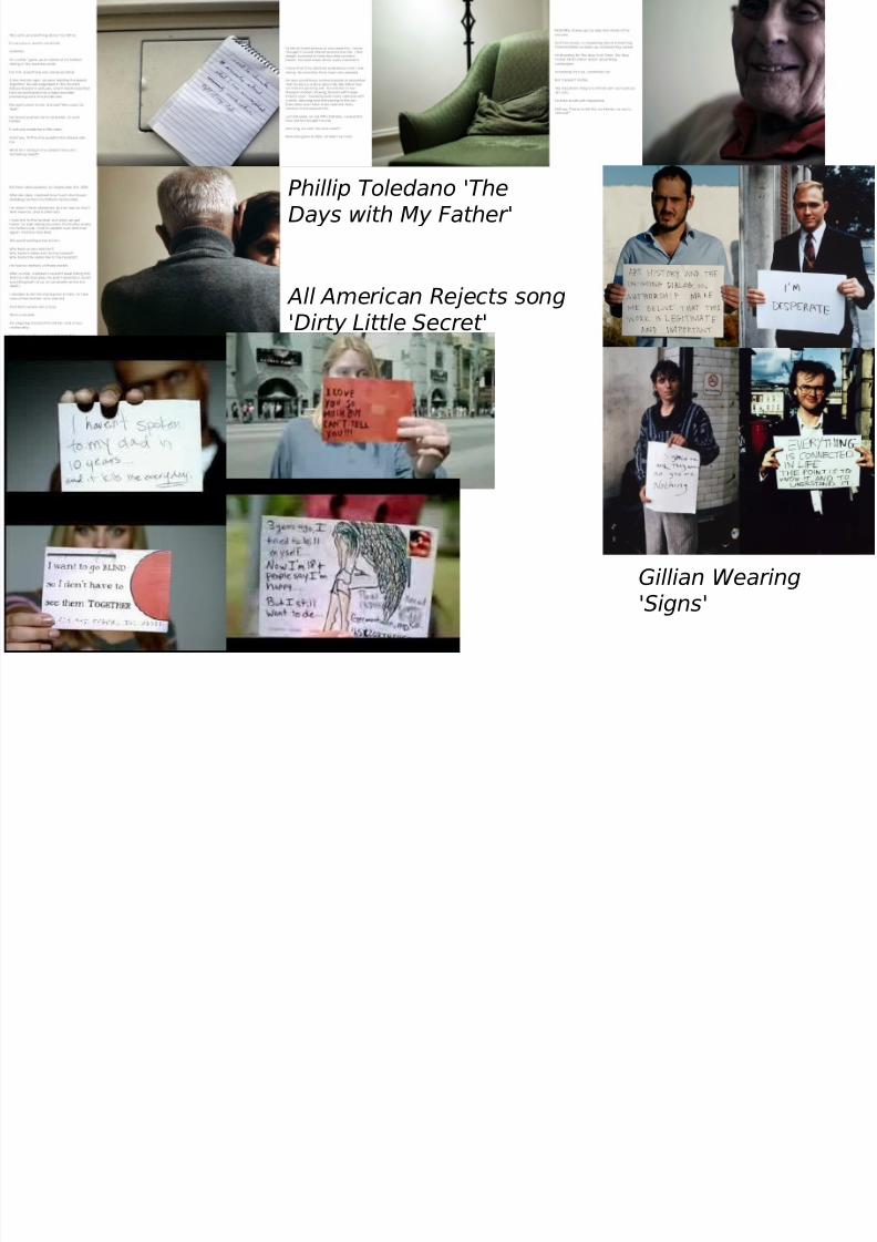
Phillip Toledano 'TheDays with My Father '
Gillian Wearing
'Signs'
All American Rejects song'Dirty Little Secret'

7/31/2019 Comission Group Final Final
http://slidepdf.com/reader/full/comission-group-final-final 18/25
We decided that we didn’t want any writing besides our images, creating this sense of being anonymous, of having no real value. Wewanted our images to stand alone to be looked at as single pieces of work ( we would have the name of the photographer and type of print etc.)
The type of font we are after is a style that is faded and almost absorbs into the background. This would work well with the setting of the fort, the crumbling walls and the lettering would create this effect that reflects the setting- almost become irrelevant andforgotten like the subjects in the pictures.
Instead of words about our work, we thought having quotes relatable to each rooms theme would suit the theme of our work-anonymous yet create a linking narrative. These would have to be put on a wall on top of the original wall because it is a grade 2listed building so we cannot do anything that will damage the structure.
These are some possible quotes
“brought those landscapes in our conscious”- Edward Burtynsky“These ships carry a great metaphor connecting us through the seas…all the materials we experience comes through ships so they have become the kind of reason globalisation is the portions it is” – Edward Burtynsky‘Books are but waste paper unless we spend in action the wisdom we get from thought - asleep. When we are weary of the living, wemay repair to the dead, who have nothing of peevishness, pride, or design in their conversation.’ - William Butler Yeats‘Beauty can be seen in all things, seeing and composing the beauty is what separates the snapshot from the photograph. ’ – MattHardy
‘I have always looked upon decay as being just as wonderful and rich an expression of life as growth’ - Henry Miller
So why these quotes?
Making the audience fully understand the impact of their actions bringing it back to their consciousness so that these once discardedobjects are remembered and are looked at.

7/31/2019 Comission Group Final Final
http://slidepdf.com/reader/full/comission-group-final-final 19/25
AD
V ERT
ISE
MEN
T
Started to look atdesigns of exhibition
posters (colour,composition, writing)
7/31/2019 Comission Group Final Final
http://slidepdf.com/reader/full/comission-group-final-final 20/25
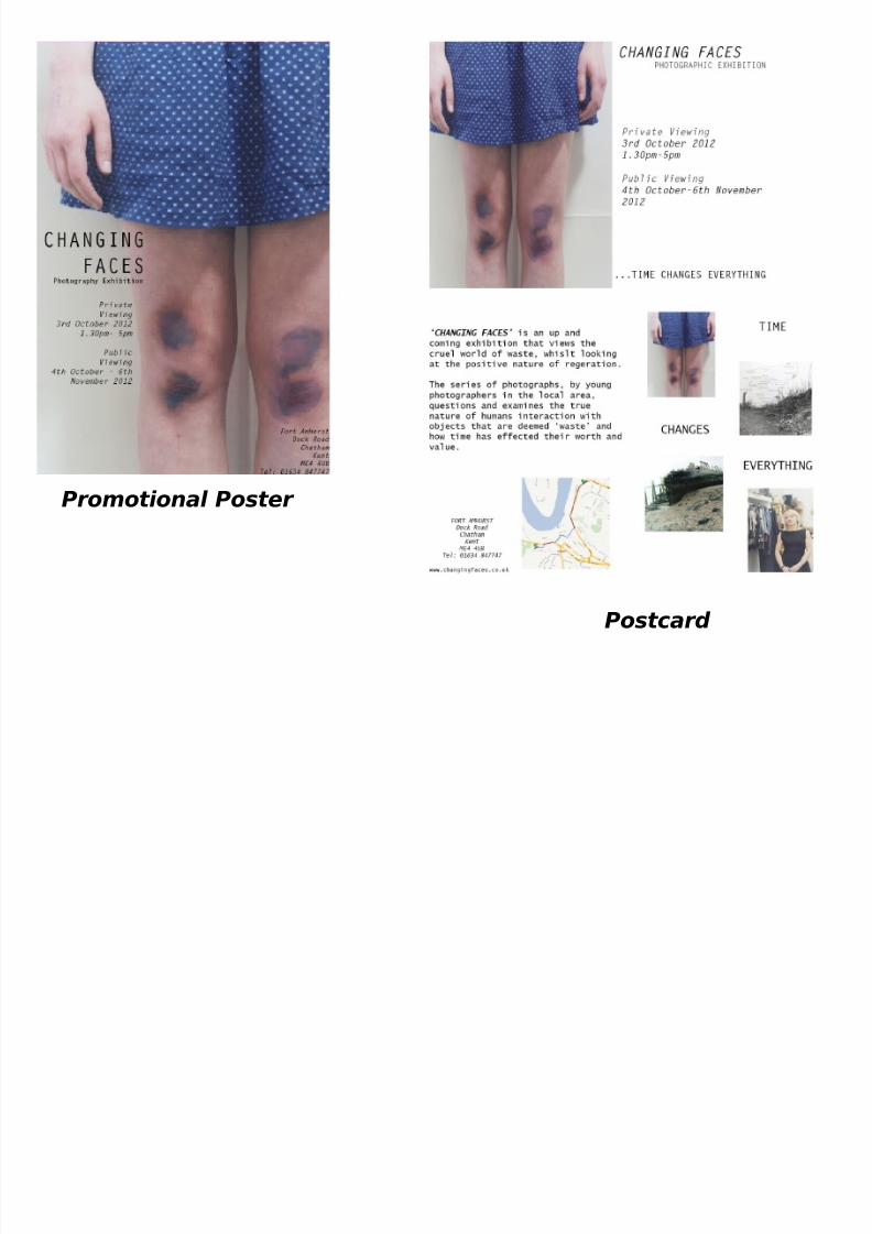
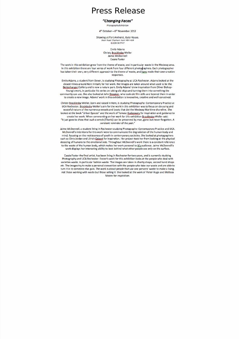
Promotional Poster
Postcard
7/31/2019 Comission Group Final Final
http://slidepdf.com/reader/full/comission-group-final-final 21/25
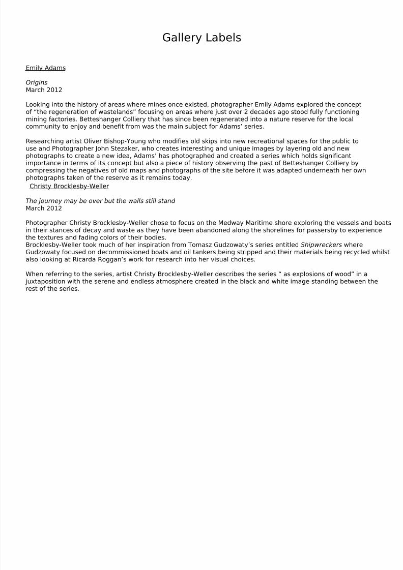
Press Release
7/31/2019 Comission Group Final Final
http://slidepdf.com/reader/full/comission-group-final-final 22/25
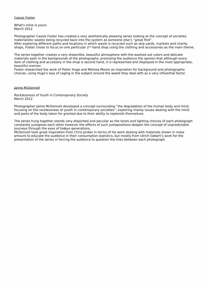
Gallery Labels
Emily Adams OriginsMarch 2012 Looking into the history of areas where mines once existed, photographer Emily Adams explored the conceptof “the regeneration of wastelands” focusing on areas where just over 2 decades ago stood fully functioningmining factories. Betteshanger Colliery that has since been regenerated into a nature reserve for the localcommunity to enjoy and benefit from was the main subject for Adams’ series.
Researching artist Oliver Bishop-Young who modifies old skips into new recreational spaces for the public touse and Photographer John Stezaker, who creates interesting and unique images by layering old and newphotographs to create a new idea, Adams’ has photographed and created a series which holds significantimportance in terms of its concept but also a piece of history observing the past of Betteshanger Colliery bycompressing the negatives of old maps and photographs of the site before it was adapted underneath her ownphotographs taken of the reserve as it remains today.
Christy Brocklesby-Weller The journey may be over but the walls still standMarch 2012 Photographer Christy Brocklesby-Weller chose to focus on the Medway Maritime shore exploring the vessels and boatsin their stances of decay and waste as they have been abandoned along the shorelines for passersby to experiencethe textures and fading colors of their bodies.Brocklesby-Weller took much of her inspiration from Tomasz Gudzowaty’s series entitled Shipwreckers whereGudzowaty focused on decommissioned boats and oil tankers being stripped and their materials being recycled whilstalso looking at Ricarda Roggan’s work for research into her visual choices. When referring to the series, artist Christy Brocklesby-Weller describes the series “ as explosions of wood” in a
juxtaposition with the serene and endless atmosphere created in the black and white image standing between therest of the series.
7/31/2019 Comission Group Final Final
http://slidepdf.com/reader/full/comission-group-final-final 23/25
Cassie Foster What's mine is yoursMarch 2012
Photographer Cassie Foster has created a very aesthetically pleasing series looking at the concept of societiesmaterialistic wastes being recycled back into the system as someone else’s “great find”.After exploring different paths and locations in which waste is recycled such as skip yards, markets and charityshops, Foster chose to focus on one particular 2nd hand shop using the clothing and accessories as the main theme.
The series together creates a very dreamlike, beautiful atmosphere with the washed out colors and delicatematerials seen in the backgrounds of the photographs, promising the audience the opinion that although everyitem of clothing and accessory in the shop is second hand, it is represented and displayed in the most appropriate,beautiful manner.Foster researched the work of Pieter Hugo and Melissa Moore as inspiration for background and photographicchoices, using Hugo’s way of caging in the subject around the waste they deal with as a very influential factor.
Jaime McDonnell Recklessness of Youth in Contemporary Society March 2012
Photographer Jaime McDonnell developed a concept surrounding “the degradation of the human body and mind,focusing on the recklessness of youth in contemporary societies”, exploring mainly issues dealing with the mindand parts of the body taken for granted due to their ability to replenish themselves.
The series hung together stands very disjointed and peculiar as the tones and lighting choices of each photographconstantly juxtapose each other however the effects of such juxtapositions deepen the concept of unpredictable
journeys through the eyes of todays generations.McDonnell took great inspiration from Chris Jordan in terms of his work dealing with materials shown in massamount to educate the audience in their consumption statistics, but mostly from Ulrich Gebert’s work for thepresentation of the series in forcing the audience to question the links between each photograph.
7/31/2019 Comission Group Final Final
http://slidepdf.com/reader/full/comission-group-final-final 24/25
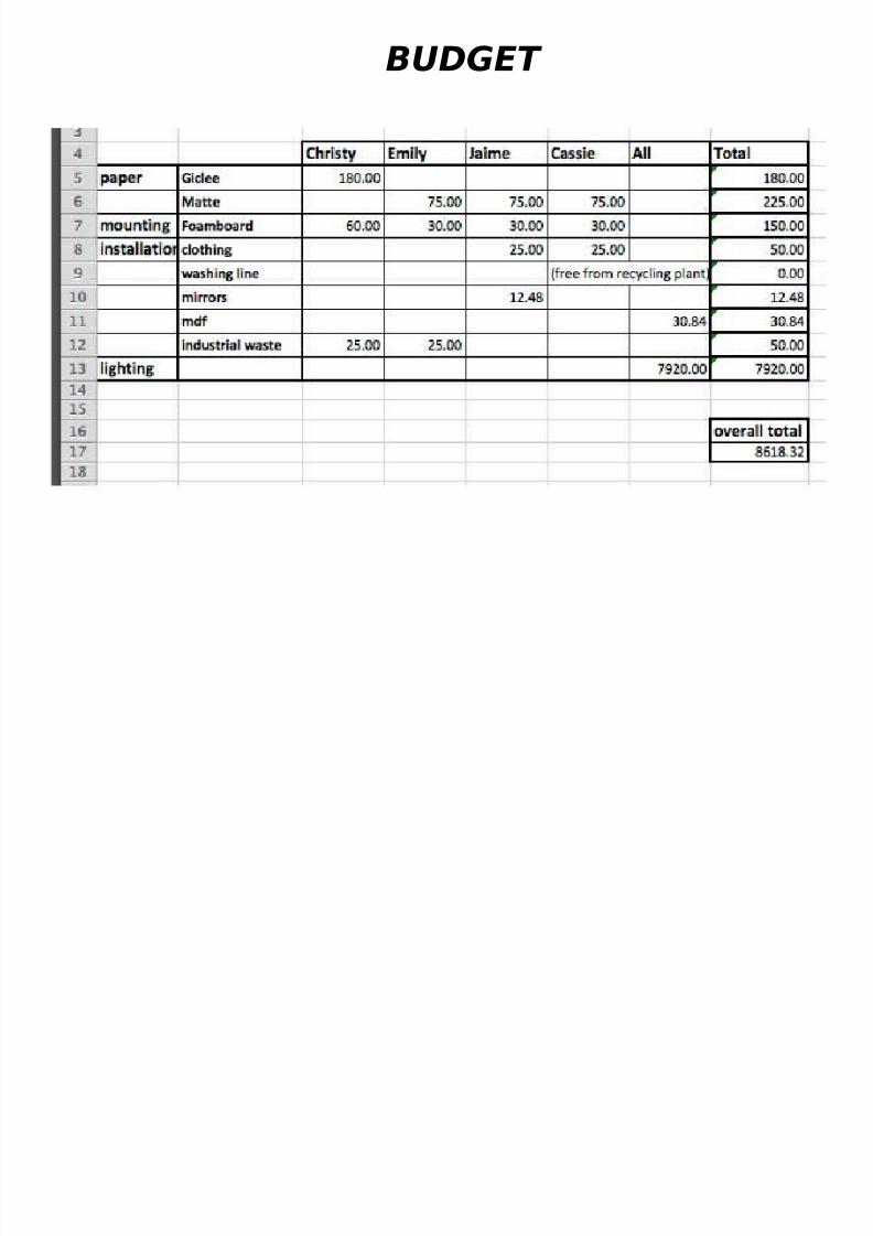
BUDGET

7/31/2019 Comission Group Final Final
http://slidepdf.com/reader/full/comission-group-final-final 25/25
Evaluation
What have we learnt?
We have learnt to give and take personal opinions about work, to create an exhibition that had been made in aconstructive manner and that everyone felt they contributed to.Emily felt that she struggled with communicating her ideas at times, whilst Christy felt that perhaps she tookcontrol over things too much. Cassie feels she has a better understanding of how testing it can be to work in agroup of people that have to compromise each others personal preferences. Jaime felt she struggled withengaging with the given task and therefore wasn’t able to fully communicate her personal opinions howeverlearnt to work within a group to build an exhibition that involved different series’ of work.
What could of gone better?
As a group there was some issues with communication and reliability, although there was numerous opportunityfor team members to get in contact and perhaps this was not utilized.
How about Management?Considering the time period and the absence of some team members, the project went well, we completed alltasks to a good standard.
Significant Challenge? The most significant challenge was lack of physical communication in places and the equal balance of jobs.
How did we overcome this?We set up Facebook groups to exchange information, however there was a significant unbalance of jobs betweengroup members which left more responsibly on others.