
INAUGURAL SOUTH AFRICAN COMPETETIVENESS FORUM A Brand South Africa Initiative
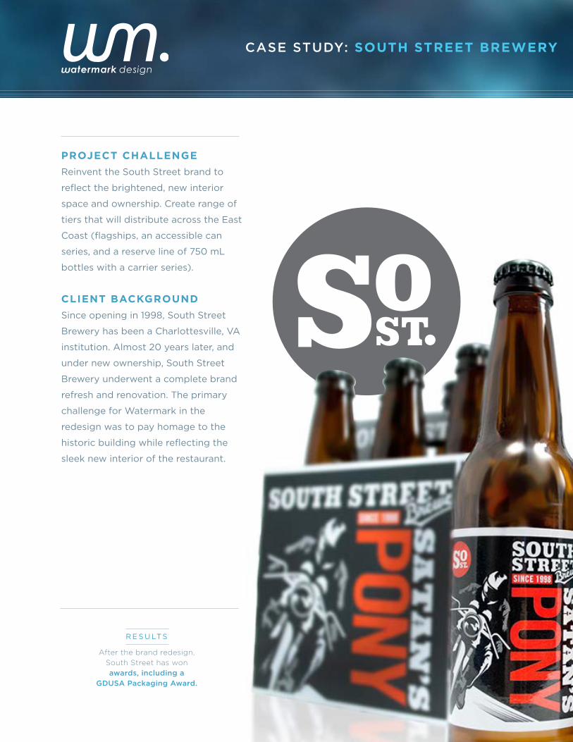
PROJECT CHALLENGE
Reinvent the South Street brand to
reflect the brightened, new interior
space and ownership. Create range of
tiers that will distribute across the East
Coast (flagships, an accessible can
series, and a reserve line of 750 mL
bottles with a carrier series).
CLIENT BACKGROUND
Since opening in 1998, South Street
Brewery has been a Charlottesville, VA
institution. Almost 20 years later, and
under new ownership, South Street
Brewery underwent a complete brand
refresh and renovation. The primary
challenge for Watermark in the
redesign was to pay homage to the
historic building while reflecting the
sleek new interior of the restaurant.
CASE STUDY: SOUTH STREET BREWERY
After the brand redesign,
South Street has won
awards, including a
GDUSA Packaging Award.
R E S U LTS
CASE STUDY: SOUTH STREET BREWERY » LO G O D E V E LO P M E N T
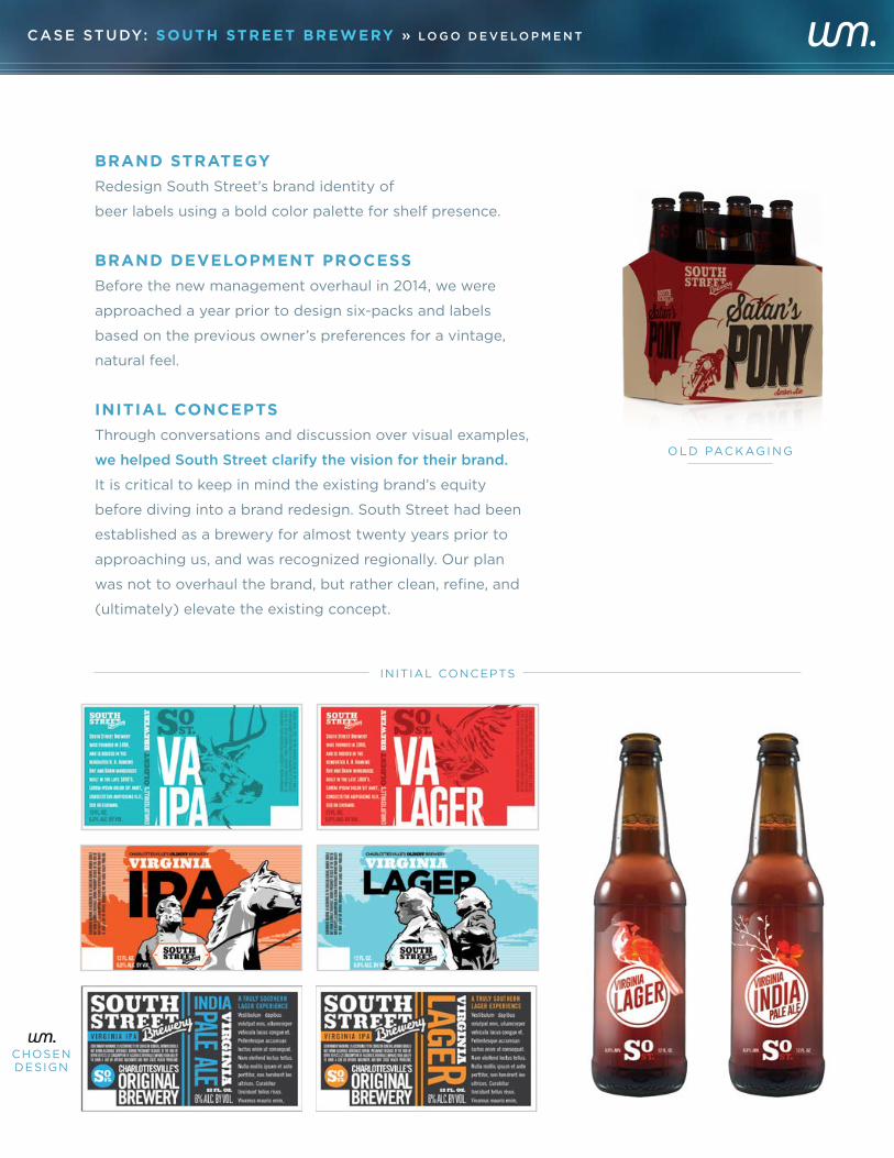
BRAND STRATEGY
Redesign South Street’s brand identity of
beer labels using a bold color palette for shelf presence.
BRAND DEVELOPMENT PROCESS
Before the new management overhaul in 2014, we were
approached a year prior to design six-packs and labels
based on the previous owner’s preferences for a vintage,
natural feel.
INITIAL CONCEPTS
Through conversations and discussion over visual examples,
we helped South Street clarify the vision for their brand.
It is critical to keep in mind the existing brand’s equity
before diving into a brand redesign. South Street had been
established as a brewery for almost twenty years prior to
approaching us, and was recognized regionally. Our plan
was not to overhaul the brand, but rather clean, refine, and
(ultimately) elevate the existing concept.
INITIAL CONCEPTS
O L D PAC K AG I N G
CHOSENDESIGN
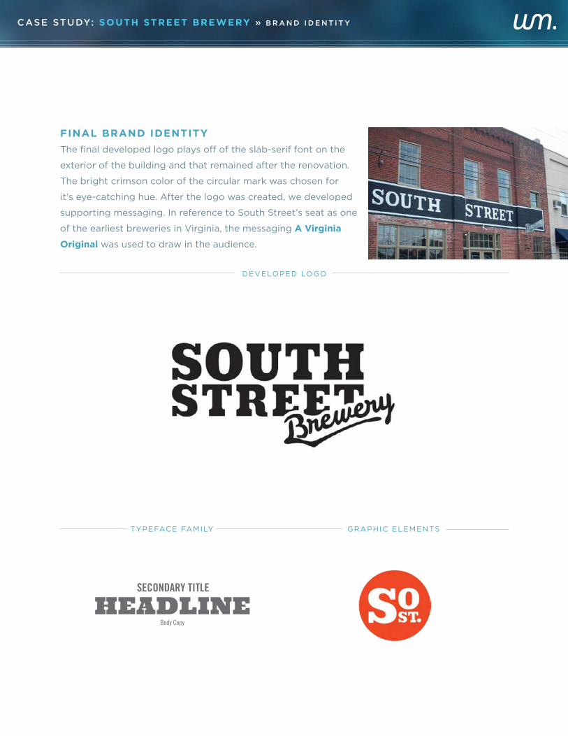
FINAL BRAND IDENTITY
The final developed logo plays off of the slab-serif font on the
exterior of the building and that remained after the renovation.
The bright crimson color of the circular mark was chosen for
it’s eye-catching hue. After the logo was created, we developed
supporting messaging. In reference to South Street’s seat as one
of the earliest breweries in Virginia, the messaging A Virginia
Original was used to draw in the audience.
TYPEFACE FAMILY GRAPHIC ELEMENTS
DEVELOPED LOGO
PRIMARY LOGO
COLOR PALETTE
FONT FAMILY
GRAPHIC ELEMENTS
MARK ONLY TAGLINE
SECONDARY TITLE
HEADLINEBody Copy
H A N D - C R A F T E D
V I R G I N I A G R O W N
CASE STUDY: SOUTH STREET BREWERY » B R A N D I D E N T I T Y
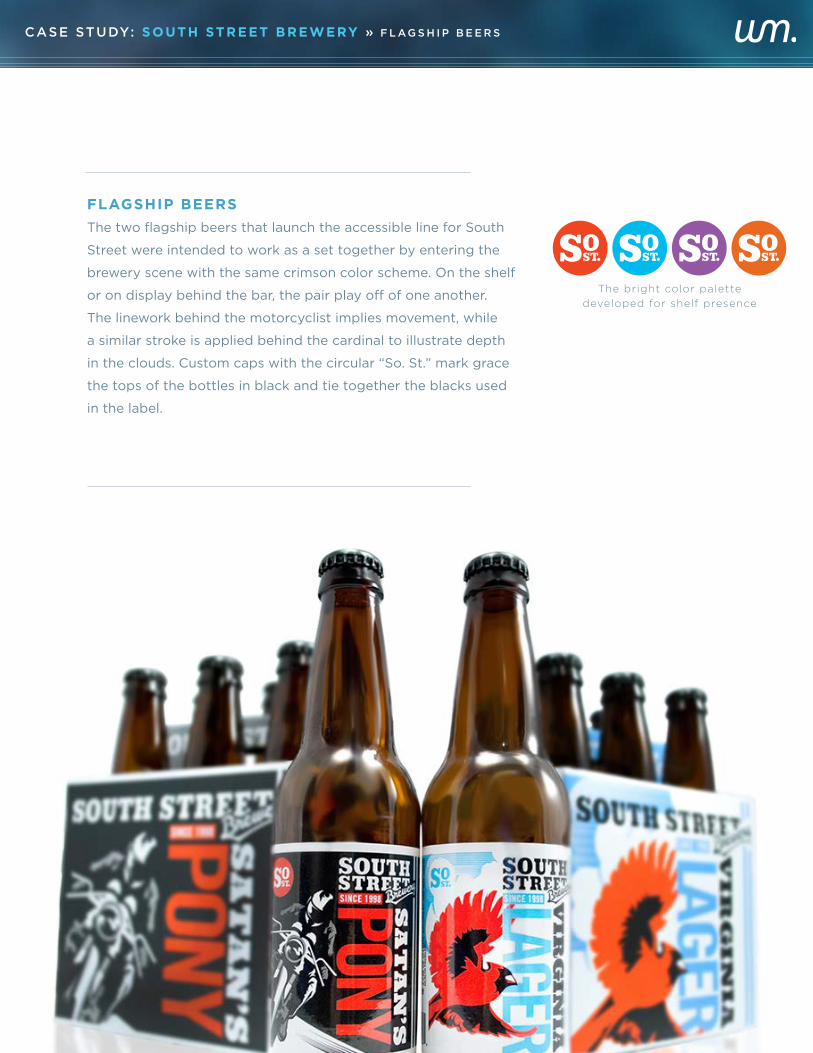
FLAGSHIP BEERS
The two flagship beers that launch the accessible line for South
Street were intended to work as a set together by entering the
brewery scene with the same crimson color scheme. On the shelf
or on display behind the bar, the pair play off of one another.
The linework behind the motorcyclist implies movement, while
a similar stroke is applied behind the cardinal to illustrate depth
in the clouds. Custom caps with the circular “So. St.” mark grace
the tops of the bottles in black and tie together the blacks used
in the label.
The bright color palette
developed for shelf presence
CASE STUDY: SOUTH STREET BREWERY » F L AG S H I P B E E R S
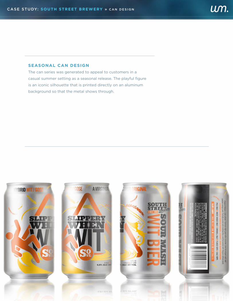
SEASONAL CAN DESIGN
The can series was generated to appeal to customers in a
casual summer setting as a seasonal release. The playful figure
is an iconic silhouette that is printed directly on an aluminum
background so that the metal shows through.
CASE STUDY: SOUTH STREET BREWERY » C A N D E S I G N
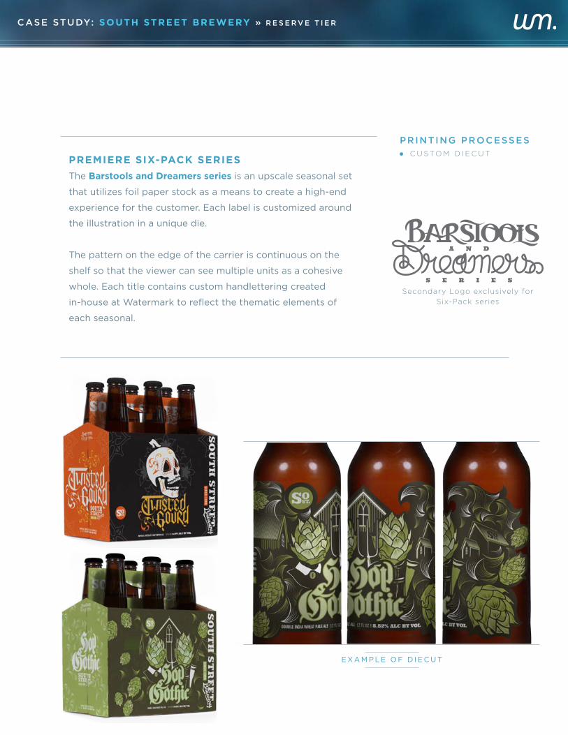
PREMIERE SIX-PACK SERIES
The Barstools and Dreamers series is an upscale seasonal set
that utilizes foil paper stock as a means to create a high-end
experience for the customer. Each label is customized around
the illustration in a unique die.
The pattern on the edge of the carrier is continuous on the
shelf so that the viewer can see multiple units as a cohesive
whole. Each title contains custom handlettering created
in-house at Watermark to reflect the thematic elements of
each seasonal.
CASE STUDY: SOUTH STREET BREWERY » R E S E R V E T I E R
PRINTING PROCESSES
· C U S TO M D I E C U T
Secondary Logo exclusively for
Six-Pack series
E X A M P L E O F D I E C U T
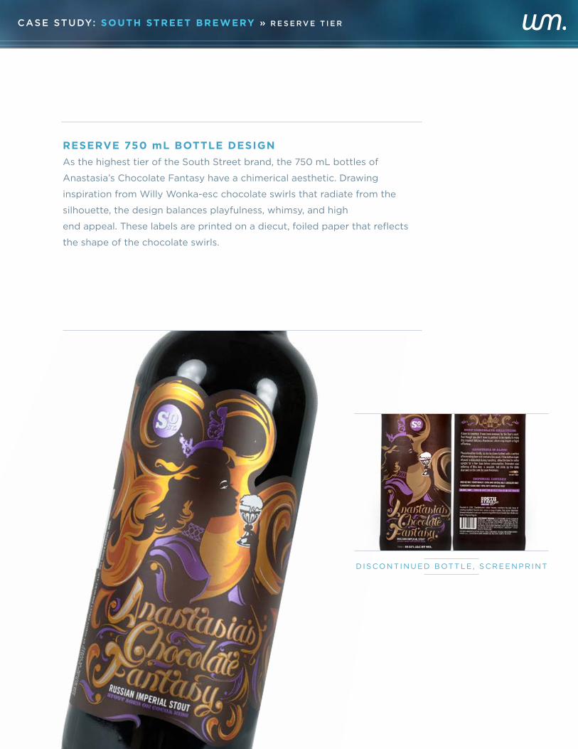
RESERVE 750 mL BOTTLE DESIGN
As the highest tier of the South Street brand, the 750 mL bottles of
Anastasia’s Chocolate Fantasy have a chimerical aesthetic. Drawing
inspiration from Willy Wonka-esc chocolate swirls that radiate from the
silhouette, the design balances playfulness, whimsy, and high
end appeal. These labels are printed on a diecut, foiled paper that reflects
the shape of the chocolate swirls.
D I S CO N T I N U E D B OT T L E , S C R E E N P R I N T
CASE STUDY: SOUTH STREET BREWERY » R E S E R V E T I E R
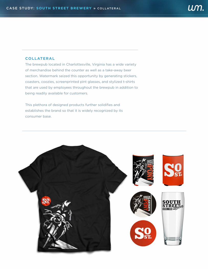
COLLATERAL
The brewpub located in Charlottesville, Virginia has a wide variety
of merchandise behind the counter as well as a take-away beer
section. Watermark seized this opportunity by generating stickers,
coasters, coozies, screenprinted pint glasses, and stylized t-shirts
that are used by employees throughout the brewpub in addition to
being readily available for customers.
This plethora of designed products further solidifies and
establishes the brand so that it is widely recognized by its
consumer base.
CASE STUDY: SOUTH STREET BREWERY » C O L L AT E R A L
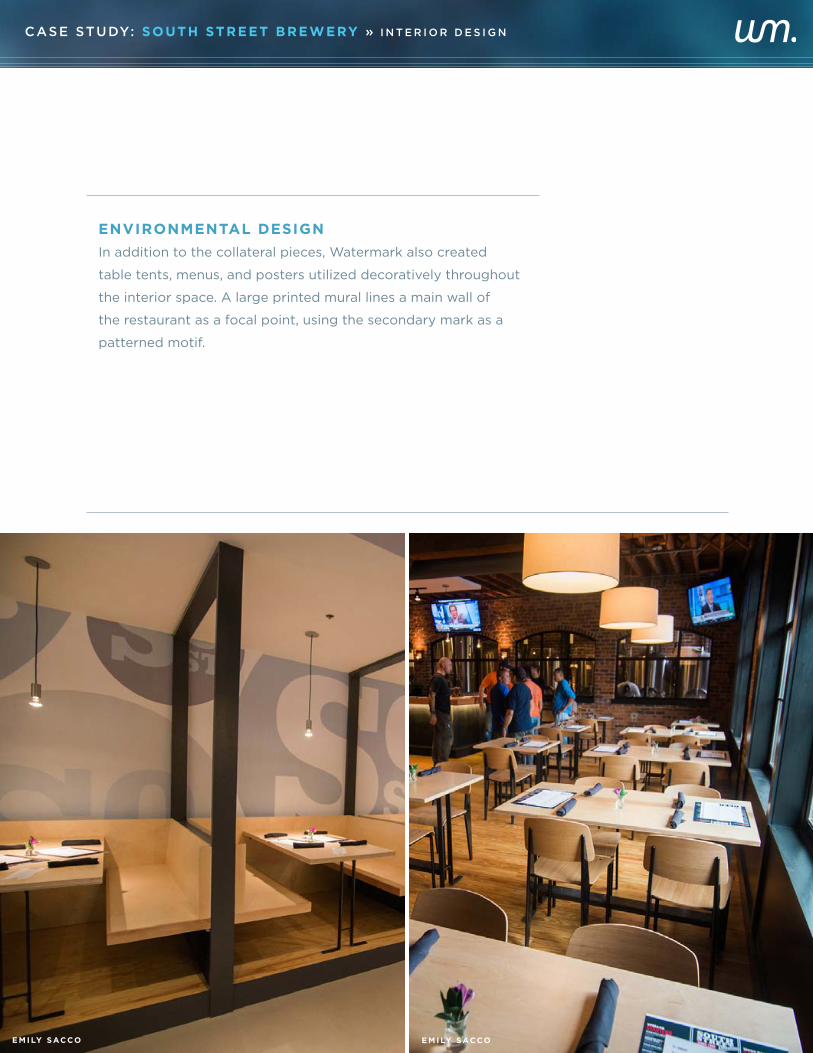
ENVIRONMENTAL DESIGN
In addition to the collateral pieces, Watermark also created
table tents, menus, and posters utilized decoratively throughout
the interior space. A large printed mural lines a main wall of
the restaurant as a focal point, using the secondary mark as a
patterned motif.
CASE STUDY: SOUTH STREET BREWERY » I N T E R I O R D E S I G N
E M I LY SACCO E M I LY SACCO