BRANDING GUIDELINES Foundation for Environmental Education€¦ · logos, words, graphics, photos,...
32
BRANDING GUIDELINES Foundation for Environmental Education
Transcript of BRANDING GUIDELINES Foundation for Environmental Education€¦ · logos, words, graphics, photos,...

BRANDING GUIDELINES Foundation for Environmental Education

2
This is a guide to the branding elements thatmake up the Foundation for EnvironmentalEducation and its programmes. Have a read,it will help you to get to know us a little better.
Why brand identity is so important
Co-badging
Logo colours
Logo specifics & usage
FEE Logo
Blue Flag Logo
Green Key Logo
Eco-Schools Logo
Young Reporters for the Environment Logo
Learning about Forests Logo
Website Icons vs Logo
Colour specifications website & official documents
Icons
Typography
Powerpoint
Word
Contents
03
04
05
07
09
11
13
15
17
19
21
22
23
24
29
31
INTRODUCTION
Intro

3
Why brand identity is so important The FEE brands live not only on paper or electronically but canrepresent many more intangible aspects of our business ethics such as a collection of feelings and perceptions about quality, image, reputation and status amongst peers and partners. It is our job to make our brand communicate its strength and values in a cohesive and consistent way and to do this there are certain rules that need to be adhered to internationally.
INTRODUCTION WHY BRAND IDENTITY IS SO IMPORTANT
These guidelines have been produced to offer clear adviceand guidelines on the use of the Foundation for Environ-mental Education (FEE) brand and its sub brands. FEE andits associated brands are internationally recognised andit is important that our values are protected and endorsedthroughout the brand identity.

4
The Foundation for Environmental Education logos should not be used to sponsor or endorse any other organisation or product nor used for religious orpolitical purposes. The logos featured in this document may only be used by third parties, with permission, where the organisation is participating in or supporting the programme.
INTRODUCTION CO-BADGING
Co-badging

5FEE CORPORATE BRANDING GUIDELINES | 06.2016
Colours

6
All logos in this document use the following colours to ensure that they are identifiable as part of the same family of logos:
These are the only colours in which the logos can be presented (online/printing). This is the core of the brand and can in no circumstances be altered.
COLOURS LOGO COLOURS
RGB: 0 102 204
PAN.: 300 U
WEB: #0066CC
CMYK: 100 46 0 0
RGB: 0 153 51
PAN.: 354 U
WEB: #009933
CMYK: 91 1 93 0

7FEE CORPORATE BRANDING GUIDELINES | 06.2016
Logo specifics& usage

8
There are currently six brands that exist in the FEE portfolio. One corporate brand, FEE, and five sub-brands; Blue Flag, Green Key, Eco-Schools, Young Reporters for the Environment and Learning about Forests.
LOGO SPECIFICS
Foundation for Environmental Education
Blue Flag Green Key Eco-Schools Young Reporters for the Environment
Learning about Forests

9
LOGO USAGE | FEE
COLOURED LOGO
The colour logo is the preferred logo and should be used wherever possible. The master logo is the most important visual representation of the brand. The logo may be used in a greyscale version where colour reproduction is not possible.
BLACK LOGO
The black logo should belimited to such uses wherea colour or grey scale logocannot be used and whenprinting on a solid colouredbackground of any colour.
WHITE LOGO
The white logo should belimited to such uses where acolour or grey scale logocannot be used and whenprinting on a solid colouredbackground of any colour.
FEE logo

10
COMPOSITION
Do NOT change the relationship between the body and the type (No text along the sides or on top of logo – only text under the logo).
LOGO USAGE | FEE
MY COMPANY
COLOUR
Do NOT change the colour of any part of the logo.
ROTATION
Do NOT rotate the logo at all.RATIO
Do NOT alter the ratio of the logo.
TEXT
Do NOT combine the logo with any other elements— such as logos, words, graphics, photos, slogans or symbols that might seem to create a hybrid mark.
Illegitimate use of the logo Size
The minimum recommended size for use is awidth of 25mm. This will ensure the text re-mains legible. In cases where the logo has tofit into other design requirements, the logocan be made smaller. There are no restrictionson the maximum size, only those dictated byfile size. For larger usage please ensure youuse a vector eps version of the logo.
25 mm

11
COLOURED LOGO
The coloured logo is the preferred logo and should be used wher5ever possible. The master logo is the most important visual representation of the brand. The logo can be used with or without the Blue Flag text below. The logo may be used in a grey scale version where colour reproduction is not possible.
BLACK LOGO
The black logo must be limited to PR uses (textile, pens, etc.), where a colour, or grey scale logo cannot be used. This version cannot be used as the official logo on Blue Flag communications, information boards, awards, etc. Moreover, this version cannot be used on a blue background corresponding to the official FEE blue colour referred to in this document.
WHITE LOGO
The white logo must be limited to PR uses (textile, pens, etc.), where a colour, or grey scale logo cannot be used. This version cannot be used as the official logo on Blue Flag communications, information boards, awards, etc. Moreover, this version cannot be used on a blue background corresponding to the official FEE blue colour referred to in this document.
Blue Flag logo
LOGO TEXT - TRANSLATION
The Blue Flag logo always remains constant, however, it is allowed to use the name of the programme under the logo.
In this instance the width of the text should be the same as the width of the logo. We recom-mend to use the Lato Bold font type, and to write the name of the programme in Capital letters “BLUE FLAG”.
LOGO USAGE | BLUE FLAG

12
COMPOSITION
Do NOT change the relationship between the body and the type (No text along the sides or on top of logo – only text under the logo).
MY COMPANY
COLOUR
Do NOT change the colour of any part of the logo.
ROTATION
Do NOT rotate the logo at all.RATIO
Do NOT alter the ratio of the logo.
TEXT
Do NOT combine the logo with any other elements— such as logos, words, graphics, photos, slogans or symbols that might seem to create a hybrid mark.
Illegitimate use of the logo
LOGO USAGE | BLUE FLAG
Size
The minimum recommended size for use is awidth of 25mm. This will ensure the imageremains clear. There are no restrictions onthe maximum size, only those dictated by filesize. For larger usage please ensure you usea vector eps version of the logo.
25 mm

13
LOGO TEXT - TRANSLATION
The main body of the Green Key logo always remains constant, however, the text underneath which names the programme can vary according to translation. Important note: To strengthen the Green Key brand which is in competition with other ecolabels, Green Key encourages only using Green Key in English on the logo.
In this instance the width of the text should fit comfortably within the width of the main body, but should not be smaller than 7pt, with the main body in-creasing in proportion. The font used, when translating, should be Arial.
LOGO USAGE | GREEN KEY
COLOURED LOGO
The coloured logo is the preferred logo and should be used wherever possible. The master logo is the most important visual representation of the brand. The logo can be used with or without the Green Key text below. The logo may be used in a grey scale version where colour repro-duction is not possible.
BLACK LOGO
The black logo must be limited to PR uses (textile, pens, etc.), where a colour, or grey scale logo cannot be used. This version cannot be used as the official logo on Green Key communications, flags, plaques, certificates, etc. Moreover, this version cannot be used on a blue background corresponding to the official FEE blue colour referred to in this document.
WHITE LOGO
The white logo must be limited to PR uses (textile, pens, etc.), where a colour, or grey scale logo cannot be used. This version cannot be used as the official logo on Green Key communications, flags, plaques, certificates, etc. Moreover, this version cannot be used on a blue background corresponding to the official FEE blue colour referred to in this document.
Green Key logo

14
LOGO USAGE | GREEN KEY
COMPOSITION
Do NOT change the relationship between the body and the type (No text along the sides or on top of logo – only text under the logo). Do NOT change the key within the lockup in any way (upside down or change side.
OLD VERSION
Do NOT use the old version of the logo - The Green Key.
MY COMPANY
COLOUR
Do NOT change the colour of any part of the logo.
ROTATION
Do NOT rotate the logo at all.RATIO
Do NOT alter the ratio of the logo. It has to be a square.
TEXT
Do NOT combine the logo with any other elements - such as logos, words, graphics, photos, slogans or symbols that might seem to create a hybrid mark.
Illegitimate use of the logo Size
The minimum recommended size for use with text is a width of 25mm. This will ensure the text remains legible. In cases where the logo has to fit into other design requirements, only the logo without the text should be used. There are no restrictions to the maximum size, only those dictated by file size. For larger us-age please ensure you use a vector eps version of the logo
25 mm

15
LOGO USAGE | ECO-SCHOOLS
LOGO TEXT - TRANSLATION
The main body of the Eco- Schools logo always remains constant, however, the text underneath which names the programme can vary according to translation. Eco-Schools may translate into more than two words in other languages and may have to be on two lines.
In this instance the width of the text should not exceed the width of the main body but should not be smaller than 7pt, with the main body increasing in proportion. The font used, when translating, should be Hobo Bold.
COLOURED LOGO
The coloured logo is the preferred logo and should be used wherever possible. The master logo is the most important visual representation of the brand. The logo can be used with or without the Eco-Schools text below. The logo may be used in a grey scale version where colour reproduction is not possible.
BLACK LOGO
The black logo should be limited to PR uses (textile, pens, etc.), where a colour, or grey scale logo cannot be used and when printing on a solid coloured background. This version cannot be used on a blue background corresponding to the official FEE blue colour referred to in this document.
WHITE LOGO
The white logo should be limited to PR uses (textile, pens, etc.), where a colour, or grey scale logo cannot be used and when printing on a solid coloured background. This version cannot be used on a blue background corresponding to the official FEE blue colour referred to in this document.
Eco-Schools logo

16
COMPOSITION
Do NOT change the relationship between the body and the type (No text along the sides or on top of logo – only text under the logo).
MY COMPANY
COLOUR
Do NOT change the colour of any part of the logo.
ROTATION
Do NOT rotate the logo at all.RATIO
Do NOT alter the ratio of the logo.
TEXT
Do NOT combine the logo with any other elements— such as logos, words, graphics, photos, slogans or symbols that might seem to create a hybrid mark.
Illegitimate use of the logo
LOGO USAGE | ECO-SCHOOLS
Size
The minimum recommended size for use with text is a width of 25mm, this will ensure the text remains legible. In cases where the logo has to fit into other design requirements, only the logo without the text should be used. There are no restrictions on the maximum size, only those dictated by file size. For larger usage please ensure you use a vector eps version of the logo.
25 mm

17
LOGO USAGE | YOUNG REPORTERS FOR THE ENVIRONMENT
LOGO TEXT - TRANSLATION
The main body of the Young Reporters for the Environment logo always remains constant, however, the text underneath which names the programme can vary according to transla-tion. Young Reporters for the Environment may translate into more than five words in other languages and may have to go on more lines.
In this instance the width of the text should not exceed the width of the main body (150% of the globe) but should not be smaller than 7pt, with the minimum size of the main body increasing in proportion. The fonts used, when translating, should be Courier bold for “Young Re-porters” and Times New Roman Italic for “for the Environment”.
COLOUR LOGO
The colour logo is the preferred logo and should be used wherever possible. The master logo is the most important visual representation of the brand. The logo can be used with or without the text below. Thelogo may be used in a grey scale version where colour reproductionis not possible.
BLACK LOGO
The black logo should be limited to use where a colour or grey scale logo cannot be used and when printing on a solid coloured background of any colour.
WHITE LOGO
The white logo should be limited to use where a colour or grey scale logo cannot be used and when printing on a solid coloured background of any colour.
YRE logo

18
LOGO USAGE | YOUNG REPORTERS FOR THE ENVIRONMENT
COMPOSITION
Do NOT change the relationship between the body and the type (No text along the sides or on top of logo – only text under the logo).
MY COMPANY
COLOUR
Do NOT change the colour of any part of the logo.
ROTATION
Do NOT rotate the logo at all.RATIO
Do NOT alter the ratio of the logo.
TEXT
Do NOT combine the logo with any other elements— such as logos, words, graphics, photos, slogans or symbols that might seem to create a hybrid mark.
Illegitimate use of the logo
25 mm
Size
The minimum recommended size for use with text is a width of 25mm. This will ensure the text remains legible. In cases where the logo has to fit into other design requirements, only the logo without the text should be used. There are no restrictions on the maximum size, only those dictated by file size. For larger usage please ensure you use a vector eps version of the logo.

19
LOGO USAGE | LEARNING ABOUT FOREST
LOGO TEXT - TRANSLATION
The main body of the Learning about Forests logo always remains constant, how-ever, the text underneath which names the programme can vary according to translation. Learning about Forests may translate into more than three words in other languages and may affect the look of this type.
In this instance the width of the text should not exceed the width of the main body but should not be smaller than 7pt, with the main body increasing in propor-tion. If the name is translated it must remain in capital letters. The font used, when translating, should be Arial.
COLOURED LOGO
The coloured logo is the preferred logo and should be used wherever possible. The master logo is the most important visual representation of the brand. The logo can be used with or without the text below. Thelogo may be used in a grey scale version where colour reproductionis not possible.
BLACK LOGO
The black logo should be limited to use where a colour or grey scale logo cannot be used and when printing on a solid coloured background of any colour.
WHITE LOGO
The white logo should be limited to use where a colour or grey scale logo cannot be used and when printing on a solid coloured background of any colour.
LEAF logo

20
LOGO USAGE | LEARNING ABOUT FOREST
COMPOSITION
Do NOT change the relationship between the body and the type (No text along the sides or on top of logo – only text under the logo).
MY COMPANY
COLOUR
Do NOT change the colour of any part of the logo.
ROTATION
Do NOT rotate the logo at all.RATIO
Do NOT alter the ratio of the logo.
TEXT
Do NOT combine the logo with any other elements— such as logos, words, graphics, photos, slogans or symbols that might seem to create a hybrid mark.
Illegitimate use of the logo Size
The minimum recommended size for use with text is a width of 25mm. This will ensure the text remains legible. In cases where the logo has to fit into other design requirements, only the logo without the text should be used. There are no restrictions on the maximum size, only those dictated by file size. For larger usage please ensure you use a vector eps version of the logo.
25 mm

21
LOGO ICONS VS LOGOS
Icons have taken a very prominent role in modern interfaces and as such have found their way into the new FEE website and our social media platforms.
THE MAIN DIFFERENCE BETWEEN THE USE OF ICONS AND LOGOS IS:
A logo is the corporate identity and represents the organisation’s trade-mark or brand. An icon supports the organisation’s trademark or brand and in the case of FEE, is presented together with the new colours to help distinguish between the programmes.
The icon must never replace the logo.
HOW TO USE THE ICON
The icon can only be used on the websites and in social media.
The icon must be used in the relevant programme colour or with the relevant programme name. (see supporting elements displayed on the right).
The colours must correspond to the relevant programme e.g. Eco-Schools has to be orange, or white against an orange background.
BLUE FLAG
GREEN KEY
ECO-SCHOOLS
YOUNG REPORTERS FOR THE ENVIRONMENT
LEARNING ABOUT FORESTS
FOUNDATION FORENVIRONMENTALEDUCATION
Supporting element: Colour panelsIcon: Supporting element: Copy in matching colours
Foundation for Environmental Education
Green Key
Eco-Schools
Young Reporters for the Environment
Learning about Forests
Blue Flag

22
Along with the new websites, new colours were introduced. These colours are pro-gramme (and FEE) specific and are used throughout the website and on communication material.
ONLINE COLOUR SPECIFICATIONS WEBSITE & OFFICIAL DOCUMENTS
The colours differ from the pan-tone colours used in the logo and cannot be used in the logo itself. The colours scale spans from one end of the scale to the other e.g., the first number #OA1432 to #OB1F51.
The colours can be used in all other communications such as document templates, national websites, e-mail, social media, infographics, etc. but only the colours related to the programme as listed below.
WEB: #154194
#0A1432
#EC6608
#009CBC
#952456
#51AE32
#86BC24
#0B1F51
#F39200
#67C1B9
#E50051
#15AF97
#D3D800
WEB: #EA5A0B WEB: #952456 WEB: #86BC24
WEB: #009CBC WEB: #51AE32
FOUNDATION FOR ENVIRONMENTAL EDUCATION
ECO-SCHOOLS
BLUE FLAG
YOUNG REPORTERS FOR THE ENVIRONMENT
GREEN KEY
LEARNING ABOUT FORESTS

23
ONLINE SOCIAL MEDIA ICONS
Foundation for Environmental Education
Green Key
Eco-Schools
Young Reporters for the Environment
Learning about Forests
Blue Flag
SOCIAL MEDIA ICONS
The icon has to be shown as a single color corresponding to the relevant programme e.g. Eco-Schools has to be orange or white against an orange background.
The social media icons can be used online on the official web-sites, national websites and on FEE’s social media platform.

24FEE CORPORATE BRANDING GUIDELINES | 06.2016
Typography

25
PLAYFUL
The rounded letters are playful, which fits with its educational purposes.
10 FONT WEIGHTS
With its 10 font variations, Lato gives very different expressions and therefore has a broad variety of use.
OPEN-SOURCE
The Lato typeface is a high- quality open-source font family (Google font) and is free to download.
FEE CORPORATE BRANDING GUIDELINES | 06.2016
Lato Regular 48 pt
Lato Regular 30 pt
Lato Regular 14 pt
LatoABCDEFGHIJKLMNOPQRSTU VWXYZÆÅØÄÖabcdefghijklmnopqrstuvwxyzæåøäö01234567890=~!@#$%^&*()+[]\{}|:;’:”<>?,./
TYPOGRAPHY IDENTITY FONT FAMILY | LATO
Lato is the new font that FEE has adopted. In all our com-munication materials and on the website we use the Lato font. The Lato type family was chosen because it creates the perfect balance as the communication font, with its clean and contemporary linear features.
26
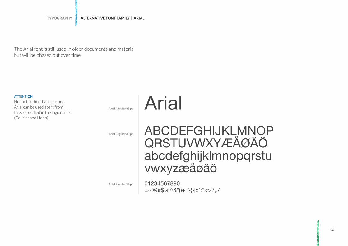
ATTENTION
No fonts other than Lato and Arial can be used apart from those specified in the logo names (Courier and Hobo).
ArialABCDEFGHIJKLMNOPQRSTUVWXYÆÅØÄÖabcdefghijklmnopqrstuvwxyzæåøäö01234567890=~!@#$%^&*()+[]\{}|:;’:”<>?,./
TYPOGRAPHY ALTERNATIVE FONT FAMILY | ARIAL
Arial Regular 48 pt
Arial Regular 30 pt
Arial Regular 14 pt
The Arial font is still used in older documents and material but will be phased out over time.

27
ATTENTION
The abbreviations can only be used as capitals.
TYPOGRAPHY ABBREVIATIONS
FEEFoundation for Enviromental Education
Young Reporters for the Environment
Learning about Forests
YRE LEAF
The Foundation for Environmental Education (FEE), Young Reporters for the Environment (YRE) and Learning about Forests (LEAF) have been using the abbreviations shown in the brackets when communicating their names. To give the public a better understanding of who we are and what we do, please use the full names when possible.

28FEE CORPORATE BRANDING GUIDELINES | 06.2016
Documents

29
DOCUMENTS POWERPOINT
EXAMPLE
One example of title slide and two variants of body slides,

30
DOCUMENTS POWERPOINT
EXAMPLE
One example of title slide and two variants of body slides,

31
DOCUMENTS WORD
EXAMPLE
An example of title slides and a body slides.

FEE CORPORATE BRANDING GUIDELINES | 06.2016
CONTACT INFORMATION
Foundation for Environmental Education (FEE)Scandiagade 132450 Copenhagen SV Denmark
+ 45 70 22 24 [email protected]


![An Illegitimate and Inappropriate Regime [English]](https://static.fdocuments.net/doc/165x107/577ce06c1a28ab9e78b34b68/an-illegitimate-and-inappropriate-regime-english.jpg)