BRANDING AND STYLING GUIDE - Sukh Initiative the very inception, the Sukh Initiative has operated as...
80
BRANDING AND STYLING GUIDE
Transcript of BRANDING AND STYLING GUIDE - Sukh Initiative the very inception, the Sukh Initiative has operated as...

BRANDING AND STYLING GUIDE

ccp-pakistan.org.pk ccp.pakistan PakistanCCP
Plot No. 23, Street No. 39, I&T Center, G-10/4, Islamabad 44000, PakistanTel: +92 51 873 5502/3, +92 51 235 1363
Website: www.ccp-pakistan.org.pk
This Branding and Styling Guide has ben developed by Center for Communication Programs Pakistanunder Sukh Initiative, a program of Aman Health Care Services.
Any inquiries regarding branding may directly be sent to CCPP ([email protected])

BRANDING ANDSTYLING GUIDE
July 2017
BRANDING AND STYLING GUIDE


BRANDING AND STYLING GUIDE
01
1. Introduction 03 2. Mission statement 05 3. Tagline 07 4. Sukh brand 09 5. Logo 11 6. Typography 21 7. Writing style 27 8. Color 31 9. Photography 37 10. Visibility 47 11. Print 51 12. Partnerships 59 13. Presentations 65 14. Website 69
Contents
PrefaceThis document develops brand identity of the Sukh Initiative. It provides guidelines and builds understanding on all the elements important to maintaining and building a brand identity. Consistent, standardized branding in all internal and external communication will strengthen and reinforce the program’s message. It will cultivate an emotional perception and connection of its beneficiaries with the program.

BRANDING AND STYLING GUIDE
02
Discontinuation of old branding and adoption of the new Branding and Styling GuideAs the custodian of the Branding and Styling Guide, Center for Communication Programs Pakistan is responsible for the maintenance and compliance of the branding of Sukh Initiative. Therefore, all the consortium partners are encouraged to conform to the following standard operating procedures:
Compliance• Follow the directions and instructions given
in the guide for designing and developing content and material;
• Consult and coordinate with Center for Communication Programs Pakistan in a timely manner for specific need and information that is not covered in this guide;
• Seek permission of the Program Management Unit for any exceptions that may be required viz branding and styling work.
Quality Control• To ensure consistency in branding and
styling, the designed work may be shared with Center for Communication Programs Pakistan through most reliable and efficient means, one week ahead of the planned development, for inputs and review.
Quality Audit• Program Management Unit will do the quality
audit on a quarterly basis to reassess compliance of branding and styling of Sukh Initiative by implementing partners.
Revision• In case the partner would like a permanent
revision in the branding and styling guide on a particular point, the matter may be formally communicated and taken up at the meetings of Senior Management Team, held regularly every month.
INTRODUCTION
1
BRANDING AND STYLING GUIDE
03

The Sukh Initiative emerged from the 2012 London Summit on Family Planning as a partnership between three private foundations, i.e. the Aman Foundation, the Bill & Melinda Gates Foundation, and the David and Lucile Packard Foundation, with the objective of increasing the use of modern family planning methods through demand and supply related inputs amongst married women within one million peri-urban population of Karachi, Pakistan. The Initiative entails strategies and innovations that promote improved quality family planning and reduce unintended pregnancies. The Aman Health Care Services (AHCS) is responsible for the implementation of the Sukh Initiative and provision of strong performance management and data solutions for synergized and aligned strategies driving the success of the program. The AHCS has contracted partners for implementation of various aspects of the program.
At the initiation of the program, Sukh Initiative adopted the following logo and tagline in view of the program's various facets and interventions directed towards benefiting young and married women in particular and other members of the society in general.
Considering the success made and grounds covered by the program over the last four years, it was deemed suitable by the program management to give Sukh Initiative a new branding, which is more exciting, consistent, and attractive to the beneficiary communities. With these aspirations, new branding guidelines have been developed. The new logo, which is an updated version of the old logo, and the new tagline that is more appealing, given as follows, comes into effect from July 2017.
1. Introduction
BRANDING AND STYLING GUIDE
04
Old logo
New logo

MISSION STATEMENT
2
BRANDING AND STYLING GUIDE
05

“Sukh Initiative empowers families to access contraception by increasing knowledge, improving quality of services and expanding their basket of choices, contributing to the goals of FP2020”.The mission statement, adopted by the executive board of the Sukh Initiative, guides the program in achieving its goal and objectives by use of innovative approaches and programmatic excellence. The identity of an institution is expressed through its values, goals, actions, achievements and brand. The mission statement is the foundation for the Sukh Initiative’s brand identity.
2. Mission statement
BRANDING AND STYLING GUIDE
06

TAGLINE
3
BRANDING AND STYLING GUIDE
07

From the very inception, the Sukh Initiative has operated as a collaborative program, working closely with other partners for strong performance management so that different strategies are synergized and aligned and high impact drives the success of the program. The program’s tagline, ‘sehat ke raste hanste baste’ signifies that the route to a happy life is through healthy practices. The tagline also clearly communicates the essence of the mission.
‘Sehat ke raste hanste baste’ conveys an impactful message that has an appeal for the audience.
‘Sehat ke raste hanste baste’ is a call for happy and healthy life.
‘Sehat ke raste hanste baste’ is a central message to adopt healthy ways of life.
3. Tagline
BRANDING AND STYLING GUIDE
08

SUKH BRAND
4
BRANDING AND STYLING GUIDE
09

The Sukh brand is developed to establish its identity and equity amongst all internal and external stakeholders.
The Sukh Initiative denotes peace of mind that can be achieved through adoption of healthy timing and spacing of pregnancies and as a result prevention of ill health caused by too many, too frequent pregnancies and childbirths. The word ‘Sukh’ is associated with lasting happiness, and highlights the message that good health brings long-term prosperity and wellbeing to a family. This program title was chosen to provide a positive association with healthy behaviors while maintaining culturally appropriate norms.
The Sukh brand is:
Bold - Gives a bold and clear message of
health in relation to women
Simple - Aligned to the vision and theme of the
program and reflects its spirit
Appealing - Appealing and impactful
Representative - Focused on women and reflective of the
whole society
Contemporary - Conveys a message that is the need of
the time
4. Sukh brand
BRANDING AND STYLING GUIDE
10

LOGO
5
5.1 Logo overview5.2 Target audience5.3 Objectives5.4 Application5.5 Exclusion zone and minimum size5.6 Correct use of logo 5.7 Unacceptable use of logo5.8 Logo and tagline5.9 Email signature
BRANDING AND STYLING GUIDE
11

The Sukh Initiative logo is to provide consistent and standardized branding in all internal and external communications. As the Sukh Initiative is aimed towards assisting women to increase their knowledge of healthy birth spacing, access to services and increase their choices of using contraceptives, the logo is an identifier for them in practicing the same and draws associations.
The inscription ‘Sukh’ in Urdu language in the logo, with its predominant green as well as image of a flower, evokes a sense of peace and prosperity. The word ‘Sukh’ is associated with lasting happiness, and highlights the message that good health provides long-term prosperity and benefits to a family. Strategic, standardized visibility and promotion of the brand and its associated content, text and messaging will develop an association of the Sukh Initiative as a credible source of quality family planning services and information.
5.1 Logo overview
Preferred ways to use logo
Reversed from green Grayscale 100% Black
BRANDING AND STYLING GUIDE
12

The target audience for the Sukh Initiative is categorized for program and external communication.
For program communication, audiences are defined for primary, secondary and tertiary levels as:
• Primary program audience Married women of reproductive ages,
husbands, especially the newly married couples in focused areas of Karachi
• Secondary program audience Mothers-in-law and other family
members, friends, peers and support networks
• Tertiary program audience Community influential, elders, religious
leaders, and other notables
For external communication purposes, the audiences are identified for primary and secondary levels as:
• Primary external audience Program partners, government
counterparts, public health activists and officials and donor organizations
• Secondary external audience Relevant civil society organizations,
private sector and media organizations
5.2 Target audience
BRANDING AND STYLING GUIDE
13

The logo of Sukh Initiative:
• Represents the program’s shared vision and common understanding of its mission and objectives
• Reflects a joint ownership of families and communities
• Signifies empowerment of a woman in taking a lead for happier, healthier life for herself and her family
• Promotes collective decision-making and inter-spousal communication in making and practicing family planning choices
5.3 Objectives
BRANDING AND STYLING GUIDE
14

The logo is to be used to represent the Sukh Initiative on all internal and external media where branding applies, e.g. publications, digital media, media, advertisements and other medium.
5.4 Application
BRANDING AND STYLING GUIDE
15

The brand logo should always be surrounded by a minimum area of space into which no other visual elements must be placed. This space is known as the “exclusion zone”. The exclusion zone ensures that headlines, text or other visual elements do not encroach on the logo.
In the given example, ‘X’, represents the clear space around the logo. ‘X’ is equal to the height of the letter ‘H’ in the Sukh Initiative logo. The minimum size of the logo should measure no less than 17mm in width. This rule should be observed to ensure that no other graphic elements (such as text or other logos) intrude into the exclusion zone.
For website applications, the logo should be no smaller than 90 pixels wide.
5.5 Exclusion zone and minimum size
X
X X
X
90pixels
17mm
Sukh logo with clear space around
BRANDING AND STYLING GUIDE
16

The logo is representative of the Sukh Initiative; its correct version must always be used. For the purposes of comparison, the correct logo is shown next to an incorrect one in the given example. Please note the details highlighted. The differences, which may not be apparent at first sight, are magnified when the incorrect logo (black) is superimposed on the correct logo (green).
Old and unauthorized versions of the Sukh Initiative logo should not be used. When working with external graphic artists, correct logo and brand guidelines should be provided with instructions to refrain from any customization or distortion of the logo, including its color or typography.
5.6 Correct use of logo
SHAPE OF LEAVES
EQUAL CHARACTER SPACING
EQUAL LINE SPACING
CURVE SPACING
ALIGNMENT
CORRECT LOGO
INCORRECT LOGO
URDU TYPOGRAPHY
ENGLISH TYPOGRAPHY
TAGLINE TYPOGRAPHY
EMBLEM SIZEAND PROPORTION
BRANDING AND STYLING GUIDE
17

It is critical to always use approved master artwork to maintain consistency and to retain the integrity of the program’s identity. The logo is an indivisible unit and should not be altered in its composition, or recreated.
Examples of unacceptable modifications and incorrect uses of the logo are shown as follows:
5.7 Unacceptable use of logo
don’t place the logo on low contrast background
don’t tilt or skew the logo
don’t recreate the logo
don’t add affects to the logo don’t use the old logo
don’t distort the logo
don’t change the color
don’t change the position ofany logo parts
BRANDING AND STYLING GUIDE
18

The program’s tagline should always appear with the Sukh Initiative logo. The tagline carries the theme and spirit of the program.
5.8 Logo and tagline
ALIGNMENT
LINE SPACING
TAGLINE TYPOGRAPHY
BRANDING AND STYLING GUIDE
19

BRANDING AND STYLING GUIDE
E-mail signatures of the Sukh Initiative officials should have following information elements:
Name Designation (w.r.t. Sukh Initiative) Parent institution Address Contact numbers
It should also contain thumbnail images of related social media of the Sukh Initiative with hyperlinks as well as a brief introductory statement.
5.9 E-mail signature
Employee NameDesignation
Sukh InitiativeThe Aman FoundationPlot # 333, Korangi Township,Near Pakistan Refinery Ltd. Karachi, Pakistan
UAN: +92 (21) 111-111-823Cell: +92 000 0000000
20
Sukh Initiative is a project of Aman Health Care Services

BRANDING AND STYLING GUIDE
TYPOGRAPHY
6
6.1 Typeface6.2 Heading levels6.3 Bullet numbering6.4 Use of language
21

Careful selection and arrangement of typography provides legibility and readability to any communication material. The Sukh Initiative brand uses a distinctive typographic treatment that, when used consistently, reinforces recognition of the brand. The use of typography alone, without photographs or graphics, can communicate simplicity and order.
Shree Devanagari 714 is the official typeface of the Sukh Initiative brand, which is a sans-serif typeface recognized for its design simplicity, clarity and legibility. These characteristics represent the brand’s design style. This typeface works well when combined with other typefaces, and it may be used in upper and lower cases as body text, or all upper case as a display typeface. The recommended type alignment for all print communication is ‘push left’. For optimum readability, the recommended typographic treatment for body text is black against a white background. Shree Devanagari 714 font is easily downloadable from the web.
For more information in the use of typography for the web, refer to section 14.
6.1 Typeface
SHREE DEVANAGRI 714 REGULARABCDEFGHIJKLMNOPQRSTUVWXYZabcdefghijklmnopqrstuvwxyz0123456789,;:&/*
SHREE DEVANAGRI 714 ITALICABCDEFGHIJKLMNOPQRSTUVWXYZabcdefghijklmnopqrstuvwxyz0123456789,;:&/*
SHREE DEVANAGRI 714 BOLDABCDEFGHIJKLMNOPQRSTUVWXYZabcdefghijklmnopqrstuvwxyz0123456789,;:&/*
SHREE DEVANAGRI 714 BOLD ITALICABCDEFGHIJKLMNOPQRSTUVWXYZabcdefghijklmnopqrstuvwxyz0123456789,;:&/*
AaBbCc
BRANDING AND STYLING GUIDE
22

Headings in the body text can be distinguished by changing and increasing typeface and size. Below are the examples of different levels of headings:
6.2 Heading levels
BRANDING AND STYLING GUIDE
23
Heading level 3
Font: Shree Devanagari 714 Font Size: 44 ptFont Style: BoldCase: All caps
Font: Shree Devanagari 714 Font Size: 30 ptFont Style: BoldCase: All caps
Font: Shree Devanagari 714 Font Size: 24 ptFont Style: BoldCase: All caps
Font: Shree Devanagari 714 Font Size: 24 ptFont Style: RegularCase: Sentence case
TITLE HEADING
HEADING LEVEL 1
HEADING LEVEL 2

6.2 Heading levels
BRANDING AND STYLING GUIDE
24
Font: Shree Devanagari 714 Font Size: 16 ptFont Style: BoldCase: Sentence case
Font: Shree Devanagari 714 Font Size: 14 ptFont Style: BoldCase: Sentence case
Font: Shree Devanagari 714 Font Size: 12 ptFont Style: BoldCase: Sentence case
Sub heading level 1
Sub heading level 2
Sub caption level 3
Font: Shree Devanagari 714 Font Size: 11 ptFont Style: RegularCase: Sentence case
Body text

Bullet numbering for different heading levels may be as follows:
Numbering level 1: 1, 2, 3, 4, …………..Numbering level 2: i, ii, iii , iv,………..Numbering level 3: a, b, c, d,……………
Bullet level 1: Bullet level 2: Bullet level 3:
6.3 Bullet numbering
BRANDING AND STYLING GUIDE
25
l
n
-
n Etiam nec felis sed mi auctor dapibus vitae tincidunt nunc.l Aenean pellentesque libero ut nibh pulvinar facilisis.l Mauris dapibus odio a felis auctor rhoncus.l Aliquam sit amet metus id leo condimentum finibus.
- Vivamus at ante sagittis, suscipit orci eu, tempor lectus.- Ut at lorem fermentum, iaculis mauris eget, gravida ante.- Pellentesque ornare quam vitae dolor malesuada, elementum pulvinar felis feugiat.- Nam a felis rutrum, fermentum dui a, vehicula ante.- Aenean ac magna faucibus, imperdiet nibh commodo, molestie nisi.
1. Etiam nec felis sed mi auctor dapibus vitae tincidunt nunc.i Lorem ipsum dolor sit amet, consectetur adipiscing elit.ii Aenean pellentesque libero ut nibh pulvinar facilisis.iii Proin facilisis justo at condimentum ornare.iv Proin facilisis justo at condimentum ornare.
a. Maecenas quis sapien nec lacus egestas lobortis vel eget sem.b. Curabitur vitae nibh sodales sem convallis elementum sed a lacus.c. Phasellus vel mauris ullamcorper, ultricies dolor ut, mollis sem.d. Nullam eu dolor feugiat, porta magna eget, molestie neque.

The standard language of communication for the Sukh Initiative is US English; it should therefore be used in publications and internal and external communications.
6.4 Use of language
BRANDING AND STYLING GUIDE
26

BRANDING AND STYLING GUIDE
27
WRITING STYLE
7
7.1 Information Architecture 7.2 Example of use – Advertisement 7.3 Example of use – Quotation

Information architecture of the Sukh Initiative should always be constructed in a manner that it conveys the Issue, Action and Impact. It should remain consistent for all written and oral material from speeches to advertisement and to meeting agendas. The writing should state the issue, discuss the action that the Sukh Initiative is taking and identify the impact of the action.
“Issue, Action and Impact” can be reordered to best construct a communication piece. All text should be concise and focused. Writing in this basic format will help ensure that the communication is bold, simple, appealing, contemporary and representative.
7.1 Information Architecture
BRANDING AND STYLING GUIDE
28

In the example all the three information elements communicate the message and call for action. The headline states the issue in a clear and simple manner and shows the impact. The body text reiterates the issue, and explains the action taken and its related impact. Importantly, issue, action and impact can be reordered in any manner to make a meaningful communication.
7.2 Example of use – Advertisement
BRANDING AND STYLING GUIDE
29

The example provided on this page illustrates writing style for quotations. The quotation states the issue, action and impact in a clear and simple manner. This is achievable by writing with an economical style that is direct, concise and focused.
7.3 Example of use – Quotation
BRANDING AND STYLING GUIDE
30
Action
“We have to treat women with respect
and have to take car of their needs; if they are
healthy, we all are healthy”
Issue
Impact

BRANDING AND STYLING GUIDE
31
COLOR
8
8.1 Primary color palette8.2 Secondary color palette8.3 Infographics

The primary colors for the Sukh Initiative’s logo are bold that are immediately recognizable and highly visible. These colors should be featured in all communications. The colors in primary color palette as shown here are bold, simple, appealing, contemporary and representative which should be used in all official communication.
8.1 Primary color palette
BRANDING AND STYLING GUIDE
32
GREEN
C:85 M:10 Y:100 K:0R:0 G:161 B:75PANTONE:7482 CHEX:#00a14b
ORANGE
C:0 M:50 Y:100 K:0R:247 G:147 B:29PANTONE:1495 CHEX:#f7931d
BLUE
C:60 M:60 Y:0 K:0R:117 G:111 B:179PANTONE:272 CHEX:#756fb3
Black
C:0 M:0 Y:0 K:100R:0 G:0 B:0PANTONE: BLACKHEX:#000000

Below are the examples of primary color palette to be used in the Sukh Initiative branding:
BRANDING AND STYLING GUIDE
33
TOOLKIT
TOOLKIT
TELEHEALTH
TOOLKIT

Some campaigns or documents may require the use of additional colors; secondary color palette may be used along with the colors from primary color palette, where needed. For example, it may be used while presenting graphical data having several parameters.
8.2 Secondary color palette
BRANDING AND STYLING GUIDE
34
DARK GREEN
C:100 M:0 Y:100 K:40R:0 G:114 B:54PANTONE:349 CHEX:#007236
VERMILLION
C:0 M:100 Y:70 K:0R:237 G:24 B:70PANTONE:1788 CHEX:#ed1846
PARROT GREEN
C:80 M:0 Y:100 K:0R:13 G:177 B:75PANTONE:7481 CHEX:#0cb14b
RED
C:0 M:90 Y:100 K:0R:239 G:64 B:35PANTONE:179 CHEX:#ef4023
LIGHT GREEN
C:40 M:0 Y:100 K:0R:166 G:206 B:56PANTONE:390 CHEX:#a6ce38
PURPLE
C:20 M:100 Y:0 K:0R:197 G:22 B:140PANTONE:247 CHEX:#c5168c
GRAY
C:5 M:0 Y:0 K:15R:206 G:215 B:221PANTONE:420 HEX:#ced7dd

Below is the example of secondary color palette to be used in the Sukh branding:
BRANDING AND STYLING GUIDE
35
Training of master trainers
29 master trainers, including 20 community
health supervisors, 4 �eld coordinators, 2 executive
trainers and 3 town coordinators
6 week long training for community health workers Reproductive health and healthy time and spacing of pregnancy
3 day training of community health
supervisorsSupportive supervision and
monitoring skills
Training of �eld sta� and other stakeholders
Training on social mobilisation
For �eld coordinators, social mobilisers and
community health supervisors in 2 batches 2 day training on
mental health and wellbeing236 community health workers trained at all �eld stations3 day orientation
workshop on Islam and family planning
14 local religious leaders and community elders from
all 10 operational areas 1 day training on value clari�cation and attitude transformation6 community health workers, 1 manager (operations) and 1 assistant manager (operations)
2 day orientation of community health supervisors Role and responsibilities of Population Welfare Department+Training on infection prevention protocols for intrauterine contraceptive device and implant insertions
Community health workers training curriculum developedWith support from Path�nder International
August2014
26 August - 12 September
2014
15 October 2014 -
15 January 2015
22-24 December 2014
21-22 January2015
24-26 February and
17-19 March 2015
3 February - 8 April
2015
27-29 April2015
27 March &27 May
2015

The infographics used in the Sukh Initiative will follow the basic principles of design to support the information presented and to make it more easily accessible to a larger audience. The infographics should be in 2-D form having a proper caption, and a legend. The primary shades from the primary color palette can be used, however whenever there is a need for more contrasting colors, secondary shades can be used from the secondary color palette.
8.3 Infographics
BRANDING AND STYLING GUIDE
36

BRANDING AND STYLING GUIDE
37
PHOTOGRAPHY
9
9.1 Photography overview9.2 Copyrights and credits9.3 Consent form

Use of photography can help project attributes of the brand, i.e. bold, simple, appealing, contemporary and representative. Photographs should present the dignity of the people portrayed. Images are most compelling when they tell stories – representing women and children in ways that reflect the reality of their worlds.
Following considerations and directions may help in appropriate use of photography:
• Use photo captions where needed to present the context.
• Do not manipulate photo images, remove, add or alter objects.
• Do not display faces of women and children who may be vulnerable to exploitation, abuse, discrimination, violence or trauma if identified in photographs.
• The photographs taken for Sukh Initiative are reserved for the exclusive/official use by the program staff and partners. They are not to be used for commercial purposes.
• For internal or external image distribution, include copyright, photo credit and information on restrictions of use.
• All the photographs taken for the Sukh Initiative should be credited.
9.1 Photography overview
BRANDING AND STYLING GUIDE
38
©Sukh/FS01/reference number/Arfa

Attribute – Bold
Bold images communicate clearly and immediately what is essential in a situation, stirring deep emotions in the viewer.
BRANDING AND STYLING GUIDE
39
Bold can also be shown in the frank, confident gaze that the subject directs at the viewer.
Bold can mean dramatic in the narrative sense – confronting the audience with a difficult issue.
©Su
kh/P
MU-
2017
/Usm
an
©Su
kh/P
MU-
2017
/Usm
an
©Su
kh/P
MU-
2017
/Usm
an
Intense colors and close framing create a strong image.

Attribute – Simple
Simple images affirm all that is best in women and children; illustrating both who they are and what they can be.
BRANDING AND STYLING GUIDE
40
A centered composition makes this image simple and powerful.
Simple images often focus on a detail that hints at much larger subjects.
Image should be uncluttered, with a minimum of distracting elements.
©Su
kh/P
MU-
2017
/Usm
an
©Su
kh/P
MU-
2017
/Usm
an
A natural balance is struck between an engaging foreground and a simple background.
©Su
kh/P
MU-
2017
/Usm
an
©Sukh/PMU-2017/Usman

Attribute – Appealing
Appealing images convey all the hope and the confidence, stimulating a thought process.
BRANDING AND STYLING GUIDE
41
This image has a positive appeal for education.
The image of a mother and a child complement the program’s message.
©Su
kh/P
MU-
2017
/Usm
an
©Su
kh/P
MU-
2017
/Usm
an

Attribute – Contemporary
Contemporary images are recognizably current, and show the active participation of women and children. Unique camera angles, good cropping, interesting colors and strong crisp lines all let us feel as if we were right there with the subjects.
BRANDING AND STYLING GUIDE
42
Contemporary imagery presents people captured in the picture as unique individuals in diverse social and cultural situations.
Looking at a familiar scene from a different perspective also makes a photograph feel contemporary.
©Sukh/PMU-2017/Usman
©Su
kh/P
MU-
2017
/Usm
an

Attribute – Representative
Images taken for the Sukh Initiative are representative of its community. The women and children in the picture give a clear message about the program. Young girls and boys in the picture depict the youth, which is integral to the Sukh Initiative.
BRANDING AND STYLING GUIDE
43
This image shows MWRA of the respective community seeking medical consultation.
This image represents a healthy and happy family which complements Sukh Program.
©Su
kh/P
MU-
2017
/Usm
an
©Su
kh/P
MU-
2017
/Usm
an

The Sukh Initiative images should be credited in all publications. Crediting should be in one of the following formats:
• For PMU images: ©Sukh/PMU-2017/Usman (photographer’s first name is optional)
• For images from field offices: ©Sukh/FS01/reference number/Arfa
or if no reference number:
©Sukh/FS01/2017/Arfa
or if neither reference number nor photographer is known:©Sukh/FS01/2017
• For print publications (brochures, flyers, posters, banners, etc.), photographs should be credited:
i. beneath the image, flush right; or ii. vertically beside the image, flush
left or right bottom; or iii. on a separate ‘credits’ page, to
include the page reference and position on the page where the image appears.
• For web reproduction, photographs should be credited beneath the image, flush right, as above.
• For PowerPoint presentations, photographs should be credited beneath the photographs, push right or on the last slide of the presentation.
9.2 Copyrights and credits
BRANDING AND STYLING GUIDE
44
Lorem ipsum dolor sit amet, consectetur adipiscing elit. Phasellus mollis rhoncus lobortis. Phasellus pharetra mattis risus. Maecenas consectetur, ligula vel dapibus auctor, ante nisl vehicula justo, ac congue tortor purus eget metus. In consequat lacus sit amet imperdiet commodo. Donec nulla urna, sodales ut porta tempus, molestie sit amet libero. Fusce id tempus magna. Pellentesque vel velit eget magna euismod iaculis. Suspendisse ut sapien eu magna sagittis consectetur. Proin ex erat, lacinia in laoreet a, consectetur a ipsum. Integer sit amet aliquam orci.
Nullam vulputate mauris ac leo luctus, sit amet cursus risus egestas. Aenean rhoncus augue et blandit congue. Sed a congue lectus, vel dapibus turpis. Nulla mollis tempus placerat. Nunc eget sodales erat. Aenean scelerisque lorem ac felis aliquam gravida. Proin sagittis tristique augue, non condimentum orci luctus vel. Mauris risus purus, finibus at lorem et, porttitor aliquet lacus. Cras aliquam leo at purus sodales, eu blandit ligula gravida. Nullam posuere mi at
©Sukh/FS01/reference number/Arfa
Lorem ipsum dolor sit amet, consectetur adipiscing elit. Phasellus mollis rhoncus lobortis. Phasellus pharetra mattis risus. Maecenas consectetur, ligula vel dapibus auctor, ante nisl vehicula justo, ac congue tortor purus eget metus. In consequat lacus sit amet imperdiet commodo. Donec nulla urna, sodales ut porta tempus, molestie sit amet libero. Fusce id tempus magna. Pellentesque vel velit eget magna euismod iaculis. Suspendisse ut sapien eu magna sagittis consectetur. Proin ex erat, lacinia in laoreet a, consectetur a ipsum. Integer sit amet aliquam orci.
Nullam vulputate mauris ac leo luctus, sit amet cursus risus egestas. Aenean rhoncus augue et blandit congue. Sed a congue lectus, vel dapibus turpis. Nulla mollis tempus placerat. Nunc eget sodales erat. Aenean scelerisque lorem ac felis aliquam gravida. Proin sagittis tristique augue, non condimentum orci luctus vel. Mauris risus purus, finibus at lorem et, porttitor aliquet lacus. Cras aliquam leo at purus sodales, eu blandit ligula gravida. Nullam posuere mi at
©Su
kh/F
S01/
2017
/Arfa
Lorem ipsum dolor sit amet, consectetLorem ipsum dolor sit amet, consectetur adipiscing elit. Phasellus mollis rhoncus lobortis. Phasellus pharetra mattis risus. Maecenas consectetur, ligula vel dapibus auctor, ante nisl vehicula justo, ac congue tortor purus eget metus. In consequat lacus sit amet imperdiet commodo. Donec nulla urna, sodales ut porta tempus, molestie sit amet libero. Fusce id tempus magna. Pellentesque vel velit eget magna euismod iaculis. Suspendisse ut sapien eu magna sagittis consectetur. Proin ex erat, lacinia in laoreet a, consectetur a ipsum. Integer sit amet aliquam orci.
Nullam vulputate mauris ac leo luctus, sit amet cursus risus egestas. Aenean rhoncus augue et blandit congue. Sed a congue lectus, vel dapibus turpis. Nulla mollis tempus placerat. Nunc eget sodales erat. Aenean scelerisque lorem ac felis aliquam gravida. Proin sagittis :©
Sukh
/FS0
1/20
17
Copyrights and creditsThe Sukh Initiative images should be credited in all publications. Crediting should be in one of the following formats:
• For PMU images: ©Sukh/PMU-2017/Usman (photographer’s first name is optional)
• For images from field offices: ©Sukh/FS01/reference number/Arfa
or if no reference number:
©Sukh/FS01/2017/Arfa

For the purpose of taking photographs under the Sukh Initiative, relevant persons, including field health workers, health care providers, (MWARs, young girls and boys) community stakeholders, implementing partners and the project management officials, are obligated to seek consent of the subject (individual(s)) on the prescribed Consent Form.
9.3 Consent form
BRANDING AND STYLING GUIDE
45


BRANDING AND STYLING GUIDE
47
VISIBILITY
10
10.1 Visibility overview10.2 Acknowledgement

The Sukh branded material such as supplies, signage, and other products, need to be designed to stand out from their environment and those of other organizations. Branded material brings visibility to the Sukh Initiative and help stakeholders recognize the efforts being made under the program.
Strategic, standardized visibility and promotion of the brand and its associated content will develop an association of the Sukh Initiative with credible source of much needed quality services and information amongst the individuals and communities it serves and all its stakeholders.
Brand visibility communicates accountability to donor organizations, program beneficiaries and partners. The level of visibility given to the Sukh brand should be considered in the social and political context of the environment where the Sukh Initiative operates, ensuring there is no risk to staff and partners.
10.1 Visibility overview
BRANDING AND STYLING GUIDE
48

The visibility items of the Sukh Initiative are reserved only for the use of staff or other authorized personnel during official functions or events. Visibility items may be distributed to external partners, volunteers or children, upon approval of the head of the office. Visibility items are not to be sold or given away to unauthorized persons. The Sukh branded visibility items should not be customized or altered with personalized designs or messages.
BRANDING AND STYLING GUIDE
49

All Implementing partners in their verbal and written communication and announcements will use standardized uniform acknowledgement of Aman Health Care Services. The following statement will be included in all external /public communication:
“Sukh Initiative, a program of Aman Health Care Services, is improving maternal and child health by promoting healthy reproductive behaviors, increasing access to quality family planning services, and working with communities, to support and sustain positive social and behavior change”.
Acknowledgement of Aman Health Care Services is to be made in cases of significant renovation of building (school, health facility, youth friendly space, a community-based organization) or in case of a provision of equipment. A plaque will be placed at a prominent place inside the building, adjacent to the equipment, the tele-health booths, youth friendly spaces and all other relevant spaces/ material, stating:
“This <renovation/equipment/building> was supported by the Sukh Initiative, a program of Aman Health Care Services.
[Date]”
10.2 Acknowledgement
BRANDING AND STYLING GUIDE
50

BRANDING AND STYLING GUIDE
51
11
11.1 Print overview11.2 Publications 11.3 Stationary overview11.4 Boilerplate

The design of all the publications should be based upon the principles and writing style of the Sukh brand. The consistent use of the brand’s design elements (photography, typography, color and logo) increases recognition of the brand by its audiences. Every publication design should feature the process color of green on the cover.
Paper SelectionIn general, Sukh publications should be printed on an environment-friendly paper with a smooth finish, matte-coated surface, with a bright white value, and at least 30% recycled content or recyclable material.
Copyright NoticeThe correct copyright notice in Sukh publications should read: © Sukh Initiative.
11.1 Print overview
BRANDING AND STYLING GUIDE
52
©Sukh Initiative 2017 The annual report for Sukh Initiative was prepared and designed by Center for Communication
Programs Pakistan. Information in this report was provided by project implementing partners Aman Healthcare, Aman Telehealth, Aahung, Agha Khan University, dkt Pakistan and Jhpiego, Information
contained in this document does not imply official endorsement of the donors. Maps and illustrations included in this report are for illustrative purposes and are not for authoritative
representations.Photo credits: Sukh Initiative except where separately credited.
Any inquiries regarding this report should be sent to [email protected]
Plot # 333, Korangi Township Near Pakistan Refinery Ltd.
Karachi, Pakistan+92 (21) 111-111-823
Education & Literacy DepartmentGovernment of Sindh
Health DepartmentGovernment of Sindh Population Welfare Department
P r o j e c t I m p l e m e n t i n g P a r t n e r s
P r o v i n c i a l G o v e r n m e n t P a r t n e r s
AMAN COMMUNITY HEALTH PROGRAM

The title of all program documents – reports, budgets, policies, approval form, and other similar material – will carry the Sukh Initiative logo, positioned on the top right hand side as part of the document title or header.
The Sukh Initiative logo is to be positioned prominently on the cover of all program publications, e.g. event participant packs, reports, job aids, training manuals, trainee reference materials, worksheets, and research publications.
Publications in local language – the Sukh Initiative logo should be positioned on the left upper corner of the title page. Logo of Aman Health Care Services should be placed on the right upper corner of the title page.
Publications in English language – the Sukh Initiative logo should be on the upper right corner of the title page, with Aman Health Care Services logo on the upper left corner.
The following text is to be printed on the inside title page or at the lower bottom back cover of the publication:
“This activity /brochure [ specify] is carried out/produced under the Sukh Initiative, a program of the Aman Health Care Services”
11.2 Publications
BRANDING AND STYLING GUIDE
53

Stationery items such as business cards, envelopes and letterheads often serves as the first point of contact with external audiences. Following are the examples of official stationary items of the Sukh Initiative:
11.3 Stationary overview
BRANDING AND STYLING GUIDE
54
Sukh Initiativ
e - A Proje
ct of Aman Health C
are Services
Plot # 333,
Korangi Township,
Near Pakistan
Refinery Limited, K
arachi-7490
0, Pakistan
UAN: 111-111-8
23 Fax: +92-21
-35120475
URL: sukh.thea
manfoundation
.org
Sukh Initiative - A Project of Aman Health Care Services Plot # 333, Korangi Township, Near Pakistan Refinery LimitedKarachi-74900, PakistanUAN: 111-111-823 Fax: +92-21-35120475URL: sukh.theamanfoundation.org

Business card specifications
Size: 3.5” x 2”
Typography
Employee name: 10 point type over 12 point leading. Shree Devanagari 714, Bold, title case
Organization name: 7 point type over 8.4 point leading. Shree Devanagari 714, Bold, upper and lower case
All other text: 7 point type over 8.4 point leading. Shree Devanagari 714, upper and lower case with 8.4 point line spacing after end of paragraphs
All letters and numerals to be kerned as necessary, letter spacing should be set at zero
Color: All type prints 100% Black
Paper stock: 100lb Cover or similar
BRANDING AND STYLING GUIDE
55
.16 inch
.16 inch
.16 inch
.16 inch
Front
Back
Plot # 333, Korangi TownshipNear Pakistan Refinery, Karachi, Pakistan
UAN: 111-111-823Fax: +92-21-35120475
URL: sukh.theamanfoundation.org
Sukh Initiative - A Project of Aman Health Care Services
Employee NameTitle
[email protected]+92-300-0000000
@Aman_FoundationSukh.pk
Front
Back

Letterhead specifications
Size: 8.25” x 11.69”
Typography:
Organization name: 9 point type over 10.8 leading, Shree Dewanagree Bold, upper and lower case; green C:85, M:10, Y:100, K:0
Address and contact information: 8 point type over 10.8 leading, Shree Dewanagree, upper and lower case; prints 100% Black
Body Text: 11 point type over 13-point leading, Arial. Leave one line space between paragraphs. Body text prints solid black.
Paper stock: 70lb Text or similar
BRANDING AND STYLING GUIDE
56
.4 inch
.4 inch
.25 inchSukh Initiative - A Project of Aman Health Care Services
Plot # 333, Korangi Township, Near Pakistan Refinery Limited, Karachi-74900, PakistanUAN: 111-111-823 Fax: +92-21-35120475 URL: sukh.theamanfoundation.org
.4 inch
.4 inch

Media Release specifications
Size: 8.25” x 11.69”
Typography
Media Release heading: 18 point type, Shree Devanagari 714, title case, green
Organization name in footer: 8 point type over 10 point leading, Shree Devanagari 714, upper and lower case, green
Address and contact information in footer: 8 point type over 10 point leading, Shree Devanagari 714 , upper and lower case, green
Body text11 point type over 13 point leading, Arial. Leave one line space between paragraphs. Print in solid black.
BRANDING AND STYLING GUIDE
57
.4 inch
.4 inch
.25 inch
Media Release
Sukh Initiative - A Project of Aman Health Care ServicesPlot # 333, Korangi Township, Near Pakistan Refinery Limited, Karachi-74900, Pakistan
UAN: 111-111-823 Fax: +92-21-35120475 URL: sukh.theamanfoundation.org

To give a set of information about project and acknowledging donors, the following standard boilerplate should be printed on the rear cover of all the publications:
“Sukh Initiative is a multi-donor funded family planning and reproductive health project of Aman Health Care Services, implemented through a consortium of local and international organizations. The project aims to increase modern contraceptive prevalence rate by 15 percentage points in the one million under-served population of peri-urban areas of Karachi, Pakistan”
11.4 Boilerplate
BRANDING AND STYLING GUIDE
58
Sukh Initiative is a multi-donor funded family planning and reproductive health project of Aman Health Care Services, implemented through a consortium of local and international organizations. The project aims to increase modern contraceptive prevalence rate by 15% points in the one million under-served population of peri-urban areas of Karachi, Pakistan
Plot # 333, Korangi Township Near Pakistan Refinery Ltd. Karachi, Pakistan
+92 (21) 111-111-823
Education & Literacy DepartmentGovernment of Sindh
Health DepartmentGovernment of Sindh Population Welfare Department
Provincial Government Partners
Project Implementing Partners
AMAN COMMUNITY HEALTH PROGRAM

BRANDING AND STYLING GUIDE
59
PARTNERSHIPS
12
12.1 Partnership overview12.2 Placement of logo in partnership12.3 Partnership examples12.4 Banner and standee

Partnerships and collaborative relationships are integral to the Sukh Initiative. Partnerships can be made with one or multiple partners.
All the partners:• Will not use directly or by implication
the name(s), logo(s), trademark(s), service mark(s) of the Sukh Initiative donors (namely, Aman Foundation, Bill and Melinda Gates Foundation and The Lucile and Packard Foundation) in connection with any products, publicity, promotion, financing, advertising, or other public disclosure without prior written permission from the Program Management Unit.
• May not make any statement or otherwise imply to external audiences, i.e. investors, media or the general public that it in any way communicates their status of being a grantee of the foundations. They shall only represent themselves as sub-grantee of the Aman Health Care Services.
• Will not use the name of the donors in publications, for the purposes of advertising, promotion, commercial purposes or otherwise, without appropriate prior written permission from the Program Management Unit.
Exceptions:The Program Management Unit of the Sukh Initiative will approve any exceptions to this particular branding guideline in advance and in writing.
12.1 Partnership overview
BRANDING AND STYLING GUIDE
60

In a partnership, it is important to give partner’s logo equal emphasis. The logos should be shown at proportionately the same size and at the same level. In such a case, the Sukh Initiative logo should appear on the right hand side, and the logo of Aman Health Care Services need to be placed on the left hand side, while the logo of single partners may be placed in between the two logos. As people read from left to right, the Sukh Initiative logo may be the last to be seen, leaving with the reader a lasting and memorable impression. Remember to maintain the recommended minimum clear space around each logo. In case of the use of logos of more than one partner, the two or more logos may be placed in the footer while the logos of the Sukh Initiative and the Aman Health Care Services on the header.
Following are the examples of the correct use of the placement of logos:
12.2 Placement of logo in partnership
BRANDING AND STYLING GUIDE
61
Health DepartmentGovernment of Sindh
Population Welfare Department

Below are the examples of correct placement of logos with multiple partners.
12.3 Partnership Examples
BRANDING AND STYLING GUIDE
62
Education & Literacy Department
Government of Sindh
Health Department
Government of Sindh
Population Welfare DepartmentProvincial Government Partners
Project Implementing Partners
AMAN COMMUNITY HEALTH PROGRAM

Public events present unique opportunities for partners to highlight important aspects of their work. Step and repeat banners, standee and other high visibility items, often serve as backdrops for photo opportunities during these events. Following are the exemples of banner and standee with Sukh and partner logos.
12.4 Banner and standee
BRANDING AND STYLING GUIDE
63

T
5
BRANDING AND STYLING GUIDE
62

BRANDING AND STYLING GUIDE
65
PRESENTATIONS
13
13.1 Presentations overview13.2 Use of PowerPoint

This section explains how to use the elements of the Sukh Initiative brand to create presentations in PowerPoint.
Use the font Arial in bold and regular weights. Charts and diagrams should be simple, clear and uncomplicated. Three-dimensional effects and animation should be avoided. The complete primary color palette can be used; however, keep the number of colors appearing on any one slide to a minimum.
The use of photography to enhance or complement a message is encouraged. However, photo imagery should be kept to a minimum and used to communicate, not decorate.
The key points can be type-only slides or type and image slides. Pacing is important, so after a text-heavy section, a slide of color background with one sentence or an image slide with one sentence can be used to create a moment of rest. The text should be kept simple and to a minimum.
13.1 Presentations overview
BRANDING AND STYLING GUIDE
66

The examples below illustrate the recommended way to use text simply and clearly when preparing a presentation in PowerPoint.
13.2 Use of PowerPoint
BRANDING AND STYLING GUIDE
67

T
5
BRANDING AND STYLING GUIDE
66

BRANDING AND STYLING GUIDE
69
WEBSITE
14
14.1 Website overview14.2 Logo on webpage14.3 Colors14.4 Typography, writing and imagery

The Sukh Initiative website (sukh.theamanfoundation.org) is one of the platforms used by the program to communicate with its various stakeholders, donors and supporters. This section explains how to use the elements of the Sukh Initiative’s brand identity to build functional, interesting and engaging web pages.
14.1 Website overview
BRANDING AND STYLING GUIDE
70
Correct use of imagery
Correct use of the logo
Correct use of color and typography
Proper content legibility
Correct use of typography and writing style
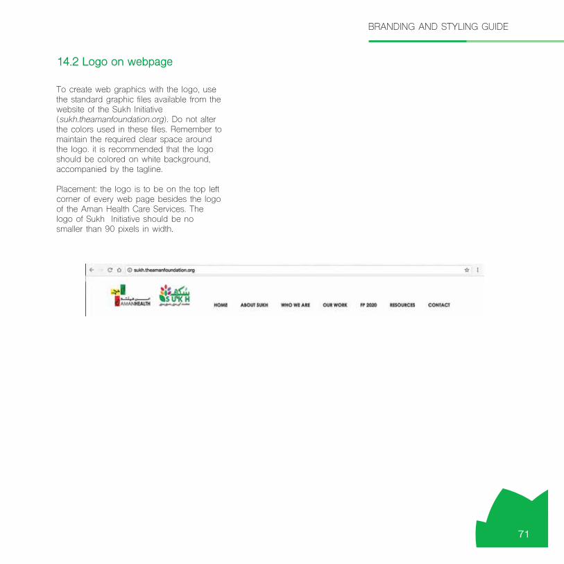
To create web graphics with the logo, use the standard graphic files available from the website of the Sukh Initiative (sukh.theamanfoundation.org). Do not alter the colors used in these files. Remember to maintain the required clear space around the logo. it is recommended that the logo should be colored on white background, accompanied by the tagline.
Placement: the logo is to be on the top left corner of every web page besides the logo of the Aman Health Care Services. The logo of Sukh Initiative should be no smaller than 90 pixels in width.
14.2 Logo on webpage
BRANDING AND STYLING GUIDE
71

Refer to the primary color palette of the Sukh Initiative for the selection of colors for webpage development. All main pages (homepage or section landing pages) should use white as their primary background color to maximize legibility of the text and use green as an accent color. Less text heavy pages can use colors from primary palette as their primary background color, with white or black text. The following colors can be used for emphasis, variety and secondary design elements:
Vermillion
Red
Purple
Dark green
Light green
Gray
Body text should be black on a white background. On content pages, link colors should be the web default values.
14.3 Colors
BRANDING AND STYLING GUIDE
72
#ed1846
#c5168c
#007236
#0cb14b
#ced7dd
#ef4023

Typography
Web fonts: Use Shree Devanagari 714 bold in graphics used as titles or headlines, and in other graphics that incorporate text. Shree Devanagari 714 is the official font for all HTML text (body text, headers, captions, links, etc.) on sukh.theamanhealth.org. Arial, a sans-serif font can be used as an alternative accent font. Names of website sections and headers on web pages may be either in upper and lower case or all upper case. Headers and body text should be aligned from the left in languages that read from left to right.
Writing
When you write for the web:
• Be economical and to the point – sentences should be a Maximum of about 30-35 words long.
• Use the active voice. • Avoid starting sentences with subordinate clauses.• Structure your text using the format issue, action,
and impact. • Make liberal use of headers, subheads and
bulleted and Numbered lists, in order to break up large areas of text, facilitate scanning and enhance readability.
If the text for a given web page is more than 500 words, consider splitting it up into two or more pages.
Imagery
On the web, use the three preferred image styles:
• Content relevant photographs in vertical or horizontal format optimized for the web.
• Silhouetted portraits. • Banners/promotional buttons/icons/graphics.
Provide photo credit information for all photographs on the web pages, as it is done for print publications.
14.4 Typography, writing and imagery
BRANDING AND STYLING GUIDE
73


Photo credits: Sukh Initiative except where separately credited.

Sukh Initiative is a multi-donor funded family planning and reproductive health project of Aman Health Care Services, implemented through a consortium of local and international organizations. The project aims to increase modern contraceptive prevalence rate by 15 percentage points in the one million under-served population of peri-urban areas of Karachi, Pakistan
Plot # 333, Korangi Township Near Pakistan Refinery Ltd. Karachi, Pakistan
+92 (21) 111-111-823
Education & Literacy DepartmentGovernment of Sindh
Health DepartmentGovernment of Sindh Population Welfare Department
Provincial Government Partners
Project Implementing Partners
AMAN COMMUNITY HEALTH PROGRAM