Analysis of music videos, album covers and advertisements
17
ANALYSIS OF A POP VIDEO ABIGAIL FIRTH
-
Upload
abigailfirth -
Category
Education
-
view
255 -
download
2
Transcript of Analysis of music videos, album covers and advertisements
ANALYSIS OF
A POP VIDEOABIGAIL FIRTH
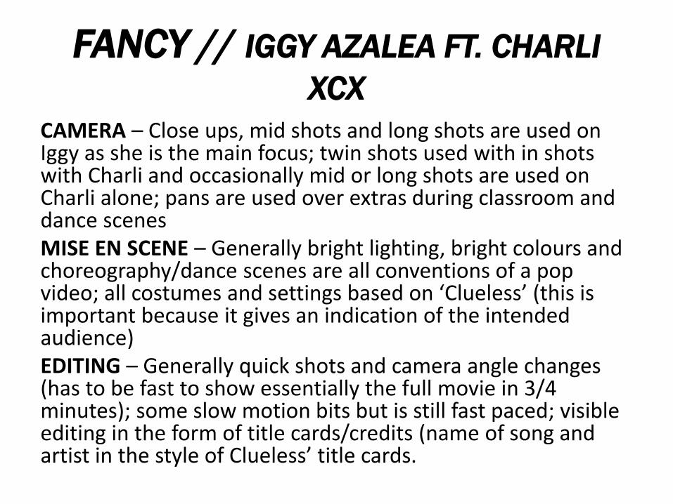
FANCY // IGGY AZALEA FT. CHARLI
XCX
CAMERA – Close ups, mid shots and long shots are used on Iggy as she is the main focus; twin shots used with in shots with Charli and occasionally mid or long shots are used on Charli alone; pans are used over extras during classroom and dance scenesMISE EN SCENE – Generally bright lighting, bright colours and choreography/dance scenes are all conventions of a pop video; all costumes and settings based on ‘Clueless’ (this is important because it gives an indication of the intended audience)EDITING – Generally quick shots and camera angle changes (has to be fast to show essentially the full movie in 3/4 minutes); some slow motion bits but is still fast paced; visible editing in the form of title cards/credits (name of song and artist in the style of Clueless’ title cards.
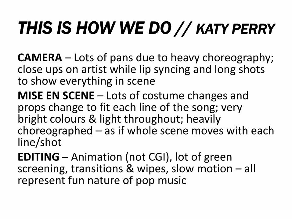
THIS IS HOW WE DO // KATY PERRY
CAMERA – Lots of pans due to heavy choreography; close ups on artist while lip syncing and long shots to show everything in sceneMISE EN SCENE – Lots of costume changes and props change to fit each line of the song; very bright colours & light throughout; heavily choreographed – as if whole scene moves with each line/shotEDITING – Animation (not CGI), lot of green screening, transitions & wipes, slow motion – all represent fun nature of pop music
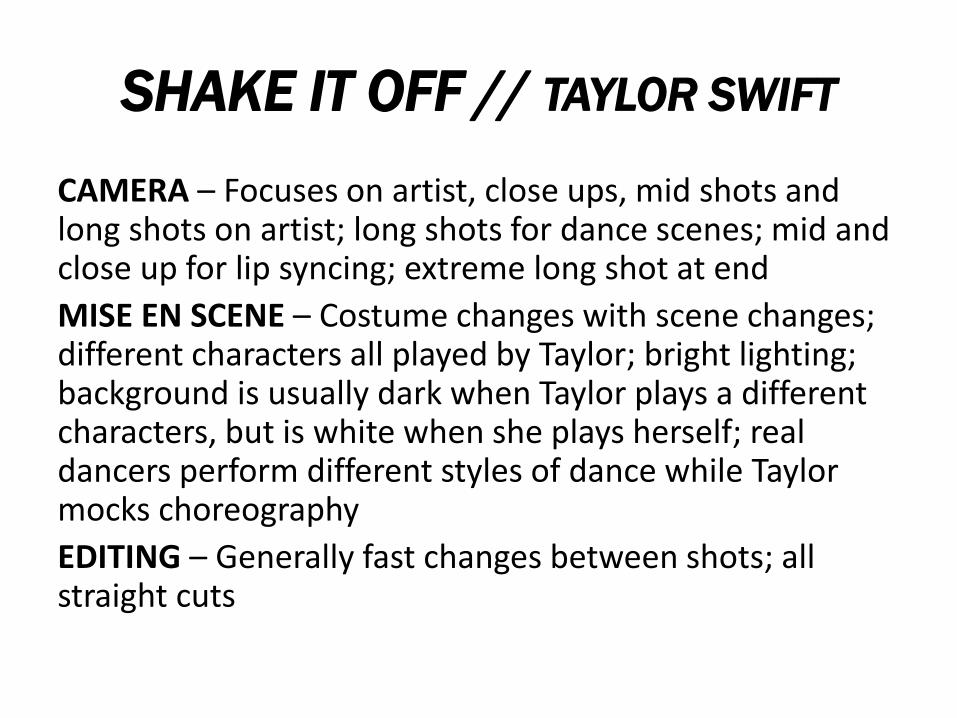
SHAKE IT OFF // TAYLOR SWIFT
CAMERA – Focuses on artist, close ups, mid shots and long shots on artist; long shots for dance scenes; mid and close up for lip syncing; extreme long shot at end
MISE EN SCENE – Costume changes with scene changes; different characters all played by Taylor; bright lighting; background is usually dark when Taylor plays a different characters, but is white when she plays herself; real dancers perform different styles of dance while Taylor mocks choreography
EDITING – Generally fast changes between shots; all straight cuts
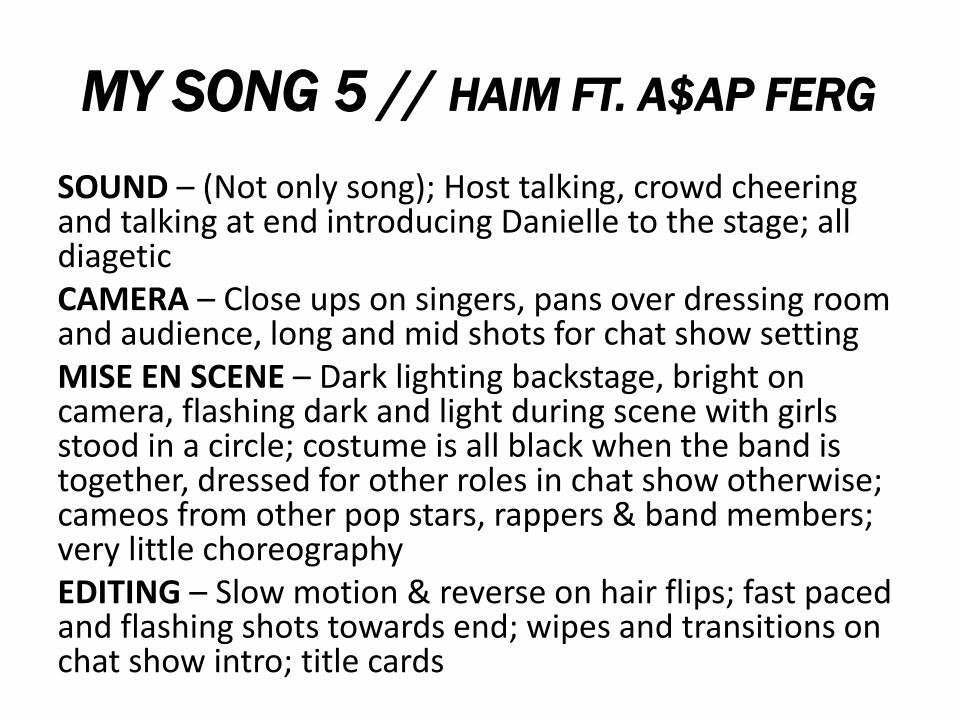
MY SONG 5 // HAIM FT. A$AP FERG
SOUND – (Not only song); Host talking, crowd cheering and talking at end introducing Danielle to the stage; all diageticCAMERA – Close ups on singers, pans over dressing room and audience, long and mid shots for chat show settingMISE EN SCENE – Dark lighting backstage, bright on camera, flashing dark and light during scene with girls stood in a circle; costume is all black when the band is together, dressed for other roles in chat show otherwise; cameos from other pop stars, rappers & band members; very little choreographyEDITING – Slow motion & reverse on hair flips; fast paced and flashing shots towards end; wipes and transitions on chat show intro; title cards
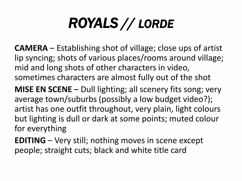
ROYALS // LORDE
CAMERA – Establishing shot of village; close ups of artist lip syncing; shots of various places/rooms around village; mid and long shots of other characters in video, sometimes characters are almost fully out of the shot
MISE EN SCENE – Dull lighting; all scenery fits song; very average town/suburbs (possibly a low budget video?); artist has one outfit throughout, very plain, light colours but lighting is dull or dark at some points; muted colour for everything
EDITING – Very still; nothing moves in scene except people; straight cuts; black and white title card

ANALYSIS OF A
POP ALBUM
COVER
THE NEW CLASSIC //
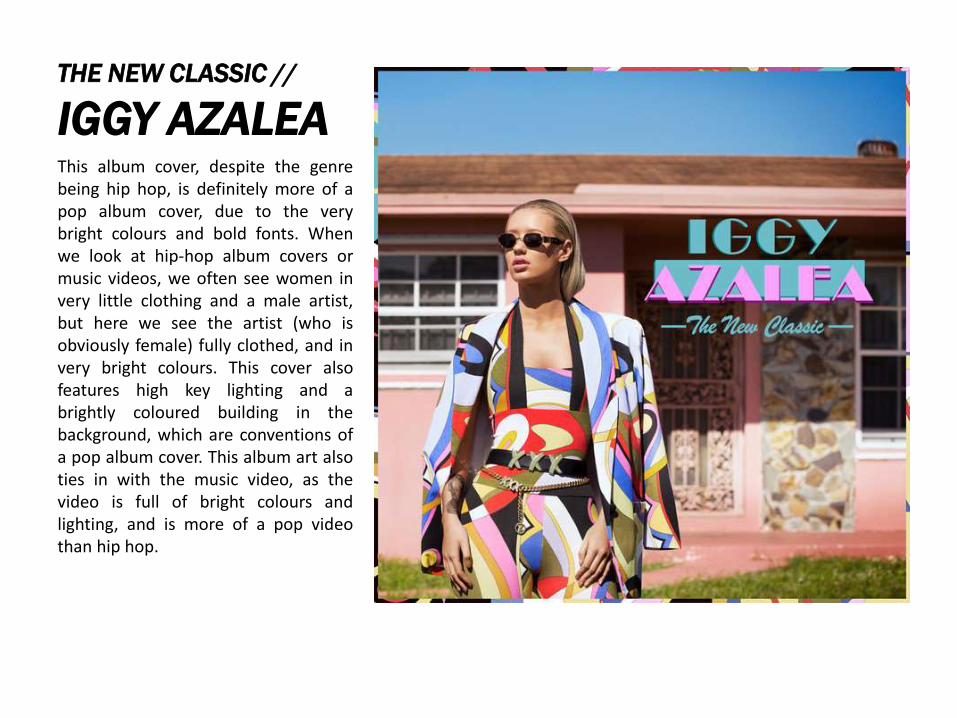
IGGY AZALEAThis album cover, despite the genrebeing hip hop, is definitely more of apop album cover, due to the verybright colours and bold fonts. Whenwe look at hip-hop album covers ormusic videos, we often see women invery little clothing and a male artist,but here we see the artist (who isobviously female) fully clothed, and invery bright colours. This cover alsofeatures high key lighting and abrightly coloured building in thebackground, which are conventions ofa pop album cover. This album art alsoties in with the music video, as thevideo is full of bright colours andlighting, and is more of a pop videothan hip hop.
PRISM //
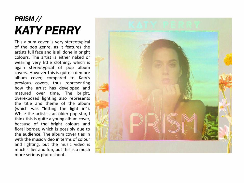
KATY PERRYThis album cover is very stereotypicalof the pop genre, as it features theartists full face and is all done in brightcolours. The artist is either naked orwearing very little clothing, which isagain stereotypical of pop albumcovers. However this is quite a demurealbum cover, compared to Katy’sprevious covers, thus representinghow the artist has developed andmatured over time. The bright,overexposed lighting also representsthe title and theme of the album(which was “letting the light in”).While the artist is an older pop star, Ithink this is quite a young album cover,because of the bright colours andfloral border, which is possibly due tothe audience. The album cover ties inwith the music video in terms of colourand lighting, but the music video ismuch sillier and fun, but this is a muchmore serious photo shoot.
1989 //
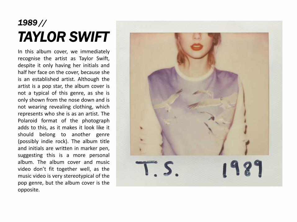
TAYLOR SWIFTIn this album cover, we immediatelyrecognise the artist as Taylor Swift,despite it only having her initials andhalf her face on the cover, because sheis an established artist. Although theartist is a pop star, the album cover isnot a typical of this genre, as she isonly shown from the nose down and isnot wearing revealing clothing, whichrepresents who she is as an artist. ThePolaroid format of the photographadds to this, as it makes it look like itshould belong to another genre(possibly indie rock). The album titleand initials are written in marker pen,suggesting this is a more personalalbum. The album cover and musicvideo don’t fit together well, as themusic video is very stereotypical of thepop genre, but the album cover is theopposite.
DAYS ARE GONE //
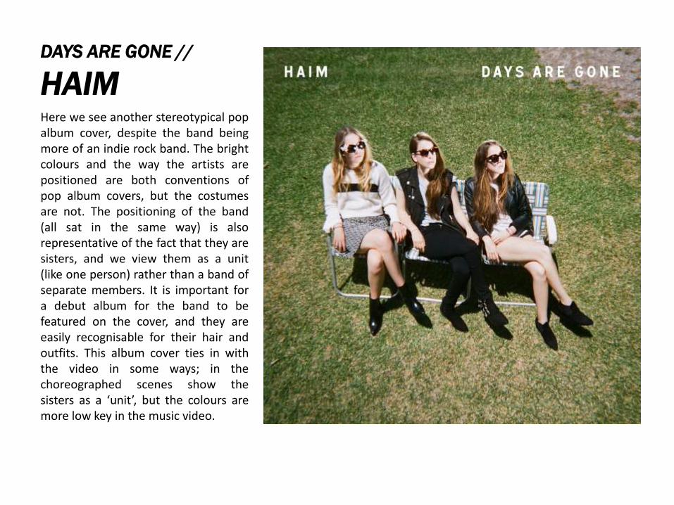
HAIMHere we see another stereotypical popalbum cover, despite the band beingmore of an indie rock band. The brightcolours and the way the artists arepositioned are both conventions ofpop album covers, but the costumesare not. The positioning of the band(all sat in the same way) is alsorepresentative of the fact that they aresisters, and we view them as a unit(like one person) rather than a band ofseparate members. It is important fora debut album for the band to befeatured on the cover, and they areeasily recognisable for their hair andoutfits. This album cover ties in withthe video in some ways; in thechoreographed scenes show thesisters as a ‘unit’, but the colours aremore low key in the music video.
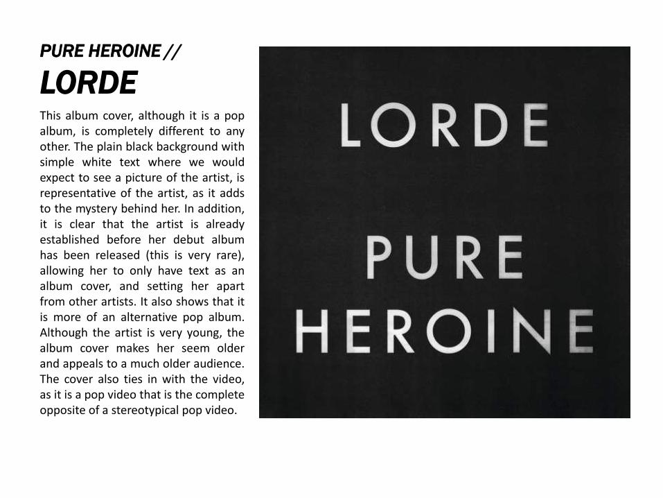
PURE HEROINE //
LORDEThis album cover, although it is a popalbum, is completely different to anyother. The plain black background withsimple white text where we wouldexpect to see a picture of the artist, isrepresentative of the artist, as it addsto the mystery behind her. In addition,it is clear that the artist is alreadyestablished before her debut albumhas been released (this is very rare),allowing her to only have text as analbum cover, and setting her apartfrom other artists. It also shows that itis more of an alternative pop album.Although the artist is very young, thealbum cover makes her seem olderand appeals to a much older audience.The cover also ties in with the video,as it is a pop video that is the completeopposite of a stereotypical pop video.

ANALYSIS OF
POP ALBUM
ADVERTISEMEN
TS
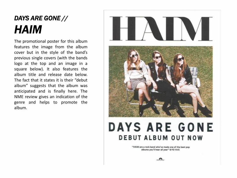
DAYS ARE GONE //
HAIMThe promotional poster for this albumfeatures the image from the albumcover but in the style of the band’sprevious single covers (with the bandslogo at the top and an image in asquare below). It also features thealbum title and release date below.The fact that it states it is their “debutalbum” suggests that the album wasanticipated and is finally here. TheNME review gives an indication of thegenre and helps to promote thealbum.
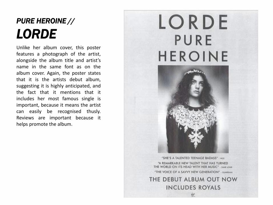
PURE HEROINE //
LORDEUnlike her album cover, this posterfeatures a photograph of the artist,alongside the album title and artist’sname in the same font as on thealbum cover. Again, the poster statesthat it is the artists debut album,suggesting it is highly anticipated, andthe fact that it mentions that itincludes her most famous single isimportant, because it means the artistcan easily be recognised thusly.Reviews are important because ithelps promote the album.
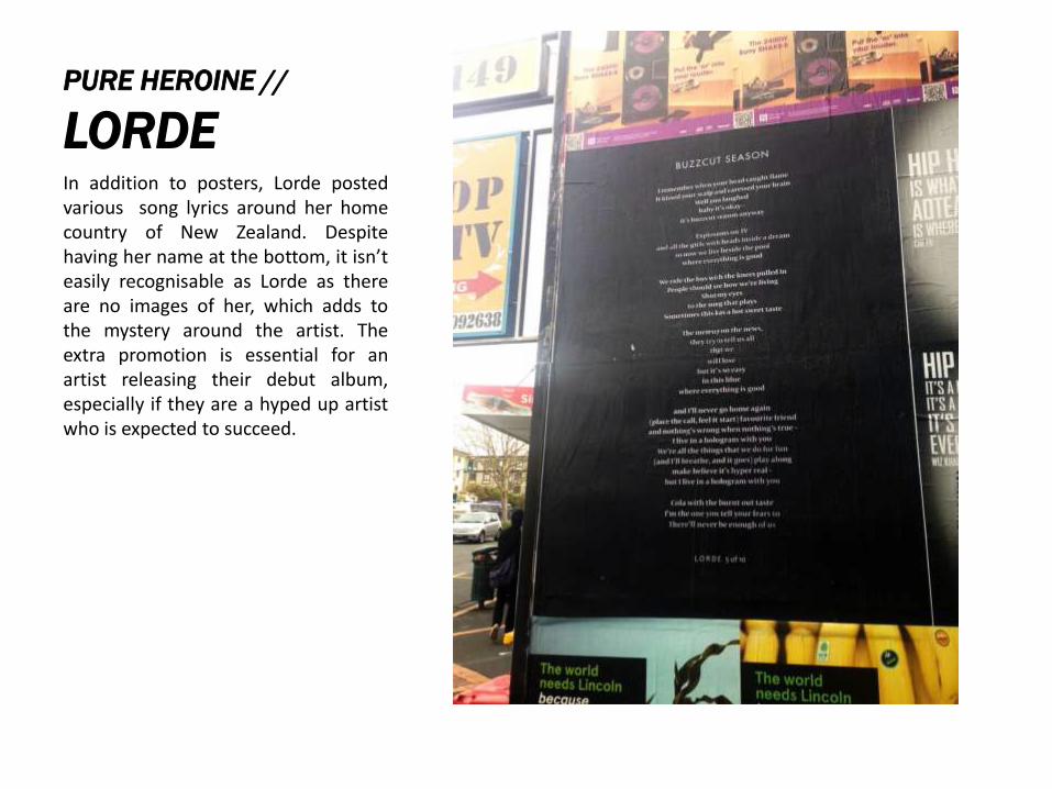
PURE HEROINE //
LORDEIn addition to posters, Lorde postedvarious song lyrics around her homecountry of New Zealand. Despitehaving her name at the bottom, it isn’teasily recognisable as Lorde as thereare no images of her, which adds tothe mystery around the artist. Theextra promotion is essential for anartist releasing their debut album,especially if they are a hyped up artistwho is expected to succeed.
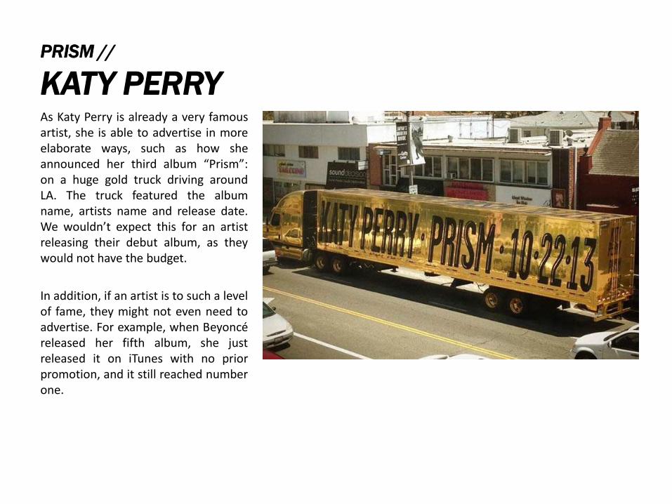
PRISM //
KATY PERRYAs Katy Perry is already a very famousartist, she is able to advertise in moreelaborate ways, such as how sheannounced her third album “Prism”:on a huge gold truck driving aroundLA. The truck featured the albumname, artists name and release date.We wouldn’t expect this for an artistreleasing their debut album, as theywould not have the budget.
In addition, if an artist is to such a levelof fame, they might not even need toadvertise. For example, when Beyoncéreleased her fifth album, she justreleased it on iTunes with no priorpromotion, and it still reached numberone.