BRIEF HISTORY 52 LAA REGIMENT Brief Partial History of 52 ...

A Brief History of Data VisualizationMichael Friendly
Psychology Department and Statistical Consulting ServiceYork University
4700 Keele Street, Toronto, ON, Canada M3J 1P3
in: Handbook of Computational Statistics: Data Visualization. See also BIBTEX entry below.
BIBTEX:
@InCollection{Friendly:06:hbook,author = {M. Friendly},title = {A Brief History of Data Visualization},year = {2006},publisher = {Springer-Verlag},address = {Heidelberg},booktitle = {Handbook of Computational Statistics: Data Visualization},volume = {III},editor = {C. Chen and W. H\"ardle and A Unwin},pages = {???--???},note = {(In press)},
}
© copyright by the author(s)
document created on: March 21, 2006created from file:hbook.texcover page automatically created withCoverPage.sty(available at your favourite CTAN mirror)

A brief history of data visualization
Michael Friendly∗
March 21, 2006
Abstract
It is common to think of statistical graphics and data visualization as relatively moderndevelopments in statistics. In fact, the graphic representation of quantitative informationhas deep roots. These roots reach into the histories of the earliest map-making and visualdepiction, and later into thematic cartography, statistics and statistical graphics, medicine,and other fields. Along the way, developments in technologies (printing, reproduction)mathematical theory and practice, and empirical observation and recording, enabled thewider use of graphics and new advances in form and content.
This chapter provides an overview of the intellectual history of data visualization frommedieval to modern times, describing and illustrating somesignificant advances along theway. It is based on a project, called theMilestones Project, to collect, catalog and documentin one place the important developments in a wide range of areas and fields that led to mod-ern data visualization. This effort has suggested some questions of the use of present-daymethods to analyze and understand this history, that I discuss under the rubric of “statisticalhistoriography.”
1 Introduction
The only new thing in the world is the history you don’t know. —Harry S TrumanIt is common to think of statistical graphics and data visualization as relatively modern de-
velopments in statistics. In fact, the graphic portrayal of quantitative information has deep roots.These roots reach into the histories of the earliest map-making and visual depiction, and laterinto thematic cartography, statistics and statistical graphics, with applications and innovationsin many fields of medicine and science that are often intertwined with each other. They alsoconnect with the rise of statistical thinking and widespread data collection forplanning andcommerce up through the 19th century. Along the way, a variety of advancements contributedto the widespread use of data visualization today. These include technologies for drawing andreproducing images, advances in mathematics and statistics, and new developments in data col-lection, empirical observation and recording.
From above ground, we can see the current fruit and anticipate futuregrowth; we must lookbelow to understand their germination. Yet the great variety of roots and nutrients across these
∗This paper was prepared for theHandbook of Computational Statistics on Data Visualization. Michael Friendlyis Professor, Psychology Department, York University, Toronto, ON, M3J 1P3 Canada, E-mail: [email protected] work is supported by Grant 8150 from the National Sciences and Engineering Research Council of Canada. Iam grateful to the archivists of many libraries and toles Chevaliers des Album de Statistique Graphique: Antoinede Falguerolles, Ruddy Ostermann, Gilles Palsky, Ian Spence, Antony Unwin, and Howard Wainer for historicalinformation, images, and helpful suggestions.
1

domains, that gave rise to the many branches we see today, are often not well known, and havenever been assembled in a single garden, to be studied or admired.
This chapter provides an overview of the intellectual history of data visualization from me-dieval to modern times, describing and illustrating some significant advances along the way. Itis based on what I call the Milestones Project, an attempt to provide a broadlycomprehensiveand representative catalog of important developments inall fields related to the history of datavisualization.
There are many historical accounts of developments within the fields of probability (Hald,1990), statistics (Pearson, 1978, Porter, 1986, Stigler, 1986), astronomy (Riddell, 1980), car-tography (Wallis and Robinson, 1987), which relate to,inter alia, some of the important de-velopments contributing to modern data visualization. There are other, more specialized ac-counts, which focus on the early history of graphic recording (Hoff and Geddes, 1959, 1962),statistical graphs (Funkhouser, 1936, 1937, Royston, 1970, Tilling, 1975), fitting equations toempirical data (Farebrother, 1999), economics and time-series graphs (Klein, 1997), cartogra-phy (Friis, 1974, Kruskal, 1977) and thematic mapping (Robinson, 1982, Palsky, 1996), andso forth; Robinson (Robinson, 1982, Ch. 2) presents an excellent overview of some of the im-portant scientific, intellectual, and technical developments of the 15th–18th centuries leadingto thematic cartography and statistical thinking.Wainer and Velleman(2001) provide a recentaccount of some of the history of statistical graphics.
But there are no accounts that span the entire development of visual thinking and the visualrepresentation of data, and which collate the contributions of disparate disciplines. In as muchas their histories are intertwined, so too should be any telling of the development of data vi-sualization. Another reason for interweaving these accounts is that practitioners in these fieldstoday tend to be highly specialized, and unaware of related developments in areas outside theirdomain, much less their history.
2 Milestones Tour
Every picture tells a story. —Rod Stewart, 1971In organizing this history, it proved useful to divide history into epochs,each of which
turned out to be describable by coherent themes and labels. This divisionis, of course somewhatartificial, but it provides the opportunity to characterize the accomplishments ineach period in ageneral way, before describing some of them in more detail. Figure1, discussed in Section3.2,provides a graphic overview of the epochs I describe in the subsectionsbelow, showing thefrequency of events considered milestones in the periods of this history. For now, it suffices tonote the labels attached to these epochs, a steady rise from the early 18th century to the late 19th
century, with a curious wiggle thereafter.In the larger picture— recounting the history of data visualization— it turns out that many
of the milestones items have a story to be told: What motivated this development? What was thecommunication goal? How does it relate to other developments— What were the pre-cursors?How has this idea been used or re-invented today? Each section below triesto illustrate the gen-eral themes with a few exemplars. In particular, this account attempts to tell a few representativestories of these periods, rather than to try to be comprehensive.
For reasons of economy, only a limited number of images could be printed here, and theseonly in black and white. Others are referred to by web links, mostly from the Milestones
2

Early maps& diagrams Measurement
& Theory
New graphicforms Begin modern
period
Golden ageModern dark
ages
Re-birth
High-D Vis
Milestones: Time course of developmentsDensity
0.000
0.001
0.002
0.003
0.004
0.005
Year
1500 1600 1700 1800 1900 2000
Figure 1: The time distribution of events considered milestones in the history of data visualiza-tion, shown by a rug plot and density estimate.
Project,http://www.math.yorku.ca/SCS/Gallery/milestone/, where a colorversion of this chapter will also be found.
2.1 Pre-17th Century: Early maps and diagrams
The earliest seeds of visualization arose in geometric diagrams, in tables of the positions of starsand other celestial bodies, and in the making of maps to aid in navigation and exploration. Theidea of coordinates was used by ancient Egyptian surveyors in laying out towns, earthly andheavenly positions were located by something akin to latitude and longitude at least by 200 BC,and the map projection of a spherical earth into latitude and longitude by Claudius Ptolemy [c.85–c. 165] in Alexandria would serve as reference standards until the14th century.
Among the earliest graphical depictions of quantitative information is an anonymous 10th
century multiple time-series graph of the changing position of the seven most prominent heav-enly bodies over space and time (Figure2), described byFunkhouser(1936) and reproducedin Tufte (1983, p. 28). The vertical axis represents the inclination of the planetary orbits, thehorizontal axis shows time, divided into thirty intervals. The sinusoidal variation, with differentperiods is notable, as is the use of a grid, suggesting both an implicit notion of acoordinatesystem, and something akin to graph paper, ideas that would not be fully developed until the1600–1700s.
In the 14th century, the idea of a plotting a theoretical function (as a proto bar graph), and
3

Figure 2: Planetary movements shown as cyclic inclinations over time, by an unknown as-tronomer, appearing in a 10th century appendix to commentaries by A. T. Macrobius on Cicero’sIn Somnium Scripionus. Source:Funkhouser(1936, p. 261).
the logical relation between tabulating values and plotting them appeared in a work by NicoleOresme [1323–1382] Bishop of Liseus1 (Oresme, 1482, 1968), followed somewhat later by theidea of a theoretical graph of distance vs. speed by Nicolas of Cusa.
By the 16th century, techniques and instruments for precise observation and measurementof physical quantities, and geographic and celestial position were well-developed (for example,a “wall quadrant” constructed by Tycho Brahe [1546–1601], covering an entire wall in his ob-servatory). Particularly important were the development of triangulation and other methods todetermine mapping locations accurately (Frisius, 1533, Tartaglia, 1556). As well, we see ini-tial ideas for capturing images directly (the camera obscura, used by Reginer Gemma-Frisius in1545 to record an eclipse of the sun), the recording of mathematical functions in tables (trigono-metric tables by Georg Rheticus, 1550), and the first modern cartographicatlas (Teatrum OrbisTerrarumby Abraham Ortelius, 1570). These early steps comprise the beginnings of data visu-alization.
2.2 1600-1699: Measurement and theory
Among the most important problems of the 17th century were those concerned with physicalmeasurement— of time, distance, and space— for astronomy, surveying, map making, naviga-tion and territorial expansion. This century also saw great new growth in theory and the dawnof practical application— the rise of analytic geometry and coordinate systems(Descartes and
1Funkhouser(1936, p. 277) was sufficiently impressed with Oresme’s grasp of the relation between functionsand graphs that he remarked, “if a pioneering contemporary had collected some data and presented Oresme withactual figures to work upon, we might have had statistical graphs four hundred years before Playfair.”
4

Fermat), theories of errors of measurement and estimation (initial steps by Galileo in the anal-ysis of observations on Tycho Brahe’s star of 1572 (Hald, 1990, §10.3)), the birth of probabilitytheory (Pascal and Fermat), and the beginnings of demographic statistics (John Graunt) and“political arithmetic” (William Petty)— the study of population, land, taxes, value of goods,etc. for the purpose of understanding the wealth of the state.
Early in this century, Christopher Scheiner (1630, recordings from 1611) introduced an ideaTufte (1983) would later call the principle of “small multiples” to show the changing configu-rations of sunspots over time, shown in Figure3. The multiple images depict the recordings ofsunpots from 23 October 1611 until 19 December of that year. The largekey in the upper leftidentifies seven groups of sunspots by the letters A–F. These groups are similarly identified inthe 37 smaller images, arrayed left-to-right and top-to-bottom below.
Figure 3: Scheiner’s 1626 representation of the changes in sunspots over time. Source:Scheiner(1630).
Another noteworthy example (Figure4) shows a 1644 graphic by Michael Florent van Lan-gren [1600–1675], a Flemish astronomer to the court of Spain, believed tobe the first visualrepresentation of statistical data (Tufte, 1997, p. 15). At that time, lack of a reliable means todetermine longitude at sea hindered navigation and exploration.2 This 1D line graph shows all
2For navigation, latitude could be fixed from star inclinations, but longitude required accurate measurement oftime at sea, an unsolved problem until 1765 with the invention of a marine chronometer by John Harrison. SeeSobel(1996) for a popular account.
5

12 known estimates of the difference in longitude between Toledo and Rome, and the name ofthe astronomer (Mercator, Tycho Brahe, Ptolemy, etc.) who provided each observation.
Figure 4: Langren’s 1644 graph of determinations of the distance, in longitude, from Toledo toRome. The correct distance is16◦30′. Source:Tufte (1997, p. 15).
What is notable is that van Langren could have presented this information in various tables—ordered by author to show provenance, by date to show priority, or by distance. However, only agraph shows the wide variation in the estimates; note that the range of values covers nearly halfthe length of the scale. Van Langren took as his overall summary the center of the range, wherethere happened to be a large enough gap for him to inscribe “ROMA.” Unfortunately, all of theestimates were biased upwards; the true distance (16◦30′) is shown by the arrow. Van Langren’sgraph is also a milestone as the earliest-known exemplar of the principle of “effect ordering fordata display” (Friendly and Kwan, 2003).
In the 1660s, the systematic collection and study of social data began in various Europeancountries, under the rubric of “political arithmetic” (John Graunt1662and William Petty1665),with the goals of informing the state about matters related to wealth, population, agricultural
land, taxes and so forth,3 as well as for commercial purposes such as insurance and annuitiesbased on life tables (Jan de Witt,1671). At approximately the same time, the initial statementsof probability theory around 1654 (seeBall (1908)) together with the idea of coordinate systemswere applied by Christiaan Huygens in 1669 to give the first graph of a continuous distributionfunction4 (from Gaunt’s life table based on the bills of mortality). The mid 1680s saw the firstbivariate plot derived from empirical data, a theoretical curve relating barometric pressure toaltitude, and the first known weather map,5 showing prevailing winds on a map of the earth(Halley, 1686).
By the end of this century, the necessary elements for the development of graphical methodswere at hand— some real data of significant interest, some theory to make sense of them, and afew ideas for their visual representation. Perhaps more importantly, one can see this century asgiving rise to the beginnings of visual thinking, as illustrated by the examples of Scheiner andvan Langren.
3For example,Graunt(1662) used his tabulations of London births and deaths from parish records and the billsof mortality to estimate the number of men the king would find available in the event of war (Klein, 1997, 43–47).
4 Image:http://math.yorku.ca/SCS/Gallery/images/huygens-graph.gif5 Image:http://math.yorku.ca/SCS/Gallery/images/halleyweathermap-1686.jpg
6

2.3 1700-1799: New graphic forms
With some rudiments of statistical theory, data of interest and importance, and the idea ofgraphic representation at least somewhat established, the 18th century witnessed the expansionof these aspects to new domains and new graphic forms. In cartography,map-makers began totry to show more than just geographical position on a map. As a result, new data representations(isolines and contours) were invented, and thematic mapping of physical quantities took root.Towards the end of this century, we see the first attempts at the thematic mappingof geologic,economic, and medical data.
Abstract graphs, and graphs of functions became more widespread, along with the earlybeginnings of statistical theory (measurement error) and systematic collection of empirical data.As other (economic and political) data began to be collected, some novel visual forms wereinvented to portray them, so the data could ‘speak to the eyes.’
For example, the use of isolines to show contours of equal value on a coordinate grid (mapsand charts) was developed by Edmund Halley (1701). Figure5, showing isogons— lines ofequal magnetic declination— is among the first examples of thematic cartography, overlay-ing data on a map. Contour maps and topographic maps were introduced somewhat later byPhillippe Buache (1752) and Marcellin du Carla-Boniface (1782).
Figure 5: A portion of Edmund Halley’sNew and Correct Sea Chart Shewing the Variationsin the Compass in the Western and Southern Ocean, 1701.Source: Halley (1701), image fromPalsky(1996, p. 41).
Timelines, or “cartes chronologiques” were first introduced by Jacques Barbeu-Dubourg in
7

the form of an annotated chart of all of history (from Creation) on a 54-foot scroll (Ferguson,1991). Joseph Priestley, presumably independently, used a more convenientform to show first atimeline chart of biography (lifespans of 2,000 famous people, 1200 B.C. to1750 A.D.,Priestley(1765)), and then a detailed chart of history (Priestley, 1769).
The use of geometric figures (squares or rectangles) and cartograms tocompare areas or de-mographic quantities by Charles de Fourcroy6 (1782) and August F.W. Crome (1785) providedanother novel visual encoding for quantitative data using superimposedsquares to compare theareas of European states.
As well, several technological innovations provided necessary ingredients for the produc-tion and dissemination of graphic works. Some of these facilitated the reproduction of dataimages, such as three-color printing, invented by Jacob le Blon in 1710 andlithography byAloys Senefelder in 1798. Of the latter,Robinson(1982, p. 57) says “the effect was as great asthe introduction [of the Xerox machine].” Yet, likely due to expense, most of these new graphicforms appeared in publications with limited circulation, unlikely to attract wide attention.
A prodigious contributor to the use of the new graphical methods, Johann Lambert [1728–1777] introduced the ideas of curve fitting and interpolation from empirical data points. He usedvarious sorts of line graphs and graphical tables to show periodic variation, for example, in airand soil temperature.7
William Playfair [1759–1823] is widely considered the inventor of most of thegraphicalforms widely used today— first the line graph and bar chart (Playfair, 1786), later the pie chartand circle graph (Playfair, 1801). Figure6 shows a creative combination of different visualforms: circles, pies and lines, re-drawn fromPlayfair(1801, Plate 2).
The use of two separate vertical scales for different quantities (population and taxes) istoday considered a sin in statistical graphics (you can easily jiggle either scale to show differentthings). But Playfair used this device to good effect here to try to show taxes per capita in variousnations and argue that the British were overtaxed, compared with others. But alas, showingsimple numbers by a graph was hard enough for Playfair— he devoted several pages of text inPlayfair(1786) describing how to read and understand a line graph. The idea of calculating andgraphing rates and other indirect measurements was still to come.
In this figure the left axis and line on each circle/pie graph shows population, while theright axis and line shows taxes. Playfair intended that theslopeof the line connecting the twowould depict the rate of taxation directly to the eye; but, of course, the slopealso depends onthe diameters of the circles. Playfair’s graphic sins can perhaps be forgiven here, because thegraph clearly shows the slope of the line for Britain to be in the opposite direction of those forthe other nations.
A somewhat later graph (Playfair, 1821), shown in Figure7, exemplifies the best that Play-fair had to offer with these graphic forms. Playfair used three parallel time series to show theprice of wheat, weekly wages, and reigning monarch over a∼250 year span from 1565 to 1820,and used this graph to argue that workers had become better off in the mostrecent years.
By the end of this century (1794), the utility of graphing in scientific applications prompted aDr. Buxton in London to patent and market printed coordinate paper; curiously, a patent for linednotepaper was not issued until 1815. The first known published graphusing coordinate paperis one of periodic variation in barometric pressure (Howard, 1800). Nevertheless, graphing of
6 Image:http://math.yorku.ca/SCS/Gallery/images/palsky/defourcroy.jpg7 Image: http://www.journals.uchicago.edu/Isis/journal/demo/v000n000/000000/
fg7.gif
8

Figure 6: Re-drawn version of a portion of Playfair’s 1801 pie-circle-line chart, comparingpopulation and taxes in several nations.
data would remain rare for another 30 or so years,8 perhaps largely because there wasn’t muchdata (apart from widespread astronomical, geodetic, and physical measurement) of sufficientcomplexity to require new methods and applications. Official statistics, regarding populationand mortality, and economic data were generally fragmentary and often not publicly available.This would soon change.
2.4 1800-1850: Beginnings of modern graphics
With the fertilization provided by the previous innovations of design and technique, the first halfof the 19th century witnessed explosive growth in statistical graphics and thematic mapping, ata rate which would not be equalled until modern times.
In statistical graphics, all of the modern forms of data display were invented: bar and piecharts, histograms, line graphs and time-series plots, contour plots, scatterplots, and so forth.In thematic cartography, mapping progressed from single maps to comprehensive atlases, de-picting data on a wide variety of topics (economic, social, moral, medical, physical, etc.), andintroduced a wide range of novel forms of symbolism. During this period graphical analysisof natural and physical phenomena (lines of magnetism, weather, tides, etc.) began to appearregularly in scientific publications as well.
In 1801, the first geological maps were introduced in England by William Smith [1769–1839], setting the pattern for geological cartography or “stratigraphic geology” (Smith, 1815).
8William Herschel (1833), in a paper that describes the first instance of a modern scatterplot, devoted three pagesto a description of plotting points on a grid.
9

Figure 7: William Playfair’s 1821 time series graph of prices, wages, and ruling monarch overa 250 year period.Source: Playfair(1821), image fromTufte (1983, p. 34)
These and other thematic maps soon led to new ways to show quantitative information on maps,and, equally importantly, to new domains for graphically-based inquiry.
In the 1820s, Baron Charles Dupin [1784–1873] invented the use of continuous shadings(from white to black) to show the distribution and degree of illiteracy in France(Dupin, 1826)—the first unclassed choropleth map,9 and perhaps the first modern-style thematic statistical map(Palsky, 1996, p. 59). Later given the lovely title, “Carte de la France obscure et la Franceeclairee,” it attracted wide attention, and was also perhaps the first application ofgraphics in thesocial realm.
More significantly, in 1825, the Ministry of Justice in France instituted the firstcentralizednational system of crime reporting, collected quarterly from all departmentsand recording thedetails of every charge laid before the French courts. In 1833, Andre-Michel Guerry, a lawyerwith a penchant for numbers used this data (along with other data on literacy,suicides, donationsto the poor and other “moral” variables) to produce a seminal work on the moral statistics ofFrance (Guerry, 1833)— a work that (along withQuetelet(1831, 1835)) can be regarded as thefoundation of modern social science.10
Guerry used maps in a style similar to Dupin to compare the ranking of departmentsonpairs of variables, notably crime vs. literacy, but other pairwise variable comparisons weremade.11 He used these to argue that the lack of an apparent (negative) relation between crime
9 Image:http://math.yorku.ca/SCS/Gallery/images/dupin2.gif10Guerry showed that rates of crime, when broken down by department,type of crime, age and gender of the
accused and other variables, remained remarkably consistent from year to year, yet varied widely across departments.He used this to argue that such regularity implied the possibility of establishing social laws, much as the regularityof natural phenomena implied physical ones. Guerry also pioneered the study of suicide, with tabulations of suicidesin Paris, 1827–1830, by sex, age, education, profession, etc. and acontent analysis of suicide notes as to presumedmotives.
11Today, one would use a scatterplot, but that graphic form was only just invented (Herschel, 1833) and would not
10

and literacy contradicted the arm-chair theories of some social reformers who had argued thatthe way to reduce crime was to increase education.12 Guerry’s maps and charts made somewhatof an academic sensation both in France and the rest of Europe; he later exhibited several ofthese at the 1851 London Exhibition, and carried out a comparative studyof crime in Englandand France (Guerry, 1864), for which he was awarded the Moynton Prize in statistics by theFrench Academy of Sciences.13 But Guerry’s systematic and careful work was unable to shinein the shadows cast by Adolphe Quetelet, who regarded moral and socialstatistics as his owndomain.
Figure 8: A portion of Dr. Robert Baker’s cholera map of Leeds, 1833, showing the districtsaffected by cholera.Source:Gilbert (1958, Fig. 2).
In October 1831, the first case of asiatic cholera occurred in Great Britain, and over 52,000
enter common usage for another 50 years; seeFriendly and Denis(2005).12Guerry seemed reluctant to take sides. He also contradicted the social conservatives who argued for the need to
build more prisons or impose more severe criminal sentences. SeeWhitt (2002).13Among the 17 plates in this last work, seven pairs of maps for England andFrance each included sets of small
line graphs to show trends over time, decompositions by subtype of crime and sex, distributions over months of theyear, and so forth. The final plate, on general causes of crime is an incredibly detailed and complex multivariatesemi-graphic display attempting to relate various types of crimes to each other, to various social and moral aspects(instruction, religion, population) as well as to their geographic distribution.
11

people died in the epidemic that ensued over the next 18 months or so (Gilbert, 1958). Sub-sequent cholera epidemics in 1848–1849 and 1853–1854 produced similarly large death tolls,but the water-born cause of the disease was unknown until 1855 when Dr. John Snow producedhis famous dot map14 (Snow, 1855) showing deaths due to cholera clustered around the BroadStreet pump in London. This was indeed a landmark graphic discovery, but it occurred at theend of the period, roughly 1835–1855, that marks a high-point in the application of thematiccartography to human (social, medical, ethnic) topics. The first known disease map of cholera(Figure8), due to Dr. Robert Baker (1833), shows the districts of Leeds “affected by cholera”in the particularly severe 1832 outbreak.
I show this figure to make another point— why Baker’s map did not lead to a “eureka”experience, while John Snow’s did. Baker used a town plan of Leeds that had been dividedinto districts. Of a population of 76,000 in all of Leeds, Baker mapped the 1800 cholera casesby hatching in red “the districts in which the cholera had prevailed.” In his report, he notedan association between the disease and living conditions: “how exceedingly the disease hasprevailed in those parts of the town where there is a deficiency, often an entire want of sewage,drainage, and paving” (Baker, 1833, p. 10). Baker did not indicate the incidence of disease onhis map, nor was he equipped to displayratesof disease (in relation to population density)15
and his knowledge of possible causes, while definitely on the right track, was both weak andimplicit (not analyzed graphically or by other means). It is likely that some, perhaps tenuous,causal indicants or evidence were available to Baker, but he was unableto connect the dots, orsee a geographically distributed outcome in relation to geographic factors in even the simpleways that Guerry had tried.
At about the same time,∼1830–1850, the use of graphs began to become recognized insome official circles for economic and state planning— where to build railroads and canals?what is the distribution of imports and exports? This use of graphical methodsis no better illus-trated than in the works of Charles Joseph Minard [1781–1870], whoseprodigious graphicalinventions ledFunkhouser(1937) to call him the Playfair of France. To illustrate, we choose(with some difficulty) an 1844 “tableau-graphique” (Figure9) by Minard, an early progenitor ofthe modern mosaic plot (Friendly, 1994). On the surface, mosaic plots descend from bar charts,but Minard introduced two simultaneous innovations: the use of divided andproportional-widthbars so that area had a concrete visual interpretation. The graph shows the transportation of com-mercial goods along one canal route in France by variable-width, divided bars (Minard, 1844).
In this display the width of each vertical bar shows distance along this route;the divided barsegments have height∼ amount of goods of various types (shown by shading), so the area ofeach rectangular segment is proportional to cost of transport. Minard,a true visual engineer(Friendly, 2000), developed such diagrams to argue visually for setting differential priceratesfor partial vs. complete runs. Playfair had tried to make data ‘speak to the eyes,’ but Minardwished to make them ‘calculer par l’œil’ as well.
It is no accident that, in England, outside the numerous applications of graphical methodsin the sciences, there was little interest in or use of graphs among statisticians (or “statists” as
14 Image:http://www.math.yorku.ca/SCS/Gallery/images/snow4.jpg15The German geographer Augustus Petermann produced a “Cholera map of the British Isles” in 1852 us-
ing national data from the 1831–1832 epidemic, (image:http://images.rgs.org/webimages/0/0/10000/1000/800/S0011888.jpg) shaded in proportion to the relative rate of mortality using class intervals(< 1/35, 1/35 : 1/100, 1/100 : 1/200, . . . ). No previous disease map allowed determination of the range ofmortality in any given area.
12

Figure 9: Minard’s Tableau Graphique, showing the transportation of commercial goods alongthe Canal du Centre (Chalon–Dijon). Intermediate stops are spaced by distance, and each baris divided by type of goods, so the area of each tile represents the cost of transport. Arrowsshow the direction of transport.Source: ENPC:5860/C351 (Col. et cliche ENPC; used bypermission).
they called themselves). If there is a continuum ranging from “graph people” to “table people,”British statisticians and economists were philosophically more table-inclined, andlooked upongraphs with suspicion up to the time of William Stanley Jevons around 1870 (Maas and Morgan,2005). Statistics should be concerned with the recording of “facts relating to communities ofmen which are capable of being expressed by numbers” (Mouat, 1885, p.15), leaving the gen-eralization to laws and theories to others. Indeed, this view was made abundantly clear in thelogo of the Statistical Society of London (now the Royal Statistical Society): abanded sheaf ofwheat, with the mottoAliis Exterendum— to others to flail the wheat. Making graphs, it seemed,was too much like bread-making.
2.5 1850–1900: The Golden Age of statistical graphics
By the mid-1800s, all the conditions for the rapid growth of visualization had been established—a “perfect storm” for data graphics. Official state statistical offices were established throughout
13

Europe, in recognition of the growing importance of numerical information for social plan-ning, industrialization, commerce, and transportation. Statistical theory, initiated by Gauss andLaplace, and extended to the social realm by Guerry and Quetelet, provided the means to makesense of large bodies of data.
What started as theAge of Enthusiasm(Funkhouser, 1937, Palsky, 1996) for graphics endedwith what can be called theGolden Age, with unparalleled beauty and many innovations ingraphics and thematic cartography. So varied were these developments, that it is difficult to becomprehensive, but a few themes stand out.
2.5.1 Escaping flatland
Although some attempts to display more than two variables simultaneously had occurred earlierin multiple time-series (Playfair, 1801, Minard, 1826), contour graphs (Vauthier, 1874) and avariety of thematic maps, (e.g.,Berghaus(1838)) a number of significant developments ex-tended graphics beyond the confines of a flat piece of paper. Gustav Zeuner [1828–1907] inGermany (Zeuner, 1869), and later Luigi Perozzo [?–1875] in Italy (Perozzo, 1880) constructed3D surface plots of population data.16 The former was an axonometric projection showing var-ious slices, while the latter (a 3D graph of population in Sweden from 1750–1875 by year andage group) was printed in red and black and designed as a stereogram.17
Contour diagrams, showing iso-level curves of 3D surfaces, had alsobeen used earlier inmapping contexts (Nautonier, 1604, Halley, 1701, von Humboldt, 1817), but the range of prob-lems and data to which they were applied expanded considerably over this time inattemptsto understand relations among more than two data-based variables, or where the relationshipsare statistical, rather than functional or measured with little error. It is more convenient to de-scribe these under Galton, below. By 1884, the idea of visual and imaginary worlds of varyingnumber of dimensions found popular expression in Edwin Abbott’s (1884) Flatland, implicitlysuggesting possible views in four and more dimensions.
2.5.2 Graphical innovations
With the usefulness of graphical displays for understanding complex dataand phenomena es-tablished, many new graphical forms were invented and extended to new areas of inquiry, par-ticularly in the social realm.
Minard (1861) developed the use of divided circle diagrams on maps (showing both a total,by area, and sub-totals, by sectors, with circles for each geographic region on the map). Laterhe developed to an art form the use of flow lines on maps of width proportional to quantities(people, goods, imports, exports) to show movement and transport geographically. Near theend of his life, the flow map would be taken to its highest level in his famous depiction of thefate of the armies of Napoleon and Hannibal, in whatTufte (1983) would call the “best graphicever produced.” SeeFriendly(2002) for a wider appreciation of Minard’s work.
The social and political uses of graphics is also evidenced in the polar area charts (called“rose diagrams” or “coxcombs”) invented by Florence Nightingale [1820–1910] to wage a
16 Image:http://math.yorku.ca/SCS/Gallery/images/stereo2.jpg17Zeuner used one axis to show year of birth and another to show presentage, with number of surviving persons
on the third, vertical axis, giving a 3D surface. One set of curves thusshowed the distribution of population for agiven generation; the orthogonal set of curves showed the distributions across generations at a given point in time,e.g., at a census.
14

campaign for improved sanitary conditions in battlefield treatment of soldiers (Nightingale,1857). They left no doubt that many more soldiers died from disease and the consequencesof wounds than at the hands of the enemy. From around the same time, Dr. John Snow [1813–1858] is remembered for his use of a dot map of deaths from cholera in an 1854 outbreak inLondon the cholera deaths in London. Plotting the residence of each deceased provided the in-sight for his conclusion that the source of the outbreak could be localizedto contaminated waterfrom a pump on Broad Street, the founding innovation for modern epidemiological mapping.
Figure 10: Lallemand’sL’abaque du bateau Le Triomphe, allowing determination of magneticdeviation at sea without calculation.Source: courtesy Mme. Marie-Noelle Maisonneuve, Lesfonds anciens de la bibliotheque de l’Ecole des Mines de Paris.
Scales and shapes for graphs and maps were also transformed for a variety of purposes,leading to semi-logarithmic graphs (Jevons, 1863, 1958) to show percentage change in com-modities over time, log-log plots to show multiplicative relations, anamorphic maps byEmileCheysson (Palsky, 1996, Fig. 63-64) using deformations of spatial size to show a quantita-tive variable (e.g., the decrease in time to travel from Paris to various placesin France over 200years), and alignment diagrams or nomograms using sets of parallel axes.We illustrate this sliceof the golden age with Figure10, a tour-de-force graphic for determination of magnetic devia-tion at sea in relation to latitude and longitude without calculation (“L’Abaque Triomphe”) by
15

Charles Lallemand (1885), director general of the geodetic measurement of altitudes throughoutFrance, that combines many variables into a multi-function nomogram, using 3D,juxtapositionof anamorphic maps, parallel coordinates and hexagonal grids.
2.5.3 Galton’s contributions
Special note should be made of the varied contributions of Francis Galton [1822-1911] to datavisualization and statistical graphics. Galton’s role in the development of the ideas of correlationand regression are well-known. Less well-known is the role that visualization and graphingplayed in his contributions and discoveries.
Galton’s statistical insight (Galton, 1886)— that, in a bivariate (normal) distribution (say,height of child against height of parent), (a) the isolines of equal frequency would appear asconcentric ellipses, and (b) that the locus of the (regression) lines of means ofy |x and ofx | ywere the conjugate diameters of these ellipses — was based largely on visualanalysis fromthe application of smoothing to his data. Karl Pearson would later say, “that Galton shouldhave evolved all this from his observations is to my mind one of the most noteworthy scientificdiscoveries arising from pure analysis of observations.” (Pearson, 1920, p. 37). This was onlyone of Galton’s discoveries based on graphical methods.
In earlier work, Galton had made wide use of isolines, contour diagrams andsmoothingin a variety of areas. An 1872 paper showed the use of “isodic curves”to portray thejoint effects of wind and current on the distance ships at sea could travel in any direction. An1881 “isochronic chart” (Galton, 1881) showed the time it took to reach any destination in theworld from London by means of colored regions on a world map. Still later, he analyzed ratesof fertility in marriages in relation to the ages of father and mother using “isogens,” curves ofequal percentage of families having a child (Galton, 1894).
But perhaps the most notable non-statistical graphical discovery was that of the “anti-cyclonic”(counter-clockwise) pattern of winds around low-pressure regions,combined with clockwise ro-tations around high-pressure zones. Galton’s work on weather patterns began in 1861 and wassummarized inMeteorographica(1863). It contained a variety of ingenious graphs and maps(over 600 illustrations in total) one of which is shown in Figure11. This remarkable chart, oneof a two-page trellis-style display, shows observations on barometric pressure, wind direction,rain and temperature from 15 days in December 1861.18 For each day, the3 × 3 grid showsschematic maps of Europe, mapping pressure (row 1), wind and rain (row2) and temperature(row 3), in the morning, afternoon and evening (columns). One can clearly see the series ofblack areas (low pressure) on the barometric charts for about the firsthalf of the month, corre-sponding to the counter-clockwise arrows in the wind charts, followed by ashift to red areas(high pressure) and more clockwise arrows.Wainer(2005, p. 56) remarks, “Galton did for thecollectors of weather data what Kepler did for Tycho Brahe. This is no small accomplishment.”
2.5.4 Statistical Atlases
The collection, organization and dissemination of official government statistics on population,trade and commerce, social, moral and political issues became widespread inmost of the coun-
18 In July 1861, Galton distributed a circular to meterologists throughout Europe, asking them to record these datasynchonously, three times a day for the entire month of December, 1861. About 50 weather stations supplied thedata; seePearson(1930, p. 37–39).
16

Figure 11: One page of Galton’s 1863 multivariate weather chart of Europe showing barometricpressure, wind direction, rain, and temperature for the month of December, 1861. Source:Pearson(1930, pl. 7).
tries of Europe from about 1825 to 1870 (Westergaard, 1932). Reports containing data graphicswere published with some regularity in France, Germany, Hungary, and Finland, and with tabu-lar displays in Sweden, Holland, Italy and elsewhere. At the same time, there was an impetus todevelop standards for graphical presentation at the International Statistical Congresses that hadbegun in 1853 in Belgium (organized by Quetelet), and these congresseswere closely linkedwith state statistical bureaus. The main participants in the graphics section included Georgvon Mayr, Hermann Schwabe, PierreEmile Levasseur andEmile Cheysson. Among other rec-ommendations was one from the 7th Statistical Congress in 1869 that official publications beaccompanied by maps and diagrams. The state-sponsored statistical atlasesthat ensued provideadditional justification to call this period the Golden Age of Graphics, and someof its mostimpressive exemplars.
The pinnacle of this period of state-sponsored statistical albums is undoubtedly theAlbumsde Statistique Graphiquepublished annually by the French ministry of public works from 1879-1897 under the direction ofEmile Cheysson.19 They were published as large-format books
19Cheysson had been one of the major participants in committees on the standardization of graphical methods at
17

(about 11 x 17 in.), and many of the plates folded out to four- or six-times that size, all printedin color and with great attention to layout and composition. We concur with Funkhouser (1937,p.336) that “theAlbumspresent the finest specimens of French graphic work in the century andconsiderable pride was taken in them by the French people, statisticians andlaymen alike.”
The subject matter of the albums largely concerned economic and financial data related tothe planning, development and administration of public works— transport ofpassengers andfreight, by rail, on inland waterways and through seaports, but also included such topics asrevenues in the major theaters of Paris, attendance at the universal expositions of 1867, 1878and 1889, changes in populations of French departments over time, and soforth.
More significantly for this account theAlbumscan also be viewed as an exquisite sampler ofall the graphical methods known at the time, with significant adaptations to the problem at hand.The majority of these graphs used and extended the flow map pioneered by Minard. Others usedpolar forms— variants of pie and circle diagrams, star plots and rose diagrams, often overlaidon a map and extended to show additional variables of interest. Still others used sub-dividedsquares in the manner of modern mosaic displays (Friendly, 1994) to show the breakdown ofa total (passengers, freight) by several variables. It should be noted that in almost all casesthe graphical representation of the data was accompanied by numerical annotations or tables,providing precise numerical values.
TheAlbumsare discussed extensively byPalsky(1996), who includes seven representativeillustrations. It is hard to choose a single image here, but my favorites are surely the recursive,multi-mosaic of rail transportation for the 1884–1886 volumes, the first of which is shown inFigure12. This cartogram uses one large mosaic (in the lower left) to show the numbersofpassengers and tons of freight shipped from Paris from the four principal train stations. Of thetotal leaving Paris, the amounts going to each main city are shown by smaller mosaics, coloredaccording to railway lines; of those amounts, the distribution to smaller cities is similarly shown,connected by lines along the rail routes.
Among the many other national statistical albums and atlases, those from the U.S.Cen-sus bureau also deserve special mention. TheStatistical Atlas of the Ninth Census, produced in1872–1874 under the direction of Francis A. Walker [1840–1897] contained 60 plates, includingseveral novel graphic forms. The ambitious goal was to present a graphic portrait of the nation,and covered a wide range of physical and human topics: geology, minerals, weather; populationby ethnic origin, wealth, illiteracy, school attendance and religious affiliation; death rates byage, sex, race and cause, prevalence of blindness, deaf mutism and insanity, and so forth. “Agepyramids” (back-to-back, bilateral frequency histograms and polygons) were used effectively tocompare age distributions of the population for two classes (gender, married/single, etc.). Sub-divided squares and area-proportional pies of various forms were also used to provide com-parisons among the states on multiple dimensions simultaneously (employed/unemployed, sex,schooling, occupational categories). The desire to provide for easy comparisons among statesand other categorizations was expressed by arranging multiple sub-figures as “small multiples”in many plates.
Following each subsequent decennial census for 1880 to 1900, reports and statistical atlaseswere produced with more numerous and varied graphic illustrations. The 1898 volume fromthe Eleventh Census (1890), under the direction of Henry Gannett [1846–1914] contained over400 graphs, cartograms and statistical diagrams. There were several ranked parallel coordinate
the International Statistical Congresses from 1872 on. He was trained asan engineer at the ENPC, and later becamea professor of political economy at theEcole des Mines.
18

Figure 12: Mouvement des voyageurs et des marchandises dans les principalesstations dechemins de fer en 1882. Scale: 2mm2 = 10,000 passengers or tons of freight.Source: Album,1884, Plate 11 (author’s collection).
19

plots comparing states and cities over all censuses from 1790–1890. Trellis-like collectionsof shaded maps showed interstate migration, distributions of religious membership, deaths byknown causes, and so forth.
The 1880 and 1890 volumes produced under Gannett’s direction are alsonotable for (a) themulti-modal combination of different graphic forms (maps, tables, bar charts, bilateral poly-gons) in numerous plates, and (b) the consistent use of effect-order sorting (Friendly and Kwan,2003) to arrange states or other categories in relation to what was to be shown, rather than forlookup (e.g., Alabama–Wyoming).
Figure 13: Interstate migration shown by back-to-back bar charts, sorted by emigration.Source:Statistical Atlas of the Eleventh Census, 1890, diagram 66, p. 23 (author’s collection).
For example, Figure13 shows interstate immigration in relation to emigration for the 49states and territories in 1890. The right side shows population loss sorted by emigration, rangingfrom NY, Ohio, Penn. and Illinois at the top to Idaho, Wyoming and Arizona at the bottom. Theleft side shows where the emigrants went: Illinois, Missouri, Kansas and Texas had the biggestgains, Virginia the biggest net loss. It is clear that people were leaving theeastern states andwere attracted to those of the midwest Mississippi valley. Other plates showedthis data inmap-based formats.
However, the Age of Enthusiasm and the Golden Age were drawing to a close. The FrenchAlbums de Statistique Graphiquewere discontinued in 1897 due to the high cost of production;statistical atlases appeared in Switzerland in 1897 and 1914, but never again. The final two U.S.Census atlases, issued after the 1910 and 1920 censuses, “were bothroutinized productions,largely devoid of color and graphic imagination” (Dahmann, 2001).
2.6 1900-1950: The modern dark ages
If the late 1800s were the “golden age” of statistical graphics and thematic cartography, the early1900s can be called the “modern dark ages” of visualization (Friendly and Denis, 2000).
There were few graphical innovations, and, by the mid-1930s, the enthusiasm for visualiza-tion which characterized the late 1800s had been supplanted by the rise of quantification and
20

formal, often statistical, models in the social sciences. Numbers, parameter estimates, and, es-pecially, those with standard errors were precise. Pictures were— well, just pictures: pretty orevocative, perhaps, but incapable of stating a “fact” to three or more decimals. Or so it seemedto many statisticians.
But it is equally fair to view this as a time of necessary dormancy, application, and popu-larization, rather than one of innovation. In this period statistical graphics became main stream.Graphical methods entered English20 textbooks (Bowley, 1901, Peddle, 1910, Haskell, 1919,Karsten, 1925), the curriculum (Costelloe, 1915, Warne, 1916), and standard use in government(Ayres, 1919), commerce (Gantt charts and Shewart’s control charts) and science.
These textbooks contained rather detailed descriptions of the graphic method, with an appre-ciative and often modern flavor. For example, Sir Arthur Bowley’s (1901) Elements of Statisticsdevoted two chapters to graphs and diagrams, and discussed frequencyand cumulative fre-quency curves (with graphical methods for finding the median and quartiles), effects of choiceof scales and baselines on visual estimation of differences and ratios, smoothing of time-seriesgraphs, rectangle diagrams in which three variables could be shown by height, width and areaof bars, and “historical diagrams” in which two or more time series could be shown on a singlechart for comparative views of their histories.
Bowley’s (1901, p. 151-154) example of smoothing (see Figure14) illustrates the characterof his approach. Here he plotted the total value of exports from Britain andIreland over 1855–1899. At issue was whether exports had become stationary in the most recent years and theconclusion by Sir Robert Giffen (1899), based solely on tables of averages for successive fiveyear periods,21 that “the only sign of stationariness is an increase at a less rate in the last periodsthan in the earlier periods” (p. 152). To answer this, he graphed the rawdata, together withcurves of the moving average over three, five and ten year periods. The three- and five-yearmoving averages show strong evidence of an approximately 10 year cycle, and he noted, “noargument can stand which does not take account of the cycle of trade, which is not eliminateduntil we take decennial averages” (p. 153). To this end, he took averages of successive 10-yearperiods starting 1859 and drew a freehand curve “keeping as close [tothe points] as possible,without making sudden changes in curvature,” giving the thick curve in Figure 14.22 Supportfor Sir Robert’s conclusion and the evidence for a 10-year cycle owe much to this graphicaltreatment.
Moreover, perhaps for the first time, graphical methods proved crucial in a number of newinsights, discoveries, and theories in astronomy, physics, biology, and other sciences. Amongthese, one may refer to (a) E. W. Maunder’s (1904) “butterfly diagram” to study the variation ofsunspots over time, leading to the discovery that they were markedly reduced in frequency from1645–1715; (b) the Hertzsprung-Russell diagram (Hertzsprung, 1911, Spence and Garrison,1993), a log-log plot of luminosity as a function of temperature for stars, used to explain thechanges as a star evolves and laying the groundwork for modern stellar physics; (c) the dis-
20The first systematic attempt to survey, describe, and illustrate available graphic methods for experimental datawasEtienne Jules Marey’s (1878) La Methode Graphique. Marey [1830–1904] also invented several devices forvisual recording, including the sphymograph and chronophotography to record motion of birds in flight, peoplerunning, and so forth.
21Giffen, an early editor ofThe Statist, also wrote a statistical text published posthumously in 1913; it containedan entire chapter on constructing tables, but not a single graph (Klein, 1997, p. 17).
22A reanalysis of the data using a loess smoother shows that this is in fact over-smoothed, and corresponds closelyto a loess window width off = 0.50. The optimal smoothing parameter, minimizing AICC is f = 0.16, giving asmooth more like Bowley’s three- and five-year moving averages.
21
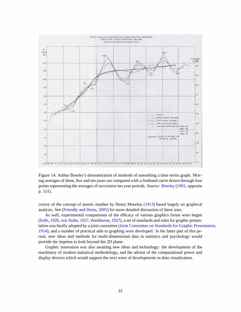
Figure 14: Arthur Bowley’s demonstration of methods of smoothing a time seriesgraph. Mov-ing averages of three, five and ten years are compared with a freehandcurve drawn through fourpoints representing the averages of successive ten year periods.Source:Bowley(1901, oppositep. 151).
covery of the concept of atomic number by Henry Moseley (1913) based largely on graphicalanalysis. See (Friendly and Denis, 2005) for more detailed discussion of these uses.
As well, experimental comparisons of the efficacy of various graphics forms were begun(Eells, 1926, von Huhn, 1927, Washburne, 1927), a set of standards and rules for graphic presen-tation was finally adopted by a joint committee (Joint Committee on Standards for Graphic Presentation,1914), and a number of practical aids to graphing were developed. In the latterpart of this pe-riod, new ideas and methods for multi-dimensional data in statistics and psychology wouldprovide the impetus to look beyond the 2D plane.
Graphic innovation was also awaiting new ideas and technology: the development of themachinery of modern statistical methodology, and the advent of the computational power anddisplay devices which would support the next wave of developments in datavisualization.
22

2.7 1950–1975: Re-birth of data visualization
Still under the influence of the formal and numerical zeitgeist from the mid-1930s on, datavisualization began to rise from dormancy in the mid 1960s. This was spurredlargely by threesignificant developments:
• In the USA, John W. Tukey [1915–2000], in a landmark paper,The Future of Data Anal-ysis(Tukey, 1962), issued a call for the recognition of data analysis as a legitimate branchof statistics distinct from mathematical statistics; shortly, he began the invention of a widevariety of new, simple, and effective graphic displays, under the rubricof “ExploratoryData Analysis” (EDA)— stem-leaf plots, boxplots, hanging rootograms, two-way tabledisplays, and so forth, many of which entered the statistical vocabulary and software im-plementation. Tukey’s stature as a statistician and the scope of his informal, robust, andgraphical approach to data analysis were as influential as his graphicalinnovations. Al-though not published until 1977, chapters from Tukey’s EDA book (Tukey, 1977) werewidely circulated as they began to appear in 1970–1972, and began to makegraphicaldata analysis both interesting and respectable again.
• In France, Jacques Bertin [1918–] published the monumentalSemiologie Graphique(Bertin, 1967). To some, this appeared to do for graphics what Mendeleev had done forthe organization of the chemical elements, that is, to organize the visual and perceptualelements of graphics according to the features and relations in data. In a parallel but sep-arate steam, an exploratory and graphical approach to multidimensional data(“L’analysedes donnees”) begun by Jean-Paul Benzecri [1932–] provided French and other Europeanstatisticians with an alternative, visually-based view of what statistics was about.
• But the skills of hand-drawn maps and graphics had withered during the dormant “mod-ern dark ages” of graphics (though nearly every figure in Tukey’sEDA (Tukey, 1977)was, by intention, hand-drawn). Computer processing of statistical data began in 1957with the creation of FORTRAN, the first high-level language for computing. By the late1960s, widespread mainframe university computers offered the possibilityto constructold and new graphic forms by computer programs. Interactive statistical applications,e.g.,Fowlkes(1969), Fishkelleret al. (1974) and true high-resolution graphics were de-veloped, but would take a while to enter common use.
By the end of this period significant intersections and collaborations would begin: (a) com-puter science research (software tools, C language, UNIX, etc.) at Bell Laboratories (Becker,1994) and elsewhere would combine forces with (b) developments in data analysis(EDA, psy-chometrics, etc.) and (c) display and input technology (pen plotters, graphic terminals, digitizertablets, the mouse, etc.). These developments would provide new paradigms,languages andsoftware packages for expressing statistical ideas and implementing data graphics. In turn, theywould lead to an explosive growth in new visualization methods and techniques.
Other themes began to emerge, mostly as initial suggestions: (a) various novel visual repre-sentations of multivariate data (Andrews’ (1972) Fourier function plots, Chernoff (1973) faces,star plots, clustering and tree representations); (b) the development of various dimension-reduction techniques (biplot (Gabriel, 1971), multidimensional scaling, correspondence analy-sis), providing visualization of of multidimensional data in a 2D approximation; (c) animations
23

of a statistical process; and (d) perceptually-based theory and experiments related to how graphicattributes and relations might be rendered to better convey the data visually.
By the close of this period, the first exemplars of modern GIS and interactive systems for2D and 3D statistical graphics would appear. These would set goals for future development andextension.
2.8 1975–present: High-D, interactive and dynamic data visualization
During the last quarter of the 20th century data visualization has blossomed into a mature, vi-brant and multi-disciplinary research area, as may be seen in this Handbook, and software toolsfor a wide range of visualization methods and data types are available for every desktop com-puter. Yet, it is hard to provide a succinct overview of the most recent developments in datavisualization, because they are so varied, have occurred at an accelerated pace, and across awider range of disciplines. It is also more difficult to highlight the most significant develop-ments, that may be seen as such in a subsequent history focusing on this recent period.
With this disclaimer, a few major themes stand out:
• the development of highly interactive statistical computing systems. Initially, thismeantlargely command-driven, directly programmable systems (APL, S), as opposed to com-piled, batch processing;
• new paradigms of direct manipulation for visual data analysis (linking, brushing (Becker and Cleveland,1987), selection, focusing, etc.);
• new methods for visualizing high-dimensional data (the grand tour (Asimov, 1985), scat-terplot matrix (Tukey and Tukey, 1981), parallel coordinates plot (Inselberg, 1985, Wegman,1990), spreadplots (Young, 1994a), etc.);
• the invention (or re-invention) of graphical techniques for discrete and categorical data;• the application of visualization methods to an ever-expanding array of substantive prob-
lems and data structures, and• substantially increased attention to the cognitive and perceptual aspects of data display.
These developments in visualization methods and techniques arguably depended on ad-vances in theoretical and technological infrastructure, perhaps more so than in previous periods.Some of these are:
• large-scale statistical and graphics software engineering, both commercial (e.g., SAS)and non-commercial (e.g., Lisp-Stat, the R project). These have often been significantlyleveraged by open-source standards for information presentation and interaction (e.g.,Java, Tcl/Tk);
• extensions of classical linear statistical modeling to ever wider domains (generalized lin-ear models, mixed models, models for spatial/geographical data, and so forth).
• vastly increased computer processing speed and capacity, allowing computationally in-tensive methods (bootstrap methods, Bayesian MCMC analysis, etc.), access to massivedata problems (measured in terabytes) and real-time streaming data. Advances in this areacontinue to press for new visualization methods.
From the early 1970s to mid 1980s, many of the advances in statistical graphics concernedstatic graphs for multidimensional quantitative data, designed to allow the analyst to see rela-tions in progressively higher dimensions. Older ideas of dimension reduction techniques (prin-
24

cipal component analysis, multidimensional scaling, discriminant analysis, etc.) led to gener-alizations of projecting a high-D dataset to “interesting” low-D views, as expressed by variousnumerical indices that could be optimized (projection pursuit) or explored interactively (grandtour).
The development of general methods for multidimensional contingency tablesbegan in theearly 1970s, with Leo Goodman (1970), Shelly Haberman (1973) and others (Bishopet al.,1975) laying out the fundamentals of log-linear models. By the mid 1980s, some initial, spe-cialized techniques for visualizing such data were developed (fourfold display (Fienberg, 1975),association plot (Cohen, 1980), mosaic plot (Hartigan and Kleiner, 1981) and sieve diagram(Riedwyl and Schupbach, 1983)), based on the idea of displaying frequencies by area (Friendly,1995). Of these, extensions of the mosaic plot (Friendly, 1994, 1999) have proved most gener-ally useful, and are now widely implemented in a variety of statistical software, most completelyin thevcd package (Meyeret al., 2005) in R.
It may be argued that the greatest potential for recent growth in data visualization came fromthe development of dynamic graphic methods, allowing instantaneous and direct manipulationof graphical objects and related statistical properties. One early instancewas a system for in-teracting with probability plots (Fowlkes, 1969) in realtime, choosing a shape parameter of areference distribution and power transformations by adjusting a control. The first generalsystem for manipulating high-dimensional data was PRIM-9, developed by Fishkeller, Fried-man and Tukey (1974), and providing dynamic tools for Projecting, Rotating (in 3D), Isolating(identifying subsets) and Masking data in up to 9 dimensions. These were quite influential, butremained one-of-a-kind, “proof of concept” systems. By the mid 1980s,as workstations anddisplay technology became cheaper and more powerful, desktop software for dynamic graphicsbecame more widely available (e.g., MacSpin, Xgobi). Many of these developments to thatpoint are detailed in the chapters ofDynamic Graphics for Statistics(Cleveland and McGill,1988).
In the 1990s, a number of these ideas were brought together to provide more general systemsfor dynamic, interactive graphics, combined with data manipulation and analysis in coherent andextensible computing environments. The combination of all these factors was more powerfuland influential than the sum of their parts. Lisp-Stat (Tierney, 1990) and its progeny (Arc,Cook and Weisberg(1999); ViSta, Young(1994b)), for example, provided an easily extensibleobject-oriented environment for statistical computing. In these systems, widgets (sliders, se-lection boxes, pick lists, etc.), graphs, tables, statistical models and the userall communicatedthrough messages, acted upon by whomever was a designated “listener,”and had a method to re-spond. Most of the ideas and methods behind present day interactive graphics are described andillustrated inYounget al. (2006). Other chapters in this Handbook provide current perspectiveson other aspects of interactive graphics.
3 Statistical historiography
As mentioned at the outset, this review is based on the information collected for the MilestonesProject, which I regard (subject to some caveats) as a relatively comprehensive corpus of thesignificant developments in the history of data visualization. As such, it is of interest to considerwhat light modern methods of statistics and graphics can shed on this history,a self-referentialquestion we call “statistical historiography” (Friendly, 2005). In return, this offers other ways
25

to view this history.
3.1 History as “data”
Historical events, by their nature, are typically discrete, but marked with dates or ranges ofdates, and some description— numeric, textual, or classified by descriptors(who, what, where,amount, and so forth). Among the first to recognize that history could be treated as data and
Figure 15: A specimen version of Priestley’sChart of Biography. Source: Priestley(1765).
portrayed visually, Joseph Priestley (1765, 1769) developed the idea of depicting the lifespansof famous people by horizontal lines along a time scale. His enormous (2’ by 3’) and detailedChart of Biographyshowed two thousand names from 1200 BC to 1750 AD by horizontal linesfrom birth to death, using dots at either end to indicate ranges of uncertainty. Along the verticaldimension, Priestly classified these individuals, e.g., as statesmen or men of learning. A smallfragment of this chart is shown in Figure15.
Priestley’s graphical representations of time and duration apparently influenced Playfair’sintroduction of time-series charts and bar charts (Funkhouser, 1937, p. 280). But these inven-tions did not inspire the British statisticians of his day, as noted earlier; historical events andstatistical facts were seen as separate, rather than as data arrayed along a time dimension. In1885 at the Jubilee meeting of the Royal Statistical Society, Alfred Marshall (1885) argued thatthe causes of historical events could be understood by the use of statisticsdisplayed by “histori-cal curves” (time-series graphs): “I wish to argue that that the graphicmethod may be applied asto enable history to do this work better than it has hitherto” (p. 252).Maas and Morgan(2005)discuss these issues in more detail.
3.2 Analyzing Milestones data
The information collected in the Milestone Project is rendered in print and webforms as achronological list, but is maintained as a relational database (historical items,references, im-ages) in order to be able to work with it as “data.” The simplest analyses examine trends over
26

time. Figure1 shows a density estimate for the distribution of 248 milestones items from 1500to the present, keyed to the labels for the periods in history. The bumps, peaks and troughs allseem interpretable: note particularly the steady rise up to∼ 1880, followed by a decline throughthe “modern dark ages” to∼ 1945, then the steep rise up to the present. In fact, it is slightlysurprising to see that the peak in the Golden Age is nearly as high as that at present, but thisprobably just reflects under-representation of the most recent events.23
Other historical patterns can be examined by classifying the items along various dimensions(place, form, content, and so forth). If we classify the items by place of development (Europevs. North America, ignoring Other), interesting trends appear (Figure16). The greatest peakin Europe around 1875–1880 coincided with a smaller peak in North America.The decline inEurope following the Golden Age was accompanied by an initial rise in North America, largelydue to popularization (e.g., text books) and significant applications of graphical methods, then asteep decline as mathematical statistics held sway.
Early maps
Measurement& Theory
New graphicforms
Begin modernperiod
Golden age
Modern darkages
High-D Vis
n=162Europe
n= 83
N. America
Milestones: Places of development
Rel
ativ
e de
nsity
0.00
0.01
0.02
Year
1500 1600 1700 1800 1900 2000
Figure 16: The distribution of milestone items over time, comparing trends in Europe and NorthAmerica.
Finally, Figure17 shows two mosaic plots for the milestones items classified by Epoch,Subject matter and Aspect. Subject was classed as having to do with human (e.g., mortality,disease), physical or mathematical characteristics of what was represented in the innovation.Aspect classed each item according to whether it was primarily map-based,a diagram or statis-
23Technical note: In this figure an optimal bandwidth for the kernel densityestimate was selected (using theSheather-Jones plugin estimate) for each series separately. The smaller range and sample size of the entries forEurope vs. North America gives a smaller bandwidth for the former, bya factor of aabout 3. Using a common band-width, fixed to that determined for the whole series (Figure1) undersmooths the more extensive data on Europeandevelopments and oversmooths the North American ones. The details differ, but most of the points made in thediscussion about what was happening when and where hold.
27

tical innovation or a technological one. The left mosaic shows the shifts in Subject over time:Most of the early innovations concerned physical subjects, while the laterperiods shift heavilyto mathematical ones. Human topics are not prevalent overall, but were dominant in the 19th
century. The right mosaic, for Subject× Aspect indicates that, unsurprisingly, map-based in-novations were mainly about physical and human subjects, while diagrams and statistical oneswere largely about mathematical subjects. Historical classifications clearly rely on more detaileddefinitions than described here, however, it seems reasonable to suggest that such analyses ofhistory as “data” are a promising direction for future work.
-1600 17th C 18th C 19th C 1900-50 1950-75 1975+ Epoch
Ph
ysic
al
H
um
an
Ma
the
ma
tica
lS
ubje
ct
Maps Diagrams Technology Aspect
Ph
ysic
al
H
um
an
Ma
the
ma
tica
lS
ubje
ct
Figure 17: Mosaic plots for milestones items, classified by Subject, Aspect and Epoch.
3.3 What was he thinking?: Understanding through reproduction
Historical graphs were created using available data, methods, technology, and understandingcurrent at the time. We can often come to a better understanding of intellectual,scientific, andgraphical questions by attempting a re-analysis from a modern perspective.
Earlier, we showed Playfair’s time-series graph (Figure7) of wages and prices, and notedthat Playfair wished to show that workers were better off at the end of theperiod shown thanat any earlier time. Presumably he wished to draw the reader’s eye to the narrowing of the gapbetween the bars for prices and the line graph for wages. Is this what you see?
What this graph shows directly is quite different than Playfair’s intention. It appears thatwages remained relatively stable, while the price of wheat varied greatly. The inference thatwages increased relative to prices is indirect and not visually compelling.
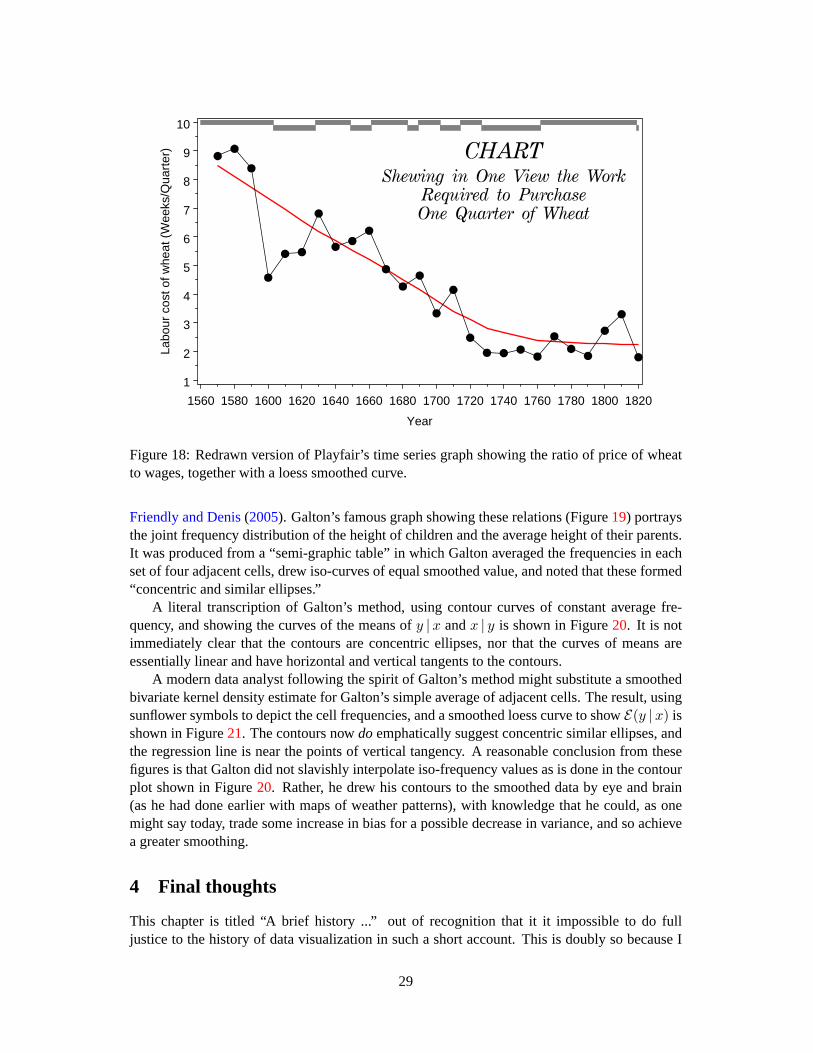
We cannot resist the temptation to give Playfair a helping hand here—by graphing the ratioof wages to prices (labor cost of wheat), as shown in Figure18. But this would not have occurredto Playfair, because the idea of relating one time series to another by ratios (index numbers)would not occur for another half-century (due to Jevons). SeeFriendly and Denis(2005) forfurther discussion of Playfair’s thinking.
As another example, we give a brief account of an attempt to explore Galton’s discovery ofregression and the elliptical contours of the bivariate normal surface, treated in more detail in
28
Labo
ur c
ost o
f whe
at (
Wee
ks/Q
uart
er)
1
2
3
4
5
6
7
8
9
10
Year
1560 1580 1600 1620 1640 1660 1680 1700 1720 1740 1760 1780 1800 1820
Figure 18: Redrawn version of Playfair’s time series graph showing the ratio of price of wheatto wages, together with a loess smoothed curve.
Friendly and Denis(2005). Galton’s famous graph showing these relations (Figure19) portraysthe joint frequency distribution of the height of children and the average height of their parents.It was produced from a “semi-graphic table” in which Galton averaged thefrequencies in eachset of four adjacent cells, drew iso-curves of equal smoothed value,and noted that these formed“concentric and similar ellipses.”
A literal transcription of Galton’s method, using contour curves of constant average fre-quency, and showing the curves of the means ofy |x andx | y is shown in Figure20. It is notimmediately clear that the contours are concentric ellipses, nor that the curves of means areessentially linear and have horizontal and vertical tangents to the contours.
A modern data analyst following the spirit of Galton’s method might substitute a smoothedbivariate kernel density estimate for Galton’s simple average of adjacent cells. The result, usingsunflower symbols to depict the cell frequencies, and a smoothed loess curve to showE(y |x) isshown in Figure21. The contours nowdo emphatically suggest concentric similar ellipses, andthe regression line is near the points of vertical tangency. A reasonable conclusion from thesefigures is that Galton did not slavishly interpolate iso-frequency values asis done in the contourplot shown in Figure20. Rather, he drew his contours to the smoothed data by eye and brain(as he had done earlier with maps of weather patterns), with knowledge thathe could, as onemight say today, trade some increase in bias for a possible decrease in variance, and so achievea greater smoothing.
4 Final thoughts
This chapter is titled “A brief history ...” out of recognition that it it impossible to do fulljustice to the history of data visualization in such a short account. This is doubly so because I
29

Figure 19: Galton’s smoothed correlation diagram for the data on heights ofparents and chil-dren, showing one ellipse of equal frequency. Source: (Galton, 1886, Plate X.).
have attempted to present a broad view spanning the many areas of applicationin which datavisualization took root and developed. That being said, it is hoped that thisoverview will leadmodern readers and developers of graphical methods to appreciate the rich history behind thelatest hot new methods. As we have seen, almost all current methods have amuch longerhistory than is commonly thought. Moreover, as I have surveyed this work and traveled to manylibraries to view original works and read historical sources, I have been struck with the exquisitebeauty and attention to graphic detail seen in many of these images, particularlythose from the19th century. We would be hard-pressed to recreate many of these today.
From this history one may also see that most of the innovations in data visualization arosefrom concrete, often practical goals: the need or desire to see phenomena and relationshipsin new or different ways. It is also clear that the development of graphicmethods dependedfundamentally on parallel advances in technology, data collection and statistical theory. Finally,I believe that the application of modern methods of data visualization to its own history, in thisself-referential way I call “statistical historiography,” offers some interesting views of the pastand challenges for the future.
30

Mid
-par
ent h
eigh
t
61
63
65
67
69
71
73
75
Child height
61 63 65 67 69 71 73 75
7
7
3
0
305274
96
118
Figure 20: Contour plot of Galton’s smoothed data, showing the curves ofy |x (filled circles,solid line),x | y (open circles, solid line) and the corresponding regression lines (dashed).
References
A few items in this reference list are identified by shelfmarks or call numbers inthe followinglibraries:BL: British Library, London;BNF: Bibliotheque Nationale de France, Paris (Tolbiac);ENPC: Ecole Nationale des Ponts et Chaussees, Paris;LC: Library of Congress;SBB: Staats-bibliothek zu Berlin.
Abbott, E. A. (1884).Flatland: A Romance of Many Dimensions. Cutchogue, NY: BuccaneerBooks. (1976 reprint of the 1884 edition).14
Andrews, D. F. (1972). Plots of high dimensional data.Biometrics, 28, 125–136.23
Asimov, D. (1985). Grand tour.SIAM Journal of Scientific and Statistical Computing, 6(1),128–143. 24
Ayres, L. P. (1919).The War with Germany, A Statistical Summary. Washington, D.C.: U.S.Government Printing Office. Commonly known as theAyres report; reprinted: Arno Press,NY, 1979. 21
Baker, R. (1833). Report of the Leeds Board of Health.BL: 10347.ee.17(8). 12
31

Galton’s data: Kernel density estimate
Mid
Par
ent h
eigh
t
61
63
65
67
69
71
73
75
Child height
61 63 65 67 69 71 73 75
0.0013
0.0013
0.0013
0.0052
0.00 52
0.0091
0.0130
0.0169
0.0208
0.0247
Figure 21: Bivariate kernel density estimate of Galton’s data, using sunflower symbols for thedata, and a smoothed loess curve forE(y |x) (solid) and regression line (dashed).
Ball, W. W. R. (1908).A Short Account of the History of Mathematics. London: Macmillan &Co., 4th edn. (re-published in 1960, N.Y.: Dover).6
Becker, R. A. (1994). A brief history of S. In P. Dirschedl and R. Ostermann, eds.,Computa-tional Statistics, (pp. 81–110). Heidleberg: Physica Verlag.23
Becker, R. A. and Cleveland, W. S. (1987). Brushing scatterplots.Technometrics, 29, 127–142.24
Berghaus, H. (1838).Physikalischer Atlas. Gotha: Justus Perthes. 2 vols., published 1845–48.14
Bertin, J. (1967). Semiologie Graphique: Les diagrammes, les reseaux, les cartes. Paris:Gauthier-Villars. 23
Bishop, Y. M. M., Fienberg, S. E., and Holland, P. W. (1975).Discrete Multivariate Analysis:Theory and Practice. Cambridge, MA: MIT Press.25
Bowley, A. L. (1901).Elements of Statistics. London: P. S. King and Son.21, 22
32

Buache, P. (1752). Essai de geographie physique.Memoires de L’Academie Royale des Sci-ences, (pp. 399–416).BNF: Ge.FF-8816-8822. 7
Chernoff, H. (1973). The use of faces to represent points ink-dimensional space graphically.Journal of the American Statistical Association, 68, 361–368.23
Cleveland, W. S. and McGill, M. E., eds. (1988).Dynamic Graphics for Statistics. Boca Raton.FL: CRC Press.25
Cohen, A. (1980). On the graphical display of the significant components in a two-way contin-gency table.Communications in Statistics– Theory and Methods, A9, 1025–1041.25
Cook, R. D. and Weisberg, S. (1999).Applied Regression Including Computing and Grapics.New York: Wiley. 25
Costelloe, M. F. P. (1915). Graphic methods and the presentation of this subject to first yearcollege students.Nebraska Blue Print. 21
Crome, A. F. W. (1785). Uber die Grosse and Bevolkerung der Samtlichen EuropaschenStaaten. Leipzig: Weygand.8
Dahmann, D. C. (2001). Presenting the nation’s cultural geography [incensus atlases].At American Memory: Historical Collections for the National Digital Library Internet.Http://memory.loc.gov/ammem/gmdhtml/census.html.20
de Fourcroy, C. (1782).Essai d’une table poleometrique, ou amusement d’un amateur de planssur la grandeur de quelques villes. Paris: Dupain-Triel.8
de Witt, J. (1671).The Worth of Life Annuities Compared to Redemption Bonds. Leiden: n.p.6
du Carla-Boniface, M. (1782). Expression des nivellements; ou, methode nouvelle pour marquersur les cartes terrestres et marines les hauteurs et les configurations duterrain. In Francoisde Dainville, “From the Depths to the Heights,” translated by Arthur H. Robinson,Surveyingand Mapping, 1970, 30:389–403, on page 396.7
Dupin, C. (1826).Carte figurativ de l’instruction populaire de la France. Jobard.BNF: Ge C6588 (Funkhouser (1937, p. 300) incorrectly dates this as 1819).10
Eells, W. C. (1926). The relative merits of circles and bars for representing component parts.Journal of the American Statistical Association, 21, 119–132.22
Farebrother, R. W. (1999).Fitting Linear Relationships: A History of the Calculus of Observa-tions 1750–1900. New York: Springer.2
Ferguson, S. (1991). The 1753 carte chronographique of Jacques Barbeu-Dubourg.PrincetonUniversity Library Chronicle, 52, 190–230.8
Fienberg, S. E. (1975). Perspective Canada as a social report. Tech. rep., Department of AppliedStatistics, University of Minnesota. Unpublished paper.25
Fishkeller, M. A., Friedman, J. H., and Tukey, J. W. (1974). PRIM-9: An interactive multidi-mensional data display and analysis system. Tech. Rep. SLAC-PUB-1408, Stanford LinearAccelerator Center, Stanford, CA.23, 25
Fowlkes, E. B. (1969). User’s manual for a system for interactive probability plotting onGraphic-2. Tech. rep., Bell Laboratories.23, 25
33

Friendly, M. (1994). Mosaic displays for multi-way contingency tables.Journal of the AmericanStatistical Association, 89, 190–200.12, 18, 25
Friendly, M. (1995). Conceptual and visual models for categorical data. The American Statisti-cian, 49, 153–160.25
Friendly, M. (1999). Extending mosaic displays: Marginal, conditional, and partial views ofcategorical data.Journal of Computational and Graphical Statistics, 8(3), 373–395.25
Friendly, M. (2000). Re-Visions of Minard.Statistical Computing & Statistical GraphicsNewsletter, 11(1), 1, 13–19.12
Friendly, M. (2002). Visions and re-visions of Charles Joseph Minard. Journal of Educationaland Behavioral Statistics, 27(1), 31–52.14
Friendly, M. (2005). Milestones in the history of data visualization: A case study in statisticalhistoriography. In C. Weihs and W. Gaul, eds.,Classification: The Ubiquitous Challenge,(pp. 34–52). New York: Springer.25
Friendly, M. and Denis, D. (2000). The roots and branches of statistical graphics.Journal de laSociete Francaise de Statistique, 141(4), 51–60. (published in 2001).20
Friendly, M. and Denis, D. (2005). The early origins and development of the scatterplot.Journalof the History of the Behavioral Sciences, 41(2), 103–130.11, 22, 28, 29
Friendly, M. and Kwan, E. (2003). Effect ordering for data displays. Computational Statisticsand Data Analysis, 43(4), 509–539.6, 20
Friis, H. R. (1974). Statistical cartography in the United States prior to 1870and the role ofJoseph C. G. Kennedy and the U.S. Census Office.American Cartographer, 1, 131–157.2
Frisius, R. G. (1533). Libellus de locorum describendorum ratione. Antwerp. 4
Funkhouser, H. G. (1936). A note on a tenth century graph.Osiris, 1, 260–262.2, 3, 4
Funkhouser, H. G. (1937). Historical development of the graphical representation of statisticaldata. Osiris, 3(1), 269–405. Reprinted Brugge, Belgium: St. Catherine Press, 1937. 2, 12,14, 18, 26
Gabriel, K. R. (1971). The biplot graphic display of matrices with applicationto principalcomponents analysis.Biometrics, 58(3), 453–467.23
Galton, F. (1863).Meteorographica, or, Methods of Mapping the Weather. London: Macmillan.BL: Maps.53.b.32. 16
Galton, F. (1881). On the construction of isochronic passage charts.Proceedings of the Ge-ographical Section of the British Association, n.v.(XI), 657, 704. Read Sept. 1, 1881; alsopublished:Roy. Geog. Soc. Proc., 1881, 657-658.16
Galton, F. (1886). Regression towards mediocrity in hereditary stature.Journal of the Anthro-pological Institute, 15, 246–263.16, 30
Galton, F. (1894). Results derived from the natality table of Korosi by employing the method ofcontours or isogens.Journal of the Royal Statistical Society, 57(4), 702–708.16
Giffen, R. (1899). The excess of imports.Journal of the Royal Statistical Society, 62(1), 1–82.21
34

Gilbert, E. W. (1958). Pioneer maps of health and disease in England.Geographical Journal,124, 172–183.11, 12
Goodman, L. A. (1970). The multivariate analysis of qualitative data: Interactions among mul-tiple classifications.Journal of the American Statistical Association, 65, 226–256.25
Graunt, J. (1662).Natural and Political Observations Mentioned in a Following Index and MadeUpon the Bills of Mortality. London: Martin, Allestry, and Dicas.6
Guerry, A.-M. (1833).Essai Sur La Statistique Morale de la France. Paris: Crochard. Englishtranslation: Hugh P. Whitt and Victor W. Reinking, Lewiston, N.Y. : Edwin Mellen Press,2002. 10, 39
Guerry, A.-M. (1864).Statistique morale de l’Angleterre comparee avec la statistique moralede la France, d’apres les comptes de l’administration de la justice criminelle en Angleterre eten France, etc.Paris: J.-B. Bailliere et fils.BNF: GR FOL-N-319; SG D/4330; BL: Maps32.e.34; SBB: Fe 8586; LC: 11005911. 11
Haberman, S. J. (1973). The analysis of residuals in cross-classifiedtables. Biometrics, 29,205–220. 25
Hald, A. (1990).A History of Probability and Statistics and their Application before 1750. NewYork: John Wiley and Sons.2, 5
Halley, E. (1686). On the height of the mercury in the barometer at different elevations abovethe surface of the earth, and on the rising and falling of the mercury on the change of weather.Philosophical Transactions, (pp. 104–115).6
Halley, E. (1701). The description and uses of a new, and correct sea-chart of the whole world,shewing variations of the compass. London.7, 14
Hartigan, J. A. and Kleiner, B. (1981). Mosaics for contingency tables. In W. F. Eddy, ed.,Computer Science and Statistics: Proceedings of the 13th Symposium on theInterface, (pp.268–273). New York, NY: Springer-Verlag.25
Haskell, A. C. (1919).How to Make and Use Graphic Charts. New York: Codex. 21
Herschel, J. F. W. (1833). On the investigation of the orbits of revolving double stars.Memoirsof the Royal Astronomical Society, 5, 171–222.9, 10
Hertzsprung, E. (1911). Publikationen des astrophysikalischen observatorium zu Potsdam.Num. 63. 21
Hoff, H. E. and Geddes, L. A. (1959). Graphic recording before Carl Ludwig: An historicalsummary.Archives Internationales d’Histoire des Sciences, 12, 3–25. 2
Hoff, H. E. and Geddes, L. A. (1962). The beginnings of graphic recording. Isis, 53, 287–324.Pt. 3. 2
Howard, L. (1800). On a periodical variation of the barometer, apparently due to the influenceof the sun and moon on the atmosphere.Philosophical Magazine, 7, 355–363.8
Inselberg, A. (1985). The plane with parallel coordinates.The Visual Computer, 1, 69–91. 24
Jevons, W. S. (1863). A serious fall in the value of gold ascertained, and its social effects setfourth. London. 15
35

Jevons, W. S. ([1879] 1958). Graphical method. InPrinciples of Science: A Treatise on Logicand Scientific Method, (pp. 492–496). New York: Dover, 3rd edn. First ed.: 1874; pagenumbers from 3rd Ed. Dover reprint (1958).15
Joint Committee on Standards for Graphic Presentation (1914). Preliminary report publishedfor the purpose of inviting suggestions for the benefit of the committee.Publications of theAmerican Statistical Association, 14(112), 790–797.22
Karsten, K. G. (1925).Charts and Graphs. An Introduction to Graphic Methods in the Controland and Analysis of Statistics. New York: Prentice Hall.21
Klein, J. L. (1997).Statistical Visions in Time: A History of Time Series Analysis, 1662-1938.Cambridge, UK: Cambridge University Press.2, 6, 21
Kruskal, W. (1977). Visions of maps and graphs. InProceedings of the International Symposiumon Computer- Assisted Cartography, Auto-Carto II, (pp. 27–36). 1975.2
Lallemand, C. (1885). Les abaques hexagonaux: Nouvelle methode generale de calculgraphique, avec de nombreux exemples d’application. Paris: Ministere des travaux publics,Comite du nivellement general de la France.16
Maas, H. and Morgan, M. S. (2005). Timing history: The introduction of graphical analysis in19th century british economics.Revue d’Histoire des Sciences Humaines, 7, 97–127.13, 26
Marey, E.-J. (1878).La Methode Graphique dans les Sciences Experimentales et Principale-ment en Physiologie et en Medecine. Paris: G. Masson.21
Marshall, A. (1885). On the graphic method of statistics.Journal of the Royal Statistical Society,Jubille volume, 251–260.26
Maunder, E. W. (1904). Note on the distribution of sun-spots in heliographic latitude, 1874 to1902.Royal Astronomical Society Monthly Notices, 64, 747–761.21
Meyer, D., Zeileis, A., and Hornik, K. (2005).vcd: Visualizing Categorical Data. R packageversion 0.9-5.25
Minard, C. J. (1826).Projet de canal et de chemin de fer pour le transport de pavesa Paris,precede d’un tableau des progres de la depense du pave de Paris pendant les deux dernierssiecles. Paris: A. Pihan Delaforest.ENPC: 4.5065/C289. 14
Minard, C. J. (1844). Tableaux figuratifs de la circulation de quelques chemins de fer. lith.(n.s.).ENPC: 5860/C351, 5299/C307. 12
Minard, C. J. (1861).Des Tableaux Graphiques et des Cartes Figuratives. Paris: E. Thunot etCie. ENPC: 3386/C161; BNF: V-16168. 14
Moseley, H. (1913). The high frequency spectra of the elements.Philosophical Magazine, (pp.1024–). (continued, 1914, pp. 703–).22
Mouat, F. J. (1885). History of the Statistical Society of London.Journal of the Royal StatisticalSociety, Jubille volume, 14–62.13
Nautonier, G. L. (1602–1604).Mecometrie de l’eymant, c’est a dire la maniere de mesurer leslongitudes par le moyen de l’eymant. Paris: n.p.BL: 533.k.9. 14
Nightingale, F. (1857).Mortality of the British Army. London: Harrison and Sons.15
36

Oresme, N. (1482). Tractatus de latitudinibus formarum. Padova.BL: IA 3Q024. 4
Oresme, N. (1968).Nicole Oresme and the Medieval Geometry of Qualities and Motions: ATreatise on the Uniformity and Difformity Known asTractatus de Configrationibus Qualita-tum et Motuum. Madison WI: University of Wisconsin Press. Tr.: M. Clagget. 4
Palsky, G. (1996).Des Chiffres et des Cartes: Naissance et developpement de la CartographieQuantitative Francais au XIXe siecle. Paris: Comite des Travaux Historiques et Scientifiques(CTHS). 2, 7, 10, 14, 15, 18
Pearson, E. S., ed. (1978).The History of Statistics in the 17th and 18th Centuries Against theChanging Background of Intellectual, Scientific and Religeous Thought. London: Griffin &Co. Ltd. Lectures by Karl Pearson given at University College London during the academicsessions 1921–1933.2
Pearson, K. (1914–1930).The life, letters and labours of Francis Galton. Cambridge: Univer-sity Press.16, 17
Pearson, K. (1920). Notes on the history of correlation.Biometrika, 13(1), 25–45.16
Peddle, J. B. (1910).The Construction of Graphical Charts. New York: McGraw-Hill. 21
Perozzo, L. (1880). Della rappresentazione graphica di una collettivita di individui nella suc-cessione del tempo.Annali di Statistica, 12, 1–16.BL: S.22. 14
Petty, W. (1665).The economic writings of Sir William Petty: together with the observationsupon the bills of mortality. Cambridge: The University Press. C. H. Hall (ed.) (more probablyby Captain John Graunt).6
Playfair, W. (1786).Commercial and Political Atlas: Representing, by Copper-Plate Charts, theProgress of the Commerce, Revenues, Expenditure, and Debts of England, during the Wholeof the Eighteenth Century. London: Corry. Re-published in Wainer, H. and Spence, I. (eds.),The Commercial and Political Atlas and Statistical Breviary, 2005, Cambridge UniversityPress, ISBN 0-521-85554-3.8
Playfair, W. (1801).Statistical Breviary; Shewing, on a Principle Entirely New, the Resourcesof Every State and Kingdom in Europe. London: Wallis. Re-published in Wainer, H. andSpence, I. (eds.),The Commercial and Political Atlas and Statistical Breviary, 2005, Cam-bridge University Press, ISBN 0-521-85554-3.8, 14
Playfair, W. (1821). Letter on our agricultural distresses, their causes and remedies; accompa-nied with tables and copperplate charts shewing and comparing the prices ofwheat, breadand labour, from 1565 to 1821.BL: 8275.c.64. 8, 10
Porter, T. M. (1986).The Rise of Statistical Thinking 1820–1900. Princeton, NJ: PrincetonUniversity Press.2
Priestley, J. (1765). A chart of biography. London.BL: 611.I.19. 8, 26
Priestley, J. (1769).A New Chart of History. London: Thomas Jeffreys.BL: Cup.1250.e.18(1753). 8, 26
Quetelet, A. (1831).Recherches sur le Penchant au Crime aux DifferensAges. Brussels: Hayez.English translation by Sawyer F. Sylvester. Cincinnati, OH: Anderson Publishing Company,1984. 10
37

Quetelet, A. (1835).Sur l’homme et le developpement de ses facultes, ou Essai d’une physiquesociale. Paris: Bachelier. English translation, by R. Knox and T. Smilbert,A Treatise on Manand the Development of his Faculties. Edinburgh, 1842; New York: Burt Franklin, 1968.10
Riddell, R. C. (1980). Parameter disposition in pre-Newtonain planetary theories.Archives Hist.Exact Sci., 23, 87–157.2
Riedwyl, H. and Schupbach, M. (1983). Siebdiagramme: Graphische darstellung von kontin-genztafeln. Tech. Rep. 12, Institute for Mathematical Statistics, Universityof Bern, Bern,Switzerland. 25
Robinson, A. H. (1982).Early Thematic Mapping in the History of Cartography. Chicago:University of Chicago Press.2, 8
Royston, E. (1970). Studies in the history of probability and statistics, III.a note on the historyof the graphical presentation of data.Biometrika, (pp. 241–247). 43, Pts. 3 and 4 (December1956); reprinted InStudies in the History Of Statistics and Probability Theory, eds. E. S.Pearson and M. G. Kendall, London: Griffin.2
Scheiner, C. (1626–1630).Rosa Ursina sive Sol ex Admirando Facularum & MacularumSuarum Phoenomeno Varius. Bracciano, Italy: Andream Phaeum.BL: 532.l.6. 5
Smith, W. (1815). A delineation of the strata of England and Wales, with part of Scotland;exhibiting the collieries and mines, the marshes and fenlands originally overflowed by thesea, and the varieties of soil according to the substrata, illustrated by the most descriptivenames. London: John Cary.BL: Maps 1180.(19). 9
Snow, J. (1855).On the Mode of Communication of Cholera. London: (n.p.), 2nd edn.12
Sobel, D. (1996).Longitude: The True Story of a Lone Genius Who Solved the Greatest Scien-tific Problem of His Time. New York: Penguin.5
Spence, I. and Garrison, R. F. (1993). A remarkable scatterplot.The American Statistician,47(1), 12–19.21
Stigler, S. M. (1986).The History of Statistics: The Measurement of Uncertainty before 1900.Cambridge, MA: Harvard University Press.2
Tartaglia, N. F. (1556).General Trattato di Numeri et Misure. Venice: Vinegia.BL: 531.n.7-9;47.e.4. 4
Tierney, L. (1990).LISP-STAT: An Object-Oriented Environment for Statistical Computing andDynamic Graphics. New York: John Wiley and Sons.25
Tilling, L. (1975). Early experimental graphs.British Journal for the History of Science, 8,193–213. 2
Tufte, E. R. (1983).The Visual Display of Quantitative Information. Cheshire, CT: GraphicsPress.3, 5, 10, 14
Tufte, E. R. (1997).Visual Explanations. Cheshire, CT: Graphics Press.5, 6
Tukey, J. W. (1962). The future of data analysis.Annals of Mathematical Statistics, 33, 1–67and 81. 23
38

Tukey, J. W. (1977).Exploratory Data Analysis. Reading, MA: Addison-Wesley. Chaptersfrom what would become this book were circulated privately 1971–75.23
Tukey, P. A. and Tukey, J. W. (1981). Graphical display of data setsin 3 or more dimensions.In V. Barnett, ed.,Interpreting Multivariate Data. Chichester, U.K.: Wiley and Sons.24
Vauthier, L. L. (1874). Note sur une carte statistique figurant la repartition de la populationde Paris.Comptes Rendus des Seances de L’Academie des Sciences, 78, 264–267.ENPC:11176 C612. 14
von Huhn, R. (1927). A discussion of the Eells’ experiment.Journal of the American StatisticalAssociation, 22, 31–36.22
von Humboldt, A. (1817). Sur les lignes isothermes.Annales de Chimie et de Physique, 5,102–112. 14
Wainer, H. (2005). Graphic Discovery: A Trout in the Milk and Other Visual Adventures.Princeton, NJ: Princeton University Press.16
Wainer, H. and Velleman, P. F. (2001). Statistical graphics: Mapping the pathways of science.Annual Review of Psychology, 52, 305–335.2
Wallis, H. M. and Robinson, A. H. (1987).Cartographical Innovations: An International Hand-book of Mapping Terms to 1900. Tring, Herts: Map Collector Publications.2
Warne, F. J. (1916).Warne’s Book of Charts, A Special Feature of Warne’s Elementary Coursein Chartography. Washington, D.C.: F. J. Warne. 3 p. l., 106 charts. 31 x 41 cm.21
Washburne, J. N. (1927). An experimental study of various graphic,tabular and textual methodsof presenting quantitative material.Journal of Educational Psychology, 18, 361–376, 465–476. 22
Wegman, E. J. (1990). Hyperdimensional data analysis using parallel coordinates.Journal ofthe American Statistical Association, 85(411), 664–675.24
Westergaard, H. (1932).Contributions to the History of Statistics. London: P. S. King & Son.17
Whitt, H. (2002). Inventing sociology: Andre-Michel Guerry and theEssai Sur La StatistiqueMorale de la France. In Guerry(1833), (pp. ix–xxxvii). English translation: Hugh P. Whittand Victor W. Reinking, Lewiston, N.Y. : Edwin Mellen Press, 2002.11
Young, F. W. (1994a). ViSta: The visual statistics system. Tech. Rep. RM94-1, L.L. ThurstonePsychometric Laboratory, UNC.24
Young, F. W. (1994b). ViSta: The visual statistics system. Tech. Rep. RM94-1, L.L. ThurstonePsychometric Laboratory, UNC.25
Young, F. W., Valero-Mora, P., and Friendly, M. (2006).Visual Statistics: Seeing Data withDynamic Interactive Graphics. New York: Wiley. 25
Zeuner, G. (1869). Abhandlungen aus der mathematischen statistik. Leipzig. BL: 8529.f.12.14
39

Index
Abbott, Edwin,14age pyramid,18analysis
discriminant,25principal component,25
arithmeticpolitical, 5, 6
atlascartographic,4statistical,17, 20
atomic number,21
Baker, Robert,12bar chart,8, 20, 26
divided,12Barbeu-Dubourg, Jacques,7Bell Laboratories,23Benzecri, Jean-Paul,23Bertin, Jacques,23bilateral frequency polygon,18bills of mortality,6biplot, 23bivariate normal surface,28bootstrap,24Bowley, Arthur,21, 22boxplot,23Brahe, Tycho,4–6, 16brushing,24Buache, Phillippe,7
C, 23camera obscura,4chart
bar,8, 12, 20, 26control,21Gantt,21isochronic,16pie,8time-series,26
Cheysson,Emile,15, 17clustering,23continuous distribution function,6coordinate
parallel,16
coordinate paper,8coordinate systems,6correlation,16coxcomb,14Crome, August F.W.,8curve
contour,29cumulative frequency,21freehand,21frequency,21historical,26isodic,16isogen,16loess,29
curve fitting,8Cusa, Nicolas of,4
datamultivariate,23
de Fourcroy, Charles,8de Witt, Jan,6density estimation,29Descartes, Rene,5diagram
alignment,16butterfly,21cartogram,8, 18Chernoff faces,23circle,18contour,14, 16coxcomb,14divided circle,14geometric,3Hertzsprung-Russell,21historical,21nomogram,16pie,18rose,14, 18sieve,25statistical,18stereogram,14tree,23
dimension
40

3, 16display
fourfold, 25trellis, 16two-way table,23
du Carla-Boniface, Marcellin,7Dupin, Charles,10dynamic graphics,25
Fermat, Pierre,5figure
geometric,8flow map,14, 18FORTRAN,23Friendly, Michael,25
Galilei, Galileo,5Galton, Francis,16, 17, 28–29Gannett, Henry,18Gauss, Carl Friedrich,14Gemma-Frisius, Reginer,4Giffen, Robert,21Golden Age,13, 27Goodman, Leo,25grand tour,24graph
age pyramid,18bilateral polygon,20circle,8hanging rootogram,23high-resolution,23line, 5, 8time-series,3, 8, 26, 28
graph paper,8Graunt, John,5, 6grid
coordinate,7hexagonal,16
Guerry, Andre-Michel,10, 14
Haberman, Shelly,25Halley, Edmund,7Harrison, John,5Herschel, William,9Huygens, Christiaan,6
interactive graphics,25
interpolation,8isoline,16
Java,24Jevons, William Stanley,13
Lallemand, Charles,16Lambert, Johann,8Laplace, Pierre Simon,14le Blon, Jacob,8Levasseur, PierreEmile,17life table,6line
contour,7isogon,7isoline,7, 16slope as rate,8timeline,7
line graph1D, 5
linking, 24Lisp-Stat,24, 25lithography,8longitude,6
MacSpin,25map
anamorphic,16cartography,7chloropleth,10contour,7disease,12epidemiological,15flow, 14, 18geological,9shaded,20thematic,7, 14topographic,7weather,6, 17
Marey,Etienne Jules,21Marshall, Alfred,26matrix
scatterplot,24Maunder, E. W.,21measurement
physical,5measurement error,7
41

Minard, Charles Joseph,12, 14model
generalized linear,24mixed,24
mosaic plot,12, 25, 28Moseley, Henry,22multidimensional scaling,23, 25
Nightingale, Florence,14nomogram,16
Oresme, Nicole,4Ortelius, Abraham,4
parallel coordinates plot,24Pascal, Blaise,5Pearson, Karl,16Perozzo, Luigi,14Petermann, Augustus,12Petty, William,5, 6pie chart,8Playfair, William,8, 26, 28plot
association,25bivariate,6Fourier function,23log-log,16, 21mosaic,12, 25, 28parallel coordinate,18probability,25star,18, 23stem-leaf,23
political arithmetic,6Priestley, Joseph,8, 26PRIM-9,25printing
three-colour,8probability theory,6projection
axonometric,14Ptolemy, Claudius,3, 6
Quetelet, Adolphe,11, 14, 17
R, 24, 25regression,16, 29Rheticus, Georg,4
Royal Statistical Society,13, 26
SAS,24scaling
multidimensional,23, 25scatterplot matrix,24Scheiner, Christopher,5Schwabe, Hermann,17Senefelder, Aloys,8sieve diagram,25small multiple,18small multiples,5Smith, William,9smoothing,21, 29Snow, John,12, 15spreadplot,24star plot,18, 23statistical atlas,17statistics
demographic,5moral,10
stem-leaf plot,23stereogram,14stratigraphic geology,9symbol
sunflower,29
tablegraphical,8life, 6semi-graphic,29
tableau-graphique,12Tcl/Tk, 24thematic cartography,7time-series,8
multiple,14timeline,7, 26tour
grand,24triangulation,4Tufte, Edward,5Tukey, John W.,23two-way table,23
UNIX, 23
van Langren, Michael F.,5
42

ViSta,25visual thinking,6von Mayr, Georg,17
Walker, Francis A.,18wall quadrant,4weather map,6, 17
Xgobi, 25
Zeuner, Gustav,14
43