3.3. Waveform Cross-Correlation, Earthquake … Cross-Correlation, Earthquake Locations and HYPODD...
25
35 3.3. Waveform Cross-Correlation, Earthquake Locations and HYPODD 3.3.1 Method More accurate relative earthquake locations depend on more precise relative phase arrival observations so I exploit the similarity of waveforms for pairs of earthquakes in the frequency domain. Using this technique I will try to produce a better resolved picture of the spatial distribution of the 2001 Enola sequence. The absolute location of the swarm may not be better resolved (Figure 15). However, this technique helps to determine the internal spatial structure of the swarm through event relative locations. I again use HYPODD to relocate the 2001 earthquakes but this time using relative arrival times of principal seismic phases recorded at each station. Figure 15. Station – swarm distances. 2001 Enola earthquakes are spatially confined in a small area, in particular with respect to the station distribution (SW cluster marked with the red circle). Seismic waves leaving from the swarm area are likely to have close to identical paths at a station like GUR, HOL, WOL, etc.
-
Upload
nguyencong -
Category
Documents
-
view
221 -
download
0
Transcript of 3.3. Waveform Cross-Correlation, Earthquake … Cross-Correlation, Earthquake Locations and HYPODD...

35
3.3. Waveform Cross-Correlation, Earthquake Locations and HYPODD
3.3.1 Method
More accurate relative earthquake locations depend on more precise relative phase
arrival observations so I exploit the similarity of waveforms for pairs of earthquakes in
the frequency domain. Using this technique I will try to produce a better resolved picture
of the spatial distribution of the 2001 Enola sequence. The absolute location of the swarm
may not be better resolved (Figure 15). However, this technique helps to determine the
internal spatial structure of the swarm through event relative locations. I again use
HYPODD to relocate the 2001 earthquakes but this time using relative arrival times of
principal seismic phases recorded at each station.
Figure 15. Station – swarm distances. 2001 Enola earthquakes are spatially confined in a small area, in particular with respect to the station distribution (SW cluster marked with the red circle). Seismic waves leaving from the swarm area are likely to have close to identical paths at a station like GUR, HOL, WOL, etc.

36
Two near-by events, with seismic waves radiating along almost identical paths, are
likely to produce very similar waveforms at the same station. Two earthquakes with
similar waveforms are called a doublet. The waveform similarity is illustrated in Figure
16.
Figure 16. Similarity of the waveforms as recorded on the broadband site (GUR), on the vertical component within an hour of Julian day 182. No filtering applied. There is also at least one converted phase (or maybe a basement reflector) between the P and S phase arrivals. Horizontal scale in seconds, vertical in counts.

37
The site response is assumed to be time invariant for a doublet. The observed spectrum
of an earthquake F(f) at a station is approximately given by:
)()()()( fStfSpfSsfF ⋅⋅= , where Ss(f), Sp(f) and St(f) are the source, propagation and
site response spectra, respectively. Waveform similarity of a doublet requires close to
identical source as well as medium properties. Only doublets recorded at the same station
are correlated (see Figure 15). This technique greatly improves earthquake location
alleviating uncertainties in the phase picking procedure made by a network analysist.
The results of the waveform cross correlation are the weighted time differences
between arrival times of each doublet. Time difference of P and S arrivals are used
separately as an input for HYPODD.
Here I briefly focus on the waveform cross correlation technique and a simple testing
procedure. Appendix B contains several others.
There are two Enola 2001 data subsets. One consists of a data set recorded by the
Kinemetrics’ K2 accelerographs recording at 200 samples per second (200 Hz). The other
was recorded using a Guralp CMG-4, a broadband velocity instrument, set up for the
acquisition at 100 samples per second (100 Hz). Even though the sampling rates are
different, a re-sampling procedure is not required; a doublet is analyzed at one station at
the time.
To process the waveforms I use the Fast Fourier Transform (FFT) on a windowed P and
S phase. P and S wave waveform cross-correlations are executed separately. Later both
results are combined to further constrain earthquake locations.
38
For P phase waveform cross correlation I use the vertical component and the N-S
component for the S phase.
The data preparation is as follows:
1. P and S phase arrivals of the 100 largest events (the algorithm for the selection is
explained in Chapter 2) were manually picked.
2. Using HYPOELLIPSE the earthquakes were located using a velocity model
(Table 3, page 25, Chapter 3.1).
3. P and S arrival times were extracted from the HYPOELLIPSE output files (See
Appendix C for details.)
4. The mean (offset) from each seismogram was removed.
5. Using the results from Step 3 each seismogram was windowed starting 0.15 sec
before the P and S arrivals and ending 0.50 sec after the arrival. This step
separates P from S arrivals.
6. The windowed P and S arrivals were band-pass filtered using a 1 - 40 Hz and 1 -
20 Hz, 4th order Butterworth filter, respectively. A Hanning window tapered off
the trace ends.
7. Fast Fourier Transforms of the windowed P arrivals for each doublet were
calculated. The same procedure was conducted for the windowed S arrivals.
Once the data preparation steps were complete I used the spectral waveform cross
correlation procedure as proposed by Poupinet (1984) to produce relative P and S phase
arrivals for each doublet.

39
The cross spectrum S (f) is defined by:
)( Α ⋅ )(= fff 21 *A )( S (8)
Where A1 and A2 are the spectra of the windowed phases and the asterisk denotes
complex conjugate. The coherence is calculated using the expression:
)()(AS
)( C 21
2
fAff
f⋅
)( = (9)
Spectra A1 (f), A2 (f) and S (f) are smoothed using a 4 point running average window.
The coherence is a direct measure of how similar two spectra are so (9) can be used as a
weighting function.
The phase part Φ(f) of the cross spectrum S (f) (8) is used to obtain the time delay ∆t
between the two windowed signals. By fitting a straight line (least squares method) to
Φ(f), starting from the origin, it is possible to evaluate ∆t from:
ftf ⋅∆⋅=Φ π2)( (10)
So the delay ∆t is proportional to the slope of the line. The least-squares fit is weighted
by a factor at each frequency. Using (9) we can define the weight as:

40
)(1)(
2
2
fCfC
− (11)
Moreover, each time difference ∆t between two doublet/waveforms is associated with
the arithmetic average of C(f) squared. This number illustrates the fidelity of the obtained
time difference for a doublet. The function C(f) ranges from 0 (no spectra similarity) to 1
(spectra are identical). The weighting function (11) fails when the compared waveforms
are identical.
The time differences (∆t) are further processed with HYPODD where additional
reweighting schemes (based on RMS values) may be used. Based on these time
differences for each doublet and files with HYPOELLIPSE individual locations, the DD
can be applied to relocate the 2001 Enola sequence.
The next sequence of figures illustrates a simple test of the waveform cross correlation
algorithm. In this example, a vertical broadband seismogram was delayed by 0.05 sec.
The test consists of running the seismograms through the algorithm in order to obtain the
delay (∆t) based on the P arrival using the presented set of equations. Further tests are
included in Appendix B.

41
Figure 17. A vertical accelerogram at the BAR site. P phase is isolated using the information from the manual pick file. The dimensions of the window are: 0.15 sec before the P arrival and 0.5 sec after the arrival. A 4th order Butterworth band-pass filter, 1 to 40 Hz, was applied before the windowing procedure. I use a simple Hanning window to taper the ends of the traces before calculating the spectra. The red line is the original trace and the blue line is the same trace delayed 0.05 sec.
In Figure 17 the red trace is the “original” filtered P arrival. The blue trace is the same
as the red one delayed by 0.05 sec (20 samples). This is an example of a doublet. So how
far off is the calculated delay using the equation from the given one of 0.05 sec?

42
Figure 18. Amplitude spectra of both traces (the color scheme is preserved: red line is the spectrum of the red trace, and blue line is the spectrum of the blue trace, both from the Figure 17. The spectra are identical as expected from the same waveforms. Note that there is a significant amount of energy (>40 Hz) even after filtering with the 4th order band-pass Butterworth filter with the upper cut-off frequency of 40 Hz.
Waveforms (P and S arrivals) of a doublet are windowed based on an operator pick
file and when plotted on the same axes (as in Figure 17) a certain level of alignment
between waveforms exists. The alignment is directly proportional to how consistent a
network analyst was while picking phases. The first motion of both windowed P arrivals,
for example, will be perfectly aligned (no delay) if the arrivals were picked based on the

43
same criteria. Of course, this zero delay is arbitrary. It is based on the pick file. I call it
the relative (plotting) delay.
Figure 19. Cross spectrum (magnitude) of the two waveforms. The same spectra of the two functions also coincide at the same frequencies (12 and 22 Hz).
The actual time difference (delay) for a doublet depends on the (assumed) small
hypocentral separation between the earthquakes. The earthquakes might have taken place
days/months apart. One earthquake in a doublet (the red trace) defines the time reference

44
frame. The algorithm calculates the travel time necessary for a P wave originating from
the hypocenter to arrive at the station based on the origin and the observed time,
separately, for both earthquakes in a doublet. The observed time is the operator picked P
arrival. The time difference for two travel times (i.e. two P arrivals for two earthquakes in
a doublet) I call the initial delay.
Figure 20. Coherence function between the two traces as given by (9). The weight (quality) of the calculated delay (Figure 21) is expressed as the arithmetic average of C (f) up to 50 Hz (25 Hz for the broadband seismograms) function to the second power (C2(f)). Here the assigned (“quality” of waveform cross-correlation) weight is 0.99985. That is the maximum weight for the perfectly similar (identical) traces. It differs from the expected value of 1 due to numerical rounding.

45
Now the calculated delay (based on P or S arrivals) is sum of the initial and the relative
delays.
Figures 17-20 show two input functions (the “original” and the delayed
seismogram), their spectra, the cross spectrum function and the coherence function,
respectively (see captions for details).
Figure 21. The phase of the cross-spectrum function S (f). Red line is the calculated delay (no weights) between the two traces (Figure 17) as defined by (10). The delay is: 0.049957 sec. Dashed black line (here it coincides with red line) is the weighted best fit (least squares) for the data given by blue dots (the phase of the cross spectrum). See Figure 22. The sample rate of the accelerograph is 200 Hz (0.005 sec/sample).

46
According to Figure 21 the phase stays linear through out the frequency range.
Figure 22 shows the weights based on the coherence function. It suggests that the weights
are different for different frequencies even though the waveforms are identical. The
amplitude of the coherence function (being larger when the cross spectrum reaches
maxima) causes this difference.
Figure 22. Weighted phase. This time, the weights, as given by (11) are used when calculating the least squares fit (note the vertical scale difference in Figures 21 and 22). The delay is now: 0.049956 sec. So the calculated and weighted delays differ from the initially given delay of 0.05 sec for barely 0.000043 and 0.000044 sec, respectively! Note that the sampling rate is 0.005 sec. Thus, the precision of the technique (in this “ideal” case) is ~ 100 times the rate of data acquisition!

47
Note the order of magnitude of the phase (106). The coherence (based on smoothed
spectra) for the identical waveforms barely departs from 1 (Figure 20). Therefore, this
large order of magnitude is due to large weights. Numerical rounding and the numerical
implementation of (11), when the denominator gets very large, give “humps” in the
weighted phase spectrum. The “humps” coincide with the maxima in the cross spectrum
and coherence function (~ 12 and ~ 22 Hz, Figure 19 and Figure 20).
Figure 23 shows the cross-correlation method for a real earthquake doublet.
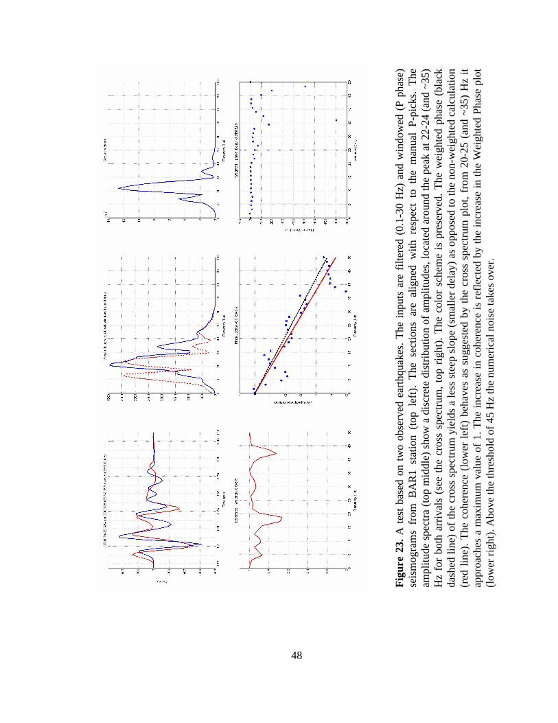
48
Fig
ure
23. A
tes
t ba
sed
on t
wo
obse
rved
ear
thqu
akes
. The
inp
uts
are
filte
red
(0.1
-30
Hz)
and
win
dow
ed (
P ph
ase)
se
ism
ogra
ms
from
BA
R1
stat
ion
(top
lef
t).
The
sec
tions
are
alig
ned
with
res
pect
to
the
man
ual
P-pi
cks.
The
am
plitu
de s
pect
ra (t
op m
iddl
e) s
how
a d
iscr
ete
dist
ribu
tion
of a
mpl
itude
s, lo
cate
d ar
ound
the
peak
at 2
2-24
(and
~35
) H
z fo
r bo
th a
rriv
als
(see
the
cro
ss s
pect
rum
, top
rig
ht).
The
col
or s
chem
e is
pre
serv
ed. T
he w
eigh
ted
phas
e (b
lack
da
shed
line
) of t
he c
ross
spe
ctru
m y
ield
s a
less
ste
ep s
lope
(sm
alle
r del
ay) a
s op
pose
d to
the
non-
wei
ghte
d ca
lcul
atio
n (r
ed l
ine)
. The
coh
eren
ce (
low
er l
eft)
beh
aves
as
sugg
este
d by
the
cro
ss s
pect
rum
plo
t, fr
om 2
0-25
(an
d ~3
5) H
z it
appr
oach
es a
max
imum
val
ue o
f 1.
The
incr
ease
in c
oher
ence
is r
efle
cted
by
the
incr
ease
in th
e W
eigh
ted
Phas
e pl
ot
(low
er ri
ght)
. Abo
ve th
e th
resh
old
of 4
5 H
z th
e nu
mer
ical
noi
se ta
kes
over
.

49
Figure 24. The format of the waveform cross correlation output is further used as a HYPODD input file. Bold letters are doublets ID’s. In the same line, zeroes indicate the correction for the origin time when the cross correlation data are used together with catalog data (i.e. an analyst phase picks) and the cross correlation and the catalog data have different origin times stored in the file headers. The first column lists station codes where a particular doublet is observed. The second column represents relative time differences (in seconds) for doublets as obtained using the cross correlation technique. The third column contains the “quality factor” for the cross correlation (Figure 20). The fourth column list the phase used for the doublet (P for a P and S for an S phase, respectively). Weights of 1 are due to numerical rounding (weight ≥ 0.999).
At the very end an output file is automatically generated as a product of the waveform
cross correlation (Figure 24). This is the input file for HYPODD.

50
3.3.2. Results
This time I use relative phase arrival times produced by the waveform cross-
correlation technique as input to HYPODD (example Figure 25). The resulting analysis
yields the final picture of the 2001 Enola earthquake locations. Following the data
subdivision scheme of Chapter 3.2.2. I separated the location procedure into:
Figure 25. 2001 Enola earthquake locations. The blue triangle is ENO site. Black dots are earthquakes located using HYPOELLIPSE on both P and S arrivals (individual-loc). Red dots are earthquakes located using only waveform cross correlation data for P arrivals. Error bars are on the order of meters.

51
a) earthquake locations using P waveform cross-correlation data
b) earthquake locations using S waveform cross-correlation data
c) earthquake locations using P and S waveform cross-correlation data
It appears that the earthquakes form two clusters, based on separate P and S relative
arrival times (Figure 25 and Figure 26). The one to the north, based on this map view,
seems to be separated from the one to the south by a seismically quiescent zone.
Figure 26. 2001 Enola earthquake locations using S waveform cross correlation technique. The locations are very similar to the ones in Figure 25 where only P phase data are used. Location errors (on the order of meters) are too small to be noted in the figure.
52
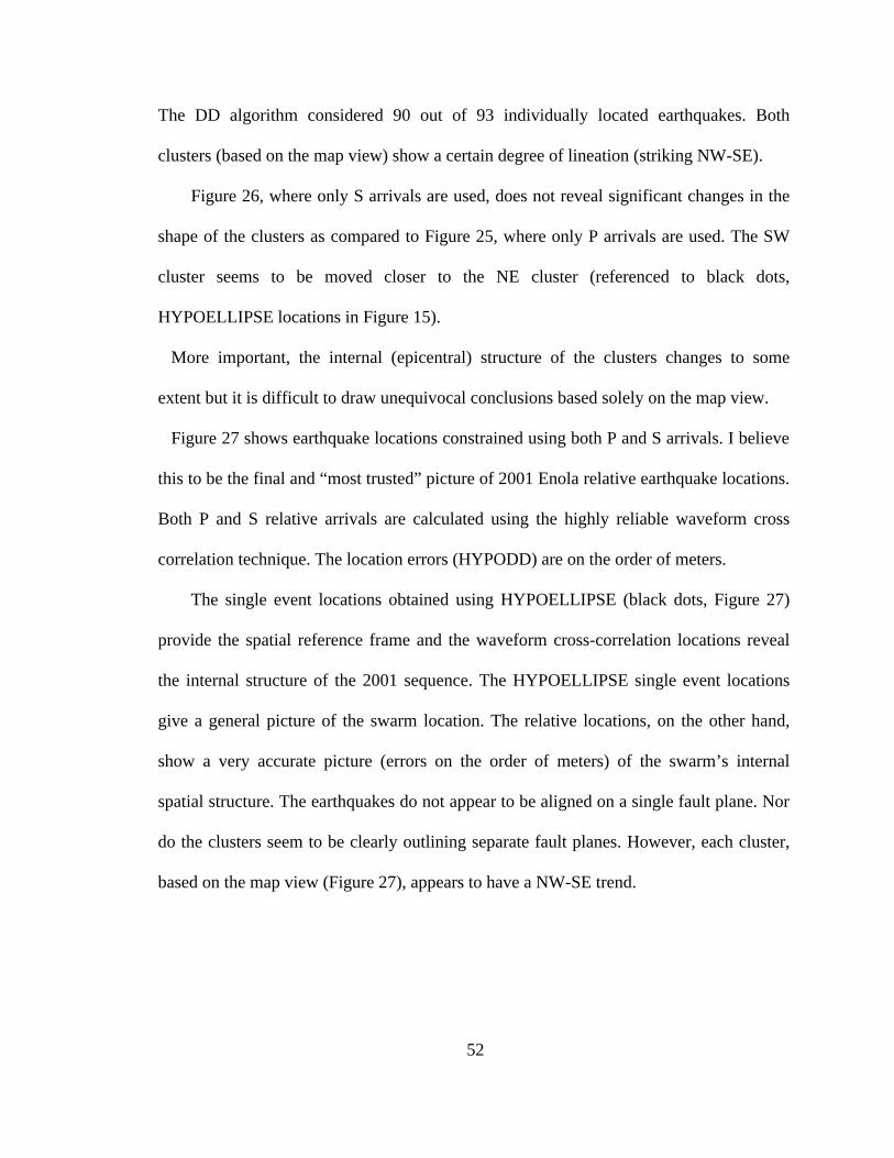
The DD algorithm considered 90 out of 93 individually located earthquakes. Both
clusters (based on the map view) show a certain degree of lineation (striking NW-SE).
Figure 26, where only S arrivals are used, does not reveal significant changes in the
shape of the clusters as compared to Figure 25, where only P arrivals are used. The SW
cluster seems to be moved closer to the NE cluster (referenced to black dots,
HYPOELLIPSE locations in Figure 15).
More important, the internal (epicentral) structure of the clusters changes to some
extent but it is difficult to draw unequivocal conclusions based solely on the map view.
Figure 27 shows earthquake locations constrained using both P and S arrivals. I believe
this to be the final and “most trusted” picture of 2001 Enola relative earthquake locations.
Both P and S relative arrivals are calculated using the highly reliable waveform cross
correlation technique. The location errors (HYPODD) are on the order of meters.
The single event locations obtained using HYPOELLIPSE (black dots, Figure 27)
provide the spatial reference frame and the waveform cross-correlation locations reveal
the internal structure of the 2001 sequence. The HYPOELLIPSE single event locations
give a general picture of the swarm location. The relative locations, on the other hand,
show a very accurate picture (errors on the order of meters) of the swarm’s internal
spatial structure. The earthquakes do not appear to be aligned on a single fault plane. Nor
do the clusters seem to be clearly outlining separate fault planes. However, each cluster,
based on the map view (Figure 27), appears to have a NW-SE trend.

53
Figure 27. 2001 Enola earthquake locations (total of 90) using both P and S waveform cross correlation data.
The cross sections (Figure 28) reveal clustered 2001 Enola seismicity. The clusters
seem to be connected by a cloud of seismicity at the depth of ~ 5 km where the Paleozoic
– Precambrian boundary is.
Based on waveform similarity more earthquakes could be selected and sorted in groups
with a common source. I speculate it would be possible to get a more comprehensive
picture of the 2001 Enola earthquake clustering if more earthquakes were located. I do
not think more clusters would be revealed. The largest earthquakes define the main
seismicity zones.

54
Figure 28. NS and EW cross-sections. Earthquake locations are constrained with both P and S waveform cross correlation data. The major seismicity lies within a 1.5 kilometer-thick layer at the depth of the Precambrian basement. There are two apparent clusters of seismicity (left plot). The one to the south appears to be deeper. Both clusters seem to share a common cloud of earthquakes at depth of ~ 6 km.
Adding more locatable earthquakes is not an easy problem. The whole data set of the
2001 sequence should be organized in a database that would ease associating an event
with multiple stations. This is evident even for a relatively small data set such as the 2001
Enola earthquake sequence.

55
Figure 29. Two location cubes show two clusters of seismicity, in particular the cube to the left. The deeper SW cluster, to the left in the left 3-D section, (the SW cluster in Figure 27) may appear as westward ~ 50º dipping, SW-NE striking (appears as a NW-SE lineation on the map view in Figure 27). Its 3-dimensional shape seems to be tubular rather than planar.
Figure 29 does not reveal a simple faulting geometry. The SW cluster exhibits a sort of
tubular shape. It is not clear, at this point, whether that shape developed from depth
towards the surface (temporal migration) or it was completely random in time.
The spatial dimension of the Enola seismicity does not allow me to resolve the “single
fault” question in a less opaque manner. However, I cannot completely rule out a
possibility that these two clusters indeed form a fault plane that ruptured in patches with
an aseismic zone between them. Moreover, there could be two separate fault planes
which dimensions are only indicated by the size of the clusters.
Several factors make an interpretation of the 2001 sequence in a tectonic and structural
context very difficult. These factors include absence of mapped faults in the strict swarm

56
crustal volume, lack of apparent fault planes (based on the earthquake spatial structure)
and clustering of seismicity both in space and distinctively in time.
It is not likely that the Enola zone would produce an earthquake of magnitude 6 or
higher due to the small, possibly highly fractured source volume and the shallow depth of
the earthquakes (Chiu et al., 1984).
Not only does the entire Enola zone occupy a small crustal volume, some 10 km3, but
the seismicity even within this small volume is tightly clustered. The clustered character
of seismicity stresses the importance of the specific, highly concentrated seismogenic
properties. Moreover, the clusters do not show a definite lineation that might be
interpreted uniquely as a fault plane. This might indicate that the zone at the hypocentral
depths is filled by small scale fractures that failed producing small size earthquakes.
The migration of seismicity, discussed further in the next chapter, indicates a possible
role of fluids in the Enola earthquake factory. Špicák and Horálek (2001) discussed
migration of seismicity during an intraplate swarm, possibly controlled by fluids,
pointing out a possibility that the swarm might not have happened otherwise.
The clusters seem to connect at a depth of 5-6 km by diffuse seismicity. Closer to the
surface the connection disappears. Maybe by locating more earthquakes this apparent
aseismic gap would be filled with smaller size earthquakes. The located largest
earthquakes, in my opinion, define well enough the shape of seismicity of the 2001
sequence. It is possible then that fluids have migrated, originating from depths of ~7-8
km, splitting in two channels at ~5 km and diffusing into the cluster defined zones
helping fractures to fail and produce the earthquakes. Examining the steep dipping
geometry of the cluster could support this hypothesis.

57
In my opinion the rest of the 2001 Enola seismicity would also group within the two
clusters, organizing some 2,500 earthquakes, separated already by the order of 10s of
meters in a highly concentrated seismogenic zone.
What could be causing this highly localized seismogenic zone still remains
unanswered.
The 1982 sequence was the first seismic episode to be observed instrumentally in the
Enola region. Over a period of 2 years the sequence produced over 30,000 earthquakes.
Now, 20 years later another 1982-like seismic episode took place within the same 4 x 4
km area this time a bit less productive in terms of earthquake numbers, producing some
2500 earthquakes over a period of 2 months. Even though the instrumented time spans
are different, the daily seismicity rates for both swarms reveal that the 1982 sequence was
more abundant in earthquake production. This tremendous number of earthquakes,
relatively small in magnitudes (M < 3) was located in a ~ 8 km3 crustal cube centered at ~
4 km depth. Paleozoic sandstones and carbonates occur up to a depth of ~ 5 km where the
Precambrian basement starts (Schweig et al., 1992). Despite numerous faults surrounding
the Enola region that could have been as good, if not more favorable, hosts of the
seismicity, a region without mapped faults produced both sequences. An evidence of
clear lineation that could be interpreted as a fault/s has not been found for the 1982
sequence (Chiu et al., 1984).

58
3.4. The Earthquake Chronology
Figure 30. Chronology of 2001 Enola sequence. The left plot shows the activity up to 152 Julian day (second to last burst in seismicity. See Figure 4, Chapter 2). Plot on the right (blue dots) shows the activation of the shallow cluster (to the NE). “Blue” earthquakes occurred in just two days, day 181 and 182 (the last burst in seismicity. See Figure 4, Chapter 2).
The 2001 Enola sequence exhibits a peculiar migration in time. The NE cluster was
barely active until the last few last days of the network deployment (Figure 30). It
remained activate only for two days producing about 50 large size earthquakes (within
the population of 100 biggest). This cluster also contributes one of the largest earthquakes
in the 2001 sequence. The deeper SW cluster did not have a distinct time pattern. The
earthquakes in this cluster occurred at different depths over a period of about two months.
Chiu et al. (1984) investigated the spatial migration in time for the 1982 sequence,
grouping 88 events in 12-day periods. The epicentral region of each major sequence, i.e.,
a mainshock plus intermediate foreshocks and aftershocks was aseismic before the major
sequence commenced. The seismic activity before each major sequence occurred in the

59
region surrounding that activity. As the major sequence developed, the surrounding zone
went seismically quiet. They further concluded that these observations indicated that
patterns of strain accumulation and release in the swarm source zone had developed and
changed in short periods of time – hours to days.
Putting together the above observation with the fact that the 2001 sequence also
shows temporal migration (considering the largest selected earthquakes and their
clustering on day 182) brings the temporal similarity of both sequences to our immediate
attention.
What temporal process could lead to observed clustering for both sequences separated
by 20 years? Would it be possible that the proposed fractured media in the strict swarm
area (Chiu et al. 1984; Schweig et al. 1991 and Booth et al., 1990) is filled with fluids
that migrated during both sequences in a similar manner and controlled the seismicity
rates both spatially and temporally?
There is one more thing that needs to be mentioned: Selecting the 100 largest
earthquakes and plotting them chronologically does not necessarily mean that the
seismicity of the deep SW cluster “shut off” when the shallow NE cluster emerged. It
only brings out the fact that these last ~ 50 earthquakes on 182 Julian day were larger
than possible smaller magnitude events that might have been filling out the volume of the
deep SW cluster.
Again, these 100 largest earthquakes illustrate the main features but leave the picture
of the 2001 sequence seismicity a bit incomplete. Locating more earthquakes would
theoretically complete the spatial and temporal behavior of the 2001 sequence.