1st Submission of Final Product
4
1 st Submission of Final Product Eliza Chapman-Smith
Transcript of 1st Submission of Final Product
1st Submission of Final ProductEliza Chapman-Smith
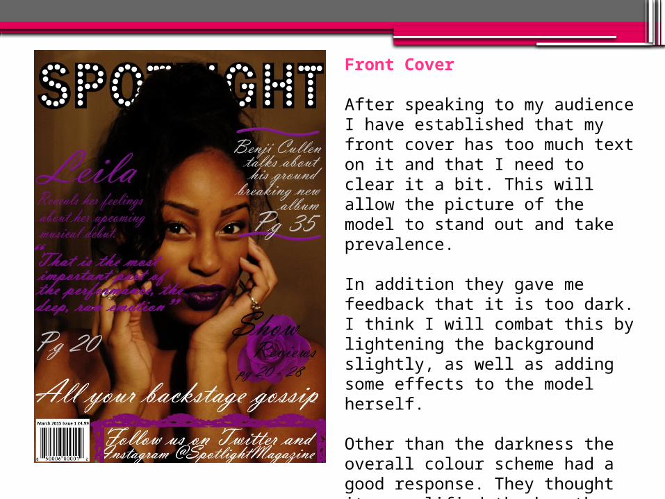
Front Cover
After speaking to my audience I have established that my front cover has too much text on it and that I need to clear it a bit. This will allow the picture of the model to stand out and take prevalence.
In addition they gave me feedback that it is too dark. I think I will combat this by lightening the background slightly, as well as adding some effects to the model herself.
Other than the darkness the overall colour scheme had a good response. They thought it exemplified the key themes of the genre and that it looked effective and professional.
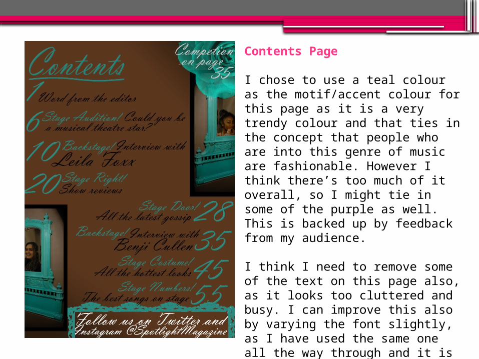
Contents Page
I chose to use a teal colour as the motif/accent colour for this page as it is a very trendy colour and that ties in the concept that people who are into this genre of music are fashionable. However I think there’s too much of it overall, so I might tie in some of the purple as well. This is backed up by feedback from my audience.
I think I need to remove some of the text on this page also, as it looks too cluttered and busy. I can improve this also by varying the font slightly, as I have used the same one all the way through and it is fairly flamboyant so the overall effect is quite strong.
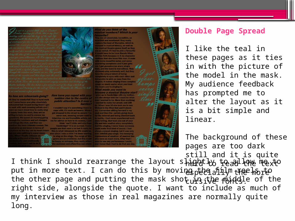
Double Page Spread
I like the teal in these pages as it ties in with the picture of the model in the mask. My audience feedback has prompted me to alter the layout as it is a bit simple and linear.
The background of these pages are too dark still and it is quite hard to read the text especially the more cursive fonts.
I think I should rearrange the layout slightly to allow me to put in more text. I can do this by moving the film reels to the other page and putting the mask shot in the middle of the right side, alongside the quote. I want to include as much of my interview as those in real magazines are normally quite long.