13 a melanie-bartholomew
12
Portfolio Melanie Bartholomew
-
Upload
melanie-bartholomew -
Category
Design
-
view
89 -
download
0
Transcript of 13 a melanie-bartholomew

PortfolioMelanie Bartholomew

ContentsMontage 4
Web Page Mockup 6
Infographic 8
Business Identity Business card 10
Business IdentityLetterhead 12 Coding 14
Brochure 16
Photodesign 18
Prezi Presentation 20
Magazine Cover 22
Melanie Bartholomew208.201.3195
37 S. 700 E. Nephi, Ut 84648

4
Programs UsedAdobe Photoshop
DateOcober 19, 2016
Course and SectionComm 130, Section 1
Instructor NameSister Sara Tranberg
ObjectiveCreate a spiritual poster using images and type using layers.
DescriptionThis is a spiritual poster montage made of images and type.
ProcessThe first image I placed in photoshop was the picture of the hand. I used the clone stamp to hide any
unwanted peices to the picture as to not distract from the focus of th image. I then added the sheet music picture and then the background texture. I changed the blend mode and opacity to make them
visually pleasing. I used the brush tool to wipe out any part of the background I did not want showing,.
montage

6
Programs UsedAdobe Photoshop
DateNovember 16, 2016
Course and SectionComm 130, Section 1
Instructor NameSister Sara Tranberg
ObjectiveCreate a web page layout for a new company website organizing the layers.
DescriptionA web page layout for a Tiny Home company.
ProcessI organized a layout that would best fit the company. I used Adobe Photoshop to create a webpage
mockup and from there I added color and content. I Used used his logo colors to create contrast throughout the webpage as well as unity. I used repetitive shapes and colors to create unity as well.
Web Page Mockup

8
Programs UsedAdobe Illustrator
DateNovember 2, 2016
Course and SectionComm 130, Section 1
Instructor NameSister Sara Tranberg
ObjectiveCreate any type of infographic to be shared on Pinterest as well as the company’s blog.
DescriptionThis is an infographic about a cruise line.
ProcessI first researched my topic to gather the information I needed to put into the infographic. Using
Adobe Illustrator I created illustrations with the pen tool. I Oganized the layout and put in the type and illustrations, making sure to create unity and contrast. I used a picture of the ocean to create the
water effect to the backround by placing it over a blue rectangle and lowering the opacity.
Infographic

10
Programs UsedAdobe Illustrator
DateOcober 26, 2016
Course and SectionComm 130, Section 1
Instructor NameSister Sara Tranberg
ObjectiveDesign consistent layouts and branding for a business card and letterhead.
DescriptionA letterhead, front and back of a business card for the company I designed the logo for.
ProcessThe first thing I did was desing a logo for a company. I used the design of that logo to create the front
and back of a business card as well as a letterhead. I used the pink form the middle of the flower to create the block of color on the bottom of the front of the business card and created unity by adding the same
block of color to the letterhead. I reused the color as the back of the business card. I also created unity by using a line of pink under the logo and next to the contact information in the letterhead.
Business Identity:Business card
12
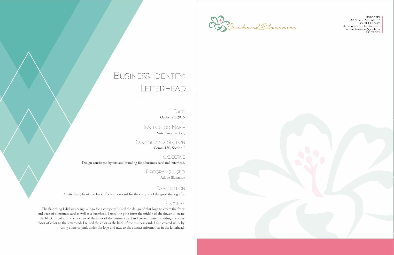
Business Identity:Letterhead
Programs UsedAdobe Illustrator
DateOcober 26, 2016
Course and SectionComm 130, Section 1
Instructor NameSister Sara Tranberg
ObjectiveDesign consistent layouts and branding for a business card and letterhead.
DescriptionA letterhead, front and back of a business card for the company I designed the logo for.
ProcessThe first thing I did was design a logo for a company. I used the design of that logo to create the front
and back of a business card as well as a letterhead. I used the pink form the middle of the flower to create the block of color on the bottom of the front of the business card and created unity by adding the same
block of color to the letterhead. I reused the color as the back of the business card. I also created unity by using a line of pink under the logo and next to the contact information in the letterhead.

14
Programs UsedTextWrangler & Adobe Photoshop
DateNovemebr 9, 2016
Course and SectionComm 130, Section 1
Instructor NameSister Sara Tranberg
ObjectiveDesign a webpage for a client that has the logo I created and how I created it.
DescriptionThis is a webpage for a client that has the logo I created and how I created it.
ProcessThe first thing I did was type up my HTML. I used Adobe Photoshop to get the green and pink colors
of my logo into CSS. I made I created contrast by making the header large and green. I changed the website button on the bottom from the default color to white, while chaning colors green when you
hover over it. I created visual hierarchy with the logo by making it the largest item on the page.
Coding

16
Programs UsedAdobe Photoshop, Illustrator, and Indesign
DateDecember 1, 2016
Course and SectionComm 130, Section 1
Instructor NameSister Sara Tranberg
ObjectiveDesign a full-color, folding brochure to help promote the company.
This design is a full-color, folding brochure to help promote the company product.
ProcessI sketeched my ideas down on a peice of paper. I used Adobe Illustrator to create my logo for
this oils company. I brought my sketch to life by creating a wireframe in adobe InDesign. I used Adobe Photoshop to edit orignal images and to create masks. I chose colors that would contrast
with each other as well as different sizes of shapes in the design to help create contrast.
Brochure

18
Programs UsedPhotoshop
DateOcober 13, 2016
Course and SectionComm 130, Section 1
Instructor NameSister Sara Tranberg
ObjectiveCreate a photo design with design elements and a named color scheme.
DescriptionCreate a photo design that has an image along with design elements and a named color scheme.
ProcessI drove to the canyon and took a picture with the fall colors and placed that picture in Photoshop. I
didn’t want to cover any of the picture up with solid colord shapes that would distract from the picture. I used transparent circles as my shapes to create unity with the curve of the road and the beauty of the
picture. From there I added the type and circles of color to show off my fall color scheme I had chosen.
Photodesign

20
Programs UsedAdobe Photoshop & Illustrator
DateOcober 5, 2016
Course and SectionComm 130, Section 1
Instructor NameSister Sara Tranberg
ObjectiveDesign a Prezi presentation to persuade a client that Prezi is a viable presentation software
DescriptionThis is a Prezi presentation to persuade a client that Prezi is a viable presentation software
ProcessI researched ideas to put into my presentation. After researching, I sketched my layout. I used Adobe
Photshop to adjust colors in the photos I used. I designed slides using Adobe Illustrator. I made sure to create Unity by having the same basic design for each slide using the same color of rectangle. Here is the
link to the website for your convenience: https://prezi.com/d2iritsn8gow/how-to-be-a-mean-mom/
Prezi Prezentation

22
Programs UsedAdobe InDesign
DateSeptember 29, 2016
Course and SectionComm 130, Section 1
Instructor NameSister Sara Tranberg
ObjectiveDesign a magazine cover.
DescriptionThis is a magazine that shows who I am and what my interests are.
ProcessI sketched my ideas down on paper and chose the one with the best flow. From there I made my
wireframe in InDesign. I added my content into my wireframe. I chose a color scheme that would go the best with my photo. I used alignment to create good design and the colors created contrast.
Magazine Cover