1 Brand guidelines - Ministry for Culture and Heritage
10
March 2011 Brand guidelines For endorsements and third parties
Transcript of 1 Brand guidelines - Ministry for Culture and Heritage
1
March 2011
Brand guidelinesFor endorsements and third parties

2Contents
Introduction .................................................................. 3Principle of application .................................................4Our logo ......................................................................... 5Our logo – application and acknowledgement ............ 7Core colour ....................................................................8Typeface ........................................................................9Contact details ............................................................ 10

3Introduction
The Ministry for Culture and Heritage has recently simplified its logo so that it’s user-friendly, flexible and consistently highlights government funding for the arts, culture and heritage.
The Ministry’s circular logo applied in association with your organisation’s, enables the public to recognise the rich diversity of New Zealand’s arts, culture and heritage – each element unique in its own right but also as a whole, telling a comprehensive, deeper cultural story.

4
To ensure the focus remains on the culture and practitioners, and to avoid brand clutter, apply the ‘one-up’ principle – ie. the one who directly provides the funding is acknowledged.For example; Creative New Zealand or NZ on Air would acknowledge government support through the Ministry, but artists, arts organisations or filmmakers directly funded by Creative New Zealand or NZ on Air, would continue to acknowledge Creative New Zealand or NZ on Air.
Principle of application

5Our logo
REVERSED VERSIONBLACK VERSION KEYLINE VERSION
CLEARSPACELeave a space of at least the width of the word ‘Culture’ (taken from the logo) between the logo and any other element, including the edge of the page.
DISK, INCLUDING ENDORSEMENT LINE: ALL INSTANCESPlease note there are two versions of this logo, horizontal and vertical, to suit different design solutions. Clear space rules are the same as core logo (to the right).
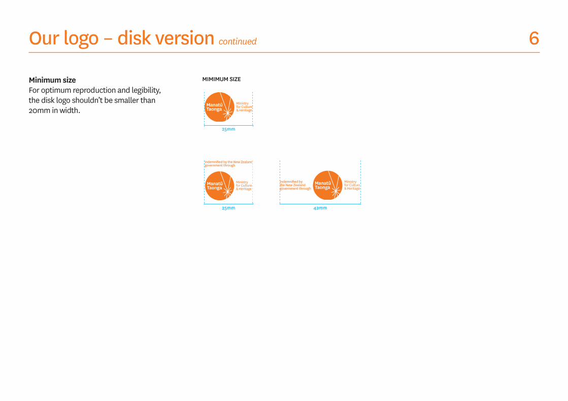
The disk version of our logo has been created specifically for endorsement purposes. See the following pages for examples of when and where this version of the logo should be used.
Use any of the following logos according to the background on which they will be placed to give the Manatū Taonga logo the greatest visibility and legibility.
For organisations acknowledging government indemnification of touring exhibitions please use the logo in association with the words: Indemnified by the New Zealand government through
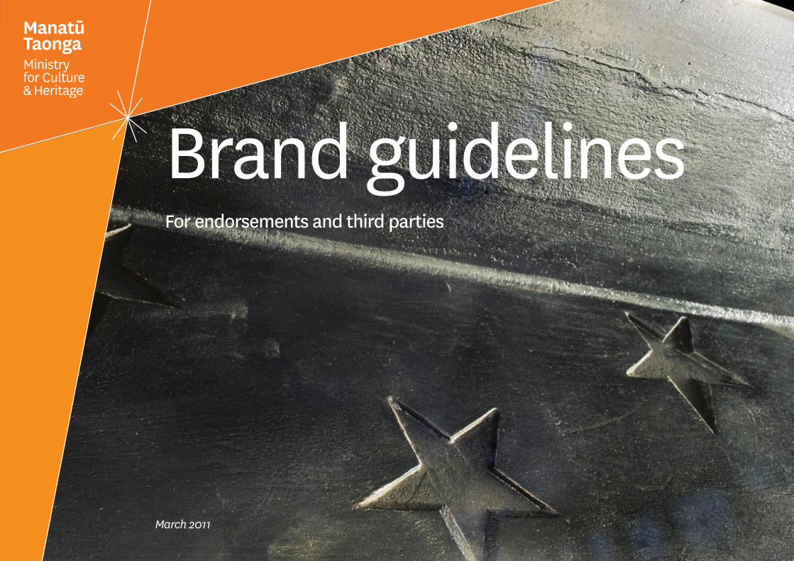
6Our logo – disk version continued
Minimum sizeFor optimum reproduction and legibility, the disk logo shouldn’t be smaller than 20mm in width.
25mm
25mm 42mm
MIMIMUM SIZE
7
USED IN ENDORSEMENT/SUPPORTER CONTEXT:
Wellington Administration Level 2 101 Wakefield Street Wellington 6011
PO Box 6640 Marion Square Wellington 6141 New Zealand
Auckland Development Office Level 3 59-67 High Street Auckland 1010
P 0800 479 674 04 801 3890 F (04) 801 3891 E [email protected] W nzso.co.nz
Season 2010
Our logo – application and acknowledgement

8Core colour
Orange is our core colour. It is vibrant and proud – but is also earthy and grounded in tone. We use black as a support colour.
PANTONE 152C
PANTONE 152U
CMYK COATED: 0/65/100/0
CMYK UNCOATED: 0/60/100/0
RGB: 229/114/0
HEX: #E57200
BLACK

9Typeface
Klim NationalThis typeface was designed in Aotearoa and is a world leading Sans Serif font. It’s a contemporary classic with a distinctive warmth taken from vintage letterpress fonts, blending history with the modern.
Use National Light through to National Semibold – with a preference for the lighter weight fonts. The Bold and Extra Bold weights are very bulky and don’t suit our brand.
This typeface requires kerning (ie: the spacing between the letters) in most instances. As a general rule, the larger the font gets, the more kerning it requires. Body copy needs around -20 tracking overall, yet larger headlines need to be much tighter (around -40).
Default typefaceArial is our typeface for HTML and word processing where National isn’t available.
NationalNATIONAL LIGHT
ABCDEFGHIJKLNMOPQRSTUVWXYZ abcdefghijklnmopqrstuvwxyz&1234567890
NATIONAL BOOK
ABCDEFGHIJKLNMOPQRSTUVWXYZ abcdefghijklnmopqrstuvwxyz&1234567890
NATIONAL REGULAR
ABCDEFGHIJKLNMOPQRSTUVWXYZ abcdefghijklnmopqrstuvwxyz&1234567890
ARIAL REGULAR
ABCDEFGHIJKLNMOPQRSTUVWXYZ abcdefghijklnmopqrstuvwxyz&1234567890
NATIONAL MEDIUM
ABCDEFGHIJKLNMOPQRSTUVWXYZ abcdefghijklnmopqrstuvwxyz&1234567890
NATIONAL SEMIBOLD
ABCDEFGHIJKLNMOPQRSTUVWXYZ abcdefghijklnmopqrstuvwxyz&1234567890
ARIAL BOLD
ABCDEFGHIJKLNMOPQRSTUVWXYZ abcdefghijklnmopqrstuvwxyz&1234567890

10Contact details
MedMeMinistry for Culture and Heritage Te Manatū Taonga Phone: +64 4 499 4229 Fax: +64 4 499 4490 Email: [email protected]