Visualization of Future Transport...
62
Department of Computer Science and Engineering CHALMERS UNIVERSITY OF TECHNOLOGY UNIVERSITY OF GOTHENBURG Göteborg, Sweden, September 2009 Visualization of Future Transport Concepts Master of Science Thesis in the Programme Interaction Design MATTHIAS KLEIN HENRIK LUND
Transcript of Visualization of Future Transport...
Department of Computer Science and Engineering CHALMERS UNIVERSITY OF TECHNOLOGY UNIVERSITY OF GOTHENBURG Göteborg, Sweden, September 2009
Visualization of Future Transport Concepts Master of Science Thesis in the Programme Interaction Design MATTHIAS KLEIN HENRIK LUND
The Author grants to Chalmers University of Technology and University of Gothenburg the non-exclusive right to publish the Work electronically and in a non-commercial purpose make it accessible on the Internet. The Author warrants that he/she is the author to the Work, and warrants that the Work does not contain text, pictures or other material that violates copyright law. The Author shall, when transferring the rights of the Work to a third party (for example a publisher or a company), acknowledge the third party about this agreement. If the Author has signed a copyright agreement with a third party regarding the Work, the Author warrants hereby that he/she has obtained any necessary permission from this third party to let Chalmers University of Technology and University of Gothenburg store the Work electronically and make it accessible on the Internet. Visualization of Future Transport Concepts MATTHIAS KLEIN HENRIK LUND © MATTHIAS KLEIN, September 2009. © HENRIK LUND, September 2009. Examiner: OLOF TORGERSSON Department of Computer Science and Engineering Chalmers University of Technology SE-412 96 Göteborg Sweden Telephone + 46 (0)31-772 1000 Department of Computer Science and Engineering Göteborg, Sweden September 2009
Abstract This thesis addresses new needs in the field of visualization at the company Volvo Technology. Its goal is to investigate and suggest appropriate visualization practices in relation to Soft Products, a relatively new business area of the company. Initially the focus was to find a visualization technique for a specific purpose but the thesis revealed the need for a broader understanding of different visualization techniques. From these insights the thesis describes different possible purposes that visualizations could have at Volvo Technology and suggests appropriate visualization guidelines.
To validate and exemplify the proposed visualization guidelines a concept demonstrator was created. The concept demonstrator is a visualization of a future transport concept, and during the creation of the concept demonstrator many problems and needs regarding visualization were revealed.
The conclusion argues for a definition of the purpose of visualization before implementing the visualizations at Volvo Technology. The initial goal of Volvo Technology was mainly to focus on ways of creating more impressive visualizations, but the thesis reveals that the needs concerning visualization are much more diverse.
Sammanfattning Denna masteruppsats behandlar nya visualiseringsbehov hos företaget Volvo Technology. Målet med uppsatsen är att undersöka och föreslå lämpliga visualiseringstillämningar inom området ”Soft Products”, ett relativt nytt branschområde hos företaget. Till en början låg fokus på att hitta en visualiseringsteknik för ett specifikt syfte, men det visade sig att även en bredare förståelse för olika visualiseringstekniker behövdes. Med dessa insikter som grund beskriver uppsatsen olika syften visualiseringar kan ha hos Volvo Technology och föreslår även lämpliga riktlinjer för visualiseringar.
För att validera och exemplifiera dessa riktlinjer skapades även en konceptdemonstratör. Konceptdemonstratören är en visualisering av et framtida transporteringskoncept, och när konceptdemonstratören skapades identifierades flera problem och behov relaterade till visualisering.
Slutsatsen beskriver vikten av att definiera syftet med visualiseringen före implementering. Det ursprungliga målet från Volvo Technology var att fokusera på nya sätt att skapa imponerande visualiseringar, men den här uppsatsen demonstrerar att behovet av visualiseringar är betydligt mer mångsidigt.
Table of contents
1 Introduction...................................................................................................................................... 1 1.1 About Volvo Technology......................................................................................................... 1 1.2 Background .............................................................................................................................. 1 1.3 Problem description................................................................................................................. 1 1.4 Goal ........................................................................................................................................... 2 1.5 Limitations ............................................................................................................................... 2
2 Theoretical background................................................................................................................... 3 2.1 Visualization............................................................................................................................. 3
2.1.1 Scientific Visualization..................................................................................................................... 3 2.1.2 Information Visualization ................................................................................................................. 3 2.1.3 Knowledge Visualization.................................................................................................................. 4
2.2 Perception................................................................................................................................. 4 2.2.1 Processing and perception of visual information .............................................................................. 4 2.2.2 Processing and perception of language............................................................................................. 5
3 Problem analysis .............................................................................................................................. 6 3.1 Interviews ................................................................................................................................. 6 3.2 Current visualization practice ................................................................................................ 6
3.2.1 Scenarios........................................................................................................................................... 6 3.2.2 The Concept Studio .......................................................................................................................... 6 3.2.3 Vehicle rig and driving simulator ..................................................................................................... 7 3.2.4 Reproduction..................................................................................................................................... 8 3.2.5 Other methods................................................................................................................................... 8 3.2.6 Pre-study........................................................................................................................................... 8
3.3 Affinity diagram ...................................................................................................................... 8 3.4 Context diagram .................................................................................................................... 11 3.5 Discussion of possible focuses ............................................................................................... 11
3.5.1 Hard and Soft Products ................................................................................................................... 11 3.5.2 Innovative interaction solutions...................................................................................................... 12 3.5.3 “Happy Day Scenarios” .................................................................................................................. 12 3.5.4 Audience involvement .................................................................................................................... 13 3.5.5 Visualization techniques ................................................................................................................. 14 3.5.6 Purposes of visualization ................................................................................................................ 14 3.5.7 Easy-to-use software and time efficiency ....................................................................................... 15 3.5.8 Actors and cost efficiency............................................................................................................... 15
3.6 Focus of the thesis .................................................................................................................. 16 4 Purpose and Fidelity of Visualization ........................................................................................... 18
4.1 Different purposes – one solution?....................................................................................... 18 4.2 What you should know before visualizing........................................................................... 18 4.3 Aren’t high-fidelity visualizations always beneficial? ........................................................ 19 4.4 Low-fidelity visualization can even lead to better feedback .............................................. 19 4.5 Cost efficiency ........................................................................................................................ 20 4.6 Storyboarding as an efficient method of visualizing services ............................................ 21 4.7 Summary ................................................................................................................................ 23
5 Visualization Guidelines ................................................................................................................ 24 5.1 The Visualization Framework .............................................................................................. 24
5.1.1 Case 1: Evaluation in early stages .................................................................................................. 25 5.1.2 Case 2: Education and information in early stages ......................................................................... 26 5.1.3 Case 3: Selling and convincing in early stages ............................................................................... 26 5.1.4 Case 4: Evaluation in late stages..................................................................................................... 26 5.1.5 Case 5: Education and information in late stages ........................................................................... 27 5.1.6 Case 6: Selling and convincing in late stages ................................................................................. 27
5.2 Design Guidelines .................................................................................................................. 27 5.2.1 Telling a story with the Comics Metaphor...................................................................................... 27 5.2.2 Explaining relations with textual and visual information ............................................................... 29
6 Concept Demonstrator ................................................................................................................... 32 6.1 Selecting a scenario................................................................................................................ 32 6.2 Design decisions ..................................................................................................................... 32
6.2.1 Presenter ......................................................................................................................................... 33 6.2.2 Interaction ....................................................................................................................................... 33 6.2.3 Layout............................................................................................................................................. 33 6.2.4 Storyboard....................................................................................................................................... 36 6.2.5 Visual style ..................................................................................................................................... 37 6.2.6 Sound .............................................................................................................................................. 38
6.3 Choice of software ................................................................................................................. 38 6.3.1 2D animation .................................................................................................................................. 38 6.3.2 3D animation .................................................................................................................................. 38
6.4 Implementation of concept demonstrator ........................................................................... 39 6.4.1 Creation of images .......................................................................................................................... 39 6.4.2 Animation of images....................................................................................................................... 40 6.4.3 Compilation of animated clips and interaction logic ...................................................................... 41
6.5 Result ...................................................................................................................................... 42 7 Evaluation ...................................................................................................................................... 44 8 Discussion....................................................................................................................................... 46
8.1 Focus of the thesis .................................................................................................................. 46 8.2 Content of visualization......................................................................................................... 47 8.3 The Visualization Guidelines ................................................................................................ 47 8.4 The Concept Demonstrator .................................................................................................. 47
9 Conclusion...................................................................................................................................... 49 9.1 Future Work .......................................................................................................................... 49
References............................................................................................................................................. 51 Appendix ............................................................................................................................................... 53
A. Interview guide........................................................................................................................ 53 B. Affinity diagram...................................................................................................................... 54 C. Scenario description ............................................................................................................... 56
1
1 Introduction
1.1 About Volvo Technology Volvo Technology Corp (VTEC) is part of the Volvo Group and employs about 400 people of whom 360 are engineers.
VTEC is an innovation company that develops new technologies, new products and new business concepts within the transport and vehicle industry, and they are an integral part of the research and development in the Volvo Group. Their primary customers are other corporations inside the Volvo Group and Volvo Cars, but they also provide services to some selected suppliers. VTEC also participates in national and international projects in certain strategic areas, organised in common research programmes, involving universities, research institutes and other companies.
This master thesis was conducted at their office located at Lundbystrand, Gothenburg. Apart from that office they also are located at Chalmers Science Park, Gothenburg, in Lyon, France and in Greensboro, USA.
1.2 Background The Volvo Group vision is:
“To be valued as the world’s leading provider of commercial transport solutions” (Dencker 2007)
To achieve this in the past the main goal has been to provide the best solutions for “Hard Products”, meaning the sales of new vehicles, equipment and engines. But the development of the market has led the Volvo Group to realize the importance to move into the area of “Soft Products” where the focus has not been as great in the past. Soft products are defined as:
“Soft products are all products and services sold to a customer that enhance the customer’s experience and satisfaction other than the sale of new vehicles / equipment / engines.” (Dencker 2007)
The reason for this shift of focus to sustain their vision is mainly due to the unstable market of purely providing Hard Products. Buying new vehicles is an investment that leads to up and downs according to the current economical climate, but services in the Soft Products area are there to provide streamlining of the transport solutions in between new Hard Product investments. This segment of business is not as economically bounded as Hard Products and can provide a stable economical climate even during otherwise bad economy.
Since previous work at Volvo Technology has been mainly focused on visualizing and enhancing Hard Products they have felt a need to review their visualization techniques regarding Soft Products.
1.3 Problem description Volvo Technology ordered this thesis to further investigate and evaluate the use of visualization in relation to future transport concepts. The gained knowledge about visualization should help Volvo Technology to further improve their work practices in the field of visualization and the main question is:
How should future transport concepts be visualized?
1.4 Goal The goal of the thesis is to investigate and suggest suitable visualization practices for Volvo Technology.
In order to evaluate the proposed visualization practise a concept demonstrator will be implemented. The concept demonstrator will visualize a future transport concept and demonstrate the benefits of the proposed visualization practise.
1.5 Limitations The thesis does not deal with future transport concepts or service development issues, but instead only with how future transport concepts or services can be visualized. It does not result in a software application, which could be used to create visualizations. The concept demonstrator is only an exemplified visualization. However, relevant software related insights, derived from the development of the concept demonstrator are documented. Furthermore the thesis won’t result in a concrete process for creating visualizations at Volvo Technology. It also will not result in an integration of visualization into Volvo Technology’s service development process.
2
2 Theoretical background
2.1 Visualization In its broadest use it can be said that cave drawings are visualizations. Someone made something visible, and thousands of years later one is able to form a mental image of what they expressed through the drawing. A visualisation is simply a way of communicating through visual imagery. The term visualization has in more recent years evolved and is sometimes used more synonymous with computer visualizations.
It was with the dawn of computer visualizations that the field of visualizations started to expand rapidly. In the beginning visualizations were mainly used for scientific purposes, in the area known as scientific visualization, but as computers and visualization techniques evolved new subfields of visualization emerged and soon visualization were a part of everyday life ranging from weather maps to digitally enhanced movies. (Schroeder et al. 1996)
The only clearly defined subfields in the field of visualization are Scientific Visualization, Information Visualization and the emerging Visual Analytics. It is not until recent years that research areas focused on general communication have emerged. New fields like knowledge visualization try to address the general characteristic of visualizations and this leads back to the original meaning of the word visualization, supporting communication between individuals through the help of visual imagery. The sole focus on computer visualizations has been lifted and knowledge visualization aims at providing a broader analysis of appropriate visualization techniques for different purposes. (Burkhard 2004)
2.1.1 Scientific Visualization The first definitions of Scientific Visualization were mentioned in the article “Visualization in Scientific Computing” in which the field is defined as "the use of computer graphics to create visual images which aid in understanding of complex, often massive numerical representation of scientific concepts or results." (McCormick et al. 1987)
A more exemplifying description is given by Friendly et al. (2001) who describe scientific visualization as being: “primarily concerned with the visualization of 3-D+ phenomena (architectural, metrological, medical, biological, etc.), where the emphasis is on realistic renderings of volumes, surfaces, illumination sources, and so forth, perhaps with a dynamic (time) component.”
The field is an interdisciplinary branch of science and helps scientists in nearly all fields to further analyze and understand complex scientific concepts or results with the help of computer visualizations. To put it simple it deals with creating visualizations of the physical world that otherwise are hard to see. These visualizations are usually an abstraction of the physical world but the underlying data always has the origin in the physical world.
2.1.2 Information Visualization The evolution of computers, scientific visualizations and human computer interaction lead to the exploration of visualization in other areas than scientific visualization. In the early 90s information visualization was introduced as a new subfield of visualization.(Rhyne 2007) Card et al. (1999) define information visualization as:
The use of computer-supported, interactive, visual representations of abstract data to amplify cognition.
3
This area was a natural evolution of visualization when the evolutions of computers lead to enormous amounts of data. To be able to take advantage of this data there was a need to visualize relations and properties in a form better adapted to the human cognition.
The goal of the area is similar to scientific visualization and it is to help people to understand and analyse data. But in contrast to scientific visualization, which uses the physical world as a base for the data, information visualization deals with abstract data. In the field of information visualization the goal is not to visualize physical artefacts, instead the field is focused on the exploration of abstract data to create new insight. (Burkhard 2004)
2.1.3 Knowledge Visualization The area of Knowledge Visualization was introduced in the article “Learning from Architects: The Difference between Knowledge Visualization and Information Visualization” (Burkhard 2004) and defined as: Knowledge visualization examines the use of visual representations to improve the transfer of knowledge between at least two persons or group of persons.
The goal of knowledge visualization in not only to communicate facts but also to communicate insights, experiences, attitudes, values, premonitions, perspectives, options and predictions.
Knowledge visualization aims at improving the transfer of knowledge by using a combination of computer and non-computer-based visualization. Some examples of visualizations in this field are photographs, information graphics, sketches, diagrams, images, mind maps, interactive visualizations, animations, imaginary visualizations, story boards and physical artefacts. (Burkhard 2005) Different visualization techniques have different functions and the choice of visualization technique is depending on what type of knowledge and to whom you want to transfer that knowledge, it is also common to use more than one visualization technique that complement each other.
2.2 Perception In earlier times the term “visualization” described solely “mental images, that people formed while they thought”. (Ware 2008) Nowadays visualizations are mainly considered to be graphical representations of information, often but not only created with the aid of computers. Although the meaning of the term “visualization” has shifted over time from mental to physical images, mental processes still play a role, when dealing with visualizations of today. For example it makes sense for a designer of visualizations to gather insights about how the human mind perceives and processes information. These insights could accordingly drive decisions about how information should be represented in visualizations.
In this chapter a short overview of perception issues is given, which are considered important regarding visualization. As visualizations comprise in many cases visual and textual information, in the following the perception and processing of visual information and language are described.
2.2.1 Processing and perception of visual information The representation of visual information is processed in areas of the brain, which are called the visual system. (Ware 2008) Visual information processing takes place in two stages. Firstly the information is parallel processed by the eye and the primary visual cortex. Specialized neurons in certain visual cortex areas identify features, like
4
orientation, colour, texture, contour, or motion. Secondly the information processing is divided into two complementary subsystems, one more important for object identification, one more important for spatial localization. (Burkhard 2005)
When perceiving visual objects the identified features are composed to patterns, which finally make up objects. (Ware 2008) There exist two complementary theoretical approaches explaining the perception of objects. The bottom-up approach, or direct perception, states that all information, which needs to be perceived, is in the sensory input. The top-down approach, or constructive perception, describes that sensory information needs to be combined with individual prior knowledge and experience. (Burkhard 2005)
In addition to the process of identifying features, patterns and objects the visual perception is driven by aims and intentions. If one wants to execute a certain task with the aid of an object, the visual system would scan the environment for connected features and patterns of this specific object. (Ware 2008)
The perception of visual information is a powerful ability of the human mind. As images are pre-attentive and processed before text, they need less energy than text to be consumed. Pattern identification, illustration of structural relations, support in problem solving and the property of presenting overview and details are some empirically proven examples, in which visual information can be used in an advantageous way. (Burkhard 2005)
2.2.2 Processing and perception of language Regardless of the way language is represented and perceived, e.g. spoken words, text, its information is processed in the same areas of the brain, commonly known as language centre. The language centre comprises different areas of the brain than the visual system. (Ware 2008)
A language is a “system of conventional spoken or written symbols used by people in a shared culture to communicate with each other”. (Encyclopædia Britannica 2009) Using and understanding a language requires linguistic knowledge. The mental representation of linguistic knowledge is called grammar, which comprises knowledge about the language’s structure, e.g. vocabulary, syntax, semantics, etc. (Fromkin et al. 2000)
One important property of language is the ability to express and deal with conditional relations, which enable people to reason abstractly and think about consequences of actions in a flexible way. These conditional relations are characterized by qualifiers like e.g. “if”, “but” or “while”. (Ware 2008)
5
3 Problem analysis
The first challenge of this thesis work was to circumscribe and define the subject. The thesis description of Volvo Technology had a rather general character, which allowed a wide range of possible focuses. Furthermore the supervisors made clear that possible thesis results could deal with various issues in the field of visualization. According to this it was determined that a broad understanding of the context has to be obtained. This includes information about the existing visualization practices at Volvo Technology, the target group and the underlying purpose and desired use of the visualization, which require an understanding of the company’s work environment and strategies.
3.1 Interviews To obtain a detailed understanding of the context, interviews with several Volvo Technology employees were conducted. All interviewees could be considered as possible stakeholders regarding future results of the thesis. Concerning the selection of the interviewees it was planned that they would be employed in different company divisions and would have different degrees of responsibilities as well as different work backgrounds. It was assumed that they therefore would have different needs and expectations regarding the use of visualization.
The interviews were arranged and conducted in the form of semi-structured interviews. An interview guide with general questions was prepared in advance to structure the interviews (appendix A). In total eight Volvo Technology employees were interviewed.
3.2 Current visualization practice One of the results from the interviews was the insight in how Volvo currently works with visualization and what type of tools they use.
3.2.1 Scenarios To communicate new concepts a common practice is to create a scenario that illustrates the benefits of that concept. First a manuscript is created that describes a fictional scenario of how the new concept ideas would work for different stakeholders. Usually the scenario illustrates familiar situations to different stakeholders where the new concept ideas come to the aid.
Once the manuscript for the scenario is created there is the need to communicate the manuscript. Actors, usually Volvo employees, act as different stakeholders in the fictional scenario and deliver much of the information.
To support the different actors in their different stakeholder roles, animations and interfaces are created. These supporting animations can for example illustrate proposed user-interfaces or give the viewers an idea of in which geographical location the specific scene takes place. Other essential elements the actors make use of are the vehicle rig and the driving simulator.
The presentation of these scenarios usually takes place in the Concept Studio, which is a room that has been configured to support the scenario based visualization techniques.
3.2.2 The Concept Studio Volvo Technology describes the Concept Studio as “a meeting place which helps us to create, validate, visualize and communicate concepts and ideas”. It consists of a large room similar to a cinema or a theatre stage that supports a large audience and has
6

advanced support for multimedia display as well as space for actors. The core of the Concept Studio is a large display, see figure 3-1, which allows multiple computer screen-feeds to be managed on a large surface. This allows the presenter to show different supporting animations for different actors on different parts of the large display and also leaves room for more traditional presentation tools, e.g. PowerPoint.
Figure 3-1 - Screen in the Concept Studio
3.2.3 Vehicle rig and driving simulator The vehicle rig with a scale model of a trailer, see figure 3-2, acts as the scenery for the actors playing roles interacting directly with the vehicle, mainly the truck driver. The driving simulator is often used during the presentation of new concepts to illustrate different traffic scenarios and to show how new concepts function in a more realistic environment.
Figure 3-2 - Vehicle rig
Usually when there are new concepts, the driving simulator software needs to be customised to be able to handle the new information or illustrate a specific traffic situation.
The driving simulator, see figure 3-3, is also used for creating static animations. Short scenarios are then programmed and after that screen-captured in the driving simulator environment. The produced movies are often enhanced with added visual elements and different angles.
7

Figure 3-3 - Driving simulator
3.2.4 Reproduction Since the acting plays such a big role of the information communicated through the scenario, reproduction of a scenario usually needs the actors to be a part of every presentation. Some videos have been created for easier reuse, and have then used the animations and screen captures of the scenario to give a presentation of the scenario. To replace the actors a voiceover explains the different screen captures.
3.2.5 Other methods Some projects, usually projects that are closer to market, also created various levels of information videos. Some are developed in house and some created by professional agencies.
3.2.6 Pre-study One year before this thesis work, Volvo Technology started to investigate the use of new visualization techniques. The results were documented in the paper “Digital Animation as a Scenario Visualization Tool” (Elmer 2008) The paper gives a brief overview of different solutions to create 3D animations, e.g. Maya, Machinima and Games. It discusses these methods in relation to the content of Volvo Technology’s scenarios and how to translate them into 3D environments in a convenient way. The conclusion of the study is that the level of differences between different scenarios is too great to use some of the more easy to use software and it recommends using one of the more traditional 3D animation software, e.g. Maya or 3D Studio Max.
3.3 Affinity diagram After the conduction of the interviews it was decided to interpret the collected information with the aid of an affinity diagram (appendix B). Creating an affinity diagram is a methodological approach of bringing all collected information together and grouping it, to reveal key issues. In that way common issues and the scope of a customer’s needs and problems are shown in one place. The affinity diagram itself is a hierarchical diagram consisting of notes with the statements of the interviewees and other insights. (Holtzblatt et al. 2005)
8
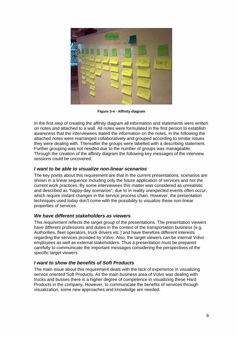
Figure 3-4 - Affinity diagram
In the first step of creating the affinity diagram all information and statements were written on notes and attached to a wall. All notes were formulated in the first person to establish awareness that the interviewees stated the information on the notes. In the following the attached notes were rearranged collaboratively and grouped according to similar issues they were dealing with. Thereafter the groups were labelled with a describing statement. Further grouping was not needed due to the number of groups was manageable. Through the creation of the affinity diagram the following key messages of the interview sessions could be uncovered:
I want to be able to visualize non-linear scenarios The key points about this requirement are that in the current presentations, scenarios are shown in a linear sequence including only the future application of services and not the current work practices. By some interviewees this matter was considered as unrealistic and described as “happy-day scenarios”, due to in reality unexpected events often occur, which require instant changes in the service process chain. However, the presentation techniques used today don’t come with the possibility to visualize these non-linear properties of services.
We have different stakeholders as viewers This requirement reflects the target group of the presentations. The presentation viewers have different professions and duties in the context of the transportation business (e.g. Authorities, fleet operators, truck drivers etc.) and have therefore different interests regarding the services provided by Volvo. Also, the target viewers can be internal Volvo employees as well as external stakeholders. Thus a presentation must be prepared carefully to communicate the important messages considering the perspectives of the specific target viewers.
I want to show the benefits of Soft Products The main issue about this requirement deals with the lack of experience in visualizing service oriented Soft Products. As the main business area of Volvo was dealing with trucks and busses there is a higher degree of competence in visualizing these Hard Products in the company. However, to communicate the benefits of services through visualization, some new approaches and knowledge are needed.
9
I want to show the overall flow of a service This requirement deals with a similar issue as the previous one but focuses on a more specific aspect of a service. As the benefit of some services cannot be easily communicated with a scenario the need for a holistic perspective on a service was expressed by some interviewees.
I want to involve viewers in the presentation Today’s presentations are communicated one-directed from the presenters and actors to the audience. Some interviewees mentioned the need for involving the audience due to this could enhance the understanding of complicated concepts. Furthermore in the context of discussing concepts and getting feedback of the viewers, a grading system was suggested, which allows the viewers to give their opinions.
I just want to press "play" and show the presentation This requirement deals with the complexity of holding a presentation today. A scenario must be developed, actors need to rehearse and all of them must be present at the presentation day. This is expensive and does not allow flexibility in who holds the presentation. The ideal from one of the interviewees would be to have a self-explanatory movie prepared that conveys the concepts in a nice way. This would allow anyone to hold a presentation fast, easy and cheap.
It should be easy, cheap and time-efficient to prepare a presentation Some interviewees expressed a need for a better way of preparing the presentations since current preparations are too time-consuming. A tool that could combine the whole purpose of the presentations, to convey the new concepts, would save a lot of time. The tool should allow a user to easily create a custom presentation in a scenario based approach. The interviewees explained that a solution like this might eliminate the need for expensive actors and that they could test and view the outcome of the presentation without the need of rehearsals.
I want to show the overall benefits and disadvantages of different Hard Product setups Some interviewees were more focused on the traditional Hard Products. Here the need for visualization was more oriented towards simulations. There was a need to be able to show different Hard Products setups and to test how these new setups would behave in the real world. The focus was also more development oriented and the needs for visualization were mainly to promote discussion with different stakeholders about new concepts.
I want interaction to test and discuss different concepts ("simulation") Related to the previous requirement, the more development oriented interviewees would like interaction with the presentation material. They explained that this was important to test different solutions in collaboration with the customer and as well give the customer a better understanding on why the new concept is better than the previous solution.
I want to impress the viewers If a presentation impresses the viewers, they could get a more positive view of the concepts presented. Also the company could give itself a modern and positive image through impressive presentations.
The presentation should be informative and explanatory This requirement deals with where the focus of a presentation should be. In contrast to the previews requirement some interviewees expressed that the focus should be on
10
conveying information and understanding of the new concepts, and not so much focus on “selling” the concepts.
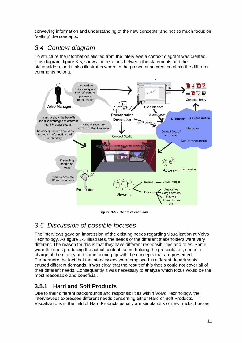
3.4 Context diagram To structure the information elicited from the interviews a context diagram was created. This diagram, figure 3-5, shows the relations between the statements and the stakeholders, and it also illustrates where in the presentation creation chain the different comments belong.
Figure 3-5 - Context diagram
3.5 Discussion of possible focuses The interviews gave an impression of the existing needs regarding visualization at Volvo Technology. As figure 3-5 illustrates, the needs of the different stakeholders were very different. The reason for this is that they have different responsibilities and roles. Some were the ones producing the actual content, some holding the presentation, some in charge of the money and some coming up with the concepts that are presented. Furthermore the fact that the interviewees were employed in different departments caused different demands. It was clear that the result of this thesis could not cover all of their different needs. Consequently it was necessary to analyze which focus would be the most reasonable and beneficial.
3.5.1 Hard and Soft Products Due to their different backgrounds and responsibilities within Volvo Technology, the interviewees expressed different needs concerning either Hard or Soft Products. Visualizations in the field of Hard Products usually are simulations of new trucks, busses
11
or their components. On the contrary, Soft Products visualizations make use of scenarios to illustrate the application of new services.
An interesting insight from the interviews was that the needs regarding Hard Products visualization were very specific in a lot of cases. Examples for those are the simulation of different factory layouts or simulations of different engine sizes to evaluate how they affect economical aspects. In this context it must be stated that simulation software for these purposes already is on the market (e.g. Flexsim, a software specialised for logistics simulation).
Furthermore, it was assessed that a focus on one of these rather specific Hard Products visualization needs would have left too many more holistic needs unconsidered. The main stakeholders of this thesis expressed anyway that a preference for Soft Products was desired. The reason for that was that Soft Products represent a rather new field within Volvo. Therefore less domain knowledge and experience is available. Consequently it was decided to focus solely on the visualization of Soft Products.
3.5.2 Innovative interaction solutions One interviewee suggested focusing on innovative ways of presenting. The associated ulterior motive would be to obtain a deep impression among the audience. In this context it was investigated if in addition to user interaction possibilities on the software user interface, innovative user interaction from the hardware perspective could be considered to augment the way of presenting.
Therefore some research on different interaction design techniques was conducted. An important criterion for deciding whether a technique would be appropriate was its ability of impressing the audience through its innovation as well as its usefulness in the application domain of presentations. Among the discussed techniques were Multi-Touch-Screens, Air-Touch-Interaction and Augmented Reality. Although all these techniques seemed capable of creating an impressive effect, they also have in common that a high amount of time is needed to implement them as reliable solutions. It was determined that it would have been necessary to put the major focus on the hardware during this thesis, whereas the focus on the visualization itself would have shifted to the background. After all this approach was considered as less beneficial due to it would have addressed mostly the requirement of impressing the viewers and it simultaneously would have left other important requirements aside.
3.5.3 “Happy Day Scenarios” One person introduced the term “Happy Day Scenario” during the interview sessions. It was used to criticise the character and presentation of today’s scenarios at Volvo Technology. It has to be mentioned that the usage of the term “Happy Day Scenario” was not clearly differentiated. In fact two different points of criticism were summarized by this term.
One of these points of criticism dealt with the fact that today’s scenarios were too sequential. It was suggested that it would be beneficial if the story of a scenario can be affected in real-time during a presentation. Consequently it would be possible to react on the audience’s questions. Furthermore the dynamic behaviour of the visualization would reflect the flexibility of the illustrated service solution in this way.
After elaborating this idea, it became clear that a realization would be very unrealistic. First of all an important requirement for such a solution would be a rather capacious scenario, which describes all possible tracks of the story and which foresees all possible changes in the story. None of the existing scenarios fulfils this requirement. Furthermore
12
a high amount of information about the service must be available to visualize it in this flexible way. This probably only applies to mature services, which are already close to the market. The suggested technique doesn’t seem to be suitable for early service ideas.
Also from the software development perspective, the realization of this idea has some weak points. As dynamical as the final visualization should be in the end, it simultaneously would be more difficult to design a flexible framework allowing an easy creation of visualizations of that kind. Finally, even if all other problems were solved in a convenient way, it would be still unclear whether this way of presenting is really beneficial. Due to these reasons, this idea was discarded.
The second point of criticism summarized by the term “Happy Day Scenario” takes up that today’s visualizations only illustrate a futuristic, flawless application of services and miss to mention what the current work practices look like. In this context it might be difficult for the viewers of the presentation to understand the benefits of the shown scenario because the difficulties and problems of the current work practices, which are solved by the new services, are not properly explained. But in fact these benefits are the major message, which should be communicated to the audience by the presentations.
When presenting new services, it can be assumed that the explanation of the present situation is important and should be part of the presentation. Therefore it was decided to keep this insight in mind, when creating the visualization part of this thesis.
3.5.4 Audience involvement In addition to the presenter’s interaction possibilities it was investigated how the audience could participate during the presentation, which was mentioned by some interviewees in the interview sessions.
In this context it needs to be explained, why audience participation can be beneficial for a presentation. First of all it could increase the presentation’s level of fun and excitement, as the way of presenting would be somehow uncommon and differ to the usual practice. Also, if the viewers do something more than passively listening, their understanding of the presentation’s message would probably be increased due to their active involvement.
Another argument in favour of audience participation might be that stakeholders could be integrated into the service development process in this way. They could easily give feedback to presented concepts, they could drive the process with new ideas and they could prevent that important needs are overlooked.
During the interview session a voting system was suggested as a way of dealing with the issue of integrating the audience into the development process. After further examinations it was determined that a focus on the technical realization of this voting system would take a huge part of the planned time frame of this thesis work. Similar to the innovative interaction techniques mentioned above, the focus would be shifted away from the visualization itself.
Another argument against the voting system was discovered in terms of many cases in which the purpose of the presentation is not to evaluate certain concepts, but to convince certain internal stakeholders to approve the further development of the service. In those cases the voting system as an evaluation tool wouldn’t make sense.
Furthermore a voting system can be considered as nothing more than a technical version of a questionnaire. Questionnaires can be produced very fast and time efficient whereas for the realization of a voting system a reasonable effort of development activities have to be planned. In the end the completed digital voting system might ease the handling of
13
collected data. However, it was determined that the final benefits wouldn’t justify the effort of realizing a voting system in the context of this thesis.
Another reason for involving the viewers in the presentation can be to increase their level of fun and understanding. One approach to this issue was to design a solution, which allows the viewers to interact with the presentation screen via Multi-Touch. A strong argument against a solution like that was the number of viewers, which might be up to 50 persons. With so many persons a reasonable collaborative interaction couldn’t be imagined. Another reason, which led to dismiss this approach, was the high amount of time, which is needed to establish the technical circumstances.
3.5.5 Visualization techniques The results from the interviews were discussed in relation to the pre-study “Digital animation as a scenario visualization tool”. It seemed that there was a mismatch between the needs from the interviews and the proposed software solution of the pre-study. The pre-study was focused on different methods for creating 3D animations, but disregarded other visualization techniques. Also the current presentation practice is dominated by 3D visualizations as the truck simulator environment plays mostly a dominant role.
The strong focus on 3D visualizations might be based on the traditional matters of Volvo Technology’s visualizations, which are Hard Products, like trucks and busses. Innovation in the field of Hard Products is characterized by optimizations of physical properties, e.g. properties of the chassis, engine etc. As spatial relations are important for these optimizations, three-dimensionality can become necessary in the related visualizations.
However, since services in the field of Soft Products mostly deal with actions and processes instead of physical properties, it must be questioned whether a dominant focus on 3D visualization is still justified. For visualizations of more abstract benefits, which don’t have spatial properties, three-dimensionality might be unnecessary. This issue also is important, when considering that the development of 3D visualizations is rather expensive and time-consuming. In conclusion it was decided to further investigate 3D, other visualization techniques and their impacts and benefits in the context of Soft Products visualizations.
3.5.6 Purposes of visualization The interview sessions revealed that the employees had a multiplicity of needs regarding visualizations. When analyzing the needs it became clear that the intended purposes of visualizations were manifold. Among the purposes were internal discussion, presentation of early concepts to external stakeholders, evaluation, education, convincing internal stakeholders and selling concepts to external stakeholders.
It must be stated that one type of visualization cannot take all these different purposes into account. The purpose of visualization has different impacts on aspects like visualization technique, level of fidelity or target group, which must be considered when dealing with visualizations. Underestimating the importance of this relation can lead to disadvantages in terms of unnecessarily high cost or simply that the visualization doesn’t fulfil its intended purpose.
However, it seemed that Volvo Technology wasn’t aware of this issue. At least the current visualization practice didn’t reflect a deeper preoccupation with the relation between purpose and level of fidelity or visualization technique. Accordingly, it was decided to investigate this issue further, as the consideration of it seemed to have a significant importance.
14
3.5.7 Easy-to-use software and time efficiency An important requirement for the creation of visualizations is time efficiency. In this context it was mentioned during the interviews that there is a need for software, which allows the time efficient production of visualizations. Time efficiency was especially connected with the complexity of the visualization software and the time needed to acquire sufficient skills in using it.
Also the pre-study discussed the need for an “easy-to-use” software. The pre-study concluded, that it is impossible to find an existing framework that would offer the desired usability and that would simultaneously allow the creation of the necessary content for visualizing the wide range of services. All too often it would be necessary to create e.g. 3D-models in professional 3D-software, which would require a high level of skill. Furthermore the aspects of future services, which would have to be visualized, cannot be predicted. Accordingly, an overall solution, which would provide 3D-models as ready-made building blocks in a library can hardly be prepared in advance.
Due to these reasons it cannot be expected that professional 3D-visualizations could be created without any skills in the creation of computer graphics and some learning effort is inevitable. This aspect also applies to other advanced visualization techniques. However, a general time-efficient approach might be to create visualizations as flexible as possible, so that parts of it could be easily reused in the future. Collecting and structuring the created content in a proper way, would be helpful to prevent redundant content creations in the future.
Another relevant issue regarding time efficiency might be that other visualization techniques might be easier to deal with than 3D visualizations. As mentioned above in the subchapter about visualization techniques, 3D visualization might not always be the most appropriate choice of medium. It can be concluded that it seems reasonable to investigate the role of time efficiency and usability in this context, too.
3.5.8 Actors and cost efficiency One relevant aspect in the context of cost efficiency is the integration of actors. Actors can be seen as a strong point in Volvo’s current visualizations of scenarios. They provide the user with a natural framework for presenting the new scenarios and they make it easy to imagine how the new concepts would work in real life situations.
But one of the downsides of using actors is the cost. The actors need to rehearse and be present at all presentations. For the person creating the scenario it also adds the uncertainty of not knowing how the presentation will look until they acted it out.
These were the main points the interviews expressed against the use of actors, but it was also noted that many of the new Soft Products concepts had more holistic benefits. These benefits cannot be explained as easy with representations of different stakeholders on stage. The interaction and collaboration of many Soft Products often have holistic long-term impacts and benefits. To understand these benefits a top-down perspective on the service would be necessary. But the presentation with the actors only displays actions on a lower level.
It is of course possible to integrate this more holistic perspective on new concepts in their current framework with actors. But the current work practice seems to put too much focus on individual stakeholders and their benefits, when the main messages of the concept sometimes are the holistic benefits.
15
In general it was decided to focus on solutions without actors. Although actors can be beneficial, it was determined that it is unproblematic to leave them apart when dealing with visualizations. It also was concluded to investigate further issues related to cost efficient ways of creating visualizations.
3.6 Focus of the thesis Volvo Technology’s original description of this thesis stated that the work items were:
I. Choice of a suitable (flexible & not too complex) digital animation software
II. Development or integration of vehicle models into the animation framework
III. Development of an inter-modal transport scenario
IV. Integration of digital animation framework into the concept studio
V. Finalizing the concept demonstrator.
The purpose of these work items was to show the benefits of standardized visualization techniques. In order to check whether a visualization technique is beneficial, its underlying purpose must be clear. In other words, visualization can only be beneficial, if it fulfils its purpose in a sufficient way. The intended purpose of the visualization was indirectly mentioned in the initial description in terms of demonstrating the benefits of future transport concepts to allow a decision on which concepts should be commercialized. This can be understood as the main intended purpose of the standardized visualization techniques would be evaluation.
However, the interview session clearly showed that the intended usage of visualization is to a considerably degree more diverse than just evaluation. In fact, different issues like selling concepts to external stakeholders, convincing internal stakeholders, internal discussions and informal education were mentioned among the intended purposes. Each of those purposes requires a different approach to visualization, as different aspects would have to be emphasized. In particular the choice of a suitable visualization technique changes with different purposes. In this context the choice of appropriate digital animation software and the development of a software framework, which would satisfy the needs of all the different purposes, is considered as an impossible task.
Moreover, the realization of a digital animation software framework or a focus on innovative interaction techniques would require a decision about a distinct visualization purpose. The development of a solution in these categories would spend the scheduled time frame in large part. Although the functionality of the Concept Studio could be enhanced in this way, the existing dilemma of using the same visualization technique for a multiplicity of different purposes would still be unsolved.
On that account it was decided to focus on a practical solution in terms of a guide, which helps on deciding on suitable visualization techniques dependent on different purposes. This was considered as the most beneficial approach for Volvo Technology, as it could be helpful for a wide range of employees dealing with different visualization purposes. Furthermore, a well-structured guide could support decisions on time and cost efficient visualization techniques, which still fulfil the intended purpose in a good way. In particular this benefit was considered as important, as the need for time and cost efficient solutions was clearly identified during the interview sessions. Also when taking a look on today’s preferred visualization method, which can be described as very complex and time-consuming, the need for more efficient solutions is apparent.
16
Furthermore it was decided to create an exemplified visualization for a certain purpose. This visualization should give an example of choosing the appropriate technique for a distinct purpose. The creation of this concept demonstrator would allow further evaluations of the main underlying theoretical framework. Moreover, by using a different visualization technique than today’s truck simulator approach, it could be beneficial in broadening Volvo Technology’s perspective on the multiplicity of available visualization techniques. Regarding the development of the concept demonstrator, it was decided to put importance on choosing a visualization software application, which is reasonably easy to learn.
17
4 Purpose and Fidelity of Visualization
4.1 Different purposes – one solution? The analysis of the interviews revealed the diversity regarding the expectations of visualizations among the Volvo Technology employees as well as differences in the purpose of visualizations. Whereas some have expressed their need of using visualizations for the purpose of evaluation, others explained that they need visualizations to sell concepts or to convince internal and external stakeholders with certain ideas. Altogether it can be summarized that the interviewees wished an overall visualization solution, which satisfies their individual needs and which can be used for different purposes. But how can one modality of visualization satisfy so many different needs? Could one way of visualizing fulfil such a diversity of purposes? Considering the multiplicity of visualization techniques and their differences in expenditure and expression this can be heavily doubted.
4.2 What you should know before visualizing But how should you then visualize something? In fact this question shouldn’t be asked in the first place, because other issues, which influence the decision about the medium of visualization, have to be solved first. Burkhard and Meier (2005) suggest four questions, which needs to be answered to ensure that knowledge is efficiently transferred with the help of visualizations:
Why should knowledge be visualized? (aim)
What type of knowledge needs to be visualized? (content)
Who is being addressed? (recipient)
What is the best method to visualize this knowledge? (medium)
As it is obvious the first question already deals with the aim or in other terms the purpose of the visualization. The purposes of visualizations can be manifold. Examples of purposes are idea validation, evaluation, feedback collection, arousal of innovation, education and advertisement. The given purposes differ a lot and it is evident that they would lead to very different visualizations.
Having a clear answer to the first question, allows reasoning about which aspects of a product actually have to be represented in the visualization and which can or should be left apart. The second question, which focuses on the actual content of visualization, deal with these issues. For example, when planning to conduct an evaluation, it is only necessary to represent the aspects, which needs to be evaluated. When creating advertisements only certain aspects of a product might cause the desired impact and they are therefore emphasized in the visualization.
Furthermore useful insights about the necessary level of detail can be obtained by clarifying this question. If for example in an early development stage only the idea of using a public transport bus for passengers and cargo should be communicated, it might be enough to explain this with simple sketches. If on the other hand it should be elaborated how a bus must be constructed to support this multimodality, it would be necessary to display detailed models, which show how the bus interior can be transformed to support cargo transportation. In the context of evaluations, Söderman (2001) also suggests questions similar to Burkhard and Meier’s first two questions, which needs to be dealt with before visualizing:
18
What are the questions to be answered about the product (concept)?
What is the purpose of the evaluation?
Burkhard and Meier’s third question takes up the importance of the awareness of the designated target group of the visualization. Different properties like age, education or profession may have influence on the character and style of the visualization as well as on its content.
Finally, not until the first three questions have been answered, the fourth question takes up the decision about the visualization method. In fact it can hardly be decided how to visualize something without knowing why, what exactly and for who the visualization should be. When analyzing how Volvo Technology deals with visualizations, it cannot be concluded that the first three questions are not answered at all. However, the necessary connection between the answers of the first three questions and their impact on decisions about the visualization method is lacking.
4.3 Aren’t high-fidelity visualizations always beneficial? A common opinion about visualization might be that a high degree of realism, fidelity or detail always is favourable. This belief can also be recognized when taking a look on Volvo Technology’s work practice. Here the truck simulator environment, using 3D graphics, is basically the preferred solution for all kinds of visualizations. But is a focus on high-fidelity visualizations always necessary? Furthermore it can be questioned whether there are situations when high-fidelity visualizations could be disadvantageous.
One could argue now that less detailed visualizations might decrease the interest of the viewers and their attention. In this context van den Hende et al. (2007) have examined the emersion of viewers dependant on different visualization techniques. This paper gives empirical support that the comprehension, narrative realism, and narrative informativeness was not affected whether it was a drawing, photo or animation. In fact in this study, drawing caused the highest level of immersion.
Hughes (2004) discusses the shift of focus when visualizing. Even if Hughes’ research mainly focuses in the direction of road planning and issues more related to authorities in the field of transportation, his views regarding visualization are relevant. He argues that visualization should not be about creating high-resolution pictures but rather focus on communicating and clarifying the concept and values to the users. The efficiency of this communication is not necessarily increased with animations and real-time simulations, and designers should instead put more focus on what information is relevant to communicate the important messages. The visualization should help to create a consensus around the concept between the designers and the viewers that meet the needs and values of the users. He also argues that visualization with the wrong focus even can distract and shift the focus to less important aspects.
4.4 Low-fidelity visualization can even lead to better feedback
According to Söderman (1997), the choice of product representation even changes the viewer’s view of the concept. Paper-sketches for example can promote discussion and participation from the viewers more than a virtual reality representation. This is because of a virtual reality representation has more authority providing the viewers with a more “finished” look that limits people’s engagement due to the belief that it already is decided how it will look.
19
This is another important aspect showing the impact of the purpose on the choice of medium. If the aim of visualization is for example the evaluation of some initial concepts, participation and discussion among the participants would be appreciated and paper sketches could represent a valuable choice of medium supporting this behavior. If the purpose of the visualization is to sell the concept externally or to “sell” internally in terms of receiving recourses for continued development, a more detailed visualization would be beneficial to provide the underlying concepts with a professional and sophisticated touch. Thus using the same visualization technique for both purposes wouldn’t be suitable.
Although Söderman’s research mainly deals with product representations of physical artifacts, cars, chairs etc. it is reasonable to believe that it also applies to services, which Volvo Technology is interested in presenting, due to the fact that services have similar to physical artifacts different aspects, which evolve and are shaped during a development process. In some cases, services might even have a higher number of distinct aspects since a future transport scenario is a lot more complex than a chair.
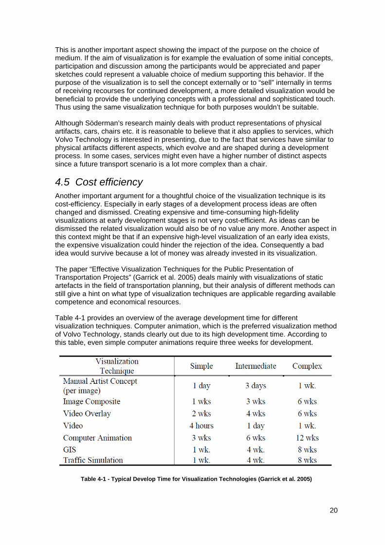
4.5 Cost efficiency Another important argument for a thoughtful choice of the visualization technique is its cost-efficiency. Especially in early stages of a development process ideas are often changed and dismissed. Creating expensive and time-consuming high-fidelity visualizations at early development stages is not very cost-efficient. As ideas can be dismissed the related visualization would also be of no value any more. Another aspect in this context might be that if an expensive high-level visualization of an early idea exists, the expensive visualization could hinder the rejection of the idea. Consequently a bad idea would survive because a lot of money was already invested in its visualization.
The paper “Effective Visualization Techniques for the Public Presentation of Transportation Projects” (Garrick et al. 2005) deals mainly with visualizations of static artefacts in the field of transportation planning, but their analysis of different methods can still give a hint on what type of visualization techniques are applicable regarding available competence and economical resources.
Table 4-1 provides an overview of the average development time for different visualization techniques. Computer animation, which is the preferred visualization method of Volvo Technology, stands clearly out due to its high development time. According to this table, even simple computer animations require three weeks for development.
Table 4-1 - Typical Develop Time for Visualization Technologies (Garrick et al. 2005)
20
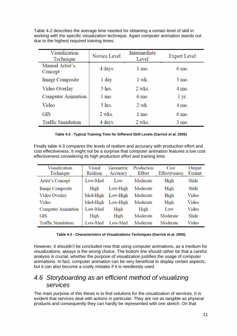
Table 4-2 describes the average time needed for obtaining a certain level of skill in working with the specific visualization technique. Again computer animation stands out due to the highest required training times.
Table 4-2 - Typical Training Time for Different Skill Levels (Garrick et al. 2005)
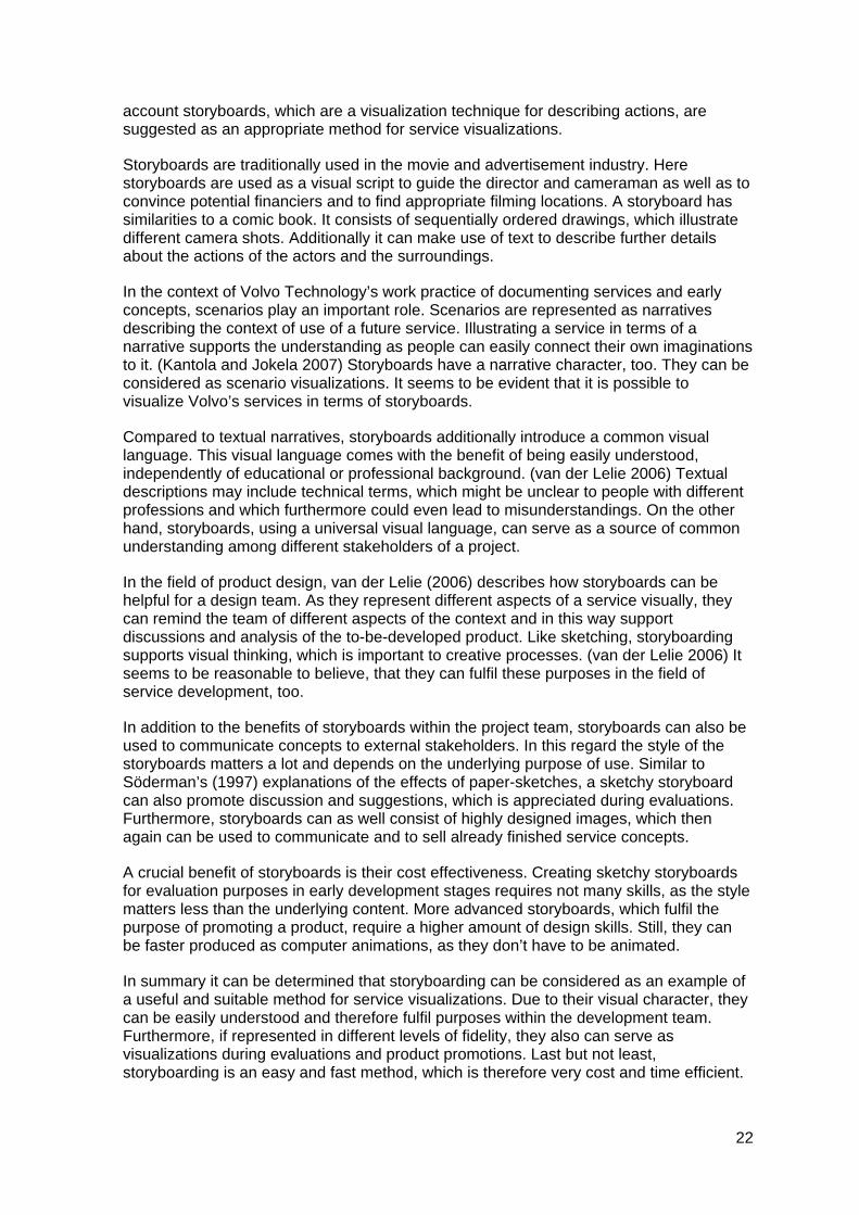
Finally table 4-3 compares the levels of realism and accuracy with production effort and cost effectiveness. It might not be a surprise that computer animation features a low cost effectiveness considering its high production effort and training time.
Table 4-3 - Characteristics of Visualizations Techniques (Garrick et al. 2005)
However, it shouldn’t be concluded now that using computer animations, as a medium for visualizations, always is the wrong choice. The bottom line should rather be that a careful analysis is crucial, whether the purpose of visualization justifies the usage of computer animations. In fact, computer animation can be very beneficial to display certain aspects, but it can also become a costly mistake if it is needlessly used.
4.6 Storyboarding as an efficient method of visualizing services
The main purpose of this thesis is to find solutions for the visualization of services. It is evident that services deal with actions in particular. They are not as tangible as physical products and consequently they can hardly be represented with one sketch. On that
21
account storyboards, which are a visualization technique for describing actions, are suggested as an appropriate method for service visualizations.
Storyboards are traditionally used in the movie and advertisement industry. Here storyboards are used as a visual script to guide the director and cameraman as well as to convince potential financiers and to find appropriate filming locations. A storyboard has similarities to a comic book. It consists of sequentially ordered drawings, which illustrate different camera shots. Additionally it can make use of text to describe further details about the actions of the actors and the surroundings.
In the context of Volvo Technology’s work practice of documenting services and early concepts, scenarios play an important role. Scenarios are represented as narratives describing the context of use of a future service. Illustrating a service in terms of a narrative supports the understanding as people can easily connect their own imaginations to it. (Kantola and Jokela 2007) Storyboards have a narrative character, too. They can be considered as scenario visualizations. It seems to be evident that it is possible to visualize Volvo’s services in terms of storyboards.
Compared to textual narratives, storyboards additionally introduce a common visual language. This visual language comes with the benefit of being easily understood, independently of educational or professional background. (van der Lelie 2006) Textual descriptions may include technical terms, which might be unclear to people with different professions and which furthermore could even lead to misunderstandings. On the other hand, storyboards, using a universal visual language, can serve as a source of common understanding among different stakeholders of a project.
In the field of product design, van der Lelie (2006) describes how storyboards can be helpful for a design team. As they represent different aspects of a service visually, they can remind the team of different aspects of the context and in this way support discussions and analysis of the to-be-developed product. Like sketching, storyboarding supports visual thinking, which is important to creative processes. (van der Lelie 2006) It seems to be reasonable to believe, that they can fulfil these purposes in the field of service development, too.
In addition to the benefits of storyboards within the project team, storyboards can also be used to communicate concepts to external stakeholders. In this regard the style of the storyboards matters a lot and depends on the underlying purpose of use. Similar to Söderman’s (1997) explanations of the effects of paper-sketches, a sketchy storyboard can also promote discussion and suggestions, which is appreciated during evaluations. Furthermore, storyboards can as well consist of highly designed images, which then again can be used to communicate and to sell already finished service concepts.
A crucial benefit of storyboards is their cost effectiveness. Creating sketchy storyboards for evaluation purposes in early development stages requires not many skills, as the style matters less than the underlying content. More advanced storyboards, which fulfil the purpose of promoting a product, require a higher amount of design skills. Still, they can be faster produced as computer animations, as they don’t have to be animated.
In summary it can be determined that storyboarding can be considered as an example of a useful and suitable method for service visualizations. Due to their visual character, they can be easily understood and therefore fulfil purposes within the development team. Furthermore, if represented in different levels of fidelity, they also can serve as visualizations during evaluations and product promotions. Last but not least, storyboarding is an easy and fast method, which is therefore very cost and time efficient.
22
4.7 Summary In summary it must be determined that the purpose of a visualization plays a major role for the choice of the visualization technique and level of fidelity. Ignoring the correlation between purpose, choice of medium and level of detail can result in visualizations, which do not attain their goals, which are perceived in the wrong manner or which spend too many expenditures. For this reason it was concluded to develop a decision framework for Volvo Technology, which helps in deciding about suitable visualization techniques dependant on the purpose and development stage of a service. In the following this framework is introduced and explained.
23
5 Visualization Guidelines
This chapter is meant to be a guide supporting Volvo Technology in dealing with visualization. In section 5.1 a framework is provided, which explains different visualization purposes and suggests related levels of fidelity and other aspects to consider. Section 5.2 introduces design guidelines, which provide suggestions about how visualization can be designed to enhance the understanding of the audience.
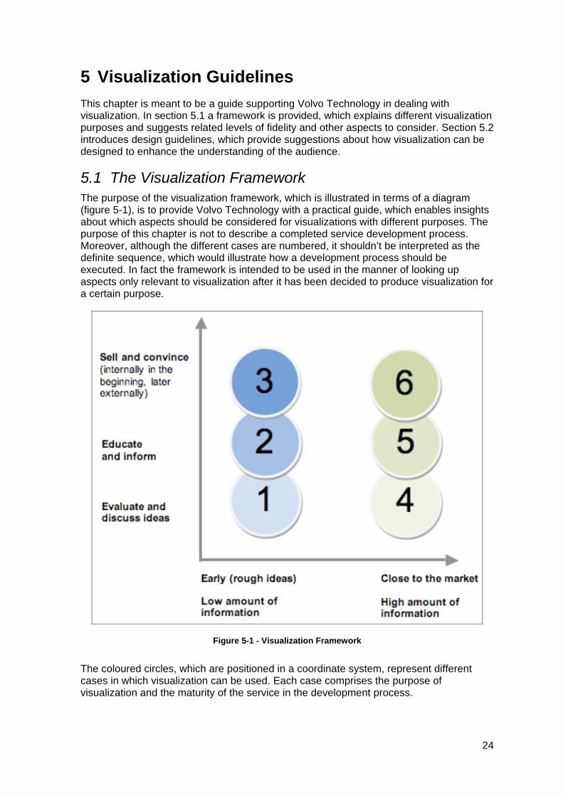
5.1 The Visualization Framework The purpose of the visualization framework, which is illustrated in terms of a diagram (figure 5-1), is to provide Volvo Technology with a practical guide, which enables insights about which aspects should be considered for visualizations with different purposes. The purpose of this chapter is not to describe a completed service development process. Moreover, although the different cases are numbered, it shouldn’t be interpreted as the definite sequence, which would illustrate how a development process should be executed. In fact the framework is intended to be used in the manner of looking up aspects only relevant to visualization after it has been decided to produce visualization for a certain purpose.
Figure 5-1 - Visualization Framework
The coloured circles, which are positioned in a coordinate system, represent different cases in which visualization can be used. Each case comprises the purpose of visualization and the maturity of the service in the development process.
24
The x-axis in the diagram represents the maturity of a service in the development process. It reflects the development from early rough ideas to a fully developed service. Additionally it is specified in the diagram that the degree of existing information rises along the x-axis.
The y-axis represents the purpose of the visualization. Three different purposes are specified: Evaluation and discussion, education and information as well as selling and convincing. The different purposes are also connected with the target audience of the visualization.
5.1.1 Case 1: Evaluation in early stages Case 1 represents the purpose of evaluation in an early stage. The activities in this case are focused on discussing, evaluating and elaborating newly evolved service ideas. The main aim might be to find out whether an idea is promising in a general sense.
It seems reasonable to believe that simple sketches might be enough to visualize these ideas. As the purpose of the stage is not to sell concepts, nobody needs to be impressed. Instead the focus should also be clearly on identifying negative aspects of the idea.
Furthermore, a sketchy look-and-feel increases the emergence of feedback, which is highly desirable for evaluation purposes. Especially when presenting visualized ideas to external stakeholders a sketchy look-and-feel can be beneficial, as the stakeholders would get the right impression about the maturity of the ideas. More professionally styled visualizations could give the impression that the ideas are already far developed. Consequently people could feel more inhibited in criticizing major issues. Thus, they can get distracted by the nice looking visualization and accordingly tend to focus on details. However, in early evaluation stages a focus on major issues is more reasonable.
Dependent on the underlying concepts, sketches can be ordered in terms of storyboards. As described in chapter 4.6, storyboards are considered as very compatible with services. In this context it can be assumed that in very early stages a concept doesn’t comprise much information. An early service concept might not be coherent yet and might consist of unconnected single aspects. In these cases it might be therefore not possible to create a storyboard and single sketches might be more suitable.
It also can be assumed that application domain experts can understand the broader context of concepts represented in terms of single sketches. Experts might not need a storyline or scenario to identify advantages or disadvantages of a certain concept. Whereas novices of a certain domain might more easily understand a concept if it is illustrated in the manner of scenarios, which underlie storyboards. Consequently storyboards might be easier to understand than sketches for domain novices.
Another benefit of sketches is that they can be produced very efficiently. As the style doesn’t have to be nice, everybody can create sketches within a short time. In early stages this is especially beneficial, as concepts often have to go through several iterations. No time is wasted in visualizing ideas, which might be dismissed later. Furthermore, dismissing of bad ideas is encouraged, as it doesn’t hurt to throw away a sketch. Bad ideas, which already are visualized in a nicer more expensive way, are harder to dismiss, as it might be painful to throw away the nice-looking expensive visualization.
25
5.1.2 Case 2: Education and information in early stages Case 2 represents the purpose of education in an early stage. The context of this case might be to inform e.g. new team members or external stakeholders about the current development state.
The clear focus of visualizations in these cases is information. Similar to evaluation visualizations, the focus should not be on impressing someone. Instead the represented information possesses a high importance. Comparing the purpose of education to the purpose of evaluation, a clear difference is that discussion or feedback might not be that important. Therefore too sketchy visualizations might not be appropriate. Still, it must be considered that a concept in an early stage can change a lot in further stages. Consequently, the educational visualizations in early stages shouldn’t cost too much, as they might not be reused in later stages.
As described in the previous subchapter, domain novices might understand complicated concepts better, if they are illustrated within a storyline or scenario. Accordingly, carefully produced storyboards seem to be an appropriate choice of medium. First of all, storyboards are cheap in production, as they don’t require complex animation skills or development. Secondly, they provide a visual language to tell a story, in a manner, which is understandable to everyone. Another benefit of carefully prepared storyboards in this context is that they can be dealt with without a presenter who explains the context. In this way they could fulfil the purpose of an explanatory manual, which e.g. new team members can look on and read to gain knowledge about the concept.
5.1.3 Case 3: Selling and convincing in early stages Case 3 deals with the purpose of selling and convincing in an early stage. Visualizations in this case are mainly used to get approval from managers or other stakeholders for the continuation of a project. In these cases the information represented in the visualization plays of course an important role.
Also the impression of the visualization is rather important. A visualization, which impresses, can lead to a positive opinion about the underlying concepts among the stakeholders. A professional look-and-feel could communicate professionalism of the visualized concept. Furthermore professional visualizations can communicate authority.
Regarding the choice of medium for these cases, too concrete recommendations can hardly be made, except for that the visualization should reflect a neat professional impression. However, that shouldn’t lead to the conclusion that only high-end 3D movies would be applicable. Also more cost-efficient storyboards, which make use of nicely produced images, could impress the audience.
5.1.4 Case 4: Evaluation in late stages Case 4 deals with the visualization purpose of evaluation purposes in late stages. Compared to evaluations in early stages, the focus might be rather on detailed aspects than on the whole context of the service concept. It is assumed that the majority of the information related to the service concept is already far developed. In the same manner as in early stages, it is not necessary to impress the audience.
When preparing visualizations for this case it is important to illustrate the concepts in a more detailed way than in earlier stages. The participants of the evaluation session shouldn’t question general matters, which have already been evaluated but rather focus on particular detailed aspects. The results of the evaluation should allow defining the service more precisely in a reliable way. On the one hand the style of the visualization shouldn’t be too sketchy, because that would lead to very general feedback and could
26
hinder the focus on details. On the other hand the style shouldn’t be too impressive because in this way feedback could be hindered, as it would be communicated that the concept already is perfect.
It is difficult to suggest a certain medium of visualization for this case as many might be suitable and the decision is also dependant on the specific character of the concept. Still a good strategy might be to focus in particular on the information content of the visualization. Only if the information is present in a sufficient level of detail, it would be possible to identify smaller weaknesses of the concept.
5.1.5 Case 5: Education and information in late stages Case 5 represents the visualization purpose of education in late stages. Similar to education in early stages the focus should lie on the explanation of information instead of on an impressive look. In fact, it doesn’t really matter which visualization technique is used in this case as long as it helps to clarify matters.
Furthermore it can be expected that the service concept is nearly completed at this point. Accordingly it is reasonable to believe that the contents of a created visualization wouldn’t change much in the future and it can be reused for the same purpose several times. Therefore it might make sense to consider the cost of the visualization in connection with future reuse possibilities. In this context it can also be reasonable to think about more time-consuming expensive visualization techniques, if they help to fulfil the intended purpose.
5.1.6 Case 6: Selling and convincing in late stages Case 6 deals with the purpose of selling and convincing in late stages. In the same manner of convincing in early stages the professional impression and information are the aspects to put a focus on.
In fact visualizations in these cases fulfil the same purposes as pure advertisements. In this context it seems to be appropriate to hire a professional advertisement agency for the production of a suitable visualization. Cost aspects must be as well conceived in connection with the usage continuance of the visualization. Similar to educational visualization in late stages, visualization in this case might be used several times without changes, because the service concept should be already finalized to some extent. Accordingly high-end impressive visualizations might be justified.
5.2 Design Guidelines In the context of designing the concept demonstrator, it was determined that it would be useful to come up with guidelines, which deal with how visualizations and presentations in general can be designed to be perceived and understood well. In order that these kinds of guidelines are beneficial for Volvo Technology, it was concluded that the guidelines must be tailored to presentations in the Concept Studio. Furthermore they should take into account the findings of the interview sessions.
5.2.1 Telling a story with the Comics Metaphor At Volvo Technology conceptual Soft Products or services usually are documented in terms of scenarios. A scenario is basically a narrative describing an exemplified context of use of the specific service. In order to communicate the contents of a service for different purposes, these scenarios are presented in the form of a play with actors supported by visualizations on the screen.
27
In fact this approach comes with a lot of advantages. A play with an underlying story allows communicating information in an easily understandable fashion. The reason for this is that a story includes a lot of implicit and uncertain information. The audience of the story usually fills their own experiences and imaginations in these uncertainties and can therefore get “intellectually and emotionally attached to the story.” (Gershon 2001) It can be assumed that the presence of real actors can even strengthen this emotional attachment as people could recognize themselves even better in the actors conveying a certain personal touch. Furthermore storytelling can have a positive effect when feedback from the audience to some content is desired as according to Gershon (2001) it “taps the human’s mind’s creative and artistic mode”.
However, the analysis of the interview sessions revealed that one desired requirement for this thesis is to show ways of presenting services without actors, because they are expensive. Regardless of the described benefit of actors it is certainly as well possible to tell a story just on the screen with the aid of visualizations. Anyhow it seems to be reasonable that at least a presenter is needed as well to guide through the presentations and to answer upcoming questions.
When telling a story visually it is undeniably important that the viewers can follow the reasoning of the storyline. Especially in the context of services a lot of different activities might be connected and for the understanding of the benefits it is required to remember the interplay between those. Showing one isolated visual representation after each other as it usually is done in PowerPoint or a presentation, which solely relies on continuous animation are not good ways of supporting this understanding. The reason for this is that the viewers have to rely on visual memory to keep up interconnections, which is a rather “weak skill” (Tufte 1990) and they may not be able to recall what happened a few moments before. (Gershon 2001) Another negative side effect of isolated screens with a low amount of information is that it can cause passivity and ignorance among the viewers. (Tufte 1990)
A good solution for establishing an understanding of a visually told story is the Comics Metaphor described by Gershon (2001). Similar to a traditional comic book certain parts of the story are displayed in separate frames on the screen. The contents of each frame can be an animation, a short movie as well as a still image. The presenter can tell the story by commenting and describing one frame after each other. Due to the frames remain on screen after being dealt with, the viewers don’t have to rely on visual memory and get an overview of associated aspects. The setup of Volvo Technology’s Concept Studio includes a big back-projected screen supporting a resolution of four times HD. Considering this high resolution it seems to be appropriate to use the Comics Metaphor with its support for a high amount of information.
However, when displaying this high amount of information at the same time, it also is important to provide the viewers with guidance where to focus, so to speak at which part of the story they are at the moment. When applying a visual search for a certain piece of interest the human mind pre-processes the whole environment in a limited way. The single piece of interest needs to stand out in comparison to its surroundings due to a certain feature, which can be e.g. colour, shape, size, orientation and movement. (Ware 2008) (See also chapter 2.2 for information about visual information processing in the human mind) In the example of the concept demonstrator this is achieved through movement as the active frame appears on the screen and contains animated content.
According to Gershon (2001), another aspect, which improves visual storytelling, is continuity. This basically means that the distinct parts of the visualization are connected through logical transitions. This can be achieved through the meaningful application of animations. Also, recurring elements, which provide an overview of the story, can be
28
helpful in this regard. In the concept demonstrator the map displaying the route of the delivery fulfils this purpose. It represents the timeline of the story and provides a sense of location through an animation, which shows the first frame of a scene expanding out of a point on the map, where the actions of this scene take place.
Summary:
Storytelling attaches emotionally and intellectually because the audience fills the implicit information and uncertainties with their own experiences and imaginations. It also inspires the human’s creative mind and can therefore be beneficial for generating feedback.
Telling a story visually with the Comics Metaphor can establish a good understanding because it doesn’t rely on the weak visual memory and it avoids passivity and ignorance among the viewers through its high amount of information.
When a high amount of information is shown at the same time, the momentary point of focus must stand out by a distinct attribute like colour, shape, size, orientation or movement.
Continuity improves a visual story by regularly providing an overview and logical transitions (e.g. animations) between parts of the story.
5.2.2 Explaining relations with textual and visual information Visual designs are in most cases hybrids of language and visual information. (Ware 2008) This also applies for Volvo Technology’s presentations held in the Concept Studio since they comprise visualizations, which comprehend visual and textual information as well as actors and presenters, which convey spoken language and gestures. As it is described in detail in the theoretical background, the perception and processing of visual information and language-based information in the human mind are fairly different. Both media come with different advantages and disadvantages of expressing particular circumstances. In the context of designing and giving a presentation it is undeniably important to be aware of these issues to establish good understanding among the audience of the presentation.
The visual system, which processes visual information in the human mind, is especially good at perceiving patterns and at assembling them to familiar objects with their connected features. Therefore the usage of visual media is especially recommended for displaying structural relationships. Figure 5-2 shows clearly how much better a hierarchical company structure can be understood in a visual diagram compared to a text. Also spatial aspects as who belongs to which department can be perceived very fast in the pictorial representation.
29
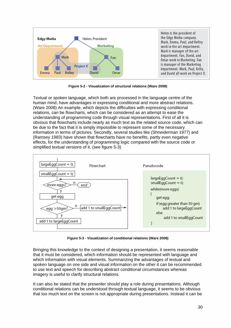
Figure 5-2 - Visualization of structural relations (Ware 2008)
Textual or spoken language, which both are processed in the language centre of the human mind, have advantages in expressing conditional and more abstract relations. (Ware 2008) An example, which depicts the difficulties with expressing conditional relations, can be flowcharts, which can be considered as an attempt to ease the understanding of programming code through visual representations. First of all it is obvious that flowcharts include nearly as much text as the related source code, which can be due to the fact that it is simply impossible to represent some of the necessary information in terms of pictures. Secondly, several studies like (Shneiderman 1977) and (Ramsey 1983) have shown that flowcharts have no benefits, partly even negative effects, for the understanding of programming logic compared with the source code or simplified textual versions of it. (see figure 5-3)
Figure 5-3 - Visualization of conditional relations (Ware 2008)
Bringing this knowledge to the context of designing a presentation, it seems reasonable that it must be considered, which information should be represented with language and which information with visual elements. Summarizing the advantages of textual and spoken language on one side and visual information on the other it can be recommended to use text and speech for describing abstract conditional circumstances whereas imagery is useful to clarify structural relations.
It can also be stated that the presenter should play a role during presentations. Although conditional relations can be understood through textual language, it seems to be obvious that too much text on the screen is not appropriate during presentations. Instead it can be
30

recommended that the presenter should communicate most of the information through spoken language. (Ware 2008)
31
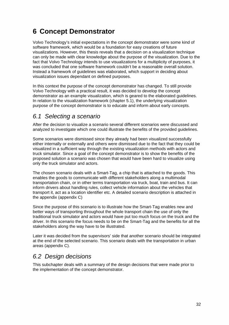
6 Concept Demonstrator
Volvo Technology’s initial expectations in the concept demonstrator were some kind of software framework, which would be a foundation for easy creations of future visualizations. However, this thesis reveals that a decision on a visualization technique can only be made with clear knowledge about the purpose of the visualization. Due to the fact that Volvo Technology intends to use visualizations for a multiplicity of purposes, it was concluded that one software framework couldn’t be a reasonable overall solution. Instead a framework of guidelines was elaborated, which support in deciding about visualization issues dependant on defined purposes.
In this context the purpose of the concept demonstrator has changed. To still provide Volvo Technology with a practical result, it was decided to develop the concept demonstrator as an example visualization, which is geared to the elaborated guidelines. In relation to the visualization framework (chapter 5.1), the underlying visualization purpose of the concept demonstrator is to educate and inform about early concepts.
6.1 Selecting a scenario After the decision to visualize a scenario several different scenarios were discussed and analyzed to investigate which one could illustrate the benefits of the provided guidelines.
Some scenarios were dismissed since they already had been visualized successfully either internally or externally and others were dismissed due to the fact that they could be visualized in a sufficient way through the existing visualization methods with actors and truck simulator. Since a goal of the concept demonstrator is to show the benefits of the proposed solution a scenario was chosen that would have been hard to visualize using only the truck simulator and actors.
The chosen scenario deals with a Smart-Tag, a chip that is attached to the goods. This enables the goods to communicate with different stakeholders along a multimodal transportation chain, or in other terms transportation via truck, boat, train and bus. It can inform drivers about handling rules, collect vehicle information about the vehicles that transport it, act as a location identifier etc. A detailed scenario description is attached in the appendix (appendix C)
Since the purpose of this scenario is to illustrate how the Smart-Tag enables new and better ways of transporting throughout the whole transport chain the use of only the traditional truck simulator and actors would have put too much focus on the truck and the driver. In this scenario the focus needs to be on the Smart-Tag and the benefits for all the stakeholders along the way have to be illustrated.
Later it was decided from the supervisors’ side that another scenario should be integrated at the end of the selected scenario. This scenario deals with the transportation in urban areas (appendix C).
6.2 Design decisions This subchapter deals with a summary of the design decisions that were made prior to the implementation of the concept demonstrator.
32
6.2.1 Presenter In the analysis phase of the thesis it was decided to create the visualization without actors, but it wasn’t investigated whether there should be a need for a presenter or if the visualization should speak for itself.
The analysis of the scenario leads to the conclusion that a presenter was beneficial when presenting a new scenario, first of all to be able to answer question and uncertainties from the viewers, but also to elaborate the benefits of the scenario.
To elaborate the visualization could have been done with a speaker voice in a movie, but it was noted that the natural interaction with question and further explanation from a presenter was more beneficial. The reason for this conclusion is because many benefits in the scenario are not that obvious, they are not directly linked to the course of actions seen in the scenario. For example, a system that limits the truck’s speed can be described from numeral different perspectives and comprises many conditions. It can increase the lifespan of the truck, contribute to safer roads, ensure safety of goods etc.
As described in the design guidelines in chapter 5.2.2 conditional relations can be best explained in terms of textual or spoken language. Due to the fact that too much text on the screen would overstrain the audience and decrease the level of enjoyment, it was decided that these benefits could be best explained by spoken language, thus a presenter.
6.2.2 Interaction Even though in the analysis phase it was dismissed to include audience interaction, it was still discussed how and if the presenter should be able to interact with the visualization.
To simply have a movie that explained the whole scenario by itself was discarded due to several reasons. The first was that it was reasonable to believe that questions might occur during the presentation. To simply have a movie might lead viewers to forget these questions until the end of the movie and it also gets harder to discuss something that happened earlier.
In conclusion it was decided to divide the animation into steps, having natural pauses in between animations where the presenter could give more detailed explanations of what is happening or answer questions. The interaction also allows the presenter to go back to previous animations if explanations require support of earlier animations.
6.2.3 Layout This subchapter deals with the choices made regarding how to structure and present the animations in the visualization of the scenario.
When analyzing the scenario it became clear that more than the available narrative was needed to clearly visualize how the Smart-Tag would work and what the benefits of it would be. This has to do with the fact that the available scenario mainly shows how the Smart-Tag affects its surroundings and doesn’t put focus on the Smart-Tag itself
6.2.3.1 Main area The selected scenario consists of five scenes taking place at different locations along an inter-modal transportation chain. To ensure that the viewers always have a sense of location it was decided to create a map of the whole transport chain as a starting point for the visualization (figure 6-1). This map is used to follow the goods along the transport chain and then zoom in on different scenes of the scenario. If we are at the factory, the
33
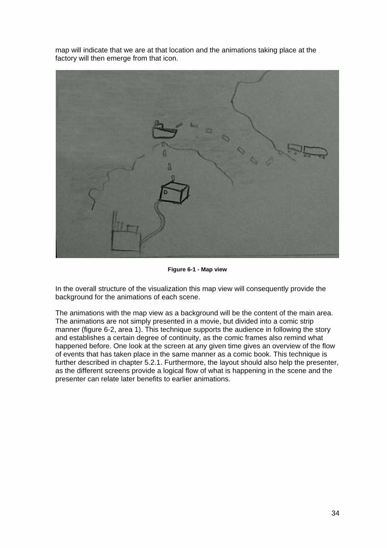
map will indicate that we are at that location and the animations taking place at the factory will then emerge from that icon.
Figure 6-1 - Map view
In the overall structure of the visualization this map view will consequently provide the background for the animations of each scene.
The animations with the map view as a background will be the content of the main area. The animations are not simply presented in a movie, but divided into a comic strip manner (figure 6-2, area 1). This technique supports the audience in following the story and establishes a certain degree of continuity, as the comic frames also remind what happened before. One look at the screen at any given time gives an overview of the flow of events that has taken place in the same manner as a comic book. This technique is further described in chapter 5.2.1. Furthermore, the layout should also help the presenter, as the different screens provide a logical flow of what is happening in the scene and the presenter can relate later benefits to earlier animations.
34
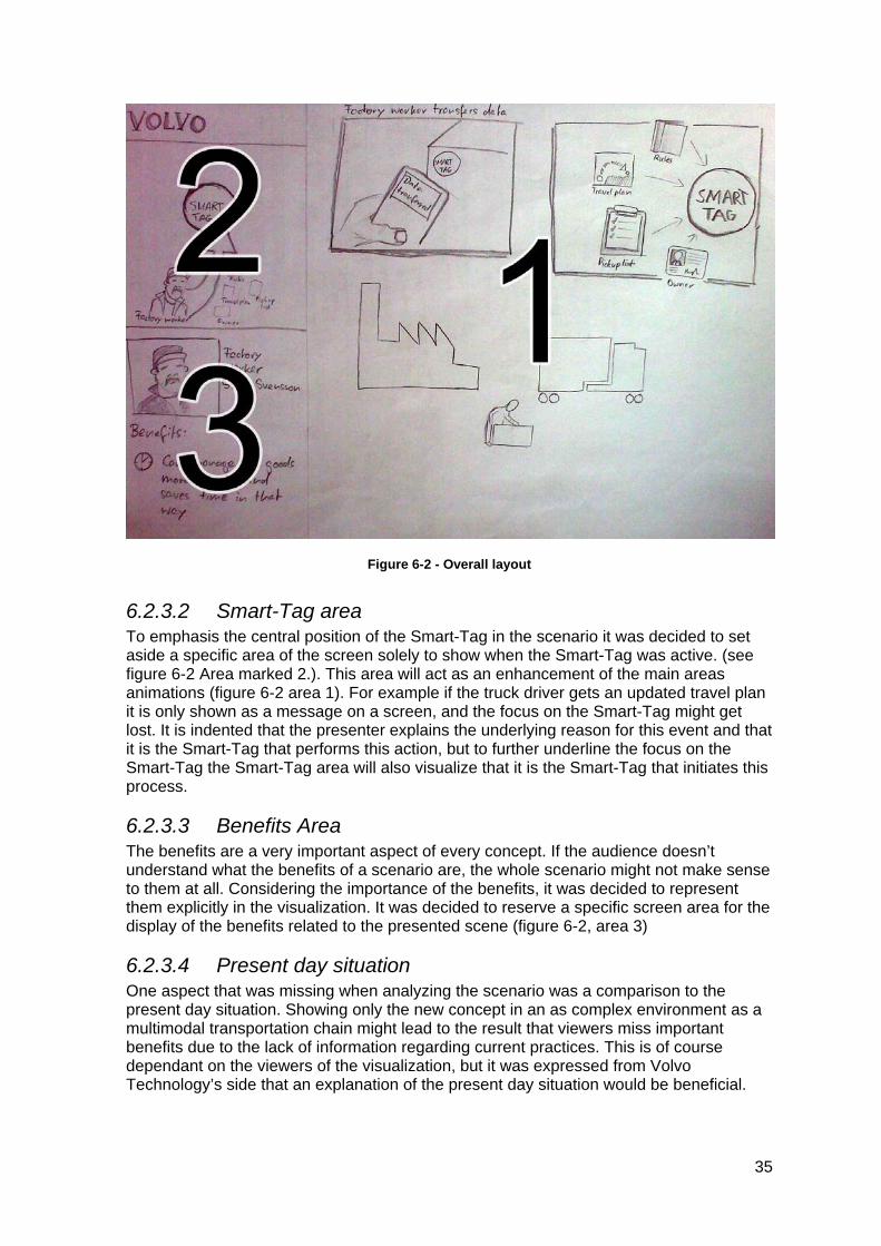
Figure 6-2 - Overall layout
6.2.3.2 Smart-Tag area To emphasis the central position of the Smart-Tag in the scenario it was decided to set aside a specific area of the screen solely to show when the Smart-Tag was active. (see figure 6-2 Area marked 2.). This area will act as an enhancement of the main areas animations (figure 6-2 area 1). For example if the truck driver gets an updated travel plan it is only shown as a message on a screen, and the focus on the Smart-Tag might get lost. It is indented that the presenter explains the underlying reason for this event and that it is the Smart-Tag that performs this action, but to further underline the focus on the Smart-Tag the Smart-Tag area will also visualize that it is the Smart-Tag that initiates this process.
6.2.3.3 Benefits Area The benefits are a very important aspect of every concept. If the audience doesn’t understand what the benefits of a scenario are, the whole scenario might not make sense to them at all. Considering the importance of the benefits, it was decided to represent them explicitly in the visualization. It was decided to reserve a specific screen area for the display of the benefits related to the presented scene (figure 6-2, area 3)
6.2.3.4 Present day situation One aspect that was missing when analyzing the scenario was a comparison to the present day situation. Showing only the new concept in an as complex environment as a multimodal transportation chain might lead to the result that viewers miss important benefits due to the lack of information regarding current practices. This is of course dependant on the viewers of the visualization, but it was expressed from Volvo Technology’s side that an explanation of the present day situation would be beneficial.
35
Regarding the comparison to the present situation several different solutions were discussed, e.g. showing a present day scenario side by side with the future scenario, creating a presentation with multiple paths where you could choose to show what happens today in a specific situation or how it will be solved in the future. The solution that mainly was considered though, was to integrate a “flashback” in the beginning of each scene showing the present day situation. Simple pictures supporting the presenter’s elaboration about the current day situation could have been a solution for this.
In the end it was decided to leave this part out from the visualization and instead include it in the presenter’s script. The main reason for not including it in the visualization was that too little information about the present day situation was available. This information could for sure have been retrieved from Volvo employees but the time and effort required didn’t seem to be realistic in relation to the outcome.
It was also discussed whether the visualizations of the present day situation really would contribute to the understanding of the present day situation compared to verbally describing it. An example is a scene where a reach stacker driver is being informed that the weight of the cargo exceeds the capabilities of his vehicle in order to avoid vehicle and cargo damages. To provide a visualization of a broken reach stacker or damaged goods didn’t appear to improve the understanding of the present day situation. The present day situation could in this case be sufficiently described through words, and visualizations of this might derange instead the overall perception of the visualization.
6.2.4 Storyboard The creation of the storyboard started with an analysis of the content of the scenario. Lists were made to structure the important content and to give an overview of what was going to be visualized. This provided a base for what scenes were going to be present in the animations.
Once an overview of the relevant content had been created several different storyboards were created in order to find the most appropriate way of illustrating the content. The storyboard was made as rough sketches with pen and paper (figure 6-3) to ensure that it was easy to change and rework the content.
36
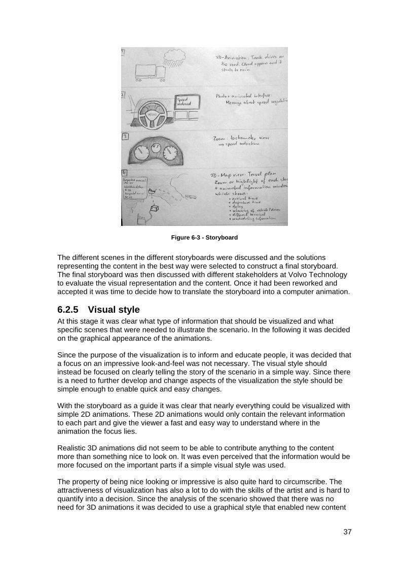
Figure 6-3 - Storyboard
The different scenes in the different storyboards were discussed and the solutions representing the content in the best way were selected to construct a final storyboard. The final storyboard was then discussed with different stakeholders at Volvo Technology to evaluate the visual representation and the content. Once it had been reworked and accepted it was time to decide how to translate the storyboard into a computer animation.
6.2.5 Visual style At this stage it was clear what type of information that should be visualized and what specific scenes that were needed to illustrate the scenario. In the following it was decided on the graphical appearance of the animations.
Since the purpose of the visualization is to inform and educate people, it was decided that a focus on an impressive look-and-feel was not necessary. The visual style should instead be focused on clearly telling the story of the scenario in a simple way. Since there is a need to further develop and change aspects of the visualization the style should be simple enough to enable quick and easy changes.
With the storyboard as a guide it was clear that nearly everything could be visualized with simple 2D animations. These 2D animations would only contain the relevant information to each part and give the viewer a fast and easy way to understand where in the animation the focus lies.
Realistic 3D animations did not seem to be able to contribute anything to the content more than something nice to look on. It was even perceived that the information would be more focused on the important parts if a simple visual style was used.
The property of being nice looking or impressive is also quite hard to circumscribe. The attractiveness of visualization has also a lot to do with the skills of the artist and is hard to quantify into a decision. Since the analysis of the scenario showed that there was no need for 3D animations it was decided to use a graphical style that enabled new content
37
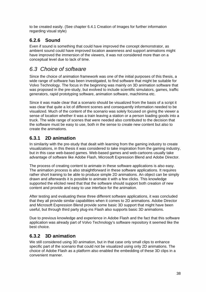
to be created easily. (See chapter 6.4.1 Creation of Images for further information regarding visual style)
6.2.6 Sound Even if sound is something that could have improved the concept demonstrator, as ambient sound could have improved location awareness and support animations might have improved the immersion of the viewers, it was not considered more than on a conceptual level due to lack of time.
6.3 Choice of software Since the choice of animation framework was one of the initial purposes of this thesis, a wide range of software has been investigated, to find software that might be suitable for Volvo Technology. The focus in the beginning was mainly on 3D animation software that was proposed in the pre-study, but evolved to include scientific simulators, games, traffic generators, rapid prototyping software, animation software, machinima etc.
Since it was made clear that a scenario should be visualized from the basis of a script it was clear that quite a lot of different scenes and consequently information needed to be visualized. Much of the content of the scenario was solely focused on giving the viewer a sense of location whether it was a train leaving a station or a person loading goods into a truck. The wide range of scenes that were needed also contributed to the decision that the software must be easy to use, both in the sense to create new content but also to create the animations.
6.3.1 2D animation In similarity with the pre-study that dealt with learning from the gaming industry to create visualizations, in this thesis it was considered to take inspiration from the gaming industry, but in this case web-based games. Web-based games and web-cartoons usually take advantage of software like Adobe Flash, Microsoft Expression Blend and Adobe Director.
The process of creating content to animate in these software applications is also easy. The animation process is also straightforward in these software applications. It requires rather short training to be able to produce simple 2D animations. An object can be simply drawn and afterwards it is possible to animate it with a few clicks. This knowledge supported the elicited need that that the software should support both creation of new content and provide and easy to use interface for the animation.
After testing and evaluating these three different software applications, it was concluded that they all provide similar capabilities when it comes to 2D animations. Adobe Director and Microsoft Expression Blend provide some basic 3D support that might have been useful, but through third party plug-ins Flash also supports basic 3D animations.
Due to previous knowledge and experience in Adobe Flash and the fact that this software application was already part of Volvo Technology’s software repository it seemed like the best choice.
6.3.2 3D animation We still considered using 3D animation, but in that case only small clips to enhance specific part of the scenario that could not be visualized using only 2D animations. The choice of Adobe Flash as a platform also enabled the embedding of these 3D clips in a convenient manner.
38
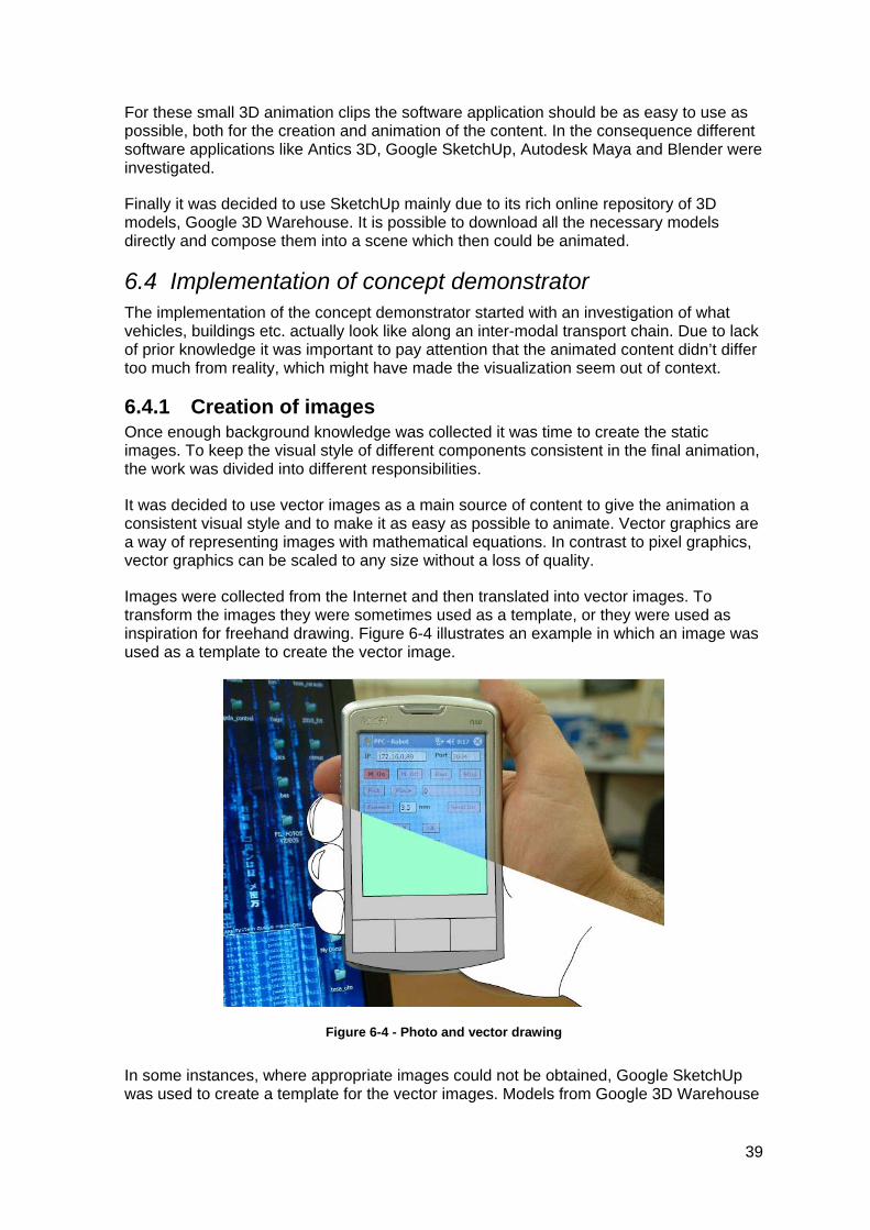
For these small 3D animation clips the software application should be as easy to use as possible, both for the creation and animation of the content. In the consequence different software applications like Antics 3D, Google SketchUp, Autodesk Maya and Blender were investigated.
Finally it was decided to use SketchUp mainly due to its rich online repository of 3D models, Google 3D Warehouse. It is possible to download all the necessary models directly and compose them into a scene which then could be animated.
6.4 Implementation of concept demonstrator The implementation of the concept demonstrator started with an investigation of what vehicles, buildings etc. actually look like along an inter-modal transport chain. Due to lack of prior knowledge it was important to pay attention that the animated content didn’t differ too much from reality, which might have made the visualization seem out of context.
6.4.1 Creation of images Once enough background knowledge was collected it was time to create the static images. To keep the visual style of different components consistent in the final animation, the work was divided into different responsibilities.
It was decided to use vector images as a main source of content to give the animation a consistent visual style and to make it as easy as possible to animate. Vector graphics are a way of representing images with mathematical equations. In contrast to pixel graphics, vector graphics can be scaled to any size without a loss of quality.
Images were collected from the Internet and then translated into vector images. To transform the images they were sometimes used as a template, or they were used as inspiration for freehand drawing. Figure 6-4 illustrates an example in which an image was used as a template to create the vector image.
Figure 6-4 - Photo and vector drawing
In some instances, where appropriate images could not be obtained, Google SketchUp was used to create a template for the vector images. Models from Google 3D Warehouse
39
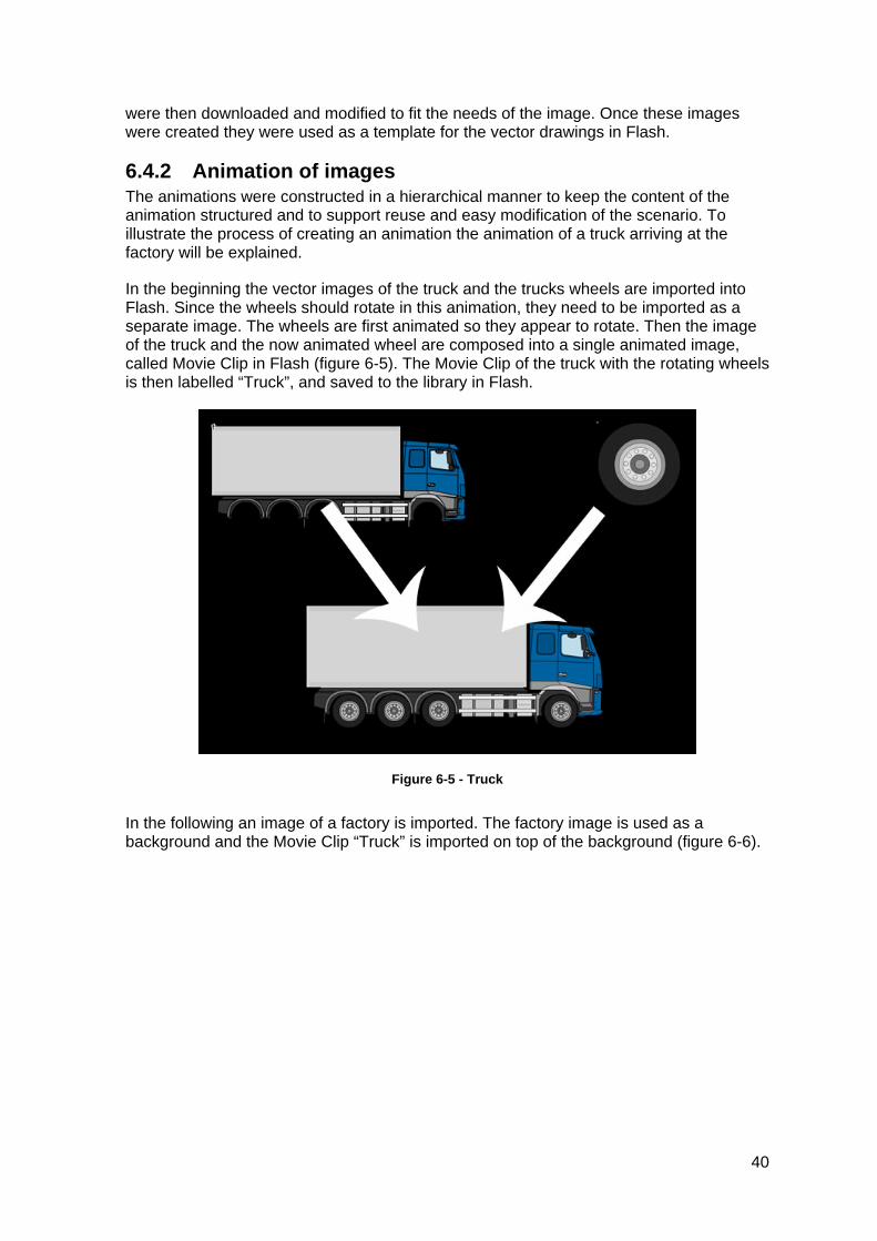
were then downloaded and modified to fit the needs of the image. Once these images were created they were used as a template for the vector drawings in Flash.
6.4.2 Animation of images The animations were constructed in a hierarchical manner to keep the content of the animation structured and to support reuse and easy modification of the scenario. To illustrate the process of creating an animation the animation of a truck arriving at the factory will be explained.
In the beginning the vector images of the truck and the trucks wheels are imported into Flash. Since the wheels should rotate in this animation, they need to be imported as a separate image. The wheels are first animated so they appear to rotate. Then the image of the truck and the now animated wheel are composed into a single animated image, called Movie Clip in Flash (figure 6-5). The Movie Clip of the truck with the rotating wheels is then labelled “Truck”, and saved to the library in Flash.
Figure 6-5 - Truck
In the following an image of a factory is imported. The factory image is used as a background and the Movie Clip “Truck” is imported on top of the background (figure 6-6).
40
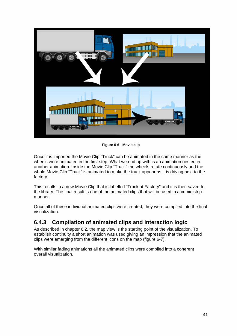
Figure 6-6 - Movie clip
Once it is imported the Movie Clip “Truck” can be animated in the same manner as the wheels were animated in the first step. What we end up with is an animation nested in another animation. Inside the Movie Clip “Truck” the wheels rotate continuously and the whole Movie Clip “Truck” is animated to make the truck appear as it is driving next to the factory.
This results in a new Movie Clip that is labelled “Truck at Factory” and it is then saved to the library. The final result is one of the animated clips that will be used in a comic strip manner.
Once all of these individual animated clips were created, they were compiled into the final visualization.
6.4.3 Compilation of animated clips and interaction logic As described in chapter 6.2, the map view is the starting point of the visualization. To establish continuity a short animation was used giving an impression that the animated clips were emerging from the different icons on the map (figure 6-7).
With similar fading animations all the animated clips were compiled into a coherent overall visualization.
41
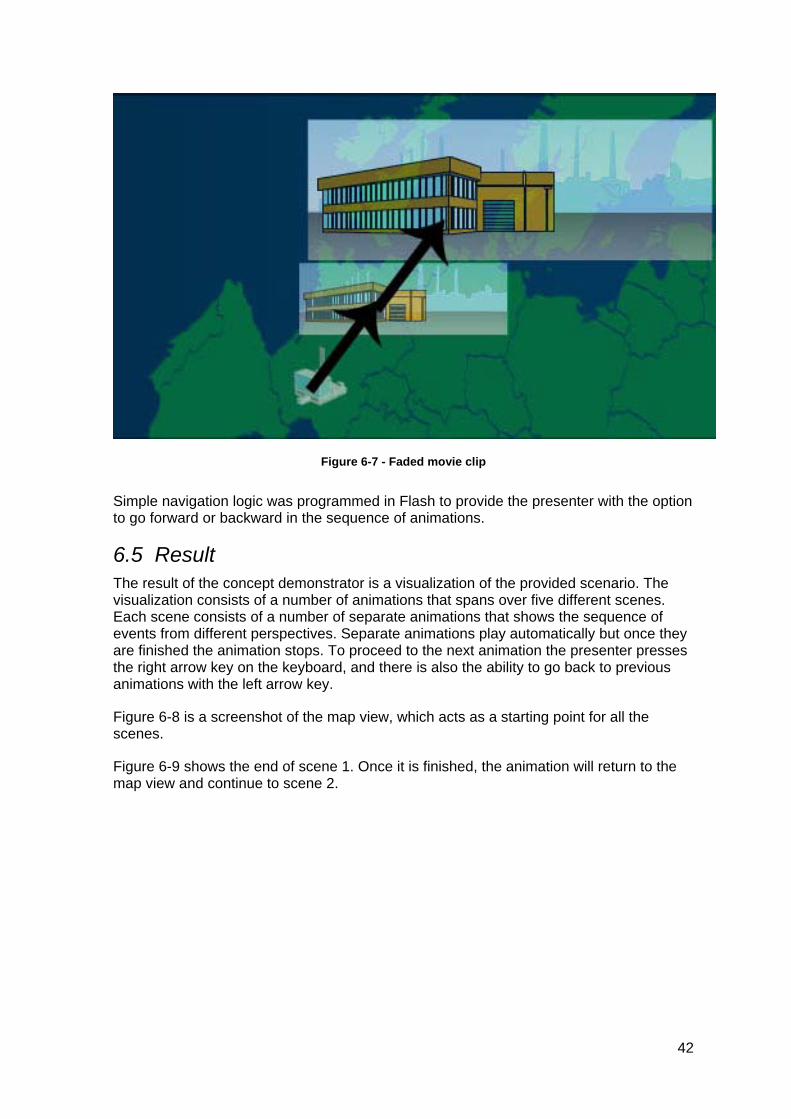
Figure 6-7 - Faded movie clip
Simple navigation logic was programmed in Flash to provide the presenter with the option to go forward or backward in the sequence of animations.
6.5 Result The result of the concept demonstrator is a visualization of the provided scenario. The visualization consists of a number of animations that spans over five different scenes. Each scene consists of a number of separate animations that shows the sequence of events from different perspectives. Separate animations play automatically but once they are finished the animation stops. To proceed to the next animation the presenter presses the right arrow key on the keyboard, and there is also the ability to go back to previous animations with the left arrow key.
Figure 6-8 is a screenshot of the map view, which acts as a starting point for all the scenes.
Figure 6-9 shows the end of scene 1. Once it is finished, the animation will return to the map view and continue to scene 2.
42
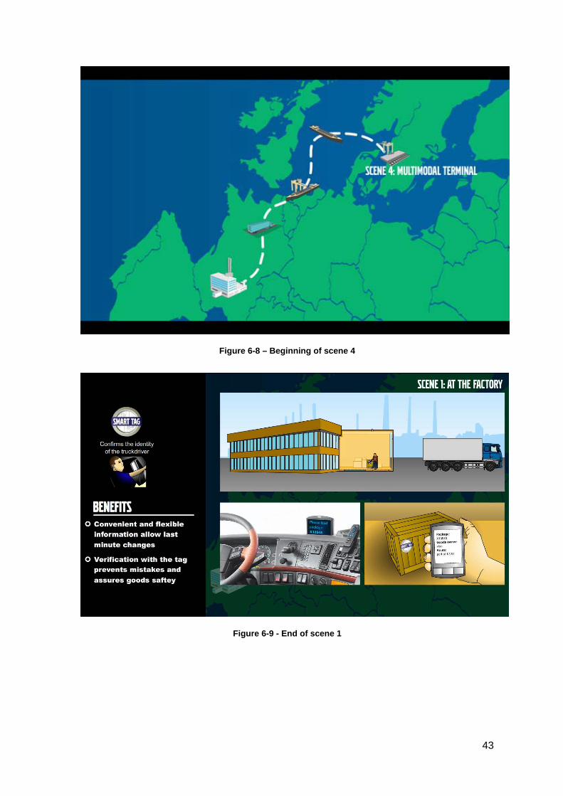
Figure 6-8 – Beginning of scene 4
Figure 6-9 - End of scene 1
43
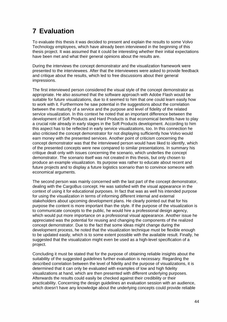
7 Evaluation
To evaluate this thesis it was decided to present and explain the results to some Volvo Technology employees, which have already been interviewed in the beginning of this thesis project. It was assumed that it could be interesting whether their initial expectations have been met and what their general opinions about the results are.
During the interviews the concept demonstrator and the visualization framework were presented to the interviewees. After that the interviewees were asked to provide feedback and critique about the results, which led to free discussions about their general impressions.
The first interviewed person considered the visual style of the concept demonstrator as appropriate. He also assumed that the software approach with Adobe Flash would be suitable for future visualizations, due to it seemed to him that one could learn easily how to work with it. Furthermore he saw potential in the suggestions about the correlation between the maturity of a service and the purpose and level of fidelity of the related service visualization. In this context he noted that an important difference between the development of Soft Products and Hard Products is that economical benefits have to play a crucial role already in early stages in the Soft Products development. According to him this aspect has to be reflected in early service visualizations, too. In this connection he also criticised the concept demonstrator for not displaying sufficiently how Volvo would earn money with the presented services. Another point of criticism concerning the concept demonstrator was that the interviewed person would have liked to identify, which of the presented concepts were new compared to similar presentations. In summary his critique dealt only with issues concerning the scenario, which underlies the concept demonstrator. The scenario itself was not created in this thesis, but only chosen to produce an example visualization. Its purpose was rather to educate about recent and future projects and to display a future logistics scenario than to convince someone with economical arguments.
The second person was mainly concerned with the last part of the concept demonstrator, dealing with the CargoBus concept. He was satisfied with the visual appearance in the context of using it for educational purposes. In fact that was as well his intended purpose for using the visualization in terms of informing different internal and external stakeholders about upcoming development plans. He clearly pointed out that for his purpose the content is more important than the style. If the purpose of the visualization is to communicate concepts to the public, he would hire a professional design agency, which would put more importance on a professional visual appearance. Another issue he appreciated was the potential for reusing and changing the components of the realized concept demonstrator. Due to the fact that some ideas might change during the development process, he noted that the visualization technique must be flexible enough to be updated easily, which is to some extent possible with the available result. Finally, he suggested that the visualization might even be used as a high-level specification of a project.
Concluding it must be stated that for the purpose of obtaining reliable insights about the suitability of the suggested guidelines further evaluation is necessary. Regarding the described correlation between the level of fidelity and the purpose of visualizations, it is determined that it can only be evaluated with examples of low and high fidelity visualizations at hand, which are then presented with different underlying purposes. Afterwards the results could easily be checked against their credibility or their practicability. Concerning the design guidelines an evaluation session with an audience, which doesn’t have any knowledge about the underlying concepts could provide reliable
44

results about how well the presentations have been understood and remembered, thus whether the guidelines would support the understanding. The guidelines dealing with methodological issues can only be evaluated over time and then need to be compared to previously applied methods. Similar evaluations are necessary to check the level of easiness of learning to work with different software frameworks.
45
8 Discussion
8.1 Focus of the thesis One of the main challenges of this thesis has been to define the subject. The problem description chapter states that this thesis aims at answering the question “How should future transport concepts be visualized”. The reason for this rather general question was to illustrate the manifold different focuses and possible goals that have been discussed throughout this thesis.
Initially the purpose was oriented towards investigating “state of the art” visualization techniques to impress the viewers of presentations. It was also investigated, how the Concept Studio and current visualization techniques at VTEC could be used and optimized to further explain and enhance the visualization of soft products. Apart from these requests it was also expressed that the visualization should be fast and easy to produce, and that it was necessary to be able to produce visualizations with flexible content.
As the pre-study discusses, much of these directions have origin from inspirations from the game community. Current generation games have very impressive visuals and games like Simcity and The Sims also provide easy user interfaces to configure the content of the games. Even if these games show promising capabilities, one important missing component is the flexibility. The content of these games is mainly very static, or in other words, only predefined building blocks can be used to create something. If one imagines now to use these techniques for visualizing future transport concepts, it can easily be imagined that the existing building blocks are not sufficient for representing the ideas. Future transport concepts usually deal with new innovative ideas. If building blocks for these ideas would already exist, the ideas might probably not be new. Consequently, much time needs to be spent to produce and integrate a lot of new content needs, and the initial benefits of such a solution wouldn’t apply.
It was decided that our solution could not cover all of the areas in the expressed vision, but the request to adapt the visualization to the Concept Studio persisted. The use of the Concept Studio was something that wasn’t questioned or discussed and this limited the initial view on possible visualization solutions. This led to the investigation of visualization techniques that were adapted to take advantage of the very large display, the multiple screen inputs allowed better ways of displaying the information, optimization of fonts, window sizes etc. This shifted the focus from the content of the concept demonstrator to a more layout and graphical style perspective. Creating sketches or computer-animated images was in the early stages of the thesis too far away from the expressed vision.
To find the focus of this thesis took a lot more time than expected and this has to do with the wide range of different possible focuses that were expressed throughout the thesis. The expressed visions about visualizations weren’t preserved as coherent with the visualization need that was found. To find a compromise was one of the hardest parts of the thesis.
To conclude the initial vision on possible visualization focuses influenced the work too much. To be able to create the visualization in an easy way, to optimize and integrate the visualization into the Concept Studio and to make an impressive visualization were things that influenced the large focus on the concept demonstrator. In retrospect it should probably have been more beneficial to create shorter visualization examples to illustrate how different visualization techniques can be used for different purposes, as argued in the evaluation chapter.
46
8.2 Content of visualization To understand what type of information should be visualized was one of the main challenges of the thesis. That the content should be about future transport concepts of some kind was explained early, but what these future transport concepts could deal with was more difficult to understand.
After a while, it became clear that different types of services that should be visualized, and that these services are the main focuses of the new Soft Products area. To come to this knowledge might seem like an easy task but the mixed use of the terms services and soft products, with no content to relate to, made it hard to understand what should be visualized.
The information regarding these services was mainly communicated through scenario descriptions, brief power point presentations and manuscripts. This made it hard to get an overview of a specific service, since the scenarios usually had a more exemplifying character. They explained how the different services would work for different stakeholders and how it solved problems, but background information and why the service was needed was sometimes difficult to understand.
Since no further information regarding these services were provided it was decided to visualize one of the scenarios. The decision to visualize a predefined scenario did not meet all the requirements from VTEC, though. The need to express and add information that was not present in the provided scenario description or manuscripts was expressed several times. This was a time-consuming problem since it once again was unclear what was going to be visualized.
Having very limited information regarding the services and then try to change and adapt the scenario to new needs was hard since it would have required a lot more information regarding the services. It was assumed that Volvo Technology expected that the creation of visualizations would define the services more clearly, or in other words that it would generate new information about the services. Although it is believed that visualizations could be used as a tool for the generation of new ideas, it wasn’t considered as a relevant task for this thesis. After all the focus of this thesis lies on the explanation of existing services with the aid of visualization and it does not deal with service development.
8.3 The Visualization Guidelines The Visualization Guidelines are an important result of this thesis. However, it must be stated that they still need to be elaborated further to be of practical use. So far the Visualization Guidelines provide some hints on which appropriate visualization methods should be used in different stages. In further steps it is necessary to concretise these hints and integrate recommended visualization practices in the service development process. Also some further evaluation effort might be necessary.
Still, the Visualization Guidelines can be considered as beneficial for Volvo Technology, as they point out the existence of suitable and cost-efficient techniques for different purposes. In this context they might serve as inspiration for overcoming the current sole focus on one expensive visualization technique, which is often used without considering the purpose of the visualization.
8.4 The Concept Demonstrator The concept demonstrator should represent an exemplified visualization, which is created with a particular focus on its underlying purpose. It can be discussed whether the chosen
47
visualization techniques are the most suitable, regarding the purpose of the concept demonstrator visualization, which is defined as education and information in an early development stage.
Due to the fact that the visualization deals with concepts in early development stages, it won’t be reused many times in the future, because the visualized concepts might most probably be changed or refined during the further development process. In this context some of the chosen visualization techniques can be considered as not optimal concerning their cost-efficiency.
It can be determined that much time of this thesis work was spent with drawing nice looking vector graphics and creating animations. Although this approach of visualizing might have been more cost-efficient than the creation of 3D visualizations, it might be reasonable to believe that even more cost-efficient techniques could have been considered. For example an explanatory and detailed storyboard could have explained the underlying concepts in a sufficient way, too. The abandonment of animation would have resulted in a reasonable saving of time. Furthermore the degree of exhibited perfectionism concerning the look-and-feel of the visualization was probably too high, as the purpose of the visualization wasn’t to impress the audience or to communicate professionalism.
On the other hand the reason for developing a more advanced visualization was also to introduce a different view on visualization. The starting point of this thesis was to solely focus on 3D and the important lesson to learn from our concept demonstrator is that it is sufficient to use easier visualization methods to communicate the same message.
Furthermore it must be stated that the choice of Adobe Flash as software application for the production of visualizations, revealed some benefits, which might be relevant for Volvo Technology’s work practice. The creation of graphics and animations can be considered as rather easy and can probably be learned fast by novice users, too. Also, the main structure of nested symbols might be beneficial, as single items can be easily replaced in a movie.
48
9 Conclusion
The aim of this thesis was to provide an answer to the question: How should future transport concepts be visualized? Consequently the first assumption was that the development of a visualization technique was needed for a specific purpose. This assumption was also held up on the part of Volvo Technology, as it was stated that an optimization of the current 3D simulation framework would be appreciated. However, interviews revealed that the needs regarding visualization were more manifold than expected and in fact visualizations were needed for a multiplicity of purposes. In consequence of this insight, it was concluded that the further development of one visualization technique would not provide a sufficient answer to the question and would not satisfy the identified needs.
To answer the question and address more of the identified needs regarding visualization, the chapter Visualization Guidelines was developed as a result of this thesis. This chapter serves as guide on how to address some of the different needs regarding visualization. It also serves as an explanation and elaboration why the initial approach would have failed to address many of their requests.
The concept demonstrator was developed as an example visualization, which fulfils its purpose in an understandable and cost-efficient way. Since much of the time during this thesis was spent creating the concept demonstrator, it can easily be perceived as being the main result. But it should be stressed that the difficulties and problems along the way of this thesis can be seen as a much more important result than the animations in the concept demonstrator.
Instead of viewing the result of the concept demonstrator as an example of a proposed standardized visualization framework, it should be viewed as an example on a new view on visualization and proof that underlying reasons and messages behind the visualization are more important than the visualization framework itself.
A concluding remark regarding the result of this thesis is that it hopefully manages to express the manifold uses visualizations can have at Volvo Technology. Hughes (2004) argument that visualization should not be about creating high-resolution pictures but rather focus on communicating and clarifying the concept and values to the viewers serves as an appropriate guideline to further investigations in the field of visualizations. One should always concentrate on the purpose of the visualization, what the message is, to who it should be presented etc. Once this is clearly defined, one can start discussing different visualization techniques, which are appropriate to communicate and clarify the intended purpose.
9.1 Future Work It might be hard to implement any new visualization techniques in the work practice as a result of this thesis. It serves more as an analysis of Volvo Technology’s needs and possible solutions and gives some directions Volvo Technology might take in the future.
To be able to really take advantage of our guidelines it would be beneficial to investigate more thoroughly different visualization methods at different stages in the development process and to evaluate them, as suggested in the evaluation chapter.
To get concrete examples of new work practices in the field of visualization a thorough analysis of the existing service development process is needed. Once an understanding of the service development process is achieved it is easy to make concrete examples of when and where to use different visualization techniques.
49
Furthermore it can be recommended that already created visualization content, e.g. drawn vehicles, animations, should be stored in an accessible way. This would allow future reuse and consequently the process of creating visualization would be eased.
50
References
Burkhard, Remo A. (2004). “Learning from Architects: The Difference between Knowledge Visualization and Information Visualization”. in Proceedings of Eighth International Conference on Information Visualization (IV04) (pp. 519-524). London: IEEE
Burkhard, Remo A. (2005). "Towards a Framework and a Model for Knowledge Visualization: Synergies between Information and Knowledge Visualization". in Knowledge and Information Visualization: Searching for Synergies. Tergan, S.-O. and Keller, T. Springer, Heidelberg/New York
Burkhard, Remo A. and Meier, Michael (2005). "Tube map visualization: evaluation of a novel knowledge visualization application for the transfer of knowledge in long-term projects", Journal of Universal Computer Science, Vol. 11, No.4, pp.473-94.
Card, S., MacKinlay, J. and Shneiderman, B. (1999). “Readings in Information Visualization: Using Vision to Think”. Morgan Kaufmann Publishers Inc., San Francisco, CA.
Dencker, Andreas (2007). “Soft Products” (Internal Volvo presentation). Gothenburg.
Elmer, Marcus (2008). “Digital Animation as a Scenario Visualization Tool” (Internal Volvo study). Gothenburg
Encyclopædia Britannica (2009) Encyclopædia Britannica Online. http://www.britannica.com/EBchecked/topic/329791/language . Accessed 2009-07-23
Friendly, Michael and Denis, Daniel J., (2001). “Milestones in the history of thematic cartography, statistical graphics, and data visualization”. http://www.math.yorku.ca/SCS/Gallery/milestone/ . Accessed 2009-07-23
Fromkin, Viktoria (2000). “Linguistics: an introduction to linguistic theory”. Wiley-Blackwell
Garrick, N. W., Miniutti, P., Westa, M., Luo, J. and Bishop, M. (2005) “Effective Visualization Techniques for the Public Presentation of Transportation Projects”. The New England Transportation Consortium July 2005
Gershon, Nashum (2001). “What Storytelling Can Do For Information Visualization”. in Communications of the ACM, Volume 44, Issue 8, pp.31-37. ACM Press
Holtzblatt, Karen, Burns Wendell, Jessamyn and Wood, Shelley (2004). “Rapid Contextual Design: A how-to guide to key techniques for user-centered design”. Morgan Kaufman Publishers
Hughes, Ronald G. (2004). “Visualization in Transportation: Current Practice and Future Directions”. Transportation Research Board 83rd Annual Meeting - January 11-15, 2004.
Kantola, Niina and Jokela, Timo (2007). “SVSb: Simple and Visual Storyboards. Developing a Visualisation Method for Depicting User Scenarios”. in OzCHI 2007 Proceedings, ACM Press
McCormick, B. H., DeFanti T. A. and Brown M. D. (1987). “Visualization in Scientific Computing”. in ACM SIGBIO Newsletter, Volume 10, Issue 1, pp.15-21, ACM Press
51
Ramsey, H. R., Atwood, M. E., Van Doren, J. R. (1983). “Flowcharts Versus Program Design Languages: An Experimental Comparison” in Communications of the ACM, June 1983, Volume 26, Number 6, ACM Press
Rhyne, Theresa-Marie (2007). “Visualization and the Larger World of Computer Graphics” in TR News, Issue number 252, Transportation Research Board
Schroeder, Will, Martin, Ken and Lorensen, Bill (1996). “TheVisualization Toolkit, An Object-Oriented Approach To 3D Graphics”. Prentice Hall
Shneiderman, B., Mayer, R., McKay, D. and Heller, P. (1977). “Experimental Investigations of the Utility of Detailed Flowcharts in Programming” in Communications of the ACM, Volume 20, Number 6, pp.373-381, ACM Press
Söderman, Mikael (1997). “Forms of representation: tools for exchanging knowledge in innovation processes”. in Proceedings from the 13th Triennial Congress of the International Ergonomics Association, Tampere, Finland
Söderman, Mikael (2001). “Product Representations: Exploring computer-based technologies and customers understanding of product concepts”. Chalmers University of Technology
Tufte, Edward R. (1990). “Envisioning Information”. Cheshire, CT: Graphics Press
Van den Hende, E.A., Schoormans, J.P.L., Morel, K.P.N., Lashina, R., van Loenen, E. and de Boevere, E.I. (2007). “Using Early Concept Narratives to Collect Valid Customer Input about Breakthrough Technologies: The Effect of Application Visualization on Transportation”. Technological Forecasting & Social Change
Van der Lelie, Corrie (2006). “The value of storyboards in the product design process”. in Personal and Ubiquitous Computing, Volume 10, Numbers 2-3, pp.159-162, Springer London
Ware, Colin (2008). “Visual Thinking For Design”. Morgan Kaufman
52
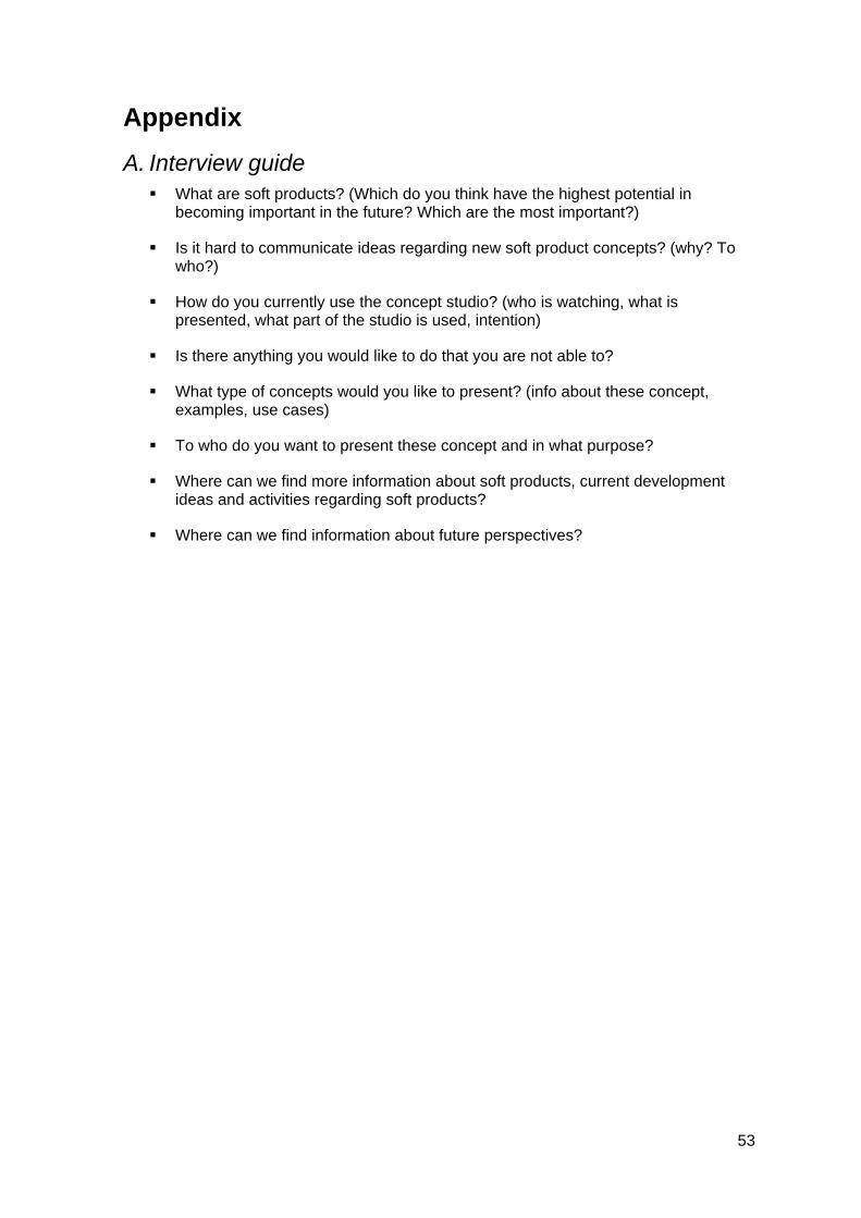
Appendix
A. Interview guide What are soft products? (Which do you think have the highest potential in
becoming important in the future? Which are the most important?)
Is it hard to communicate ideas regarding new soft product concepts? (why? To who?)
How do you currently use the concept studio? (who is watching, what is presented, what part of the studio is used, intention)
Is there anything you would like to do that you are not able to?
What type of concepts would you like to present? (info about these concept, examples, use cases)
To who do you want to present these concept and in what purpose?
Where can we find more information about soft products, current development ideas and activities regarding soft products?
Where can we find information about future perspectives?
53
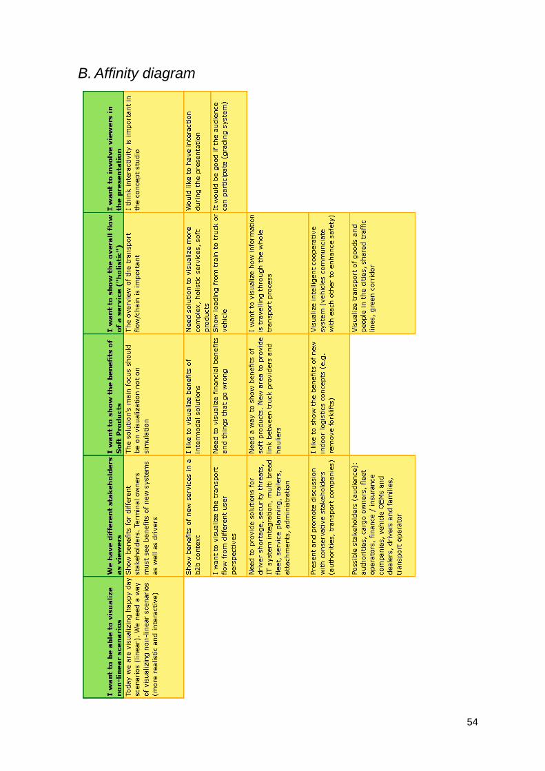
B. Affinity diagram
54
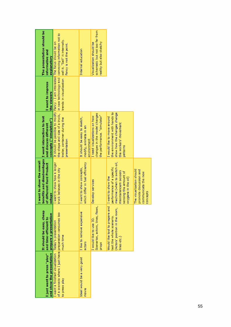
55
C. Scenario description This scenario describes a future intermodal transportation process, in which problems and difficulties of today are solved through standards and technology. One important aspect of the scenario is the flawless and flexible management of goods, which is achieved through a standardized IT system used by the involved vehicles and stakeholders. This IT system is illustrated in terms of a smart tag. Furthermore the scenario explains the benefits of multipurpose transport solutions, which allow the efficient use of transportation facilities for passengers and goods and thus decrease the traffic in urban environments.
The visualization of the scenario makes use of different techniques to establish an optimal understanding of the benefits of the presented solutions. In contrast to past VTEC solutions, actors are not needed for the presentation of this scenario. Instead the story is mainly told on the screen through visualization and further explained by a presenter.
The screen is divided into three areas, which deal with specific aspects of the scenario. The main area is used to display the pure story. In this area various multimedia animations and movies illustrate the plot. The second screen area is used to display, which information is stored on the tag and who makes use of it. In this way the audience can observe when which information is processed by the standardized system according to the storyline shown on the main screen. The third area deals with the concrete benefits of the future solutions compared to the current practice. Also in parallel to the main plot, involved stakeholders and their specific benefits of the future solutions are displayed. The storyline is divided into different scenes, which are characterized by the location of the presented actions. Each transition of one scene to the next is realized by a map animation, which visualizes the change in location.
Plot
The factory A SmartTag is attached to the goods and it is shown which information that is stored in the tag. Once the goods has been marked a truck arrives and gets notified which specific package to pick up and where in the factory area to pick it up. The truck driver then scans the tag and confirms that it is the correct goods.
On the road The goods are traveling by truck on a road and bad weather appears. The driver gets a notification that his speed has been reduced due to the bad weather conditions. The SmartTag then updates its expected arrival times and proposed travel plan is updated. The tag sends the updated travel plan to the current truck driver, books a new ship transport, cancels and informs the scheduled pickup in the destination port and books a pickup by train in the arriving port.
In the harbor The goods have missed its scheduled pickup at the port and have to wait. The goods are repackaged into a container and placed in the port to wait for a new ship.
On the sea Due to stormy weather the captain checks his cargos scheduled pickup lists. On a computer he can see that only a small part of the cargo will miss its scheduled pickups if he reduces the speed and he decides to slow down the ship. All the goods in the ship updates their arrival times and if needed they book new pickup methods in the arriving harbor.
56
57
At the arriving harbor Later the goods are on its way to be picked up by a reach stacker when the reach stacker operator receives a message informing him that the container is too heavy for this specific reach stacker and that he needs to get another one. The container is then moved to the train the train leaves the harbor.
On the train The container is loaded on the train and the tag collects information about the engine model, how many wagons the train has and its route. This information collecting process is illustrated in the tag area. The benefits of this action for traffic managers, authorities and the society are displayed.
From train to multipurpose bus to final delivery On the train station the train is unloaded. The goods are removed from the container and placed in a facility. The SmartTag now communicates with the Urban Traffic Planning computer to find its way in the city. The Urban Traffic Planning computer informs the SmartTag that a bus is available for goods transportation. The SmartTag then informs the bus driver that it is scheduled for transportation. Then a bus arrives at the train station and passengers are leaving it. The crate is removed from the container and loaded on the bus. An animation illustrates how the bus can be easily transformed from passenger transport vehicle to goods transport vehicle. The bus further transports the goods. A map animation indicates that the bus has entered an urban area. Further animations show congestion and how the bus makes use of a buslane to avoid delay in delivery. Another map view displays a distribution concept, which includes the bus and smaller vans. The bus passes by certain bus stations at which the goods are loaded to a van, which delivers it in the inner city. In the end the van driver delivers the goods to the final recipient.