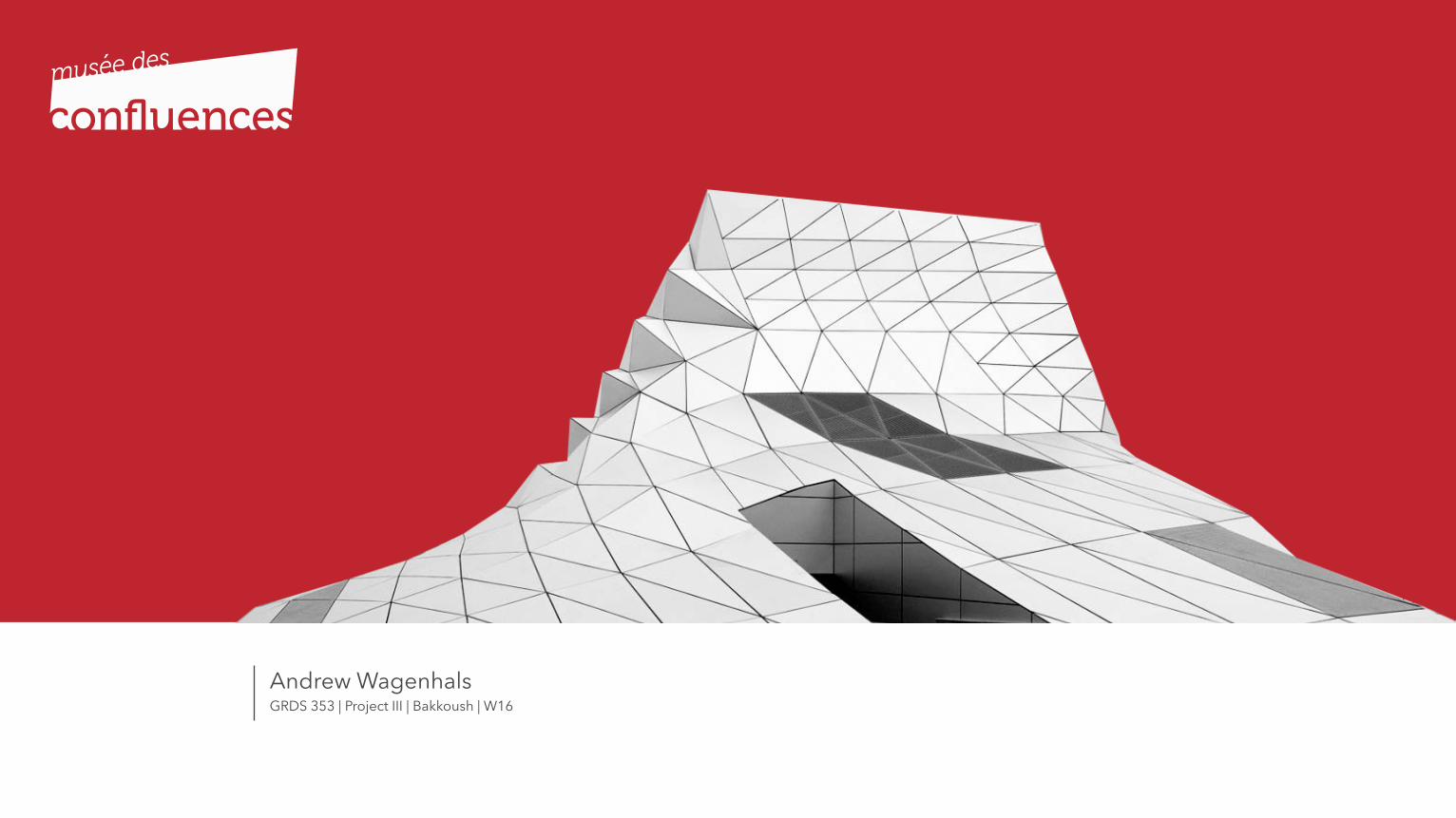
Musée des Confluences
33
GRDS 353 | Project III | Bakkoush | W16 Andrew Wagenhals
-
Upload
andrew-wagenhals -
Category
Design
-
view
232 -
download
0
Transcript of Musée des Confluences
Project II | Overview
GRDS 353 | Project III | Bakkoush | W16Andrew Wagenhals
02
Table of Contents
002Project III | Table of Contents
03003
01 Introduction
Goals and Objectives
02 Identity
Discovery Design Development Deploy
03 Program Discovery Design Development Deploy
04 Final Program
Identity Program
Project III | Table of Contents
04
Introduction
004Project III | Introduction
05005Project III | Introduction | Goals and Objectives
Goals and Objectives
The goals and objectives of this project are to redesign the identity for the Musee de Confluences (Lyon) typographically to suit the nature of its modern architecture. Just a typographic treatment. Attention to typographic details, expression and style. Use consistent typography for the Collateral material (Program/events/poster).
Identity
06Project III | Identity
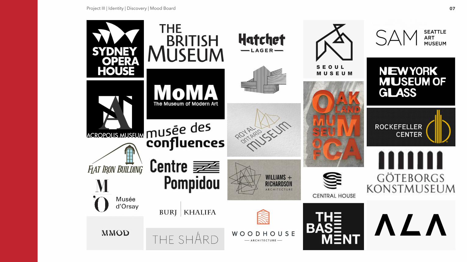
07Project III | Identity | Discovery | Mood Board
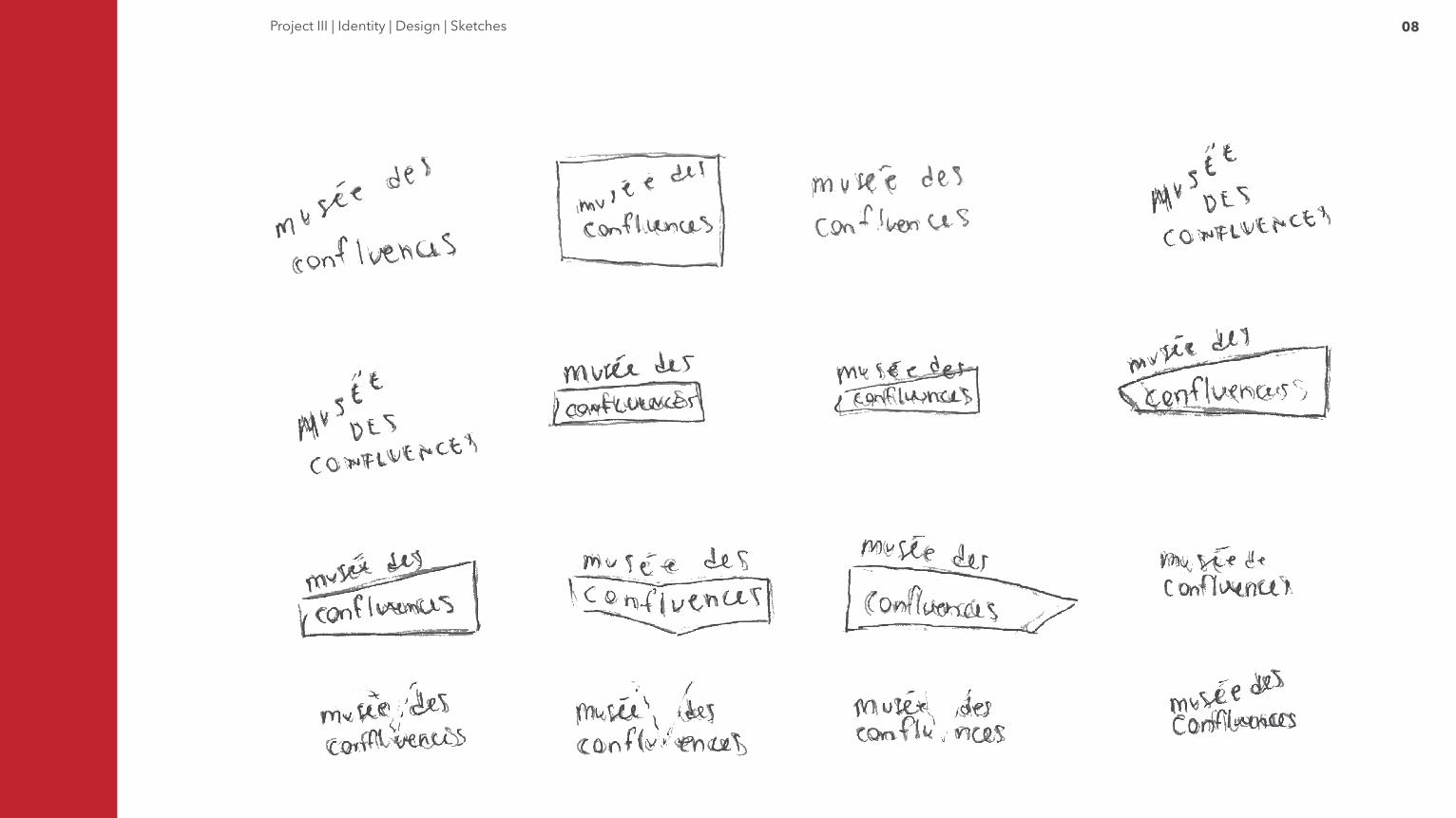
08Project III | Identity | Design | Sketches
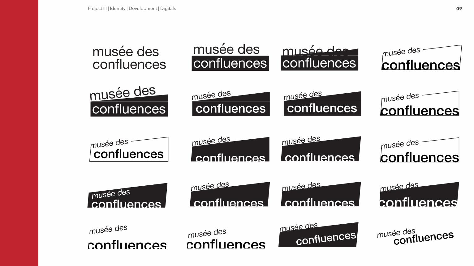
09Project III | Identity | Development | Digitals
confluences confluences
confluences confluences confluences
confluences confluences confluences confluences
confluences
confluences
confluences
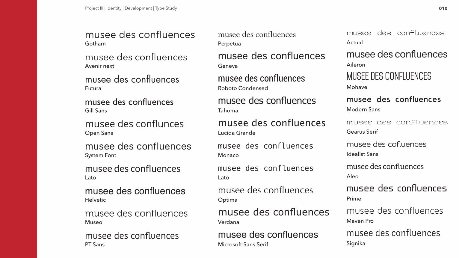
010Project III | Identity | Development | Type Study
Gotham
Avenir next
Futura
Gill Sans
Open Sans
System Font
Lato
Helvetic
Museo
PT Sans
Actual
Aileron
Mohave
Modern Sans
Gearus Serif
Idealist Sans
Aleo
Prime
Maven Pro
Signika
musee des confluences
musee des confluences
musee des confluences
musee des confluences
musee des confluences
musee des confluences
musee des confluences
musee des confluences
musee des confluences
musee des confluences
Perpetua
Geneva
Roboto Condensed
Tahoma
Lucida Grande
Monaco
Lato
Optima
Verdana
Microsoft Sans Serif
011Project III | Identity | Development | Type Specimen
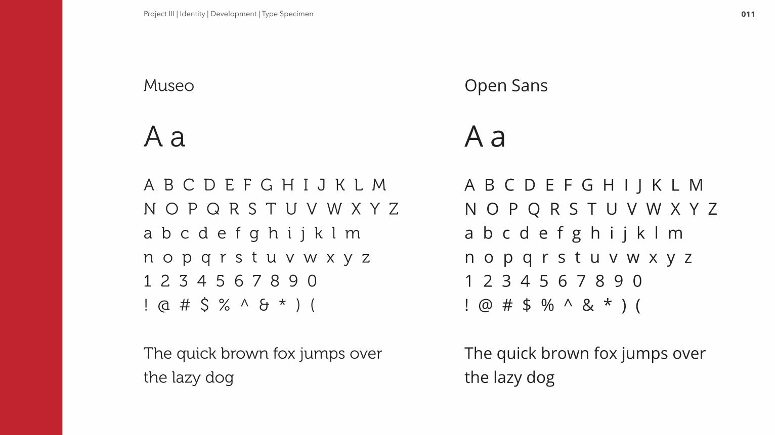
Museo
A a
A B C D E F G H I J K L M
N O P Q R S T U V W X Y Z
a b c d e f g h i j k l m
n o p q r s t u v w x y z
1 2 3 4 5 6 7 8 9 0
! @ # $ % ^ & * ) (
The quick brown fox jumps over
the lazy dog
Open Sans
A aA B C D E F G H I J K L MN O P Q R S T U V W X Y Za b c d e f g h i j k l mn o p q r s t u v w x y z1 2 3 4 5 6 7 8 9 0! @ # $ % ^ & * ) (
The quick brown fox jumps over the lazy dog
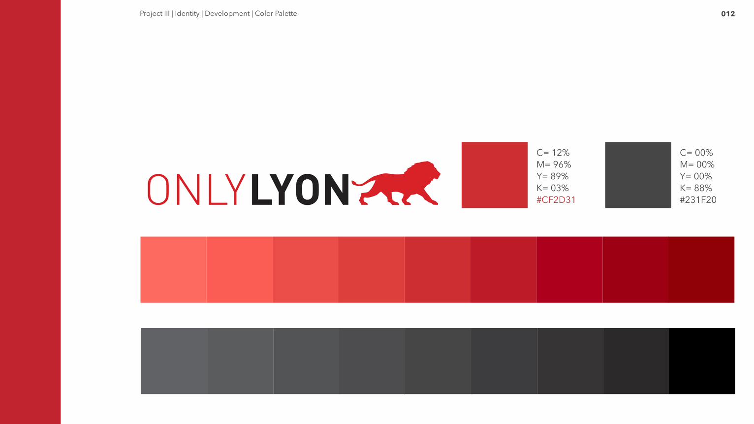
012Project III | Identity | Development | Color Palette
C= 12%M= 96%Y= 89%K= 03%#CF2D31
C= 00%M= 00%Y= 00%K= 88%#231F20
013Project III | Identity | Deploy | Final Logotype
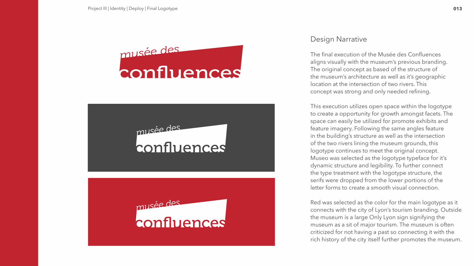
Design Narrative
The final execution of the Musée des Confluences aligns visually with the museum’s previous branding. The original concept as based of the structure of the museum’s architecture as well as it’s geographic location at the intersection of two rivers. This concept was strong and only needed refining.
This execution utilizes open space within the logotype to create a opportunity for growth amongst facets. The space can easily be utilized for promote exhibits and feature imagery. Following the same angles feature in the building’s structure as well as the intersection of the two rivers lining the museum grounds, this logotype continues to meet the original concept.Museo was selected as the logotype typeface for it’s dynamic structure and legibility. To further connect the type treatment with the logotype structure, the serifs were dropped from the lower portions of the letter forms to create a smooth visual connection.
Red was selected as the color for the main logotype as it connects with the city of Lyon’s tourism branding. Outside the museum is a large Only Lyon sign signifying the museum as a sit of major tourism. The museum is often criticized for not having a past so connecting it with the rich history of the city itself further promotes the museum.
014
Program
014Project III | Program
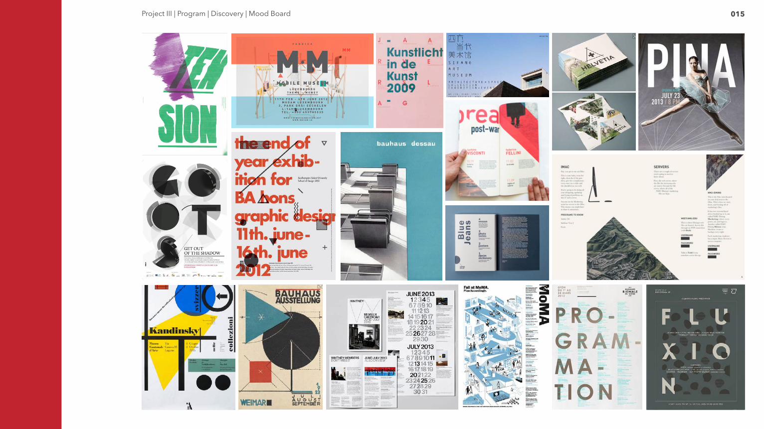
015Project III | Program | Discovery | Mood Board
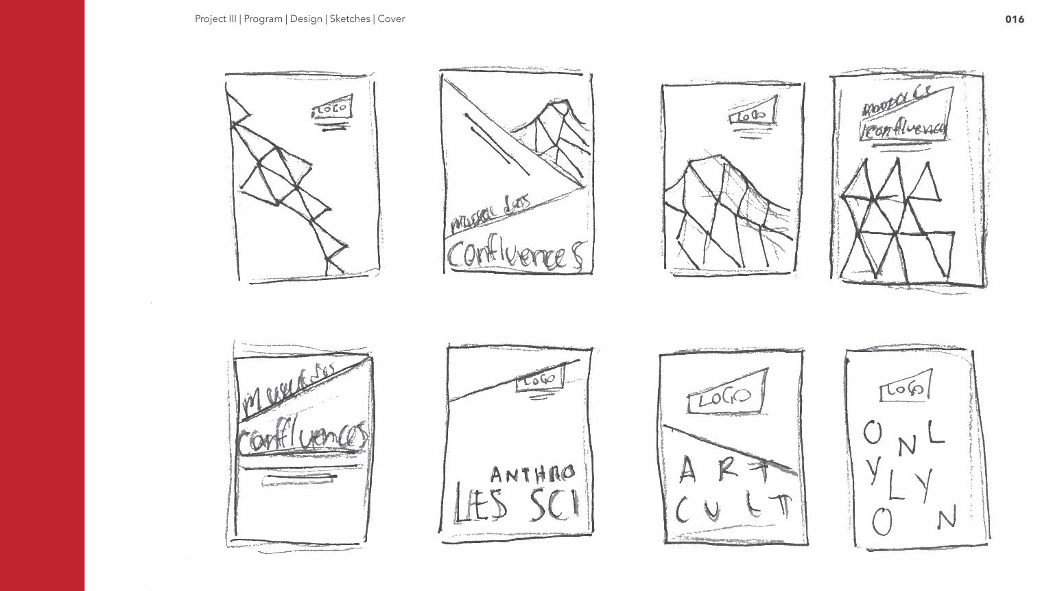
016Project III | Program | Design | Sketches | Cover
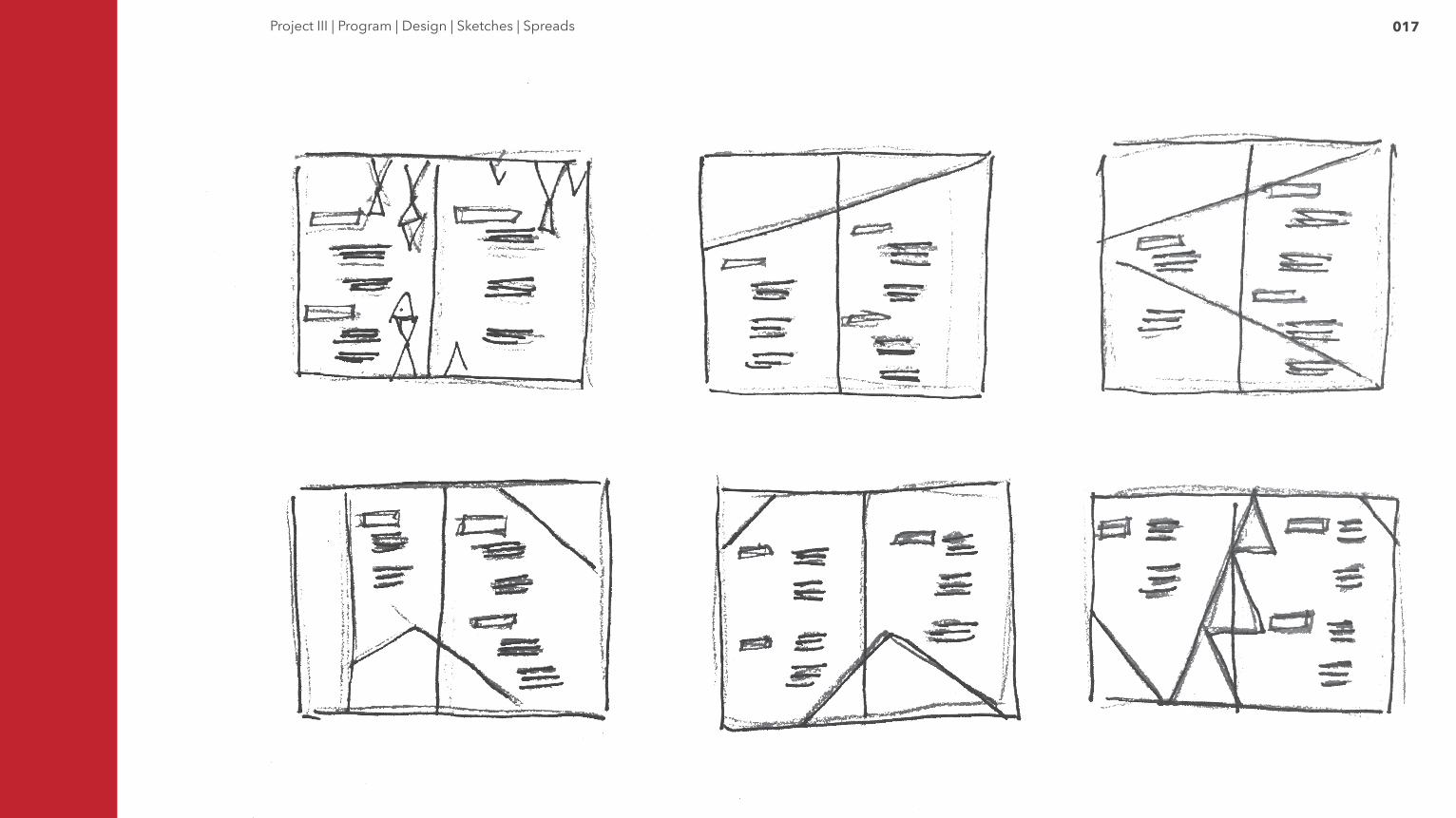
017Project III | Program | Design | Sketches | Spreads
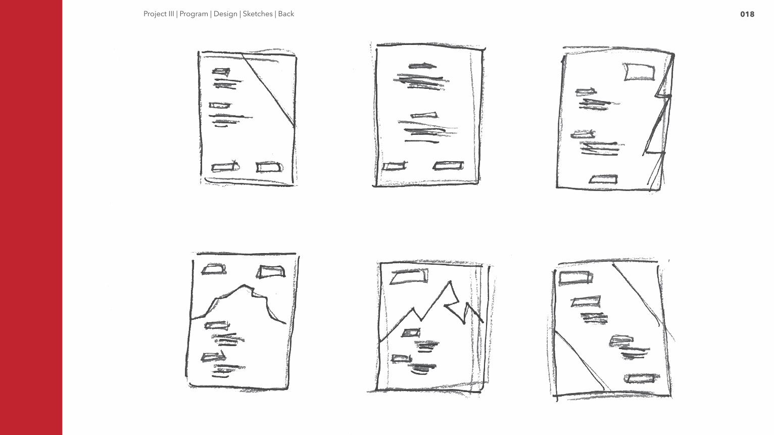
018Project III | Program | Design | Sketches | Back
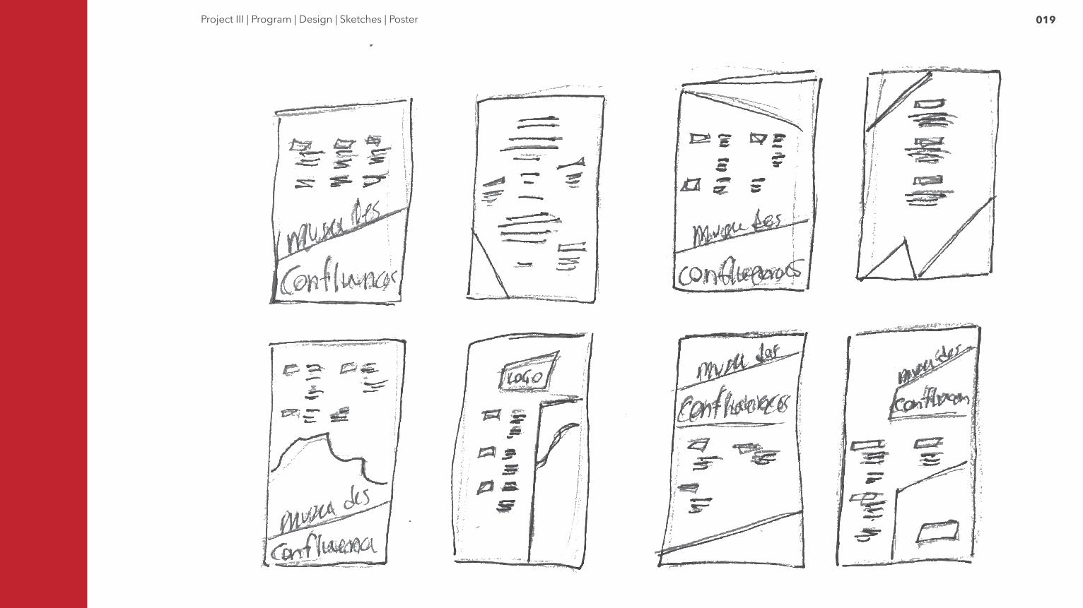
019Project III | Program | Design | Sketches | Poster
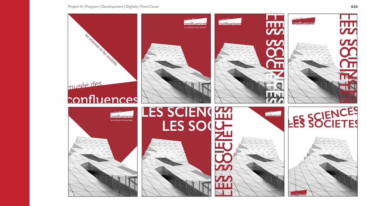
020Project III | Program | Development | Digitals | Front Cover
021Project III | Program | Development | Digitals | Events Spread
022Project III | Program | Development | Digitals | Events Spread
023Project III | Program | Development | Digitals | Back Cover
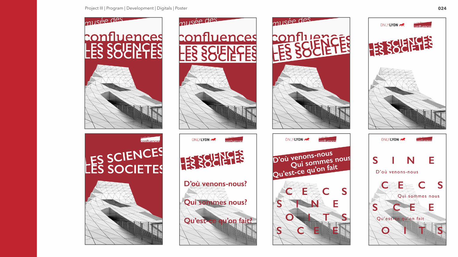
024Project III | Program | Development | Digitals | Poster
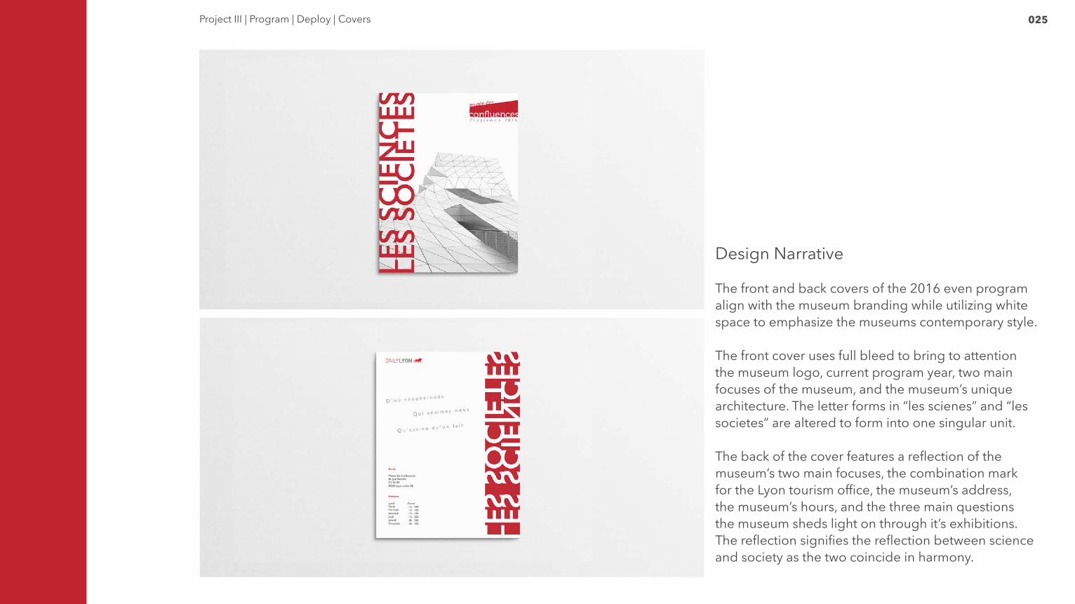
025Project III | Program | Deploy | Covers
Design Narrative
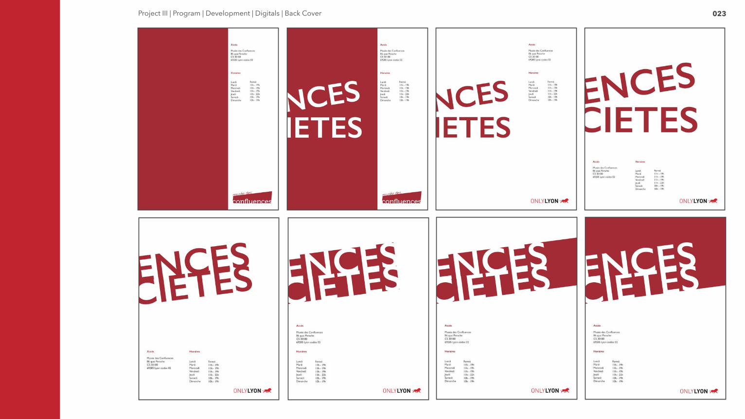
The front and back covers of the 2016 even program align with the museum branding while utilizing white space to emphasize the museums contemporary style.
The front cover uses full bleed to bring to attention the museum logo, current program year, two main focuses of the museum, and the museum’s unique architecture. The letter forms in “les scienes” and “les societes” are altered to form into one singular unit.
The back of the cover features a reflection of the museum’s two main focuses, the combination mark for the Lyon tourism office, the museum’s address, the museum’s hours, and the three main questions the museum sheds light on through it’s exhibitions. The reflection signifies the reflection between science and society as the two coincide in harmony.

026Project III | Program | Deploy | Spread
Design Narrative
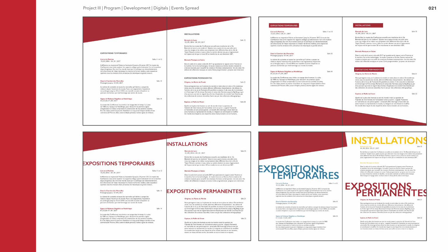
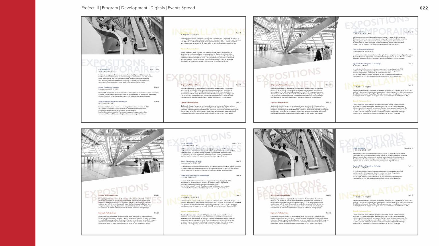
The final program spread uses the brand’s degree system along with playful typographic technique to engage with museum guests.
The three main event categories are identified by a dynamic CYMK color coding system. Permanent exhibitions are corporate red, temporary exhibitions are blue, and installations are yellow. The main titles fade into the background yet continue to distinguish the category. Each event contains a brief description, dates of which the event will be exhibited at the museum, and room numbers of which to locate the event.
A main image of the museum exterior rests on the left page to connect guests directly with the space they’ve entered and furthermore with the museum experience.
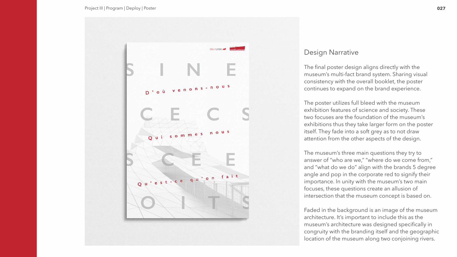
027Project III | Program | Deploy | Poster
Design Narrative
The final poster design aligns directly with the museum’s multi-fact brand system. Sharing visual consistency with the overall booklet, the poster continues to expand on the brand experience.
The poster utilizes full bleed with the museum exhibition features of science and society. These two focuses are the foundation of the museum’s exhibitions thus they take larger form on the poster itself. They fade into a soft grey as to not draw attention from the other aspects of the design.
The museum’s three main questions they try to answer of “who are we,” “where do we come from,” and “what do we do” align with the brands 5 degree angle and pop in the corporate red to signify their importance. In unity with the museum’s two main focuses, these questions create an allusion of intersection that the museum concept is based on.
Faded in the background is an image of the museum architecture. It’s important to include this as the museum’s architecture was designed specifically in congruity with the branding itself and the geographic location of the museum along two conjoining rivers.
028
Final Program
028Project III | Final Program
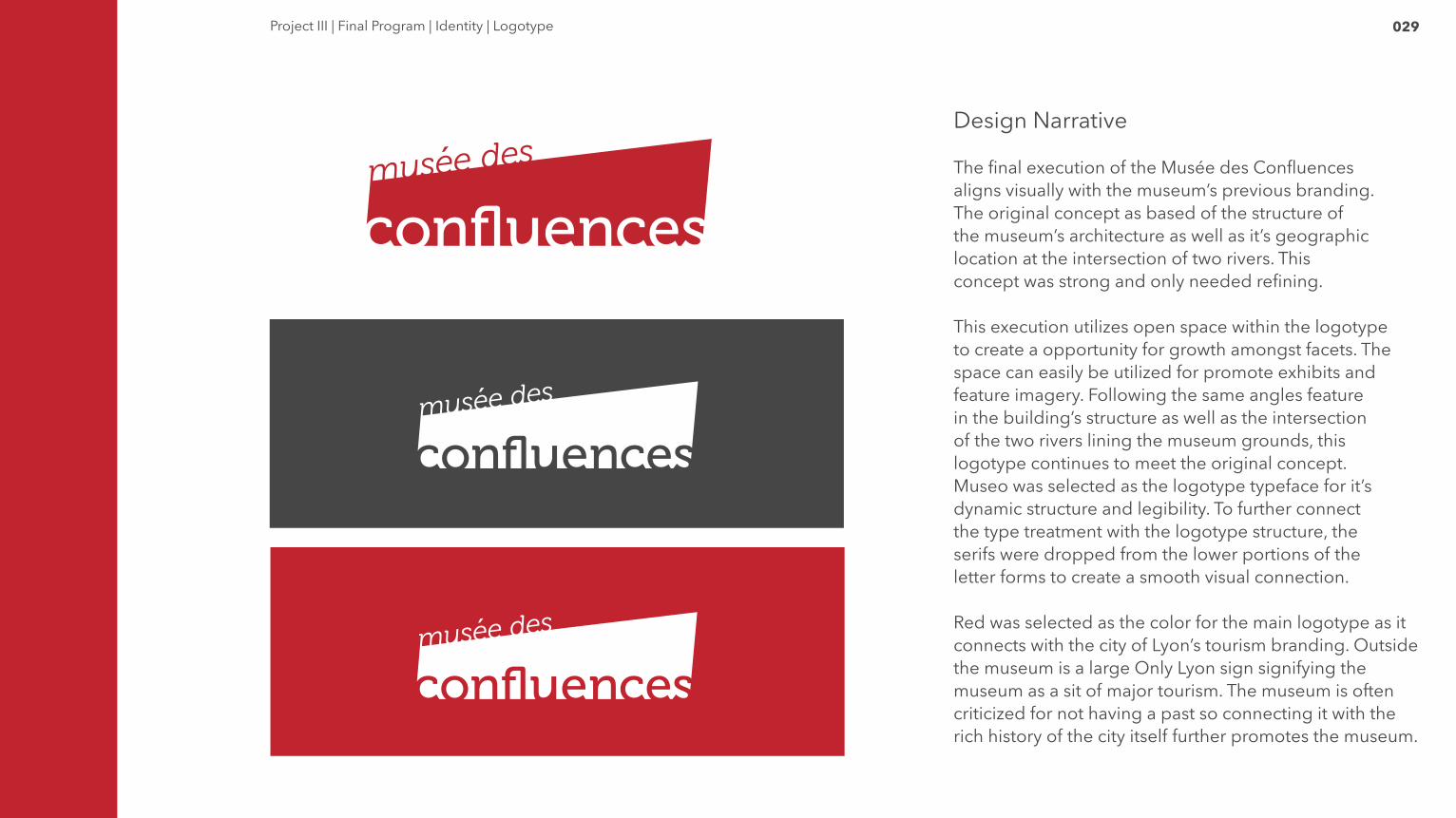
029Project III | Final Program | Identity | Logotype
Design Narrative
The final execution of the Musée des Confluences aligns visually with the museum’s previous branding. The original concept as based of the structure of the museum’s architecture as well as it’s geographic location at the intersection of two rivers. This concept was strong and only needed refining.
This execution utilizes open space within the logotype to create a opportunity for growth amongst facets. The space can easily be utilized for promote exhibits and feature imagery. Following the same angles feature in the building’s structure as well as the intersection of the two rivers lining the museum grounds, this logotype continues to meet the original concept.Museo was selected as the logotype typeface for it’s dynamic structure and legibility. To further connect the type treatment with the logotype structure, the serifs were dropped from the lower portions of the letter forms to create a smooth visual connection.
Red was selected as the color for the main logotype as it connects with the city of Lyon’s tourism branding. Outside the museum is a large Only Lyon sign signifying the museum as a sit of major tourism. The museum is often criticized for not having a past so connecting it with the rich history of the city itself further promotes the museum.

030Project III | Final Program | Program | Covers
Design Narrative
The front and back covers of the 2016 even program align with the museum branding while utilizing white space to emphasize the museums contemporary style.
The front cover uses full bleed to bring to attention the museum logo, current program year, two main focuses of the museum, and the museum’s unique architecture. The letter forms in “les scienes” and “les societes” are altered to form into one singular unit.
The back of the cover features a reflection of the museum’s two main focuses, the combination mark for the Lyon tourism office, the museum’s address, the museum’s hours, and the three main questions the museum sheds light on through it’s exhibitions. The reflection signifies the reflection between science and society as the two coincide in harmony.
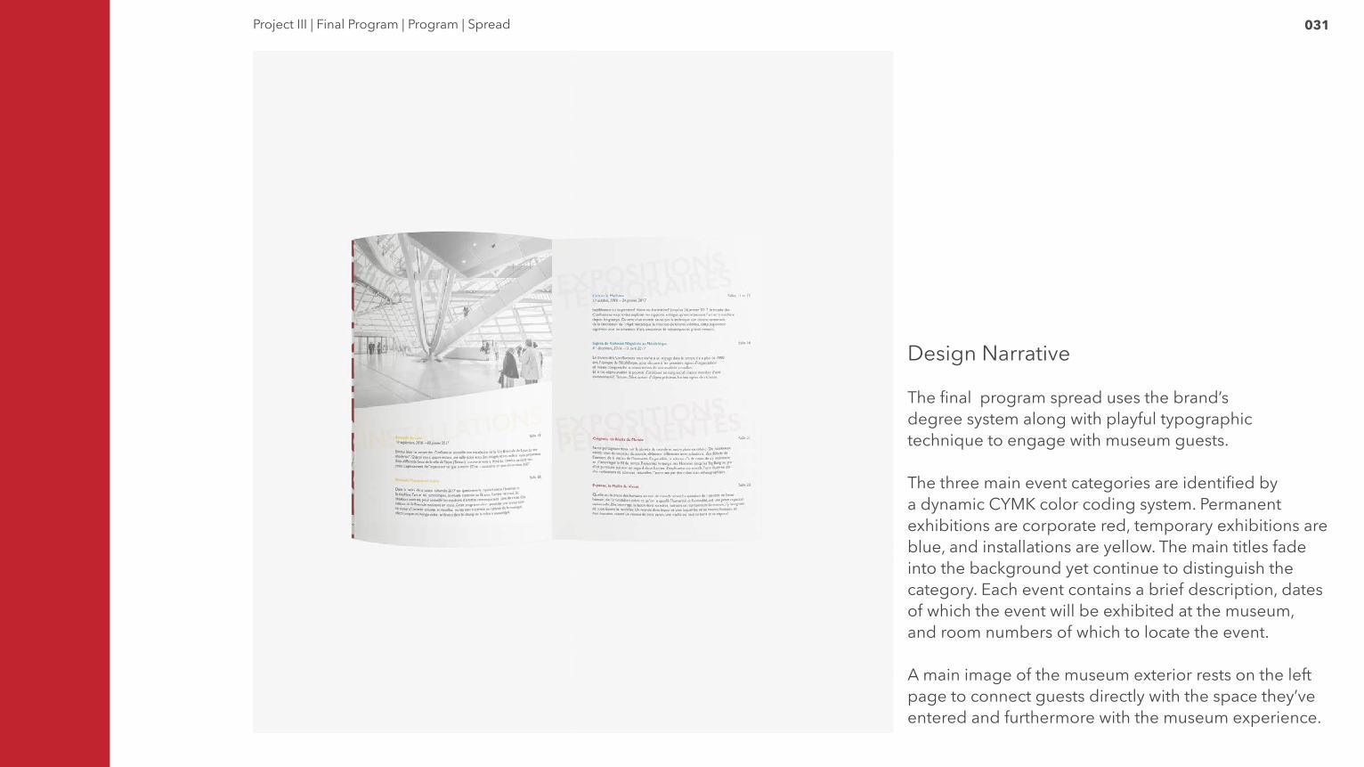
031Project III | Final Program | Program | Spread
Design Narrative
The final program spread uses the brand’s degree system along with playful typographic technique to engage with museum guests.
The three main event categories are identified by a dynamic CYMK color coding system. Permanent exhibitions are corporate red, temporary exhibitions are blue, and installations are yellow. The main titles fade into the background yet continue to distinguish the category. Each event contains a brief description, dates of which the event will be exhibited at the museum, and room numbers of which to locate the event.
A main image of the museum exterior rests on the left page to connect guests directly with the space they’ve entered and furthermore with the museum experience.

032Project III | Final Program | Program | Poster
Design Narrative
The final poster design aligns directly with the museum’s multi-fact brand system. Sharing visual consistency with the overall booklet, the poster continues to expand on the brand experience.
The poster utilizes full bleed with the museum exhibition features of science and society. These two focuses are the foundation of the museum’s exhibitions thus they take larger form on the poster itself. They fade into a soft grey as to not draw attention from the other aspects of the design.
The museum’s three main questions they try to answer of “who are we,” “where do we come from,” and “what do we do” align with the brands 5 degree angle and pop in the corporate red to signify their importance. In unity with the museum’s two main focuses, these questions create an allusion of intersection that the museum concept is based on.
Faded in the background is an image of the museum architecture. It’s important to include this as the museum’s architecture was designed specifically in congruity with the branding itself and the geographic location of the museum along two conjoining rivers.

Les Sciences et Les Sociétés