Minimalism in Data Visualization: Perceptions of Beauty ...proc.conisar.org/2017/pdf/4514.pdf ·...
13
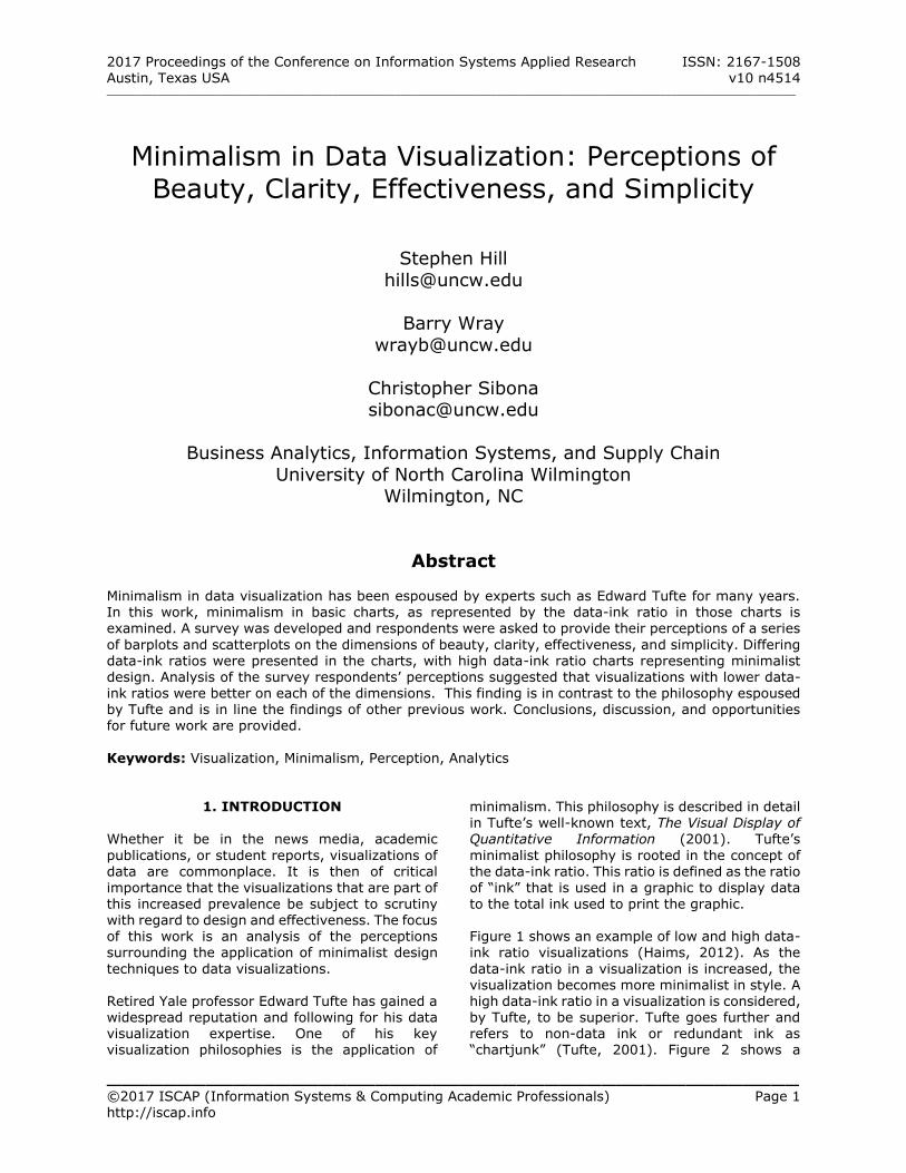
2017 Proceedings of the Conference on Information Systems Applied Research ISSN: 2167-1508 Austin, Texas USA v10 n4514 __________________________________________________________________________________________________________________________ _________________________________________________ ©2017 ISCAP (Information Systems & Computing Academic Professionals) Page 1 http://iscap.info Minimalism in Data Visualization: Perceptions of Beauty, Clarity, Effectiveness, and Simplicity Stephen Hill [email protected] Barry Wray [email protected] Christopher Sibona [email protected] Business Analytics, Information Systems, and Supply Chain University of North Carolina Wilmington Wilmington, NC Abstract Minimalism in data visualization has been espoused by experts such as Edward Tufte for many years. In this work, minimalism in basic charts, as represented by the data-ink ratio in those charts is examined. A survey was developed and respondents were asked to provide their perceptions of a series of barplots and scatterplots on the dimensions of beauty, clarity, effectiveness, and simplicity. Differing data-ink ratios were presented in the charts, with high data-ink ratio charts representing minimalist design. Analysis of the survey respondents’ perceptions suggested that visualizations with lower data- ink ratios were better on each of the dimensions. This finding is in contrast to the philosophy espoused by Tufte and is in line the findings of other previous work. Conclusions, discussion, and opportunities for future work are provided. Keywords: Visualization, Minimalism, Perception, Analytics 1. INTRODUCTION Whether it be in the news media, academic publications, or student reports, visualizations of data are commonplace. It is then of critical importance that the visualizations that are part of this increased prevalence be subject to scrutiny with regard to design and effectiveness. The focus of this work is an analysis of the perceptions surrounding the application of minimalist design techniques to data visualizations. Retired Yale professor Edward Tufte has gained a widespread reputation and following for his data visualization expertise. One of his key visualization philosophies is the application of minimalism. This philosophy is described in detail in Tufte’s well-known text, The Visual Display of Quantitative Information (2001). Tufte’s minimalist philosophy is rooted in the concept of the data-ink ratio. This ratio is defined as the ratio of “ink” that is used in a graphic to display data to the total ink used to print the graphic. Figure 1 shows an example of low and high data- ink ratio visualizations (Haims, 2012). As the data-ink ratio in a visualization is increased, the visualization becomes more minimalist in style. A high data-ink ratio in a visualization is considered, by Tufte, to be superior. Tufte goes further and refers to non-data ink or redundant ink as “chartjunk” (Tufte, 2001). Figure 2 shows a
Transcript of Minimalism in Data Visualization: Perceptions of Beauty ...proc.conisar.org/2017/pdf/4514.pdf ·...
2017 Proceedings of the Conference on Information Systems Applied Research ISSN: 2167-1508 Austin, Texas USA v10 n4514 __________________________________________________________________________________________________________________________
_________________________________________________ ©2017 ISCAP (Information Systems & Computing Academic Professionals) Page 1 http://iscap.info
Minimalism in Data Visualization: Perceptions of
Beauty, Clarity, Effectiveness, and Simplicity
Stephen Hill
Barry Wray
Christopher Sibona [email protected]
Business Analytics, Information Systems, and Supply Chain
University of North Carolina Wilmington Wilmington, NC
Abstract Minimalism in data visualization has been espoused by experts such as Edward Tufte for many years. In this work, minimalism in basic charts, as represented by the data-ink ratio in those charts is examined. A survey was developed and respondents were asked to provide their perceptions of a series
of barplots and scatterplots on the dimensions of beauty, clarity, effectiveness, and simplicity. Differing data-ink ratios were presented in the charts, with high data-ink ratio charts representing minimalist design. Analysis of the survey respondents’ perceptions suggested that visualizations with lower data-ink ratios were better on each of the dimensions. This finding is in contrast to the philosophy espoused by Tufte and is in line the findings of other previous work. Conclusions, discussion, and opportunities for future work are provided.
Keywords: Visualization, Minimalism, Perception, Analytics
1. INTRODUCTION Whether it be in the news media, academic
publications, or student reports, visualizations of data are commonplace. It is then of critical importance that the visualizations that are part of
this increased prevalence be subject to scrutiny with regard to design and effectiveness. The focus of this work is an analysis of the perceptions surrounding the application of minimalist design
techniques to data visualizations. Retired Yale professor Edward Tufte has gained a widespread reputation and following for his data visualization expertise. One of his key visualization philosophies is the application of
minimalism. This philosophy is described in detail in Tufte’s well-known text, The Visual Display of Quantitative Information (2001). Tufte’s
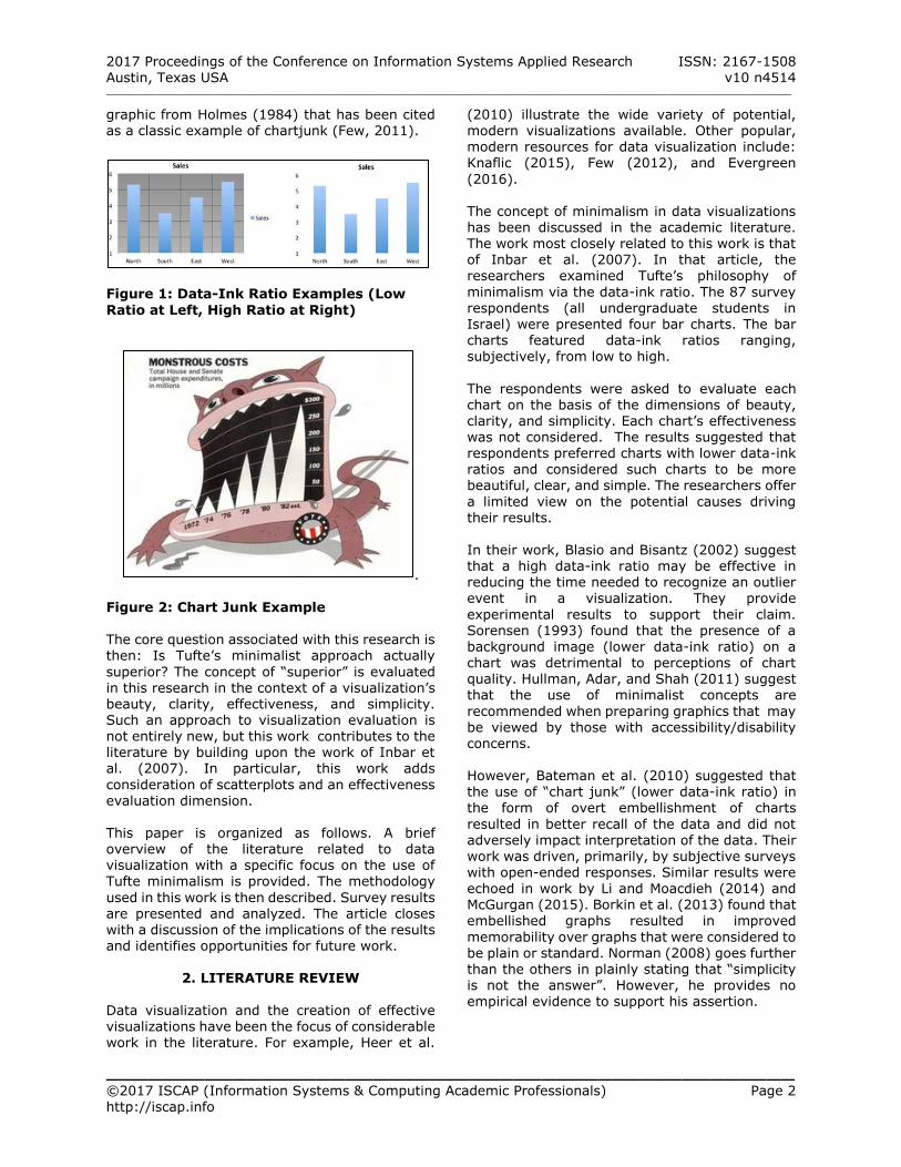
minimalist philosophy is rooted in the concept of the data-ink ratio. This ratio is defined as the ratio of “ink” that is used in a graphic to display data
to the total ink used to print the graphic. Figure 1 shows an example of low and high data-ink ratio visualizations (Haims, 2012). As the
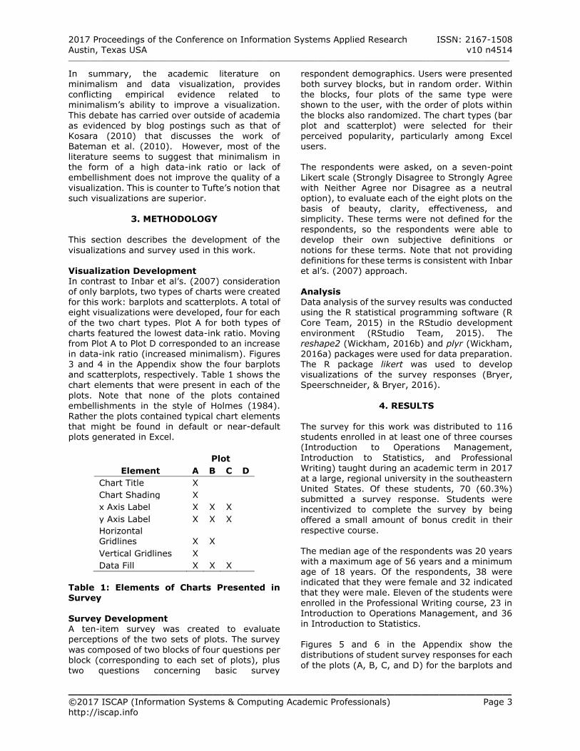
data-ink ratio in a visualization is increased, the visualization becomes more minimalist in style. A high data-ink ratio in a visualization is considered, by Tufte, to be superior. Tufte goes further and refers to non-data ink or redundant ink as “chartjunk” (Tufte, 2001). Figure 2 shows a
2017 Proceedings of the Conference on Information Systems Applied Research ISSN: 2167-1508 Austin, Texas USA v10 n4514 __________________________________________________________________________________________________________________________
_________________________________________________ ©2017 ISCAP (Information Systems & Computing Academic Professionals) Page 2 http://iscap.info
graphic from Holmes (1984) that has been cited
as a classic example of chartjunk (Few, 2011).
Figure 1: Data-Ink Ratio Examples (Low
Ratio at Left, High Ratio at Right)
.
Figure 2: Chart Junk Example
The core question associated with this research is then: Is Tufte’s minimalist approach actually
superior? The concept of “superior” is evaluated in this research in the context of a visualization’s beauty, clarity, effectiveness, and simplicity. Such an approach to visualization evaluation is not entirely new, but this work contributes to the literature by building upon the work of Inbar et al. (2007). In particular, this work adds
consideration of scatterplots and an effectiveness evaluation dimension. This paper is organized as follows. A brief overview of the literature related to data visualization with a specific focus on the use of Tufte minimalism is provided. The methodology
used in this work is then described. Survey results are presented and analyzed. The article closes with a discussion of the implications of the results and identifies opportunities for future work.
2. LITERATURE REVIEW
Data visualization and the creation of effective visualizations have been the focus of considerable work in the literature. For example, Heer et al.
(2010) illustrate the wide variety of potential,
modern visualizations available. Other popular, modern resources for data visualization include: Knaflic (2015), Few (2012), and Evergreen
(2016). The concept of minimalism in data visualizations has been discussed in the academic literature. The work most closely related to this work is that of Inbar et al. (2007). In that article, the researchers examined Tufte’s philosophy of
minimalism via the data-ink ratio. The 87 survey respondents (all undergraduate students in Israel) were presented four bar charts. The bar charts featured data-ink ratios ranging, subjectively, from low to high.
The respondents were asked to evaluate each chart on the basis of the dimensions of beauty, clarity, and simplicity. Each chart’s effectiveness was not considered. The results suggested that respondents preferred charts with lower data-ink ratios and considered such charts to be more beautiful, clear, and simple. The researchers offer
a limited view on the potential causes driving their results. In their work, Blasio and Bisantz (2002) suggest that a high data-ink ratio may be effective in reducing the time needed to recognize an outlier event in a visualization. They provide
experimental results to support their claim. Sorensen (1993) found that the presence of a
background image (lower data-ink ratio) on a chart was detrimental to perceptions of chart quality. Hullman, Adar, and Shah (2011) suggest that the use of minimalist concepts are
recommended when preparing graphics that may be viewed by those with accessibility/disability concerns. However, Bateman et al. (2010) suggested that the use of “chart junk” (lower data-ink ratio) in the form of overt embellishment of charts
resulted in better recall of the data and did not adversely impact interpretation of the data. Their work was driven, primarily, by subjective surveys with open-ended responses. Similar results were
echoed in work by Li and Moacdieh (2014) and McGurgan (2015). Borkin et al. (2013) found that embellished graphs resulted in improved
memorability over graphs that were considered to be plain or standard. Norman (2008) goes further than the others in plainly stating that “simplicity is not the answer”. However, he provides no empirical evidence to support his assertion.
2017 Proceedings of the Conference on Information Systems Applied Research ISSN: 2167-1508 Austin, Texas USA v10 n4514 __________________________________________________________________________________________________________________________
_________________________________________________ ©2017 ISCAP (Information Systems & Computing Academic Professionals) Page 3 http://iscap.info
In summary, the academic literature on
minimalism and data visualization, provides conflicting empirical evidence related to minimalism’s ability to improve a visualization.
This debate has carried over outside of academia as evidenced by blog postings such as that of Kosara (2010) that discusses the work of Bateman et al. (2010). However, most of the literature seems to suggest that minimalism in the form of a high data-ink ratio or lack of embellishment does not improve the quality of a
visualization. This is counter to Tufte’s notion that such visualizations are superior.
3. METHODOLOGY This section describes the development of the
visualizations and survey used in this work. Visualization Development In contrast to Inbar et al’s. (2007) consideration of only barplots, two types of charts were created for this work: barplots and scatterplots. A total of eight visualizations were developed, four for each
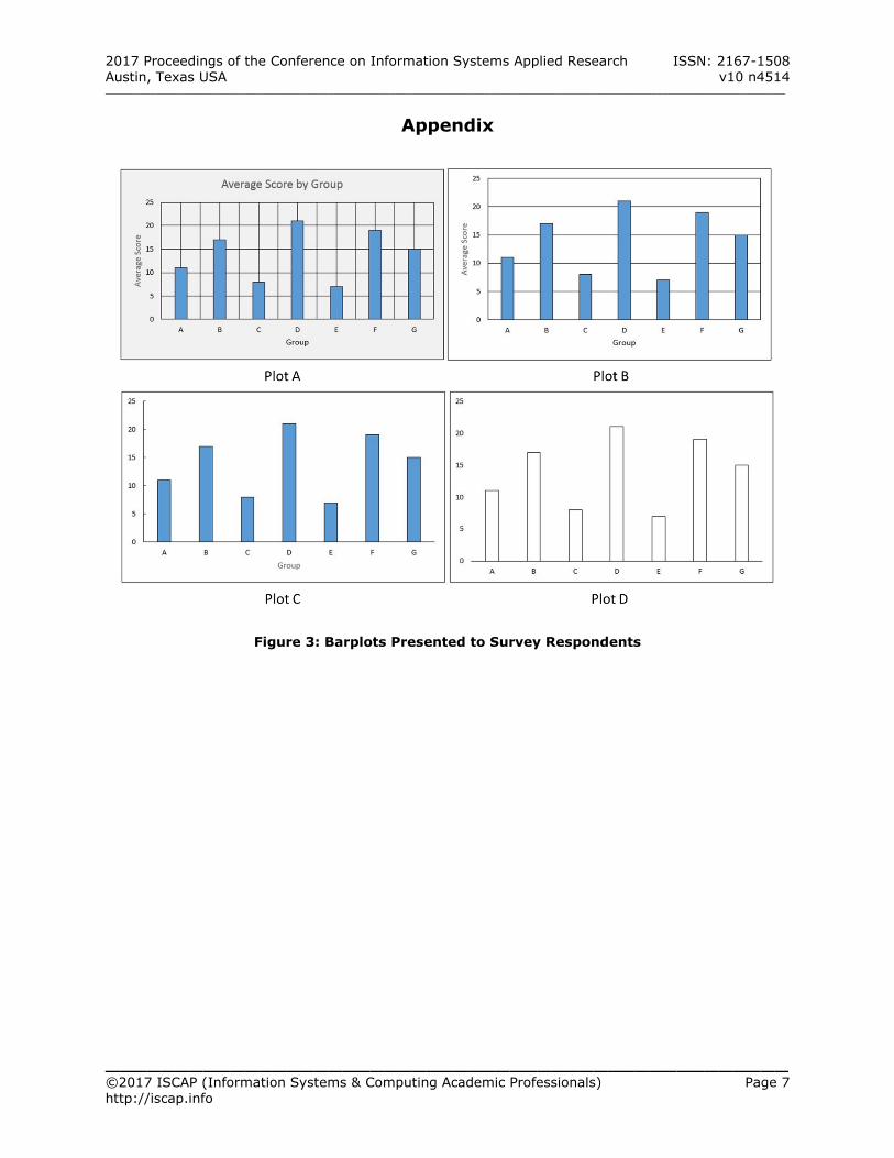
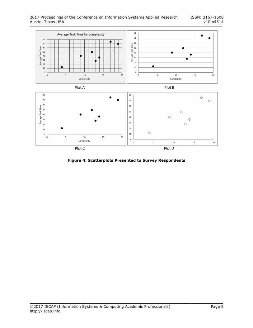
of the two chart types. Plot A for both types of charts featured the lowest data-ink ratio. Moving from Plot A to Plot D corresponded to an increase in data-ink ratio (increased minimalism). Figures 3 and 4 in the Appendix show the four barplots and scatterplots, respectively. Table 1 shows the chart elements that were present in each of the
plots. Note that none of the plots contained embellishments in the style of Holmes (1984).
Rather the plots contained typical chart elements that might be found in default or near-default plots generated in Excel.
Plot
Element A B C D
Chart Title X Chart Shading X x Axis Label X X X y Axis Label X X X Horizontal Gridlines X X Vertical Gridlines X Data Fill X X X
Table 1: Elements of Charts Presented in Survey Survey Development A ten-item survey was created to evaluate perceptions of the two sets of plots. The survey
was composed of two blocks of four questions per block (corresponding to each set of plots), plus two questions concerning basic survey
respondent demographics. Users were presented
both survey blocks, but in random order. Within the blocks, four plots of the same type were shown to the user, with the order of plots within
the blocks also randomized. The chart types (bar plot and scatterplot) were selected for their perceived popularity, particularly among Excel users. The respondents were asked, on a seven-point Likert scale (Strongly Disagree to Strongly Agree
with Neither Agree nor Disagree as a neutral option), to evaluate each of the eight plots on the basis of beauty, clarity, effectiveness, and simplicity. These terms were not defined for the respondents, so the respondents were able to develop their own subjective definitions or
notions for these terms. Note that not providing definitions for these terms is consistent with Inbar et al’s. (2007) approach. Analysis Data analysis of the survey results was conducted using the R statistical programming software (R
Core Team, 2015) in the RStudio development environment (RStudio Team, 2015). The reshape2 (Wickham, 2016b) and plyr (Wickham, 2016a) packages were used for data preparation. The R package likert was used to develop visualizations of the survey responses (Bryer, Speerschneider, & Bryer, 2016).
4. RESULTS
The survey for this work was distributed to 116 students enrolled in at least one of three courses (Introduction to Operations Management,
Introduction to Statistics, and Professional Writing) taught during an academic term in 2017 at a large, regional university in the southeastern United States. Of these students, 70 (60.3%) submitted a survey response. Students were incentivized to complete the survey by being offered a small amount of bonus credit in their
respective course. The median age of the respondents was 20 years with a maximum age of 56 years and a minimum
age of 18 years. Of the respondents, 38 were indicated that they were female and 32 indicated that they were male. Eleven of the students were
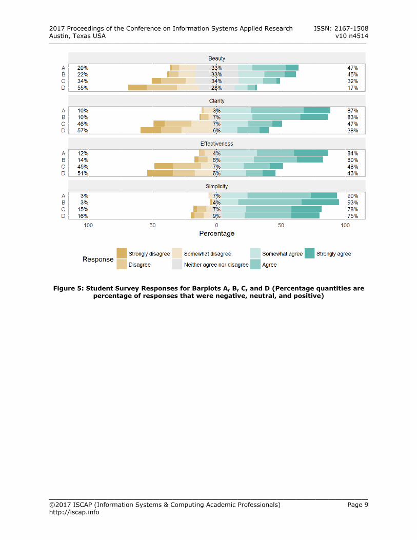
enrolled in the Professional Writing course, 23 in Introduction to Operations Management, and 36 in Introduction to Statistics. Figures 5 and 6 in the Appendix show the distributions of student survey responses for each
of the plots (A, B, C, and D) for the barplots and
2017 Proceedings of the Conference on Information Systems Applied Research ISSN: 2167-1508 Austin, Texas USA v10 n4514 __________________________________________________________________________________________________________________________
_________________________________________________ ©2017 ISCAP (Information Systems & Computing Academic Professionals) Page 4 http://iscap.info
scatterplots, respectively. Responses are grouped
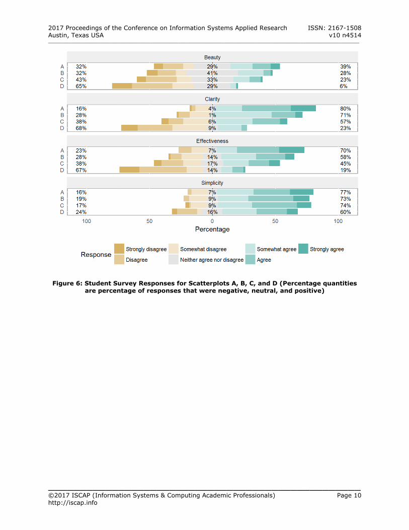
by the Beauty, Clarity, Effectiveness, and Simplicity dimensions. These figures suggest that the survey respondents largely viewed the
minimalist plots (Plots D) as the least beautiful, clear, effective, and simple. The respondents found the plots (Plots A), with the lowest data-ink ratio of the four plots, to be highest rated on each of the four dimensions. For the barplots, plots A and B are perceived to
be roughly equivalent on all four dimensions. Stripping both horizontal and vertical gridlines to create plot C results in a significant decrease (p value less than 0.05) as indicated by Fisher’s Exact Test (Fisher, 1992), on all four dimensions. For the scatterplots, there are greater differences
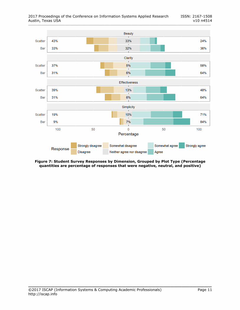
in perceptions between the four plots for the Beauty, Clarity, and Effectiveness dimensions. Each difference was significant (p value less than 0.05). Plots A, B, and C are perceived similarly on the Simplicity dimension. When comparing the plots in aggregate (grouping
responses associated with Plots A, B, C, and D together), survey respondents perceived that barplots were better than the scatterplots on each of the four dimensions. This difference was found to be significant (p values less 0.05) and is illustrated in Figure 7 in the Appendix.
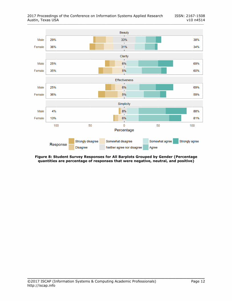
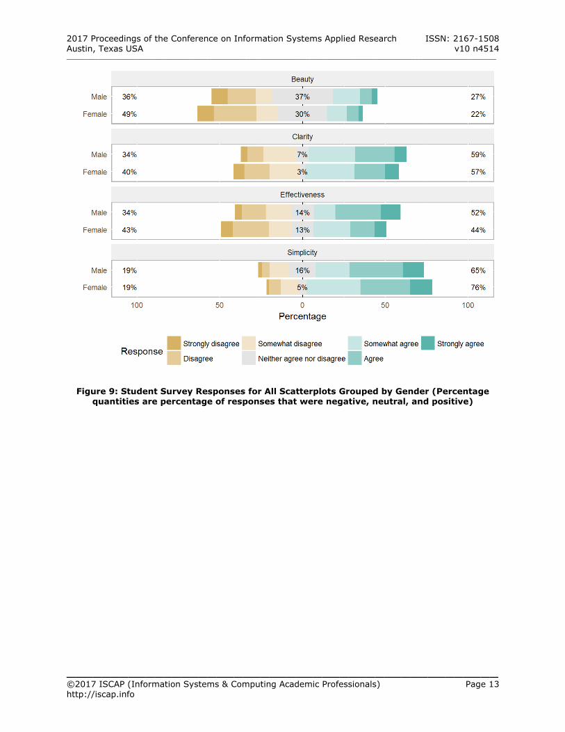
Although the researchers did not preconceive that there would be differences in perceptions by
gender, differences were found. Across all plots, female students perceived lower levels of beauty and effectiveness than their male counterparts. The difference was significant for the simplicity
and effectiveness dimensions. Females tended to perceive each of the scatterplots as featuring greater simplicity than the males. Figures 8 and 9 in the Appendix illustrate these differences in perception. Gender differences in perception of plot beauty, clarity, effectiveness, and simplicity may be an interesting extension of this work.
5. CONCLUSIONS AND DISCUSSION
In this work, perceptions of minimalist
approaches to data visualization were examined via a survey. Respondents were presented with two sets of four plots and were asked to rate each
plot on perceived Beauty, Clarity, Effectiveness, and Simplicity. The plots presented similar data, but were varied in their data-ink ratio. The results of the survey response analysis suggest that plots with lower data-ink ratios (less
minimalist) are perceived as superior on each of
the four dimensions. This held true whether the
plots presented were barplots or scatterplots. These results are in largely in agreement with previous work by Inbar et al. (2007) on barplots
across the dimensions of Beauty, Clarity, and Simplicity. The results are contrary to the philosophy of highly-regarded visualization expert Edward Tufte. Despite these findings, questions remain. For example, why did the survey respondents prefer
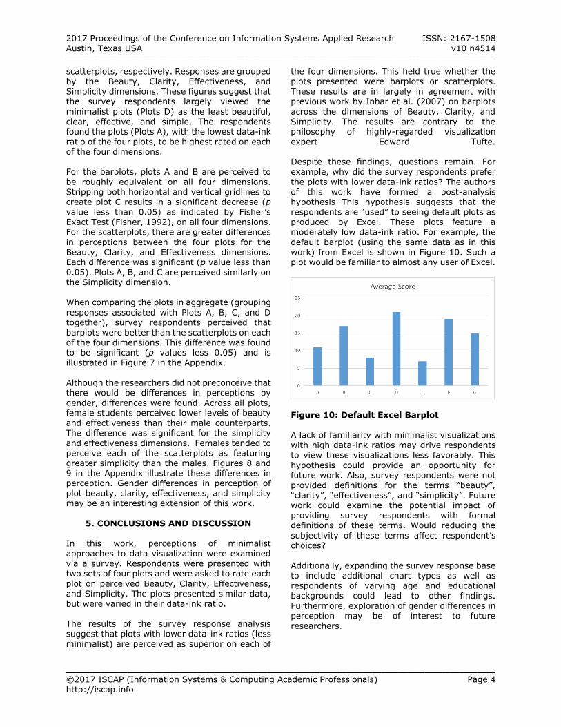
the plots with lower data-ink ratios? The authors of this work have formed a post-analysis hypothesis This hypothesis suggests that the respondents are “used” to seeing default plots as produced by Excel. These plots feature a moderately low data-ink ratio. For example, the
default barplot (using the same data as in this work) from Excel is shown in Figure 10. Such a plot would be familiar to almost any user of Excel.
Figure 10: Default Excel Barplot A lack of familiarity with minimalist visualizations with high data-ink ratios may drive respondents to view these visualizations less favorably. This
hypothesis could provide an opportunity for future work. Also, survey respondents were not provided definitions for the terms “beauty”, “clarity”, “effectiveness”, and “simplicity”. Future work could examine the potential impact of providing survey respondents with formal definitions of these terms. Would reducing the
subjectivity of these terms affect respondent’s choices?
Additionally, expanding the survey response base to include additional chart types as well as respondents of varying age and educational backgrounds could lead to other findings.
Furthermore, exploration of gender differences in perception may be of interest to future researchers.
2017 Proceedings of the Conference on Information Systems Applied Research ISSN: 2167-1508 Austin, Texas USA v10 n4514 __________________________________________________________________________________________________________________________
_________________________________________________ ©2017 ISCAP (Information Systems & Computing Academic Professionals) Page 5 http://iscap.info
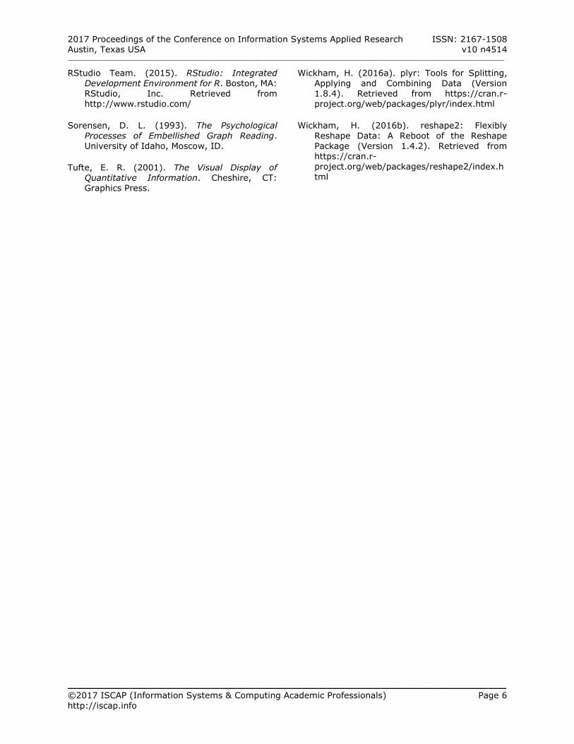
6. REFERENCES
Bateman, S., Mandryk, R. L., Gutwin, C., Genest,
A., McDine, D., & Brooks, C. (2010). Useful
junk?: the effects of visual embellishment on comprehension and memorability of charts. In Proceedings of the SIGCHI Conference on Human Factors in Computing Systems (pp. 2573–2582). ACM. Retrieved from http://dl.acm.org/citation.cfm?id=1753716
Blasio, A. J., & Bisantz, A. M. (2002). A
comparison of the effects of data–ink ratio on performance with dynamic displays in a monitoring task. International Journal of Industrial Ergonomics, 30(2), 89–101. https://doi.org/10.1016/S0169-
8141(02)00074-4
Borkin, M. A., Vo, A. A., Bylinskii, Z., Isola, P., Sunkavalli, S., Oliva, A., & Pfister, H. (2013). What Makes a Visualization Memorable? IEEE Transactions on Visualization and Computer Graphics, 19(12), 2306–2315. https://doi.org/10.1109/TVCG.2013.234
Bryer, J., Speerschneider, K., & Bryer, M. J.
(2016). Package “likert.” Retrieved from http://cran.pau.edu.tr/web/packages/likert/likert.pdf
Evergreen, S. D. H. (2016). Effective Data
Visualization: The Right Chart for the Right Data. SAGE Publications.
Few, S. (2011). The Chartjunk Debate. Visual
Business Intelligence Newsletter, No. June, 1–11.
Few, S. (2012). Show Me the Numbers: Designing Tables and Graphs to Enlighten (2nd ed.). USA: Analytics Press.
Fisher, R. A. (1992). Statistical Methods for
Research Workers. In S. Kotz & N. L. Johnson (Eds.), Breakthroughs in Statistics (pp. 66–70). Springer New York. https://doi.org/10.1007/978-1-4612-4380-
9_6
Haims, N. (2012, March 15). Data-Ink and The Dangers of Chart Junk in Information Design.
Retrieved June 14, 2017, from http://nolanhaimscreative.com/2012315data-ink-and-the-dangers-of-chart-junk-in-information-design-html/
Heer, J., Bostock, M., & Ogievetsky, V. (2010). A
tour through the visualization zoo. Commun. Acm, 53(6), 59–67.
Holmes, N. (1984). Designer’s Guide to Creating
Charts and Diagrams. New York, NY, USA: Watson-Guptill Publications.
Hullman, J., Adar, E., & Shah, P. (2011). Benefitting InfoVis with Visual Difficulties. IEEE Transactions on Visualization and Computer Graphics, 17(12), 2213–2222. https://doi.org/10.1109/TVCG.2011.175
Inbar, O., Tractinsky, N., & Meyer, J. (2007). Minimalism in Information Visualization: Attitudes Towards Maximizing the Data-ink
Ratio. In Proceedings of the 14th European Conference on Cognitive Ergonomics: Invent! Explore! (pp. 185–188). New York, NY, USA:
ACM. https://doi.org/10.1145/1362550.1362587
Knaflic, C. N. (2015). Storytelling with Data: A Data Visualization Guide for Business Professionals. John Wiley & Sons.
Kosara, R. (2010, April 22). Chart Junk Considered Useful After All. Retrieved June
15, 2017, from https://eagereyes.org/criticism/chart-junk-considered-useful-after-all
Li, H., & Moacdieh, N. (2014). Is “chart junk” useful? An extended examination of visual embellishment. Proceedings of the Human Factors and Ergonomics Society Annual
Meeting, 58(1), 1516–1520. https://doi.org/10.1177/1541931214581316
McGurgan, K. (2015). Data-ink Ratio and Task Complexity in Graph Comprehension. Retrieved from http://scholarworks.rit.edu/theses/8668/
Norman, D. A. (2008). The Way I See It: Simplicity is not the answer. Interactions, 15(5), 45.
https://doi.org/10.1145/1390085.1390094
R Core Team. (2015). R: A Language and Environment for Statistical Computing. Vienna, Austria: R Foundation for Statistical
Computing. Retrieved from https://www.R-project.org/
2017 Proceedings of the Conference on Information Systems Applied Research ISSN: 2167-1508 Austin, Texas USA v10 n4514 __________________________________________________________________________________________________________________________
_________________________________________________ ©2017 ISCAP (Information Systems & Computing Academic Professionals) Page 6 http://iscap.info
RStudio Team. (2015). RStudio: Integrated
Development Environment for R. Boston, MA: RStudio, Inc. Retrieved from http://www.rstudio.com/
Sorensen, D. L. (1993). The Psychological Processes of Embellished Graph Reading. University of Idaho, Moscow, ID.
Tufte, E. R. (2001). The Visual Display of Quantitative Information. Cheshire, CT: Graphics Press.
Wickham, H. (2016a). plyr: Tools for Splitting,
Applying and Combining Data (Version 1.8.4). Retrieved from https://cran.r-project.org/web/packages/plyr/index.html
Wickham, H. (2016b). reshape2: Flexibly Reshape Data: A Reboot of the Reshape Package (Version 1.4.2). Retrieved from https://cran.r-project.org/web/packages/reshape2/index.html
2017 Proceedings of the Conference on Information Systems Applied Research ISSN: 2167-1508 Austin, Texas USA v10 n4514 __________________________________________________________________________________________________________________________
_________________________________________________ ©2017 ISCAP (Information Systems & Computing Academic Professionals) Page 7 http://iscap.info
Appendix
Figure 3: Barplots Presented to Survey Respondents
2017 Proceedings of the Conference on Information Systems Applied Research ISSN: 2167-1508 Austin, Texas USA v10 n4514 __________________________________________________________________________________________________________________________
_________________________________________________ ©2017 ISCAP (Information Systems & Computing Academic Professionals) Page 8 http://iscap.info
Figure 4: Scatterplots Presented to Survey Respondents
2017 Proceedings of the Conference on Information Systems Applied Research ISSN: 2167-1508 Austin, Texas USA v10 n4514 __________________________________________________________________________________________________________________________
_________________________________________________ ©2017 ISCAP (Information Systems & Computing Academic Professionals) Page 9 http://iscap.info
Figure 5: Student Survey Responses for Barplots A, B, C, and D (Percentage quantities are
percentage of responses that were negative, neutral, and positive)
2017 Proceedings of the Conference on Information Systems Applied Research ISSN: 2167-1508 Austin, Texas USA v10 n4514 __________________________________________________________________________________________________________________________
_________________________________________________ ©2017 ISCAP (Information Systems & Computing Academic Professionals) Page 10 http://iscap.info
Figure 6: Student Survey Responses for Scatterplots A, B, C, and D (Percentage quantities
are percentage of responses that were negative, neutral, and positive)
2017 Proceedings of the Conference on Information Systems Applied Research ISSN: 2167-1508 Austin, Texas USA v10 n4514 __________________________________________________________________________________________________________________________
_________________________________________________ ©2017 ISCAP (Information Systems & Computing Academic Professionals) Page 11 http://iscap.info
Figure 7: Student Survey Responses by Dimension, Grouped by Plot Type (Percentage
quantities are percentage of responses that were negative, neutral, and positive)
2017 Proceedings of the Conference on Information Systems Applied Research ISSN: 2167-1508 Austin, Texas USA v10 n4514 __________________________________________________________________________________________________________________________
_________________________________________________ ©2017 ISCAP (Information Systems & Computing Academic Professionals) Page 12 http://iscap.info
Figure 8: Student Survey Responses for All Barplots Grouped by Gender (Percentage
quantities are percentage of responses that were negative, neutral, and positive)
2017 Proceedings of the Conference on Information Systems Applied Research ISSN: 2167-1508 Austin, Texas USA v10 n4514 __________________________________________________________________________________________________________________________
_________________________________________________ ©2017 ISCAP (Information Systems & Computing Academic Professionals) Page 13 http://iscap.info
Figure 9: Student Survey Responses for All Scatterplots Grouped by Gender (Percentage
quantities are percentage of responses that were negative, neutral, and positive)