


Languages
Pages
Legal


Sian DowellBilateral thinker. Creative do-er

I am a creative multi-disciplinary designer, who develops creative solutions to visually communicates ideas. The purpose of design is user interaction; be it through form or function; my design practice lies in the moment interaction between design and its user. My bilateral thinking is flexible and adaptable, exploring the junction between design and areas beyond the creative industry such as education, science and information design.
Through my indepth research, I understand who my audience are and how my designs would help, inform and entertain. I want to increase the value of design in sectors where creativity is not normally appreciated, and bridge the gap between creative and non- creative with design processes and research-driven communication.
I will make my mark by pursuing a position that allows me to combine social enterprise, information design and interaction to create better bridges between communities, busin- esses and people. An awareness for power of creativity has sparked my entrepreneurial spirit, to develop projects that utilise creative thinking and take advantage of emerging technologies.

Hurricanes in MoceanEveryone is aware of the devastation on land when a hurricane strikes, but the devastation at sea is not common knowledge. Whole reefs can be uprooted and destroyed, as well as adverse effects on the currents and temperature of the ocean, which majorly affects sea-life.
The Mocean app educates users on what happens in the ocean during a hurricane storm. Different visual elements such as animated currents, colour changes on-screen and ‘real-time’ scientific data are used to make this scientific event tangible and easy to understand, with the information designed to be visual rather than as dense text.

The high and powerful impact of the hurricane is shown by the darkening of the screen; as the hurricane sits in one spot for longer and upwelling starts to occur, the sea gets stormier. All of the components of the app, such as currents, temperature, change in colour etc. happen simultaneously with how it is used, so information has been designed to be quick and easy to read and see at one time.
Change in Sea LevelsAs the hurricane stays in one spot, upwelling occurs; this is where the deep cold temperatures of the ocean makes its ways to the warmer surface. This is shown with a colour thermometer.
Animated CurrentsThe combination of upwelling and friction from the hurricane causes changes in the currents. The currents are always moving on screen, but as the hurricane appears, the arrows get larger and faster.
Cause and Affect UX/UIThe user’s finger is the hurricane; when the user presses down in one spot for a certain amount of time, upwelling starts to occur.

Surface level
Thermocline
Deep water
20 C
7 C
11 C
Latitude 22.4N
67.1W
80mph
490mb/22.4”
Wind speed
Longitude
Pressure

Hurricances in MoceanDiscover what happens at sea when a hurricane occurs
The app could be available to download from museum websites, such as the Science Museum as part of their weather education category.
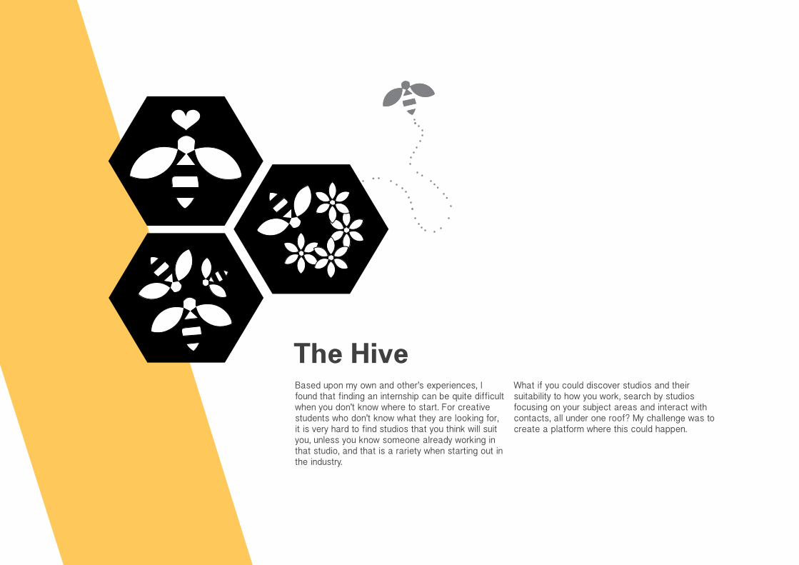
The HiveBased upon my own and other’s experiences, I found that finding an internship can be quite difficult when you don’t know where to start. For creative students who don’t know what they are looking for, it is very hard to find studios that you think will suit you, unless you know someone already working in that studio, and that is a rariety when starting out in the industry.
What if you could discover studios and their suitability to how you work, search by studios focusing on your subject areas and interact with contacts, all under one roof? My challenge was to create a platform where this could happen.

The Hive is an online directory of design studios, bridging the gap between the aspiring intern and the studio.
Traditional means of communcating with a studio are still present, such as emailing a portfolio, but this platform gives descriptions of work ethics and studio ethos to help decide which studio would be more suitable for you. The website was designed to be very quick
and easy to navigate, with attention to user flow, especially for someone who is looking through many studios at one time.
I have used information architecture to arrange the information into a tangible format, and uses drag and drop and roll-overs for a smoother user interface, which means less clicks as possible.

The Hive
Search studios by your favourite creative subjects
Discover studios and their suitability to you
Interact with contacts to help make your decision
Login Create New Login
Name Password
Search without
login
Finding an internship that feels right in the buzzing creative industry.
a new-Bee
a studio/agency
Create new login for
Name
New password
Location
Confirm password
studio/agencynew login &
profile
Please create a profile for your studio/agency. This will be the information that is crucial to helping aspiring interns find a studio that best suits them.
Studio website URL
Phone number
Brief description of studio
Offer day visit yes no
Please provide the email of your latest intern
Upload logo/icon Upload photos of work Save prof le
Please tick what design disciplines you offer at your studio:
Graphic DesignBrand and IdentityPackagingEditorialService DesignDigital DesignInteractive DesignFilm and AnimationAdvertisingProduct DesignRetail DesignExhibition Design Interior DesignClient Services
Process of work in studio
Skills desired in intern
Magpie StudioContact:[email protected]+44 (0)20 7377 7551
12/1/2015-16/1/2015
12/1/2015-23/1/2015
2/2/2015-13/2/2015
Update Profile
Add Ratings
Add Photos
Change Password
Rating from Previous Interns:
Visit studio
website
The Hive
description of the studio as a summarised sentence-what they do and how the much of the creative disciplines listed are used in their practice e.g. predominantly graphic design and editorial design with some web design
process of working-individually, regular meetings, how they generate ideas, sat an a desk and working by yourself etc.
skills that the studio are looking
Studio Profile
Studios can upload images of their work, as well as short descriptions about their studio, to save the user time clicking on different links to their website. A badge on the studio’s website signifies that they have a profile on The Hive, and when you click on it, takes you directly to the profile on the site. UX/UI Bee
As the user clicks the buttons, the bee navigates the parralax scroll of the log in pages and profile set up. This means the user never has to scroll.
We take interns
Visit our prof le on The Hive

Arranged by Location
The first step is to choose where in the UK you would like to intern. These are organised by colour and light up when the mouse hovers over it.
Arranged by Favourite SubjectA hierachy is made by the user, choosing subjects by order of importance. Once at least four subjects are filled in, the site lets the user continue onto the directory, with the lists tailored to the subjects in the users chosen order.
Favourite StudiosBy dragging the name of the studio to ‘Your Favourites’, the user starts to build up an archive of studios to compare later, and once they are in there, they are easy to find again when the user logs on in the future.

Talk to the studio’s latest intern to ask any questions about their experience
Visit the studio for the day to get a feel of the place
See availability for internships on the studio’s calender

Blueprint: Design WorkshopsBlueprint is a research project to develop a suitable learning model to implement creative education in schools.
The aim of Blueprint is to raise awareness of design subjects that are not currently taught on the school curriculum. By teaching a range of creative processes, and encourage conceptual thinking, I delivered an approach to creative learning that is relevant to subjects within the creative field and beyond it.
The workshops embed experience from tutors who are currently studying at degree or masters level, encouraging the inclination to pursue a creative subject by being role models to the students.
This type of teaching fosters persistence for the students to realise a deeper interest they may have not had before, as well as develop their problem-solving skills by use of design. This new creative working process helped to engage the disengaged learner, and inspire them to be involved in an education model that improves their outlook on learning for fun.
These were free workshops for year ten students, in seven local secondary schools in Kingston Upon Thames.

Through direct engagement with students, rather than trying to tackle higher faculty or government, I hoped that it would inspire Key Stage 4 students to pursue a career in design.
Those who attended came from ethnic minority or low income families, so my team of tutors encouraged the students with an inclination of creativity by pursuing an industry that is normally only open for the middle-class. By showing students the wide range of availability in careers, we showed them that this pathway was attainable, no matter what background they came from.
These workshops were open for any student to attend, whether they already studied art at GCSE or not, but knew that they had an interest in discovering more.
The workshops were structured so that each session had a specific design skill or creative thought-process, taught through activities to engage in processes different to what they are taught in school. This included how to visually research through mind-maps and thumbnail sketches, consideration of an audience and who they are designing for, and playing with idea generation by making everyday objects, such as Vaseline tins, into something better and more appropriate for a certain market.


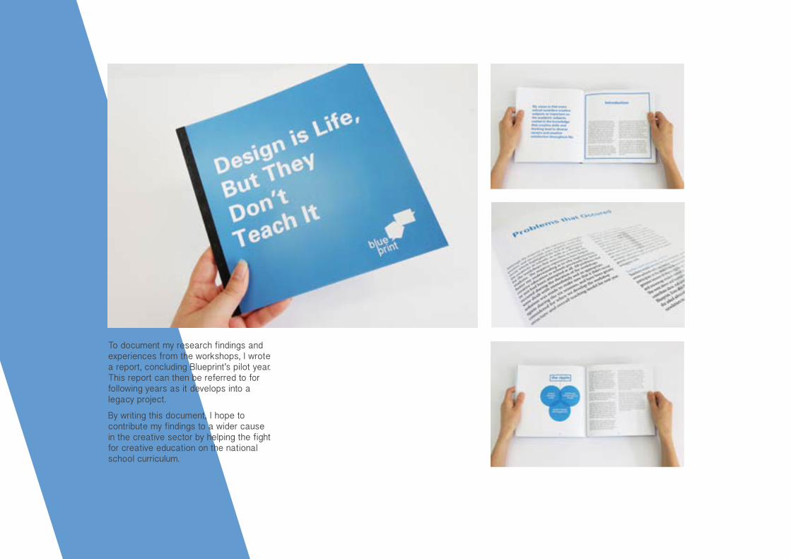
To document my research findings and experiences from the workshops, I wrote a report, concluding Blueprint’s pilot year. This report can then be referred to for following years as it develops into a legacy project.
By writing this document, I hope to contribute my findings to a wider cause in the creative sector by helping the fight for creative education on the national school curriculum.

Blueprint: ExhibitionAs part of the workshop initiative, we gave the students a small brief. This was to engage the students and help them learn that design can be a powerful platform to communicate the issue, and change other’s perceptions through design.
This applied the creative skills and thinking they had learnt in the first few sessions. I wanted to exhibit their ideas, and show that the students
had used their creative and conceptual approaches to be able to visually communicate.
The exhibition was shown at the Stanley Picker Gallery on 25th-27th March 2015, with a private view for parents and teachers.


My Health ServiceThe NHS and Coordinate My Care (CMC) wanted to improve the care given to their patients and see the effectiveness of their service. They approached Kingston University Graphic Design students to design a platform for this to happen.
Through case studies and interviews with NHS staff, we realised that no one is sure who actually has control, since patients assume its their GP, and GPs want more responsibility taken by patients. Our film is
a platform to start the debate for who has control, inspiring more passive users of the NHS to take more control of their care and help GPs by taking a more active role.
We used the concepts of individuality, representing each different patient and case scenario with a different ball. The outcomes for the project were shown at an exhibition at the Royal Marsden Hospital in November 2014 and E-Health Week in February 2015.coordinate
my care

Our film was based solely from primary research, with particular focus on real case studies and current long-term users of the NHS, and used their experience to create a narrative that covered every NHS user, both active and non-active.
The case studies were in-depth investigations of how our nation use the NHS and its resources, and how we can evoke change to their attitudes towards the service given, since many cases had had negative experiences.
We experimented with footage of sports and ball games to see if our concept would communicate well, and once our class had understood thefilm, we made our own footage, using a different character with each different ball.
By using extracts of audio from interviews, veiwers will resonate with at least one person we represent in our film, and understand how they can help the effectiveness of NHS care given to users.

Control Film Storyboard
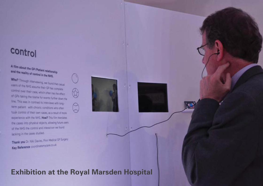
Exhibition at the Royal Marsden Hospital


The Institute of Sexology The Institute of Sexology is an exhibition at the Wellcome Collection, exploring the history of the study of sex through social experiments, photography, scientific data and historical artefacts. The exhibition was a collection of interesting studies, but had no true coherent order or chronology.
Collaboratively with Hayley Lewis and Sian Bowles, we chose to redesign the exhibition catalogue for this exhibit to make the exhibition flow.
Since this was a scientific exploration, featuring collections from Freud and Henry Wellcome himself, we presented the catalogue as an academic journal, but instead of having dense text, we designed a historically narrated text to tell the story, with quotes from the Sexologists and collectors in the exhibition, showing viewers the sexologist’s personal explorations and studies to bring back the social aspect of sex.


Touchpoint: B&QB&Q have a great brand essence; an affordable and accessible DIY and home improvement retailer that welcomes every shopper with socibility and simplicity, making them feel at home and stress free.
However, when visiting the store, the in-store experience does not match this. The layout feels slightly outdated, and the visual language does not
match their website, meaning colour navigation was different, and the general look of the store did not have consistency with other brand touchpoints.
I have renewed the B&Q brand, as well as designed a new touchpoint to update the in-store experience for the modern customer, as well as encourage returning cutomers to enjoy the new experience.

The navigation around store is confusing, as all the signs look similar with black backgrounds and orange borders.
Current In-Store Branding
The website has recently been updated, and uses coloured icons for each different room in a house and section for online shopping. This colour system has been used on the map in-store, but nowhere else, and even then the colours on the map are not following the coloured sections on the website.
The continuity with the colours used for the brand could be improved and applied to more touchpoints in-store to make navigation esier for customers.

Bathroom Bedroom
Garden All rooms
Decoration Kitchen
New In-Store Wayfinding and Signage
Using the icons from the website, I have updated the branding in-store, using colour navigation to create a new wayfinding system.
The map has been redesigned accoding to the colours of the sections on the website. Once these colours had been established, the colours could be used for the signage.
The large signs show where each section starts and ends, and signs on the ends of aisles indicate the aisle number and what is sold down that aisle.
Other wayfinding signs include directional signs, using the colours of the sections for the typography on a clear white background, and keeping elements of B&Qs famous orange with arrows and in-store services, such as toilets, tills and cutting areas.

C=0Y=74M=100K=0
C=34Y=89M=12K=0
C=69Y=80M=0K=0
C=83Y=14M=67K=1
C=0Y=37M=99K=0
C=53Y=0M=94K=0
C=78Y=22M=16K=0 C=0Y=0M=0K=100
B&Q Logo
With the new wayfinding and use of colour, it felt appropriate to update the use of the logo. I kept the same square shape and use of type, but used the square shape to create house shape. The variations of colour represent different rooms in the house, and brings individuality by having different colour combinations.
These are representative of the wide range of customers that shop at B&Q, and can be applied to more touchpoints in-store, such as on shopping bags, vinylls on the entrance doors and in car parks.

“B&Q is welcoming to anyone who is interested in improving their home, not just the professional builder. The warehouses have everything I need;
they are quite chaotic inside because of the layout, but I go in there so often I know where
everything is off by heart.”
John Jensen27, Builder
“We also shop here when we are doing up the house, which is every two years. We still have to ask staff members how to do certain things in
the house, but most times there is no staff around to ask, so we look online once we get home and then visit the store again to buy the
products we need.”
Steve and Bettie Finlay69 and 72, avid DIY decorators
“I have worked at B&Q for 4 years now. I have been trained to consult for kitchen fitting, but most times customers don’t know they can
make an appointment with me and see me then and there. I think its because customers are used to booking online, but its not an option
on our website.”
Emma Rielly38, B&Q Employee
Customer and Employee Feedback
During initial market research, I asked employees and customers their thoughts on B&Q and how they interact with the brand. Their answers revealed insights that offered development for a new touchpoint.

search your list
info guides
project tools
scan item find help
a new in-store shopping
experience
Introducing New Technology to B&Q Many retailers are becoming digitised to keep up with the switched-on modern shopper. Customer service is a high priority for B&Q, but as the in-store experience gets out-dated, they may lose customers to online shopping due to lack of new technologies.
The Personal Assistant is a digital device for in-store customer service. They are available to borrow from the customer service desk, and then take back as you leave the store. The device has been designed for customers of all ages, and has been designed to accomodate senior customers according to guidelines for digital devices.

Personal Assistant
240 mm
169.
5 m
m
Wireless Tablet
165.
5 m
m
233 mm

Search for ItemsThe search includes which aisle the item is located in, recommended items to buy with it, and an option to add it to the customer’s personal shopping list.
Personal Shopping ListThe shopping list shows the items in order of location around store. This makes it more efficient to grab those items while the customer is walking around store.
Project ToolsThis shows instructions for common DIY projects for homeowners, with a list of the products the customer will need to complete that project.
Information GuidesThe guides have important information needed for each section, including calculators, guides for different wood, measurements etc.
hammer 5Found in aisle
Recomended with this item:
Your list Your listAdd more products
5
8
11
15
21
Project toolsYour list
PlanningPaving calculator
Metric calculator
Garages and gardensBack to info
guides
Sheds and garden buildings
Fencing
Decking and wood work

Scanning
Scanning allows the customer to find out more information about a product or help decide colour schemes for decorating.
By scanning the barcode of a product, it gives the customer a full description of the product that may not be available on the label. It also shows ratings from people who have reviewed it online when shopping through the website. This product can then be added to the customer’s shopping list.
The customer can scan any colour they please by lining it up with the camera at the back of the hand device, anything from a sweet wrapper to a piece of material. Once it has scanned, the customer can add it to their collection of samples to build up a colour palette, and take it to the paint desk to be mixed.
Scan item
Products Samples
Colour sample Scan another item
add to sample list
Your list
JCB cordless 20v combi drill 2 batteries
Scan another item
Add to list
5Found in aisle
Your list

Nearest assistant
Book a consultant
4.05 Neil Dowell
12
39
6
3.50
3.55
4.00
4.10
4.15
4.20
Engaging with In-Store Staff
Sometimes customers still need help with a project or need to enquire with an employee.
Since sometimes customers have trouble locating members of staff in such large warehouses, the hand device can both locate the nearest available assistant, with a GPS magnet attached to their aprons, and let you book an appointment with a consultant to see within minutes of booking.

STUDENT AMBASSADORCass Art Sept 2014-July 2015
FREELANCE PRESENTATION DESIGNERAlan Paine Sept 2014 SALES ASSISTANTCoastal Enterprises 2007-2014
ACCOUNT EXECUTIVE INTERNCommunisis July 2014
GRAPHIC DESIGN INTERNSilk Pearce June 2014
ANNUAL FUND STUDENT CALLERKingston University Mar-Apr 2014
VISITING ART TUTORCooper UnionFeb 2014
SALES ASSISTANTThe East of England Co-operative Society 2009-2012
Experience
KINGSTON UNIVERSITYBA (Hons) Graphic Design 2012-2015
COLCHESTER INSTITUTEFoundation Diploma Distinction2011-2012
TENDRING TECHNOLOGY AND SIXTH FORM COLLEGE 2004-20113 A-levels grade A-B, 11 GCSEs grade A*-B
Education
I am a multi-disciplinary creative and bilateral thinker who will tackle any brief with a bold and creative solu-tion. I explore all pathways of design through research to strategise and communicate an idea. I thrive with projects surrounding interactivity and social change, and have ambitions to use my creative skills and thinking to create great solutions for business-es, brands and charities, or start my own social business.
Hello
Top Related