


Languages
Pages
Legal


Media courseworkTaylor
Chambers

The masthead instantly allows us to understand what we can expect from the magazine
The main image is a perfect example of what aspect of school life this magazine is focusing on
The words at the bottom of the magazine also allow us to understand what can be of expected inside the magazine
The puffs also give us and sneak preview of what is inside the magazine helps us to decide whether we want to buy the magazine or not
Colour scheme of orange yellow and white, colour scheme is maintained on the front cover
There is a anchorage so we know who the person in the front cover is
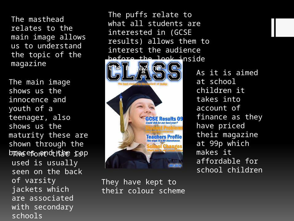
The masthead relates to the main image allows us to understand the topic of the magazine
The main image shows us the innocence and youth of a teenager, also shows us the maturity these are shown through the braces and the cap
The puffs relate to what all students are interested in (GCSE results) allows them to interest the audience before the look inside the magazine
As it is aimed at school children it takes into account of finance as they have priced their magazine at 99p which makes it affordable for school children
The font that is used is usually seen on the back of varsity jackets which are associated with secondary schools
They have kept to their colour scheme

The masthead again relates to the main image as it shows students reading
The students aren’t giving the camera any eye contact to show that they are interested in the books
Colour scheme of white blue and black
The main image and puff allow us to get a sneak preview of what can be expected inside the magazine
Appropriate catchphrase for a school magazine

This is a close up of two students. Only includes the top half of their body.
I have edited this picture by darkening the edges and darkening the background, I also darkened the two girls in order to make the picture clearer.
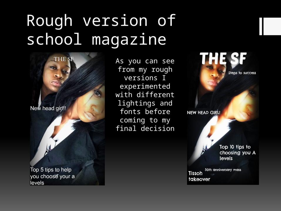
Rough version of school magazine
As you can see from my rough versions I experimented with different lightings and fonts before
coming to my final decision

I have changed the picture from colour to black and white and I have cropped out the other member of the photo in order to make the picture the right size for a magazine
I standard colour picture of two students working

This is the final version of my
school magazine, as you can see I have further edited the
pictured and added puffs in order to attract
my audience into buying and reading my
magazine, the smaller pictures
on the cover allow the
audience to get a insight into what can be expected
inside the magazine
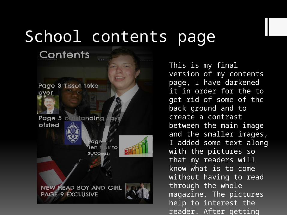
School contents page
This is my final version of my contents page, I have darkened it in order for the to get rid of some of the back ground and to create a contrast between the main image and the smaller images, I added some text along with the pictures so that my readers will know what is to come without having to read through the whole magazine. The pictures help to interest the reader. After getting feedback from other peers I decided to go with this design as this seemed to please most

Colour scheme
R&B
R&B R&B
I would choose to use images like these as they are some of the most recognisable R&B artists
R&B magazines usually have clear bold font so these are some of the fonts I would choose
From R&B magazines I have seen they mostly consist of colours such as Blue and white so that’s why I've chosen these

Mood board

MAIN IMAGE
MAST HEAD
QUOTETEXT
TEXT
TEXT
Page number
Page number
Page number
PICTURE
EDITORS COLUMN

Front cover analysis
Vibe is published Len Burnett

Contents page analysis
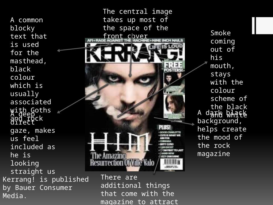
A deep direct gaze, makes us feel included as he is looking straight us
A common blocky text that is used for the masthead, black colour which is usually associated with Goths and rock
A dark black background, helps create the mood of the rock magazine
Smoke coming out of his mouth, stays with the colour scheme of the black and white
The central image takes up most of the space of the front cover
There are additional things that come with the magazine to attract a specific type of audience
Kerrang! is published by Bauer Consumer Media.
Top Related