


Languages
Pages
Legal

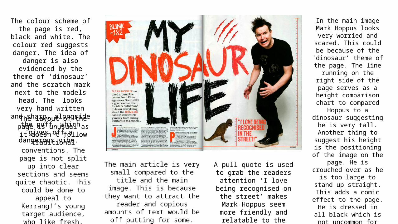
In the main image Mark Hoppus looks very worried and scared. This could be because of the ‘dinosaur’
theme of the page. The line running on the right side of the page serves as a height
comparison chart to compared Hoppus to a
dinosaur suggesting he is very tall. Another thing to suggest his height is the
positioning of the image on the page. He is crouched over as he is too large to
stand up straight. This adds a comic effect to the page. He is dressed in all black which
is not uncommon for punk/alternate people. The
target audience would identify with him and his
image as this is how they’d dress.
The colour scheme of the page is red, black and white. The colour red suggests danger. The idea of danger is also
evidenced by the theme of ‘dinosaur’ and the scratch
mark next to the models head. The looks very hand written
and sharp, alongside the puff, which gives off a dangerous
vibe.
The main article is very small compared to the title and the main image. This is because they want to
attract the reader and copious amounts of text would be off
putting for some.
The layout of the page is unusual as it doesn’t follow traditional conventions. The page is not split up into clear
sections and seems quite chaotic. This could be done
to appeal to Kerrang!’s young target audience, who like fresh, quirky ideas and
do not follow to regulations themselves.
A pull quote is used to grab the readers attention ‘I love
being recognised on the street’ makes Mark Hoppus
seem more friendly and relatable to the audience.
Top Related