


Languages
Pages
Legal

Designing e-learning v4.doc 1 © 2012 Bryan Hopkins
Instructional design for e-learning
A guide for the Global Learning Centre
Written by Bryan Hopkins
Senior Learning Solutions Officer
UNHCR GLC, Budapest
I n s t ruct iona l des i gn for e - learn ing
Designing e-learning v4.doc 2 © 2012 Bryan Hopkins
Contents
Introduction ...................................................................................................... 3
What makes learning effective? .............................................................................. 4
Some key ideas ............................................................................................... 4
Applying these theories ..................................................................................... 8
The systematic approach to designing learning materials ............................................. 12
ADDIE ......................................................................................................... 12
Defining the objective of the learning .................................................................... 14
Writing objectives ......................................................................................... 14
Deciding how to present e-learning ....................................................................... 17
Possible high-level approaches .......................................................................... 17
Lower-level structures .................................................................................... 21
Designing e-learning for systems training ............................................................. 26
Developing content ........................................................................................... 29
Structuring a module ...................................................................................... 32
Doing the detailed design ................................................................................... 35
Writing instructional material ........................................................................... 35
Combining on-screen text and audio ................................................................... 39
Writing questions ............................................................................................. 41
General principles for writing good questions ........................................................ 41
Multiple-choice questions ................................................................................ 46
Alternative response questions .......................................................................... 52
Matching questions ........................................................................................ 54
Free format questions ..................................................................................... 55
Essay response questions ................................................................................. 56
Reflection questions ....................................................................................... 59
Technical aspects of e-learning design ................................................................... 62
Screen design ............................................................................................... 62
Using visual material ...................................................................................... 67
What functionality does a course need? ............................................................... 68

I n s t ruct iona l des i gn for e - learn ing
Designing e-learning v4.doc 3 © 2012 Bryan Hopkins
Introduction
This guide looks at some of the issues you need to take into consideration when designing self-paced, distance learning materials using computers, for convenience referred to here as ‘e-learning’.
I n s t ruct iona l des i gn for e - learn ing
Designing e-learning v4.doc 4 © 2012 Bryan Hopkins
What makes learning effective?
Some key ideas
Behaviourism (Operant conditioning) Behaviourism is a large topic within psychology that sees human behaviour as being a response to its environment: we see a stimulus and we respond. If the reaction to our response is positive we internalise that response to that stimulus.
This simple stimulus-response mechanism makes the internal workings of the mind, in terms of mood, personality, etc, irrelevant. Behaviourists may therefore see the concept of 'theories of learning' as irrelevant.
The main contributor to Behaviourism as applied to learning was B F Skinner, who is associated with what is sometimes known as radical behaviourism or operant conditioning.
Behaviourist approaches to learning propose that we provide the necessary information or instruction to a learner, test that they have learnt and then provide the appropriate response (positive praise or correction).
A rigorous application of behaviourism in learning design therefore leads to a highly controlled structure, which is why Skinner's ideas are often associated with the concept of the 'learning machine'. While such rigorousness has gone out of fashion, these ideas have inspired later thinking such as Gagne's Conditions of Learning and Mager and Pipe's Criterion Referenced Instruction.
Constructivism Bruner saw learning as an active process in which people construct new ideas based on existing knowledge and experience.
Learning materials should therefore be designed in such a way that it is easy for a learner to:
access material in a way that is most appropriate for them
integrate it with what they already know or can do
This integration is helped by contact with other learners.
In practice, constructivist learning design provides a learner with a learning goal and resources that will allow them to reach that goal. They will be provided with a limited amount of external direction.
An overall constructivist approach should be supported by monitoring and directed interventions as necessary (often referred to as 'scaffolding'). How much scaffolding is needed depends on the extent to which a learning designer believes it to be appropriate, and herein lies a problem with constructivism. Some writers feel that the limitations of the brain's working (short-term) memory mean that having to come to terms with a learning process as well as content makes unsupported constructivism an inherently inefficient way to learn, and that more directed, behaviourist, approaches are therefore better for novices.
Pure constructivism seems to suggest that systematic instructional design is inappropriate, but recent thinking regarding the importance of scaffolding has suggested that the two approaches can co-exist.
I n s t ruct iona l des i gn for e - learn ing
Designing e-learning v4.doc 5 © 2012 Bryan Hopkins
Andragogy As opposed to pedagogy (children's learning), andragogy is concerned with how adults learn. Knowles' theory proposes that:
adults need to know why they are learning something
learning should be task-oriented and experiential rather than simply knowledge
learning should be relevant to the individual's work
adults prefer problem-oriented learning rather than content-oriented
The process of learning is therefore more important than the content, and learning materials should be a resource. Trainers should facilitate learning rather than simply instruct, which is the model implied by the experience of the traditional 'schoolteacher'.
Experiential learning Rogers proposed that learning is more effective when someone sees that the subject matter is relevant to them.
Learning activities should be designed so that the learner:
feels safe and their self-esteem is not threatened
should have opportunities to self-evaluate their progress.
Cognitive flexibility Spiro felt that if a learner were to be able to apply new ideas to different situations that the learning materials should be designed in such a way that they provided multiple representations of the content. In other words, that it is possible to consider different ideas and applications relating to the same subject.
Conditions of learning This particularly influential idea put forward by Gagne proposed that certain conditions needed to be met in order for someone to learn. These conditions for the basis for a sequence of learning activities:
gain the learner's attention
tell the learner what the objective is
remind the learner of relevant knowledge they already have
present the new information
guide the learner through the learning process
elicit a response from the learner
provide feedback
assess the performance
generalise the knowledge and relate it to reality
This process is commonly used in the structural design of learning activities and materials.
Gagne also discussed the notion of 'hierarchies of learning', which range from simple recognition of a stimulus through to problem-solving. This relates closely to Bloom's taxonomy of behavioural objectives.
Four-component instructional design Four-component instructional design (4C/ID) is a model developed by van Merrienboer for designing programmes for training complex skills. The four components are:
I n s t ruct iona l des i gn for e - learn ing
Designing e-learning v4.doc 6 © 2012 Bryan Hopkins
learning tasks, aimed at giving practice in the entire complex skill
supportive information, the theory needed so that learners can develop schemata, mental models they can use to decide on successful strategies.
just-in-time information, step-by-step instructions that the learner must learn to follow rigorously
part-task practice, sub-tasks needed to achieve the whole task.
It defines complex skills as those requiring expertise in multiple inter-connected objectives and looks to provide a process by which people learn the necessary skills in a co-ordinated and integrated manner, rather than by learning isolated skills and expecting them to be able to "add them together" successfully.
It divides complex tasks into a combination of:
recurrent tasks, which the learner must do over and over again, and so which they must be able to perform automatically after following just-in-time information a sufficient number of times
non-recurrent tasks, where a task is different each time it is done, and can only be completed satisfactorily if the learner has developed appropriate schemata, usually helped by supportive information.
Learning styles Many different theories explaining how people learn have been proposed over the years. Here are a few of the most significant.
Broadly we can divide current ideas into two general areas:
cognitive theories, about how people process information
learning theories, about strategies people adopt to learn
Cognitive theories include:
Serialist-holist and verbal-imagery
Field dependence
Neuro-linguistic programming
Learning theories include:
Kolb's learning cycle
Activist - theorist - pragmatist - reflectivist
It has been pointed out that people’s preferred approaches to learning can change as time goes by, and that they may have different preferences for different types of task.
However, although these concepts for looking at how people learn do work well in explaining the process of learning, there is little strong evidence to show that designing training around a particular target group's preferred learning style does actually lead to better results.
I n s t ruct iona l des i gn for e - learn ing
Designing e-learning v4.doc 7 © 2012 Bryan Hopkins
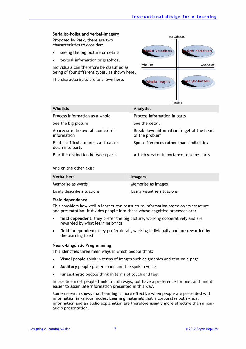
Serialist-holist and verbal-imagery
Proposed by Pask, there are two characteristics to consider:
seeing the big picture or details
textual information or graphical
Individuals can therefore be classified as being of four different types, as shown here.
The characteristics are as shown here.
Wholists Analytics
Process information as a whole Process information in parts
See the big picture See the detail
Appreciate the overall context of information
Break down information to get at the heart of the problem
Find it difficult to break a situation down into parts
Spot differences rather than similarities
Blur the distinction between parts Attach greater importance to some parts
And on the other axis:
Verbalisers Imagers
Memorise as words Memorise as images
Easily describe situations Easily visualise situations
Field dependence
This considers how well a learner can restructure information based on its structure and presentation. It divides people into those whose cognitive processes are:
field dependent: they prefer the big picture, working cooperatively and are rewarded by what learning brings
field independent: they prefer detail, working individually and are rewarded by the learning itself
Neuro-Linguistic Programming
This identifies three main ways in which people think:
Visual people think in terms of images such as graphics and text on a page
Auditory people prefer sound and the spoken voice
Kinaesthetic people think in terms of touch and feel
In practice most people think in both ways, but have a preference for one, and find it easier to assimilate information presented in this way.
Some research shows that learning is more effective when people are presented with information in various modes. Learning materials that incorporates both visual information and an audio explanation are therefore usually more effective than a non-audio presentation.
Wholist-Verbalisers
Analytic-Imagers
Analytic-Verbalisers
Wholist-Imagers
Wholists Analytics
Verbalisers
Imagers
I n s t ruct iona l des i gn for e - learn ing
Designing e-learning v4.doc 8 © 2012 Bryan Hopkins
Remember also that visual information includes both text and graphics. You can improve the effectiveness of your visual information by presenting it using both text and graphics.
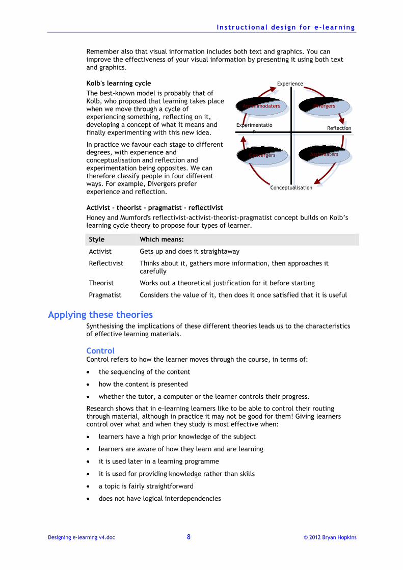
Kolb's learning cycle
The best-known model is probably that of Kolb, who proposed that learning takes place when we move through a cycle of experiencing something, reflecting on it, developing a concept of what it means and finally experimenting with this new idea.
In practice we favour each stage to different degrees, with experience and conceptualisation and reflection and experimentation being opposites. We can therefore classify people in four different ways. For example, Divergers prefer experience and reflection.
Activist - theorist - pragmatist - reflectivist
Honey and Mumford's reflectivist-activist-theorist-pragmatist concept builds on Kolb’s learning cycle theory to propose four types of learner.
Style Which means:
Activist Gets up and does it straightaway
Reflectivist Thinks about it, gathers more information, then approaches it carefully
Theorist Works out a theoretical justification for it before starting
Pragmatist Considers the value of it, then does it once satisfied that it is useful
Applying these theories Synthesising the implications of these different theories leads us to the characteristics of effective learning materials.
Control Control refers to how the learner moves through the course, in terms of:
the sequencing of the content
how the content is presented
whether the tutor, a computer or the learner controls their progress.
Research shows that in e-learning learners like to be able to control their routing through material, although in practice it may not be good for them! Giving learners control over what and when they study is most effective when:
learners have a high prior knowledge of the subject
learners are aware of how they learn and are learning
it is used later in a learning programme
it is used for providing knowledge rather than skills
a topic is fairly straightforward
does not have logical interdependencies
Accommodaters
Assimilaters
Divergers
Convergers
Experimentatio
nReflection
Experience
Conceptualisation
I n s t ruct iona l des i gn for e - learn ing
Designing e-learning v4.doc 9 © 2012 Bryan Hopkins
High degrees of learner control are often associated with learning materials designed from a constructivist perspective.
Adaptability to individuals Learning should adapt itself to the needs of each individual. Experienced classroom teachers do this instinctively, but distance learning does not do this so well.
Perception Perception is the ability to pick out important features and information. Designers can use various techniques to help with perception, such as colour, graphics, audio, page and screen layout and the, etc.
Attention Once the learner has perceived the important information, the course must make sure that it keeps their attention.
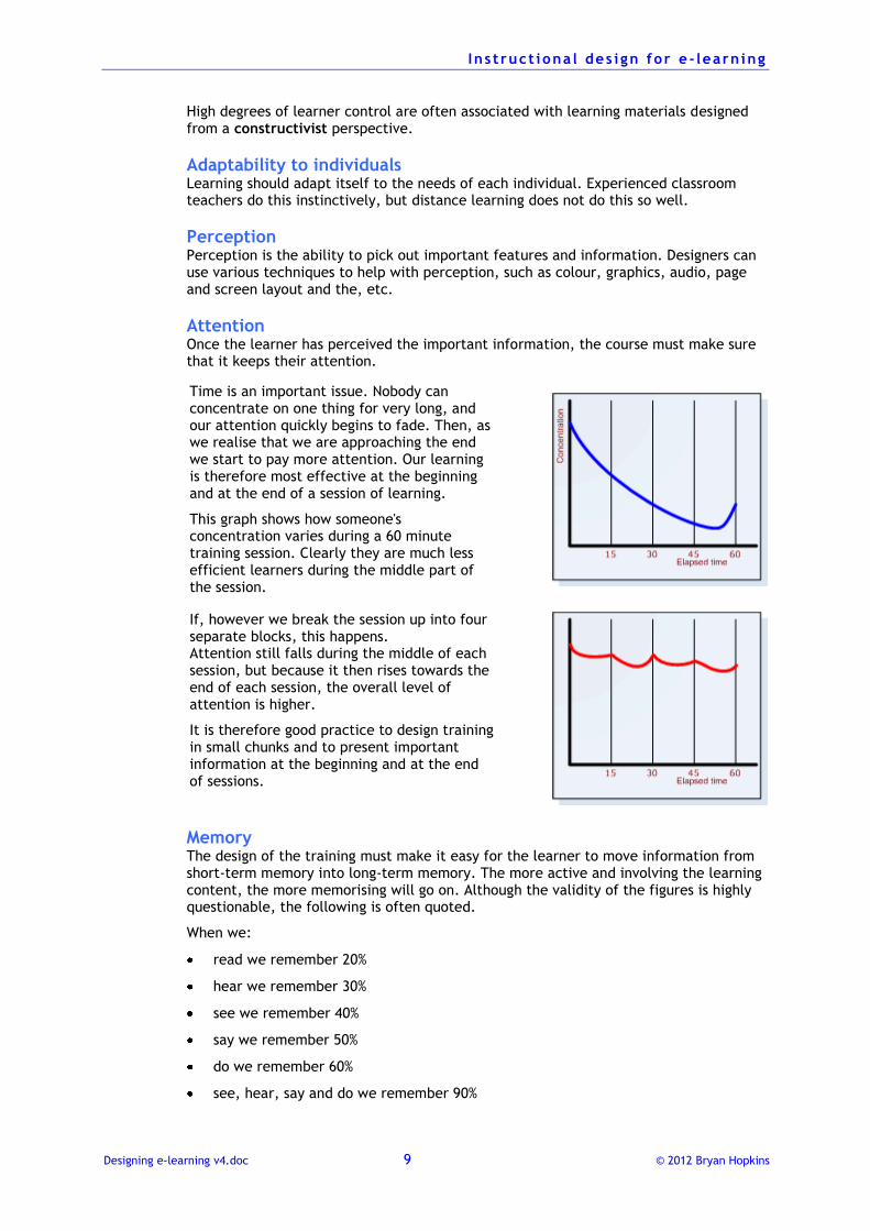
Time is an important issue. Nobody can concentrate on one thing for very long, and our attention quickly begins to fade. Then, as we realise that we are approaching the end we start to pay more attention. Our learning is therefore most effective at the beginning and at the end of a session of learning.
This graph shows how someone's concentration varies during a 60 minute training session. Clearly they are much less efficient learners during the middle part of the session.
If, however we break the session up into four separate blocks, this happens. Attention still falls during the middle of each session, but because it then rises towards the end of each session, the overall level of attention is higher.
It is therefore good practice to design training in small chunks and to present important information at the beginning and at the end of sessions.
Memory The design of the training must make it easy for the learner to move information from short-term memory into long-term memory. The more active and involving the learning content, the more memorising will go on. Although the validity of the figures is highly questionable, the following is often quoted.
When we:
read we remember 20%
hear we remember 30%
see we remember 40%
say we remember 50%
do we remember 60%
see, hear, say and do we remember 90%
I n s t ruct iona l des i gn for e - learn ing
Designing e-learning v4.doc 10 © 2012 Bryan Hopkins
Courses that allow the learner to read, hear and see will therefore be more effective at helping somebody to remember something new. This is made easier by:
efficient organisation of the information (such as by task analysis)
repetition, for example by answering several questions about the same subject
using memory enhancing (mnemonic) techniques, such as acronyms or stories
For example, many people instinctively think of Richard of York Giving Battle In Vain or the nonsense word ROYGBIV when trying to recall the colours of the rainbow.
Comprehension All new information we come across is interpreted by reference to what we know already. Good learning designs therefore move from the:
known to the unknown
easy to the difficult
simple to the complex.
Techniques such as analogies and metaphors relating to familiar subjects help considerably with comprehension.
Active learning People learn primarily by doing something. The design of a course should therefore make sure that learners regularly and frequently have to make some considered and thoughtful interaction.
In e-learning tutorials one much-quoted guideline is to give a learner a ‘thoughtful interaction’ at least once every three or four screens. Treat this with respect, as it can legitimise a somewhat plodding approach to design.
And remember, 'Click on Next to continue' is not a thoughtful interaction!
Motivation A training course should make people want to carry on and learn more. Various theories have been put forward regarding what sorts of things motivate people in a learning situation. These include:
challenge, not too easy and not too hard
curiosity about something new
control over what they are doing
fantasy, the learner being able to leave their reality temporarily
relevance to their work or lives
confidence that they can learn this material
satisfaction that the training is useful
We can seek to improve motivation by providing training that matches what a learner looks for from training activities. We can find out more about this by using such tools as the Canfield Learning Styles Inventory. This uses a structured questionnaire approach where results can be analysed to identify preferences in a number of different areas, such as:
how much they value working in teams
the organisation of course work
competition with others
the role of an instructor
I n s t ruct iona l des i gn for e - learn ing
Designing e-learning v4.doc 11 © 2012 Bryan Hopkins
independence in the learning.
Closeness to real life One golden rule in designing learning materials is to make them as close to the real performance as possible, as this helps the learner to transfer what they have learned into the actual workplace.
This is known as the encoding specificity principle, after work by the cognitive psychologists Tulving and Thompson. Their work demonstrated that people remember things more effectively when information available at encoding (when they learnt) is also available at retrieval (when they apply it).
If, therefore, the performance involves dealing with people, you should consider using media that can simulate this. Workshops and role-plays are ideal solutions, but if these are not possible then think about e-learning solutions using video and audio elements.
If the performance does not seem to suggest that video or audio is needed, you may decide not to use it unless there are other good reasons for doing so.
You can also encourage transfer of learning by trying to integrate training with work-based activities. Provide training activities that make the learner go and find something or talk to somebody.
I n s t ruct iona l des i gn for e - learn ing
Designing e-learning v4.doc 12 © 2012 Bryan Hopkins
The systematic approach to designing learning materials
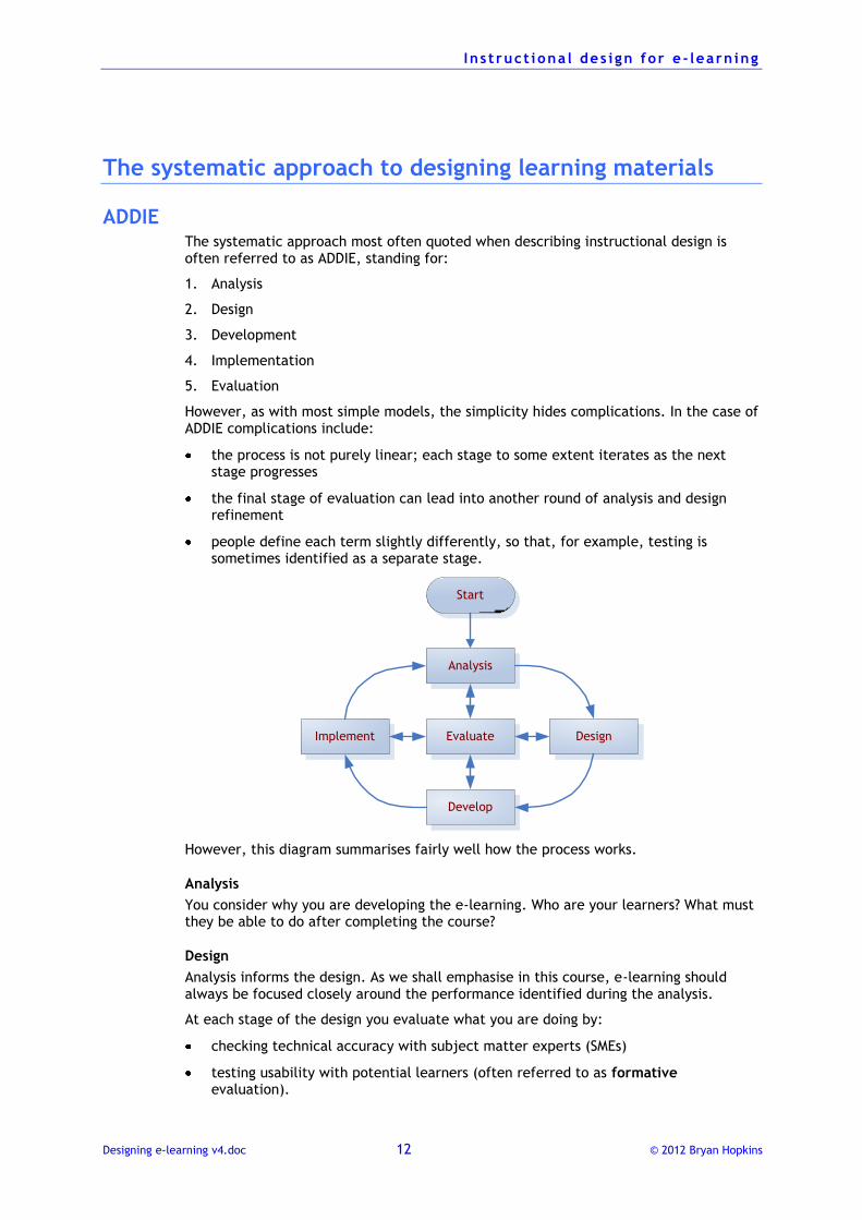
ADDIE The systematic approach most often quoted when describing instructional design is often referred to as ADDIE, standing for:
1. Analysis
2. Design
3. Development
4. Implementation
5. Evaluation
However, as with most simple models, the simplicity hides complications. In the case of ADDIE complications include:
the process is not purely linear; each stage to some extent iterates as the next stage progresses
the final stage of evaluation can lead into another round of analysis and design refinement
people define each term slightly differently, so that, for example, testing is sometimes identified as a separate stage.
Analysis
Evaluate
Develop
Implement Design
Start
However, this diagram summarises fairly well how the process works.
Analysis
You consider why you are developing the e-learning. Who are your learners? What must they be able to do after completing the course?
Design
Analysis informs the design. As we shall emphasise in this course, e-learning should always be focused closely around the performance identified during the analysis.
At each stage of the design you evaluate what you are doing by:
checking technical accuracy with subject matter experts (SMEs)
testing usability with potential learners (often referred to as formative evaluation).
I n s t ruct iona l des i gn for e - learn ing
Designing e-learning v4.doc 13 © 2012 Bryan Hopkins
Develop
You pass the design storyboards on to the developers, who write the code, prepare and assemble the assets.
There is more usability testing carried out at this stage.
What you learn at this stage may mean that you have to refine the design. For example, a clever interaction specified in the design may prove too complicated for the learners and so must be redesigned.
Implement
The finished course is implemented with the learners. You evaluate the course by considering whether:
the learners like it
they learn from it.
This is your summary evaluation.
Analysis (again)
You take the evaluation to another level and see if the learners are applying what they have learnt. What you find here may lead to you making changes to the design.
And so it goes on.
I n s t ruct iona l des i gn for e - learn ing
Designing e-learning v4.doc 14 © 2012 Bryan Hopkins
Defining the objective of the learning
The objectives of learning programmes should be to make sure that people can carry out some task. What the objectives are determines the content and the approach, so it is essential to decide on these at the very beginning of the design process.
Writing objectives There are several different types of objective used in instructional design:
Performance objectives describe what someone actually does in the workplace.
Training objectives describe what a learner will be able to do after completing the training.
Enabling objectives apply to the small tasks that when all completed will mean that the learner has satisfied the overall performance.
In terms of learning design, the enabling objectives define the individual bricks with which a course is put together.
Objectives should be used throughout the design process, as:
an overall objective, defining what the learners must be able to do after completing the learning
enabling objectives, defining the individual sub-tasks that make up the whole
Whichever type of objective you are designing, they need three parts:
a condition, the circumstances under which the performance is done
the performance, that which is done
the criterion, the measure of success.
The objective can then be written as:
Given [insert your condition] the learner will [insert observable performance] so that [insert criterion]
Moving from performance to learning design Good instructional design starts by you defining the overall performance objective, in other words, what the person would do in the workplace.
You then convert this to a training objective. The essential difference is that your conditions will be different. For example, instead of a:
paper product manual you may provide an electronic copy
real customer you may provide a specimen customer.
However, in as far as is possible your:
performance should be the same (although it will be a computer simulation of the performance), and
criteria of success should be the same.
Your training objective will therefore:
I n s t ruct iona l des i gn for e - learn ing
Designing e-learning v4.doc 15 © 2012 Bryan Hopkins
indicate what the learner needs to complete the course
show what the learning materials must cover
defining the way in which the learning will be tested.
What makes a good condition? The condition describes the circumstances under which the performance must be carried out. Consider repairing a puncture in a bicycle wheel. The conditions for this objective should state the tools available and where it must be done.
For example:
Given a puncture repair outfit and a well-lit shed
Think about how this affects the performance. This condition does not allow the learner to use a bucket of water to find the puncture, and so the task may be much harder. On the other hand, a well-lit shed makes the task easier, but is not necessarily realistic. Not many punctures happen when a bicycle is in a shed!
The test for a good condition is therefore to ask, “Is it realistic?”
The crucial difference between a performance and a learning objective lies in the condition. A performance objective states the conditions under which the actual performance takes place, whereas a learning objective states the conditions under which the learning will be done.
What makes a good performance? The performance defines what the learner must actually do. The key word here is do, as this part of the objective must be behavioural, i.e., something you can observe.
In our example above the performance part of the objective could be:
repair a puncture
This is observable; you can watch someone repair a puncture.
Contrast this with words such as know, understand, appreciate. You cannot watch anybody knowing, understanding or appreciating. Words such as these must never be used in an objective.
When working in some subject areas, product knowledge training for example, you may find it difficult to see how to avoid using such words. In these instances ask yourself the question "What will the learner do with this knowledge or understanding?"
For example, suppose you are designing some learning materials for retail staff about television sets. The learner needs to be able to sell the set to a customer, so think about how they will use their knowledge. For example:
explain how a feature will benefit a customer
compare set A with set B
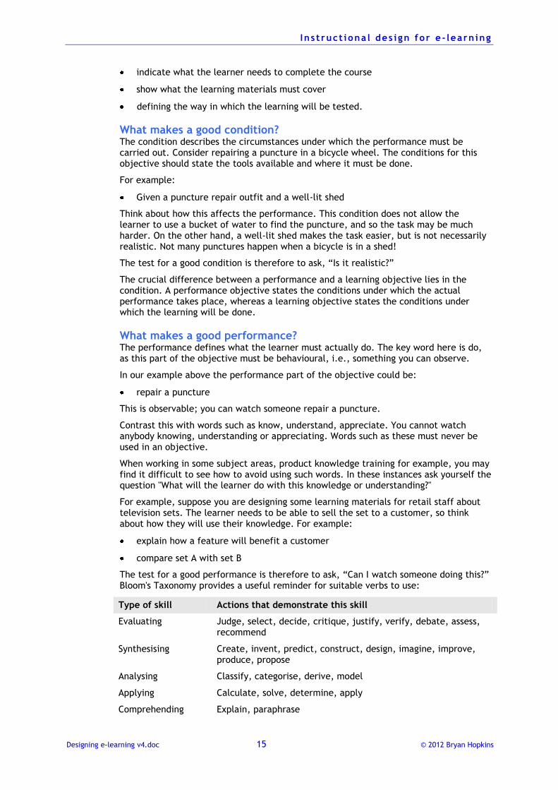
The test for a good performance is therefore to ask, “Can I watch someone doing this?” Bloom's Taxonomy provides a useful reminder for suitable verbs to use:
Type of skill Actions that demonstrate this skill
Evaluating Judge, select, decide, critique, justify, verify, debate, assess, recommend
Synthesising Create, invent, predict, construct, design, imagine, improve, produce, propose
Analysing Classify, categorise, derive, model
Applying Calculate, solve, determine, apply
Comprehending Explain, paraphrase
I n s t ruct iona l des i gn for e - learn ing
Designing e-learning v4.doc 16 © 2012 Bryan Hopkins
Knowing List, state, recite
What makes a good criterion? The criterion should contain two elements (some references to this subject define them separately, implying a four-part objective). These elements are the:
measure of success, which clearly states information such as how high, how many, how quickly
measurement tool, which explains how the measurement will be made, for example by the person carrying out the performance, by a supervisor, etc.
The test for a measure of success is to ask, "Is this appropriate?"
What makes it appropriate? Clearly it must be related to the performance, and it must be set at a level that is neither too high nor too low. Too high may be unachievable and therefore discouraging, whereas too low will not offer any sense of achievement.
Consider the puncture example. Appropriate measures of success could be:
so that the tyre stays inflated for one month, or
so that no bubbles are seen coming from the patch when it is held underwater
I n s t ruct iona l des i gn for e - learn ing
Designing e-learning v4.doc 17 © 2012 Bryan Hopkins
Deciding how to present e-learning
Before starting the detailed design process you need to decide how to present your e-learning course. This is where the creative aspects of instructional design come in, and you must think about what overall approach will make your learning materials most effective.
For example, will you present the learning materials in a straight and factual way, will you wrap them up in a story, will you encourage your learners to think, etc.?
To decide on what your strategy will be you need to revisit your learners' profile. Key things you need to consider are:
how they may feel about the subject
previous experience and knowledge
the nature of the topic (about procedures, knowledge-oriented, etc)
However, the most important thing to remember throughout the design process is why people need to know the subject:
How will they apply the knowledge?
What issues do they face?
What decisions do they need to make?
And so on. The answers to these questions should be defined by your objectives.
If you constantly do this you will find it much easier to structure the course and design interactions that people can see are relevant to their work. This will make it much more likely that they will engage with your materials.
When you know something about this, you can make decisions about your strategy. Here are some of the possibilities to take into consideration.
Possible high-level approaches
Just present the facts You can use the structure suggested by your task analysis to create a logical sequence of modules within which you simply present the content in a straightforward manner.
This is ‘the default’ way of designing e-learning, and works well if the subject is interesting and the target group motivated. However, if either of these is not true people may find it rather tedious, especially if it is not designed in a performance-centred way.
Encourage reference Think about how much people need to actually remember about the subject and how much they are expected to refer to detailed guidance. If reference is an important skill and people need to know how and where to find information, base the instructional strategy around this.
Give learners tasks to complete for which they will need to find the information. Limit the amount of information people are actually given in the e-learning material itself.
Wrap the subject up in a story Everybody likes a good story, whether it be in a book, on the television or at the cinema. Good stories wrap people up in them, so that they want to keep turning the page and find out more.
I n s t ruct iona l des i gn for e - learn ing
Designing e-learning v4.doc 18 © 2012 Bryan Hopkins
How do you do that with e-learning? First, consider the elements of a story:
1. There is a status quo, as the opening position is defined and characters are introduced.
2. Something disturbs the status quo, there is a problem, characters are involved.
3. One or more of our characters take action to resolve the disturbance and to try to get back to a situation that everyone is happy with.
4. The situation is resolved (the denouement) and there is a new status quo.
Whatever story you read or watch, it will follow a pattern like this.
How does this work in an e-learning situation? Consider, for example, an e-learning programme where you want to teach somebody how to carry out a new process:
1. Introduce a character and explain what they do their everyday working life (status quo).
2. Present them with the new process they must follow (disturbance).
3. Show how the character completes the new process (action).
4. Show the character having completed the process (new status quo).
Where storytelling and e-learning differ is that in the story the author has decided how the story will unfold and what the denouement will be, whereas in an e-learning course the instructional design can allow the learner to create their own story and denouement.
You do this by asking the learner questions about the subject matter as the story unfolds. Perhaps the characters involved will present some of the factual content that the learner must learn, or there is feedback to the questions they answer that contains content. Or both.
On its own and approach like this can be quite effective, but it can come across as somewhat dry. To make it more interesting and engaging we can add storytelling elements such as character, genre and drama.
Character
Michael Caine once said, "People go to the cinema to see themselves on the screen."
And when people do see themselves on the screen they identify with the story and become emotionally involved. The same applies to an e-learning course: if someone can see themselves involved in the subject matter they will take it much more seriously.
You therefore need to spend some time creating engaging and believable characters in your e-learning that the learner will identify with. Engaging characters :
are multidimensional, with certain behaviours, ideas and prejudices, often conflicting and always in shades of grey
are appropriate, behaving in a way that is appropriate for their particular situation
speak realistically
have believable relationships.
Genre
The genre comes from the setting that we employ. For example, we might employ a detective genre, where the central character is trying to find something out and comes across various problems. Other common genres include adventure, romance, science fiction, mystery and documentary.
Drama
Drama comes from the nature of the story. It has been suggested that every story that has ever been written can be classified in one of eight different ways:
I n s t ruct iona l des i gn for e - learn ing
Designing e-learning v4.doc 19 © 2012 Bryan Hopkins
Orpheus (our character loses something important and then struggles to find it or deals with the emotional impact of the loss)
Romeo and Juliet (our character meets someone or something they want, something intervenes and the character then tries to overcome the obstacle)
Achilles (our character has a weakness that leads to their ultimate downfall)
Candide (our character has a simple optimism about the world and learns an important lesson)
Faust (our character sells their soul to the Devil to gain something but then must pay the price)
Cinderella (our character has a dream which is finally realised after some adversity)
Circle (our character chases after something that may not want to be caught)
Tristan (our character competes with another character to acquire something or somebody)
Applying this to our example of teaching someone a new process you could make your character:
get something wrong so they then have to learn how to do it correctly (Orpheus)
think that the process is very simple but then have to learn some of the subtleties (Candide)
have to compete against someone else who is trying to do the process more quickly (Tristan)
Think about emotions People approach every new event in their life with some emotion, whether it be excitement, anticipation, fear or resentment. Logging on to an e-learning course is no exception. It is therefore important to think how people will be feeling when they start the course and to take this into account with the design.
For example, someone who is going to study a course on:
health and safety law may feel a sense of resignation that it is going to be boring
equal opportunities may feel somewhat indignant because they 'are not prejudiced'
induction into their new job may feel anxious about the new workplace
It is all too easy to design a course from the perspective of the subject matter and to forget these emotional issues. However, if you do think about how your learners are likely to be feeling about the subject matter you should be able to come up with a more engaging approach.
Consider the examples mentioned above.
Health and safety law
E-learning courses on law have a great potential to be boring for someone who is not really interested in law. So one approach would be to reflect on the observation that law is to do with legal and illegal activity, and that policeman and detectives are interested in illegal activities, so why not create a story using a police or detective genre that brings out the key aspects of the law?
The sense of drama could be heightened by using a Faustian story where the protagonist disregards health and safety law in order to make their working life easier but then something awful happens to them and they must pay the consequences.
Equal opportunities
Equal opportunities training strikes at some very basic human emotions: values, about what is right and wrong, good and bad. Because we live in a society where we are
I n s t ruct iona l des i gn for e - learn ing
Designing e-learning v4.doc 20 © 2012 Bryan Hopkins
always told that we must not discriminate against anyone, that everyone is equal, it is very difficult for anyone to admit to themselves that they do have prejudices.
Equal opportunities training, therefore, may instinctively make people feel defensive. This makes it unlikely that simple exhortations about what you should and should not do will actually work.
An approach that works with the emotions is to ask people to reflect on particular situations that illustrate aspects of discrimination. Give the learner non-threatening questions that ask them to decide what is appropriate or reasonable in such a case, and then provide feedback that supports or gently corrects their opinion.
Induction
When someone starts a new job they are initially primarily interested in basic survival, such as where to find food and water and where they can go to the toilet. When they have found those they want to make sure that their surroundings are safe, and they then start to become interested in the people around them. When all of those needs are satisfied they become interested in gaining the respect of other people and finally they can become fully developed, creative individuals.
This simple analysis comes from the work of Abraham Maslow, whose hierarchy of needs idea proposed that people need to satisfy needs in a particular order in order to feel comfortable.
Applying this psychological idea to induction suggests that rather than immediately telling people what a wonderful, caring organisation they have come to work for, induction programmes should first tell them how to find food, water and toilets, and little by little move on to mission statements and corporate values.
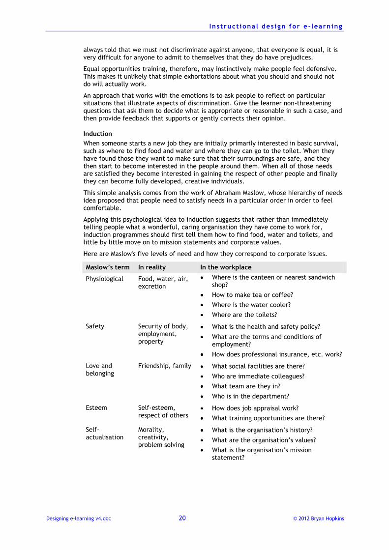
Here are Maslow's five levels of need and how they correspond to corporate issues.
Maslow’s term In reality In the workplace
Physiological Food, water, air, excretion
Where is the canteen or nearest sandwich shop?
How to make tea or coffee?
Where is the water cooler?
Where are the toilets?
Safety Security of body, employment, property
What is the health and safety policy?
What are the terms and conditions of employment?
How does professional insurance, etc. work?
Love and belonging
Friendship, family What social facilities are there?
Who are immediate colleagues?
What team are they in?
Who is in the department?
Esteem Self-esteem, respect of others
How does job appraisal work?
What training opportunities are there?
Self-actualisation
Morality, creativity, problem solving
What is the organisation’s history?
What are the organisation’s values?
What is the organisation’s mission statement?
I n s t ruct iona l des i gn for e - learn ing
Designing e-learning v4.doc 21 © 2012 Bryan Hopkins
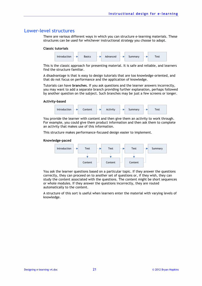
Lower-level structures There are various different ways in which you can structure e-learning materials. These structures can be used for whichever instructional strategy you choose to adopt.
Classic tutorials
Introduction Basics Advanced Summary Test
This is the classic approach for presenting material. It is safe and reliable, and learners find the structure familiar.
A disadvantage is that is easy to design tutorials that are too knowledge-oriented, and that do not focus on performance and the application of knowledge.
Tutorials can have branches. If you ask questions and the learner answers incorrectly, you may want to add a separate branch providing further explanation, perhaps followed by another question on the subject. Such branches may be just a few screens or longer.
Activity-based
Introduction Content Activity Summary Test
You provide the learner with content and then give them an activity to work through. For example, you could give them product information and then ask them to complete an activity that makes use of this information.
This structure makes performance-focused design easier to implement.
Knowledge-paced
Introduction
Content
SummaryTest
Content
Test
Content
Test
You ask the learner questions based on a particular topic. If they answer the questions correctly, they can proceed on to another set of questions or, if they wish, they can study the content associated with the questions. The content might be short sequences or whole modules. If they answer the questions incorrectly, they are routed automatically to the content.
A structure of this sort is useful when learners enter the material with varying levels of knowledge.
I n s t ruct iona l des i gn for e - learn ing
Designing e-learning v4.doc 22 © 2012 Bryan Hopkins
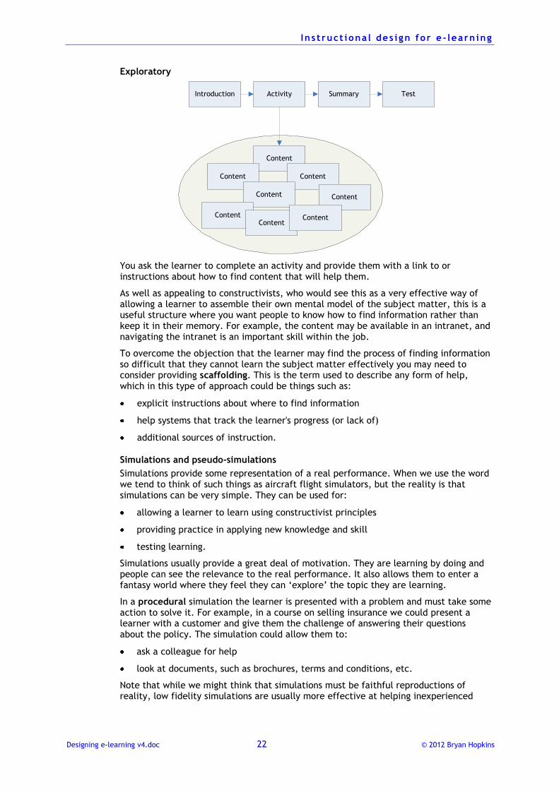
Exploratory
Introduction
Content
Activity Summary Test
ContentContent
Content Content
ContentContent
Content
You ask the learner to complete an activity and provide them with a link to or instructions about how to find content that will help them.
As well as appealing to constructivists, who would see this as a very effective way of allowing a learner to assemble their own mental model of the subject matter, this is a useful structure where you want people to know how to find information rather than keep it in their memory. For example, the content may be available in an intranet, and navigating the intranet is an important skill within the job.
To overcome the objection that the learner may find the process of finding information so difficult that they cannot learn the subject matter effectively you may need to consider providing scaffolding. This is the term used to describe any form of help, which in this type of approach could be things such as:
explicit instructions about where to find information
help systems that track the learner's progress (or lack of)
additional sources of instruction.
Simulations and pseudo-simulations
Simulations provide some representation of a real performance. When we use the word we tend to think of such things as aircraft flight simulators, but the reality is that simulations can be very simple. They can be used for:
allowing a learner to learn using constructivist principles
providing practice in applying new knowledge and skill
testing learning.
Simulations usually provide a great deal of motivation. They are learning by doing and people can see the relevance to the real performance. It also allows them to enter a fantasy world where they feel they can ‘explore’ the topic they are learning.
In a procedural simulation the learner is presented with a problem and must take some action to solve it. For example, in a course on selling insurance we could present a learner with a customer and give them the challenge of answering their questions about the policy. The simulation could allow them to:
ask a colleague for help
look at documents, such as brochures, terms and conditions, etc.
Note that while we might think that simulations must be faithful reproductions of reality, low fidelity simulations are usually more effective at helping inexperienced
I n s t ruct iona l des i gn for e - learn ing
Designing e-learning v4.doc 23 © 2012 Bryan Hopkins
people to learn. This is because high fidelity introduces too much information for a learner to cope with.
For example, imagine that you want to design a simple simulation to teach someone how to start a piece of complex machinery:
a high fidelity solution would make all switches and dials on a control panel operative
a low fidelity solution would make only the switches and dials relevant at each stage in the start-up sequence functional.
This implies that when designing a simulation you must think about how it is going to be used:
If a learner is going to build up their skills, you may need to introduce increasingly high levels of fidelity as they progress (for example, you may make more switches active on the control panel or ‘ring the learner’ to introduce a complication in the middle of the scenario)
If it is to test mastery of a performance the fidelity will probably need to be much higher.
Therefore when introducing a new skill area to the learner, keep it simple. This explains the term pseudo-simulations, where we are talking about simple e-learning systems that are in essence linear but which can give the learner the illusion of being complex and adaptive. A well-designed pseudo-simulation will engage a learner so much that they do not notice the linear structure.
There is often a temptation to feel that you must introduce complex branching structures within a pseudo-simulation. This is not wrong, but beware: the design (and eventual development) can become extremely complex and time-consuming.
There are some extra design issues to take into consideration when designing a simulation.
The underlying model. The major issue to resolve before starting design is about the underlying model. In our selling insurance example we would have to decide how to structure the conversations between the learner and the customer. For example:
How do you distil a complex conversation into a sequence of simple steps?
How will the learner's responses affect their flow through the simulation?
How will you deal with good/bad, right/wrong decisions? There and then or at the end?
Controlling the simulation. How will the simulation be presented, for example:
How will the learner make choices?
Will they be expected to manipulate objects?
Giving feedback. A key issue is about what sort of feedback they will receive:
Natural feedback is the sort of feedback they would receive in real-life
Artificial feedback is the feedback that the training model gives them.
There will probably need to be a mixture of both types; ideally with the artificial feedback being replaced by real feedback as the learner's performance improves.
I n s t ruct iona l des i gn for e - learn ing
Designing e-learning v4.doc 24 © 2012 Bryan Hopkins
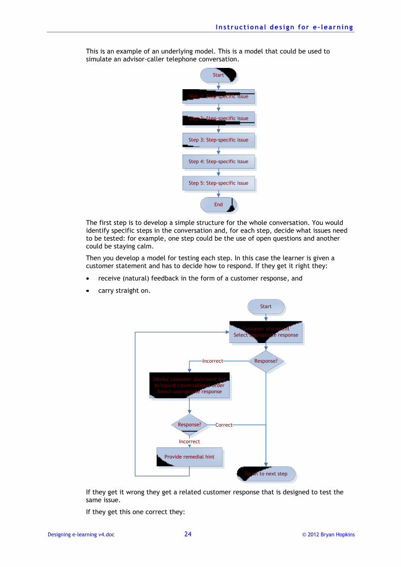
This is an example of an underlying model. This is a model that could be used to simulate an advisor-caller telephone conversation.
Start
Step 1: Step-specific issue
Step 2: Step-specific issue
Step 3: Step-specific issue
Step 4: Step-specific issue
Step 5: Step-specific issue
End
The first step is to develop a simple structure for the whole conversation. You would identify specific steps in the conversation and, for each step, decide what issues need to be tested: for example, one step could be the use of open questions and another could be staying calm.
Then you develop a model for testing each step. In this case the learner is given a customer statement and has to decide how to respond. If they get it right they:
receive (natural) feedback in the form of a customer response, and
carry straight on.
Start
Customer statement
Select appropriate response
Response?
Go on to next step
Similar customer statement but
in logical conversational order
Select appropriate response
Response?
Provide remedial hint
Incorrect
Correct
Incorrect
If they get it wrong they get a related customer response that is designed to test the same issue.
If they get this one correct they:
I n s t ruct iona l des i gn for e - learn ing
Designing e-learning v4.doc 25 © 2012 Bryan Hopkins
get positive customer (natural) feedback, and
carry on to the next step.
If they get this wrong they:
are given a negative response from the customer (natural feedback)
are given remedial guidance (artificial feedback)
return to try the step again.
You can of course develop the complexity of this model to increase its fidelity as appropriate.
Drills
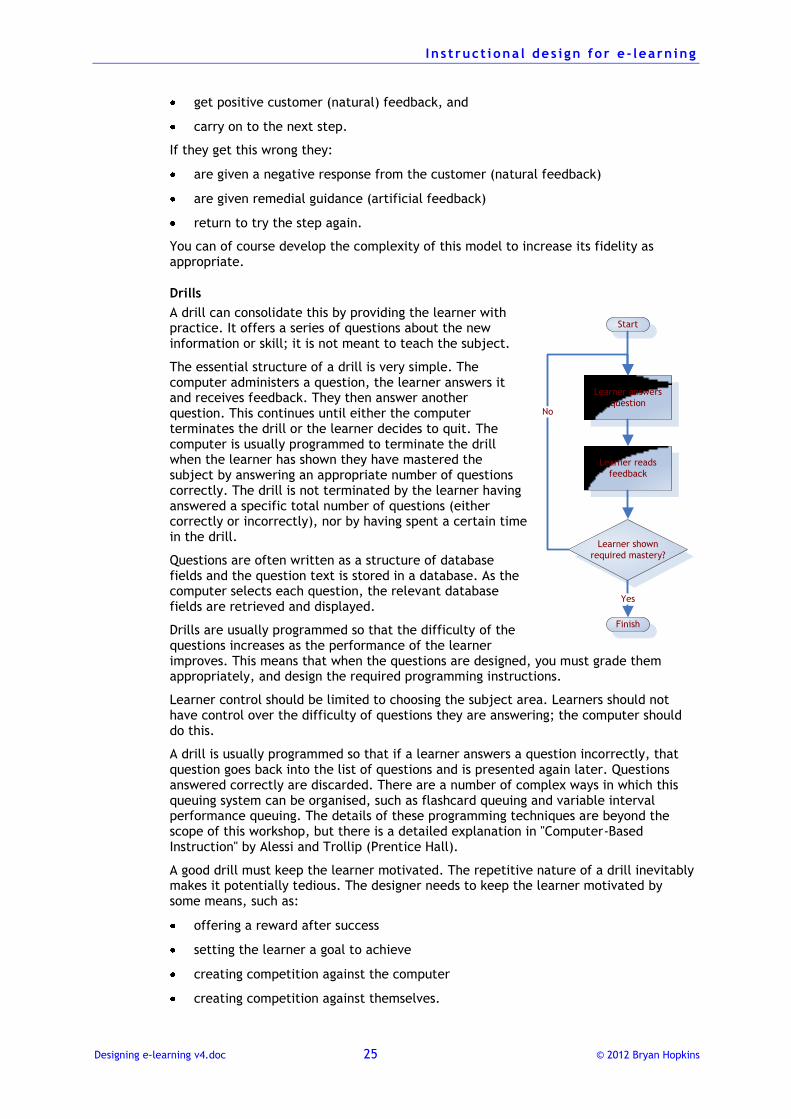
A drill can consolidate this by providing the learner with practice. It offers a series of questions about the new information or skill; it is not meant to teach the subject.
The essential structure of a drill is very simple. The computer administers a question, the learner answers it and receives feedback. They then answer another question. This continues until either the computer terminates the drill or the learner decides to quit. The computer is usually programmed to terminate the drill when the learner has shown they have mastered the subject by answering an appropriate number of questions correctly. The drill is not terminated by the learner having answered a specific total number of questions (either correctly or incorrectly), nor by having spent a certain time in the drill.
Questions are often written as a structure of database fields and the question text is stored in a database. As the computer selects each question, the relevant database fields are retrieved and displayed.
Drills are usually programmed so that the difficulty of the questions increases as the performance of the learner improves. This means that when the questions are designed, you must grade them appropriately, and design the required programming instructions.
Learner control should be limited to choosing the subject area. Learners should not have control over the difficulty of questions they are answering; the computer should do this.
A drill is usually programmed so that if a learner answers a question incorrectly, that question goes back into the list of questions and is presented again later. Questions answered correctly are discarded. There are a number of complex ways in which this queuing system can be organised, such as flashcard queuing and variable interval performance queuing. The details of these programming techniques are beyond the scope of this workshop, but there is a detailed explanation in "Computer-Based Instruction" by Alessi and Trollip (Prentice Hall).
A good drill must keep the learner motivated. The repetitive nature of a drill inevitably makes it potentially tedious. The designer needs to keep the learner motivated by some means, such as:
offering a reward after success
setting the learner a goal to achieve
creating competition against the computer
creating competition against themselves.
Start
Learner answers
question
Learner shown
required mastery?
Learner reads
feedback
Yes
No
Finish
I n s t ruct iona l des i gn for e - learn ing
Designing e-learning v4.doc 26 © 2012 Bryan Hopkins
Each drill should take about 15 minutes. To avoid monotony the questions should be presented in groups that a typical learner would be able to complete in about 15 minutes.
Introduce time pressure only if relevant. Time limits should only be applied to individual questions or the whole drill if they are relevant to the performance, i.e. if in real-life the learner has to make a decision quickly.
Designing e-learning for systems training E-learning is an obvious methodology to use for providing training on new software systems. It can be made to be close to the real performance and monitoring and advising on performance is easy.
But to make it effective there are some principles to remember.
Keep it close to the real world
If people need to know what and where to click and input data, make sure they practice clicking and inputting in these places.
Remember the principles of different types of information. Avoid descriptive sequences about what happens and how the system works (processes). These may be relevant in separate modules about principles of or justifications for new systems, but should be left out of actual systems training modules, which are instructions.
Self-assessments or tests should be based on actual usage situations, not be separate content-oriented questions.
Keep it flexible
Computer users can vary hugely in how they like to approach training and in what they know. Rigid step-by-step instruction may be perfect for some people but frustrating to others.
You may therefore want to think about developing pseudo-simulations of a system to allow learners to ‘explore’ the system, or to provide a real system operating in a training environment, so that all data is fictitious and the learner can experiment knowing that they are not going to do any damage.
Deciding on the technical structure There are broadly three levels at which you can provide systems training:
Hard-coded procedures
Pseudo-simulations
Real systems in a training environment.
Which you use depends to a large extent on the budget available and the nature of the application. Hard-coded screens are generally the simplest and cheapest to develop. Training systems may be expensive and difficult to set up.
Hard-coded procedures
Hard-coded procedure e-learning is a little like a standard e-learning tutorial. The system screen that the learner sees is simply a static graphic file on top of which they can input data or where they can click. To the learner it looks as if they are typing into a real system. Such graphics can easily be created using screen capture applications such as Adobe Captivate.
Once the learner has responded and been given feedback the next graphic in a fixed sequence loads.
I n s t ruct iona l des i gn for e - learn ing
Designing e-learning v4.doc 27 © 2012 Bryan Hopkins
Pseudo-simulations
In this method the screens are again static graphics, but there is a database of them. When the learner clicks to make a response or input, the next screen shown is the same as the one that would appear in the real system.
This therefore appears to be real but it is, in fact, just a simulation. Just how ‘complete’ the simulation is will depend on your resources, such as time available or financial budget.
If a learner makes an action that does not have a matching screen in your database, you ask them to try again, possibly providing a hint about what to do.
Real systems in a training environment
Here the real system, or a mirror of it, is used with a database behind it containing dummy data. The system therefore behaves just like the real thing.
Deciding on the learning methodology Once you have decided on which of the technical approaches to use, you need to think about the learning methodology you will use. One commonly used method follows the long-established way for a craftsperson to teach an apprentice:
1. I’ll show you how to do it
2. You try with my supervision
3. Do it yourself and I’ll see how you get on.
In systems e-learning this is sometimes called the Show me–Try it–Test me method.
Show me
This follows a process something like this:
1. You explain what the learner is going to do.
2. You provide a screen capture animation to show the pointer or cursor moving from its starting point to the location of the first click or action.
3. Text and/or voice-over explains what the learner needs to do and demonstrates this.
4. The learner clicks on a Forward button to go to the next step.
5. The animation demonstrates the next step.
6. The learner moves on.
This continues until the necessary action has been completed. Note:
It might be necessary to break a long sequence down into shorter steps so that the learner is not left overwhelmed.
The learner must be able to step backwards and forwards one action at a time.
Try it
This is similar except:
1. At the beginning of each step you must tell the learner what they need to do.
2. The learner moves the pointer or cursor, rather than an animation.
3. The learner moves forward by carrying out the required action, not by using a Forward button.
4. If they make the wrong action, you give them remedial feedback and ask them to try again.
I n s t ruct iona l des i gn for e - learn ing
Designing e-learning v4.doc 28 © 2012 Bryan Hopkins
Test me
This takes the ‘Try it’ step further:
1. You explain what the learner has to do but offer no guidance on what to do.
2. The learner can move or click anywhere.
3. When they act, they receive corrective feedback if they do the wrong thing so they can try again (unless this for a test of mastery). If they do the right thing they go to the next step.
4. When they complete the sequence they are told that they have finished.
Depending on whether or not you are using this to give the learner more practice or to formally test their ability you may or may not:
offer optional help on what to do next, accessible by clicking on a ‘Help’ button
provide corrective feedback for mistakes.
I n s t ruct iona l des i gn for e - learn ing
Designing e-learning v4.doc 29 © 2012 Bryan Hopkins
Developing content
There are several different techniques you can use to develop detailed learning content for each module. With experience you will discover which techniques you find the most useful.
Task analysis
Knowledge auditing
Rule sets
You can use all three in this order if necessary.
Task analysis Starting from the objective for the desired performance, ask the question "What do you have to do in order to do that?" to ever increasing levels of detail.
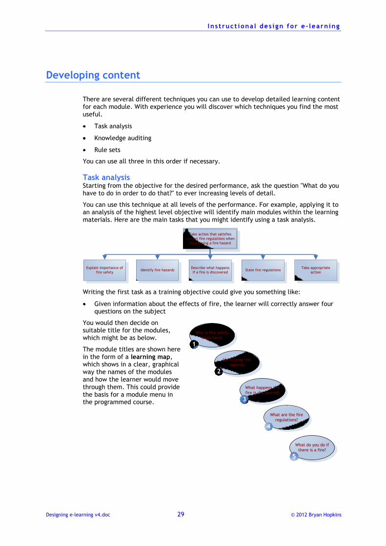
You can use this technique at all levels of the performance. For example, applying it to an analysis of the highest level objective will identify main modules within the learning materials. Here are the main tasks that you might identify using a task analysis.
Take action that satisfies
current fire regulations when
discovering a fire hazard
Describe what happens
if a fire is discoveredState fire regulationsIdentify fire hazards
Take appropriate
action
Explain importance of
fire safety
Writing the first task as a training objective could give you something like:
Given information about the effects of fire, the learner will correctly answer four questions on the subject
You would then decide on suitable title for the modules, which might be as below.
The module titles are shown here in the form of a learning map, which shows in a clear, graphical way the names of the modules and how the learner would move through them. This could provide the basis for a module menu in the programmed course.
Why is fire safety
important?
1
Identifying fire
hazards
2
What happens if a
fire is discovered?
3
What are the fire
regulations?
4
What do you do if
there is a fire?
5
I n s t ruct iona l des i gn for e - learn ing
Designing e-learning v4.doc 30 © 2012 Bryan Hopkins
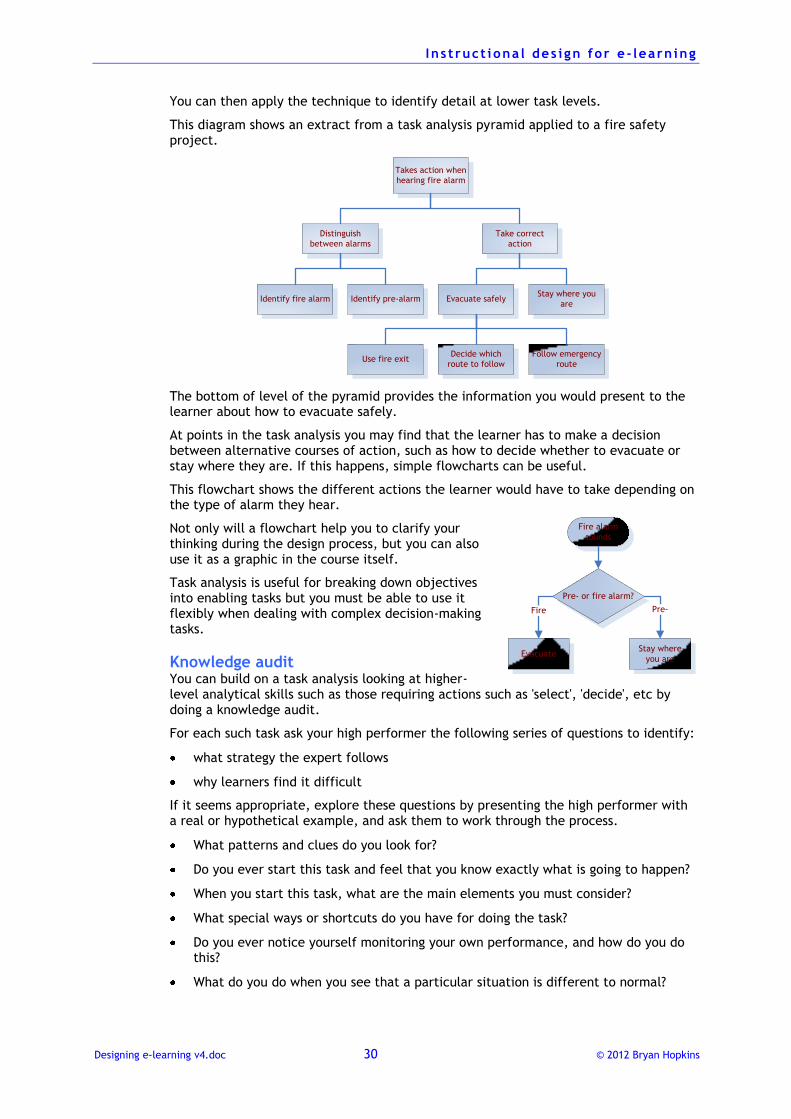
You can then apply the technique to identify detail at lower task levels.
This diagram shows an extract from a task analysis pyramid applied to a fire safety project.
Takes action when
hearing fire alarm
Take correct
action
Distinguish
between alarms
Identify fire alarm Identify pre-alarmStay where you
areEvacuate safely
Follow emergency
route
Decide which
route to followUse fire exit
The bottom of level of the pyramid provides the information you would present to the learner about how to evacuate safely.
At points in the task analysis you may find that the learner has to make a decision between alternative courses of action, such as how to decide whether to evacuate or stay where they are. If this happens, simple flowcharts can be useful.
This flowchart shows the different actions the learner would have to take depending on the type of alarm they hear.
Not only will a flowchart help you to clarify your thinking during the design process, but you can also use it as a graphic in the course itself.
Task analysis is useful for breaking down objectives into enabling tasks but you must be able to use it flexibly when dealing with complex decision-making tasks.
Knowledge audit You can build on a task analysis looking at higher-level analytical skills such as those requiring actions such as 'select', 'decide', etc by doing a knowledge audit.
For each such task ask your high performer the following series of questions to identify:
what strategy the expert follows
why learners find it difficult
If it seems appropriate, explore these questions by presenting the high performer with a real or hypothetical example, and ask them to work through the process.
What patterns and clues do you look for?
Do you ever start this task and feel that you know exactly what is going to happen?
When you start this task, what are the main elements you must consider?
What special ways or shortcuts do you have for doing the task?
Do you ever notice yourself monitoring your own performance, and how do you do this?
What do you do when you see that a particular situation is different to normal?
Fire alarm
sounds
Pre- or fire alarm?
EvacuateStay where
you are
Pre-Fire
I n s t ruct iona l des i gn for e - learn ing
Designing e-learning v4.doc 31 © 2012 Bryan Hopkins
If you rely on equipment to do the job, do you ever find yourself disagreeing with it, and if so, how do you resolve this?
As you work through these questions, the high performer will give you information on how they make their decisions and carry out the task. They will also give you ideas about why learners can find it difficult.
Rule sets Another useful technique that can help you move from objectives to text is the use of rule sets. Consider this example.
One objective identified during a house buying process might be to 'Acquire written confirmation that your offer has been accepted by the vendor'. The set of rules associated with this objective would be:
1. The purchaser writes to the estate agent with details of their offer.
2. The estate agent replies with written confirmation that the offer has been accepted.
3. The estate agent asks the purchaser for a deposit.
4. The purchaser sends the estate agent a cheque as a deposit.
Here is a rule set developed to cover wiring a plug:
Differences between the conductors in a 13 amp plug
1. Electrical cable has a thick plastic sheath around it to protect the thin wires within.
2. The electrical cable to every major appliance contains three conducting wires.
3. The live wire is coated in brown coloured insulation.
4. The neutral wire is coated in blue coloured insulation.
5. The earth wire is coated in yellow and green coloured insulation.
Correct terminal for each conductor
1. The live wire is connected to the live terminal.
2. The neutral wire is connected to the neutral terminal.
3. The earth wire is connected to the earth terminal.
Function of each of the three terminals
1. The live terminal enables current to pass from the electric socket to the appliance.
2. The neutral terminal enables electricity to flow back to the socket.
3. If a fault develops, the earth terminal enables current to flow safely into the ground.
Steps required to connect a plug to an appliance
1. Loosen the large screw between the pins.
2. Remove the cover of the plug.
3. Undo the two cable clamp screws at the bottom of the plug.
4. Loosen the cable clamp.
5. Position the cable on the open plug.
6. Strip the required amount of sheathing from the cable.
7. Position the flex on the plug.
I n s t ruct iona l des i gn for e - learn ing
Designing e-learning v4.doc 32 © 2012 Bryan Hopkins
8. Remove the required amount of insulation from the end of each conductor.
9. Twist together the filaments of each conductor.
10. Secure each wire to its terminal.
11. Replace the cable clamp screws at the bottom of the plug.
12. Tighten the screws to secure the flex with the cable clamp.
13. Replace the cover of the plug.
14. Replace the large screw between the pins.
Note how the rules are numbered: this makes it easier for a subject-matter expert to comment on them.
Rule sets provide a clear statement of the material, and can easily be reviewed and amended by subject matter experts. They then provide a good starting point for writing the primary text.
Structuring a module It is important to develop a consistent way of sequencing e-learning materials. This helps people to make decisions about what to do and how to find things. We can divide the sequence into three parts:
Introduction
Body of the material
Ending the module
Make sure that learners move on to the learning part as quickly as possible. However, you must also make sure that they know what the module is about and that they have any other information they need before starting. It is therefore useful to develop a standard approach to introducing a module.
Always start with a consistent series of sections. Here is a suggested sequence.
Introduction
Title page
Make the title page attractive and engaging. Make sure that it tells the learner what the course is about.
Who the course is for
Make it clear who the course is aimed at. This should state what job grade is necessary, what level of experience is required and any previous training that should have been completed.
Objectives of the course
Explain to the learner what they are going to learn; this is what is known as a learner's objective. Stating objectives here shows the relevance of the course to the learner and hence increases motivation.
For example, a learner's objective for this workshop could be:
You will be able to follow a systematic process for developing e-learning.
Write these in a welcoming style. The rigorous three part method for writing training objectives is appropriate for the design process, but is not suitable for writing a learner's objective.
Instructions on using the materials
Provide the learner with information they need to use the course. For example:
I n s t ruct iona l des i gn for e - learn ing
Designing e-learning v4.doc 33 © 2012 Bryan Hopkins
Is there a pre-test that they should try?
Are there are any other sources of information they will need?
Do they need to involve a supervisor or line manager at any time?
Relate the course to the learner's existing knowledge
Provide a brief introduction to the course that shows how this material builds on what the learner already knows. This is another way to increase motivation.
It may also be appropriate here to tell the learner that it may not be appropriate to carry on if they do not already have this level of knowledge.
Offer a pre-test if appropriate
Using questions to test a learner's level of understanding of a subject before working through the material is called a pre-test. These are useful where:
learners come to the material with varying levels of knowledge or skill
some subjects within the material can be skipped, if appropriate
However, it is pointless and frustrating for a learner to complete a pre-test and to then work through the course in a standard way, regardless of their performance.
Using the results of a pre-test to guide the learner towards certain parts of the material and away from others only works if the test is based around identified training objectives. After all, if the learner can answer questions in such a way that they show that they can satisfy all of the required objectives, there is no need for them to complete the training.
Present the body of the material The body of the material will be made up of the presentation of information and questions to check understanding.
There are some general aspects of design that you should try to follow.
Give the learner signs of progress
If you are designing paper-based materials, the learner will get a sense of progress just by looking at the balance of pages read and pages still to read. However, this visual feedback is absent in e-learning, so you will need to make sure the content is the learner an idea of how far as they have progressed and how far they have to go.
Supplement this with on-screen navigational elements, such as a progress bar.
Introduce, explain, summarise
Learners feel more comfortable with new information if they know what the scope of the information is. So at the start of a new subject provide a brief explanation of what the subject is and what the learner will cover (which is a similar principle to introducing a module with the learner's objectives). At the end of the subject provide a summary of the key points.
Develop the content gradually
People assimilate and understand new information by matching it with what they already know. So always start with:
what people know and move on to what they do not know
the easy and move to the difficult
start with the simple and move on to the complex.
I n s t ruct iona l des i gn for e - learn ing
Designing e-learning v4.doc 34 © 2012 Bryan Hopkins
Ending the module There must be a clear end to the material. This should include a summary of key learning points that should relate to the individual performances identified in your pyramid analysis. Some studies have shown that learners learn more from a summary of key learning points than from the main body of the tutorial! So do not leave the summary out.
Encourage the learner to reflect on what they have learnt. Suggest that they:
make a note of how they can use what they have learnt
plan how they will apply what they have learnt in the next few days.
I n s t ruct iona l des i gn for e - learn ing
Designing e-learning v4.doc 35 © 2012 Bryan Hopkins
Doing the detailed design
Writing instructional material There are two main rules to follow.
Write for your audience
During the analysis stage of the project you should have developed a picture of the likely users of the course. With that picture in mind you can write material at a level suitable for them.
Write clearly
Writing clearly can be more challenging. Our education teaches us to use sophisticated language, but this may not be the most effective style to use when writing instructional materials. There is also the difficulty that people find it harder to read text from a screen than from paper.
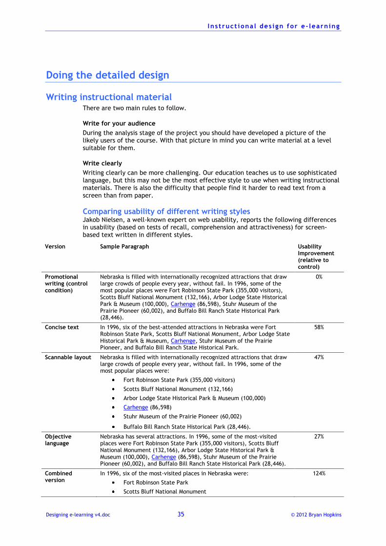
Comparing usability of different writing styles Jakob Nielsen, a well-known expert on web usability, reports the following differences in usability (based on tests of recall, comprehension and attractiveness) for screen-based text written in different styles.
Version Sample Paragraph Usability Improvement (relative to control)
Promotional writing (control condition)
Nebraska is filled with internationally recognized attractions that draw large crowds of people every year, without fail. In 1996, some of the most popular places were Fort Robinson State Park (355,000 visitors), Scotts Bluff National Monument (132,166), Arbor Lodge State Historical Park & Museum (100,000), Carhenge (86,598), Stuhr Museum of the Prairie Pioneer (60,002), and Buffalo Bill Ranch State Historical Park (28,446).
0%
Concise text In 1996, six of the best-attended attractions in Nebraska were Fort Robinson State Park, Scotts Bluff National Monument, Arbor Lodge State Historical Park & Museum, Carhenge, Stuhr Museum of the Prairie Pioneer, and Buffalo Bill Ranch State Historical Park.
58%
Scannable layout
Nebraska is filled with internationally recognized attractions that draw large crowds of people every year, without fail. In 1996, some of the most popular places were:
Fort Robinson State Park (355,000 visitors)
Scotts Bluff National Monument (132,166)
Arbor Lodge State Historical Park & Museum (100,000)
Carhenge (86,598)
Stuhr Museum of the Prairie Pioneer (60,002)
Buffalo Bill Ranch State Historical Park (28,446).
47%
Objective language
Nebraska has several attractions. In 1996, some of the most-visited places were Fort Robinson State Park (355,000 visitors), Scotts Bluff National Monument (132,166), Arbor Lodge State Historical Park & Museum (100,000), Carhenge (86,598), Stuhr Museum of the Prairie Pioneer (60,002), and Buffalo Bill Ranch State Historical Park (28,446).
27%
Combined version
In 1996, six of the most-visited places in Nebraska were:
Fort Robinson State Park
Scotts Bluff National Monument
124%
I n s t ruct iona l des i gn for e - learn ing
Designing e-learning v4.doc 36 © 2012 Bryan Hopkins
Arbor Lodge State Historical Park & Museum
Carhenge
Stuhr Museum of the Prairie Pioneer
Buffalo Bill Ranch State Historical Park
You can see that the most effective style for presenting information in screen is the one that is written in a style that is:
concise, avoiding unnecessary wording
objective, avoiding unnecessary description
scannable, making key text easily visible
Writing guidelines Follow these guidelines to help you write good, clear instructional English.
Use easy to understand language
The richness of English means that it is often possible to use several different words to express a meaning. When you are trying to decide which word to use, try to use the simplest. Here are some examples.
If you want to write: Use this instead:
facilitate help
calculate work out
necessitate have to
alleviate ease
Use personal language
Using the word 'you' makes the learner feel the material is aimed at them and increases their motivation.
Use short sentences
Long sentences are harder to read and understand due to the limitations of our short-term memory. But avoid just writing short sentences, as a blend of shorter and longer sentences improves the rhythm of reading. Aim for an average sentence length of between 15 and 20 words.
Use short paragraphs
Large paragraphs on screen look intimidating and are difficult to read. Paragraphs are used to group sentences with a similar content and to provide a breathing space. So do not worry too much about grammatical considerations: if a paragraph looks too big, split it up.
Consider ways of breaking up paragraphs using such things as numbered or bullet point lists.
Use the active voice
Where possible, use the active voice rather than the passive. For example, write "Send the form to the customer" rather than "The form is sent to the customer".
This is because passive sentences introduces ambiguities: in the above example does "The form is sent to the customer" mean that the learner must send the form or that someone else does it?
There will be instances where the passive is useful, but to make your writing as clear as possible make sure that less than 20% of sentences use the passive.
I n s t ruct iona l des i gn for e - learn ing
Designing e-learning v4.doc 37 © 2012 Bryan Hopkins
Avoiding nominalisations
Nominalisation is a grammatical term for creating a noun from a verb. This is not a bad thing in itself, but what it then allows is the replacement of a clear action phrase by something much flabbier and less clear.
For example:
Original nominalisation Rewritten active form
Representatives should ensure the formation of a multi-functional selection committee
Representatives should form a multi-functional selection committee
Staff should assist in the identification of obstacles.
Staff should assist in identifying obstacles.
Note how the nominalisation adds extra words and hides the meaning of the sentence.
Avoid nominalisations
Nominalisation is a grammatical term for creating a noun from a verb. This is not a bad thing in itself, but what it then allows is the replacement of a clear action phrase by something much flabbier and less clear.
For example:
Original nominalisation Rewritten active form
Representatives should ensure the formation of a multi-functional selection committee
Representatives should form a multi-functional selection committee
Staff should assist in the identification of obstacles.
Staff should assist in identifying obstacles.
Note how the nominalisation adds extra words and hides the meaning of the sentence.
Use active headings
Make sure that headings and sub-headings describe some action. For example, the headings on this page are active; they tell you what you should do as well as summarising the content of the sub-section.
State positive actions
It is always better to tell somebody what they should do rather than what they should not do.
This is because our brains pay more attention to verbs in a sentence than to syntax such as 'not'. For example, it is more powerful to say, "Use the active voice" rather than "Do not use the passive voice".
Also, when you tell someone what they should not do you may forget to tell them what they should do.
Be concise
Keep written content to a minimum, particularly for e-learning as people find it difficult to read text from the screen.
Remember whom you are writing for and put in only what they need. Avoid adding extra material that is not relevant. You will find this much easier to do if you base your
I n s t ruct iona l des i gn for e - learn ing
Designing e-learning v4.doc 38 © 2012 Bryan Hopkins
content around your detailed task analysis and if you have a clear target group description.
In e-learning remember the limitations of the screen size. Make sure that the learning point you are introducing can be presented on one screen. If it is going to need more than one screen, break it down into logical components and present each one separately.
Avoid using scrolling windows or other techniques for 'cramming' text into a screen.
If you feel that a significant amount of content needs to be presented on a single page, consider using 'hot graphics', that when selected, display more detailed information in a pop-up window.
Introduce then expand
A technique used in newspapers to present information is to summarise the content of an article in one sentence or paragraph, and then to expand on it. This is known as the inverted pyramid style.
You can use this technique in writing instructional materials. At the start of every screen use a heading or a sentence to summarise the content of the screen.
Sort information into types
You can improve the clarity of whatever you write by looking out for the different types of information that you are presenting. We can divide information into five different types.
Facts Straightforward information about the subject.
"Accidents at work cost our organisation £250,000 each year".
Concepts Information about what something is or is not.
"Loose carpet tiles can cause serious injury" provides information about the concept of what is dangerous.
Instructions Tell you what to do. "Ring the Health & Safety Officer if you find a loose carpet tile" is an instruction for reporting something dangerous.
Processes How something works. "The Health & Safety Officer will come and look at the floor and decide what needs to happen" explains the process of what the Health & Safety Officer does.
Principles Advice on how to do something better.
"Ring the Health & Safety Officer if you have any worries about your workplace" is just good advice.
Learners find it much easier to understand new material if these different elements are separated, by headings or into different paragraphs, for example.
Also, each type lends itself to different ways of presentation. Processes can be represented by graphics, instructions by numbered lists, for example.
Measuring clear English There are various tools available for giving us a quantitative measure about how clear a passage of English text is. They all work by scanning the text and counting the length of sentences, the numbers of long words, etc. and then give a ‘measure’ of complexity. The complexity of language makes it impossible of course for this to be precise in any way, but these tools are useful for giving us an idea about just how easy or difficult it is to read something.
Common measures are:
I n s t ruct iona l des i gn for e - learn ing
Designing e-learning v4.doc 39 © 2012 Bryan Hopkins
a given ‘reading age’, i.e. the age or level of education a reader would need to understand it
percentage of passive voice sentences (which are harder to understand)
average sentence length.
Two tools are built into Microsoft Word:
The Flesch Reading Ease test rates text on a 100-point scale, and the higher the score, the easier it is to understand the document. For most standard files, you want the score to be between 60 and 70.
The Flesch-Kincaid Grade Level test gives a U.S. school grade level. For example, a score of 8.0 means that an eighth grader can understand the document. For most documents, aim for a score of approximately 7.0 to 8.0.
Look at this example of text taken from a IOM/FOM
In 2013, Global Strategic Priorities (GSPs) will continue to guide prioritization at the country/regional level, and to inform resource allocation accordingly. The GSPs established for the 2012-2013 biennium continue to be used and will apply to the planning for 2013. The GSPs are included in Annex I, the Overview of the GSP commitments by Region in Annex IA (worksheet 1 -5).
UNHCR's level of global engagement in the 15 areas of operational priority included in the GSPs have been determined on the basis of commitments made and validated by field and regional offices during the planning process for 2012. They now form the foundation of UNHCR's efforts to demonstrate the impact of its programmes in bringing about positive changes for persons of concern. It is therefore crucial that field teams maintain GSP commitments made in 2012 in the prioritized parts of2013 plans.
Managers should make every effort to allocate adequate resources to GSP areas so as to maintain, and wherever possible improve the situation of persons of concern. Operations should outline how they intend to build upon the on-going efforts to pursue GSPs. This should also be reflected in the "Prioritized Results" tab available for each Population Planning Group in Focus.
In the exceptional cases when the external operating context has changed since the time of the detailed planning process of November 2011 in such a way that a GSP commitment can no longer be pursued, operations managers should consult with regional Bureaux.
This scores:
Flesch Reading Ease, 27.1, i.e. very difficult to read.
The Flesch-Kincaid Grade Level, 15.4, i.e. 15 years of education needed
30% passive sentences, again making it hard to understand.
Combining on-screen text and audio Writing text that will be used as a voice-over is harder than first appears. We may be comfortable about writing for paper, but sometimes when text is read out loud it does not sound as good as we hoped. This is, of course, why writing plays is so challenging!
An extra complication is introduced when we are writing essentially the same thing twice, once to appear as text on the screen and again to be heard as a voice-over. This section provides some guidelines for you to follow to make sure that the screen-based text and the audio fit together well.
Manage the amount of text According to Wikipedia:
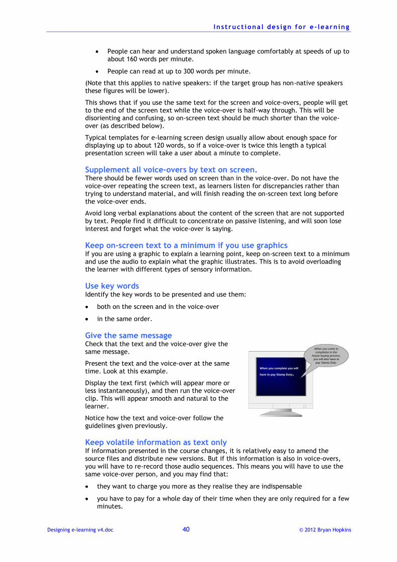
I n s t ruct iona l des i gn for e - learn ing
Designing e-learning v4.doc 40 © 2012 Bryan Hopkins
People can hear and understand spoken language comfortably at speeds of up to about 160 words per minute.
People can read at up to 300 words per minute.
(Note that this applies to native speakers: if the target group has non-native speakers these figures will be lower).
This shows that if you use the same text for the screen and voice-overs, people will get to the end of the screen text while the voice-over is half-way through. This will be disorienting and confusing, so on-screen text should be much shorter than the voice-over (as described below).
Typical templates for e-learning screen design usually allow about enough space for displaying up to about 120 words, so if a voice-over is twice this length a typical presentation screen will take a user about a minute to complete.
Supplement all voice-overs by text on screen. There should be fewer words used on screen than in the voice-over. Do not have the voice-over repeating the screen text, as learners listen for discrepancies rather than trying to understand material, and will finish reading the on-screen text long before the voice-over ends.
Avoid long verbal explanations about the content of the screen that are not supported by text. People find it difficult to concentrate on passive listening, and will soon lose interest and forget what the voice-over is saying.
Keep on-screen text to a minimum if you use graphics If you are using a graphic to explain a learning point, keep on-screen text to a minimum and use the audio to explain what the graphic illustrates. This is to avoid overloading the learner with different types of sensory information.
Use key words Identify the key words to be presented and use them:
both on the screen and in the voice-over
in the same order.
Give the same message Check that the text and the voice-over give the same message.
Present the text and the voice-over at the same time. Look at this example.
Display the text first (which will appear more or less instantaneously), and then run the voice-over clip. This will appear smooth and natural to the learner.
Notice how the text and voice-over follow the guidelines given previously.
Keep volatile information as text only If information presented in the course changes, it is relatively easy to amend the source files and distribute new versions. But if this information is also in voice-overs, you will have to re-record those audio sequences. This means you will have to use the same voice-over person, and you may find that:
they want to charge you more as they realise they are indispensable
you have to pay for a whole day of their time when they are only required for a few minutes.
When you complete you will
have to pay Stamp Duty.
When you come to
completion in the
house buying process,
you will also have to
pay Stamp Duty.
I n s t ruct iona l des i gn for e - learn ing
Designing e-learning v4.doc 41 © 2012 Bryan Hopkins
Writing questions
Questions are used in all forms of learning materials to:
let the learner check their understanding of what they have studied (learning about learning, or metacognition), known as formative questions
assess how well the learner has learnt the content (summative questions)
stimulate a learner to think about a subject before exploring it in more detail
allow a learner to see the consequences of different decisions, as when used in a simulation
manage navigation, where the learner’s response takes them to another part of the training
give the learner practice in retrieving information from their long –term memory (which reinforces the strength of the memory and makes sure they can find it quickly again later).
General principles for writing good questions There are some general guidelines to follow.
Make questions cover a real objective Think about the purpose of training, which is to apply knowledge. This means that a good question should be testing an identified performance objective. Do not include a question just for the sake of it or because it is easy to write.
The most effective questions in learning materials are performance-oriented, i.e., they ask the learner to consider how to apply knowledge. This is, after all, what
training is about – to make sure someone can apply knowledge in a real situation.
This contrasts with content-oriented questions, which ask about knowledge in isolation from its application.
Look at these examples.
Performance-oriented Content-oriented
What do you do if you suspect you have a computer virus?
How does a computer virus work?
How much annual leave will a person have by the end of June?
How quickly does annual leave accrue?
Someone goes off sick on May 3rd. After what date would they need to provide a doctor’s certificate, if they stay off sick?
How many days can someone take off sick before they need a doctor’s certificate?
Check for understanding, not memorising Avoid asking questions that merely repeat information the learner has just read. Questions whose answers are word for word copies of information presented are called verbatim questions and have no learning value.
Questions about facts often fall into this category. For example, consider these two questions:
“Does the policy cover theft?”
“Would a customer be covered if their phone was stolen from their jacket pocket?”
The first tests the recall of policy conditions while the second checks that they can understand and apply these conditions.
I n s t ruct iona l des i gn for e - learn ing
Designing e-learning v4.doc 42 © 2012 Bryan Hopkins
One good way to make questions test understanding is to make them performance-
oriented – every new situation is a test of understanding and being able to use information.
If you do want to ask a content-oriented question, there are various ways in which you can present questions that test understanding rather than recall:
Paraphrase, repeat the information presented but use alternative wording
New application, make the learner apply the information presented to a new application
Categorical, make the learner apply the information presented to a more general or specific example
Get the reading level right Make sure the wording of the question is appropriate to the reading level of the target group. Questions must always test knowledge of the subject rather than of reading ability. This is particularly important where the first language of some learners will not be the language of the test.
So write questions clearly and simply.
Avoid negative words Questions that ask the learner to identify which is not the correct answer are difficult to understand. They:
avoid telling someone the right answer
focus attention on the wrong thing to do
test the learner's comprehension of English rather than of the subject, as they are linguistically harder to understand
Make questions ask the learner select correct things rather than incorrect things.
Avoid abbreviations Avoid using abbreviations in questions (unless of course you are checking an understanding of an abbreviation).
Keep questions all on one screen or page Make sure that the wording of questions and feedback fit on to one screen. If you find that you need to allow scrolling of the screen or turning to a new page, you must redesign the question.
If your e-learning software works by displaying feedback in a pop-up window (which, although popular, is not good practice) make sure that the content of the feedback stands alone, as the window may obscure question text.
Content-question or question-content? One important question to resolve about every question that you include in an e-learning course is to decide whether it goes before or after the content that it questions:
In content-question you present the content and then ask the learner a question about the content
In question-content you ask the learner a question about the content and then give them the content in feedback or on following screens.
Each has its particular advantages and disadvantages, and deciding which approach to take is something you can do from screen to screen, as in some circumstances one will be more effective than the other. A combination of both approaches can help to create a more stimulating and interesting course.
I n s t ruct iona l des i gn for e - learn ing
Designing e-learning v4.doc 43 © 2012 Bryan Hopkins
Content-question
Advantages:
You can test the learner's understanding of the content they have read.
You can test to see the learner can apply knowledge in other situations.
Disadvantages:
It can lead to the writing of potentially banal questions.
Question-content
Advantages:
It can present more of a challenge to the learner.
It can give a learner practice in accessing external sources of information.
It works well where people have some prior knowledge of the subject.
Disadvantages:
It can be discouraging for a learner to have to answer questions where they do not know the subject matter.
In general if you do use the question first then content approach it is a good idea to ask another question after the content presentation to give the learner practice in retrieving the information from their memory.
Using formative questions Formative questions are questions designed to help someone test their understanding of a subject, much like a teacher would ask a class a question. The essential characteristics of such questions are that:
scores for them are not formally recorded
learners receive constructive feedback.
Give constructive feedback
All formative questions must provide feedback. The feedback that you give should always be:
positive, not criticising the person for having made a wrong decision
corrective, explaining why the right answer is right
immediate, as soon as the user has answered.
Learning is aided by providing error-contingent feedback. This is where the feedback you provide is different for each distractor, rather than "No, that is not correct." Look at this example, where option 3 is the correct answer.
Which of the following best describes a manager's role in dealing with information?
Options in question Error-contingent feedback
1. Analysing information and protecting it
Protecting information is generally not good management. Effective managers look for information from within the organisation and elsewhere and then share it with people who need it.
2. Filtering and spreading information appropriately
Filtering information can be important but it has its dangers. Effective managers look for information from within the organisation and elsewhere and then share it with people who need it.
3. Looking for information and then
Effective managers look for information from within the organisation and elsewhere and then share it with
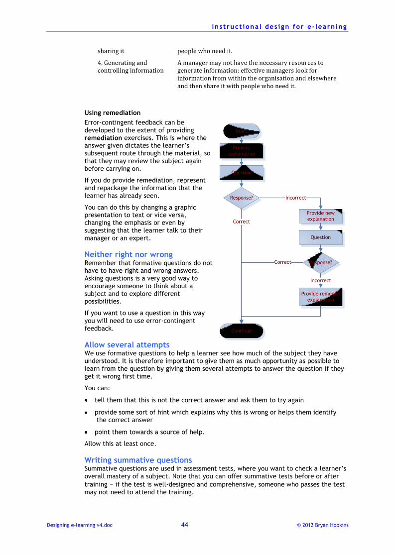
I n s t ruct iona l des i gn for e - learn ing
Designing e-learning v4.doc 44 © 2012 Bryan Hopkins
sharing it people who need it.
4. Generating and controlling information
A manager may not have the necessary resources to generate information: effective managers look for information from within the organisation and elsewhere and then share it with people who need it.
Using remediation
Error-contingent feedback can be developed to the extent of providing remediation exercises. This is where the answer given dictates the learner’s subsequent route through the material, so that they may review the subject again before carrying on.
If you do provide remediation, represent and repackage the information that the learner has already seen.
You can do this by changing a graphic presentation to text or vice versa, changing the emphasis or even by suggesting that the learner talk to their manager or an expert.
Neither right nor wrong Remember that formative questions do not have to have right and wrong answers. Asking questions is a very good way to encourage someone to think about a subject and to explore different possibilities.
If you want to use a question in this way you will need to use error-contingent feedback.
Allow several attempts We use formative questions to help a learner see how much of the subject they have understood. It is therefore important to give them as much opportunity as possible to learn from the question by giving them several attempts to answer the question if they get it wrong first time.
You can:
tell them that this is not the correct answer and ask them to try again
provide some sort of hint which explains why this is wrong or helps them identify the correct answer
point them towards a source of help.
Allow this at least once.
Writing summative questions Summative questions are used in assessment tests, where you want to check a learner’s overall mastery of a subject. Note that you can offer summative tests before or after
training – if the test is well-designed and comprehensive, someone who passes the test may not need to attend the training.
Start
Question
Response?
Continue
Provide new
explanation
Response?
Provide remedial
explanation
Incorrect
Correct
Correct
Incorrect
Provide
explanation
Question
I n s t ruct iona l des i gn for e - learn ing
Designing e-learning v4.doc 45 © 2012 Bryan Hopkins
There are some important differences to consider between summative and formative questions.
Issue Summative Formative
Scoring
The answers are recorded in
the management system, and
a score for a correct, partially
correct or incorrect answer is
logged.
Scores are not logged in the
management system, although they
may be recorded temporarily if the
learner is working through a series
of questions and their performance
needs to be monitored.
Feedback The learner will not generally
receive any feedback to tell
them if their answer is correct
or incorrect.
However, they should be told
that their answer has been
recorded.
The learner should receive
feedback that explains that their
answer is correct and why it is
correct, or that it is incorrect and
why it is incorrect.
Attempts The learner should only have
one attempt during each pass
through the assessment test.
If they repeat the test they
may be given the question
another time.
The learner should have at least
two possibilities to answer the
question correctly.
Right and
wrong
There should be a clear right
and wrong answer, although
there may be more than one
correct answer.
It is not necessary to have a correct
answer, but the feedback should
provide useful information.
Scoring summative questions
You always need to think carefully about how you will award scores for summative questions, especially when you use different question types or have some questions with more than one correct answer.
If all of your questions are single correct multiple choice questions, you just need to decide that you will award, say, one mark for the correct answer and zero for an incorrect answer.
However, if a question has two correct options, you need to decide if you are going to award a half mark for only selecting one of the correct options. You have to decide whether or not it is therefore appropriate to give someone a half mark for not answering the question completely correctly: this depends on the nature of the question and the subject matter.
If you do decide that someone needs to select all correct options before being given a mark, you should make this clear in the wording of the question.
I n s t ruct iona l des i gn for e - learn ing
Designing e-learning v4.doc 46 © 2012 Bryan Hopkins
Multiple-choice questions A multiple choice question is any question that asks the learner to select the correct answer(s) from a list of alternatives (or options). Some technical terms:
the correct answer is sometimes known as the key
the incorrect alternatives are the distractors
E-learning materials use a lot of multiple-choice questions as they are easy to program and easy for the computer to judge. This does not mean, however, that they are easy to design! It can be very difficult to design a set of multiple-choice questions that really test the material the learner is studying.
Graphics and audio allow for a lot of variety in the structure of a multiple-choice question. Although the principle of choosing a correct answer from a set of possibilities remains, there are various ways in which the possibilities can be presented and the choice made. For example, the learner can:
select a graphic image
click on the correct part of a graphic image
drag a graphic image into an answer box
select an audio item
Ways of presenting a question The most common and obvious style of multiple choice question is to ask a simple question and offer a number of possible answers. However, it can sometimes be difficult to think of suitable questions in this style, so it is useful to think about alternative styles.
Premise and consequence
Present the learner with a situation and provide them with a choice of possible outcomes.
An organisation wants to estimate how much it will cost to offer existing services to a new group of clients. Which of the following would be useful activities to carry out? 1. Marginal cost analysis. 2. Strategy-context evaluation 3. Programme evaluation review 4. Value for money analysis
Case study
Give the learner a scenario based on the source material. If your scenario is strong enough, you may be able to find several questions within it.
Multiple true or false
Offer two statements A and B about the content. Then ask the learner if A is true and B false, A is false and B true, A and B are both true or A and B are both false. Four options from two statements.
I n s t ruct iona l des i gn for e - learn ing
Designing e-learning v4.doc 47 © 2012 Bryan Hopkins
Here is an example.
A voluntary organisation providing support to homeless people finds it hard to provide the required level of services during a time of economic recession. Two reasons put forward to explain this are:
A. An increased number of people needed services B. it is harder to raise money at this time
What do you think about the validity of these two reasons? 1. Neither A nor B are relevant to voluntary organisations. 2. Only A relevant to voluntary organisations. 3. Only B is relevant to voluntary organisations. 4. Both A and B are relevant to voluntary organisations.
Missing item
Give the learner an incomplete text or graphic-based list and ask them to identify what is missing from the list.
Option evaluation
There are several ways to use this structure.
Give the learner a statement and ask them to evaluate it against specific, relevant criteria and then asked them to assess the statement. For example, you could give options of Unlikely, Possible, Probable, Very probable.
Give the learner a question and an answer, and then provide them with a list of possible ways of assessing the answer. For example, is the answer given Incorrect, Partially correct, Acceptable or Excellent. You will need to give the learner some criteria for categorising these descriptions.
Questions like this are very useful for testing people's understanding of subtle or complex issues where there may not be completely correct answers. If the question is summative, you may need to decide on awarding half marks for some answers.
Using multiple correct questions It is perfectly acceptable to give learners questions where there are two or more correct answers in a list. You should provide a correspondingly higher number of distractors.
Scoring multiple correct questions
The main issue with using questions such as this in an assessment test is about awarding scores. You need to decide on a scoring scheme that rewards partially correct answers as well.
Providing feedback
With multiple correct questions it is difficult to provide feedback that addresses the exact answering pattern if the question is only partially correctly answered. It is not fair to tell someone that their answer is 'incorrect' if they have correctly selected one or more of the correct answers.
The best thing to do is to start the incorrect feedback with something like "That is not completely correct...." This is potentially misleading if they failed to but is better than telling them that they are wrong. Of course, it may be possible to code the questions so that it detects responses that do not include any correct selections.
It can be difficult to provide error-contingent feedback with multiple correct questions that cover different combinations of responses. It is possible to do it but the question design time goes up considerably.
I n s t ruct iona l des i gn for e - learn ing
Designing e-learning v4.doc 48 © 2012 Bryan Hopkins
Explaining the question
Take care when wording the instructions to multiple correct questions. You may need to tell the learner that:
there are a specific number of answers to select, or
there may be more than one correct answer.
Be careful about including multiple correct questions within a series of single correct questions. Learners do not always read the instructions and may assume that only one answer is correct!
For this reason a better way to present multiple correct multiple choice questions in an assessment test is to present them as a series of alternative response questions (true/false, for example). It is also thought that this is a more reliable way of asking such questions.
Questions where all the options are correct answers
Think carefully about presenting questions where all the options are correct.
Avoid asking such questions where all the options are obviously correct. An example of this would be a question such as "Which of the following are desirable qualities in a house?", and where the options are all positive attributes. These can irritate learners and are not very meaningful learning opportunities.
There are occasions where using such a question can be effective in pointing out that the learner really must take into account all possibilities, but this should be done sparingly. Because the answers to such questions are often rather obvious, they are not good choices for summative assessment questions.
If you want to ask a question where all the options are reasonable answers, you could ask the learner to select what they think is a 'good' (rather than the best) answer. For example, you might want the learner to be able to explore the difference between different strategies, given a particular situation. In such questions you should provide error-contingent feedback for each option.
Guidelines for effective multiple choice questions
Always number or letter the list
Learners find it easier mentally to sort items that have easy references, such as numbers (1, 2, 3, etc.) or letters (a, b, c, etc.).
Do this even if the software you are using to present the questions does not need the number or letters.
Provide four or five possible answers
A multiple choice question can offer, in theory, anything from two possible answers upwards. Of course, with only two answers the learner has a 50% chance of guessing the right answer, while with a large number of answers it is increasingly difficult to guess correctly, but the question becomes unwieldy both to design and read.
The best compromise is to offer no more than four or five alternatives.
Make all the choices believable
The hardest part about writing multiple choice questions is thinking of the distractors, and it is sometimes hard to resist the temptation to put one in as a joke. Avoid this: it merely increases the user’s chance of guessing the right answer from those left.
I n s t ruct iona l des i gn for e - learn ing
Designing e-learning v4.doc 49 © 2012 Bryan Hopkins
For example, is option 3 in this question plausible?
The United Nations Convention of 1951 defines UNHCR's responsibility towards:
1. Refugees 2. Internally displaced people 3. International civil servants 4. Stateless people
Make the meaning of the question clear to the user
Do not ask questions that mean different things to different people. For example:
UNHCR's work is important because:
1. It helps refugees 2. It supports governments in helping refugees 3. Both refugees and internally displaced people are helped 4. Refugees are often powerless
Clearly everyone will have different thoughts about this.
However, note that questions asking the learner to choose the ‘best’ (or similar superlative) option are fine as long as the learner knows what the criteria are for making the decision. For a formative question it is particularly important in this case to provide error-contingent feedback.
You can also confuse the meaning of a question by adding unnecessary information in the options. Think about what the question is asking and confine content in the options to information that answers that question. For example, in the example below the text about debt consolidation is irrelevant and merely confuses.
What are the three repayment options available for a Personal Loan?
1. Deferred. Remember, this option can not be offered where 70% or more of the Personal Loan is for debt consolidation.
2. Standard. 3. Part payment. 4. Lump sum payment. 5. January holiday.
Keep the options as short as possible
You keep the options short by putting as much text as possible in the stem of the question (the first part of the question). For example:
Christmas Day is on December:
1. 5 2. 17 3. 25 4. 31
This is preferable to writing December 5, December 17, etc. in the list of answers.
This is easier to do (and makes the question easier to understand) if the blank in the question is at the end. For example, write it as above rather than as something like “December X is Christmas Day. What is X?”
Make options parallel
'Parallel' here means that the options should be grammatically similar.
So, for example, in the example above about UNHCR's work all of the options have a similar structure, and follow on grammatically from the stem.
Keep options mutually exclusive
It is easy when trying to write distractors to create one that actually means more or less the same as the correct option, or is a special case of the correct option.
I n s t ruct iona l des i gn for e - learn ing
Designing e-learning v4.doc 50 © 2012 Bryan Hopkins
Here are two examples.
Does Ms. Smith require a full medical examination?
1. No – provided she has already has had a full entry medical and it is within its expiry date
2. Yes – all APPC appointments require a full medical exam 3. No – but she must provide a certificate of good health 4. No – provided she has not used more than 3 sick leave days a month
Here options 1 and 2 are not mutually exclusive – option 2 is implied within option 1.
Notice also that the question is actually asking for a yes or no response, while the options contain justifications.
Another example:
Which of the following statements are correct? Click two or more options, then click confirm.
1. The writer provides enough detail to explain the current refugee problem 2. This could probably be simplified to aid readability 3. The writer makes good use of visuals (table of data) 4. The writer uses a prosaic, literary style which makes sentences and paragraphs
rather long
Here, option 4 means the same as 2. If you had decided that option 2 were the correct answer, then 4 would also be correct.
On the other hand, a learner may see two options that are obviously the same and decide that they must be distractors.
Either way, the question ends up playing tricks on the learner and so is not functioning correctly.
Avoid giving the learner clues
It is surprisingly easy to give a learner clues about right and wrong answers. We have already discussed implausible answers, but you must also look out for such things as:
presenting opposites: an obvious distractor is the direct opposite of the key, so if a learner sees a pair in the list they will concentrate on those two
making the correct answer the longest: you may find yourself doing this by adding information to make the correct answer unambiguously correct
options written in a different style of language, especially one that sounds more 'official'
'a' and 'an': ending the stem with the word 'a' and including distractors beginning with vowels (or vice versa)
repeating a key word in the stem and the correct option
using jargon terms in just the correct option
repetitive answer positions: repeatedly using the same number in the list for the correct answer (keep a die in your desk and roll it to decide the position of the key).
I n s t ruct iona l des i gn for e - learn ing
Designing e-learning v4.doc 51 © 2012 Bryan Hopkins
Here are some examples.
A staff member’s TA is for 5 months. What is the requirement regarding medical clearance?
1. A certificate of good health valid for the first three months followed by a full medical OR ideally a full medical examination before starting employment
2. Provide a certificate of good health ONLY as it is valid for 5 months 3. Provide a certificate of good health upon extension of the TA beyond 6 months 4. She does not need to provide anything
Clues include:
Option 1 is the longest and contains most plausible detail. It is also written in a formal style.
Option 2 contains ‘only’ – such words alert people to them being incorrect.
Option 2 says ‘5 months’ – administrators never use odd numbers like this, so it is implausible
Option 4 does not sound plausible.
Avoid using 'not' in the stem
Avoid asking learners to say which is not a correct answer. Such questions:
become tests of mental dexterity rather than of an understanding of the subject
make people think about the incorrect answer rather than the correct answer.
It is also better to avoid ‘not’ statements in the options, but if you do want to do this, make sure you highlight the ‘not’ appropriately.
Avoid using ‘none’ or ‘all’ as an option
Look at this question:
Which of the following groups does UNHCR work with?
1. Refugees 2. Internally displaced people 3. Stateless people 4. All of these
The weakness with this type of question is that if the learner knows that UNHCR does not work with stateless people, the ‘all’ option is not a possible correct answer. The question then becomes a simple alternative response type, with an increased chance of guessing the right answer.
With the way this question is worded, there is also an important error of logic. Technically all the options are correct, but the question writer really intended the learner to select option 4. It would be therefore easy to evaluate a selection of 'Refugees' as incorrect, when of course it is correct.
Similarly, avoid using specific determine words such as ‘never’, 'only', 'all' or ‘always’ in the stem or options of a question. Absolutes are always very hard to find, and if a learner can think of an exception, however obscure, they have a good reason to reject 'never' and 'always' options.
Put answers in alphabetical or numerical order (where appropriate)
When answers are numbers or single words it is good practice to put them in numerical or alphabetical order.
If there is any other logical sequence to the options, use this.
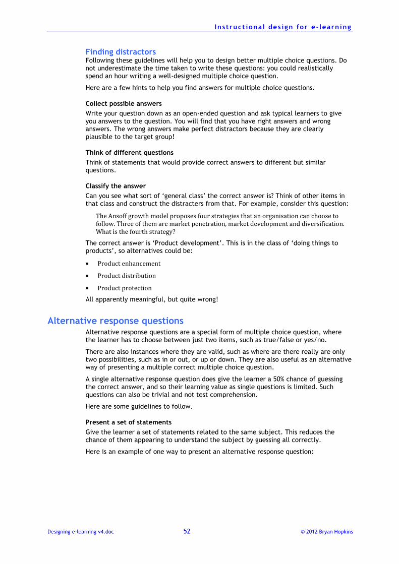
I n s t ruct iona l des i gn for e - learn ing
Designing e-learning v4.doc 52 © 2012 Bryan Hopkins
Finding distractors Following these guidelines will help you to design better multiple choice questions. Do not underestimate the time taken to write these questions: you could realistically spend an hour writing a well-designed multiple choice question.
Here are a few hints to help you find answers for multiple choice questions.
Collect possible answers
Write your question down as an open-ended question and ask typical learners to give you answers to the question. You will find that you have right answers and wrong answers. The wrong answers make perfect distractors because they are clearly plausible to the target group!
Think of different questions
Think of statements that would provide correct answers to different but similar questions.
Classify the answer
Can you see what sort of ‘general class’ the correct answer is? Think of other items in that class and construct the distracters from that. For example, consider this question:
The Ansoff growth model proposes four strategies that an organisation can choose to follow. Three of them are market penetration, market development and diversification. What is the fourth strategy?
The correct answer is ‘Product development’. This is in the class of ‘doing things to products’, so alternatives could be:
Product enhancement
Product distribution
Product protection
All apparently meaningful, but quite wrong!
Alternative response questions Alternative response questions are a special form of multiple choice question, where the learner has to choose between just two items, such as true/false or yes/no.
There are also instances where they are valid, such as where are there really are only two possibilities, such as in or out, or up or down. They are also useful as an alternative way of presenting a multiple correct multiple choice question.
A single alternative response question does give the learner a 50% chance of guessing the correct answer, and so their learning value as single questions is limited. Such questions can also be trivial and not test comprehension.
Here are some guidelines to follow.
Present a set of statements
Give the learner a set of statements related to the same subject. This reduces the chance of them appearing to understand the subject by guessing all correctly.
Here is an example of one way to present an alternative response question:
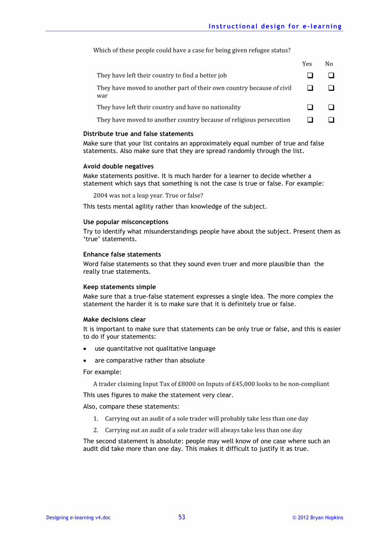
I n s t ruct iona l des i gn for e - learn ing
Designing e-learning v4.doc 53 © 2012 Bryan Hopkins
Which of these people could have a case for being given refugee status?
Yes No
They have left their country to find a better job
They have moved to another part of their own country because of civil war
They have left their country and have no nationality
They have moved to another country because of religious persecution
Distribute true and false statements
Make sure that your list contains an approximately equal number of true and false statements. Also make sure that they are spread randomly through the list.
Avoid double negatives
Make statements positive. It is much harder for a learner to decide whether a statement which says that something is not the case is true or false. For example:
2004 was not a leap year. True or false?
This tests mental agility rather than knowledge of the subject.
Use popular misconceptions
Try to identify what misunderstandings people have about the subject. Present them as ‘true’ statements.
Enhance false statements
Word false statements so that they sound even truer and more plausible than the really true statements.
Keep statements simple
Make sure that a true-false statement expresses a single idea. The more complex the statement the harder it is to make sure that it is definitely true or false.
Make decisions clear
It is important to make sure that statements can be only true or false, and this is easier to do if your statements:
use quantitative not qualitative language
are comparative rather than absolute
For example:
A trader claiming Input Tax of £8000 on Inputs of £45,000 looks to be non-compliant
This uses figures to make the statement very clear.
Also, compare these statements:
1. Carrying out an audit of a sole trader will probably take less than one day
2. Carrying out an audit of a sole trader will always take less than one day
The second statement is absolute: people may well know of one case where such an audit did take more than one day. This makes it difficult to justify it as true.
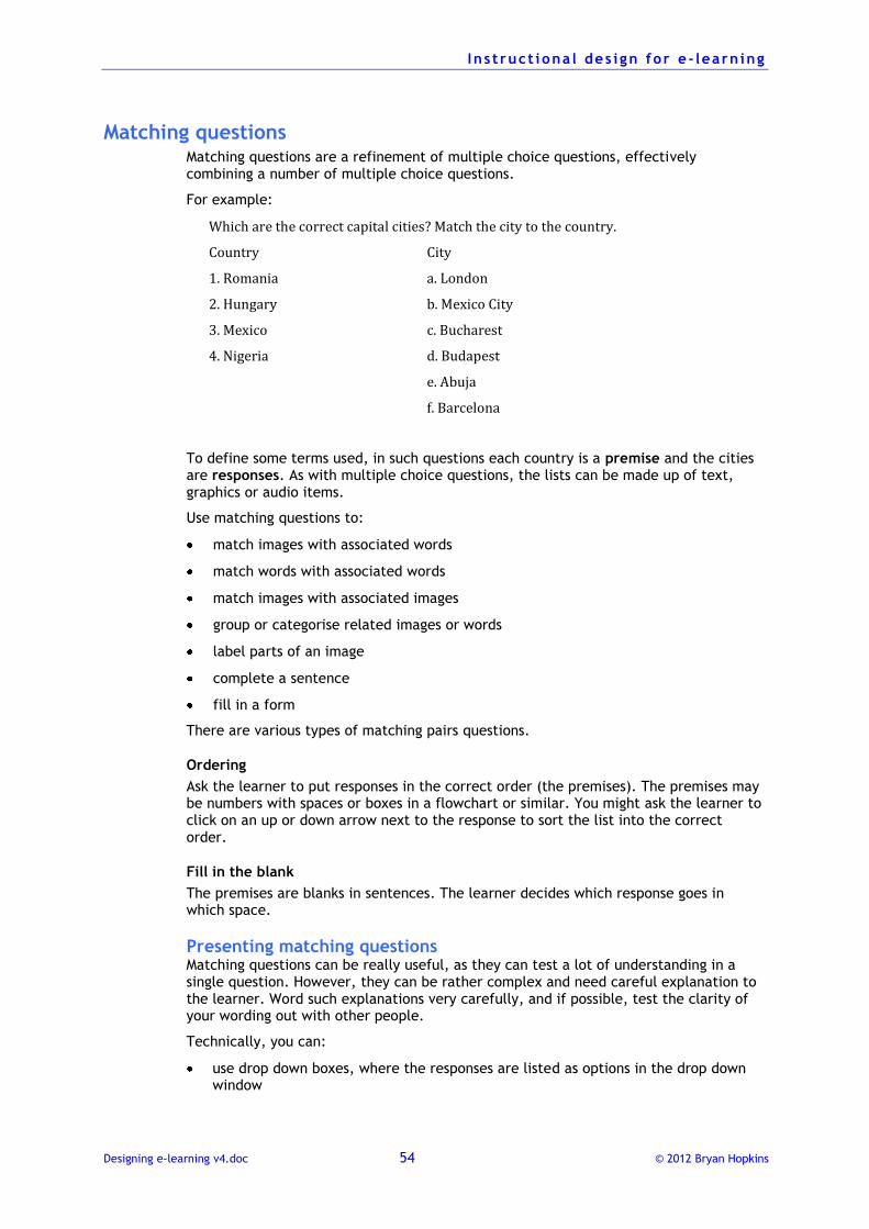
I n s t ruct iona l des i gn for e - learn ing
Designing e-learning v4.doc 54 © 2012 Bryan Hopkins
Matching questions Matching questions are a refinement of multiple choice questions, effectively combining a number of multiple choice questions.
For example:
Which are the correct capital cities? Match the city to the country.
Country City
1. Romania
2. Hungary
3. Mexico
4. Nigeria
a. London
b. Mexico City
c. Bucharest
d. Budapest
e. Abuja
f. Barcelona
To define some terms used, in such questions each country is a premise and the cities are responses. As with multiple choice questions, the lists can be made up of text, graphics or audio items.
Use matching questions to:
match images with associated words
match words with associated words
match images with associated images
group or categorise related images or words
label parts of an image
complete a sentence
fill in a form
There are various types of matching pairs questions.
Ordering
Ask the learner to put responses in the correct order (the premises). The premises may be numbers with spaces or boxes in a flowchart or similar. You might ask the learner to click on an up or down arrow next to the response to sort the list into the correct order.
Fill in the blank
The premises are blanks in sentences. The learner decides which response goes in which space.
Presenting matching questions Matching questions can be really useful, as they can test a lot of understanding in a single question. However, they can be rather complex and need careful explanation to the learner. Word such explanations very carefully, and if possible, test the clarity of your wording out with other people.
Technically, you can:
use drop down boxes, where the responses are listed as options in the drop down window
I n s t ruct iona l des i gn for e - learn ing
Designing e-learning v4.doc 55 © 2012 Bryan Hopkins
use a drag and drop approach, where the learner drags what they think the correct response is over to the premise and lets it go.
Guidelines for matching questions Many of the guidelines about writing good multiple choice questions also apply to matching questions, but there are some additional guidelines to follow.
Keep items in each list homogeneous
Design each list so that the items in it are of the same sort. For example, in the question above the first list contains countries and the second list cities.
Avoid clues
In addition to the possible clues discussed above, a clue that is specific to matching questions is to provide items in the list that are obviously related. For example, in the question above Mexico and Mexico City are too obviously connected.
Offer more responses than premises
If the list of responses is longer than the list of premises, the learner will always have to make a choice between alternatives even for the last premise.
Unfortunately many rapid e-learning tools are designed so that there have to be the same number of premises and responses. This comes from a lack of understanding amongst tool designers about the complexities of question design.
Free format questions The term ‘free format’ can cover both short, one word responses and essay length answers. In this section we will just look at the first possibility. Essay responses are covered in the following section.
Short answer, or constructed-response questions, require the learner to enter a response into a space. They are easy questions to design, and can be the most challenging to learners, as the correct answer is not visible.
Free-format questions work very well in paper-based materials, but are more problematic in e-learning courses for a number of reasons:
If you want to check the response you must design thorough judging routines to take into account misspelling, etc.
If you want to save the learner's response you must add some data storage capability.
If the response is not judged, feedback is not related to the response. When learners realise this they may not bother with responding and simply read the feedback, making this a non-interactive interaction.
There are two main types, open-ended and completion.
Completion questions Completion questions are sometimes called 'cloze' (which comes from the word for closure used in Gestalt psychology) or 'fill in the blanks': in other words the learner has to provide a missing word.
For example:
Internally ______________ ___________ are those who have had to leave their homes but have stayed in the country of their nationality.
When designing completion questions, make sure that you:
have just one or two blanks, as any more can make the sense of the statement ambiguous and hard to answer correctly
I n s t ruct iona l des i gn for e - learn ing
Designing e-learning v4.doc 56 © 2012 Bryan Hopkins
put the blanks at the end of the statement, as putting blanks at the beginning makes the statement more difficult to comprehend linguistically
So an improvement in this question would be:
People who have had to leave their homes but have stayed in the country of their nationality are known as Internally _______________ ____________.
allow for different spellings and capitalisation, as well as for variants (in this example we might accept ‘People’ as well as ‘Persons’).
Open ended questions This example would become open-ended if we asked:
What does the abbreviation ‘IDP’ means? _____________________________________
The points about allowing misspellings, etc., also apply here.
The best application for free format questions is where the answer is numerical. For example:
Approximately how many refugees are there in Chad?
But be careful. The answer scanning must also be able to pick up responses such as 'one thousand ', or the programming must bar the typing of letters.
Essay response questions These are questions where the learner must write a lengthier response to an open-ended question. If this is being done within an e-learning course, find a way for your learner to type and save a response, either using the LMS, specially designed notepad or an external method such as a word processor.
Terminology for this type of response varies, but some useful definitions are:
brief response – takes less than 10 minutes to answer
extended response – takes longer than 10 minutes, often what we loosely call an ‘essay’
Extended response questions make the learner discuss a relatively small area in great depth, which makes them effective for specialised topics but less good where we want people to have a good appreciation of a number of different topics. This is usually what we are looking for in occupational training courses.
Questions of this sort place a lot of demands on writing skills, and it can take some people a long time to express in writing what are relatively simple ideas. This may be a particular problem where people are having to write in a non-native language.
Ways of evaluating essay responses Evaluating responses is a big problem with this type of question. There are various challenges:
It takes much longer to score such a response, and this can be expensive in terms of time and money.
Scoring can be inconsistent – can you be confident that two different people will give the same score to the same piece of work? If not, the question is not valid as a
test. There are so many variables here – clarity of expression, use of graphics,
expectations about the individual – that it is almost impossible to develop a truly objective test.
There are broadly two approaches you can follow to marking brief or extended response questions:
I n s t ruct iona l des i gn for e - learn ing
Designing e-learning v4.doc 57 © 2012 Bryan Hopkins
Analytical marking, where you use a scoring rubric to break down the desired components of a good answer.
Holistic marking, where you give a mark based on the overall quality of the response.
Analytic marking is more consistent but is time-consuming to develop and works best where there are discrete elements to test. Holistic marking is good for extended responses, less clearly structured and opinion-oriented material but scores can vary widely between different assessors.
Making analytic marking work Here are some guidelines for making analytic marking work.
Make sure the question measures a specific objective of the training
Think carefully about the wording and structure of the question and make sure that it really does ask the learner to explain or discuss something that is directly relevant to their work.
Make the question readable
Think about the lowest reading abilities likely in your target group and phrase the question so these people can read and understand it. Test the wording with other people to see if they can understand what is needed before you publish it.
Avoid questions that are matters of opinion
Ask questions to which there are right or wrong answers. Questions to which the answer is a matter of opinion cannot be analytically scored in any meaningful way as there is no definitive right or wrong. Consider this example:
How well is the distribution of non-food items carried out in your duty station?
A more meaningful question here might be something like:
Describe two aspects of the distribution of non-food items in your duty station that cause problems and for each suggest one way in which in this could be improved.
Develop a tight scoring plan
Scoring plans (or ‘rubrics’) are essential to try and standardise how responses will be evaluated. They can also help to minimise the dependency on an expensive and unavailable expert resource. How to specify a rubric is described in more detail below.
Give a word count
Tell the learner what the maximum number of words is that they should put in their answer. Make it clear that marks will be deducted if they exceed this, but in practice allow them to go over by 10%.
This makes everybody’s life much easier, as it will limit the amount of writing they do and the reading you do!
You should write your own model answer when deciding the word count, so that you know how many words really are needed to include what you are looking for.
Designing scoring rubrics Rubrics are essential if you want to make the scoring consistent from one evaluator to another.
Here is an example of a scoring rubric for the question below. There are five steps, described below, to developing something like this.
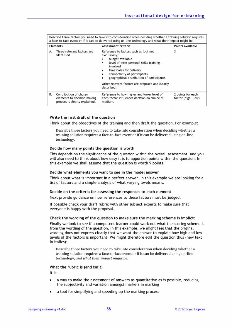
I n s t ruct iona l des i gn for e - learn ing
Designing e-learning v4.doc 58 © 2012 Bryan Hopkins
Describe three factors you need to take into consideration when deciding whether a training solution requires a face-to-face event or if it can be delivered using on-line technology and what their impact might be.
Elements Assessment criteria Points available
A. Three relevant factors are identified
Reference to factors such as (but not exclusively):
budget available
level of inter-personal skills training involved
timescales for delivery
connectivity of participants
geographical distribution of participants.
Other relevant factors are proposed and clearly described.
3
B. Contribution of chosen elements to decision-making process is clearly explained.
Reference to how higher and lower level of each factor influences decision on choice of medium.
2 points for each factor (high – low)
Write the first draft of the question
Think about the objectives of the training and then draft the question. For example:
Describe three factors you need to take into consideration when deciding whether a training solution requires a face-to-face event or if it can be delivered using on-line technology.
Decide how many points the question is worth
This depends on the significance of the question within the overall assessment, and you will also need to think about how easy it is to apportion points within the question. In this example we shall assume that the question is worth 9 points.
Decide what elements you want to see in the model answer
Think about what is important in a perfect answer. In this example we are looking for a list of factors and a simple analysis of what varying levels means.
Decide on the criteria for assessing the responses to each element
Next provide guidance on how references to these factors must be judged.
If possible check your draft rubric with other subject experts to make sure that everyone is happy with the proposal.
Check the wording of the question to make sure the marking scheme is implicit
Finally we look to see if a competent learner could work out what the scoring scheme is from the wording of the question. In this example, we might feel that the original wording does not express clearly that we want the answer to explain how high and low levels of the factors is important. We might therefore edit the question thus (new text in italics):
Describe three factors you need to take into consideration when deciding whether a training solution requires a face-to-face event or if it can be delivered using on-line technology, and what their impact might be.
What the rubric is (and isn’t)
It is:
a way to make the assessment of answers as quantitative as is possible, reducing the subjectivity and variation amongst markers in marking
a tool for simplifying and speeding up the marking process
I n s t ruct iona l des i gn for e - learn ing
Designing e-learning v4.doc 59 © 2012 Bryan Hopkins
an audit trail we can use to defend a decision about scoring.
It isn’t
the right answer, but is a guideline to what a right answer should look like.
Making holistic marking work Holistic marking is quicker but less reliable than analytic marking. So to minimise the problems, follow these guidelines.
Use several markers
Have several different people mark the questions and find what the average is. The speed of holistic marking offsets the extra time needed.
Develop a model answer
A model answer will help assessors understand what the question is looking for and will identify responses that are clearly off target.
Mark answers sequentially
Mark all the Questions 1s, then the Question 2s, and so on, rather than Candidate A, then Candidate B. This will make it much easier to develop an idea of good and poor answers.
Conceal names
The highly subjective nature of holistic marking makes it much easier for knowledge of the writer to subliminally influence your judgement. This also applies to analytic marking, but to a lesser extent.
Give a word count
The comments above apply even more so in this type of response.
Reflection questions Questions do not always have to elicit a definite response that the computer will judge. People also learn by reflecting on what they have studied and thinking about how they will apply it, so it is a good idea to include questions that encourage the learner to do some external thinking or physical activity.
For example, you could use suggestions such as these:
Imagine how you will use your new skills.
How does what you have just learnt fit into the big picture of your work?
How does what you have learnt compare to what happens in your workplace at the moment?
If you put these new skills into practice, what effect will this have on working with your colleagues?
Think about what you have just learnt. What implications might this have for how you go about your job?
How does what you have just learnt fit into what you already know?
Have a chat to your colleagues about what you have just learnt. See what ideas they have about the subject.
Do you think you would be able to explain this to someone else? See if you can explain these principles to someone who has not gone through this training.
You might find it useful to design yourself a simple aide memoir about this subject. Have a go at that before moving on.
I n s t ruct iona l des i gn for e - learn ing
Designing e-learning v4.doc 60 © 2012 Bryan Hopkins
As well as encouraging learning by reflection, such questions also help to reduce any:
isolation felt by the e-learner
discomfort felt by inconsistencies between what they already know or do and what they are being told to do in the e-learning.
Depending on the facilities offered by your e-learning systems, you might suggest that the learner makes a note of these things in an electronic notepad or in their e-mail client as a ‘to do’ item, for example.
Usability issues for on-screen tests and questions The software packages used to put questions on-screen often placed certain restrictions on how questions can work. This is particularly the case where the software is designed to be easy to use.
These restrictions can have certain implications for how you write or otherwise design a question.
What is right or wrong?
The software will sometimes place a tick or a cross next to the set of options in a multiple choice or alternative response question to indicate that this is a correct or incorrect option.
However, this can sometimes be confusing as it can suggest that the learner's response is correct when it is incorrect, or vice versa.
Pop-up windows for feedback
Feedback to questions is often given in a pop-up window that appears in the centre of the screen, covering up the question and options. This makes it difficult or impossible for a learner to relate the feedback to the question.
This is just a simple example of how software designers do not understand usability issues!
Ensuring test reliability
On-line tests are an easy way to make testing available to large numbers of people in different geographical locations, but there are potential problems.
A major problem is ensuring that the person taking the test is who they say they are. If the test is significant in any way their can be an incentive for a candidate who feels weak to ask someone to sit the test for them. There are no real electronic ways to guarantee that the correct person is making the question selections, and if authenticity is essential, there has to be a completely trustworthy invigilator observing the test completion process.
Setting randomised tests
Then, it is necessary to make sure that each person sits a different test. You can do this by providing a bank of questions from which the program selects a certain number at random. Each person will then sit a completely unique test.
How many questions?
The number of questions to include in an assessment test depends on the nature of the subject and the level of mastery required. A practical guide is that a one hour e-learning course would have a test of about 10 questions which would be drawn from a bank of 20.
Pass marks
Generally, the pass mark for a quantitative test (one containing multiple choice-type items) is set at about 70 to 80%. However, to make sure that this is valid it is important

I n s t ruct iona l des i gn for e - learn ing
Designing e-learning v4.doc 61 © 2012 Bryan Hopkins
to do a thorough item analysis for the tests to make questions are set at the right level of difficulty.
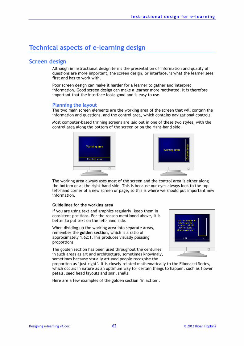
I n s t ruct iona l des i gn for e - learn ing
Designing e-learning v4.doc 62 © 2012 Bryan Hopkins
Technical aspects of e-learning design
Screen design Although in instructional design terms the presentation of information and quality of questions are more important, the screen design, or interface, is what the learner sees first and has to work with.
Poor screen design can make it harder for a learner to gather and interpret information. Good screen design can make a learner more motivated. It is therefore important that the interface looks good and is easy to use.
Planning the layout The two main screen elements are the working area of the screen that will contain the information and questions, and the control area, which contains navigational controls.
Most computer-based training screens are laid out in one of these two styles, with the control area along the bottom of the screen or on the right-hand side.
The working area always uses most of the screen and the control area is either along the bottom or at the right-hand side. This is because our eyes always look to the top left-hand corner of a new screen or page, so this is where we should put important new information.
Guidelines for the working area
If you are using text and graphics regularly, keep them in consistent positions. For the reason mentioned above, it is better to put text on the left-hand side.
When dividing up the working area into separate areas, remember the golden section, which is a ratio of approximately 1.62:1.This produces visually pleasing proportions.
The golden section has been used throughout the centuries in such areas as art and architecture, sometimes knowingly, sometimes because visually attuned people recognise the proportion as ‘just right’. It is closely related mathematically to the Fibonacci Series, which occurs in nature as an optimum way for certain things to happen, such as flower petals, seed head layouts and snail shells!
Here are a few examples of the golden section ‘in action’.
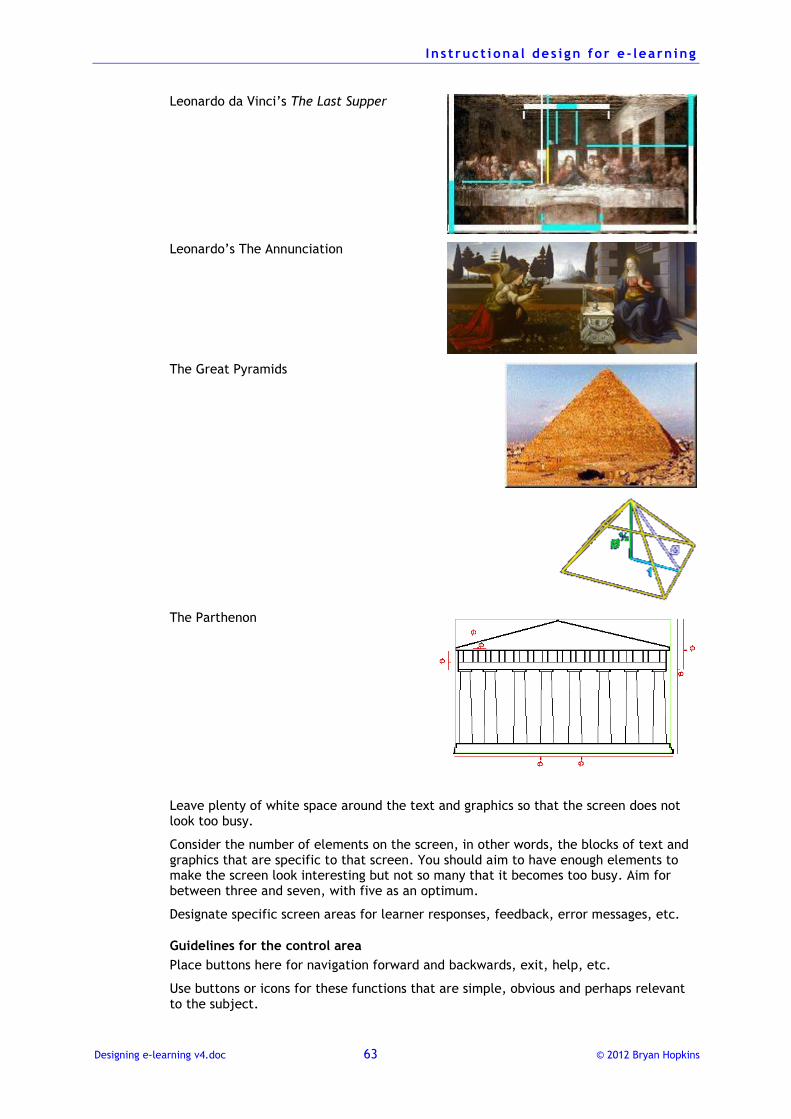
I n s t ruct iona l des i gn for e - learn ing
Designing e-learning v4.doc 63 © 2012 Bryan Hopkins
Leonardo da Vinci’s The Last Supper
Leonardo’s The Annunciation
The Great Pyramids
The Parthenon
Leave plenty of white space around the text and graphics so that the screen does not look too busy.
Consider the number of elements on the screen, in other words, the blocks of text and graphics that are specific to that screen. You should aim to have enough elements to make the screen look interesting but not so many that it becomes too busy. Aim for between three and seven, with five as an optimum.
Designate specific screen areas for learner responses, feedback, error messages, etc.
Guidelines for the control area
Place buttons here for navigation forward and backwards, exit, help, etc.
Use buttons or icons for these functions that are simple, obvious and perhaps relevant to the subject.
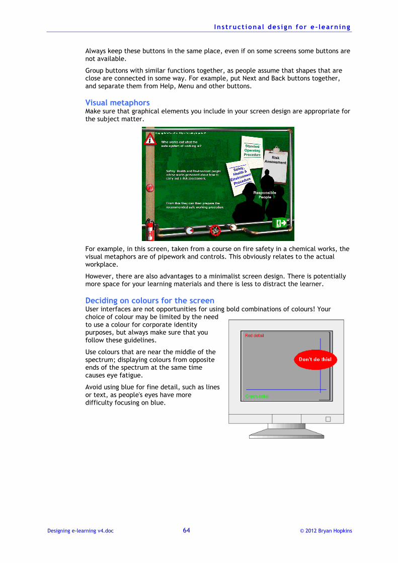
I n s t ruct iona l des i gn for e - learn ing
Designing e-learning v4.doc 64 © 2012 Bryan Hopkins
Always keep these buttons in the same place, even if on some screens some buttons are not available.
Group buttons with similar functions together, as people assume that shapes that are close are connected in some way. For example, put Next and Back buttons together, and separate them from Help, Menu and other buttons.
Visual metaphors Make sure that graphical elements you include in your screen design are appropriate for the subject matter.
For example, in this screen, taken from a course on fire safety in a chemical works, the visual metaphors are of pipework and controls. This obviously relates to the actual workplace.
However, there are also advantages to a minimalist screen design. There is potentially more space for your learning materials and there is less to distract the learner.
Deciding on colours for the screen User interfaces are not opportunities for using bold combinations of colours! Your choice of colour may be limited by the need to use a colour for corporate identity purposes, but always make sure that you follow these guidelines.
Use colours that are near the middle of the spectrum; displaying colours from opposite ends of the spectrum at the same time causes eye fatigue.
Avoid using blue for fine detail, such as lines or text, as people's eyes have more difficulty focusing on blue.
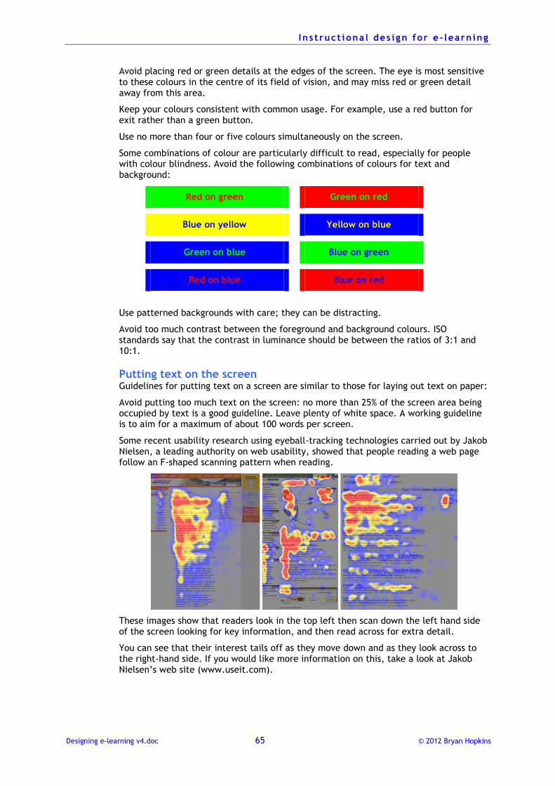
I n s t ruct iona l des i gn for e - learn ing
Designing e-learning v4.doc 65 © 2012 Bryan Hopkins
Avoid placing red or green details at the edges of the screen. The eye is most sensitive to these colours in the centre of its field of vision, and may miss red or green detail away from this area.
Keep your colours consistent with common usage. For example, use a red button for exit rather than a green button.
Use no more than four or five colours simultaneously on the screen.
Some combinations of colour are particularly difficult to read, especially for people with colour blindness. Avoid the following combinations of colours for text and background:
Red on green Green on red
Blue on yellow Yellow on blue
Green on blue Blue on green
Red on blue Blue on red
Use patterned backgrounds with care; they can be distracting.
Avoid too much contrast between the foreground and background colours. ISO standards say that the contrast in luminance should be between the ratios of 3:1 and 10:1.
Putting text on the screen Guidelines for putting text on a screen are similar to those for laying out text on paper:
Avoid putting too much text on the screen: no more than 25% of the screen area being occupied by text is a good guideline. Leave plenty of white space. A working guideline is to aim for a maximum of about 100 words per screen.
Some recent usability research using eyeball-tracking technologies carried out by Jakob Nielsen, a leading authority on web usability, showed that people reading a web page follow an F-shaped scanning pattern when reading.
These images show that readers look in the top left then scan down the left hand side of the screen looking for key information, and then read across for extra detail.
You can see that their interest tails off as they move down and as they look across to the right-hand side. If you would like more information on this, take a look at Jakob Nielsen’s web site (www.useit.com).
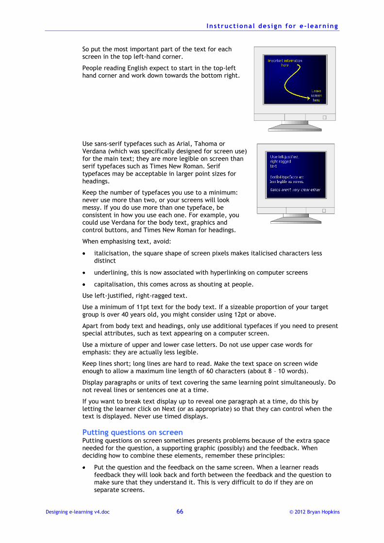
I n s t ruct iona l des i gn for e - learn ing
Designing e-learning v4.doc 66 © 2012 Bryan Hopkins
So put the most important part of the text for each screen in the top left-hand corner.
People reading English expect to start in the top-left hand corner and work down towards the bottom right.
Use sans-serif typefaces such as Arial, Tahoma or Verdana (which was specifically designed for screen use) for the main text; they are more legible on screen than serif typefaces such as Times New Roman. Serif typefaces may be acceptable in larger point sizes for headings.
Keep the number of typefaces you use to a minimum: never use more than two, or your screens will look messy. If you do use more than one typeface, be consistent in how you use each one. For example, you could use Verdana for the body text, graphics and control buttons, and Times New Roman for headings.
When emphasising text, avoid:
italicisation, the square shape of screen pixels makes italicised characters less distinct
underlining, this is now associated with hyperlinking on computer screens
capitalisation, this comes across as shouting at people.
Use left-justified, right-ragged text.
Use a minimum of 11pt text for the body text. If a sizeable proportion of your target group is over 40 years old, you might consider using 12pt or above.
Apart from body text and headings, only use additional typefaces if you need to present special attributes, such as text appearing on a computer screen.
Use a mixture of upper and lower case letters. Do not use upper case words for emphasis: they are actually less legible.
Keep lines short; long lines are hard to read. Make the text space on screen wide enough to allow a maximum line length of 60 characters (about 8 – 10 words).
Display paragraphs or units of text covering the same learning point simultaneously. Do not reveal lines or sentences one at a time.
If you want to break text display up to reveal one paragraph at a time, do this by letting the learner click on Next (or as appropriate) so that they can control when the text is displayed. Never use timed displays.
Putting questions on screen Putting questions on screen sometimes presents problems because of the extra space needed for the question, a supporting graphic (possibly) and the feedback. When deciding how to combine these elements, remember these principles:
Put the question and the feedback on the same screen. When a learner reads feedback they will look back and forth between the feedback and the question to make sure that they understand it. This is very difficult to do if they are on separate screens.
I n s t ruct iona l des i gn for e - learn ing
Designing e-learning v4.doc 67 © 2012 Bryan Hopkins
Keep the question visible after presenting the feedback. Developers sometimes use a pop-up window to show the feedback, with the window covering part of the question. This again makes it hard for the learner to relate the feedback to the question.
Using visual material Visual materials are an essential part of any e-learning course. Without them a course is reduced to text, which quickly becomes boring for a learner. However, visuals need to be more than ‘eye candy’; they must:
support the learning
help the user to navigate through the course.
There are various types of visual material that you may consider using:
Static graphics
Animated graphics
Controllable graphics that the learner controls in some way; for example, they may click on the graphic to reveal something or make something happen
Video
Important points to consider There are various points to take in to consideration when using visual materials.
Bandwidth, bandwidth, bandwidth
Files containing visual materials are much larger than text files. This means that if you are using:
a network to deliver the course your network must be able to deliver the graphics quickly, otherwise it will become very frustrating for the learner
CD-ROMs, your available disk space may get used up very quickly.
Combining text and visuals
You can build text and graphics (and audio) gradually to:
distinguish key information
list a series of items, events, etc.
maximise screen space where there is a lot of information
break up large amounts of information into memorable chunks
show sequential information.
Clickable graphics are not interactions
E-learning programmes developed using sophisticated software such as Macromedia Flash but without a careful application of instructional design sometimes describe themselves as ‘interactive’ because the learner clicks on buttons to make visual items work.
These are not meaningful interactions, and should not be cited as demonstrating high quality learning material. After all, they are in reality no different to ‘Click on Next to continue’.
Clickable graphics are invaluable for helping with explanations but are no substitute for on-screen activities that make the learner think about what they are studying, make a decision and take some specific action.
I n s t ruct iona l des i gn for e - learn ing
Designing e-learning v4.doc 68 © 2012 Bryan Hopkins
What functionality does a course need? An important part of designing e-learning training is to decide how the learner will navigate through the course and how he or she will control objects on screen.
There are several aspects to navigation that you must take into account:
where the learner is
how to move on and where they can move to
bookmarking and easy access.
Where the learner is Paper-based materials always carry information about where the reader is, in the form of page numbers, headers and footers. The reader also gets a good idea of how far through the material they are by comparing the thickness of the pages they have read against the thickness of what is to come. E-learning courses need to provide similar metaphors.
To do this, you must decide how to include:
a title on every page
the name of the course and the module name
where the learner is within the module (such as by a screen number or by a status bar).
At the outline design stage consider how long each module is likely to be and make sure they are not too long. Learners have a sense of making progress when they can complete modules quickly.
How to move on There are four essential navigational features that must be provided on every screen:
Forward, which takes the learner to the next screen.
Backwards, which takes the learner to the previous screen.
Exit, which takes the learner to a menu, probably at module level.
Help, which gives the learner access to help on using the program or on subject content.
Designing controls These need to be designed with certain things in mind.
Put controls in the same place on every screen.
Keep the placing of controls consistent on every screen. Because people usually look for navigation buttons when they have finished reading the screen, the best place for them is in the lower right-hand corner.
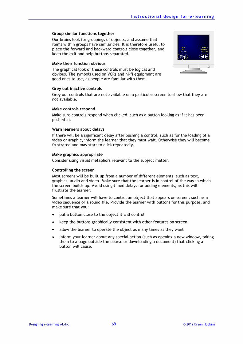
I n s t ruct iona l des i gn for e - learn ing
Designing e-learning v4.doc 69 © 2012 Bryan Hopkins
Group similar functions together
Our brains look for groupings of objects, and assume that items within groups have similarities. It is therefore useful to place the forward and backward controls close together, and keep the exit and help buttons separated.
Make their function obvious
The graphical look of these controls must be logical and obvious. The symbols used on VCRs and hi-fi equipment are good ones to use, as people are familiar with them.
Grey out inactive controls
Grey out controls that are not available on a particular screen to show that they are not available.
Make controls respond
Make sure controls respond when clicked, such as a button looking as if it has been pushed in.
Warn learners about delays
If there will be a significant delay after pushing a control, such as for the loading of a video or graphic, inform the learner that they must wait. Otherwise they will become frustrated and may start to click repeatedly.
Make graphics appropriate
Consider using visual metaphors relevant to the subject matter.
Controlling the screen
Most screens will be built up from a number of different elements, such as text, graphics, audio and video. Make sure that the learner is in control of the way in which the screen builds up. Avoid using timed delays for adding elements, as this will frustrate the learner.
Sometimes a learner will have to control an object that appears on screen, such as a video sequence or a sound file. Provide the learner with buttons for this purpose, and make sure that you:
put a button close to the object it will control
keep the buttons graphically consistent with other features on screen
allow the learner to operate the object as many times as they want
inform your learner about any special action (such as opening a new window, taking them to a page outside the course or downloading a document) that clicking a button will cause.
I n s t ruct iona l des i gn for e - learn ing
Designing e-learning v4.doc 70 © 2012 Bryan Hopkins
Bookmarking and easy access When someone reads a book they know that they can easily get back to useful information, either by looking in the index or by sticking a bookmark in at the appropriate place. This is important functionality: people quickly forget what they have learnt and will often want to go back to look at something again.
You must make sure that people can do this with an e-learning course. As well as providing a bookmarking facility so that someone can take a break from studying and get back to the same place easily later on, you should also consider:
indexing systems, so that a learner can find a specific topic easily
print options, so that a learner can print out important information.
Accessibility Learning opportunities must be available to everyone, regardless of physical abilities. It is therefore important to make sure that your e-learning is designed so that it does not discriminate against people with different abilities.
Here are some of the issues to consider:
Interfaces that rely on mouse-clicking rather than keyboard input make it difficult for people who cannot use a mouse – for example, people with physical disabilities who cannot move a mouse with the required degree of precision or click the mouse button.
People with visual disabilities often rely on special screen-reading software that scans text on the screen and generates this as audio so that the computer literally reads the screen out to the user. Of course, this cannot happen if graphical icons replace words on screen.
Here are some things you should always do:
Identify all graphics that appear on screen with a meaningfully written label known as the ‘Alt’ tag. This appears if users choose not to have graphics display on screen and is read out by screen-reading software. They must describe the graphic in no more than one sentence and must always end with a full stop.
Use a sans-serif typeface such as Arial or Verdana for all on-screen displays.
Use colour schemes that provide a high contrast between text and the background, and avoid patterned backgrounds.
Do not include text that the learner needs to read only in a graphic, as screen readers cannot pick this up. If you do put text in a graphic, replicate it in the main body text.
Make sure the last item of a bulleted lists ends with a full stop for the last item, so that screen readers pick up that the list is ending.
Always use the term ‘select’ instead of click. People sometimes use the keyboard rather than the mouse to access items.
Finding out more about accessibility
There are also various things you can do to make sure that a browser interface is as easy to use as possible for people with disabilities.
I n s t ruct iona l des i gn for e - learn ing
Designing e-learning v4.doc 71 © 2012 Bryan Hopkins
Check Bobby compliance:
bobby.watchfire.com/bobby/html/en/index.jsp
Bobby is a site managed by the Center for Applied Special Technology. It provides information on design guidelines for web sites and also allows you to test pages for compliance with the accepted standards.
Check compliance with W3C standards
www.w3.org/WAI/
W3C (the body responsible for setting World Wide Web standards) operates the Web Accessibility Initiative, which defines standards aimed at making sure that the Web is accessible to all. As Tim Berners-Lee, the Director of the W3C and acknowledged inventor of the World Wide Web, has said, ‘The power of the Web is in its universality. Access by everyone regardless of disability is an essential aspect.’
Look through Microsoft’s guidance
www.microsoft.com/enable/
The Microsoft web site provides useful information about how to check pages for accessibility.
BECTA
http://www.becta.org.uk/industry/advice/advice.cfm?id=4360
The British Educational Communications and Technology Agency has published a comprehensive guide to accessibility in web-based materials, which also covers e-learning.
Top Related