൴y, and coal is not used exclusively for electricity ...
37
© GEA 2012 www.globalenergyassessment.org Chapter 1, #1 The Energy System Energy Primer
Transcript of ൴y, and coal is not used exclusively for electricity ...

© GEA 2012 www.globalenergyassessment.org Chapter 1, #1
The Energy System
Energy Primer
Presenter
Presentation Notes
Figure 1.1 | The energy system: schematic diagram with some illustrative examples of the energy sector and energy end use and services. The energy sector includes energy extraction, treatment, conversion, and distribution of final energy. The list is not exhaustive and the links shown between stages are not “fixed”; for example, natural gas can also be used to generate electricity, and coal is not used exclusively for electricity generation. Source: adapted from Nakicenovic et al., 1996b.

© GEA 2012 www.globalenergyassessment.org Chapter 1, #2
Global Energy Flows
Energy Primer
Presenter
Presentation Notes
Figure 1.2 | Global energy flows of primary to useful energy, including conversion losses (waste and rejected energy), in EJ for 2005. Source: adapted from Nakicenovic et al., 1998 , based on IEA, 2007a ; 2007b ; 2010.

© GEA 2012 www.globalenergyassessment.org Chapter 1, #3
Energy Units and Scales
Energy Primer
Presenter
Presentation Notes
Figure 1.3 | Illustrative examples of energy units and scales used in the GEA.

© GEA 2012 www.globalenergyassessment.org Chapter 1, #4
Energy Primer
Presenter
Presentation Notes
Figure 1.4 | Global fi nal energy input into different energy services categories since 1971 (in EJ), by major energy service category. Source: adapted from IEA, 2010 .

© GEA 2012 www.globalenergyassessment.org Chapter 1, #5
Global Energy Flows
Energy Primer
Presenter
Presentation Notes
Figure 1.5 | Global energy fl ows (in EJ) from primary to useful energy by primary resource input, energy carriers (fuels) and end-use sector applications in 2005. Source: data from IEA, 2007a ; b 7 (corrected for GEA primary energy accounting standard), and Cullen and Allwood, 2010 .

© GEA 2012 www.globalenergyassessment.org Chapter 1, #6
World Energy Use
Energy Primer
Presenter
Presentation Notes
Figure 1.6 | World energy use: primary energy (by fuel), final energy (by energy carrier), and useful energy (by sector/type of energy service) for the world and five GEA regions for 2005 (in EJ). Source: based on IEA, 2007a and 2007b (corrected for GEA primary accounting standard, see also Footnote 5, above). For a definition of the GEA regions, see Appendix 1.B .

© GEA 2012 www.globalenergyassessment.org Chapter 1, #7
Growth in Energy Service Demand in the UK since 1980
Energy Primer
Presenter
Presentation Notes
Figure 1.7 | Growth in energy service demand (measured by final energy inputs) United Kingdom since 1800, in EJ. Source: data from Fouquet, 2008 . Updates after 2000 and data revisions courtesy of Roger Fouquet, Basque Centre for Climate Change, Bilbao, Spain.
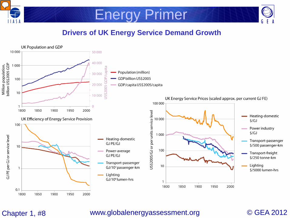
© GEA 2012 www.globalenergyassessment.org Chapter 1, #8
Drivers of UK Energy Service Demand Growth
Energy Primer
Presenter
Presentation Notes
Figure 1.8 | Drivers of UK energy service demand growth: population, GDP and income per capita (panel 1); efficiency of energy service provision (per GJ service demand or service activity level – panel 2); and prices of energy services (per GJ service demand or activity level, activity level units have been normalized to approximately equal one GJ of current final energy use – panel 3). Source: data from Fouquet, 2008 . Updates after 2000 and data revisions courtesy of Roger Fouquet, Basque Centre for Climate Change, Bilbao, Spain.

© GEA 2012 www.globalenergyassessment.org Chapter 1, #9
History of World Primary Energy Use
Energy Primer
Presenter
Presentation Notes
Figure 1.9 | History of world primary energy use, by Source (in EJ). Source: updated from Nakicenovic et al., 1998 and Grubler, 2008 .

© GEA 2012 www.globalenergyassessment.org Chapter 1, #10
Structural Change in World Primary Energy
Energy Primer
Presenter
Presentation Notes
Figure 1.10 | Structural change in world primary energy (in percent). Source: updated from Nakicenovic et al., 1998 and Grubler, 2008 .

© GEA 2012 www.globalenergyassessment.org Chapter 1, #11
Decarbonization of Global Primary Energy since 1850
Energy Primer
Presenter
Presentation Notes
Figure 1.11 | Decarbonization of primary energy (PE) use worldwide since 1850 (kg of CO2 emitted per GJ burned). Note: For comparison, the specific emission factors (OECD/IPCC default emission factors, LHV basis) for biomass (wood fuel), coal, crude oil, and natural gas are also shown (colored squares). See also discussion in text. Source: updated from Grubler and Nakicenovic, 1996 .

© GEA 2012 www.globalenergyassessment.org Chapter 1, #12
Primary Energy Use versus GDP per Capita
Energy Primer
Presenter
Presentation Notes
Figure 1.12 | Primary energy use (GJ) versus GDP (at market exchange rates (MER) in 2005US$) per capita. Source: USA, Japan: updated from Grubler, 1998 , UK: Fouquet, 2008 , India and China: IEA ( 2010 ) and World Bank ( 2010 ). Note: Data are for the United States (1800–2008), United Kingdom (primary and final energy, 1800–2008), Japan (1922–2008), China (1950–2008), and India (1950–2008). For China and India, also GDP at purchasing power parities (PPP, in 2005International$) are shown.

© GEA 2012 www.globalenergyassessment.org Chapter 1, #13
First-Law Efficiency of an Energy Chain
Energy Primer
Presenter
Presentation Notes
Figure 1.13 | Illustrative example of the compound First-Law efficiency of an entire energy chain to provide the energy service of illumination. Index: primary energy entering system = 100%.

© GEA 2012 www.globalenergyassessment.org Chapter 1, #14
Estimated Exergy Efficiencies by Energy Carrier
Energy Primer
Presenter
Presentation Notes
Figure 1.14 | Estimated exergy efficiencies (average for OECD countries) from primary exergy (= 100%) to useful exergy and to services by energy carrier (fuel). Source: adapted from Nakicenovic, 1993.

© GEA 2012 www.globalenergyassessment.org Chapter 1, #15
Energy Intensity Improvements over Time
Energy Primer
Presenter
Presentation Notes
Figure 1.15 | Energy intensity improvements over time. US (1800–2008), Japan (1885–2008), India (1950–2008), and China (1970–2008). Source: see Figure 1.12 . Note: Energy intensities (in MJ per $) are always shown for total primary energy (bold lines) and commercial primary energy only (thin lines) and per unit of GDP expressed at market exchange rates (MER in 2005US$) and for China, India, and Japan also at purchasing power parities (PPP in 2005International$). For the United States, MER and PPP are identical.
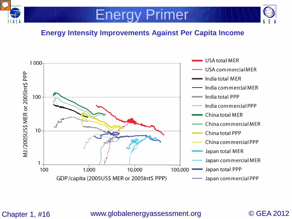
© GEA 2012 www.globalenergyassessment.org Chapter 1, #16
Energy Intensity Improvements Against Per Capita Income
Energy Primer
Presenter
Presentation Notes
Figure 1.15 | Energy intensity improvements against per capita income US (1800–2008), Japan (1885–2008), India (1950–2008), and China (1970–2008). Source: see Figure 1.12 . Note: Energy intensities (in MJ per $) are always shown for total primary energy (bold lines) and commercial primary energy only (thin lines) and per unit of GDP expressed at market exchange rates (MER in 2005US$) and for China, India, and Japan also at purchasing power parities (PPP in 2005International$). For the United States, MER and PPP are identical.

© GEA 2012 www.globalenergyassessment.org Chapter 1, #17
Principles of Resource Classification: Reserves, Resources and Occurrences
Energy Primer
Presenter
Presentation Notes
Figure 1.16 | Principles of resource classification, illustrating the definition of the three fundamental concepts: reserves, resources, and occurrences. Source: adapted from McKelvey, 1967 .

© GEA 2012 www.globalenergyassessment.org Chapter 1, #18
Energy Densities of Fossil and Renewable Energy Supply and Demand
Energy Primer
Presenter
Presentation Notes
Figure 1.17 | Energy densities of fossil (grey) and renewable (green) energy supply and demand (red). Source: modified and adapted from Smil, 1991 .

© GEA 2012 www.globalenergyassessment.org Chapter 1, #19
World Energy Trade: Crude Oil and Oil Products
Energy Primer
Presenter
Presentation Notes
Figure 1.18a | World energy trade of fossil fuels: direct primary and secondary energy coal (black), oil and oil products (red) and gas (LNG light blue, pipeline gas: dark blue), in EJ. Source: Oil/gas energy trade for 2005 (BP, 2007 ), coal trade for 2008 (WCI, 2009 ).

© GEA 2012 www.globalenergyassessment.org Chapter 1, #20
World Energy Trade: Gas by Pipeline and LNG
Energy Primer
Presenter
Presentation Notes
Figure 1.18a | World energy trade of fossil fuels: direct primary and secondary energy coal (black), oil and oil products (red) and gas (LNG light blue, pipeline gas: dark blue), in EJ. Source: Oil/gas energy trade for 2005 (BP, 2007 ), coal trade for 2008 (WCI, 2009 ).

© GEA 2012 www.globalenergyassessment.org Chapter 1, #21
World Energy Trade: Coal
Energy Primer
Presenter
Presentation Notes
Figure 1.18a | World energy trade of fossil fuels: direct primary and secondary energy coal (black), oil and oil products (red) and gas (LNG light blue, pipeline gas: dark blue), in EJ. Source: Oil/gas energy trade for 2005 (BP, 2007 ), coal trade for 2008 (WCI, 2009 ).

© GEA 2012 www.globalenergyassessment.org Chapter 1, #22
World Energy Trade: Total Direct Energy
Energy Primer
Presenter
Presentation Notes
Figure 1.18b | World energy trade of total direct energy (black) as well as embodied energy in goods traded (grey), in EJ. Source: Embodied energy trade for 2004 (GTAP database, 2010 ), direct energy trade (BP, 2007 ; WCI, 2009 ).

© GEA 2012 www.globalenergyassessment.org Chapter 1, #23
World Energy Trade: Embodied Energy in Goods
Energy Primer
Presenter
Presentation Notes
Figure 1.18b | World energy trade of total direct energy (black) as well as embodied energy in goods traded (grey), in EJ. Source: Embodied energy trade for 2004 (GTAP database, 2010 ), direct energy trade (BP, 2007 ; WCI, 2009 ).

© GEA 2012 www.globalenergyassessment.org Chapter 1, #24
Electricity Output by Generating Source in 2005
Energy Primer
Biomass
Coal
Oil
Gas
Nuclear
Hydro
Other renewables
OECD90 REF ASIA MAF LAC World
66 4 4 16 7 34 18256 1179 1198 4526 1903 9454 TWh
EJ
Presenter
Presentation Notes
Figure 1.19 | Electricity output by generating source in 2005: World and five GEA Regions in TWh and EJ (in italics). Source: IEA, 2007a and 2007b . Note: Circle areas are proportional to electricity generated.

© GEA 2012 www.globalenergyassessment.org Chapter 1, #25
World Electricity Generation in Five GEA Regions
Energy Primer

© GEA 2012 www.globalenergyassessment.org Chapter 1, #26
Development of Annual Energy-related CO2 Emissions by Region
Energy Primer
Presenter
Presentation Notes
Figure 1.21 | Development of annual energy-related CO2 by region (compared to global non-energy sources) from 1900 to 2005 in Pg (Gt)(CO 2 ) and Tg (CH 4 ). Source: data from Boden et al., 2010 ; Houghton, 2008 ; IPCC-RCP database.
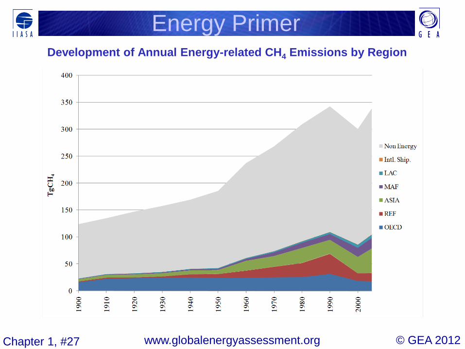
© GEA 2012 www.globalenergyassessment.org Chapter 1, #27
Development of Annual Energy-related CH4 Emissions by Region
Energy Primer

© GEA 2012 www.globalenergyassessment.org Chapter 1, #28
Development of Annual Energy-related Pollutant Emissions
Energy Primer
Presenter
Presentation Notes
Figure 1.22 | Development of annual energy-related pollutant emissions in Tg: sulfur (SO 2 ), nitrogen oxides (NO x ), black carbon (BC), organic carbon (OC), carbon monoxide (CO), and volatile organic compounds (VOCs) by annual region (compared to global non-energy sources) from 1900 to 2005.

© GEA 2012 www.globalenergyassessment.org Chapter 1, #29
World Final Energy Per Capita versus Cumulative Population
Energy Primer
Presenter
Presentation Notes
Figure 1.23 | World final energy (GJ) per capita versus cumulative population for 11 GEA regions sorted by declining per capita energy use (with final energy use disaggregated by sector and total, color bars); and total per capita final energy use for 137 countries in 2005 (black, solid line). Dashed horizontal line shows the average global final energy use per capita. Source: data from IEA, 2010 .

© GEA 2012 www.globalenergyassessment.org Chapter 1, #30
Per Capita Primary Energy Use by Service Category over Time and Across Different Populations
Energy Primer
Presenter
Presentation Notes
Figure 1.24 | Per capita primary energy use by service category over time and across different populations. Source: historical estimates: Smil, 1991 ; Japan, United States: IEA, 2010 ; India: Pachauri, 2007 ; Netherlands: Vringer and Block, 1995.

© GEA 2012 www.globalenergyassessment.org Chapter 1, #31
Lorenz Curves of Energy Inequality
Energy Primer
Presenter
Presentation Notes
Figure 1.25 | Lorenz curves of energy inequality, measuring cumulative global population (in percent) disposing of corresponding fraction of cumulative income (in percent of PPP$ (green), fi nal energy (blue), and electricity use (red) (in percent of Joules energy used) for the Year 2000. Source: IEA, 2010 and UNDP and WHO, 2009.

© GEA 2012 www.globalenergyassessment.org Chapter 1, #32
Structure of Total Levelized Costs of Electricity Generation Technologies
Energy Primer
Presenter
Presentation Notes
Figure 1.26 | Structure of total levelized costs of different electricity generation technologies (in percent using a 5% discount rate) and representative cost ranges for 2030 as used in the GEA pathways (cf. Chapter 17 ) for capital costs, operation and maintenance (O&M), fuel costs, as well as waste disposal costs for nuclear and advanced coal with carbon capture and sequestration (CCS). All values are given in 2005US$ and are shown in Table 1.9 . Note: (a) Includes decommissioning costs for nuclear power and costs for transport and disposal of 90% of CO 2 emissions for advanced coal power plants with carbon capture and storage (CCS).

© GEA 2012 www.globalenergyassessment.org Chapter 1, #33
Gasoline Prices with and without Taxes and Implied Carbon Prices
Energy Primer
Presenter
Presentation Notes
Figure 1.27 | Gasoline prices with and without taxes in US$/liter and implied price of carbon (US$/tCO2) for 1st quarter of 2010. Source: data from IEA, 2011.
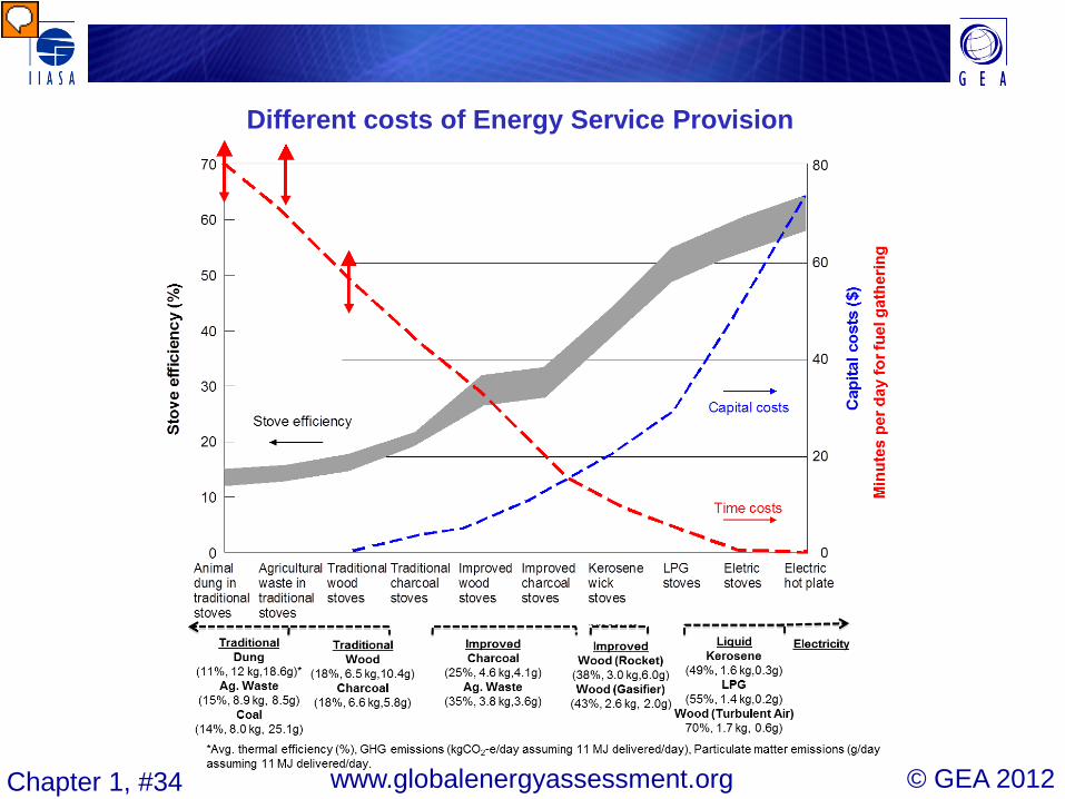
© GEA 2012 www.globalenergyassessment.org Chapter 1, #34
Different costs of Energy Service Provision
Presenter
Presentation Notes
Figure 1.28 | Different costs of energy service provision. Example: cooking in developing countries. Notes: Red arrows show uncertainty ranges in time costs. GHG emissions are illustrative estimates and include all greenhouse gases and other emissions that affect radiative forcing. Emissions from fuel production and renewability of charcoal, wood, and agricultural residues are not included. Source: adapted from OTA, 1991 and Chapter 3.

© GEA 2012 www.globalenergyassessment.org Chapter 1, #35
Primary Accounting Methods
Energy Primer
Presenter
Presentation Notes
Figure 1.A.1. | Comparison of global total primary energy supply between 2005 and 2100 using three different primary energy accounting methods based on identical useful energy demands as quantified in the illustrative GEA-M set of pathways (see Chapter 17).

© GEA 2012 www.globalenergyassessment.org Chapter 1, #36
World Primary Energy Estimates
Energy Primer
Presenter
Presentation Notes
Figure 1.A.2. | World primary energy. Original data by four reporting agencies and harmonized primary energy equivalences. Source: data from Macknick, 2009.

© GEA 2012 www.globalenergyassessment.org Chapter 1, #37
Energy Primer