Word Template Usage - Wellesley College
20
Word Template Usage for Mac
Transcript of Word Template Usage - Wellesley College

Table of Contents
1. Preparation1.1 Downloading Resources
2. Basic Design2.1 How to Place and Edit Text — 2.1.1 Editing the Headline — 2.1.2 Editing the Body Text2.2 How to Replace and Edit Images — 2.2.1 Replacing the “Your Logo Here” Image — 2.2.2 Moving and Resizing Images
3. Advanced Design3.1 Advanced Text and Image Editing — 3.1.1 Creating and Linking Textboxes — 3.1.2 Inserting an Image and Text-Wrapping Around an Image3.2 Design Guidelines and Details — 3.2.1 Recommended Typefaces and Colors — 3.2.2 Layout Details — 3.2.3 Logo and Image Details
4. Publication
5. Troubleshooting
The use of these tools should be easy, fast, and effective. Should you have any questions, need any assistance, or require further support, please contact us, and we will pleased to help.
Written and created by Cicia Lee ’14
3
1. PreparationCreate or gather the materials that you will need for your communicationThis may include the following:• Title or headline text• Body text• Images and captions• Officers list or sidebar information (for letters and newsletters)
1.1 Downloading ResourcesDownload from the Volunteer Connection (VConnect) and save to your computer the following:• Class, Club, or SIG logo• The Word Template (.dotx) file(s) for your communication1
• (If mailing) The appropriate Data on Demand mailing list
VConnect may be found by navigating through the Alumnae Association website or by going directly tohttp://web.wellesley.edu/web/Alumnae/Volunteer/VConnect
A note about the logos and templates on the VConnect site:Logo sizes and usage• Large color (i.e. “2001-largegreen.jpg”) — these are intended for use in the .dotx templates or other
purposes requiring reasonably high resolution2. • Large greyscale — these are in greyscale (black & white) format and are also intended for use in the .pdf
templates or other purposes requiring reasonably high resolution. • Small color (web) — these are intended for use in broadcast email layouts and on websites. The
resolution is comparatively low for these purposes – depending on the shape of the logo, the maximum width has been set to 200 pixels wide or 100 pixels high.
1 Please note: .dotx templates should be saved to your computer, rather than opened in a browser window, as noted on the VConnect templates page. Also be sure to download the template with the correct number of pages for your communication. If you aren’t sure how many pages you need, download a template with more pages than you think you’ll need.2 The “...-largecolor” logos are in RGB color format. Though Word will accept RGB, greyscale, or CMYK images, if you intend to print your piece on a traditional printing press or with an online printer, please contact the Alumnae Association.

4
2. Basic DesignThe following sections will deal with the basics of how to work with text and images.
2.1 How to Place and Edit Text Open Microsoft Word. The .dotx templates on the VConnect website were created in Microsoft® Word 2008 for Mac.
In Word, open the template file that you saved to your computer. (File > Open)
With the template open, you are now going to place your content into the template. For this example, a single page letter will be prepared with Template B.
— 2.1.1 Editing the Headline• Select the textbox containing the headline by clicking on the headline text once. A blue box should appear around the text.
• Clicking the textbox again will allow you to type in the box.
• Select the sample text “Headline Here” and delete it.
• Type your headline.

5
Changing the Font Size and Type, and Resizing the Textbox
• You may change the font size of the headline (or any other text) by clicking in the Font Size box and typing a number, or selecting a size from the drop-down menu by clicking the down-arrow.
• Your Font Size box may be in your Formatting Palette (View > Toolbox > Formatting Palette > Font > Size)
• You may similarly change your font type in the Font box next to the Font Size box by clicking in the box and typing the name of the font, or by selecting a font from the drop-down menu by clicking the down arrow. Your Font box may also be in your Formatting Palette.
• If you need to resize the textbox (if your headline is longer than the box allows), click on any white space in the page to de-select the headline box, and then re-click on the headline box. The blue box with blue circle drag-handles should reappear. Click on a circle and drag in the direction you need to extend the textbox.
• If you need you need to move or delete the blue line beneath the headline textbox, click on it once to select it. You may now hit “Delete” on your keyboard, or hold the command (⌘) button to drag it. Be sure to keep the right blue drag handle at the edge of the page or margin (depending on your template).
• Your headline may now look like the example to the left.
6
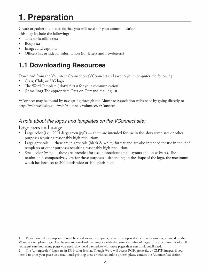
— 2.1.2 Editing the Body Text
• Select the textbox containing the body by clicking on the body text once. A blue box should appear around the text.
• Click the textbox again to select and edit the text.
• You may change the font size or font type by following the instructions above. You may adjust the size of the textbox by following a similar process to the one above.
For templates with a side information bar:
• For a template with a side information bar, download Template A.
• Click on the textbox containing the sidebar information. Click again to edit the text.
• To best preserve the text formatting set for the sidebar (bold, italics), highlight each line of text individually and type in the correct information.
• You may also reformat the text as you wish by using the bold, italic, or underline options next to the Font Size box.

7
2.2 How to Replace and Edit Images
— 2.2.1 Replacing the “Your Logo Here” Image
• Control+click (right-click) on the “Your Logo Here” image, and click on “Change Picture”
• A browse window will open asking you to choose a picture. Navigate to where you saved your large color or large black and white logo. Click “insert.”
• Your logo should appear in the same location, and should be approximately the same height as the sample logo.
• It is possible to replace any image in this way, in order to keep the size and placement of the original image.
— 2.2.2 Moving and Resizing Images3
• Click on your image to select it. Click and drag the blue circles to resize the image4. Click the image and drag it to where you would like to place it.
• You may have to move other objects on the page to accomodate the resized image. You can click and drag to resize them similarly.
• Tip: Holding command (⌘) and dragging an object will allow you to drag it freely. By default, Word allows you to drag and place objects only by particular fractions of an inch.
• Tip: Holding shift (⇧) and dragging an object will allow you to drag objects perfectly straight horizontally or vertically. If you hold shift while dragging a blue circle to resize an image, it will maintain the proportions of the original image.
3 If you would like to insert or embed your own image into a textbox, please read “3.1.2 Inserting an Image and Text-Wrapping Around an Image” in the “Advanced Design” section.4 Optional Tip: When resizing the logo, try to resize it so that the width of your logo is approximately the width of the original “Your Logo Here” image to maintain visual balance with the header image and the information side bar. See “3.2.2 Layout Details.”

8
3. Advanced DesignThe following sections will deal with more complex features of working with text and images. Section 3.2 includes general design guidelines for using the templates.
3.1 Advanced Text and Image Editing
— 3.1.1 Creating and Linking Textboxes5
• Click outside of any textboxes so that nothing is selected. The cursor should be flashing at the very edge of the page, in the area under your logo. • Double click at the far left side of the page, near the bottom of the page but above the footer line, to move the flashing cursor to the bottom of the page. (Otherwise, the inserted page will appear before your current, in which case you can select all items on your current page and cut and paste them onto the new first page, but this is difficult to do while maintaining the formatting)
• Insert a page break by going to Insert > Break > Page Break
• A blank page should appear after your first.
• To create a new linked textbox, click on the square near the lower right corner.
5 If you’ve deleted a textbox and need to replace it and link it back to the series, please see the “Troubleshooting” section.

9
• Create a new textbox on the next page by clicking and dragging the cross-hairs cursor that appears when you click on the square in the lower right corner.
• Try to make the edge of the new textbox approximately 0.5” from the edge of the page, or try to line up the right edge of the textbox with the edge of the textbox on the first page. Tip: you can hold command (⌘) to drag the edges freely. You can also adjust the textbox further by dragging its edges after you create it.
• Your two linked textboxes should now be outlined in green, and the number 2 will appear in the corner of your second linked textbox.
• Any text that extends past the edge of the first textbox will now flow into the second.
• You can create additional pages with linked textboxes in the same way. You can also create columns with the textboxes by placing two linked textboxes that are half the width of the page side by side on the page. You cannot format text inside a textbox to automatically be in columns, but must create separate linked textboxes.
— 3.1.2 Inserting an Image and Text-Wrapping Around an Image
To insert the image:
• Click on white space in the document, to make sure no textboxes are selected.
• In the menu bar, go to Insert > Picture > From File. In the browse window that appears, navigate to the picture you’d like to insert. Click “insert.”
• Your picture will appear in the corner of your page. By default, it will be the original size of the image.

10
To wrap the textbox text around the image:
• Click on the image to select it. Control(⌃)+click (right-click) > Arrange > In Front of Text. The image must be in front of the text box.
• In the same menu, in “Text Wrapping,” select either “Square” or “Tight.”
• Resize the image by dragging the blue circles at the corners of the image, and drag the image to where you would like it to be located on the page6.
• Click on the textbox to select it. Control(⌃)+click (right-click) the image and select “Format Text Box” from the menu.
• In the “Layout” tab of the options box, click “Advanced” in the bottom right corner.• In the “Picture Position” tab, check the boxes at the bottom of the dialog box that say “Wrap text within
text boxes for overlay objects,” and “Allow overlap.” • In the “Text Wrapping” tab, in the “Wrapping Style” section, select either “Square” or “Tight” layout7. • If your image is in the area of the textbox, the text in the textbox should now flow around the image.
6 When you change the text-wrapping options on the image to “Square” and resize it, it may shift other objects on the page such as the logo or left-side image. When you move it on top of the text box, the other objects should move back to where they are after you continue to follow the instructions for formatting the textbox.7 More advanced options: you can select in the “Wrap text” section if you would like the text to wrap to both sides or one side. Under “Distance from text,” you can specify how much clear space you would like between the image and the text.

11
3.2 Design Guidelines and Details— 3.2.1 Recommended Typefaces and Colors
Recommended Typefaces
• According to Wellesley’s new visual identity guidelines, Adobe Garamond Pro is the preferred serif typeface. The styles set in the Word templates have Adobe Garamond Pro as the body text and Headline 1 text typeface. If Adobe Garamond Pro is unavailable, Garamond Pro or Garamond are the preferred alternate typefaces.
Adobe Garamond Pro Regular
ABCDEFGHIJKLMNOP QRSTUVWXYZ abcdefghijklmnopqrstuvwxyz 0123456789
GaramondRegular
ABCDEFGHIJKLMNOP QRSTUVWXYZ abcdefghijklmnopqrstuvwxyz 0123456789

12
• For headlines, subtitles, or any instances you wish to contrast the serif typeface with a sans-serif, the recommended sans-serif typeface is Swiss 721, according to the official guidelines. As that is not a common font, the alternate preferred sans-serif typeface is Helvetica or Helvetica Neue if available. The styles in the Word templates should have Headings 2-4 in various weights of Helvetica Neue.
Swiss 721Roman
ABCDEFGHIJKLMNOP QRSTUVWXYZ abcdefghijklmnopqrstuvwxyz 0123456789
HelveticaRegular
ABCDEFGHIJKLMNOP QRSTUVWXYZ abcdefghijklmnopqrstuvwxyz 0123456789

13
Helvetica NeueRegular
ABCDEFGHIJKLMNOP QRSTUVWXYZ abcdefghijklmnopqrstuvwxyz 0123456789
Helvetica NeueLight
ABCDEFGHIJKLMNOP QRSTUVWXYZ abcdefghijklmnopqrstuvwxyz 0123456789

14
Recommended Colors
• According to the Wellesley College Visual Identity Guidelines, specific Pantone colors have been designed as the four class colors.
• Note that for legibility, text in the green, red, and purple are a slightly darker shade, while the yellow becomes Wellesley Blue.
PMS 364 C73 / M9 / Y97 / K39R66 / G119 / B48#427730
PMS 369C59 / M0 / Y100 / K7R108 / G179 / B63#002776
PMS 186 C0 / M100 / Y75 / K4R198 / G12 / B48#C60C30
PMS 267C86 / M96 / Y0 / K0R82 / G35 / B152#522398
PMS 122C0 / M14 / Y80 / K0R252 / G212 / B80#FCD450
PMS 187C5 / M100 / Y71 / K22R167 / G25 / B48#A71930
PMS 268C86 / M100 / Y0 / K12R79 / G45 / B127#472D7F
PMS 280C100 / M78 / Y5 / K18R0 / G39 / B118#002776
Not to be ministeredunto but to minister
Not to be ministeredunto but to minister
Not to be ministeredunto but to minister
Not to be ministeredunto but to minister
• Though you cannot specify Pantone Colors in Word, if you go to the Font Color selector, and click “More Colors,” in the “Image Palettes” section, you can choose from a wide spectrum of colors. Try to match with the designated Pantone colors given above as best as possible.
15
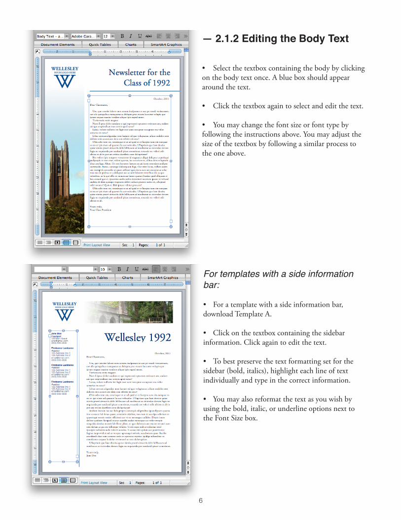
— 3.2.2 Layout Details
Visual Hierarchy
• Generally, you should organize your headings/titles and text according to how the reader will see them. On a first scan, the eyes are typically drawn first to the largest headers and to visuals. Second, the eyes notice subtitles and other headings, in order of decreasing emphasis. Thirdly, they are drawn to sectioned text (side info bars, quoted items), then bullets, and lastly to body text.
• Remember to be consistent with font sizes and formatting (bold, italic, underline, colors) for titles/text that are on the same “level” of importance.
MAIN HEADER: Should be the most distinguished item on the page. Can create visual emphasis by making it the comparatively largest font size. You can also make it a different color (try to use a Wellesley color), or bold it. Italics is not recommended, as it is not commonly used for main-header sort of emphasis. Using a serif (Adobe Garamond Pro) will look more formal than using a sans-serif (Helvetica, shown) font.
MAIN SECTION TITLE (or, important subtitle): Should be the second most distinguished item on the page, so second comparatively largest font size. Consider alternating to a serif or sans-serif font, to contrast main header or body text. Keep text relatively short, but informative. Leave some space before and after. Can bold, italicize, or underline.
SUBSECTION TITLE (or, less important subtitle): Should have less emphasis than main section title. Try to contrast font with the body text. Try not to use too many different fonts overall; use one that you have already used elsewhere, but you may bold, underline, or italicize it. The font size should be slightly larger than the body text. It is not necessary to put space between this subtitle and the text, but you may.
BODY TEXT: Should be no smaller than 10pt font, nor larger than 14pt font (except in special situations) for readability. Can be in a serif or sans-serif. Serif is generally easier to read on paper, sans-serif easier on computer screens. The body text will be the last thing read.
SECTIONED TEXT: This body text will be more visually attractive and easier to read than the wide paragraph text at the top. It isn’t recommended that you change this body text font if the text is related to the other sections in the document.

16
Spacing and Lines General guidelines:
• Between titles and text: allow two or more breaks (“enter” spaces) between main headers and text. Allow a break above and below main section titles. You may allow a space above and below subtitles, but it isn’t always necessary to have spaces between subtitles and text, especially if the subtitle is distinguished enough from the text. Allow a break between titles of different “levels.”8
• Between pictures and text: allow a space of a couple of breaks between an image that acts as a focus and any text (see above image). Allow a margin of at least approximately an eighth (1/8) of an inch around any image with text wrapped around it, or between one image and another (see picture in the preceding “Images” section).
• Avoid outlining textboxes, especially with main content. Strongly consider instead using divider lines (as with the side information bar in the sample document). Only outline boxes in special circumstances and always make sure that there is sufficient space around the edges of the box, and that there is sufficient space between the content within the box and the box outline, and that the content is evenly centered. It is sometimes more appropriate to outline boxes (being sure to space and center things properly) with additional information boxes or pulled quotes. If you can format the section like other sections and without outlining textboxes, consider doing that instead.
• Also generally avoid outlining images, unless you are trying to define the edge of the image more clearly, if for example the background of the image is very close to the background color of the page (see the “Visual Hierarchy” image of a page). If it isn’t necessary to have defined edges (above image), or if the contrast is already sufficiently stark, consider not outlining the image.
• Divider lines: may use these to separate sections, or to emphasize a specific section. When using divider lines, consider extending the line to either the edges of the page, or to the edge of the margin of the rest of the content. You may also consider lining up the divider line with the width or height, depending on the direction of the line, of the content you are separating.
8 See “Visual Hierarchy” in the first section of “3.2.2 Layout Details”.
17
— 3.2.3 Logo and Image Details
Logos
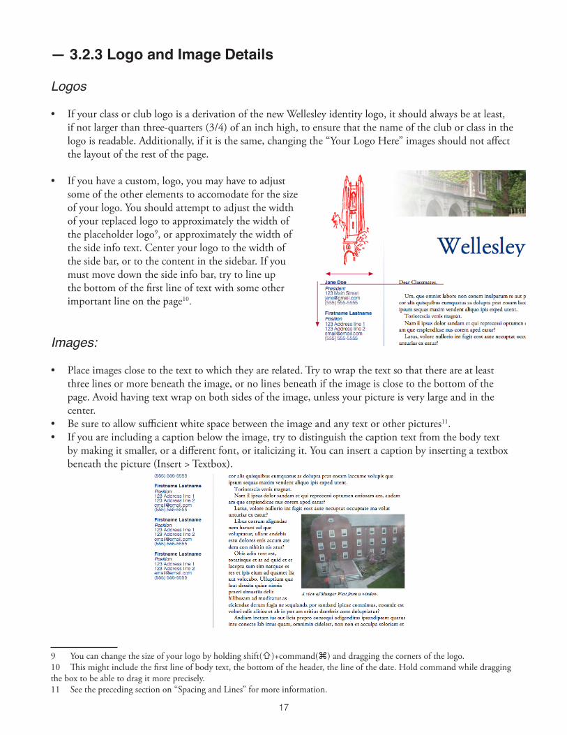
• If your class or club logo is a derivation of the new Wellesley identity logo, it should always be at least, if not larger than three-quarters (3/4) of an inch high, to ensure that the name of the club or class in the logo is readable. Additionally, if it is the same, changing the “Your Logo Here” images should not affect the layout of the rest of the page.
• If you have a custom, logo, you may have to adjust some of the other elements to accomodate for the size of your logo. You should attempt to adjust the width of your replaced logo to approximately the width of the placeholder logo9, or approximately the width of the side info text. Center your logo to the width of the side bar, or to the content in the sidebar. If you must move down the side info bar, try to line up the bottom of the first line of text with some other important line on the page10.
Images:
• Place images close to the text to which they are related. Try to wrap the text so that there are at least three lines or more beneath the image, or no lines beneath if the image is close to the bottom of the page. Avoid having text wrap on both sides of the image, unless your picture is very large and in the center.
• Be sure to allow sufficient white space between the image and any text or other pictures11.• If you are including a caption below the image, try to distinguish the caption text from the body text
by making it smaller, or a different font, or italicizing it. You can insert a caption by inserting a textbox beneath the picture (Insert > Textbox).
9 You can change the size of your logo by holding shift(⇧)+command(⌘) and dragging the corners of the logo.10 This might include the first line of body text, the bottom of the header, the line of the date. Hold command while dragging the box to be able to drag it more precisely.11 See the preceding section on “Spacing and Lines” for more information.
18
4. PublicationAfter saving your document, you can post your piece online and email your group to inform them that it is available, or provide it to Printing Services or another vendor of your choice for printing and mailing.
Save your document as a Word document
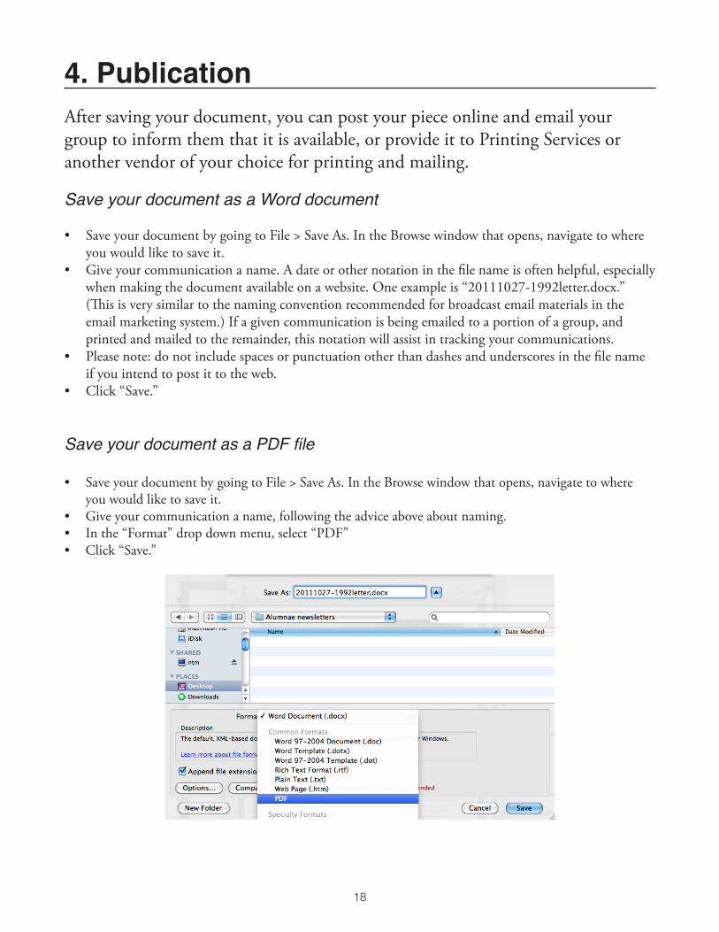
• Save your document by going to File > Save As. In the Browse window that opens, navigate to where you would like to save it.
• Give your communication a name. A date or other notation in the file name is often helpful, especially when making the document available on a website. One example is “20111027-1992letter.docx.” (This is very similar to the naming convention recommended for broadcast email materials in the email marketing system.) If a given communication is being emailed to a portion of a group, and printed and mailed to the remainder, this notation will assist in tracking your communications.
• Please note: do not include spaces or punctuation other than dashes and underscores in the file name if you intend to post it to the web.
• Click “Save.”
Save your document as a PDF file
• Save your document by going to File > Save As. In the Browse window that opens, navigate to where you would like to save it.
• Give your communication a name, following the advice above about naming.• In the “Format” drop down menu, select “PDF”• Click “Save.”

19
5. TroubleshootingThis section addresses some potential problems that may arise while editing your Word template. Please contact us if you have further questions or difficulties and we will be glad to help.
I’ve accidentally moved an image/textbox/object. How do I move it back?
• If you have accidentally dragged something, simply click on the object, and hold command (⌘) and drag it back to its original location.
• If everything has shifted after trying to insert a new image/textbox/object, control(⌃)-click (right-click) the object, and change the “Text-Wrapping” in the right-click menu to “In Front of Text.” This should allow all of the other objects on the page to return to their original positions. If you would like to have text wrap around the object or image, please see section “3.1.2 Inserting an Image and Text-Wrapping Around an Image” in “Advanced Design.”
I’ve accidentally deleted a linked textbox in a series of textboxes. How do I put a textbox back in that space with flowed text?
• Select all of the text in your linked textboxes (command(⌘)+A, or Edit > Select All). Copy the text, and paste it into a new blank document. Delete the text from the textboxes, but do not delete the textboxes.
• Switch to Publishing Layout (View > Publishing Layout). • Create a new textbox in the space where you deleted the original textbox (Insert > Textbox)12.• If you are using a template with columns, click on the closest following set of columns. Control(⌃)-click
(right-click) the textboxes, and in “Grouping,” select “Ungroup.” The textbox that is to be linked directly after your created textbox must not be in a grouping.
• Select your newly created textbox. In the Standard toolbar in the Publishing Layout, click on the “Link” button. Then click on the textbox that you want to relink to (this textbox must be empty).
• If you have deleted a textbox in the middle of a series, select the previous textbox, and click “Break Link” (next to “Link”). Then click “Link,” and select the next textbox, which should be your created textbox. Select your new textbox and link it to the next textbox.
• Copy and paste your text from the blank document back into your linked textboxes. The text should now flow again through all of the linked textboxes. You can now switch back to Print Layout if you would prefer (View > Print Layout).
12 See “3.1.1 Creating and Linking Textboxes” in “Advanced Design” for further instructions.

© Wellesley College Alumnae Association2011