When Shaders & Textures Collide -...
62
1 When When Shaders & Shaders & Textures Textures Collide Collide Kevin Bjorke Kevin Bjorke NVIDIA Corporation NVIDIA Corporation Hello, I’m Kevin Bjorke from the NVIDIA Corporation Developer Content Group, and this talk is called: WHEN SHADERS AND TEXTURES COLLIDE.
Transcript of When Shaders & Textures Collide -...
1
WhenWhenShaders &Shaders &TexturesTexturesCollideCollide
Kevin BjorkeKevin BjorkeNVIDIA CorporationNVIDIA Corporation
Hello, I’m Kevin Bjorke from the NVIDIA Corporation Developer Content Group, and this talk is called: WHEN SHADERS AND TEXTURES COLLIDE.

2
Everybody Wants More
Everyone here know that games, schedules, budgets, and complexity have been continuing to grow rapidly. The picture here is of a baroque church, whose complexity reminded me of the level that games are alreadysurpassing.

3
Everybody Wants More
…and Moore’s Law can’t keep up
The demands of producers and audiences for sophisticated and expressive visuals are outstripping Moore's law -- most games are already CPU-bound and are likely to continue this trend. One way to combat this, to add visual excitement to games, is to capitalize on the other resources available in the users PC and in next-generation consoles. The GPU can provide considerable extra power, and since GPUs are accelerating their abilities faster than CPUs, this trend is only going to continue.
Some of you may have seen some of the unusual ways to do this, particular the Havok FX demos of GPU-powered physics, that adds all kinds of complexity without impacting the CPU rate or gameplay.
Effective shading and texture, which leverages the artistic potentials of the GPU, offer a continuing opportunity to enhance visual richness without bogging-down gameplay speed on both PCs and next-generation consoles. Currently GPU power is scaling faster than CPU power, and even faster than the software itself! So the opportunities are good and promise to only improve over time.
4
Next Gen, New Challenges
“If you think you are good enough you have just started your decline.”Simply layering-on more lights or per-pixel lighting doesn’t automaticallyenhance game playWhat is “Next-Gen Done Right”?
http://developer.nvidia.com
This intermediate-level talk focuses on texturing and shading, especially for artists and programmers who are looking to expand their possibilities in next-gen consoles, which are inheriting techniques and ideas pioneered by PC games. The intent is to introduce some new ideas and also to help you get the game assets you may already be working on to look their absolute best.
This presentation provides texture painters, artists, and programmers with key insights on how their tasks interact, so that artists can better understand what does and doesn't work best with shading while shader writers understand how to provide optimal controls and visual power to the artists who use their shaders, along with ideas and tools for both kinds of game-creators to better understand the power inherent in modern shading. Attendees will be exposed to novel shading algorithms, innovative use of texturing, and real-world production examples showing how existing artwork can be supercharged through savvy shading.
There will be a couple of demos during the talk, either using Adobe Photoshop or NVIDIA FX Composer – we’ll be using the current release of FX Composer and all of the example code will be available on the NVIDIA developer web site shortly after GDC, if it’s not already there, available to anyone without the hassle of signing an NDA.

5
Painters & Hackers
“Art does not reproduce the visible;
it makes thingsvisible”– Paul Klee
New Harmony, 1936
Painting and hacking are two different ways of understanding the world and expressing ideas about it. I love this quote by Paul Klee – Klee was an early 20th Century painter, and a teacher at the Bauhaus design school in Germany. If you get a chance to drive over to San Francisco during GDC, you’ll find that the SF MOMA has a room dedicated to nothing but rotating Klee exhibits.
I think this short quote really gets at a lot of what videogame art needs to accomplish in terms of not simply creating copies of realistic worlds, but of creating expressive, fun environments for playing games.
These aren’t the same thing!
At the same time….

6
Painters & Hackers
“Art does not reproduce the visible;
it makes thingsvisible”– Paul Klee
New Harmony, 1936
“A videogame is not Art”– Hideo Kojima
Kojima-san is dead-on. Videogames are more than art, more than programming, more than marketing. They’re something new and constantly expanding and made by team effort.
So let’s think quickly about painting and hacking.

7
Anything Can Be Painted
Painting is directPainting can influence programs, but in hidden ways that may be difficult to visualizeDownside: Scales Poorly
Painting is direct. SHOW ME.
Painters are often aware that textures can influence shading in hidden ways, but it’s often hard to visualise. Direct feedback on the image is best.

8
Anything Can Be Programmed
Programming is indirectImagery is often the result of abstract ideas, with little direct controlDownside: programmer art
Programming is all hidden. Shader writers code against notions of how optics and physics work, or against some imagined set of rules, to create fast complex imagery. The downside is usually that process gets in front of content and we can be in danger of seeing “programmer art” like the Mandelbrot set here.

9
Great Technical Artists
Great technical artists are both hackers and painters, or better yet teams of painters and hackers.
I love this drawing on the left, with the little embryonic baby – you can see the technical understanding and imagination, and the person who made this was a bit paranoid maybe, since he wrote all his notes in reverse so no one else can read them – the drawing is by Leonardo Davinci, probably the ultra template for a technical artist. The image below is from another famous technical artist, Albrecht Durer, who not only invented his own means of drawing and shading but also the commercial art house and the corporate logo.
Both of them hit the magic balance between art and technique.

10
Shaping the Subjective Experience Every pixel has
the potential and the obligation to be a deliberate choice.
© Epic Games
So let’s talk about textures, and I’m going to start by discussing a topic that continues to confuse even experienced developers of PC games and next-gen titles:

11
Why We MIP
MIP Maps. PC games have used MIP maps more in the past, due to the bigger memory footprints, but new consoles change that consideration. Everyone, regardless of their titles, should know how MIP maps work – even if your MIP processes are all automated parts of the nightly build.
If you don’t know what MIP mapping is already, you’re about to. Savvy management of MIP maps is a crucial performace issue for PC games and next-generation consoles. When a texture has MIP maps, it means that there’s a chain of ever-smaller version of that texture, and the GPU can call on the correct MIP level as appropriate for each rendered pixel so that the size of the texture can be smoothly and quickly adjusted regardless of changes in view angle and perspective.
Grabbing textures from MIP maps is generally faster for the GPU than having to filter them on the fly, and often the API can just take your high-res image and generate the MIPs for you at run time. Often, that’s good enough. But we can also make our MIP maps in advance, saved on disk, which will save us load time and give us a few extra opportunities to control our art process.
We’ll talk about tools for this in a little bit, but for now let’s just talk about ideas.…

12
Why We MIP
…
Controlling your MIP maps can let you manage which details are crucial in your textures and models, and which are not. Understanding MIPs can also help you get a handle on what sorts of texture sizes are best you’re your game. And knowing what’s important, and how detailed it needs to be, can help you as a texture artist so that you only spend your time painting what you’ll really see, and not wasting your time on stuff that will get lost in the final render.
There’s a very common scenario, I’ve seen it occur over and over – a texture painter makes a fantastic character face, renders it onto their model and shows it at art review. It’s really great, expressive, and when it gets into a running game engine it just looks like mush. Why does this happen?
Usually, I happens because the art review rendered the face 200 pixels high, and in-game that face is never bigger than 30 pixels high.

13
Stage Makeup = LOD
Makeup example courtesyTara Maginnis,http://www.costumes.org
Makeup artists have been dealing with this issue for as long as… as long as there have been makeup artists.
Here’s a little view of an actress wearing “nice old lady” makeup – it’s been deliberately designed to be visible and expressive when seen from a distance of anywhere from 40 to 200 feet away, but NOT CLOSER – so the guy in seat 32M can see very well.

14
Stage Makeup = LOD
Makeup example courtesyTara Maginnis,http://www.costumes.org
When we look at it up close, it may seem more like a Skeletor’s sister than grandma – the LOD for this makeup is only appropriate when seen from far away, and it’s been prepared according to well-known formulas.
If the actress had been wearing makeup appropriate for a closeup in a movie, she’d look a lot more “normal” at typical conversational distances –but when seen on stage from row M, her face would lose a lot of its expressive power and character.
In gaming, the low-res view can sometimes be more important than high-res – think about the TYPICAL sizes of characters on-screen during game play, and make sure that the MIP levels at those sizes are legible. It’s very common for artists to create gorgeous maps at high-res, and then be saddened by the fact that no one ever sees their hard work.
If there are just a few really important faces, it may sometimes be worthwhile to actually get in there and hand-tweak the individual MIP level images. That’s also tedious. Often, we can work wonders simply by applying a good sharpening algorithm to the MIPs as they are created, to save time and still accentuate key features.

15
Sharpening on MIP levels
Here’s a quick example showing our “Dusk” model with two different vrsionsof the same texture. The shape of her mouth is geometry, so that centerline is always sharp – but look here at the eyebrows, or the definition of her lips and the little cupid’s bow, and the faint but sustained presence of her freckles. Just choosing to sharpen or not sharpen can give a character stronger, more characteristic features.

16
Which Size is the Right Size?
UVDetective.fx
DEMODEMO
Knowing which texture size is the right size can be difficult. I’m going to shwoyou a short demo of a shader I made to simplify the answer.
DEMO: MIKEUVDETECTIVE.FXPROJ
Here’s UVDetective on our character Mad Mod Mike. As I roll this back and forth, you can see the colors shift. Up here in the properties, I can type-in any texture resolution – let’s say 512 – and then adjust the character or other model to a size that I think would be typical in-game. Here, black means “about right” – yellow means “could be smaller and you wouldn’t notice,”while blue means “the texture’s getting stretched.” Just a little blue on the chin is probably pretty harmless.
So if Mike’s face were typically being rendered at about this size, which is…. About 300 pixels high (for the projector), then a 512 map would be just about perfect for best-quality rendering. Anything higher-res is a waste of effort.
17
The Evils Charts Can Do
Texture Atlases and charts let us remap any 3D shape to a group of 2D shapes
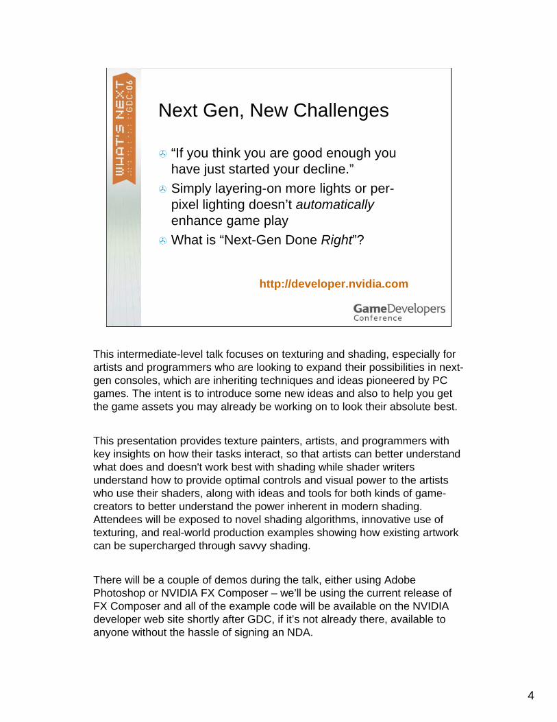
I’d like to talk a little about charts and MIPmaps.Charts are great, we all use texture atlases and charts. They are a neccesary evil that we all deal with when applying 2D textures to complex, arbitrarily-shaped 3D objects. I just want to say, there is a limit!
This is an actual surface normal map that I ran across about a year ago. It was generated automatically. I think at times we’ve all seen a very splintered map like this. Fortunately it never shipped with a game.
For a model with no texture filtering, no mip mapping, this might actually work. But if it’s MIP mapped or smooth-textured in any way, the results will be absolutely terrible, for a couple of reasons.
First, when we filter down, the pixels that are near the edges of these many many charts will start to absorb black. Black isn’t a neutral color!

18
The Evils Charts Can Do
Texture Atlases and charts let us remap any 3D shape to a group of 2D shapes
Look at this map when you drop it a few MIP levels – especially the edges and the many small pieces down here.
The normals were’s seeing here are going to get all mixed-up, all over the model when it’s rendered. And are these valid values? Maybe here or there in the large flat regions, but for the smaller bits, our filtering algorithm, which was theoretically supposed to make things look good at all distances, has turned into a sort of evil random number generator, and the model is going to sparkle like crazy.
This is a problem that will occur not just for normal maps, but for color maps too.
19
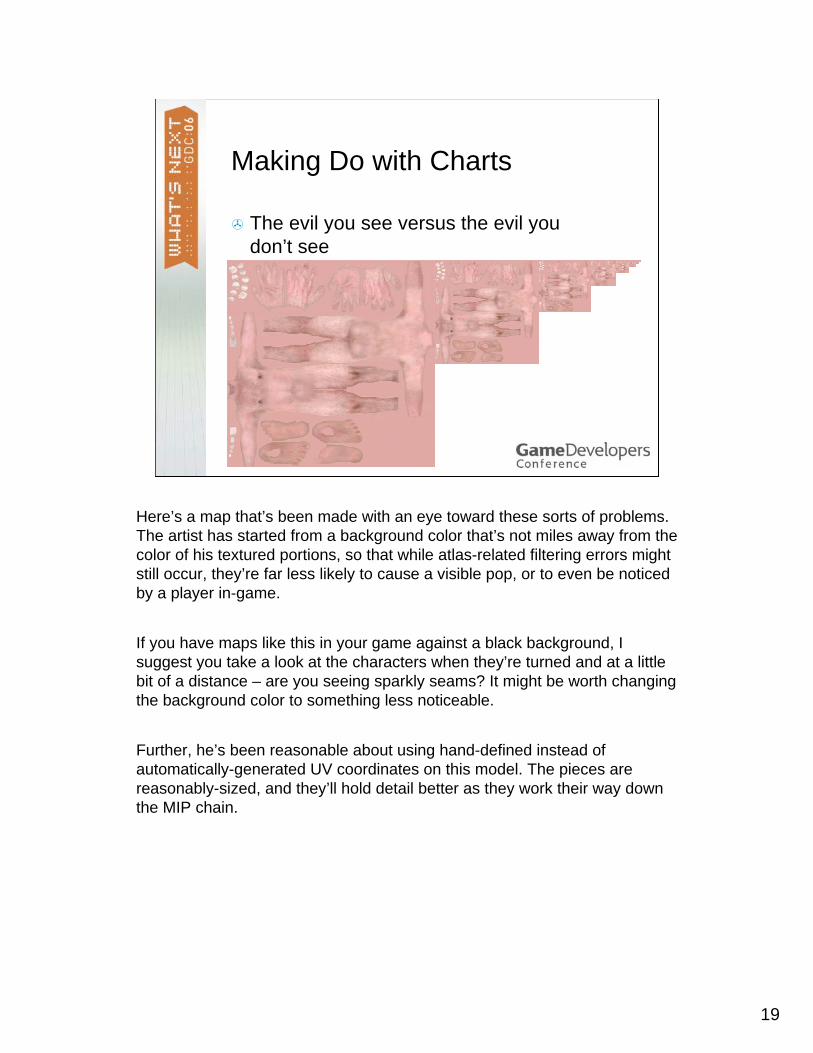
Making Do with Charts
The evil you see versus the evil you don’t see
Here’s a map that’s been made with an eye toward these sorts of problems. The artist has started from a background color that’s not miles away from the color of his textured portions, so that while atlas-related filtering errors might still occur, they’re far less likely to cause a visible pop, or to even be noticedby a player in-game.
If you have maps like this in your game against a black background, I suggest you take a look at the characters when they’re turned and at a little bit of a distance – are you seeing sparkly seams? It might be worth changing the background color to something less noticeable.
Further, he’s been reasonable about using hand-defined instead of automatically-generated UV coordinates on this model. The pieces are reasonably-sized, and they’ll hold detail better as they work their way down the MIP chain.

20
This texture represents an attempt to fix some of the normal-mapping issues. This is actually a re-built version of the same nightmare map from a minute ago.
Black corrected to grey, to reduce contrastEdges smudged around to reduce high-level Mip errors further.This area… at low levels this green is going to pollute this red and vice-versa and we’re really pretty-well stuck with that. Sad but true.
But there is another problem in reducing a normal map like this…. And one that so far no tool available, to my knowledge, has truly managed to handle fully. So I can’t offer an easy solution, but let you know what some errors might look like when you occasionally encounter them.
21
Normals from Bumps
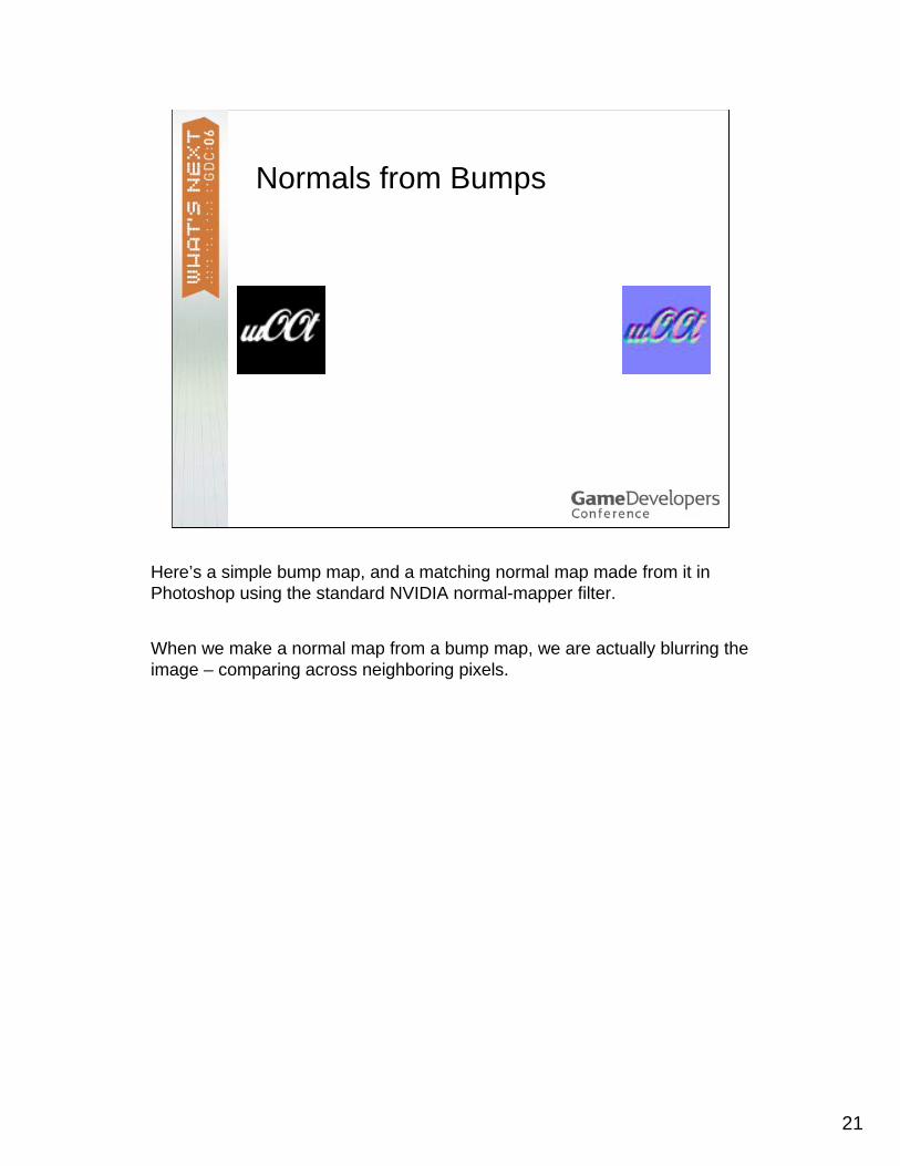
Here’s a simple bump map, and a matching normal map made from it in Photoshop using the standard NVIDIA normal-mapper filter.
When we make a normal map from a bump map, we are actually blurring the image – comparing across neighboring pixels.

22
Normals from Bumps
See how the normals cover a larger area than the original in the blowup? This has an important effect on what happens when we filter this image for shading, later on.

23
MIPs and Normal Maps
What happens when we MIP a normal map?
I went onto CgTalk this past week, anyone use that? I went on and was digging in the forums looking for insight into how other people deal with normal maps and I was surprised to find a lot of people struggling with these issues and scratching their heads.
Here’s a typical tile grayscale bumpmap.

24
MIPs and Normal Maps
And here’s a normal map made directly from that, using a photoshop filter.
If we make MIP maps from that normal map….

25
We get a picture like this
But let’s compare to the grayscale…..

26
You can see that the grayscale holds a lot more interesting detail that we’re losing in the MIPped normal map.
And this is even given that I’ve deliberately faded the lower mip levels toward grey, so that the depth of the bumps gets smaller alongside the UV size.
Normal-map creation loses detail. It’s a type of blur operation, and MIPping itself is a blur operation. So we lose a lot of the detail we went to the trouble of creating in our bump map! If this bump map has a corresponding color map, we can sometimes see these disparities quite clearly.
Worse, our normal-mapping algorithm is based on comparisons of neighboring grayscale values. But when we MIP the normal map itself, we’re actually shrinking not just the picture, but the filter we used to create the normals, too. If we started with a 3x3 filter, the next MIP will effectively have a 1.5x1.5 filter, then next one a filter of ¾ pixel x ¾ pixel…
The result can be either complete lack of bump, or random distracting sparkling of the surface normals at middle levels, or probably both.
What we’d rather have is a MIPped normal map based not on the highest-resolution only, but one based on the scaled MIP map levels of the bump map itself – in other words, on what we’re seeing here in the grayscale version.

27
The result looks like this. We get more detail down in the lower levels. And since we gently scaled our bump map MIPs toward a neutral gray, we still get a sort of scaling down of the bumps in both XY dimmensions and the perceived depth of the bump, without such a serious sacrifice in detail.
Let’s compare to the previous result
See the differences? Here, here, and the crispness of these lines? There’s NOTHING in these lower levels, but here we’re still seeing something worthwhile.
Anyone using lots of normal-map tiling – for buildings, for roads, for ornate armor, for almost anything – should be aware of this technique.

28
Here are some more comparisons. Here we can see better rendition of structure….. Look how the lower ones in the poor version might have stuff in them, but it’s junky – the overall structure just turns to noise.

29
Again, a little better roughness at the low levels,
30
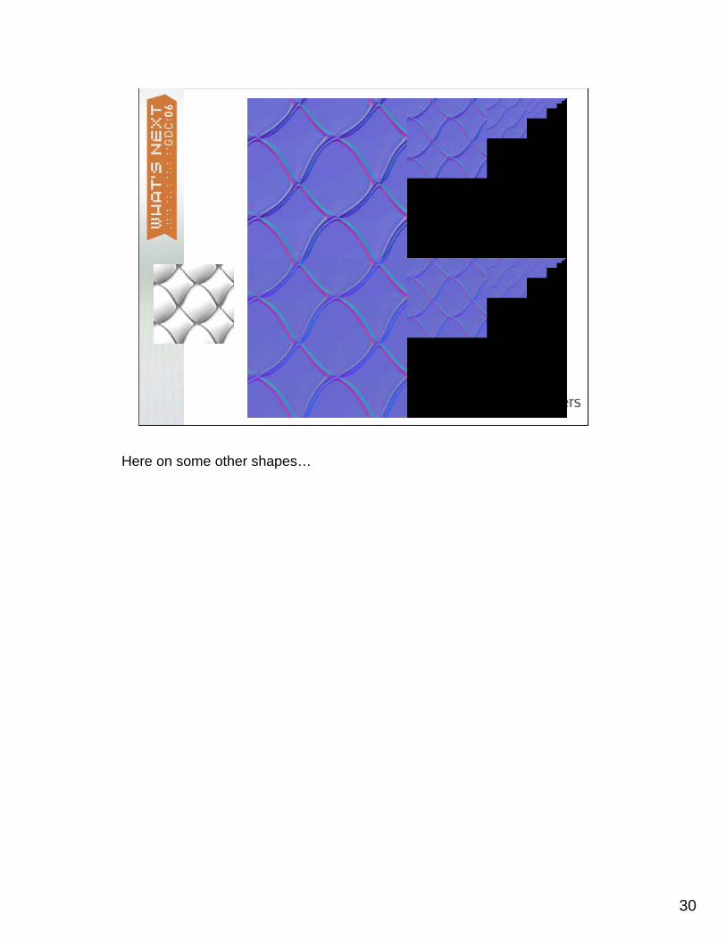
Here on some other shapes…

31
…and so forth.
While you could manage all these manipulations by hand, it’s actually pretty simple to do the right thing, we’ve written our DDS exporter for Photoshop –that is, the NVIDIA DDS exporter -- to do the right thing for you, just by selecting the “Normal Map” option when converting a grayscale bumpmap to mipped DDS.

32
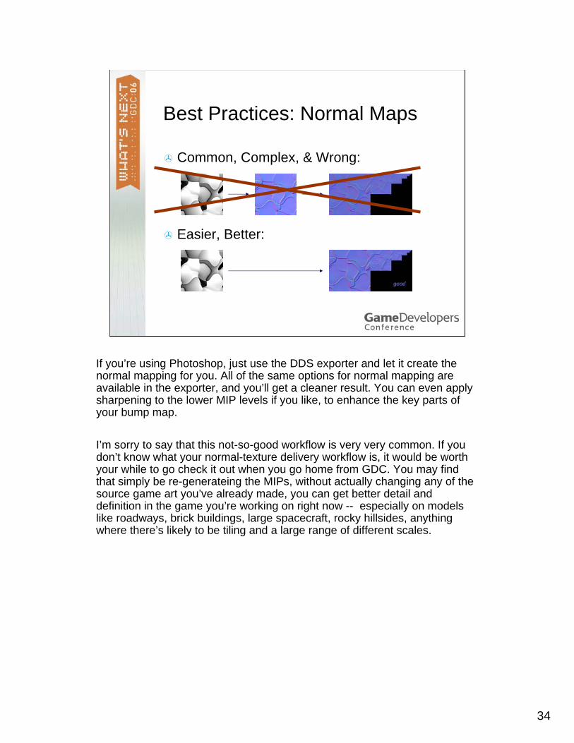
Best Practices: Normal Maps
Common, Complex, & Wrong:
So the typical workflow, and I’ve seen this at a lot of studios, whether they’re using Photoshop, in-house tools, or whatever, is this.

33
Best Practices: Normal Maps
Common, Complex, & Wrong:
DON’T DO THAT. You lose information, you can create random sparklingand other artifacts, and to top it off it’s actually more complicated than it needs to be.
Fortunately, the RIGHT way is actually simpler!
34
Best Practices: Normal Maps
Common, Complex, & Wrong:
Easier, Better:
If you’re using Photoshop, just use the DDS exporter and let it create the normal mapping for you. All of the same options for normal mapping are available in the exporter, and you’ll get a cleaner result. You can even apply sharpening to the lower MIP levels if you like, to enhance the key parts of your bump map.
I’m sorry to say that this not-so-good workflow is very very common. If you don’t know what your normal-texture delivery workflow is, it would be worth your while to go check it out when you go home from GDC. You may find that simply be re-generateing the MIPs, without actually changing any of the source game art you’ve already made, you can get better detail and definition in the game you’re working on right now -- especially on models like roadways, brick buildings, large spacecraft, rocky hillsides, anything where there’s likely to be tiling and a large range of different scales.

35
Color & Depth
While we’re on the subject of bricks, let’s talk about color manipulations.
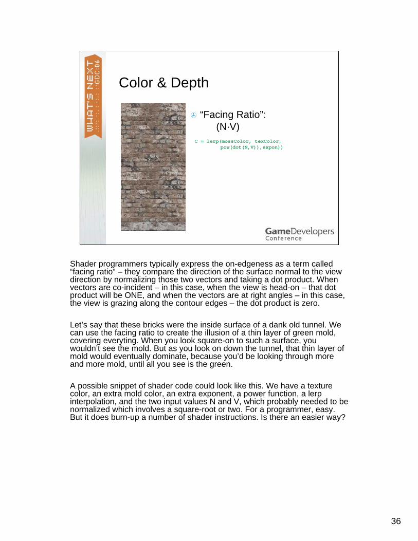
Here’s some brick. One thing you’ve probably noticed about any surface that has depth – in fact, about just about ANY surface – is that it has different characteristics when viewed head-on, like this brick, or at a grazing angle. This is really true of any sort of object.
Try it yourself, right here. Take anything and look at it juuust along the grazing angle. We normally think of paper as being matte, but if you hold it at a narrow angle, you might be surprised to see that you can see a clear reflection of the screen. Iy you’re wearing a sweater or a tee-shirt, you can look closely along the contour edges and you’ll see that the color of that clothing looks slightly desaturated, mixed with the color of lots of random little fibers that are too small to normally notice individually, but viewed on-edge through a mass of them, add color. When you go home after GDC today, notice that even the darkest-colored cars can reveal a pale layer of dust, but only when viewed on-edge.
36
Color & Depth
“Facing Ratio”:(N·V)
C = lerp(mossColor, texColor,pow(dot(N,V)),expon))
Shader programmers typically express the on-edgeness as a term called “facing ratio” – they compare the direction of the surface normal to the view direction by normalizing those two vectors and taking a dot product. When vectors are co-incident – in this case, when the view is head-on – that dot product will be ONE, and when the vectors are at right angles – in this case, the view is grazing along the contour edges – the dot product is zero.
Let’s say that these bricks were the inside surface of a dank old tunnel. We can use the facing ratio to create the illusion of a thin layer of green mold, covering everyting. When you look square-on to such a surface, you wouldn’t see the mold. But as you look on down the tunnel, that thin layer of mold would eventually dominate, because you’d be looking through more and more mold, until all you see is the green.
A possible snippet of shader code could look like this. We have a texture color, an extra mold color, an extra exponent, a power function, a lerp interpolation, and the two input values N and V, which probably needed to be normalized which involves a square-root or two. For a programmer, easy. But it does burn-up a number of shader instructions. Is there an easier way?

37
Color & Depth
“Facing Ratio”:(N·V)
C = lerp(mossColor, texColor,pow(dot(N,V)),expon))
An alternative, worth considering on large models that don’t move around much, is to just color the mips. The Mip texture I’m showing now has simply given each successive layer a little bit of a green tint, untill the lowest ones are almost entirely green.
The texture itslef, when compressed by perspective, can contain the facing ratio. Let’s look at this on a model
38
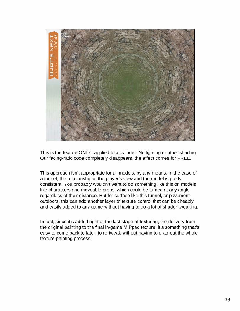
This is the texture ONLY, applied to a cylinder. No lighting or other shading. Our facing-ratio code completely disappears, the effect comes for FREE.
This approach isn’t appropriate for all models, by any means. In the case of a tunnel, the relationship of the player’s view and the model is pretty consistent. You probably wouldn’t want to do something like this on models like characters and moveable props, which could be turned at any angle regardless of their distance. But for surface like this tunnel, or pavement outdoors, this can add another layer of texture control that can be cheaply and easily added to any game without having to do a lot of shader tweaking.
In fact, since it’s added right at the last stage of texturing, the delivery from the original painting to the final in-game MIPped texture, it’s something that’s easy to come back to later, to re-tweak without having to drag-out the whole texture-painting process.

39
Texture Scripts in Photoshop™
“Mipster”
DEMODEMO
In fiddling with textures in Photoshop, I’ve made myself a couple of useful tools that we’ve started bundling with the DDS exporter.
One tool is called the CubeMapShuffler, and it’s just a fast and easy way to move texture formats back and forth between the so-called inverse-cross format and six side-by-side squares. It’s handy when you’re hand-painting cube maps or if you inherit a map from someone else.
The other script is called Mipster, and that’s what’s shown here. Mipster is a MIP-map builder that uses Photoshop’s built-in filtering and color tools, rather than counting on the exporter to do the right thing for every possible circumstance. Adobe spent a lot of time, effort, and I’m sure cash in getting their image filtering really really right, and Mipstercapitalizes on that. The script lets you start from a single high-res image, and it will quickly generate all of the MIP levels using the high-quality filters that are already a part of Photoshop – you can choose between the standard ones – and writes each MIP level into its own layer, so if you want to hand-tweak or examine any particular part of the MIP chain, it’s right there for you.
It also lets you add tinting by adding transparent color overlay layers, that can each be hand-tweaked at any time for doing tricks like rolling to a specific color at a specific point in the chain – and finally, it also can manage handling texture alpha, either as a unified alpha channel or a different alpha for each MIP layer. It’s free, it’s fun to watch, and I mention it here partly because some of the examples were made with it and also because I’m always keen to hear user feedback on how we can make these sorts of tools more powerful and useful.
DEMO: NVIDIA_MIPSTER.JS

40
Text Mips
Adobe spent a lot of time on image filtering, and also a lot of time –alongside Apple and Microsoft and probably others – in getting text renditions right. I’ll just mention in passing a variant of Mipster that I’ve been fiddling with recently, that capitalizes on Adobe’s expertise at typesetting regardless of the image size.
In “Mipster Text,” which we can make available on the NVIDA web site or just email me for a copy, Photoshop actually re-renders the text layers for each MIP level. Adobe is very proud of all their secret tricks at managing text at arbitrary sizes, and in general the text rendered into the lower MIP levels IS indeed more legible – if you are using text as part of your textures, it may be worth your while to try this and see if your texture is more legible. In my trials I’ve usually gained one or two MIP level’s worth of legibility, which can be important at the smaller sizes.

41
Gratuitous Equation Alert!
)()(∫ ∫≠ xfxf
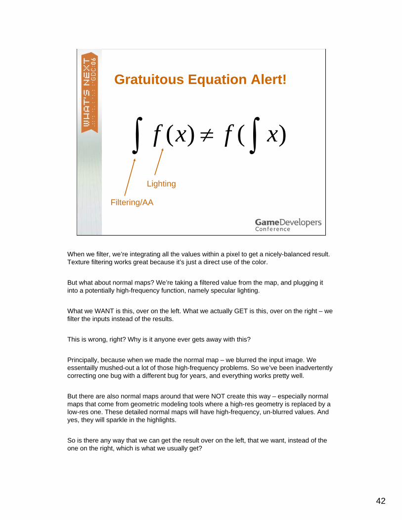
Okay, technically this isn’t an equation it’s an inequality. But it shows a slight error that we often see in game lighting.
42
Gratuitous Equation Alert!
)()(∫ ∫≠ xfxf
Filtering/AA
Lighting
When we filter, we’re integrating all the values within a pixel to get a nicely-balanced result. Texture filtering works great because it’s just a direct use of the color.
But what about normal maps? We’re taking a filtered value from the map, and plugging it into a potentially high-frequency function, namely specular lighting.
What we WANT is this, over on the left. What we actually GET is this, over on the right – we filter the inputs instead of the results.
This is wrong, right? Why is it anyone ever gets away with this?
Principally, because when we made the normal map – we blurred the input image. We essentailly mushed-out a lot of those high-frequency problems. So we’ve been inadvertently correcting one bug with a different bug for years, and everything works pretty well.
But there are also normal maps around that were NOT create this way – especially normal maps that come from geometric modeling tools where a high-res geometry is replaced by a low-res one. These detailed normal maps will have high-frequency, un-blurred values. And yes, they will sparkle in the highlights.
So is there any way that we can get the result over on the left, that we want, instead of the one on the right, which is what we usually get?

43
The Toksvig Factor
No sparklies at the edges!Need to choose a fixed phongexponent
http://developer.nvidia.com/object/mipmapping_normal_maps.html
DEMODEMO
Yes! I’m not going to go into any further math on this, but Michale Toksvigover at NVIDIA has done the math for you and come up with a scheme that’s only slightly more expensive that regular phong shading but uses texture and MIP mapping to pre-integrate phong highlights for any given specular power.
DEMO: TOKSVIGAA.FXPROJ
Here’s a running demo, and I can switch back and forth – see the little beads and jaggies here? Now I’ll switch the technique setting to use the Toksvigmethod, and – voila – no sparkles!
This is a powerful technique and I recommend all programmers and TDstake a good look at it.

44
Nightfall – color control
Okay, back to painting.
Here’s a classic example of using texture to control lighting -- it’s shown up in a few books, and I’d like to suggest some possible uses of the same idea.
45
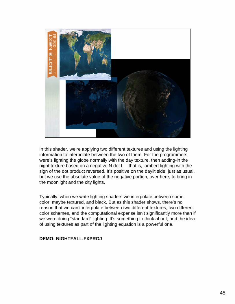
In this shader, we’re applying two different textures and using the lighting information to interpolate between the two of them. For the programmers, were’s lighting the globe normally with the day texture, then adding-in the night texture based on a negative N dot L – that is, lambert lighting with the sign of the dot product reversed. It’s positive on the daylit side, just as usual, but we use the absolute value of the negative portion, over here, to bring in the moonlight and the city lights.
Typically, when we write lighting shaders we interpolate between some color, maybe textured, and black. But as this shader shows, there’s no reason that we can’t interpolate between two different textures, two different color schemes, and the computational expense isn’t significantly more than if we were doing “standard” lighting. It’s something to think about, and the idea of using textures as part of the lighting equation is a powerful one.
DEMO: NIGHTFALL.FXPROJ

46
Painting a Shader
1D & 2D functions
So let’s take the idea of texture-controlled shading a few steps further.
As shader programmers usually know, you can replace just about any bounded 1D function with a single color gradient texture. Similarly, we can replace most any 2D function with a 2D texture. And at times we can break down complex functions into combinations of texture lookups.
This is a really powerful technique, it’s actually pretty well-known and used in the visualization and CAD communities, but not so often in games.
This illustration is of, well obviously, a dinosaur covered in car paint. The car paint is directly-pulled from sampling data of real-world car paint, and the functions that describe that real-world car paint BRDF --- does everyone know what we mean when we say BRDF? – that BRDF is coded into a pair of textures that are indexed, not on the surface UVs, but on variations in the view angle, the angle to the light, and their combinations.
Now your game probably doesn’t have metal-enamel dinosaurs – that’s programmer art –but it might have something like this:

47
Painting a Shader
1D & 2D functions
The truck we’re seeing here uses a BRDF, that is a complex surface shader, that was hand-painted. It started out by getting some samples from real-world car paint, but ultimately the artists on this particular NVIDIA demo project found that it was just as easy – and in fact better, for what they were doing – to just paint-in a new BRDF themselves, by rading the phycially-based source textures into Photoshop and repainting them to get something they really, really, liked.

48
Two Pictures = One BRDF
+ =
It’s really not that hard, once you get fiddling with it, to create your own BRDF.
Here are some examples of a shader we ship with the standard NVIDIA SDK samples. It’s called “Cook Torrance” but since it’s based on two textures, you can actually quickly tweak it around to create a wide variety of arbitrary sorts of materials.
A great aspect of this approach is that it requires almost zero programmer intervention. A single, highly-efficient shader, with a single set of vertex buffer setup rules and so forth, can be used to draw lots of different sorts of interesting materials. A BRDF like this can be combined with other standard UV-mapped textures, the input textures can be very small, and most of the math can even be done in the vertex shader! The pixel shader is mainly doing texture accesses and mixing colors together.
Let’s look at this on our model “Dusk”:
DEMO: DUSKCT.FXPROJ

49
DEMODEMO
Here are some different serious and fanciful materials made using this technique.
All of these textures were made quickly in Photoshop, just using the gradient tool. All that is but the last one, which shows a little bit of the whackierpossibilities. These sort of textures can also handle anisotropic or simple plain-vanilla sorts of surfaces.

50
Providing Sensible Controls
The most harmonious circumstance comes when these worlds intermeshEverything really great that any of us have done has been the result of teamworkTexture and Shading are both about color control
J. Itten, Die Begegnung, 1916
One problem with that technique is that we’re asking the texture painter to guess what the final result will look like. Paint in photohshop, save to disk, read it into a 3D app, repeat, repeat, repeat…..
What would be better would be a way to look at these results directly as you paint them, right?
51
Brdf_paint
Let artists paint the BRDF directly…
DEMODEMO
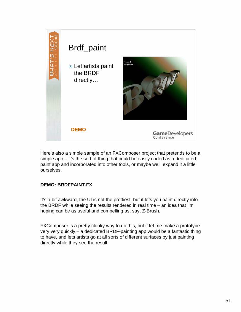
Here’s also a simple sample of an FXComposer project that pretends to be a simple app – it’s the sort of thing that could be easily coded as a dedicated paint app and incorporated into other tools, or maybe we’ll expand it a little ourselves.
DEMO: BRDFPAINT.FX
It’s a bit awkward, the UI is not the prettiest, but it lets you paint directly into the BRDF while seeing the results rendered in real time – an idea that I’m hoping can be as useful and compelling as, say, Z-Brush.
FXComposer is a pretty clunky way to do this, but it let me make a prototype very very quickly – a dedicated BRDF-painting app would be a fantastic thing to have, and lets artists go at all sorts of different surfaces by just painting directly while they see the result.

52
Hair Functions
Use Kajiya-kay.fxh, or… roll your own!
Grayscale Color
DEMODEMO
Hair direction is… a normal map!
Any procedural texture that you can find in the shading arsenal has the potential for hand-painted tweaks….. Here are some textures that were created by a program to simplify hair shading. One texture defines the color or grayscale character of the highlight, while the other texture, unseen here, defines the direction the hair lies on the surface of the head – and directions as colors are exactly the same as… normal maps!
But how do you paint a normal map?
53
Directional Painting
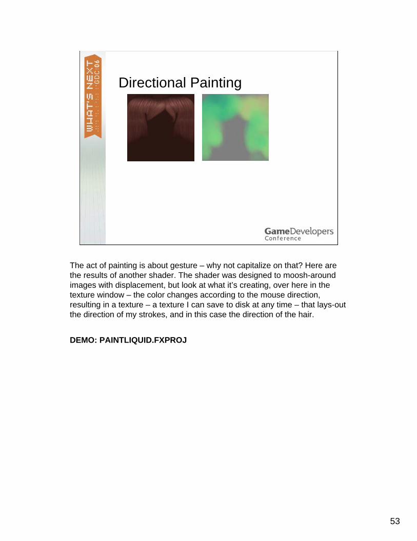
The act of painting is about gesture – why not capitalize on that? Here are the results of another shader. The shader was designed to moosh-around images with displacement, but look at what it’s creating, over here in the texture window – the color changes according to the mouse direction, resulting in a texture – a texture I can save to disk at any time – that lays-out the direction of my strokes, and in this case the direction of the hair.
DEMO: PAINTLIQUID.FXPROJ

54
Directional Painting
DEMO: LIQUID_PAINT.FX
There are all sorts of fun applications for this technique, in the illustration you can see I’ve used it to just paint-on motion blur.

55
Even More Abstract Textures
Textures as animation channelsTextures to guide particle animation/ image flowEtc….
SLIDE IN PROGRESS
There are tons of abstract uses for texture that you might try intercepting with painting – here’s a simple one, I’m replacing the shadow color with a texture overlay to create cross-hatched shadows.
56
Shading to Look Like Painting
Anime Shadow Technique
Reice with Rounded “Hand-Drawn” Shadow Shading
“Reice” courtesy Han daeHoon, Graphic Factory, Korea
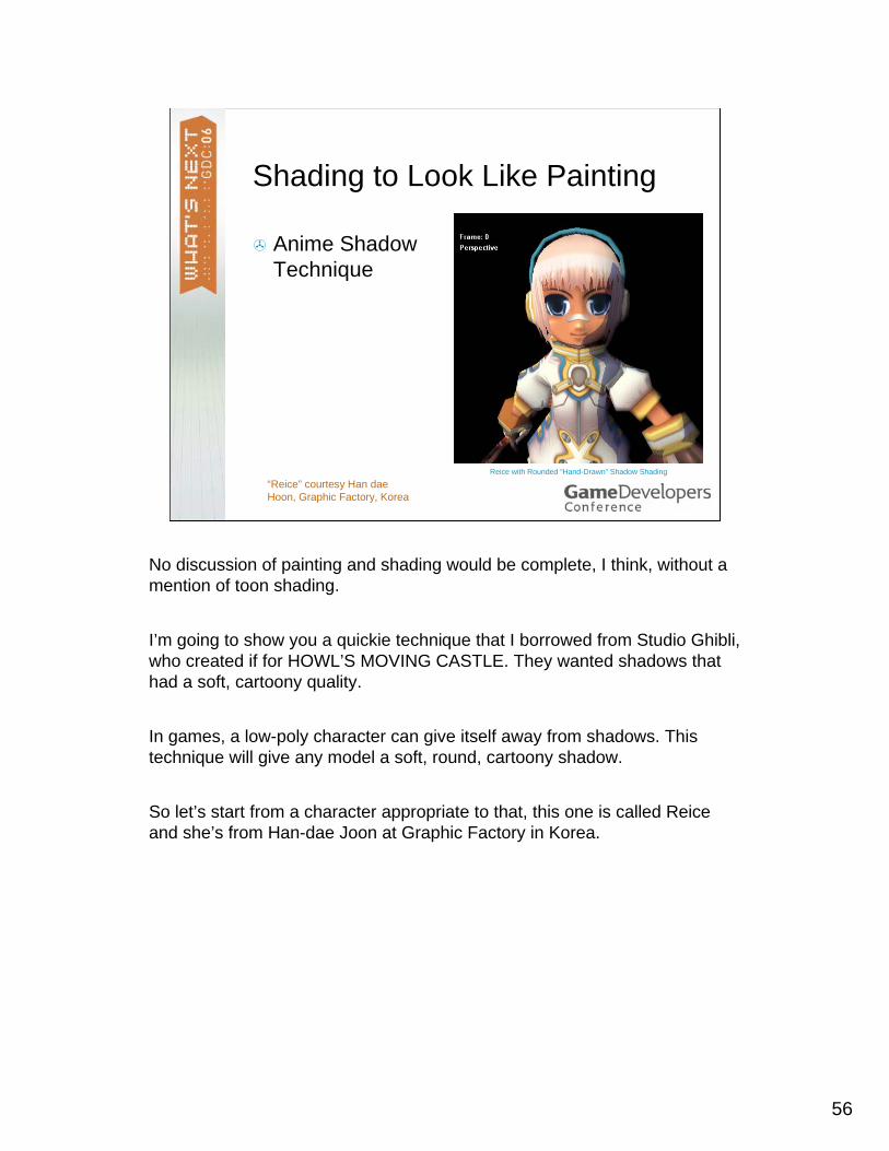
No discussion of painting and shading would be complete, I think, without a mention of toon shading.
I’m going to show you a quickie technique that I borrowed from Studio Ghibli, who created if for HOWL’S MOVING CASTLE. They wanted shadows that had a soft, cartoony quality.
In games, a low-poly character can give itself away from shadows. This technique will give any model a soft, round, cartoony shadow.
So let’s start from a character appropriate to that, this one is called Reiceand she’s from Han-dae Joon at Graphic Factory in Korea.

57
Render Color and Normals
RGB Raw Surface Normals
To get rounded shadows, first we’ll render this character twice – or just one time with two simultaneous image outputs, thanks to MRT. One image is simple color, the other is a set of the surface normals, re-cast as a normal map.

58
Blur the Normals
Blur Pass 1: Horizontal Blur Pass 2: Vertical (and optional clip to show form)
Next, we’re going to blur the normal map – a LOT. We’ll do two passes, one horizontal, one vertical.

59
Composite
Hard cutoff on blurred normals = “round shadow”
Reice with Final rounded shadow outline
DEMODEMO
Now we just recombine the color image with lighting based not on the actual surface normal, but the blurred image normal.
DEMO: REICE_ANIMESHADOW.FXPROJ
As we play with the demo, you can see how controllable this is – at stride zero the poly shapes are clear, with wide strides we get soft rounded, very cartoony shadows that move very consistently across the character.

60
Pushing Forward
You progress not through what has been done, but reaching towards what has yet to be done
– Kahlil Ghibran
So we’re running short on time, I’ll need to wrap up! Remember, there’s NO REPLACEMENT FOR FIDDLING AROUND. There are lots of potential ways to let artists interact visually with the surfaces and effects possible through shading, and thanks to high-powered interactivity, they can do it in ways that we might not have thought of only a few years or even months ago.

61
Pushing Forward
You progress not through what has been done, but reaching towards what has yet to be done
– Kahlil Ghibran
The market only rewards innovation– Gopal Solanki
Try out all these tools – do download the samples from the NVIDIA developer web site, and let us know about anything cool and useful that you find, because there’s plenty of sky left to explore.

62
Resources
http://developer.nvidia.comGPU Gems [email protected]
…and thank all of you VERY MUCH for visiting this talk!