What’s New in Qv11 -...
22
What’s New in Qv11 1 Author Shima Nakazawa Last Modified October 14, 2011 Name of QVW What’s New in Qv11 Revised Version 1 QV version QV11 Classification Public Target Audience – Who should be looking at this application? Any knowledge they should have? QlikView Developers and users who are familiar with previous version of QlikView. This document does not describe the uniqueness of QlikView (data association, green/white/gray), but the new features included in QlikView 11. Application Overview – Explain the uniqueness of this application. What is the purpose to show? This application contains QlikView 11 new features including… 1. Alternate States (Comparative Analysis) 2. Dimension Limits 3. Show Condition on dimensions/expressions 4. Container Object – Grid style 5. Metadata (comments) 6. Actions (new functions) Server side Qv11 features 1. Collaborative Sessions 2. Annotations For more information, see “What’s New” tab within the application. We strongly suggest not talking about only the new features, but trying to weave them into business scenarios to show the business values. Data – What type of data is included? Is it available for distribution? This application contains demo data around consumer goods sales. This company sells to customers who have stores. This is not a company such as super markets who sell to individual consumers directly. Analyze sales reps’ performance, products, customers, geography and also create reports that show invoice/item level.
Transcript of What’s New in Qv11 -...

What’s New in Qv11
1
Author Shima Nakazawa Last Modified October 14, 2011
Name of QVW What’s New in Qv11 Revised Version 1
QV version QV11 Classification Public
Target Audience – Who should be looking at this application? Any knowledge they should have?
QlikView Developers and users who are familiar with previous version of QlikView. This document does not
describe the uniqueness of QlikView (data association, green/white/gray), but the new features included in
QlikView 11.
Application Overview – Explain the uniqueness of this application. What is the purpose to show?
This application contains QlikView 11 new features including…
1. Alternate States (Comparative Analysis)
2. Dimension Limits
3. Show Condition on dimensions/expressions
4. Container Object – Grid style
5. Metadata (comments)
6. Actions (new functions)
Server side Qv11 features
1. Collaborative Sessions
2. Annotations
For more information, see “What’s New” tab within the application.
We strongly suggest not talking about only the new features, but trying to weave them into business scenarios
to show the business values.
Data – What type of data is included? Is it available for distribution?
This application contains demo data around consumer goods sales. This company sells to customers who have
stores. This is not a company such as super markets who sell to individual consumers directly.
Analyze sales reps’ performance, products, customers, geography and also create reports that show invoice/item
level.

2
Scenario Role – Who is this scenario
for?
Overall question and breakdown
questions to answer within the
scenario
Outcome and breakdown answers
Scenario 1:
Seeing overall view by
various metrics
As a user, I’d like to see
dashboard by different
metrics.
• C-level
• Regional managers
Need to see the data by Sales,
Quantity, Margin or Margin%
• Is there a correlation
between sales $ vs quantity
for best selling periods?
• How about sales reps?
Sales $ top sales vs
Quantity top sales.
You will find…
• Switch to other metric as needed and the entire
dashboard will reflect to the change
• Good Sales $ periods do not mean more quantity sold
QV11 features
• Conditional Enabling of Dimensions and Expressions
Other features
• Brushing
Scenario 2:
Identifying products
profitability in northeast
region
As a regional sales
manager in northeast
region in the US, I need to
oversee the sales patterns
of my sales team to
identify if there are any
suspicious transactions
taken.
• Regional Sales
manager
• Product manager
Margin seems to be lower than
expected. Any suspicious
transactions taken within my
region?
• Which customers are
affecting the overall
margin?
• Who’s responsible for these
customers?
• For any particular
products?
• Why is the margin so low?
Too many discounts?
You will find…
• loss in profitability with a couple of customers
• One sales rep is taking suspicious transactions
• Many transactions with 0 sales amounts.
• Too many samples to only one customer not others
Qv11 features
• Conditional Enabling of Dimensions and Expressions
• Actions (clear field)
Qvs11 features
• Collaborative Sessions
• Annotations
Other features
• Map
• Reports

3
Scenario 3:
Which product has the
most potential for Q3?
Identify which product
has the most potential to
increase sales and margin
for the coming quarter?
• Product line sales
managers
• Marketing
manager for
promotions
• Inventory
managers to make
decisions together
with product line
sales managers
Today is June 20th, 2011. I’d like to
plan for next quarter (Q3).
• Which products should I
promote for better sales?
• I’d like to see the analysis
based on last year’s data
for the same season.
• How is margin?
Going after…
• Item that is popular for the season
• Item that is popular for holiday weekends
Qv11 features
• Dimension Limits
Scenario 4:
Identifying which product
to promote together with
hot dogs
Identify which product
would sell better with my
responsible product to
increase sales for the
coming quarter?
What sells more with
hotdogs?
• Product line sales
managers
• Marketing
manager for
promotions
• Inventory
managers to make
decisions together
with product line
sales managers
Today is June 20th, 2011. I’d like to
plan for next quarter (Q3).
• Which products should I
promote for better sales?
• I’d like to see the analysis
based on last year’s data
for the same season.
• Any regional insights?
Going after…
• Item that is popular for the season
• Item that is popular for holiday weekends
• Target for adults rather than children
• One region sells more than others
Qv11 features
• Dimension Limits
• Comparative Analysis
• Metadata

4
Scenario 5:
Sharing my new finding
with others (QVS
required)
Identifying any other
product that may sell
better with hotdogs. How
can I share my new
finding?
• Product line sales
managers
• Marketing
manager for
promotions
• Inventory
managers to make
decisions together
with product line
sales managers
Continuous scenario from the
previous one.
• Is there other product
which sells better than
Wine/Beer with hotdogs?
• How can I share my finding
with others?
Going after…
• Soda seems to sell much better than wine or beer
• With triple the sales of beer
Qv11 features
• Comparative Analysis
• Annotations
Scenario 6:
Can I group objects?
As a Qv developer, I need
to group objects so that
they will function
together.
• Qv Developer How can I group objects together?
• So that they minimize
together
• Less number of objects to
deal with when
linking/copying objects
from one sheet to another
• Displaying multiple objects
at the same time in a
screen but grouped
together
Going after…
• Easy to develop
• Avoiding confusions from end users. eg., a slider bar
works with only a chart within the sheet, and when
the chart is minimized, then the slider bar also needs
to be minimized together.
Qv11 features
• Container Object – Grid style

What’s New in Qv11
5
Scenario 1: Seeing overall view by various
metrics
• Container Object
• Conditional Enabling of Dimensions and Expressions
(Show condition)
Sheet Dashboard
Selections so far None
In this sheet, you will see a user perspective feature which is show condition.
As a VP of Sales, I need the overall sales
information but sometimes, I need to look
at the data in sales, quantity, margin or
margin % depending on what information I
need at that time.
By default, I am looking at Sales
information. And now, I want to select all
periods that had more than 8M$ in sales.
Paint on bars that are above 8,000K.
Result:

6
What I am curious to know is whether we
had great sales because we sold more
quantities in general or not.
I will change the metric to Quantity and see
how long these bars are. If quantity follows
the sales, then these bars should be
standing tall compared to other periods.
Select Quantity
As a result, I can see that these are not the
best qty sold periods.
I can also see from the top sales person that
these names have changed between top
sales $ vs top Qty sold.
If I need to look at Margin, I can do so by
selecting “margin” at the top, and I don’t
need to run by report department to
produce a separate view for me.
This is using the new QlikView11 features
called Show condition.
Salect Margin
In this scenario, you learned a new feature that benefits users for the easy-of-use capability.

7
Scenario 2: Identifying products
profitability in northeast region
• Conditional Enabling of Dimensions and Expressions
(Show condition)
• Collaborative Session
• Annotations
Sheet Customers
Selections so far None
I am a regional sales manager, and I am responsible for the northeast sales in the US. I would like to oversee the
sales patterns of my sales team to identify if there are any suspicious transactions taken.
I want to see customer sales in a map view
and select US by painting on the map.
These dots indicate sales amount per
customer. It seems there are two big
customers in the east coast as well as in the
west coast. (see two big bubbles)
Paint on the map to select only US dots
I will concentrate in my territory, northeast
and this year, 2011.
Paint on the map to select the dots in the northeast.
Select 2011
In the Customer KPI’s, I can see the
information about each customer’s
purchases.
If I scroll down, I can identify two customers
with negative margin. “EDS” and “Fill It”.

8
I will sort by Margin % here to select these
two customers.
Double (single in ajax) click on Margin % column to sort.
Select Fill It and EDS.
Now, I know that the sales reps of these
customers report to John Greg and Stewart
Wind.
(You may open the “+” to show the hierarchy – tree view in a list
box)
If I look closely, I can see that EDS has a lot
more invoices (transactions) than Fill It.
By selecting 2010, I can see that we were
not making margin last year either.
It seems I need to investigate on who the
sales person is for this customer.
Select 2010
Select EDS
I will go back to 2011 view, and see who the
sales rep is in Sales Reps tab.
Select 2011 or hit “Back” button to go back to 2011.
It is Edward Laychak who works in John
Greg’s team since 2006.
Note: assume that you know when Edward
started working in the company. You don’t
see this information unless you create a list
box for Employment Date field.
Select Edward Laychak
Which products is he selling to this
customer, EDS?
Go to Products tab

9
I know that Vegetables has been the top
sales product this year so far in this
company overall with average margin of
above 40%.
Selling this product, how come Edward can
have negative margin? I need to see what is
going on.
Select “Vegetables” and go to Reports tab
Since I want to investigate more on the
products, I will see the “product report”.
Click Product report button
By default, I have a view at a high level of
products. From this report, I see no
problem with French Fries with 72% margin.
However, the problem seems to be the rest
of the products. Especially, I see that Frozen
Vegetables has no sales but a great amount
of quantity.
Now, I will add more dimensions to fit to the
granular level of information I need.
This is a new feature in QlikView11, which is
by using show condition for dimensions and
expressions, users can create their own ad-
hoc reports.
Note: show the dimensions and expressions
tab in properties if needed
Select Invoice Number, Invoice Date, Item Desc
Deselect Product Line and Product Group.

10
Looking at this invoice level info per item, it
seems when he sells the items, then he gets
good margin. That means he is not giving
discounts.
However, I see many 0’s in the sales column,
which means he’s been giving out more
samples than he should; therefore, it is
resulting the loss for the company.
I need to speak with him and his manager to
process this.
I will print out the report and show this to
them.
Select “Custom Report”
Optional: QVS feature
I can do a collaborative session with them
online, which is a new QlikView 11 feature.
(need to be on a server)
Optional: QVS feature
If Edward and his manager are not available
right now, then I can make an annotation so
that they can review later. This is also a new
QlikView 11 feature which users can create
comments or share with others with
snapshots.
Take a snapshot
Make a comment that says
“Edward seems to provide many samples to EDS this year. What is
going on?”
If you want to show how Edward has been
selling Vegetables to other customers,
deselect EDS, and view in a customer report
with margin turned on.
You can see that EDS is the only customer
he has negative margin in 2011.
Deselect EDS
Click “Customer report”
Add “Margin” metric
11
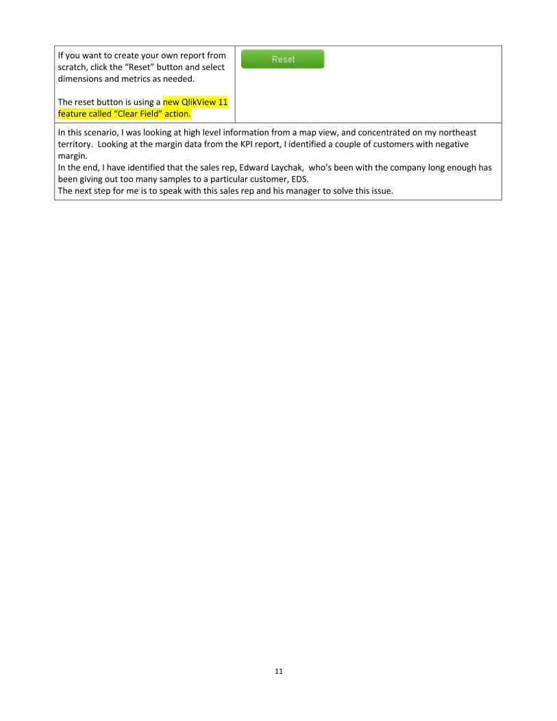
If you want to create your own report from
scratch, click the “Reset” button and select
dimensions and metrics as needed.
The reset button is using a new QlikView 11
feature called “Clear Field” action.
In this scenario, I was looking at high level information from a map view, and concentrated on my northeast
territory. Looking at the margin data from the KPI report, I identified a couple of customers with negative
margin.
In the end, I have identified that the sales rep, Edward Laychak, who’s been with the company long enough has
been giving out too many samples to a particular customer, EDS.
The next step for me is to speak with this sales rep and his manager to solve this issue.

12
Scenario 3: What sells more with
hotdogs?
Dimension Limits
Sheet Will go into Products sheet during the scenario
Selections so far None
You will see a scenario where you are assigned to pick a group of products with great sales and margin, and how
to identify the product sub group. The timing is for the next quarter, Q3.
I am looking at the data as of June 30th
,
2011. I am a product manager responsible
for Deli section in the United States.
I was tasked to identify a group of products
and strategize for Q3 to increase its sales.
First, I would like to identify the top
products that are making up 80% of overall
sales.
Go to Products sheet
Since I am targeting for next quarter, I will
analyze last year’s data for the same season.
That being said, I will select 2010 and Q3.
Select 2010 and Q3
Now I can see the product sub groups by top
sales in 2010 Q3. But I am interested in only
the 80% of total sales.
Enter “80%” (including the % symbol) in the input box, or adjust
the slider bar to 80%

13
Now, in this chart, I can see the 80% of sales
per product sub groups.
This is a new functionality in QlikView 11
called “Dimension Limits”. Users can easily
limit the number of dimensions to show
only x % of accumulated values. In this case
80% accumulated sales for product sub
groups.
(If you would like to display the rest of the
items, in this case, product sub group, you
can show as “Others”. See “Sales Reps”
sheet for an example. This is also a part of
this new functionality.)
Therefore, I am displaying only 19 out of 70
product sub groups, which make up 80% of
sales in 2010 Q3.
(I can cycle through the dimensions for
further detailed analysis. But for now, I am
good with product sub groups.)
Now, I’d like to pick a group to make a
promotion.
Looking at the data, Hot Dogs, Bologna and
Deli Meats are in the list that are from my
department.
Among these three groups, I can see that
Hot dogs have the most sales as well as the
margin.
That said, I have decided to make a
promotion on hot dogs as it is a great
product for a summer season.

14
In this scnario, you learned the new functionality in QlikView 11, called “Dimension Limits”with which you can
limit the number of dimension values to your needs using accumulated values.
To see how you can identify which product to bundle-sell with hot dogs, move to the next scenario.

15
Scenario 4: Identifying which product to
promote with Hot dogs
Comparative Analysis
Metadata
Sheet Products
Selections so far
“Hot Dogs” in Product Sub Group
“2010” and “Q3” from time dimensions
Top “80%” in an input box or a slider bar
I’d like to promote Hot Dogs for the next quarter. Now, my challenge is how to identify which products will be
sold better with hot dogs.
The next quarter is officially getting into the
summer season. I have identified that Hot
Dogs were one of the top products sold with
good margin.
To plan for the next quarter, I’d like to
identify which products to promote
together with Hot dogs.
So now I select Hot Dogs and look at sales
overlaps with other products.
Select “Hot Dogs” in the straight table.
My target is 4th
of July weekend, Labor day
weekend and any other hot summer
weekends for a grill party.
Instead of targeting children, I’d narrowed
down to adults. My idea is to sell more
drinks. Which drinks are good to bundle
discounts with hot dogs?
Go to Sales Overlaps sheet.

16
In this sheet, I can analyze any products that
have been sold together with other
products.
Confirm that Hot Dogs are already selected
in the Base section.
The diagram with circles is called the “Venn
Diagram”, and this is a great way to show
overlaps of multiple groups.
Note: Need internet to see the Venn
diagram
Venn Diagram (need internet)
I’d like to focus the potential sales on adults,
rather than children.
By targeting adults, I will look into potential
sales in drinks, beers and wine. Which do
you think sells more with hot dogs?
What you are about to see now is a new
functionality in QlikView 11 called
Comparative Analysis using Alternate
States.
Alternate States is advanced set analysis to
compare multiple groups (states) together.
(Option: Also, notice that other fields such
as time dimensions, region and sales reps
selections are affecting alternate states
groups, too. This is because these fields are
also defined in the alternate states
expressions. See the definition of
expressions for a new syntax. )
Now, using the alternate states
functionality, first, I will pick “Beer” from
Group 1.
I can see that Beer itself was sold for 80K$ in
2010, Q3.
Select “Beer”
17
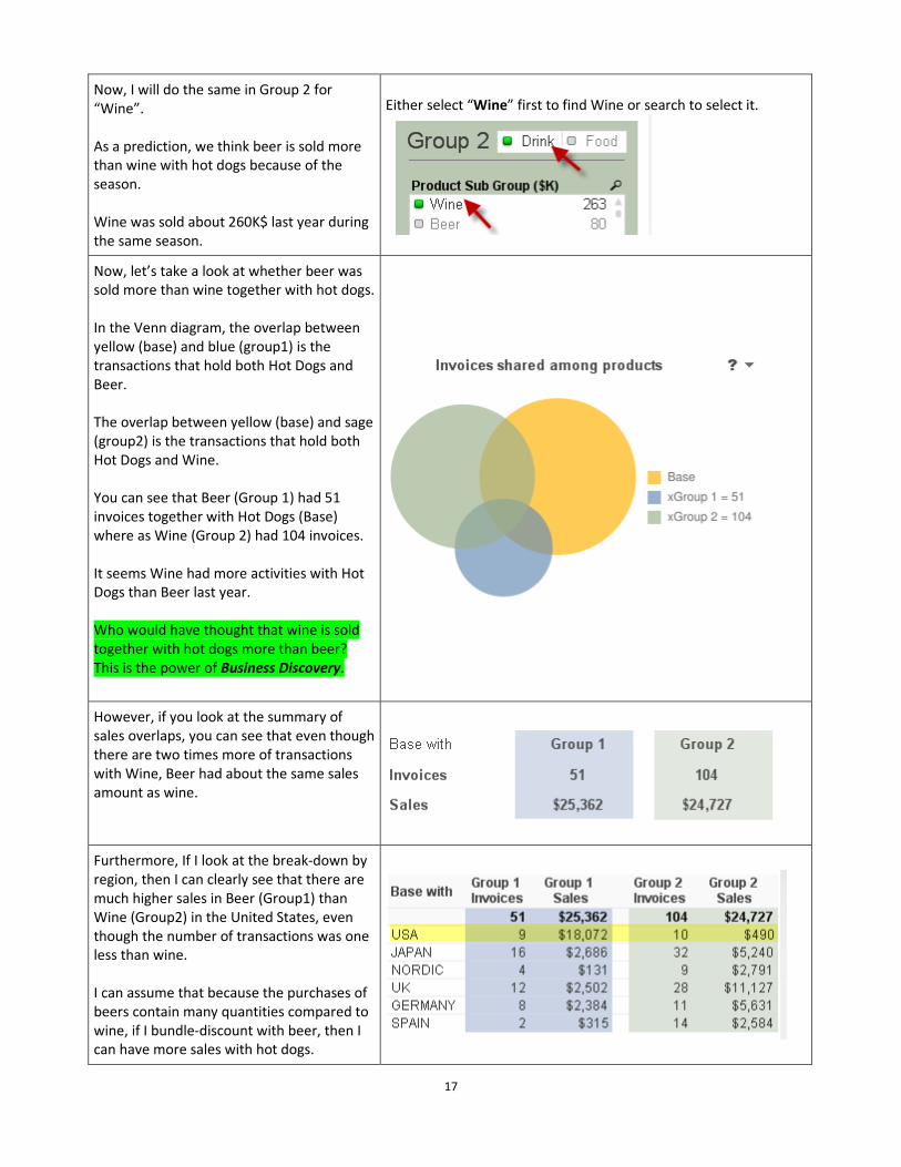
Now, I will do the same in Group 2 for
“Wine”.
As a prediction, we think beer is sold more
than wine with hot dogs because of the
season.
Wine was sold about 260K$ last year during
the same season.
Either select “Wine” first to find Wine or search to select it.
Now, let’s take a look at whether beer was
sold more than wine together with hot dogs.
In the Venn diagram, the overlap between
yellow (base) and blue (group1) is the
transactions that hold both Hot Dogs and
Beer.
The overlap between yellow (base) and sage
(group2) is the transactions that hold both
Hot Dogs and Wine.
You can see that Beer (Group 1) had 51
invoices together with Hot Dogs (Base)
where as Wine (Group 2) had 104 invoices.
It seems Wine had more activities with Hot
Dogs than Beer last year.
Who would have thought that wine is sold
together with hot dogs more than beer?
This is the power of Business Discovery.
However, if you look at the summary of
sales overlaps, you can see that even though
there are two times more of transactions
with Wine, Beer had about the same sales
amount as wine.
Furthermore, If I look at the break-down by
region, then I can clearly see that there are
much higher sales in Beer (Group1) than
Wine (Group2) in the United States, even
though the number of transactions was one
less than wine.
I can assume that because the purchases of
beers contain many quantities compared to
wine, if I bundle-discount with beer, then I
can have more sales with hot dogs.

18
This is great potential sales for my
department.
If you are not familiar with what each
column is showing, then mouse-over on the
column header and see the info.
This is an extended feature in QlikView 11
called metadata, and developers can add
comments in both dimensions and
expressions to support users with more info.
In this scenario, we started looking at one top sales product group, hot dogs and analyzed which drinks can
be sold together for potential higher sales based on last year’s data.
Using alternate states functionality, we can do comparative analysis in ad-hoc matter so that users can
make the right decision with provided data. Simply see the data from different angles to find the
information you are looking for. Data Association is the power here.

19
Scenario 5: Sharing my new finding with
others (QVS required)
Comparative Analysis
Annotations
Sheet Sales Overlap
Selections so far
“Hot Dogs” in Product Sub Group (Base)
“Beer” in Product Sub Group (Group 1)
“Wine” in Product Sub Group (Group 2)
This is a continuous scenario from the previous one.
We have found that we have a potential to sell hot dogs if we sell them together with beer. However, the
question rises to…
Is there another product which also has more potentials than beer to sell with hot dogs?
When you analyze sales overlaps, you may
wonder if you should go by the transaction’s
frequency or products sales $’s so that you
can make the right decision for the best
promotions.
I know that if I go with the product with
more transactions, then my Hot Dogs will be
sold more frequently; thus more sales to
me.
Previously, we saw that Wine had more
transactions than Beer. However, would it
be strange in general to bundle-discount
Hot Dogs with Wine? Would people really
go for it?
I’d like to look at another product at this
point and explore my options to make
promotions with hot dogs.
In Group 2, deselect “Wine” and identify “Soda” which has 388K$
sales.
Select “Soda”.
I have identified Soda which has more sales
than Wine, so I’d like to see if this item is
sold better with Hot Dogs.
Previously, Wine had more than 100
invoices in common with Hot Dogs with
about 25K$ sales.
Now, I can see that Soda has less invoices
(77) but more than triple the sales amount
overlapping with Hot Dogs.

20
Now, I have an option to either go with wine
which has more frequency in transactions,
or go with Soda which has more than triple
the sales.
Frequency is good for my product, hot dogs,
but selling more soda is good for producing
sales for the company because it has
potential of up sell in the product by itself.
I need to talk with my sales director and
show him what I am seeing in this view.
I can either send him the link to my view so
that I can walk him through what I found, or
write annotations to my findings so that he
can follow up and respond to me when he is
available.
This is a new functionality in QlikView 11
called “Annotations” and “Collaborative
Sessions”.
Show the share link or annotations.
In this scenario, you realized that Soda has triple the sales than Beer or Wine. So for the company’s profit, this is
a better option to up sell; however for my product, hot dogs, it is better for me to go with more frequency to sell
quantities to make my sales go higher.

21
Scenario 6: Grouping objects • Container Object
Sheet Dashboard
Selections so far None
In this sheet, you will see a developer perspective feature called container object – grid style.
(Preparation)
Before the presentation, make sure to
identify the container object around three
charts, and “Allow Move/Size” is checked.
It is the outside layer.
(Preparation)
If you are not sure, go to sheet properties >
Objects
As a QlikView Developer, for some
occasions, I want to group objects. Using
the new feature in QlikView 11 called
container object in grid style, I can
accomplish this.
As a result, I can resize the entire container
object, and all charts within it will
automatically get adjusted.
Also, I do not need to worry about aligning
Activate the outside container object, and try to resize it by
grabing the corner of the object.

22
all objects per pixel basis.
In this example, I have two container
objects. One holds two bar charts side by
side, and the larger (parent) container
object holds two objects; one is the (child)
container object and a pivot table.
This feature helps if you use minimized icons. You can have a chart with a slider object, for example, and they
will be minimized together or moved together for repositioning.
You can also use this for the common objects in each sheet. Instead of copying/linking individual objects in each
sheet, you can include them in a container object and use it to copy/link to other sheets.