Week 8-10 Describing Data in Charts and Graphs
18
Describing Data Charts and Graphs
-
Upload
muhammad-ammar -
Category
Documents
-
view
224 -
download
0
Transcript of Week 8-10 Describing Data in Charts and Graphs

7/29/2019 Week 8-10 Describing Data in Charts and Graphs
http://slidepdf.com/reader/full/week-8-10-describing-data-in-charts-and-graphs 1/18
Describing Data
Charts and Graphs
7/29/2019 Week 8-10 Describing Data in Charts and Graphs
http://slidepdf.com/reader/full/week-8-10-describing-data-in-charts-and-graphs 2/18
Lecture Objectives
You should be able to:
1. Define Basic Terms 2. Recognize Types of Data and Data Scales
3. Draw appropriate graphs based on type of data
and type of analysis desired.
4. Interpret the graphs

7/29/2019 Week 8-10 Describing Data in Charts and Graphs
http://slidepdf.com/reader/full/week-8-10-describing-data-in-charts-and-graphs 3/18
Basic Terms
1. Data, Information, and Knowledge2. Populations and Samples
3. Variables and Observations
Types of Data: 1. Categorical and Numerical2. Cross Sectional and Time Ordered

7/29/2019 Week 8-10 Describing Data in Charts and Graphs
http://slidepdf.com/reader/full/week-8-10-describing-data-in-charts-and-graphs 4/18
Data, Information, and Knowledge
Data
Data
Data Information
Processing
Analysis Reports
ApplicationMeaning
Relevance
Knowledge

7/29/2019 Week 8-10 Describing Data in Charts and Graphs
http://slidepdf.com/reader/full/week-8-10-describing-data-in-charts-and-graphs 5/18
Populations and Samples
Sample: Subset of collection
Described by Statistics
Population: Collection of all possible entities of interestDescribed by Parameters
Statistical Inference
Art and science of using
samples to make conclusions about
populations.

7/29/2019 Week 8-10 Describing Data in Charts and Graphs
http://slidepdf.com/reader/full/week-8-10-describing-data-in-charts-and-graphs 6/18
Variables and Observations
Entity Height
(inches)
Weight
(pounds)
Age
(years)
Sex
(Category) Person 1
Person 2
Person 3
*
*
67
61
72
*
*
170
120
220
*
*
33
38
62
*
*
Male
Female
Male
*
*
OB
SERV
ATIONS
VARIABLES
Measurement
7/29/2019 Week 8-10 Describing Data in Charts and Graphs
http://slidepdf.com/reader/full/week-8-10-describing-data-in-charts-and-graphs 7/18
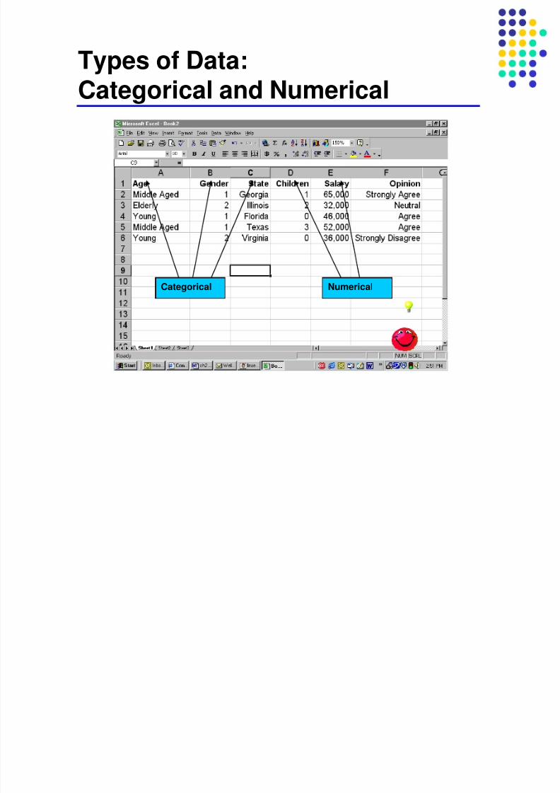
Types of Data:
Categorical and Numerical
Categorical Numerical

7/29/2019 Week 8-10 Describing Data in Charts and Graphs
http://slidepdf.com/reader/full/week-8-10-describing-data-in-charts-and-graphs 8/18
Data ScalesData are generally classified into four types:
1. Nominal – Categorical data2. Ordinal – shows ranks, intervals may vary
3. Interval – intervals are constant, arbitrary 0
4. Ratio – Numeric data with a ‘real’ 0 value.
Ordinal, Interval and Ratio scales are all Numeric data.

7/29/2019 Week 8-10 Describing Data in Charts and Graphs
http://slidepdf.com/reader/full/week-8-10-describing-data-in-charts-and-graphs 9/18
Types of Data:
Time Series and Cross-sectionalPopulation
Month (Millions)
1900 56
1910 58
1920 60
1930 65
1940 76
1950 84
1960 95
1970 120
1970
Population GDP Gender
Country (Millions) $ Billion Ratio
USA 160 575 0.998
China 800 155 1.105
India 600
Nigeria 100
Japan 120
Canada 30
Variable(s) over time Variable(s) at one point in timeacross multiple entities(countries in this case)

7/29/2019 Week 8-10 Describing Data in Charts and Graphs
http://slidepdf.com/reader/full/week-8-10-describing-data-in-charts-and-graphs 10/18
Numeric Data (Interval or Ratio):Frequency Tables
A Frequency Table showing a classification of the AGE of
attendees at an event.
Relative
Class Frequency Frequency Percent
10 to 20 3 0.15 15
20 to 30 6 0.30 30
30 to 40 5 0.25 25
40 to 50 4 0.20 20
50 to 60 2 0.10 10
20 1.00 100

7/29/2019 Week 8-10 Describing Data in Charts and Graphs
http://slidepdf.com/reader/full/week-8-10-describing-data-in-charts-and-graphs 11/18
Frequency Histograms
Histogram of Age
0
3
6
5
4
2
0
0
2
4
6
8
5 15 25 36 45 55 More
F
r e q u e n c y
A graphical display of distribution of frequencies

7/29/2019 Week 8-10 Describing Data in Charts and Graphs
http://slidepdf.com/reader/full/week-8-10-describing-data-in-charts-and-graphs 12/18
Developing Frequency Tables
and Histograms1. Sort Raw Data in Ascending Order:
12, 13, 17, 21, 24, 24, 26, 27, 27, 30, 32, 35,
37, 38, 41, 43, 44, 46, 53, 58
2. Find Range: 58 - 12 = 46
3. Select Number of Classes: 5 (usually between 5 and 15)
4. Compute Class Interval (width): 10 (range/classes = 46/5then round up)
5. Determine Class Boundaries (limits): 10, 20, 30, 40, 50
6. Compute Class Midpoints: 15, 25, 35, 45, 55
7. Count Observations & Assign to Classes

7/29/2019 Week 8-10 Describing Data in Charts and Graphs
http://slidepdf.com/reader/full/week-8-10-describing-data-in-charts-and-graphs 13/18
Categorical Data:
Bar Charts
Obs Age Gender State Salary
1 25 M FL 25
2 28 F SC 36
3 31 M GA 44
4 35 F GA 38
5 36 M SC 56
6 38 F FL 68
7 42 M SC 79
8 51 F FL 64
9 55 M GA 88
10 61 F FL 71
11 62 M GA 92
12 65 F SC 54
State Freq
FL 3
SC 5
GA 4
Frequency by State
0
1
2
3
4
5
6
FL SC GA

7/29/2019 Week 8-10 Describing Data in Charts and Graphs
http://slidepdf.com/reader/full/week-8-10-describing-data-in-charts-and-graphs 14/18
Categorical Data:
Pie ChartsState Freq
FL 3
SC 5
GA 4
Frequency by State
3, 25%
5, 42%
4, 33%
FL
SC
GA

7/29/2019 Week 8-10 Describing Data in Charts and Graphs
http://slidepdf.com/reader/full/week-8-10-describing-data-in-charts-and-graphs 15/18
Numeric Data by CategoryAverage Salary by State, Gender
0.00
10.00
20.00
30.00
40.00
50.00
60.00
70.00
80.00
FL GA SC
$
T h o u s a n d
F
M
F M
FL 66.00 25.00
GA 70.00 74.67
SC 53.67 67.50

7/29/2019 Week 8-10 Describing Data in Charts and Graphs
http://slidepdf.com/reader/full/week-8-10-describing-data-in-charts-and-graphs 16/18
Bivariate Numerical Data
Scatter Plot
Salary by Age
0
20
40
60
80
100
0 10 20 30 40 50 60 70
Age (yrs)
$
T h o u s a n d

7/29/2019 Week 8-10 Describing Data in Charts and Graphs
http://slidepdf.com/reader/full/week-8-10-describing-data-in-charts-and-graphs 17/18
Two variables, different units
Source:http://www.epa.gov/ttn/chief/trends/trends06/nationaltier1upto2006basedon2002finalv2.1.xls
Year CO Nox
1990 154,188 25,527
1991 147,128 25,180
1992 140,895 25,261
1993 135,902 25,356
1994 133,558 25,350
1995 126,778 24,955
1996 128,859 24,786
1997 117,911 24,706
1998 115,380 24,347
1999 114,541 22,843
2000 114,465 22,599
2001 106,263 21,546
2002 109,235 21,277
2003 107,062 20,476
2004 104,892 19,564
2005 102,721 18,947
2006 100,552 18,226
Total CO and NOx Emissions, United States
0
20,000
40,000
60,000
80,000
100,000
120,000
140,000
160,000
180,000
1990 1992 1994 1996 1998 2000 2002 2004 2006
C O ,
S h o r t T o n s
0
5,000
10,000
15,000
20,000
25,000
30,000
N O x ,
S h o r t T o n s
CO
Nox

7/29/2019 Week 8-10 Describing Data in Charts and Graphs
http://slidepdf.com/reader/full/week-8-10-describing-data-in-charts-and-graphs 18/18
Chapter Summary
Categorization: Bar, Pie chartsDistribution: Stem and Leaf, Histogram, Box Plot
Relationships: Scatter Plots, Line ChartsMultivariate: Spider Plots, Maps, Bubble Charts