Visualising data - Open Government Partnership · Visualising data Christine Jeavans ... their...
62
Visualising data Christine Jeavans BBC Visual Journalism
Transcript of Visualising data - Open Government Partnership · Visualising data Christine Jeavans ... their...

Visualising data
Christine Jeavans
BBC Visual Journalism


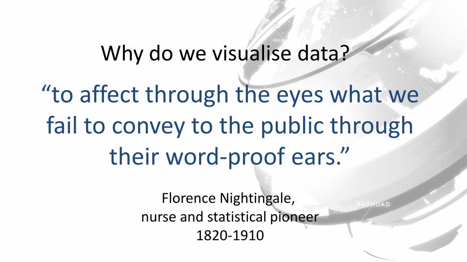
“to affect through the eyes what we fail to convey to the public through
their word-proof ears.”
Florence Nightingale, nurse and statistical pioneer
1820-1910
Why do we visualise data?

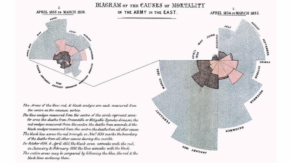
Crimean War 1853-56
Florence Nightingale

What can we learn?
• Be relevant – know your audience
• Tell the story
• Visually interesting
• Data = people
• Be relevant – on a personal level
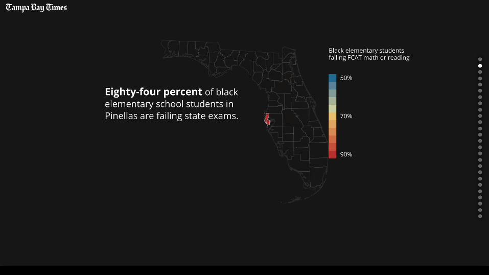
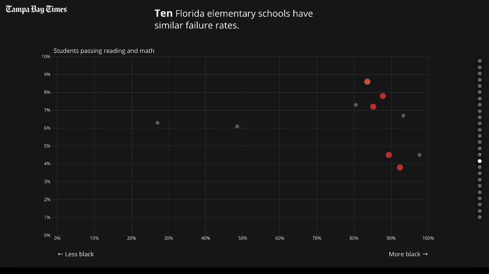
BEING RELEVANT:DEEPER UNDERSTANDING OF BIG STORIES

24 June 2016

Brexit – the data story

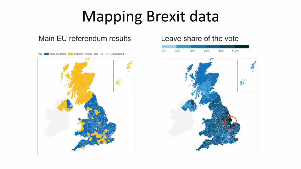
Mapping Brexit data

Mapping Brexit data

Washington Post

Maps are great because…
• They are familiar, users feel comfortable
• This means they can focus on the information
• Easy to spot patterns
• Bring in other data and knowledge
• “What is happening in my area?”

But not always
TELL THE STORYDON’T MAKE THE USER DO ALL THE WORK!


GATHERING YOUR OWN DATA

BBC World Service data project
• Jihadist attacks sadly reported every day but…
• How many people were killed?
• Who were they?
• Where?
• Who was responsible?
• Method used


First designs

Languages
• Arabic
• Persian
• Urdu
• Hausa
• Pashto

‘WHERE DO I FIT IN?’MAKING DATA PERSONAL

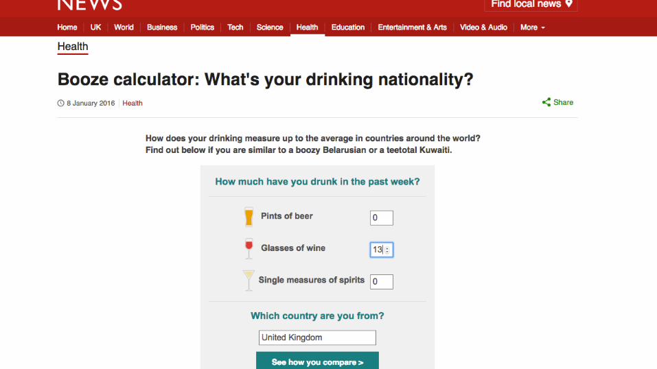
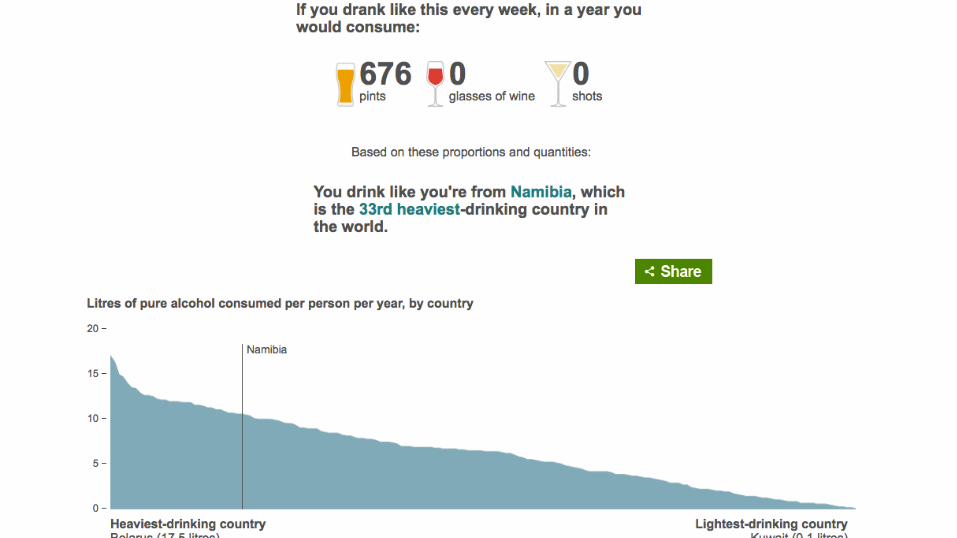
Personal relevance calculators
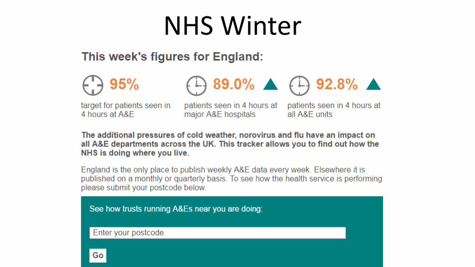
NHS Winter


Will a robot take your job?

Engaging the audience


In summary• Relevance – why audience interested?
• Story telling – lead through the data or show how to explore
• Visually interesting – clear, engaging, playful if appropriate
• Data = people
• Show users where they fit in
Thank you!
@bbcnewsgraphics
@chrisjeavans