Visual Storage - mcad-mfa.com€¦ · 07/12/2012 · Her illustrations are dramatic, and beautiful,...
51
Minneapolis College of Art and Design Visual Storage Master of Fine Arts 2013 Thesis Exhibition
Transcript of Visual Storage - mcad-mfa.com€¦ · 07/12/2012 · Her illustrations are dramatic, and beautiful,...
Minneapolis College of Art and Design
Visual StorageMaster of Fine Arts 2013 Thesis Exhibition
Min
neap
olis C
olleg
e of A
rt and
Desig
n V
isual S
torag
e Master o
f Fine A
rts 2013 Th
esis Exh
ibitio
n
2501 Stevens AvenueMinneapolis, MN 55404612.874.3700mcad.edu
2501 Stevens AvenueMinneapolis, MN 55404mcad.edu
Icon, Logo and Address Lock-up
Visual StorageMaster of Fine Arts 2013 Thesis Exhibition
About the Minneapolis College of Art and Design
Recognized nationally and internationally for its innovative and interdisciplinary approaches to visual arts education, the Minneapolis College of Art and Design is home to more than 700 students and offers professional certificates, bachelor of fine arts and bachelor of science degrees, and graduate degrees.
Founded in 1886, MCAD was one of the first colleges to offer the BFA degree. The college has earned the highest accreditation possible and has the highest four-year graduation rate of all Midwestern visual arts colleges. And college facilities contain the latest in technology, with multiple studios and labs open 24 hours a day.
Master of Fine Arts at MCAD
The Minneapolis College of Art and Design’s MFA program is a community of makers, thinkers, theorists, researchers, and creative professionals. Our student body is diverse with a robust international presence. The subject of student inquiry responds to social, cultural, and professional needs as well as to entrepreneurial opportunities, stretching across art and design practices. Students in the program pursue creative work in a mentor based, interdisciplinary environment that includes graphic design, printmaking, paper & book arts, painting, photography, illustration, sculpture, drawing, animation, interactive media, filmmaking, comic arts, furniture design, and installation art.
For more information, contact or visit the following sites:
Admissions
mcad.edu/academic-programs/graduate-degrees
Official Program Site
mcad-mfa.com
Participant Portfolios
mcad-mfa.tumblr.com

Min
neap
olis C
olleg
e of A
rt and
Desig
n // M
aster of Fin
e Arts 2013
Visu
al Sto
rage // m
cad.ed
u03
02
Contents
02 InTroDuCTIon
04 ADAM SETAlA08 AnDrEw wIllIAM AllISon12 ArphAThIp pADhAnArATh16 AShEly pEIFEr20 BEATA FlEISChMAnn24 DAnI wAgnEr28 huAn wEn32 JAMMo K. Xu36 JASIo STEFAnSKI40 JEongho pArK44 John KESTon48 KATE ThoMAS52 KEllI nElSon56 KylE roBErT hArABEDIAn60 lAurEn FAITh wIlCoX64 MErVy CoDIzAl puEBlo68 nICholAS KoVATCh72 pEng wu76 pIng JI80 ShAnnon ESTlunD84 ShAnnon ryAn McCArThy88 STEVEn AlEXAnDEr lISTwon92 zIwEI lIu
96 CrEDITS
welcome from the Director –
The following pages feature the creative work of 23 talented artists and designers that have completed the Master of Fine Arts degree program in Visual Studies at the Minneapolis College of Art and Design. These images represent the culmination of two years of rigorous studio practice, individual mentorship, research, critical thinking and intense discourse. The interdisciplinary mix of the students and the high level of talent present in this group is exciting, relevant and accomplished. Their work vividly demonstrates the lively and dynamic interaction of a diverse group of students, ideas and creativity that has made this a very special graduating class.
The faculty and staff are proud of these students and are honored to have contributed significantly to their education. we wish them all great success and look forward to following their future careers.
Tom DeBiaso
professor DirectorMaster of Fine Artsgraduate program

Min
neap
olis C
olleg
e of A
rt and
Desig
n // M
aster of Fin
e Arts 2013
Visu
al Sto
rage // m
cad.ed
u05
04
AdamSetalaIllustrationMinneapolis, Minnesota
[email protected] adamsetala.com
I was a shy suburban kid in the late 1980’s, and early 1990’s, when comic books became my escape. I was always fascinated by superhero comics such as X-MEN, due to the over inflatedness and audacity they seemed to embrace. I also marveled at the cinematic, and kinetic way in which these stories were visualized, and wanted to become the person responsible for making them. Ultimately, I wanted to be the storyteller.
Adam Setala
The Way I treat Others, 20125” x 8” Ink
Min
neap
olis C
olleg
e of A
rt and
Desig
n // M
aster of Fin
e Arts 2013
Visu
al Sto
rage // m
cad.ed
u07
06
Yet I didn’t become a comic artist. As my skills as an illustrator evolved, and as I began to look at the field of illustration in general, I felt more closely bonded with editorial work. The use of visual metaphors, the communicative skills needed to be effective, the problem solving, and the constant geyser of new topics to explore were all things that meant a lot to me, and in the end turned me toward the dark side that is editorial illustration.
For example, Tove Jansson’s Moominpappa books are some of my favorites. Her illustrations are dramatic, and beautiful, and have the ability to illicit real emotion through effective communication. This is what I strive to accomplish through my own work, emotion through communication, and communication through emotion.
The Dripping Branch, 20138.5” x 6.5” Ink
Dead Pony, 20138.5” x 6.5” Ink
Saint Christopher, 20129” x 12” Acrylic Paint
Untitled, 20125” x 3.5” Acrylic Paint
Painting of Boy8” x 8” Acrylic Paint
ThIS IS whAT I STrIVE To ACCoMplISh Through My own worK. EMoTIon Through CoMMunICATIon, AnD CoMMunICATIon Through EMoTIon.

Min
neap
olis C
olleg
e of A
rt and
Desig
n // M
aster of Fin
e Arts 2013
Visu
al Sto
rage // m
cad.ed
u09
08 paintingpittsurgh, pennsylvania
Andrew William Allison
[email protected] awallison.tumblr.com
I create collections of what I call ‘visual poems,’ which take the form of sculptural installations. Each arrangement combines provocative artifacts that imply events, emotions, memories or personal associations. As I work, I often set up certain shifting narrative challenges: “Can I make a piece that appears evil? “Can I make a piece that feels like it is a part of the house I grew up in?” Other questions arise from pure material curiosities, such as asking: “Can I make a piece out of only water and vinyl?”
Untitled, 201313” x 10” x 4” Acrylic and joint compound on cut coke bottle, found wood, mardi gras beads and wire.
I oFTEn unCoVEr rEoCCurrIng SyMBolIC ForMS whoSE ConnoTATIonS EVoKE CErTAIn plACES, pEoplE, or EVEnTS ThAT I hAVE EnCounTErED ThroughouT My lIFETIME.
Min
neap
olis C
olleg
e of A
rt and
Desig
n // M
aster of Fin
e Arts 2013
Visu
al Sto
rage // m
cad.ed
u11
10
Untitled, 20138” x 10” Acrylic on digital print
Curtain, 20139” x 10” Folded digital print
Griffins, 20137” x 8” x 6” Spray paint, acrylic, grout, cardboard, joint compound, cast plaster and found candy box
Palmtree, 20137.5’ x 3.5’ Acrylic on mdf
I often uncover reoccurring symbolic forms whose connotations evoke certain places, people, or events that I have encountered throughout my lifetime. Each association becomes a character that acts out certain ideas or narratives, like actors in a play.
EACh ArrAngEMEnT CoMBInES proVoCATIVE ArTIFACTS ThAT IMply EVEnTS, EMoTIonS, MEMorIES or pErSonAl ASSoCIATIonS.

Min
neap
olis C
olleg
e of A
rt and
Desig
n // M
aster of Fin
e Arts 2013
Visu
al Sto
rage // m
cad.ed
u13
12
Arphathippadhanarathgraphic DesignBangkok, Thailand
[email protected] eartharphathipblogspot.com
My intention is to convert aspects of abstract art into abstract graphic design and in doing so, represent the abstraction of sub-conscious thoughts as logical expressions. This gesture has become the essence of my project “Expressensory” (from expressive + sensory). It is important to my graphic design goals, as I would like to improve my ability to use my inner self, thoughts and senses, yet also to communicate with other people through my work, and ultimately to create something that is honest, beautiful, meaningful and thoughtful.
Arphathip Padhanarath

Min
neap
olis C
olleg
e of A
rt and
Desig
n // M
aster of Fin
e Arts 2013
Visu
al Sto
rage // m
cad.ed
u15
14
I express my concepts using design, drawing, illustration, mixed media, collage, typography, and certain programs of computer-based graphics. I use bold colors, display types, and compositions in wildly expressive styles. Postmodern eclecticism also inspires me in its use of vivid colors and forms from popular culture, such as those found in the works of Gunther Kieser, David Carson, Paul Sher, and Robert Rauschenberg, my favorite designers. In addition, looking at fashion in particular has always inspired me: looking at fashion window displays makes me feel the same sensations as looking at the art work in the museums or galleries.
My work is about embracing the irrational and nonsensical and make it appear comprehensible through the logic of the subconscious. I try different experiments with materials, such as using food colors (powder type) on toilet paper. I believe that with every experiment I have found a new set of purposes and reasons to support my notion of ‘the new logic’ and my job is to compose this logic in such a way that is obvious and understandable to my audience.
hIghlIghT SEgMEnTS In your SuMMAry or quoTES you FInD CoMpEllIng
Expressensory, 201236” x 46” Mixed-media (food colors, stencils, rub-down letters), printed on canvas. 1th edition.
Min
neap
olis C
olleg
e of A
rt and
Desig
n // M
aster of Fin
e Arts 2013
Visu
al Sto
rage // m
cad.ed
u17
16
AshelypeiferpaintingDallas, Texas
[email protected] ashelypeifer.com
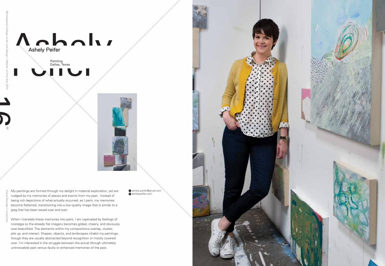
My paintings are formed through my delight in material exploration, yet are nudged by my memories of places and events from my past. Instead of being rich depictions of what actually occurred, as I paint, my memories become flattened, transitioning into a low-quality image that is similar to a jpeg that has been saved over and over.
When I translate these memories into paint, I am captivated by feelings of nostalgia so the already flat imagery becomes gilded, cheery, and obviously over-beautified. The elements within my compositions overlap, cluster, pile up, and interact. Shapes, objects, and landscapes inhabit my paintings, though they are usually abstracted beyond recognition or mostly covered over. I’m interested in the struggle between the actual (though ultimately unknowable) past versus faulty or enhanced memories of the past.
Ashely Peifer

Min
neap
olis C
olleg
e of A
rt and
Desig
n // M
aster of Fin
e Arts 2013
Visu
al Sto
rage // m
cad.ed
u19
18
Laffy Taffy, 201330” x 30” Mixed media on panel
Campout, 201330” x 30” Mixed media on panel
Sweet Sweet Fantasy Baby, 20138” x 8” Mixed media on panel
Hello Hello, 201356” x 56” Mixed media on panel
Trapper Keeper, 201330” x 30” Mixed media on panel
Changing Everyday, 20138” x 8” Mixed media on panel
“ThErE ArE ThIngS ThAT worDS Don’T FAThoM. A STorE oF unproCESSED, unnAMABlE FEElIngS rEMAInS BEyonD lAnguAgE. gooD pICTurES ADDrESS ThIS rEAlM.”- pEr KIrKEBy
ShApES, oBJECTS, AnD lAnDSCApES InhABIT My pAInTIngS, Though ThEy ArE uSuAlly ABSTrACTED BEyonD rECognITIon or MoSTly CoVErED oVEr.

Min
neap
olis C
olleg
e of A
rt and
Desig
n // M
aster of Fin
e Arts 2013
Visu
al Sto
rage // m
cad.ed
u21
20
Furniture DesignMinneapolis, Minnesota
Beata Fleischmann
[email protected] haptic-lab.com
Within my practice I have been focusing on the supposed ‘purpose’ of objects that make up our environment. This purpose I define as the point at which the use of the object and the function of an object intersect. Although use and function are interrelated, they are not necessarily the same thing.
Juhani Pallasmaa stated that it is the tactile sense that connects us with time and tradition that make up the history of purpose. Reliance on sight within design creates a distance between the maker and the user and the object, therefore I want to focus more on the haptic aspects of design to bridge those gaps. One way I express this is by making use of a material
Jassie, 20122’6” x 2’6” x 3’ Felt, birch, steel
This piece is part of a window exhibition entitled Made Here. This display is part of an effort to revitalize Hennepin Avenue in downtown Minneapolis.
“I want to alIgn myself wIth thIs conversatIon In that desIgn and craft should not be alIenated from each other.relIance on sIght wIthIn desIgn creates a dIstance between the maker and the user and the object, therefore I want to focus more on the haptIc aspects of desIgn to brIdge that gap.”

Min
neap
olis C
olleg
e of A
rt and
Desig
n // M
aster of Fin
e Arts 2013
Visu
al Sto
rage // m
cad.ed
u23
22
that lends itself to a tactile experience, such as the textile wool felt. Felt also lends itself to the idea of time, in terms of its purposes as a traditional handcrafted material. I strive for a tactile approach both in my process and in my final piece. As much as I will use the computer to work designs out digitally or create 3d models, I never let that process take the place of physically designing.
The awareness of craft came to me as I was growing up in South Africa. The mixture between Western and African cultures, whether positive or negative, is always present. I think that by embracing both in terms of design, a society can be inclusive rather than exclusive. As I move onward, I want to create pieces that show a link between craft and design by use of materiality and method. Also, I will use materials that evoke a tactile experience while at the same time elicit a story. And so, these objects will be functional but also useful and therefore have a purpose.
Nest, 20123’ x 2’6” x 2’6” Felt, carbon fiber, steel
Hopscotch rug, 2013varies Felt, shearling, magnets
This is a modular rug system that can change shape and grow depending on the space it is needed for.
Ambit, 20132’6” x 3’ x 6’ Felt, birch, steel
This lounge chair was a collaboration between my mentor, George Mahoney, and I. It was selected for an exhibition in the Burnet Gallery in Minneapolis.
Flux, 201210” x 4’ x 18” Birch, walnut, felt
Juhani Pallasmaa stated that it is the tactile sense that connects us with time and tradition that make uP the history of PurPose.
Min
neap
olis C
olleg
e of A
rt and
Desig
n // M
aster of Fin
e Arts 2013
Visu
al Sto
rage // m
cad.ed
u25
24
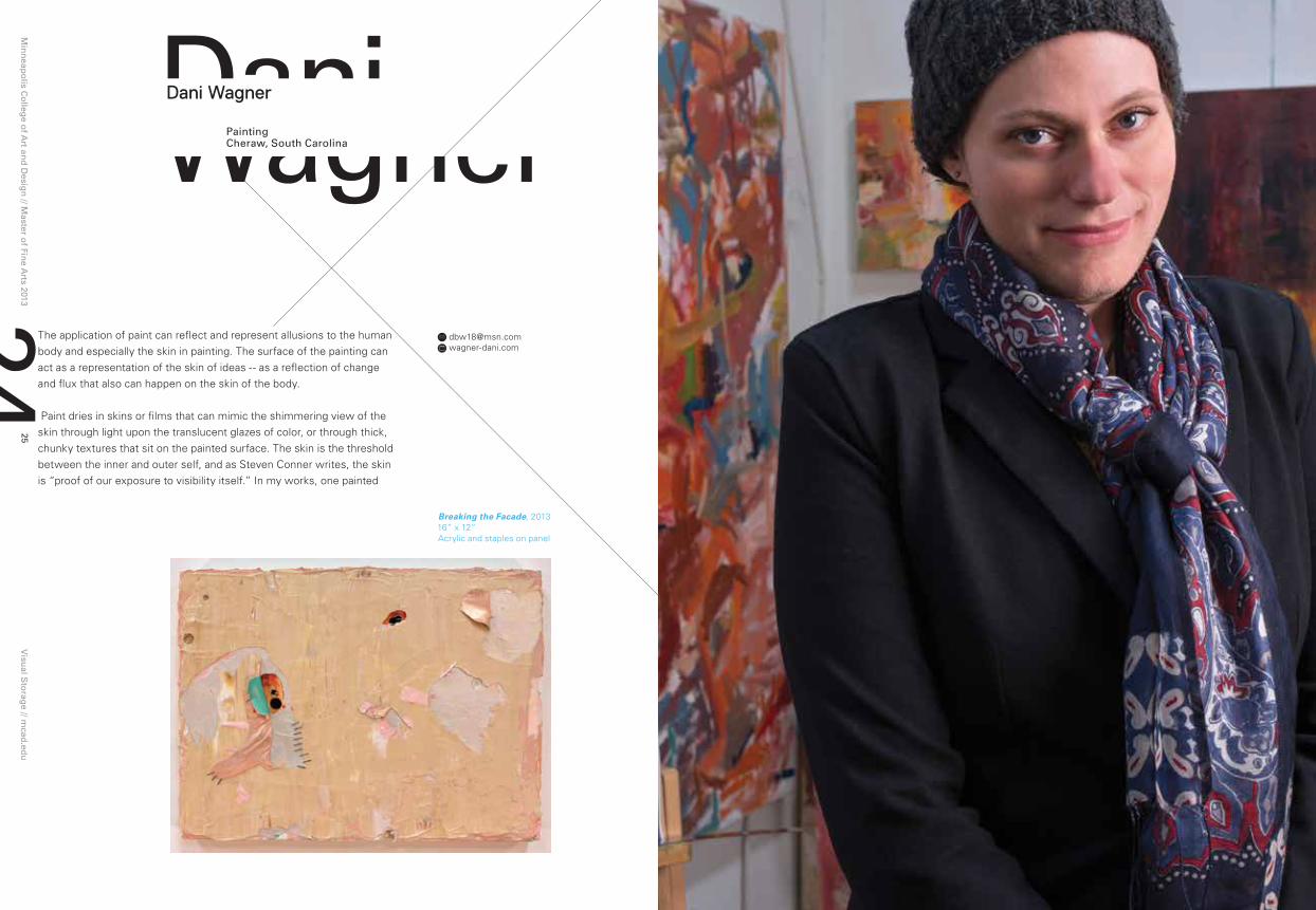
DaniwagnerpaintingCheraw, South Carolina
Dani Wagner
[email protected] wagner-dani.com
The application of paint can reflect and represent allusions to the human body and especially the skin in painting. The surface of the painting can act as a representation of the skin of ideas -- as a reflection of change and flux that also can happen on the skin of the body.
Paint dries in skins or films that can mimic the shimmering view of the skin through light upon the translucent glazes of color, or through thick, chunky textures that sit on the painted surface. The skin is the threshold between the inner and outer self, and as Steven Conner writes, the skin is “proof of our exposure to visibility itself.” In my works, one painted
Breaking the Facade, 201316” x 12” Acrylic and staples on panel
Min
neap
olis C
olleg
e of A
rt and
Desig
n // M
aster of Fin
e Arts 2013
Visu
al Sto
rage // m
cad.ed
u27
26
surface is erased by the next, eclipsing or destroying the previous attempt to capture this glimmering surface all in an effort to transcribe the lush vision of the “body” of a painting. The rebirth of a painting emerging from the pentimento of erased and repainted layers can also reflect a continual process of assessment and reassessment of one’s identity and life, and the uncertainty regarding a changing body and identity. Currently my works have undergone a drastic change from being traditionally formatted, rectilinear paintings, to paintings that are cut into, shredded, torn, sewn, and nailed back together. I incorporate elements such as screws, nails, staples, and even
hair. It is an attempt to move the thought of what a painting is supposed to be to a new place, which can be as challenging and complex as the bodies changing form through voluntary surgical force. As a transgender woman, my works are deeply tied to my blossoming identity, my thoughts about the gender spectrum and gender identity, and in particular, the body in a constant state of flux, and the feelings that occur when one makes the ultimate decision to transgress these rigid boundaries.
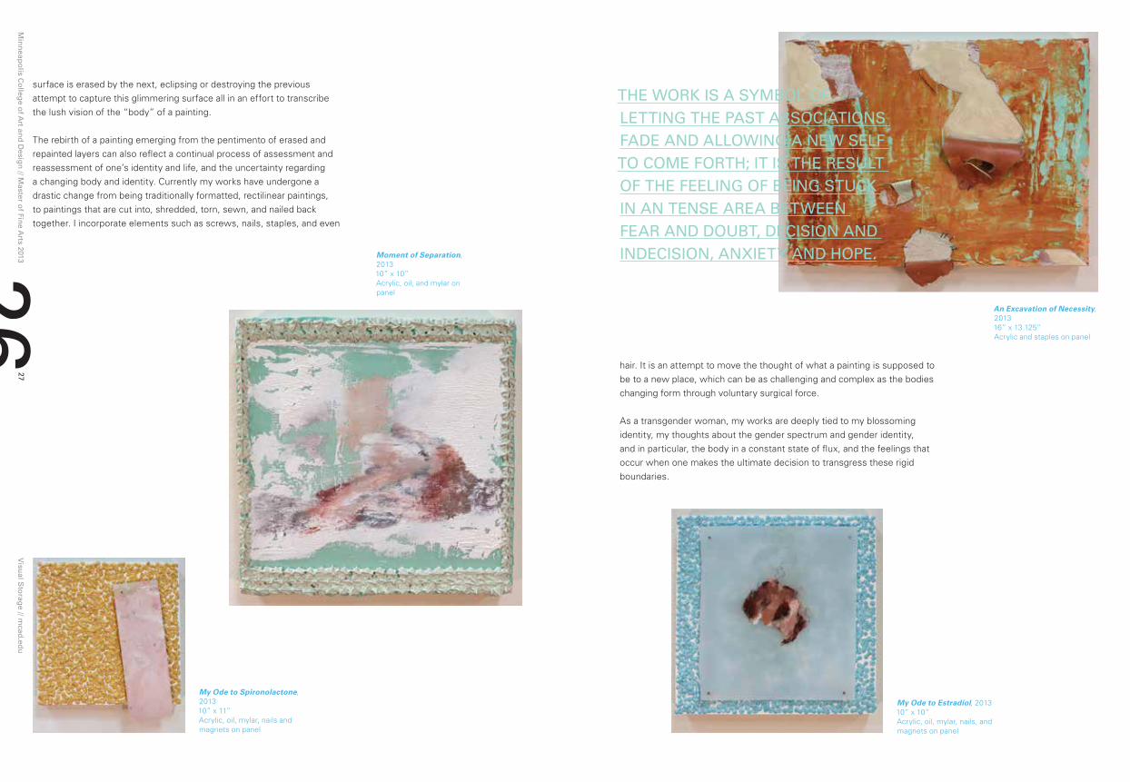
ThE worK IS A SyMBol oF lETTIng ThE pAST ASSoCIATIonS FADE AnD AllowIng A nEw SElF To CoME ForTh; IT IS ThE rESulT oF ThE FEElIng oF BEIng STuCK In An TEnSE ArEA BETwEEn FEAr AnD DouBT, DECISIon AnD InDECISIon, AnXIETy AnD hopE.
An Excavation of Necessity, 201316” x 13.125” Acrylic and staples on panel
Moment of Separation, 201310” x 10” Acrylic, oil, and mylar on panel
My Ode to Estradiol, 201310” x 10” Acrylic, oil, mylar, nails, and magnets on panel
My Ode to Spironolactone, 201310” x 11” Acrylic, oil, mylar, nails and magnets on panel
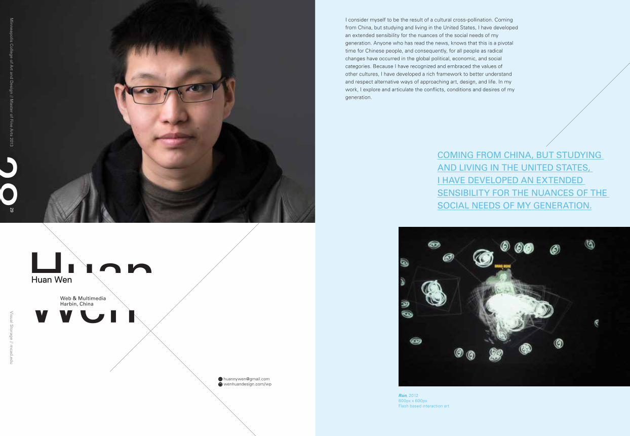
huanwenweb & Multimediaharbin, China
Huan Wen
[email protected] wenhuandesign.com/wp
Min
neap
olis C
olleg
e of A
rt and
Desig
n // M
aster of Fin
e Arts 2013
Visu
al Sto
rage // m
cad.ed
u29
28
Run, 2012800px x 600px Flash based interaction art
I consider myself to be the result of a cultural cross-pollination. Coming from China, but studying and living in the United States, I have developed an extended sensibility for the nuances of the social needs of my generation. Anyone who has read the news, knows that this is a pivotal time for Chinese people, and consequently, for all people as radical changes have occurred in the global political, economic, and social categories. Because I have recognized and embraced the values of other cultures, I have developed a rich framework to better understand and respect alternative ways of approaching art, design, and life. In my work, I explore and articulate the conflicts, conditions and desires of my generation.
CoMIng FroM ChInA, BuT STuDyIng AnD lIVIng In ThE unITED STATES, I hAVE DEVElopED An EXTEnDED SEnSIBIlITy For ThE nuAnCES oF ThE SoCIAl nEEDS oF My gEnErATIon.

Min
neap
olis C
olleg
e of A
rt and
Desig
n // M
aster of Fin
e Arts 2013
Visu
al Sto
rage // m
cad.ed
u31
30
Mood barometer, 201322” x 17” 2D
Moodswing UI, 201338” x 26”2D
Moodswing, 20139” x 13”Mobile app poster
Weary Idealist, 2012800px x 600pxFlash based interaction art
BECAuSE I hAVE rECognIzED AnD EMBrACED ThE VAluES oF oThEr CulTurES, I hAVE DEVElopED A rICh FrAMEworK To BETTEr unDErSTAnD AnD rESpECT AlTErnATIVE wAyS oF ApproAChIng ArT, DESIgn, AnD lIFE.
Min
neap
olis C
olleg
e of A
rt and
Desig
n // M
aster of Fin
e Arts 2013
Visu
al Sto
rage // m
cad.ed
u33
32
JammoXuVisual Storytelling
Chengdu, China
Jammo K. Xu
[email protected] jammo-xu.com“wE wAlK Through ourSElVES,
MEETIng roBBErS, ghoSTS, gIAnTS, olD MEn, young MEn, wIVES, wIDowS, BroThErS-In-loVE. BuT AlwAyS MEETIng ourSElVES.” —— JAMES JoyCE, porTrAIT oF ThE ArTIST AS A young MAn.
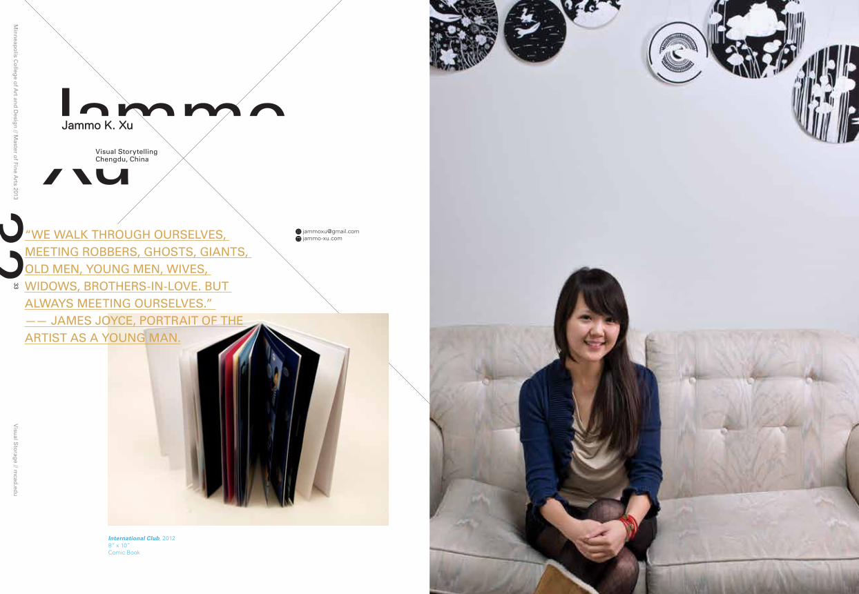
International Club, 20128” x 10” Comic Book

Min
neap
olis C
olleg
e of A
rt and
Desig
n // M
aster of Fin
e Arts 2013
Visu
al Sto
rage // m
cad.ed
u35
34
Before I came to study art at the Minneapolis College of Art and Design, I studied animation at the Communication University of China. I developed experience in animation, which includes movement principles, scene design, character design and animation. Additionally, I am skilled in the process of video production, including creating scripts, storyboarding, and editing, and have mastered digital tools. Moreover, I spent an expansive amount of time reading, writing, traveling, observing, and recording to enrich my experiences as well as broaden my horizons.
But I began to “meet myself” as a student of the Master of Fine Arts program at MCAD, where I experienced more opportunities to see and critique work from other art fields such as illustration, painting, graphic design, public art, sound art and sculpture. Some art forms drew me to study more and explore different materials and mediums in order to find my preferred way of expressing my ideas.
One sentence from Paulo Coelho’s The Alchemist enlightened me: “Infatuated with images and words, people forgot the language of the universe.” I discovered that the most important thing for me is not the external material forms, but my original concepts. Thus, I now recognize that the skills which I have mastered are just the tools to provide me with broader processes and perspectives to tell my stories. I decided to stop only pursuing art forms and focused more on storytelling. I started to rethink the forms of traditional storytelling and began to explore interdisciplinary projects to conjoin the connections between traditional storytelling and visual art. Floating Islands, 2013
15 inches diameter(maximum) Digital Print / Installation
A Flash of Thought, 20121024 x 768 Motion Graphic
I now rECognIzE ThAT ThE SKIllS whICh I hAVE MASTErED ArE JuST ThE ToolS To proVIDE ME wITh BroADEr proCESSES AnD pErSpECTIVES To TEll My STorIES.
An Interview, 20126” x 6” Digital Print / Installation

Min
neap
olis C
olleg
e of A
rt and
Desig
n // M
aster of Fin
e Arts 2013
Visu
al Sto
rage // m
cad.ed
u37
36
JasioStefanskigraphic DesignBuffalo, new york
Jasio Stefanski
[email protected] functionfirm.com
I seek a field of discovery, one that requires inquiry as opposed to drawing conclusions. It is not so much a practice as it is a way of life, a way of approaching the world determined to translate its subtleties, exchanges, and tendencies on my own terms. I want to expose the essence of communication, attempting to provide avenues that we do not take often but find familiar. For that reason, my work relies on the familiarity that we share with typography, employing it for both its simplicity and vast complexity.
Color is equally important in that it transcends language. Its appeal and readability is universal -- a complex yet approachable language that attracts both children and adults, providing an evolving dialogue between forms and individuals. I am interested in using this universal language in hope of creating work that is accessible; proposing a visual language that revels in playful simplicity while maintaining a meaningful complexity.
Hiiii, 2013Paint/projection

Min
neap
olis C
olleg
e of A
rt and
Desig
n // M
aster of Fin
e Arts 2013
Visu
al Sto
rage // m
cad.ed
u39
38
Communication begins with a problem that needs to be solved. I use various processes in order to experiment with communication, often confined to specific forms or methodologies that impose given limitations; working digitally then with analog media, and finally arriving at a synthesis of both. My work has been about developing a holistic approach that utilizes a variety of media for both their limitations as well as their advantages. I learn through the products of these experiments, the failures and the relationships.
Co tam synku?, 201318” x 24” Print/digital
Untitled, 2013215px x 300px / 9” x 12” CSS3 / screen print
TRUE COLORS, 2011Digital
Fun Haus, 20129” x 14” Photo
Min
neap
olis C
olleg
e of A
rt and
Desig
n // M
aster of Fin
e Arts 2013
Visu
al Sto
rage // m
cad.ed
u41
40
Jeonghoparkgraphic Design
Seoul, South Korea
Jeongho Park
[email protected] jeonghopark.com
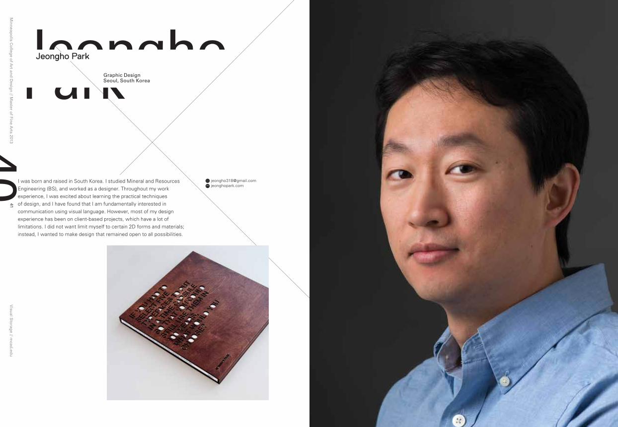
I was born and raised in South Korea. I studied Mineral and Resources Engineering (BS), and worked as a designer. Throughout my work experience, I was excited about learning the practical techniques of design, and I have found that I am fundamentally interested in communication using visual language. However, most of my design experience has been on client-based projects, which have a lot of limitations. I did not want limit myself to certain 2D forms and materials; instead, I wanted to make design that remained open to all possibilities.

Min
neap
olis C
olleg
e of A
rt and
Desig
n // M
aster of Fin
e Arts 2013
Visu
al Sto
rage // m
cad.ed
u43
42 Type Capsule, 201312” x 12” Information graphic book
Type Capsule is an infographic book about typefaces based on my personal survey. This publication consists of five sections: introduction, research detail, research result, typefaces, and email comments.
Types, 201330” x 30” x 0.75” Bubinga
Wood installation based on a personal survey result about typefaces, using laser engraving on wood.
TypE IS A SErIES oF lETTEr ForMS ThAT MAKES A MESSAgE VISIBlE. In ThIS SEnSE, TypE IS onE KInD oF VISuAl CoMMunICATIon.— Doug nEwSoM & JIM hAynES
After I joined the MFA program to study Graphic Design with a focus on Information Graphic at Minneapolis College of Art and Design, I explored information related to language and typefaces, while combining traditional two-dimensional informational graphics, three-dimensional installation, and animated or kinetic two-dimensional graphics.
While developing two projects that feature data about languages and typefaces, I have tried in my graduate studio work to create visual interpretations of information that maintain a balance between aesthetic form, communication complexity and visual simplicity. I plan to continue to work with the possibilities of hybrid media in my information design practice.

Min
neap
olis C
olleg
e of A
rt and
Desig
n // M
aster of Fin
e Arts 2013
Visu
al Sto
rage // m
cad.ed
u45
44
[email protected] johnkeston.com
As a musician and new media artist who uses sound and performance as the primary modalities within his practice, I perform regularly around the country and was featured at the Montreal Jazz Festival, at In/Out Festival in New York, and at the Northern Spark 2012 – as well as installations that have been shown at galleries in Minneapolis including the Burnet Gallery, and on Wired.com.
new MediaMinneapolis, Minnesota
John Keston
Post-prepared Piano by John Keston and Piotr Szyhalski, 201314” x 38” Inkjet print, tar paper, nails, twine, iPad, headphones
Post-prepared Piano by John Keston and Piotr Szyhalski is an exploration of non-musical processes as methods in constructing new sounds. By juxtaposing virtuosic piano performance with crudeness of hammering nearly 800 nails, a vast territory of what
may be considered artistic practice is outlined. Discovery of new pathways in that territory lies at the heart of this project. In it’s final form the work functions as a residue of an intricate process during which sound travels through multiple realms: the physical and non-physical, the high and low technologies, the sophisticated and proletarian materials. Visit http://ppp.johnkeston.com for audiovisual media and more information.

Min
neap
olis C
olleg
e of A
rt and
Desig
n // M
aster of Fin
e Arts 2013
Visu
al Sto
rage // m
cad.ed
u47
46
Through these various media explorations, my work explores the creation of mutable, audiovisual scores for improvised musical performances through the representation of personal perspectives, practical examples, proposed projects, and research. I believe that an audiovisual score can be a useful tool to connect improvising musicians to each other and their audiences through the insertion of a mediating audiovisual layer within the work.
These systems are used as a primary influential agent for an ensemble of improvisers, providing them with a context for a musical conversation. In contrast to traditional notation and graphic scores, audiovisual scores embrace the chaotic ambiguities of environmental influences revealing a context of the unpredictability of everyday events. Presenting an unpredictable audiovisual score parallels the indeterminate improvisation of the ensemble. It activates the last vestige of what remains immutable within traditional forms of the notation-driven performance inserting it into a mutable layer within the work.
Voice Lessons (video still), 201232” Touchscreen Interactive Video and Sound
Voice Lessons is an electronic, audio device that interrogates the popular myth that every musical instrument imitates the human voice. Touching the screen allows the participant to manipulate the visuals and vocalizations of the “voice teacher” as he recites vocal warm up exercises. The piece resides in the space between a musical instrument and voice lesson. Visit http://johnkeston.com/sound/voice-lessons/ for media and more details.
Duets for Synthesizer and _______ (video still), 201327” iMac Interactive Video and Sound
Duets for Synthesizer and _______, is an attempt to join in with arbitrary environments as if they were conscious participants in an improvisational ensemble. A simple analog synthesizer is used to produce accompaniment for the locations. Binaural recording is used to enhance the experience. Visit http://audiocookbook.org/sound_design/video-duet-for-synthesizer-and-the-washing/ for media and more information.
Does not apply, 2012PerformanceReal-time video broadcast
The DKO performance at the MCAD MFA open studio night on December 7, 2012 used video and sound broadcast into the space in real-time as an audiovisual score. The ensemble (Jon Davis, John Keston, and Graham O’brien) interpreted the score as they improvised. Visit http://audiocookbook.org/music/dko-at-frank-part-2-everyday-music-2012/ for video documentation.
prESEnTIng An unprEDICTABlE AuDIoVISuAl SCorE pArAllElS ThE InDETErMInATE IMproVISATIon oF ThE EnSEMBlE. IT ACTIVATES ThE lAST VESTIgE oF whAT rEMAInS IMMuTABlE wIThIn TrADITIonAl ForMS oF noTATIon DrIVEn pErForMAnCE InSErTIng IT InTo A MuTABlE lAyEr wIThIn ThE worK.
AuDIoVISuAl SCorES EMBrACE ThE ChAoTIC AMBIguITIES oF EnVIronMEnTAl InFluEnCES gIVIng ThE MuSIC ThE ConTEXT oF unprEDICTABlE EVEryDAy EVEnTS.

KateThomasprint paper Booklos Angeles, California
Kate Thomas
Min
neap
olis C
olleg
e of A
rt and
Desig
n // M
aster of Fin
e Arts 2013
Visu
al Sto
rage // m
cad.ed
u49
48
[email protected] helloimkate.com
My print and installation work reflects the discomfort I felt as an adolescent growing up in an ultra-conservative Christian environment. From a young age, I was taught that women were the inferior gender. The work of women was to bear children, and therefore we were overlooked for more meaningful work. Through scripture, I understood my status as an object to be owned by men: “For the man is not of the woman; but the woman of the man. Neither was the man created for the woman; but the woman for the man”” (Corinthians 11:8-9).
woMEn’S SAnITy wAS SAVED By BrIngIng ThESE hIDDEn EXpErIEnCES InTo ThE opEn, nAMIng ThEM, AnDTurnIng our rAgE InTo poSITIVE ACTIon To rEDuCE AnD hEAl VIolEnCE. - glorIA STEInEM

Min
neap
olis C
olleg
e of A
rt and
Desig
n // M
aster of Fin
e Arts 2013
Visu
al Sto
rage // m
cad.ed
u51
50
My artistic investigation into the past explores the influence of the oppressive, anti-female and often outrageous aspects of my religious experience, yet I wish to present my work without making generalized, controversial statements about the sanctity of religion as a whole. I am more interested in sharing my experience with the viewer as a means to draw attention to the often hidden and stifled lives of female adolescents in this contemporary subculture.
In the process of making this work, showing, and talking about it, I have realized the value in recognizing that we are not alone in these moments. The empowering effect of this realization has happened for me and I am eager to share it with others.
Untitled, 20131’ x 4’ Installation
I replicate elements of the biblical literature that was part of my childhood religious education and create an environment that suggest the subtle indoctrination made possible by written dogma. I want the viewer to pass through the space only barely sensing the presence of text on the walls. The subtle nature of the texts and its abstractions both highlights its power and subverts it.
Epilogue, 20139” x 36’ Accordian fold book on Japanese Paper
“Epilogue” serves as a chronological documentation of my process of becoming an ex-religious fanatic.
whIlE wE ArE prIMArIly ConCErnED wITh rECorDIng A hIDDEn hErITAgE, wE ArE AlSo InTErESTED In A rEInTErprETATIon oF ArT hISTory FroM our nEw AwArEnESS AS woMEn.onCE ConSCIouSnESSES hAVE BEEn rAISED, wE CAnnoT uSE lAnguAgE In ThE SAME wAy.- ElSA honIg FInE
Min
neap
olis C
olleg
e of A
rt and
Desig
n // M
aster of Fin
e Arts 2013
Visu
al Sto
rage // m
cad.ed
u53
52
paintingEast grand Forks, Minnesota
Kelli Nelson
kellijnelson.com kellijnelson.com
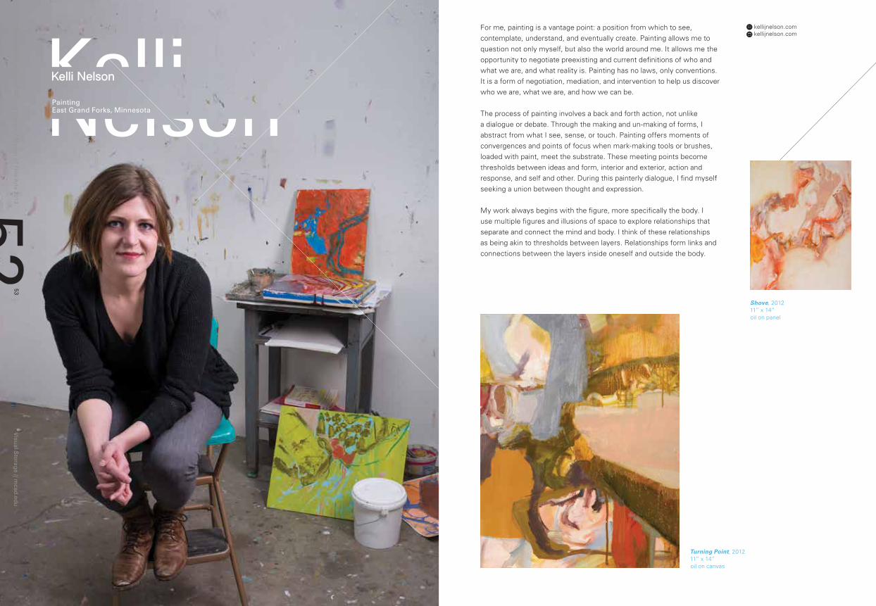
For me, painting is a vantage point: a position from which to see, contemplate, understand, and eventually create. Painting allows me to question not only myself, but also the world around me. It allows me the opportunity to negotiate preexisting and current definitions of who and what we are, and what reality is. Painting has no laws, only conventions. It is a form of negotiation, mediation, and intervention to help us discover who we are, what we are, and how we can be.
The process of painting involves a back and forth action, not unlike a dialogue or debate. Through the making and un-making of forms, I abstract from what I see, sense, or touch. Painting offers moments of convergences and points of focus when mark-making tools or brushes, loaded with paint, meet the substrate. These meeting points become thresholds between ideas and form, interior and exterior, action and response, and self and other. During this painterly dialogue, I find myself seeking a union between thought and expression. My work always begins with the figure, more specifically the body. I use multiple figures and illusions of space to explore relationships that separate and connect the mind and body. I think of these relationships as being akin to thresholds between layers. Relationships form links and connections between the layers inside oneself and outside the body.
Shove, 201211” x 14” oil on panel
Turning Point, 201211” x 14” oil on canvas
Min
neap
olis C
olleg
e of A
rt and
Desig
n // M
aster of Fin
e Arts 2013
Visu
al Sto
rage // m
cad.ed
u55
54
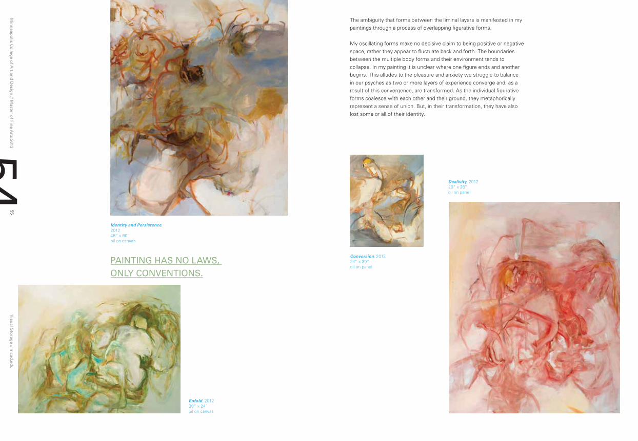
pAInTIng hAS no lAwS, only ConVEnTIonS.
The ambiguity that forms between the liminal layers is manifested in my paintings through a process of overlapping figurative forms.
My oscillating forms make no decisive claim to being positive or negative space, rather they appear to fluctuate back and forth. The boundaries between the multiple body forms and their environment tends to collapse. In my painting it is unclear where one figure ends and another begins. This alludes to the pleasure and anxiety we struggle to balance in our psyches as two or more layers of experience converge and, as a result of this convergence, are transformed. As the individual figurative forms coalesce with each other and their ground, they metaphorically represent a sense of union. But, in their transformation, they have also lost some or all of their identity.
Declivity, 201220” x 25” oil on panel
Conversion, 201224” x 30” oil on panel
Identity and Persistence, 201248” x 60” oil on canvas
Enfold, 201230” x 24” oil on canvas
Min
neap
olis C
olleg
e of A
rt and
Desig
n // M
aster of Fin
e Arts 2013
Visu
al Sto
rage // m
cad.ed
u57
56
KyleharabedianComic Art
Dearborn, Michigan
Kyle Robert Harabedian
[email protected] kyleharabedian.blogspot.com
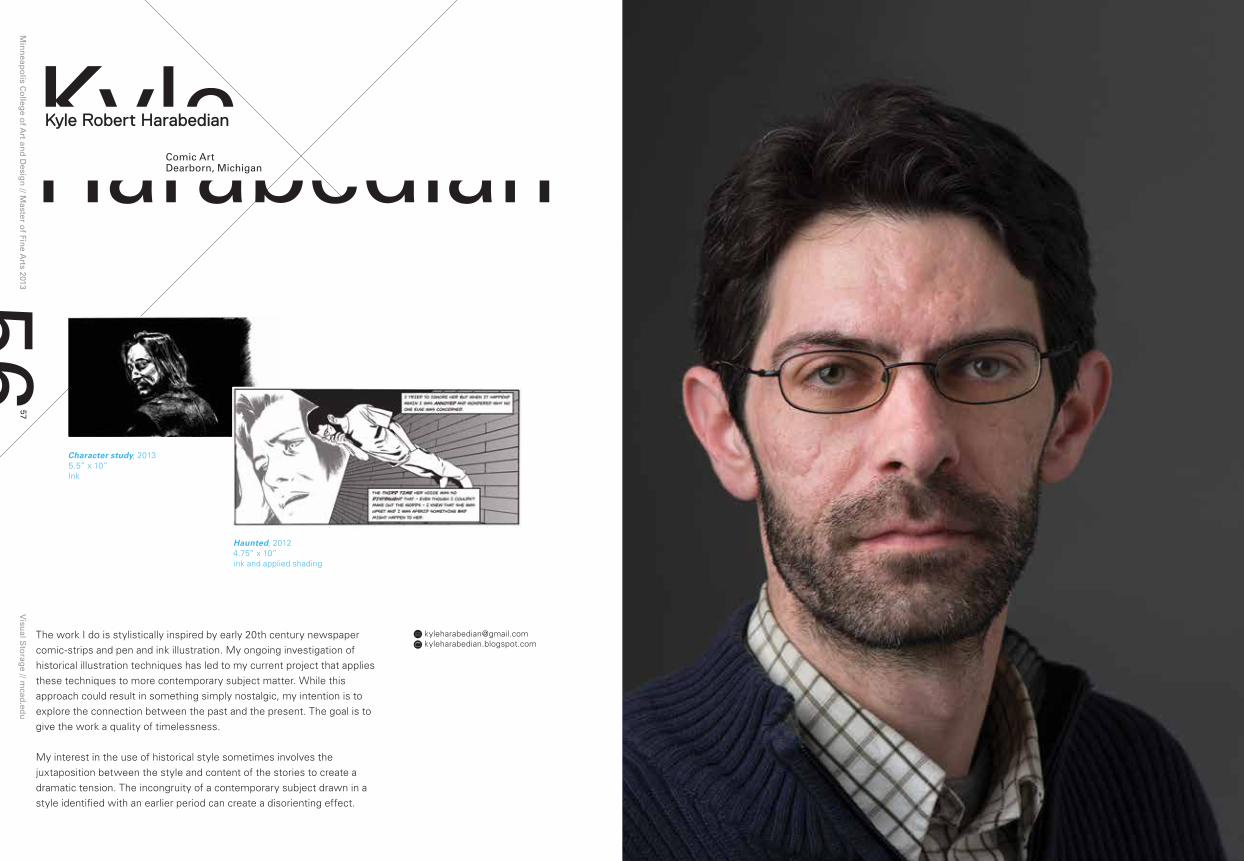
The work I do is stylistically inspired by early 20th century newspaper comic-strips and pen and ink illustration. My ongoing investigation of historical illustration techniques has led to my current project that applies these techniques to more contemporary subject matter. While this approach could result in something simply nostalgic, my intention is to explore the connection between the past and the present. The goal is to give the work a quality of timelessness.
My interest in the use of historical style sometimes involves the juxtaposition between the style and content of the stories to create a dramatic tension. The incongruity of a contemporary subject drawn in a style identified with an earlier period can create a disorienting effect.
Character study, 20135.5” x 10” Ink
Haunted, 20124.75” x 10” ink and applied shading
Min
neap
olis C
olleg
e of A
rt and
Desig
n // M
aster of Fin
e Arts 2013
Visu
al Sto
rage // m
cad.ed
u59
58
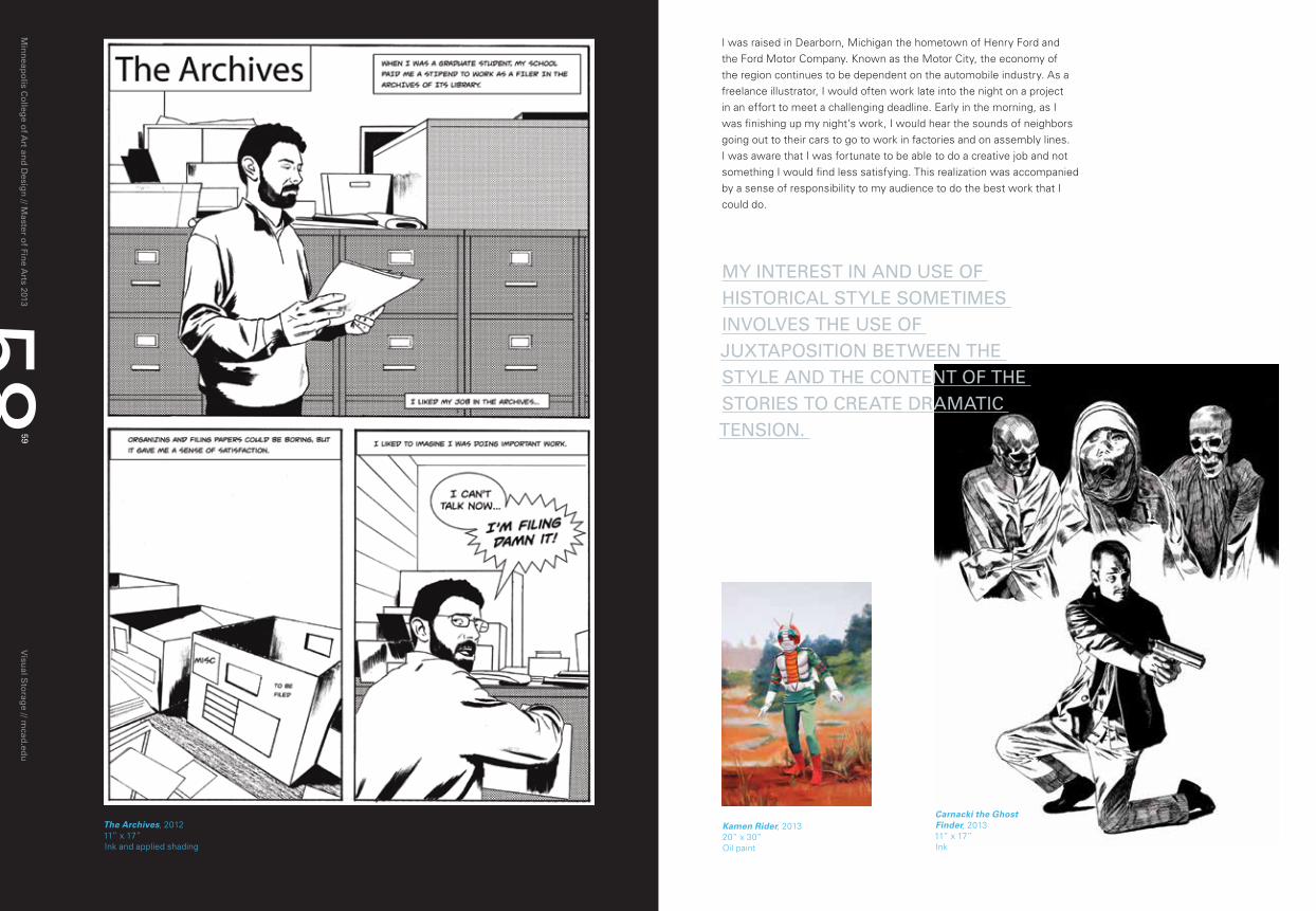
I was raised in Dearborn, Michigan the hometown of Henry Ford and the Ford Motor Company. Known as the Motor City, the economy of the region continues to be dependent on the automobile industry. As a freelance illustrator, I would often work late into the night on a project in an effort to meet a challenging deadline. Early in the morning, as I was finishing up my night’s work, I would hear the sounds of neighbors going out to their cars to go to work in factories and on assembly lines. I was aware that I was fortunate to be able to do a creative job and not something I would find less satisfying. This realization was accompanied by a sense of responsibility to my audience to do the best work that I could do.
Carnacki the Ghost Finder, 201311” x 17” Ink
Kamen Rider, 201320” x 30” Oil paint
My InTErEST In AnD uSE oF hISTorICAl STylE SoMETIMES InVolVES ThE uSE oF JuXTApoSITIon BETwEEn ThE STylE AnD ThE ConTEnT oF ThE STorIES To CrEATE DrAMATIC TEnSIon.
The Archives, 201211” x 17” Ink and applied shading
Min
neap
olis C
olleg
e of A
rt and
Desig
n // M
aster of Fin
e Arts 2013
Visu
al Sto
rage // m
cad.ed
u61
60
[email protected] lwilcox.tumblr.com
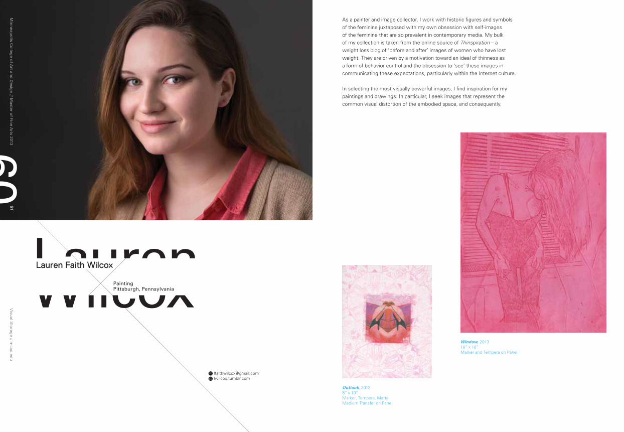
As a painter and image collector, I work with historic figures and symbols of the feminine juxtaposed with my own obsession with self-images of the feminine that are so prevalent in contemporary media. My bulk of my collection is taken from the online source of Thinspiration – a weight loss blog of ‘before and after’ images of women who have lost weight. They are driven by a motivation toward an ideal of thinness as a form of behavior control and the obsession to ‘see’ these images in communicating these expectations, particularly within the Internet culture.
In selecting the most visually powerful images, I find inspiration for my paintings and drawings. In particular, I seek images that represent the common visual distortion of the embodied space, and consequently,
Window, 201310” x 10” Marker and Tempera on Panel
laurenwilcoxpaintingpittsburgh, pennsylvania
Lauren Faith Wilcox
Outlook, 20138” x 10” Marker, Tempera, Matte Medium Transfer on Panel

Min
neap
olis C
olleg
e of A
rt and
Desig
n // M
aster of Fin
e Arts 2013
Visu
al Sto
rage // m
cad.ed
u63
62 Kaleidoscope 2, 201212” x 16” Spray Paint, Marker and Tempera on Panel
Display, 20136” x 6” Chalk and Oil on Paper
Venetians 2, 20135” x 6.5” False Etching (Oil on Paper)
the distortion of a sense of the embodied self. These images attempt to elevate the abject self through a critical gaze at the highly mediated images of discrete body zones of imperfection – outsized torsos, thighs, breasts -- to reify those imperfections as a “potentially perfect” body forms, if one can just lose the weight.
My work represents the grotesque, through an uncanny combination of the imaginary visual pleasure of the imperfect body part with the abject self. This simple ‘constructed’ feminine identity is a contrast to the dangerous conformity of mediated ideal body images represented on Thinspiration.
ShE SEEKS IMAgES ThAT ESpECIAlly rEprESEnT ThE CoMMon VISuAl DISTorTIon oF SpACE, AnD ThE DISTorTIon oF A SEnSE oF SElF, whICh ArE A pArT oF ThE DrIVE To DoCuMEnT ThE BoDy In ThIS FAShIon.

Min
neap
olis C
olleg
e of A
rt and
Desig
n // M
aster of Fin
e Arts 2013
Visu
al Sto
rage // m
cad.ed
u65
64
Mervypueblopublic ArtManila, philippines
[email protected] mpueblo.wix.com/webgallery
Through interacting and participating in community, the developing experience brings deeper insights that foster unlimited creativity. It is not the intellectual justification that I focus on in my practice, but rather my real concerns – not academics or art style, but the interest in existentialist condition. It is about the intersubjective real – the two sides of the coin, the gray areas, the un-quantifiable, or the un-definable relation between people in terms of love, hate, fear, and courage.
Being curious about the everyday is a way of seeing how mundane objects are intertwined with the social fabric or the system of society. I think of my practice as a lay ethnographer of the contemporary culture who questions and examines how our social values are shaped by the prevailing disciplinary forces, such as family, education, society, and government.
Mervy Codizal Pueblo
Project Stone Mediation, 2011Dimension variable Performance/Earthwork at Downtown Minneapolis
IT IS noT ThE InTEllECTuAl JuSTIFICATIon ThAT I FoCuS on In My prACTICE, BuT rAThEr My rEAl ConCErnS – noT ACADEMICS or ArT STylE, BuT ThE InTErEST In EXISTEnTIAlIST ConDITIon.
Min
neap
olis C
olleg
e of A
rt and
Desig
n // M
aster of Fin
e Arts 2013
Visu
al Sto
rage // m
cad.ed
u67
66
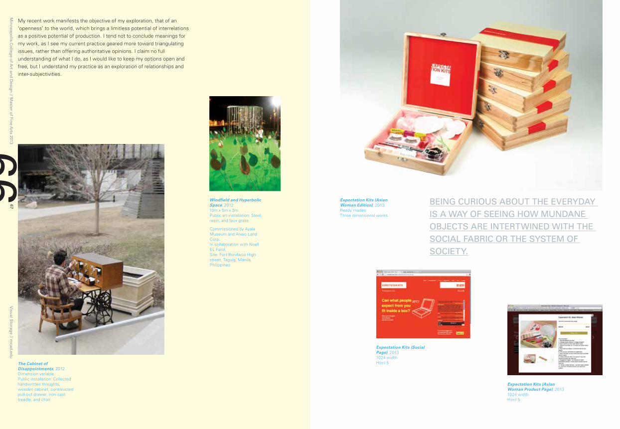
My recent work manifests the objective of my exploration, that of an ‘openness’ to the world, which brings a limitless potential of interrelations as a positive potential of production. I tend not to conclude meanings for my work, as I see my current practice geared more toward triangulating issues, rather than offering authoritative opinions. I claim no full understanding of what I do, as I would like to keep my options open and free, but I understand my practice as an exploration of relationships and inter-subjectivities.
Windfield and Hyperbolic Space, 201210m x 5m x 3m Public art installation: Steel, resin, and faux grass
Commissioned by Ayala Museum and Alveo Land Corp.In collaboration with Noell EL Farol.Site: Fort Bonifacio High street, Taguig, Manila, Philippines
The Cabinet of Disappointments, 2012Dimension variable Public installation: Collected handwritten thoughts, wooden cabinet, constructed pull-out drawer, iron-cast treadle, and chair
Expectation Kits (Asian Woman Edition), 2013Ready mades Three dimensional works
Expectation Kits (Asian Woman Product Page), 20131024 width Html 5
Expectation Kits (Social Page), 20131024 width Html 5
BEIng CurIouS ABouT ThE EVEryDAy IS A wAy oF SEEIng how MunDAnE oBJECTS ArE InTErTwInED wITh ThE SoCIAl FABrIC or ThE SySTEM oF SoCIETy.
Min
neap
olis C
olleg
e of A
rt and
Desig
n // M
aster of Fin
e Arts 2013
Visu
al Sto
rage // m
cad.ed
u69
68
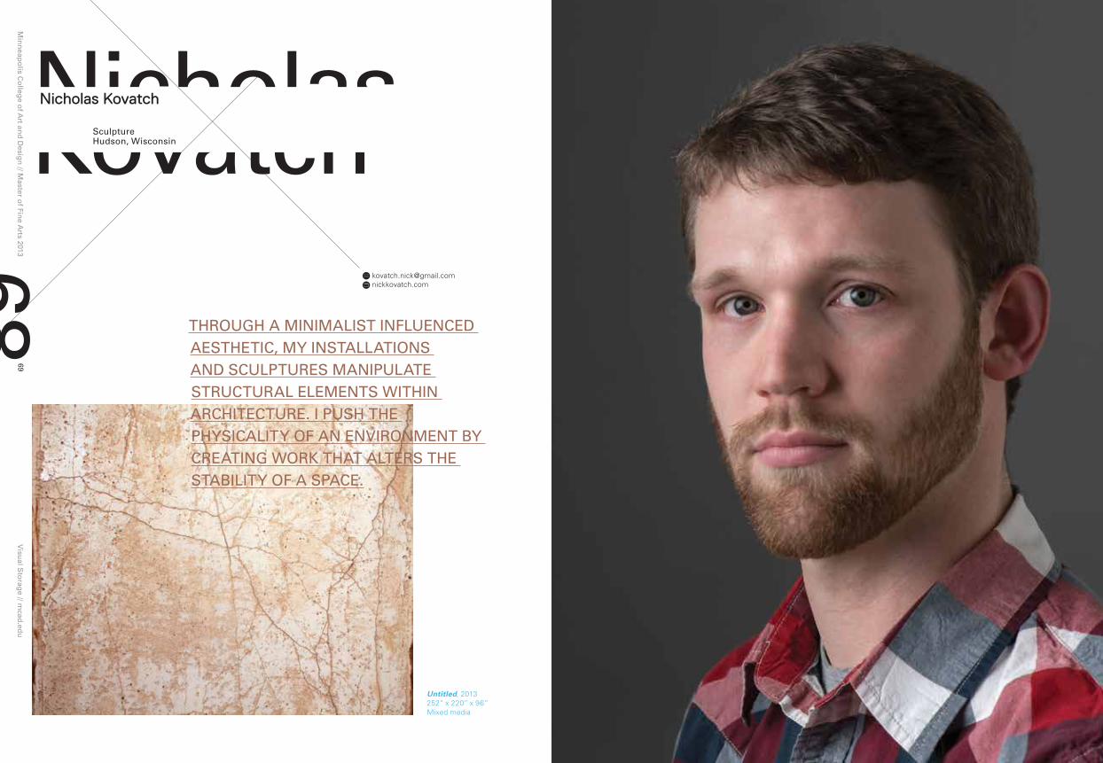
nicholasKovatchSculpturehudson, wisconsin
Nicholas Kovatch
[email protected] nickkovatch.com
Untitled, 2013252” x 220” x 96” Mixed media
Through A MInIMAlIST InFluEnCED AESThETIC, My InSTAllATIonS AnD SCulpTurES MAnIpulATE STruCTurAl ElEMEnTS wIThIn ArChITECTurE. I puSh ThE phySICAlITy oF An EnVIronMEnT By CrEATIng worK ThAT AlTErS ThE STABIlITy oF A SpACE.

Min
neap
olis C
olleg
e of A
rt and
Desig
n // M
aster of Fin
e Arts 2013
Visu
al Sto
rage // m
cad.ed
u71
70
Through a minimalist aesthetic, my installations and sculptures manipulate structural elements within an architecture pushed through the physicality of the environment creating work that alters the stability of a space.
The materials that are commonly used in my practice are resin, joint compound, sheetrock, wood, and fabric. These materials are utilized because they allow me to be flexible with the forms I create. Once the structure for a form is discovered, through experimentation and intuition, I use resin to solidify my architectural manipulation into a permanent shape.
In order to present uncanny elements within the structural elements of a space, I surreptitiously embed the sculpture within the existing space. The scale of my work varies, but each sculpture takes on the illusion of being a physical extension of the interior architecture.
Through these changes within a room, I want to create an encounter that provokes moments of recognition and contemplation about space. I strive to make an environment that is either empathetic or unsettling -- to push the boundaries of how people respond to an uncanny surrounding.
Vacant, 201160” x 48” x 22” Epoxy resin, joint compound, fabric, dry black pigment
Untitled, 2012120” x 207” x 3” Epoxy resin, joint compound, fabric

Min
neap
olis C
olleg
e of A
rt and
Desig
n // M
aster of Fin
e Arts 2013
Visu
al Sto
rage // m
cad.ed
u73
72
pengwuInteractive Designhefei, China
Peng Wu
I explore the difficult or confusing situations I personally encounter in my life – as an artist and a human being. I believe these specific situations can be bridges that connect human individuals. When people are packing their belongings for moving, they feel something. When people stand in front of a shelf in the grocery store, comparing products and trying to find what they really want, they feel something. I respond to these everyday mundane situations and mine these subtle feelings and desires as the subjects of my work.
I believe the outcomes of responding to these seemingly incidental quotidian situations can collectively depict the true image of the world we live in -- as well as my attitudes toward it. My response to such situations is meant to reveal and release the value I perceive outside the restrictions of capitalism and modernization. Primary for me in my work are the use of poetics and humor that act as subversive forces to the instrumental spectacles of contemporary society.
[email protected] peng-wu.net
Min
neap
olis C
olleg
e of A
rt and
Desig
n // M
aster of Fin
e Arts 2013
Visu
al Sto
rage // m
cad.ed
u75
74
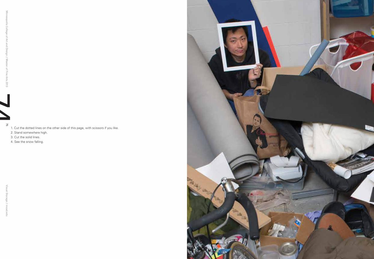
1. Cut the dotted lines on the other side of this page, with scissors if you like.2. Stand somewhere high.3. Cut the solid lines.4. See the snow falling.

Min
neap
olis C
olleg
e of A
rt and
Desig
n // M
aster of Fin
e Arts 2013
Visu
al Sto
rage // m
cad.ed
u77
76
pingJigraphic Designnanjing, China
Ping Ji
For me, design is a rational task. My approach is almost scientific, and this kind of work cannot succeed without extreme patience as well as attention to detail. Normally, I begin one project on paper, then digitize it through the use of various software. Starting this process on paper is important because it allows for less tangible meanings to layer themselves into the design, through the intuitive elements formed by haptic processes.
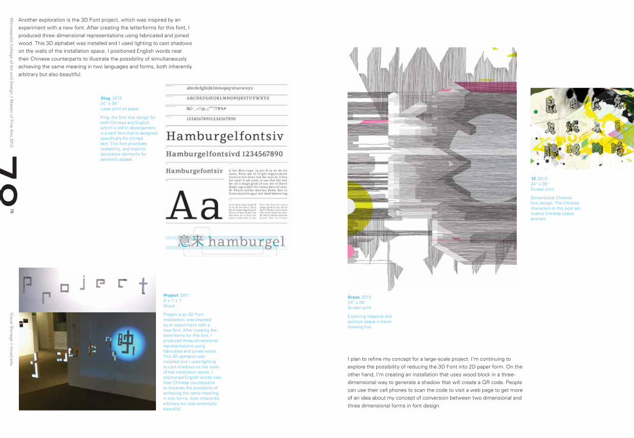
During my first year, I was in the process of creating a font design that can be used in both English and Chinese letterforms. The dilemma of using existing fonts for this purpose is that they do not achieve an equal level of congruence both formally or stylistically in both languages. Further, they often do not appear to be related when a Chinese letter in one font is placed next to an English letter from the same font. My font is a serif font that is designed specifically for printed text. This font prioritizes readability, and exploits decorative elements for aesthetic appeal.
[email protected] pinglab.info
It, 201324” x 36” Screen print
I FoCuS on ThE ConCEpT oF ConVErSIon BETwEEn Two DIMEnSIonAl AnD ThrEE DIMEnSIonAl ForM.
Min
neap
olis C
olleg
e of A
rt and
Desig
n // M
aster of Fin
e Arts 2013
Visu
al Sto
rage // m
cad.ed
u79
78
Another exploration is the 3D Font project, which was inspired by an experiment with a new font. After creating the letterforms for this font, I produced three-dimensional representations using fabricated and joined wood. This 3D alphabet was installed and I used lighting to cast shadows on the walls of the installation space. I positioned English words near their Chinese counterparts to illustrate the possibility of simultaneously achieving the same meaning in two languages and forms, both inherently arbitrary but also beautiful.
I plan to refine my concept for a large-scale project. I’m continuing to explore the possibility of reducing the 3D Font into 2D paper form. On the other hand, I’m creating an installation that uses wood block in a three-dimensional way to generate a shadow that will create a QR code. People can use their cell phones to scan the code to visit a web page to get more of an idea about my concept of conversion between two dimensional and three dimensional forms in font design.
Kraze, 201324” x 36” Screen print
Exploring negative and positive space in hand-drawing line.
12, 201324” x 36” Screen print
Dimensional Chinese font design. The Chinese characters in this post are twelve Chinese zodiac animals.
Project, 20114’ x 1’ x 1’Wood
Project is an 3D Font installation, was inspired by an experiment with a new font. After creating the letterforms for this font, I produced three-dimensional representations using fabricated and joined wood. This 3D alphabet was installed and I used lighting to cast shadows on the walls of the installation space. I positioned English words near their Chinese counterparts to illustrate the possibility of achieving the same meaning in two forms, both inherently arbitrary but also potentially beautiful.
Xing, 201224” x 36” Laser print on paper
Xing, the font that design for both Chinese and English, which is still in development, is a serif font that is designed specifically for printed text. This font prioritizes readability, and exploits decorative elements for aesthetic appeal.

Min
neap
olis C
olleg
e of A
rt and
Desig
n // M
aster of Fin
e Arts 2013
Visu
al Sto
rage // m
cad.ed
u81
80
[email protected] shannonestlund.com
A studio practice is the site where my search for meaning becomes physical. Through the act of making work, the intangible can be dragged into the physical world in order to investigate it more profoundly.
My encounters with specific places are distilled into their most essential insights and, through process and manipulation, these insights are dissected, rearranged, and experimented with, all toward the singular purpose of coming toward some deeper -- though perhaps complex and incomplete -- understanding.
painting and Sculpture Jacksonville, Florida
Shannon Estlund
Ultimatum, 201348” x 48” Oil on panel
Coquina Gates, 201248” x 48” Oil on panel
Through ThE ACT oF MAKIng worK, ThE InTAngIBlE CAn BE DrAggED InTo ThE phySICAl worlD In orDEr To InVESTIgATE IT MorE CloSEly.

Min
neap
olis C
olleg
e of A
rt and
Desig
n // M
aster of Fin
e Arts 2013
Visu
al Sto
rage // m
cad.ed
u83
82
Intervals, 201360” x 60” Oil on panel
Provocation, 201348” x 48” Oil on panel
Middle of Nowhere, 20129’ X 9’ X 16’ Steel, branches, wire, paint, chair
My paintings and sculptures focus on environments and the relationship between the individual and place. The ‘Middle of Nowhere’ is an outdoor installation that oscillates between interior and exterior, and between public and private space.
Similarly, my abstract painted landscapes invite explorations of spaces that are complicated to physically or visually navigate, yet with the potential for discovery. Through the use of extraordinary elements and spatial confusion they examine the indeterminate, unexplainable, and unknowable. My work is both a metaphorical “call to adventure,” and a means of subverting the more obvious value structures of capitalism, mass culture, and mechanized society by proposing the possibility of alternatives.

Min
neap
olis C
olleg
e of A
rt and
Desig
n // M
aster of Fin
e Arts 2013
Visu
al Sto
rage // m
cad.ed
u85
84
ShannonMcCarthygraphic Designunion City, pennsylvania
Shannon Ryan McCarthy
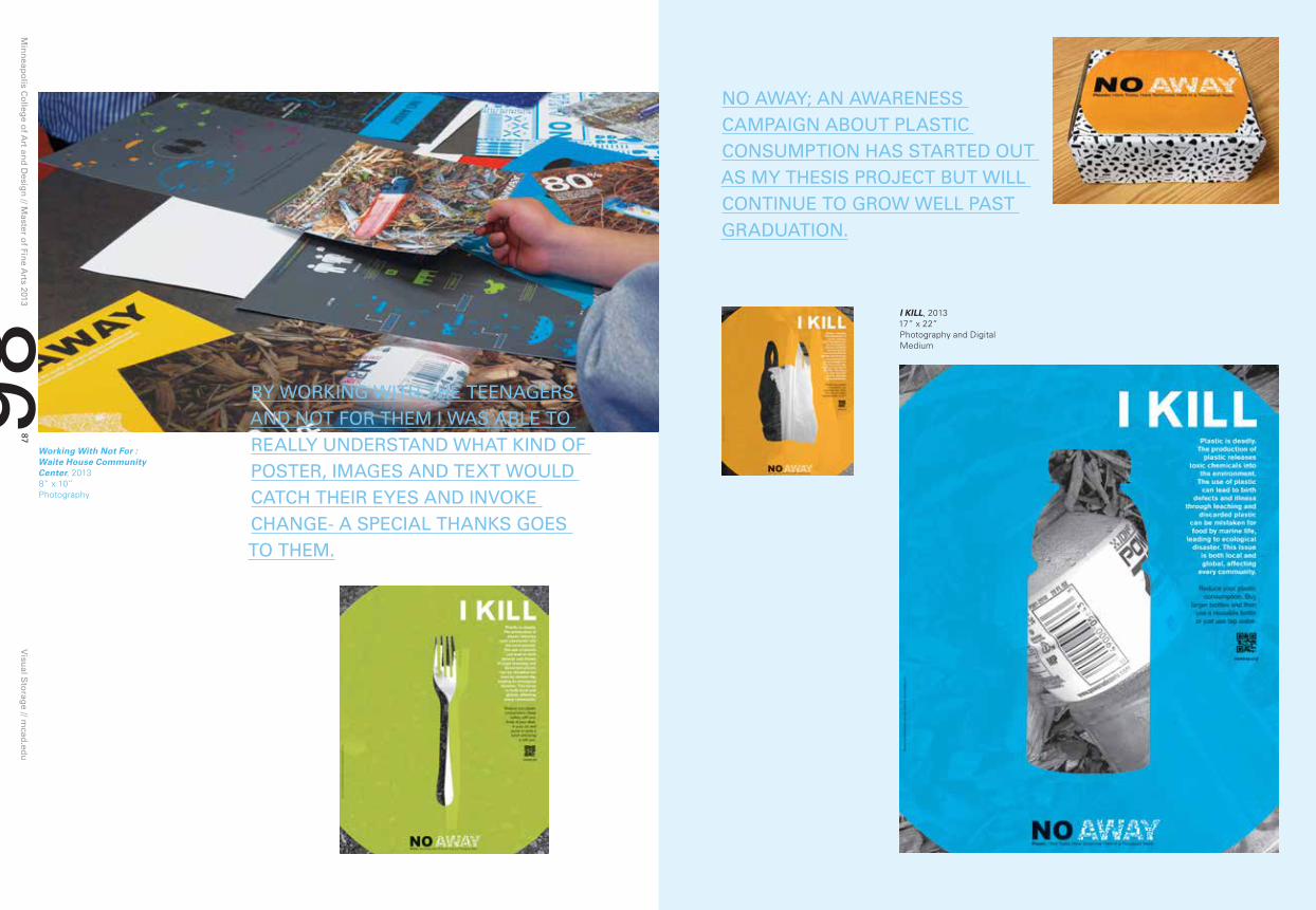
My design practice is largely focused on using both emerging and experimental technologies to address sustainability issues and to create social design. My work is focused on the harmful effects of disposable or single use plastics. NO AWAY; An Awareness Campaign about Plastic Consumption has implications for my growth and development in this area well past graduation.
I was able to work closely with my target audience -- teenagers (ages 14 to 17) with help from the Waite House Community Center in Minneapolis. By working with the teenagers and not for them, I was able to understand what would catch their attention and possibly provoke change.
I became particularly interested in the area of plastics when I came upon the work of Chris Jordon, a photographer based in Seattle, Washington. Jordan’s photographic series, Midway: Message from the Gyre, contains pictures of Albatross corpses with their stomachs filled with plastic bits, remnants of bottle caps and lighters. These birds were found near and on the Midway Atoll, a remote cluster of islands more than 1000 miles from the nearest continent. The images of the Albatrosses moved me and I wanted to do my part in trying to have the world become more aware of the massive amount of plastic consumption and its profound affects on not only the environment, but also marine and wild life as well as humankind.
[email protected] srmccarthy.tumblr.com
noaway.org
Min
neap
olis C
olleg
e of A
rt and
Desig
n // M
aster of Fin
e Arts 2013
Visu
al Sto
rage // m
cad.ed
u87
86
By worKIng wITh ThE TEEnAgErS AnD noT For ThEM I wAS ABlE To rEAlly unDErSTAnD whAT KInD oF poSTEr, IMAgES AnD TEXT woulD CATCh ThEIr EyES AnD InVoKE ChAngE- A SpECIAl ThAnKS goES To ThEM.
no AwAy; An AwArEnESS CAMpAIgn ABouT plASTIC ConSuMpTIon hAS STArTED ouT AS My ThESIS proJECT BuT wIll ConTInuE To grow wEll pAST grADuATIon.
I KILL, 201317” x 22” Photography and Digital Medium
Working With Not For : Waite House Community Center, 20138” x 10” Photography
listwon
Min
neap
olis C
olleg
e of A
rt and
Desig
n // M
aster of Fin
e Arts 2013
Visu
al Sto
rage // m
cad.ed
u89
88
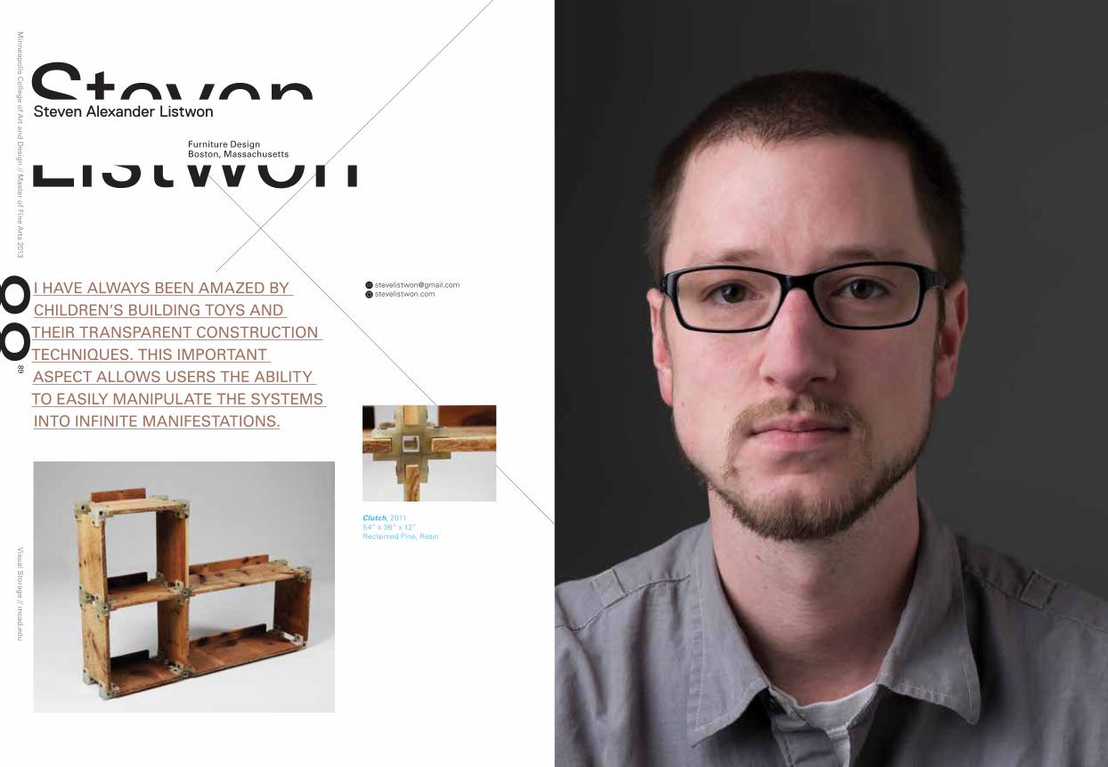
StevenFurniture DesignBoston, Massachusetts
[email protected] stevelistwon.com
Clutch, 201154” x 36” x 12” Reclaimed Pine, Resin
I hAVE AlwAyS BEEn AMAzED By ChIlDrEn’S BuIlDIng ToyS AnD ThEIr TrAnSpArEnT ConSTruCTIon TEChnIquES. ThIS IMporTAnT ASpECT AllowS uSErS ThE ABIlITy To EASIly MAnIpulATE ThE SySTEMS InTo InFInITE MAnIFESTATIonS.
Steven Alexander Listwon

Min
neap
olis C
olleg
e of A
rt and
Desig
n // M
aster of Fin
e Arts 2013
Visu
al Sto
rage // m
cad.ed
u91
90 My decision to pursue an MFA in furniture design was one made in an attempt to harness all of these past elements and utilize them in a creative academic setting. MCAD’s graduate program afforded me this creative space and the work that I have produced during the last two years serves as a strong source of pride. I have explored system-based furniture design that has allowed me to embrace historical and material-based influences while simultaneously growing as a designer.
My current work is fueled by many different engines; beginning with my interest in children’s building toys and their transparent construction techniques, which allows the child the ability to easily manipulate the systems into infinite manifestations. As my undergraduate studies were focused within the discipline of industrial design, this fascination honed my practice by emphasizing the importance of research and concept, into a consideration of materials to produce objects of function.
I transitioned into the professional sector by obtaining a position at a furniture design firm where fabrication techniques and collaborative design were highlighted. During my seven years with Bill Bancroft Furniture Design, we produced a catalogue of site-specific furniture solutions in tandem with local architects, artisans, and designers.
Clutch 2.0, 201248” x 18” x 18” Cherry, Acetal, Aluminum
Clutch chair, 201236” x 30” x 20” Plywood, Fiberglass, Bronze
I hAVE EXplorED SySTEM-BASED FurnITurE DESIgn whICh hAS AllowED ME To EMBrACE My hISTorICAl InFluEnCES whIlE SIMulTAnEouSly growIng AS A DESIgnEr.

Min
neap
olis C
olleg
e of A
rt and
Desig
n // M
aster of Fin
e Arts 2013
Visu
al Sto
rage // m
cad.ed
u93
92
ziweiliuIllustrationJinzhou, China
Ziwei Liu
I was raised in China. About two years ago, I made a life-changing and fantastic decision to come to America and expand my horizons by studying aboard. I feel very lucky that I can pursue my fascination with children’s illustration and children’s picture book creation, while learning from my mentor Nancy Carlson.
Digital Illustration, 2011Adobe Illustrator
[email protected] ziwei-liu.com

Min
neap
olis C
olleg
e of A
rt and
Desig
n // M
aster of Fin
e Arts 2013
Visu
al Sto
rage // m
cad.ed
u95
94
I want to study children’s picture book creation because of my obsession with listening to stories and drawing everything everywhere all the time when I was young. As I listened to stories, pictures would form in my mind at the same time. It became my passion to delineate the images as the stories emerged. My yearning for picture books both as a child and as an adult, have influenced my goal to be able to draw the stories that have accumulated in my head, which now I have the freedom and skill to represent in my work.
In Beijing, 2012 Watercolor, Photoshop
Why Am I Here, 201322” x 8.5” Watercolor, Photoshop
wITh FunCTIon oF My BooK, I ATTEMpT To gIVE young ChIlDrEn An InTErESTIng AnD DIFFErEnT wAy To FEEl AnD lEArn By EXprESSIng STorIES wITh wArMTh AnD poSITIVE EnErgy.
I FEEl VEry luCKy ThAT I CAn purSuE My FASCInATIon wITh ChIlDrEn’S IlluSTrATIon AnD ChIlDrEn’S pICTurE BooK CrEATIon, whIlE lEArnIng FroM My MEnTor nAnCy CArlSon.

Minneapolis College of Art and Design2501 Stevens AvenueMinneapolis, MN 55404mcad.edu
© 2013 Minneapolis College of Art and Design. All artists and their corresponding artwork published in this book are copyrighted materials. All rights reserved.
No part of this book may be used or reproduced in any manner without written permission from the artist or publisher.
Credits
Tom DeBiasoDirector // Master of Fine Arts Program
Kiley Van noteAssistant to the Director
Brent MeyersCreative Director // MCAD DesignWorks
Jeongho parkDesigner
rik SferraPhotography
Frenchy lunningCopywriter and Editor
About the Minneapolis College of Art and Design
Recognized nationally and internationally for its innovative and interdisciplinary approaches to visual arts education, the Minneapolis College of Art and Design is home to more than 700 students and offers professional certificates, bachelor of fine arts and bachelor of science degrees, and graduate degrees.
Founded in 1886, MCAD was one of the first colleges to offer the BFA degree. The college has earned the highest accreditation possible and has the highest four-year graduation rate of all Midwestern visual arts colleges. And college facilities contain the latest in technology, with multiple studios and labs open 24 hours a day.
Master of Fine Arts at MCAD
The Minneapolis College of Art and Design’s MFA program is a community of makers, thinkers, theorists, researchers, and creative professionals. Our student body is diverse with a robust international presence. The subject of student inquiry responds to social, cultural, and professional needs as well as to entrepreneurial opportunities, stretching across art and design practices. Students in the program pursue creative work in a mentor based, interdisciplinary environment that includes graphic design, printmaking, paper & book arts, painting, photography, illustration, sculpture, drawing, animation, interactive media, filmmaking, comic arts, furniture design, and installation art.
For more information, contact or visit the following sites:
Admissions
mcad.edu/academic-programs/graduate-degrees
Official Program Site
mcad-mfa.com
Participant Portfolios
mcad-mfa.tumblr.com

Minneapolis College of Art and Design
Visual StorageMaster of Fine Arts 2013 Thesis Exhibition
Min
neap
olis C
olleg
e of A
rt and
Desig
n V
isual S
torag
e Master o
f Fine A
rts 2013 Th
esis Exh
ibitio
n
2501 Stevens AvenueMinneapolis, MN 55404612.874.3700mcad.edu
2501 Stevens AvenueMinneapolis, MN 55404mcad.edu
Icon, Logo and Address Lock-up