Visual Presentation
47
Visual Presentation
-
Upload
francesca-hoffman -
Category
Documents
-
view
86 -
download
31
description
Visual Presentation. For categorical data, pie charts can be effective in their simplicity for portraying relative frequencies. Pie chart to show percentages of each smoking status in a sample of 211 women. You can try various things to spice up the chart. - PowerPoint PPT Presentation
Transcript of Visual Presentation
Visual Presentation
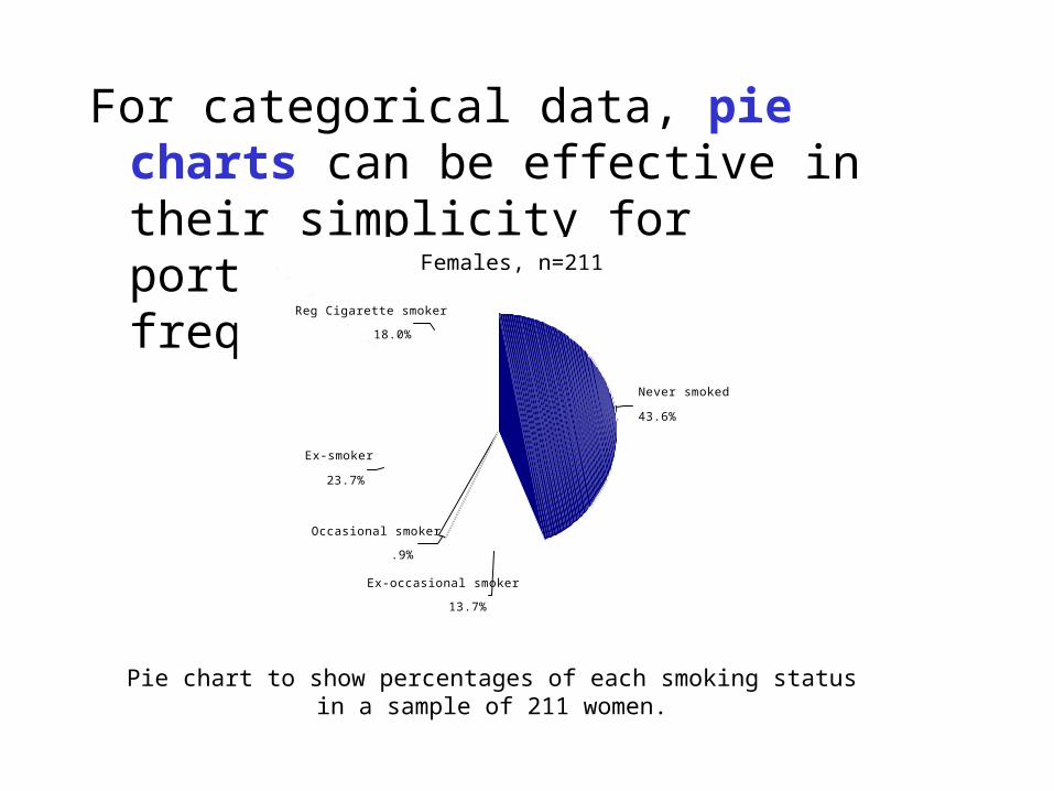
For categorical data, pie charts can be effective in their simplicity for portraying relative frequencies.
Pie chart to show percentages of each smoking status in a sample of 211 women.
Females, n=211
18.0%
23.7%
.9%
13.7%
43.6%
Reg Cigarette smoker
Ex-smoker
Occasional smoker
Ex-occasional smoker
Never smoked
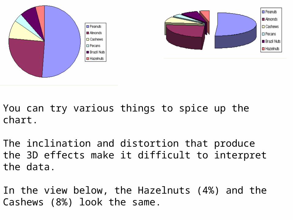
You can try various things to spice up the chart.
The inclination and distortion that produce the 3D effects make it difficult to interpret the data.
In the view below, the Hazelnuts (4%) and the Cashews (8%) look the same.
You should avoid using such distortions.
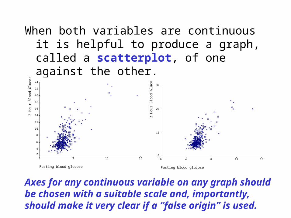
When both variables are continuous it is helpful to produce a graph, called a scatterplot, of one against the other.
Fasting blood glucose
151173
2 H
ou
r B
loo
d G
luco
se 24
22
20
18
16
14
12
10
8
6
4
2
Fasting blood glucose
1612840
2 H
ou
r B
loo
d G
luco
se 30
20
10
0
Axes for any continuous variable on any graph should be chosen with a suitable scale and, importantly, should make it very clear if a “false origin” is used.
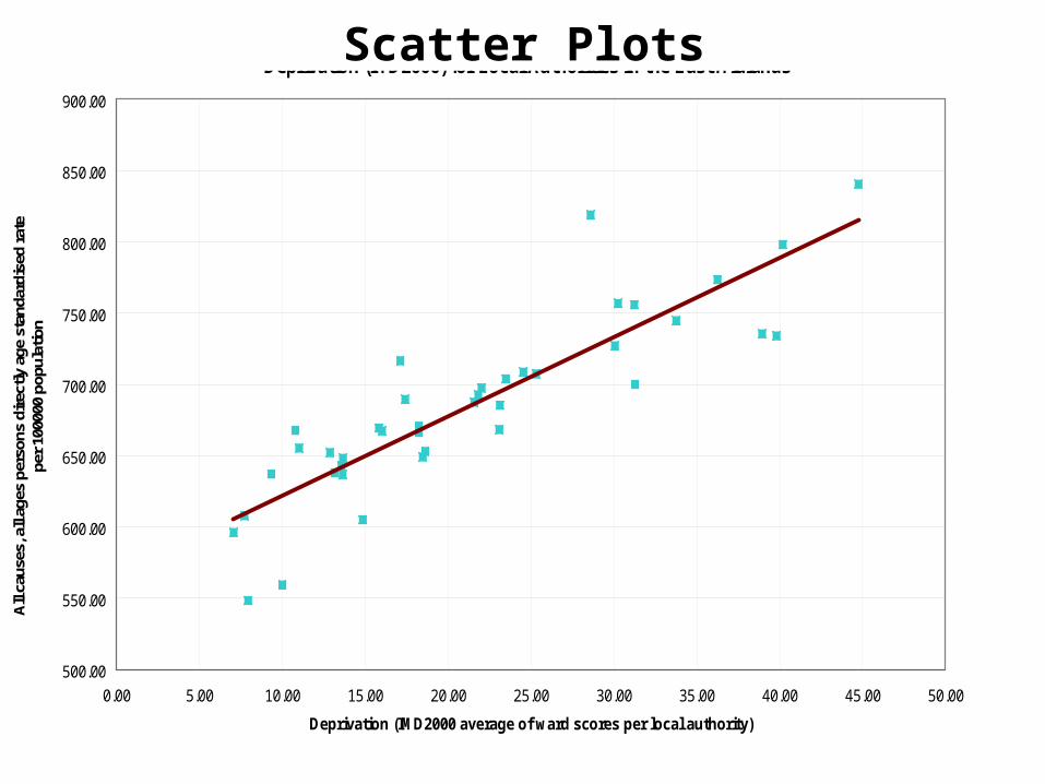
Relationship between Mortality from All Causes All Ages (DSR 1999 and 2001 pooled) and Deprivation (IMD2000) for Local Authorities in the East Midlands
500.00
550.00
600.00
650.00
700.00
750.00
800.00
850.00
900.00
0.00 5.00 10.00 15.00 20.00 25.00 30.00 35.00 40.00 45.00 50.00
Deprivation (IMD2000 average of ward scores per local authority)
All
caus
es, a
ll ag
es p
erso
ns d
irec
tly a
ge s
tand
ardi
sed
rate
pe
r 10
0000
pop
ulat
ion
Scatter Plots
0
5
10
15
20
25
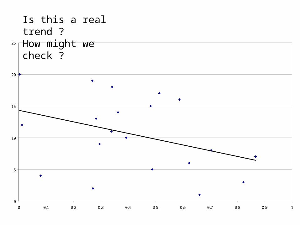
0 0.1 0.2 0.3 0.4 0.5 0.6 0.7 0.8 0.9 1
Peasron correlation coefficient= -0.37
Is this a real trend ?How might we check ?
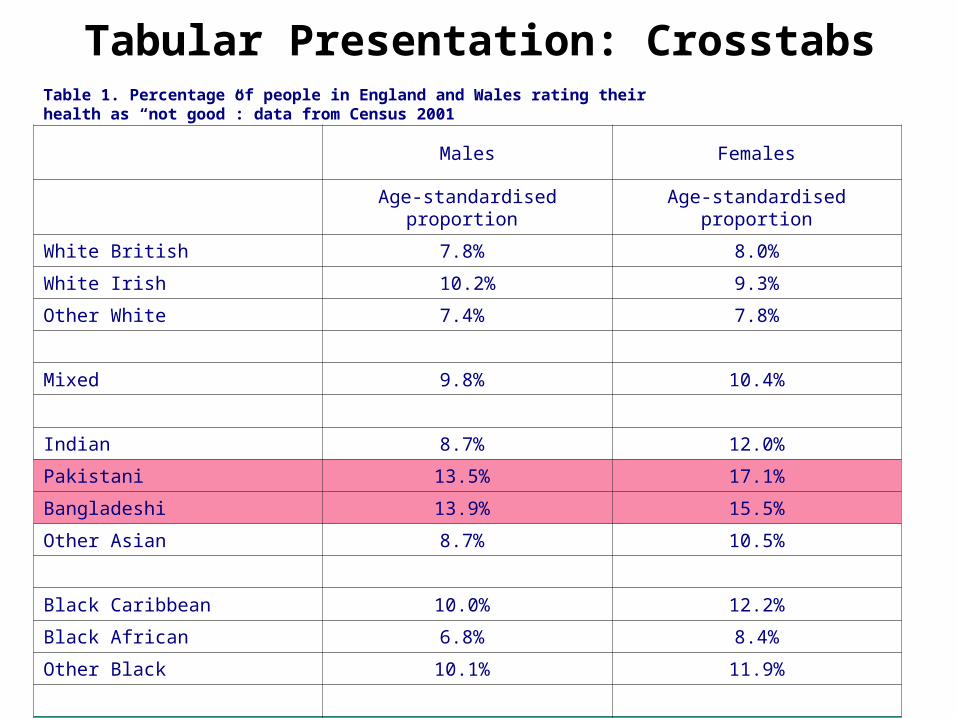
Table 1. Percentage of people in England and Wales rating theirhealth as “not good”: data from Census 2001
Males Females
Age-standardised proportion Age-standardised proportion
White British 7.8% 8.0%
White Irish 10.2% 9.3%
Other White 7.4% 7.8%
Mixed 9.8% 10.4%
Indian 8.7% 12.0%
Pakistani 13.5% 17.1%
Bangladeshi 13.9% 15.5%
Other Asian 8.7% 10.5%
Black Caribbean 10.0% 12.2%
Black African 6.8% 8.4%
Other Black 10.1% 11.9%
Chinese 5.6% 6.2%
Any other ethnic group 8.2% 8.0%
All ethnic groups 7.9% 8.2%
Tabular Presentation: Crosstabs
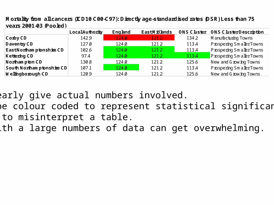
Local Authority England East Midlands ONS Cluster ONS Cluster DescriptionCorby CD 142.9 124.0 121.2 134.2 Manufacturing TownsDaventry CD 127.0 124.0 121.2 113.4 Prospering Smaller TownsEast Northamptonshire CD 102.6 124.0 121.2 113.4 Prospering Smaller TownsKettering CD 97.4 124.0 121.2 113.4 Prospering Smaller TownsNorthampton CD 130.8 124.0 121.2 125.6 New and Growing TownsSouth Northamptonshire CD 107.1 124.0 121.2 113.4 Prospering Smaller TownsWellingborough CD 120.9 124.0 121.2 125.6 New and Growing Towns
Mortality from all cancers (ICD10 C00-C97): Directly age-standardised rates (DSR) Less than 75 years 2001-03 (Pooled)
Tables clearly give actual numbers involved. They can be colour coded to represent statistical significance.Very hard to misinterpret a table.However with a large numbers of data can get overwhelming.
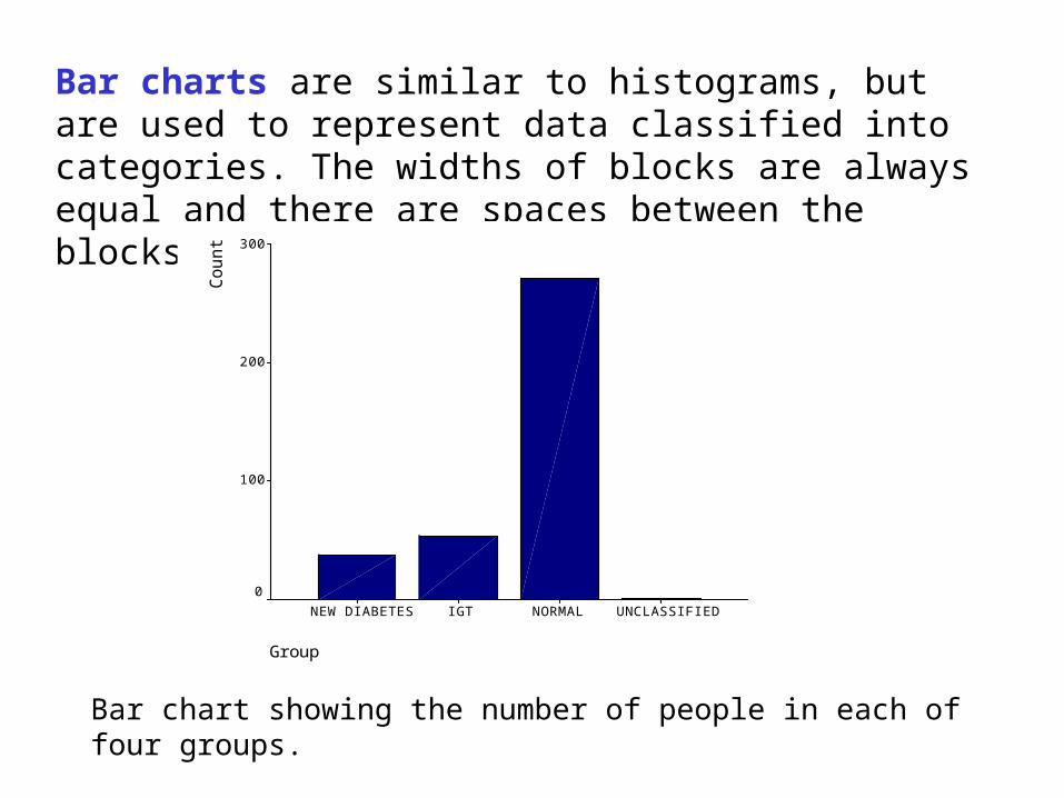
Bar charts are similar to histograms, but are used to represent data classified into categories. The widths of blocks are always equal and there are spaces between the blocks.
Group
UNCLASSIFIEDNORMALIGTNEW DIABETES
Co
un
t 300
200
100
0
Bar chart showing the number of people in each of four groups.
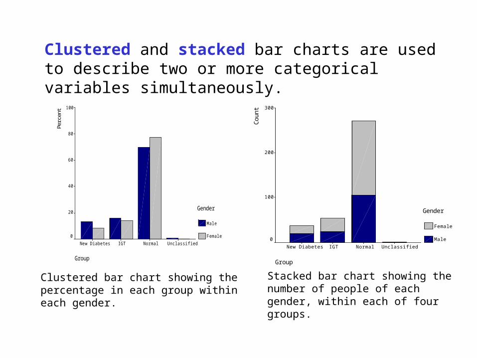
Clustered and stacked bar charts are used to describe two or more categorical variables simultaneously.
Group
UnclassifiedNormalIGTNew Diabetes
Perc
ent 100
80
60
40
20
0
Gender
Male
Female
Group
UnclassifiedNormalIGTNew Diabetes
Co
un
t 300
200
100
0
Gender
Female
Male
Clustered bar chart showing the percentage in each group within each gender.
Stacked bar chart showing the number of people of each gender, within each of four groups.
0%
20%
40%
60%
80%
100%Fe
mal
es
Mal
es
Fem
ales
Mal
es
Fem
ales
Mal
es
Fem
ales
Mal
es
Fem
ales
Mal
es
Fem
ales
Mal
es
Fem
ales
Mal
es
Fem
ales
Mal
es
Fem
ales
Mal
es
NE NW Y&H EM WM EE L SE SW
65 and over
35-64
16-34
Under 16
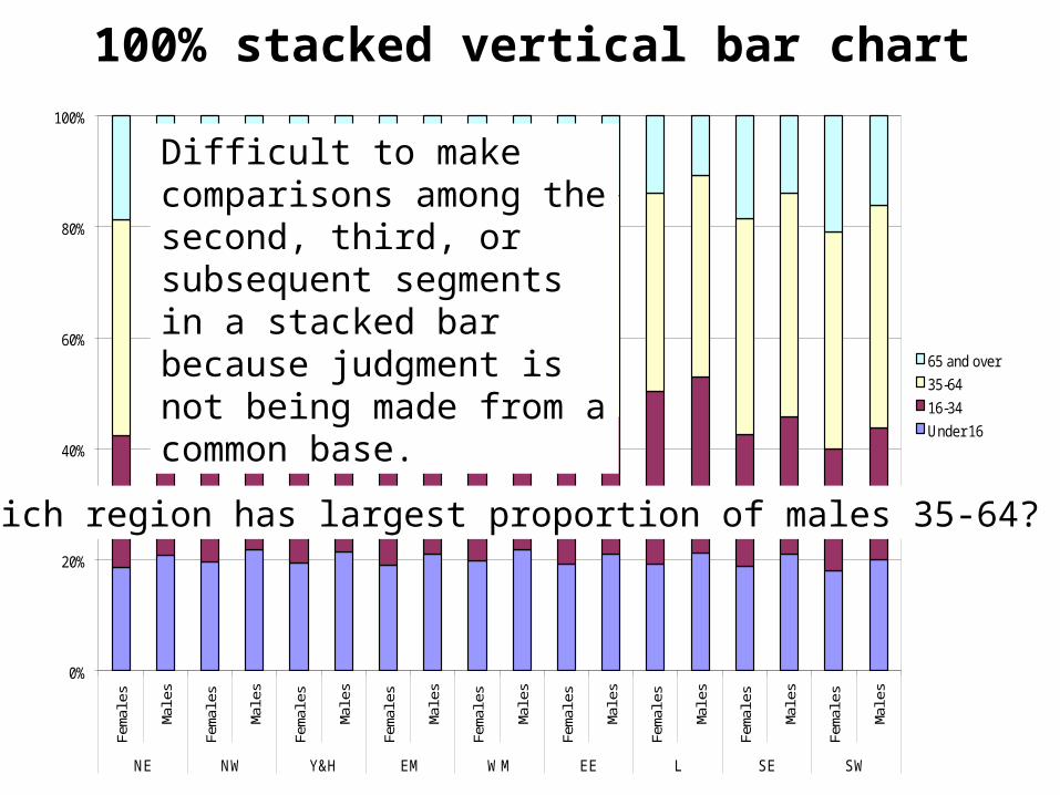
100% stacked vertical bar chart
Difficult to make comparisons among the second, third, or subsequent segments in a stacked bar because judgment is not being made from a common base.
Which region has largest proportion of males 35-64?
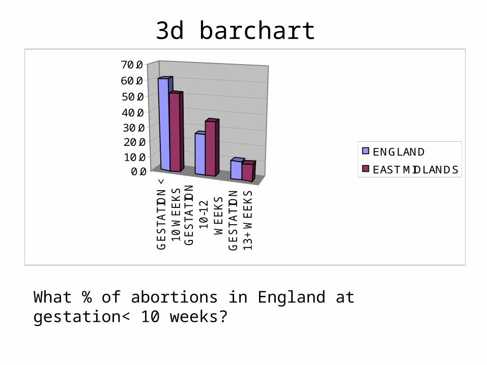
3d barchart
GE
STA
TIO
N <
10 W
EE
KS
GE
STA
TIO
N10-1
2W
EE
KS
GE
STA
TIO
N13+ W
EE
KS
0.010.0
20.030.0
40.0
50.0
60.0
70.0
ENGLAND
EAST MIDLANDS
What % of abortions in England at gestation< 10 weeks?
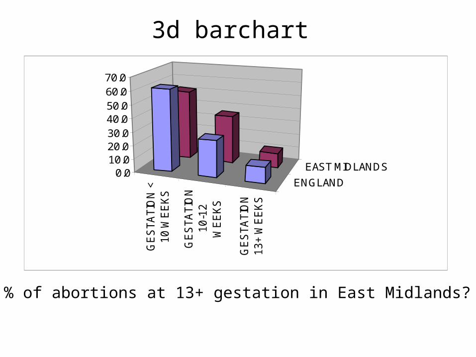
3d barchart
GE
STA
TIO
N <
10 W
EE
KS
GE
STA
TIO
N10-1
2W
EE
KS
GE
STA
TIO
N13+ W
EE
KS
ENGLAND
EAST MIDLANDS0.0
10.020.030.040.050.060.070.0
What % of abortions at 13+ gestation in East Midlands?
0.0
10.0
20.0
30.0
40.0
50.0
60.0
70.0
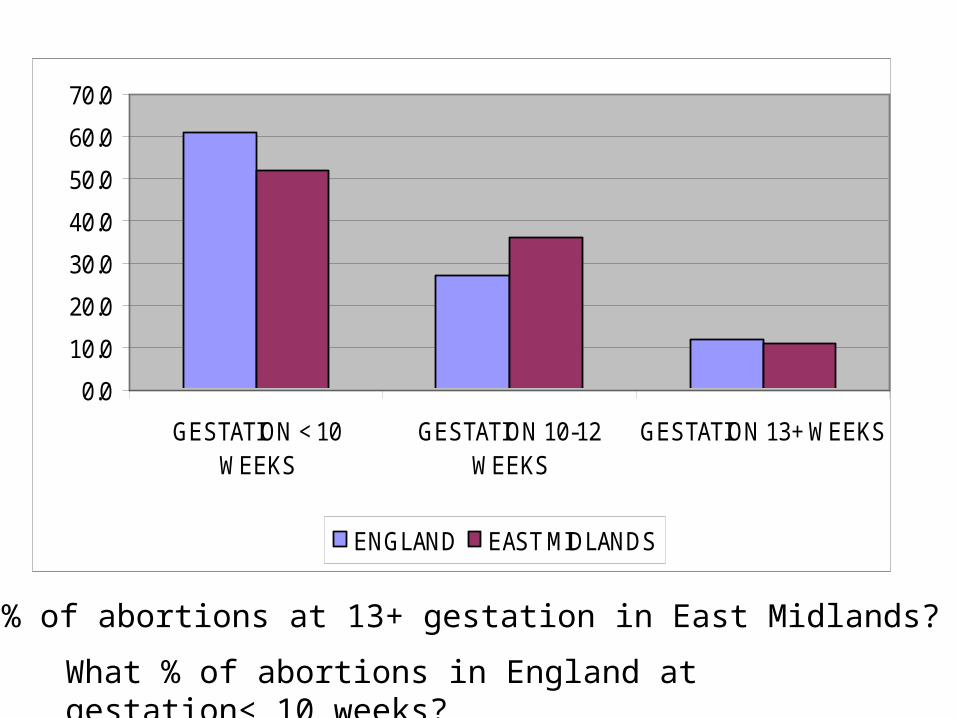
GESTATION < 10WEEKS
GESTATION 10-12WEEKS
GESTATION 13+ WEEKS
ENGLAND EAST MIDLANDS
What % of abortions at 13+ gestation in East Midlands?
What % of abortions in England at gestation< 10 weeks?
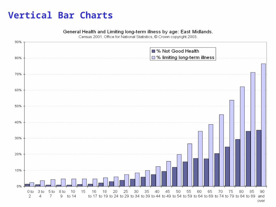
Vertical Bar Charts

Horizontal Bar ChartMortality from all causes, females, East Midlands LAs, 2002-2004 pooled
0 100 200 300 400 500 600 700 800
Rutland UABlaby CD
Melton CDSouth Kesteven CD
Derbyshire Dales CDSouth Northamptonshire CD
Rushcliffe CDHarborough CD
Broxtowe CDOadby and Wigston CD
Daventry CDCharnwood CD
Hinckley and Bosworth CDWellingborough CD
East Northamptonshire CDWest Lindsey CD
Newark and Sherwood CDSouth Holland CD
North Kesteven CDLeicestershire,
Gedling CDENGLAND
East Lindsey CDKettering CD
EAST MIDLANDSBoston CD
Northampton CDDerby UA
Erewash CDTrent SHA
North West Leicestershire CDAmber Valley CD
South Derbyshire CDChesterfield CD
North East Derbyshire CDHigh Peak CDMansfield CD
Bassetlaw CDLincoln CD
Ashfield CDNottingham UA
Corby CDLeicester UABolsover CD
Directly age-standardised rates (DSR)
Spurious ranking somebody's got to be at the bottom
Encourages comparison when perhaps not justified
95% CI’s arbitrary
No consideration of multiple comparisons
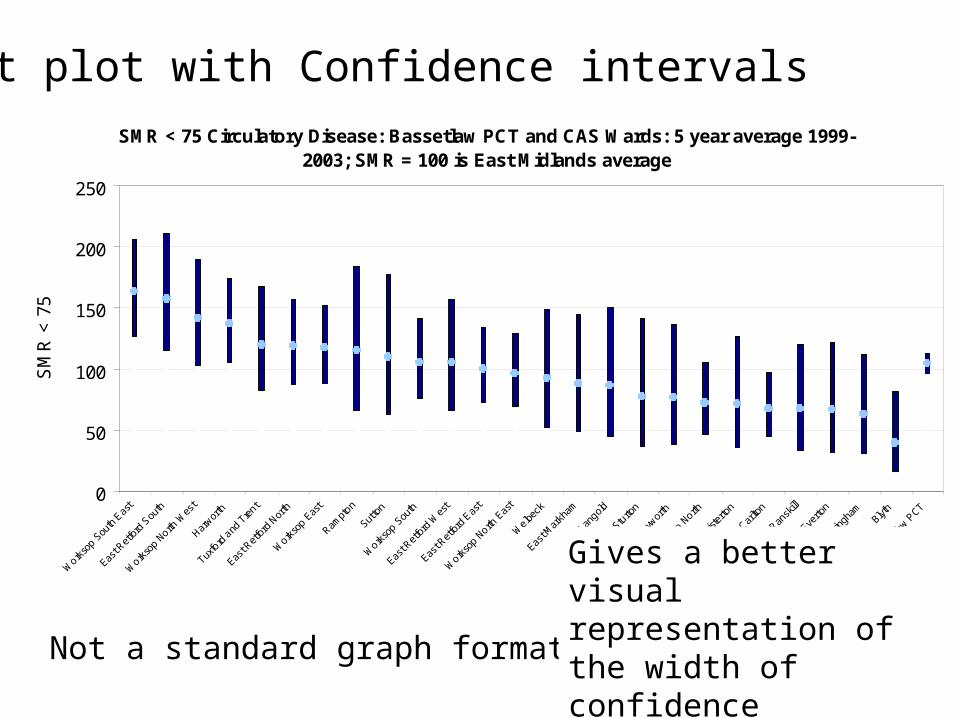
SMR < 75 Circulatory Disease: Bassetlaw PCT and CAS Wards: 5 year average 1999-2003; SMR = 100 is East Midlands average
0
50
100
150
200
250
Work
sop
South
Eas
t
East R
etfo
rd S
outh
Work
sop
North W
est
Harwor
th
Tuxfo
rd a
nd T
rent
East R
etfo
rd N
orth
Work
sop
East
Rampt
on
Sutto
n
Work
sop
South
East R
etfo
rd W
est
East R
etfo
rd E
ast
Work
sop
North E
ast
Welbe
ck
East M
arkh
am
Lang
old
Sturto
n
Clayw
orth
Work
sop
North
Mist
erto
n
Carlto
n
Ransk
ill
Everto
n
Beckin
gham
Blyth
Basse
tlaw P
CT
SM
R <
75
Dot plot with Confidence intervals
Not a standard graph format in excel
Gives a better visual representation of the width of confidence intervals, useful when CI’s are wide.
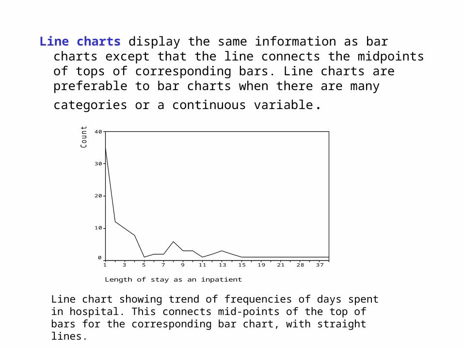
Line charts display the same information as bar charts except that the line connects the midpoints of tops of corresponding bars. Line charts are preferable to bar charts
when there are many categories or a continuous variable.
Length of stay as an inpatient
3728211915131197531
Co
un
t
40
30
20
10
0
Line chart showing trend of frequencies of days spent in hospital. This connects mid-points of the top of bars for the corresponding bar chart, with straight lines.
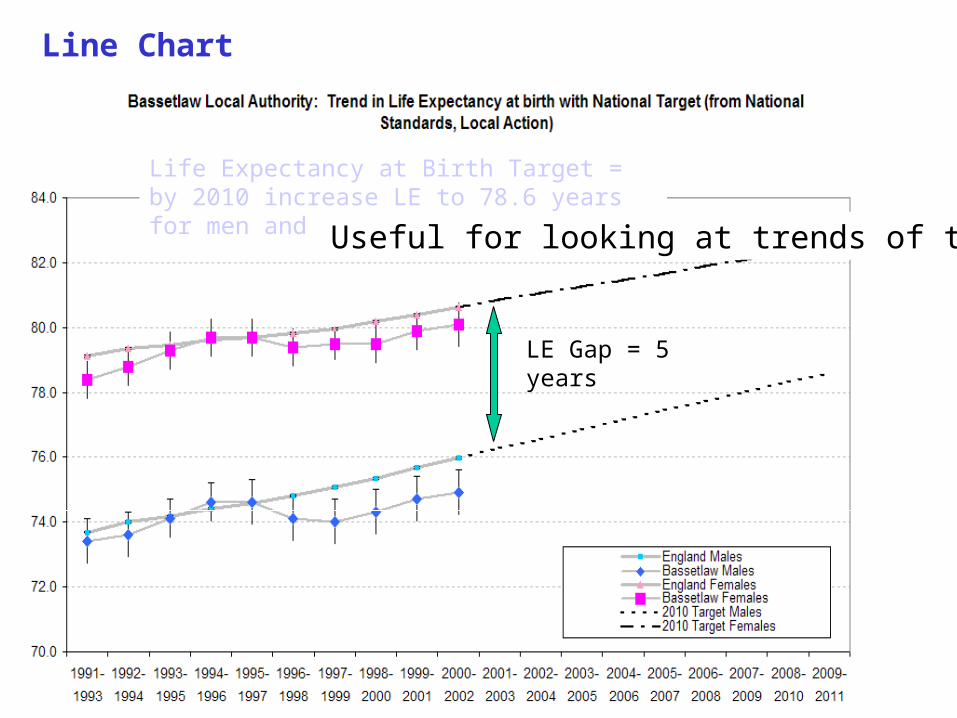
Life Expectancy at Birth Target = by 2010 increase LE to 78.6 years for men and to 82.5 years for women
Line Chart
LE Gap = 5 years
Useful for looking at trends of time
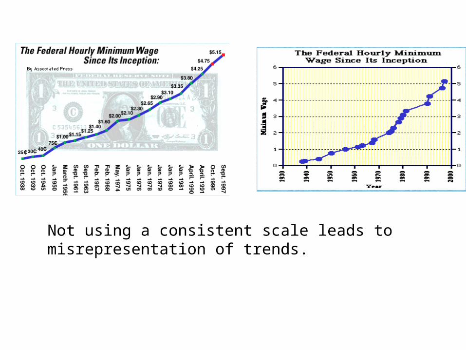
Not using a consistent scale leads to misrepresentation of trends.
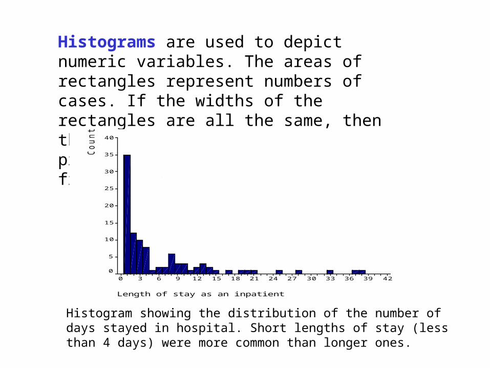
Histograms are used to depict numeric variables. The areas of rectangles represent numbers of cases. If the widths of the rectangles are all the same, then the height of the blocks is proportional to the observed frequencies.
Histogram showing the distribution of the number of days stayed in hospital. Short lengths of stay (less than 4 days) were more common than longer ones.
Length of stay as an inpatient
42393633302724211815129630
Co
un
t
40
35
30
25
20
15
10
5
0
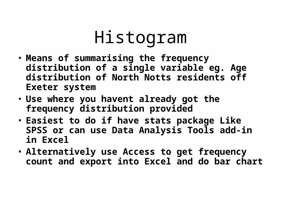
Histogram• Means of summarising the frequency distribution
of a single variable eg. Age distribution of North Notts residents off Exeter system
• Use where you havent already got the frequency distribution provided
• Easiest to do if have stats package Like SPSS or can use Data Analysis Tools add-in in Excel
• Alternatively use Access to get frequency count and export into Excel and do bar chart
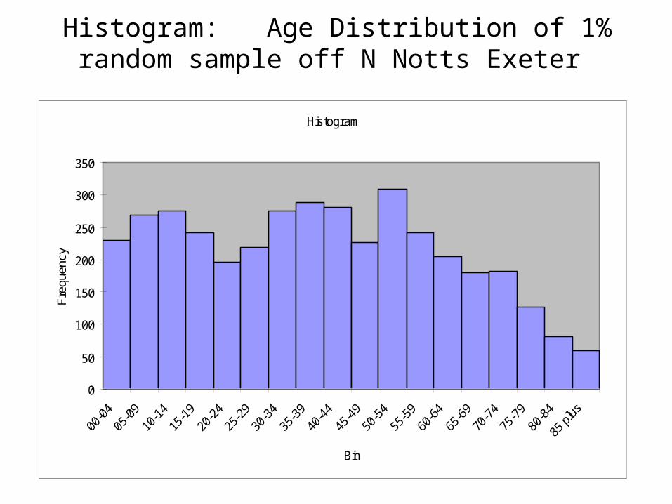
Histogram: Age Distribution of 1% random sample off N Notts Exeter
Histogram
0
50
100
150
200
250
300
350
Bin
Fre
quen
cy

Figure 10 Histogram with normal-curve and statistics for cholesterol measurements.
Cholesterol
12.5
12.0
11.5
11.0
10.5
10.0
9.5
9.0
8.5
8.0
7.5
7.0
6.5
6.0
5.5
5.0
4.5
4.0
3.5
60
50
40
30
20
10
0
Std. Dev = 1.45
Mean = 6.6
N = 357.00
useful for illustrating the shape of the distribution of a batch of numbers

Figure 10 Histogram with normal-curve and statistics for cholesterol measurements.
Cholesterol
12.5
12.0
11.5
11.0
10.5
10.0
9.5
9.0
8.5
8.0
7.5
7.0
6.5
6.0
5.5
5.0
4.5
4.0
3.5
60
50
40
30
20
10
0
Std. Dev = 1.45
Mean = 6.6
N = 357.00
Mean=6.6
useful for illustrating the shape of the distribution of a batch of numbers
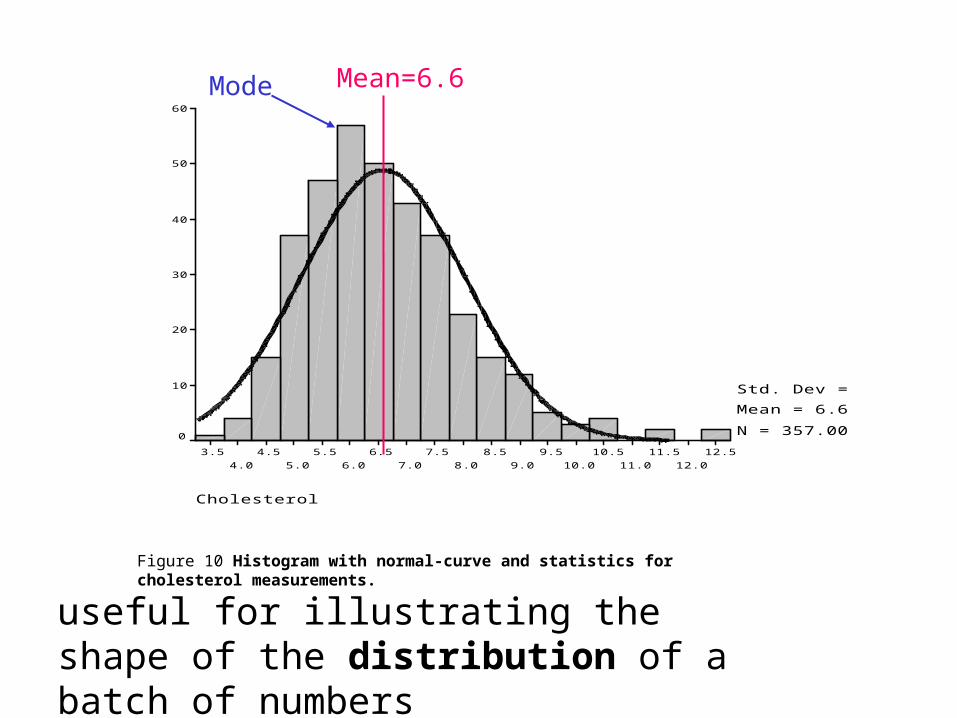
Figure 10 Histogram with normal-curve and statistics for cholesterol measurements.
Cholesterol
12.5
12.0
11.5
11.0
10.5
10.0
9.5
9.0
8.5
8.0
7.5
7.0
6.5
6.0
5.5
5.0
4.5
4.0
3.5
60
50
40
30
20
10
0
Std. Dev = 1.45
Mean = 6.6
N = 357.00
Mean=6.6Mode
useful for illustrating the shape of the distribution of a batch of numbers
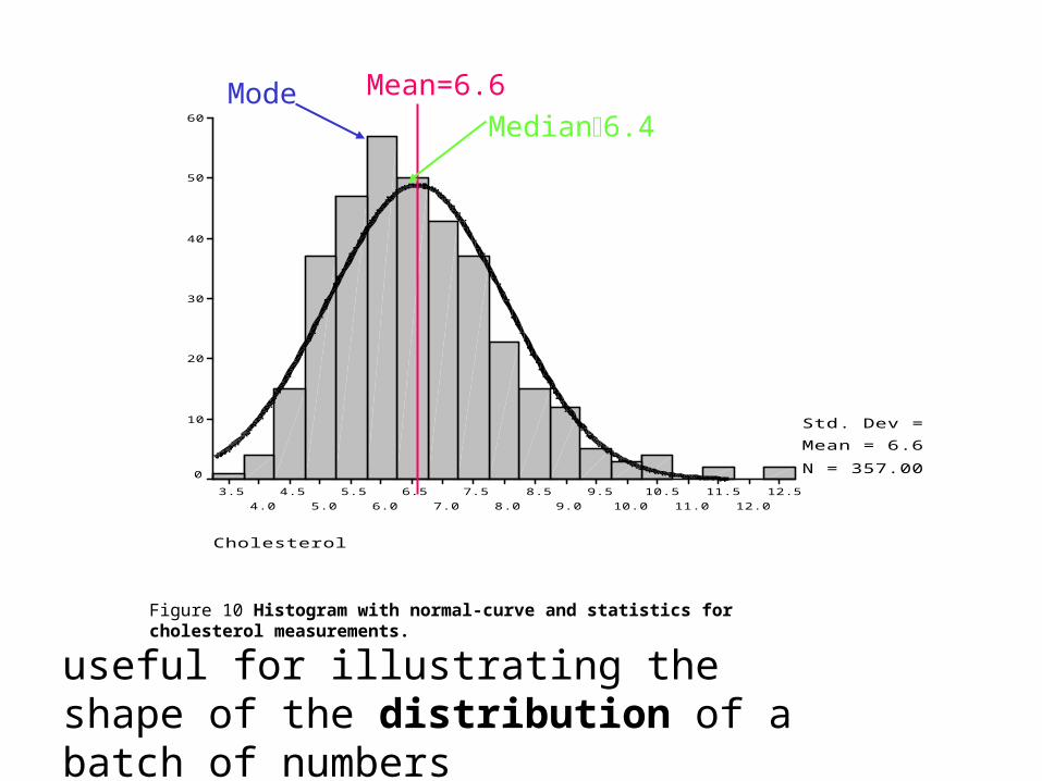
Figure 10 Histogram with normal-curve and statistics for cholesterol measurements.
Cholesterol
12.5
12.0
11.5
11.0
10.5
10.0
9.5
9.0
8.5
8.0
7.5
7.0
6.5
6.0
5.5
5.0
4.5
4.0
3.5
60
50
40
30
20
10
0
Std. Dev = 1.45
Mean = 6.6
N = 357.00
Mean=6.6ModeMedian6.4
useful for illustrating the shape of the distribution of a batch of numbers
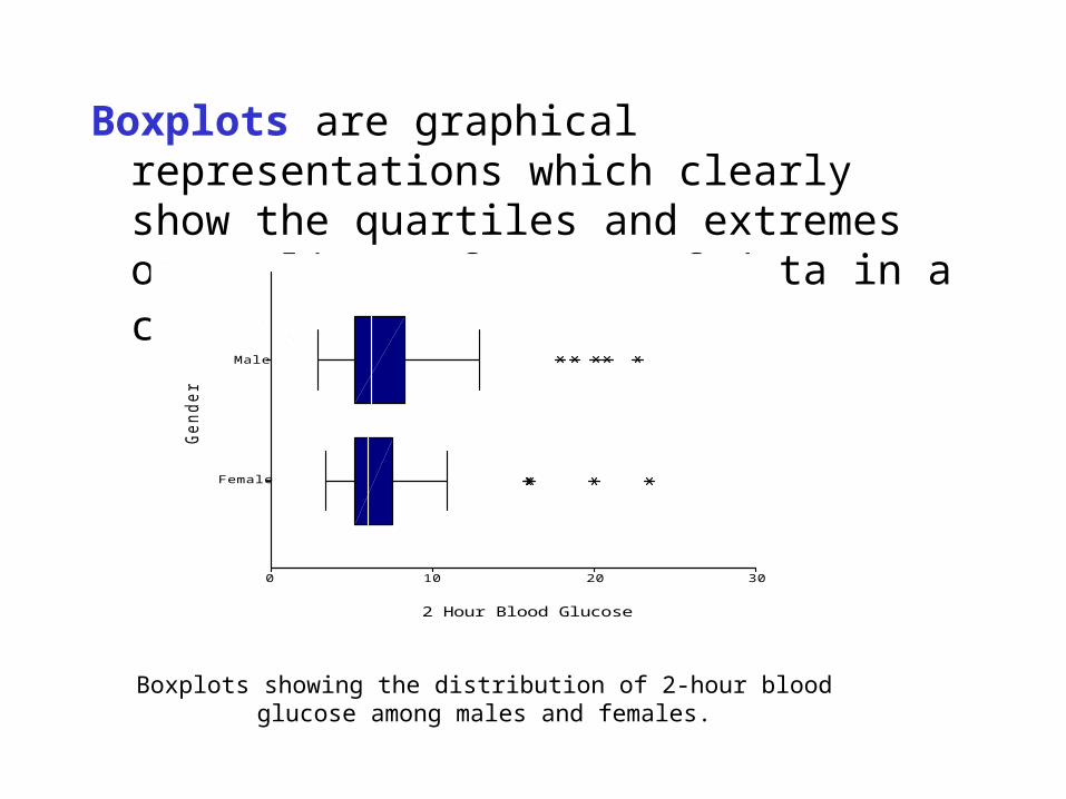
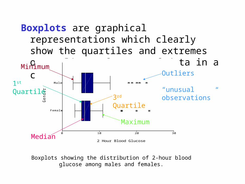
Boxplots are graphical representations which clearly show the quartiles and extremes or outliers of a set of data in a compact manner.
Boxplots showing the distribution of 2-hour blood glucose among males and females.
Ge
nd
er
Male
Female
2 Hour Blood Glucose
3020100
Boxplots are graphical representations which clearly show the quartiles and extremes or outliers of a set of data in a compact manner.
Boxplots showing the distribution of 2-hour blood glucose among males and females.
Ge
nd
er
Male
Female
2 Hour Blood Glucose
3020100
Median
1st Quartile
3rd Quartile
Outliers “unusual observations”
Minimum
Maximum
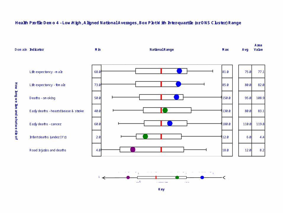
AreaValue
77.1
82.0
108.9
83.1
119.8
4.4
8.2
Avg
75.0
80.0
95.0
80.0
110.0
6.0
12.0
Max
81.0
85.0
150.0
130.0
180.0
12.0
18.0
National Range
Key
Min
68.0
73.0
50.0
40.0
60.0
2.0
4.0
Indicator
Life expectancy - male
Life expectancy - female
Deaths - smoking
Early deaths - heart disease & stroke
Early deaths - cancer
Infant deaths (under 1Yr)
Road injuries and deaths
Domain
Ho
w lo
ng
we live
an
d w
hat w
e d
ie o
f
Health Profile Demo 4 - Low/High, Aligned National Averages, Box Plot With Inter-quartile (or ONS Cluster) Range
MaxMin 75thPercentile25t
Stat. sig. low value Stat. sig. high valueNon sig. valueNational average
0
0.1
0.2
0.3
0.4
0.5
0.6
0.7
0.8
0.9 1
12
34
56
7
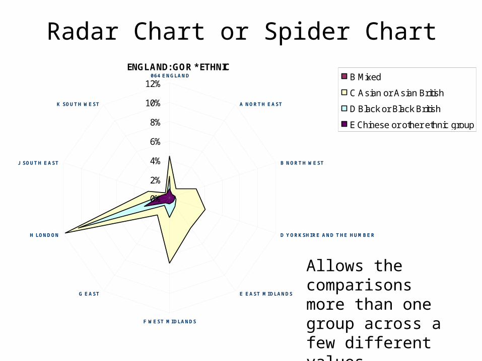
ENGLAND: GOR * ETHNIC
0%
2%
4%
6%
8%
10%
12% 064 ENGLAND
A NORTH EAST
B NORTH WEST
D YORKSHIRE AND THE HUMBER
E EAST MIDLANDS
F WEST MIDLANDS
G EAST
H LONDON
J SOUTH EAST
K SOUTH WEST
B Mixed
C Asian or Asian British
D Black or Black British
E Chinese or other ethnic group
Radar Chart or Spider Chart
Allows the comparisons more than one group across a few different values

Age Range Total MalesFemale
s
0 - 4 239013 122979 116034
5 - 9 265214 136557 128657
10 - 14 279334 143337 135997
15 - 19 260104 134049 126055
20 - 24 245101 124587 120514
25 - 29 254367 125803 128564
30 - 34 312846 153371 159475
35 - 39 325425 161507 163918
40 - 44 294160 146595 147565
45 - 49 269255 134352 134903
50 - 54 299218 150064 149154
55 - 59 250110 124810 125300
60 - 64 207432 102758 104674
65 - 69 186394 90219 96175
70 - 74 169602 78579 91023
75 - 79 143481 61883 81598
80 - 84 94157 35805 58352
85 - 89 51772 15850 35922
90 and over
25189 5753 19436
Totals 4172174204885
8212331
6
population pyramids for districts and regions comparing against the age-gender distribution for the UK as a whole: available on the ONS website under “Census 2001”
Population Pyramids
East Midlands Region
Not standard excel format
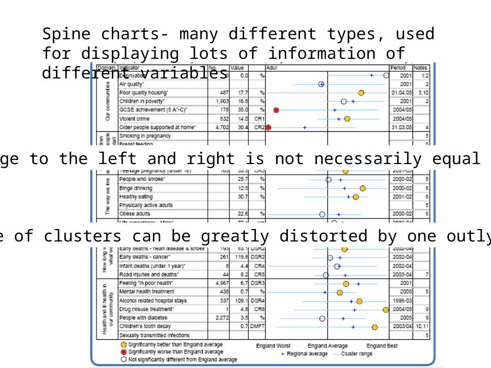
Spine charts- many different types, used for displaying lots of information of different variables
The range to the left and right is not necessarily equal
The range of clusters can be greatly distorted by one outlying point
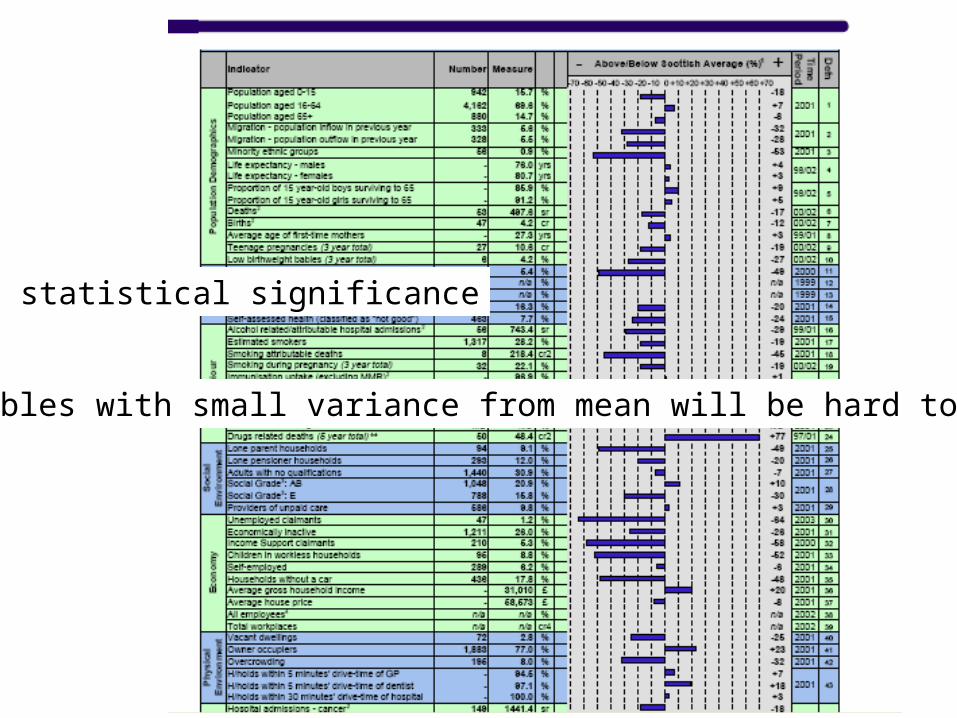
No statistical significance
Variables with small variance from mean will be hard to spot
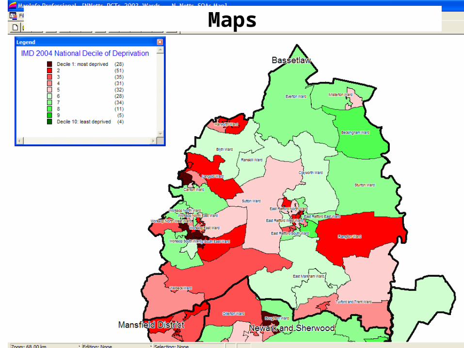
Maps
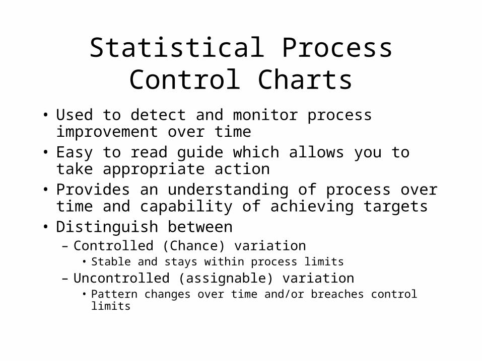
Statistical Process Control Charts
• Used to detect and monitor process improvement over time
• Easy to read guide which allows you to take appropriate action
• Provides an understanding of process over time and capability of achieving targets
• Distinguish between– Controlled (Chance) variation
• Stable and stays within process limits
– Uncontrolled (assignable) variation• Pattern changes over time and/or breaches control limits

Funnel Plots
• No ranking
• Data Displayed
• No preset threshold for out of control
• Visual relationship with volume
• Emphasises increased variability of smaller centres
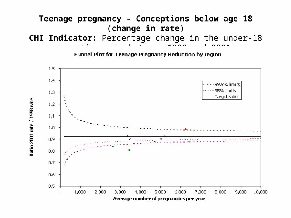
Teenage pregnancy - Conceptions below age 18 (change in rate)CHI Indicator: Percentage change in the under-18 conception rate
between 1998 and 2001.
Funnel Plot for Teenage Pregnancy Reduction
0.5
0.6
0.7
0.8
0.9
1.0
1.1
1.2
1.3
1.4
1.5
- 200 400 600 800 1,000 1,200Average number of pregnancies per year
Rat
io 2
001/
1998
99.9% limits
95% limits
Target ratio
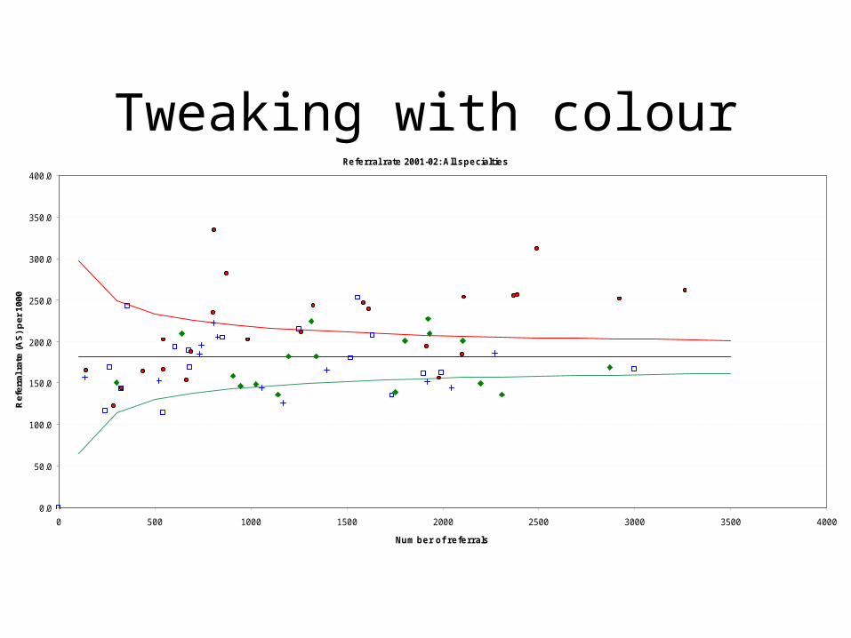
Tweaking with colourRe fe rral rate 2001-02: All s pe cialtie s
0.0
50.0
100.0
150.0
200.0
250.0
300.0
350.0
400.0
0 500 1000 1500 2000 2500 3000 3500 4000
Num be r of re fe rrals
Ref
erra
l rat
e (A
S)
per
100
0
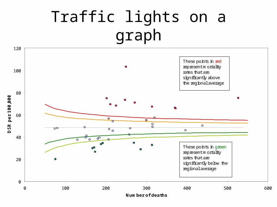
Traffic lights on a graph
0
20
40
60
80
100
120
0 100 200 300 400 500 600
Number of deaths
DSR
per
100,0
00
These points in red represent mortality rates that are significantly above the regional average
These points in green represent mortality rates that are significantly below the regional average
Exercise
• List 3 advantages and 3 disadvantages to Funnel plots
X-Bar and R Chart
• Traditional chart – data points with mean and control limits
• The X-bar chart monitors the mean over time, based on the average of a series of observations, called a subgroup.
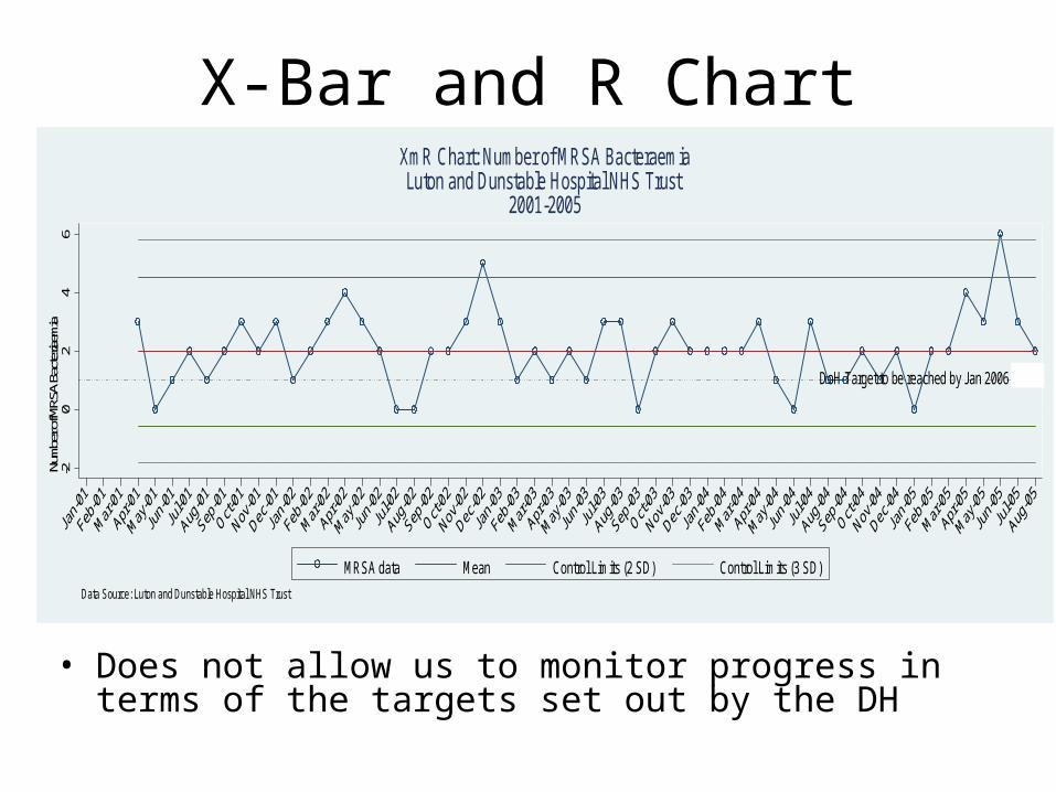
X-Bar and R Chart
• Does not allow us to monitor progress in terms of the targets set out by the DH
DoH Target to be reached by Jan 2006 in L&D
-20
24
6Nu
mber
of MR
SA B
acter
iaemi
a
MRSA data Mean Control Limits (2 SD) Control Limits (3 SD)
Data Source: Luton and Dunstable Hospital NHS Trust
XmR Chart: Number of MRSA BacteraemiaLuton and Dunstable Hospital NHS Trust
2001-2005
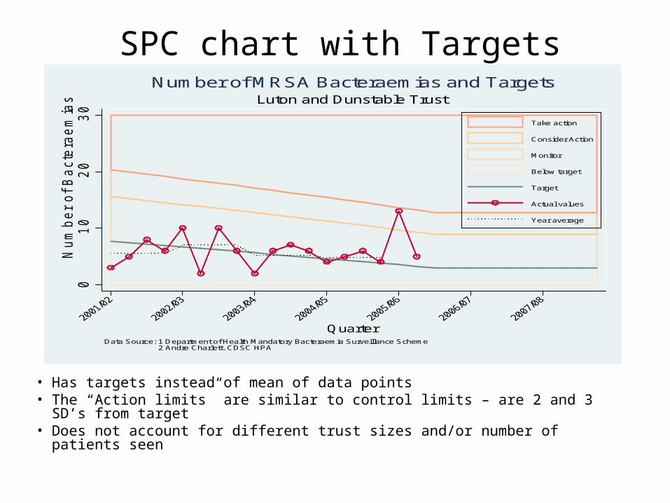
SPC chart with Targets
• Has targets instead of mean of data points• The “Action limits” are similar to control limits – are 2 and 3 SD’s from
target• Does not account for different trust sizes and/or number of patients seen
01
02
03
0
Num
ber
of B
acte
rae
mia
s
Quarter
Take action
Consider Action
Monitor
Below target
Target
Actual values
Year average
Data Source: 1 Department of Health Mandatory Bacteraemia Surveillance Scheme 2 Andre Charlett. CDSC HPA
Luton and Dunstable TrustNumber of MRSA Bacteraemias and Targets

Interpretation and use
• When are SPC methods not appropriate? – are we stretching their use?
• What if all points lie outside control limits? Is this a:– Bad measure?– Bad system?
• Where should control limits be set and how should we decide?
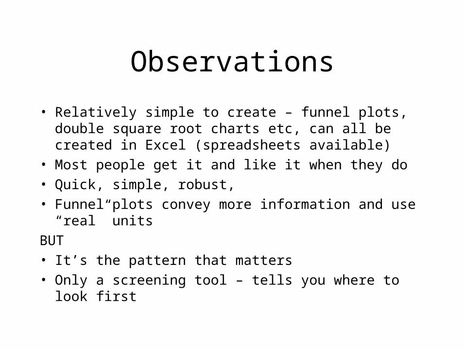
Observations
• Relatively simple to create – funnel plots, double square root charts etc, can all be created in Excel (spreadsheets available)
• Most people get it and like it when they do
• Quick, simple, robust,
• Funnel plots convey more information and use “real” units
BUT
• It’s the pattern that matters
• Only a screening tool – tells you where to look first