Visual Identity Manual 4 - SSC€¦ · Don’t crop the logo. 1. Visual identity and communication...
43
Visual Identity Manual 4.1 March 2018
Transcript of Visual Identity Manual 4 - SSC€¦ · Don’t crop the logo. 1. Visual identity and communication...

Visual Identity Manual 4.1March 2018

SSC Brand Guide 2
1. Visual identity and communication 3 SSC corporate logo 4 Overview of all SSC logotypes 5 Do not change or modify 6 Logotype sizes and free zone 7 Partner Branding 8 Color palette 9 Color palette - web colors 10 Color palette - colors converted to NGS 11 Typography 12-13 Typography scaling 14 Imagery, photography & illustrations 15 Corporate imagery 16 People pictures 17 Business area imagery 18 Graphic elements 19 Iconography 20 Solution illustrations 21 Infographics/charts 22
2. Applications 23 Paper standards 24 Business cards 25 Examples, business cards 26 E-mail signatures 27 Letterhead & continuation sheets 28 Correspondence cards 29
Envelopes 30 Notepad 31 SSC Basic Folder 32 PowerPoint presentations 33 Web 34 Intranet 35 Example prints 36 Signage 37 Flags 38 Vehicles 39 Clothing, indoor working 40 Clothing, outdoor working 41 Badges, identification card 42 Giveaways 43
Content
Content Page Content Page Content Page
Content

SSC Brand Guide 3
ww
1. VISUAL IDENTITY AND COMMUNICATION
The SSC visual identity and communication are made up of the components described in this section. You will find templates and guidelines for using these available for download on an ftp site. What follows is a summary of those guidelines.

SSC Brand Guide 4
SSC corporate logoThe SSC logo is the visual representation of our brand. It plays a key role in communicating who we are – and reflecting the high levels of quality and trust we have built for more than 40 years. The logo emphasizes both our area of operations and spirit. The circular spheres symbolize astronomical bodies that form a person connecting with space. Thus, our logo represents our customers realizing their fundamental goal. The SSC logotype consists of three core elements: the SSC graphic matrix, the SSC name and the SSC circle. The logo has been adapted into a range of approved logotype versions available for different printing and visualization requirements (see next page). Consistent reproduction of these versions strengthens awareness of our brand.
1. Visual identity and communication – SSC corporate logo

SSC Brand Guide 5
Overview of all SSC logotypes
1. Visual identity and communication – Overview of all SSC logotypes
The preferred version of the logotype in color.
Preferred version
Alternative versions
6. Color gradient version. For signs only.
4. Black and white.
The preferred SSC logo This logo version of the SSC logo is always preferred.
Alternative versionsThere will be applications that require black and white reproduc-tions of the SSC logotype, for example: photocopies, invoices, faxes and similar documentation. For these usages please use one of the alternative versions provided.
1. Positive logo on dark backgroundReproduces in SSC Corporate Blue against colored backgrounds. A white line has been added to the SSC circle to provide visual clarity. This is preferred for all applications for clothing, badges, etc.
2. Solid version100% corporate blue circle only (no ligh ter upper section). For reproduction on white or very light background only.
3. Negative versionThe negative version has been created to reverse white out of a background color. The example illustrates reversed white out of SSC Corporate Blue. For colored or photographic background.
4. Black versionPrints in solid black. Used for brand packaging when the SSC Corporate Blue version cannot be used, or when printing in black and white.
5. Spot colorTo be used in one color/spot color printing applications. PMS 295 is the correct spot color code for SSC Corporate Blue according to the Pantone matcing system.
6. SignageThe circle and symbol has been given color gradients (dark to light shade of corporate blue) to achieve a sense of depth. Only for signage.
5. Spot color, PMS 295
5. The negative of the logotype.
2. The solid version of the logotype has no tinted (lighter) upper section
1. The basic version of the logotype in color with white outline.
The logotype in color. A blue circle (SSC Corporate Blue) with white symbol and wordmark.

SSC Brand Guide 6
Do not change or modify The appearance of the SSC logo must never be altered in any way – under no circumstances. No translations, no use of other typography, no adding any other words or pictures or other additions or alterations of any other kind is permitted. There is only one version of artwork for the logo. Artwork for the logo is supplied as an Encapsulated PostScript file (EPS) and can be downloaded at our intranet. In every instance, it is essential that there is a good contrast between the logotype and the background. This is required to maintain the integrity of the logo and to ensure that it is easy to read and recognize. In most cases the logotype is positioned on a white background.
PROJECT NAME
Never distort the logo.
Do not reproduce over an image unless the background is plain and quiet.
Addition of names or words in near proximity to the logo is not permitted (see next page).
Never rotate the logo.
Don’t crop the logo.
1. Visual identity and communication – Logotype – Do not change or modify
Never reproduce the logo on colors not present in the SSC color palette (see page 41).

SSC Brand Guide 7
1. Visual identity and communication – Logotype free zone
0.5 X
0.5 X
0.5 X 0.5 X X
Recommended sizes for the corporate logo
Paper size (mm) Logo size (mm)
700 x 1000 60
500 x 700 40
A3, 297 x 420 30
A4, 210 x 297 20
Letter, 279 x 216, 11 x 8½ 20
A5, 210 x 148 15 E65, 210 x 100
Business cards 13
For use on very small items only 5
Logotype sizes and free zoneIt is important to keep a clear area around the SSC logos. As a guide, we have included rules for its placement, minimum size and exclusion zone around the SSC corporate logo.
Clear space The figure below shows that when the height of the SSC logotype is taken as 100%, the distance between the logotype and the edge of the material must be at least 50% of the height. No other design elements should be present in this area.
Clear spaceThe minimum amount of clear space is equal to 50 % of the diameter of the logotype you use in the particular application.

SSC Brand Guide 8
Partner BrandingSSC partners with many organizations. To ensure consistent usage in our material, the SSC logotype should be positioned either to the left or above partner logos in the bottom-center of pages, slides, etc., as shown below. Recommended positions are shown below.
X
X
0.5 X
0.5 X
0.5 X
0.5 X
XX
0.5 X 0.5 X
0.5 X 0.5 X
X
X
X X
0.5 X 0.5 X
0.5 X 0.5 X
X X
0.5 X0.5 X
0.5 X0.5 X
1. Visual identity and communication – Partner Branding
Horizontal Example When SSC is the sender, the logo should be placed to the left of the partner brand.
Vertical ExampleWhen SSC is the sender, the logo should be placed above the partner brand.

SSC Brand Guide 9
Color paletteOur colors are divided into two separate ranges – corporate colors and secondary colors. The corporate color range comprises the colors and tones in the SSC logo. The secondary range of colors is an extension of the corporate colors, offering separate color nuances for a wider use of colors in imagery (photography and illustrations). Specifications for the colors are presented here. Note that the colors printed in this manual are reproduced in four-color offset. They must not be used as color references for printed matter.
Corporate color range
Secondary colors
Corporate BluePMS: 295CMYK: 100, 70, 8, 54RGB: 20, 37, 78
Blue GreenPMS 3275CMYK: 90, 0, 52, 0RGB: 0, 162, 145
Cool GrayCMYK: 5, 3, 5, 11RGB: 224, 223, 220
Highlight GreenPMS 7488CMYK: 52, 0, 82, 0RGB: 142, 193, 82
Warm Gray 1CMYK: 9, 12, 12, 20RGB: 199, 189, 183
OrangePMS 715CMYK: 0, 54, 87, 0RGB: 246, 141, 46
Warm Gray 2CMYK: 14, 19, 21, 38RG B: 155, 142, 132
PurplePMS PurpleCMYK: 40, 90, 0, 0RGB: 167, 53, 139
BlackCMYK: 0, 0, 0, 100RGB: 0, 0, 0
1. Visual identity and communication – Color palette
Color Settings
CMYK-RGB:RGB-settings can depend on which program you use and which color setting is in place.
These RGB settings are found in Adobe CS and CC suites, Color setting “Europe General Purpose 3.”
Presented CMYK and RGB values correspond to PANTONE® Plus Series Color Bridge (Revision 2014)
If you work with RGB, the program should be in RGB-mode.
If you work with CMYK, the pro-gram should be in CMYK-mode.
Light BluePMS 290CMYK: 23, 0, 2, 0RGB: 205, 234, 250
BlackK: 100 *PMS BlackRGB: 0, 0, 0
Black 52 %K: 52RGB: 153, 153, 153
32 % K: 32RGB: 194, 194, 194
16 % K: 16RGB: 226, 226, 226
70 %
20 %
50 %
10 %
30 %
5 %
*For deep black with 250% ink coverage (common in 4-color offset printing) use CMYK: 60, 40, 30, 100

SSC Brand Guide 10
Color palette - intranetThese codes are used for the intranet and can be used in other digital media.
1. Visual identity and communication – Color palette
Color Use Hex Dec ColorCorporate blue Header/
background#14254e 20, 37, 78
Blue Green Header/background
#009999 0, 162, 145
Highlight Green #99cc66 142, 193, 82Purple Header/
background#993399 167, 53, 139
Orange Header/background
#ff9933 246,141, 46
Light Blue backgrounds #ccffff 205, 234, 250
Color Use Hex Dec ColorCorporate blue Main menu #14254e 20, 37, 78Blue Green Tbd #009999 0, 162, 145Highlight Green Calendar, lnks #99cc66 142, 193, 82Purple #993399 167, 53, 139Orange Icons #ff9933 246,141, 46Light Blue #ccffff 205, 234, 250Blue Webpart header #3e6794 62, 103, 148Medium blue GMS PA’s #91aece 145, 174, 206Cool grey #e0dfdc 224,223,220
Hex (web)colorsColors are presented as a result of mathematical calculations. Conversions may be inaccurate/ap-proximate/useless. Always consult a professional and/or other publi-cations before utilization. Beware colors can appear very different on different screens, printers, projec-tors etc.
TellUs (intranet) colorsAdditional colors being used for the SSC intranet, TellUs, as in page 31.

SSC Brand Guide 11
Color palette - colors converted to NCSThese color codes are presented as a result of mathematical calculations. Conversions may be in-accurate/approximate. Always consult a professional and/or other publications before utilization. Beware colors can appear very different on different screens, printers, projectors etc.
1. Visual identity and communication – Color palette
Hex and NCS colorsColors are presented as a result of mathematical calculations. Conversions may be inaccurate/ap-proximate/useless. Always consult a professional and/or other publi-cations before utilization. Beware colors can appear very different on different screens, printers, projec-tors etc.
Color Hex Dec Color NCSCorporate blue #14254e 20, 37, 78 6030-R80BBlue Green #009999 0, 162, 145 Highlight Green #99cc66 142, 193, 82 Purple #993399 167, 53, 139 2060-R40Orange #ff9933 246,141, 46 1050-Y40Light Blue #ccffff 205, 234, 250 0520-R90B

SSC Brand Guide 12
TypographyOur approach incorporates two font sets (professional and office) that we will use globally for all media.
Typefaces for professionally-printed materialThis set is for printed matters to be reproduced by professional printers and layout programs. Myriad Pro is the name of the typeface. It is a classic, universal and sans serif font that is well-suited to the SSC brand identity.
Neo Sans for headlinesThe second set is for titles and short texts only. We use Neo Sans for headlines and phrases that can (or should) stand out. Neo sans is a modern sans serif with a ‘high-tech’ look and feel.
Primary typefaceMyriad Pro is the typeface used for printed material such as business cards, brochures, advertisements, etc. Use this typeface in its true form. This will guarantee a consistent, professional look across our communications. You can, of course, adjust letter spac-ing, kerning and leading for maxi-mum readability. Do not condense, extend or otherwise distort type. Do not use extra letter spacing in titles, headlines or body text.
HeadlinesNeo Sans is to be used for short but important texts only. Ideal for titles, headlines or eye-openers.It should be used sparsely but strategically.
Myriad Pro light
AaBbCcDdCcDdEeFfGgHhIiJjKkLlMmNnOoPpQqRrSsTtUuVvWwXxYyZz0123456789%
Myriad Pro regular
AaBbCcDdCcDdEeFfGgHhIiJjKkLlMmNnOoPpQqRrSsTtUuVvWwXxYyZz0123456789%Myriad pro bold
AaBbCcDdCcDdEeFfGgHhIiJjKkLlMmNnOoPpQqRrSsTtUuVvWwXxYyZz0123456789%Myriad Pro italic
AaBbCcDdCcDdEeFfGgHhIiJjKkLlMmNnOoPpQqRrSsTtUuVvWwXxYyZz0123456789%
Neo Sans regular
AaBbCcDdCcDdEeFfGgHhIiJjKkLlMmNnOoPpQqRrSsTtUuVvWwXxYyZz0123456789%
Neo Sans medium
AaBbCcDdCcDdEeFfGgHhIiJjKkLlMmNnOoPpQqRrSsTtUuVvWwXx-YyZz0123456789%
Neo Sans bold
AaBbCcDdCcDdEeFfGgHhIiJjKkLlMmNnOoPpQqRrSsTtUuVvWwXx-YyZz0123456789%
abcde 01234
1. Visual identity and communication – Typography
AaBbCcSs@012345

SSC Brand Guide 13
TypographyOur approach incorporates two font sets (office) that we will use.
Typefaces for office printing and digital presentationsThe second set is for printed matters to be reproduced from Microsoft Office as well as for digital communications to be reproduced for Internet publication. We use Arial for head-lines and shorter text, PowerPoint presentations, e-mails and websites, Times New Roman is used for letters and longer texts such as reports and proposals. Times New Roman for longer text in documents produced in Microsoft Office (or similar).
1. Visual identity and communication – Typography
Typefaces for office applicationsArial, Arial Bold and Times New Roman are used for electronic material such as letters, PowerPoint presentations and e-mails.
AaBbCcSs012345Arial regular
AaBbCcDdCcDdEeFfGgHhIiJjKkLlMmNnOoPpQqRrSsTtUuVvWwXxYyZz0123456789%
Arial bold
AaBbCcDdCcDdEeFfGgHhIiJjKkLlMmNnOoPpQqRrSsTtUuVvWwXxYyZz0123456789%
Times New Roman
AaBbCcDdCcDdEeFfGgHhIiJjKkLlMmNnOoPpQqRrSsTtUuVvWwXxYyZz0123456789%

SSC Brand Guide 14
Typography scalingScaling typography size appropriately will help to clarify communications, provide emphasis and enhance visual effect. However, most communications applications must be tailored to suit various means of producing and reproducing forms of communications. Here are examples for professionally printed material.
1. Visual identity and communication – Typography examples
Heading 2:Neo Sans RegularPMS 295, 26/28 pt
Heading 1:Neo Sans Medium, CAPS, 26/28 pt
Subheading:Myriad Pro Semibold 10,5 /13ptPMS 295
Marked words:Myriad Pro Light Italic
Body text:Myriad Pro Light9/13 pt
Quisit luptat la feum quat, se consed ero odit nullam dolor ilisi.Caption:Myriad P Pro Light Italic 9/13 pt
HEADLINE 1 Headline 2Quisit luptat la feum quat, se consed ero odit nullam dolor ilisi. Ros do dolorper suscin hendiat lamet lum ing et vullam, quam nulput. Ibh et ulput lumsandignim dip enim zzrit, quat.
Quisit luptat la feum quat, se consed ero odit nullam dolor ilisi. Ros do dolorper suscin hendiat lamet lum ing et vullam, quam nulput nibh eugait ipisit alisi. Ibh et ulput lumsandignim dip enim zzrit, quat, quam zzriliquatio delit dolent lum dolenit in hendre cor sit la feu faccums andrerilis dit wis ad minci eugiametum vel inis nibh exer si blan vel dolese dolore dolore modiam.
SubheadingQuisit luptat la feum quat, se consed ero odit nullam dolor ilisi. Ros do dolorper suscin hendiat lamet lum ing et vullam, quam nulput nibh eugait ipisit alisi.• Quisit luptat la feum quat, se consed ero odit nullam dolor ilisi. • Ros do dolorper suscin hendiat lamet lum ing et vullam,
Ros do dolorper suscin hendiat lamet lum ing et vullam, quam nulput nibh eugait ipisit alisi. Ibh et ulput lumsandignim dip enim zzrit, quat, quam zzriliquatio delit dolent lum dolenit in hendre cor sit la feu faccums.
Introduction:Myriad Pro Semibold 10,5/15 pt

SSC Brand Guide 15
Imagery, photography & illustrationsWe use imagery to communicate our offer in a compelling and immediate way to make a meaningful connection with our audiences. The imagery has to support our strategic intentions as well as meet practical communications needs. To support this in a purposeful manner, we have defined imagery to function across six categories;
• corporate imagery• people pictures• business area imagery• solution pictures• solution illustrations• graphic elements
These categories are further explained in following pages.
Note: some of the images are not owned by SSC Group and are only for demonstration pur-poses.
1. Visual identity and communication –Imagery, photography & illustrations

SSC Brand Guide 16
Corporate imageryMain purposeCreate awareness and build our company reputation in overall business category.
Core themeCircular spheres showing Earth, astronomical bodies as well as products or services that symbolize mankind connecting with space. These pictures are characterized by their beautiful, almost graphic nature. They have a feeling of closeness to Earth, to bodies in space and to nature, and give a sensation of movement.
1. Visual identity and communication – Corporate imagery

SSC Brand Guide 17
People picturesMain purposeIndicate our role as enablers, our competence and the can-do attitude of our employees.
Core themeOur employees are always hard at work, whether partnering with customers,working in groups or alone. These are pictures of people characterized by strong, intense colors, bold contrasts, unexpected angles and varying depth of field. Importantly, these should show our employees engaged in work.
1. Visual identity and communication – People pictures

SSC Brand Guide 18
Business area imageryMain purposeIndicate the diverse offering throughout SSC.
Core themeThese pictures must clearly illustrate our activities. Like our corporate images, they are characterized by their beautiful, graphic nature whilst offering a sensation of movement.
1. Visual identity and communication – Subsidiary/business area imagery

SSC Brand Guide 19
Graphic elementsThe graphical expression, the eye-catching star patterns and the modern colors are essential elements in the marketing material for SSC and its strategic brands. These elements may be rotated and cropped.
1. Visual identity and communication – Graphic Elements
Star patterns:Raster patterns representing star sprangled skies. The patterns are made of small diamonds distributed regularly.Different raster frequency (number of dots per inch) can be used. The patterns can be combined or used separately. Works well used as “filter” over photographs or color back-grounds.
YOUR SATELLITEOUR PRIORITY
SSC Satellite Services:
sscspace.com

SSC Brand Guide 20
Iconography Pictograms representing different business areas can be used in print as well as digital media. Icons are preferrably used in digital media and for pushpins.
Pictograms:Stylized graphic images based on Business Area Imagery. Pre-ferrably used as complement to photos, taking the visualization of the diverse offering through-out SSC one step further.
Icons:Simplified graphic symbols. Commonly seen in modern short exposure media applica-tions. Best used as identifiers, helping the reader navigate.
6. Visual identity and communication – Graphic Elements
1. Visual identity and communication – Iconography

SSC Brand Guide 21
1. Visual identity and communication – Solution illustrations
Solution illustrations Main purposePresent the details of our concepts and solutions (i.e. products and services) for customer usage applications
Core themeUse illustrations where photography is neither practical nor appropriate as well as to simplify complex content. Illustrations can be rendered both as 2D and as 3D illustrations or drawings. Illustrations for solutions should meet the same criteria as those for solution pictures in terms of reinforcing associations with safe, reliable, clean and efficient operations.

SSC Brand Guide 22
Example of diagrams
Dorem ipsum 85 %Lorem ipsum 15 % 2005 2006 2007 2008 2009
40
20
60
80
100
120
140
118 12
8
114
100
67
Infographics/charts Infographics should have a simple and preferrably flat design, using the SSC color palette.
The preferred worldmap to illus-trate our ground station network. The map can be found on the Intranet.
1. Visual identity and communication – Infographics/charts

SSC Brand Guide 23
23 SSC Visual Identity
2. APPLICATIONSThis section demonstrates how the graphic design shall be implemented on printed office, digital and promotional material as well as exhibitions, signage and more. It is very important that these communication forms have a consistent identity all over the world.

SSC Brand Guide 24
Paper standards The type of paper used is an important element when executing the SSC identity applications. Thus, it is always recommended to use the paper specified in this manual or a equivalent paper. If the recommended paper is not available in your area, please ensure the correct paper type is chosen for your application. Detailed information about the suitable paper choice for your application can be found in the text below. Coated paper is used for all applications such as: Stationary, brochures, posters etc.
Recommended paper weights for various applications:
Application Paper weight
Business card 300g
Letterhead 90-120g
Correspondence cards 300g
Product sheets 170g
Brochure, insert 170g
Brochure, covers 250g
2. Applications – Paper standards

SSC Brand Guide 25
2. Applications –Business cards
An example of a business card
Business cards Business cards are in horizontal format with the dimensions, typefaces and placement of elements as shown below. Only the corporate blue color is used.
Print RecommendationsFor all stationery applications print the text with solid PMS 295 color (the Corporate Color).
Business cards should only be re-produced by a professional printer and in color – never print in a black and white printer; avoid reproduc-ing photocopies of business cards whenever possible.
Firstname Lastname Academic degreeTitleDivision
SSCP.O. Box 4207
Visitors: Torggatan 15
SE-171 04 SolnaSweden
Phone: +## # ### ## ##Mobile:[email protected]
+## ## ### ## ##

SSC Brand Guide 26
Examples, business cards
2. Applications –Overview, business cards
Example 1: No divisionNo subsidiary
Example 2: With academic title and division
Example 3: Subsidiary No division
John Smith Project Manager
SSCP.O. Box 4207
Visitors: Torggatan 15
SE-171 04 SolnaSweden
Phone: +46 8 627 ## ##Mobile:[email protected]
+46 70 2## ## ##
John Smith M ScProject ManagerScience Services
SSCP.O. Box 4207
Visitors: Torggatan 15
SE-171 04 SolnaSweden
Phone: +46 8 627 ## ##Mobile:[email protected]
+46 70 2## ## ##
John Smith Project Manager
SSC Space US, Inc.417 Canadian DriveSuite AHorsham, P A 19044, USA
Phone: +1 215 328 ### #Mobile:[email protected]
+1 ### ### ### #

SSC Brand Guide 27
Official e-mail sent by employees of SSC should include a standard “digital signature.”
The e-mail signature may also fea-ture a disclaimer after the contact details, which should appear in Arial Regular 7pt colored in black and follow this recommended template:
“This e-mail (including any at-tached documents) is intended for the named recipient(s) only. We also ask you to notify the sender by reply e-mail immediately and delete this message from your system. Thank you.”
2. Applications –E-mail signatures
E-mail signaturesAll employees have an e-mail address following this basic structure:[email protected]. If two or more persons have the same name, we add the middle initial: [email protected]. The correct format for e-mails is shown below.
NameTitleXxxx Xxxxxxxxxxx
Company namedivision/departmentAdressVisiting address: XxxxxxxxxxxSwitchboard: +x Xxxxxxxxxxxxxx Tel: +xx XXXXXXXFax: +xx xxxxxxxxxxMobile/SMS: +xx xxxxxxxxxxxE-mail: [email protected]
Corporate id. no. xxxxxxxxxxxxwww.sscspace.com/subsidiary name
SSC Brand Guide 28
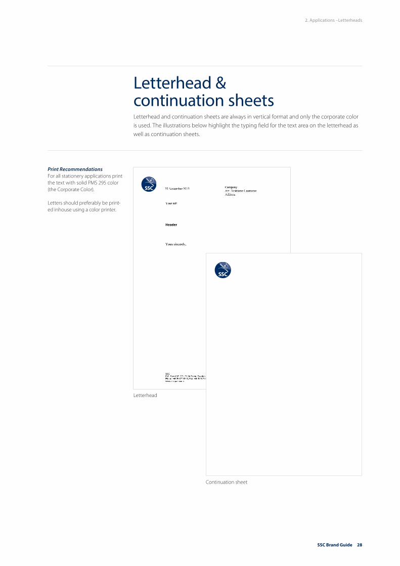
Letterhead & continuation sheets Letterhead and continuation sheets are always in vertical format and only the corporate color is used. The illustrations below highlight the typing field for the text area on the letterhead as well as continuation sheets.
Print RecommendationsFor all stationery applications print the text with solid PMS 295 color (the Corporate Color).
Letters should preferably be print-ed inhouse using a color printer.
2. Applications –Letterheads
Letterhead
Continuation sheet

SSC Brand Guide 29
Correspondence cards Correspondence cards are always in vertical format. Only the corporate blue color is used for the design of our correspondence cards. The illustration below highlights the area for hand-written notes and the address field.
SSC Swedish Space CorporationP.O. Box 4207SE-171 04 Solna, SwedenPhone: +46 8 627 62 00Fax: +46 8 98 70 [email protected]
Print RecommendationsFor all stationery applications print the text with solid PMS 295 color (the Corporate Color).
2. Applications –Correspondence cards

SSC Brand Guide 30
SSCP.O. Box 4207SE-171 04 Solna, SwedenPhone: +46 8 627 62 00Fax: +46 8 98 70 69www.sscspace.com
SSCP.O. Box 4207SE-171 04 Solna, SwedenPhone: +46 8 627 62 00Fax: +46 8 98 70 69www.sscspace.com
Envelope C4
Envelope E65
Envelope Commercial
Envelope C5
2. Applications –Envelopes
Envelopes The design of our envelopes is consistent with that of our letterhead and continuation sheets. Only the corporate blue color is used.
SSCP.O. Box 4207SE-171 04 Solna, SwedenPhone: +46 8 627 62 00Fax: +46 8 98 70 69www.sscspace.com
SSCP.O. Box 4207SE-171 04 Solna, SwedenPhone: +46 8 627 62 00Fax: +46 8 98 70 69www.sscspace.com
Print RecommendationsFor all stationery applications print the text with solid PMS 295 color (the Corporate Color).

SSC Brand Guide 31
Notepad Notepads are in vertical format. Only the corporate blue color or grey is used for the design of our notepads.
2. Applications –Notepad
Note: There is an option to print a gray logo on a notepad

SSC Brand Guide 32
SSC basic folder A basic folder can be used to organize and hand-out numerous documents. It features the SSC logotype, text and the star pattern. The illustration below highlights the field where a label and/or see-through window can be added, i.e. for the recipients address.
2. Applications –SSC basic folder
EUROPESSCP.O. Box 4207SE-171 04 SolnaSwedenTel: +46 8 627 62 00
SSCEsrange Space CenterP.O. Box 802SE-981 28 KirunaSwedenTel: +46 980 72 000
SSCStockholm TeleportVidjavägen 15SE-123 52 FarstaSwedenTel: +46 8 447 35 70
SSCLSE Space Argelsrieder Feld 22D-82234 WesslingGermanyTel:+49 8153 88 10 99 26
SSCLSE Space Robert-Bosch-Strasse 7D-64293 DarmstadtGermanyTel:+49 6151 87 011 37
SSCAurora TechnologyCrown Business CentreHeereweg 3452161 CA LisseThe NetherlandsTel: +31 252 532239
SSCVia Antonio Salandra, 1800187 RomeItalyTel: +39 06 42272021
AMERICASSSC417 Caredean DriveSuite AHorsham, PA 19044USATel: +1-215-328-9130
SSC102 South Tejon StreetSuite 1100Colorado Springs, CO 80903USATel: +1-719-578-3321
SSCAutopista Los Libertadores Km 28,PeldehueSantiagoChileTel: +56 2 2698 1702
ASIA PACIFICSSCWestern AustraliaSpace CentreNorth Depot Hill RoadMingenew, WA 6522AustraliaTel: +61 8 9929 1000
SSCRoom 812, Shi TengBusiness Hotel82 Bei Yuan RoadChaoYang DistrictBeijing 100101ChinaTel: +86 10 649 685 51
SSCSpace Krenovation Park88 Moo Tambon Thung Sukala, Amphoe Siracha, Chonburi 20230 ThailandTel: +66 871486006
sscspace.com

SSC Brand Guide 33
PowerPoint presentationsA standard overhead template must be used to ensure that one consistent face is shown to the market. For this purpose, we have created the “SSC PPT template” and a PPT tool box. They are to be used as the working tools and base for all PowerPoint presentations held by employ-ees within SSC.
Create all your presentations from this file, which contains layouts and guidelines for:• Title slides and section dividers
without images.• Title slides and section
dividers with inserted images. • Use only the Calibri typeface for
PowerPoint presentations.• The SSC logotype is always
placed in the bottom righthand corner or in the top right hand corner.
• Use only colours from the colour palette.
• Do not clutter slides with too many images. Strive for a neat balance between text, diagrams and pictures.
2. Applications –PowerPoint presentations
To be implemented
in 2018

SSC Brand Guide 34
WebThe SSC website (www.sscspace.com) has the following main purposes: marketing and sales, recruiting, news and contact information. Please see Appendix Brand Guide - Digital Meida.
2. Applications –Web
SSC Brand Guide 35
IntranetThe intranet editors have separate guidelines for the intranet available. New branding and Intranet Brand Guide to be implemented during 2018.
2. Applications –Web, Intranet

SSC Brand Guide 36
Example printsBrochure front and back covers should clearly present what our offering does for customers – in a memorable way. Creating effective front covers requires grabbing attention and being confident enough to use punchy, dynamic text and boldly executed visuals that engage and involve readers.
2. Applications –Brochures, Covers
Use imagery, expressive typog-raphy and graphic elements to create interest and gain an SSC look and feel.
Brochures, inside contentAn orderly, neat and tidy layout is key. Use a limited range of font sizes and different weights. Avoid the unnecessary use of italics and underlining. Use good typographic signposting like chapter section titles, page numbers, headers, sub-headlines, etc.
WE HELP EARTH BENEFIT FROM SPACESince our start pioneering scientific rocket launches in northern Sweden, we have grown into a renowned, full-service supplier of state-of-the-art space engineering, satellite and launch services to commercial and institutio-nal customers worldwide.
Inspired by the exciting changes in the global space market, we remain at the forefront by continuously developing new capabilities in close cooperation with our customers. Our understanding of the emer-
solutions enables us to tailor and deliver sustainable innovative services to many market segments.
We focus on three core areas:
◆ We provide rocket and balloon launch services at Esrange Space Center and develop experiment pay-loads. The on-going upgrade of the center, including the planned launch capabilities for small satellites, will enable us to continue to deliver unmatched ser-vices well into the future.
◆ As the operator of one of the world’s largest civilian networks of ground stations, we provide reliable acc- ess to satellites in virtually any orbit. With a new set of satellite services, we are dedicated to meeting sat- ellite owners’ increasing need for capacity.
◆ We also provide engineering services to customers’ projects by bringing consulting expertise to all phases of their space programs.
Sincere engagement, close customer relations, and
we continue to prepare for the future with great
our core values: customer orientation, reliability and excellence.
I N T R O D U C T I O N
S S C | 3
Y O U R P A R T N E R F O R A D V A N C E D S P A C E S E R V I C E S
sscspace.com
YOURSATELLITE,OUR PRIORITY We ensure satellite owners and operators can focus on mission objectives and rely on SSC to manage all necessary ground net-work services, operations & maintenance.
Duis autem vel eum iriure dolor in hendrerit in vulputate velit esse molestie consequat, vel illum dolore eu feugiat nulla facilisis at vero eros et accumsan et iusto odio dignissim qui blandit praesent luptatum zzril delenit augue duis dolore te feugait nulla facilisi. Lorem ipsum dolor sit amet, cons ectetuer adipiscing elit, sed diam nonummy nibh euismod tincidunt ut laoreet dolore magna aliquam erat volutpat. Ut wisi enim ad minim veniam, quis nostrud exerci tation ullamcorper suscipit lobortis nisl ut aliquip
ex ea commodo consequat. Lorem ipsum dolor sit amet, consectetuer adipiscing elit, sed diam nonummy nibh euismod tincidunt ut laoreet dolore magna aliquam erat volutpat. Ut wisi enim ad minim veniam, quis nostrud exerci tation ullamcorper suscipit lobortis nisl ut aliquip ex ea commodo consequat.
Duis autem vel eum iriure dolor in hendrerit in vulputate velit esse molestie consequat, vel illum
CONTENTS
Lorem ipsum 4Dolor sit amet 6Ullamco laboris nisi ut 7Consectetur adipisicing 9Eiusmod tempor 10Incididunt ut labore 12Magna aliqua 13Nostrud exercitation 15Duis aute irure dolor 17Voluptate velit esse 18Excepteur sint occaecat 19Non proident 20
SSC 2017 –WORKING TOGETHER FROM ALL CORNERS OF THE WORLD
3ADVANCED SPACE SERVICES
2
ESP AND DEDICATED LAUNCH SERVICESA NEW PERSPECTIVE ON I.O.T.
Lorem ipsum dolor sit ametBut who has any right to find fault with a man who chooses to enjoy a pleasure that has no annoying consequences, or one who avoids a pain that produces no resultant pleasure?
Et dolore magna aliquaOn the other hand, we denounce with righteous indigna-tion and dislike men who are so beguiled and demoralized by the charms of pleasure of the moment, so blinded by desire, that they cannot foresee the pain and trouble that are bound to ensue; and equal blame belongs to those who
Duis aute irure dolorAs saying through shrinking from toil and pain. These cases are perfectly simple and easy to distinguish. In a free hour, when our power of choice is unparallelled and when nothing prevents our being able to do what we like best, every pleasure is to be welcomed and every pain avoided. But in certain circumstances and owing to the claims.
Lorem ipsum dolor sit ametOf duty or the obligations of business. It will frequently occur that pleasures have to be repudiated and annoyances
12 13ADVANCED SPACE SERVICES ADVANCED SPACE SERVICES

SSC Brand Guide 37
Signage on buildings should welcome visitors to our offices and plants. It must clearly identify us, while at the same time make it easy for the visitor to find what he or she is looking for. This is particularly important for production units and sales offices, where strategic brands must be highly visible to ensure that all visitors and transport personnel quickly know they’re in the right place. Divisions may not have their own signs.
2. Applications – Signage
SignageThe SSC logo must be included on all signs. Facilities and subsidiaries, for example Esrange Space Center and SSC Space Chile, may add the name of the facility or subsidiary as shown in the example below. The web address is not compulsory.
www.sscspace.com

SSC Brand Guide 38
2. Applications – Flags
FlagsThe SSC flag consists of the blue logotype on a white background, as shown below. The size can be increased or decreased, but the overall proportions must be correct. Particular care is also required to ensure correct reproduction of specified colors on various flag materials.
An example of a flag.

SSC Brand Guide 39
VehiclesExamples of marking for different types of vehicles and the principles to be followed are pre-sented below. Please note that the examples shown here have not been issued for use. They are presented for illustrative purposes only.
2. Applications – Vehicles

SSC Brand Guide 40
2. Applications –Clothing, indoor working
Clothing, indoor workingGarments feature the full color logo printed small on the front. As an option, these can be printed on the reverse of the garment. The full color logo is also featured on the front of caps.

SSC Brand Guide 41
Clothing, outdoor workingTypical examples of branded clothing are shown below.
2. Applications –Clothing, outdoor working

SSC Brand Guide 42
Example of ID badge.
2. Applications – Badges, identification card
Badges, identification cardThe design of badges used at our premises should be based on the example below.
NameTitleLocationStaff/Guest
NameLocationStaff/Guest

SSC Brand Guide 43
GiveawaysThe preferred colors are corporate blue and white. Examples of desirable giveaways showing appropriate placement of the SSC logotype. As long as our logotype is correctly applied, many different items are suitable as giveaways.
2. Applications – Giveaways
Giveaway (complimentary) items are an important means of promoting the SSC brand. All giveaways should reflect:• High quality.• Simple yet smart design.• Fresh, clean appearance.• Functional style.• Healthy lifestyle.