VISUAL COMMUNICATION A WRITER™S GUIDE - · PDF fileSusan Hilligoss, Clemson University...
191
VISUAL COMMUNICATION A WRITERS GUIDE Second Edition Susan Hilligoss, Clemson University Tharon Howard, Clemson University New York Boston San Francisco London Toronto Sydney Tokyo Singapore Madrid Mexico City Munich Paris Cape Town Hong Kong Montreal
Transcript of VISUAL COMMUNICATION A WRITER™S GUIDE - · PDF fileSusan Hilligoss, Clemson University...

i
VISUAL COMMUNICATIONA WRITER�S GUIDE
Second Edition
Susan Hilligoss,
Clemson University
Tharon Howard,
Clemson University
New York Boston San FranciscoLondon Toronto Sydney Tokyo Singapore Madrid
Mexico City Munich Paris Cape Town Hong Kong Montreal

ii
Visual Communication: A Writer’s Guide, Second Edition, by Susan Hilligoss and Tharon Howard
Copyright ©2002 Pearson Education, Inc. (Publishing as Longman Publishers.)
All rights reserved. Printed in the United States of America. Instructors may reproduce portions of this bookfor classroom use only. All other reproductions are strictly prohibited without prior permission of thepublisher, except in the case of brief quotations embodied in critical articles and reviews.
ISBN: 0-321-09981-8
1 2 3 4 5 6 7 8 9 10 - CRW - 04 03 02 01
This work is protected by United States copyright laws and is providedsolely for the use of instructors in teaching their courses and assessing
student learning. Dissemination or sale of any part of this work (includ-ing on the World Wide Web) will destroy the integrity of the work and
is not permitted.The work and materials from it should never bemade available to students except by instructors using the accom-
panying text in their classes.All recipients of this work are expected toabide by these restrictions and to honor the intended pedagogical pur-poses and the needs of other instructors who rely on these materials.

iii
1
7
31
55
97
121
133
141
163
175
Contents
Chapter 1Why Visual Communication for Writers?
Chapter 2First Impressions: Perception and Genres
Chapter 3Second Impressions: Interpreting Imagesand Information Graphics
Chapter 4Planning Visual Design
Chapter 5Creating Pages and Screens
Chapter 6Using Type
Chapter 7Adding Images and Information Graphics
Chapter 8Putting It Together: Sample Documents
Chapter 9Learning More about Visual Communication
Glossary

iv
Acknowledgments
We are grateful to John Trimbur for his interest in Susan’s visual communication seminar thatled to the first edition of this book, and for the high example he has set in composition studies.For her enthusiasm and encouragement to make the first edition happen, Anne E. Smith hasour sincere thanks. We also appreciate Lynn Huddon’s efforts and support on this secondedition. Donna Campion coordinated the process of putting together both editions with skilland tact. Leslie Taggart made a number of valuable suggestions. We also thank the College ofArchitecture, Arts, and Humanities and the Pearce Center for Professional Communication atClemson University for use of the Multimedia Authoring Teaching and Research Facility.
We wish to recognize Christopher Lohr’s efforts on the layout of the first edition and WendyHoward’s help proofreading the second edition. Bryce and Logan Howard gave their patience.
Permission to reproduce two flyers was given by the Department of Speech and CommunicationStudies, Clemson University. Thanks to the graduate students in Visual Communication forcreating the genre graphics in Chapters 4, 5, and 8. Permission to reproduce their work is asfollows: Amy Joy Bumgarner, makeover of speech lecture flyer; Keena Hamilton, typesetting ofpoem by William Wordsworth; Joseph D. Hooper, Kids newsletter; Ryan James Keith, originaland makeover of presentation slides; Christopher Lohr, logo original and makeover, withcomments, and portfolio pages; Rebecca J. Pope, makeover of speech club flyer and commen-tary; M. Esther Revis-Wagner, original and makeover of resumes; Deborah M. Staed, diagramsof whole page, body section, and navigation section of Web pages, with commentary, andoriginal and makeover of Web pages; Myra A.Whittemore, grant proposal with budget,outcome graphic, and commentary; Michele Slater, storyboard for Web pages and tri-foldbrochure; Sarah Weathers, Ceilbrite Web pages; Angela Davis, Aim High image poem; ParkerSmith, tri-fold brochure and Livewire newsletter redesign. David Munger of Digital Text Con-struction, Davidson, NC, provided additional graphics. Our thanks to Barbara Heifferon for theexample of the South Carolina Department of Transportation project. Susan’s technical editingclass, spring 1999, created the glossary and provided additional copyediting of the first edition.
Finally, we are indebted to many people for their contributions to visual rhetoric and documentdesign, especially Stephen A. Bernhardt, Karen A. Schriver, Anne Wysocki, and Charles Kostelnick.

1
CHAPTER 1
Why Visual Communication for Writers?
In the past, college students wrote mainly essays and research papers seen by teachers andno one else. These papers were typed on typewriters, or “word-processed” and printed outon equipment that emulated typed text. They were formatted according to standards basedon the manuscript preparation guidelines that college teachers used to submit their ownwriting to scholarly journals or presses.
Today, besides essays, college students write many other types of documents and considerreaders outside the classroom. They prepare their work with sophisticated computers andprinters that rival the output of commercial printing. They have many choices of fonts and theability to incorporate drawings, charts, and graphs. They have access to a wealth of graphics viathe Internet and inexpensive collections of clip art, as well as the means to create digitalphotographs and artwork. They make pages for the World Wide Web and effectively publishtheir work to a large audience. They collaborate with others, so that their documents presentthe ethos of a group, class, or organization to their readers. In short, the world of collegewriting has changed.
The visual design of the traditional essay or research paper, so long taken for granted, is onlyone of many “looks” that college writing may take. With so many choices, how should you, asa writer, make decisions about visual design? This guide is intended to provide strategies andnumerous examples for you to consider.
What is visual communication?
In this guide, visual communication means all the ways that writers and readersinteract through the look of pages and screens. Visual design means the structuredprocess of planning for this interaction. There are other similar, overlapping terms. Thewidely used term document design covers much the same ground as visual communication,except that document design may also refer to matters of language, such as employingcertain types of paragraph and sentence structure that have been shown to be easilyunderstood by readers (Shriver 10; Felker et al. 1-2). Communications design andinformation design also refer broadly to visual communication.1 In this guide, texts
2
and documents refer to both paper and on-screen writing. Likewise, images andgraphics are used interchangeably for visuals that are distinct from verbal material.
Visual communication is part of the writer’s task because the visual elements of a text affecthow readers interact with the words. The interaction is rhetorical, and the importance ofvisual communication in documents is also supported by empirical research.
Visual communication is rhetorical
We can think of a document as a field of interacting rhetorical clusters.Karen A. Shriver
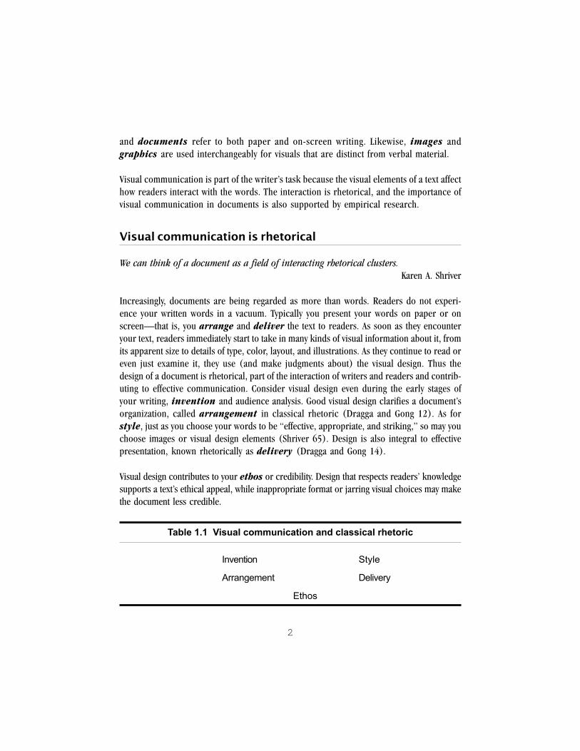
Increasingly, documents are being regarded as more than words. Readers do not experi-ence your written words in a vacuum. Typically you present your words on paper or onscreen—that is, you arrange and deliver the text to readers. As soon as they encounteryour text, readers immediately start to take in many kinds of visual information about it, fromits apparent size to details of type, color, layout, and illustrations. As they continue to read oreven just examine it, they use (and make judgments about) the visual design. Thus thedesign of a document is rhetorical, part of the interaction of writers and readers and contrib-uting to effective communication. Consider visual design even during the early stages ofyour writing, invention and audience analysis. Good visual design clarifies a document’sorganization, called arrangement in classical rhetoric (Dragga and Gong 12). As forstyle, just as you choose your words to be “effective, appropriate, and striking,” so may youchoose images or visual design elements (Shriver 65). Design is also integral to effectivepresentation, known rhetorically as delivery (Dragga and Gong 14).
Visual design contributes to your ethos or credibility. Design that respects readers’ knowledgesupports a text’s ethical appeal, while inappropriate format or jarring visual choices may makethe document less credible.
Table 1.1 Visual communication and classical rhetoric
Invention Style
Arrangement Delivery
Ethos

3
In summary, when you plan the look of your document with your readers in mind, you engagein rhetorical thinking.
Visual design organizes readers� experiences of texts
Research in cognition, perception, and human factors psychology demonstrates that read-ers’ understanding of texts is influenced by formatting and visual cues. Reading is a complexactivity that relies on many layers of visual information.
How readers read. Studies of functional documents like manuals and forms have shown thatreaders do not read every word:
1. Readers are selective about what and how they read.2. They read to accomplish their own purposes.3. They actively interpret documents in light of their own knowledge and expectations.
Initially, readers decide what and how they will read. As Janice C. Redish, a researcher indocument design and usability testing, declares, “Reading is a voluntary act; people don’t haveto do it” (“Understanding” 15). In the workplace, in public discourse, and at school, manydocuments compete for attention. Readers are compelled to be selective.
Once they decide to look at a document, readers do not necessarily read from start to finish.They scan, then read with their goals in mind—that is, they use the document as a tool toaccomplish their own purposes. For example, in one study, readers of a manual read onlytwo or three sentences at a time before they returned to the task at hand (“Understanding” 20).
Readers on the Web also scan for key words. A recent study showed that a large majority of testusers scanned a new page rather than read word by word (Nielsen, “How Users Read on theWeb”). This habit has implications for the look and organization of Web pages.
Finally, readers actively interpret as they read. Those interpretations are based on the words infront of them, but also on their past experiences and knowledge. As they read, people createmental models, or schema, of complex ideas. They also rely on their previous mental models.If readers’ and writers’ mental models of the document do not match—or writers do not maketheir own models of the document’s features clear—readers may misunderstand portions ofthe document or even mistake its purpose.

4
Visual concepts contribute to readers’ models. For example, in one case study, American readersused their training in document design and their knowledge of American companies’ annualreports (their mental models based on past experience) as they examined Japanese annualreports translated into English. Yet their experience did not include design concepts familiar toJapanese readers and writers, who placed a high value on aesthetics and ambiguity (Maitra andGoswami 202). Thus, the American readers judged the Japanese reports in terms of their ownmental models that required images to convey specific information and maintain culturalneutrality (202). They did not receive enough visual cues to interpret some images. They re-interpreted these to be “flashy” and nonfunctional (measured against their models), whereasto Japanese writers and readers, these images conveyed important values (200).
In another study, students aged 11 to 21 evaluated brochures on drug prevention for theireffectiveness. They offered sophisticated evaluations of the choices of graphics, but found manyof the visuals unpersuasive. Although the brochures were aimed at a teenage audience, thestudents considered the illustrations “’insulting’” or “’corny’” (Schriver 172). They pointed tothe visuals that makes scanning and locating information convenient. Suggestions basedon research findings include the following:
Table 1.2 Research-based visual strategies2
Queuing Creating hierarchies of information
Filtering Showing organization through design features suchas headings, lists, typographic changes, layout
Color cueing Using color to focus attention, simplify information,group elements, and create separate layers ofinformation
Mixing modes Giving information in pictures as well as words
Making schema explicit Making clear the document model, such as a mapof a Web site showing the relationships of pages
Creating multiple paths Giving readers both verbal and visual choices througha document to support their different experiencesand learning styles
User-centered design Engaging readers in the process of designingdocuments through design reviews and usabilitytesting
5
These are general strategies geared mainly to functional documents. In the following chapters,you will learn more about these and other strategies—and when and how to apply them forspecific audiences and documents. Above all, researchers in document design wholeheartedlysupport the last strategy, user-centered design. Regardless of suggestions, guidelines, andadvice, writers should engage actual readers in the process of creating documents.
Using this guide
Good visual design complements good writing; it does not replace it. Together writing anddesign are part of finding the best available means to communicate with readers.
Tools. The explanations and examples in this guide assume that you can access and use acomputer with “graphical” word processing software, such as Microsoft Word, WordPerfectfor Windows, or Clarisworks. For paper documents either a laser or ink-jet printer is recom-mended; for Web documents, a graphical browser. Charts and graphs may require spread-sheet or presentation software; manipulation of images may require a paint or drawingprogram. Scanning requires a scanner and image editing software (such as AdobePhotoshop™). Examples are in black and white, although issues of using color—both printand onscreen—are explained. Even without specialized tools, you can create some types ofeffective visuals in paper documents by means of photocopying and pasting.
Skills and time management. Applying the techniques of good design takes time and effort.Give yourself ample time to learn and experiment before writing deadlines. Read the section on“drafts,” then have others look at and comment on them.
Summary
! The changes in college writing affect the visual presentation of your documents.
! Visual communication is rhetorical, involving invention, arrangement, and delivery as wellas contributing to ethos.
! Research with actual readers has implications for the visual design of documents.
! Don’t expect visual design to substitute for good writing.
! As you experiment with design, do visual “drafts” and let others comment on them.

6
Notes
1Karen A. Shriver discusses definitions and competing terms for this field in “What Is Docu-ment Design?” Dynamics in Document Design: Creating Texts for Readers (New York:Wiley, 1997), pp. 1-11.
2Based on the following sources: Elizabeth Keyes, “Typography, Color, and InformationStructure,” Technical Communication, 40.4 (1993): 640-49; Janice C. Redish, “Understand-ing Readers,” in Carol M. Barnum and Saul Carliner, Techniques for Technical Communica-tors (New York: Macmillan, 1993), 32, 36; Donald Norman, The Design of Everyday Things(New York: Doubleday, 1990) 187-217.

7
CHAPTER 2
First Impressions: Perception andGenres
What happens when we first view a document or image? Our eyes take in information, to besure, but how do we make sense of what we see? Our perceptual abilities combined withour knowledge and past experience are involved. That is, we rely on the overall visual organi-zation of materials plus our knowledge of text and graphical genres.
This chapter is about our first impressions when we take in visual information. It introducesideas that are useful both in interpreting published visuals and in creating visual design. Hereare two approaches for understanding our initial impressions of visuals: 1) the principles ofperception, Gestalt psychology, and reading; and 2) rhetorical genres.
Visual perception
One approach to what we see comes from the psychology of sensation, perception, and memory.Vision takes in more sensory data than any other means of sensation. The eyes constantly movein small jumps in a process called foveal vision, which brings images into focus onto thearea of clearest focus of the eye, the fovea. Then, in the process called perception, the braininterprets the data. Within hundredths of a second, the eyes can take in data that the brainprocesses in less than half a second (Coe 132-33).
However, we are not passive viewers. On the contrary, visual perception is an active, think-ing process of planning for, as well as interpreting, sensory data from the eyes. That is, percep-tion is a cognitive activity. In the terms of Rudolf Arnheim, an influential theorist of perceptualpsychology and art, visual perception “is not a passive recording of stimulus material but anactive concern of the mind” necessary for human survival (37).
The very fact that we direct our attention is an important part of visual perception. As we lookaround, we find focal points. A common example is walking into a room crowded withpeople. As we enter, we do not perceive everything in the room at once or equally. Instead, wetend to focus on a few items, such as a window, one small knot of people, or a person seated ina chair. In doing so, we ignore much of the other sensory information, a process called

8
filtering. That filtering presumably “protects the mind from being swamped with” irrel-evant information (Arnheim 25-26). As soon as we distinguish something in our field ofvision, our past experience—including genre knowledge, which will be described later—comes into play, seizing on and interpreting the area of focus (Kostelnick and Roberts, 48-49).We use our vision to accomplish goals. We have an idea of what we will and want to see as welook around.
Readers take in a document’s visual design and images immediately. Image memory—thatis, our memory of particular images as well as our own constructed “mental images” of pic-tures, events, and visual-related words—is also one of our most enduring types of memory(Coe 77). We apply lasting memories of images across the documents we encounter. Thus thedesign affects readers’ first impressions of genre, interest, and importance. As they continue tolook at the document, whether they are reading the entire text or scanning for important points,readers continue to gather information from the visual design, which can both structure theirreading and supplement the text.
To summarize, “We see what we expect to see” describes the way that we plan and focus ourattention visually. Many studies of eyewitness accounts of crimes confirm what Arnheimtheorized: Our ability to focus comes with the ability to filter out visual information that doesnot seem relevant at the time, plus the ability to interpret what we do focus on only in termsof what is familiar to us. It helps to put this active, planning, filtering behavior into more memo-rable terms:
Table 2.1 Visual perception
Weforecast what we expect to see,focus on a small area,seek the familiar, andtend to filter out other information.
That combination of forecasting, focus, familiarity, and filtering gives power to but also limits active visualperception. The process of planning, focusing, and filtering occurs over and over as we look around.
Being aware of these perceptual issues in visual communication can help you as you bothinterpret and create visuals for documents. One of the most important applications of percep-tion to visual design arises from Gestalt psychology.
9
Gestalt principles
Gestalt is a German word that is translated as “form” or “wholeness” (Bevlin 15; Kostelnickand Roberts 53). The term describes an early 20th-century German movement in psychology.Gestalt psychologists studied many aspects of perception. In particular, they found that ourperception of form depends not just on seeing individual parts but on the organization of thewhole. In visual communication, the principles of Gestalt psychology are flexible, powerfultools for interpreting many kinds of visual information and for creating successful documents,pages, and screens.
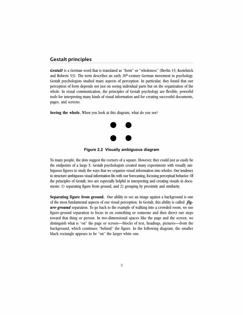
Seeing the whole. When you look at this diagram, what do you see?
Figure 2.2 Visually ambiguous diagram
To many people, the dots suggest the corners of a square. However, they could just as easily bethe endpoints of a large X. Gestalt psychologists created many experiments with visually am-biguous figures to study the ways that we organize visual information into wholes. Our tendencyto structure ambiguous visual information fits with our forecasting, focusing perceptual behavior. Ofthe principles of Gestalt, two are especially helpful in interpreting and creating visuals in docu-ments: 1) separating figure from ground, and 2) grouping by proximity and similarity.
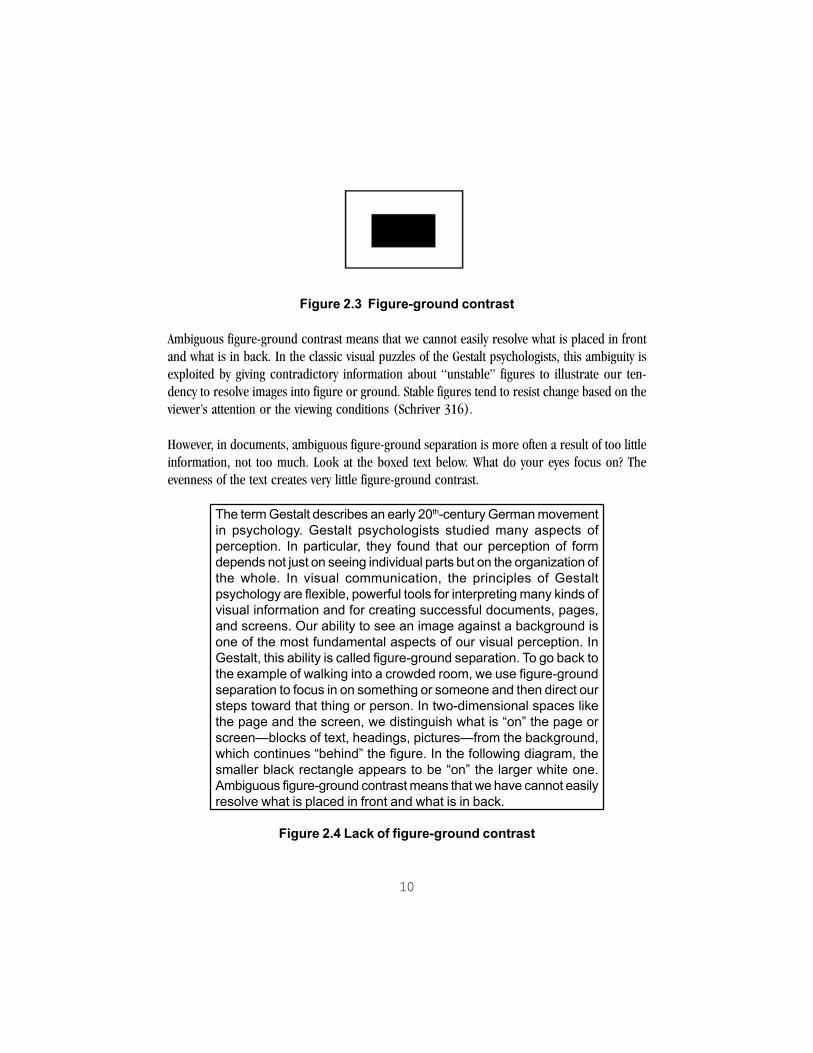
Separating figure from ground. Our ability to see an image against a background is oneof the most fundamental aspects of our visual perception. In Gestalt, this ability is called fig-ure-ground separation. To go back to the example of walking into a crowded room, we usefigure-ground separation to focus in on something or someone and then direct our stepstoward that thing or person. In two-dimensional spaces like the page and the screen, wedistinguish what is “on” the page or screen—blocks of text, headings, pictures—from thebackground, which continues “behind” the figure. In the following diagram, the smallerblack rectangle appears to be “on” the larger white one.
10
Figure 2.3 Figure-ground contrast
Ambiguous figure-ground contrast means that we cannot easily resolve what is placed in frontand what is in back. In the classic visual puzzles of the Gestalt psychologists, this ambiguity isexploited by giving contradictory information about “unstable” figures to illustrate our ten-dency to resolve images into figure or ground. Stable figures tend to resist change based on theviewer’s attention or the viewing conditions (Schriver 316).
However, in documents, ambiguous figure-ground separation is more often a result of too littleinformation, not too much. Look at the boxed text below. What do your eyes focus on? Theevenness of the text creates very little figure-ground contrast.
The term Gestalt describes an early 20th-century German movementin psychology. Gestalt psychologists studied many aspects ofperception. In particular, they found that our perception of formdepends not just on seeing individual parts but on the organization ofthe whole. In visual communication, the principles of Gestaltpsychology are flexible, powerful tools for interpreting many kinds ofvisual information and for creating successful documents, pages,and screens. Our ability to see an image against a background isone of the most fundamental aspects of our visual perception. InGestalt, this ability is called figure-ground separation. To go back tothe example of walking into a crowded room, we use figure-groundseparation to focus in on something or someone and then direct oursteps toward that thing or person. In two-dimensional spaces likethe page and the screen, we distinguish what is �on� the page orscreen�blocks of text, headings, pictures�from the background,which continues �behind� the figure. In the following diagram, thesmaller black rectangle appears to be �on� the larger white one.Ambiguous figure-ground contrast means that we have cannot easilyresolve what is placed in front and what is in back.
Figure 2.4 Lack of figure-ground contrast

11
Even standard text conventions like word-spacing, upper- and lower-case letters, punctuation,and paragraphing assist with figure-ground separation. In ancient times, manuscripts werewritten in all capital letters. There was no spacing between the words and no punctuation, some-thing like this:
INANCIENTTIMESMANUSCRIPTSWEREWRITTENINALLCAPITALLETTERSTHEREWASNOSPACINGBETWEENTHEWORDSANDNOPUNCTUATIONSOMETHINGLIKETHIS
Figure 2.5 The look of ancient text
Creating clear separations of figure and ground based on the rhetorical organization of thedocument is a good starting point for layout.
Grouping. The examples above show how we strive to relate disparate visual elements tocreate recognizable structures and wholes. One of the strongest ways to create relationshipsis by grouping related items together. We group in two main ways: by proximity andsimilarity.
Table 2.6 Grouping
What we observe Gestalt principle1. objects close to each other are related proximity (closeness)
2. objects similar in shape, orientation, color, similarity or texture are related1
Orientation refers to the object’s direction—upright, horizontal, slanted, or rotated. Tex-ture refers to any pattern on the object. Look at the following figure. Do you see four lines ortwo pairs of lines?

12
Figure 2.7 Proximity (closeness)
Look at the boxes below. Which items do you group?
Figure 2.8 Grouping by closeness (1) and shape (2)
Figure 2.9 Grouping by orientation (3) and texture (4)
Proximity and similarity are the two most general and powerful grouping strategies.2 Weassume that even these abstract images are related just because they look alike or because theyare located near each other. The basic chunking of text into short, visually distinct paragraphsrelies on these grouping strategies. Lines of text are near enough to each other and have similar“footprints” of typography, size, length, and so on to be treated together.
These flexible strategies can be combined in many ways to create elaborate, subtle structuresfor displays and documents. For example, in a fact sheet about voter registration, you mightdecide to highlight important items with a check mark, like a mark on a paper ballot. You couldmake a list of such items:

13
! xxx xxxxx xxxxxx! xxxx xx xxxxxx xx! xxxx xxx xxxxx xxx! xxxxxxx xx xxxxx
Figure 2.10 List of check marks
That visually groups the items by proximity and position on the page. Or you could scatter thecheck-marked items throughout the fact sheet. As long as the marks are bold and distinctive,readers will still tend to group them. Why? Because, as you can see, the eye tends to focus onthese similar items regardless of their position.
xxxxxxxxxxxx xx xx!xx!xxxxxxxx xxxxx xxxxxxxxxxx xxxxxxxxxxx xxxxxxxx xxxxxxx !xxxxxxxxxxxx xxxxxxxxxxx xxxxxx xxxx !xxxxxx xxxx
Figure 2.11 Layer of scattered check marks
In other words, the check marks create a separate visual layer of information that can be viewedseparately and scanned by itself while the remaining elements are filtered out (Keyes 640-41).
We also can combine grouping with standard Western layout conventions to create a visualhierarchy of information in a process called queuing (Keyes 640). Outlines use this process.We are accustomed to giving priority to the larger “high-level” headings and realizing that thesmaller, “lower-level” type contains detailed information. In Figure 2.12, the bold headings allhave the same size and weight (“color”) of type, and they are all placed in the same relationshipto the margin, paper edges, and other text. Despite the different words used in the headings,readers will treat them as visually similar. The italic headings will likewise be considered similar.
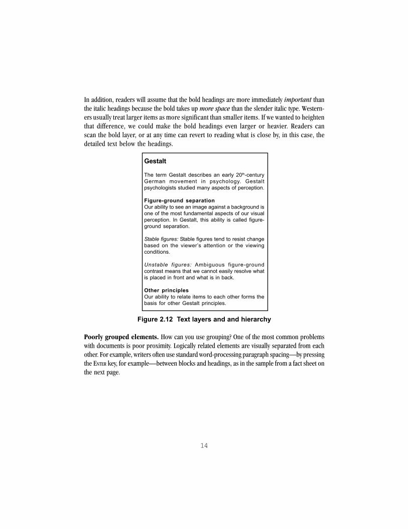
14
In addition, readers will assume that the bold headings are more immediately important thanthe italic headings because the bold takes up more space than the slender italic type. Western-ers usually treat larger items as more significant than smaller items. If we wanted to heightenthat difference, we could make the bold headings even larger or heavier. Readers canscan the bold layer, or at any time can revert to reading what is close by, in this case, thedetailed text below the headings.
Gestalt
The term Gestalt describes an early 20th-centuryGerman movement in psychology. Gestaltpsychologists studied many aspects of perception.
Figure-ground separationOur ability to see an image against a background isone of the most fundamental aspects of our visualperception. In Gestalt, this ability is called figure-ground separation.
Stable figures: Stable figures tend to resist changebased on the viewer�s attention or the viewingconditions.
Unstable figures: Ambiguous figure-groundcontrast means that we cannot easily resolve whatis placed in front and what is in back.
Other principlesOur ability to relate items to each other forms thebasis for other Gestalt principles.
Figure 2.12 Text layers and and hierarchy
Poorly grouped elements. How can you use grouping? One of the most common problemswith documents is poor proximity. Logically related elements are visually separated from eachother. For example, writers often use standard word-processing paragraph spacing—by pressingthe ENTER key, for example—between blocks and headings, as in the sample from a fact sheet onthe next page.

15
Why is there no bus service to the community center?
The original routes were scheduled before the communitycenter was built.
Who is affected?
Everyone who uses the community center is impacted.
What can be done?
The center council has been meeting with city officials.
Figure 2.13 Evenly spaced text
To the reader, the even spacing means that the heading does not seem close to its text. Insteadit “hangs” between the two paragraphs. A better solution is to have the heading sit closer to thetext with which it belongs.
Why is there no bus service to the community center?The original routes were scheduled before the communitycenter was built.
Who is affected?Everyone who uses the community center is impacted.
What can be done?The center council has been meeting with city officials.
Figure 2.14 Headings close to following text
Even better, combine proximity and similarity by making the headings more like each other andless like the explanatory text.

16
Why is there no bus service to the community center?The original routes were scheduled before the communitycenter was built.
Who is affected?Everyone who uses the community center is impacted.
What can be done?The center council has been meeting with city officials.
Figure 2.15 Headings grouped by bold type
Using repetition and contrast. Similarity also suggests two other strategies. To make itemssimilar we can repeat an element that they share. Likewise, to make different items stand outfrom each other and the background, we need to create clear contrast.
More on visual perception
Perception includes many other dimensions. A few that are helpful in interpreting and creatingvisuals are ordered perception, information zones, eye movement, and color.
Ordered perception. We readily distinguish the relative size of items and can quickly assignthem an order or sequence—smallest to largest, or largest to smallest. Likewise, in a black andwhite illustration, we can point out the sequence of tones (or values) from black through shadesof gray to white. We can also look at several patterns—such as dots or checkerboards—and orderthem by their texture, that is, the fineness or coarseness of their elements. We can apply size, value, andtexture to aid readers in sequencing information (Bertin 67).

17
Figure 2.16 Visual ordering
Eye movement and brain processing. According to human factors experts, the eyemoves most naturally from the upper left to the lower right of the visual field (Coe 259-60). Thismotion may somewhat counter the reading of text strictly horizontally, left to right. However, aneye-movement study by the Poynter Institute concluded that newspaper readers begin readingor “enter” a page wherever the strongest visual element is located. If the dominant visual was inthe middle or lower half of the page, test readers began reading there (Baird et al. 6).
Color. Color is powerful and complex. It focuses attention like no other visual feature, and itoutweighs other means of grouping (Bang 106). It moves viewers. Color can also distract andoverwhelm. A color can mean one thing in one context and something completely different inanother. A full discussion of color and perception is beyond the scope of this guide. However,here is a brief introduction. For guidelines on using color in documents, see Chapters 5 and 7.
Color has three perceptual dimensions, hue, value, and saturation:
" Hue is what we usually mean by color—blue, green, red, and so on.
" Value is the amount of black or white in a color. Printers add white to a hue to create tints,and black to create shades. Value is an important concept for designing documents.
" Saturation is the purity of a hue, often defined as the amount of color plus some amountof black, white, or gray. Bright red is highly saturated, while pink is not. Saturated colorsretain their distinctiveness in bright light.

18
Although humans distinguish many colors (up to 7 million), we do not rank hues in anyreliable order (Coe 147; Bertin 67). We do reliably place colors in order from lightest todarkest. That is, we rank them by value. (See the earlier discussion of ordered perception.)Value also helps us distinguish figure from background. We can pick out dark items on a lightbackground or light items on a dark background, regardless of the actual hues.
Over the years research on color, especially as used in documents, has indicated that colorhelps readers find, organize, and make decisions about complex information. It can increaselearning. Some colors also have physiological effects. In addition, the results of surveys showthat computer users prefer color. Readers of advertising find color ads more memorable thanblack and white ads, while newspaper readers prefer bold color (Horton 223-5; Baird et al. 6).
Yet color also brings problems. Many problems result simply from overusing color and assum-ing that particular colors have set meanings for all viewers. Remember that different culturesassign very different social and emotional meanings to colors. For example, yellow indicateswildly different qualities in Western, Chinese, and Arabic cultures:
Table 2.17 Cultural differences with the color yellow
caution, cowardice Westernhonor, royalty Chinesehappiness, prosperity Arabic
(adapted from Coe 150)
Overused, color also distracts attention for readers and can tire the eyes. There are manyperceptual tricks that color plays on the eye, so that perception of any one color depends onnearby colors (Horton 227).
Color-vision deficiency affects 8 percent of males and 0.4 percent of females. People with color-vision deficiency may confuse red and green, confuse yellow and blue, or see only shades ofgray (Coe 148). Documents that use color for important signals and organizational cuingshould therefore accommodate readers for whom these signals may be unclear. See Chapters5 and 7 for specific guidelines.

19
The psychology of seeing applied to documents
Western documents, arranged in pages or screens, divide material into text and pictures.There is evidence that the eye tends to focus on the illustrations before the text and noticepictures (representational illustrations) before more abstract illustrations (Dragga and Gong171). Images are also easier to recall from memory than non-image data (Coe 77). Visualrepresentations let us grasp spatial relationships and actions more quickly than verbal expla-nations do (Shneiderman 206-7). Further, people seem to have different ways that they learnbest. Psychologists have divided these ways into cognitive styles. Learning primarily throughvisual means or imagination differs from the learning styles that emphasize analytical reasoning(Coe 57; Shneiderman 207). Our visual conventions are closely tied to language and experi-ence. The presence of verbal cues influences how we interpret pictures.
Visual perception and reading
Reading itself certainly requires visual perception. Readers approach documents with one ormore of five goals. They may want to:
" skim for the general meaning or gist of the whole document
" scan quickly for specific information
" search more thoroughly to comprehend specific information
" read receptively for thorough comprehension of the document
" read critically for evaluation of the document
(adapted from Coe 139-40)
Readers form goals as soon as they notice documents. Their genre expectations “kick in” asthey notice the medium, format, and design. Visual information is critical to readers’ meetingtheir goals as they proceed into the document. Let’s examine the goals that readers have, usingthe example of a non-profit campus literacy organization.
Reading goals in action. Say that you and other students have created a brochure for thecampus literacy organization that trains and places volunteer reading tutors. The brochure isdesigned to attract interest from students and sponsoring groups. Many readers will approachthe brochure only to skim or scan it to understand basically what your organization does.They’ll take in its images and some of its basic facts, then set it aside. The images may wellestablish the credibility of your organization, its ethos, in these readers’ minds. Some will (at this

20
time or later) search the brochure for specific information, such as a phone number. No oneexpects a brochure to cover a topic in depth, so it makes a quick visual and rhetorical impres-sion. At the same time, it makes a few well-chosen facts easily accessible. Visual design isimportant to both purposes.
Reading goals and visual design. As readers approach your document, visual design andother elements of the document, especially the arrangement of text, intertwine. Readers ofthe literacy brochure use visual design and information to accomplish set, often ratherlimited, goals. Charles Kostelnick and David D. Roberts note that “We use vision to completethe task at hand—and little more” (50; authors’ italics). They rely on previous knowledge tointerpret your document visually, and where that knowledge is not yet generalized (as in Websites), they rely on pattern and consistency to interpret what they see. From visual elementsthey also infer qualities of the organization and the writer—ethos—even to the point of mak-ing judgments. Our prior knowledge of visuals leads us to the discussion of genres.
Genres and visuals
As we look, we focus on the familiar and filter the rest. What then is familiar? In part it is ouraccumulated memories and experience, including our mental models (schemata). Thesemental models are highly organized into networks and categories of information, so that we canrecognize many visual forms, from photographs to types of documents, almost instantaneously.As readers, publication designers, and writers, we constantly act on that recognition. The idea of genreknowledge is helpful in understanding how these larger visual and document forms operate.
Genre knowledge. Genres, which are kinds of discourse or documents like poems, persua-sive essays, or news articles, have different goals and proceed differently. Rhetorically, genresare not just forms of texts but also “socially active devices” (Jolliffe 279; Miller 151). That is,knowledge of genre helps readers determine what the writer wants from them as they read andhelps them to read successfully and purposefully (Jolliffe 279-80). For example, readersapproach a poem with certain expectations. They bring very different expectations to readingan essay of political argument, a resume, a magazine profile, a brochure, or a consumer guide.As defined in this guide, our genre knowledge consists of networks of mental models orschemata that we have created from repeated experiences.
Readers make genre decisions early and use a variety of types of information to do so. Someinformation is language-based. The conventional phrase “Once upon a time” signals a fairytale—or a variant of that genre—to many people raised to speak and read English. In fact,

21
this phrase is a verbal convention, one of “the customary forms and configurations thatmembers of an audience expect” to appear in a given example of a genre (Kostelnick andRoberts 33).
Much genre information is non-verbal. Many genres look different from each other: a novel,a yearbook, a magazine, a newspaper. Newsletters have many of the same visual features asnewspapers but have a recognizable format of their own. Sonnets have a characteristic “boxy”look on the page. In fact, simply looking at a text or a portion of a document may help us toclassify it, so that we know what to expect even before reading. Compare, for example, Figures8.1 and 8.9.
As we interpret what we are looking at, we also position ourselves and the document in relationto the writers, artists, or designers. We may decide that we are looking at a very old poem orpainting, or one that was created in a different culture from ours. Within the image we may findother ways to relate to the producers. For example, we may find represented figures sympa-thetic. This interpersonal response is a part even of abstract images and diagrams (Kress andLeeuwen 41). Or, like the students reading anti-drug use brochures in Chapter 1, we may feeldisconnected from the document’s authors.
Genre knowledge is held in common by groups of readers and writers called discoursecommunities. These communities may be large or small, and we all belong to a number ofshifting, overlapping discourse communities.
How are genres and reading goals related? Genre and visual perception interactcomplexly during reading. Through the literacy brochure’s folded format and design, read-ers quickly take in the fact that is it is a brochure—and expect it to contain certain types ofinformation. Almost as soon as they see it, readers use the brochure’s visual features to makemoment-by-moment decisions—to keep reading, for example—and to make judgmentsabout the credibility of the group and the usefulness of the information. Try this out byexamining the brochure in Figure 8.17 and keeping track of what visual features attractyour attention.
What are visual conventions or practices? As with verbal knowledge, our visual knowl-edge of genres is made up of many clustered bits of knowledge and expectations—visualconventions or practices or simply features. These clusters operate at all levels ofdetail. Large-scale features include the size and weight of paper or printed stock that thepublication uses. A newspaper uses newsprint, easily identifiable by its texture and size(and feel). At the medium level of page layout, there is the convention that newsletters and

22
newspapers usually have multiple columns while reports and academic essays have ex-actly a one-page-wide “column.” On a smaller scale, the acceptable format for businessletters specifies the spatial organization of the text. Each element has a place: date, insideaddress, salutation, body, closing, signature block, and the like. We only need to glance at apiece of paper to make an initial decision about what it is and how it relates to our purposes.That is the power of visual conventions.
Based on other cues, we are able to understand and correctly apply two or more differentconventional interpretations of the same visual element. For example, in a research paper,superscript numbers indicate footnotes or endnotes. Yet in mathematical text, superscriptsindicate exponents (the “power” to which a variable is raised).
One common type of ancient map is the strip map.2
x2 + y2 = z2
Figure 2.18 Same symbol, different meanings
The same visual element has two conventional meanings. We use the context to determinewhich interpretation to apply. If the writers have not used the superscript convention inthe same way that we understand it, we will be confused and frustrated.
Whose practice is it? A particular visual convention may be standard within a certain groupand part of its local culture. For example, many companies and agencies distinguish betweentypes of stationery used for different types of documents. In fact, writers at one organization routinelycalled one set of documents that they wrote “pink memos” and another set “white memos” becausethe two verbal genres were also distinctive visually (Odell, Goswami, Herrington, and Quick 21).Other visual conventions are much more widespread.
In page and screen layout, for example, readers of Western languages recognize theseconventions:
" text will read from top left to bottom right
" larger items are more significant than smaller items
" items higher on the page have more priority than those lower down
" signals of continuation (“more to come”) appear at bottom center or bottom right
(Kristof and Satran 90)

23
Another example is the slashed circle as an international symbol for “prohibited.”
Figure 2.19 This widespread visual convention meansan activity is prohibited.
It is a mistake, however, to assume that “widespread” means “universal.” Visual symbols, inparticular, require care in their use. Many apparently “universal” symbols are not understoodat all, or are understood in ways completely unintended by the writer or designer. Norshould particular images, symbols, or visual techniques be automatically labeled “natural” or“lifelike.” As the art historian E. Gombrich has shown, much of the visual “language” of draw-ing and painting is not based on life, but on other drawings and paintings (65, 75-77). Overtime we realize that these so-called lifelike renderings employ techniques that are more localthan universal.
What previous visual knowledge do designers and viewers share? If you have everplayed the game PICTIONARY®, you know that it does not take much artistic skill.3 Success dependson how fast you can tap into your team’s previous visual knowledge. The same applies to allpictures, images, and illustrations. Look at the following picture:
Figure 2.20 These visual conventions indicate gender and relationship.

24
The visual conventions to indicate gender are fairly clear to Western readers. The sizes of theshapes plus the joined arms indicate a relationship of mother and daughter.
Let’s try another. Say that the word to illustrate is spinach. You try this:
Figure 2.21 Spinach?
Is it clear that this image is supposed to be spinach? Probably not, so you try:
Figure 2.22 Spinach?
Think your team will get it? Finally you sketch:
Figure 2.23 A visual association for spinach

25
In American popular culture, spinach is associated with the cartoon character Popeye, andPopeye has a characteristic look, including huge forearms.4 Could you do the same withanother green, leafy vegetable such as kale or collards? Probably not. Visual conventionscan be highly specific, with unique associations in viewers’ experiences.
How flexible is this practice? Is the visual feature required, in effect a rule? If so, thatconvention is strict (Kostelnick and Roberts 34). Business letters have a strict format, as domany types of academic papers and resumes. On the other hand, the formats of newsletters andbrochures are relatively flexible. Within certain expectations, the creators of newsletters andbrochures have considerable freedom to adapt the look. There is a limit to the freedom,however. Even within flexible genres and conventions, readers still need enough quick visualinformation to identify the document’s genre and accomplish their reading goals.
However, even rigid conventions can change. Those who use a convention often face newneeds and so they adapt existing genre knowledge.
Visual practices change. Like business letters, workplace memoranda have fairly rigidvisual conventions. Letters and memos differ a great deal in where they place routing andsubject information. In memos, all routing or classifying information goes in the top heading. Inparticular, in business letters you as sender put your name at the bottom (and nowhere else),whereas in memos you put your name at the top on the FROM: line (and nowhere else.)
25

26
Figure 2.24 Memo and letter formats
Electronic mail formats are based on memos, with the routing information (which also servesas the electronic envelope) at the top, separate from the body. Yet e-mail users found that somemail systems did not identify them except by their short “userIDs,” and recipients were some-times confused about who sent the message. E-mail users began attaching “signature files” or“sig files” to the bottom of the body of their messages. That is, they identified themselves assenders both at the top and bottom of the e-mail.
As e-mail has become widespread, the convention of putting the sender’s name at both top andbottom of a message is now increasingly seen in paper memoranda. The change is not yetwidely accepted—it is not a new convention. The discourse communities that see value in theold practices for memoranda insist on having all routing information at the top. Many regardthe bottom signature on memos as simply wrong. But over time, the conventions for all of thesegenres may adapt because of the introduction of e-mail. As Carolyn Miller has noted, genres evolveand decay (153).
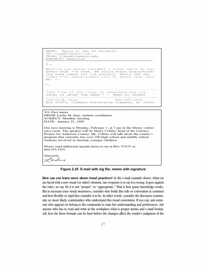
27
Figure 2.25 E-mail with sig file; memo with signature
How can you learn more about visual practices? As the e-mail example shows, when weare faced with a new visual (or other) element, one response is to say it is wrong. It goes againstthe rules, we say. Or it is not “proper” or “appropriate.” That is how genre knowledge works.But to increase your visual awareness, consider who holds this rule or convention in commonand how flexible or rigid they consider it to be. In other words, consider the discourse commu-nity or, more likely, communities who understand this visual convention. If you can, ask some-one who appears to belong to the community to state her understanding and preferences. Askanyone who has to read and write in the workplace what is proper memo and e-mail format.Ask how far these formats can be bent before the changes affect the reader’s judgment of the

28
writer. Then go to other people and ask the same questions. Note where their statementsoverlap and where they diverge, and consider why that might be the case, based on the dis-course communities to which you think they belong.
Visual practices are complex and fluid. Knowledge of genres and specific visual conven-tions helps us negotiate the complex world of documents that we encounter. A large part of thisbook is devoted to increasing your knowledge of specific visual practices. However, there is noattempt to develop a system of classification of visuals. Because of the complexity of visualinformation as well as the open nature of genres, that would be a difficult and probablypointless task (Miller 151-53). Genre knowledge is fluid, at times contradictory, andsubject to change. As you develop your awareness, consider that our genre knowledgesometimes limits as well as helps us. Part of learning is learning where and how to applyknowledge, plus learning the extent and influence of discourse communities that sanctionthis knowledge.
Conclusion: visual perception, practices, and genres. For many reasons, some ex-perts are now recommending that visual information make up a fairly large proportion of pagesand especially screens. Genres that require much skimming and searching, such as instruc-tions, manuals, and online documentation, have up to half or more of their information invisual form, which includes layout features and the blank or “white” space used to frameblocks of information (Coe 221). Other genres are also becoming more visual, to motivate,convey ethos, and aid readers in understanding.
Summary
" Visual perception is an active process of planning and fulfilling expectations about what weare viewing. Visual perception is extraordinarily fast and involves the brain almostfrom the start.
" As we look, we focus on the familiar and tend to filter out the rest.
" The Gestalt principles of 1) figure-ground separation and 2) grouping by proximity andsimilarity help explain our perception of complex pages and screens.
" Knowledge of visual practices involves knowing who employs them and how flexible thepractices are.
" Visual information is becoming more prevalent in many genres.

29
Exercises
1. Consider the “junk mail” that you receive. How do you determine it is junk? That is, what cuesdo you use to classify it as the genre of junk mail (or direct marketing solicitation, to use theindustry term)? Which cues are visual, like the large-size envelopes and colorful inserts? Whichare language-based, like the method of addressing you? Which are tactile? What features doesjunk mail share with other mail, such as bills or business envelopes that contain new creditcards? Given the subtleties that some direct marketers use, how do you make the determinationwithout wasting much time? Consider your reading goals and moment-by-moment decision-making as you examine a piece of mail. What visual information contributes to your decisionsto stop or to continue reading?
2. With a partner or small group, try “drawing” the words below. Discuss the differencesbetween your drawings and what visual features play a part in each. Try sketching other wordsand have your partner or group members guess the words from the sketches. What featuresmatter most?
sky cape map
tree homeless modern art
oak yield philosophy
3. The World Wide Web is relatively new, yet immensely popular. Do you think that the discoursecommunities of Web users have created distinctive visual genres? That is, are there clearlydifferent kinds of sites based on visual information? Try the following. Identify several types ofWeb sites. Then compare them visually: number and types of images, moving or static imagery,use of color, number, and types of visually distinct areas on the screen, type styles, format of text.How would you evaluate these differences?
Notes
1These are four of Jacques Bertin’s six “retinal variables.” He states that these four, shape, texture,orientation, and color, have “associativity” (Bertin 65).
2Mullet and Sano 95. Although they are the most important for our purposes, figure-groundseparation, proximity, and similarity are only three of the Gestalt principles. The others include

30
closure, continuation, symmetry, and common fate. Good discussions of Gestalt theory fordesigners and writers appear in Mullet and Sano (91-93), Schriver (303-26), Coe (18-23),and Kostelnick and Roberts (53-70). Robin Williams has worked out a design method basedin part on Gestalt principles in The Non-Designer’s Design Book.
3PICTIONARY® is a commercial game similar to the parlor game “Charades,” in which teams guesswords from quick sketches rather than gestures. PICTIONARY® is a registered trademark ofPictionary Incorporated under license to Hasbro, Inc.
4Popeye the Sailor is a copyrighted character of King Features Syndicate.

31
CHAPTER 3
Second Impressions: InterpretingImages and Information Graphics
Typically as we examine documents, we resolve what we see into words and “pictures.”1 AsChapter 2 has shown, we tend first to focus on the pictures—visual elements like photographs,drawings, maps, or graphs. The array of pictures that we encounter in print and on computerscreens is vast and complex. The ability to analyze and interpret visuals in our culture issometimes called visual literacy. Visual literacy includes not just understanding the basicsof visual information and persuasion, but also the potential for distortion.
This chapter concerns the interpretation of pictures, meaning anything on the page or screenthat is set off to be looked at. The pictures may also contain words and call on us to read, butthey have additional dimensions. Pictures can be divided into:
1. Images—including photographs, lifelike or stylized drawings, cartoons, and combinationsof these with each other and with text, as in advertisements
2. Information graphics—including maps, diagrams, tables, charts, and graphs.
In this chapter, you will find strategies for making sense of common types of images andinformation graphics. For more about using them in your own documents, see Chapter 7.
Making sense of images
Images call on our perceptual and genre knowledge, including many specific visual conven-tions, plus our emotional responses. This discussion concerns still images, but much of it alsoapplies to moving images on television, film, and the Web. Common types of still images includenews and documentary photographs, conceptual photographs, drawings, clip art, cartoons,and advertisements in print and on the Web.

32
News and documentary photographs
When we say an image looks real, we often use our knowledge of photographs as a yardstick.The 35-millimeter color photograph has been called the standard of realistic representation inour time (Kress and van Leeuwen 163). That reputation has been honed by a century ofnewspaper and documentary photography, which “records events or faithfully shows the real-ity of people or places” (Finberg and Itule 227). News and documentary photos arespontaneous or near-spontaneous recordings of human events and conditions, ranging fromnews events to sports to daily life. Professional news and documentary photos are seriousvisual compositions with the potential for great emotional and social impact. To maintain theircredibility, these photographs can only be edited or manipulated in certain ways, such as beingcropped, that is, having extraneous details cut off. Like all visuals, news and documentary photo-graphs are selective and subject to manipulation. However, photojournalists and news photo editorshave an ethical responsibility to let the photographic image tell the viewer an informative and fullstory—as well as an interesting one (Finberg and Itule 197, 226).
Conceptual photographs
Photo illustrations or conceptual photographs are posed or manipulated to make apoint. Conceptual photography also includes many pictures taken to illustrate news, featurestories, art photography, and all advertising photography. The photograph is often staged,manipulated or edited to make the point more clearly. Stunt photos—for example, having yourpicture taken at a carnival behind a prop showing a monster’s body—are obviously concep-tual. So are the results of “morphing” software that transform photos digitally. So are newsphotos that are manipulated and edited beyond basic journalistic practice. The 27 June 1994cover of Time magazine showing O. J. Simpson as darker-skinned and more heavily bearded—and possibly more menacing—than in the original photo is another example. Professionalphotographers who exhibit their work also employ concepts, often to raise questions about ouracceptance of photographic reality. Conceptual photos have many worthwhile uses, if their pur-poses are understood.
You probably have also seen stock photographs, standardized conceptual images from commer-cial data bases. Stock photos are sold as backgrounds for annual reports, ads, brochures, andmany other documents. In addition to lending a professional polish to a document, theseimages may create moods and portray themes.2 Stock photographs are also available in com-mon word processing and desktop publishing programs, as well as on the Web. Although theyare often more sophisticated than clip art, stock pictures have many of the same drawbacks.

33
Conceptual pictures represent reality, in a way—but only in a way. Their impact comes from theblending of apparent photographic reality with many subtle or arresting visual effects.
Drawings, cartoons, clip art
Drawings have an enormous range—from detailed pen and ink illustrations to colorfulicons (small, stylized images often used for links and “buttons” in software). In this electronicage, many drawings are not actually drawn by hand, but rather created with computer illustra-tion programs by graphic artists. With photographs as the standard of reality, we often do notexpect drawings to be particularly lifelike or realistic. (An exception is scientific and technicalillustrations, which are expected to be as accurate as possible.)
In fact, the popular genres of drawings—cartoons and comic strips—exaggerate for the sakeof humor. Computers and the Web have made huge collections of colorful drawings availableelectronically. These collections are called clip art, from the print books that originally werethe source of these images. Much clip art is available for fair use (see Chapter 7). Because it isso widespread, clip art is influential. For the same reason, it can be trite and overused. Worse,clip art can perpetuate gender, racial, and cultural stereotypes.
Remember that norms for images change over time. The changes may be particularly apparentin drawings. For example, for years the U. S. Army has published a monthly magazine devotedto vehicle maintenance updates. Its comic-book appearance, many illustrations, and sexyfemale characters interest soldier-mechanics who are mostly male and who are not necessarilyproficient or well-motivated readers. But the sexual appeal has changed over 20 years. An issuefrom 1970 features a continuing female character in a mini-skirt and halter top. In a 1990issue, the female characters, now of different ethnic backgrounds, dress in fatigues. In addition,the drawings no longer look like part of the counter-culture of the 1960’s. The more obviousvisual sexism and outdated art have been “toned down” to suit a volunteer professional Armythat has more women and is more aware of gender and racial bias (Bernhardt 217).
Print and Web advertisements
Advertising makes use of all kinds of images, such as conceptual photographs, drawings, andreproductions of paintings and sculpture, to name just a few. Each ad also arranges visualelements in a space and sequence designed to persuade the potential buyer. Advertising is one

34
of the chief sources of visual images and design for many people; it literally defines much ofwhat we know about visual communication. The field of graphic design owes its growth toadvertising and corporate communications (see Chapter 9).
The art historian and cultural critic John Berger has said that advertising creates an alternatereality, inviting us to envy advertising’s dream world and seek its glamour, which he defines asthe happiness of being envied by others (132, 142). He also notes how sophisticated our genreknowledge is. In a magazine, we are generally able to distinguish ads from news articles andfeatures, despite the fact that they are placed together and employ many of the same visualfeatures, such as photographs (151-52). Yet many advertisers seek to blur the line between thedocument’s editorial content and the ads.
The Web is also a commercial environment. Because it is relatively new, the conventions for theplacement and look of ads are not completely settled. Newcomers to the Web may be temptedby links that appear to be part of a page’s contents, only to find that the links take them to acommercial product or service.
Analyzing images
Try asking the following questions when you analyze an image, whether it is a news or documen-tary photograph, a conceptual photo, an ad, a cartoon, a comic strip, a line drawing, or a pieceof clip art. Not all the questions will apply, of course, but many will be relevant. Extend youranalysis of those answers that seem most important.3
Rhetorical purpose�images
! Where does this image appear?
! What is the image’s purpose? Does it document a situation, event, or condition? Is itconceptual? If so, what is its point? Does it specifically support an appeal to buy something?
! Is the image realistic, like a photograph? Or more stylized, like a cartoon or caricature?
! If the image is realistic, do you detect any types of distortion? Describe any features that maybe distorted.
! How polished or “professional” is the image?
! What tone does the image project?
! How seriously do you take it? Explain why.

35
! Who do you think are the intended viewers of this image? What features suggest thataudience?
! Who do you think produced this image? Is the creator or photographer stated?
! What would you say your relationship is to the producer or producers? Do you think theyunderstand you as a viewer?
Overall design
! What draws your eye first?
! What does the dominant part of the image portray?
! What is in the center of the image?
! What is shown in front and larger? What is behind and smaller?
! What is shown in the upper half? The lower half?
! Are portions more blurred? Are there very distinct parts in sharp focus?
We respond to what we think is the dominant area, in sharp focus. The center of thevisual field—page or screen—is one common area of emphasis. We may also tend toplace more emphasis on what is larger (in front) and in the upper half. Would you saythis is true in this image? How so?
! On a sheet of paper, draw or trace the major areas of the image and label them.
! Is there empty space? What does the empty space “frame”?
! Are some areas or shapes very large? Are others very small?
We respond to extremes of scale. Not only do huge areas seem very close while tinyones seem far away, but together the two extremes may suggest tension or conflict. Forexample, a small outline of a child placed on a large white background may suggest tous that the child is alone and vulnerable, at odds with the vast background, or just lesssignificant than the background.
! Describe the major shapes and lines created. Consider what effect the shapes and lines create.
According to some who study psychology and art, “Smooth, flat, horizontal shapesgive us a sense of stability and calm” (Bang 56). Vertical lines, defying gravity, suggestenergy and activity, while diagonal lines create tension and interest, moving off thepage or screen in a clear direction. Circles are the ultimate in symmetry and may beconsidered both dynamic and static, completely in balance.

36
! Describe the overall arrangement of parts. Are they ordered symmetrically or otherwisebalanced against each other?
! Would you say that the parts form an array of smaller images, like a yearbook page? In whatorder do you look at these? Or are they a sequence to be read as a story? Does thearrangement convey anything about the purpose of the image?
People
! Who is portrayed? Describe your inferences from each feature of the person(s)—age,details of dress, gender, ethnicity, class, posture and stance, portions of the body shown, tiltof head, facial expression, gesture of hands.
! What is the person looking at? Follow her or his “gaze” or “eyeline.” Does he or she looktoward something else in the image? Or out of the picture toward the viewer? What do youmake of the direction of the gaze?
! If there are two or more people, what features suggest their relationships to each other?
! If there are two or more people, does one seem dominant? How is that expressed?
! As with shapes in general, people who are larger (take up more area of the image) or areplaced “above” other people may seem more dominant.
! From what angle are the people shown? Do you seem to look down on them, as if they werebelow you as viewer? Look up to them? Look right at them?
In film studies, the angle of viewing suggests the relationship between the viewer andthe people portrayed. If we as viewers “look down” on people, they may seem powerlessor helpless. On the other hand, looking up to them makes them seem powerful, evendomineering (Giannetti and Langdon 45). At eye level, neither above nor below us,they appear more “at our level” of power and freedom.
! Are the people shown close up? Far away?
In an image, people’s apparent distance from the viewer suggests emotional distance. Forexample, a close-up of someone’s face may make us feel more emotionally involved withthe person—and the image as a whole. Extreme close ups may also seem cramped orclaustrophobic.
! What do you consider to be your relationship as viewer to the person or people shown? Doyou empathize with them or not? Explain why.
37
! If there is no one represented, imagine what sort of person would be at home in this image.Explain why.
Setting
! If the image has a distinctive background, describe it. How does it relate to the dominantfocus of the image—especially people, if any?
! What time and place does the image suggest? What is the effect of that setting?
! Is anything “out of place” in the image? Is a horse shown inside a house, for example? Whatdo you make of the incongruity?
Symbols and signs
! Are there items or features in the image that “mean more than themselves”? Consider theconnotations and associations of particular objects or features in the image. Then relatethem to the rest of the image.
Objects like a flag, a cross, and a six-pointed star are obvious symbols. However,language and visuals are filled with signs, things that stand for someone or somethingelse. We associate emotion-laden concepts with particular sensory features, and theybecome signs, or stand-ins for those concepts and emotions. For example, cosmeticsads draw on cultural anxieties about aging and attractiveness. In the context ofmoisturizing products, dryness can become “a metaphor for loss of sexualattractiveness,” with dry skin standing in for the whole woman past her youth andsexual prime (Berger 188).
Color
! Describe the colors, or absence of color, in the image.
! Where is color is applied?
! Is the color realistic in your view? If not, describe why you think it is not.
! How does color, or its absence, make you feel about the image?
! What previous associations do you have with the colors used? How do those affect yourunderstanding of the image?

38
Text
! If the image includes text—such as headlines, labels, captions, or paragraphs ofexplanation—relate the text to the image.
! In what ways does the text help you make sense of the image? Does it answer questionsabout the image, or only raise more questions?
! What is the personality and tone of the typography—the fonts that the text uses? (SeeChapter 6 for more on fonts.)
Story
! What is the story being told in the image? Consider the people and objects in the image andtheir relationships to each other, the viewer, and the setting, and the text.
! Who can relate to this story? Who may not find it believable or interesting?
! Who or what is excluded from this image? Why do you think that?
! What attitudes—social, political, economic, cultural—are suggested in this image? Whobenefits from the attitudes shown? Who doesn’t?
Look at illustration 3.1. Using some of the questions on rhetorical purpose, overall design,people, and story, what can you say about this image?
Figure 3.1 An image for analysis
39
In sum, examine an image rhetorically and critically. Locate yourself in relationship to theimages. Consider how the parts of the image interact, but also consider the world outsidethe image.
Making sense of information graphics
Every day as readers we constantly encounter factual information displayed in tables, charts,graphs, and maps. In newspaper and magazine articles, these information graphics sum-marize key points and often make dry, abstract information more compelling. In the social andphysical sciences, a research paper’s most convincing evidence for its argument may be in itsdata displays.4 These visual arrays open a dynamic space for discovering relationshipsamong abstract ideas and thus creating knowledge (Bolter 77). Information graphics—tables,charts, graphs, and maps—use our powerful abilities of visual discrimination to compare,notice trends, and understand complex relationships among parts.
We also expect these graphics, like news photographs, to give accurate, undistorted representa-tions of the world. However, all information displays are selective. That is part of their ability toshow clearly certain aspects of the data. Because they are selective, they are also subject todistortion and manipulation. They can obscure data, misrepresent relationships among thedata, and even suggest biased conclusions. The following sections describe common typesof information graphics, then suggest strategies for making sense of them and spotting pos-sible distortions.
Tables
Tables arrange information into columns and rows. (Strictly speaking, most tables are notgraphics at all, but they display information more visually than text does.) Tables use a gridstructure to help the eye locate and compare bits of information.
Making sense of tables. Here is a table showing numbers of students living in three dormsover the course of three semesters:

40
Table 3.2 How many students in dorms?
Fall Spring Summer Total, 98-99
East Dorm 400 380 120 900West Dorm 250 270 115 635South Dorm 345 415 45 804
Term totals 995 1065 280 2339
The title gives the purpose of the table while the orderly presentation lets us compare across, bydorm, or down, by term. The top row gives important information in the column headings,while the far left column (called the stub) labels the rows. We can see that East Dorm has thegreatest number of students in total. We can see that spring term has the highest number ofdorm residents while summer has the least. South Dorm had the highest number of studentsfor any term—spring—a fact that is somewhat buried (see Figure 3.3 for comparison).
Distortion. Complex tables may obscure data, and simple ones may omit important data.However, tables are not subject to the visual distortions that plague graphical displays. Poortables may not be well labeled or set up for easy comparison.
Charts and graphs
Charts and graphs plot numbers into visual form.5 Most common charts use two dimensions,the horizontal (the x-axis) and the vertical (the y-axis). Different charts show data differ-ently. Here are a few standard types:
Bar charts compare values across categories. They are good at showing how proportions arerelated to each other—but not total numbers. In the example, the categories are the threedorms gathered by terms. The length of the shaded bars representing the different dorms’students can easily be compared. South Dorm’s high spring total and low summer total aremore evident here.

41
Figure 3.3 Bar chart
When the bars are vertical, it becomes a column chart, which allows convenient comparisonover time.
Figure 3.4 Column chart

42
Line graphs show trends, usually over time. Would you say that the progression from fall tospring to summer term is continuous? The line graph, which connects the three terms, assumesthat there is a smooth progression. This version may wrongly emphasize a downward trend inoccupancy. Summer dorm residency is probably a different category—always low.
Figure 3.5 Line graph
Some charts allow us to see the total numbers more easily. Pie charts are well-known forshowing how a single whole is divided into parts. However, we cannot easily tell precise amountsfrom these shapes. Pie charts are best for showing a few segments that differ significantly fromeach other. They must be labelled with percentages if we are to comprehend precise differences.
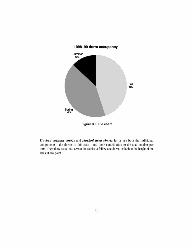
43
Figure 3.6 Pie chart
Stacked column charts and stacked area charts let us see both the individualcomponents—the dorms in this case—and their contribution to the total number perterm. They allow us to look across the stacks to follow one dorm, or look at the height of thestack at any point.

44
Figure 3.7 Stacked column chart
Figure 3.8 Stacked area chart
Distortion. There are several types of distortion commonly found in charts and graphs. Asyou look, ask the following questions:
! Is the baseline (the bottom of the scale) cut off? The cut-off baseline is one of the mostcommon distortions. It focuses the eye on the relevant portion of the data, and is cheaperto produce because the graphic is smaller. But it exaggerates small changes.
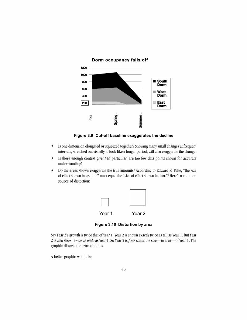
45
Figure 3.9 Cut-off baseline exaggerates the decline
! Is one dimension elongated or squeezed together? Showing many small changes at frequentintervals, stretched out visually to look like a longer period, will also exaggerate the change.
! Is there enough context given? In particular, are too few data points shown for accurateunderstanding?
! Do the areas shown exaggerate the true amounts? According to Edward R. Tufte, “the sizeof effect shown in graphic” must equal the “size of effect shown in data.”6 Here’s a commonsource of distortion:
Year 1 Year 2
Figure 3.10 Distortion by area
Say Year 2’s growth is twice that of Year 1. Year 2 is shown exactly twice as tall as Year 1. But Year2 is also shown twice as wide as Year 1. So Year 2 is four times the size—in area—of Year 1. Thegraphic distorts the true amounts.
A better graphic would be:

46
Year 1 Year 2
Figure 3.11 A more accurate portrayal of �twice the growth�
Other questions to ask:
! Does the title overstate the trend of the data?
! Are dollar amounts adjusted for inflation?
! Are items clearly labeled?
Maps
Maps represent the landscape and its features. Beyond the road and weather maps of dailylife, maps are important tools for conveying complex information to us as educated citizens,voters, and participants in the economy. Like other information graphics, maps are selectiveand subject to distortion. As you make sense of a map, consider these factors.
What is the scale? Because maps are smaller than the landscape that they represent, theyrequire a scale. The scale states how to relate distances on the map to distances on the ground.For example, one inch may represent five miles. A scale may be presented as a ratio, inwords, or as a graphic:
Table 3.12 Scale
Scale Type ExampleRatio 1:10,000 (1 map unit represents 10,000
units on the ground)
Verbal One centimeter represents 10,000 meters
Graphic 1 mile

47
With ratio and verbal scales, the larger the second number, the smaller the map scale. (Remem-ber that one fourth [1:4] is smaller than one half [1:2].) With graphic scales, the moredistance that a unit represents, the smaller the scale. Small-scale maps are less detailedthan large-scale maps.
What is the projection? Maps convert the three-dimensional surface of the earth into thetwo dimensions of a flat plane. To do so, mapmakers use projection, especially in creatingworld maps. Think of a projection as wrapping a flat piece of paper around a transparentglobe. A light from within the globe “projects” the shapes of the earth onto the paper. Differentprojections produce quite different-looking maps, which have different strengths and uses.Some are valued for their accuracy for navigation, like the Mercator projection. Some, likeequal-area projections, preserve the relative size of land masses.
What are the symbols? To read a map well, you must understand the graphic symbols of thatmap. Many of its special symbols—the different lines, grid marks or “ticks,” points, icons,labels, and other markings—are interpreted in a map key or legend on or near the map.
What kind of information does the map offer? Of the many types of maps, the followingare commonly found in newspapers, magazines, and reference works.7 Surface maps, suchas road maps, show the location of places on the earth’s surface: highways, streets, airports,towns, points of interest. Location maps show an area featured in a news story, sometimeswith a sidebar or highlight box of explanation. Event maps follow a sequence of events fromplace to place, with commentary—such as the path of John F. Kennedy’s motorcade in Dallason the day of his assassination. Weather maps show the distribution of temperatures and theweather forecast. Distribution maps show the location (or distribution) of features acrossan area, such as average December temperatures across the U.S., endangered species in aprotected wilderness, or natural resources in a state. Geologic maps show the strata belowthe earth’s surface while topographic maps show visible features of the earth, such asmountains and rivers, often with contour lines that show changes in elevation. Land usemaps show human activity in an area, such as industry, residences, farmland, and parks.Data maps show statistical information across an area, such as cancer rates by state.
Sources of distortion and bias. Maps must represent three dimensions on a flat surface,and they must make many details clear in a small space. As a result, all maps distort reality tosome degree (Monmonier, How to Lie 1). In addition, some subtle distortions will directviewers toward certain interpretations of the map. Map readers must be alert for these possibledistortions. Following are a few examples of common map distortions and their effects.
48
Lack of detail. The smaller the scale, the cruder the map will be and the less detail it willcontain. Symbols on small-scale maps are less likely to be placed accurately because they haveto be large enough to see; they also tend to obscure features of the map. Maps created for theWeb have an additional problem. They need to be relatively small in file size to load quickly.Some small maps on the Web are so limited in their detail that they give readers only the mostgeneric information.
Distorted relationships and emphasis. Particularly in world maps, the projection dis-torts portions of the earth’s areas, angles, gross shapes, distances, or directions. Differentprojections have different effects on these relationships. The distortions of a particular meansof projection can be used to support political arguments. For example, the common Mercatorprojection, which became a standard schoolroom map in the early 20th century, enlarges areasnear the poles—like the far northern countries of Canada and the former Soviet Union. Inparticular the distorted view of the Soviet Union’s size was taken as evidence of its threat to theUnited States. At the same time, the Mercator projection diminishes the areas around thetropics (Monmonier 95).
Similarly, using Gestalt and perceptual principles, a map’s center is its focal point. English-speak-ing countries like the United States have typically put Greenwich, England, at the center becausethe prime meridian (0° latitude) runs through Greenwich. However, that placement also makesthe countries of the former British Empire quite prominent. The United Kingdom, the UnitedStates, and Canada occupy a central zone, while Asia is sometimes divided in half at the left andright edges of the world map—shoved to the margins. In short, different maps have differentpolitical implications.

49
Figure 3.13 Mercator projection with Asia divided
Certain types of maps are prone to specific distortions. Data maps fill known areas, like statesor counties, with points or shading to indicate the density of some statistical feature, likepopulation. These maps are common in news articles. However, readers can too easily focuson the largest geographic areas—or the biggest contrasts in shading—regardless of thenumbers involved.
Distortions to persuade. Many maps are created not only to aid viewers’ understanding ofplace relationships, but also to persuade them. For example, subway maps present the subwayroutes as straight lines. The distances between stops are quite even, like beads on a string. Themap eliminates distracting details and shows the routes from the perspective of subway riders(Aziz 53-54). However, the actual routes of the subway, represented on a surface map, twist andturn all over the city that it runs beneath. City subway maps are all based on Henry Beck’s 1931drawing for the London Underground. The clean, modern design and simplicity of the maphelped persuade Londoners to accept this new mode of transportation; and so it helped makemoney for the subway corporation (Forty 237-38).

50
Maps are constantly used to persuade. Maps of proposed developments are often presented atpublic meetings and hearings. Like the subway map, their purpose is to persuade officials andthe public, so they tend to be highly selective and visually appealing (Monmonier 77-78). Mapsmay also be used to deny the existence of places or groups of people. Any contested piece ofground is likely to have quite different maps showing the interests of one group rather thananother (Monmonier 88-107).
As you look at a map, ask these questions:
! How large an area is shown? How does that fit with other maps of this region?
! What is at the center of the map? What is at the margins?
! How familiar are you with the area covered?
! Do the symbols used have particular connotations—like progress, comfort, security,or (in war zones) aggression?
! Is there a particular interpretation of the map suggested by the title, the caption orexplanations, or the symbols used?
! To your knowledge, has anything been omitted?
! Who benefits from the reality shown in this map? Who does not?
As you can see, maps not only convey information, but often a point of view. Some of the samequestions useful for analyzing images can be used for maps.
Analyzing information graphics
If you are not used to looking at graphics that contain numbers or complex data, it helps tostudy a few carefully. Give yourself plenty of time to orient yourself and learn the conventions.(These can differ considerably, especially in scientific and technical fields.) As you becomefamiliar with a certain graphic genre, you will probably need less time to orient yourself, butyou will continue to need to study complex displays carefully to understand their points. Notall of the following questions will apply, of course, but many will be relevant.

51
Rhetorical purpose�information graphics
First consider these questions:
! Where does the graphic appear? Who is the audience?
The wider the audience, the less complex the graphic is likely to be. It will make apoint quickly and may have decorative features for interest. The more specialized theaudience, the more complex the graphic may be.
! Who produced it? Do they have any special interest in presenting the information one wayor another?
! Does the graphic contain color or visually interesting features? Why do you think that?Relate these to the audience and the ethos of the producers.
! Scan the title above the graphic, and the caption below it, if there is one. Look at the displayitself and its labels.
! What type is it—table, bar chart, pie chart, line graph, map?
! What is the general purpose of this type of graphic?
! What is the purpose of this particular display?
! How much time do you think the producers expect viewers to spend looking at it? Why?
! What is the source of the data?
! What clues do you have about the total size of the data set—the body of evidence fromwhich the numbers are drawn—that the display is taken from?
! Examine the display closely: the columns and rows of a table, the lines or bars of a graph,or the spatial organization of a map. Find the baseline or scale.
! Point out the main area of interest. If you are permitted, circle or trace around this area.
! Draw or state the main area’s relationship to another part of the graphic.
! Keeping the display’s purpose in mind, state what you see portrayed. Write down:
1. the main point that you take from it,2. any subpoints, and3. any questions that you have after close examination.
! Do you detect any distortions in the display of the data?

52
Summary
! Visual literacy is the ability to analyze and interpret visuals in our culture. It includesawareness of distorting elements in visuals.
! “Pictures” can be divided into images, including news photographs, conceptualphotographs, lifelike or stylized drawings, cartoons, clip art, and advertisements; andinformation graphics, including tables, charts, graphs, and maps.
! In making sense of images, consider their rhetorical purpose, the overall design, thepeople depicted, the setting, the use or absence of color, the text, and the story told,including whose story is told by the image and whose is excluded.
! In making sense of information graphics, consider their rhetorical purpose, the generaltype, and the particular features. State the graphic’s point in your own words. Check forcommon sources of distortion.
Exercises
1. Examine a news photograph, ad, or other image from a magazine using the questions forimage analysis. Bring a copy of the image to discuss with other class members.
2. Look at the drawing of hands below, an image that is typical of business clip art. Using thequestions for image analysis, what can you say about this image?
3. Compare an information graphic from a daily newspaper or weekly news magazine with onefrom a more specialized publication, such as Scientific American. How would you character-ize the differences? What reasons can you give for those differences?

53
4. Analyze maps used as illustrations. (For example, see the cover of this textbook. Someeditions use a map as a background.)
5. If your library carries English-language newspapers from other countries, examine thelocation maps that accompany their articles. Find a map of the same area in your hometown,regional, or national newspaper. Are there any differences of emphasis or features?
6. What types of graphs and charts are you expected to interpret in your classes? What pointershave you found helpful in making sense of these displays?
Notes
1That division is a result of centuries of Western literacy based on a phonetic writing system, plusprinting press technology. See Bolter, pp. 59-60.
2Ellen Lupton and J. Abbott Miller analyze stock photography in “Pictures for Rent,” in DesignWriting Research: Writing on Graphic Design (New York: Kiosk-Princeton Architectural,1996), 121-34.
3These questions combine rhetorical, aesthetic, semiotic, and ideological analysis. They arebased on Molly Bang, Picture This: Perception and Composition (Boston: Bulfinch-Little,Brown, 1991); Arthur Asa Berger, “Sex and Symbol in Fashion Advertising and Analyzing Signsand Systems,” in Diana George and John Trimbur, Reading Culture: Contexts for CriticalReading and Writing, 3rd ed. (New York: Longman, 1999), pp. 186-93; Gunther Kress andTheo van Leeuwen, Reading Images: The Grammar of Visual Design (London: Routledge,1996); and Gail E. Hawisher and Cynthia L. Selfe, Literacy, Technology, and Society: Con-fronting the Issues (Upper Saddle River, NJ: Prentice-Hall, 1997), p. 580. See Chapter 9 forexplanations of aesthetics (chiefly modernism), semiotics, and ideological criticism.
4Journalism uses the term information graphics while the sciences tend to use datagraphics or data displays. This discussion omits several other types of graphics anddisplays, such as scientific and technical illustrations, diagrams, flowcharts, blueprints, andarchitectural drawings.
5The terms are used interchangeably here.

54
6Visual Display, p. 57. For more about Tufte’s theories of information graphics, see Chapter 9.
7Adapted from Finberg and Itule, pp. 163-66.

55
CHAPTER 4
Planning Visual Design
As you plan a document, consider its visual design as part of the rhetorical process of analyzingyour readers. The better you can imagine your readers as they read, the better you will be ableto design a document so that they can read and act. This chapter presents an overall strategy forplanning visual design, then applies that strategy to a variety of genres.
Consider genres, purposes, readers, and contexts together. The next pages containmany detailed issues to consider, as well as planning worksheets. As you answer questions andfill in blanks, remember that readers read in specific situations for specific reasons. That meansthat their needs can change. Therefore, do not isolate one answer from another. For example,if your readers are well educated but in a hurry, able only to scan your document at this point,then you need to take both considerations into account in the visual design. That is, yourreaders may be able to read dense paragraphs of text, but in this document, they will trulyappreciate an attractive, accessible, visually organized design with headings and an overview.
What is your document�s purpose?
Your purpose in writing is a major factor in planning for its look and visual features. We havedefined genre as one means of defining rhetorical purpose and action. Later in this chapter,specific genres will be analyzed. Here are some additional aspects of purpose to consider.
Rhetorical appeal. In what ways does your document rely on logos, ethos, and pathos?Visual design always contributes to ethos, as we saw in Chapter 1. It can also organize,contributing to logos. Images and other visual features may contribute to pathos, anappeal to readers’ feelings.
Relationship with readers. What do you want the document to do? Another way to state thatis: What relationship do you want to establish with readers? In the terms of James Britton andhis co-researchers, these relationships may be expressive, transactional, or poetic (88-90). You may want readers to:
! Share your personal values, opinions, and interests—an expressive purpose.
56
! Act on your information and claims: reply to you, argue with you, find out more information,plan another action (such as making an appointment with an official or a clinic or approvingyour request)—a transactional purpose.
! Engage with you in a playful or aesthetic experience—a poetic or artistic purpose.
The images and type to convey the experience of a favorite poem will be very different fromthe design of a fact sheet comparing the advantages and disadvantages of recycling meth-ods. Many documents also combine rhetorical purposes. Most documents have at leastsome expressive purpose because we all want to be thought well of, yet a particulardocument may be primarily transactional.
Flexibility of genre. As explained in Chapter 2, some genres have strict format rules whileothers offer greater freedom. More flexibility gives you more choices for a document’s look, butmay also require more attention to and planning of the design.
Lifespan. We all like to think of our writing as timeless, but in fact documents often havespecific lifespans. A resume is usually up to date for a few months, at most a year or two. Aproposal may serve its purpose in a matter of weeks. A flyer may fulfill its destiny inside a week.As you plan visuals, consider the length of time that you expect a document to be effective.
Publication method and copies. How will you convey your document to readers? Is yourdocument a unique item, such as a portfolio, memoir, or academic paper? Or is it intended tobe reproduced in many copies, such as a brochure, newsletter, or flyer? Will it be projected ona screen or published on the Web? While these questions concern production, they relateclosely to your ultimate purpose of delivering the document and the type of visuals that you canreasonably produce—and reproduce.
Significance. Evaluate each aspect of visual design against its significance for the document.Ask yourself what the success of this document means. A job? A large percentage of your coursegrade? Approval for a community project? The reputation of an organization? In that case,spending time, money, and effort for the best document design and visuals is probably justified.If you are producing the final document yourself, you will have the benefit of learning a greatdeal as well. However, you may be able to get similar results more quickly or cheaply, or withfewer facilities, than you had originally planned. For example, if you are explaining the tech-niques of mountain rescue, a hand-drawn sketch of a belay mechanism, carefully labeled, canbe more effective than an inept computer-generated illustration or even a photograph. If time iscritical, as in creating a flyer to be posted for a meeting, then you will probably need to do the
57
best design that you can produce and copy quickly. Weigh significance with the factors dis-cussed in the section on facilities.
Who are your readers?
Just as with your words, your visual communication requires analysis of your readers and theirgoals. Consider these issues:
Number. The number of readers is one factor in deciding what design resources might beappropriate. In general, the more readers your document will have, the more time, money, andpeople may reasonably be devoted to designing the project. However, the importance of somedocuments that have only a few readers—proposals, resumes, portfolios—may also justifytime and expense in design and printing costs.
Age and range of ages. Age affects both genre expectations and visual acuity. Readers over50 years old may not be able to read small type. College-age readers may expect a high level ofvisual design in documents intended to appeal to them as a group. High-school students arealso sophisticated consumers of graphics. They readily interpret the quality and relevance ofvisuals and relate those to the author’s view of teenagers and their interests (Schriver 171).
Education. Readers with college or postgraduate education are used to reading long textswithout much visual information. However, depending on other circumstances, they may actu-ally prefer more visually-informative texts. Documents to reach people who have less formalschooling or who do not read much need special attention to visual design. In particular, theyneed accessible, visually organized text rather than dense paragraphs. Simply increasing theratio of pictures to text may not address these readers’ needs. Researching their needs isimportant. If your document will reach readers of varying levels of education, you may plan adesign that is attractive and accessible in several ways at once.
Job background. Readers with backgrounds in or strongly influenced by the professionalcultures of science, technology, or business may expect considerable quantitative informationin charts and graphs. They may correspondingly prefer less text. Readers in the humanitiestend to prefer text as the focus. Readers with arts backgrounds will be attentive to the overallaesthetics of the document. Some readers may object to any visual element that is not coveredby the genre expectations of their field. Adding an image to the title page of your academicpaper, for example, may be considered inappropriate. Remember that your instructor is also aprimary reader.

58
Gender, race, class. As we saw in Chapter 3, there may be hidden biases of gender, race, class,and culture in many visuals. Be sensitive to these as you choose clip art, photographs, or otherrepresentational images for your document. If you cannot obtain images of people that showdiversity and equal participation, you may decide to use non-representational (abstract) imagesor focus on objects rather than people. Many newsletter editors and designers have faced thisdilemma. In addition, class may be a consideration in the overall approach to visuals and theproportion of visuals to text.
Culture. Many other cultural factors may influence readers’ visual expectations. Europeansuse standard paper sizes different from those usually available in the United States. Likewise,in Europe it is more common to use sans serif typefaces for lengthy texts while in the UnitedStates serif typefaces (like this one, Garamond BookCondensed) remain the rule for long texts.Cultural norms may also influence the number and kinds of illustrations that readers preferand respond to. Strict adherents of Islam regard pictures (representational images of any type)as blasphemous, while abstract images are acceptable. Various cultures treat the meaning andsymbolism of common colors like red quite differently (Coe 150, 320). Again, asking forreader input about preferences—i.e., user testing—can help.
As we saw with the Army maintenance manual in Chapter 3, it can be difficult to make visualchoices to appeal to a group of readers yet not exclude other readers who have good reason toview the document.
Familiarity with similar documents. Knowledge of similar documents—genre knowl-edge—helps readers anticipate and make use of the visual design. For example, knowing thata scientific article typically has an abstract and then is arranged into sections with headings forIntroduction, Methods, Results, and Discussion (called IMRAD structure) enables readersfamiliar with these articles to locate and evaluate information quickly. In fact, readers of scien-tific articles often read the Discussion before they read the Methods sections. An article thatdoes not follow the expected format will possibly confuse and frustrate the reader. On the otherhand, a fresh approach to a familiar genre, such as a brochure, may awaken interest in readersjaded by the usual—as long as they are convinced it is still a brochure and can find what theyneed from it.
Knowledge of a genre’s visual cues may also be used to select and disregard documents.Readers often encounter hundreds, even thousands, of examples of certain genres. If theirreading is voluntary, they may use visual design to classify a document and then disregard it.Chapter 2 mentions junk mail in this regard. Another example: many college bulletin boardsare crowded with flyers. Potential readers may notice the flyers and correctly understand their

59
genre, but decide not to pay attention to any one of them. Their decision may change, of course,as when a student or faculty member waits outside a classroom and reads a bulletin board topass the time.
Reading goals. Will readers be primarily scanning or skimming to get the gist of the docu-ment? Will they need to search for specific items, such as a particular model of a product? Arethey going to settle in to read receptively or critically? See Chapter 2 for a fuller explanation ofthese goals.
Setting for reading. Documents not only compete with other documents for readers’ atten-tion, but also compete with the overall setting and tasks unrelated to reading. For example, asa class project, a group of students planned to create health information materials for statetransportation workers. One item that the students planned was a visually attractive poster to putin the workers’ break room. After interviewing several workers, however, the students decidedagainst the poster. Although the break room had tables, employees spent very little time there,usually just enough to get refreshments from the vending machines.1 Instead of a poster, thestudents created small flyers and brochures that workers could voluntarily pick up with theirpaychecks. As you plan a document, consider where readers will encounter it and what inter-feres with their attention to it: poor lighting, glare, wind or rain (if outdoors), noise, distancefrom which it must be read, lack of seating or reading surfaces, preoccupation with other tasks,and the like.
In general, the more that reading requires a voluntary decision to get the document, and the morecompetition and distractions that readers may have in first approaching your document, the morethat first impressions—including visual impression—matter for them. Otherwise, they will not evenpick it up.
What resources do you have?
Knowing your purpose and readers, you must decide how you will produce this document.That is, you need to assess your resources. These include the talent and experience of thepeople involved, the production facilities that you have available, and the time and money youhave. All of these must be weighed against the significance of the project. Because they tend torequire an approach to production that is somewhat different from text, visuals usually add timeand complexity to a document project. Planning and flexibility are key.
People. First consider who will be involved, what they are good at, and what they are willing orable to learn, given the purpose, time, and scope of the project. If you will be the sole producer—

60
researcher, writer, graphic designer, and publisher—consider what you already know how to doand what you may need to learn. Whether you are working alone or in a team, line up resourcepeople to ask questions of. These may be your instructor, lab assistants, librarians, or other students.
Facilities. Do you or your group intend to produce this document yourselves? If so, whatfacilities do you have? If you plan to use computers, are you aware of what software you haveavailable and whether it can produce the visuals that you want? The same is true of publica-tion—if you plan to print the document, what printing facilities do you have? Are they compat-ible with your computer and software? Do they support color and intensive graphics (whichmay take a good deal of printer memory)? Do you know what file formats are used? If you planto present the document electronically—as a Web site, e-mail message, slide presentation,floppy disk, CD-ROM—is the presentation setup compatible with your production facilities?
It is not necessary to have a computer to produce good visuals. Pencil, pen, and ruler still yieldgood results for charts, graphs, and line drawings. Felt markers are effective for creating smallareas of color, especially if you are using color to cue the reader to related items. For portfolios,colored construction paper, cutouts from magazines (not library copies!), scissors, and rub-ber cement can be used to create title and section pages. However, depending on campusresources, your instructor may expect you to employ specific software as part of your project.
Time. For any project that incorporates document design or visuals, starting early is important.If you intend to have charts that rely on data, you need to gather the data. The same computersoftware that has put visual communication within reach for many college writers also places aburden on them. Learning new software can take time, lots of time. That is especially true ofpage layout, graphic editing, and many Web authoring programs. Even simple “paint” softwarecan be difficult and frustrating to the newcomer. Good planning worksheets can help you.For an example, see the end guide at of this chapter.
Money. Some types of documents may incur costs. For example, you may want to printresumes on “rag” paper or brochures on heavy or colored paper, an additional expense. Youmay need to have photographs developed or slide transparencies produced at a print or copyshop. You may need to pay a fee to use certain copyrighted materials. If you decide on profes-sional printing for a brochure or newsletter, the costs may be much higher than you expected.Be sure to get an estimate early in your project, giving the printer details about the visualfeatures—color, layout, and the like. The rule: color is free on the screen, but usually costly onthe printed page.

61
People revisited—asking readers for input. One of the best ways to find out howreaders actually approach a document is to ask them. In technical writing and interface design,where print and electronic documents may reach thousands of readers, this process has cometo be called field testing or usability testing. Involving readers in the planning of your docu-ment can help you with ideas for the visual design, the information to include or exclude, andthe argument and arrangement. Their experience can be invaluable. As the students found ininterviewing the transportation workers, there is no substitute for reader input. Some docu-ments are designed for a particular decision-maker or client. Checking with your client aboutpreferences for format and visuals is a good idea. If you are unsure if having readers reviewyour work is suitable for your task, ask your instructor. In general, testing your document andrevising it based on reader input is not only smart, but also ethical. It shows responsibility toyour readers.
Giving credit. Creating and using visuals often involves the work of others. Acknowledge yoursources and the people who have assisted you. Put a credit line below illustrations and images(particularly in academic papers and proposals). In other documents, it is proper to give a listof credits for design and graphics work, as well as writing and editing, in a separate sectioncalled “Acknowledgments” or, in newsletters, a masthead.
Figure 4.1 Sample credit line
How do you turn analysis into visual features?
You have analyzed your purpose, readers, and resources. You’ve contacted a few of the peoplewho are likely readers of your document. Now what? The following sections suggest how arhetorical analysis of typical genres can be translated into design features. As you considerthese, realize that design choices both empower and limit. Each choice is a tradeoff. For
62
example, deciding to keep a fact sheet to one page limits the information, but may increase itsattractiveness to the intended readers.
Single-panel genres
These are the genres that readers generally see “all at once”: poems, logos, resumes, flyers, andposters. These genres may have complex visual structures, but readers usually do not needspecial navigational features as they read.
Setting for a poem, quotation, or graffitiPurpose: Expressive and artistic, to establish a relationship with readers and invite them toengage in a many-faceted understanding of the words presentedRhetorical appeals: Ethos and pathos, logosCopies: One or very few—representing a unique experienceLifespan: Probably more than a yearReaders: This document may appeal across ages and backgrounds, though cultural, educa-tional, and linguistic differences may be importantSetting: Indoors, normal reading distance, seatedDistraction: LittleReading goals: Receptive understanding, voluntarily undertaken—not evaluativeReader’s immediate action: Reflection, imaginative participationFormat: One page or screen, sometimes moreVisual flexibility: GreatVisual/text ratio: Either visuals or text may predominate
Visual features. The great visual flexibility of genre offers an opportunity to learn aboutvisual design and its impact. To create an experience that parallels or contrasts with yourunderstanding of the words, you can employ the whole range of visual design: type, layout, andillustrations. You can also call on all the symbolic and associative elements of visual design.
TIPS for setting poems, quotations, and graffiti
" Much of the page or screen can be illustration or framing space.
" If you use multiple panels, you can tell a visual story or use color, metaphor, repeated itemsor other grouping strategies to lead readers among the panels.

63
ResumePurpose: Transactional, to get an interview for a job or for entrance to a special academic program.Rhetorical appeals: Ethos and logosCopies: ManyLifespan: Medium to long—several months to more than a yearReaders: Targeted to prospective employers or faculty admissions committeesSetting: Seated indoors, normal reading distanceDistractions: Time pressure to complete task, competition from other workReading goals: Skimming and scanning at first, then evaluative; reading not voluntary; otherresumes compete directly for readers’ attentionReader’s immediate action: Reject, call for interview, or set aside for further action (filing,further evaluation)Format: For college students, usually one printed pageVisual flexibility: Limited but by no means rigidVisual/text ratio: Text well balanced by visual ordering, white space
Visual features. Resumes must fit the many conventions of this genre, yet there is morefreedom than you may imagine. E-mail and scannable resumes impose more limits to design.To create a clear organization and enhance your credibility, visual information and text must bebalanced. There should be neither too much white space nor too much text. For example, onehuman resources director at a large company first gives a resume a 5-second “squint” test to seeif the page is full enough but not overcrowded. He tends to judge skimpy resumes as deficient orlacking, while over-full pages offend his sense of propriety and design. If these judgments seemharsh, they are by no means unique. Because readers scan resumes quickly, the key to the designof a printed resume is a clear visual hierarchy of information to aid this scanning and accurateevaluation. Use gestalt principles of grouping and proximity to help readers, and avoid visualdevices that impair legibility.
TIPS for print resumes
! Provide a clear visual hierarchy of information to aid quick scanning and accurate evaluation.
! Put your name at the top in the largest size or heaviest weight of type, and make headingsthe next largest size or weight—and so on.
! Don’t let headings “hang” between blocks of info—put them closer to the sections theyintroduce and farther from the previous section.
! Be consistent in your use of visual emphasis—bold, caps, and the like.

64
! Use bold rather than underlining.
! Use all caps (uppercase letters) and italics for short stretches only.
! Make key contact information, such as phone number(s), address, and e-mail address,large enough to see and accessible—near the top, not the bottom where it could bemissed by eyes, scanner, or fax machine.
! If possible, laser-print your resume or have it professionally printed.
Increasingly prospective employers are asking for e-mail or scannable resumes. Print re-sumes, skimmed by human eyes, benefit from the clear visual formatting mentioned earlier.However, many e-mail systems do not support that kind of formatting. What results is a hash ofextra characters and information that makes the resume useless. E-mail resumes, therefore,must be sent as plain “ASCII” text. They may still benefit from the limited formatting options thatcue the reader to main sections and group-related items.

65
CHRIS TOMAS
150 Pendleton Avenue [email protected]
Central, SC 29333 http://people.clemson.edu/~tomar/(864) 555-3582
OBJECTIVE
Internship in law firm
EDUCATION
Clemson UniversityB.S., Sociology, expected May 2004Minors: Management, History
RELATED COURSEWORK
Legal Environment of BusinessRace, Gender, ClassBusiness WritingAdvanced Expository Writing
WORK EXPERIENCE
CLEMSON UNIVERSITY, Clemson, SC2001-presentPart-Time Work-Study Assistant, Access and Equities Office. Answer phone, schedule appointments, prepare mailings.Assist students by making available information regarding ADA (Americans with Disabilities Act) and state access andequity laws. Responsible for desktop publishing campus handbook on resources for students with disabilities. Editedcopy for the handbook and presented to supervisor for approval.
GENERAL STORES, Greenville, SCSummers 1998-2001Sales Associate, Hardware. Assist customers in purchasing decisions and transactions. Demonstrate process ofremodelling kitchens using interior design computer software. Train new associates.
OTHER SKILLS
Microsoft Word, PowerPoint, Excel and Publisher; HomePro design softwareExcellent writing, copyediting, and research skillsBasic carpentry
VOLUNTEER SERVICE
Habitat for Humanity, 1998-present
References available upon request
Figure 4.2 A print resume format
66
! Put your resume directly into the body of the e-mail message.
! Place all text flush left (against the left margin).
! Make all text the same size.
! Use no formatting—no bold, italics, or underlining.
! For headings use all caps (uppercase).
! Separate main sections by vertical spaces (press “Enter”).
! Be consistent in spacing.
! Avoid tabs, tables, and columns.
Furthermore, large employers that receive many resumes often scan paper resumes by com-puter and then electronically search the results for keywords. Only resumes that survive thescanning and search processes are actually read. Your resume is scanned as an image, literallya picture, that is then interpreted into letters and text through OCR (Optical Character Recogni-tion) software. Your main goal is to create a clear image so that the software recognizes every letter.
In sum, you may need to prepare more than one version of your resume with these differentvisual formats in mind.
TIPS for scannable resumes
! Use white or light 8.5” x 11” paper, printed on one side only.
! Avoid paper with a patterned background or heavy “watermark,” and print in black only.
! Laser-print the resume if possible.
! Avoid dot matrix or other printing of poor quality.
! Send originals, not copies.
! Do not fold or staple.
! Use standard typefaces like Times, Arial, Helvetica, Century Schoolbook.
! Make type size 10 to 14 points.
! As long as the letters do not touch each other, you may use bold or all caps for headings.
! Avoid italics, underlining, script, shading, and other special formatting.
! Do not condense the type or the space between lines.
! Avoid columns or rules (long horizontal or vertical lines).
! Use a standard resume layout.
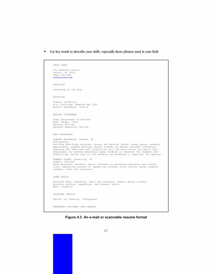
67
! Use key words to describe your skills, especially those phrases used in your field.
CHRIS TOMAS
150 Pendleton AvenueCentral, SC 29333(864) [email protected]
OBJECTIVE
Internship in law firm
EDUCATION
Clemson UniversityB.S., Sociology, expected May 2004Minors: Management, History
RELATED COURSEWORK
Legal Environment of BusinessRace, Gender, ClassBusiness WritingAdvanced Expository Writing
WORK EXPERIENCE
CLEMSON UNIVERSITY, Clemson, SC2001-presentPart-Time Work-Study Assistant, Access and Equities Office. Answer phone, scheduleappointments, prepare mailings. Assist students by making available informationregarding ADA (Americans with Disabilities Act) and state access and equity laws.Responsible for desktop publishing campus handbook on resources for students withdisabilities. Edited copy for the handbook and presented to supervisor for approval.
GENERAL STORES, Greenville, SCSummers 1998-2001Sales Associate, Hardware. Assist customers in purchasing decisions and transac-tions. Demonstrate process of remodelling kitchens using interior design computersoftware. Train new associates.
OTHER SKILLS
Microsoft Word, PowerPoint, Excel and Publisher; HomePro design softwareExcellent writing, copyediting, and research skillsBasic carpentry
VOLUNTEER SERVICE
Habitat for Humanity, 1998-present
REFERENCES AVAILABLE UPON REQUEST
Figure 4.3 An e-mail or scannable resume format

68
FlyerPurpose: Transactional but also expressive (and possibly artistic), to publicize a meeting,event, activity, or opportunityRhetorical appeal: Ethos, pathos, and logosCopies: ManyLifespan: Short—days or weeksReaders: Wide range of passersby, targeting one or more subgroups who may need or want toknow about the occasion—analyze the characteristics of your audience closely for this genreSetting: Indoors on bulletin boards or outdoors on kiosks, first viewing distance 10-15 feet,then closer for readingDistractions: Crowds, poor lighting, other goals, lack of timeReading goals: Skimming, then scanning; reading is voluntary; other flyers compete directlyfor readers’ attentionReader’s immediate action: Decide to remember the event or not, note specific infomentally or in writingFormat: One pageVisual flexibility: Considerable freedomVisual/text ratio: Lots of white space and visuals to text
Visual features. To attract and interest readers sated with other similar documents, a flyerneeds good visibility to viewers approaching from 10-15 feet away plus bold design—layout,typography, possibly images—in keeping with the ethos of the event. Critical information shouldbe clearly grouped. Flyers may need lamination for extended outdoor use or tear-offs that helpreaders recall info. In general, avoid visuals that require careful reading or interpretation, suchas charts or tables.
TIPS for flyers
! Use large type that has good legibility and weight, that is, fairly thick strokes.
! Group information clearly, “framing” it with ample white space.
! To add impact, use bold design, clip art, or decorative visuals in keeping with the ethos of the event.

69
Figure 4.4 Sample flyer by Amy Bumgarner

70
Fact sheetPurpose: Transactional, to explain key points about an issue, an organization, or a programRhetorical appeals: Logos, ethosCopies: ManyLifespan: Medium to long—months to more than a yearReaders: People who already have some interest, such as the audience for a meeting, ormembers of a group who receive a mailingSetting: Sitting indoors at a meeting or opening mail at home or office, normal reading distanceDistractions: In a meeting, the noise of discussion or lecture; at home or work, the needs ofothers, phone, television or radio, pressing tasksReading goals: Skimming or scanning, then searching and possibly reading entire docu-ment for critical comprehension; reading is voluntary; other documents may compete forreaders’ attentionReader’s immediate action: Be motivated to cast a vote, call to enroll in a program, buy aproduct or service, or contact the organization or other people to discuss the issueFormat: Typically one page, or one sheet printed front and backVisual flexibility: Considerable freedom of layoutVisual/text ratio: Text may predominate, but spacing and visual layering enable readers tosearch quickly for needed information
Visual features. To organize complex information and make it attractive, in keeping with thesponsoring group’s ethos, use chunking, layering, visual hierarchy. To attract and interestreaders who may be apprehensive about the issue or the complexity of the information, youmay need to incorporate other visuals, such as images, tables, or clear graphics.
TIPS for fact sheets
! Lead readers into the issues with bold or highlighted headings, and, if appropriate,drawings or photographs.
! Chunk information into short paragraphs.
! Create clear tables for comparison of data and options.
! Use vivid, simple bar charts and other easily interpreted information graphics. Keepnumerical data simple and explain it well.
! Put contact information in a separate section, visually identified.
! Ask for reader input.

71
LogoPurpose: Expressive, artistic, to establish and maintain a visual identity with viewers andreadersRhetorical appeal: Ethos, pathosCopies: ManyLifespan: Long—months or yearsReaders: Wide range—even those who don’t read a particular document will look at the logoSetting: Indoors, viewing at arm’s length while reading organization’s letters, memos, or Website; outdoors on flyersReading goals: Skimming and scanningReader’s immediate action: Form a favorable impression of the organization and per-haps gain a sense of its missionFormat: Usually a computer image file that can be copied, resized, and placed on a variety ofprint and screen documentsVisual flexibility: Considerable freedom, but constrained by group ethosVisual/text ratio: Visual predominates; text elements, such as name or initials, are treatedas design features but must remain legible
Visual features. To convey the ethos of the organization visually, in a means acceptable tomembers of the organization, as well as to send a clear message to readers, logos need to besimple and distinctive. They are often combined with the name of the group (these designs arethen called logotypes), so they need to be coordinated with the typography of the letterhead.Because they are resized and used on both paper and screens, they tend to need bold elementsthat weather the degradation of different media and browsers. Likewise, they must be clear inblack and white as well as color. Logos convey stability, so a design everyone can live with is key.Testing with members and potential readers is of great importance. Also try the logo in differentsizes and formats. Because they are widely distributed and present a group’s ethos, logos canbe one of the most difficult types of design (“A Raven” 50).
TIPS for logos
! Gather input from the group or client before you design: What ethos does the group wantto convey to readers? What do members want to avoid? On what materials will the logo appear?
! Do preliminary sketches (thumbnails), and share them with the group for more input.
! See how the logo looks in black and white as well as color.
! Print or reproduce the logo in several sizes to ensure its clarity.
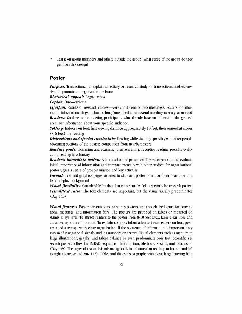
72
! Test it on group members and others outside the group. What sense of the group do theyget from this design?
PosterPurpose: Transactional, to explain an activity or research study; or transactional and expres-sive, to promote an organization or issueRhetorical appeal: Logos, ethosCopies: One—uniqueLifespan: Results of research studies—very short (one or two meetings). Posters for infor-mation fairs and meetings—short to long (one meeting, or several meetings over a year or two)Readers: Conference or meeting participants who already have an interest in the generalarea. Get information about your specific audience.Setting: Indoors on foot; first viewing distance approximately 10 feet, then somewhat closer(3-6 feet) for readingDistractions and special constraints: Reading while standing, possibly with other peopleobscuring sections of the poster; competition from nearby postersReading goals: Skimming and scanning, then searching, receptive reading; possibly evalu-ation; reading is voluntaryReader’s immediate action: Ask questions of presenter. For research studies, evaluateinitial importance of information and compare mentally with other studies; for organizationalposters, gain a sense of group’s mission and key activitiesFormat: Text and graphics pages fastened to standard poster board or foam board, or to afixed display backgroundVisual flexibility: Considerable freedom, but constraints by field, especially for research postersVisual/text ratio: The text elements are important, but the visual usually predominates(Day 149)
Visual features. Poster presentations, or simply posters, are a specialized genre for conven-tions, meetings, and information fairs. The posters are propped on tables or mounted onstands at eye level. To attract readers to the poster from 8-10 feet away, large clear titles andattractive layout are important. To explain complex information to these readers on foot, post-ers need a transparently clear organization. If the sequence of information is important, theymay need navigational signals such as numbers or arrows. Visual elements such as medium tolarge illustrations, graphs, and tables balance or even predominate over text. Scientific re-search posters follow the IMRAD sequence—Introduction, Methods, Results, and Discussion(Day 149). The pages of text and visuals are typically in columns that read top to bottom and leftto right (Penrose and Katz 112). Tables and diagrams or graphs with clear, large lettering help

73
scientific readers take in data. For information fair posters, there is more freedom of layout.Large photographs and other kinds of images can play a role. For both types, color can help toattract and organize readers’ experience of the poster. Good contrast between major elementsand clear, consistent groupings—that is, clear from a distance of 3-6 feet—are key.
TIPS for posters
! Storyboard your presentation, paying careful attention to the selection and sequencing ofinformation.
! If the type of poster backing is not specified, use standard foam board, which is morerigid than cardboard. Sizes range from 20” x 30” to 40” x 60”. Attach computer-printedpages of text and graphics with rubber cement or special adhesive.
! Use 1-inch (72-point) high letters for the main title and important information such as theorganization or your names as authors (scientific presentations). You may buy press-on vinylor transfer lettering, or produce these in word processing, presentation, or graphics programs.
! Use 24-point type for the text (Day 150).
! For legibility, be sure that the titles, text, and visuals contrast well with the background.
! Break up long text passages into shorter, chunked paragraphs and bulleted lists.
For scientific or technical presentations:
! Check with the meeting organizers for size and format requirements.
! Arrange pages of text and graphics in columns, placing the introduction at the top left andending with the conclusions at the bottom right of the poster.
! Create informative graphics such as tables, graphs, or technical illustrations and labelthem clearly. These graphics can be more complex and quantitative than those for oralpresentations, as viewers can take as much time reading as they wish.
! Use color to attract interest, cue navigation, and distinguish important features intables and graphics.
! Include a list of works cited.
For information fairs:
! Design a colorful poster that will appeal to the audience you hope to reach.
! Use the range of visuals that appeal to your viewers: photographs, brightly colored images,
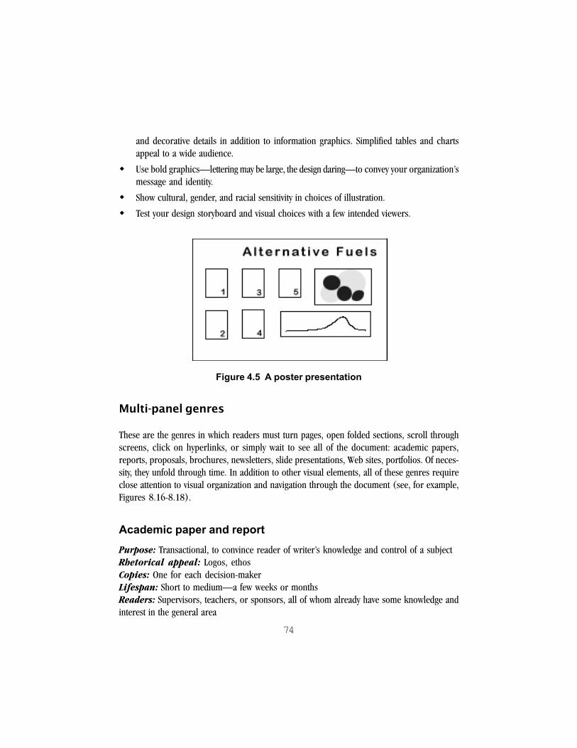
74
and decorative details in addition to information graphics. Simplified tables and chartsappeal to a wide audience.
! Use bold graphics—lettering may be large, the design daring—to convey your organization’smessage and identity.
! Show cultural, gender, and racial sensitivity in choices of illustration.
! Test your design storyboard and visual choices with a few intended viewers.
Figure 4.5 A poster presentation
Multi-panel genres
These are the genres in which readers must turn pages, open folded sections, scroll throughscreens, click on hyperlinks, or simply wait to see all of the document: academic papers,reports, proposals, brochures, newsletters, slide presentations, Web sites, portfolios. Of neces-sity, they unfold through time. In addition to other visual elements, all of these genres requireclose attention to visual organization and navigation through the document (see, for example,Figures 8.16-8.18).
Academic paper and reportPurpose: Transactional, to convince reader of writer’s knowledge and control of a subjectRhetorical appeal: Logos, ethosCopies: One for each decision-makerLifespan: Short to medium—a few weeks or monthsReaders: Supervisors, teachers, or sponsors, all of whom already have some knowledge andinterest in the general area

75
Setting: Sitting indoors, normal reading distanceDistractions and constraints: Time pressure, competition from other tasks and docu-ments, including other papers and reportsReading goals: Skimming, scanning; then receptive and evaluative readingOrder of reading: Typical busy readers first read the title, then the abstract or summary (ifany), then the headings and captions for visuals, the first and last pages of chapters or sections,and the opening sentences of paragraphs (Killingsworth and Palmer 262-63)Reader’s immediate action: Evaluate overall worth of report; ask for clarification,expansion or revision.Format: Several typed or printed pages, possibly bound in a report cover or notebookVisual flexibility: Likely to be quite limited.Visual/text ratio: Text elements significant, but clear visual organization and well-chosen supporting data graphics may weigh as much as text for some readers
Visual features. In many respects, reports have the rigidity of academic papers, so find outrequirements well ahead of planning and producing visuals. The following tips are based ongeneral document design guidelines for informal reports. Clear attention to visual organizationand visual hierarchy of information—chunking and layering—assists busy readers in scan-ning and searching for pertinent information. You can see that readers’ scanning is reflected intheir typical order of reading. Ample margins look good and invite readers to make notes.Tables and graphs summarize and emphasize data, enabling readers quickly to make compari-sons and determine trends. Navigation is handled by standard visual sequencing methods foracademic and business documents: clear title and headings, plus page numbers, captions, andcallouts. Long reports should also have a table of contents, an abstract or executive summary,and appendices for additional data. Running heads can also help.
NOTE: For more information on the design of academic research papers and formalreports, see a style manual such as the MLA Handbook or the Publication Manual ofthe American Psychological Association. A business or technical writing textbook isanother good resource.
TIPS for academic papers and reports
! Find out any requirements for the paper or report’s format and visuals.
! Give the document an informative title.
! Number the pages.
! Divide a report into sections with informative headings.

76
! Do not divide an academic paper into sections unless your format so allows.
! If you argue from or report on quantitative information, include appropriate tables, charts,or graphs. Label them clearly and consistently.
! If you are explaining complex objects, events, or processes, consider images—diagrams,maps, drawings, photos—as part of your logical appeal.
! Unless your format specifies otherwise, place the visual close to the point where you referto it in the text.
! In the text, make a point about each visual included.
! Refer to each visual clearly through a callout: “The following table shows ___.” “In Figure 2,_____.”
! If you copy or adapt a visual from another source, such as the Web, give credit in a sourceline below the visual.
ProposalPurpose: Transactional, to gain approval or funding of an activity or projectRhetorical appeal: Logos, ethos, and pathos in appealing to those in need who will benefitCopies: One for each decision-makerLifespan: Short to medium—a few weeks or monthsReaders: As with reports, supervisors, teachers, or sponsors—plus community leadersSetting: Sitting indoors, normal reading distanceDistractions and constraints: Time pressure, competition from other tasks and docu-ments, including other proposalsReading goals: Skimming, scanning; then receptive and evaluative reading; searching forimportant specific factsOrder of reading: Same order as reports, keying on the title, then the abstract or summary(if any), then the headings and captions for visualsReader’s immediate action: Evaluate overall worth of proposal; ask for clarification,expansion or revision; decide to approve or fundFormat: Several typed or printed pages, possibly bound in a report cover or notebookVisual flexibility: Major parts of proposal fairly constrained but some freedomVisual/text ratio: Text elements most significant but visual design important for first impres-sion and clear access, graphics important for argument

77
Visual features. Proposals may seem like reports, but there is a difference. Proposalspresent new ideas for action and may also form the basis of partnerships to create change, sothey need to make a good first impression. Good visual design supports the ethos of therequesting person or group and shows a commitment to the project. Typefaces, graphicalelements, and any images used should first convey the seriousness and professionalism of theproposal writer(s). The same clear visual organization that you employ in reports is alsoappropriate in proposals. Yet many proposals can also use some visual innovation. Thespirit of the proposed project can be conveyed in a well-chosen image or photograph,especially if it shows who or what will benefit from the project. For example, a croppedphotograph of the entrance to a clinic, showing the name of the facility and its directorstanding outside, may accompany a proposal for a fundraiser aimed to benefit the clinic. Thephotograph not only reinforces who will benefit, but shows that the proposal writers took thetime to find or take the photograph. In the reader’s mind, the writers’ attention to this detailmay reflect well on their ability to carry out the project—that is, the visual has an ethicalappeal. Be sure to make clear what the image or photograph is through a label or otheracknowledgment.
Production notes. For proposals to outside sponsors, consider using heavyweight paperand binding the proposal in a professional (not school) report cover or notebook. Pagesshould lie flat in the binding, so that the document does not suddenly close up during reading.
TIPS for proposals
! Make a good first impression with the design of the cover or title page.
! If you use any images, consider how they convey the overall community benefits ofthe project.
! Be sensitive to potential bias in choosing images.
! Provide a visually clear organization, using headings and other visual features of formalreports, such as callouts, captions, appendices, and the like. If the proposal is more than2-3 pages, consider including an abstract and a table of contents.
! Let the readers interpret and compare information or options by including data graphicssuch as tables, charts, or line graphs.
78
BrochurePurpose: Expressive and transactional, to publicize an organization or programRhetorical appeal: Ethos, logosCopies: ManyLifespan: Long—more than a yearReaders: Likely to be several targeted groups of readers who can benefit from the organiza-tion or programSetting: Sitting or standing indoors. Readers may pick up the brochure from a display standor at a meeting; or receive it in the mail.Distractions and constraints: Setting may be noisy; nearby brochures in a display com-pete for attention; readers have seen many brochures and do evaluate their polishReading goals: Skimming and scanning, then searching. Reading is voluntary.Order of reading: Cover panel, then one of the panels inside the fold, then browsing.Analyze sequence of information and visuals carefully.Reader’s immediate action: Comprehend the group’s or program’s mission and keyactivities, decide if it will benefit the reader, act to get more informationFormat: Usually a six- or eight-panel folded sheet (6-panel: 8.5” x 11”; 8-panel: 8.5” x 14”).Visual flexibility: Considerable freedom within certain expected brochure conventionsVisual/text ratio: Cover panel primarily visual with key text; other panels balance textand visual elements
Visual features. To persuade readers to pick up the brochure and form a clear, favorableimpression of the organization or program, attractive design, images, and layout are key. Thecover panel attracts readers to the brochure. Color and some boldness of design can help. Toconvey basic information without overwhelming, a brochure needs clear sequencing for thespecialized format and ample white space (chunking of text blocks). Avoid crowding thepanels with text. Contact information must be easy to pick out.
Production features. The number of copies needed and the long lifespan of brochuresmay justify professional printing. If you plan to mail the brochure, one panel may need to be instandard postal format. Check with your post office for requirements.
TIPS for brochures
! Take an existing brochure that you like, open it flat, and analyze its structure. In what orderdo you read it? Storyboard the panels.
! Storyboard your own brochure.

79
! If your brochure will be placed in a display stand, give it a clear title and visual impact inthe top half of the cover panel. A brochure for handing out and mailing may treat the coverpanel more freely.
! Do not crowd the panels with text. Use ample white space, and put at least one visual on theinside panels.
! Apply borders and boxes with care and consistency in this “boxy” genre. White spaceoften can do the job just as well as a box.
! Place contact information prominently.
! Get reader input.
Figure 4.6 A sample brochure
NewsletterPurpose: Transactional, to inform members of a group (such as a class, an organization, ora company) of newsworthy events; and expressive, to maintain group relationships and identityRhetorical appeal: Logos, ethos, and pathosCopies: ManyLifespan: Medium to long, depending on how often issued—weekly, monthly, quarterly,or annually

80
Readers: Primarily members of a group, but also outsiders who sponsor the group or whoare prospective membersSetting: Sitting indoorsDistractions and constraints: The reading setting may be public (as a lobby or waitingroom) and noisy. At work or home, other tasks compete for attention—the newsletter will likelybe of low priority to many readers. Moreover, as with brochures, readers have seen manynewsletters.Reading goals: Skimming and scanning, then searching. For some articles, reading to com-prehend the whole. Reading is voluntary and may depend on how much the reader identifieswith the group. Relatively few readers will read the entire newsletter.Order of reading: Browsing, sometimes sequentialReader’s immediate action: Reaffirm favorable impression of group; locate and compre-hend items of importance to herself or himself; for one or two items, may note upcoming eventsor take action such as contacting another personFormat: Typically one, two, or four full-size sheets (8.5 x 11”), stapled; or printed on 11x17sheets and foldedVisual flexibility: Considerable freedomVisual/text ratio: Text and visual elements balance
Visual features. Newsletters are organized for print browsing, to attract readers through apleasing, coherent design to a variety of types of information and articles. Like brochure design,newsletter design is a subspecies to itself, with many elements to consider. Visuals and whitespace are important to balance text. The short paragraphs in journalistic style are themselves avisual feature. Clip art has more uses in newsletters than in perhaps any other genre. The designshould be tested with group members but also sponsoring readers.
Production notes. Newsletters that have a long lifespan—six months or a year—and areintended to represent the group to outsiders (as for funding or support or recruiting) may wellbe printed professionally.
TIPS for newsletters
! Take an existing newsletter that you like, and analyze its structure. In what order do youread it? How do your eyes move over the pages? What do you focus on first? Look at thepages, columns, and visuals. Storyboard the pages.
! Storyboard your own newsletter.
! Take advantage of readers’ tendency to view the page from top left to bottom right in aslanted “Z” pattern.

81
! Try a grid (see Chapter 5) to maintain an overall consistency among the pages withoutsacrificing interest and visual flexibility.
! Try using white space to group and frame areas. Use boxes and borders sparingly.
! Stick to two fonts—at most three—and use them consistently.
! Keep in mind that newsletter reading is voluntary and often serves as much to maintain agroup’s identity as to give factual information. Interesting visuals, such as photographs ofmembers and participants, help maintain that identity and keep readers involved.
! In choosing clip art or images, be sensitive to readers’ backgrounds, including gender, race,and class.
! Refine the design with reader input.

82
Figure 4.7 Newsletter by Joseph D. Hooper

83
Presentation slidesPurpose: Transactional, to support an informative or explanatory speech and to convey theethos of the speaker and the speaker’s organizationRhetorical appeal: Logos, ethos, and in some cases pathosCopies: One, but slides or files can be copiedLifespan: Varies from brief to longReaders: Meeting participants who already have an interest in the general subject areaSetting: Sitting indoors, often in darkened roomDistractions and special constraints: Reading is not voluntary. Readers cannot controlthe pace, focus, or viewing angle of slides, nor can they review previous slides. The setting mayhave poor screen lighting; the room may not be darkened enough to see well; there may bedistracting noise from latecomers or in adjoining hallways. Business people may be tired of thespecial effects of some presentation software.Reading goals: Skimming and scanning, then searching; some evaluationOrder of reading: Sequential (controlled by speaker)Reader’s immediate action: Take notes; ask for clarification or expansionFormat: slides, transparencies, or a computer generated sequence projected onto a screen.Typical orientation is wide (landscape) rather than long (portrait).Visual flexibility: Some freedom, but constraints by topic and field expectations ofthis genreVisual/text ratio: Text and visual elements balance, the visual including ample blank or“white” space.
Visual features. Most speeches and short talks need visuals. Transparencies or com-puter-generated slides projected onto a screen are standard. The keys to good slides are 1)visual support of the speech and 2) a presentation format that everyone can see and read.Because reading is not voluntary and viewers cannot control the sequence or pace, your firstduty is not to irritate this captive audience with unreadable, dull, annoying, offensive, or overlycute visuals. For support of the speech, the slides should not reproduce the speaker’s notesword for word but orient the audience, keep them interested, and visually clarify complexinformation. The presentation format of slides is also critical, especially the size of the type andimages. The clear viewing area for overhead projection is smaller than the lighted area, limitingthe amount of material that any one panel can hold.

84
TIPS for presentation slides
General:
! To orient the audience, use a title slide followed by an overview of the main points, then aseries of well-organized main points with subpoints—like an outline.
! Use key phrases or short sentences, preferably in parallel grammatical structure, ratherthan long sentences.
! Apply highlighting and indenting consistently.
! Make the color scheme, format of visuals, and fonts consistent from slide to slide.
! Keep ample margins on all four sides.
! Remember that it takes up to two minutes to discuss a slide.
! Try your slides beforehand with the same type of equipment and room that you will have foryour speech.
Visual elements:
! Use large, simple tables and graphs to clarify complex information. Label these clearly.
! In your talk, make clear the point of each table and graph.
! Use clip art, scanned photographs, or other images for variety and interest, but keep thesesimple. Test images for cultural, racial, and gender bias.
Type:
! For small classrooms and small meeting rooms with ordinary projection equipment, usetype that is 16 points or larger. Presentation software such as Microsoft PowerPoint®
typically employs 44-point type for headings and 32-point type for main text items.Remember that middle-aged or older viewers (such as many college faculty and businesspeople) often cannot read the smaller type.
! Do not crowd text onto a slide. Instead make another slide.
! Use no more than two fonts in your presentation. Choose well-known, legible fonts thatcontrast with each other, such as Arial and Times.
85
Color and special effects:
! Choose colors for images, text, and background that have good figure-ground contrast.Place dark on light and light on dark. For example, place dark blue text on a white or lightyellow background rather than light blue text on a yellow background.
! Avoid highly patterned backgrounds that make text less legible.
! If you are presenting from a computer, you may wish to control the flow of information andkeep your audience’s interest with animated effects to bring in text. Keep the effects simpleand reasonably consistent. Do not repeat them to the point of annoying viewers.
Web sitePurpose: Varies greatly. For example, an organizational site may promote the organizationand its mission or issues (transactional, expressive, and artistic); maintain its identity among itsmembers (expressive); and give pertinent information to members and outsiders, especiallylinks to other resources (transactional). Analyze your purpose and audience carefullybefore designing.Rhetorical appeal: Logos, ethos, and pathosCopies: Many, each produced on the individual reader’s browserLifespan: Can vary from days to more than a year, depending on purposeReaders: In theory, the entire Internet; in practical terms, a small group or set of groupsSetting: Indoors sitting at a networked computer, though personal digital assistants, cellularphones, and other wireless devices are changing thisDistractions and special constraints: All the constraints of screen reading andWeb browsingReading goals: Skimming, scanning, and searching. Readers move from keyword to key-word or link to link rather than sequentially. They rarely read to comprehend the whole.Reading is voluntary and may depend on 1) how much the reader identifies with the group orissue or 2) how the site compares in content and attractiveness with other sites. There istremendous competition from other sites.Order of reading: Link to link or browsing—rarely sequentialReader’s immediate action: Gain a sense of site’s mission and main information; decideif the site is worthwhile in content or of benefit to reader; link to more information or other sites;bookmark the site for reading again; act to get more information.Format: One or more linked Web “pages” of any length, viewed on screenVisual flexibility: Considerable freedomVisual/text ratio: Visual elements predominate over text

86
Visual features. In this new medium, the rules are constantly being rewritten. Web sitesneed visual impact, good organization, clear navigation, and a sense of interactivity. Consistencyof visual organization can help keep readers oriented among the pages of the site. In additionto the following tips, see the section on storyboarding (later in this chapter), as well as theprinciples of page and screen layout (Chapter 5) and the sample makeovers (Chapter 7).
TIPS for Web sites
General:
! Take an existing Web site that you like and analyze its structure. In what order do you readit? Look at the design and storyboard the screens.
! Storyboard your own Web site, showing how pages are linked.
! Take advantage of readers’ tendency to scan for links by giving them links on each page.
! Maintain a consistent look across the pages of your site so readers know they are still in it.
! Try a grid (see Chapter 5) to create consistency without sacrificing interest and visual flexibility.
! Create consistent and usable navigation controls.
! Test your site on different computers and browsers, as well as with your intended readers.
Type:
! Use short paragraphs and about 20-40 characters (up to eight words) per line.
! Break up very long pages, which require readers to keep scrolling, into several shorter pages.
! Avoid italic text, which is hard to read on screen.
! For legibility, put dark text on a light background and light text on a dark background.
Color, visuals, and effects:
! Avoid animations to no purpose. Also avoid annoying features such as “blink” tags.
! Avoid patterned backgrounds behind text. They reduce legibility.
! Apply color not only for interest but also to maintain site identity.
! Use a “browser-safe” palette to help control the variation of different browser settings.
! Reduce the size of images for faster loading, so that readers don’t leave the site in frustration.

87
PortfolioPurpose: Demonstrate the breadth and depth of your writing to an instructor or poten-tial employerRhetorical appeal: Ethos, logos, and pathosCopies: Print—unique; Web or CD-ROM—multipleLifespan: Medium to long—a month to more than a yearReaders: Instructor, potential employersSetting: Sitting indoors, possibly at a networked computer, normal reading distanceDistractions and constraints: Time pressure; may need to read with the writer present, asat an interview; may need instructions for accessing Web or electronic portfolio. Some readerswill be very familiar with portfolios and others will have little or no experience.Reading goals: Scanning, searching, and evaluating. Some competition from other portfolios.Order of reading: Browsing (random access) or sequentialReader’s immediate action: Understanding of individual’s special strengths and key skillsin action; evaluation against other students or candidates or the standards of the jobFormat: Bound print pages; linked Web pages; CD-ROMVisual flexibility: Considerable freedomVisual/text ratio: Text predominates with visual accents and organizers
Visual features. A portfolio is a unique genre, with much opportunity for visual creativity, yetit calls for many of the navigational features of more conventional long documents. Because itprojects your ethos and because readers may be rushed or unfamiliar with portfolio layouts,the portfolio should have a unified look, visual impact that supports your ethos and the com-municative purpose, and clear organization. A repeated visual element, such as a coloredborder, or a visual metaphor or theme, can help unify the different types of writing that portfo-lios usually have. Likewise, features such as a contents page and overviews of individual sec-tions help to orient readers, letting them know the context for particular documents andpointing them to special features. There is a place for personal expression here, as long as youtake your audience’s age and reasons for reading into account. Instructors and fellow studentsare likely to be interested in personal expression that implies your individual growth. Em-ployers are less interested in expression than in clear structure and easy access thatdemonstrates your potential organizational skills on the job. (Instructors who are readinga stack of portfolios appreciate good organization, too.) Screen-based portfolios shouldfollow the guidelines for screen layout and navigation.
Production features. The importance of portfolios justifies spending time to create a con-sistent “interface” with title, contents, and overview information linked visually by typeface andlayout—and color or images, if you choose those. If time and resources permit, printing the

88
different documents in a consistent way can also unify a portfolio. However, portfolio readersalso expect and enjoy the variety of documents that they encounter, as long as the individualpieces are easy to access. Binding print documents in a folder or cover helps the reader handlethem. Oversized documents (larger than 8.5” x 11”) can be placed in folder pockets.
TIPS for portfolios
! For a simple but effective portfolio, create a cover page, a contents page, and sectionseparators. Unify these with a simple visual theme.
! Repeat a visual feature—a border, an image—to unify the parts of the portfolio.
! Or slightly vary a visual feature—for example, by changing a color, or by adding a newvisual element to each section—to show a progression or tell a visual story.
! Try to use a folder or binder that lets the pages lie flat.
! Avoid using a large envelope to hold your portfolio. It is harder to open than a folder orbinder, and discourages the reader from browsing pages.
! Also avoid putting multiple-page documents in clear plastic sleeves if you expect the readerto look at each page.
! Test your electronic portfolio to ensure that it can be accessed by the reader’s type ofcomputer and software.
Thumbnails and storyboards
Two tools from the world of graphic design and film are very helpful to writers planning visualdesign. A thumbnail is a small, quick, rough sketch—like a doodle. Thumbnails are easy todraw, yet they give the essence of a visual idea to build on. You can sketch thumbnails ofindividual pages/screens, an intended illustration, image, chart, photograph, detail of typogra-phy, or layout feature. Label the drawings and their features so you’ll recall what they mean. Ifyou are working alone, thumbnails let you see your ideas and set the stage for more polishedversions. If you are collaborating with others, thumbnails are an excellent brainstorming andconferencing tool.
A storyboard is a sequence of thumbnails, with commentary. Storyboards are used exten-sively in filmmaking, and more recently in multimedia development. In our terms, they are mostuseful for multi-panel genres that unfold to the reader through time. Beside each sketch, yourecord what is happening and how the reader navigates to the next panel. If your project iscomplex, it helps to enlarge the sketches and to put each one on a separate sheet of paper, so

89
that they can be rearranged. The classic collaborative storyboard is posted on a wall so that allinvolved can study it, make suggestions, and rearrange the parts.
For a large Web site with many visuals and intricate navigation, consider a kind of super-storyboard. Multimedia designer and author Lisa Lopuck has noted that page or screen designis static, whereas multimedia is dynamic. She suggests imagining your site as “a series ofenvironments, or ‘places,’” such as a house (9), or a park, library, busy intersection—you getthe picture. Each room or place within the house serves a purpose and supports distinctiveactivities. Jot down the places in this metaphoric environment, and begin assigning activities tothose places. Make a schematic drawing of the relationships of these places and activities. Thencreate a storyboard for each place, finally bringing them together via the larger metaphor ofhouse, park, and so on.
Figure 4.9 shows the thumbnail sketches and initial storyboard that Michelle Slater used tobegin designing the home page (index.htm) for the Greenville Church of Christ. The topportion is a thumbnail sketch for the screen that allowed Michelle to decide where differentkinds of information would be located, such as placing the “Who,” “Where,” “What,” “See,”and “Link” navigation links in a frame on the left side of the screen. The thumbnail also allowedMichelle to describe the “story” of what will happen when the users interact with the page inspecific ways. For example, when the users “rollover” the image of a globe in the frame on theright hand side of the screen, the image will change to the Greenville Church of Christ logo. Orwhen users rollover the “Who” link, the graphic expands from the single word “Who” to themore descriptive “Who We Are.” Michelle also used the thumbnail at the top to make decisionsabout color and background choices, such as the use of “dark gray text” for the right handframe and the “ghosted image of collaged faces” as the background.
On the bottom third of her storyboard, Michelle also worked out the storyboard for what pagesusers would see when they clicked on the “Who,” “Where,” or other links. With this heirarchicallyarranged “map” for her site, Michelle knew all the names of the pages she needed for her site,making the site much easier for her first to create and then later to update and maintain.
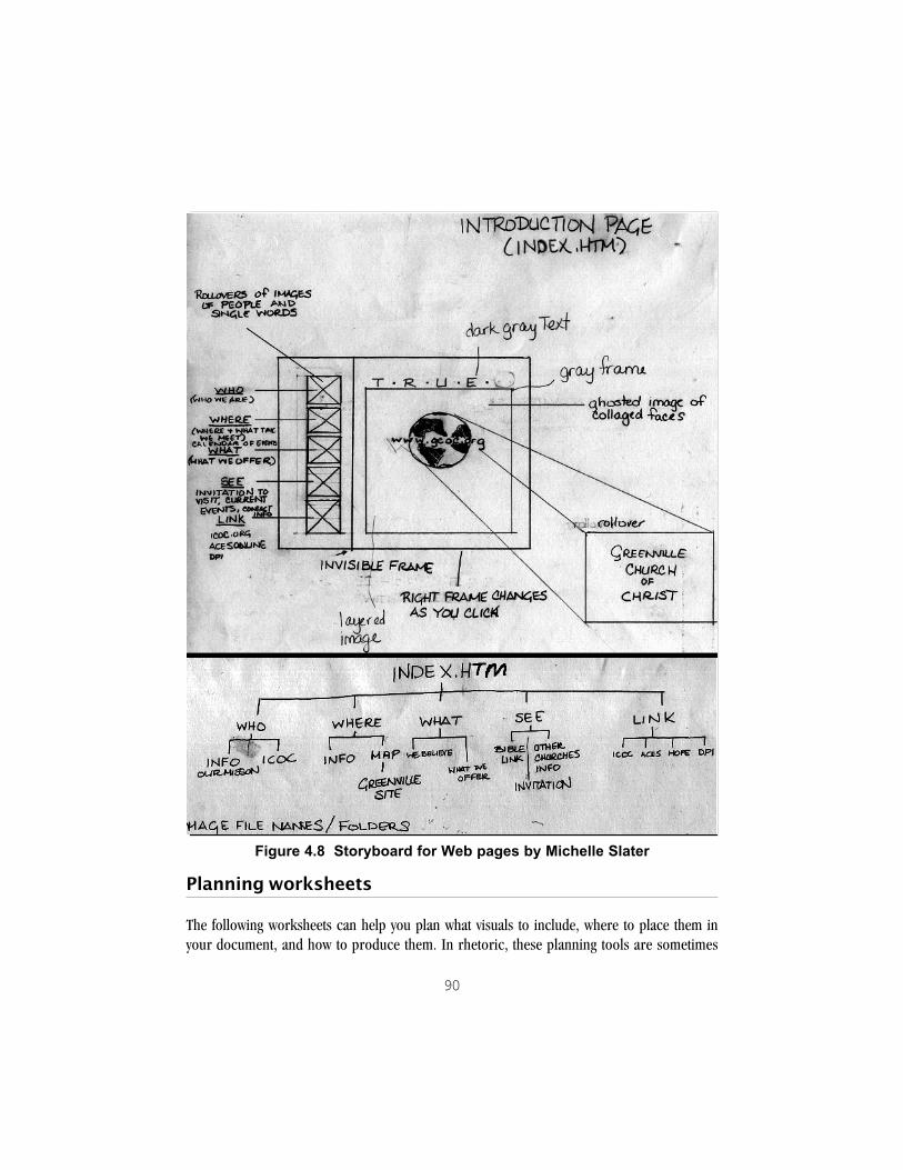
90
Planning worksheets
The following worksheets can help you plan what visuals to include, where to place them inyour document, and how to produce them. In rhetoric, these planning tools are sometimes
Figure 4.8 Storyboard for Web pages by Michelle Slater

91
called “heuristics.” You should adapt these to your purposes. There is no wrong way to dothem. As you fill in the analysis worksheet, refer to the sections analyzing various genres in thischapter. That may help you complete the worksheet. Also be sure to think carefully about yourparticular document, your readers, and its significance, as well as your facilities and timeconstraints. You may need many more thumbnails and storyboards than are provided in thesecond worksheet, plus more task analyses than are given in the third worksheet.
NOTE: Check with your instructor for specific requirements about the format ofvisuals and the means for producing them. For example, your document may havespecific guidelines for incorporating visual information, or you may be required touse certain charting or presentation software.
Summary
! Plan the visuals for your document as carefully as you plan the writing.
! As you develop visuals, consider your purpose, readers, and resources—people, time,money, and equipment.
! Plan for input from potential readers before you produce the final visuals.
! Use thumbnails and storyboards as planning tools.
Notes
1We thank Dr. Barbara Heifferon and her advanced technical writing students, fall 1998,for this example.

92
Visual Planning 1�Rhetorical Analysis
Project titleGenre
Purpose
relationship with readersvisual flexibilitylifespanformatpublication method and copiessignificance
Readers
number�plus names of specific readersage, range of ageseducation, jobgender, race, class, culturefamiliarity with similar documentssetting for readinggoals for readingskim, scan, search, read receptively, read critically
Resources
production peoplenames, skills, availabilityspecific viewers (to give feedback)names, availabilityfacilitieshardware, software, materials, suppliestime�deadlinescosts
What visual ideas do these genre, purpose, reader, and resource issues give you?
What visuals do you think you should avoid?

93
Visual Planning 2�Storyboarding
Project title
Genre (multi-panel)
Describe what is happening in this panel.
thumbnail of panel 1
Describe what is happening in this panel.
thumbnail of panel 2
Describe what is happening in this panel.
thumbnail of panel 3

94
Visual Planning 3�Tasks and Timeline
Project titlePut key items from worksheets 1 and 2 here as tasks, such as �find a picture of __,��make a chart to show ___,� �get photo developed,� �edit clip art,� �practice presentationwith slides.� Then connect tasks to the time line.
Time lineproject start project end
TASK TASKPeople PeopleResources ResourcesEstimated time to complete Estimated time to complete
TASK TASKPeople PeopleResources ResourcesEstimated time to complete Estimated time to complete
TASK TASKPeople PeopleResources ResourcesEstimated time to complete Estimated time to complete

95
Visual Planning 4�Reader Input
Reader�s name
Date Location
What is your impression of this document?
Would you pick it up to read it? Why, or why not?
What do you think of the overall look of the document?
What do you think of the visuals in it�pictures, illustrations, tables, charts?
Comment on what you see as the point of each visual.
What is your impression of the authors or designers of this document? Canyou point to places in the document that make you feel that way?
What suggestions do you have for visuals?

96

97
CHAPTER 5
Creating Pages and Screens
The basic design element of print documents is the page; that of electronic documents is thescreen. The concepts of Gestalt psychology and genre provide starting points for the layout ofpages and screens.
The following guidelines are strategies, not recipes. Work with one or two principles at a time togain a feel for the visual elements. Do several versions of a page or screen and compare them,using these concepts as analytic tools.
NOTE: These guidelines apply best to genres that have some visual flexibility, such assettings for poems and graffiti, flyers, fact sheets, brochures, newsletters, Web sites,and portfolios. They are less useful for genres that specify exact formatting rules, suchas academic papers. See Chapter 2 for a discussion of rigid and flexible genres.
Gestalt-based principles
If you can create effective 1) figure-ground contrast and 2) visual groupings through proximityand similarity, you will have learned the most important perceptual principles of layout. Thefollowing principles are based mainly on Gestalt principles, with additions from semiotic theory,human factors research, and modernist theories of design. These ideas will add subtlety oforganization to your documents.
Treat the page or screen as a background spaceReaders approach documents as composed of text and visuals “on” a background, the visualfield or Gestalt of the page or screen. Take advantage of this perceptual tendency.
As you place text and visuals, do a squint test: hold documents at arm’s length or stand awayfrom the screen and squint to become aware of the major areas of the field. Look at therelationships of the parts to each other and to the whole visual field. Make thumbnails (smallsketches of the pages or screens) to stay aware of the overall Gestalt.

98
Use white space to advantage! White space, or blank background space, defines what is placed “on” the page or screen.
! Use white space to group and separate.
! Use lack of contrast for continuity of text.
! Chunk text for scanning and searching genres.
! Be careful of extra space that wrongly groups your information.
! Examine the shapes that the white space creates. The visual field is created as much bythese shapes as by the figures on it.
! Screens require even more blank space, up to 40 to 60 percent of the visual field(Coe 221).
Put dark text on a light background, or light text on a darkbackgroundTo stand out from the background, text must contrast in value from that background. Valueis a graphics term meaning the relative lightness or darkness of a color. The lightest is white;the darkest is black. Use very dark text on light backgrounds. Alternatively, use light text onvery dark backgrounds.
Black text on a white background is the most legible. The reverse, white or light text on a blackbackground, has good contrast, but may be considered less legible because it is less common.Only put light on dark for short stretches of text—and sparingly.
On screens, where you usually have color available, be careful to choose colors that contrast invalue. For example, don’t put bright red text on a bright royal blue background. If those colorswere reduced to black and white, they would be one shade of gray on another shade of gray—hard to read.
TIP: One way to check the values of screen text and background colors is to take ascreen capture of your text. Then open the image in an image-editing program suchas Adobe Photoshop™. Temporarily change the mode to “grayscale” to see if the textstands out against the background.
Some background choices are more a matter of acculturation and preference than percep-tion. Bright, pure colors like yellow may provide good figure-ground contrast for dark text.

99
However, because yellow is unusual for backgrounds, it may not be a good choice forextended reading on screens.
Avoid patterned screen backgrounds that reduce the legibility of textPatterned backgrounds can substantially reduce the figure-ground contrast of text. Thatis particularly true on screens, where the resolution (fineness of detail) is considerablyless than we expect from the printed page. Text superimposed on highly patterned back-grounds may be almost illegible. Many of the backgrounds available for Web sites andcomputer slide presentations fail this test.
Create a focal point on the page or screenReaders focus first on the dominant visual, whether that is a picture or a contrasting areaof type.
! Use images—photographs, well-chosen clip art, to focus attention on the covers ofnewsletters, brochures, and other genres that readers pick up voluntarily.
! On an unbroken page of text, as in the middle of a brochure or newsletter, use a pullquote or other simple visual feature to create a focal point.
A pull quote is a quote�pulled� from an article
for visual emphasis.
Figure 5.1 Pull quote
Make contrasts easy to discern�bold and simpleAs readers cope with the complex structure of a page or screen, they look for visually-distinctitems. When you add new typefaces or other elements, make sure that they are clearly differentin size and structure from others in the field.

100
If necessary, use highlighting—such as drop shadows—to increase figure-ground contrast.Be careful, however, to keep such highlighting simple.
On computer screens, small, delicate graphic or type features may not be visible. Design screenswith heavier, coarser elements that can withstand this degradation.
Consider the global as well as local effects of contrast. The reader may be overwhelmed by manyunrelated contrasts.
Plan for colorConsider your document’s audience and apply the principles of contrast, grouping, and simi-larity as you plan for color. See Chapter 2 for additional guidelines. On pages, remember thatcolor may add life and interest, but also expense. On both pages and screens, limit colors to six.That includes the color of background, text, and (on Web pages) links (Coe 223).
Place elements close to each other to create visual associationsOne of the most effective changes you can make to your documents is to apply the principle ofproximity. The human eye discriminates among small changes in spacing and tends to groupitems that are visually close.
! Place headings close to the text they introduce.
! Make sections visually distinct. Use white space as the primary separator.
! Place figures and illustrations close to the text that interprets them.
! Create associations by juxtaposing items.
TIP: Instead of creating headings yourself, use a heading “style” in your wordprocessor. These styles often adjust the standard vertical spacing by placing the headingfurther from preceding text and closer to its associated text. Or, without using a style,you may also bypass the standard single and double-spacing format options. Reducethe space between a heading and its text by several “points.” Add several points ofspacing before the heading. That way you create a “frame” of space around theheading and the associated text.

101
Show relationships visuallyRecall the principle of similarity: We tend to group items by their proximity (closeness to eachother), their position and orientation on the page, their shape, and their color or texture.
Repeat visual features to unifyRepeat an element more than once in the page, screen, document.
xxxxxxxxxxxx xx xx✔ xx✔ xxxxxxxx xxxxx xxxxxxxxxxx xxxxxxxxxxx xxxxxxxx xxxxxxx ✔ xxxxxxxxxxxx xxxxxxxxxxx xxxxxx xxxx ✔ xxxxxx xxxx
Figure 5.2
Readers will tend to group the repeated items because of their similarity of shape.
Keep alignments strong and simpleThe eye follows the line created by text edges. That is the Gestalt principle of good continuation,therefore keep alignments strong and simple.
! In general, keep one major alignment in a document: left, center, right.
! Try not to mix alignments on a page or screen.
! Align each element with something else in the visual field.
! With screen documents (slides and Web pages), remember that the center of the screenwill likely be in sharper focus, so avoid extreme left or right alignments on screen.

102
Figure 5.3 Mixed left and center alignment on a screen
Figure 5.4 Consistent left alignment, each element lined up with another
Balance elements on the page or screenVisual balance is more than symmetry. Rather, consider the analogy of balance in physics. Twopeople of different weight can balance on a seesaw if the lighter person sits farther from thefulcrum and the heavier person sits closer to it. Symmetry—like aligning along the center of the

103
page—maintains balance because each half of the field is a mirror image of the other. (In ouranalogy, both people weigh the same.) Symmetrical layouts are very stable. Yet asymmetrical,balanced layouts create tension and therefore interest. If you think that your readers may notautomatically read your document, you might try this type of layout.
! Balance a large picture or text block with one or more small but distinctive items placedhigher and farther from the center of the page or screen.
! Try unequal visual areas to create tension and interest.
! Remember that balance is visual, not mechanical.
Figure 5.5 Balance: symmetry and asymmetry
The two page layouts in Figure 5.5 illustrate different approaches to balance. The two-columnlayout on the left is symmetrical, like a mirror image. The asymmetrical layout on the right usesthe high contrast of the small, black rectangle in the header to balance the lower tonal densityof the large, gray block.
Avoid unnecessary design elementsHundreds of design elements are available for page layout. That does not mean you should usethem all. For example, a box or border may seem to provide instant grouping or closure, but it

104
is often unnecessary. Indeed, it may draw so much attention as to distract readers from the restof the page or screen.
Decide if a design feature is needed! Use the squint test to see the whole effect of your design.
! Decide what you want to emphasize most.
! Consider subtracting features one by one.
! Instead of eliminating a feature, try to:
—make an item paler or smaller, so that it has less prominence on the page
—change its color
—give important items more size or contrast
—replace a full box with a border on one side
—use white space, shading, or a change in type size to achieve the effect.
! If the feature is markedly different from everything else, try to match its shade, color, shape,or alignment with another element to create a relationship.
! If you have many such features, go back to the squint test to see their relationships to eachother and the whole.
When you do use a special design element, treat it rhetorically. The genre or purpose may callfor additional interest on the page or screen. Whatever you choose should be visually simple,applied consistently, and in keeping with the overall visual design and purpose of the document.
Genre-based principles
As Chapter 2 shows, what we expect to see is very much related to what we have seen in the past.Visual conventions are everywhere. Your documents will be more effective if they let readersemploy their past experience with visual emphasis, layers, scanning of text, navigation, andillustrations. They also identify the genre of the document, so they are prepared for the particu-lar visual conventions of that genre. Although they are closely related to the ideas in the previoussection, the following guidelines take genre knowledge into greater account than those above.

105
Provide visual emphasisIn Western cultures, emphasis goes to larger items and to items higher in the visual field.Smaller items and items further down the page or screen are deemed less important. Therefore:
! Make more important information larger, or give it more visual weight.
! Put more important information higher in the visual field.
! Realize that actual size and emphasis may conflict. For example, a realistic array of sportsequipment that includes a golf ball and a basketball will emphasize the basketball.
Create visual layers! Use visual cues to link elements on a single page or screen.
! Use visual cues to connect multiple page or screen documents.
! For longer documents, create several independent layers that viewers can scan as they flippages or move from screen to screen.
Take advantage of typical reading patternsReaders may enter a document by looking at the dominant visual. In addition, Western readerssearch for continuation cues at bottom center or right (Kristof and Satran 91).
! Place the most important text close to the dominant visual.
! In newsletters, put jumplines (such as “Continued on p. 3”) at the bottom center orright of articles that continue onto another page.
! On Web pages, put “Forward” or “Next” links and buttons to the right of the visual field.
Pay attention to interactions of layout with illustrationsAs we have seen, readers tend to focus on images before text and focus on more representa-tional images before more abstract images. The orientation of human figures in photos and clipart also affects the layout. Consider these conventions as you design:
! Time moves to the right.
! Pages open to the right.

106
! Faces turned toward the center of the page/screen lead viewers back into the visual field.
! Faces turned away from the center lead viewers out of the page or screen.
Consider the tone or personality of layoutsFor example, take alignments:
! Centering creates a formal, conservative tone recalling the title pages of old books. Weddingand other invitations are often centered.
! Left alignment is standard for body text in Western documents. Its tone tends to be neutral,objective, scientific.
! Right alignment is rare for body text (but common for columns of numbers). It can createan unusual, “edgy” setting for some expressive documents.
Study the format of particular genresNewsletter conventions, for example, are based on years of readers’ and editors’ experiencewith periodicals, especially newspapers. The layout of newsletters has a whole vocabulary andbody of received wisdom, so does the design of resumes. The guidelines in this chapter touchon just the most basic conventions. For more detailed information about a particular genre, seeChapter 4 and the bibliography.
Treat multi-panel genres with special careAs we saw in Chapter 4, single-panel genres are the documents that readers generally see “allat once” (poems, logos, resumes, flyers, posters) while multi-panel genres—newsletters,brochures, Web pages—unfold to through time as readers turn pages, open folded sec-tions, or click on links. Multi-panel genres require close attention to visual organization andnavigation through the document.
In multiple page and screen documents, consider how much the reader sees at once and howmuch the reader needs to retain from panel to panel. Use the following guidelines to help youget started, and collect and analyze examples of documents that you like.

107
Give an overview of multi-panel documents! Create a table of contents or navigation bar.
! Add an “in this issue” block on the front page of newsletters, Web sites, fact sheets.
! Write a short executive summary or abstract for proposals and reports.
Give consistent continuation and navigation cues! Use “jumplines” to connect newsletter articles that are continued on another page.
! Put an icon, short rule (line), or dingbat (small visual symbol) at the end of newsletterarticles to signify closure.
! Place navigation buttons and links in the same positions from screen to screen so readerscan find them easily.
On Web pages, give links on each panel or screenful of textReaders read Web text differently from print information. They scan for links as much as theyengage in continuous reading. One rule of thumb is to provide about four links (text orgraphical) for every 25 lines—a full screen—of text (Coe 222).
Use the order of reading to design panelsFor example, readers tend to look at the cover of a brochure, then open it to a second panelbefore seeing the inside three panels. That gives you a “second front page” to engage yourreaders, so design the first two panels of a brochure as a sequence.
Design for the entire viewConsider everything the reader sees at once—the whole visual field.
! Design the interior pages of newsletters as a whole: a two-page spread.
! Design the inner three panels of a brochure as a three-page spread.

108
Try a grid to unify multiple panelsA grid divides the page or screen into rectangular areas and serves as a template for page orscreen layout. A grid’s main purpose is to help you maintain consistency among the pages orpanels of a multiple-view document. However, a grid can also help you vary the layout withoutstraying too far from your chosen format.
! Sketch different arrangements of material on the grid to see the overall look.
! Remember that columns need not be even.
! Remember that size equals emphasis.
Figure 5.6 Two-column and three-column grids for newsletters

109
Figure 5.7 Flexible use of a three-column grid
Consider the differences between designing a �page� anddesigning a screen.
Because the Web is such a new medium, relative to printed media, it is easy for designers toforget that they really aren’t designing a “page” per se. Indeed, what we routinely refer to as a“Web page” isn’t really a “page” at all; it’s just a convenient metaphor. However, like all meta-phors, the analogy between a page and a screen breaks down and can become a trap for the unwary.
One of the principal differences between designing for the screen is that web designers have farless control over what the user actually sees. Whereas the author of a print document candepend that the size of a page will remain relatively stable, the web designer has little controlover the size of users’ computer monitors, the resolution of those monitors, whether or not theusers have their browser software maximized, or even what fonts the users might be using orhave installed on their systems.

110
Failing to keep these factors in mind lead to disastrous results, as can be seen in the examplebelow. The designer of this Web page created it for a screen running at a resolution of 1024x768pixels since that was the resolution he used on his computer.
[
Figure 5.8 Soccer page at 1024x768 resolution
Unfortunately, for another Web user running her monitor at a resolution of 640x480, the pagelooks entirely different and is far, far less effective. For her, the burning soccer ball is almostentirely missing, and the team name and logo in the top frame are severely cropped. As a result,there’s very little about this page resolution that indicates the primary purpose of this site to thisparticular user. Unless she’s willing to invest a fair amount of time and energy in the site, she maynever figure out that this is a Web site for the Clemson Raptors soccer team.
Another and perhaps even more vexing problem with the design of this Web “page” is that itrequires the user to scroll. At a resolution of 640x480, over half of the “table of contents” forthe site doesn’t appear on the screen, requiring that the user scroll down in the left frame justto see what navigation options she has available to her. However, usability testing research hasconsistently shown that, when Web users are browsing or “surfing” a site, they do not scrolldown on a page 90% of the time (Nielson 112).

111
Figure 5.9 Soccer page at 640x480 resolution
These two factors—the recognition that users tend not to scroll and the instability of a Webpage’s display size—are perhaps the major influences on a screen’s design. They have theeffect of privileging certain areas of the screen over others. Because objects that are placed inthe upper left quadrant of a screen are more likely to be visible to users without the need forscrolling, they are usually the most important information the designer wishes to convey tousers. Web designers often describe this phenomenon using a “real estate” metaphor.
Just as real estate agents will say that “location, location, location” determines the value of ahouse, Web designers have learned that information they place on the lower-right-hand quad-rant of a screen occupies the least valuable “screen real estate.” Consequently, Web authorstend to place company logos or visuals that influence users’ understanding of the purpose or“branding” of a site at the top of the screen. This helps create a context that will allow the userto interpret the site more effectively. Navigation information is also critical since users want toknow how to move around a site. Hence, navigation information is often located along the leftedge of the screen.

112
Figure 5.10 Screen real estate metaphor
As Web authors have come to understand the effect of screen real estate, they have increasinglyabandoned designs based on the old “page” metaphor. New designs are emerging, and two ofthe most popular of these are known as the “inverted-L” and the “letterbox” format.
As its name implies, the inverted-L format looks like an “L” that has been turned upside downand flipped. The inverted-L is perhaps the most popular design found on the Web today, andthere are a tremendous number of variations on it. For example, on very large, complex Websites a designer might choose to reduce the size of the logo and name at the top in order tocreate space for a high-level navigation bar that will take users to major divisions in a site. Thenthe table of contents area along the left side might be used for navigation with the subsections ofeach major division.

113
Figure 5.11 Inverted-L format
Regardless of how the variation, however, the main point of the inverted-L is to maximize theimpact of the available screen real estate.
The second popular type of design is known as the “letterbox” format. It is called “letterbox”because its elongated shape resembles the letterbox format used to show motion pictures on atelevision screen without cropping.

114
Figure 5.12 Web page in letterbox format
In the example here, the designer chose a letterbox design to avoid the screen real estateproblems of having too much text on the screen. Typical of letterbox designs, this site uses anavigation bar or clickable graphic that may be viewed at resolutions of 640x480 and higherwithout cropping, distortion, or the need for scrolling. The navigation bar in this particular caseis also a “rollover,” so that, when the user places the cursor on top of a “clickable” area on thenavigation bar, the graphic changes in order to signal some kind of navigation cues to the enduser. Also, as is typical of letterbox designs, this site repeats the same design elements through-out the site. Users will find the same navigation bar using the same rollovers on every screen,and users will find the same header block with key words (in the same size and type of font) atthe top of each screen, signaling the purpose and main idea of each screen to the users.

115
Consider the screen of Web pages as a complex visual field
Web design evolves quickly, but it is clear that Web readers expect a complex experience that isunlike print and even other online materials. The following advice on Web layout comes fromDeb Staed, who teaches university faculty and students about Web and multimedia design. Debuses the familiar “inverted-L” format.
Figure 5.13 Whole Web page layout

116
Figure 5.14 Body section layout

117
Figure 5.15 Navigation section layout

118
Consider a software templateMany word processing and desktop publishing programs provide models, or templates, ofcertain genres, such as resumes, brochures, newsletters, and Web pages. To use them, yousimply choose a model from a file list. You are given a completed design that you then fill in withyour own information. Using a template can not only save time, but also teach you about basiclayout with less frustration than starting from scratch would. Templates do have problems. Theyare designed to showcase the software’s features, many of which may be unsuited for yourreaders and purpose. They also are widely used by other people, so they are not especiallyoriginal. See Chapter 4 for some common pitfalls regarding particular genres. When you usea template:
! Resist the urge to start typing immediately.
! Ask yourself if the design fits your document’s purpose and readers.
! Plan where you will place your main text and visuals.
! Modify the layout, headings, and content for your purpose.
! Avoid “featuritis”—including features just because the template has them.
! Consider these guidelines.
! Get reader input.
Use familiar models to unify Web sites and portfoliosWeb sites and portfolios tend to have parts or sections. These somewhat unusual genres alsohave less settled format conventions than other genres, and readers may not know what toexpect. As a result visual design can be a way to unify the parts of the document.
For both Web sites and portfolios, it is common to treat the space as similar to a more familiartype of document or space. (As we saw in Chapter 4, Lisa Lopuck calls these “places.”) That is,employing a metaphor or mental model can help readers correctly anticipate what will comeand retain where they have been in the document. Common metaphors include books, maps,rooms, buildings, journeys, and stories. Make sure that the model is clear to readers.
If you become interested in layout, look for examples and advice from professional graphicdesigners in works like The Non-Designer’s Design Book by Robin Williams and The MakeoverBook by Roger C. Parker.

119
Summary
! Learn and try out one or two principles of layout at a time.
! Do multiple versions, and get reader input.
! Apply the Gestalt principles of figure-ground contrast and grouping.
! Be attentive to the many specialized layout features of particular genres.
Exercises
Collect several examples of print and on-screen documents that you like: brochures, factsheets, flyers, newsletters, onscreen presentation slides, Web pages. For each:
1. Jot down what you like about the document.
2. “Squint” at it to blur the details and make the overall design elements stand out. Try sketchingwhat you see—the main areas.
3. Then try to analyze your sketch—the layout—using some of the concepts in this chapter.Write your analysis on the sketch.
TIP for screen documents: If the colors and flicker of the computer screeninterfere with your analysis of a Web site or a presentation slide’s layout, try this. Takea “screen capture” by pressing “Prnt Scrn” (on Windows-based machines). Thiscopies the appearance of the screen to the Clipboard. Then open a paint programsuch as MICROSOFT PAINT™ and paste the image there. You can save and print the imagein black and white to help you analyze it.
4. Instead of sketching the layout, try cutting out the basic shapes from colored constructionpaper and laying them on a background. Try moving the shapes around. This method isvaluable because the coarser shapes encourage looking at the “big picture,”or Gestalt. Foran elaboration of this technique, see Molly Bang, Picture This: Perception and Composi-tion (Boston: Bulfinch-Little, Brown, 1991).

120

121
CHAPTER 6
Using Type
Type is the main visual feature of most documents. Learning to use type well can help organizeyour documents more clearly, make a better impression on readers, and let them read yourdocuments more easily. This chapter considers two main issues:
1. how to choose legible type and
2. how to combine different typefaces.
To do that, we need a vocabulary for discussing type based on its structure and look.
By the way, type refers to all the alphabetic and numerical characters of documents, plus punctua-tion marks. A typeface, or font, is the design of a particular set of type. In this book, the termstypeface and font are used interchangeably.
How is type constructed?
All type has many visual features, starting with the look of individual letters.
Letterforms
Each capital and small letter has a form. Let’s look closely at a few features of letterforms:
serifs
LearningFigure 6.1 Graphics with serifs, x-height marked

122
Each letter in a typeface is made of strokes. Some typefaces, like this one, have small strokes onthe ends of letters called serifs. The presence or absence of serifs is a way to distinguish amongvarieties of type. The height of small letters like e, a, r, and n is called the x-height. X-height isnamed for the space taken up by the letter x, and is a major factor in legibility.
In the following words, examine the differences in the shapes of letterforms, especially the endsof letters. (That is, are there serifs?)
1. graph 2. graph3. graph 4. graph
Figure 6.2 Different shapes of letters
Samples 1, 2, and 4 have serifs while Sample 3 does not. The shape of the letter g also differs.The x-height of Sample 3 is also larger than the others, while Sample 1’s letter h is taller thanSample 2’s. Each of the four fonts creates a different tone. With its graceful curved lines andserifs, sample 1 has a traditional look, called Old Style. Sample 2 looks like a typewriter font;each letter takes up the same amount of space, and its serifs are typically flat, boxy slabs. Sample3, with no serifs and large x-height, has a more contemporary look. It is a sans serif font.Sample 4 obviously imitates the look of handwriting and is called script.
Type is traditionally measured by height, in a printer’s unit called a point. (There are approxi-mately 72 points to the inch.) Yet different typefaces in the same size vary considerably in boththeir real and apparent height and width, so looking at the actual type on the page or screen ishelpful. Notice the differences in size in these typefaces, all 18 points high:
Eighteen point ArialEighteen point Garamond Light CondensedEighteen point Bookman Old StyleEighteen point Impact
Figure 6.3 Same point size, different apparent size
The impact of type is based on a combination of differences. In addition to size, letterformsalso vary in thickness of strokes (called weight) and slant (called direction). Letters
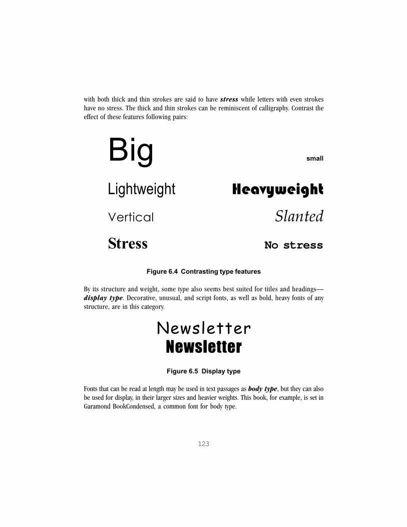
123
with both thick and thin strokes are said to have stress while letters with even strokeshave no stress. The thick and thin strokes can be reminiscent of calligraphy. Contrast theeffect of these features following pairs:
Big small
Lightweight Heavyweight
Vertical Slanted
Stress No stress
Figure 6.4 Contrasting type features
By its structure and weight, some type also seems best suited for titles and headings—display type. Decorative, unusual, and script fonts, as well as bold, heavy fonts of anystructure, are in this category.
NewsletterNewsletterFigure 6.5 Display type
Fonts that can be read at length may be used in text passages as body type, but they can alsobe used for display, in their larger sizes and heavier weights. This book, for example, is set inGaramond BookCondensed, a common font for body type.

124
Times New RomanFonts that can be read at length may be used in text passages asbody type, but they can also be used for display.
Arial and Arial BlackArial and Arial BlackArial and Arial BlackArial and Arial BlackArial and Arial BlackFonts that can be read at length may be used in textpassages as body type, but they can also be usedfor display.
Figure 6.6 Body type
As you make choices for documents, try to notice the differences in type and begin using thisbasic vocabulary to discuss those differences.
What makes type more legible?
Both Gestalt and genre-based principles are important in increasing the legibility of text. By nowyou have heard the advice “Use enough figure-ground contrast” several times. Contrast be-tween text and background is crucial for legibility, whether in display or body type. As explainedin Chapters 1 and 2, several factors interact to affect reading behavior and thus legibility. Theseinclude the medium of the document (paper or screen), readers’ genre knowledge, and theirgoals for reading. The classic study of legibility is by Miles A. Tinker. His results and those ofother researchers have been summarized in technical and professional communication text-books (Schriver, 274-75; Kostelnick and Roberts, 142-45; 190-92). The tips given in thischapter are based on Gestalt principles, legibility research, and accepted type conventions forWestern genres.
Place type on a plain background that contrasts well in valueBlack type on white background offers the best contrast for simple legibility. Reversed type—white or pale type on a black or dark background—is legible in headlines or short textelements. Use a heavier weight for reversed type.

125
For body text, use type of 10, 11, or 12 pointsSmaller type is hard to read, especially for older readers.
For long passages, consider type with a large x-heightAs we have seen, x-height is the height of small letters like o or x. A typeface with a fairly largex-height is usually more legible than type of the same size, but a smaller x-height.
Use ample leadingBesides type size and x-height, several other factors affect legibility. Leading (pronounced“ledding”) is the vertical spacing between lines of type. Too little leading makes letters difficultto distinguish. Too much leading may interfere with the reader’s forward progress through thetext. Different typefaces may need somewhat different leading.
Too little leading makes letters difficult to distinguish. Toomuch leading may interfere with the reader�s forwardprogress through the text. Different typefaces may needsomewhat different leading.
Figure 6.7 Too little leading
Too little leading makes letters difficult to distinguish. Too
much leading may interfere with the reader�s forward
progress through the text. Different typefaces may need
somewhat different leading.
Figure 6.8 Too much leading
As a rule, short passages—brochure copy, newsletter articles, text blocks in a resume—cantake somewhat more generous leading than extended text (as reports or proposals) can. The

126
latter requires enough leading to distinguish letters clearly, but not so much as to make linesdrift away from each other during longer periods of reading.
TIP: The standard leading—often called single spacing—for common wordprocessing programs is typically the point size plus 2 to 2.5 points of extra space. Thestandard leading for 12-point type is therefore about 14 to 14.5 points. Up to 4 pointsof leading will give reasonable legibility. You can usually adjust the leading by using theline spacing format features of your software.
What about double spacing? That is a requirement for many academic papers, and youshould follow the guidelines you are given. However, in print and online publications,double spacing is rare.
Adjust line lengths for legibilityAs with leading, the length of lines affects legibility. In text passages, overly long and overly shortlines both interfere with readers’ ability to group words into meaningful units.
! For pages, make lines between 40 and 70 characters long.
! For screens, reduce the line length to 40-55 characters.
As with leading, the length of lines affects legibility. Overly long and overly short lines both interferewith readers� ability to group meaningful units. For pages, make lines between 40 and 70 characters long.For screens, reduce the line length to 40-55 characters.
Figure 6.9 Lines too long
As with leading,the length oflines affects leg-ibility. Overlylong and overlyshort lines bothinterfere withreaders� abilityto group mean-ingful units.
Figure 6.10 Lines too short

127
Consider type, leading, and line length togetherChanging one of these factors affects the others. In the previous example, reducing the type sizeadds more characters per line—in effect increasing the line length. Make sure that yourchanges remain within the guidelines for legibility.
Watch for excess white space when you justify textShort lines or narrow columns combined with justified text, as in the previous example, cancreate “rivers” of white space that wrongly group the information. (Justification or “full justi-fication” aligns both the left and right edges of text passages by inserting small amount of extraspace between words.) Even with longer lines, readers can be momentarily confused by thisexcess space.
Consider left-justified or �ragged right� alignments for body textWhile fully justified text has a professional look, left-aligned text with a “ragged right” margingets good marks for legibility. These results may have more to do with particular software orreader preferences than human factors. (For a review of research, see Schriver 269-71.) Left-justified text appears more informal. Consider alignment as part of your document’s ethos.
Reduce the number of words broken by hyphenationToo much hyphenation also interrupts the reader’s grasp of words. Often excessive hyphen-ation is the result of shortening the lines, as in columns.
Too much hyphena-tion also inter-rupts the reader�s graspof words. Often exces-sive hyphenation is the result of shor-tening the lines,as in col-umns.
Figure 6.11 Too much hyphenation

128
Avoid setting multiple lines in capital lettersAll capital letters create a “boxy” shape that seems to interfere with reading. This is especiallytrue of reversed type, putting white or light letters on a dark background.
Avoid italics for lengthy passages; on screen, avoid italicscompletelyItalics are harder to read. On screen, the combination of thin, slanted lines and the pixellation(jagged, dot-like appearance) of letters is particularly hard to decipher.
Test your font choices with likely readersTesting is especially important for Web pages, where different browsers interpret the colors andfonts differently. Remember, if a user doesn’t have a font installed on his or her hard drive, youWeb page design will be corrupted.
How can you use type effectively?
Clear organization and legibility are important, but so are the reader’s interest and the ethos thatyou project. Type is a major element in your document’s personality.
The array of fonts on word-processing and desktop publishing programs is both a pleasureand a challenge. A good beginning rule for combining fonts:
Stick to two or at most three fonts in any one documentChoose one font for body type and one for display—article titles, headings, pull-quotes. If youuse a third, it may be a particularly striking font for the document’s masthead or main title orother effect. However, remember that it helps to repeat any visual feature somewhere in thedocument. You may combine two display fonts in a variety of ways.
Use type consistently to help the reader organize and scanHeadings, pull-quotes, jump lines, and other text features that readers use as scanning layersshould be consistent at each level.

129
Make bold distinctions between fontsCombine typefaces that have definite contrasts in structure, weight, slant, or size. Better still,make sure that the fonts contrast in at least two ways. High contrast gets noticed by readers.Changes in weight—light vs. bold or extra bold—may be more noticed than actual changesof font (Schriver 274).
Avoid small changes in type sizeThe difference between 10-point type and 12-point type is not very noticeable. If you aresticking with a single font, make clear the size and weight differences of headings.
Remember that sans serifs often combine well with serif typefacesIt is a well-worn but safe guideline: Use sans serif fonts like Arial or Helvetica for headings anddisplay type. Use an Old Style serif font like Times Roman, Palatino, Garamond or Goudy OldStyle for body type. These contrast in structure. The built-in styles for body text and headings ofmany word processing programs incorporate this basic concept. The more traditional the audi-ence or rigid the genre, the more likely that this combination will serve well.
Combine typefaces that reflect the ethos and tone of yourdocumentDisplay type is a good way to express how you want readers to respond to your document.
Lively Newsletter for SchoolchildrenFlyer for a Lecture
Invitation to a GraduationInvitation to a GraduationInvitation to a GraduationInvitation to a GraduationInvitation to a GraduationProposal Cover
Figure 6.12 Samples of display type
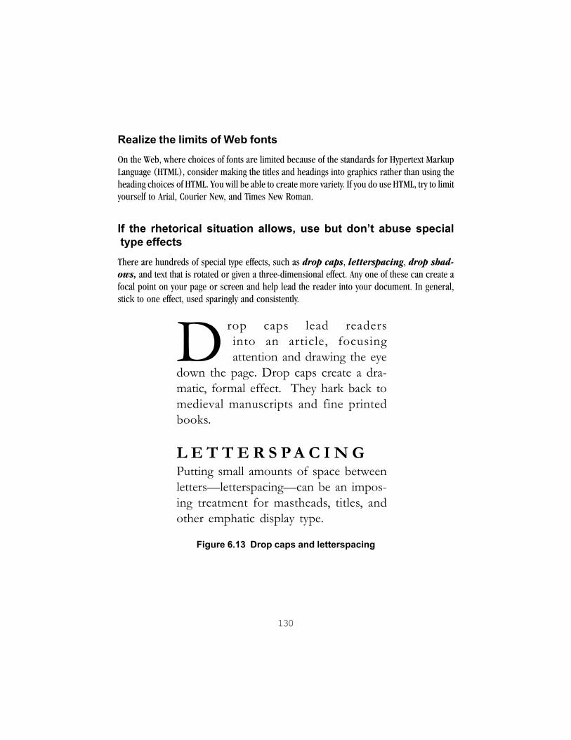
130
Realize the limits of Web fontsOn the Web, where choices of fonts are limited because of the standards for Hypertext MarkupLanguage (HTML), consider making the titles and headings into graphics rather than using theheading choices of HTML. You will be able to create more variety. If you do use HTML, try to limityourself to Arial, Courier New, and Times New Roman.
If the rhetorical situation allows, use but don�t abuse special type effectsThere are hundreds of special type effects, such as drop caps, letterspacing, drop shad-ows, and text that is rotated or given a three-dimensional effect. Any one of these can create afocal point on your page or screen and help lead the reader into your document. In general,stick to one effect, used sparingly and consistently.
Drop caps lead readersinto an article, focusingattention and drawing the eye
down the page. Drop caps create a dra-matic, formal effect. They hark back tomedieval manuscripts and fine printedbooks.
L E T T E R S PA C I N GPutting small amounts of space betweenletters�letterspacing�can be an impos-ing treatment for mastheads, titles, andother emphatic display type.
Figure 6.13 Drop caps and letterspacing

131
are popular on the Web and in informal newslettersand brochures.
Figure 6.14 Drop shadows
Summary
! Type is the single most important element for readers, so it pays to learn to use it effectively.
! Noticing the structure of typefaces or fonts aids in using type well.
! There are two main uses of type:
—display type for titles, headings, and other distinctive features
—body type for text passages
! For legibility, make sure that the type contrasts clearly with the background.
! Avoid emphasis that obscures letterforms, such as multiple lines of all caps or italics.
! For greatest legibility of body type, choose a font with a large x-height.
! Stick to two or, at the very most, three fonts in a document.
! When you combine fonts, remember the principles of contrast and similarity:
—make the contrasts between the fonts bold
—create consistent visual relationships in your use of each font
Exercises
1. Describe each of the following fonts. Are its features:
! Lightweight or heavyweight?
! Slanted or upright?
! Script (like hand lettering) or detached?
! Decorative or plain?

132
! With serifs or without?
! Stressed (having both thick and thin strokes in a letter) or without stress (having evenstrokes)?
! What tone does the font project? Who would use it, and for what?
! Would you say that the font is for display type or body type, or both?
Layout, fonts, graphicsLayout, fonts, graphics
Layout, fonts, graphicsLayout, fonts, graphicsLayout, fonts, graphics2. Examine the large printed letters on one or more of the following:
! a book cover
! an ad
! the package of a common food or household item
! a sign for a business, campus, or other building
Analyze the features of the typeface or faces. What message do they convey?
3. Take a favorite quotation, poem, or scrap of graffiti. Select a font that expresses the words,and create a simple visual setting for the lines. Add a second font if you like. Experiment with linelengths and spacing, even special effects. Try two or three versions, and ask other readers to tellyou what they experience when they look at the different versions.

133
CHAPTER 7
Adding Images and InformationGraphics
Much visual information is embedded in choices of type and overall layout. Yet for many docu-ments you will want to add images (photographs, drawings, clip art) or information graphics(tables, charts, graphs, maps). This chapter contains tips for using images and informationgraphics effectively. Some of these apply Gestalt principles:
! framing a graphic with white space to achieve figure-ground contrast
! placing a graphic close to its related text to take advantage of proximity
! making two variables on a graph distinctive in shape or color to using a line drawing ratherthan a photograph to help viewers distinguish the structure
Other tips rely on research findings, such as being aware of the minimum size for colored items.Still other tips convey the specialized genre knowledge of information graphics, such as choos-ing a pie chart when you want to see the relationship between a whole and its parts. Some tipscome from a combination of Gestalt, genre-based, and research principles. For example,keeping graph areas proportional to the data avoids a distortion that arises from our percep-tion of the graph’s size combined with our genre knowledge that visual size is usually propor-tional to the data results. For important information about the limits of these visuals, especiallytheir potential for stereotyping and distortion, see Chapter 3.
Do plan to include images or information graphics if your genre permits. Readers focus onthem right away. See Chapter 4 for likely choices for particular genres. Many ready-madeimages—such as clip art and stock photography—are now widely available to incorporateinto collegiate writing. Charts can be drawn with graph paper or created in word processing,presentation, or spreadsheet software. Be aware that research papers and reports have veryspecific rules for creating, placing, and labeling information graphics. These vary somewhat byfield, so consult with your instructor about requirements.

134
General tips
Here are some general tips for adding images or information graphics to your document.
Fit the picture to your purpose and audienceCasual readers or viewers of presentations often need informal, relatively simple informationgraphics with color and interesting images while scientists and professors will expect careful,rather more complex graphics without extraneous detail, or chartjunk (Tufte, Visual Dis-play 107). Consult Chapter 4 to help plan.
Make a point with each visual� make that point clear in the text! Use callouts from the text to the visual: “See the chart below.” “In the following table, . . .”
Or more formally, “In the next scene, the woman’s gaze is toward the viewer (Figure 2).”
Tell readers what they�re looking at! Include labels and informative titles.
! Write captions for news photos.
! If you have many images or information graphics, consider numbering them, as Figure 1,Figure 2— or simply 1, 2, and so on. See format guidelines for research papers for extendedexamples.
Make the picture the right size! Test it in the setting. If the picture will be reduced, try making a photocopy at a smaller size
to see if everything is still legible. If the picture will be viewed from a distance, have a helpertest that it is clear at that distance.
! Learn to resize digital images without changing the proportions. Otherwise they will lookdistorted. See your software’s instructions or ask for help with this important step.
Make the relevant features stand out! Use figure-ground contrast and clear shading.
! Give enough visual context to orient readers, but also help them focus.

135
! Crop photos to focus on the important parts.
! Choose the most relevant data points.
! Cue readers with an arrow or other mark, but don’t clutter up the picture with extra marks.
Place the picture as soon after the relevant text as possible�onthe same page or a facing page
NOTE: Some research paper and report formats require that all tables, images, andinformation graphics—the last two formally referred to as figures—be placed at theback of the paper. Check the requirements with your instructor.
Frame the picture�and titles and labels�with a small buffer ofwhite space! Some genres, like newsletters and brochures, allow you to run a column of text around an
image or graphic.
! In other genres, you simply place graphics “in line” between paragraphs of text.
Make sure objects are large enough for color to show upHuman factors research suggests that an object has to be the size of a 36-point O to carrycolor (Coe 151):
OFigure 7.1 Letter �O� in 36-point Times New Roman
For the same reason, you should avoid color for tiny patterns. If you color text, make wholewords the same color.
Don�t distort the meaning! On charts, make the baseline clear.
! Keep graph areas proportional to the data.
136
! On maps, give the scale.
! Don’t manipulate photos or other images used for their informative or documentary content.
! Consider the ethical implications before you manipulate images intended to support moodor theme.
Give credit! Put a source line below images and information graphics that you reproduce from
other sources.
! Check the copyright of graphics and know whether your use is fair use. Fair use allowswriters, editors, and others to use the copyrighted works of others, within certain limits,without asking permission of the copyright owner. In general, a single reproduction of acopyrighted image for educational purposes is considered fair use. Multiple copies,especially for profit, generally require permission. Factual information is less restrictedthan creative works, including images, for which permission may be required.
! If you collect the data and create the graphics yourself, make that clear.
Tips for adding images
For images that create a mood, consider who will respond to theimage and who may feel excluded! Images have an ethos. You may like the mood, but does it include your audience as well?
Remember that clip art and stock photography may reinforcegender, racial, and ethnic stereotypes! Try some of the analysis questions in Chapter 3.
For portfolio covers or poem settings, create collages of ready-made images! Use proximity and other Gestalt principles to create associations among disparate elements.

137
Treat images that are the subject of an analysis as if they wereinformation graphicsIf you write a lengthy analysis of an ad or other image, reproduce it as part of your argument.You may also need to copy important details (perhaps enlarged) and place them separatelynear your discussion of each detail. Label the image, give your source, and use callouts to makeclear which areas you are discussing.
Tips for adding information graphics
Choose the right graphic for your data and rhetorical purpose.1
Table 7.2 Deciding on a type of graphic
If your reader needs to Chooseget an overview outline, list, table, or
flowchart
compare options or exact quantities table
see how a whole is divided into parts pie chart
compare amounts in different categories bar chart, column chart
see change over time line graph, area chart
examine patterns of many data points scatterplot
Realize that technical line drawings can be more informativethan photographsDrawings are more selective and can help readers focus on the structure and relevant features.
Use good visual formatting! Don’t overload any one table, graph, or chart.
! Keep gridlines to the minimum that your readers need for understanding.

138
! Remember that color can highlight but also distract—if you are allowed to use color, do sowith care, to make trends and distinctions in data clear.
! Avoid putting different textures together—that’s distracting and uninformative.
! Use shading to show trend or ordering.
! Make the different variables visually distinctive, as in the following scatterplot:
Figure 7.3 A scatterplot with different variables
The different shapes let readers track the information for the three dorms. For example, SouthDorm (triangles) had the highest occupancy in spring and the lowest in summer.

139
In tables, ensure that like items read down (Day 62)NOT
Table 7.4 Imaginary Pebbles 1
Sample 1 Sample 2 Sample 3
size 6.5 mm 8 mm 17 mmcolor red magenta turquoiseweight 0.5 mg 0.7 mg 6.2 mg
BUT
Table 7.5 Imaginary Pebbles 2
Sample Size (mm) Color Weight (mg)
1 6.5 red 0.52 8. magenta 0.73 17. turquoise 6.2
The second table is tidier. More importantly, it helps readers to compare similar categories,like size.
Exercises
1. Take the quotation, poem, or scrap of graffiti that you set in type in Chapter 6. Now addan image to the setting: a photograph, a drawing, an illustration from clip art or the Web(give credit to your source on the back of the page). Compare the type-only setting andthe one with the image. What is the difference in tone? In emphasis? What does that tell youabout images? Try two or three versions, and ask others to give you feedback about theirexperience of the different versions.

140
Notes
1The following resources offer more detailed advice for choosing a graph type: William Horton,“Pictures Please—Presenting Information Visually,” Techniques for Technical Communi-cators, ed. Carol M. Barnum and Saul Carliner (New York: Macmillan, 1993), pp. 187-218;Stephen M. Kosslyn, “Visual Table of Contents” and “Choosing a Graph Format,” Elementsof Graph Design (New York: Freeman, 1994), pp. x-xi and 19-61; Charles Kostelnick andDavid D. Roberts, “Data Displays,” Designing Visual Language: Strategies for Pro-fessional Communicators (Boston: Allyn & Bacon, 1998), pp. 263-312.

141
CHAPTER 8
Putting It Together: Sample Documents
This chapter contains several sample documents designed or re-designed by students. All wereenrolled in a visual communication seminar as part of a graduate program in professionalcommunication, which emphasizes writing and rhetoric. Some of the students had experiencein graphic or interface design while others were just beginning to think visually. In someexamples, the documents are “before” and “after” versions. In others, only a final design isshown. Some of the students’ own comments are included in the discussion.
As they worked, they conferred with us, their instructors, about demonstrating principles ofvisual communication. They considered their audiences. They tried out different ideas. Theyrevised. They struggled to comprehend new software. They learned about production. Aboveall, they taught us—about technology, creativity, and fruitful collaboration.
Look at these samples as a source of questions as well as answers. Examine them in lightof the guidelines in Chapters 4, 5, 6, and 7. What choices were made? What could havebeen done differently?
Poem
Keena Hamilton typeset this well-known poem by William Wordsworth to demonstrate its ex-pressive, lyrical qualities. Like many of the samples here, it went through several versions. Thisversion is based on her final design. The text is aligned along the right margin. This strikingchoice supports its expressive purpose. Students of Wordsworth will also note that the original12-line poem is here broken into 16 lines. Keena employs several techniques from Chapters 5and 6. All elements are right-aligned, so nothing distracts. There are strong contrasts, such asthe white space on the left versus the lines of the text to the right. The script drop capital Scontrasts with the body type in size, weight, and slant. The poem’s font seems ordinary but hasunusual touches. Look at the delicate angled serifs, the tall ascenders that “reach to the sky” (asin dwelt), and the looped k. To keep the text legible and not crowd those tall ascenders, Keenaused ample leading (space between lines).

142
Figure 8.1 Visual interpretation of a poem
Resume
Resumes benefit from good visual organization and emphasis. The less experience you have,the more you need good organization in the writing and the layout. Esther Revis-Wagnercreated both of these resumes, based on the experiences of a fictional person. In the revision,she strove for visual emphasis, well grouped blocks of text, clear visual layers, a strong leftalignment, and an overall coherence of type and structure.
he dwelt among th’
untrodden ways
Beside the
springs of Dove:
A maid whom there were
none to praise
And very few to love.
A violet by a mossy stone
Half-hidden from the eye!
Fair as a star when only one
Is shining in the sky!
She lived unknown,
and few could know
When Lucy ceased to be;
But she is in her grave, and oh!
The difference to me.
—William Wordsworth

143
Figure 8.2 Poorly organized and developed resume

144
Figure 8.3 Revised resume
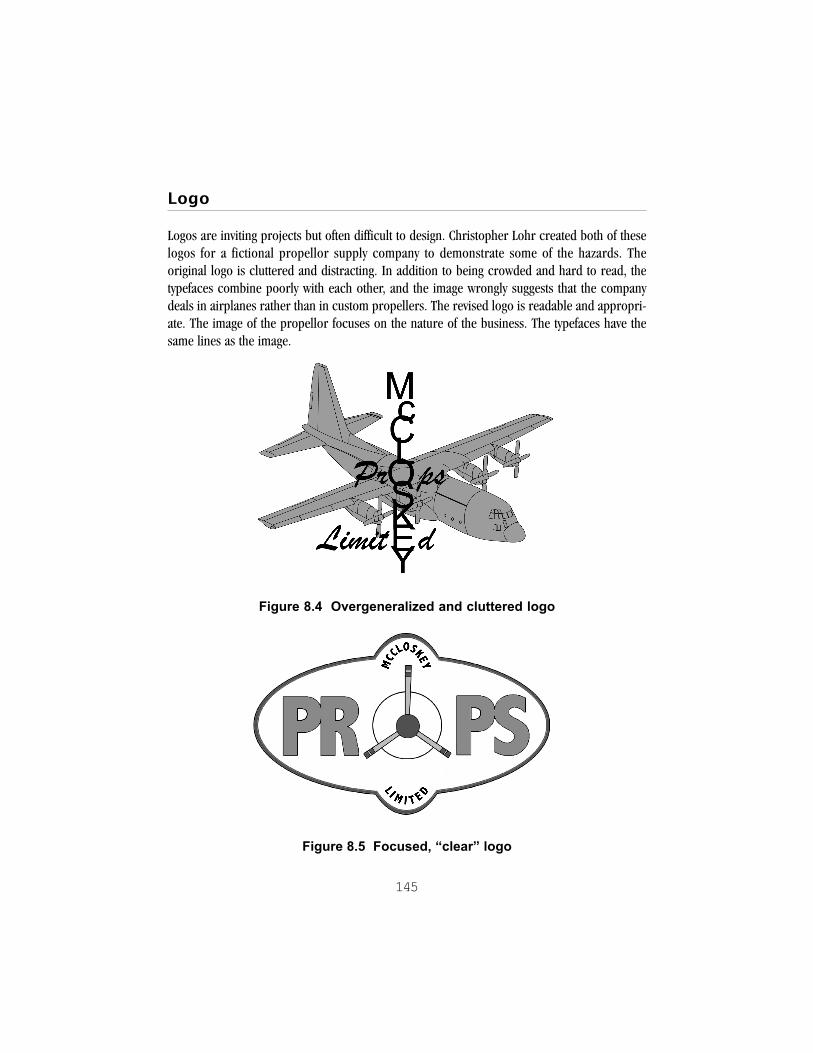
145
Logo
Logos are inviting projects but often difficult to design. Christopher Lohr created both of theselogos for a fictional propellor supply company to demonstrate some of the hazards. Theoriginal logo is cluttered and distracting. In addition to being crowded and hard to read, thetypefaces combine poorly with each other, and the image wrongly suggests that the companydeals in airplanes rather than in custom propellers. The revised logo is readable and appropri-ate. The image of the propellor focuses on the nature of the business. The typefaces have thesame lines as the image.
Figure 8.4 Overgeneralized and cluttered logo
Figure 8.5 Focused, �clear� logo
146
Flyer
The original was an actual flyer hung at a major university advertising the meeting of the Speechand Communications Club. It was meant to grab the attention of all passersby, even though thetarget group was speech majors. The purpose of the new flyer is the same, but it employsdifferent fonts and point sizes to attract the notice of passersby. Rebecca Pope redesigned theflyer and provided these notes:
Original:
! The whole text is centered and dull.
! All text is in the same sans serif font, with no variations in size or thickness, giving all the textequal importance.
! Overuse of exclamation points actually detracts from emphasis.
! Equal spacing between all items fails to draw the eye down the page.
! Visually boring.
Revision:
! Large, exciting font gets the attention of speech majors immediately.
! Use of three fonts creates visual contrast and draws the eye to important items.
! Change in font size draws eye down the page and gives the more important items visual precedence.
! Thick black lines meeting in bottom right corner draw the eye down through the information.
(Original courtesy of the Speech & Communication Studies Department, Clemson University)
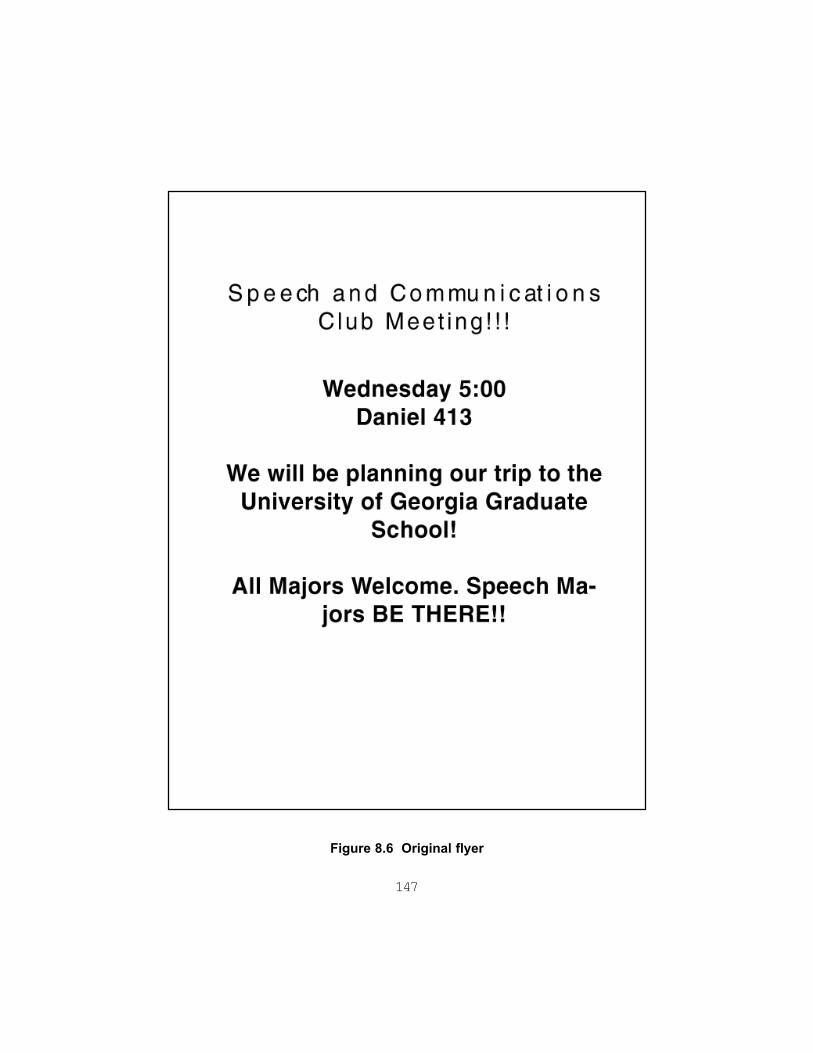
147
Figure 8.6 Original flyer

148
Figure 8.7 Revised flyer

149
Proposal
Myra Whittemore is both the author and the designer of this proposal for a local history project.She knew that her readers, members of the South Carolina Humanities Commission, wereinterested in funding small projects. These contribute to the state’s historical and literary life, yetmust also benefit a diverse group of citizens—in this case the community of Wadmalaw Island,Myra’s home. Visuals add interest and a focal point. They can also help to show that theproposer is committed to the project and shares the values of the Humanities Commission.Myra decided to add two graphics: 1) a table (generated in a spreadsheet) for her budget, and2) a clip art image that evoked the locale and expressed the benefits of her project.
A note about the illustration: Wadmalaw Island’s history and the natural setting of palmettos andlive oaks recall the Old South. Yet, as Myra found, commonly available clip art may suggest anindirect nostalgia for the former white-dominated plantation culture. She rejected an evocativeillustration of an older African-American working man as potentially condescending.
The image that she eventually chose, a spreading tree, does not represent anything particular tocoastal South Carolina. Nor did it reproduce as well as others she could have used. However, itdoes not have negative connotations. And Myra found that she could use the image to conveythe theme of “One Grant, Many Outcomes,” labeling the tree’s branches with the many benefitsthat her project would generate.

150
Figure 8.8 Visual proposal
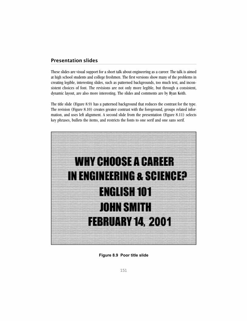
151
Presentation slides
These slides are visual support for a short talk about engineering as a career. The talk is aimedat high school students and college freshmen. The first versions show many of the problems increating legible, interesting slides, such as patterned backgrounds, too much text, and incon-sistent choices of font. The revisions are not only more legible, but through a consistent,dynamic layout, are also more interesting. The slides and comments are by Ryan Keith.
The title slide (Figure 8.9) has a patterned background that reduces the contrast for the type.The revision (Figure 8.10) creates greater contrast with the foreground, groups related infor-mation, and uses left alignment. A second slide from the presentation (Figure 8.11) selectskey phrases, bullets the items, and restricts the fonts to one serif and one sans serif.
Figure 8.9 Poor title slide
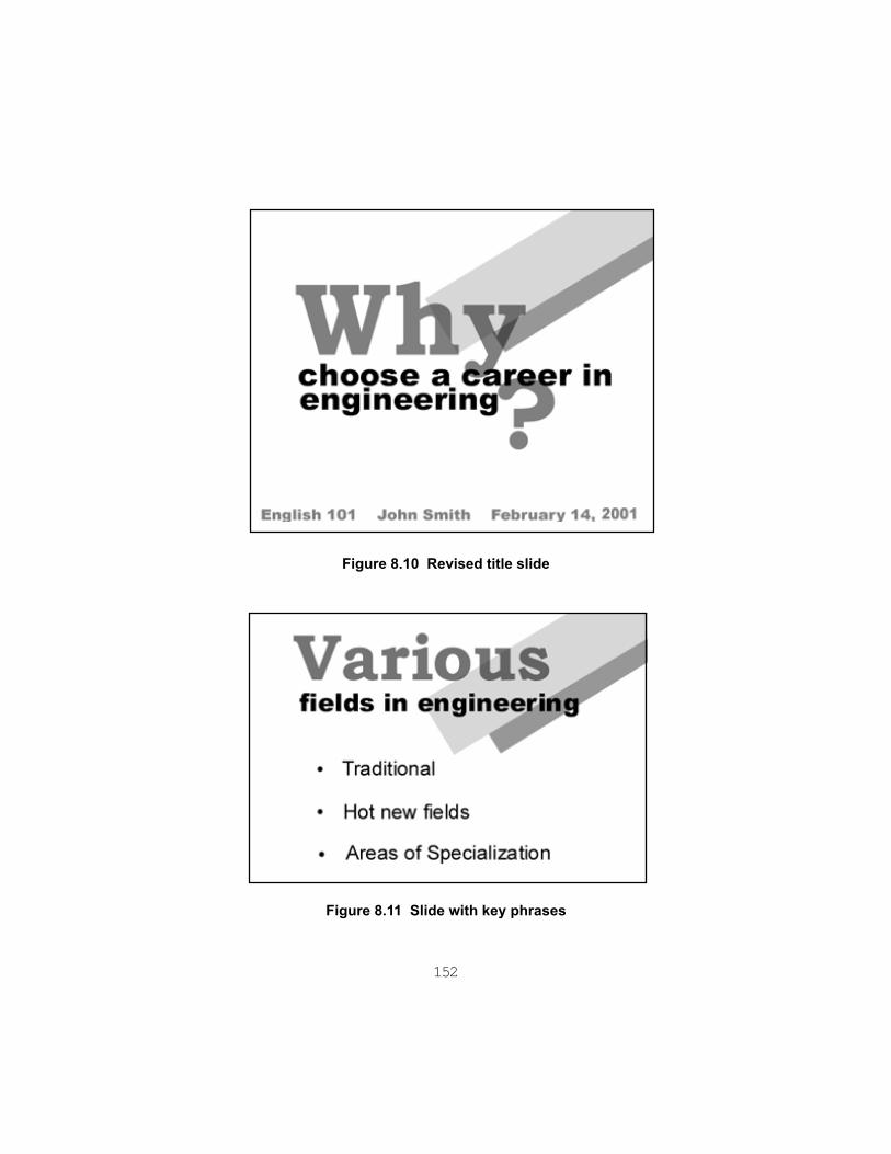
152
Figure 8.10 Revised title slide
Figure 8.11 Slide with key phrases

153
Web pages
Web pages, like presentation slides, offer so many design options that it is easy to overwhelm thereader. Remember that Web readers scan a page from link to link, searching for the next interest-ing place to go. Deb Staed, who teaches students and faculty how to make interesting, well-designed Web pages and multimedia presentations, created this typical homepage (Figure8.12) and revised it to be more legible (Figure 8.13). The first version has a distractingbackground that makes the slender type hard to read (see Figure 2.3 in Chapter 2 for discus-sion of this kind of problem). The images, the band of flowers and the sun, have blank back-grounds and are not integrated into the page’s overall visual field. Nor are there any links, so thereader may feel this page is a “dead end.” The revision has a simple white background, so thatthe type and images stand out. The repeated suns are used as bullets to create a consistenttheme for the links, which lead viewers further into the site. The whole is organized but stillsprightly and full of the creator’s personality.
Figure 8.12 Original Web page with poor figure-ground separation

154
Figure 8.13 Revised Web page with high contrast and strong alignment
The following Web page (Figure 8.14) was created by Sarah Weathers for a company that offerscleaning services. Based loosely on the inverted-L format, with a contents bar at the left, the sitehas features that break up the “blocky” or squarish look normally associated with the inverted-L format. For example, the shaded triangle in the logo (colored blue in Sarah’s version) cutsthrough the letters of the company’s name. The two areas of the logo, colored blue and white,echo each other, reversing background and foreground and unifying the image. The contrastscreated, as well as the unusual but clear shapes, add a dynamic quality to the page.

155
Figure 8.14 Sarah Weather�s CeilBrite Web page
Image Poem
Another application of unusual shapes to direct attention and add interest occurs in the nextsample, an image poem by Angela Davis (Figure 8.15). Angela began this project when herclass was assigned Exercise 1 from Chapter 7. Created as a poster, the document reversesnormal expectations of reading and viewing. The background, a photograph of the Eiffel Towershown from pedestrian level, divides the page into vivid darker and lighter areas. The darkestarea, the bottom, creates the greatest contrast with the large words in reversed type, so attentionis drawn there. Decreasing size is used to direct readers to read from bottom to top, and severalwords use the edges of the page and the image as anchors in a “step” movement upward. Thereis a punning relationship between the words and the image, too.

156
Figure 8.15 Angela Davis� Poster

157
Brochure
The brochure on the following pages was created by Michelle Slater and Parker Smith in orderrecruit new students for Clemson’s MA in Professional Communication program by advertisingthe kinds of careers graduates could pursue. Creating and reading a “tri-fold” brochure likethis one takes a fair amount of imagination because, like Web pages, you have to think carefullyabout the “navigation” system for the brochure. How will the user of a brochure interact withits folding?
This brochure has a traditional format: an 8.5" by 11" page folded in thirds, called a “tri-fold.”Because of the folding, there are six panels, three on the front page and three on the back. Afterthe page has been folded, the front panel stands alone and attracts the reader inside. Onopening, the reader then typically sees the inside "flap" and one of the inside panels, then therest of the inside. A reader may then scan the inner panels as one cohesive page. The backpanel usually contains contact information, such as the mailing and Web site addresses shownin Figure 8.17.
Figure 8.16 Opening panels of a tri-fold brochure
Note how the authors used font size and shading to emphasize the names of the careers on eachpanel, except for the front or cover panel. Notice also how they divided each panel into twocolumns and made very subtle use of the same font shading for the pull quotes that they usedfor the large headers. The effect here is to pull readers into each panel, encouraging them toread more closely. Note that we have added labels to each panel in order to make the brochure’snavigation easier to follow.

158
Figure 8.17 Page one of a tri-fold brochure
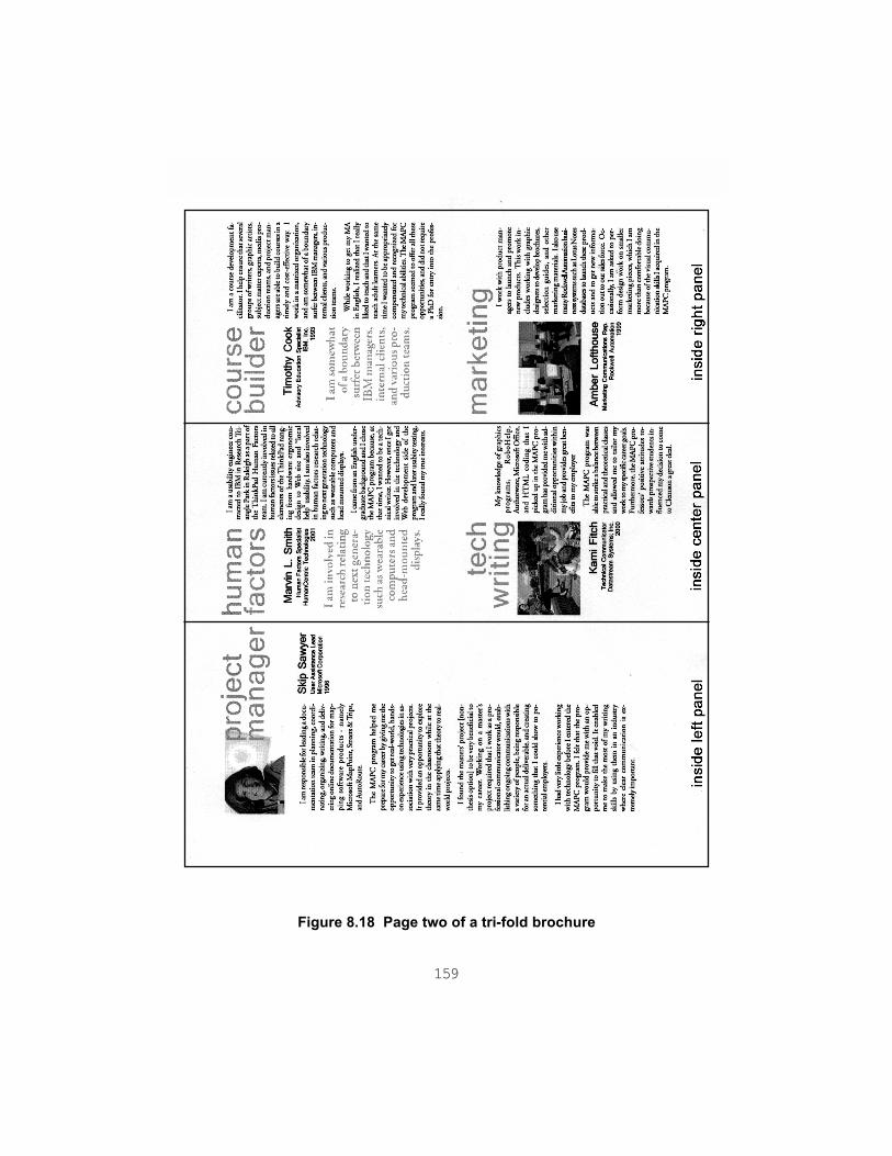
159
Figure 8.18 Page two of a tri-fold brochure

160
Newsletters
Parker Smith created this newsletter by redesigning an actual newsletter as a class assignment.Parker’s redesigned newsletter (Figure 8.19) has an asymmetrical, yet balanced layout. (SeeChapter 5 and Figure 5.5 for more discussion of balance.) “Squint” at this layout. The twodarker portions of the page, the title Livewire and the left-hand column, should stand out. Theyare balanced against each other. The title, aligned flush right, has bold black letters that contrastwell against the white background. The title is smaller but more dramatic than the left column,which is medium gray. Thus the two sections are balanced in value and tonal density, that is, thearea covered by ink. The layout also has plenty of figure-ground contrast, using ample whitespace around these darker areas as well as to set off the two right-hand text columns.
Other features help to define parts of the page and also to unify the look. The different types ofinformation on the page have different visual emphasis and treatment. The gray column on theleft contains routine scheduling information. The two white columns both contain news andeditorial content. The small graphics like the Web (behind the title), the book, and the enve-lope are somewhat casual line drawings. They are consistent with each other in tone and style.Thus, while they are different images, their common treatment pulls the different areas together,draws the reader into the page, and cues each new part of the page.
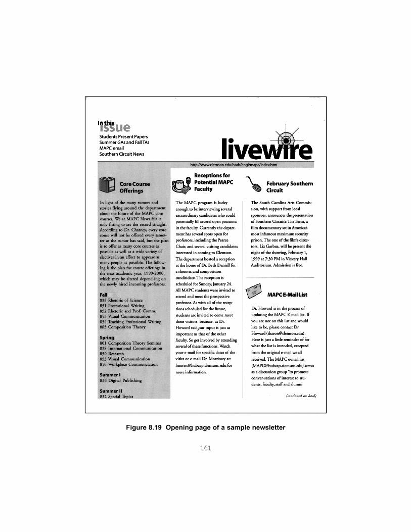
161
Figure 8.19 Opening page of a sample newsletter

162
163
CHAPTER 9
Learning More about VisualCommunication
This guide gives a great deal of advice—prescriptions for good visual communication, if youwill. However, the advice is just that, good counsel, not law writ in stone. Part of being informedabout visual communication is to recognize that it has a history and cultural context, just asrhetoric does. Thus its terms are not universal or timeless but always in the process of beingadapted and contested. The document format that is perfectly acceptable for one instructor orwork supervisor may be rejected by another. What looks appropriate, innovative, or attractiveat one time is judged improper, dated, or dull at another. When you ask readers to give youfeedback about the look of your document, they may focus on completely different aspects ofit. The contradictions do not mean that readers’ acceptance of a document’s look is random orwhimsical. In fact, there are a number of cultural circumstances that help explain advice aboutvisual design—and explain why it may be contradictory.
This guide also has a context. It draws heavily on a few movements, theories, and practicesabout visuals: modernist aesthetics, semiotics, ideological criticism, cognitive psychology, andtechnical communication, as well as rhetoric.
This chapter summarizes some influences on visual communication as a subject. It attemptsone answer to the question: Where do ideas about the ads, logos, magazines, manuals, Websites, and other print and electronic communications come from? The answer is found in thesocial, technological, and intellectual contexts of published documents and public communi-cations—the history of their making and the experiences of their makers.
Books, articles, and Internet sites about print and Web design abound. The bibliography lists anumber of these, and more appear every day. Many are excellent. Often the advice is phrased as“Do this, don’t do that.” (This guide makes similar pronouncements.) Such certainty is in factpart of our prevailing assumptions about the ethos of the visual, its intuitiveness or transpar-ency. However, consider the source and context of your information. Here are some aspectsof visual communication to explore further.

164
Graphic design: the text as image
Published documents have long incorporated the specialized knowledge of graphic design.Graphic design encompasses the entire process of delivery, or to use a publishing term,production: arranging text and visuals on pages or screens, plus choosing type, color, anddetails of paper, ink, and binding (for print documents) or platform and interface (for screendocuments). Even publications that seem to be entirely textual have been visually designed. Inrhetorical terms, graphic design makes use of “typography, illustration, photography, andprinting for purposes of persuasion, information, or instruction” (Schriver 79). In aestheticterms, graphic design brings “structural order and visual form to printed communications”(Meggs xiii). Printed and now electronic mass communication—posters, advertising, publicrelations (including corporate identity programs and logos), books, magazines, and multi-media interfaces—are major areas in which graphic design is applied.
The large, many-faceted 20th-century artistic and architectural movement called modernismand its successor, postmodernism, are especially important. The legacy of these very differentapproaches to design is not static, but always being challenged and adapted.
Modernism and graphic design
In the late 19th and early 20th-centuries, European visual artists’ responses to rapid techno-logical, scientific, and social changes were “a series of creative revolutions” that together arecalled modernism (Meggs 238). Modernist ideas and values have profoundly influenced thelook of communications, especially since World War II. In graphic design, the most influentialform of modernism has been the International Typographic Style, or Swiss style, that isevident in everything from our highway and airport signs to informational brochures, corpo-rate logos, and international symbols for Olympic events. From modernist aesthetics comesthe emphasis on function, simplicity of form, universality with objectivity, and intu-ition that is featured in much advice about the visual design of documents.
Function. “Form follows function,” the byword of modern architecture, also character-izes modernist graphic design. Reflecting the values of machines and speed, designers reex-amined everything from furniture to page layouts to discern how people encountered and usedthe material objects of their lives. Those uses gave rise to the forms of the objects. As KarenSchriver has noted, this interplay of form and function, between the design and the user’sneeds, is rhetorical (84). Modernist designers also sought to unify text and form, so that thelook of the letters, words, and pages reflected the values of the language (Kostelnick, “Typo-

165
graphical Design” 10). That is, the look of the text was in part a functional reflection of itsmeaning. The same emphasis on function led to a focus on economy and simplicity of form.
Simplicity. If a design element is not functional, it is unnecessary. Modernist painters likePablo Picasso and Piet Mondrian and architects like Walter Gropius saw the world in terms ofabstract shapes. Modernist designers of posters, books, and magazines like Lazslo Moholy-Nagy and Jan Tschichold cleared the page and began to work with geometric areas of whitespace, lines, photographs of machines and tools with their abstract forms, and blocks of text.Type designers created many new sans serif typefaces, which were cleaner and simpler inshape than serif types. Herbert Bayer of the Bauhaus design school even declared that it wasredundant to use both upper- and lowercase letters, so that he omitted capital letters in hispages (Meggs 294).
The drive to simplify also carried over to signs and symbolic communication. The developmentof icons can be traced to experiments like Otto Neurath’s Isotype, a system of pictographs thatsimplified statistical data (Meggs 303-4). The human form was also simplified in these efforts.In the area of maps, Henry C. Beck’s map for the London Underground, created in 1933,presented a simplified, brightly colored diagram instead of a conventional map that was faithfulto geographic distances (Meggs 304). This famous map became the pattern for subway mapsall over the world.
Universality and objectivity. Reducing forms, including the human form, to basicshared elements is one way to eliminate the differences that divide people and obscure theircommon goals. The Isotype goal of a “’world language without words’” was to aid publicunderstanding of “issues relating to housing, health, and economics” (Meggs 303). A univer-sal system to reach all people across languages and cultures has been the goal of many mod-ernist-influenced systems of transportation and event signs, from the U.S. Interstate highwaysystem to the international symbols in airports to Olympic event icons.
Because it was a response to and often a celebration of science, technology, and industrializa-tion, modernism also values objectivity. In particular, modernists assume that the perceptualcapabilities of eye and brain are shared by all humans, so that there is a universal response tovisual communication (Kostelnick, “Cultural Adaptation” 182-83). The principles of Gestaltpsychology reflect this assumption. So does some document design research, such as legibil-ity and readability studies. However, even type is not culturally neutral, as Robin Kinross hasshown (135-36).

166
Intuition. Modernist ideas have not only influenced the look but also the process of designingdocuments and the source of visual ideas. Much design advice counsels to use your intuition—just going with “what looks right.” That advice can be traced back to the Bauhaus, whichprivileged the intuition of individuals and cultures as the source of truth and good design(Kostelnick, “Typographical Design” 19). One effect—at least on those who have not beeneducated in architecture, art, or design—has been to obscure the roots of the very principlesthat have so influenced the look of communications.
Modernism in sum. The values of modernist design appear everywhere in guidelines forvisual communication. Function and simplicity of form have been embodied in tenets aboutanalyzing the reader, unifying the tone of text and type, using white space, employing gridstructures, creating balanced but not rigidly symmetrical layouts, employing Gestalt prin-ciples of perception, and striving for clarity of communication as well as a restrained expres-siveness. These and many other precepts based on modernist ideas retain their power andusefulness today. Yet there are contradictions inherent in modernism, especially in the simulta-neous quest for objectivity and intuition. These principles also require assumptions and choicesthat may not suit the rhetorical situation. For example, the belief that humans respond univer-sally to visual forms disregards the importance of culture and experience—genre knowledge,for example—in our understanding of even quite simple visual elements.
After modernism. Starting in the 1970’s, architects and designers have challenged the moretroubling assumptions of modernism. The many varied responses are usually calledpostmodernism. In contrast to the modernist’s ideal of universal design, postmodernistsrecognize the political, social, and historical meanings of design forms (Meggs 446). They callattention to the very limits of the forms they employ, and often use design to critique andcontextualize particular visual styles. Because postmodernism acknowledges the social andpolitical settings of documents and other objects, ideological critics have applied its ideas toeverything from maps to interior design. (Barton and Barton, “Ideology” 49-50; Lupton, “TheBathroom” 25). In contrast to modernism’s simplicity (and therefore its tendency to exclude),postmodernism embraces differences, even to the point of chaos. Harking back to earlier 20th-century art movements like Dada, postmodernism also acknowledges the visual impact of massand consumer culture, blending ads and comic book images irreverently with reproductionsof acknowledged masterpieces, like the Mona Lisa (Appignanesi and Garratt 32).Postmodernist designers value play, complexity, randomness, visual punning and a self-reflexive irony. Collage, grunge typography—“ugly” or “subversive” fonts—and “retro”design all share a postmodern visual sensibility (Williams, Blip 9).

167
Other influences on visual communication
Outside the arts themselves, other developments have influenced the dialogue about visualcommunication in documents. Some of these take up both the interpretation and the produc-tion of documents. Others primarily concern interpretation, especially on the reading of imagesin advertising, the media, and governmental publications. The emphasis in the following sec-tions is on influential and accessible works in each strand.
Information graphics and visual problem solving
In the physical sciences, technology, social sciences, and applied arts, the production of visualsis an issue that has influenced the discussion about visual communication. Information graph-ics is concerned with the clear, accurate production and interpretation of scientific, technical,and numerical research data. Until the introduction of personal computers, information graphicswere typically the domain of specialized technical illustrators. Illustrators made a variety ofcharts, figures, and other illustrations for scientific and engineering journals, but also popularmagazines and newspapers. When computers (and calculators) put graphing tools into thehands of researchers themselves, interest in the design of information graphics moved out ofthe illustrator’s craft and into wider discussion.
In the applied arts and technology, architects, urban planners, designers, and landscape archi-tects have always needed some drawing skills. While these skills have typically been honed by acraft approach, through design and (for some) mechanical drawing courses, a morecreative approach has evolved since the 1960’s. Visual problem solving allies psychology,sketching, problem-solving techniques, and systems thinking.
Information graphics. The production of clear, accessible charts and graphs to illustratenumerical data has had a relatively long craft tradition of “how-to” advice (Schriver 81). Thatsituation changed with the 1983 publication of The Visual Display of Quantitative Infor-mation by Edward R. Tufte. Tufte offered a theory, history, and aesthetics of data graphics.Visual Display has had great influence in the sciences, technical communication, and commer-cial as well as desktop publishing. Tufte’s principles, as well as the design of his several books,place him philosophically and aesthetically with modernism (Kostelnick, “Cultural Adaptation”191), although some have noted a split between modernist and postmodernist sensibility(Barton and Barton, “Postmodernism” 256 ). However, he has been most criticized for ignor-ing the rhetorical situation in which information graphics are created and viewed. For example,Tufte’s analysis of the Challenger disaster points out that the graphics prepared to show that
168
the launch should be delayed were faulty (Visual Explanations 40). Lee Brasseur arguesthat better graphics would not by themselves have changed the outcome, as Tufte has suggested(Brasseur 343).
The rhetorical context of information graphics has received attention from geographer MarkMonmonier. In the area of medical journalism and illustration, Sean McNaughton, a reporterand information graphic artist, has written a case history of a complex, two-day feature articleon prostate cancer for the Boston Globe (McNaughton 488).
Visual problem solving. Many professions require creativity, and one contemporary ap-proach to enhancing creativity is visual problem solving. This movement has been fueled tosome degree by Rudolf Arnheim’s interdisciplinary approach in Visual Thinking (1969),drawing on psychology as well as the visual arts (McKim 199). The study of mind and braincontinues to influence this movement, including studies of the brain’s hemispheres that haveopposed visual and verbal processing as well as the discussion of different “intelligences” suchas spatial intelligence by Howard Gardner and others. Because it seeks to enhance individualand group creativity, visual problem solving also draws on the human potential movements ofthe late 20th-century. This literature typically mixes abstract visual puzzles (for example, fromthe Gestaltists) with word puzzles, design problems, rapid sketching exercises, explanationsof brain function, and maxims for releasing creativity. In addition to Arnheim, the writing ofEdward De Bono, such as New Think, is influential here. This movement also renewed inter-est in the drawing techniques of Kimon Nicolaides. Another significant mainstream drawingbook is Betty Edwards’ Drawing on the Right Side of the Brain. The influence of visualproblem solving extends well beyond architecture and design into fields like management,software engineering, and multimedia design.
Information visualization. Computer technology makes possible intricately detailed two-and three-dimensional displays. That capability has accelerated interest in new types of infor-mation graphics and research into visual representations of data. A relatively new field calledinformation visualization “applies vision research to practical problems of data analy-sis,” combining psychological research and engineering (Ware 33). This complex field con-nects with the work of Tufte, as well as visual problem solving, human factors, and usabilitystudies. A good starting point is the first chapter of Readings in Information Visualization:Using Vision to Think. With Jacques Bertin’s dictum, “Graphics is the visual means of resolv-ing logical problems,” as their motto, authors Stuart A. Card, Jock D. Mackinlay, and BenShneiderman give solid explanations and accessible examples.
169
Semiotics, cultural criticism, and visual literacy
The abundance of images around us has prompted intellectual debate about the way that theyconstruct our ideas. The images presented in the media, as well as the visual environment—consumer objects, interior design, buildings—of our everyday life are the subject of muchanalysis and critique. As Ellen Lupton and J. Abbott Miller have remarked, “the very omnipres-ence of products and media” is “a socializing force from which no one is exempt” (Design165). Semiotics, cultural criticism, and visual literacy have contributed much to our under-standing of the sophistication of the visual environment around us and the ways by which weinteract with images and artifacts to build and reaffirm our cultural assumptions.
Semiotics. Semiotics is the study of signs—not traffic signs but things that stand for some-one or something else. Based on the linguistic theories of Ferdinand de Saussure and others,semiotics, or semiology, has been very influential in interpreting the visual in our culture. Thetheorist Roland Barthes has contributed, among many other studies, an interpretation of theEiffel Tower as an iconic part of visual life. Arthur Asa Berger’s Media Analysis Techniques(1991) surveys semiotic approaches to advertising and television. Gunther Kress and Theo vanLeeuwen have offered a sweeping social semiotic description of images from newspaper lay-outs to film to charts and graphs in Reading Images: The Grammar of Visual Design (1996).
Cultural and ideological criticism. In its broadest sense, cultural criticism offers a vo-cabulary and set of concepts from many fields—such as history, art history, philosophy, andanthropology—to analyze the visual world in intellectual terms. The work of art historianErnst Gombrich on representation, using examples from New Yorker cartoons to medievaldrawings, continues to be influential in the study of visuals with its social approach. In the areaof technology, Jay David Bolter’s Writing Space: The Computer, Hypertext, and the History ofWriting (1991), especially the chapter “Seeing and Writing,” touches many of the problemsthat face the writer who is becoming aware of visual communication. Although Writing Spacepredates the World Wide Web, it is particularly good at placing Western ideas of print andillustration in a large historical sweep from classical times to the present. Bolter also notes theinfluence of phonetic literacy and print technology on our present understanding of visuals.
The power relationships that we construct and maintain through our texts, visuals, and culturalartifacts are the subject of ideological criticism. John Berger’s Ways of Seeing allies the tradi-tional history of painting with media criticism. There is a large body of feminist critique ofadvertising and the visual arts as well, such as Rosemary Betterton’s 1987 collection. Theideological critique of graphic design is often treated with industrial design because consumerproducts have become almost indistinguishable from their packaging and marketing. Adrian

170
Forty’s Objects of Desire (1986) discusses, among other artifacts, the subtle advertising of thenow-famous London subway map. Ellen Lupton, a museum curator and exhibition designer,has explored the industrial design of consumer products and the architecture of bathroomsand waste systems, as well as popular graphic design. For example, with J. Abbott Miller, Luptonhas analyzed images of race, gender, age, and beauty in stock photography, now widely avail-able in digital form and even packaged with software. A collection of short analyses edited bySteven Heller and Karen Pomeroy takes on graphic design from Hitler to Mad magazine.Cynthia Y. Selfe and Richard J. Selfe, Jr., explore the politics of computer interfaces. GeographerMark Monmonier’s works on maps critique the power relationships of information graphics.In Remediation: Understanding New Media. Jay David Bolter and Richard Grusin present awide-ranging theoretical study of visual representation that includes computer games, photog-raphy, digital art, film, virtual reality, theme parks, television, and the Web.
Visual literacy. The number and kinds of images that children see and their responses tothese images make up another important issue. The phrase “visual literacy,” once used mainly ineducation, now is loosely applied to the study of all types of visuals, from information graphicsto video and film. One figure associated with visual literacy is professor of mass communica-tions Paul Messaris. The International Visual Literacy Association maintains a large bibliogra-phy (with materials up to 1995) at its Web site.
Rhetoric, document design, usability studies, andprofessional communication
Writers have typically been logocentric—centered on words, not visuals (Schriver 72). Yetfor some time, writing scholars have brought semiotic and ideological theory to the visualnature of texts. Through a growing awareness of “document design,” they have also broughtanother strand of thought to bear on visual communication: empirical research in the ways thatreaders perceive and respond to the look of documents. Technical and professional writinghas particularly contributed in this area. Above all, the field of writing views visuals as rhetori-cal, embedded in the relationships of writer (or designer), reader, and purpose.
The document design and usability testing movements. In the 1960’s and 1970’s,citizens’ rights advocates began calling for the clear communication of information aboutconsumer products and government services (Schriver 26). In the United States, this “plainlanguage” movement resulted in federal and state initiatives to reduce paperwork and commu-nicate in clear, simple language. Although these initiatives had lost momentum by the 1980’s,they gave rise to research projects that linked industry consultants, research psychologists,

171
and scholars of English and writing. This collaboration has affected the structure of these fieldsto this day.
In particular, the document design movement brought layout and visuals to writers’ attention asintegral to communication. The monograph Guidelines for Document Designers (1981),the textbook Writing in the Professions (1981), and the scholarly collection Writing inNon-Academic Settings (1985), all co-authored or edited by members of the originalDocument Design Project, have introduced many writing teachers to a structured, research-based rationale for design advice.
One outgrowth of document design research has come to be known as usability testing.Employing a wide range of research techniques from cognitive and human factors psychologyas well as ethnographic and sociological methods, usability testing enables writers to discoverusers’ goals and needs in documents (Duin 307). In its focus on readers, usability testing isrhetorical, and often involves visual communication. Manuals, computer documentation, andinterfaces are the main materials tested, but the philosophy that writers should be advocates forreaders has affected many other types of public documents. The Design of Everyday Things,by Donald A. Norman, an industrial psychologist, is an interesting and accessible treatment ofhuman factors and user-centered design issues.
The fields of usability testing and human factors have become increasingly important for visualcommunicators, especially Web site designers. For conducting serious usability research, thereis A Practical Guide to Usability Testing by Joseph S. Dumas and Janice C. Redish. Writersinterested in the brain’s processing of visual and other information can profit from examiningMarlana Coe’s Human Factors for Technical Communicators. The growing literature oninformation visualization, discussed earlier, is also relevant. For accessible Web sites, JakobNielsen’s online column entitled “Alertbox” (www.useit.com) has become a standard, althoughmany Web designers find his advice too restrictive. Nielsen, formerly an engineer for SunMicrosystems, has also published a book, Designing Web Usability: The Practice of Simplic-ity. Steve Krug has written a straightforward treatment of online accessibility in Don’t Make MeThink!: A Common Sense Approach to Web Usability.
Professional and technical communication. Textbooks in technical and business com-munication have long included information graphics and now usually include a section ondocument design. Increasingly, visual communication is regarded as a field of study and anumber of programs have courses in visual rhetoric or visual communication (Alred 137-43).Scholars who have examined the visual include Stephen Bernhardt, Ben F. Barton, and Marthalee
172
S. Barton. Recently two research-based texts by Karen A. Schriver (1997) and Charles Kostelnickand David D. Roberts (1998) have been all or substantially devoted to visual communication.
Summary
! Visual communication has social, technological, and intellectual contexts in graphic designand other fields.
! Modernism and postmodernism have influenced the look of contemporary documents.
! Other influences on the practice and theory of visuals come from information graphics,visual problem solving, semiotics, cultural and ideological criticism, the visual literacymovement, rhetoric, document design research, and professional communication.
Exercises
Invite a panel to discuss the visual design of publications. You might start by considering peoplein these areas:
! publications editor for campus newspaper or magazine
! scholarly editor from the humanities, arts, sciences, or engineering
! director of campus publicity
! Webmaster for an organization
! freelance graphic artist
! local printer
Ask them to bring one or two representative publications (the Webmaster will need online access)that they are prepared to discuss. Here are a few questions that you might ask them to prepare for:
! What education and experience led them to this type of position?
! What kinds of visuals are they most familiar with?
! How do they usually interpret those visuals?
! What guidelines do they use for the format and look of publications?
! Who makes decisions about the look?

173
! What is the process of publication?
! What advice do they commonly give writers about creating visuals and producing attractive,informative documents?
Notes
1There are many other aspects of modernism in art and literature. For an explanation ofmodern art’s impact on graphic design, see Meggs, “The Influence of Modern Art,” A Historyof Graphic Design, pp. 238-55.

174

175
Glossary
Numbers in parentheses ( ) indicate the chapter or chapters where the term is discussed.
aesthetics. The study of art and beauty. (9)
arrangement. In a document, the process of ordering information persuasively. Arrangement is the secondstage of classical rhetoric. (1)
bar chart. A chart with horizontal bars, allowing comparison of values across categories. (3)
body type. Fonts that can be read at length and used in text passages. (6)
chart. A graphical display of numerical information. (3, 7)
chartjunk. Extraneous detail in charts. (7)
chunking. Breaking information into small, visually distinct sections. (1, 2)
clip art. Widely available generic drawings used to add interest to documents. (3)
cognitive styles. Learning styles. (2)
color cueing. Using colors to focus attention, simplify information, group elements, and create separatelayers of information. (1)
column chart. A chart with vertical bars. (3)
column heading. In a table, the top row that gives important information. (3)
conceptual photograph. A photograph that is posed or manipulated to make a point. (3)
contour lines. Lines that show changes in elevation in a topographic map. (3)
contrast. How well items stand out from each other and the background. See also figure-groundseparation. (2)
convention. A customary feature that readers expect to appear in a particular genre. (2)
creating multiple paths. Giving readers both verbal and visual choices throughout a document tosupport their different experiences and learning styles. (1)
cropping. Cutting extraneous details from the edges of an image. (3)
cultural criticism. The analysis of visual and other cultural artifacts using the methods of history, art history,philosophy, psychology, anthropology, and other fields.

176
data displays, data graphics. See information graphics. (3)
data map. Shows statistical information across an area, such as the density of population. (3)
data set. The total body of numerical data from which a particular information graphic is drawn. (3)
delivery. The last stage in classical rhetoric, which includes the placement of text and visuals, plus choicesof type, color, and details of paper, ink, and binding (for print documents) or platform and interface (forscreen documents). Also called production. (1, 9)
dingbat. A small visual symbol. (5)
direction. The slant of strokes in a typeface. (6)
discourse communities. Groups of readers and writers with a common knowledge of language andconventions. (2)
display type. Fonts suited for titles and headings. Display type includes decorative, unusual, and scriptfonts, as well as all bold, heavy fonts. (6)
distribution map. Shows the location (or distribution) of features across an area, such as averagetemperatures. (3)
document design. Use of verbal and visual features that have been shown to be easily understood byreaders. (1, 9)
documents. Paper and on-screen writing, also referred to as text. (1)
drop cap. An enlarged capital letter that leads readers into an article. (6)
drop shadow. A type feature that looks like a cast shadow, used to create interest and increase figure-ground contrast. (5)
ethos. The credibility or character of the writer as it is projected through the document. One of the threerhetorical appeals of classical rhetoric. (1, 4, 9)
event map. Follows a sequence of events from place to place, with commentary. (3)
expressive purpose. Engaging the reader through personal values, opinions, and interests. (4)
fair use. A federal policy that allows writers limited use of the copyrighted works of others, without askingpermission of the copyright owner. (7)
figure-ground separation. The ability to see an image against a background, one of the most fundamen-tal aspects of visual perception. A Gestalt principle. (2)
filtering. Focusing on design features like headings, lists, typographic changes, and layout while ignoringother sensory information. (1, 2)

177
focal point. In perception, an area that we focus our eyes on. Within any visual field, we tend to find onlya few focal points. (2)
font. The design of a particular set of type. Also called typeface. (6)
foveal vision. The small, jumping movement of the eyes to bring visual input onto the fovea, the area ofclearest vision. (2)
genre. Kind of discourse or document, a “socially active” device to help readers determine what the writerwants from them. (2)
genre knowledge. The networks of mental models or schemata that we have created from repeatedexperiences. (2)
geologic map. Shows the strata below the earth’s surface. (3)
Gestalt. A German word that is translated as “form” or “wholeness.” (2)
graphic design. Using typography, illustration, photography, and printing to persuade, interest, andinform. (9)
graphics. Visuals that are distinct from verbal material. Also referred to as images. (1)
grid. Division of a page or screen into rectangular areas as a template for page or screen layout. (5)
grouping. Creating visual relationships between items. (2)
hue. What is usually meant by color, such as blue, green, or red. (2)
icon. A small, stylized image. Icons are often used in making electronic links or “buttons.” (3, 9)
ideological criticism. The study of power relationships that we construct and maintain through our texts,visuals, and cultural artifacts. Includes feminist and Marxist criticism. (9)
image. A visual that is distinct from text, also referred to as a graphic. In particular, photographs,drawings, cartoons, and ads. (1, 3)
image memory. Memory of particular visual images plus our constructed “mental images” of pictures,events, and visual-related words. One of the most enduring types of memory. (2)
information graphics. Visuals such as tables, charts, graphs, and maps. Sometimes called data graphicsor data displays. (3)
invention. The first stage of classical rhetoric, which includes planning, audience analysis, and developingthe overall approach to a document. (1, 4)
inverted-L. A common format for Web pages that places the title/logo (and often other elements, such asa navigation bar) across the top of the screen and a table of contents area along the left edge of thescreen. (5, 8)
178
jumpline. Text at the bottom center or bottom right of an article that indicates continuation onto anotherpage. (5)
justification. Alignment of both the left and right edges of text passages by inserting small amounts of extraspace between words. Also called full justification. (6)
key or legend. Interprets the graphic symbols of a map. (3)
land use map. Shows human activity in an area, such as industry, residences, farmland, and parks. (3)
layering. Creating visual objects through a document that can be scanned separately from surroundingtext. (1, 2)
leading. Pronounced “ledding.” The vertical spacing between lines of type. (6)
letterform. In a font, the visual structure of an individual letter. (6)
letterbox. An increasingly popular Web page format that emphasizes graphics. The middle area of thescreen is a wide horizontal “letterbox,” with a title/logo area above and a navigation area below. (5)
letterspacing. Putting small amounts of extra space between letters for a decorative effect. (6)
line graph. A chart using lines to show trends, usually over time. (3)
location map. Shows an area featured in a news story. (3)
logo. A visual symbol identifying a group. (4)
logos. The reasoning of a document. One of the three rhetorical appeals of classical rhetoric. (1, 4)
logotype. A logo combined with text, as in a letterhead. (4)
map. A graphical representation of the landscape and its features. (3)
Mercator projection. A standard form of world map that enlarges areas near the poles. (3)
mixing modes. Giving information in pictures as well as words. (1)
modernism. Influential group of artistic and intellectual movements that emphasize function, simplicity ofform, universality, objectivity, and intuition. (9)
multimedia design. Using text, graphics, video, and sound in a presentation or document. (9)
multi-panel genres. Documents that unfold through time as readers turn pages, open folded sections, orclick on links. (4, 5)
news and documentary photos. Spontaneous or near-spontaneous recordings of human events andconditions, ranging from news events to sports to daily life. (3)
Old Style. A traditional style of font with graceful curved lines and serifs. (6)

179
orientation. An object’s direction—upright, horizontal, slanted, or rotated. (2)
pathos. The reader’s emotional response to and intensity of interest in a document. One of the threerhetorical appeals of classical rhetoric. (1, 4)
pictograph. A picture representing a word or idea. (9)
pie chart. A chart that shows how a whole is divided into parts. (3)
pixellation. Jagged, dot-like appearance of letters. (6)
poetic or artistic purpose. Engaging the reader in a playful or aesthetic experience. (4)
point. A measure of the height of a typeface, approximately 1/72 of an inch. (6)
postmodernism. Intellectual and artistic movements that challenge the assumptions of modernism. (9)
production. The techniques and process of putting a document into final form for readers. Also seedelivery. (4)
projection. Technique used by mapmakers to convert the three-dimensional surface of the earth into thetwo dimensions of a flat plane. (3)
proximity. The Gestalt principle of placing related objects close to each other. (2, 5)
pull quote. A quotation “pulled” from an article, separated and highlighted to attract attention on apage. (5, 8)
queuing. Creating visual hierarchies of information, as through headings and subheadings. (1, 2)
reading goal. One of five ways that readers approach documents: skimming, scanning, searching,reading receptively, or reading critically. (2)
reversed type. Putting white or light letters on a dark background. (6)
rhetorical appeal. In classical rhetoric, a persuasive strategy: logos, ethos, or pathos. (1, 4)
rhetoric. The interaction of writers and readers in effective communication. (1, 9)
rule. A horizontal line. (5)
sans serif font. A contemporary-looking typeface without serifs or stress. (6, 9)
saturation. The purity of a hue. Bright red is highly saturated, while pink is not. (2)
scale. The proportion of distances on the map to distances on the ground. (3)
schema. A mental model. (1)
script. Type that imitates the look of handwriting. (6)

180
semiotics. The study of signs, based on the linguistic theories of Ferdinand de Saussure and others. (9)
serifs. Strokes on the ends of letters. (6)
similarity. The Gestalt principle of grouping objects by shape, orientation, color, or texture. (2, 5)
single-panel genres. Documents that readers generally see “all at once.” (4, 5)
squint test. Squinting at a page or screen to blur the details and make the overall design elements stand out. (5)
stacked column charts and stacked area charts. Charts that show both trends and the contribution ofindividual components to a total. (3)
stock photographs. Widely available conceptual photographs used to add interest and polish todocuments. (3)
storyboard. A sequence of thumbnails (quick sketches) with commentary, useful for planning multi-panel genres like newsletters and Web pages. (4)
stress. In a font, having both thick and thin strokes within a letter. (6)
stub. In a table, the far-left column that labels the rows. (3)
style. The third stage of classical rhetoric, which concerns choosing appropriate details in wording or designfeatures. (1)
surface map. Shows the location of places on the earth’s surface: highways, streets, airports, towns, pointsof interest. (3)
table. An arrangement of words or numbers into columns and rows. (3, 7)
template. Preset model of a genre (such as a resume or Web page) provided by a word processing ordesktop publishing program to help writers lay out a document. (5)
text. Paper and on-screen writing, also referred to as a document. (1)
texture. A pattern on an object. (2)
thumbnail. A small, quick, rough sketch used for planning visuals. (4)
tonal desity. The total amount of ink on the page or a section of a page; a term from printing.
topographic map. Shows visible features of the earth, such as mountains and rivers, often with contourlines. (3)
transactional purpose. Expecting readers to treat the information and claims of a document as truthfulso they can take further action. (4)
type. In printing, all alphabetic and numerical characters, plus punctuation marks. (6)

181
typeface. See font.
usability testing or field testing. In technical writing and interface design, a structured form of gettingreader input. (4, 9)
user-centered design. Engaging readers in the process of designing documents through design reviewsand user testing. (1, 9)
value. The amount of black or white in a color—its lightness or darkness. An important concept fordesigning documents. (2, 5)
visual communication. The ways in which the writers and readers interact through the look of the pagesand screens. (1)
visual convention. A visual feature that readers expect to appear in a particular genre. (2)
visual design. The structured process of planning for visual communication. (1)
visual field. In perception, the entire expanse of space visible at one time without moving the eyes. (2)
visual literacy. The ability to analyze and interpret visuals in our culture. (3, 9)
visual perception. The active process of planning for as well as interpreting sensory data from the eyes. (2)
weather map. Shows the distribution of temperatures and the weather forecast. (3)
weight. In a font, the thickness of strokes. (6)
x-axis. The horizontal dimension on most common charts. (3)
x-height. In a typeface, the height of small letters like e and x. X-height is a major factor in legibility. (6)
y-axis. The vertical dimension on most common charts. (3)

182

183
Works Cited
Alred, Gerald J. The St. Martin’s Bibliography of Business and Technical Communication. New York: St.Martin’s, 1997.
Appignasnesi, Richard, and Chris Garratt. Introducing Postmodernism. New York: Totem, 1995.
Arnheim, Rudolf. Visual Thinking. Berkeley, CA: U of Cal. P, 1969.
Aziz, Barbara Nimri. “Maps and the Mind.” Human Nature 1 (Aug. 1978): 50-59.
Baird, Russell N., Duncan McDonald, Ronald H. Pittman, and Arthur T. Turnbull. The Graphics of Commu-nication: Methods, Media and Technology. 6th ed. Fort Worth: Harcourt, 1993.
Bang, Molly. Picture This: Perception and Composition. Foreword by Rudolf Arnheim. Boston: Bulfinch-Little, Brown, 1991.
Barthes, Roland. Image, Music, Text. Trans. Stephen Heath. New York: Hill and Wang, 1977.
Barton, Ben F., and Marthalee S. Barton. “Ideology and the Map: Toward a Postmodern Design Practice.”Professional Communication: The Social Perspective. Ed. Nancy Roundy Blyler and CharlotteThralls. Newbury Park, CA: Sage, 1993. 49-78.
———. “Postmodernism and the Relation of Word and Image in Professional Discourse.” TechnicalWriting Teacher 17.3 (1990): 256-70.
Berger, Arthur Asa. “Sex and Symbol in Fashion Advertising and Analyzing Signs and Systems,” in DianaGeorge and John Trimbur, Reading Culture: Contexts for Critical Reading and Writing, 3rd
ed. New York: Longman, 1999. Pp. 186-93;.
Berger, John. Ways of Seeing. London: BBC-Penguin, 1972.
Bernhardt, Stephen A. “Seeing the Text.” College Composition and Communication 37.1 (1986): 68-78.
———.“The Design of Sexism: The Case of an Army Maintenance Manual.” IEEE Transactions onProfessional Communication 35.4 (1992): 217-21.
Bertin, Jacques. Semiology of Graphics: Diagrams Networks Maps. Trans. William J. Berg. Madison: U ofWisconsin P, 1983.
Betterton, Rosemary, ed. Looking On: Images of Femininity in the Visual Arts and Media. London:Pandora, 1987.
184
Bolter, Jay David. Writing Space: The Computer, Hypertext, and the History of Writing. Hillsdale, NJ:Erlbaum, 1991.
Bolter, Jay David, and Richard Grusin. Remediation: Understanding New Media. Cambridge, MA: MITPress, 1999.
Brasseur, Lee. Review of Visual Explanations: Images and Quantities, Evidence and Narrative. TechnicalCommunication Quarterly. 7.3 (1998): 341-45.
Britton, James, et al. The Development of Writing Abilities (11-18). Schools Council ResearchStudies. London: Macmillan, 1975.
Card, Stuart A., Jock D. Mackinlay, and Ben Shneiderman. Readings in Information Visualization: UsingVision to Think. San Francisco, CA: Morgan Kaufman, 1999.
Coe, Marlana. Human Factors for Technical Communicators. Wiley Technical Communication Library. NewYork: John Wiley & Sons, 1996.
Day, Robert A. How to Write and Publish a Scientific Paper. 4nd ed. Phoenix: Oryx, 1994.
De Bono, Edward. New Think: The Use of Lateral Thinking in the Generation of New Ideas. New York:Basic Books, 1968.
Dragga, Sam, and Gwendolyn Gong. Editing: The Design of Rhetoric. Amityville, NY: Baywood, 1989.
Duin, Ann Hill. “Test Drive—Evaluating the Usability of Documents.” Techniques for Technical Commu-nicators. Ed. Carol M. Barnum and Saul Carliner. New York: Macmillan, 1993. 306-35.
Dumas, Joseph S., and Janice C. Redish. A Practical Guide to Usability Testing. Exeter, England: Intellect, 1999.
Edwards, Betty. Drawing on the Right Side of the Brain: A Course in Enhancing Creativity and ArtisticConfidence. Los Angeles: Tarcher-St. Martin’s, 1979.
Felker, Daniel B., Frances Pickering, Veda R. Charrow, V. Melissa Holland, and Janice C. Redish. Guidelinesfor Document Designers. Washington, DC: Amer. Inst. for Research, n.d.
Finberg, Howard I., and Bruce D. Itule. Visual Editing: A Graphic Guide for Journalists. Belmont, CA:Wadsworth, 1990.
Forty, Adrian. Objects of Desire: Design and Society from Wedgwood to IBM. London: Pantheon, 1986.
Gardner, Howard. Frames of Mind: The Theory of Multiple Intelligences. New York: Basic, 1983.
Giannetti, Louis D., and John W. Langdon. Understanding Movies. 8th ed. New York: Prentice Hall, 1998.
Gibaldi, Joseph. MLA Handbook for Writers of Research Papers. 4th ed. New York: Mod. Lang. Assn., 1995.

185
Gombrich, E. H. Art and Illusion: A Study in the Psychology of Pictorial Representation. Princeton, NJ:Princeton UP, 1969.
Hawisher, Gail E., and Cynthia L.Selfe. Literacy, Technology, and Society: Confronting the Issues. UpperSaddle River, NJ: Prentice Hall, 1997.
Heller, Steven, and Karen Pomeroy. Design Literacy: Understanding Graphic Design. New York: Allworth, 1997.
Horton, William. Illustrating Computer Documentation. New York: Wiley, 1991.
Huff, Darrell. How to Lie with Statistics. New York: Norton, 1954.
International Visual Literacy Association. “IVLA: Research Documents.” http://www.ivla.org/news/rdocs/index.htm. (5 Feb. 1999).
Jolliffe, David A. “Genre.” Encyclopedia of Rhetoric and Composition: Communication from AncientTimes to the Information Age. Ed. Theresa Enos. New York: Garland, 1996. 279-84.
Keyes, Elizabeth. “Typography, Color, and Information Structure.” Technical Communication 40 (1993): 640-49
Killingsworth, M. Jimmie, and Jacqueline S. Palmer. Information in Action: A Guide to TechnicalCommunication. 2nd ed. Boston: Allyn and Bacon, 1999.
Kinross, Robin. “The Rhetoric of Neutrality.” Design Discourse: History, Theory, Criticism. Victor Margolin,ed. Chicago: U of Chicago P, 1989. 131-43.
Kosslyn, Stephen M. Elements of Graph Design. New York: Freeman, 1994.
Kostelnick, Charles. “Conflicting Standards for Designing Data Displays: Following, Flouting, and Rec-onciling Them. Technical Communication 45.4 (1998): 473-82.
———. “Cultural Adaptation and Information Design: Two Contrasting Views.” IEEE Transactions onProfessional Communication 38.4 (1995): 182-96.
———. “The Rhetoric of Text Design in Professional Communication.” Technical Writing Teacher 17.3(1990): 189-202.
———. “Typographical Design, Modernist Aesthetics, and Professional Communication.” Journal ofBusiness and Technical Communication 4.1 (1990): 5-24.
Kostelnick, Charles, and David D. Roberts. Designing Visual Language: Strategies for Professional Com-municators. Boston: Allyn & Bacon, 1998.
Kress, Gunther, and Theo van Leeuwen. Reading Images: The Grammar of Visual Design. London:Routledge, 1996.
186
Kristof, Ray, and Amy Satran. Interactivity by Design: Creating and Communicating with New Media.Mountain View, CA: Adobe, 1995.
Krug, Steve. Don’t Make Me Think!: A Common Sense Approach to Web Usability. Indianapolis: Que,2000.
Lopuck, Lisa. Designing Multimedia: A Visual Guide to Multimedia and Online Graphic Design.Berkeley, CA: Peachpit, 1996.
Lupton, Ellen, and J. Abbott Miller. Design Writing Research: Writing on Graphic Design. New York:Princeton Architectural, 1996.
———. The Bathroom, the Kitchen and the Aesthetics of Waste: A Process of Elimination. New York:Princeton Architectural, 1992.
Maitra, Kaushiki, and Dixie Goswami. “Responses of American Readers to Visual Aspects of a Mid-SizedJapanese Company’s Annual Report: A Case Study.” IEEE Transactions on Professional Commu-nication 38.4 (1995): 197-203.
Margolin, Victor, ed. Design Discourse: History, Theory, Criticism. Chicago: U of Chicago P, 1989.
McKim, Robert H. Thinking Visually: A Strategy Manual for Problem Solving. Belmont, CA: Wadsworth, 1980.
McNaughton, Sean. “Information Graphics at the Boston Globe: From Concept to Execution.” TechnicalCommunication 45.4 (1998): 483-90.
Meggs, Philip. A History of Graphic Design. 2nd ed. New York: Van Nostrand Reinhold, 1992.
Messaris, Paul. Visual Persuasion: The Role of Images in Advertising. Thousand Oaks, CA: Sage, 1997.
Miller, Carolyn R. “Genre as Social Action.” Quarterly Journal of Speech 70.2 (1984): 151-67.
Monmonier, Mark. How to Lie with Maps. Chicago: U of Chicago P, 1991.
Mullet, Kevin, and Darrell Sano. Designing Visual Interfaces: Communication Oriented Techniques.Mountain View, CA: Sunsoft-Prentice Hall, 1995.
Nielsen, Jakob. “The Alertbox: Current Issues in User Interface Design.” http://www.useit.com/alertbox/(5 Oct 1998).
Nielsen, Jakob, Designing Web Usability: The Practice of Simplicity. Indianapolis: New Riders, 2000.
Nicolaides, Kimon. The Natural Way to Draw: A Working Plan for Art Study. New York: Houghton, 1990.
Norman, Donald A. The Design of Everyday Things. New York: Currency-Doubleday, 1990.

187
Odell, Lee, Dixie Goswami, Anne Herrington, and Doris Quick. “Studying Writing in Non-Academic Settings.”New Essays in Technical and Scientific Communication: Research, Theory, Practice. Ed.Paul V. Anderson, R. John Brockmann, and Carolyn R. Miller. Farmingtondale, NY: Baywood,1983. 17-40.
Parker, Roger C. The Makeover Book: 101 Design Solutions for Desktop Publishing. Chapel Hill:Ventana, 1989.
Penrose, Ann M., and Steven B. Katz. Writing in the Sciences: Exploring Conventions of ScientificDiscourse. New York: St. Martin’s, 1998.
Publication Manual of the American Psychological Association. 4th ed. Washington, DC: Amer. Psycho-logical Assn., 1994.
“A Raven as Designed by Committee.” New York Times Magazine 10 Nov. 1996: 50.
Redish, Janice C. “Understanding Readers.” Techniques for Technical Communicators. Ed. Carol M.Barnum and Saul Carliner. New York: Macmillan, 1993. 14-41.
Shneiderman, Ben. Designing the User Interface: Strategies for Effective Human-Computer Interac-tion. 3rd ed. Reading, MA: Addison-Wesley, 1998.
Schriver, Karen A. Dynamics in Document Design: Creating Texts for Readers. New York: Wiley, 1997.
Selfe, Cynthia L., and Richard J. Selfe, Jr. “The Politics of the Interface: Power and Its Exercises in ElectronicContact Zones.” College Composition and Communication 45.4 (1994): 484-504.
Tinker, Miles A. Legibility of Print. Ames, IA: Iowa State University P, 1963.
Tufte, Edward R. The Visual Display of Quantitative Information. Cheshire, CT: Graphics, 1983.
———. Visual Explanations: Images and Quantities, Evidence and Narrative. Cheshire, CT:Graphics, 1997.
Ware, Colin. Information Visualization: Perception for Design. San Francisco: Morgan Kaufman, 2000.
Williams, Robin. The Non-Designer’s Design Book: Design and Typographic Principles for the VisualNovice. Berkeley, CA: Peachpit, 1994.
Williams, Robin, and John Tollett. A Blip in the Continuum. Berkeley, CA: Peachpit, 1995.