Visual Analysis of Publication Networks - DiVA portal636265/FULLTEXT01.pdfconsisting of nodes and...
46
Degree project Visual Analysis of Publication Networks Author: Jan Maushagen Date: 2013-06-27 Subject: Computer Science Level: Bachelor Level Course code: 2DV00E
Transcript of Visual Analysis of Publication Networks - DiVA portal636265/FULLTEXT01.pdfconsisting of nodes and...

Degree project
Visual Analysis of Publication Networks
Author: Jan MaushagenDate: 2013-06-27Subject: Computer ScienceLevel: Bachelor LevelCourse code: 2DV00E

Abstract
This thesis documents the development of a web-application attacking the problem of visualization of co-authorship networks. The visualization encompasses several views. Each of them shows different aspects of the data which is loaded from Academic Archive Online (DiVa), a library system which holds all publications released in the Linnaeus University. To detect relationships among authors, a new interactive layout for Node-Link Diagrams was developed which shows publications, authors and correspondening organizations (faculties, departments) in a radial manner. This Network-View is connected to another view showing the attributes (year, type) of the publications. In development, particular emphasis was placed on a rich support of user interaction in order to equip the user with a tool that allows graphical and explorative analysis of the underlying data.
Keywords: Information Visualization, Co-Authorship Networks, D3, Javascript, DiVa.
Acknowledgements
Thank you Maude for all your help and thank you Oriol for hosting my work on your web server.
i

Table of content
1. Introduction...................................................................................................................11.1 Aims of this Thesis..................................................................................................11.2 General Structure of the Report...............................................................................1
2. Background....................................................................................................................32.1 Social Networks.......................................................................................................32.2 Information Visualization........................................................................................62.3 Visual Analytics......................................................................................................8
3. Technical Aspects..........................................................................................................93.1 D3 and Others..........................................................................................................93.2 DiVa.......................................................................................................................11
4. Related Works.............................................................................................................135. User Model..................................................................................................................156 Design...........................................................................................................................16
6.1 General Idea...........................................................................................................166.2 Information Visualization Seeking Mantra...........................................................176.3 Attribute-View.......................................................................................................18
6.3.1 Filtering by Brushing on Parallel Coordinates...............................................196.4 Spreadsheet-View..................................................................................................20
6.4.1 Filtering by Search..........................................................................................206.5 Network-View.......................................................................................................21
6.5.1 Layout Algorithm: Radial-Force....................................................................226.5.2 Filtering by Organization................................................................................25
6.6 Implementation Issues...........................................................................................277. Interaction....................................................................................................................28
7.1 User Interaction.....................................................................................................287.2 Interaction of System Components........................................................................34
7.2.1 Start Routine ..................................................................................................347.2.2 Brush Routine.................................................................................................367.2.3 Search Routine................................................................................................36
8. Conclusion...................................................................................................................388.1 Future Work...........................................................................................................39
9. References...................................................................................................................40
ii

1. Introduction
The university as an institution houses several departments or faculties that employ teams of scientists and students working together in order to gather a deeper knowledge in their particular discipline. They document their research outcome by releasing books, reports, articles in journals or conference proceedings. Money plays a crucial role in financing particular research interests.
“Most research funding is carried out by two major sources, corporations and governments.” [19]
These institutions distribute grants to the science world. But which criteria are taken into account when it actually comes to grant support? Besides outlining the scope of the project to be supported, most funding agencies examine the reputation of the applying scientists. Reputation refers to the number and quality of publications. But even the place of publication and involved projects play a big role to decide whether or not a scientist is accurate to get support. In order to simplify the decision process I intend to develop an interactive application that helps to understand publication networks more intuitively. First, it should represent authors, publications and departments as graphical entities. Second, it should connect these entities in a way such that co-author relationships and common attributes (year, publisher, language) are becoming visible. To access these problems I use predefined Information Visualization techniques [25].
1.1 Aims of this Thesis
The overall aim of this thesis and the corresponding application is to provide the user with a tool that gives insight of the data in terms of:
• Structure
◦ Distribution of publications to organizations and attributes
• Relationships among data entities
◦ Co-authorship relationships for selected publications
The visualization shall put the user in a state where he or she is able to perform analysis tasks such as the systematic examination and comparison of multivariate data provided by the publications. Therefore, my application shall provide three different views.
• A Network-View represents the different data elements, e.g., authors, publications and departments. These elements should be connected by links, e.g., line-elements that show the relationships among them. For instance, a link between an author and a department means that this author works in that department. Or a link between a publication and an author states that this publication is written by that author.
• An Attribute-View shows the distribution of multivariate data.
• A Spreadsheet-View shows the data in the form provided by DiVa.
1.2 General Structure of the Report
In the first part of this thesis I will present and justify the choice of the existing theories and techniques I have based my work on (Chapters 2, 3, 4, 5). In the second part I will
1

concentrate on the software engineering process I used to build my application (Chapters 6, 7, 8). Thereby I will make use of the Unified Modeling Language (UML) to describe developed software artifacts.
2

2. Background
This section comprises the information needed to understand the problem domain of my visualization.
2.1 Social Networks
Social Networks have been studied well in the last century in various fields of science. Social Network Analysis studies the interactions between people and determines the important structural patterns in such interactions [42]. First, Durkheim and Tönnies brought to mind that social groups can exist either as personal and direct social ties among individuals who share values and belief or as impersonal, formal, and instrumental social links [37], as shown in figure 2.1.
Figure 2.1: A social group with social ties, indicated by dashed lines between the members of the group. Graphic is taken from [37].
To exemplify the concept of Social Networks I will look back at a study by Mark E. Granovetter. He exemplified the importance of social networks in our society with a paper about the likelihood of finding a job through the help of relatives. He differentiated between weak and strong ties among related persons. If person A and B are friends then their personal contact is rather high, ergo A has a strong tie to person B and vice versa. If the personal contact is rather low and the relationship is not defined as a friendship then A and B are connected by a weak tie. For instance, the relationship among employer and employee is not always characterized as a friendship.
3

Figure 2.2: Strong and weak ties in Social Networks. Graphic taken from [22].
What does one expect? Who is more helpful in terms of providing information in order to get in contact with people which offer a suitable job. Surprisingly, Granovetter came to the conclusion that in general weak ties among people, so simple acquintances, are more crucial in landing a new job than close friends.
“Weak ties play a crucial role in our ability to communicate with the outside.”[2]
Close friends move in the same circles and thereby they are exposed to the same information. To get new information we have to activate our weak ties [2]. This result gives a hint about the network topology of our society. The social relationships, ties, links among us are not random. Each of us counts a number of close friends, intermediate and distant acquintances. The interesting fact is that the likelihood that two of my close friends know each other is higher than two of my distant acquintances have contact. Granovetter concluded that a group of friends make up a cluster that is connected to a another cluster through the help of distant aquintances. In more mathematical terms, a group of friends forms a “clique”. A clique is an undirected graph consisting of nodes and edges between them such that for every two nodes, there exists an edge between them [8].
For Granovetter, the society is a collection of those cliques which are connected by rather few edges. Together they form a “small world network”. Such a network is a collection of highly intra-connected networks (cliques) with few links connecting each other. The figure 2.3 represents the topology of a small world network based on Facebook friendships. Here, the links inside the clusters refer to strong ties whereas the links among them show weak or distant relationships.
4

Figure 2.3: Example small world network based on Facebook friendships: graphic is taken from [39].
From a Social Network Analysis' point of view nodes are referred as actors and edges as channels for transfering resources [42]. When we specify our field of interest from general friendship relations to specific co-author relationships (documented in the DiVa database) we get more or less the same picture: a set of highly intra-connected author groups with weak connections among them. Of course, friendships are not really comparable to co-authorships. Nonetheless, authors often build up research clusters which come really close to the concept of the clique based society described by Granovetter in his study. The figure 2.4 shows co-authorships for selected publications. As one can see here, the collaborations encompass mainly authors from the same cluster, e.g. the same university, faculty, and department, except the publication referred through ”PID 617201”. Here, one can see a weak tie that connect different research clusters. In this case, Linnaeus University with universities in Norway and Denmark.
5

Figure 2.4: Co-authorships for selected publications: The author data of the table is downloaded from [13].
This small world topology of co-authorship networks has been taken into account for the design of my visualization because it is not useful to see all authors and their connections at once if they are mostly connected inside their research group. Links among clusters do exist as aforementioned and they bear a special importance. But in order to provide a readable visualization without overwhelming the user with too much information, I will concentrate on relationships inside research clusters.
2.2 Information Visualization
In order to understand the underlying data structure, the main task of Information Visualization is to represent abstract data with computer-supported, interactive, visual artifacts
“Cognition is a group of mental processes that includes attention, memory, producing and understanding language, learning, reasoning, problem
solving, and decision making.” [10]
Information Visualization supports our cognition by conveying information to our minds that allows us to search for patterns, recognize relationships between data and perform some inferences more easily [29]. Visualizations should free the mind of attention and memory processes that restrain creative thinking (learning, reasoning, etc.). A visualization sets our mind in a state where it does not need to memorize large amount of information. Unlike Scientifc Visualization, Information Visualization is based around abstract data which has no natural correspondence [26]. Hereby, one can think of financial data, business information or Social Networks.
PID Author 1 Author 2 Other Authors
589442
605477
609484
617247
617201
Khrennikov, Andrei (Linnéuni., Fak. teknik, Inst. Matematik)
Yurova,Ekaterina(Linnéuni., Fak. Teknik, Inst. Matematik)
Koczkas, Andreas(Linnéuni., Fak. teknik, Inst. Informatik)
Arasteh, Sina(Linnéuni., Fak. teknik, Inst. informatik)
Lundberg, Emmy (Linnéuni. , Fak. teknik, Inst. Matematikdidaktik)
Mårtensson, Amine (Linnéuni., Fak. teknik, Inst. Matematikdidaktik)
Mahapatra, Krushna(Linnéuni., Fak. teknik, Inst. Bygg-, energiteknik)
Gustavsson, Leif(Linnéuniversitetet,Fak. teknik, Inst. Bygg- ,Energiteknik)
Mahapatra, Krushna (Linnéuni, Fak. teknik, Inst. bygg-, energiteknik)
Gustavsson, Leif (Linnéuni., Fak. teknik, Inst. Bygg-, energiteknik)
Trond(Segel As, Norway);Aabrekk, Synnøve (Segel As, Norway);Svendsen, Svend (Technical University of Denmark, Lyngby, Denmark);Vanhoutteghem, Lies (Technical University of Denmark, Lyngby, Denmark)
6

Figure 2.5: Visualitzation Stages. Taken from [10].
The data-stage model developed by Chi, as shown in figure 2.5, collects the steps a visualization has to process in order to show the final result, the graphical representation, to the user [10]. The stages are black marked and the actions that have to be performed to reach the following stage are grey. Furthermore, every stage offers a particular operator that serves as an instrument to abstract from the underlying data basis. These operators permit to reach the next step until the graphical representation is realized. The four stages consist of:
• Value
◦ Represents the raw data itself which shall be visualized.
◦ This data has no value by itsself.
◦ It is stored without filtering and refining for later use [25].
• Analytical Abstraction
◦ Information is extracted from the raw data and brought into a form that is visualizable.
• Visualization abstraction
◦ The graphics renderer finally translates the analytical abstraction into a visual representation.
7

• View
◦ Refers to the graphical representation on the screen and the interactions to the user.
2.3 Visual Analytics
As mentioned in chapter 2.2, the main aim of Information Visualization is the presentation of data. The user is equipped with a tool that allows to make confirmative analysis. He or she can validate hypotheses by looking at the presentation. This analysis technique is rather static. The visualization only represents results. The user is not supported in incorporating his or her own thoughts into the automated data analysis process [29].
Visual Analytics integrates visualization techniques and data processing techniques into a highly dynamic approach where the visualization serves as an assistant for the user on his or her way to explore the data [25]. In figure 2.6, the visual data exploration is exposed. There, visualizations are used to present the actual selection and model of the data, which is computed by automated data analysis techniques such as data mining. Then, the user is given the opportunity to reason about the data and to adjust or change the model of the data. Therefore, data mining is applied, results are visualized and the process starts all over again. In such, the process consists of a feedback loop which is based on interaction between the visualization and users.
“Visualization becomes the medium of a semi automated analytical process, where humans and machines cooperate their respective, distinct capabilities
for the most effective results. The user has to be the ultimate authority in directing the analysis.” [25]
Figure 2.6: The visual analytics process as interplay between automated data analysis, visual data exploration and user reasoning. Taken from [25].
8
3. Technical Aspects
My visualization will make use of the DiVa database and web technologies, especially Javascript, Hypertext Markup Language (HTML) and Cascading Style Sheets (CSS).
“JavaScript is part of the triad of technologies that all Web developers must learn: HTML to specify the content of web pages, CSS to specify the
presentation of web pages, and JavaScript to specify the behavior of web pages.” [15]
Javascript is used to address and manipulate HTML elements. A web based Information Visualization library needs the capabilities of Javascript to access these elements in order to bind them to data. The data stored in DiVa serves as the data-basis which is to visualize.
3.1 D3 and Others
What is the most common medium where people are faced with information? The first answer that comes into mind is, of course: books, newspapers, journals or simply printed letters on a sheet of paper. But times are changing. And it is not overstated to say that the Internet already kicked the tangible mediums from their throne. Therefore, the browser as interface of that huge amount of information provided by the Internet plays a key-role in the presentation of data to the user. Javascript is an appropriate programming platform for my visualization because it is executed in the browser, and its output is shown there as well. To make my work easier, I will use the visualization library “D3” which is the state of the art in visualizing data in the browser. Developed by Bostock et al., it binds data to “a Document Object Model (DOM), and then apply data-driven transformations to the document” [12]. In the following, I will justify my decision by giving a short presentation of the most important libraries and then highlight their benefits and drawbacks in comparison to D3.
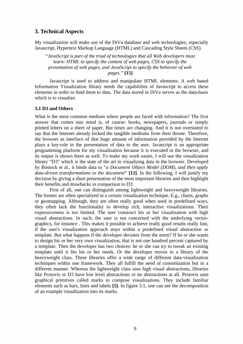
First of all, one can distinguish among lightweight and heavyweight libraries. The former are often specialized in a certain visualization technique. E.g., charts, graphs or geomapping. Although, they are often really good when used in predefined ways, they often lack the functionality to develop rich, interactive visualizations. Their expressiveness is too limited. The user construct his or her visualization with high visual abstractions. In such, the user is not concerned with the underlying vector-graphics, for instance . This makes it possible to achieve really good results really fast, if the user's visualization approach stays within a predefined visual abstraction or template. But what happens if the developer deviates from the norm? If he or she wants to design his or her very own visualization, that is not one hundred percent captured by a template. Then the developer has two choices: he or she can try to tweak an existing template until it fits his or her needs. Or the developer moves to a library of the heavyweight class. These libraries offer a wide range of different data-visualization techniques within one framework. They all fulfill the need of customization but in a different manner. Whereas the lightweight class uses high visual abstractions, libraries like Protovis or D3 have low level abstractions or no abstractions at all. Protovis uses graphical primitves called marks to compose visualizations. They include familiar elements such as bars, lines and labels [5]. In figure 3.1, one can see the decomposition of an example visualization into its marks.
9
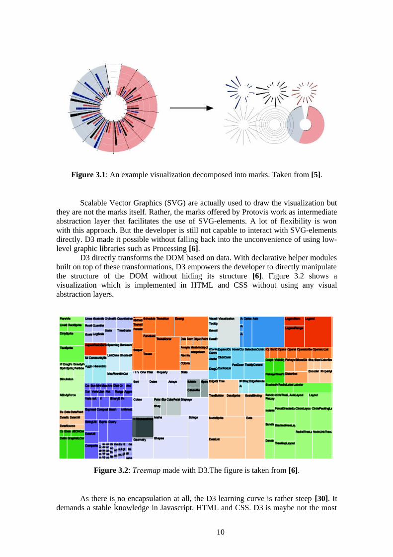
Figure 3.1: An example visualization decomposed into marks. Taken from [5].
Scalable Vector Graphics (SVG) are actually used to draw the visualization but they are not the marks itself. Rather, the marks offered by Protovis work as intermediate abstraction layer that facilitates the use of SVG-elements. A lot of flexibility is won with this approach. But the developer is still not capable to interact with SVG-elements directly. D3 made it possible without falling back into the unconvenience of using low-level graphic libraries such as Processing [6].
D3 directly transforms the DOM based on data. With declarative helper modules built on top of these transformations, D3 empowers the developer to directly manipulate the structure of the DOM without hiding its structure [6]. Figure 3.2 shows a visualization which is implemented in HTML and CSS without using any visual abstraction layers.
Figure 3.2: Treemap made with D3.The figure is taken from [6].
As there is no encapsulation at all, the D3 learning curve is rather steep [30]. It demands a stable nowledge in Javascript, HTML and CSS. D3 is maybe not the mostḱ
10

beginner friendly library on the market but it is the most flexible one. This fact was crucial to choose D3 as working environment for my visualization. Mike Bostock, the main developer of D3 reccommends to use Google Chrome for best performance and its developer kit for debugging. Therefore, Chrome will serve as my main development environment.
3.2 DiVa
DiVa is a publication library system that holds the data needed for my visualization. The data elements are scientific publication records, including a variety of information (PublicationType, Year, Pages). These attributes will be important in order to provide visual filtering techniques. DiVa is adopted by several universities located mainly in the scandinavian area. Therefore, the usage of application will not be restricted only to the Linnaeus University [13].
A drawback of DiVa is that author records are not really supported. Information about the authors are attached to the name field of a publication. There, one can find an unique ID and the associated organizations. Unfortunately, these information are not a must-have. One can find several publications which are missing any author information. For the data-processing I had to assume that one author is mapped to exactly one organization. Unfortunately, this is not always the case. A review of the data has shown that several authors belong to different organizations. These facts make the life of a programmer not easier, because one cannot rely on a consistent data basis. Furthermore, not every author has an ID and a lot of typos complicate the data processing. As shown in figure 3.3, the data are loaded by copying the DiVa link into the ”Data” text field and then pressing load.
Figure 3.3: The text field to define the data basis of the visualization [41].
The link is generated on the ”Create Link Feeds” site (figure 3.4). Here, it is possible to specify several parameters such as:
• Format (HTML, RSS, CSV)
• Organization (University, Faculties, departments )
• Language
• Number of hits
• Sorting
For the visualization, the data needs to be formatted as Comma Separated Values (CSV).
11

Figure 3.4: extract of the ”Create Link Feeds” page. Abstract from [13].
D3 fetches the data indicated by the link with the d3.csv() command. The data is loaded row by row as associative arrays. Each entry represents an attribute. Associative Arrays are also called objects in Object-oriented Programming terminology [16]. Then, the objects are joined to an array which holds all publications found in the CSV-file. From this collection, the author information are extracted by using String-functions (substring). Every author has an attribute for the corresponding name, ID, department and faculty. The written publications are computed on demand by the visualization which takes over the representation of co-authorship links. For speeding up filtering, it is also useful to give the author data a hierarchichal structure which is explained later in detail.
12

4. Related Works
Co-authorship networks or Social Networks in the broader sense have been studied well from the Information Visualization perspective. Several tools have been developed for visual analysis of Social Networks. Social Action, Pajek or Visone are only a selection of availlable software. Although, the latter two were released ten years ago, they offer several instruments for analyzing networks.
Visone uses graph theoretic concepts such as Degree, Betweeness or Closeness to describe and understand social structure. Several layout algorithms such as embedded, layered and spring are used for visualization [7]. Pajek is specialized in visualization and analysis of large networks having some ten or hundred thousand of nodes [3]. With Pajek, it is possible:
• To find clusters (neighbourhoods of important nodes).
• To find relational patterns.
• To decompose larger networks into smaller ones.
One of its suggested application areas is citation networks which are based on references in publications. They are related to co-authorship networks but generally larger in terms of relations among the publications [3]. Adam Pere and Ben Shneiderman argue that those tools feature an impressive number of analysis techniques but they produce often an overwhelming visual output that leaves many users uncertain about how to explore their terrain in an ordered manner [32]. Therefore, they introduced a new design architecture to the field of analysis tools. The ”Systematic-Yet-Flexible” approach, shown in figure 4.1, combines complex exploration techniques and traditional statistical and graph-theoretical methods into a new usage model for visual analysis tools.
Figure 4.1: The Systematic-Yet-Flexible architecture with supported Discovery processes. Figure is taken from [33].
They demonstrated the benefits of their concept by integrating it into a tool for Social Network Analysis. Social-Action looks promising in the way it supports user
13

interaction, but it was not developed for the field of co-author relationships. It lacked support for a specific graph layout for co-authorship networks. In my opinion, best analysis results can be yield if the research interest is covered entirely by the tool in charge. Therefore, the aim is to develop a tool which is perfectly suited to the needs of co-authorship network analysis.
Actually, the visualization of LNU's Publication Network was already subject of a previous thesis [43]. In 2011, Wenyi et al. developed a Java-applet that faced the same problem. But at that time, D3 was not released yet and other web based visualization libraries (Protovis) did not provide the same flexibility as D3 does. So, their applet was coded in plain Java, leading to the fact that the embedding in the browser was not as smooth as it could be achieved with D3. E.g., the user had to press a button first to load the Java virtual machine where the program could be run. The development of D3 gives us the opportunity to transport Wenyi et al. approach into a “real” web environment. Their approach was mainly based on an author view, i.e., an high abstraction level was chosen in order to visualize all publications by scientists based in Linnaeus University. My aim is to adopt their visualization concept as general idea for the Node-Link Diagram and extend it in order to provide more functionality, interaction and filtering.
14

5. User Model
The first step in a software engineering process is to characterize the user. The user model followed in my application is based on the assumption that the user encompasses general skills in operating with the newest generation of browsers, e.g. Google Chrome. Furthermore, I assume a general knowledge and interest in publication systems because the visualization will make use of special attributes of publications. Those attributes might be unclear for a person who never came into contact with scientific publications.
The supported tasks of the visualization will be based on visual data exploration. That means the user shall be able to focus on specific sub groups of authors and their relationships by filtering. For instance, it shall be easy and intuitive to select all authors and their publications from a certain department. Or to search for all publications released by a specific author. It shall also be possible to focus on publications with a specific attribute value. For instance, all publications released in 2012. Furthermore, the user shall be able to demand information by hovering the visual representations. The Use-Case diagram in figure 5.1 defines this functionality.
Figure 5.1: Use-Case Diagram.
15
6 Design
In this section I will first present the general design principle which drove my development, namely Information Visualization Seeking Mantra. Thereafter, each element of the design will be individually presented in terms of functionalty and purpose. Finally, I will use Chi's Data Stage Model [11] to outline the structure of the source code behind my design.
6.1 General Idea
The general idea of my design is to provide three views which offer the capabilities to explore the data visually (figure 6.1).
• A Network-View for representing the data entities visually serves as the main interface for controling the main-selection.The main-selection is the part of the underlying data-basis which is actually visualized. It can be constrained and extended during interaction.
• The Attribute-View as second part of my visualization shows attributes extracted from entities in the main-selection. It shall give insight into the whole attribute distribution of the main-selection and reveals correlation among data entities. For instance, it should be possible to detect a concentration of data entities on a specfic attribute value. It also functions as filtering facilitity for focusing on sub sets of the data (sub-selection).
• Last but not least, in the bottom of my visualization, one will find a Spreadsheet-View representing the format of the raw data. Attached to it, a search field will support search for specific data-entities.
Moreover, each view is complemented by a filtering instrument. Indeed, when using a visualization, one does not want to face all information at once (e.g. all authors and their publications) because one has a certain point of interest (e.g all publications by authors based in a certain department). The human mind is only capable to comprehend a certain amount of information at once [26].
If the amount of presented information exceeds a certain limit the mind is overloaded and cannot process any information. This problem is called information overload and refers to the danger of getting lost in data which could be the result of:
• Too much information that is irrelevant to the current task at hand
• Information processed in a wrong way
• Information presented in an appropriate way [25].
Filtering can solve this information overload problem by extracting only important information for the users [26].
16
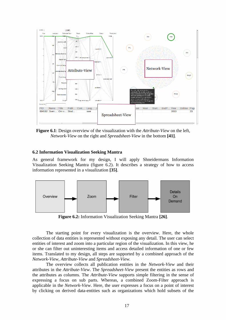
Figure 6.1: Design overview of the visualization with the Attribute-View on the left, Network-View on the right and Spreadsheet-View in the bottom [41].
6.2 Information Visualization Seeking Mantra
As general framework for my design, I will apply Shneidermans Information Visualization Seeking Mantra (figure 6.2). It describes a strategy of how to access information represented in a visualization [35].
Figure 6.2: Information Visualization Seeking Mantra [26].
The starting point for every visualization is the overview. Here, the whole collection of data entities is represented without exposing any detail. The user can select entities of interest and zoom into a particular region of the visualization. In this view, he or she can filter out uninteresting items and access detailed information of one or few items. Translated to my design, all steps are supported by a combined approach of the Network-View, Attribute-View and Spreadsheet-View.
The overview collects all publication entities in the Network-View and their attributes in the Attribute-View. The Spreadsheet-View present the entities as rows and the attributes as columns. The Attribute-View supports simple filtering in the sense of expressing a focus on sub parts. Whereas, a combined Zoom-Filter approach is applicable in the Network-View. Here, the user expresses a focus on a point of interest by clicking on derived data-entities such as organizations which hold subsets of the
17

main-selection. Then, all other entities are filtered out and the overview turns into a subview with a different perspective on the selected data. Details on Demand are implemented by incorporating simple tooltips to data-entities.
6.3 Attribute-View
The credentials for the Attribute-View are provided by ”Parallel Coordinates” (figure 6.3). Introduced by Alfred Inselberg, they plot multivariate data on parallel axes [22]. For each dimension an axe with an unique x value is created. The values of each dimension are mapped on the corresponding axe with variying y values. Thereby, a set of points (x, y) is formed. Two points are connected by drawing lines between them if they are lying on neighbouring axes and belong to the same data-entity. As a result one gets visual artifacts in terms of polylines, each representing one data entity.
On the first sight, Parallel Coordinates are looking really messy and packed, because of dense clutter of many overlapping lines [15], as seen in figure 6.3. By simply looking at Parallel Coordinates one does not gain a clear insight of the data, especially for big data sets. But if they are coupled with clever interaction techniques such as reorderable axes or brushing then their real power emerge. The former is appropriate for facilitating the discovery of relationships among dimensions. By neighbouring two interested axes, one can detect positive or negative relationships in form of increasing or decreasing lines. By brushing one can actively select sub sets (sub-selection) as being especially interesting. Brushing is a very effective filtering technique for specifying an explicit focus during Information Visualization [21].
These were crucial reasons for the decision to include Parallel Coordinates as Attribute-View. On the other hand, there are alternatives availlable such as Parallel Sets which are specialized in multidimensional, categorial data. The main idea behind them is to visualize sets (a number of data elements) in form of big, coloured blocks connected to horizontal or vertical attribute axes. Unfortunately, I came across this concept too late in the development process and structural dependencies in the implementation of the provided D3 example [32] made it hard to connect them to the other parts of the visualization. These facts led to the decision not to include Parallel Sets in my visualization.
18

Figure 6.3: Parallel Coordinates applied on DiVa data. Taken from [41].
6.3.1 Filtering by Brushing on Parallel Coordinates
The instrument to filter the data is provided by Parallel Coordinates and its Brushing event. They visualize either the content of the main-selection or the sub-selection formed by Filtering by Search. Thereby, Parallel Coordinates form their own sub-selection. The general concept of Brushing is shown in figure 6.4. By performing a mousedown event on a point of an axe, holding the mouse, and moving the cursor either up or down the Brush is created. Thereby, several polylines can cross the Brush. These selected polylines are coloured and further highlighted by undermining unselected polylines [12].
19

Figure 6.4: Parallel Coordinates with applied Brush [41].
In context of the data, Filtering by Brushing works directly with the attributes of the data and not with derived entities such as Filtering by Organization. Therefore, the DiVa data does not have to be transformed beforehand in order to perform filtering.
6.4 Spreadsheet-View
The Spreadsheet-View represents the CSV-format of the raw-data as it was downloaded from DiVa. It is highly coupled with the upper parts of the visualization. Whenever a selection is made, the Spreadsheet-View is updated to the corresponding content. The Spreadsheet-View is especially important because the user can see the original form of the data. One can see how the raw data is transformed in real time when interacting with the visual parts of the visualization.
6.4.1 Filtering by Search
Filtering by Search offers the functionality to constrain the data-basis of the Spreadsheet-View further by searching for substrings in the name field of the
20

publications at any time in the interaction process. As a reminder, here, one can find the authors and their corresponding organization. The user can search for any custom notes without regular format. For instance, the user can search for groups like ”ISOVIS”. No sophisticated transformation of the data is needed. It works on the original format of the publications such as Filtering by Brushing.
6.5 Network-View
As mentioned before, the DiVa records are only concerned with publications. So, the first consideration must be the publication entity if one wants to develop a graphical environment for the Network-View which permits co-authorships analysis. They do not need to be modeled in the final visualization if one only wants to study relationships among authors. But publications are essential for the links among them and they offer context information about the involved authors and their networks. They should be the center of the Network-View in order to stick close to the underlying data . Then, the aim, first of all, is to represent the structure of the data. As we are faced with Social Networks a Node-Link Diagram is an appropriate solution to show relationships among authors [26].
How does one model publication entities and author entities inside the same Node-Link Diagram? One shall be able to distinct among them visually. One solution is to use different graphical forms to present authors and publications (figure 6.5). Another one is attributed graph clustering where nodes are placed in a particular region of the drawing space based on a specific attribute value [44].
I decided to use clustering as the means to visually distinguish among different data entities because it facilitates the visualization of hierarchical structures such as departments and faculties. The underlying layout algorithm of the Node-Link Diagram is in charge of clustering. A detailed description of the clustering approach will follow in 6.5.1.
Figure 6.5: The properties of a visual representation. They serve as means to distinguish among different representations. The chart is taken from [26].
21

Color coding is applied such that a publication receives the color of its corresponding organization. Unfortunately, this mapping is not a bijection between author and organization, because of publications written by authors from different organizations. But, it is often the case that co-authorship is performed inside a department or faculty and it is not likely among different faculities as motivated in in chapter 2.1.
6.5.1 Layout Algorithm: Radial-Force
In order to present the publications as center of the visualization, they are lied down in the center/middle of the drawing canvas and all other entities (organizations like faculties and departments) on a circle around them. Circular clustering as main means is chosen to visually distinguish among different data entities. As mentioned before, the layout algorithm takes over the node placement on the drawing canvas (SVG-element). It is also in charge of clustering. But which layout algorithm is best suitable for a web environment? Here we have to consider that our drawing space is restricted, one should see the whole Node-Link Diagram as one piece without scrolling.
Furthermore, the visualization should run on normal consumer PCs with standard sized screens (21”). Large screens establish new possibilities for visualizations. But one cannot assume them as a basis. The challenge is to visualize a clustered Node-Link Diagram with at most 3000 publications and their corresponding authors on a restricted space. This number of publication nodes can be handled by most of the layout algorithms provided by D3 in reasonable time depending on the user's machine [12]. The bottleneck hereby is the restricted space. To visualize such a number of nodes on a small space by holding the readibility on a reasonable level is the task of the layout algorithm.
The drawing canvas is restricted in size because the Node-Link Diagram is not the only view we have to provide in our final visualization. Alongside, we have also the Attribute-View. During my exploration phase of D3 I stumbled upon its Force Layout, which offers a wide range of options for customization in terms of area of the drawing, link-length or constraints (e.g. clustering) [12]. This flexibility is especially useful if one is faced with the problem of a small drawing space. The implementation is mainly based on the work of Fruchterman and Reingold [19]. Herein, a graph is seen as a system of bodies with forces acting between them. A configuration, the positions for all bodies, is computed, where the sum of the forces on each body is zero [14].
Radial layouting is achieved by setting up a radial constraint for different node types, e.g. faculty, department and author. Each of them are placed on the outerline of an imaginary circle with varying radius. Figure 6.6 shows the node placement concerning different data-types. Publications are placed in the center with radius 0. Then the corresponding authors and organizations (departments, faculties) are following with an increased radius.
22

Figure 6.6: Node placement concerning different data-types [41].
The benefit of combining the Force-Layout with constraints is revealed if the number of possible node positions on the outerline is not big enough for a proper placement. Then the minimal distance constraint of the Force-Layout comes into play again. It finds positions for the left-over nodes above the outerline by holding a minimal distance to the other nodes (figure 6.7). Until now, the Radial-Force Layout underlies two constraints for the node placement:
• Radial constraint depending on node type.
• Minimal distance between the nodes which hold them apart to collide with each other.
23

Figure 6.7: Forming a second outerline of the middle circle if the number of possible node positions is smaller than the number of nodes [41].
If the number of publication nodes exceeds a certain limit (according to my tests around 2000) the sum of the minimal distance energy is so strong that nodes with a high radius are drifting out of the drawing canvas. This effect can be observed because the radial and the minimal distance constraint are intertwined. Theoretically, the organization and publication nodes are so distant that the minimal energy should not have an effect on them. But my tests have shown that there is an effect. To face this problem I introduced the concept of a bounding box. The bounding box is nothing else than an additional constraint which takes care that the x and y values of the nodes are not becoming bigger than the width and height of the underlying SVG-element. Thereby, it creates a kind of box which prevents the nodes to fly out of the drawing canvas. Figure 6.8 shows the computation of node positions with applied Bounding Box. As one can see, the nodes cannot escape from the visible part of the SVG-element.
24

Figure 6.8: Computing node positions with applied Bounding Box [41].
6.5.2 Filtering by Organization
Figure 6.9 exemplifies Filtering by Organization which serves as the core functionality to navigate through the data. Before any filtering is applied, the visualization is in its initial state, all publications are selected, forming the main-selection. The main-selection represents the part of the underlying data-basis which is actually visualized. In the following, all filtering operations are performed on this set. Filtering is triggered by interactive data entities which are derived from publications, hence faculties, departments or authors. One can find them on the outerline of an imaginary circle as shown in figure 6.9. They are responding to user actions. By pressing such an entity only those publications which are fulfilling the corresponding organizational constraint are selected. For instance, the user selects the faculty “Fakultesnämnden för naturvetenskap och teknik”. Then all publications which are not released under this faculty are filtered out. The user can explore the data directly by interacting with it. It is not necessary to apply any external HTML elements like dropdown menus, buttons or text fields.
25

Figure 6.9: Filtering by Organization, preview of the filtering effect by hovering the corresponding organization. Taken from [41].
When Filtering by Organization is used, it also opens a subview with organizational entities of the next hierarchichal level which are offering further filtering options. E.g. after the faculty “Fakultesnämnden för naturvetenskap och teknik” is pressed, the main selection is updated to the corresponding publications and its associated departments are shown up. They can in turn be used to constrain the main-selection further to publications which are released by authors based in a particular department.To provide such a filtering functionality, the organizations must be derived from the raw data (set of publication) first. Then, they need to be transformed into a three-level hierarchy in order to know which entities are represented in the next view.
Level 1 represents the faculities. Each of them contains associated departments representing Level 2. The departments are holding authors which make up Level 3. Herefore, the nest-operator which is part of D3 and Protovis is used. It transforms relational data into a tree. Given a key function, which returns the key value for a given datum, the nest operator groups data with the same key value. Multiple key functions can be specified to produce nested groups [5]. Filtering by Organization is the main means to explore the data. It extends or reduce the underlying data set of the whole
26
visualization. That means, if a filtering operation is performed in the Network-View, not only its data basis changes, the other parts (Attribute-View, Spreadsheet-View) are updated as well. Due to filtering, the user can focus on a specific sub group of authors. Furthermore, the author entities are also responding to user actions. It means, it is also possible to filter by a single author. A more detailed description of the interaction process among the user and the visualization is given in chapter 7.1.
6.6 Implementation Issues
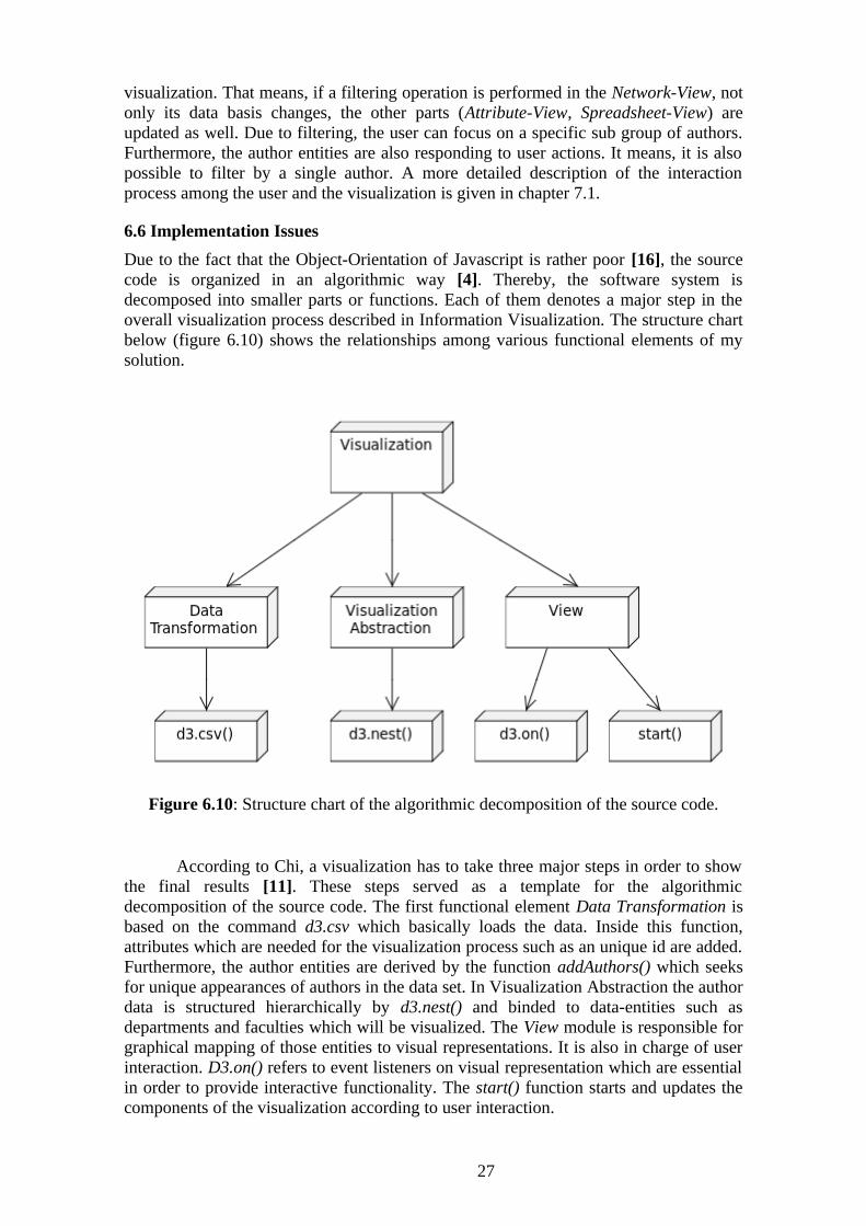
Due to the fact that the Object-Orientation of Javascript is rather poor [16], the source code is organized in an algorithmic way [4]. Thereby, the software system is decomposed into smaller parts or functions. Each of them denotes a major step in the overall visualization process described in Information Visualization. The structure chart below (figure 6.10) shows the relationships among various functional elements of my solution.
Figure 6.10: Structure chart of the algorithmic decomposition of the source code.
According to Chi, a visualization has to take three major steps in order to show the final results [11]. These steps served as a template for the algorithmic decomposition of the source code. The first functional element Data Transformation is based on the command d3.csv which basically loads the data. Inside this function, attributes which are needed for the visualization process such as an unique id are added. Furthermore, the author entities are derived by the function addAuthors() which seeks for unique appearances of authors in the data set. In Visualization Abstraction the author data is structured hierarchically by d3.nest() and binded to data-entities such as departments and faculties which will be visualized. The View module is responsible for graphical mapping of those entities to visual representations. It is also in charge of user interaction. D3.on() refers to event listeners on visual representation which are essential in order to provide interactive functionality. The start() function starts and updates the components of the visualization according to user interaction.
27

7. Interaction
In this section interaction of my visualization will be exemplified in detail. Not only interaction between the visualization and the user will be considered, also the interaction among the different implementation parts will be explained. For the former, I will apply a User Interaction Diagram (UID). For the latter, I will take a more architectural view on my visualization, using UML Sequence Diagrams to show how key functionalities are realized inside the application [17].
7.1 User Interaction
As mentioned before, the data exploration process is either guided by the Network-View or the Attribute-View. The latter only works on the main-selection provided by the former. To exemplify user interaction in a structural way I will apply a User Interaction Diagrams (UID) which is a special form of a state machine diagram [40]. User interaction is classified as:
• Exploration
◦ The user examines a different sub set of the data.
• Filter
◦ The user changes the set of the data based on specifc conditions.
• Abstract/Elaborate
◦ The user adjusts the level of abstraction of a data entity. For instance, showing tooltips by hovering [27][45].
The UID in figure 7.1 works as follows:
• The state label always refers to the state of the user interface.
• The state transitions are performed due to user interaction and are only then transitions if the user interface is updated somehow. The labels on the transitions refer to the part of the visualization which is used.
• The user interface consists of the three visualization parts (Network-View, Attibute-View and Spreadsheet-View) because every part is user interactive.
28

Figure 7.1: User Interaction Diagram.
The Interaction process works step by step. The user starts with an overview in the sense of the Seeking Mantra. Here, the visualization is in its initial state. The main-selection is visualized. No filtering is applied and no sub-selection is formed. The user has four options to start the interaction process:
• Filtering by Organization.
• Filtering by Brushing.
29

• Filtering by Search.
• Select a single publication (figure 7.2).
Figure 7.2: Focus on one publication applied through click event. Main-selection = sub-selection = ”WebComets A Tab-Oriented Approach for Browser History
Visualization” [41].
As one can see in figure 7.1, the axes indicate changes of the main-selection. In general, Filtering by Brushing or Filtering by Search do not change the main-selection, it only derives its corresponding sub-selection from it.
• The main-selection is the part of the underlying data-basis which is actually visualized. It can be constrained and extended during interaction.
• The sub-selection is part of the main-selection and is presented as highlighted nodes in the Network-View and as highlighted lines in the Attribute-View.
The state machine will always move to the corresponding Updated View State when Filtering by Brushing or Filtering by Search is activated. Updated View States are based on the same data as their previous states. The labels on the transitions indicate which part of the visualization is used to go to the next state.
30

Figure 7.3: Overview of the Network-View, corresponds to the initial state of the UID. Taken from [41].
If the user decides to filter by organization, the main-selection is updated to the corresponding nodes and the sub-selection is recomputed if either the Brush or the search field was active. Otherwise , no sub-selection is formed. The transition from the state Overview: Faculties (figure 7.3) to the state Subview: Depart (figure 7.4) indicates this pattern of software behaviour. Figure 7.5 shows the main-selection formed in figure 7.4 from the Parallel Coordinates point of view.
31

Figure 7.4: The department view of the faculty ”Fakultetsnämnden för naturvetenskap och teknik”. Taken from [41].
32
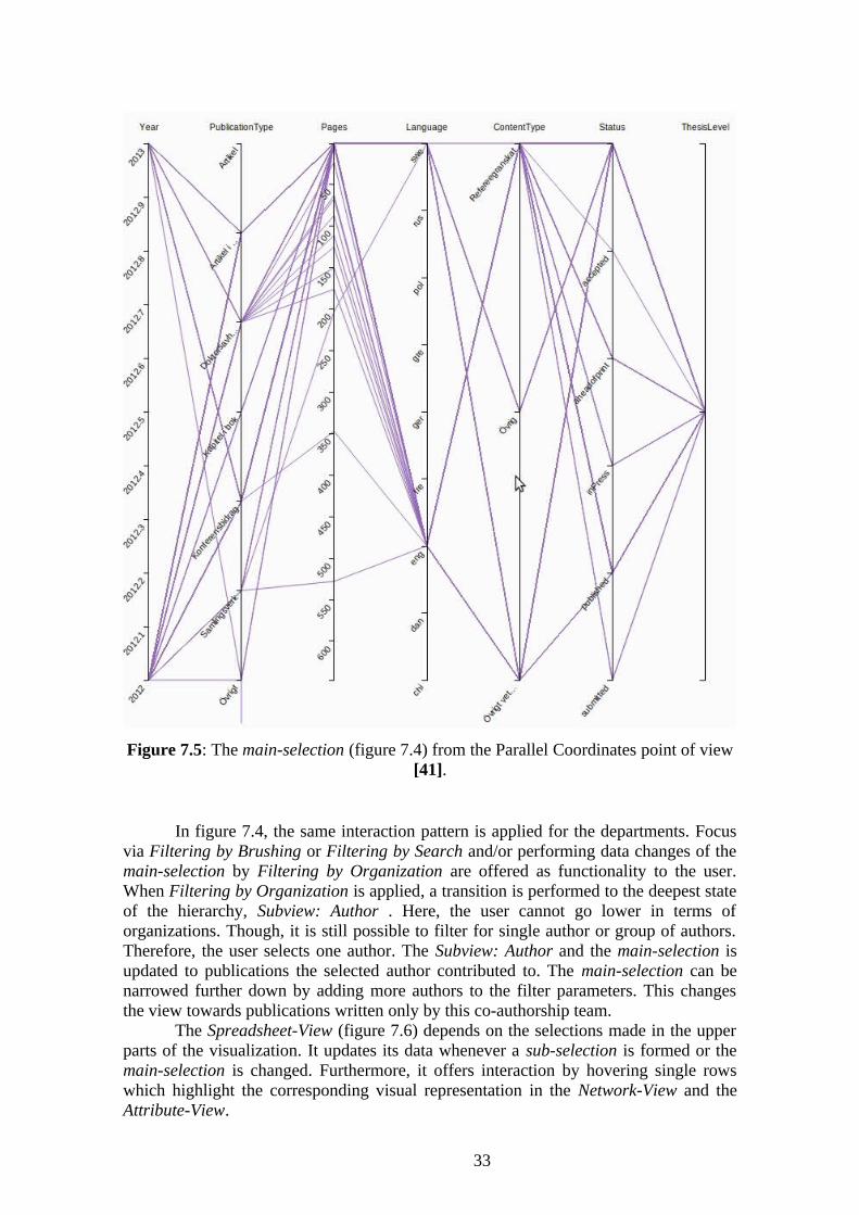
Figure 7.5: The main-selection (figure 7.4) from the Parallel Coordinates point of view [41].
In figure 7.4, the same interaction pattern is applied for the departments. Focus via Filtering by Brushing or Filtering by Search and/or performing data changes of the main-selection by Filtering by Organization are offered as functionality to the user. When Filtering by Organization is applied, a transition is performed to the deepest state of the hierarchy, Subview: Author . Here, the user cannot go lower in terms of organizations. Though, it is still possible to filter for single author or group of authors. Therefore, the user selects one author. The Subview: Author and the main-selection is updated to publications the selected author contributed to. The main-selection can be narrowed further down by adding more authors to the filter parameters. This changes the view towards publications written only by this co-authorship team.
The Spreadsheet-View (figure 7.6) depends on the selections made in the upper parts of the visualization. It updates its data whenever a sub-selection is formed or the main-selection is changed. Furthermore, it offers interaction by hovering single rows which highlight the corresponding visual representation in the Network-View and the Attribute-View.
33

Figure 7.6: Extract of the Spreadsheet-View. Rows offer hovering interactions. Taken from [41].
7.2 Interaction of System Components
After the interplay among user and visualization has been described, the task is to capture the interaction among system parts of the visualization. The aim is hereby to discuss the functionality on a finer level. The key-question in this chapter are:
• How is actually the start mechanism of the Node-Link Diagram of the Network-View realized when the user applies Filtering by Organization?
• Which functions are executed in order to update the Parallel Coordinates? When the Brush is activated, how are the polylines and the nodes updated?
As main means to describe the system routines, UML Sequence Diagrams will serve [17].
7.2.1 Start Routine
The start() routine takes care of the creation of the Node-Link Diagram in the Network-View and the Parallel Coordinates in the Attribute-View. It is executed when the user launches the application or applies Filtering by Organization. The function always comes into play if the main-selection is changed. When the Node-Link Diagram is updated, graphical entites are added or deleted, the Radial-Force Layout is recomputed again. The user does not notice that the whole layout algorithm is restarted. The trick is that node coordinates from the previous run are saved. This speed up the recomputation of the Radial-Force Layout because it is likely that old entities either hold their positions or will move to positions which are close to the old ones. This behaviour can be observed when the Subview Depart (figure 7.4) is open and the user goes back to Overview: Faculties (figure 7.3). Then all the old entities pop up at positions which are very close to the positions given by the initial run of the Radial-Force Layout.
34
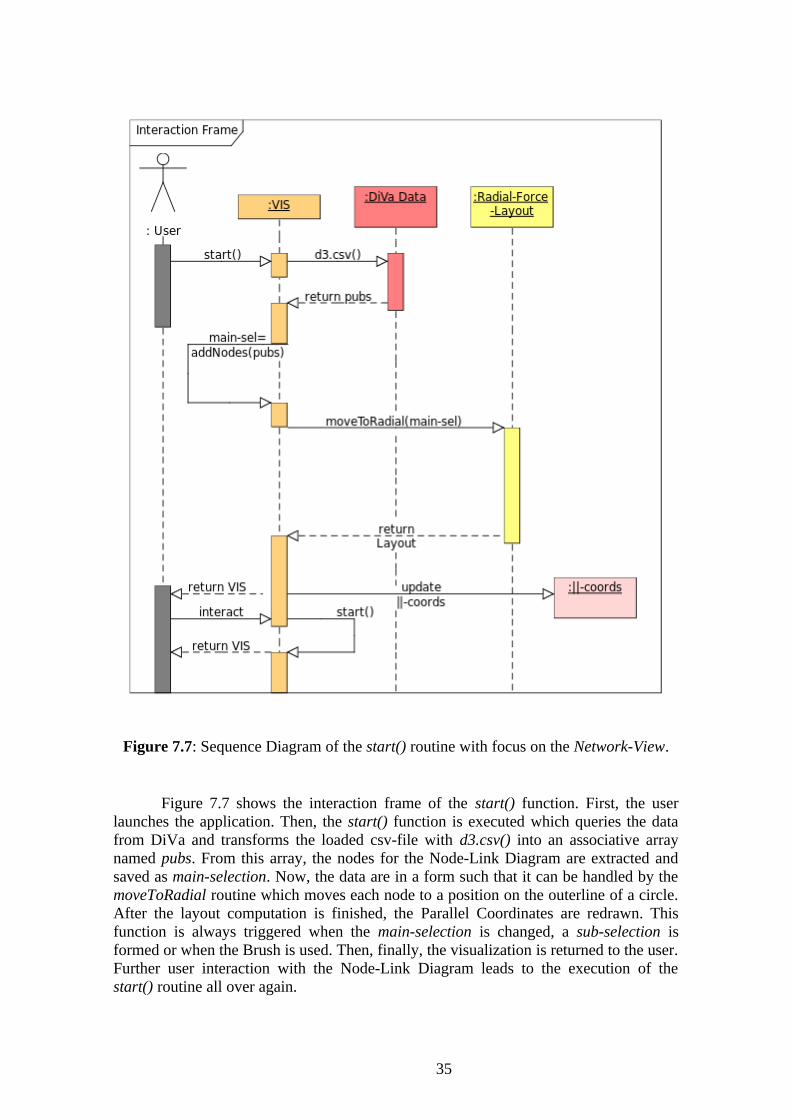
Figure 7.7: Sequence Diagram of the start() routine with focus on the Network-View.
Figure 7.7 shows the interaction frame of the start() function. First, the user launches the application. Then, the start() function is executed which queries the data from DiVa and transforms the loaded csv-file with d3.csv() into an associative array named pubs. From this array, the nodes for the Node-Link Diagram are extracted and saved as main-selection. Now, the data are in a form such that it can be handled by the moveToRadial routine which moves each node to a position on the outerline of a circle. After the layout computation is finished, the Parallel Coordinates are redrawn. This function is always triggered when the main-selection is changed, a sub-selection is formed or when the Brush is used. Then, finally, the visualization is returned to the user. Further user interaction with the Node-Link Diagram leads to the execution of the start() routine all over again.
35

7.2.2 Brush Routine
Now, I will have a closer look on the brush() routine, which is in charge of forming sub-selections from the data. The Brush routine is triggered whenever the user performs a drag event on an axe. Thereby, a rectangle is created with a certain range of coordinates. A polyline of the Parallel Coordinates is highlighted if one of its forming points lies inside this range.
Figure 7.8: The process of brushing and highlighting nodes.
In figure 7.8, one can see that the user triggers the Brush event. As a result, the Brush function is executed. It returns a set of active lines. These lines are highlighted.
7.2.3 Search Routine
A sub-selection is formed whenever the user types a character in the search field. The whole visualization is updated directly. All visual representations derived from the sub-selection are highlighted. The lines of the Parallel Coordinates, the Network-View and the Spreadsheet-View are updated. In the following a special case will be examined:
• Search is applied when the Brush is active. That means, Filtering by Search will create a sub-selection from a sub-selection.
The underlying search algorithm will only consider those publication subselected by the Brush. Therefore, all other publications from the main-selection will
36

be ignored.
Figure 7.9: Performing a search after the Brush was activated on the Parallel Coordinates.
Figure 7.9 shows the Sequence Diagram of the examined case. The lines of the Parallel Coordinates which are not part of the formed sub-selection are marked with a special ”hidden” flag. It communicates to the brush() routine that those lines cannot be selected.
37

8. Conclusion
Several tests with the ISOVIS group as well as friends and family gave me the impression that the visualization provides an intuitive, usable way to visually explore data. The goal was to develop a visual environment wherein the user can analyze the data according to a specific point of interest. That could be:
• Focus on a department or faculty.
• Interest in a specific type of publication such conference proceedings.
• Focus on a single author.
The user can express his or her research question by using various filter tools. Each of them provides a different perspective on the data.
• The Filtering by Brushing structures the data according to the attributes of a publication.
• The Filtering by Organization provides a hierarchichal view on the data based on associated organization.
• The search function reveals thematical similiarities among publications and can find collaboration networks of single authors.
Thereby, the visualization is not only presenting information. The user is encouraged to use these tools for explorative analysis as described in 2.3. Typical use case realizations would be:
• Discover co-author relationships among all authors from a specific department.
• Reveal a co-authorship network of a single author
• Examination of co-authorship networks concerning a thesis publication
Furthermore, smooth interaction between the user and the system was one of the main driver of the development. The user always receives feedback from the system, even if his or her actions are not allowed. This is important in order to form an interactive relationship with the user which is based on logical and predictable behaviour of the software.
“Individuals’ interactions with computers, television, and new media are fundamentally social and natural, just like interactions in real life.” [34]
Current evaluations such as small user studies performed on students are not convincing enough to encourage widespread adoption of Information Visualization tools. Real users, real tasks and large and complex data sets must be involved in testing [8]. My application can be used with several data sets, the size ranges from under 100 items until over 3000 items. Evaluation is needed to ensure that the application works as expected for different data sets in order to proof that the visualization actually helps the user to gain insight into the data. Unfortunately, I did not have the time to perform extensive evaluation techniques which are applicable on Information Visualization tools such as controlled experiments or user interviews [28]. But my application is exposed to the public [41]. It is accessible for everyone, anybody can test it in terms of:
• Impressiveness
◦ To which extent does the visualization give new insight of the data?
• Functionality
38

◦ Do the provided functionalities meet the the user demands?
• Usability
◦ Is the visualization easy, efficient and intuitve to use?
I hope, I can collect a valuable amount of user feedback from the internet community in order to improve my application in the next version.
8.1 Future Work
As indicated above, the future work is dependent on the user feedback I will collect from the Internet community. Nonetheless, the future work shall be concerned with the data quality. The data lack consistency, e.g. the mapping among authors and organizations is not ambigious, and is full of paradox entries, e.g zero pages for a publication. Furthermore, a lot of typos make data processing difficult. My suggestion is to apply a manual analysis process beforehand in order to clean the data. An Analyst should examine the data for paradox entries and bring it into correct form. Hereby, several tools can be used such as ”Data-Wrangler” [24].
Moreover, my visualization is open for new approaches in navigating through the data set. It would be imaginable to support a view which constructs a collaboration network by graph traversal. The starting point is a publication and its authors selected by the user. Then all other publications involving the authors of the starting publication are added to the network. As a result, probably, new authors are introduced to the network. These authors serve as a new starting point to search for new publications and their authors to add them to the network. This process stops when no new authors are found. Furthermore, a refinement of the architecture can facilitate the reuse or extension of software routines such as start() and brush(). Then the Network-View could be easily upgraded with new hierarchical levels. For instance, a group level comes into mind which represents the organization of authors into groups such as ISOVIS. Also, new forms of user interaction (i.e. line-picking in the Attribute-View) could be added easily.
39
9. References
[1] Aggarval, Charu C. (Ed.): Social Network Data Analytics, Kluwer Academic Publishers, 2011.
[2] Barabasi, Albert-Laszlo: Linked: How Everything Is Connected to Everything Else and What It Means for Business, Science, and Everyday Life. Penguin Group, 2003.
[3] Batagelj Vladimir, Mrvar Andrej.: Pajek - Analysis and Visualization of Large Networks
[4] Booch, Grady; Maksimchuk, Robert A.; Engle, Michael W.; Young, Bobbi J.; Conallen, Jim; Houston, Kelli A.: Object-oriented Analysis and Design with Applications. Third Edition, Addison Wesley, 2007.
[5] Bostock, Mike; Heer, Jeffrey: Protovis: A Graphical Toolkit for Visualization. In IEEE Transactions on Visualization and Computer Graphics Volume:15 , Issue: 6 , pages. 1121-1128, 2009.
[6] Bostock, Michael; Ogievetsky, Vadim; Heer, Jeffrey: D3: Data- Driven Documents. In IEEE Transactions on Visualization and Computer Graphics, Volume:17 , Issue: 12, pages 2301-2309, 2011.
[7] Brandes, Ulrik; Wagner, Dorothea: Visone: Analysis and Visualization of Social Networks. In Michael Jünger and Petra Mutzel (Eds.):Graph Drawing Software, pages: 321-340. Springer-Verlag, 2004.
[8] Carpendale, Sheelagh: Evaluating Information Visualization. In Information Visualization, LNCS 4590, pages: 19-45, 2008.
[9] Clique (Graph Theory), http://en.wikipedia.org/wiki/Clique_(graph_theory) (checked May 2013).
[10] Cognition, http://en.wikipedia.org/wiki/Cognition (checked May 2013).
[11] Chi, Ed H.: A Taxonomy of the Visualization Techniques using the Data State Reference Model. Xerox Alto Palo Research Center, 2000.
[12] D3, http://d3js.org/ (checked March 2013).
[13] Diva, http://lnu.diva-portal.org/smash/search.jsf (checked May 2013).
[14] Di Battista, Giuseppe; Eades, Peter; Tamassia, Roberto; Tollis, Ioannis G.: Graph Drawing - Algorithms for the Visualization of Graphs, Prentice Hall, 1999.
[15] Few, Stephen: Multivariate Analysis Using Parallel Coordinates, http://www.perceptualedge.com/articles/b-eye/parallel_coordinates.pdf (checked May 2013).
40

[16] Flanagan, David: Javascript: The Definitive Guide, O'Reilly, 2011.
[17] Fowler, Martin: UML Distilled: A Brief Guide to the Standard Object Modeling Language, Addison Wesley, 2003.
[18] Freeman, Linton: Visualizing Social Networks. In Journal of Social Structure 1, 2000.
[19] Fruchterman, Thomas M. J.; Reingold, Edward M.: Graph Drawing by Force-Directed-placement, Software—Practice and Experience, vol. 21, pages 1129-1164, 1991.
[20] Funding of science: http://en.wikipedia.org/wiki/Funding_of_science(checked March 2013)
[21] Graham, Martin, Kennedy, Jessie: Using Curves to Enhance Parallel Coordinate Visualisations. In: 7th International Conference on Information Visualization, pages 10-16. IEEE Computer Society Press, 2003.
[22] Inselberg, Alfred; Dimsdale, Bernard: Parallel Coordinates: Visual Multidimensional Geometry and Its Applications. In IEEE Visualization, pages 361–378, 1990.
[23] Interpersonal Ties, http://en.wikipedia.org/wiki/Interpersonal_ties (checked May 2013).
[24] Kandel, Sean; Paepcke, Andreas; Hellerstein, Joseph; Heer, Jeffrey: Wrangler: Interactive Visual Specification of Data Transformation Scripts, InACM Human Factors in Computing Systems (CHI), 2011.
[25] Keim, Daniel; Kohlhammer, Jörn; Ellis, Geoffrey; Mansmann, Florian: Mastering the Information Age. Solving Problems with Visual Analytics. Eurographics Association, 2010
[26] Kerren, Andreas; Ebert, Achim; Meyer, Jörg (Eds.): Human-Centered Visualization Environments. LNCS Tutorial 4417, Springer, 2007.
[27] Kerren, Andreas; Schreiber, Falk: Toward the role of interaction in Visual Analytics. In Proceedings of the 2012 Winter Simulation Conference, pages 420:1-420:13, IEEE Computer Society Press, 2012.
[28] Kerren, Andreas; Stasko, John T.; Fekete, Jean-Daniel; North, Chris: Workshop Report: Information Visualization – Human-Centered Issues in Visual Representation, Interaction, and Evaluation. In Information Visualization, 6(3):189-196, Palgrave Macmillan Ltd, 2007.
[29] Mazza, Ricardo: Introduction to Information Visualisation, University of Lugano, Faculty for Communication Sciences, 2004.
[30] Murray, Scott: Interactive Data Visualization for the Web, O'Reilly. 2013.
[31] Parallel Coordinates: http://eagereyes.org/techniques/parallel-coordinates
41
(checked March 2013)
[32] Parallel-Sets, http://www.jasondavies.com/parallel-sets/ (checked May 2013).
[33] Perer, Adam; Shneiderman, Ben: Systematic Yet Flexible Discovery: Guiding Domain Experts through Exploratory Data Analysis, Department of Computer Science University of Maryland, 2008.
[34] Reeves, Byron; Nass, Clifford: The Media Equation: How People Treat Computers, Television, and New Media Like Real People and Places. Page 5, Cambridge University Press.
[35] Shneiderman, Ben: The Eyes Have It: A Task by Data Type Taxonomy for Information Visualization, In Proceedings of the IEEE Symposium on Visual Languages, pages 336 -344, 1996.
[36] Social Circles: http://www.linkdex.com/about/features/social-circles/ (checked March 2013)
[37] Social Network, http://en.wikipedia.org/wiki/Social_network (checked March 2013).
[38] Stockfoto - Social Network Versammlung, http://de.123rf.com/photo_11641396_social-network-versammlung.html (checked May 2013).
[39] Thakur, Gautam S.: The Anatomy of my Facebook Social Graph I, http://wisonets.wordpress.com/2012/09/27/the-anatomy-of-my-facebook-social-graph-i/ (checked May 2013).
[40] Vilain, Patrícia; Schwabe, Daniel, Sieckenius de Souza, Clarisse, A Diagrammatic Tool for Representing User Interactionin UML. In Proceedings of the UML 2000 - The Unified Modeling Language, Advancing the Standard, Third International Conference, pages 133-147, Springer, 2000.
[41] The Visualization Tool of this Thesis: http://montflorit.cat/jan/ (checked May 2013)
[42] Wasserman, Stanley; Faust Katherine: Social Network Analysis. Cambridge: Cambridge University Press, 1994.
[43] Wenyi, Sun; Chunmiao, Yu: Visualization of LNU’s Publication Network. Bachelor Thesis, Linnaeus University, 2011.
[44] Xu, Zhiqiang; Ke, Yiping; Wang, Yi; Cheng, Hong; Cheng, James: A Model-based Approach to Attributed Graph Clustering. In SIGMOD '12 Proceedings of the ACM SIGMOD International Conference on Management of Data, pages 505-516, ACM, 2012.
42

[45] Yi, Ji Soo; Kang Youn Ah; Stasko, John T.; Jacko, Julie A.: Toward a deeper understanding of the role of interaction in information visualization. In IEEE Transactions of Visualization and Computer Graphics, pages 1224–1231, 2007.
43