Using Large Data Sets Workbook MEI version
11
PRC/TB 2021-02-14 Version 1.2 1 of 11 Using Large Data Sets Workbook – MEI version This booklet uses Excel and Desmos This workbook explores the different types of activities that students and teachers might undertake with a Large Data Set so that it can be used effectively to support the learning of statistical concepts. You will need the appropriate MEI dataset. Key Skills ◼ Understand the dataset and its context ◼ Clean a dataset and know how to deal with outliers ◼ Sort and Filter the dataset ◼ Produce summary statistics ◼ Draw frequency charts and box plots for a set of data ◼ Draw graphs of several datasets side by side for comparison ◼ Draw scatterplots and plot lines and curves of best fit ◼ Use technology to calculate correlation coefficients and equations of regression lines ◼ Take a random sample from a dataset Software Used ◼ A spreadsheet (in this case Excel) ◼ Graphing and statistical software (in this case Desmos). 1 Becoming familiar with the dataset Open the excel file which contains the dataset. The first tab gives the source of the data and contains a glossary of terms. Students are required to understand the context of the data so that it important that they read the glossary whilst looking through the dataset. Some questions you might like to consider are: ◼ What is the source of the data and how up to date is it? ◼ Who collected it and how was it collected? ◼ What does #N/A mean and why is it used? How should we treat these items when analysing the data? Would we treat some fields differently? Students need to understand each of the fields and how they are determined. Some of them warrant considerable discussion such as the different Systolic and Diastolic pressures and body mass index. Students should be encouraged to research further so that they fully understand the concepts by looking at the website: http://www.cdc.gov/nchs/nhanes/about_nhanes.ht
Transcript of Using Large Data Sets Workbook MEI version

PRC/TB 2021-02-14
Version 1.2
1 of 11
Using Large Data Sets Workbook – MEI version
This booklet uses Excel and Desmos
This workbook explores the different types of activities that students and teachers might undertake with a Large Data Set so that it can be used effectively to support the learning of statistical concepts.
You will need the appropriate MEI dataset.
Key Skills
◼ Understand the dataset and its context
◼ Clean a dataset and know how to deal with outliers
◼ Sort and Filter the dataset
◼ Produce summary statistics
◼ Draw frequency charts and box plots for a set of data
◼ Draw graphs of several datasets side by side for comparison
◼ Draw scatterplots and plot lines and curves of best fit
◼ Use technology to calculate correlation coefficients and equations of regression lines
◼ Take a random sample from a dataset
Software Used
◼ A spreadsheet (in this case Excel)
◼ Graphing and statistical software (in this case Desmos).
1 Becoming familiar with the dataset
Open the excel file which contains the dataset. The first tab gives the source of the data and contains
a glossary of terms. Students are required to understand the context of the data so that it important that they read the glossary whilst looking through the dataset. Some questions you might like to consider are:
◼ What is the source of the data and how up to date is it?
◼ Who collected it and how was it collected?
◼ What does #N/A mean and why is it used? How should we treat these items when analysing the
data? Would we treat some fields differently?
Students need to understand each of the fields and how they are determined. Some of them warrant
considerable discussion such as the different Systolic and Diastolic pressures and body mass index. Students should be encouraged to research further so that they fully understand the concepts by looking at the website: http://www.cdc.gov/nchs/nhanes/about_nhanes.ht

2 of 11
2 Sorting and filtering the dataset in Excel
Further familiarity with the dataset can be gained by sorting and filtering the data within Excel. This can help identify any possible outliers or rogue values.
These functions can be found at the far end of the top toolbar:
Suppose we want to sort the data according to weight. Use Crtl-A to select all the data.
Select the custom sort option:
The data is now sorted in order of weight and the #N/A values appear at the bottom.
The last entry (before those with #N/A) stands out and warrants further discussion. Is it an outlier?
When the dialogue box appears select the field that you want to sort on and specify the order, smallest to largest. Also make sure that the ‘My data has headers’ box is checked
otherwise your column headings will get sorted as well.

3 of 11
It is possible to sort the data using several fields using the ‘Add Level’ button:
Try the above sort (remember to select all the data first using Crtl -A). Sorting like this might be useful
if we wanted to compare the BMI of different genders or marital statuses.
An alternative would be to apply a filter Click on filter and an arrow should appear next to each heading:
Click on the arrow next to Food 30 and then scroll down and uncheck the box next to #N/A and No:
To turn the filters off click on the filter button again.
Exercise: Sort the data by age. This data is a random sample of 200 from a larger sample of 5000. Is the distribution of ages as you would expect? What method of sampling might have been used?
Now we have filtered out some of the records and we are just left with those people who had food 30 minutes prior to the measurements
being taken.

4 of 11
3 Producing summary statistics
Filter out the #N/A entries from the BMI column and then highlight and copy (Ctrl -C) the remaining data items:
Go to a new input bar in Desmos and type:
Then press Ctrl-V to paste the data:
This should create the list (called a).
You can now refer to the list in other commands.
The following commands can be found in
functions > Stats from the onscreen keypad:
◼ stats(𝑎)
◼ mean(𝑎)
◼ stdev(𝑎)
Exercise: Produce these statistics separately for the BMI for Males and the BMI for Females. What similarities or differences do these statistics show?

5 of 11
4 Drawing frequency charts and box plots for a set of data
Desmos can display a range of graphs and charts. You can use the previous steps for copying the
data into Desmos and then select a visualization from: functions > Dist
Desmos includes both histograms and boxplots.
For a histogram you should enter the data set and the bin width.
The magnifying glass icon in the input row can be used to auto-scale. Setting the bin alignment to Left
is often more useful. For bins of width 5 the first bin will contain values of 𝑥 where 0 ≤ 𝑥 < 5.
Desmos uses a definition of histogram that has frequency on the vertical axis and equal interval widths on the horizontal axis.
For a boxplot enter the data set.
What information does each of these charts show you about the dataset? When might you use a
histogram and when might you use a boxplot?

6 of 11
5 Drawing graphs side by side for comparison
The following example compares the first reading with the second reading for Systolic blood pressure.
Each set of numbers will need to be copied as a new list into Desmos.
Filter each set to remove the #N/A values and copy into a new list in Desmos (NB just type S1 to
obtain the variable name with the subscript):
Exercise: Draw the boxplot for the third reading. What conclusions can be reached by comparing
these plots?

7 of 11
6 Drawing Scatterplots
You can investigate whether there is a relationship between two variables, regarding the data as bivariate data, by copying and pasting two columns of data from Excel into Desmos.
In the following example BMI will be compared against waist size. These two columns have been
filtered to remove any #N/A values from either column and then copied by selecting each one separately and copying into a new blank spreadsheet. The pair of adjacent columns in the new spreadsheet can then be copied and pasted into Desmos.
The Scatterplot shows some positive correlation between the two variables. This can be confirmed by
calculating: corr(𝑥1, 𝑦1 )
NB for subscripts typing 𝑥1 will automatically be updated to 𝑥1.

8 of 11
7 Regression models
Desmos allows for any regression model that can be defined as a generalised function. In practice
students will mainly use a linear model: 𝑦 = 𝑚𝑥 + 𝑐. Bivariate data can be copied into Desmos as described in section 6.
The regression model is defined using the tilde symbol, ~, e.g. 𝑦1~𝑚𝑥1 + 𝑐. The example below shows this for the data used in the previous section: BMI will be compared against waist size.
Students are expected to use (but not derive) non-linear models for data. For example you might consider a log model instead.
The residual sum of squares (RSS), also known as the sum of squared errors of prediction (SSE) gives a guide to how good a fit the model will be. The residuals can be plotted using the plot button. Exercise: Explore the correlation between BMI and waist size separately for males and females. Is the
amount of correlation similar?
9 of 11
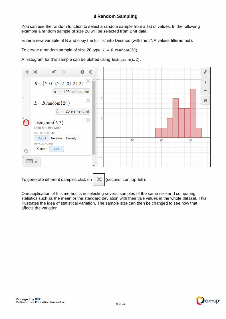
8 Random Sampling
You can use the random function to select a random sample from a list of values. In the following example a random sample of size 20 will be selected from BMI data.
Enter a new variable of B and copy the full list into Desmos (with the #NA values filtered out).
To create a random sample of size 20 type: 𝐿 = 𝐵. random(20)
A histogram for this sample can be plotted using histogram(𝐿, 2).
To generate different samples click on (second icon top-left).
One application of this method is in selecting several samples of the same size and comparing statistics such as the mean or the standard deviation with their true values in the whole dataset. This
illustrates the idea of statistical variation. The sample size can then be changed to see how that affects the variation.

10 of 11
Appendix 1: Suggested Large Data Set Investigations
Large Data Set 1
◼ Which regions have the highest life expectancy?
◼ Is there a correlation between life expectancy and GDP?
◼ Is there a correlation between land area and population?
◼ Is there a correlation between birth rate and GDP?
◼ Do countries that spend more of their GDP on health have higher birth rates/ life expectancy?
◼ Does a higher physician density have a positive impact on countries?
◼ Does a high unemployment rate have a negative impact on countries?
◼ Are there regional differences in any of the categories?
Large Data Set 2
◼ For the most recent years how does male and female life expectancy for the inner and outer
London boroughs compare to other regions in the country?
◼ Is there a correlation between median house price and life expectancy?
◼ Is there a correlation between the percentage of students achieving 5+ GCSEs at grades A*-C
and the employment rate?
◼ How has the recycling rate for inner and outer London boroughs changed over time? How does
this compare to other regions?
◼ Which boroughs have shown the most change in median house price between 2004 and 2015?
◼ Is life expectancy increasing?
◼ Which London boroughs are most similar to the UK national average for these data?
◼ Are there regional differences in the change in any of the categories over time?
Large Data Set 3
◼ Does marital status have an impact on BMI?
◼ Is there a correlation between thigh length and arm length?
◼ Is there a correlation between waist size and blood pressure?
◼ Is there a correlation between BMI and pulse rate?
◼ Do people who have eaten in the last 30 minutes have a higher pulse rate/blood pressure?
◼ Does marital status have an impact on health?
◼ Are there gender differences in any of the categories?
◼ Are there age-related differences in any of the categories?

11 of 11
Appendix 2: Using Desmos for distributions
Binomial distribution
◼ Select: functions > Dist > binomialdist
◼ Enter the number of trials and probability of success.
◼ To calculate the probability of a range select CDF and set the limits.
Normal distribution
◼ Select: functions > Dist > normaldist
◼ Enter the mean and standard deviation.
◼ To calculate the probability of a range select CDF and set the limits.