Using Graphs and Visuals to Present Financial...
70
Draft Graph RefMat May 13, 2002 10:07 AM 1 Using Graphs and Visuals to Present Financial Information Joseph T. Kelley
-
Upload
truongdang -
Category
Documents
-
view
214 -
download
1
Transcript of Using Graphs and Visuals to Present Financial...
Draft
Graph RefMat May 13, 2002 10:07 AM 1
Using Graphs and Visualsto Present Financial Information
Joseph T. Kelley
Draft
Graph RefMat May 13, 2002 10:07 AM 2
Graphics-based microcomputers have tremendously simplified graph design andproduction. Affordable laser printers now exist that can produce quickly high quality paperimages. Production problems are no longer a valid excuse for not using graphs to explainfinancial data to management, legislative bodies, and the public. Increasingly sophisticatedgraphs are available in the daily newspaper, so the standard of comparison used by theaverage reader is rising steadily.
Because the wealth of possible graphs is so varied, we initially limit our discussion tofinancial graphs. After considering the basic forms we discuss other types, such asscientific or statistical graphs. As we shall see, within our chosen limitation thepossibilities are still vast.
Since studies show that our minds retain only 10 percent of what we hear, but 50 percentof what we see, graphs are a powerful tool for presenting financial information. Becausenot all graphs are born equal: we must choose the best possible graph for whatever is themessage. These materials demonstrate principles and provide copious illustrations ofgraphs with both strengths and weaknesses. The article points out the good points as wellas the bad points, of each graph. The ugly are omitted entirely.
The graphs in these materials were produced by widely available spreadsheet software.Drawing software that is also widely available on major microcomputer platforms was usedto improve some graphs. While spreadsheet graphs are generally adequate for in-housedisplays, presentations to outside groups can benefit from the additional emphasis providedby drawing programs and presentation software.
Draft
Graph RefMat May 13, 2002 10:07 AM 3
Introduction
Principal Focus
In this chapter we will focus on seven widely-available graphs that are easily produced bymost any electronic spreadsheet. They are column graphs, bar graphs, line graphs, areagraphs, pie graphs, scatter graphs, and combination graphs. Unfortunately there is noconsistency in definitions for basic graphs. One writer’s bar graph is another’s columngraph, etc. For clarity we will define each as we introduce them.
Traditionally we report data in written form, usually by numbers arranged in tables. Aproperly prepared graph can report data in a visual form. Seeing a picture of data can helpmanagers deal with the problem of too much data and too little information. Whether theneed is to inform or to persuade, graphs are an efficient way to communicate because theycan
• illustrate trends not obvious in a table
• make conclusions more striking
• insure maximum impact.
Graphs can be a great help not only in the presentation of information but in the analysis ofdata as well. This article will focus on their use in presentations to the various audienceswith which the finance analyst or manager must communicate. We will discuss severalrelated topics as well.
Use Graphs to Draw Attention to the Most ImportantInformation
Studies show that the human mind can absorb and comprehend a graph more easily than abland array of figures. If a picture is worth a thousand words, then surely a graph is wortha thousand numbers. But, like numbers, to communicate effectively a graph must presentfairly the facts under discussion.
Fairness of Presentation
No professional would present an audience with a table of data and make a claim that thedata meant the opposite of what could be discerned from the table. Similarly, every graphmust fairly present the data from which it is constructed. Fairness of presentation existswhen a graph is:
• honest
• understandable
• able to attract and hold attention.
In this context, honesty can be defined as the faithfulness with which a graph actuallyrepresents what you purport it to represent. Without honesty, conclusions drawn from agraph are likely to be flawed or out-and-out false. You will find guidelines for avoidingsome of the worst errors later in this article.
Draft
Graph RefMat May 13, 2002 10:07 AM 4
Understandability means that the intended audience will comprehend the graph. Sincethe technical sophistication of audiences varies, the complexity of graphs will vary as well.A graph appropriate for a comptroller to study may be unduly complex for a presentation tocitizens. Understandability cuts to the core of the reason for using graphs. With it,relationships between data can be more easily understood, without it, you have onlypictures clouded by obscurity.
A graph must possess an ability to attract and hold attention or the message will not bereceived by the intended audience. Visual appeal is essential: the eye must be drawn to themost important information with a minimum of superfluous lines: less is more when itcomes to graphs. A good graph establishes or expands interest in the data it represents.
Graphs can save time because they can encourage an audience to grasp relationships morequickly than is possible from an arid matrix of numbers. When effectively used, a graphmakes the message more explicit to an audience and helps the audience in thinking clearlyabout the issues at hand.
Cardinal Rules
All graph producers who wish to foster understanding and generate interest should followthe three cardinal rules of graphing:
• explain every graph with words placed physically close to, and preferably on, thegraph—without exception!
• refer to every graph in the body of the text. Always!
• polish your graph until it has maximum message and minimum ink.
Probably the greatest single weakness in the use of graphs is the failure to state clearly andconcisely the point of the graph. If you do not know what the graph’s point is, then thegraph is just filler and the principle of “ruthless brevity” applies: if you can do without, dodo without.
In all forms of presentation, explain the graph for the user. While you might provide themessage in accompanying text, graphs sometimes get separated from nearby text. For thisand other reasons, every graph should have the message on the graph itself. Since a graphcan have more than one possible message, an explicit statement of your message isessential.
Another major failing among graph aficionados is what this author calls a Fibber McGeegraph. These graphs contain lines, columns, and text, the way Fibber’s closet containedobjects: cheek by jowl, tumbling out onto the page in a disorganized mess. You knowthere is a lot there, but the jumble is so confusing that it is hard to figure out what isimportant. The point of a graph should be clear: too many lines, columns, or text, inshort, too much ink, can easily obscure the message. Focus on maximizing the message,not the ink!
Remember: “Graphs are used to meet the need to condense all the available information intoa more usable quantity. The selection process of combining and condensing will inevitablyproduce a less than complete study and will lead the user in certain directions, producing apotential for misleading.”1 Always take care to see that a graph never misleads anaudience.
In the past just inserting a separate page containing a graph into a report would dazzle areader. Now, hardware and software allow for the effective integration of graphs into a
1Anderson, Anker V. Graphing Financial Information . New York, NY: NationalAssociation of Accountants, 1983. p 15.
Draft
Graph RefMat May 13, 2002 10:07 AM 5
word-processed document. This is the standard to which this article encourages the readerto aspire.
Maximum Message, Minimum Ink
In deciding whether you have achieved the best graph possible, ask yourself: “Does mygraph have maximum message and minimum ink?” If there is any way to increase theimpact of the graph or to make its message clearer or more direct, you should do it. If thereis any way you can remove some ink from the graph without reducing the impact of themessage, do so and you will have an improved graph.
A steady application of the principal of maximum message and minimum ink will alwaysresult in an improved graph, as we shall see.
Draft
Graph RefMat May 13, 2002 10:07 AM 6
Using Graphs for Analysis (Understanding) andPresentation (Explaining)
Graphs are useful for understanding the meaning of data and for explaining that meaning toothers. Graphs used to be so difficult to produce that they were used only for formalpresentations, the main application discussed in this article. Fortunately, spreadsheetpackages and graphing programs exist that so simplify the process of producing graphs thatnew uses for graphs have become practical.
Analyzing Data
A little known use of graphs is for the discovery of data entry errors. Many such errorsconsist of transposed digits that look similar to the eye, as digits, but visually break a trendin an emphatic way. Perhaps the curve will display a sharp spike or a steady upward trendwill inexplicably reverse itself for one year. Research these points: start with asking if thedata were keyed correctly, then if the data are correct. You will often discover an error inthe source data.
Graphs excel at helping the user in the search for expected relationships that are of use inpredicting future costs. For instance, the rate at which the tonnage of trash is increasinghas implications about the cost of waste disposal. On the other hand, the absence of anexpected trend can either be a major discovery or an indication of errors in the data. Ineither case, thoughtful graphs display the trend quickly and help the analyst save time andeffort. The analytical value of graphs is little discussed but very real.
Because carefully prepared graphs can greatly help the mind in understanding data, theright graphs can tremendously facilitate the process of analyzing the past and predicting thefuture. Repeatedly re-graph your data in various styles such as lines and columns.Because data can contain more than one message, different graphs might reveal differentmessages to the data analyst. Trying different graphs is like using different lenses inphotography. One moment you are drawn to a detail and the next to the wide picture beforeyou.
An Application in Practice
The use of graphs to analyze data — to gain an initial understanding of what the dataactually say — seems to be much less widely known than the use of graphs to present data.An examination of one case will be useful.
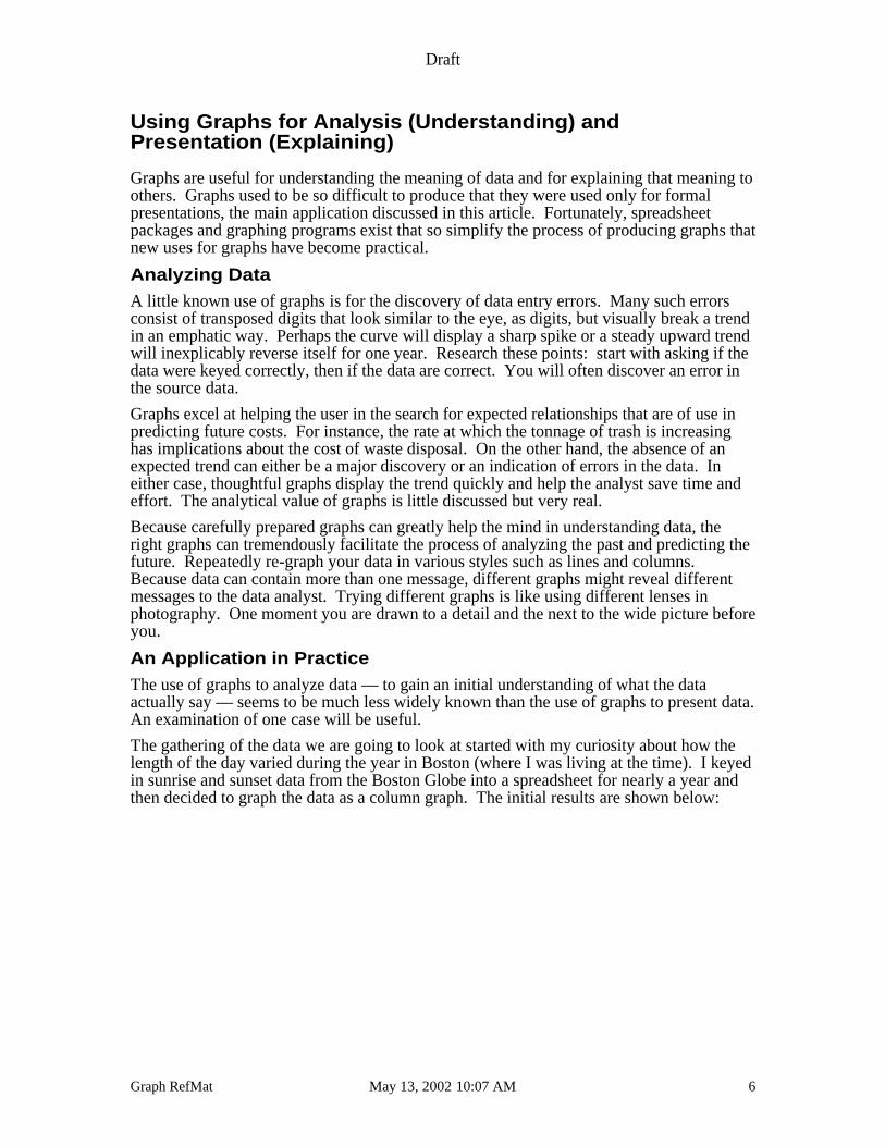
The gathering of the data we are going to look at started with my curiosity about how thelength of the day varied during the year in Boston (where I was living at the time). I keyedin sunrise and sunset data from the Boston Globe into a spreadsheet for nearly a year andthen decided to graph the data as a column graph. The initial results are shown below:
Draft
Graph RefMat May 13, 2002 10:07 AM 7
0:00
4:48
9:36
14:24
19:12
0:00
4:48
9:360
1/1
5/9
1
02
/04
/91
02
/24
/91
03
/16
/91
04
/05
/91
04
/25
/91
05
/15
/91
06
/04
/91
06
/24
/91
07
/14
/91
08
/03
/91
08
/23
/91
09
/12
/91
10
/02
/91
10
/22
/91
11
/11
/91
12
/01
/91
Sunset
Sunrise
The graph above has a lot of problems but the outstanding ones are the wildly inaccuratedata points indicated by the two “spikes” on the left hand side of the graph. Examination ofthe data showed that the Globe had printed an incorrect value in one case and in the other, Ihad miskeyed an entry.
POINT: Graphs can be very useful in finding errors in data.
I fixed the discrepant data and graphed the result.
Draft
Graph RefMat May 13, 2002 10:07 AM 8
0:00
2:24
4:48
7:12
9:36
12:00
14:24
16:48
19:12
21:360
1/1
5/9
1
02
/03
/91
02
/22
/91
03
/13
/91
04
/01
/91
04
/20
/91
05
/09
/91
05
/28
/91
06
/16
/91
07
/05
/91
07
/24
/91
08
/12
/91
08
/31
/91
09
/19
/91
10
/08
/91
10
/27
/91
11
/15
/91
12
/04
/91
Sunrise
Sunset
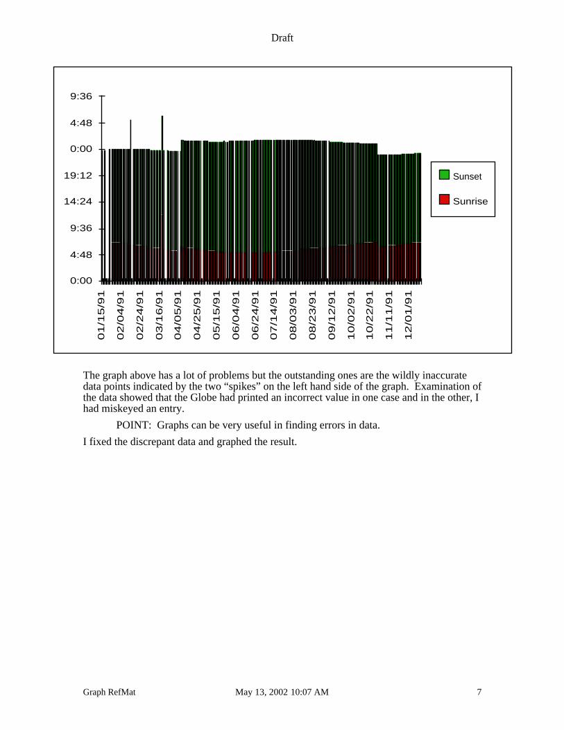
The graph now showed the regularity I had expected but, given that it should be regular,what was the sudden rise in the middle of the graph? Looking at when it started and endedgave the hint. This was the graphical impact of daylight savings time. Daylight savingstime is an example of a “change in base” that we will discuss later. For our purposes thismeans that we should adjust for this change by reversing the effect of daylight savings timeby moving sunrise and sunset back one hour from April to October.
Draft
Graph RefMat May 13, 2002 10:07 AM 9
0:00
2:24
4:48
7:12
9:36
12:00
14:24
16:48
19:12
21:360
1/1
5/9
1
02
/04
/91
02
/24
/91
03
/16
/91
04
/05
/91
04
/25
/91
05
/15
/91
06
/04
/91
06
/24
/91
07
/14
/91
08
/03
/91
08
/23
/91
09
/12
/91
10
/02
/91
10
/22
/91
11
/11
/91
12
/01
/91
12
/21
/91
Sunrise
Sunset
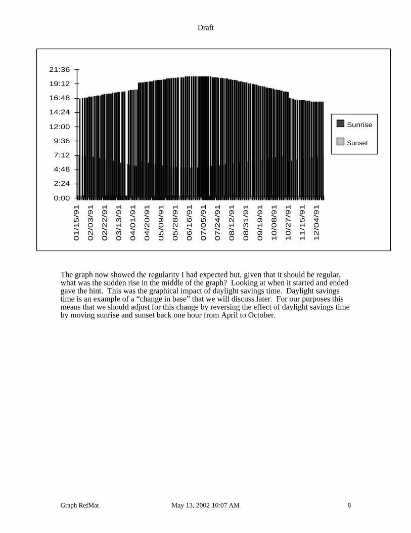
The graph now shows the changes in sunrise and sunset with the space between indicatingthe length of the day.
Presenting Information 2
Presentation is the joint process of:
• understanding what you want to say: the message
• saying it.
Graphs, because they are pictures, are particularly appropriate for presentation of financialinformation.
After using graphs for analysis, decide your message and choose your graph style. Don’tdecide immediately; look at your data in a variety of graph styles; play with it, think aboutit. When you have decided clearly what you want the graph to say, start to simplify thegraph: are all the components really needed? Is the horizontal, category axis label reallyneeded or is it clearly implied by the data? Could some unattached text eliminate the needfor a formal legend? Are all the variables really necessary? Can some ink on the page beomitted?
POINT: Cut, prune, pare, slice, and shape your graph to say loudly and simplyonly one thing: your message.
2The author is grateful to Bob Ardiel, Commissioner of Finance and Administration ofMedicine Hat for his pioneering approaches to presentations using graphics.
Draft
Graph RefMat May 13, 2002 10:07 AM 10
Before making a presentation of a graph, ask yourself “what is the message that I wish tocommunicate with this graph?” Are you seeking to inform or persuade? Will thepresentation be in a small room or a large one? Is the audience technically adept oruntrained in the ideas you will discuss? How much time do you have at your disposal? Ifyou feel the need to use many graphs, can you intersperse the presentation with relevantphotographs or vary it by asking questions of the audience?
Presenting financial information requires a careful understanding of both “what you want tosay” and “who you need to say it to.”
Draft
Graph RefMat May 13, 2002 10:07 AM 11
Graphs Commonly Available for Presentation
The kinds of graphs that are at your disposal will vary somewhat with the software chosenfor their production. This article will concentrate on the graphs that can be produced bywidely available software products.
The seven basic types of graphs (and tables) discussed are
• column• bar• line• pie• area• scatter• combination, and
• numeric tables
Each will be discussed in turn with various examples given. In addition, tables of data willbe discussed as well. The pictures below give a graphical suggestion of the typesdiscussed.
Table
Draft
Graph RefMat May 13, 2002 10:07 AM 12
Column Graphs
Definition
Column graphs consist of patterned rectangles displayed along a baseline called the x-,category or the horizontal axis. The height of the rectangle represents the amount of data.
The left-to-right bias most people possess, makes column graphs more appropriate for timeseries data than bar graphs.
Purpose
Column graphs best show:
• changes in data over time (short time series)
• comparisons of several items (relationship between two series)
Usage
Short time series
Column graphs are an appropriate choice for short time series databecause of most readers’ left-to-right bias.
However, for more than four time periods, line graphs are usually abetter choice; column graphs can put much ink on the page andoverwhelm the message. But when a message is a general trend,columns can work as well as lines. Column graphs can also providevariation in a presentation with a number of graphs.
Relationships between two series
Use column graphs to compare several items—a maximum of three.
Comparisons between series have many variations of their own sincethe columns are frequently overlapped to a greater or lesser degree.Remember when using overlapping that readers generally assigngreater psychological significance to the foreground column. Take carethat this precedence is appropriate or at least does not mislead.
Changes in composition over time—actual numbers
It is often interesting to know the components of some statistic. Forinstance, seeing the major components of total revenue can sometimesbe useful. Stacked column graphs are appropriate in these cases.
Basic Version
Comparison
Stacked ColumnsActual Numbers
Draft
Graph RefMat May 13, 2002 10:07 AM 13
Changes in composition over time—percent composition
If relative change in composition is the message, percent composition isa better choice. In percent composition, the columns are all the sameheight because they add to 100 percent. Keep the number of sectionssmall, five at maximum.
Column values as part of the graphs message
Sometimes the actual values of one or more columns are part of themessage. While this variation can often be combined with others,remember that the more ink on the page, the more confusion themessage is subject to. If you put the data values on all the (important)points, consider eliminating vertical axis as superfluous.
Data values are also useful when deviation from a norm, standard, ordesired situation is the message.
Sample Column Graphs
Compare the column graphs that follow.
Column Graph 1
Unrestricted Fund Balance
0.0
0.2
0.4
0.6
0.8
1.0
1.2
1.4
1.6
1.8
1987 1986 1985 1984 1983 1982 1981
(in millions)
Unrestricted fund balance hasbeen higher for the last twoyears than in the prior four.
Source: Controller's Office
Stacked ColumnsPercent Compostion
Columns withData Values
Draft
Graph RefMat May 13, 2002 10:07 AM 14
General Description A column graph show a time series of fund balanceresults.
Axis Labels & Legends The y-axis is labeled in the title. Note the non-standardreversal of the usual left to right flow for time. This putsthe recent years near the labels on the y-axis.
Other Possibilities A better presentation of this data would be to put the y-axis on the right hand side and have the data makersincrease from the left.
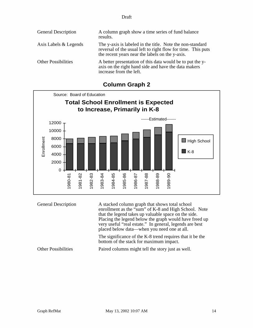
Column Graph 2
Total School Enrollment is Expected to Increase, Primarily in K-8
Enr
ollm
ent
0
2000
4000
6000
8000
10000
12000
19
80
-81
19
81
-82
19
82
-83
19
83
-84
19
84
-85
19
85
-86
19
86
-87
19
87
-88
19
88
-89
19
89
-90
High School
K-8
------Estimated-------
Source: Board of Education
General Description A stacked column graph that shows total schoolenrollment as the “sum” of K-8 and High School. Notethat the legend takes up valuable space on the side.Placing the legend below the graph would have freed upvery useful “real estate.” In general, legends are bestplaced below data—when you need one at all.
The significance of the K-8 trend requires that it be thebottom of the stack for maximum impact.
Other Possibilities Paired columns might tell the story just as well.
Draft
Graph RefMat May 13, 2002 10:07 AM 15
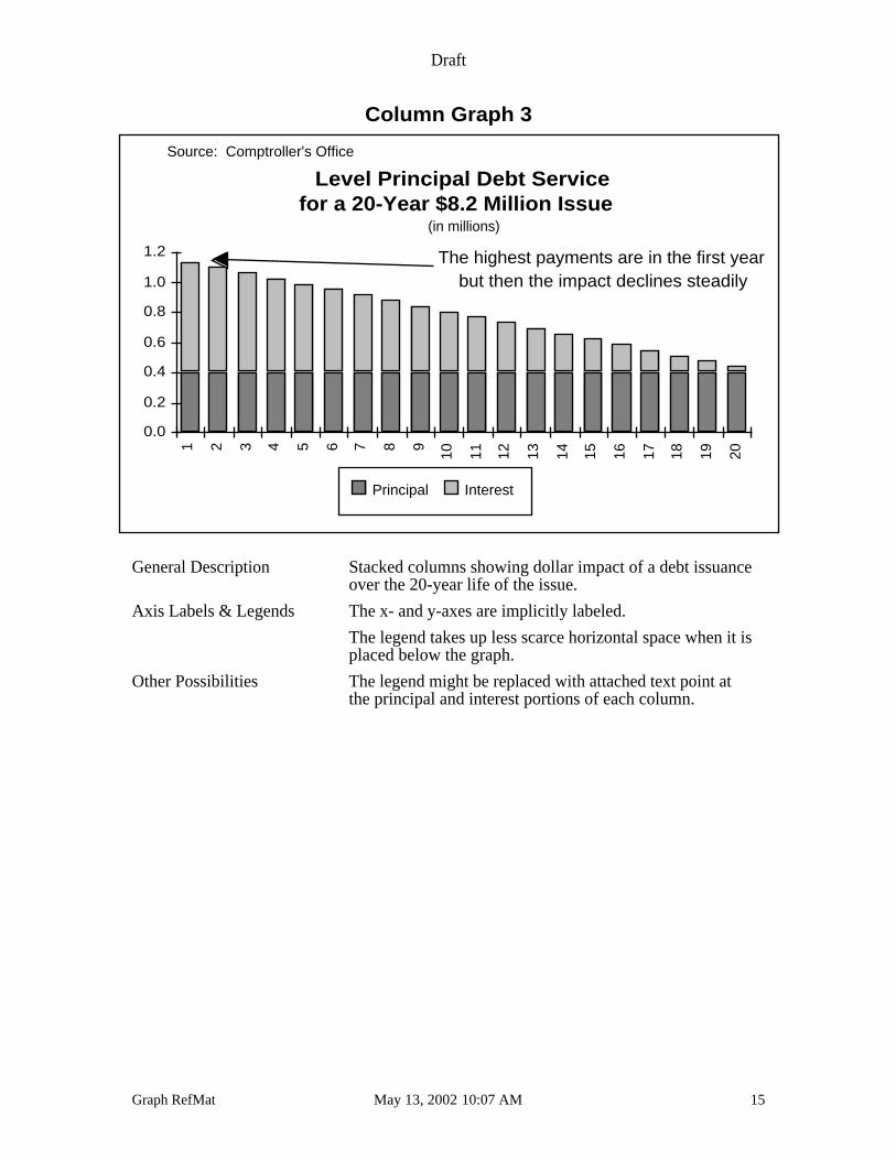
Column Graph 3
Level Principal Debt Servicefor a 20-Year $8.2 Million Issue
0.0
0.2
0.4
0.6
0.8
1.0
1.2
1 2 3 4 5 6 7 8 9
10 11 12 13 14 15 16 17 18 19 20
Principal Interest
The highest payments are in the first year but then the impact declines steadily
(in millions)
Source: Comptroller's Office
General Description Stacked columns showing dollar impact of a debt issuanceover the 20-year life of the issue.
Axis Labels & Legends The x- and y-axes are implicitly labeled.
The legend takes up less scarce horizontal space when it isplaced below the graph.
Other Possibilities The legend might be replaced with attached text point atthe principal and interest portions of each column.
Draft
Graph RefMat May 13, 2002 10:07 AM 16
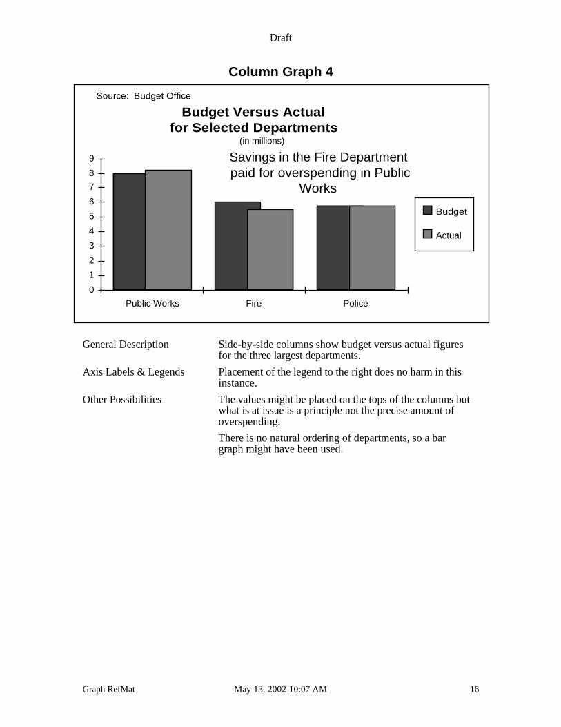
Column Graph 4
Budget Versus Actual for Selected Departments
0
1
2
3
4
5
6
7
8
9
Public Works Fire Police
Budget
Actual
Savings in the Fire Departmentpaid for overspending in Public
Works
(in millions)
Source: Budget Office
General Description Side-by-side columns show budget versus actual figuresfor the three largest departments.
Axis Labels & Legends Placement of the legend to the right does no harm in thisinstance.
Other Possibilities The values might be placed on the tops of the columns butwhat is at issue is a principle not the precise amount ofoverspending.
There is no natural ordering of departments, so a bargraph might have been used.
Draft
Graph RefMat May 13, 2002 10:07 AM 17
Bar Graphs
Definition
Column graphs in which the rectangles are arranged horizontally. The length of eachrectangle represents its value.
Purpose
Bar graphs best show:
• data series with no natural order.
A bar graph is without the left-to-right bias of a column graph since the presentation isvertical. Thus bar graphs are particularly appropriate whenever time is not the order of thedata or when the there is no natural order. If the data are a time series, a carefully chosencolumn graph is generally more appropriate but bar graphs can be used to vary apresentation when many column graphs of time series are used.
Much of the discussion of variations of bar graphs parallels that of column graphs and sowill not be repeated here. One modest advantage of bar graphs is that there is greaterhorizontal space for variable descriptors. For bar graphs, the vertical axis is the categoryaxis.
Usage
No natural order of data
Whenever data have no natural order, bar graphs are the first choice.Generally, you should organize the bars from largest to smallest or viceversa for maximum visual appeal.
Change in composition in absolute numbers
Stacked bars are useful to represent change in composition of a wholein terms of actual numbers.
Basic Version
Stacked BarsActual Numbers
Draft
Graph RefMat May 13, 2002 10:07 AM 18
Change in percent composition
Stacked bars can also be used to reflect changes in percentcomposition. This form can be an effective alternative to two pie chartsshowing percent composition for two or more time periods.
Comparison of two or three variables having no natural order
Stacked bars can be used to compare two or three variables. They aremost effective when there is no natural order to the variables.
Sample Bar Graphs
Compare the bar graphs that follow.
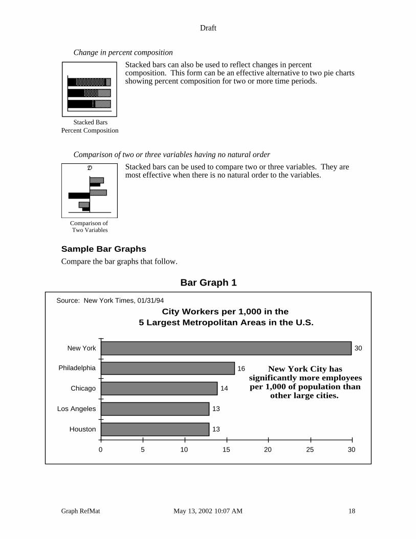
Bar Graph 1
City Workers per 1,000 in the 5 Largest Metropolitan Areas in the U.S.
0 5 10 15 20 25 30
Houston
Los Angeles
Chicago
Philadelphia
New York
13
13
14
16
30
New York City hassignificantly more employeesper 1,000 of population than
other large cities.
Source: New York Times, 01/31/94
Stacked BarsPercent Composition
Comparison of Two Variables
Draft
Graph RefMat May 13, 2002 10:07 AM 19
General Description A bar graph that shows municipal employment per 1,000population for the five largest metropolitan areas.
Axis Labels & Legends Note the superfluous axis at the bottom. The horizontalaxis should be omitted since each bar is marked with itsvalue.
Other Possibilities The data could be ordered from smallest to largest but thismight weaken the visual impact of the New York Citydata.
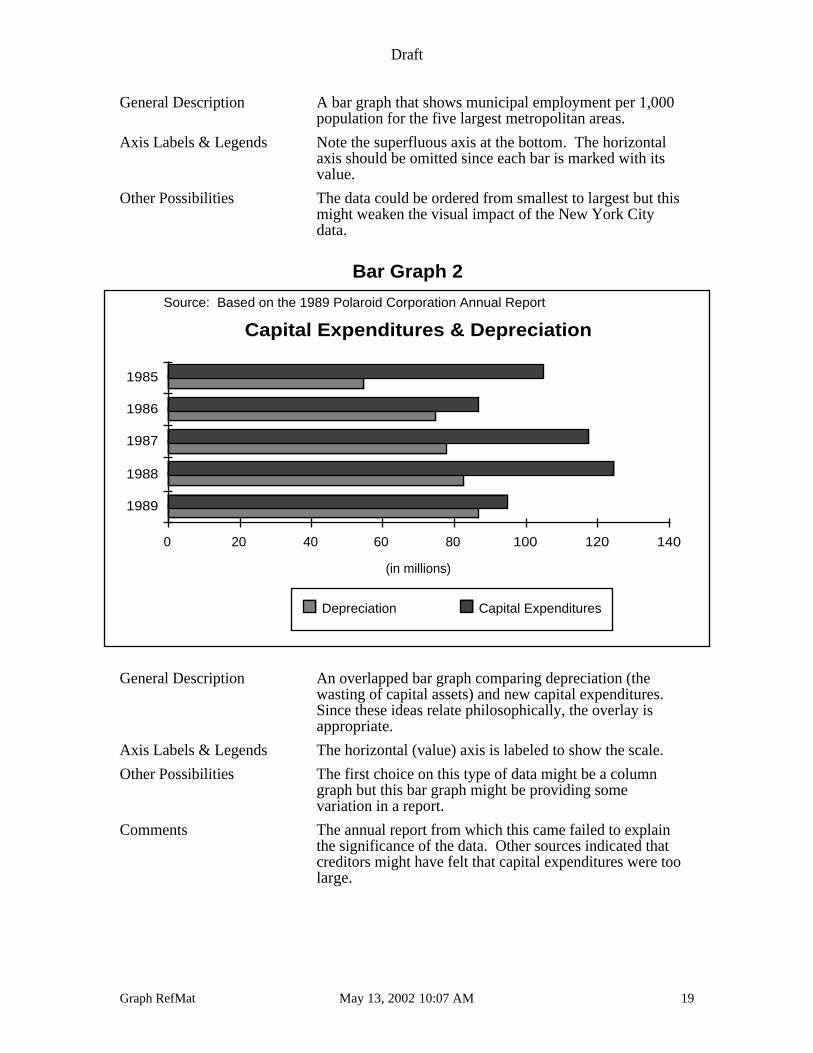
Bar Graph 2
Capital Expenditures & Depreciation
(in millions)
0 20 40 60 80 100 120 140
1989
1988
1987
1986
1985
Depreciation Capital Expenditures
Source: Based on the 1989 Polaroid Corporation Annual Report
General Description An overlapped bar graph comparing depreciation (thewasting of capital assets) and new capital expenditures.Since these ideas relate philosophically, the overlay isappropriate.
Axis Labels & Legends The horizontal (value) axis is labeled to show the scale.
Other Possibilities The first choice on this type of data might be a columngraph but this bar graph might be providing somevariation in a report.
Comments The annual report from which this came failed to explainthe significance of the data. Other sources indicated thatcreditors might have felt that capital expenditures were toolarge.
Draft
Graph RefMat May 13, 2002 10:07 AM 20
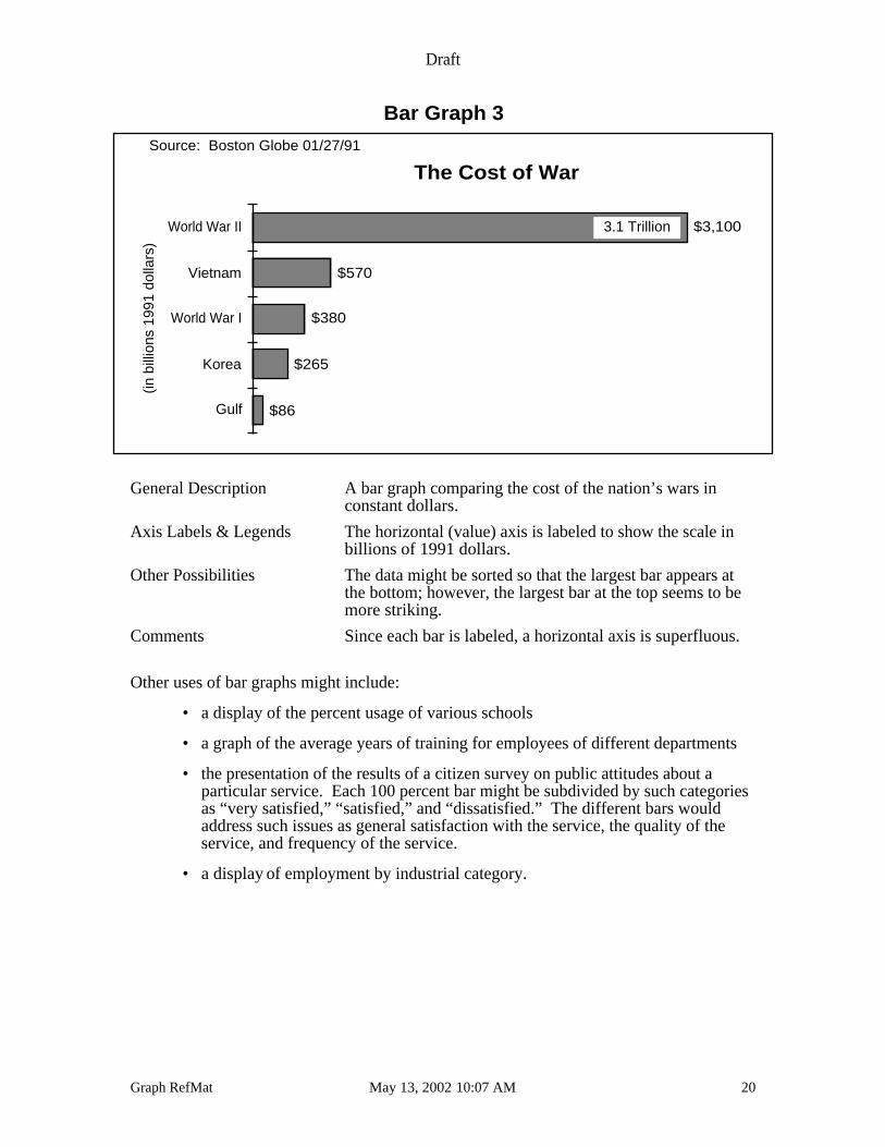
Bar Graph 3
The Cost of War(in
bill
ions
199
1 do
llars
)
Gulf
Korea
World War I
Vietnam
World War II
$86
$265
$380
$570
$3,100
Source: Boston Globe 01/27/91
3.1 Trillion
General Description A bar graph comparing the cost of the nation’s wars inconstant dollars.
Axis Labels & Legends The horizontal (value) axis is labeled to show the scale inbillions of 1991 dollars.
Other Possibilities The data might be sorted so that the largest bar appears atthe bottom; however, the largest bar at the top seems to bemore striking.
Comments Since each bar is labeled, a horizontal axis is superfluous.
Other uses of bar graphs might include:
• a display of the percent usage of various schools
• a graph of the average years of training for employees of different departments
• the presentation of the results of a citizen survey on public attitudes about aparticular service. Each 100 percent bar might be subdivided by such categoriesas “very satisfied,” “satisfied,” and “dissatisfied.” The different bars wouldaddress such issues as general satisfaction with the service, the quality of theservice, and frequency of the service.
• a display of employment by industrial category.
Draft
Graph RefMat May 13, 2002 10:07 AM 21
Line Graphs
Definition
Line graphs connect data points with lines; different series are given different line markings(for example, dashed or dotted) or different tick marks.
Purpose
Line graphs are useful when the data points are more important than the transitions betweenthem. They best show:
• the comparison of long series
• a general trend is the message.
Four series are the maximum that can be effectively compared. If the lines crosssignificantly, the graph may not even handle four series. If you have many series, considermore graphs with fewer series on each. Remember that the line marking may, or may not,be very distinctive to the eye. This is a serious consideration in the choice of the right linegraph. An alternative is to show data point markers but this can be obnoxious. Yet,especially if the lines cross, the individual time series cannot be distinguished withoutmarkers.
Many line graphs do not display well on overhead transparencies because the lines are toothin. The solution is to choose thicker lines when the graph will be projected.
Usage
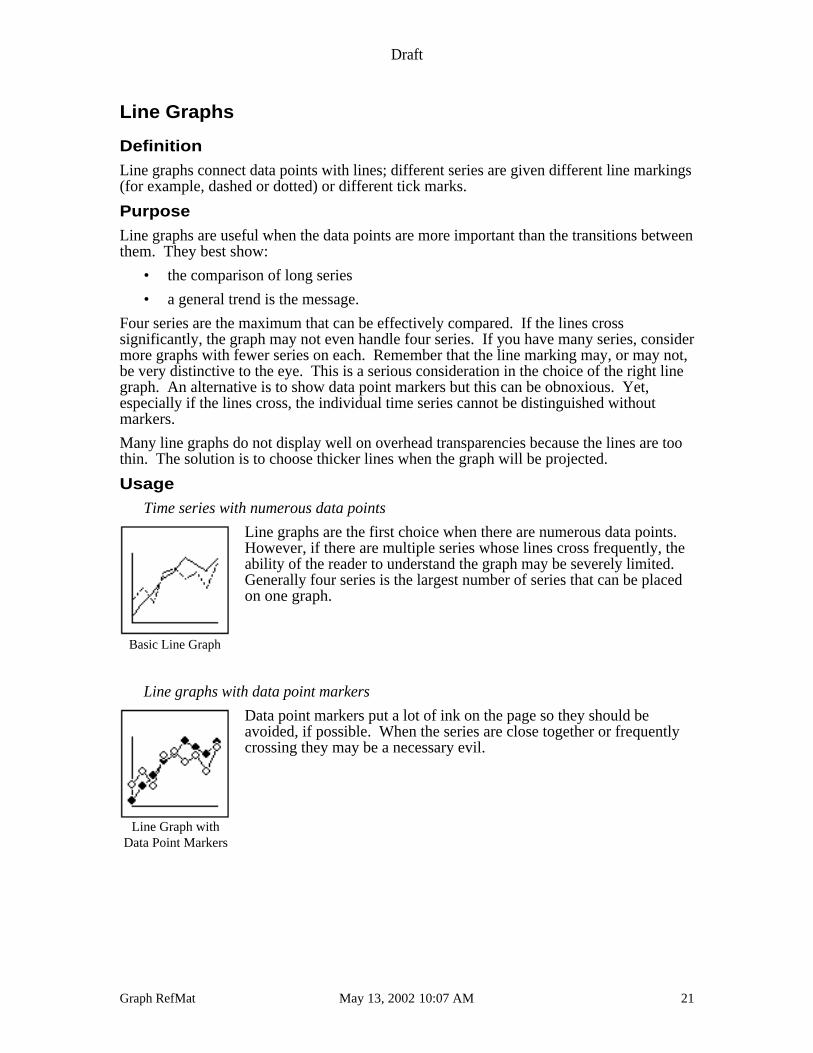
Time series with numerous data points
Line graphs are the first choice when there are numerous data points.However, if there are multiple series whose lines cross frequently, theability of the reader to understand the graph may be severely limited.Generally four series is the largest number of series that can be placedon one graph.
Line graphs with data point markers
Data point markers put a lot of ink on the page so they should beavoided, if possible. When the series are close together or frequentlycrossing they may be a necessary evil.
Basic Line Graph
Line Graph withData Point Markers
Draft
Graph RefMat May 13, 2002 10:07 AM 22
High-low graphs
High-low graphs show variation in a variable, usually over a fixed timeinterval (daily, weekly, etc.). Markers, if they are too large, canobscure the variation.
High-low-close
High-Low-Close graphs are useful when the value of the variable at theend of the time period is as important at the variation.
Sample Line Graphs
Compare the following line graphs.
Line Graph 1
Annual Averages of the 20-Bond Index
Inte
rest
Rat
e
0
2
4
6
8
10
12
19
50
19
52
19
54
19
56
19
58
19
60
19
62
19
64
19
66
19
68
19
70
19
72
19
74
19
76
19
78
19
80
19
82
19
84
19
86
19
88
19
90
19
92
19
94
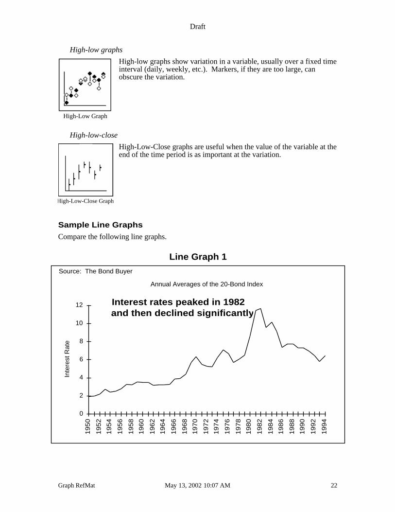
Source: The Bond Buyer
Interest rates peaked in 1982 and then declined significantly
High-Low Graph
High-Low-Close Graph
Draft
Graph RefMat May 13, 2002 10:07 AM 23
General Description A line graph showing the rise and fall of interest rates overa 44 year period.
Axis Labels & Legends Implicit labeling on the x-axis with no legend.
Line Graph 2
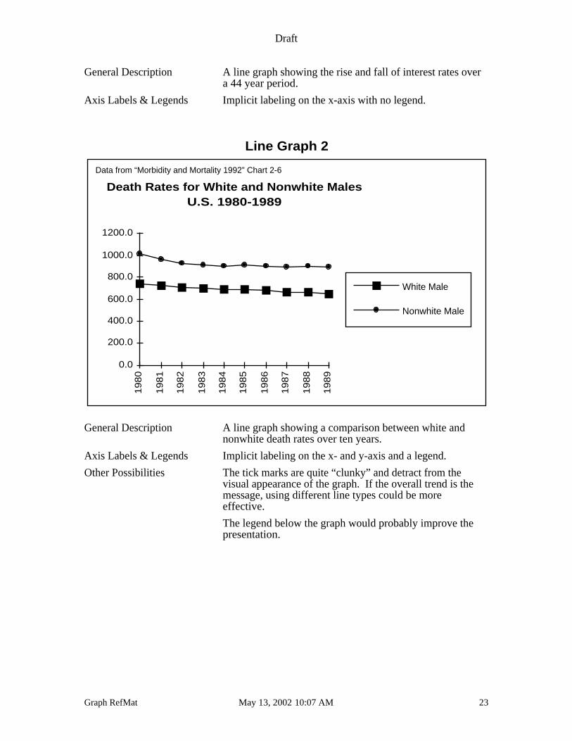
Death Rates for White and Nonwhite MalesU.S. 1980-1989
0.0
200.0
400.0
600.0
800.0
1000.0
1200.0
19
80
19
81
19
82
19
83
19
84
19
85
19
86
19
87
19
88
19
89
White Male
Nonwhite Male
Data from “Morbidity and Mortality 1992” Chart 2-6
General Description A line graph showing a comparison between white andnonwhite death rates over ten years.
Axis Labels & Legends Implicit labeling on the x- and y-axis and a legend.
Other Possibilities The tick marks are quite “clunky” and detract from thevisual appearance of the graph. If the overall trend is themessage, using different line types could be moreeffective.
The legend below the graph would probably improve thepresentation.
Draft
Graph RefMat May 13, 2002 10:07 AM 24
Line Graph 3
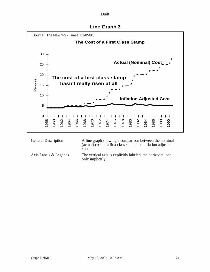
The Cost of a First Class Stamp
Pe
nn
ies
0
5
10
15
20
25
30
19
58
19
60
19
62
19
64
19
66
19
68
19
70
19
72
19
74
19
76
19
78
19
80
19
82
19
84
19
86
19
88
19
90
Source: The New York Times, 01/05/91
Actual (Nominal) Cost
Inflation Adjusted Cost
The cost of a first class stamp hasn't really risen at all
General Description A line graph showing a comparison between the nominal(actual) cost of a first class stamp and inflation adjustedcost.
Axis Labels & Legends The vertical axis is explicitly labeled, the horizontal oneonly implicitly.
Draft
Graph RefMat May 13, 2002 10:07 AM 25
Pie Charts
Definition
A pie chart is a circle with radii connecting the center to the edge. The area between tworadii is called a slice. Data values are proportionate to the angle between the radii.
Purpose
Pie charts best show:
• parts of a whole
Be wary of too many slices since they result in a cluttered graph. Six slices are as many ascan be handled on one pie.
Usage
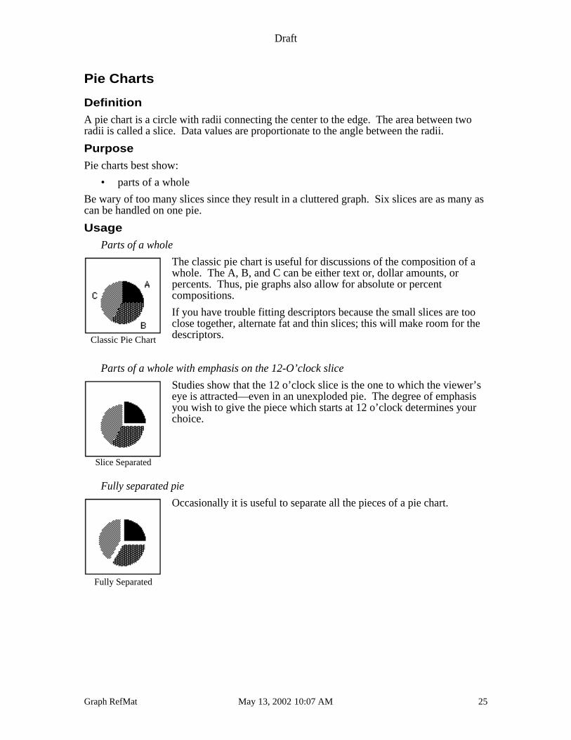
Parts of a whole
The classic pie chart is useful for discussions of the composition of awhole. The A, B, and C can be either text or, dollar amounts, orpercents. Thus, pie graphs also allow for absolute or percentcompositions.
If you have trouble fitting descriptors because the small slices are tooclose together, alternate fat and thin slices; this will make room for thedescriptors.
Parts of a whole with emphasis on the 12-O’clock slice
Studies show that the 12 o’clock slice is the one to which the viewer’seye is attracted—even in an unexploded pie. The degree of emphasisyou wish to give the piece which starts at 12 o’clock determines yourchoice.
Fully separated pie
Occasionally it is useful to separate all the pieces of a pie chart.
Classic Pie Chart
Slice Separated
Fully Separated
Draft
Graph RefMat May 13, 2002 10:07 AM 26
Parts of a whole with percents
Pie charts are such a natural choice for presenting composition of awhole that they are frequently produced with percents applied to eachslice. When the underlying numbers that generate each slice are asimportant as the percents, they should be presented as well. See nextexample.
Parts of a whole with percents and labels
As a rule, all pie charts should show the name of the pie slice, itspercent of the total and its actual amount unless the data not on the pieare in a table on the same page.
Sample Pie Charts
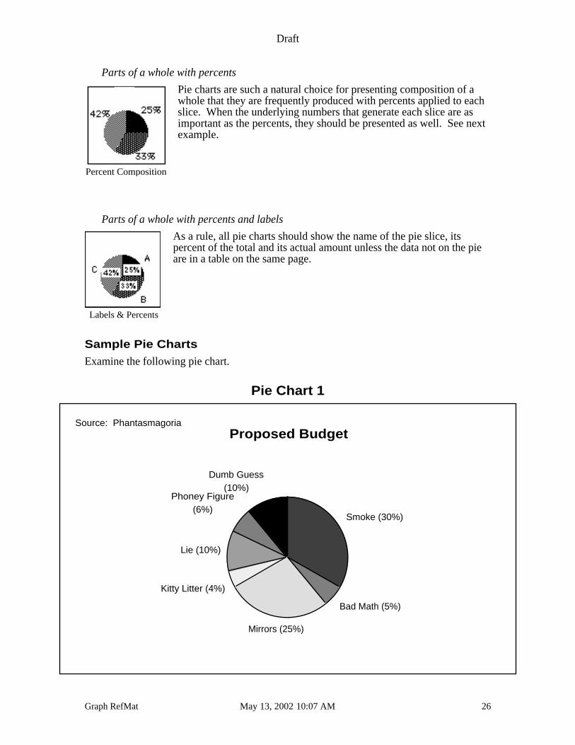
Examine the following pie chart.
Pie Chart 1
Proposed Budget
Smoke (30%)
Bad Math (5%)
Mirrors (25%)
Kitty Litter (4%)
Lie (10%)
Phoney Figure(6%)
Dumb Guess(10%)
Source: Phantasmagoria
Percent Composition
Labels & Percents
Draft
Graph RefMat May 13, 2002 10:07 AM 27
General Description The pie above shows that graphs can be used to express asense of humor as well as parts of a whole. Is thereanything numerically odd about this graph? (Hint: Towhat number should the percents of the parts of a wholealways add up?)
Legend No legend needed.
Other Comments To fit text neatly around the pie, it is often useful toalternate large and small slices by careful preparation ofthe data table.
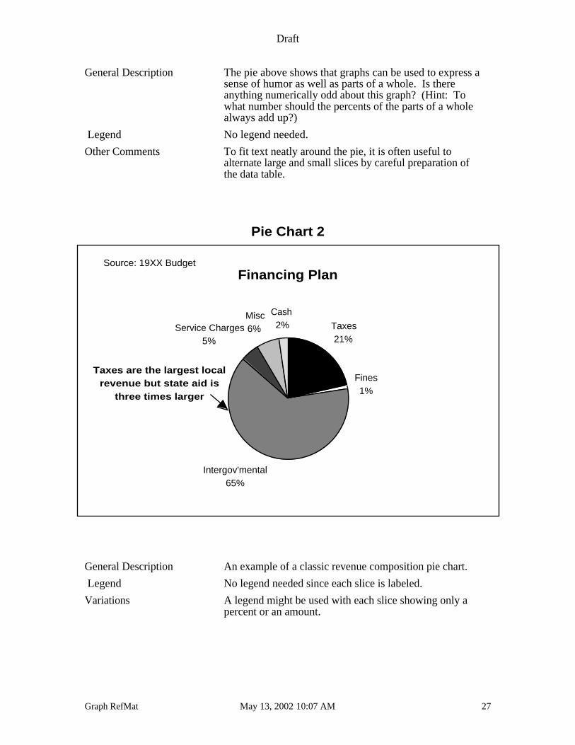
Pie Chart 2
Financing Plan
Taxes21%
Fines1%
Intergov'mental65%
Service Charges5%
Misc6%
Cash 2%
Source: 19XX Budget
Taxes are the largest localrevenue but state aid is
three times larger
General Description An example of a classic revenue composition pie chart.
Legend No legend needed since each slice is labeled.
Variations A legend might be used with each slice showing only apercent or an amount.
Draft
Graph RefMat May 13, 2002 10:07 AM 28
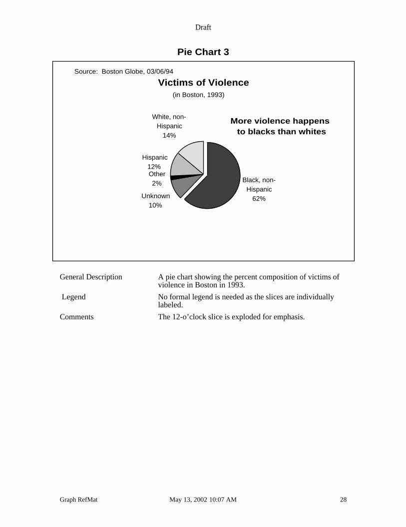
Pie Chart 3
Victims of Violence
Black, non-Hispanic
62%Unknown10%
Other2%
Hispanic12%
White, non-Hispanic
14%
(in Boston, 1993)
More violence happens to blacks than whites
Source: Boston Globe, 03/06/94
General Description A pie chart showing the percent composition of victims ofviolence in Boston in 1993.
Legend No formal legend is needed as the slices are individuallylabeled.
Comments The 12-o’clock slice is exploded for emphasis.
Draft
Graph RefMat May 13, 2002 10:07 AM 29
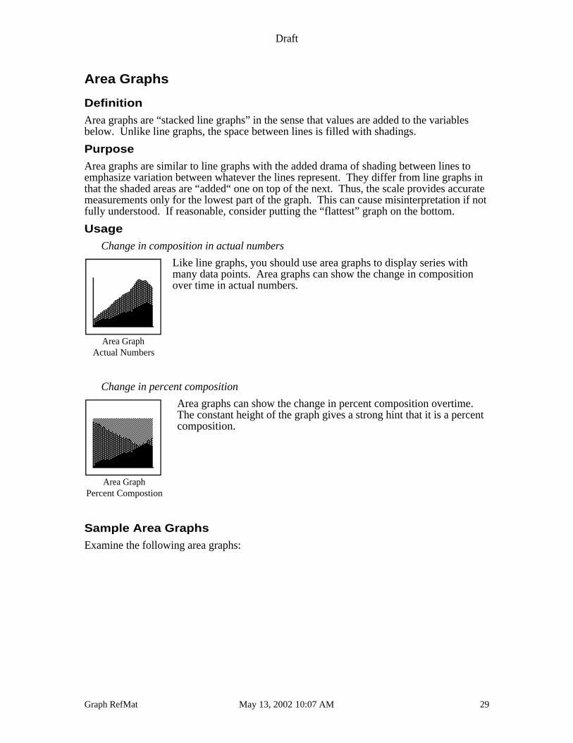
Area Graphs
Definition
Area graphs are “stacked line graphs” in the sense that values are added to the variablesbelow. Unlike line graphs, the space between lines is filled with shadings.
Purpose
Area graphs are similar to line graphs with the added drama of shading between lines toemphasize variation between whatever the lines represent. They differ from line graphs inthat the shaded areas are “added“ one on top of the next. Thus, the scale provides accuratemeasurements only for the lowest part of the graph. This can cause misinterpretation if notfully understood. If reasonable, consider putting the “flattest” graph on the bottom.
Usage
Change in composition in actual numbers
Like line graphs, you should use area graphs to display series withmany data points. Area graphs can show the change in compositionover time in actual numbers.
Change in percent composition
Area graphs can show the change in percent composition overtime.The constant height of the graph gives a strong hint that it is a percentcomposition.
Sample Area Graphs
Examine the following area graphs:
Area GraphActual Numbers
Area GraphPercent Compostion
Draft
Graph RefMat May 13, 2002 10:07 AM 30
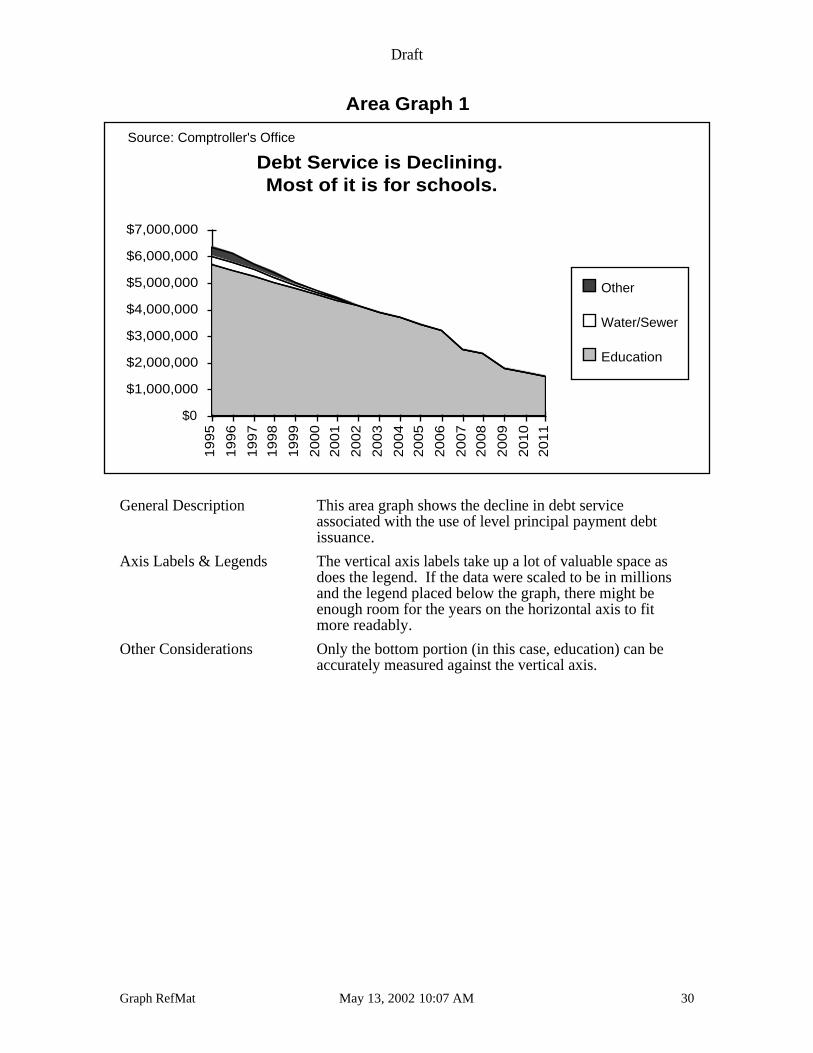
Area Graph 1
Debt Service is Declining.Most of it is for schools.
$0
$1,000,000
$2,000,000
$3,000,000
$4,000,000
$5,000,000
$6,000,000
$7,000,000
19
95
19
96
19
97
19
98
19
99
20
00
20
01
20
02
20
03
20
04
20
05
20
06
20
07
20
08
20
09
20
10
20
11
Other
Water/Sewer
Education
Source: Comptroller's Office
General Description This area graph shows the decline in debt serviceassociated with the use of level principal payment debtissuance.
Axis Labels & Legends The vertical axis labels take up a lot of valuable space asdoes the legend. If the data were scaled to be in millionsand the legend placed below the graph, there might beenough room for the years on the horizontal axis to fitmore readably.
Other Considerations Only the bottom portion (in this case, education) can beaccurately measured against the vertical axis.
Draft
Graph RefMat May 13, 2002 10:07 AM 31
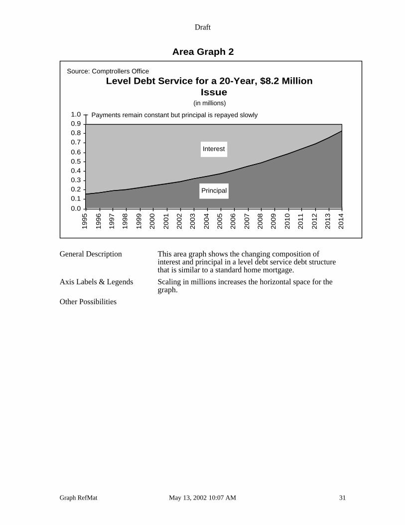
Area Graph 2
Level Debt Service for a 20-Year, $8.2 MillionIssue
0.0
0.10.20.30.40.50.6
0.70.80.91.0
19
95
19
96
19
97
19
98
19
99
20
00
20
01
20
02
20
03
20
04
20
05
20
06
20
07
20
08
20
09
20
10
20
11
20
12
20
13
20
14
Principal
Interest
(in millions)
Source: Comptrollers Office
Payments remain constant but principal is repayed slowly
General Description This area graph shows the changing composition ofinterest and principal in a level debt service debt structurethat is similar to a standard home mortgage.
Axis Labels & Legends Scaling in millions increases the horizontal space for thegraph.
Other Possibilities
Draft
Graph RefMat May 13, 2002 10:07 AM 32
Area Graph 3
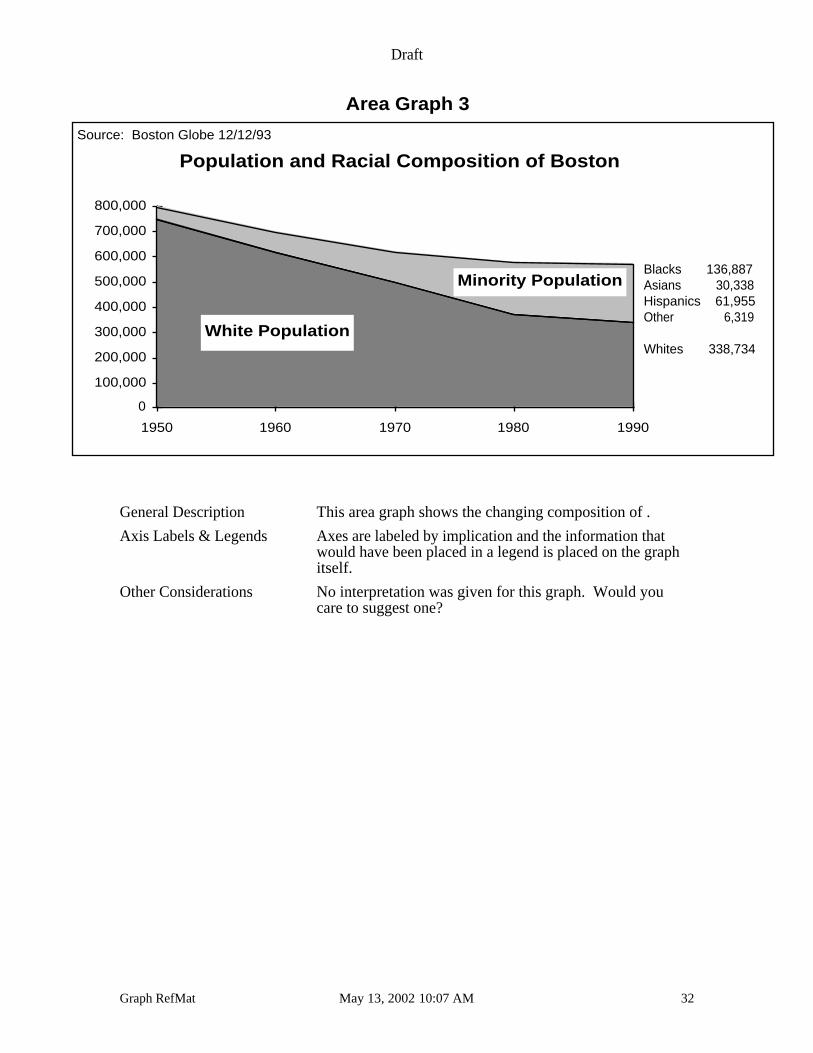
Population and Racial Composition of Boston
0
100,000
200,000
300,000
400,000
500,000
600,000
700,000
800,000
1950 1960 1970 1980 1990
Minority Population
White Population
Source: Boston Globe 12/12/93
Blacks 136,887Asians 30,338Hispanics 61,955Other 6,319
Whites 338,734
General Description This area graph shows the changing composition of .
Axis Labels & Legends Axes are labeled by implication and the information thatwould have been placed in a legend is placed on the graphitself.
Other Considerations No interpretation was given for this graph. Would youcare to suggest one?
Draft
Graph RefMat May 13, 2002 10:07 AM 33
Scatter Graphs
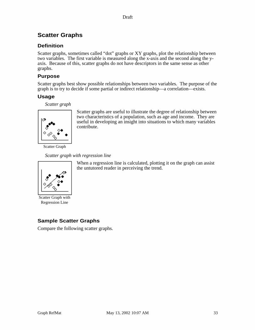
Definition
Scatter graphs, sometimes called “dot” graphs or XY graphs, plot the relationship betweentwo variables. The first variable is measured along the x-axis and the second along the y-axis. Because of this, scatter graphs do not have descriptors in the same sense as othergraphs.
Purpose
Scatter graphs best show possible relationships between two variables. The purpose of thegraph is to try to decide if some partial or indirect relationship—a correlation—exists.
Usage
Scatter graph
Scatter graphs are useful to illustrate the degree of relationship betweentwo characteristics of a population, such as age and income. They areuseful in developing an insight into situations to which many variablescontribute.
Scatter graph with regression line
When a regression line is calculated, plotting it on the graph can assistthe untutored reader in perceiving the trend.
Sample Scatter Graphs
Compare the following scatter graphs.
Scatter Graph
Scatter Graph withRegression Line
Draft
Graph RefMat May 13, 2002 10:07 AM 34
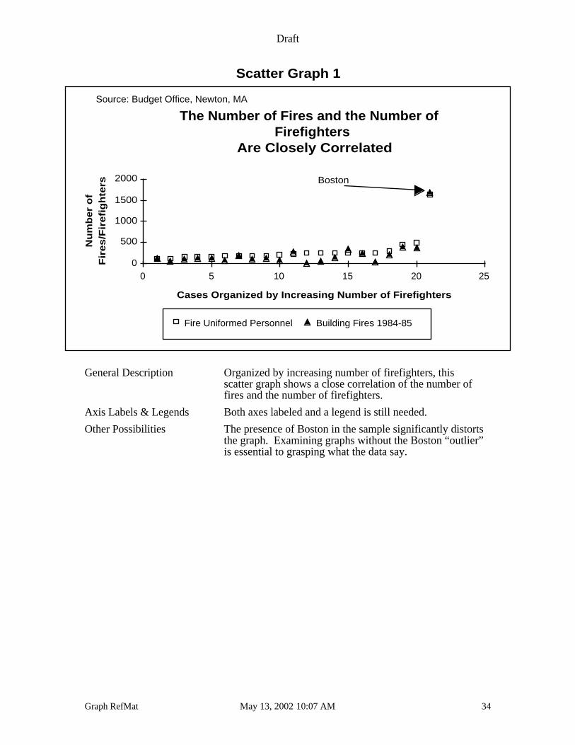
Scatter Graph 1
The Number of Fires and the Number ofFirefighters
Are Closely Correlated
Cases Organized by Increasing Number of Firefighters
Nu
mb
er
of
Fire
s/F
ire
figh
ters
0
500
1000
1500
2000
0 5 10 15 20 25
Fire Uniformed Personnel Building Fires 1984-85
Source: Budget Office, Newton, MA
Boston
General Description Organized by increasing number of firefighters, thisscatter graph shows a close correlation of the number offires and the number of firefighters.
Axis Labels & Legends Both axes labeled and a legend is still needed.
Other Possibilities The presence of Boston in the sample significantly distortsthe graph. Examining graphs without the Boston “outlier”is essential to grasping what the data say.
Draft
Graph RefMat May 13, 2002 10:07 AM 35
Scatter Graph 2
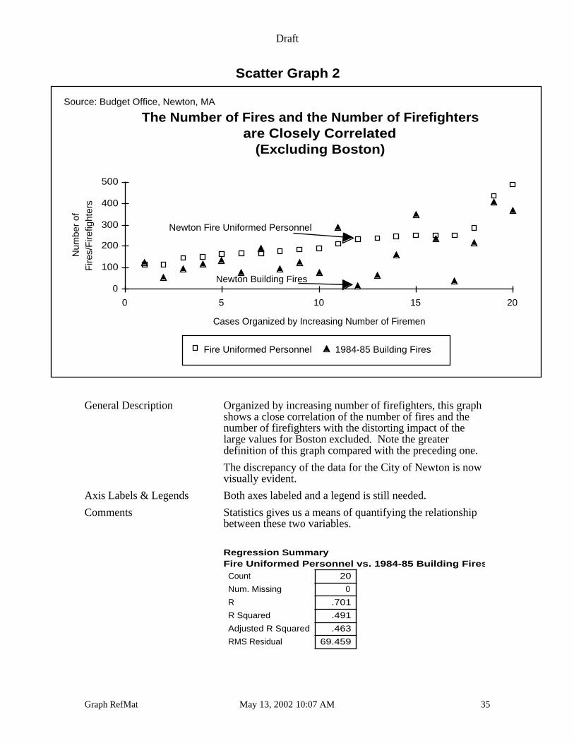
The Number of Fires and the Number of Firefighters are Closely Correlated
(Excluding Boston)
Cases Organized by Increasing Number of Firemen
Num
ber
ofF
ires/
Fire
fight
ers
0
100
200
300
400
500
0 5 10 15 20
Fire Uniformed Personnel 1984-85 Building Fires
Newton Building Fires
Newton Fire Uniformed Personnel
Source: Budget Office, Newton, MA
General Description Organized by increasing number of firefighters, this graphshows a close correlation of the number of fires and thenumber of firefighters with the distorting impact of thelarge values for Boston excluded. Note the greaterdefinition of this graph compared with the preceding one.
The discrepancy of the data for the City of Newton is nowvisually evident.
Axis Labels & Legends Both axes labeled and a legend is still needed.
Comments Statistics gives us a means of quantifying the relationshipbetween these two variables.
20
0
.701
.491
.463
69.459
Count
Num. Missing
R
R Squared
Adjusted R Squared
RMS Residual
Regression Summary Fire Uniformed Personnel vs. 1984-85 Building Fires
Draft
Graph RefMat May 13, 2002 10:07 AM 36
Scatter Graph 3
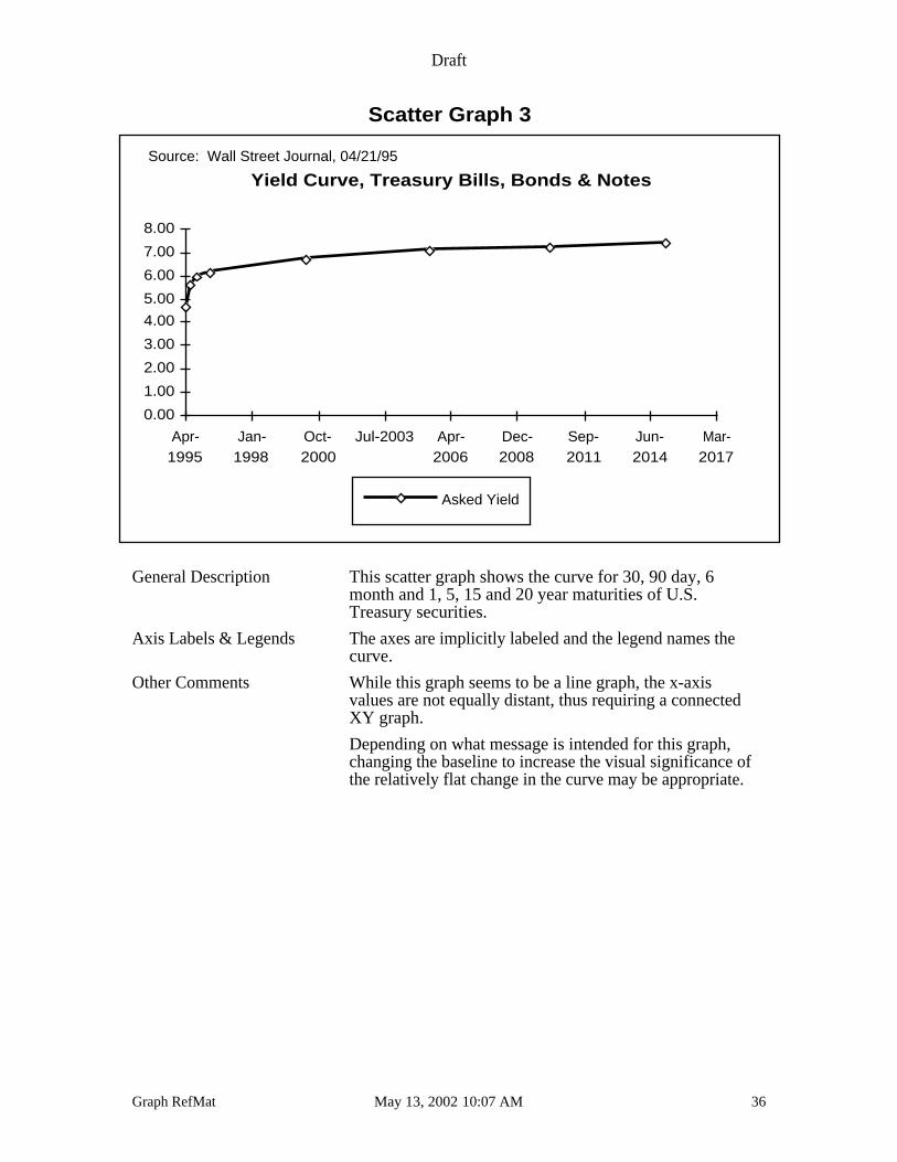
Yield Curve, Treasury Bills, Bonds & Notes
0.00
1.00
2.00
3.00
4.00
5.00
6.00
7.00
8.00
Apr-1995
Jan-1998
Oct-2000
Jul-2003 Apr-2006
Dec-2008
Sep-2011
Jun-2014
Mar-2017
Asked Yield
Source: Wall Street Journal, 04/21/95
General Description This scatter graph shows the curve for 30, 90 day, 6month and 1, 5, 15 and 20 year maturities of U.S.Treasury securities.
Axis Labels & Legends The axes are implicitly labeled and the legend names thecurve.
Other Comments While this graph seems to be a line graph, the x-axisvalues are not equally distant, thus requiring a connectedXY graph.
Depending on what message is intended for this graph,changing the baseline to increase the visual significance ofthe relatively flat change in the curve may be appropriate.
Draft
Graph RefMat May 13, 2002 10:07 AM 37
Combination Graphs
Definition
Combination graphs are presentations of data that use more than one type of graph formatin the same graph, such as line and column.
Purpose
Combination graphs are best used to dramatize the relationship between two variables.
While not fundamentally different from graphs we have discussed already, combinationgraphs can add a touch of visual flair that might otherwise be absent.
Usage
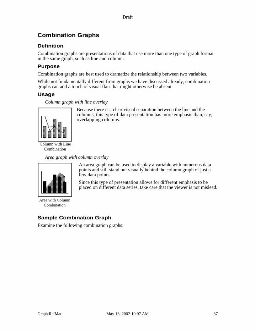
Column graph with line overlay
Because there is a clear visual separation between the line and thecolumns, this type of data presentation has more emphasis than, say,overlapping columns.
Area graph with column overlay
An area graph can be used to display a variable with numerous datapoints and still stand out visually behind the column graph of just afew data points.
Since this type of presentation allows for different emphasis to beplaced on different data series, take care that the viewer is not mislead.
Sample Combination Graph
Examine the following combination graphs:
Column with LineCombination
Area with ColumnCombination
Draft
Graph RefMat May 13, 2002 10:07 AM 38
Combination Graph 1
Health Care Costs Escalate
Although Total Employment
Declines Significantly
Fiscal Year
He
alth
Ca
re C
ost
s
in M
illio
ns
0.0
2.0
4.0
6.0
8.0
10.0
12.0
14.0
16.0
19
80
19
81
19
82
19
83
19
84
19
85
19
86
19
87
19
88
19
89
19
90
19
91
19
92
0
500
1,000
1,500
2,000
2,500
3,000
Em
plo
ym
en
t in
Th
ou
san
ds
School Cost Municipal Cost Total
Employment
Source: Budget Office, Newton, MA
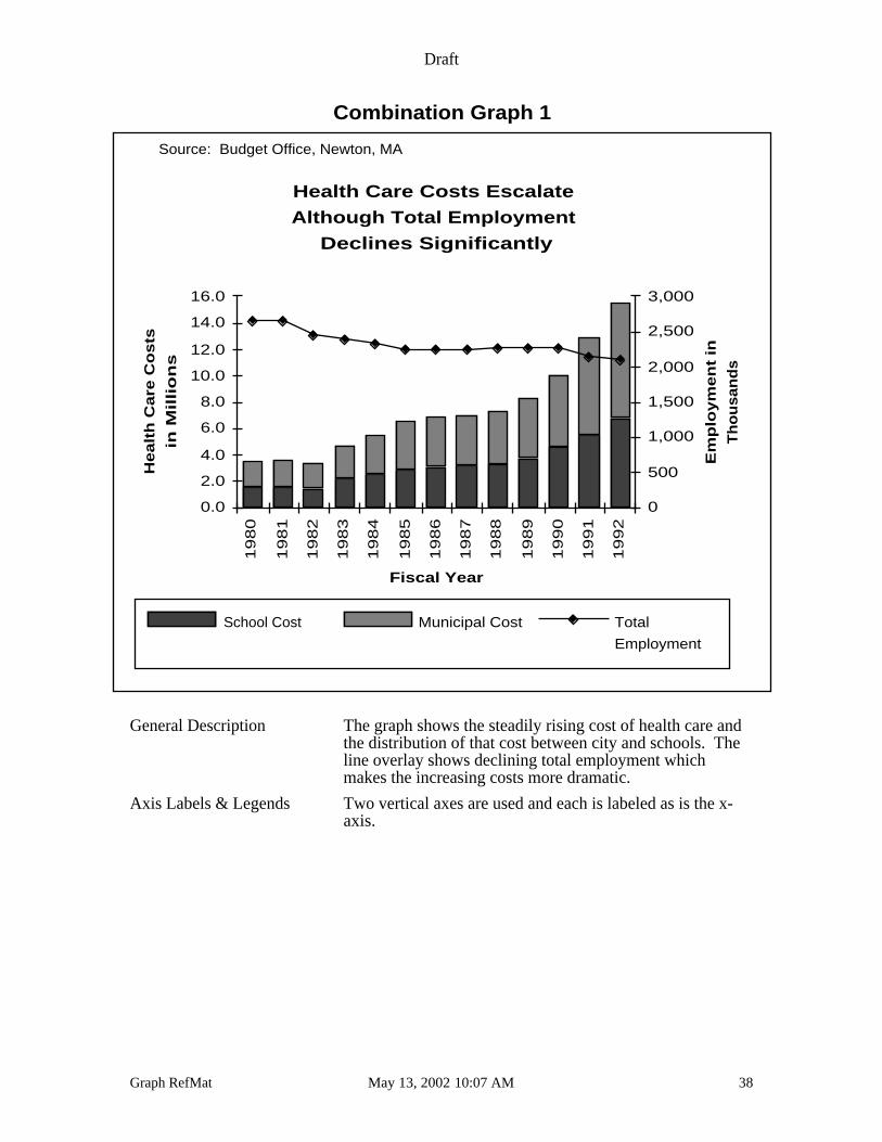
General Description The graph shows the steadily rising cost of health care andthe distribution of that cost between city and schools. Theline overlay shows declining total employment whichmakes the increasing costs more dramatic.
Axis Labels & Legends Two vertical axes are used and each is labeled as is the x-axis.
Draft
Graph RefMat May 13, 2002 10:07 AM 39
Combination Graph 2
Death Rates for Chronic Heart Disease, Actualand Expected, U.S., 1950-1990
0.0
50.0
100.0
150.0
200.0
250.0
300.0
19
50
19
55
19
60
19
65
19
70
19
75
19
80
19
85
19
90
Rate If Rise Continued
Actual Rate
Data from “Morbidity and Mortality 1992” Chart 3-19
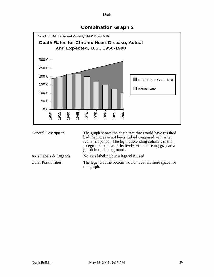
General Description The graph shows the death rate that would have resultedhad the increase not been curbed compared with whatreally happened. The light descending columns in theforeground contrast effectively with the rising gray areagraph in the background.
Axis Labels & Legends No axis labeling but a legend is used.
Other Possibilities The legend at the bottom would have left more space forthe graph.
Draft
Graph RefMat May 13, 2002 10:07 AM 40
Tables
Definition
A table is a rectangular array of data with descriptors in the first column and in the columnheadings.
Purpose
Tables best show:
• numerous precise data values
While tables are not graphs, their intimate relationship to graphs—as the source of graphsand as a widely used alternative to graphs—require their discussion here. Tables arewidely used; unfortunately, readable, well laid out tables are not.
Usage
Table of data
Tables should be constructed so that the text describing numbers is asclose as possible to the numbers themselves. Formatting should beused to distinguish descriptors from data.
Split table
For display purposes, it is often convenient to split a long table andprint multiple sets on the same page. In such situations, it is best to usea visual separator (in this case the vertical bar) to make this clear
As a general rule put effort into seeing that the table fits on a page with the same orientationas the main document; rotated pages discourage the reader unnecessarily. Generally, onedigit after the decimal point is adequate. Beware of a failure to add due to rounding and puta simple caveat in a discrete location.
Make your columns only as wide as needed to display the data clearly and center the tableon the page.
Sample Tables
Examine the following tables:
Basic Table
B
Split Table
Draft
Graph RefMat May 13, 2002 10:07 AM 41
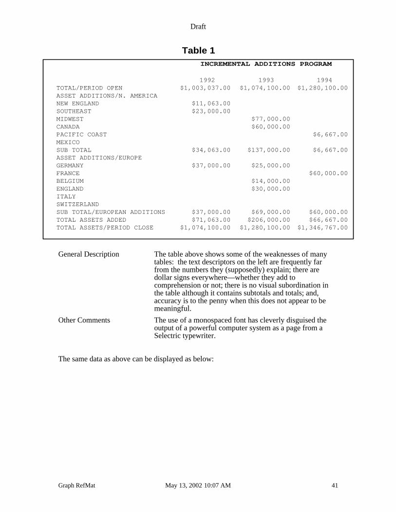
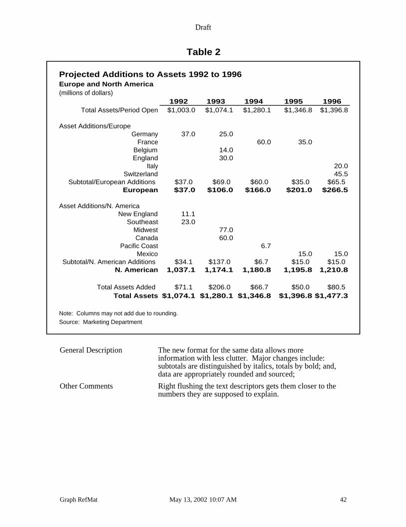
Table 1INCREMENTAL ADDITIONS PROGRAM
1992 1993 1994TOTAL/PERIOD OPEN $1,003,037.00 $1,074,100.00 $1,280,100.00ASSET ADDITIONS/N. AMERICANEW ENGLAND $11,063.00SOUTHEAST $23,000.00MIDWEST $77,000.00CANADA $60,000.00PACIFIC COAST $6,667.00MEXICOSUB TOTAL $34,063.00 $137,000.00 $6,667.00ASSET ADDITIONS/EUROPEGERMANY $37,000.00 $25,000.00FRANCE $60,000.00BELGIUM $14,000.00ENGLAND $30,000.00ITALYSWITZERLANDSUB TOTAL/EUROPEAN ADDITIONS $37,000.00 $69,000.00 $60,000.00TOTAL ASSETS ADDED $71,063.00 $206,000.00 $66,667.00TOTAL ASSETS/PERIOD CLOSE $1,074,100.00 $1,280,100.00 $1,346,767.00
General Description The table above shows some of the weaknesses of manytables: the text descriptors on the left are frequently farfrom the numbers they (supposedly) explain; there aredollar signs everywhere—whether they add tocomprehension or not; there is no visual subordination inthe table although it contains subtotals and totals; and,accuracy is to the penny when this does not appear to bemeaningful.
Other Comments The use of a monospaced font has cleverly disguised theoutput of a powerful computer system as a page from aSelectric typewriter.
The same data as above can be displayed as below:
Draft
Graph RefMat May 13, 2002 10:07 AM 42
Table 2
Projected Additions to Assets 1992 to 1996Europe and North America(millions of dollars)
1992 1993 1994 1995 1996Total Assets/Period Open $1,003.0 $1,074.1 $1,280.1 $1,346.8 $1,396.8
Asset Additions/EuropeGermany 37.0 25.0
France 60.0 35.0Belgium 14.0England 30.0
Italy 20.0Switzerland 45.5
Subtotal/European Additions $37.0 $69.0 $60.0 $35.0 $65.5European $37.0 $106.0 $166.0 $201.0 $266.5
Asset Additions/N. AmericaNew England 11.1
Southeast 23.0Midwest 77.0Canada 60.0
Pacific Coast 6.7Mexico 15.0 15.0
Subtotal/N. American Additions $34.1 $137.0 $6.7 $15.0 $15.0N. American 1,037.1 1,174.1 1,180.8 1,195.8 1,210.8
Total Assets Added $71.1 $206.0 $66.7 $50.0 $80.5Total Assets $1,074.1 $1,280.1 $1,346.8 $1,396.8 $1,477.3
Note: Columns may not add due to rounding.Source: Marketing Department
General Description The new format for the same data allows moreinformation with less clutter. Major changes include:subtotals are distinguished by italics, totals by bold; and,data are appropriately rounded and sourced;
Other Comments Right flushing the text descriptors gets them closer to thenumbers they are supposed to explain.
Draft
Graph RefMat May 13, 2002 10:07 AM 43
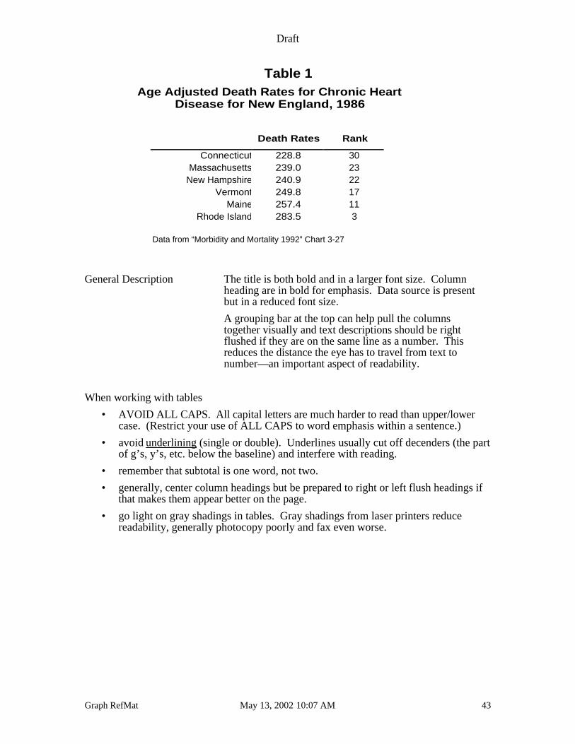
Table 1Age Adjusted Death Rates for Chronic Heart
Disease for New England, 1986
Death Rates Rank
Connecticut 228.8 30Massachusetts 239.0 23
New Hampshire 240.9 22Vermont 249.8 17
Maine 257.4 11Rhode Island 283.5 3
Data from “Morbidity and Mortality 1992” Chart 3-27
General Description The title is both bold and in a larger font size. Columnheading are in bold for emphasis. Data source is presentbut in a reduced font size.
A grouping bar at the top can help pull the columnstogether visually and text descriptions should be rightflushed if they are on the same line as a number. Thisreduces the distance the eye has to travel from text tonumber—an important aspect of readability.
When working with tables
• AVOID ALL CAPS. All capital letters are much harder to read than upper/lowercase. (Restrict your use of ALL CAPS to word emphasis within a sentence.)
• avoid underlining (single or double). Underlines usually cut off decenders (the partof g’s, y’s, etc. below the baseline) and interfere with reading.
• remember that subtotal is one word, not two.
• generally, center column headings but be prepared to right or left flush headings ifthat makes them appear better on the page.
• go light on gray shadings in tables. Gray shadings from laser printers reducereadability, generally photocopy poorly and fax even worse.
Draft
Graph RefMat May 13, 2002 10:07 AM 44
Decide the Appropriate Graph for Your Data
In choosing the right graph to convey a message, many more choices than we have shownare possible. Most are variations of what we have seen so you can easily deal with them ifyou know how to make the right basic choice. Since not all graphs are equally appropriatefor all messages, the Graphing Advice Matrix, presents some opinionated advice.
In studying the Graphing Advice Matrix, bear in mind that the two basic issues that willguide your choice of a graph are:
• what kind of data will be presented?
• what is to be said about it: what is the message?
Think about these questions as you view the Graphing Advice Matrix. If you are not sureof a particular choice, refer to the section that discusses that type of graph.
A Graph Is Only as Good as the Underlying Data
Never forget fundamentals: be sure the underlying data are accurate. This is very importantwhether you are forecasting sales tax collections or estimating tipping fee charges for theremainder of the fiscal year.
While this is not the place for an in-depth discussion of the handling of data series, thereare three rules that are relevant to all students of forecasting and estimation. Every dataseries should be studied carefully for the effects of:
• changes in rate
• changes in base
• anomalous events.
In addition, always use fundamental data series, whenever possible.
When a rate is an integral component of the events resulting in a data series, any changes inthe rate will play havoc with the data series. Such changes must be “factored out” by somespecial effort. When examining a data series of sales tax collections, any change in thesales tax rate will alter collections significantly. If such a series is to be used to forecastfuture collections, the effects of rate change must be removed. Here, using sales instead ofsales tax collections will resolve the problem. Sales are a more fundamental variable thancollections.
Similar comments apply to time series of property tax collection, where property values aremore fundamental, and to many other series useful in government budget forecasting.
To continue the sales tax collection analogy, a change in base would occur if there had beenan annexation resulting in the sudden inclusion of new sales tax paying businesses or if thesales tax were extended to include new items that had previously been excluded. Forexample, including food as a taxable item (when it had not been so before) would be achange in base. Of any data series, always ask if there has been a change in base ithappens more often than is commonly realized.
Draft
Graph RefMat May 13, 2002 10:07 AM 45
An anomalous event can significantly skew a data series. The Olympic games probablysignificantly altered sales tax collections for certain southern California communities butincluding those data in projections would not seem appropriate. Ask about major eventsconcerning whatever data series you are studying and remove their impact from the dataseries. Floods, currency devaluations, and Papal visits should all be regarded asanomalous events.
As a final piece of advice always try to use fundamental data, sometimes called underlyingdata, whenever possible. A data series is more fundamental than another data serieswhenever the first series determines the second. For example, sales tax collections are theproduct of taxable sales times the tax rate, so taxable sales is more fundamental than salestax collections. Such an approach can reduce the change in rate problem but will notgenerally reduce the effects of base changes and anomalous events.
Draft
Graph RefMat May 13, 2002 10:07 AM 46
Some Additional Graphs and Visuals
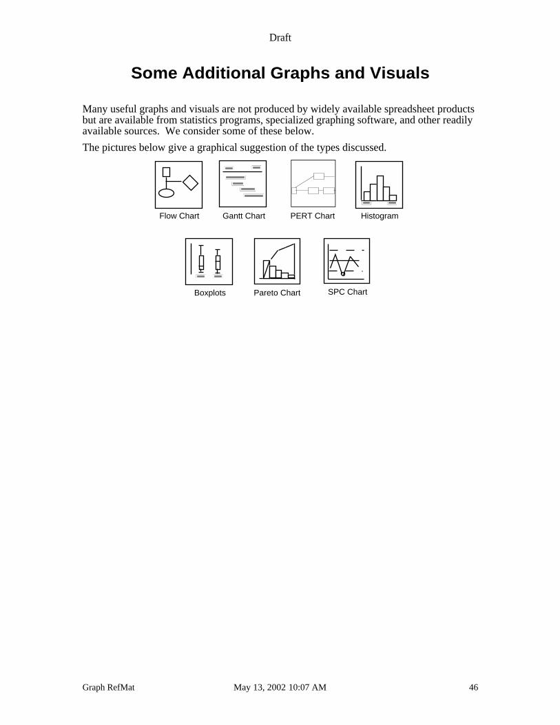
Many useful graphs and visuals are not produced by widely available spreadsheet productsbut are available from statistics programs, specialized graphing software, and other readilyavailable sources. We consider some of these below.
The pictures below give a graphical suggestion of the types discussed.
Flow Chart Gantt Chart PERT Chart Histogram
Boxplots Pareto Chart SPC Chart
Draft
Graph RefMat May 13, 2002 10:07 AM 47
Flow Chart
Definition
A flow chart is a schematic representation of the steps in a process.
Purpose
Flow charts are useful to document how a process should work. By noting inputs, outputs,and decision points a flow chart can provide useful visual documentation.
Usage
Describing the steps of a process
Flow charts describe how various steps in a process are related to eachother and where decisions are made. They can be used to documentsoftware, describe the flow of bill payments, plan a new paper flowscheme and to detect possible flaws in existing processes.
Problem Solving Flow Chart
Don't mess with it!
Yes
No
No
No
No
No
Yes
Yes
Yes
Yes
Yes
Does the darn thing
work?
You idiot!
Does anyone know?
You poor fool!
Can you blame
somebody else?
No problem!
Will you be blamed?
Did you mess with it?
Hide it!
Throw it away!
Flow Chart
Draft
Graph RefMat May 13, 2002 10:07 AM 48
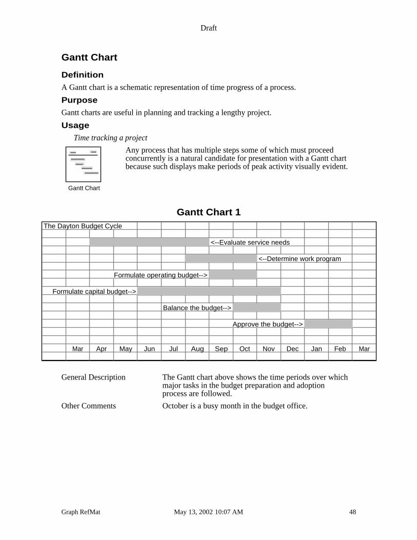
Gantt Chart
Definition
A Gantt chart is a schematic representation of time progress of a process.
Purpose
Gantt charts are useful in planning and tracking a lengthy project.
Usage
Time tracking a project
Any process that has multiple steps some of which must proceedconcurrently is a natural candidate for presentation with a Gantt chartbecause such displays make periods of peak activity visually evident.
Gantt Chart 1The Dayton Budget Cycle
<--Evaluate service needs
<--Determine work program
Formulate operating budget-->
Formulate capital budget-->
Balance the budget-->
Approve the budget-->
Mar Apr May Jun Jul Aug Sep Oct Nov Dec Jan Feb Mar
General Description The Gantt chart above shows the time periods over whichmajor tasks in the budget preparation and adoptionprocess are followed.
Other Comments October is a busy month in the budget office.
Gantt Chart
Draft
Graph RefMat May 13, 2002 10:07 AM 49
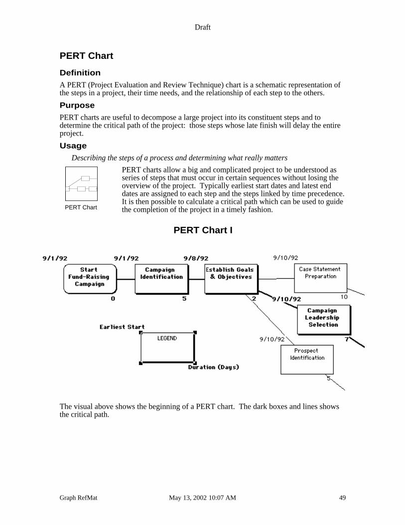
PERT Chart
Definition
A PERT (Project Evaluation and Review Technique) chart is a schematic representation ofthe steps in a project, their time needs, and the relationship of each step to the others.
Purpose
PERT charts are useful to decompose a large project into its constituent steps and todetermine the critical path of the project: those steps whose late finish will delay the entireproject.
Usage
Describing the steps of a process and determining what really matters
PERT charts allow a big and complicated project to be understood asseries of steps that must occur in certain sequences without losing theoverview of the project. Typically earliest start dates and latest enddates are assigned to each step and the steps linked by time precedence.It is then possible to calculate a critical path which can be used to guidethe completion of the project in a timely fashion.
PERT Chart I
The visual above shows the beginning of a PERT chart. The dark boxes and lines showsthe critical path.
PERT Chart
Draft
Graph RefMat May 13, 2002 10:07 AM 50
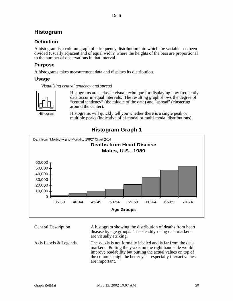
Histogram
Definition
A histogram is a column graph of a frequency distribution into which the variable has beendivided (usually adjacent and of equal width) where the heights of the bars are proportionalto the number of observations in that interval.
Purpose
A histograms takes measurement data and displays its distribution.
Usage
Visualizing central tendency and spread
Histograms are a classic visual technique for displaying how frequentlydata occur in equal intervals. The resulting graph shows the degree of“central tendency” (the middle of the data) and “spread” (clusteringaround the center).
Histograms will quickly tell you whether there is a single peak ormultiple peaks (indicative of bi-modal or multi-modal distributions).
Histogram Graph 1
Deaths from Heart DiseaseMales, U.S., 1989
Age Groups
0
10,000
20,000
30,000
40,000
50,000
60,000
35-39 40-44 45-49 50-54 55-59 60-64 65-69 70-74
Data from “Morbidity and Mortality 1992” Chart 2-14
General Description A histogram showing the distribution of deaths from heartdisease by age groups. The steadily rising data markersare visually striking.
Axis Labels & Legends The y-axis is not formally labeled and is far from the datamarkers. Putting the y-axis on the right hand side wouldimprove readability but putting the actual values on top ofthe columns might be better yet—especially if exact valuesare important.
Histogram
Draft
Graph RefMat May 13, 2002 10:07 AM 51
Other Possibilities It would be possible to create this graph with spacesbetween the columns but since the distribution along thex-axis is continuous, the use of histogram is moreappropriate.
Comments The data show a significant “skew” to the left.
Draft
Graph RefMat May 13, 2002 10:07 AM 52
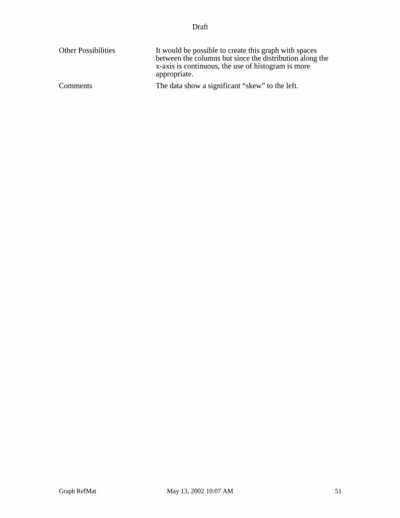
Box and Whisker Plots
Definition
A box and whisker plot displays the 10th, 25th, 50th, 75th, and 90th percentiles of avariable.
Purpose
Box and whisker plots display variation around the median of a group of data.
Usage
Displaying variation around the median
Box plots are similar to histograms in that they display both centraltendency and spread in data but they have the advantage that they candisplay this information for several data sets simultaneously.
The “box” is reserved for the 25th to 75th percentile data, the lines(whiskers) are the largest and smallest data values within 1.5 boxlengths, circles designate outliers, asterisks show extreme values.
Box Plot 1
Salary Distributions
Boxplots
Draft
Graph RefMat May 13, 2002 10:07 AM 53
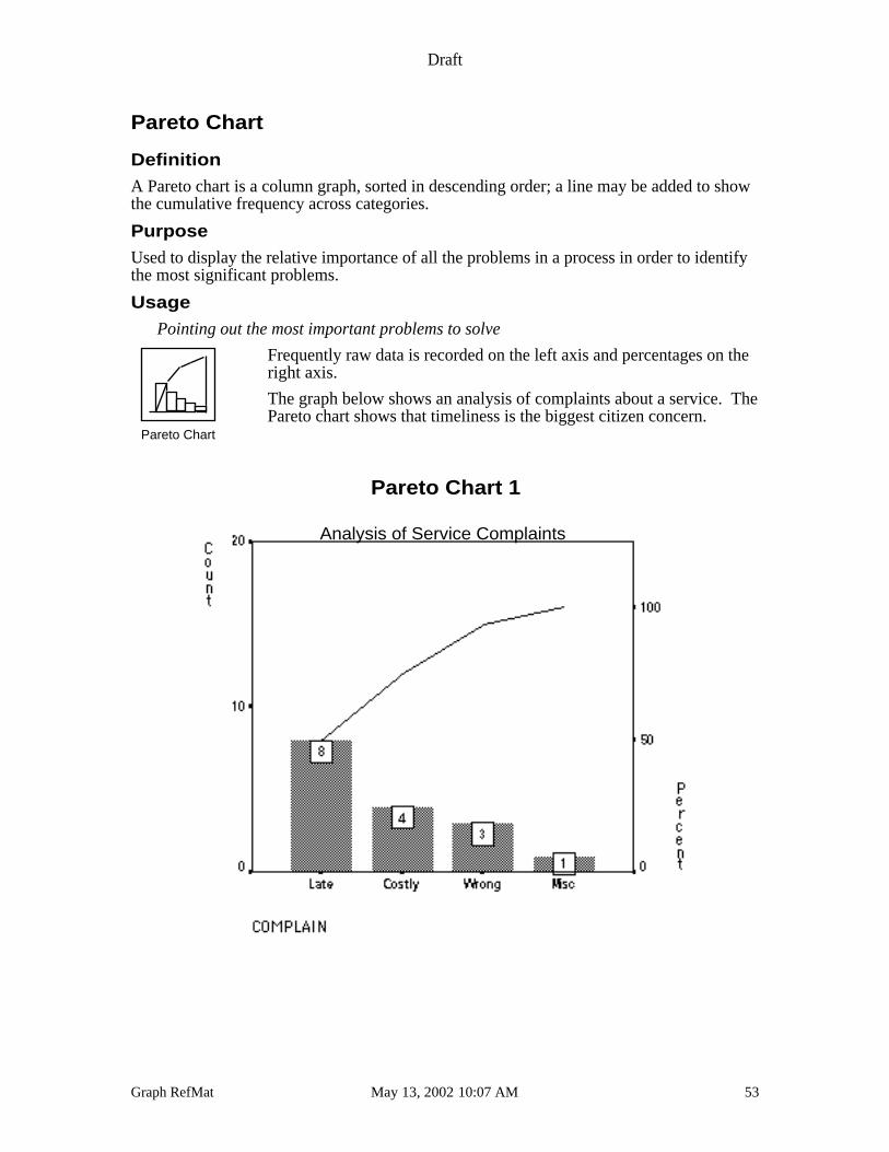
Pareto Chart
Definition
A Pareto chart is a column graph, sorted in descending order; a line may be added to showthe cumulative frequency across categories.
Purpose
Used to display the relative importance of all the problems in a process in order to identifythe most significant problems.
Usage
Pointing out the most important problems to solve
Frequently raw data is recorded on the left axis and percentages on theright axis.
The graph below shows an analysis of complaints about a service. ThePareto chart shows that timeliness is the biggest citizen concern.
Pareto Chart 1
Analysis of Service Complaints
Pareto Chart
Draft
Graph RefMat May 13, 2002 10:07 AM 54
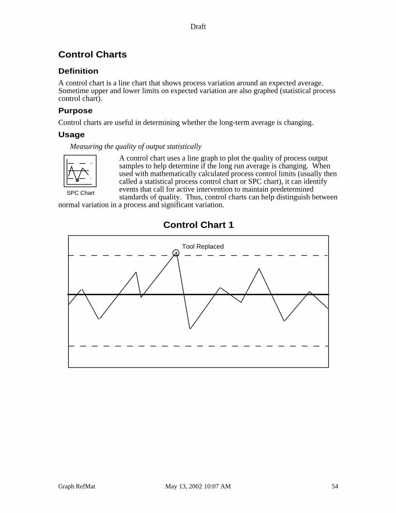
Control Charts
Definition
A control chart is a line chart that shows process variation around an expected average.Sometime upper and lower limits on expected variation are also graphed (statistical processcontrol chart).
Purpose
Control charts are useful in determining whether the long-term average is changing.
Usage
Measuring the quality of output statistically
A control chart uses a line graph to plot the quality of process outputsamples to help determine if the long run average is changing. Whenused with mathematically calculated process control limits (usually thencalled a statistical process control chart or SPC chart), it can identifyevents that call for active intervention to maintain predeterminedstandards of quality. Thus, control charts can help distinguish between
normal variation in a process and significant variation.
Control Chart 1
Tool Replaced
SPC Chart

Draft
Graph RefMat May 13, 2002 10:07 AM 55
Design Issues
When putting together the elements that will make up an overhead, a slide, or a full pagegraphic, there are some classic ideas that should be used.
Plan Your Page, Transparency or Slide
A reader first perceives a page as a whole, so plan visual harmony among the elements onyour page. Emphasize balance but not symmetry. Use small object to balance large onesalong an axis of the page. Don’t be afraid of white space. Think of white space as atechnique to be used to draw attention to the ink on the page. Because the eye finds nonatural way to define parts of a perfectly symmetrical page, such layouts are visuallyboring.
Balance Symmetry
When presenting a graph prepared on clear acetate, consider adding focus and emphasis byusing a washable red magic maker to high-light the important trend or hatch the significantslice. This will add a little variation to your presentation as well.
Since ALL graphs should have
• a title
• data series labels (descriptors)
• a source for the data
• an interpretation
there is little discussion below of these important facets of a complete graph.
In the examples that follow we note that although a legend is the “traditional” way to labeldata series, those graphs with descriptors close to the lines or pie slices, are usually easierto read since the eye requires less backward and forward movement. When possible, youshould place descriptors similarly rather than using a legend.
Consider the two graphs below. Note how the graph on the right lacks every otherhorizontal ruling. If the reader were interested in estimating the amount of the increase inmils per ton-mile, which graph is the better choice? The financial report on which thesegraphs are based used the graph on the right.
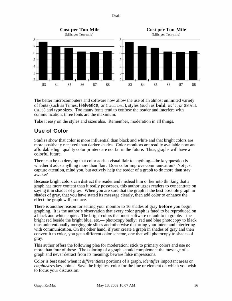
Draft
Graph RefMat May 13, 2002 10:07 AM 56
2
3
4
5
6
7
8
83 84 85 86 87 88
Cost per Ton-Mile(Mils per Ton-mile)
2
3
4
5
6
7
8
83 84 85 86 87 88
Cost per Ton-Mile(Mils per Ton-mile)
The better microcomputers and software now allow the use of an almost unlimited varietyof fonts (such as Times, Helvetica, or Courier ), styles (such as bold, italic, or SMALLCAPS) and type sizes. Too many fonts tend to confuse the reader and interfere withcommunication; three fonts are the maximum.
Take it easy on the styles and sizes also. Remember, moderation in all things.
Use of Color
Studies show that color is more influential than black and white and that bright colors aremore positively received than darker shades. Color monitors are readily available now andaffordable high quality color printers are not far in the future. Thus, graphs will have acolorful future.
There can be no denying that color adds a visual flair to anything—the key question iswhether it adds anything more than flair. Does color improve communication? Not justcapture attention, mind you, but actively help the reader of a graph to do more than stayawake?
Because bright colors can distract the reader and mislead him or her into thinking that agraph has more content than it really possesses, this author urges readers to concentrate onsaying it in shades of gray. When you are sure that the graph is the best possible graph inshades of gray, that you have stated its message clearly, then add color to enhance theeffect the graph will produce.
There is another reason for setting your monitor to 16 shades of gray before you begingraphing. It is the author’s observation that every color graph is fated to be reproduced ona black and white copier. The bright colors that most software default to in graphs—thebright red beside the bright blue, etc.— photocopy badly: red and blue photocopy to blackthus unintentionally merging pie slices and otherwise distorting your intent and interferingwith communication. On the other hand, if your create a graph in shades of gray and thenconvert it to color, you get a different color scheme, one that will photocopy to shades ofgray.
This author offers the following plea for moderation: stick to primary colors and use nomore than four of these. The coloring of a graph should complement the message of agraph and never detract from its meaning: beware false impressions.
Color is best used when it differentiates portions of a graph, identifies important areas oremphasizes key points. Save the brightest color for the line or element on which you wishto focus your discussion.
Draft
Graph RefMat May 13, 2002 10:07 AM 57
In general, avoid close encounters of the full spectrum kind.
Three-Dimensional (3-D) Graphs
Another issue of this type is the use of three-dimensional effects to heighten the impact ofthe graph. Like color, three dimensional graphs add visual flair. When the data series istwo dimensional (such as population changing over time), a third dimension adds only glitzto the graph but not to the substance. This is acceptable if you do not obscure the meaning.
When the data series is three dimensional (such as a graph of income by educationalattainment and age) does anyone who is NOT AN EXPERT at reading graphs reallyunderstand it? Just because a graph looks like a schematic of an aerial shot of mid-townManhattan, does not mean that anyone can really comprehend what you want tocommunicate. Yet, when the audience has the background to understand a more involvedthan usual graph—perhaps because the format of the graph has been in use for some timeand the same audience views it—complicated formats can contribute to understanding.
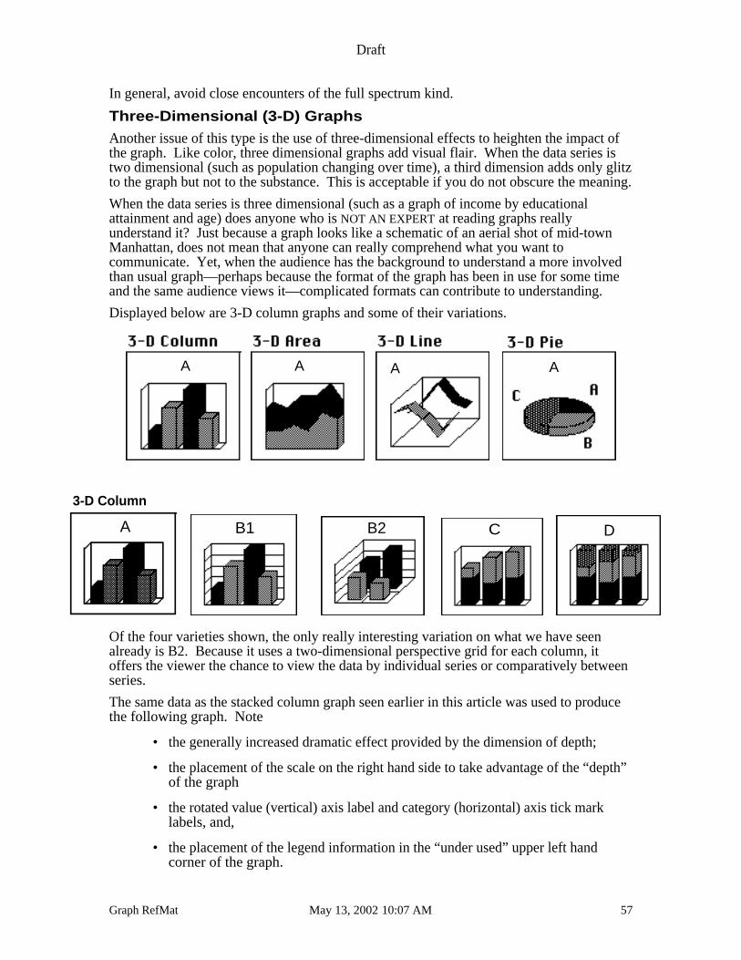
Displayed below are 3-D column graphs and some of their variations.
A A A A
3-D Column
A B1 B2 C D
Of the four varieties shown, the only really interesting variation on what we have seenalready is B2. Because it uses a two-dimensional perspective grid for each column, itoffers the viewer the chance to view the data by individual series or comparatively betweenseries.
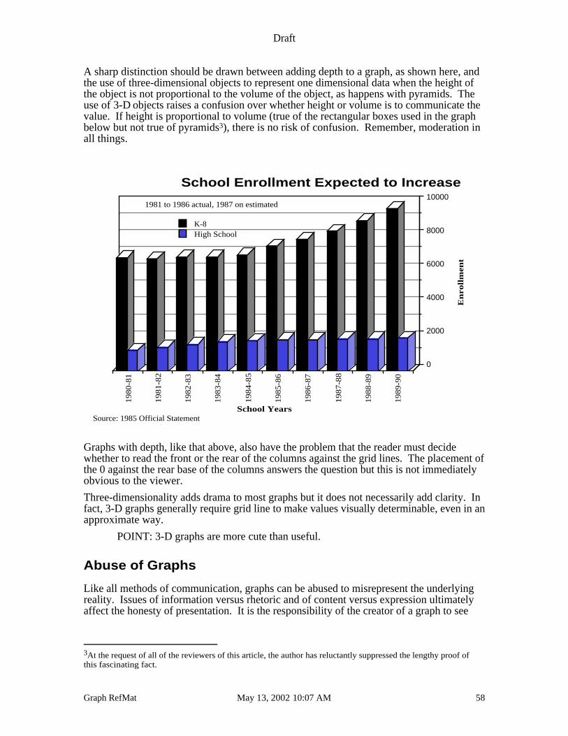
The same data as the stacked column graph seen earlier in this article was used to producethe following graph. Note
• the generally increased dramatic effect provided by the dimension of depth;
• the placement of the scale on the right hand side to take advantage of the “depth”of the graph
• the rotated value (vertical) axis label and category (horizontal) axis tick marklabels, and,
• the placement of the legend information in the “under used” upper left handcorner of the graph.
Draft
Graph RefMat May 13, 2002 10:07 AM 58
A sharp distinction should be drawn between adding depth to a graph, as shown here, andthe use of three-dimensional objects to represent one dimensional data when the height ofthe object is not proportional to the volume of the object, as happens with pyramids. Theuse of 3-D objects raises a confusion over whether height or volume is to communicate thevalue. If height is proportional to volume (true of the rectangular boxes used in the graphbelow but not true of pyramids3), there is no risk of confusion. Remember, moderation inall things.
�
19
80
-81
19
81
-82
19
82
-83
19
83
-84
19
84
-85
19
85
-86
19
86
-87
19
87
-88
19
88
-89
19
89
-90
0
2000
4000
6000
8000
10000
K-8High School
School Enrollment Expected to Increase
School Years
En
rollm
en
t
1981 to 1986 actual, 1987 on estimated
Source: 1985 Official Statement
Graphs with depth, like that above, also have the problem that the reader must decidewhether to read the front or the rear of the columns against the grid lines. The placement ofthe 0 against the rear base of the columns answers the question but this is not immediatelyobvious to the viewer.
Three-dimensionality adds drama to most graphs but it does not necessarily add clarity. Infact, 3-D graphs generally require grid line to make values visually determinable, even in anapproximate way.
POINT: 3-D graphs are more cute than useful.
Abuse of Graphs
Like all methods of communication, graphs can be abused to misrepresent the underlyingreality. Issues of information versus rhetoric and of content versus expression ultimatelyaffect the honesty of presentation. It is the responsibility of the creator of a graph to see
3At the request of all of the reviewers of this article, the author has reluctantly suppressed the lengthy proof ofthis fascinating fact.
Draft
Graph RefMat May 13, 2002 10:07 AM 59
that the presentation of the information is honest and fair. At a minimum, there are severalpractices that should be avoided since they tend to misrepresent data.
Probably the single greatest abuse in the use of graphs is the refusal to interpret the graph:the failure to provide a narrative explanation under the graph. If decoration is the desiredeffect, use clip art, not graphs. Every graph should have an explanation. If you don’tknow what the graph says, then eliminate it. Unneeded graphs, like unneeded words, onlyconfuse the issue.
More serious is when a graph misleads the reader by misrepresenting the underlying factsof the situation. Make sure that
• the data agree with its graphical representation
• no relevant data are omitted
• the meaning of data is the same to the preparer and the user.
As a rule, assume users have minimal knowledge of graphs unless you have activeinformation to the contrary.
On the second point, relevant data include clearly displaying which data points are actual,which are estimated and which are projected. Consider a break in space between actual andestimated or use continuous lines for actual data and dashed lines for projected. A viewerwho is looking at a data set should be able to estimate visually what fraction of the graph isan estimate.
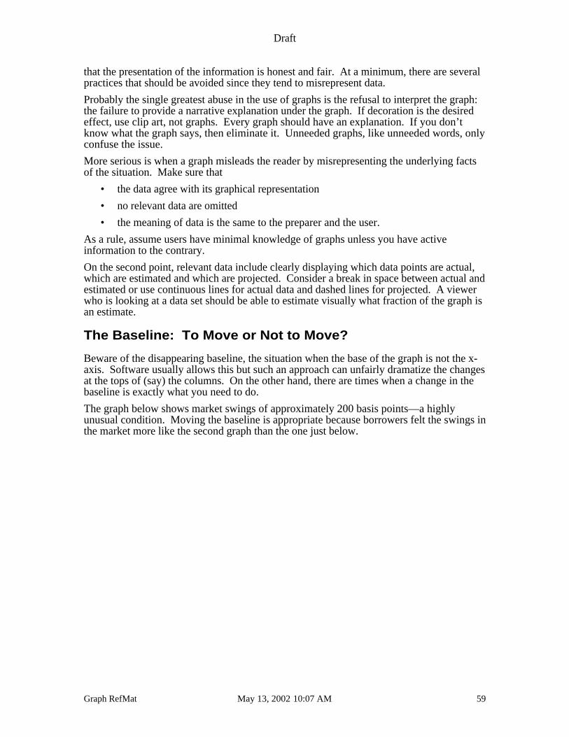
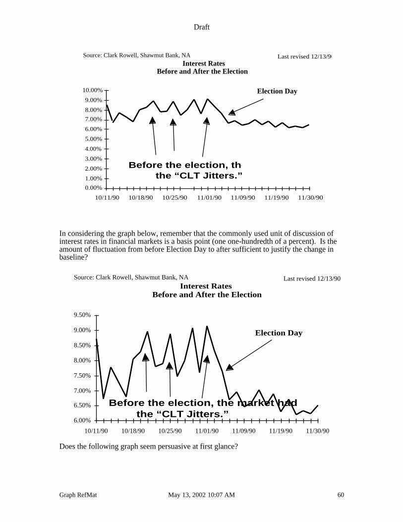
The Baseline: To Move or Not to Move?
Beware of the disappearing baseline, the situation when the base of the graph is not the x-axis. Software usually allows this but such an approach can unfairly dramatize the changesat the tops of (say) the columns. On the other hand, there are times when a change in thebaseline is exactly what you need to do.
The graph below shows market swings of approximately 200 basis points—a highlyunusual condition. Moving the baseline is appropriate because borrowers felt the swings inthe market more like the second graph than the one just below.
Draft
Graph RefMat May 13, 2002 10:07 AM 60
0.00%
1.00%
2.00%
3.00%
4.00%
5.00%
6.00%
7.00%
8.00%
9.00%
10.00%
10/11/90 10/18/90 10/25/90 11/01/90 11/09/90 11/19/90 11/30/90
Interest Rates Before and After the Election
Before the election, the market had the “CLT Jitters.”
Source: Clark Rowell, Shawmut Bank, NA Last revised 12/13/90
Election Day
In considering the graph below, remember that the commonly used unit of discussion ofinterest rates in financial markets is a basis point (one one-hundredth of a percent). Is theamount of fluctuation from before Election Day to after sufficient to justify the change inbaseline?
6.00%
6.50%
7.00%
7.50%
8.00%
8.50%
9.00%
9.50%
10/11/90 10/18/90 10/25/90 11/01/90 11/09/90 11/19/90 11/30/90
Interest Rates Before and After the Election
Before the election, the market had the “CLT Jitters.”
Source: Clark Rowell, Shawmut Bank, NA Last revised 12/13/90
Election Day
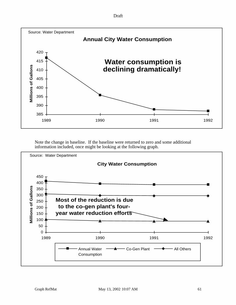
Does the following graph seem persuasive at first glance?
Draft
Graph RefMat May 13, 2002 10:07 AM 61
Annual City Water Consumption
Mill
ion
s o
f G
allo
ns
385
390
395
400
405
410
415
420
1989 1990 1991 1992
Water consumption isdeclining dramatically!
Source: Water Department
Note the change in baseline. If the baseline were returned to zero and some additionalinformation included, once might be looking at the following graph.
City Water Consumption
Mill
ion
s o
f G
allo
ns
0
50
100
150
200
250
300
350
400
450
1989 1990 1991 1992
Annual WaterConsumption
Co-Gen Plant All Others
Most of the reduction is dueto the co-gen plant's four-
year water reduction efforts
Source: Water Department
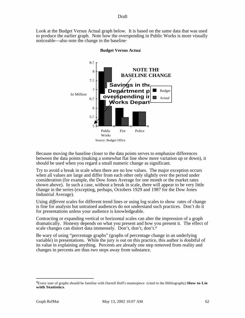
Draft
Graph RefMat May 13, 2002 10:07 AM 62
Look at the Budget Versus Actual graph below. It is based on the same data that was usedto produce the earlier graph. Note how the overspending in Public Works is more visuallynoticeable—also note the change in the baseline.
5
5.5
6
6.5
7
7.5
8
8.5
PublicWorks
Fire Police
Budget
Actual
Budget Versus Actual
In Millions
Source: Budget Office
.
NOTE THEBASELINE CHANGE!
Savings in the FireDepartment paid for
overspending in the PublicWorks Department
Because moving the baseline closer to the data points serves to emphasize differencesbetween the data points (making a somewhat flat line show more variation up or down), itshould be used when you regard a small numeric change as significant.
Try to avoid a break in scale when there are no low values. The major exception occurswhen all values are large and differ from each other only slightly over the period underconsideration (for example, the Dow Jones Average for one month or the market ratesshown above). In such a case, without a break in scale, there will appear to be very littlechange in the series (excepting, perhaps, Octobers 1929 and 1987 for the Dow JonesIndustrial Average).
Using different scales for different trend lines or using log scales to show rates of changeis fine for analysis but untrained audiences do not understand such practices. Don’t do itfor presentations unless your audience is knowledgeable.
Contracting or expanding vertical or horizontal scales can alter the impression of a graphdramatically. Honesty depends on what you present and how you present it. The effect ofscale changes can distort data immensely. Don’t, don’t, don’t.4
Be wary of using “percentage graphs” (graphs of percentage change in an underlyingvariable) in presentations. While the jury is out on this practice, this author is doubtful ofits value in explaining anything. Percents are already one step removed from reality andchanges in percents are thus two steps away from substance.
4Every user of graphs should be familiar with Darrell Huff's masterpiece (cited in the Bibliography) How to Liewith Statistics.
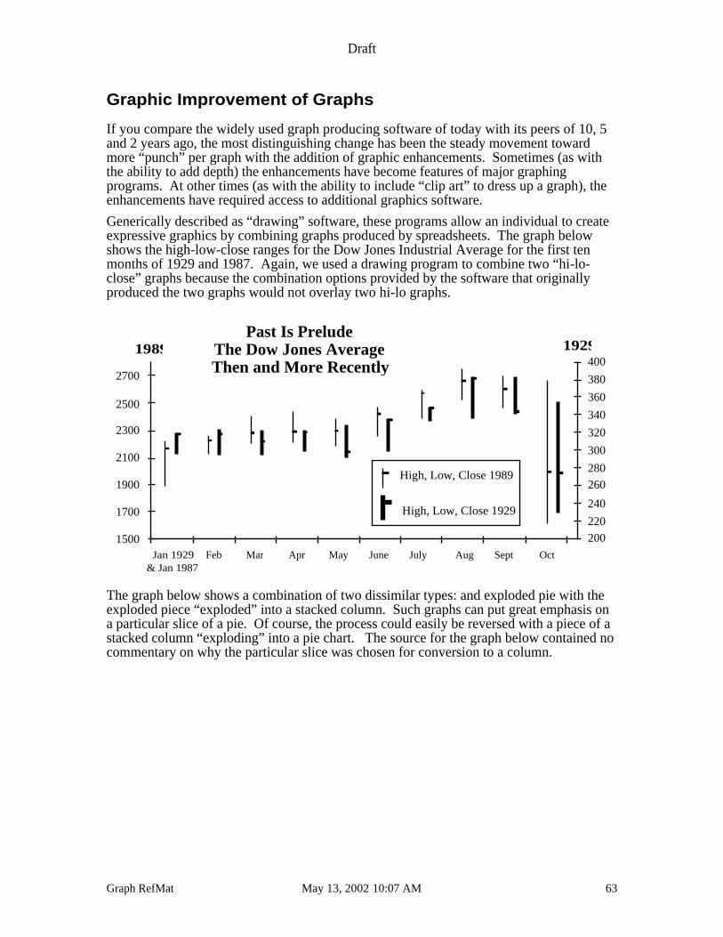
Draft
Graph RefMat May 13, 2002 10:07 AM 63
Graphic Improvement of Graphs
If you compare the widely used graph producing software of today with its peers of 10, 5and 2 years ago, the most distinguishing change has been the steady movement towardmore “punch” per graph with the addition of graphic enhancements. Sometimes (as withthe ability to add depth) the enhancements have become features of major graphingprograms. At other times (as with the ability to include “clip art” to dress up a graph), theenhancements have required access to additional graphics software.
Generically described as “drawing” software, these programs allow an individual to createexpressive graphics by combining graphs produced by spreadsheets. The graph belowshows the high-low-close ranges for the Dow Jones Industrial Average for the first tenmonths of 1929 and 1987. Again, we used a drawing program to combine two “hi-lo-close” graphs because the combination options provided by the software that originallyproduced the two graphs would not overlay two hi-lo graphs.
200
220
240
260
280
300
320
340
360
380
400
High, Low, Close 1989
High, Low, Close 1929
1500
1700
1900
2100
2300
2500
2700
Jan 1929& Jan 1987
Feb Mar Apr May June July Aug Sept Oct
Past Is PreludeThe Dow Jones AverageThen and More Recently
19291989
The graph below shows a combination of two dissimilar types: and exploded pie with theexploded piece “exploded” into a stacked column. Such graphs can put great emphasis ona particular slice of a pie. Of course, the process could easily be reversed with a piece of astacked column “exploding” into a pie chart. The source for the graph below contained nocommentary on why the particular slice was chosen for conversion to a column.
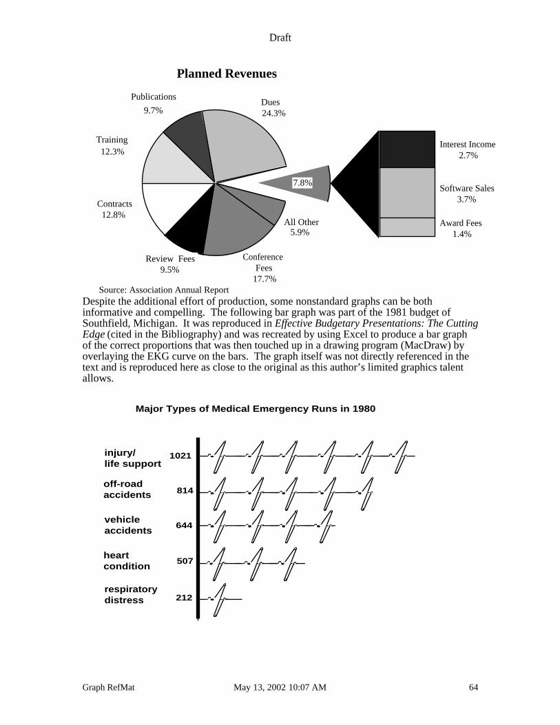
Draft
Graph RefMat May 13, 2002 10:07 AM 64
Interest Income2.7%
Software Sales3.7%
Award Fees1.4%
Planned Revenues
12.8%
12.3%
9.7% 24.3%
17.7%9.5%
7.8%
Review Fees
Contracts
Training
PublicationsDues
5.9%All Other
ConferenceFees
Source: Association Annual ReportDespite the additional effort of production, some nonstandard graphs can be bothinformative and compelling. The following bar graph was part of the 1981 budget ofSouthfield, Michigan. It was reproduced in Effective Budgetary Presentations: The CuttingEdge (cited in the Bibliography) and was recreated by using Excel to produce a bar graphof the correct proportions that was then touched up in a drawing program (MacDraw) byoverlaying the EKG curve on the bars. The graph itself was not directly referenced in thetext and is reproduced here as close to the original as this author’s limited graphics talentallows.
respiratory distress
heart condition
vehicle accidents
off-road accidents
injury/life support
1021
814
644
507
212
Major Types of Medical Emergency Runs in 1980
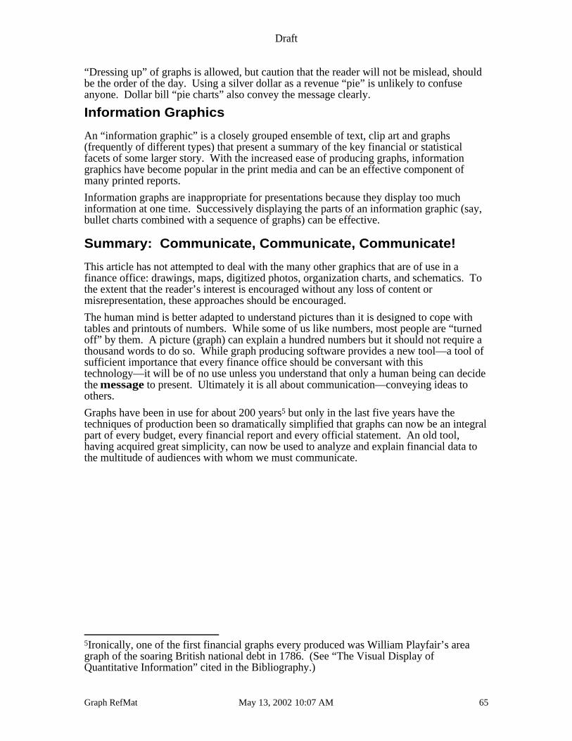
Draft
Graph RefMat May 13, 2002 10:07 AM 65
“Dressing up” of graphs is allowed, but caution that the reader will not be mislead, shouldbe the order of the day. Using a silver dollar as a revenue “pie” is unlikely to confuseanyone. Dollar bill “pie charts” also convey the message clearly.
Information Graphics
An “information graphic” is a closely grouped ensemble of text, clip art and graphs(frequently of different types) that present a summary of the key financial or statisticalfacets of some larger story. With the increased ease of producing graphs, informationgraphics have become popular in the print media and can be an effective component ofmany printed reports.
Information graphs are inappropriate for presentations because they display too muchinformation at one time. Successively displaying the parts of an information graphic (say,bullet charts combined with a sequence of graphs) can be effective.
Summary: Communicate, Communicate, Communicate!
This article has not attempted to deal with the many other graphics that are of use in afinance office: drawings, maps, digitized photos, organization charts, and schematics. Tothe extent that the reader’s interest is encouraged without any loss of content ormisrepresentation, these approaches should be encouraged.
The human mind is better adapted to understand pictures than it is designed to cope withtables and printouts of numbers. While some of us like numbers, most people are “turnedoff” by them. A picture (graph) can explain a hundred numbers but it should not require athousand words to do so. While graph producing software provides a new tool—a tool ofsufficient importance that every finance office should be conversant with thistechnology—it will be of no use unless you understand that only a human being can decidethe message to present. Ultimately it is all about communication—conveying ideas toothers.
Graphs have been in use for about 200 years5 but only in the last five years have thetechniques of production been so dramatically simplified that graphs can now be an integralpart of every budget, every financial report and every official statement. An old tool,having acquired great simplicity, can now be used to analyze and explain financial data tothe multitude of audiences with whom we must communicate.
5Ironically, one of the first financial graphs every produced was William Playfair’s areagraph of the soaring British national debt in 1786. (See “The Visual Display ofQuantitative Information” cited in the Bibliography.)
Draft
Graph RefMat May 13, 2002 10:07 AM 66
A Sometimes Annotated Bibliography
Alexander, Michael. “Mac Charting Tools.” MacWorld . January 1988.
An excellent if very brief introduction to Excel graphics. Contains much sensible advice forthe beginner and the expert alike.
Anderson, Anker V. Graphing Financial Information . New York, NY: National Association ofAccountants, 1983.
Brief, concise, and to the point, this overview of the use of graphs is a thoughtful articulationof good graphing practices.
Gray, Jack and Johnston, Kenneth S. Accounting and Management Action (Second Edition). NewYork, NY: McGraw-Hill Book Company, 1973.
Your basic accounting text.
Huff, Darrell. How to Lie With Statistics. New York, NY: W. W. Norton & Company. 1954.
The all-time classic that discusses the misrepresentation of data. Essential for all who areserious about understanding the honest presentation of numerical (statistical) data.
Johnson, Johnny R., Richard R. Rice, and Roger A. Roemmich. “Pictures that Lie: The Abuse of Graphsin Annual Reports.” Management Accounting. October 1980.
Long, Rick. “Presentation Graphics.” Infoworld . September 21, 1987.
A comparative analysis of six business-oriented software packages for the PC (HarvardGraphics, Energraphics, VP Graphics, Windows Graph, and Picture Perfect). Other packagesmentioned in side bars.
Miller, Girard, Ed. Effective Budgetary Presentations: The Cutting Edge. Chicago, IL:Government Finance Officers Association. May 1982.
While not about graphs, per se, this book reproduces many examples of graphical technique notlimited to the formats discussed here.
Nelson, Stephen L. “Communicating Financial Ratios Graphically.” Lotus. September 1987.
Discusses using Lotus 1-2-3 for the graphical presentation of standard business ratios (liquidityratio, for example).
Paller, Alan, Kathryn Szoka, and Nan Nelson. Choosing the Right Chart. Washington, DC:ISSCO Graphics. 1981.
Schmid, Calvin F. and Stanton E. Schmid. Handbook of Graphic Presentation, 2nd Edition.New York, NY: Ronald Press. 1979.
Tufte, Edward R. The Visual Display of Quantitative Information. Cheshire, CT: GraphicsPress. 1983.
A radical and fundamental rethinking of how best to present numerical information in a visualfashion. Essential for anyone serious about the presentation of financial information bygraphs.
Zelazny, Gene. “Grappling with Graphics.” Management Review. October 1975.
Zelazny, Gene. Say It With Charts: The Executives Guide to Successful Presentations.Homewood, IL: Dow Jones-Irwin. 1985.
Brief, to the point, well organized and filled with examples, this exemplary book covers morematerial than can be discussed in this brief article.
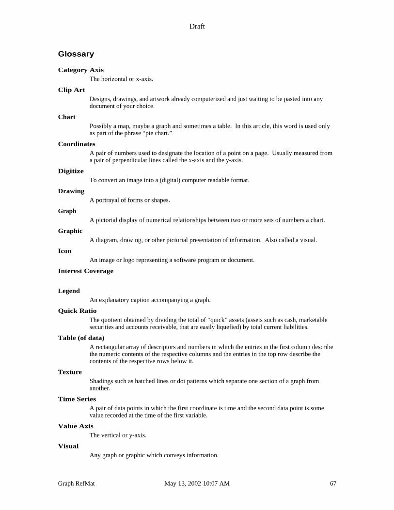
Draft
Graph RefMat May 13, 2002 10:07 AM 67
Glossary
Category AxisThe horizontal or x-axis.
Clip ArtDesigns, drawings, and artwork already computerized and just waiting to be pasted into anydocument of your choice.
ChartPossibly a map, maybe a graph and sometimes a table. In this article, this word is used onlyas part of the phrase “pie chart.”
CoordinatesA pair of numbers used to designate the location of a point on a page. Usually measured froma pair of perpendicular lines called the x-axis and the y-axis.
DigitizeTo convert an image into a (digital) computer readable format.
DrawingA portrayal of forms or shapes.
GraphA pictorial display of numerical relationships between two or more sets of numbers a chart.
GraphicA diagram, drawing, or other pictorial presentation of information. Also called a visual.
IconAn image or logo representing a software program or document.
Interest Coverage
LegendAn explanatory caption accompanying a graph.
Quick RatioThe quotient obtained by dividing the total of “quick” assets (assets such as cash, marketablesecurities and accounts receivable, that are easily liquefied) by total current liabilities.
Table (of data)A rectangular array of descriptors and numbers in which the entries in the first column describethe numeric contents of the respective columns and the entries in the top row describe thecontents of the respective rows below it.
TextureShadings such as hatched lines or dot patterns which separate one section of a graph fromanother.
Time SeriesA pair of data points in which the first coordinate is time and the second data point is somevalue recorded at the time of the first variable.
Value AxisThe vertical or y-axis.
VisualAny graph or graphic which conveys information.

Draft
Graph RefMat May 13, 2002 10:07 AM 68
x-axisA horizontal line which constitutes the base from which vertical measurements are made.
y-axisA vertical line which constitutes the base from which horizontal measurements are made.
Draft
Graph RefMat May 13, 2002 10:07 AM 69
Notes to myself:
Display a balance sheet as two stacked columns (see if offset columns have anything tooffer) or as two pies?
Do a “good grief” versus “good graph” example like Mac Charting Tools?
File Name Description
Exhibit I Chart Parts
Exhibit II Graphing Advice Matrix
Cover Sheet
Persuasion ovhds of graphs presentation
Data files
Graph RefMat. 04/25/95 Current master

Draft
Graph RefMat May 13, 2002 10:07 AM 70