
UNITED NATIONS GLOBAL COMPACT DESIGN MANUAL · United Nations Global Compact Design Manual 2016 4...
25
UNITED NATIONS GLOBAL COMPACT DESIGN MANUAL United Nations Global Compact Design Manual 2016_03.01.2016
Transcript of UNITED NATIONS GLOBAL COMPACT DESIGN MANUAL · United Nations Global Compact Design Manual 2016 4...
UNITED NATIONSGLOBAL COMPACTDESIGN MANUAL
United Nations Global Compact Design Manual 2016_03.01.2016

United Nations Global Compact Design Manual 2016 2
Content
Introduction 2
The UN Global Compact Logos Intoduction 6
Brand hierarchy overview 7Masterbrand logo 8Masterbrand logotype 9Network logo 10Network logotype 11Endorser logos 12
Clear space and minimum size 13Colorways 15 United Nations Global Compact in writing 16
Colors
Introduction 18
Corporate blue 19Secondary colors 20Recommended color combinations 21Color combination examples 22
Typography
Typography 25
Special projects, partnerships,
sub-initiatives and events
Introduction 27
Special projects brand guidelines: Logo variant 28Communication concept 29Principles and sub-initiatives led by external partners 30

United Nations Global Compact Design Manual 2016 3
INTRODUCTION
United Nations Global Compact Design Manual 2016 4
In order to ensure continued growth and strengthening of the United Nations Global Compact brand across the globe, a strong brand and visual identity is im-perative.
This updated design manual reflects the Agenda 2030 and
the Sustainable Development Goals, and the need for easier
brand governance to consistently express the essence of the
UN Global Compact brand.
To ensure that the UN Global Compact brand achieves a con-
sistent expression and coherence in the various uses of logos
as well as colors is crucial.
In this design manual you will find updated logos, a refreshed
color palette as well as structured guidelines and tools for
correct usage when working with the UN Global Compact
brand.
Should you have any questions, please contact the UN Global
Compact Communications team.

United Nations Global Compact Design Manual 2016 5
THE UN GLOBAL COMPACT LOGOS

United Nations Global Compact Design Manual 2016 6
To ensure that the identity preserves its
authority and legitimacy, it is important
to follow the guidelines for proper usage
of the logo on all levels. Depending on
the context and sender, the logos and
logotypes can be used in three ways
where the following rules apply:
1. Masterbrand Logo and Logotype
The United Nations Global Compact organization always uses either the complete logotype (consisting of the globe logo and the words “United Nations Global Compact”) or the globe logo on its own.
The masterbrand globe logo represents the Global Compact in its purest and most condensed form. The globe logo makes up the foundation for the rest of the logo levels and must never be altered in any form. Translation of the “UN Global Compact” lettering arching above the globe is not permitted under any circumstances.
Only the UN Global Compact may use these two logo variations.
Usage in partnerships alongside other partner logos to be permitted by the UN Global Compact on a case-by-case basis (see page 13 for guidance on partnerships and logo placements). Please note that this type of usage always requires approval by the UN Global Compact.
2. Network Logo and Logotype
The local networks use a customized logotype consisting of the globe logo and two lines of text. “Global Compact” in line 1, and the network name, i.e. “Network Australia” in line 2.
As a general rule, “Global Compact” should not be translated into local languages, but exceptions from the rule can be decided on a case-by-case basis by the UN Global Compact.
The name of the Local Network can be translated into relevant local languages.
All translations of network logos and logotypes are to be designed and approved by the UN Global Compact.
Local Networks are advised to only use logos provided by the UN Global Compact. Altering the provided logo files is not allowed.
3. Endorser Logos
There are two variants of endorser logos to be used by endorsing companies, corporations or organizations. One logo is for endorsers of Local Networks, the other is to be used by endorsers of the UN Global Compact in general. The Global Compact Endorser logo may be used by request only. More information is available at: https://www.unglobalcompact.org/participation/getting-started/brand-guidelines
At this level, the wording “We support” is placed below the logo. Translation of “we support” and Local Network name is allowed. All translation work is to be designed and approved by the UN Global Compact.
Please note that these two logos are the only ones allowed for endorser usage. Endorsers may only use logos provided by the UN Global Compact. Altering the provided logo files is not allowed.

United Nations Global Compact Design Manual 2016 7
Brand hierarchy overview
Network Australia
WE SUPPORT
Network Australia
WE SUPPORT
Masterbrand: Logo (1) and Logotype (2)
Network: Logo (3) and Logotype (4)
Global Compact Endorser logo (5) and Network Endorser Logo (6)
1
3
5
2
4
6
Global Compact
Network Australia

United Nations Global Compact Design Manual 2016 8
Masterbrand logo
The masterbrand logo consists of a globe with the lettering “UN GLOBAL COMPACT” in an arch above the globe and a customized version of the United Nations olive branches below the globe. The logo has a distinctive mark form signaling the United Nations’ heritage and the world of modern business. The design of the logo is in line with the family of United Nations’ logos as seen below.
Translation of the “UN Global Compact” lettering arching above the globe is not permitted under any circumstances.

United Nations Global Compact Design Manual 2016 9
Masterbrand logotype
The logotype combines the United Nations Global Compact logo and the lettering “United Nations Global Compact” in two lines. The ratio between the logo and lettering is fixed and cannot be varied in neither size, weight nor number of lines.
The logo and the two lines must always be written in the same color. The entire lettering of the logotype must always fall in two lines, “United Nations” in line 1 and “Global Compact” in line 2.
United Nations is written in Flama Medium.Global Compact is written in Flama Light.
Translation of the “United Nations Global Compact” lettering is not permitted under any circumstances.

United Nations Global Compact Design Manual 2016 10
Network logo
The Network logo follows the masterbrand logo with the addition of the network name placed in one line below the UN olive branches.
The ratio between the logo and lettering is fixed and cannot be varied in neither size, weight nor number of lines.
The logo and network name must always be written in the same color. The local network name can never exceed one line of text.
The name of the network is written in Flama Light.
Only authorized Global Compact networks may use the Network logo. All translations of network logos and logotypes are to be designed and approved by the UN Global Compact.
Local Networks are advised to only use logos provided by the UN Global Compact. Altering of the provided logo files is not permitted .
This logo is the recommended version to use for Local Network social media profile pictures.
Examples of Local Network logos
Network Australia

United Nations Global Compact Design Manual 2016 11
Network logotype
Examples of Local Network logotypes
The network logotype combines the United Nations Global Compact logo and the lettering “Global Compact Network [Country]” in two lines. The ratio between the logo and lettering is fixed and cannot be varied in neithersize, weight nor number of lines.
The logo and two lines must always be written in the same color. The entire lettering of the logotype must always fall in two lines, “Global Compact” in line 1 and the name of the Network Country in line 2.
Global Compact is written in Flama Medium.Network and Country is written in Flama Light.
Only authorized Global Compact networks may use the Network logotype. The name of the local network can be translated into relevant local languages, and should always be written in Flama Light and positioned below Global Compact as shown here.
Translation of the “Global Compact” lettering is not permitted under any circumstances.
All translations of network logos and logotypes are to be designed and approved by the Global Compact office.
Local networks are advised to only use logos provided by the Global Compact office. Altering of the provided logo files is not permitted.
Global CompactMreže Bosnia-Herzegovina
Global CompactRéseau France
Global CompactNetzwerk Deautschland
Global Compact
Network Australia

United Nations Global Compact Design Manual 2016 12
Endorser logos
The Endorser logos follow the masterbrand logo with the addition of WE SUPPORT placed one line below the UN olive branches (1), and the network name and WE SUPPORT placed two lines below the UN olive branches (2).
The ratio between the logo and lettering is fixed and cannot be varied in neither size, weight nor number of lines.
The logo, WE SUPPORT lettering and network name must be presented in the same color. The local network name must never exceed one line of text.
The name of the network is written in Flama Light.WE SUPPORT is written in capital letters in Flama Medium.
WE SUPPORT can be translated into relevant local languages.
All translations of Endorser logos are to be designed and approved by the UN Global Compact.
Endorsers may only use logos provided by the UN Global Compact. Altering of the provided logo files is not permitted.
Note that these are the only logos that endorsers of the Global Compact and/or Local Networks may use.
Examples of local endorser logos
1 2
Network AustraliaWE SUPPORT
WE SUPPORT

United Nations Global Compact Design Manual 2016 13
24mm68px
29mm82px
34mm96px
15mm
18mm
21mm
a
a
a
ab
c d
b c d
Clear space and minimum size
The logotype must always be presented in a clear and readable manner.
To enhance the presentation of the logotype, it is necessary to keep a minimum distance of respect.
To ensure a unified and consistent presentation in all communication contexts and on all media platforms, the logotype must always be surrounded by a clear space zone. The clear space zone must always equal 50 percent or more of the globe’s height and width (a).
The minimum size ensures that the logotype always presents itself in a clear and readable manner in print and digital media.
The above specifications apply to all Global Compact logos.
Digital Logos
a / The Clear Space is 50% width and height of the globe.
The Minimum Size for digital media is (height) :b/ Masterbrand logo, logotype and Network logotype: 24mm or 68pixels.c / Endorser logos: 29mm or 82pixelsd / Local endorser logos: 34mm or 96pixels
Print Logos
a / The Clear Space is 50% width and height of the globe.
The Minimum Size for print media is (height): b / Masterbrand logo, logotype and Network logotype: 15mm (height).c / Endorser logos: 18mmd / Local endorser logos: 21mm
Digital logos: Clear space and mimumum size
Print logos: Clear space and mimumum size
a
a
Global Compact
Network Australia
Global Compact
Network Australia
Network AustraliaWE SUPPORT
Network AustraliaWE SUPPORT
WE SUPPORT
WE SUPPORT

United Nations Global Compact Design Manual 2016 14
Clear space and minimum size
Don’ts
1 / Not enough clear space around logo. Masterbrand logo used by local network
2 / Not enough clear space around logotype
Do’s
1 / Correct clear space (50% of logo globe height). Masterbrand logo used by United
Nations Global Compact.
2 / Correct clear space (50% of logo globe height (a))
1
2 2
a
a
1
Global Compact
Network AustraliaGlobal Compact
Network Australia

United Nations Global Compact Design Manual 2016 15
The logotype must only be reproduced in Global Compact blue, black or negative.
The blue gradient is the primary colorway, and to be used whenever possible.
The positive version of the logotype is always preferred. The negative version should only be used as a last option. The negative (white) version of the logo should when possible be placed on a solid color (preferably Global Compact blue, black or one of the Secondary Colors), or a section of an image which appears calm – to ensure the logo is legible.
The colorways apply to all brand logos.
Colorways:
Blue gradient (1) - the primary colorwayBlack gradient (2)Blue solid color (3) Black solid color (4)White solid color (5)
Colorways
5
Blue gradient (primary colorway) Black gradient
White
Blue solid color Black solid color
1
3
2
4
5
United Nations Global Compact Design Manual 2016 16
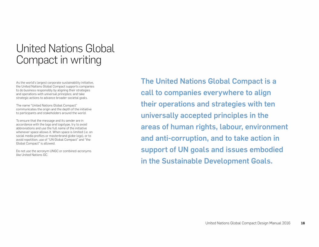
As the world’s largest corporate sustainability initiative, the United Nations Global Compact supports companies to do business responsibly by aligning their strategies and operations with universal principles; and take strategic actions to advance broader societal goals.
The name “United Nations Global Compact” communicates the origin and the depth of the initiative to participants and stakeholders around the world.
To ensure that the message and its sender are in accordance with the logo and logotype, try to avoid abbreviations and use the full name of the initiative whenever space allows it. When space is limited (i.e. on social media profiles or masterbrand globe logo), or to avoid repetition, use of “UN Global Compact” and “the Global Compact” is allowed.
Do not use the acronym UNGC or combined-acronyms like United Nations GC.
The United Nations Global Compact is a
call to companies everywhere to align
their operations and strategies with ten
universally accepted principles in the
areas of human rights, labour, environment
and anti-corruption, and to take action in
support of UN goals and issues embodied
in the Sustainable Development Goals.
United Nations Global Compact in writing

United Nations Global Compact Design Manual 2016 17
COLORS

United Nations Global Compact Design Manual 2016 18
Identity colorsIt is essential that identity colors are alwaysreproduced accurately. To get the closest color match, please ensure that the special Pantone® colors are always used for visual matching.
Please bear in mind that a printed color will vary in hue and density according to the surface it is printed on.
Global Compact Corporate Blue is the overreaching color that relates UN Global Compact to the UN system.
To accompany the Global Compact Corporate Bluesecondary colors and tones have been defined. Specifications and recommendations for use are described on the following pages.
All colors are defined as Pantone, CMYK, RGB and HEX.
Note that the secondary colors are not limited for use by any specific area or theme, but can be used freely, as long as the use is in line with the recommended color combinations on page 20.
Colors
PANTONE (SPOT COLOR)The Pantone Color Matching System is a standardized color reproduction system. Different manufacturers in different locations can all refer to the Pantone system to make sure colors match without direct contact with one another.
CMYKThe CMYK process is a method of printing color by using four inks—cyan, magenta, yellow and black. A majority of the world’s printed material is produced using the CMYK process. Pantone and CMYK cannot match 100% due to the different production methods.
RGB and HEXRGB and HEX color codes are used in digital media. RGB and HEX are two different ways of describing the same color. RGB/HEX are device-dependent color models: different devices detect or reproduce a given RGB/HEX value differently.
Introduction

United Nations Global Compact Design Manual 2016 19
Overreaching color (shown in RGB colorspace)
Global Compact Corporate Blue
Global Compact Corporate Blue Pantone: 540 U
C90, M70, Y35, K15
R30 G50, B80
#1e3250
Tone 1Pantone: 7692 U
C100, M38, Y0, K27
R76, G107, B139
#4c6b8b
Tone 2Pantone: 542
C60, M15, Y7, K3
R105, G156, B198
#699cc6
Tone 3Pantone: 545
C26 M3, Y4, K0
R174, G207, B230
#aecfe6
Tone 1 Tone 2 Tone 3
Global Compact Corporate Blue

R169, G133, B176 R191, G164, B195 R210, G193, B215
R242, G114, B121 R244, G148, B154 R248, G184, B187
R253, G190, B97 R254, G205, B138 R255, G222, B177
R195, G190, B184 R210, G206, B203 R224, G223, B220
R63, G184, B132 R109, G197, B159 R158, G214, B190
R254, G227, B93 R254, G254, B133 R255, G242, B174

United Nations Global Compact Design Manual 2016 21
Recommended color combinations
Corporate Blues with 1 secondary color (100%) + tint (40%)
NOT recommended 1 Secondary color (eg. purple) as main color (tint 100%)2 Too many secondary colors in use (tint 100%)
Corporate Blues with 2 secondary colors:
Red (100%) + Green tint (40%)
Corporate Blues with 2 secondary colors:
Grey (100%) + Orange (100% + tint 40%)
RecommendationsTo ensure a strong and recognizable visual language for the Global Compact brand, please follow the recommended color combinations.
It is recommended to combine the Corporate Blue with a maximum of 1 to 2 secondary colors.
All tints of the secondary colors can be used. Shown here are only 100% and 40%.
See examples of designs on the following pages.
1 2
United Nations Global Compact Design Manual 2016 22
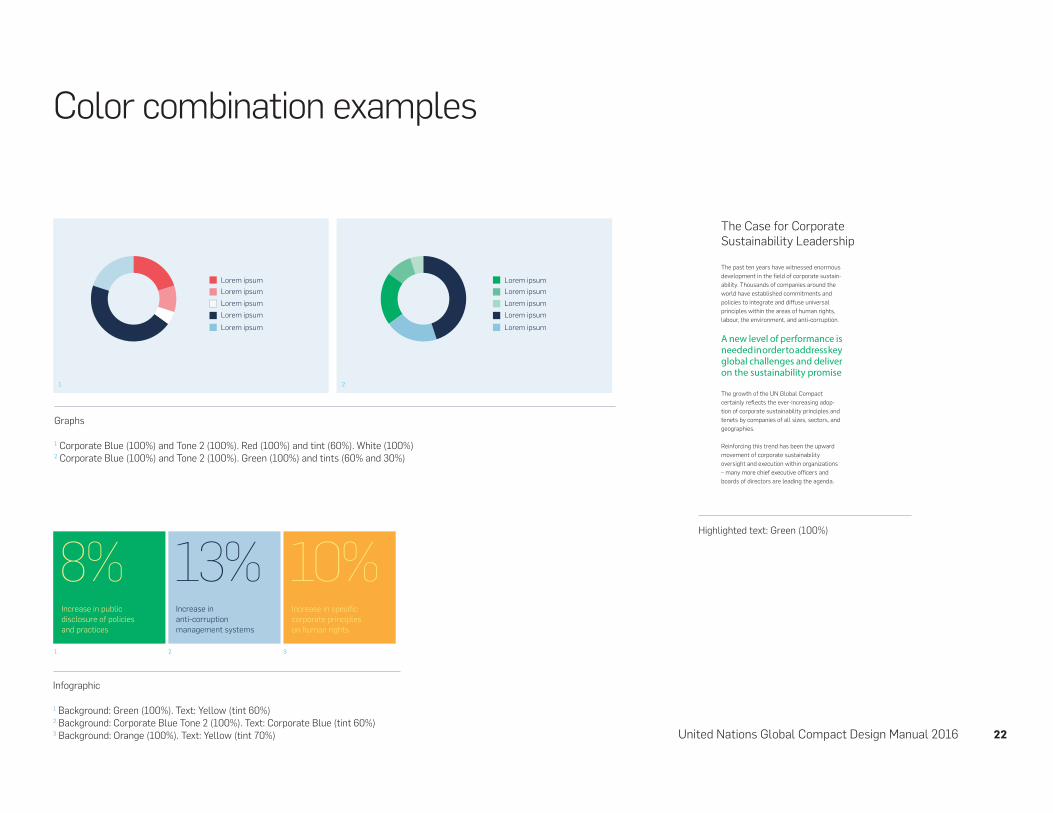
Color combination examples
Lorem ipsum
Lorem ipsum
Lorem ipsum
Lorem ipsum
Lorem ipsum
Lorem ipsum
Lorem ipsum
Lorem ipsum
Lorem ipsum
Lorem ipsum
Graphs
1 Corporate Blue (100%) and Tone 2 (100%). Red (100%) and tint (60%). White (100%)2 Corporate Blue (100%) and Tone 2 (100%). Green (100%) and tints (60% and 30%)
Highlighted text: Green (100%)
Infographic
1 Background: Green (100%). Text: Yellow (tint 60%) 2 Background: Corporate Blue Tone 2 (100%). Text: Corporate Blue (tint 60%) 3 Background: Orange (100%). Text: Yellow (tint 70%)
1
1
2
2
3
The Case for Corporate
Sustainability Leadership
The past ten years have witnessed enormous
development in the field of corporate sustain-
ability. Thousands of companies around the
world have established commitments and
policies to integrate and diffuse universal
principles within the areas of human rights,
labour, the environment, and anti-corruption.
A new level of performance is needed in order to address key global challenges and deliver on the sustainability promise
The growth of the UN Global Compact
certainly reflects the ever-increasing adop-
tion of corporate sustainability principles and
tenets by companies of all sizes, sectors, and
geographies.
Reinforcing this trend has been the upward
movement of corporate sustainability
oversight and execution within organizations
– many more chief executive officers and
boards of directors are leading the agenda.

United Nations Global Compact Design Manual 2016 23
Color combination examples
Layout
1 Text: Corporate Blue (100%). Corporate Blue Tone 2 (100%). Green (tint 30%) 2 Text: Red and tints of red. Image: Corporate Blue (100%)
1 2

United Nations Global Compact Design Manual 2016 24
TYPOGRAPHY

United Nations Global Compact Design Manual 2016 25
ABCDEFGHIJKLMNOPQRSTUVWXYZ
abcdefghijklmnopqrstuvwxyz
123456789
ABCDEFGHIJKLMNOPQRSTUVWXYZabcdefghijklmnopqrstuvwxyz 123456789
ABCDEFGHIJKLMNOPQRSTUVWXYZabcdefghijklmnopqrstuvwxyz 123456789
2
1
3
The Global Compact uses three different typefaces: Flama, Swift and Roboto.
Flama is the UN Global Compact’s main typography and is used in display typography, captions, body text, body text headings, notes, etc.
Swift is used for highlighting text i.e. quotes and subheadings.
Roboto is used for most copy throughout the website.Roboto is a websafe font and can be found on google.com/fonts.
All weights of Flama, Swift and Roboto can be used (except condensed versions of the typefaces).
Do NOT – use any additional font families– manipulate the integrity of typefaces– skew, stretch, or warp type – use condensed versions of the typefaces
1. Flama Light2. Swift Light3. Roboto Regular
Typography


