Unit 5 Spreadsheets 5.05 Reading Charts. Introduction The only place where success comes before work...
18
Unit 5 Spreadsheets 5.05 Reading Charts
-
Upload
gervase-powell -
Category
Documents
-
view
216 -
download
0
Transcript of Unit 5 Spreadsheets 5.05 Reading Charts. Introduction The only place where success comes before work...

Unit 5 Spreadsheets
5.05ReadingCharts
Introduction• The only place where success
comes before work is in the dictionary--Vidal Sassoon
• On the job, you will have to read for a number of reasons, such as to locate information, to accomplish or understand a task, to summarize, and to draw conclusions and make recommendations.
• Charts are useful for summarizing and drawing conclusions.
• Charts provide a way of presenting, reading, and comparing data in a picture form.
• The chart data probably originated as a word processing table or as a spreadsheet.
Introduction• At the end of this lesson, you
will be able to:– Utilize spreadsheet features,
charts and graphs (ACOS 6) – Disaggregate information
electronically to formulate and defend conclusions (ACOS 21B1)

Lesson
• Types of Charts The most common
types of charts are:

Lesson
• Line charts (also called graphs) connect points of data and show changes over time; they are especially useful to plot trends.
Lesson
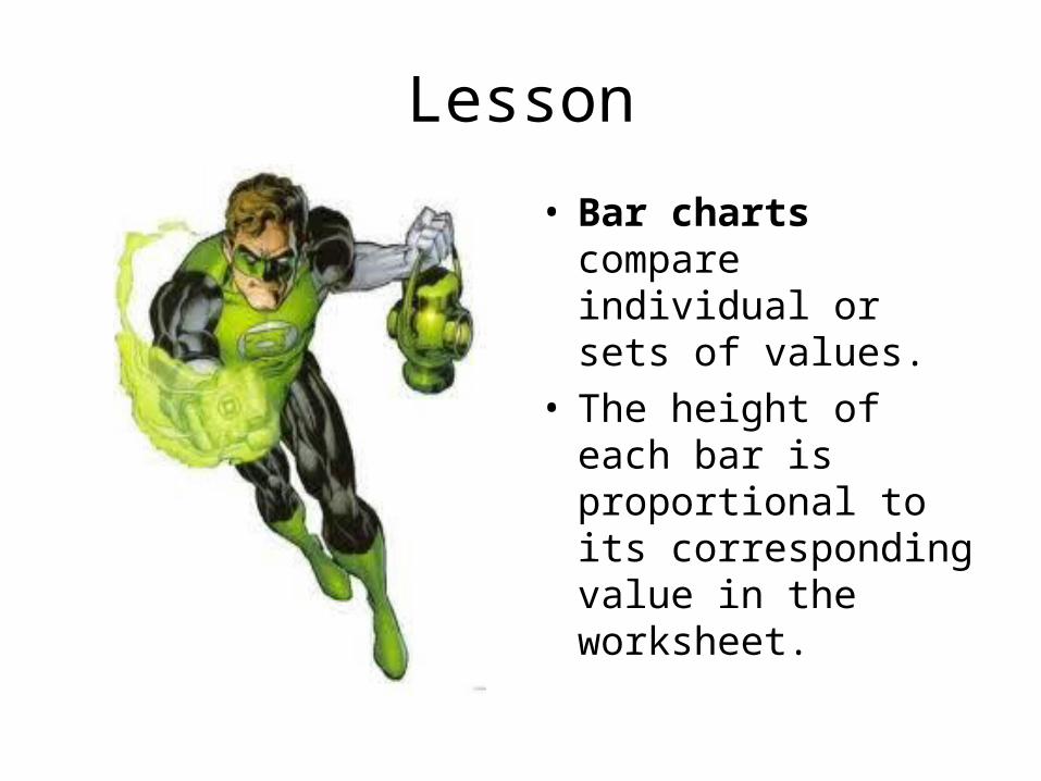
• Bar charts compare individual or sets of values.
• The height of each bar is proportional to its corresponding value in the worksheet.
Lesson
• Pie charts are circular graphs used to show the relationship of each value in a data range to the entire set of data.
• The size of each wedge represents the percentage each value contributes to the total.
• The entire circle is the total, or 100%.

Lesson• While you are reading the
following websites, compare the examples given and think about the differences between the types of charts.
– Read these sections now:
• Pie Chart• Bar Graph• Line Graph
– Take a screenshot of each and Save to F Drive as
» 5.05 Pie Chart» 5.05 Bar Graph» 5.05 Line Graph
Lesson
• Reading ChartsCharts can be read using
four basic steps:

Lesson
1. Read the title and skim over the entire chart to get a general idea of its contents
2. Read the descriptions or labels (on the two axes or on the pieces of pie)
3. Ask yourself what the numbers mean
4. Determine how the information is measured and what is being compared

Lesson• To create most charts or graphs,
excluding pie charts, you typically use data that is plotted on two axes: – The horizontal line is the x-axis
(usually the categories) – The vertical line is the y-axis (usually
the values being charted)
• Tip: To remember which axis is which, think of the x-axis as going along the corridor and the y-axis as going up the stairs. The letter "a" comes before "u" in the alphabet just as "x" comes before "y".

Summary
• In the previous lesson, you learned that the names of the categories must be in separate cells from their corresponding numbers.
• That is necessary for chart development because the names of the categories will appear on the x-axis and the y-axis provides a value for the numbers.
• The legend is a box near the chart that identifies the colors assigned to categories in the chart.
• The three main types of charts are line, bar, and pie.
• A line chart uses a line to connect the plotted data points.
• The higher or longer the bar on a bar chart, the greater the value.
• A pie chart would best be used to display the size of parts that make up some whole.

Task 1• For your task, you will be asked to list
eight conclusions you can draw from reading pie charts about company trust and you will be given two additional charts in which to answer questions.
• See 5.05 Reading Charts Worksheet for the details.
• For the first part of the worksheet, you will need to go to Wisc-Online: Pie Charts. Stop when you reach slide 12.
• Save your completed worksheet to your F Drive in your Unit 5 Folder– as 5.05 Reading Charts Dropbox.

Task 2
• In this task, you will be writing the following three paragraphs: 1. What is the Digital
Divide; 2. Overcoming the Digital
Divide; and 3. How Internet and
Home Broadband use have increased in recent years.

Task 2 Continued• You will visit two websites to find
this information. • The first two paragraphs will be a
summary of what you have learned from reading the first web site about defining the Digital Divide and projects that are in place to help overcome the digital divide.
• In the third paragraph, you will interpret a chart by using the skills learned in this lesson.
• Here are the two web sites you are to visit:
• Wikipedia: Digital Divide – If you cannot access this site, read
Digital Divide 2.0 instead.• Pew Internet Research: Increase in
Internet Use and Home Broadband

Task 2 Continued
• After you write your 3 paragraphs summarizing above, – Save to your F
Drive in your Unit 5 Folder as 5.05 Digital Use Dropbox.

Unit 5 Folder
Remember to save all of your work to your Unit 5 folder!
Are you finished?
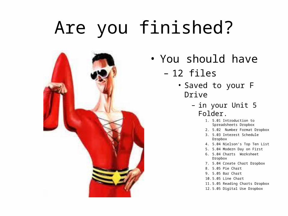
• You should have – 12 files
• Saved to your F Drive– in your Unit 5
Folder.1. 5.01 Introduction to
Spreadsheets Dropbox2. 5.02 Number Format Dropbox3. 5.03 Interest Schedule
Dropbox4. 5.04 Nielson’s Top Ten List5. 5.04 Modern Day on First6. 5.04 Charts Worksheet
Dropbox7. 5.04 Create Chart Dropbox8. 5.05 Pie Chart9. 5.05 Bar Chart10. 5.05 Line Chart11. 5.05 Reading Charts Dropbox12. 5.05 Digital Use Dropbox