Unit 5: Boxplots
13
Unit 5: Boxplots | Faculty Guide | Page 1 Unit 5: Boxplots Prerequisites Students should be able to use a stemplots (Unit 2) to aid in ordering data from smallest to largest. Given an ordered set of data, they should be able to compute the median, which was covered in Unit 4, Measures of Center. Activity Description The Unit 5 activity returns to the data collected in the survey for Unit 2’s activity. In Unit 2’s activity, the sample data, used for the sample solutions, were created rather than collected from a class, with the exception of the height data. If you chose not to collect the data from your class, let students use the sample data from Unit 2 to complete Unit 5’s activity. Students can compare the stemplots that they created for Unit 2’s activity to the boxplots from this activity. If students are drawing the boxplots by hand, the stemplots will help them order the data from smallest to largest. Students are asked to complete around 11 boxplots for this activity. So, it may be best to use software to create the boxplots. Otherwise, students should work in small groups so that they can split up the work of constructing the boxplots among group members.
Transcript of Unit 5: Boxplots
Unit 5: Boxplots | Faculty Guide | Page 1
Unit 5: Boxplots
PrerequisitesStudents should be able to use a stemplots (Unit 2) to aid in ordering data from smallest to largest. Given an ordered set of data, they should be able to compute the median, which was covered in Unit 4, Measures of Center.
Activity DescriptionThe Unit 5 activity returns to the data collected in the survey for Unit 2’s activity. In Unit 2’s activity, the sample data, used for the sample solutions, were created rather than collected from a class, with the exception of the height data. If you chose not to collect the data from your class, let students use the sample data from Unit 2 to complete Unit 5’s activity.
Students can compare the stemplots that they created for Unit 2’s activity to the boxplots from this activity. If students are drawing the boxplots by hand, the stemplots will help them order the data from smallest to largest. Students are asked to complete around 11 boxplots for this activity. So, it may be best to use software to create the boxplots. Otherwise, students should work in small groups so that they can split up the work of constructing the boxplots among group members.
Unit 5: Boxplots | Faculty Guide | Page 2
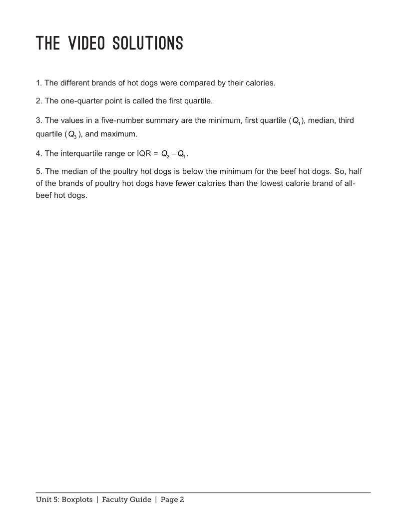
The Video Solutions
1. The different brands of hot dogs were compared by their calories.
2. The one-quarter point is called the first quartile.
3. The values in a five-number summary are the minimum, first quartile ( 1Q ), median, third
quartile ( 3Q ), and maximum.
4. The interquartile range or IQR = 3 1Q Q− .
5. The median of the poultry hot dogs is below the minimum for the beef hot dogs. So, half of the brands of poultry hot dogs have fewer calories than the lowest calorie brand of all-beef hot dogs.
Unit 5: Boxplots | Faculty Guide | Page 3
Unit Activity: Using Boxplots to Analyze Data Solutions
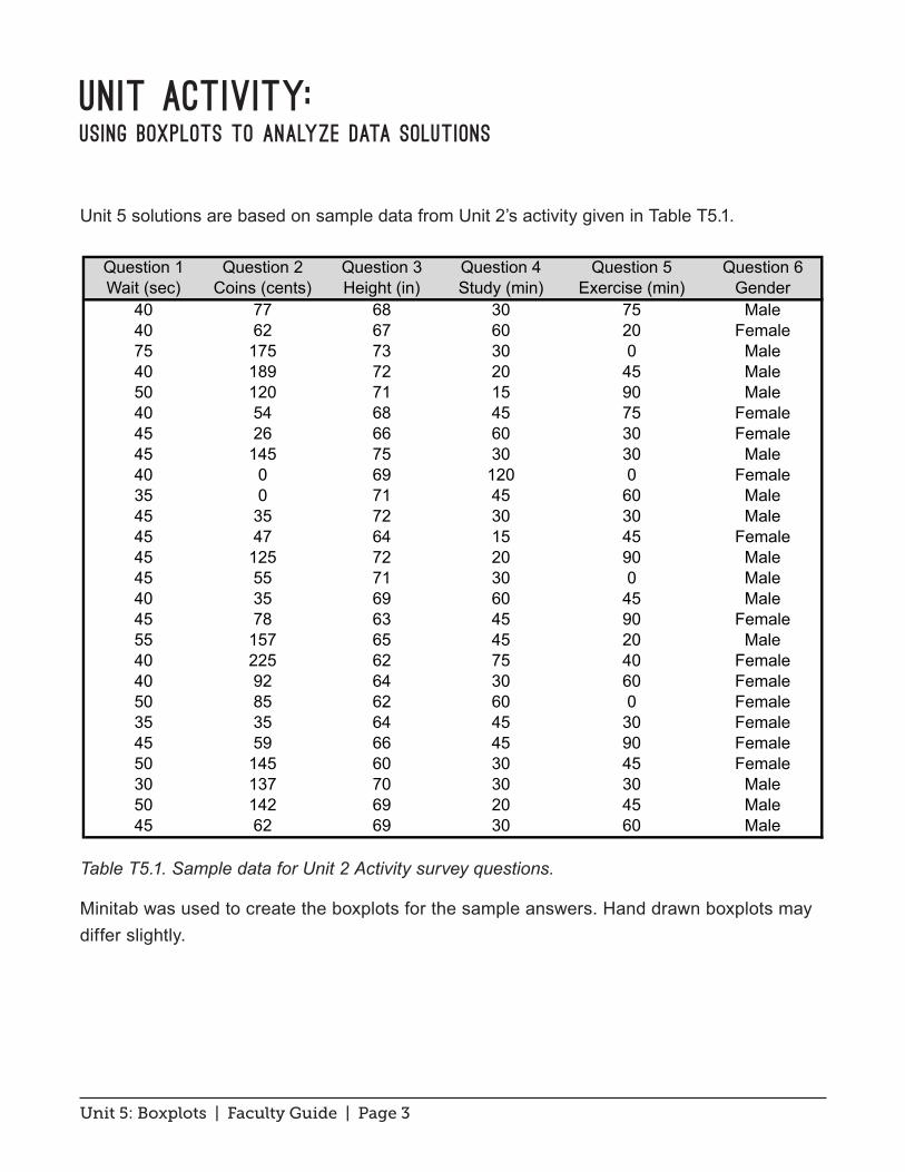
Unit 5 solutions are based on sample data from Unit 2’s activity given in Table T5.1.
Table T5.1. Sample data for Unit 2 Activity survey questions.
Minitab was used to create the boxplots for the sample answers. Hand drawn boxplots may differ slightly.
Question 1 Question 2 Question 3 Question 4 Question 5 Question 6Wait (sec) Coins (cents) Height (in) Study (min) Exercise (min) Gender
40 77 68 30 75 Male40 62 67 60 20 Female75 175 73 30 0 Male40 189 72 20 45 Male50 120 71 15 90 Male40 54 68 45 75 Female45 26 66 60 30 Female45 145 75 30 30 Male40 0 69 120 0 Female35 0 71 45 60 Male45 35 72 30 30 Male45 47 64 15 45 Female45 125 72 20 90 Male45 55 71 30 0 Male40 35 69 60 45 Male45 78 63 45 90 Female55 157 65 45 20 Male40 225 62 75 40 Female40 92 64 30 60 Female50 85 62 60 0 Female35 35 64 45 30 Female45 59 66 45 90 Female50 145 60 30 45 Female30 137 70 30 30 Male50 142 69 20 45 Male45 62 69 30 60 Male
Table T5.1
Unit 5: Boxplots | Faculty Guide | Page 4
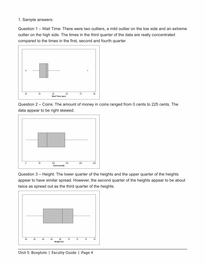
1. Sample answers:
Question 1 – Wait Time: There were two outliers, a mild outlier on the low side and an extreme outlier on the high side. The times in the third quarter of the data are really concentrated compared to the times in the first, second and fourth quarter.
Question 2 – Coins: The amount of money in coins ranged from 0 cents to 225 cents. The data appear to be right skewed.
Question 3 – Height: The lower quarter of the heights and the upper quarter of the heights appear to have similar spread. However, the second quarter of the heights appear to be about twice as spread out as the third quarter of the heights.
807060504030Wait Time (sec)
250200150100500Coins (cents)
767472706866646260Height (in)

Unit 5: Boxplots | Faculty Guide | Page 5
Question 4 – Study Time: There was one person in class who claimed to study, on average, for 120 minutes per exam. That turned out to be an extreme outlier. However, there doesn’t appear to be any dividing line in the box. That is because the first quartile and median were both 30. In fact, there were 9 students who claimed that they studied, on average, 30 minutes for an exam.
Question 5 – Exercise: The exercise times look pretty symmetric. Even though some people exercised on average for 90 minutes and others did not exercise, neither extreme turned out to be an outlier.
2. Comparative plots for how long female students felt they waited compared to male students are shown below. The outlier for the males turns out to be a mild outlier. The median time for the females was lower than for males. The data for the males were considerably more spread out than for the females, particularly if the range was used to describe the spread.
(See boxplot on next page...)
120100806040200Study (min)
9080706050403020100Exercise (min)

Unit 5: Boxplots | Faculty Guide | Page 6
3. The study times for females were more spread out than for males. Using Minitab’s algorithm for computing quartiles, the first quartile for the females equaled the third quartile for the males. Therefore, three-quarters of the females spent longer studying than three-quarters of the males. Both of the outliers are mild outliers, even though we had thought that the study time outlier for females would be an extreme outlier. That is most likely due to the larger IQR for the female study times.
4. The overall spread of the two data sets is the same, with a range of 90 minutes. The inner 50% of the data for the males is more concentrated than for females. The median for the males is very slightly higher than for females. Both distributions are roughly symmetric.
Male
Female
120100806040200
Gen
der
Study Time (min)
Male
Female
807060504030
Gen
der
Wait Time (sec)
Male
Female
9080706050403020100
Gen
der
Exercise (min)
Unit 5: Boxplots | Faculty Guide | Page 7
Exercise Solutions
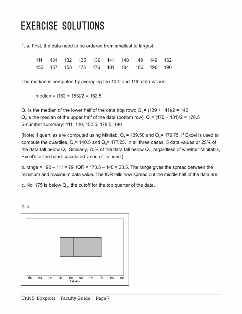
1. a. First, the data need to be ordered from smallest to largest:
111 131 132 135 139 141 148 149 149 152 153 157 158 175 176 181 184 186 190 190
The median is computed by averaging the 10th and 11th data values:
median = (152 + 153)/2 = 152.5
Q1 is the median of the lower half of the data (top row): Q1 = (139 + 141)/2 = 140 Q3 is the median of the upper half of the data (bottom row): Q3= (176 + 181)/2 = 178.5 5-number summary: 111, 140, 152.5, 178.5, 190
(Note: If quartiles are computed using Minitab, Q1 = 139.50 and Q3= 179.75. If Excel is used to compute the quartiles, Q1= 140.5 and Q3= 177.25. In all three cases, 5 data values or 25% of the data fall below Q1. Similarly, 75% of the data fall below Q3, regardless of whether Minitab’s, Excel’s or the hand-calculated value of is used.)
b. range = 190 – 111 = 79; IQR = 178.5 – 140 = 38.5. The range gives the spread between the minimum and maximum data value. The IQR tells how spread out the middle half of the data are.
c. No; 175 is below Q3, the cutoff for the top quarter of the data.
2. a.
200190180170160150140130120110Calories
Unit 5: Boxplots | Faculty Guide | Page 8
b. The second quarter (represented by left section of box) and the fourth quarter (represented by right whisker) appear close in length. Data values in the second quarter lie between 140 and 152.5, a distance of 12.5; data values in the fourth quarter lie between 178.5 and 190, a distance of 11.5. So, the data in the fourth quarter are the most concentrated.
c. The first quarter (represented by the left whisker) and third quarter (represented by right section of box) appear equally spread. Data values in the first quarter lie between 111 and 140, a spread of 29; data values in the third quarter lie between 152.5 and 178.5, a spread of 26. Hence, data in the first quarter exhibit the most spread.
d. 1.5 × 38.5 = 57.57; Q1 – 57.75 = 82.25 and Q3 + 57.57 = 236.25. None of the beef hot dogs in the sample had calories below 82.25 or above 236.25. Therefore, there are no outliers.
3. The stemplot appears below. Notice that there was one brand of beef hot dog that had low calories compared to the other brands. According to the 1.5 × IQR rule, this value was not sufficiently small compared to the rest of the data to be classified as an outlier. Ignoring that value, it appears that the beef hot dogs fall into two categories separated by a gap. The lower-calorie hot dogs have between 131 and 158 calories; the higher-calorie hot dogs have between 175 and 190 calories. This gap that appears to divide the beef hot dogs into two categories on the stemplot is not visible in the boxplot.
4. a. Five-number summary: 40, 50, 65, 92.5, 190
b. For the veggie dogs: IQR = Q3 - Q1 = -42.5; step = 1.5 × 42.5 = 63.75 Inner upper fence: Q3 + 1 step = 92.5 + 63.75 = 156.25 Outer upper fence: Q3 + 2 steps = 220 Hence, 190 is a mild outlier. See (c) for the modified boxplot. (The upper whisker ends at 110.)
Unit 5: Boxplots | Faculty Guide | Page 9
13 18 24 27 27 33 33 34 36 37 38 39 40 41 42 42 45 46 47 48 49 51 52 53 54 58 58 62 63 64 65 65 67 68 69 69 75 80 83 83 83 92 93 96 97 101 101 102 102 103 105 106 106 106 106 110 113 116 117 117 118 119 127 128 132 135 136 137 138 154 164 181 183 184 196 202 205 207 219 227 229 238 240 248 254 300 300 301 307 309 312 331 354 359 361 383 449 474 475 493 521 534 555 714
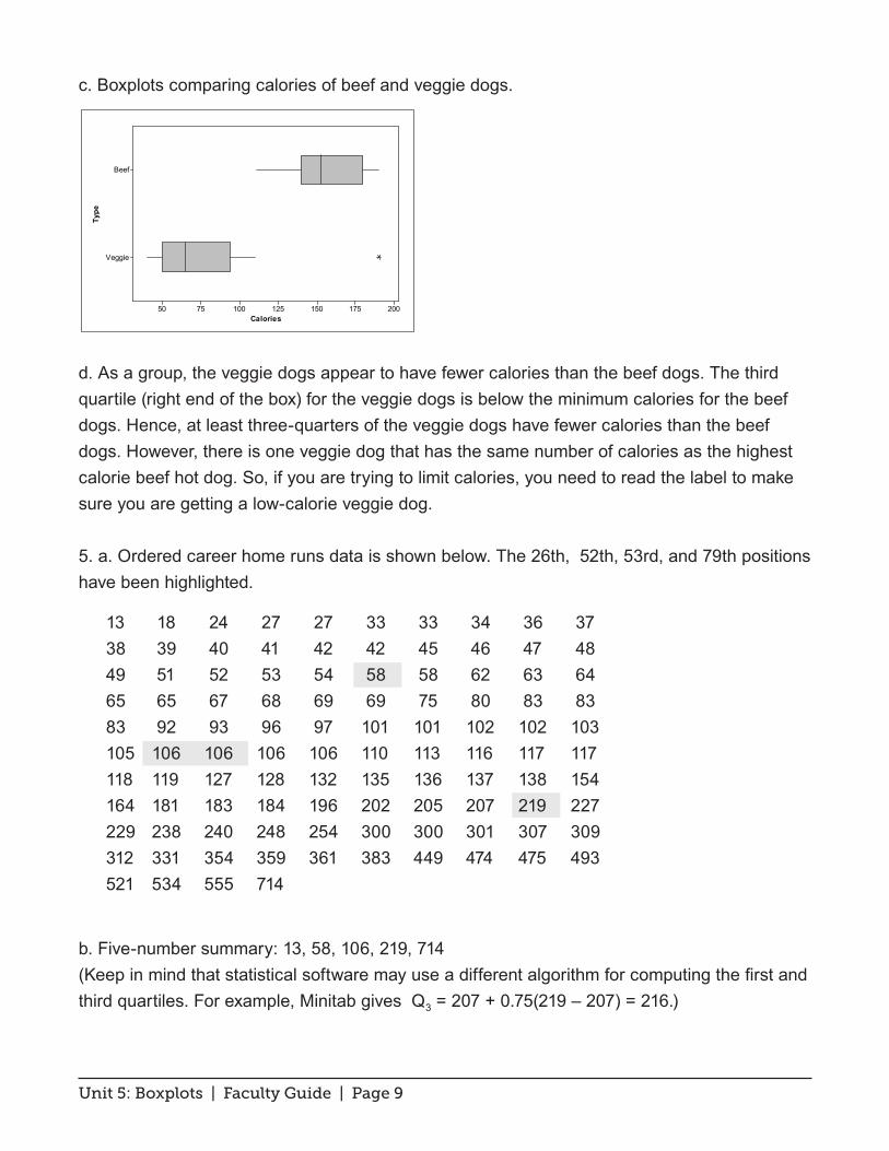
c. Boxplots comparing calories of beef and veggie dogs.
d. As a group, the veggie dogs appear to have fewer calories than the beef dogs. The third quartile (right end of the box) for the veggie dogs is below the minimum calories for the beef dogs. Hence, at least three-quarters of the veggie dogs have fewer calories than the beef dogs. However, there is one veggie dog that has the same number of calories as the highest calorie beef hot dog. So, if you are trying to limit calories, you need to read the label to make sure you are getting a low-calorie veggie dog.
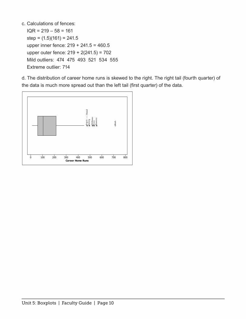
5. a. Ordered career home runs data is shown below. The 26th, 52th, 53rd, and 79th positions have been highlighted.
b. Five-number summary: 13, 58, 106, 219, 714 (Keep in mind that statistical software may use a different algorithm for computing the first and third quartiles. For example, Minitab gives Q3 = 207 + 0.75(219 – 207) = 216.)
Veggie
Beef
2001751501251007550
Type
Calories
Unit 5: Boxplots | Faculty Guide | Page 10
c. Calculations of fences: IQR = 219 – 58 = 161 step = (1.5)(161) = 241.5 upper inner fence: 219 + 241.5 = 460.5 upper outer fence: 219 + 2(241.5) = 702 Mild outliers: 474 475 493 521 534 555 Extreme outlier: 714
d. The distribution of career home runs is skewed to the right. The right tail (fourth quarter) of the data is much more spread out than the left tail (first quarter) of the data.
8007006005004003002001000Career Home Runs
Will
iam
s
Ruth
Ram
irez
Pujo
ls
---
- Mus
ial
Gehr
ig
Foxx
Unit 5: Boxplots | Faculty Guide | Page 11
Review Questions Solutions
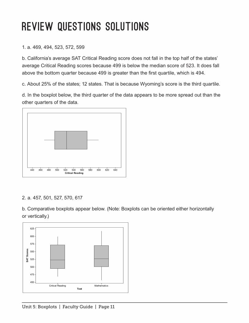
1. a. 469, 494, 523, 572, 599
b. California’s average SAT Critical Reading score does not fall in the top half of the states’ average Critical Reading scores because 499 is below the median score of 523. It does fall above the bottom quarter because 499 is greater than the first quartile, which is 494.
c. About 25% of the states; 12 states. That is because Wyoming’s score is the third quartile.
d. In the boxplot below, the third quarter of the data appears to be more spread out than the other quarters of the data.
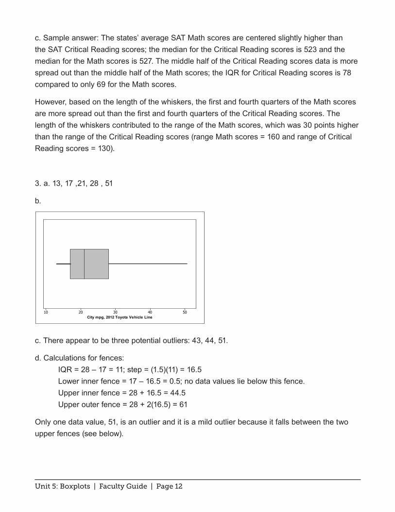
2. a. 457, 501, 527, 570, 617
b. Comparative boxplots appear below. (Note: Boxplots can be oriented either horizontally or vertically.)
640620600580560540520500480460440Critical Reading
MathematicsCritical Reading
625
600
575
550
525
500
475
450
Test
SAT
Scor
es
Unit 5: Boxplots | Faculty Guide | Page 12
c. Sample answer: The states’ average SAT Math scores are centered slightly higher than the SAT Critical Reading scores; the median for the Critical Reading scores is 523 and the median for the Math scores is 527. The middle half of the Critical Reading scores data is more spread out than the middle half of the Math scores; the IQR for Critical Reading scores is 78 compared to only 69 for the Math scores.
However, based on the length of the whiskers, the first and fourth quarters of the Math scores are more spread out than the first and fourth quarters of the Critical Reading scores. The length of the whiskers contributed to the range of the Math scores, which was 30 points higher than the range of the Critical Reading scores (range Math scores = 160 and range of Critical Reading scores = 130).
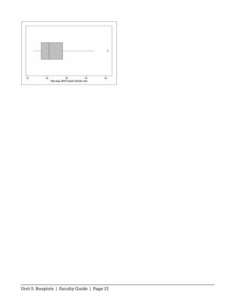
3. a. 13, 17 ,21, 28 , 51
b.
c. There appear to be three potential outliers: 43, 44, 51.
d. Calculations for fences: IQR = 28 – 17 = 11; step = (1.5)(11) = 16.5 Lower inner fence = 17 – 16.5 = 0.5; no data values lie below this fence. Upper inner fence = 28 + 16.5 = 44.5 Upper outer fence = 28 + 2(16.5) = 61
Only one data value, 51, is an outlier and it is a mild outlier because it falls between the two upper fences (see below).
5040302010City mpg, 2012 Toyota Vehicle Line
Unit 5: Boxplots | Faculty Guide | Page 13
5040302010City mpg, 2012 Toyota Vehicle Line