Understanding Self-Reflection: How People Reflect … Self-Reflection: How People Reflect on...
10
Understanding Self-Reflection: How People Reflect on Personal Data Through Visual Data Exploration Eun Kyoung Choe 1 , Bongshin Lee 2 , Haining Zhu 1 , Nathalie Henry Riche 2 , Dominikus Baur 3 1 Pennsylvania State University, University Park, PA, United States 2 Microsoft Research, Redmond, WA, United States 3 Independent Researcher, Munich, Germany [email protected], [email protected], [email protected], [email protected], [email protected] ABSTRACT Rapid advancements in consumer technologies enable peo- ple to collect a wide range of personal data. With a proper means for people to ask questions and explore their data, longitudinal data feeds from multiple self-tracking tools pose great opportunities to foster deep self-reflection. How- ever, most self-tracking tools lack support for self-reflection beyond providing simple feedback. Our overarching goal is to support self-trackers in reflecting on their data and gain- ing rich insights through visual data exploration. As a first step toward the goal, we built a web-based application called Visualized Self, and conducted an in-lab think-aloud study (N = 11) to examine how people reflect on their per- sonal data and what types of insights they gain throughout the reflection. We discuss lessons learned from studying with Visualized Self, and suggest directions for designing visual data exploration tools for fostering self-reflection. Author Keywords Personal informatics; visualization; self-reflection; visuali- zation insights; Quantified Self; self-tracking; health. ACM Classification Keywords H.5.m. Information interfaces and presentation (e.g., HCI): User Interfaces. INTRODUCTION People are increasingly tracking personal data using ever- evolving wearable sensors and mobile applications. People employ self-tracking for a variety of reasons—for example, to set and achieve goals, to document activities, or to identi- fy relationships among different factors [36]. With rapid advancements in technology, self-tracking has gained ground beyond enthusiastic Quantified-Selfers (Q-Selfers) [33]. Nowadays, people can easily collect large amounts of personal data using commercial trackers and mobile apps. Although these tools are good for collecting personal data, they usually provide limited support for fostering self- reflection and drawing personal insights. Studies show that most people, including Q-Selfers, fail to fully leverage per- sonal data [9,12,24,27,28,36]. For instance, common rea- sons for people to abandon their devices include difficulty in deciding what to do with the data and disappointment with the level of information the devices provide [27]. Moreover, it is challenging for lay people to construct ap- propriate visualizations, translate questions into data attrib- utes, choose visual mappings, and interpret the visualizations [21,36]. Fawcett argued that data exploration and analytics capabilities for personal data analysis “remain surprisingly primitive,” leaving “the analytical heavy lifting to the end user” [15, p 251]. Although we cannot expect self-trackers to act as data sci- entists [36], visual data exploration (or data exploration with visualizations) is a powerful way to help people reveal meaningful insights about themselves and to facilitate self- reflection [7,39]. Our ultimate goal is to support self- trackers in reflecting on the data they gathered and gaining rich insights through visual data exploration. As a first step, we set out to answer the following two research questions in the context of people interacting with their personal data using overview and timeline visualizations: RQ1: How do people reflect on their self-tracking data? RQ2: What insights do people gain from visual data exploration? RQ1 focuses on the “process” of self-reflection whereas RQ2 focuses on the “outcomes” of self-reflection, which we call “personal insights.” For the purpose of this work, we adopt Choe et al.’s definition of data-driven insight (“an individual observation about the data accompanied by visu- al evidence” [8]) when we refer to “personal insight.” We also limit the insights to the ones directly drawn from data. To answer our research questions, we aimed at gathering situated feedback based on people’s experience with their own data. We therefore built a web-based application called Visualized Self (Figure 1), which supports people to inte- grate personal data from multiple personal informatics sys- tems, explore the data with timeline visualizations, and perform temporal comparisons. In a think-aloud lab study (N = 11), we observed that Visualized Self helped partici- pants identify many types of personal insights. We also identified gaps in our design, from which we drew opportu- Paste the appropriate copyright/license statement here. ACM now supports three different publication options: • ACM copyright: ACM holds the copyright on the work. This is the historical approach. • License: The author(s) retain copyright, but ACM receives an exclu- sive publication license. • Open Access: The author(s) wish to pay for the work to be open ac- cess. The additional fee must be paid to ACM. This text field is large enough to hold the appropriate release statement assuming it is single-spaced in Times New Roman 8-point font. Please do not change or modify the size of this text box. Each submission will be assigned a DOI string to be included here.
Transcript of Understanding Self-Reflection: How People Reflect … Self-Reflection: How People Reflect on...

Understanding Self-Reflection: How People Reflect on Personal Data Through Visual Data Exploration
Eun Kyoung Choe1, Bongshin Lee2, Haining Zhu1, Nathalie Henry Riche2, Dominikus Baur3 1Pennsylvania State University, University Park, PA, United States
2Microsoft Research, Redmond, WA, United States 3Independent Researcher, Munich, Germany
[email protected], [email protected], [email protected], [email protected], [email protected]
ABSTRACT
Rapid advancements in consumer technologies enable peo-
ple to collect a wide range of personal data. With a proper
means for people to ask questions and explore their data,
longitudinal data feeds from multiple self-tracking tools
pose great opportunities to foster deep self-reflection. How-
ever, most self-tracking tools lack support for self-reflection
beyond providing simple feedback. Our overarching goal is
to support self-trackers in reflecting on their data and gain-
ing rich insights through visual data exploration. As a first
step toward the goal, we built a web-based application
called Visualized Self, and conducted an in-lab think-aloud
study (N = 11) to examine how people reflect on their per-
sonal data and what types of insights they gain throughout
the reflection. We discuss lessons learned from studying
with Visualized Self, and suggest directions for designing
visual data exploration tools for fostering self-reflection.
Author Keywords
Personal informatics; visualization; self-reflection; visuali-
zation insights; Quantified Self; self-tracking; health.
ACM Classification Keywords
H.5.m. Information interfaces and presentation (e.g., HCI):
User Interfaces.
INTRODUCTION People are increasingly tracking personal data using ever-
evolving wearable sensors and mobile applications. People
employ self-tracking for a variety of reasons—for example,
to set and achieve goals, to document activities, or to identi-
fy relationships among different factors [36]. With rapid
advancements in technology, self-tracking has gained
ground beyond enthusiastic Quantified-Selfers (Q-Selfers)
[33]. Nowadays, people can easily collect large amounts of
personal data using commercial trackers and mobile apps.
Although these tools are good for collecting personal data,
they usually provide limited support for fostering self-
reflection and drawing personal insights. Studies show that
most people, including Q-Selfers, fail to fully leverage per-
sonal data [9,12,24,27,28,36]. For instance, common rea-
sons for people to abandon their devices include difficulty
in deciding what to do with the data and disappointment
with the level of information the devices provide [27].
Moreover, it is challenging for lay people to construct ap-
propriate visualizations, translate questions into data attrib-
utes, choose visual mappings, and interpret the
visualizations [21,36]. Fawcett argued that data exploration
and analytics capabilities for personal data analysis “remain
surprisingly primitive,” leaving “the analytical heavy lifting
to the end user” [15, p 251].
Although we cannot expect self-trackers to act as data sci-
entists [36], visual data exploration (or data exploration
with visualizations) is a powerful way to help people reveal
meaningful insights about themselves and to facilitate self-
reflection [7,39]. Our ultimate goal is to support self-
trackers in reflecting on the data they gathered and gaining
rich insights through visual data exploration. As a first step,
we set out to answer the following two research questions
in the context of people interacting with their personal data
using overview and timeline visualizations:
RQ1: How do people reflect on their self-tracking data?
RQ2: What insights do people gain from visual data
exploration?
RQ1 focuses on the “process” of self-reflection whereas
RQ2 focuses on the “outcomes” of self-reflection, which
we call “personal insights.” For the purpose of this work,
we adopt Choe et al.’s definition of data-driven insight (“an
individual observation about the data accompanied by visu-
al evidence” [8]) when we refer to “personal insight.” We
also limit the insights to the ones directly drawn from data.
To answer our research questions, we aimed at gathering
situated feedback based on people’s experience with their
own data. We therefore built a web-based application called
Visualized Self (Figure 1), which supports people to inte-
grate personal data from multiple personal informatics sys-
tems, explore the data with timeline visualizations, and
perform temporal comparisons. In a think-aloud lab study
(N = 11), we observed that Visualized Self helped partici-
pants identify many types of personal insights. We also
identified gaps in our design, from which we drew opportu-
Paste the appropriate copyright/license statement here. ACM now supports three different publication options:
• ACM copyright: ACM holds the copyright on the work. This is the
historical approach.
• License: The author(s) retain copyright, but ACM receives an exclu-
sive publication license.
• Open Access: The author(s) wish to pay for the work to be open ac-
cess. The additional fee must be paid to ACM. This text field is large enough to hold the appropriate release statement
assuming it is single-spaced in Times New Roman 8-point font. Please do
not change or modify the size of this text box.
Each submission will be assigned a DOI string to be included here.

nities for the design of visual data exploration platforms for
self-trackers. The key contributions of this paper are:
• An understanding of how self-trackers explore personal
data with timeline visualizations and temporal compar-
isons based on situated feedback
• Types of personal insights self-trackers identify from
visual data exploration
• Opportunities and design implications for visual data
exploration platforms to promote self-reflection.
RELATED WORK
Self-Reflection and Personal Insights
Recently, the HCI community has been embracing the con-
cept of reflection as an important value in designing tech-
nology [3,4,16,29]. However, Baumer et al. pointed out that
researchers use “colloquial or implicit definitions of reflec-
tion” [4], thereby posing challenges when designing sys-
tems that support reflection. Baumer calls for the need to
have a theoretical grounding on what constitutes reflection,
and suggests ways to evaluate technologies for reflection by
focusing on asking in what ways a person is reflecting [3].
In the stage-based model of Personal Informatics, reflection
(or self-reflection) is considered as an independent stage
bridging the integration stage and the action stage [28].
However, we have little understanding of what exactly hap-
pens during this transition stage. While the stage-based
model suggests a step-by-step, instrumental view of self-
tracking, Ploderer et al., on the other hand, describe two
types of reflection: reflection-in-action (through real-time
feedback) and reflection-on-action (through aggregated
feedback) [32]. Taken together, prior research suggests that
people can do different types of reflections depending on
the phase of self-tracking, the time of receiving feedback,
and the type of feedback a system provides.
To further decompose the qualities of self-reflection, we
turn to Fleck’s “levels of reflection” framework [16]. Fleck
suggests a framework consisting of five levels of reflection:
R0—description; R1—description with justification; R2—
exploring relationships; R3—asking of fundamental ques-
tions; and R4—considering social and ethical issues [16].
Researchers can use this framework to systematically ex-
amine the qualities of reflection—for example, evaluating
SenseCam in supporting teachers’ and tutors’ reflective
practice [16]. In our work, we specifically want to use this
framework to understand how people reflect on past behav-
iors when they explore aggregated data with visualizations.
One of the main goals of visualizations is to help people
find insights [7]. As interacting with visualization is an im-
portant element of self-reflecting with data, we argue that
the outcome of self-reflection is personal insight. To exam-
ine the characteristics of personal insight as an outcome of
self-reflection, we turn to Choe et al.’s common personal
insight types: detail; self-reflection (external context, con-
tradiction, prediction, confirmation); trend; comparison (by
factor, by time segmentation, against external data, instanc-
es); correlation; data summary; distribution; and outlier [8].
We believe that these existing types serve as a good starting
point to assess visualization systems’ capability to support
self-reflection. We also expand this existing framework by
observing people’s first-hand experience with visual data
exploration, as the previous model was developed based on
relying on Q-Selfers’ presentation videos.
Personal Data Repository Platform
Research that envisions storing personal data in a computer
goes back to the early 2000s, with Bell’s Personal Digital
Store concept [5], which was later developed as a system
called MyLifeBits [19]. Initially focused on capturing and
storing digital materials including scanned books and pho-
tos, and inherent digital documents (e.g., documents,
emails, photos), MyLifeBits evolved to attempt to store
everything that could be captured, including web pages,
meetings, mouse clicks, and keystrokes.
Recently, major IT companies have invested in products to
help people collect, manage, and share their health and fit-
ness data (e.g., [1,2,20,31]). However, these solutions fall
short in helping people explore the collected data to gain
meaningful insights from it. As data aggregation of multiple
data streams becomes a common need, several systems
(e.g., Health Mashups [6], Exist [13], Zenobase [40], Flux-
tream [17]) leverage external tracking tools’ APIs to access
data to help people integrate multiple data streams. In addi-
tion, most of these systems provide visualizations to help
people explore data and draw insights. However, we have a
limited understanding of how people practice visual data
exploration with their own data, how the systems support
people’s self-reflection practice, what insights people gain,
and how visual data exploration can support the insight
gaining process. In this research, we aimed to answer these
questions from contextualized and situated feedback.
Personal Data Visualizations
Several research communities including InfoVis, HCI, and
UbiComp have explored personal data visualization [24].
Some visualizations were designed to help researchers ana-
lyze high-dimensional data streams collected from their
study participants. For example, Hsieh et al. developed
LifeStream to infer people’s state, behavior, well-being, and
environment from multiple data streams [22]. Sharmin et al.
examined how to visualize time-series sensor data to inform
the design of just-in-time adaptive interventions for stress
management [37]. Among other visualizations that were
designed to increase self-trackers’ awareness and to pro-
mote desired behaviors (e.g., [10,11,14,18,26,30,38]), the
most relevant work to ours is a study by Epstein et al. [11].
As a vehicle to deliver actionable insights, they created
various visual cuts (i.e., subset of the collected data with
some shared feature) using graph, table, and map formats
with Moves data, and found that participants liked to see
multiple cuts rather than an isolated cut because they want
to have a complete picture of themselves [11]. However,
visual cuts have limited capabilities for interactive and free
form visual data exploration, which we considered an im-
portant catalyst for self-reflection and gaining insights.
On the industry side, companies selling self-tracking devic-
es (e.g., Fitbit) or developing applications for Q-selfers
(e.g., RescueTime [35]) try to help people understand their
data (see http://quantifiedself.com/guide for an extensive
list of products). Many provide visualizations in the form of
a dashboard, and support simple interactions to explore the
data. Another common approach employs timeline meta-
phors (e.g., Facebook, Moves) to chronologically present
how people spent time. Although these tools provide an
overview of daily activities, they do not support flexible
and rich data exploration. For example, they do not support
people to compare or contrast data from different time
frames, which makes it difficult to synthesize knowledge
from the longitudinal data they collected.
VISUALIZED SELF
In the personal context, allowing people to interact with
their own data affords researchers to gain situated and con-
textualized feedback [39]. To observe and understand how
people reflect on their own data through visual data explo-
ration, we built a web application and conducted a think-
aloud study in the lab. Here, we describe the design of Vis-
ualized Self, a system we used in the study to situate people
to interact with their personal data. The nature of our study
is open and qualitative; the focus is not to test the system
but to collect contextualized feedback by introducing a new
technology concept, which supports a subset of activities
while leaving aspects of the design open.
Design Rationales
Support Data Exploration for the General Public
Our target audience is self-trackers who collect multiple
personal data streams with diverse motivations and goals
[36]. However, they have limited data analytics and visuali-
zation skills, so it is hard for them to construct visualization
on their own [21]. There is often a tradeoff between flexi-
bility and usability; as the flexibility of a system increases,
its usability decreases. To strike the balance between rich
exploration and simplicity, we aimed to support a core set
of familiar interactions that are necessary to identify the
common personal visualization insights.
Design for a Personal Data Context
Traditionally, the visualization community has paid most
attention to supporting scientists’ and researchers’ data ex-
ploration. However, the general public often has different
motivations and priorities than the professionals, which
calls for different design requirements and thus different
interfaces [24]. In designing Visualized Self, we based on
the types of personal visualization insights identified by
Choe et al. to decide which key UI features to support (e.g.,
data summary, comparison, context capturing) [8]. Addi-
tionally, self-trackers commonly track multiple data streams
or switch devices [9,28,36], but they also worry that they
might lose all the built-up knowledge from the data collect-
ed from an old device [12]. As such, we aimed to support
data integration from multiple sources and to allow people
to pivot between visualizations and various data sources.
Visualized Self serves as a useful research platform for us
to observe and understand the needs and abilities of self-
trackers even though it is not a full-blown system. We
aimed at understanding the important gaps and addressing
them in the next design iteration cycle. In particular, Visu-
alized Self does not provide a means for people to examine
and identify correlations in their data; we believe this task is
essential for reflection with personal data, which is an ac-
tive research area in personal visualization (e.g., [25]).
Visualized Self Design Elements
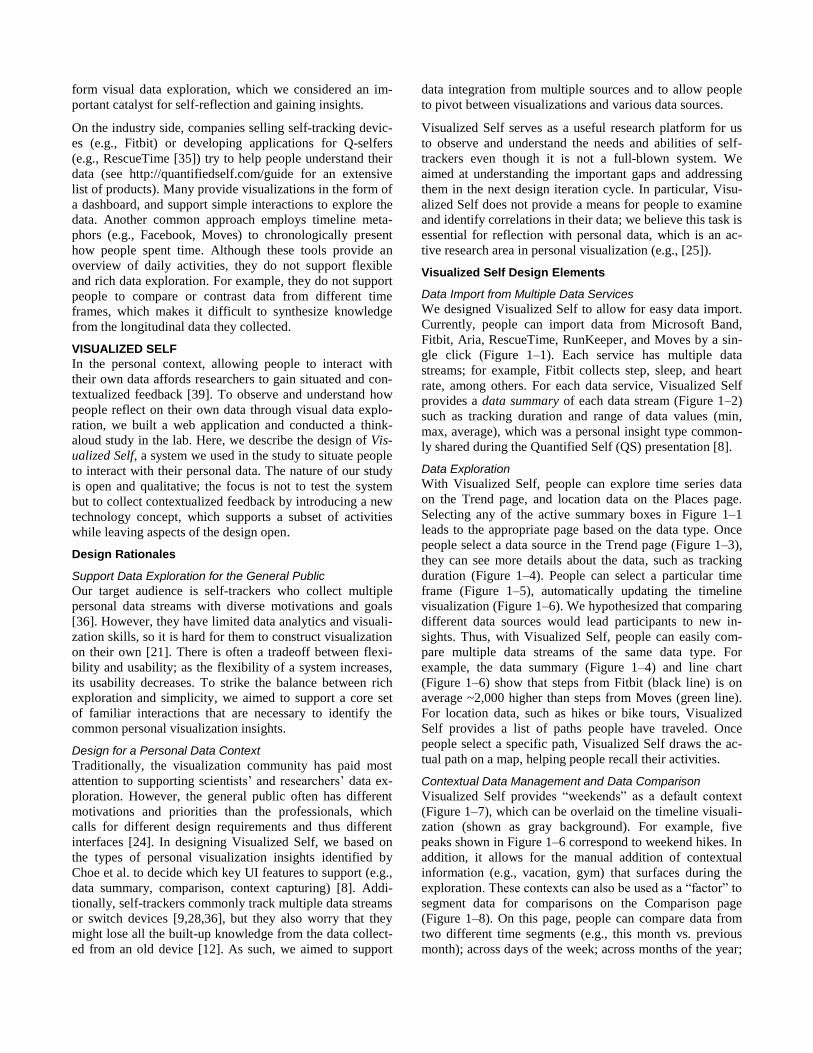
Data Import from Multiple Data Services
We designed Visualized Self to allow for easy data import.
Currently, people can import data from Microsoft Band,
Fitbit, Aria, RescueTime, RunKeeper, and Moves by a sin-
gle click (Figure 1–1). Each service has multiple data
streams; for example, Fitbit collects step, sleep, and heart
rate, among others. For each data service, Visualized Self
provides a data summary of each data stream (Figure 1–2)
such as tracking duration and range of data values (min,
max, average), which was a personal insight type common-
ly shared during the Quantified Self (QS) presentation [8].
Data Exploration
With Visualized Self, people can explore time series data
on the Trend page, and location data on the Places page.
Selecting any of the active summary boxes in Figure 1–1
leads to the appropriate page based on the data type. Once
people select a data source in the Trend page (Figure 1–3),
they can see more details about the data, such as tracking
duration (Figure 1–4). People can select a particular time
frame (Figure 1–5), automatically updating the timeline
visualization (Figure 1–6). We hypothesized that comparing
different data sources would lead participants to new in-
sights. Thus, with Visualized Self, people can easily com-
pare multiple data streams of the same data type. For
example, the data summary (Figure 1–4) and line chart
(Figure 1–6) show that steps from Fitbit (black line) is on
average ~2,000 higher than steps from Moves (green line).
For location data, such as hikes or bike tours, Visualized
Self provides a list of paths people have traveled. Once
people select a specific path, Visualized Self draws the ac-
tual path on a map, helping people recall their activities.
Contextual Data Management and Data Comparison
Visualized Self provides “weekends” as a default context
(Figure 1–7), which can be overlaid on the timeline visuali-
zation (shown as gray background). For example, five
peaks shown in Figure 1–6 correspond to weekend hikes. In
addition, it allows for the manual addition of contextual
information (e.g., vacation, gym) that surfaces during the
exploration. These contexts can also be used as a “factor” to
segment data for comparisons on the Comparison page
(Figure 1–8). On this page, people can compare data from
two different time segments (e.g., this month vs. previous
month); across days of the week; across months of the year;

and before & after a particular date (e.g., before & after my
son was born). Figure 1–8 shows the “days of the week”
comparison, demonstrating that steps on Saturdays were the
highest among other days of the week.
Implementation
We implemented Visualized Self as a web-based applica-
tion with a server backend. The backend handles user man-
agement (signup, login) and also functions as a data
backend (all data users acquire from external data providers
are stored both locally and remotely on the server). This
way, people who are logging in with the same account
across different browsers or devices do not need to down-
load their personal data repeatedly. The frontend uses a
local database that synchronizes with the remote database
server, thus ensuring data persistency. It also takes a modu-
lar approach to connecting to external data services such as
Fitbit or RunKeeper. Connections to these data services
work via APIs and most external data services rely on the
OAuth process for authentication, which enables data ac-
cess to a service without requiring a user’s password. Some
services such as Microsoft Band or RunKeeper operate on
OAuth 2 with Explicit Grants, which are based on secret
IDs handed out to developers. Because some APIs are not
capable of directly communicating with Javascript apps, the
backend can also function as a proxy server, looping the
API call and results through.
STUDY
We conducted our study in an urban city in the US. The
study was approved by the Institutional Review Board. It
was critical for us to capture how people interact with their
data using Visualized Self. As such, we conducted the study
in the lab, observing and recording all the interactions as
well as asking follow-up questions at the end of the session.
Participants
We recruited 11 (3 female) participants via a professional
recruiting agency. Due to our study’s goal of understanding
how people explore their personal data, we looked for peo-
ple who have been collecting multiple data streams. Inclu-
sion criteria for the study were adults who (1) have been
regularly tracking personal data for the past two months or
longer; and (2) have been using two or more of the follow-
ing devices or apps: Fitbit (sleep, steps, etc.), Aria (weight,
bodyfat, BMI), MS Band (sleep, steps, etc.), Moves (steps,
walks), RunKeeper (runs), and RescueTime (productivity).
We also specified that we would delete all the imported
data once the study session was over. We compensated each
participant with a $100 USD gift card.
In the pre-study questionnaire, we asked participants’ de-
mographic information and tracking background in detail
(Table 1). Their ages ranged from 24 to 60 (mean = 35.8).
All but one (P5) were employed full-time. All had relatively
extensive tracking experience; besides what we described in
Figure 1. Visualized Self user interface. Once a user imports multiple data streams (1), high-level data summary is shown (2). On
the Trend page, one will first select a data stream type (3), service type (4), and the time span by using the mini-map (5). The select-
ed time frame will be zoomed-in (6). Pre-defined (e.g., Weekends) or user captured (e.g., vacation) contexts can be overlaid on the
graph (7). The Comparison page (8) allows people to quickly conduct within-subject comparative analyses.
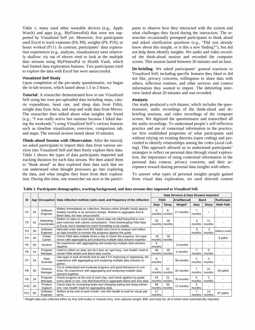
Table 1, many used other wearable devices (e.g., Apple
Watch) and apps (e.g., MyFitnessPal) that were not sup-
ported by Visualized Self yet. Moreover, five participants
used Excel to track expenses (P4, P8), weights (P9, P10), or
hours worked (P11). In contrast, participants’ data explora-
tion experiences (e.g., analysis, visualization) were relative-
ly shallow: six out of eleven tried to look at the multiple
data streams using MyFitnessPal or Health Vault, which
had limited data exploration features. Two participants tried
to explore the data with Excel but were unsuccessful.
Visualized Self Study
Upon completion of the pre-study questionnaire, we began
the in-lab session, which lasted about 1.5 to 2 hours.
Tutorial: A researcher demonstrated how to use Visualized
Self using her own pre-uploaded data including steps, calo-
rie expenditure, heart rate, and sleep data from Fitbit,
weight data from Aria, and step and walk data from Moves.
The researcher then talked about what insights she found
(e.g., “I was really active last summer because I hiked dur-
ing the weekends.”) using Visualized Self’s various features
such as timeline visualization, overview, comparison tab,
and maps. The tutorial session lasted about 10 minutes.
Think-aloud Session with Observation: After the tutorial,
we asked participants to import their data from various ser-
vices into Visualized Self and then freely explore their data.
Table 1 shows the types of data participants imported and
tracking duration for each data stream. We then asked them
to “think aloud” as they explored their data such that we
can understand what thought processes go into exploring
the data, and what insights they learn from their explora-
tion. During this time, one researcher sat next to the partici-
pants to observe how they interacted with the system and
what challenges they faced during the interaction. The re-
searcher occasionally prompted participants to think aloud
and asked clarification questions (e.g., “Did you already
know about this insight, or is this a new finding?”), but did
not help them identify insights. We audio and video record-
ed the think-aloud session and recorded the computer
screen. This session lasted between 30 minutes and an hour.
De-briefing: We asked participants’ general reactions to
Visualized Self, including specific features they liked or did
not like, privacy concerns, willingness to share data with
others, reflection routines, and other services and context
information they wanted to import. The debriefing inter-
view lasted about 20 minutes and was recorded.
Analysis
Our study produced a rich dataset, which includes the ques-
tionnaire, audio recordings of the think-aloud and de-
briefing sessions, and video recordings of the computer
screen. We digitized the questionnaire and transcribed all
the audio recordings. To understand people’s self-reflection
practice and use of contextual information in the practice,
we first established properties of what participants said
without relying on existing theories (open coding) and pro-
ceeded to identify relationships among the codes (axial cod-
ing). This approach allowed us to understand participants’
strategies to reflect on personal data through visual explora-
tion, the importance of using contextual information in the
personal data context, privacy concerns, and their ac-
ceptance toward sharing personal data insights with others.
To answer what types of personal insights people gained
from visual data exploration, we used directed content
Table 1. Participants demographics, tracking background, and data streams they imported to Visualized Self.
ID Age Occupation Data reflection method, tools used, and frequency of the reflection
Data Services & Data Streams Imported
Fitbit Aria/Manual Band RunKeeper
Step Sleep Weight* Step Sleep Walk Path
P1 34 Software Engineer
Reflect immediately on collection. Review online (Health Vault) approx-imately monthly or as services change. Wished to aggregate Aria & Band data, but was unsuccessful.
8 months
8 months
17 months 7
months - -
P2 41 Marketing
Coordinator
Reflect on data on most days. Import data into MyFitnessPal to com-pare exercise with calorie consumption. Tried downloading Fitbit data to Excel, but it needed too much formatting to be usable.
28 months
28 months
- 6
months 11
months -
P3 36 Software Engineer
Manually enter data from MS Health into Excel to analyze and reflect on data monthly to monitor the progress against the goals.
- - - 6
months 3
months (failed to load)
P4 44 Postal Carrier
Check Fitbit data multiple times a day to check the progress. No expe-rience with aggregating and analyzing multiple data streams together.
18 months
18 months
- - - 3 paths
P5 28 Student No experience with aggregating and analyzing multiple data streams together.
8 months
- 3 months - - -
P6 24 Program Manager
Used to reflect on data, but do it less as I got busy. Use Health Vault to merge Fitbit weight and Band step counts.
49 months
25 months
2 months 7
months 5
months -
P7 34 Data
Scientist
Use apps to look at trends and to see if I’m improving or regressing. No experience with aggregating and analyzing multiple data streams to-gether.
8 months - 36 months
3 months
3 months
-
P8 36 Finance Manager
Try to understand and evaluate progress and good behaviors to con-tinue. No experience with aggregating and analyzing multiple data streams together.
31 months
31 months
32 months 7
months 14
months 40 paths
P9 24 Program Manager
Check progress at the end of each day, and check against my goals every week or two. Use MyFitnessPal to aggregate Band and Aria data.
23 months
21 months
30 months 5
months 2
months -
P10 33 Product Support
Check data for increasing steps and changing eating and sleep behav-iors. Use Health Vault for aggregating data.
59 months
36 months
72 months 3
months - -
P11 60 Software Engineer
Reflect at the end of each month. Use MS Health to look for visual pat-terns.
17 months -
7 months
14 months
87 paths
* Weight data was collected either by Aria (wifi-scale) or manual entry. Aria captures weight, BMI, and body fat, all of which were automatically imported.

analysis [23] based on data-driven personal insight catego-
ries [8]. We first identified and extracted participants’ ob-
servations about the data. For example, we extracted the
following observation from P2’s think-aloud session:
“Yeah, look at this peak. 11/2014...that was a trip to San
Francisco.” We then used personal insight categories to
code each observation. For example, P2’s example contains
two insight types: extreme (“peak”) and external context
(“...a trip to San Francisco”). Two researchers separately
read and coded about 30% of the transcripts, and their ini-
tial inter-rater reliability (observed proportionate agree-
ment) was 70.3%. They then discussed discrepancies, and
revised and expanded the existing categories until they
reached an agreement of 98.0%, thereby creating the final
coding scheme of personal insight categories (Table 2).
After this step, one researcher coded the rest of the data-
driven personal insights.
RESULTS
From Lower-Level Reflection to Higher Level Reflection
Participants began to reflect as they imported the data on
the Import page, where they saw the duration of their data
collection, as well as the minimum, maximum, and average
values of each data stream. According to Fleck, this type of
reflection is a low level of reflection (R0) [16]. One unique
characteristic of our participants—that is likely different
from the Quantified Selfers—was that despite their exten-
sive data tracking experience, they did not have much expe-
rience with reflection beyond checking real-time feedback.
Thus, while our participants had collected substantial
amount of data—sometimes over multiple years, for many
of them, it was their first time seeing the longitudinal data
from multiple streams in one place. They enjoyed gaining
insights from simply looking at the data summaries. For
instance, many were surprised that they had been collecting
a lot more data than they initially thought (e.g., “So, May
2013. Oh, wow. I've been tracking weight actually for three
years.” [P9]). While browsing the Import page, participants
paid attention to the min/max values which prompted them
to recall a specific event or question data quality, leading up
to a higher level of reflection that involves explanations
(R1) or questions (R2) beyond revisiting values. For in-
stance, P7 noticed a big difference between the average step
counts from two devices: “Band has 222 days of collected
data and it's saying my average is 1,464, but Fitbit has 81
days and it's saying I have 5,064 as my average. So it leads
me to wonder which one is more accurate?”
We also observed that, from the timeline visualization, par-
ticipants often noticed device-transitioning periods, when
they switch from one device to another (e.g., Fitbit One to
Fitbit Flex, Fitbit One to MS Band). They commented posi-
tively on the fact that they could import data not only from
their current devices but also from previous devices so that
they could see the data in a continuous manner. As such,
viewing data from different services allowed them to pre-
serve the knowledge and insights gained from using prior
devices. Several participants were especially interested in
data from two or more devices captured at the same time
and visualized on the same chart. Some of them explained
that they wore two devices together to observe differences
between the data collected before switching over to a new
device. Visualized Self allowed them to directly compare
values between different sources, which is often difficult to
do on their own. However, comparing values from two de-
vices through visualization does not help people figure out
which one is a more accurate device, a question that many
people asked during their reflection.
Insight Gaining Patterns with Visual Data Exploration
We observed two insight gaining patterns from people’s
interaction with the timeline visualization, which demon-
strate an interesting relationship between visual data explo-
ration and self-reflection. First, visual data exploration—
such as looking at the peaks, trends, and maps; or sliding
the focus range to select and compare various time spans—
prompted people to recall their past behaviors, evoking ex-
ternal contexts that could explain the captured data. Often-
times, the peaks or extreme values easily caught
participants’ eyes, pushing them to reflect on what made
them achieve those unusual numbers, which often led to
good (e.g., a trip to Disneyland, running a marathon, son’s
birthday) or bad (e.g., injury, surgery, dead battery, burning
out) memories that they had forgotten. In addition to time,
the location data shown as paths on a map were powerful
memory triggers; they helped participants vividly remember
what happened a long time ago (e.g., a walk at the airport, a
bike ride around the lake). Based on Fleck’s descriptions
[16], this type of insight gaining pattern relates to R1 (revis-
iting with explanation, descriptive reflection) because peo-
ple often use the evoked contexts to explain or justify
specific phenomena observed in the data.
The second insight-gaining pattern was the opposite of the
first pattern: recalling past behaviors prompted people to
come up with a new interesting question to ask, leading
them to visually explore their data to look for an answer.
We frequently observed this workflow when participants
were on the Comparison page. For example, P1 entered
“Sept 15, 2015” to compare his weight before and after this
date. When we asked why he entered Sept. 15th, P1 men-
tioned, “That's kind of around the time I changed jobs. I
was wondering if there was anything interesting there.” P1
was indicating that switching jobs (and hence the office
location) might have affected his weight; it took him less
than 30 seconds to come up with this question, enter the
date, and check the visualization to find out that he actually
lost weight after he switched his job. Coming up with good
questions about data from scratch is difficult; surprisingly,
we observed a total of 87 times when participants formed
questions and identified insights through a subsequent ex-
ploration. As such, visual data exploration can promote
people to quickly generate questions and interact with the
visualizations in the spur of the moment to seek answers.
This type of insight gaining pattern mainly relates to R2

(exploring relationships), which involves questioning and
hypothesizing to get a different level of understanding [16].
Although Fleck suggested that the lower levels of reflection
are prerequisites for the higher levels of reflection, we did
not necessarily observe this; in fact, we observed that peo-
ple frequently bounced back and forth between R1 and R2.
Temporal Comparisons
Participants spent a long time on the Comparison page.
They enjoyed identifying various insights gained from
comparing two different time segments, days of the week,
months of the year, and other various aspects of their lives:
“this kind of nerdy, you know like what happened last January
compared to this January and seeing the differences. (…) Yeah, I
would spend all my time and use this application on this.” [P2]
Participants liked to see the immediate feedback in visuali-
zations from interactive selection and duration adjustment.
Easy data selection and comparison facilitated people to
easily develop questions to ask and identify answers. We
suspect that the fast transitioning between time frame selec-
tion and auto-updated visualization led people to frequently
bounce back and forth between R1 and R2.
Some participants wanted to capture contexts at a more
granular level—for example, differentiating work hours
versus non-work hours, or differentiating marathon training
from casual dog walking—to be able to run interesting
analyses later. We however note that there were many ques-
tions participants could not ask or answer, as our initial
support for temporal comparisons was minimal. It is a
promising avenue to explore more advanced ways to help
people form hypotheses and query them using more power-
ful visualizations that can highlight differences and correla-
tions understandable by a wide audience.
Types of Personal Insights Drawn from Visualized Self
We extracted 382 personal insight observations from our
data (ave = 34.7, min = 18 [P2], max = 60 [P9]). Among
these, we identified 1,133 insights (avg = 3.0 / observation).
Table 2. Types of visualization insights. We adopted from [8], and then revised and expanded adding new insight categories.
Type (total frequency)
Subtype (frequency)
Description Example Quotes
Recall (327) External context (171)
Uncaptured data provided by the self-tracker to under-stand and explain a phenomenon shown in the data
“I think that was soon after my surgery and that maybe would make sense cause I’d have to get up to take medicine and maybe being restless or something.” [P8]
Confirmation (80) Collected data confirms existing knowledge “So for the most part…I mean, this graph is informative in that it doesn't usually take me long to fall asleep. So this is confirming what I already know about.” [P9]
Contradiction (76)
Collected data contradicts existing knowledge “That was the opposite of what I was expecting. I would've expected that as I ate healthier I would've been burning more calories.” [P9]
Detail (257) Identify value (105)
Explicitly specify the measured value, its range for one or more clearly identified data points, or the difference between two measured values
“And it looks like my highest since I've started using it is 7,958. I wonder what date that was.” [P7]
Identify extreme (87)
Explicitly state the identities of the data points pos-sessing extreme values of the measure variable
“Yeah, look at this peak. 11/2014 that was a trip to San Francisco.” [P2]
Identify refer-ences (65)
Explicitly state the values of categorical variables, labels from the axes, or legends
“It says I'm taking a lot of weekend steps. That's quite surprising.” [P1]
Comparison (168)
By time segmen-tation (111)
Compare measured values segmented by time “I could see every month this year I'm improving.” [P11]
Multiple services* (26)
Compare the same data type from two or more ser-vices
“Yeah, so the—yeah, definitely interesting to see that the two devices gave very different trends.” [P6]
Against external data (14)
Bringing in external data for comparison “I have data for the same period for my HDL and my LDL and my tri-glycerides. My weight is important but those are just as important as well as to how those values are changing.” [P10]
By factor (12) Compare measured values by a factor (other than time) “What was happening in February 2015? [Laughter] I bet I can tell you what those are. That's one of my son's sleep regressions.” [P1]
Instances (5) Compare two specific instances “The plan says no exercise after 7:30. And these two data points is basically validating that you've got to stick by it.” [P3]
Trend (119) Describe changes over time “Then there’s also a time when I had surgery actually both holidays. In 2013 I had shoulder surgery in December. Everything went down.” [P8]
Value judgment* (118) Convey positive or negative connotations about the data
“It’s pretty irregular. I really wish I woke up at the same time. This is really bad.” [P6]
Distribution (41)
Variability (41) Explicitly state the variability of measured values “This is around—around here is when my son was born. Second kid. So, you know, some of this stuff—you can see trending up as you're not taking care of yourself. Son gets a little older, things go back to normal.” [P1]
By category (0) Explicitly describe the variation of measured values across all or most of the values of a categorical variable
By category (0)
Correlation (34) Specify the direct relationship between two variables (but not as comparison)
“So the Calorie data matches the Steps data.” [P9]
Outlier (28) Explicitly point out outliers or state the effect of outliers “The min and max are interesting. But from a global perspective, they're probably outliers on asleep.” [P11]
Data summary (27) Summary of collected data (such as number of data points, duration of tracking, and averages)
“So about two years, and averaging over ten [10,000 steps]. My goal is set at ten [10,000 steps], so that makes me happy.” [P4]
Prediction (14) Predict the future based on the collected data “Yeah, Martin Luther King. So if I go to comparison of weekend I think my weekends tend to be sluggish. Weekdays are okay.” [P3]
Total (1133) * New insight types identified in this study in comparison to Choe, Lee, and schraefel [8].

In Table 2, we summarize insight types, definitions, exam-
ple quotes, and frequency count for each type.
Overall, it appears that Visualized Self helped participants
identify most of the personal insight types reported in [8].
The most frequent insight type was recalling external con-
texts (n = 171) to explain what happened in the past (e.g.,
“Around here is when my son was born. You can see trend-
ing up as you're not taking care of yourself. Son gets a little
older, things go back to normal”). Trend (n = 119) and
comparison by time segmentation (n = 111) were also very
common. We found few insights regarding prediction,
comparison against external data, correlation, and distribu-
tion, which we revisit in the discussion section.
Additionally, we identified two new personal insight
types—comparison of multiple devices (n = 26) and value
judgment (n = 118)—that were not reported in [8]. We be-
lieved that Visualized Self’s data integration feature al-
lowed people to easily compare data streams from multiple
devices, which was difficult to do on their own. We also
noticed that people often made value judgments about their
findings (e.g., “Saturday is pretty bad [in terms of step
count]”). When value judgments carried a negative conno-
tation as in the earlier example, these insights sometimes
led to a resolution (e.g., “So I need to take action to proba-
bly monitor myself to ensure that I’m at least at 2,000
[steps] or more.” [P10]). This thought process concerns
with a higher level of reflection, R3: asking of fundamental
questions, which alters or transforms the reflector’s original
point of view. Although this transition (i.e., a value judg-
ment leading to a resolution) was rare (we observed a total
of 27 times), we believe that this type of reflection is the
key to helping people take their data to the next step, mak-
ing a resolution to change behavior.
DISCUSSION
In this section, we reflect on our findings and study limita-
tions, and suggest future directions for supporting self-
reflection in the personal data context.
Supporting Self-Reflection with Visual Data Exploration
We found that visual exploration with personal data can
help people reflect on their behaviors, and prompt them to
think about interesting questions and look for answers. Vis-
ual data exploration evoked contextual information, which
participants used for building hypotheses to test, some of
which could be quickly explored using visualizations. As
this very act of reflecting upon data using visualizations is
an important insight gaining process in the personal data
context, we should further examine ways to promote self-
reflection leveraging visualizations.
Many participants commented that existing personal infor-
matics tools are not equipped with even simple data explo-
ration capabilities. For example, although Fitbit’s
dashboard allows people to view a pre-defined duration of
data (e.g., day-, week-, and month-long data view), people
cannot specify a desired duration, compare two different
time frames, or remove outliers. Supporting flexible data
selection, filtering, and comparison features can allow peo-
ple to explore their data further and help them create inter-
esting questions and see things from a different perspective;
these findings might not be too surprising for the visualiza-
tion community, but personal informatics systems still do
not support many of these features, which could foster self-
reflection. That being said, we need other kinds of visuali-
zation supports for capturing contexts and communicating
insights. For example, once people identify an insight, a
data-driven annotation tool (e.g., ChartAccent [34]) can
help people easily highlight important insights directly on
the visualization, which could help them convey key points
in visual data-driven storytelling and presentation.
Reflection on the Frequency of Insight Types
While we identified two new insight types that were not
reported in [8], other insight types (e.g., prediction, correla-
tion, distribution) were not as frequently observed. We sus-
pect that Visualized Self’s design limitation and different
study contexts might have resulted in these differences.
People’s ability to derive insights was inherently influenced
and constrained by the design of our system. The low fre-
quency count of “correlation” might be due to the lack of
support to identify correlation. During the debriefing inter-
view, however, many participants mentioned that they
wanted to see correlational insights (e.g., “Can you guys
correlate the trend of activity with weight?” [P6]). There-
fore, the insight types with a low frequency count do not
mean that they are less important than others. Helping peo-
ple identify correlation with longitudinal data using visuali-
zations, and communicating the results in a way that
anybody can assimilate are challenging yet important topics
to explore further and warrant future research efforts.
The difference in the results can also be explained by the
different study contexts: insights from our study were iden-
tified during personal data exploration phase but insights
reported in [8] were found in the corpus of data from per-
sonal data presentation. Q-Selfers tended to affirmatively
report concrete findings during the QS meetup talks [8]. On
the other hand, when our participants were exploring data
with Visualized Self, they tended to ask questions more so
than drawing a conclusion. This type of interaction is un-
derstandable given the novelty of the tool, short duration of
the session, and the exploratory nature of the reflection.
Reflection on the Levels of Reflection
Using the levels of reflection framework helped us system-
atically examine self-trackers’ reflection practices, but giv-
en our study context and the unique characteristics of
participants, some of the findings will not be generalizable
to other contexts. For example, we observed many “R0”
type reflections—partly because our study was the first time
many of our participants saw their data in this new perspec-
tive; however, if they use this platform regularly in their
own environment, we suspect that they will focus on in-
sights related to “maintenance” than “discovery” [29], and

the pattern of reflection will likely differ from what we
found. Participants also stated that it is unnecessary to visit
this site daily, because people’s behavioral trends would not
change that frequently. But, it is possible that people will
“piggyback” visiting Visualized Self on their existing habit.
For example, P10 and P11 already had a habit of reviewing
expenses monthly and stated that that is when they would
come back to Visualized Self to reflect on their data.
We commonly observed R0, R1, and R2 type reflections,
probably due to Visualized Self’s data summary and tem-
poral comparison pages. On the other hand, drawing higher-
level reflections (i.e., R3, R4) was less common despite
their importance. As many personal informatics systems
aim to promote behavior change, R3 might be an important
reflection type that can potentially lead to short-term, or
even long-term behavior change. We did not observe R4;
relating individuals’ personal data to moral and ethical is-
sues, or socio-historical and politico-cultural contexts might
be very unusual unless the data is related to these topics
(e.g., public transportation use, ecological footprint).
Need to Incorporate More Sophisticated Contexts
Contextual information plays an important role in under-
standing one’s personal data. By definition, external con-
texts are uncaptured data provided by a self-tracker. We
learned that differentiating the same data type captured in
different contexts is important, because it might lead to
more interesting analyses later, and help people filter out
outliers that might skew the whole dataset. However, given
that a wide range of contextual information can promote
self-reflection, context capturing could become quickly
overwhelming, noisy, and uninformative, discouraging self-
reflection. Therefore, we envision that many different kinds
of contextual information can automatically be integrated to
lessen the capture burden. Participants wished to incorpo-
rate diverse contexts including: calendar events, location
semantics, major life events (e.g., marriage, birthday, mov-
ing), key dates (e.g., holiday, start of the school, goal set-
ting dates), vacation, workout types (e.g., swimming,
strength training), seasons, and weather. Inferring context
using other data streams (e.g., capturing “gym” by combin-
ing location and activity) or importing them directly from
other apps (e.g., Foursquare) can reduce the capture burden.
Rich Analysis and Inference
Although visual exploration is an important insight finding
mechanism, a few participants mentioned that they would
like to receive system-driven insights such as automated
inferences on trends (e.g., “Your weight is trending up and
your steps are trending down” [P1]), and suggestions (e.g.,
“Try going to bed at [a certain time] and then you’ll im-
prove your sleep efficiency” [P6]). We recognize the bene-
fits of such approaches, but we also believe that the human-
driven approach of identifying insight through qualitative
self-reflection will still remain an important part of the
overall landscape of self-tracking. It is also unclear whether
system-driven insights and recommendations can lead to
individuals’ transformative reflection and fundamental
change, a high-level of reflection. Going forward, combin-
ing human-driven and system-driven approaches to identify
insights is an interesting future research avenue, given the
importance of external contexts in analyzing personal data.
For example, a system might prompt participants to provide
potential contextual information when the system recogniz-
es trends and sudden changes in the data; the system might
also provide feedback such as “There is not enough data to
draw a conclusion,” asking people to collect more data.
CONCLUSION
We conducted an in-lab think aloud study to understand
how self-trackers reflect on their data and what personal
insights they gain through visual data exploration. We built
a web application called Visualized Self to situate self-
trackers to explore their own data. Overall, participants
expressed excitement over the concept of a personal data
visualization platform, and were able to identify many per-
sonal insights. We however suggest several research ave-
nues that Visualized Self did not fully addressed, including
supporting sophisticated ways to incorporate contextual
information, identifying and communicating correlational
insights, and integrating system-driven approaches to pro-
vide rich analyses and inferences. In closing, we believe
that providing rich data exploration support will help self-
trackers reflect on their experience and gain insights, which
is the heart of the self-tracking practice.
ACKNOWLEDGMENT
This research was supported by Microsoft Research and the
National Science Foundation (CRII:CHS-1464382).
REFERENCES
1. Apple HealthKit. https://developer.apple.com/healthkit.
2. Apple ResearchKit & CareKit.
http://www.apple.com/researchkit.
3. Baumer, E. P. (2015). Reflective informatics: concep-
tual dimensions for designing technologies of reflec-
tion. Proc. CHI '15, 585–594.
4. Baumer, E. P., Khovanskaya, V., Matthews, M., Reyn-
olds, L., Schwanda Sosik, V., & Gay, G. (2014). Re-
viewing reflection: on the use of reflection in
interactive system design. Proc. DIS '14, 93–102.
5. Bell, G. (2001). A Personal Digital Store, Communica-
tions of the ACM, 44(1), 86–91.
6. Bentley, F., Tollmar, K., Stephenson, P., Levy, L.,
Jones, B., Robertson, S., ... & Wilson, J. (2013). Health
Mashups: Presenting statistical patterns between well-
being data and context in natural language to promote
behavior change. ACM TOCHI, 20(5), 30.
7. Card, S. K., Mackinlay, J. D., & Shneiderman, B.
(1999). Readings in information visualization: using
vision to think. Morgan Kaufmann.
8. Choe, E. K., Lee, B., & schraefel, m. c. (2015). Charac-
terizing visualization insights from quantified-selfers’

personal data presentations. IEEE CG&A, 35(4), 28–
37.
9. Choe, E. K., Lee, N. B., Lee, B., Pratt, W., & Kientz, J.
A. (2014). Understanding quantified selfers’ practices
in collecting and exploring personal data. Proc. CHI
'14, 1143–1152.
10. Consolvo, S., Klasnja, P., McDonald, D. W., Av-
rahami, D., Froehlich, J., LeGrand, L., ... & Landay, J.
A. (2008). Flowers or a robot army?: encouraging
awareness & activity with personal, mobile displays.
Proc. UbiComp '08, 54–63.
11. Epstein, D., Cordeiro, F., Bales, E., Fogarty, J., &
Munson, S. (2014). Taming data complexity in life-
logs: exploring visual cuts of personal informatics data.
Proc. DIS '14, 667–676.
12. Epstein, D. A., Ping, A., Fogarty, J., & Munson, S. A.
(2015). A lived informatics model of personal infor-
matics. Proc. UbiComp '15, 731–742.
13. Exist. https://exist.io.
14. Fan, C., Forlizzi, J., & Dey, A. K. (2012). A spark of
activity: exploring informative art as visualization for
physical activity. Proc. UbiComp '12, 81–84.
15. Fawcett, T. (2015). Mining the quantified self: personal
knowledge discovery as a challenge for data sci-
ence. Big Data, 3(4), 249–266.
16. Fleck, R. (2012). Rating reflection on experience: A
case study of teachers’ and tutors’ reflection around
images. Interacting with computers, 24(6), 439–449.
17. Fluxtream. https://fluxtream.org.
18. Froehlich, J., Findlater, L., Ostergren, M., Ramanathan,
S., Peterson, J., Wragg, I., ... & Landay, J. A. (2012).
The design and evaluation of prototype eco-feedback
displays for fixture-level water usage data. Proc. CHI
'12, 2367–2376.
19. Gemmell, J., Bell, G., & Lueder, R. (2006). MyLife-
Bits: a personal database for everything. CACM, 49(1),
88–95.
20. Google Fit. https://www.google.com/fit.
21. Grammel, L., Tory, M., & Storey, M. (2010). How
information visualization novices construct visualiza-
tions. IEEE TVCG (InfoVis '10), 16(6), 943–952.
22. Hsieh, C. K., Tangmunarunkit, H., Alquaddoomi, F.,
Jenkins, J., Kang, J., Ketcham, C., ... & Estrin, D.
(2013). Lifestreams: A modular sense-making toolset
for identifying important patterns from everyday life.
Proc. SenSys '13.
23. Hsieh, H. F., & Shannon, S. E. (2005). Three ap-
proaches to qualitative content analysis. Qualitative
health research, 15(9), 1277–1288.
24. Huang, D., Tory, M., Aseniero, B. A., Bartram, L.,
Bateman, S., Carpendale, S., Tang, A., & Woodbury,
R. (2015). Personal visualization and personal visual
analytics. IEEE TVCG, 21(3), 420–433.
25. Jones, S. L., & Kelly, R. (2016). Finding interesting
correlations in multi-faceted personal informatics sys-
tems. Ext. Abstracts CHI '16, 3099–3106.
26. Kim, Y. H., Jeon, J. H., Choe, E. K., Lee, B., Kim, K.,
& Seo, J. (2016). TimeAware: leveraging framing ef-
fects to enhance personal productivity. Proc. CHI '16,
272–283.
27. Lazar, A., Koehler, C., Tanenbaum, J., & Nguyen, D.
H. (2015). Why we use and abandon smart devices.
Proc. UbiComp '15, 635–646.
28. Li, I., Dey, A., & Forlizzi, J. (2010). A stage-based
model of personal informatics systems. Proc. CHI '10,
557–566.
29. Li, I., Dey, A. K., & Forlizzi, J. (2011). Understanding
my data, myself: supporting self-reflection with
ubicomp technologies. Proc. UbiComp '11, 405–414.
30. Lin, J. J., Mamykina, L., Lindtner, S., Delajoux, G., &
Strub, H. B. (2006). Fish’n’Steps: encouraging physi-
cal activity with an interactive computer game. Proc.
UbiComp '06, 261–278.
31. Microsoft HealthVault.
https://www.healthvault.com/us/en.
32. Ploderer, B., Reitberger, W., Oinas-Kukkonen, H., &
van Gemert-Pijnen, J. (2014). Social interaction and re-
flection for behaviour change. Personal and Ubiqui-
tous Computing, 18(7), 1667–1676.
33. Quantified Self. http://www.quantifiedself.com.
34. Ren, D., Brehmer, M., Lee, B., Höllere, T., & Choe,
E.K. (2017). ChartAccent: Annotation for Data-Driven
Storytelling. PacificVis '17.
35. RescueTime. https://www.rescuetime.com.
36. Rooksby, J., Rost, M., Morrison, A., & Chalmers, M.
C. (2014). Personal tracking as lived informatics. Proc.
CHI '14, 1163–1172.
37. Sharmin, M., Raij, A., Epstien, D., Nahum-Shani, I.,
Beck, J. G., Vhaduri, S., ... & Kumar, S. (2015). Visu-
alization of time-series sensor data to inform the design
of just-in-time adaptive stress interventions. Proc.
UbiComp '15, 505–516.
38. Thieme, A., Comber, R., Miebach, J., Weeden, J., Kra-
emer, N., Lawson, S., & Olivier, P. (2012). We've bin
watching you: designing for reflection and social per-
suasion to promote sustainable lifestyles. Proc. CHI
'12, 2337–2346.
39. Thudt, A., Lee, B., Choe, E.K., & Carpendale, S.
(2017). Expanding research methods for a realistic un-
derstanding of personal visualization. IEEE CG&A,
37(2), 12–18.
40. Zenobase. https://zenobase.com.