
Understanding Density Independence in Android
16
Understanding Density Independence in Android by Steven Byle on Apr 19, 2013 Background Android is a mobile operating system with very few limitations on its devices’ hardware. Manufacturers can create devices of almost any screen shape, size, and density. Devices can have physical keyboards and buttons, or only virtual keyboards and buttons. While this flexibility is great for allowing device customization, it creates a few hurdles for application developers. First, how can apps support all of these various devices configurations with a consistent experience? Also, how can apps take advantage of devices that have higher end hardware or more features than others? Android was built with this in mind, and gives developers tools to support all device configurations, and optimize the experience for other device configurations, which will be covered later. In order for an application to be flexible and compatible with any device configuration, careful thought is required to make sure the user experience is appropriate across configurations. When creating an Android application, designers and developers must create user interfaces that work well with the small space of a phone, and the large space of a tablet. They also must take into account having image resources optimized for high and low density screens. While there are many ways to create optimized user interfaces for different screen sizes and orientations, the focus of this blog is how Android supports different screen densities. The basic design concept of Android is to have user interfaces that have elements that are about the same physical size, regardless of the screen density. Why? Simple, a user’s finger is the same physical size no matter what the screen density is. A button or clickable item should render about the same physical size (larger than a fingertip) on any device. This also goes for text, words should render about the same (readable) font size across devices. Screen Density, Not Resolution Screen density is a ratio of resolution and display size, which can be quantified as dots per inch, or dpi. The higher the dpi, the smaller each individual pixel is, and the greater clarity. Simply put, a higher dpi means more detail is displayed per inch, but does not necessarily correlate with a higher screen resolution. For example, the Galaxy Nexus (4.65” diagonal) has a 720x1280 px resolution, while the Nexus 7 (7”
description
Understanding Density Independence in Android
Transcript of Understanding Density Independence in Android

Understanding Density Independence in
Android
by Steven Byle on Apr 19, 2013
Background
Android is a mobile operating system with very few limitations on its devices’
hardware. Manufacturers can create devices of almost any screen shape, size, and
density. Devices can have physical keyboards and buttons, or only virtual keyboards
and buttons. While this flexibility is great for allowing device customization, it creates
a few hurdles for application developers. First, how can apps support all of these
various devices configurations with a consistent experience? Also, how can apps take
advantage of devices that have higher end hardware or more features than others?
Android was built with this in mind, and gives developers tools to support all device
configurations, and optimize the experience for other device configurations, which
will be covered later.
In order for an application to be flexible and compatible with any device
configuration, careful thought is required to make sure the user experience is
appropriate across configurations. When creating an Android application, designers
and developers must create user interfaces that work well with the small space of a
phone, and the large space of a tablet. They also must take into account having
image resources optimized for high and low density screens. While there are many
ways to create optimized user interfaces for different screen sizes and orientations,
the focus of this blog is how Android supports different screen densities.
The basic design concept of Android is to have user interfaces that have elements
that are about the same physical size, regardless of the screen density. Why? Simple,
a user’s finger is the same physical size no matter what the screen density is. A button
or clickable item should render about the same physical size (larger than a fingertip)
on any device. This also goes for text, words should render about the same (readable)
font size across devices.
Screen Density, Not Resolution
Screen density is a ratio of resolution and display size, which can be quantified as
dots per inch, or dpi. The higher the dpi, the smaller each individual pixel is, and the
greater clarity. Simply put, a higher dpi means more detail is displayed per inch, but
does not necessarily correlate with a higher screen resolution. For example, the
Galaxy Nexus (4.65” diagonal) has a 720x1280 px resolution, while the Nexus 7 (7”

diagonal) has an 800x1280 px resolution. It is a common misconception to assume
that they have about the same screen density, since their resolutions are almost
identical. However, the Galaxy Nexus has a screen density of about 316 dpi and the
Nexus 7 has a screen density of 216 dpi, not even close. This is because while they are
displaying the same resolution, they are also displaying it in different amounts of
space. Again, screen density is a ratio of resolution and display size, and both factors
contribute to the density.
Density Buckets
There is a myriad of Android devices with varying screen densities, which can range
from 100 dpi to over 480 dpi. In order to optimize images for all these screen
densities, images need to be created at different resolutions. However, trying to
optimize every image resource for every possible density would be incredibly tedious,
cause app sizes to be enormous, and simply is not a feasible solution. As a
compromise, Android uses density “buckets” that are used to group devices together
within certain screen density ranges. This way, apps are only required to optimize
images for each density bucket, instead of every possible density. This keeps the
workload reasonable for designers and developer, and also prevents the application
size from ballooning. Of course, there is a tradeoff, leading to variance in the physical
rendered size of images depending on device density, which will be shown later.
So, how do designers and developers optimize image resources for these density
buckets? First, the rendered size of the image needs to be decided. For example, say
an icon is intended to be 0.5x0.5 in when rendered on a screen. Next, the image must
be created at the largest density supported, or as a scalable vector graphic. Best
practice is to support the maximum density, which currently is xxhdpi at 480 dpi. At
480 dpi, a 0.5x0.5 in image converts to 240x240 px. Once the maximum density
version of the graphic resource is created at 240x240 px, it can then be scaled down
proportionally to create each subsequent density bucket version, each using the same

file name. Google recommends not creating a tvdpi version at 213 dpi, since it is only
needed for certain applications and used by a small set of devices. Once all versions
have been created, they can be added to “drawable” folders, using resource
identifiers to tell Android what density bucket they are intended for. Last, simply
reference the graphic resource in xml layouts and code using its name generated in
the “R” file, which holds references to all resources in the app. Android will then load
the resources at runtime, doing its best to match the actual device’s configuration to
the resource identifiers applied. If any density version of an image resource is not
included, Android will use another density version and scale it to the proportional size
required. It is not recommended to let Android do this, as it is not as efficient nor as
precise at manipulating resources as image editing software.
Dimension Units
In Android, user interfaces can be created in xml, and programmatically in code. In
order to express a form of distance or length, there are several units for dimensions.
These can be used on elements to set widths, heights, margins, padding, and more.
px - An actual pixel on the screen. This is a density dependent unit, and the physical
size of a single “px” varies depending on screen density.
in - A physical inch on the screen. This is a density independent unit, and the physical
size of a single “in” is the same on every screen density. The number of pixels a single
“in” translates to varies depending on screen density.
mm - A physical millimeter on the screen. This is a density independent unit, and the
physical size of a single “mm” is the same on every screen density. There are 25.4
“mm” in an inch. The number of pixels a single “mm” translates to varies depending
on screen density.
pt - A point, a common font size unit, on the screen. This is a density independent
unit, and the physical size of a single “pt” is the same on every screen density. There
are 72 “pt” in an inch. The number of pixels a single “pt” translates to varies
depending on screen density.
dp - A density independent pixel. This is a density independent unit, however the
physical size of a single “dp” is only approximately the same on every screen density.

There are approximately 160 “dp” in an inch. A scaling factor, depending on the
density bucket of the device, is applied to convert “dp” to the number of pixels at 160
dpi. The number of pixels a single “dp” translates to varies depending on the pixel on
screen density and the density bucket the device falls into.
sp - A scale independent pixel, specially designated for text sizes. This is a density
independent unit, however the physical size of a single “sp” is only approximately the
same on every screen density. Scaling factors, depending on the density bucket of the
device, as well as the user’s text size preference, are applied to convert “sp” to the
number of pixels at 160 dpi. The number of pixels this translates to varies depending
on screen density and the density bucket the device falls into.
The Magic of “dp”
As discussed, “px” is not density independent, and is not the same size on every
device, while “in”, “mm”, and “pt” are density independent and the same size on every
device. However, “dp” and “sp” are a little bit different from the rest, since they are
density independent, but they are not the same size on every device. Why is that? The
answer is in how “dp” and “sp” are computed into pixels. Android uses mdpi, 160 dpi,
as its baseline density, where 1dp is 1px. Essentially, “dp” can be thought of as “px” at
160 dpi. This is why 160 dp converts to about 1 in. So depending on the ratio
between a devices density bucket and the baseline density, mdpi, a scaling factor is
applied to convert “dp” to “px”.
The reason “dp” tends to vary in physical size is due to the same scaling factor being
applied for the entire density bucket. The scaling factor is computed with the density
bucket’s dpi, and not the device’s actual dpi. When the device’s dpi is not exactly the
same as its density bucket’s dpi, the same amount of “dp” converts to the same
amount “px”. This leads to the same amount of “px” being displayed on different
density screens, which render at different sizes.
The table above shows how 100 dp converts to “px” on different density devices. 100
dp should roughly translate to 0.625 in, and does so perfectly at the bucket sizes.
However, when the dpi of the device is less than the density bucket’s dpi, its pixels
are physically larger, and the same amount of “dp” will render larger, and vice versa.
So this begs the question, why does “dp” allow this variation in its physical size?
Basically, Android sacrifices some precision in physical size, in order to maintain
performance and display quality. Since “dp” scales to “px” using Android’s density
bucket ratios (0.75:1.0:1.5:2.0:3.0), this allows for minimal “px” rounding and simpler
computations. Also, since the scaling factors are proportional to the density bucket
ratios, “dp” will render proportionally to image resources provided for each density.
Lastly, when scaling graphics, it is best to stay as close to whole numbers and simple
fractions, as complex fractions can create artifacts and aliasing.
Defining UI Element Bounds
When defining width and height attributes on a user interface element, there are
special options available, as well as the dimension units.
wrap_content - This will “wrap” the bounds of the element to be just large enough
to contain its content (images, text, etc), children elements contained within it, plus
padding. Essentially, this set the element be the size of its largest content, and will
not adjust the size of the element.
match_parent (fill_parent deprecated in API 8) - This will “match” the bounds of the
element to its parent element, using the maximum allowed space, minus padding.
Essentially, this lets the element be the max size its parent allows, and will adjust the
size of the element if needed.
dimension unit - This will set the bounds of the element to precisely the size of the
dimension unit, each discussed earlier. Essentially, this sets the element be the exact
size of the dimension unit, and will adjust the size of the element if needed.
Demo
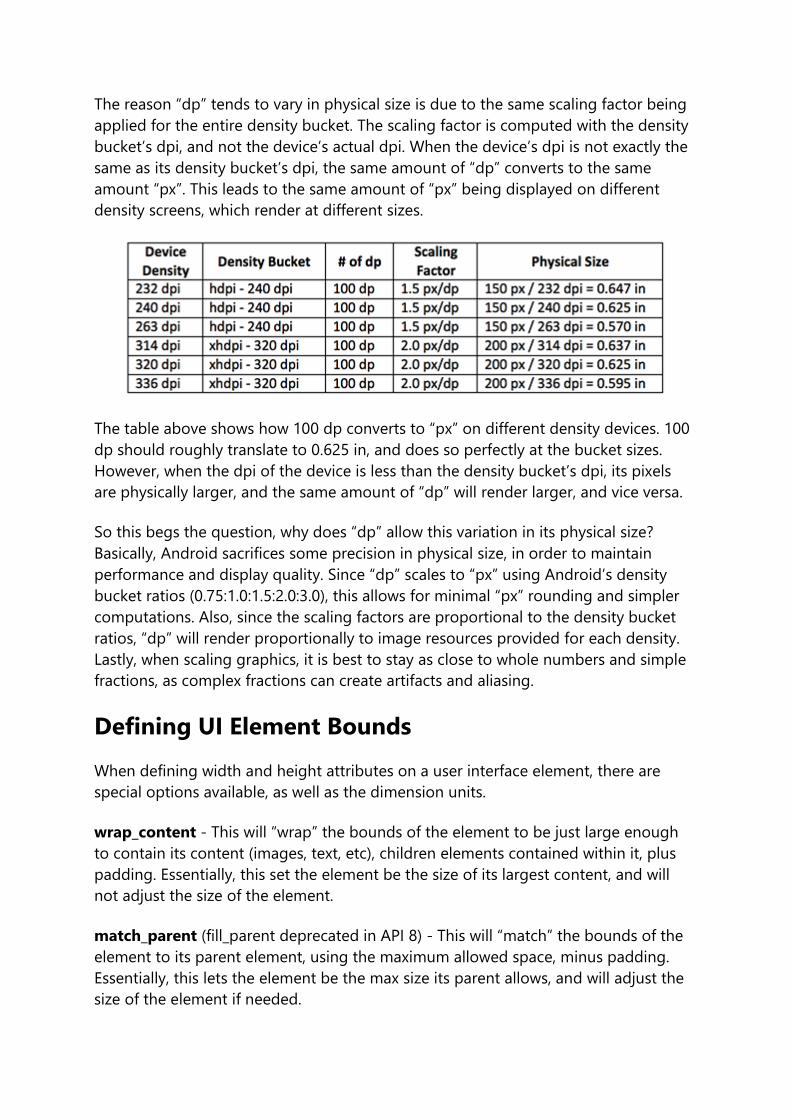
To demonstrate how this all comes together, creating and testing an example
application is necessary. For this example, take a design that uses a 200x200 px image
at xhdpi, or 320 dpi. For simplicity, the image resource can be named “android_logo”.
Using the 200x200 px resolution at 320 dpi as the desired physical size, the alternate
image sizes can be computed.
200x200px Image at xhdpi (320dpi)
After computing the required density specific image dimensions, they can be created
by scaling down from the maximum density version, as explained earlier. Next, each
density version of the image can be put into its respective “drawable” folder using
resource identifiers. Android will then choose the best resource at runtime,
depending on the configuration of the device.

Now, to exhibit the possible ways of keeping density independence, the image
should be set to the same physical size, using each of the density independent
dimension units. Since “px” is not density independent, and “sp” is designed for text,
they can be omitted.
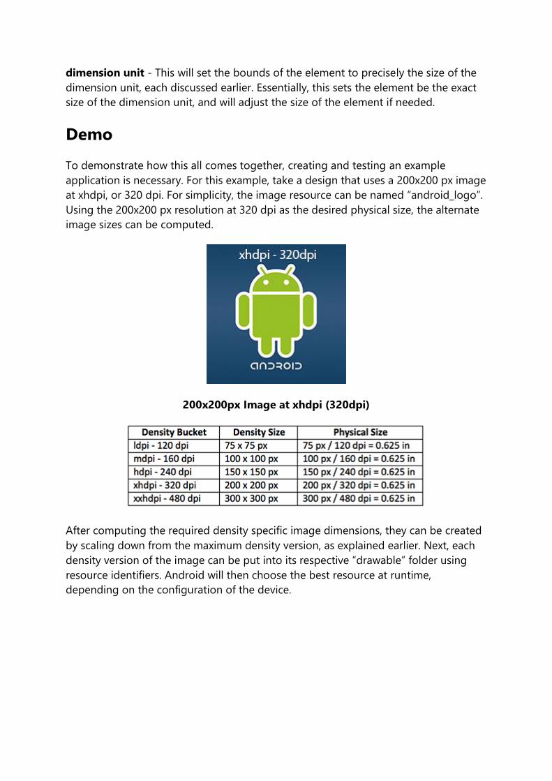
Device Example: xhdpi Bucket
By using a layout with the same image using each dimension unit set to the same
physical size, it is possible to compare how each dimension unit works. When running
on an emulator at 320 dpi, the images display at the exact same size, for every
dimension unit. This is expected since the dpi of the emulator exactly matches the
xhdpi density bucket, 320 dpi. However, when running on a Galaxy Nexus, which also
falls into the xhdpi density bucket, there are some variations in the size of the image.

320dpi Emulator Screenshot


Galaxy Nexus Screenshot
Upon inspection, it is apparent that the images set with “wrap_content” and “dp”
match in size, while the images set with “in”, “mm”, and “pt” also match in size.
However, the two groups or images don’t match each other. So what’s happening
here? As discussed earlier, “wrap_content” and “dp” use the density bucket ratios to
properly convert their dimensions. So, the image computes to 200x200 px on the
device. However, the Galaxy Nexus’s actual screen density is not exactly 320 dpi, it
has a 315.3 xdpi and a 318.7 ydpi. Since the actual density is less than the xhdpi
bucket density of 320 dpi, the pixels on the actual device will be larger than the
intended physical size of 0.625 in.
When analyzing the images set with “in”, “mm”, and “pt”, notice that each image
converts to 197.1x199.2 px. As discussed earlier, “in”, “mm”, and “pt” all use the actual
device’s density to convert their dimensions to pixels. Since the actual density of the
Galaxy Nexus is less than the xhdpi bucket density at 320 dpi, fewer pixels are needed
to cover 0.625x0.625 in, and the image gets scaled down.
When comparing the rendered images, it is apparent that the images set with
“wrap_content” and “dp” have less precise physical sizes, but their image quality is
better than the images set with “in”, “mm”, and “pt”.
No scaling with "wrap_content" and "dp" (left). Scaling with "in", "pt", and
"mm" (right).
Device Example: hdpi Bucket
Next, when running on an emulator at 240 dpi, the images display at the exact same
size, for every dimension unit. Again, this is expected since the dpi of the emulator
exactly matches the hdpi density bucket at 240 dpi. But as before, when running on
an hdpi device, this time a Droid Incredible, there are some variations in the size of
the image.


240dpi Emulator Screenshot
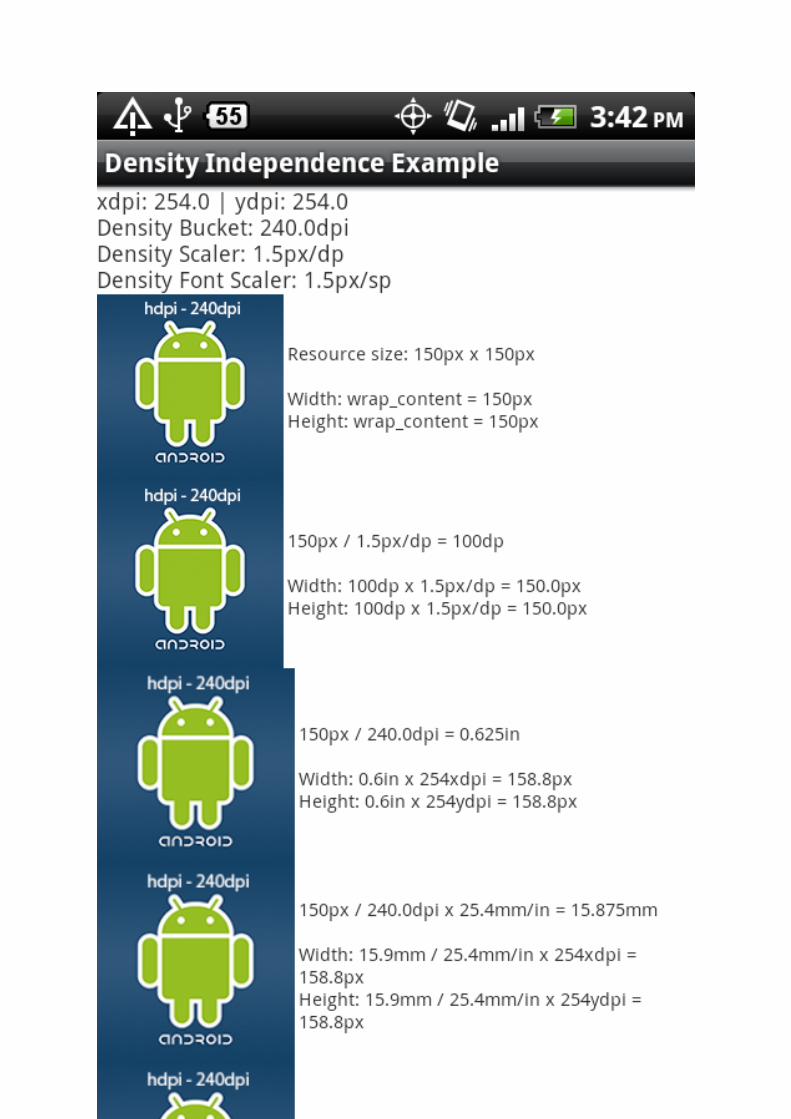
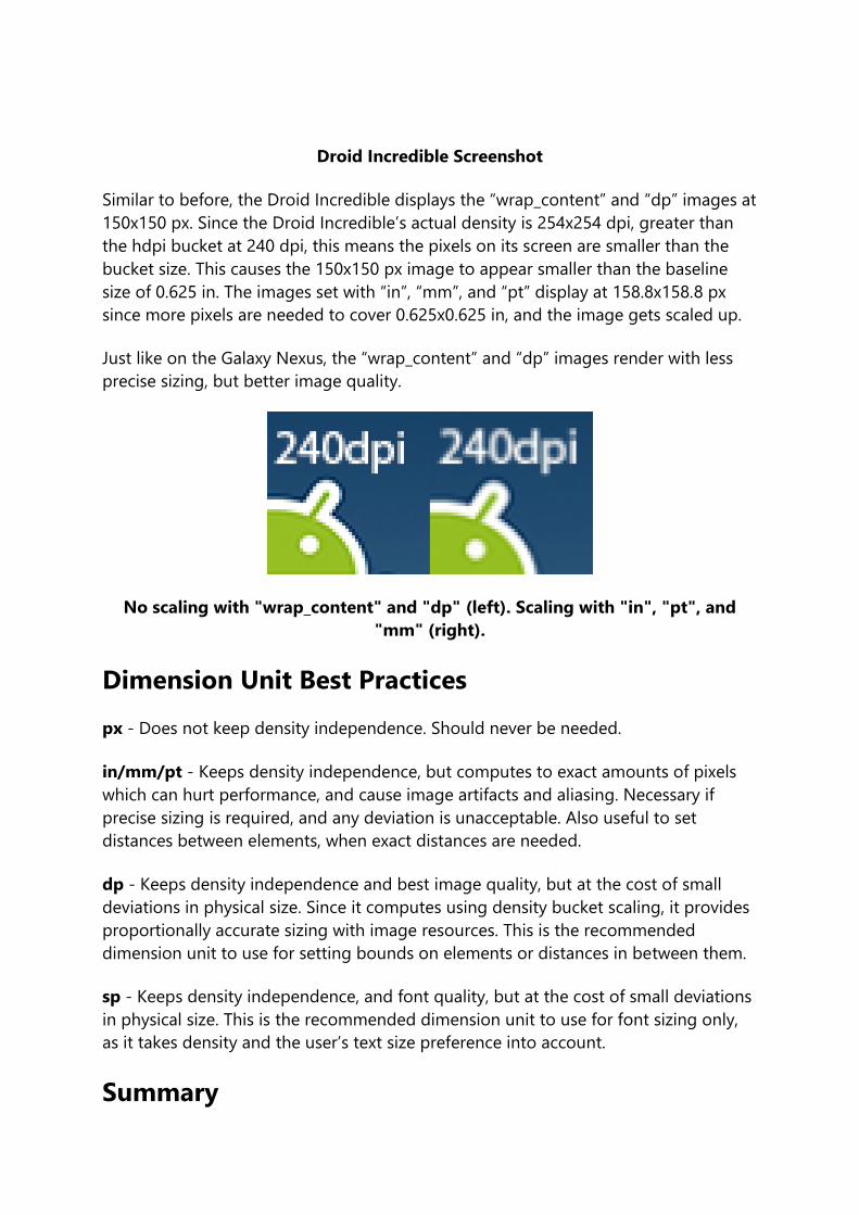
Droid Incredible Screenshot
Similar to before, the Droid Incredible displays the “wrap_content” and “dp” images at
150x150 px. Since the Droid Incredible’s actual density is 254x254 dpi, greater than
the hdpi bucket at 240 dpi, this means the pixels on its screen are smaller than the
bucket size. This causes the 150x150 px image to appear smaller than the baseline
size of 0.625 in. The images set with “in”, “mm”, and “pt” display at 158.8x158.8 px
since more pixels are needed to cover 0.625x0.625 in, and the image gets scaled up.
Just like on the Galaxy Nexus, the “wrap_content” and “dp” images render with less
precise sizing, but better image quality.
No scaling with "wrap_content" and "dp" (left). Scaling with "in", "pt", and
"mm" (right).
Dimension Unit Best Practices
px - Does not keep density independence. Should never be needed.
in/mm/pt - Keeps density independence, but computes to exact amounts of pixels
which can hurt performance, and cause image artifacts and aliasing. Necessary if
precise sizing is required, and any deviation is unacceptable. Also useful to set
distances between elements, when exact distances are needed.
dp - Keeps density independence and best image quality, but at the cost of small
deviations in physical size. Since it computes using density bucket scaling, it provides
proportionally accurate sizing with image resources. This is the recommended
dimension unit to use for setting bounds on elements or distances in between them.
sp - Keeps density independence, and font quality, but at the cost of small deviations
in physical size. This is the recommended dimension unit to use for font sizing only,
as it takes density and the user’s text size preference into account.
Summary

To recap, the keys to keeping density independence:
Decide the required physical rendered size needed for each image asset.
Design vector graphic image assets, or raw image assets larger than the size
needed for the maximum density bucket.
Create density specific versions of every image asset for each density bucket,
and place them into the proper “drawable” resource folder using identifiers.
When setting bounds for images, use “wrap_content” for best display,
“match_parent” to fill the display, or “dp” for a fixed size.
When setting distances in layouts, use “dp” for best display. Only use “in”,
“mm”, or “pt” if a precise size is required. There should never be a use for “px”.
With an understanding of how Android handles displaying user interfaces on
different density screens, it becomes much easier to design and develop applications
optimized for any density display.
Source Code
The full source of this demo can be found on GitHub, in a zipped format, and the .apk
install file is also attached below.
Attachments
Android Density Independence.apk__0.zip
http://www.captechconsulting.com/blog/steven-byle/understanding-density-independence-
android


