Understanding an image - DST IGETdst-iget.in/tutorials/IGET_RS_02/IGET_RS_002...IGET_RS-002...
11
Understanding an image Using SAGA Tutorial ID: IGET_RS_002 This tutorial has been developed by BVIEER as part of the IGET web portal intended to provide easy access to geospatial education. This tutorial is released under the Creative Commons license. Your support will help our team to improve the content and to continue to offer high quality geospatial educational resources. For suggestions and feedback please visit http://dst-iget.in/.
Transcript of Understanding an image - DST IGETdst-iget.in/tutorials/IGET_RS_02/IGET_RS_002...IGET_RS-002...

Understanding an image
Using SAGA
Tutorial ID: IGET_RS_002
This tutorial has been developed by BVIEER as part of the IGET web portal intended to provide easy access to geospatial education. This tutorial is released under the Creative Commons license. Your support will help our team to improve the content and to continue to offer high quality geospatial educational resources. For suggestions and feedback please visit http://dst-iget.in/.

IGET_RS-002 Understanding an image
2
Understanding an Image
Objective: To understand basic characteristics of a satellite image.
Software: SAGA GIS
Level: Beginner
Time required: 1 Hour
Prerequisites and Geospatial Skills
1. SAGA GIS should be installed on the computer
2. Basic knowledge about the SAGA interface
3. Should have completed Exercise ID: IGET_RS_001
Reading
1. Digital image, http://www.crisp.nus.edu.sg/~research/tutorial/image.htm
2. Landsat bands, http://landsat.usgs.gov/band_designations_landsat_satellites.php,
http://landsat.usgs.gov/best_spectral_bands_to_use.php
Tutorial dataset: http://dst-iget.in/tutorials/IGET_RS_02/IGET_RS_002_Data.zip
IGET_RS-002 Understanding an image
3
Introduction
Satellite or airborne digital images are composed of a two-dimensional array of discrete
picture elements, known as pixels. Generally, the pixels in remote sensing images are in
square shape. The corresponding length of a side of the pixel on earth surface is known as
ground sampling distance or simply ‘spatial resolution’. Each pixel is associated with a spectral
brightness value (also, known as Digital Number, simply ‘DN’) of corresponding ground
feature. These DN values are a quantized spectral radiance1 of a specific wavelength received
at the sensor. The value range of Digital numbers in an image is determined by the radiometric
resolution. For example a sensor with 8-bit radiometric resolution permits maximum 28 i.e.,
256 DN values (brightness values or gray scale levels) ranging from 0-255. A pixel with high
DN value represents that the sensor received high spectral radiance from the corresponding
ground area of the pixel and vice versa. In order to acquire sufficient spectral information of
an objects on the earth surface, a set of sampling wavelengths in the electromagnetic
spectrum are used. The sensor will record the DN values which are specific to these sampling
wave lengths. Therefore, each sampling wavelength will result an array of pixels and is known
as a band of satellite image. If a sensor uses one wider wavelength range (i.e, ≈ 0.4 µm to 0.7
µm) to measure the spectral response characteristics of an area, then it records all the
information into one single image band, such sensors are known as ‘panchromatic sensors’ and
the satellite image is known a ‘panchromatic satellite image’. A multispectral sensor collects
the spectral information using few number of sampling wavelengths in electromagnetic
spectrum, hence it is a multi-layer (multi band) image. For example, Landsat-8 sensor records
the spectral information in eleven image bands, for more information please refer
http://landsat.usgs.gov/band_designations_landsat_satellites.php. In this tutorial we will use
Landsat Thematic mapper sensor data to understand few basic data characteristics of
multispectral images.
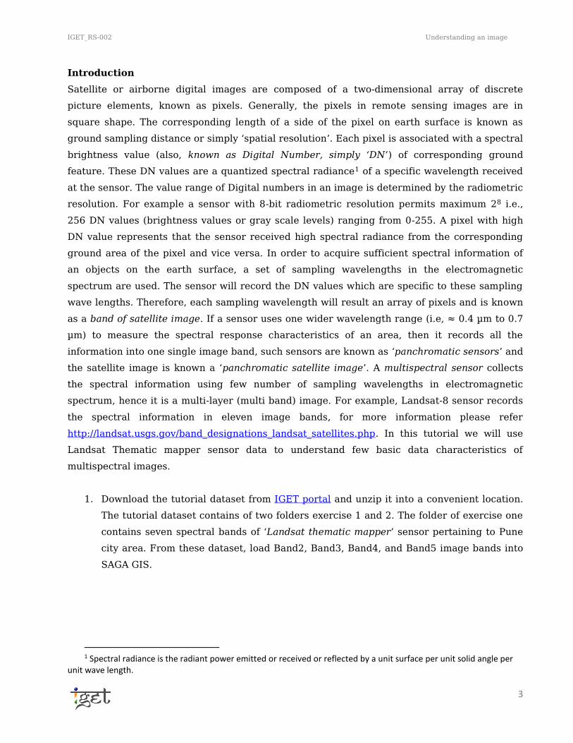
1. Download the tutorial dataset from IGET portal and unzip it into a convenient location.
The tutorial dataset contains of two folders exercise 1 and 2. The folder of exercise one
contains seven spectral bands of ‘Landsat thematic mapper’ sensor pertaining to Pune
city area. From these dataset, load Band2, Band3, Band4, and Band5 image bands into
SAGA GIS.
1 Spectral radiance is the radiant power emitted or received or reflected by a unit surface per unit solid angle per
unit wave length.
IGET_RS-002 Understanding an image
4
2. To view image bands double click on the Image bands under ‘Data’ tab in ‘Manager’
section. In order to open them in separate viewers, make sure to select option ‘New’ in
‘Add layer to selected map’ window when it prompt.
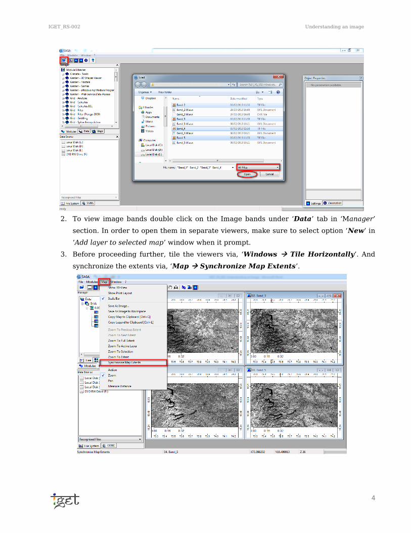
3. Before proceeding further, tile the viewers via, ‘Windows Tile Horizontally’. And
synchronize the extents via, ‘Map Synchronize Map Extents’.

IGET_RS-002 Understanding an image
5
4. The dataset using in this tutorial is pertaining to the same area of IGET_RS_001
tutorial. So we would request you to have a look at IGET_S_001 tutorial before
proceeding further.
5. If a grey scale (Black to white) colour ramp used to represent the image. Then black
colour represents less, grey colour represents medium and white colour represents
high spectral returns from the earth surface features. Zoom to various land-cover
classes i.e., water, urban areas, and agriculture etc., and try to explore the brightness
values (DN) in terms of spectral response of land-cover classes for the individual bands.
Write down the relative spectral response as ‘low’, ‘medium’ or ‘high’, for the different
land cover classes and spectral bands (For help refer step no: 8 to 17 of IGET_RS_001).
Water Urban Areas Agriculture
BAND 2
BAND 3
BAND 4
BAND 5
Table 1: Fill in the table with classes: low, medium and high.

IGET_RS-002 Understanding an image
6

IGET_RS-002 Understanding an image
7
You can use spectral reflectance curve to explain the spectral variance of various land cover
features on the surface of earth as function of wave length.
Band Statistics
The distribution of brightness values (DN values) in a single band can be represented
graphically using a histogram. The correlation between two (or more) bands can be assessed
graphically by using a scatter plot. Large negative values indicate a strong negative
correlation where as large positive values indicate strong positive relation and covariance
values near to zero indicate no correlation. In this section, we will explore the image band data
characteristics by using graphical methods.
Graphical Representation
Histogram
The study of histogram provides initial information about the most important parameter of an
image, i.e., contrast. Histogram is a frequency distribution function of DN values, which
provides the information about number of pixels having a particular Digital Number. It can
describe an image just in statistical terms without even explaining its spatial patterns.
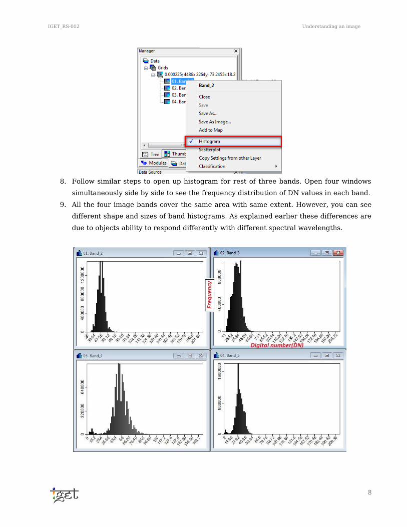
6. Histogram can be calculated for each band by just right clicking on the image band
under Data Tab in Manager section, and select ‘Histogram’. A new window will popup
showing the histogram of the image band selected.
7. You can zoom in or out of the histogram extent using scroll key of mouse and also by
dragging mouse with left data button and reset by right data button of mouse.
IGET_RS-002 Understanding an image
8
8. Follow similar steps to open up histogram for rest of three bands. Open four windows
simultaneously side by side to see the frequency distribution of DN values in each band.
9. All the four image bands cover the same area with same extent. However, you can see
different shape and sizes of band histograms. As explained earlier these differences are
due to objects ability to respond differently with different spectral wavelengths.

IGET_RS-002 Understanding an image
9
10. Now we will go in detail about, how histogram will help us to analyze an image at pre-
processing level? And what information this histogram can provide? To do this, load the
‘Band4Clip’ image band from the folder of Exersice2 in tutorial dataset into SAGA GIS.
Now repeat step 6 to open the histogram for the Band4Clip. Zoom out to get full extent
of the histogram.
11. Unlike the previous histograms what mainly will capture your attention in this
histogram pattern? It is having two prominent peaks (Refer the figure shown below).
12. This type of histogram pattern is termed as bimodal histograms. Histogram is bi-modal
or n-modal depending on two or n-reflective maxima, corresponding to 2 or n groups of
objects with similar digital numbers.
13. As explained earlier the DN values are smaller for weaker spectral responses and vice
versa. If the digital numbers are represented using grey colour ramp i.e., black to white
scale, then black colour represents less, grey colour represents medium and white
colour represents high spectral return from the earth surface features. If we consider
the histogram for ‘Band4Clip’ image (As shown below), the first peak represents water
bodies because water has very low reflectance in near infrared band(NIR) and the
second peak represents the rest of the features which comparatively have higher
reflectance in NIR band.
11
15
16

IGET_RS-002 Understanding an image
10
14. Now we will convert this histogram to a table to have a deeper look of data in image
band. Goto ‘Menu Bar Histogram Convert to Tablei’. A histogram table would
be added to data list. Double click on it to open in a viewer.
15. Check out for attributes of the table and what does it imply? You can find more details
about this attributes in Description Tab of Object Property Window.
16. The table gives the detailed information regarding cumulative frequencies and total
area covered by particular pixel classes.
17. Do similar analysis for the image bands provided in folder of exercise 1 and note down
the values of following parameters.
Along with histogram there are other parameters such as Arithmetic mean, mode, Median,
variance, Standard Deviation etc. as well; which summarizes the image’s grey level / contrast.
We will look into some of them
a. Arithmetic Mean: corresponds to the mean brightness of an image band.
b. Mode: It is defined as events occurring most often in a distribution. In the image band
histogram mode refers to the pixels with particular DN value which is having higher
frequency of occurrence.
c. Median: It refers to the value which is occupying central position.
d. Variance: The variance analysis refers to the variation in spectral radiance levels with
respect to mean value in the image band. It is mainly used to find if the image contrast
is high or intermediate or low.
e. Standard Deviation: Standard deviation measures the tendency of dispersion of a
distribution from the center i.e. it measures how dispersed the distribution is. It is
calculated as square root of variance and generally used to measure dispersion of
values around the arithmetic mean.
1.1.2 Scatterplot
A scatterplot is simply a graph of the DN values of one band plotted against the DN values of
another band. If the DN values in the image bands follows normal distribution, then the
corresponding feature space of scatterplot will form an ellipse. The feature space in scatter
plot is very useful to select the training samples and also helpful to for principal components.
In a Bi-dimensional scatterplot, the Cartesian axes (X, Y) represents the Digital Numbers of the
two bands in interest, Z axis represents the frequency of occurrence of certain phenomenon. In
this section we will learn how to construct scatterplot.
18. Right click on Band3 under Data tab in Manager section and select Scatterplot. It will
prompt a new window, now select options as shown in below figure and click ‘OK’.

IGET_RS-002 Understanding an image
11
19. Now you can see the scatterplot of Band3 vs Band4 in a map layout. The X axis of
scatterplot represents Band3 while y-axis represents Band4. It also gives the regression
equation between the two bands along with correlation coefficient.
20. As previously done for histogram, we can compute the scatter plot data in form
of table. Goto ‘Menu bar Scatterplot Convert to Table’ and have a look at
mean, minimum, maximum, standard deviation values using the description table of
object properties window.
18
19
21