“Typography is to writing as soundtracks are to...
62
“Typography is to writing as soundtracks are to movies.” Hoefler typeface designer
-
Upload
nguyenkhanh -
Category
Documents
-
view
255 -
download
1
Transcript of “Typography is to writing as soundtracks are to...

“Typography is to writing as soundtracks are to movies.”
Hoefler typeface designer

Pre-Gutenberg (before 1456)
◦ Words and images were equal partners in communication

Gutenberg (1456-1760) ◦ The influence of the
printed word – images as afterthoughts

Artistic (1891-1983)
◦ Characterized by Art
Nouveau decorative style and later artistic movements in the 20thcentury

Digital (1984-present
◦ Characterized by
technological tools and creation of typefaces based on computer software

Type works as a design element of composition
Hierarchy/Dominance
Unity
Variety
Balance
Proportion

The most important part of the verbal content is given the most prominence.
Depending on the vehicle, the verbal content receiving the most prominence could be a headline, title, compelling sentence, word, phrase, etc.
◦ Color & Size

Consistent use of typography is also a critical aspect
The best way to accomplish a consistent look is to limit the number of typefaces used in the design.
A good rule of thumb is to use a maximum of two or three typefaces per design.
Designs that use a large number of jumbled fonts are difficult to read and detract from a site’s sense of unity.

Trick to mixing typefaces is to make the difference look obvious and purposeful
Using opposites – typefaces that have different but complementary typeface characteristics

Variety

Balance determines the visual distribution of type and how it will appear in relation to the other visual elements
◦ Symmetrically
◦ Asymmetrically

When the proportions of your typography are harmonious, your content will have a natural flow
the proportions of your typography are imbalanced, the content will seem cluttered and disorganized.

proportional typeface contains glyphs of varying widths
monospaced (non-proportional or fixed-width) typeface uses a single standard width for all glyphs in the font.
a glyph is an elemental symbol within an agreed set of symbols, intended to represent a readable character

Letter and word forms ◦ Line
◦ Texture
◦ Shape


◦Blackletter ◦ Roman
◦Script ◦ Serif - Sans Serif - Square Serif
◦ Miscellaneous

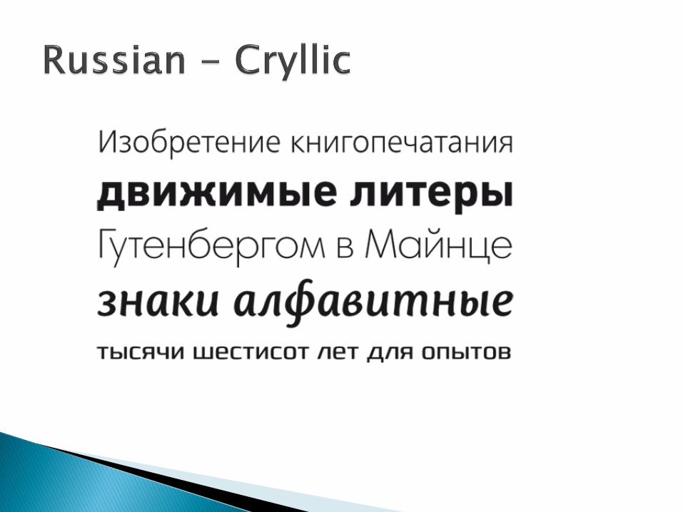
Black letter, also known as Gothic script or Gothic minuscule, was a script used throughout Western Europe from approximately 1150 to 1500.
It continued to be used for the German language until the 20th century.
◦ Fraktur is a notable script
of this type, and sometimes the entire group of faces is known as Fraktur. Black letter is sometimes called Old English,

"roman" type has two principal meanings, both stemming from the stylistic origin of text typefaces from inscriptional capitals used in ancient Rome:
◦ one of the major families of traditional typefaces as a synonym for serif or antiqua fonts.

Script typefaces are based upon the varied and often fluid stroke created by handwriting.
They are organized into highly regular formal types similar to cursive writing and looser, more casual scripts.

In typography, serifs are semi-structural details on the ends of some of the strokes that make up letters and symbols.
A typeface that has serifs is called a serif typeface (or seriffed typeface). A typeface without serifs is called sans-serif, from the French sans, meaning “without”.

In typography, a slab serif (also called mechanistic, square serif or Egyptian) typeface is a type of serif typeface characterized by thick, block-like serifs. Serif terminals may be either blunt and angular (Rockwell), or rounded (Courier).
Slab serif typefaces generally have no bracket (feature connecting the strokes to the serifs). Some consider slab serifs to be a subset of modern serif typefaces.


In print, sans-serif fonts are more typically used for headlines than for body text.
The conventional wisdom holds that serifs help guide the eye along the lines in large blocks of text. Sans-serifs, however, have acquired considerable acceptance for body text in Europe.

“I don’t think that type should be expressive at all. I can write the word ‘dog’ with any typeface and it doesn’t have to look like a dog. But there are people that [think that] when they write ‘dog’ it should bark.”
◦ Massimo Vignelli in the
documentaty Helvetica.

Size
Color
Font
Text Block size
Justification
White space

Type is measured in points (1 point = .0138 inch) – printed text blocks are between 9 and 12 points
Display text appear from 14 points ◦ Banner type headlines can
be up to 72 points
◦ Combining upper and lower case flows better – upper case is useful for short text


Implies type color and background color – black type over white background works best (other combinations are tiring to the eyes)
◦ stark contrast is most desired

Refers to all the letters and symbols within a specific typeface
Attributes such as plain text, bold, italic are considered part of available fonts


This refers to line width and column length
◦ Measured in picas (1 pica = 12 points) – average line width is 24 picas or about 12 words

2 columns are more readable than 1

Text is left, center, or right justified
◦ Left is most common – but used without variation is formal and rigid
◦ Right also called “ragged” is associated with an informal or modern style
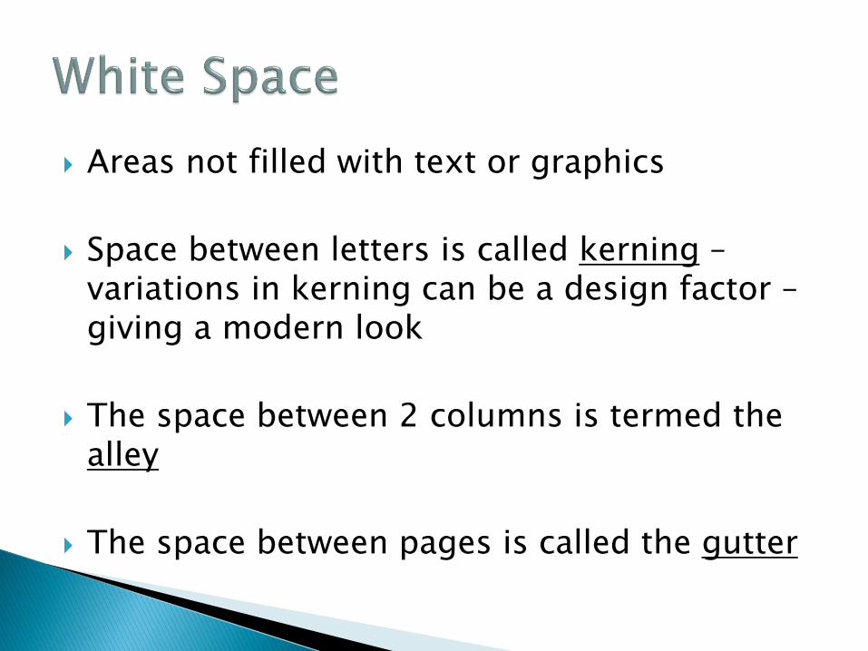
Areas not filled with text or graphics
Space between letters is called kerning – variations in kerning can be a design factor – giving a modern look
The space between 2 columns is termed the alley
The space between pages is called the gutter

Nameplate: Most newspapers are identified by their nameplates. When people look at a newspaper, the first thing they see is the nameplate.
First used in England and then in America, the most popular nameplate is in Old English style.
◦ Many newspapers today still have this style. Examples of newspapers that use this style include:

Text: The majority of all body text in newspapers is serif type, with most papers using one of four or five basic faces.
Research has shown that it takes slightly longer to read sans serif type, and serif type is more visually pleasing to the eye as it has a horizontal flow.

Headlines: Headline type is the most dominant typographic element on the page. Headlines should be chosen to reflect the overall personality of the paper. Both serif and sans serif type are used for headlines.
However, serif faces are seen to be more expressive and less impersonal (Aldrich-Ruenzel 79).
◦ “For the best legibility, headlines should have a tight
leading to correspond to correct word-and letterspacing” (Aldrich-Ruenzel 80). There should be a little white space on either side of a headline in order to give the page some breathing room.

Standard: Standard typography is used to announce regular features or daily columns. It aids readers by showing them where certain stories are as they glance through the paper.
A good choice for standard typography would be a sans serif face to contrast with serif text. Sometimes standard typography is set apart with a different style (bold, italic, caps) or in reverse type (white letters on a dark background).

Drawings
Writing

Drawings represent 2 kinds of visual messages:
Pictographs – pictures that stand for objects
Ideographs – images that represent abstract ideas


Problems with iconic representation
◦ Lack of standardization
◦ Producing images requires an artist

African Petroglyphs

Sumerians
Egyptians
Chinese
Phoenicians
Greeks

Cuneiform = wedge shaped stylus – pushed into wet clay tablets
Required strict schooling from childhood on – with 100’s of characters to learn

Much like the Sumerians but used papyrus reeds instead of clay tablets
Hieroglyphs (hierglyphics) ◦ Script difficult to translate as it could read from
right to left – left to right – top to bottom or bottom to top
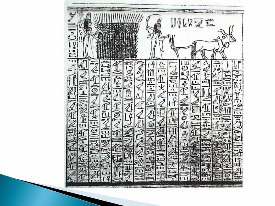

Hieratic & Demotic ◦ Hieratic is the most familiar used for official
business and religious documents
◦ Demotic – less illustrative and its characters were highly abstract and symbolic

Original Chinese was never reduced to symbols – it remained a written language comprising of more than 44,000 individual symbols for centuries.
◦ Scribes who knew the language were highly respected – possessed much political power because they controlled the information that became history


Pictographs known as logograms, are symbols that represent an entire word ◦ None of the symbols represent the sounds of the
language
◦ 210 B.C. the language was simplified to about 1,000 basic characters – still used today
◦ Their pictorial calligraphic style is considered an art form

Phoenicians - greatest advance in history of communication – the alphabet ◦ While the Egyptians used 5,000 symbols – the
Phoenicians used only 22. ◦ The compact easily learned alphabet ended the
political power of the scribes ◦ Most importantly – more individuals could produce
writings that a large audience could read


They increase the Phoenician alphabet to 24 letters
Their sense of symmetry – promoted the idea that letters should be placed in an imaginary horizontal baseline – achieving a sense of order
Introduced the elements of uppercase and lowercase – capitals were written in stone and lowercase were written in papyrus
They were the first to recognize that alphabetic letters possessed both informational and aesthetic qualities


Romans absorbed much of the Greek culture including the alphabet – and added the letters W and much later the letter J and thus our modern day alphabet of 26 letters takes its final form


Modern Headline
Neue Helvetica® Arabic Legendary typeface and its Arabic companion.


![k c]l - context.aanhet.netcontext.aanhet.net/.../en/co-typography.pdf · 2 Typography 1 Introduction okokok okok Withinagivenstyle,therecanbemultiplealternativesofafont.Theexamplebelowshowsa](https://static.fdocuments.net/doc/165x107/5f08ff8a7e708231d424bd7a/k-cl-2-typography-1-introduction-okokok-okok-withinagivenstyletherecanbemultiplealternativesofafonttheexamplebelowshowsa.jpg)