Typography & Information Design: Reflections and Critiques
9
PIIM IS A RESEARCH AND DEVELOPMENT FACILITY AT THE NEW SCHOOL © 2013 PARSONS JOURNAL FOR INFORMATION MAPPING AND PARSONS INSTITUTE FOR INFORMATION MAPPING 68 Fifth Avenue New York, NY 10011 THE PARSONS INSTITUTE FOR INFORMATION MAPPING 212 229 6825 piim.newschool.edu ABSTRACT AND REFLECTION A stroke, a letter, a word, a sentence, a paragraph, a page, and a book: all essentially linear constructs of the typo- graphic mind put into action. ere is a typographic order of “things,” a logical sequence from the most simple, to the most complex. A line, a space, a rectangle, a margin—an aesthetic device for visuality. As an infinite list of signifiers, the above lists signify the qualitative/ quantitative display of the visual properties of typography: the micro and the macro, the color and the density, the positives and the negatives, the visible and the invisibles; these are some of the typographic paradigms that yield communicative visualization. I taught typography and information design concur- rently for more than a decade in the Parsons Communica- tion Design program (now Parsons e New School for Design), serving as a full-time faculty member between 1998–2009. e intrinsic properties of these mutually reciprocal endeavors, typography and information design, form the “twin topic” subjects of this brief investigation. I believe I have succeeded in sharing my fascination with all my students, they who were most patiently tormented by my investigative interrogations. Indeed, it was reputed that I, not they, were confused; this earned me, in some circles, the stigma of being the most “confused” instructor of all time. is paper is served as a succinct teaching tool capturing some of the theories I have developed over my tenure in Parsons. e pedagogies and methods I incorporate in this paper can be considered as a summary of that investigation. Typography & Information Design: Reflections and Critiques CHUN-WO PAT, MFA It illustrates the dialogue I have had with my students, my colleagues, and myself. ese conversations took place in the classrooms of course, but they were never limited by such boundaries; they were carried into the streets and many restaurants that surround the campus; in fact, the conversation to understand more of these two topics does not cease. I do not pretend that my paper is a didactic discourse to provide instructional practicality, but I do hope that some readers, especially design students who anticipate to embark an education on typographic studies and its intrinsic relationship with information design will find it interesting and useful. INTRODUCTION To highlight the approach I undertake for this paper, I shall offer a few words of explanations. First, the projects (see p. 6–8)I used as illustrations for this paper should be seen as a static representation (two-dimensional). It is best viewed in its true scale: 48 inches square, a format that has no format (X=Y ratio), so referred to as a non-format format. is has a few benefits from a teaching perspective. First, the size is too big to be seen in a computer screen. erefore, it forces the student to look beyond the screen. To do this, a comparative study—screen typography v.s. print typography—will be required. On the screen environ- ment, proportion is what I call “one-to-many” (scalable sizes, optimized view-ability, “projected” distortion. Type sizes are relatives). Whereas in the print world, proportion is “one-to-one”. It offers a more faithful depiction of scale (9 pt type is 9 pt type). Secondly, there is no landscape or portrait as a common binary formatting logic. erefore, students have to define proportion through the composi- tion; as well as to the orientation of their own design sensibilities. Hence, the act of reading will no longer be dictated by conventions (leſt/right, up/down). is creates an open and a dynamic reading experience. is “non-format” has been used in Parsons by myself and a colleague from the very outset of teaching information 1998 1999 2000 2001 2002 2003 2004 2005 2006 2007 2008 2009 2010 2011 2012 Information Mapping & Design Seminar Information Architecture Visualizing Information Topics: Typography Studio Senior Thesis I Senior Thesis II Language & Letterform Advanced Typography & Graphic Communication Advanced Studio Collateral Design Type Core Studio Typography I Typography II Timeline: Courses taught in Parsons
Transcript of Typography & Information Design: Reflections and Critiques

PIIM IS A RESEARCH AND DEVELOPMENT FACILITY AT THE NEW SCHOOL
© 2013 PARSONS JOURNAL FOR INFORMATION MAPPING AND PARSONS INSTITUTE FOR INFORMATION MAPPING
68 Fifth Avenue New York, NY 10011
THE PARSONS INSTITUTE FOR INFORMATION MAPPING
212 229 6825piim.newschool.edu
ABSTRACT And RefleCTion
A stroke, a letter, a word, a sentence, a paragraph, a page, and a book: all essentially linear constructs of the typo-graphic mind put into action. There is a typographic order of “things,” a logical sequence from the most simple, to the most complex. A line, a space, a rectangle, a margin—an aesthetic device for visuality. As an infinite list of signifiers, the above lists signify the qualitative/quantitative display of the visual properties of typography: the micro and the macro, the color and the density, the positives and the negatives, the visible and the invisibles; these are some of the typographic paradigms that yield communicative visualization.
I taught typography and information design concur-rently for more than a decade in the Parsons Communica-tion Design program (now Parsons The New School for Design), serving as a full-time faculty member between 1998–2009. The intrinsic properties of these mutually reciprocal endeavors, typography and information design, form the “twin topic” subjects of this brief investigation. I believe I have succeeded in sharing my fascination with all my students, they who were most patiently tormented by my investigative interrogations. Indeed, it was reputed that I, not they, were confused; this earned me, in some circles, the stigma of being the most “confused” instructor of all time.
This paper is served as a succinct teaching tool capturing some of the theories I have developed over my tenure in Parsons. The pedagogies and methods I incorporate in this paper can be considered as a summary of that investigation.
Typography & Information Design:Reflections and CritiquesChun-wo pAT, mfA
It illustrates the dialogue I have had with my students, my colleagues, and myself. These conversations took place in the classrooms of course, but they were never limited by such boundaries; they were carried into the streets and many restaurants that surround the campus; in fact, the conversation to understand more of these two topics does not cease. I do not pretend that my paper is a didactic discourse to provide instructional practicality, but I do hope that some readers, especially design students who anticipate to embark an education on typographic studies and its intrinsic relationship with information design will find it interesting and useful.
inTRoduCTion
To highlight the approach I undertake for this paper, I shall offer a few words of explanations. First, the projects (see p. 6–8)I used as illustrations for this paper should be seen as a static representation (two-dimensional). It is best viewed in its true scale: 48 inches square, a format that has no format (X=Y ratio), so referred to as a non-format format. This has a few benefits from a teaching perspective. First, the size is too big to be seen in a computer screen. Therefore, it forces the student to look beyond the screen. To do this, a comparative study—screen typography v.s. print typography—will be required. On the screen environ-ment, proportion is what I call “one-to-many” (scalable sizes, optimized view-ability, “projected” distortion. Type sizes are relatives). Whereas in the print world, proportion is “one-to-one”. It offers a more faithful depiction of scale (9 pt type is 9 pt type). Secondly, there is no landscape or portrait as a common binary formatting logic. Therefore, students have to define proportion through the composi-tion; as well as to the orientation of their own design sensibilities. Hence, the act of reading will no longer be dictated by conventions (left/right, up/down). This creates an open and a dynamic reading experience. This
“non-format” has been used in Parsons by myself and a colleague from the very outset of teaching information
1998
1999
2000
2001
2002
2003
2004
2005
2006
2007
2008
2009
2010
2011
2012
Information Mapping & Design Seminar
Information Architecture Visualizing Information
Topics: Typography Studio
Senior Thesis I
Senior Thesis II
Language & Letterform
Advanced Typography & Graphic Communication Advanced Studio Collateral Design
Type Core Studio
Typography I
Typography II
Timeline: Courses taught in Parsons

typography & information design:reflections and critiqueschun-wo pat, mfa
PARSONS JOURNAL FOR INFORMATION MAPPINGvOLUME v ISSUE 1, wINTER 2013[PAGE 2]
© 2013 PARSONS JOURNAL FOR INFORMATION MAPPING AND PARSONS INSTITUTE FOR INFORMATION MAPPING
space data occupies). You should look for patterns evolving in your sketches
and drawings and exploit these patterns for strong visual effect. This could yield a more comprehensive presentation, with improved retention and faster understanding of the data you present.
Concepts must be shown as a tight, black and white, or full color, actual size presentations. You should include the reference material you found that inspired your presen-tation as well as notes, sketches, etc. which support or were used in the development of your timeline.
Format: 48 inch by 48 inch This assignment consists of three components:
A: Time (linear or cyclical)
B: Map (geographical or spatial)
C: Culture (in any given time and place, past, present or future)
design within the program (fifteen years) and still yields surprising and innovative results. To guide the students to this understanding, I sometimes ask the students to occasionally rotate their work in various orientations, upside down, or sideway (obviously there is no change in the format of a square ) to challenge them to “see” the relationship of their visual ideas. This was a technique I acquired from my training at Yale that remains useful, it allows us to “see” proportional balance without “reading”.
ASSignmenT: Timeline
infoRmATion mApping & deSign SeminAR
Design a timeline. Using any consistent theme, idea, discipline, etc., create a graphic representation expressing this data in a relationally based time frame.
The unit, and sub-units of time (duration) are at your discretion. The “events” listed may be based on past time reference or a time sequence (i.e., start through finish).
Consider not only intervals of space between events (which of course represent time) but how data may be transcribed in terms of density and volume (the physical
map
time culturedot
D/L
L/W P/Tline plane
letter
word text
culture
map
mapculturemap
time
map
time
time
map
culture
time
variable
constant A constant B
See diagram 3 and 4 and its application in critique #1
A dot is perhaps the most simple of all a graphic elements in design. It activates a surface, fixes an eye movement, and connects a path (A stroke can be imagined as a connection of two dots). Numbers, letters, words can be visualized as dots (from a macro level). Dots form the constellation of visual ideas.
A line is perceived as a path, a movement, a gesture—static or dynamic. It creates a sense of linear sequence, an order of things (beginning and ending, as in time) to guide the perceiver to derive meanings (from the text as in typography). Letters in the alphabet are constructed in lines (vertical,
horizontal, diagonal, and curvilinear). Letters combined to form words, words to form sentences(lines); and sentences to form paragraphs(text). Letters, words, and texts provide a microcosm of a visual strategy.
A plane is a shape, a surface, an image, a boundary—static or dynamic: it defines an area and gives a dimension upon a surface. When multiplied, layered, or manipulated it creates a volume. Through volume, images and type can be integrated. Texts are shapes (planes as a container of content). They define meanings assigned within their boundaries.
legend: A viSuAl AnAlogy

typography & information design:reflections and critiqueschun-wo pat, mfa
PARSONS JOURNAL FOR INFORMATION MAPPINGvOLUME v ISSUE 1, wINTER 2013[PAGE 3]
© 2013 PARSONS JOURNAL FOR INFORMATION MAPPING AND PARSONS INSTITUTE FOR INFORMATION MAPPING
diAgRAm 1
concretetextsentencewordletterstrokedot
vi.v.iv.iii.ii.i.
planelineshapeshapelinedot
dot
line
line
Metaphysics
The study of being and existence; includes the definition and classification of entities, physical or mental, the nature of their properties, and the nature of change.
M
The word "metaphysics" derives from the Greek words (metá) ("beyond", "upon" or "after") and (physiká) ("physics"). It was first used as the title for several of Aristotle's works, because they were usually anthologized after the works on physics in complete editions. The prefix meta- ("beyond") indicates that these works come "after" the chapters on physics. However, Aristotle himself did not call the subject of these books "Metaphysics": he referred to it as "first philosophy." The editor of Aristotle's works, Andronicus of Rhodes, is thought to have placed the books on first philosophy right after another work, Physics, and called them (ta meta ta physika biblia) or "the books that come after the [books on] physics". This was misread by Latin scholiasts, who thought it meant "the science of what is beyond the physical. However, once the name was given, the commentators sought to find intrinsic reasons for its appropriateness. For instance, it was understood to mean "the science of the world beyond nature (phusis in Greek)," that is, the science of the immaterial. Again, it was understood to refer to the chronological or pedagogical order among our philosophical studies, so that the "metaphysical sciences would mean, those that we study after having mastered the sciences that deal with the physical world" (St. Thomas Aquinas, "In Lib, Boeth. de Trin.", V, 1).
sim
ple
text
sentence
word
letter
stroke
dot
co
mplex
ab
str
ac
tc
on
cr
ete
shape
shape plane
abstract
This hypothetical diagram illustrates a linear progression of a basic visualization technique-from the simplest to the most complex—through the use of typography as its underlying structure. This conceptualization schema can be broken down into the lower and the upper levels: the abstract (level I to III) and the concrete (level IV–VI). The abstract is visualization of a design concept and the concrete is the realization of a design concept thru research to content creation.
DIAGRAM 1:
The triadic interplay of dot-line-plane/letter-word-text can help students to study proportion, geometry, contrast, figure and ground, as well as its extended application into three components of the assignments—time, map and culture (see p.2 for descriptions). Also diagram 2 for interaction/oscillation of these elements; diagram 3 and 4 the application/synthesis of diagram 2 in my student work.
This hypothetical diagram illustrates a linear progression of a basic visualization technique from the simplest to the most complex—through the use of typography as its underly-ing structure. This conceptualization schema can be brokendown into the lower and the upper levels: the abstract (level I to III) and the concrete (level IV–VI). The abstract is visualization of a design concept and the concrete is the realization of a design concept thru research
to content creation. The triadic interplay of dot-line-plane/letter-word-text can help students to study proportion, geometry, contrast, figure and ground, as well as its extended application into three components of the assignments—time, map and culture (see p.2 for descriptions). Also diagram 3 for interaction/oscillation of these elements; diagram 4 and page 7 the application/synthesis of diagram 3 in my student work.
The word “metaphysics” derives from the Greek words (metá) (“beyond,” “upon,” or
“after”) and (physiká) (“physics”).It was first used as the title for several of Aristotle’s works, because they were usually anthologized after the works on physics in complete editions. The prefix meta- (“beyond”) indicates that these works come “after” the chapters on physics. However, Aristotle himself did not call the subject of these books “Metaphysics”: he referred to it as “first philosophy.” The editor of Aristotle’s works, Andronicus of Rhodes, is thought to have placed the books on first philosophy right after another work, Physics, and called them (ta meta ta physika biblia) or “the books that come after the [books on]
physics”. This was misread by Latin scholiasts, who thought it meant “the science of what is beyond the physical. However, once the name was given, the commentators sought to find intrinsic reasons for its appropriateness. For instance, it was understood to mean “the science of the world beyond nature (phusis in Greek),” that is, the science of the immaterial. Again, it was understood to refer to the chronological or pedagogical order among our philosophical studies, so that the
“metaphysical sciences would mean, those that we study after having mastered the sciences that deal with the physical world” (St. Thomas Aquinas, “In Lib, Boeth. de Trin.”, V, 1).

typography & information design:reflections and critiqueschun-wo pat, mfa
PARSONS JOURNAL FOR INFORMATION MAPPINGvOLUME v ISSUE 1, wINTER 2013[PAGE 4]
© 2013 PARSONS JOURNAL FOR INFORMATION MAPPING AND PARSONS INSTITUTE FOR INFORMATION MAPPING
diAgRAm 2
D2c: PLANE: TEXT: GRAVITY: AXIS
D2b: PLANE: TEXT: DENSITY: COLOR
D2a: LINE: HEADINGS
ax
is
ax
is
ax
is
ax
is
ax
is
san
ser
ifse
rif
The word "metaphysics" derives from the Greek words (metá) ("beyond", "upon" or "after") and (physiká) ("physics").[7] It was first used as the title for several of Aristotle's works, because they were usually anthologized after the works on physics in complete editions. The prefix meta- ("beyond") indicates that these works come "after" the chapters on physics. However, Aristotle himself did not call the subject of these books "Metaphysics": he referred to it as "first philosophy." The editor of Aristotle's works, Andronicus of Rhodes, is thought to have placed the books on first philosophy right after another work, Physics, and called them (ta meta ta physika biblia) or "the books that come after the [books on] physics". This was misread by Latin scholiasts, who thought it meant "the science of what is beyond the physical. However, once the name was given, the commentators sought to find intrinsic reasons for its appropriateness. For instance, it was understood to mean "the science of the world beyond nature (phusis in Greek)," that is, the science of the immaterial. Again, it was understood to refer to the chronological or pedagogical order among our philosophical studies, so that the "metaphysical sciences would mean, those that we study after having mastered the sciences that deal with the physical world" (St. Thomas Aquinas, "In Lib, Boeth. de Trin.", V, 1).
The word "metaphysics" derives from the Greek words (metá) ("beyond", "upon" or "after") and (physiká) ("physics").[7] It was first used as the title for several of Aristotle's works, because they were usually anthologized after the works on physics in complete editions. The prefix meta- ("beyond") indicates that these works come "after" the chapters on physics. However, Aristotle himself did not call the subject of these books "Metaphysics": he referred to it as "first philosophy." The editor of Aristotle's works, Andronicus of Rhodes, is thought to have placed the books on first philosophy right after another work, Physics, and called them (ta meta ta physika biblia) or "the books that come after the [books on] physics". This was misread by Latin scholiasts, who thought it meant "the science of what is beyond the physical. However, once the name was given, the commentators sought to find intrinsic reasons for its appropriateness. For instance, it was understood to mean "the science of the world beyond nature (phusis in Greek)," that is, the science of the immaterial. Again, it was understood to refer to the chronological or pedagogical order among our philosophical studies, so that the "metaphysical sciences would mean, those that we study after having mastered the sciences that deal with the physical world" (St. Thomas Aquinas, "In Lib, Boeth. de Trin.", V, 1).
The word "metaphysics" derives from the Greek words (metá)
("beyond", "upon" or "after") and (physiká) ("physics").[7] It was
first used as the title for several of Aristotle's works, because they
were usually anthologized after the works on physics in complete
editions. The prefix meta- ("beyond") indicates that these works
come "after" the chapters on physics. However, Aristotle himself did
not call the subject of these books "Metaphysics": he referred to it
as "first philosophy." The editor of Aristotle's works, Andronicus of
Rhodes, is thought to have placed the books on first philosophy
right after another work, Physics, and called them (ta meta ta
physika biblia) or "the books that come after the [books on]
physics". This was misread by Latin scholiasts, who thought it meant
"the science of what is beyond the physical. However, once the
name was given, the commentators sought to find intrinsic reasons
for its appropriateness. For instance, it was understood to mean
"the science of the world beyond nature (phusis in Greek)," that is,
the science of the immaterial. Again, it was understood to refer to
the chronological or pedagogical order among our philosophical
studies, so that the "metaphysical sciences would mean, those that
we study after having mastered the sciences that deal with the
physical world" (St. Thomas Aquinas, "In Lib, Boeth. de Trin.", V, 1).
The word "metaphysics" derives from the Greek words (metá) ("beyond", "upon" or "after") and (physiká) ("physics").[7] It was first used as the title for several of Aristotle's works, because they were usually anthologized after the works on physics in complete editions. The prefix meta- ("beyond") indicates that these works come "after" the chapters on physics. However, Aristotle himself did not call the subject of these books "Metaphysics": he referred to it as "first philosophy." The editor of Aristotle's works, Andronicus of Rhodes, is thought to have placed the books on first philosophy right after another work, Physics, and called them (ta meta ta physika biblia) or "the books that come after the [books on] physics". This was misread by Latin scholiasts, who thought it meant "the science of what is beyond the physical. However, once the name was given, the commentators sought to find intrinsic reasons for its appropriateness. For instance, it was understood to mean "the science of the world beyond nature (phusis in Greek)," that is, the science of the immaterial. Again, it was understood to refer to the chronological or pedagogical order among our philosophical studies, so that the "metaphysical sciences would mean, those that we study after having mastered the sciences that deal with the physical world" (St. Thomas Aquinas, "In Lib, Boeth. de Trin.", V, 1).
The word "metaphysics" derives from the Greek words (metá) ("beyond", "upon" or "after") and (physiká) ("physics").[7] It was first used as the title for several of Aristotle's works, because they were usually anthologized after the works on physics in complete editions. The prefix meta- ("beyond") indicates that these works come "after" the chapters on physics. However, Aristotle himself did not call the subject of these books "Metaphysics": he referred to it as "first philosophy." The editor of Aristotle's works, Andronicus of Rhodes, is thought to have placed the books on first philosophy right after another work, Physics, and called them (ta meta ta physika biblia) or "the books that come after the [books on] physics". This was misread by Latin scholiasts, who thought it meant "the science of what is beyond the physical. However, once the name was given, the commentators sought to find intrinsic reasons for its appropriateness. For instance, it was understood to mean "the science of the world beyond nature (phusis in Greek)," that is, the science of the immaterial. Again, it was understood to refer to the chronological or pedagogical order among our philosophical studies, so that the "metaphysical sciences would mean, those that we study after having mastered the sciences that deal with the physical world" (St. Thomas Aquinas, "In Lib, Boeth. de Trin.", V, 1).
The word "metaphysics" derives from the Greek words (metá) ("beyond", "upon" or "after") and (physiká) ("physics").[7] It was first used as the title for several of Aristotle's works,
because they were usually anthologized after the works on physics in complete editions. The prefix meta- ("beyond") indicates that
these works come "after" the chapters on physics. However, Aristotle himself did not call the subject of these books
"Metaphysics": he referred to it as "first philosophy." The editor of Aristotle's works, Andronicus of Rhodes, is thought to have placed
the books on first philosophy right after another work, Physics, and called them (ta meta ta physika biblia) or "the books that
come after the [books on] physics". This was misread by Latin scholiasts, who thought it meant "the science of what is beyond the physical. However, once the name was given, the
commentators sought to find intrinsic reasons for its appropriateness. For instance, it was understood to mean "the science of the world beyond nature (phusis in Greek)," that is,
the science of the immaterial. Again, it was understood to refer to the chronological or pedagogical order among our philosophical studies, so that the "metaphysical sciences would mean, those
that we study after having mastered the sciences that deal with the physical world"
(St. Thomas Aquinas, "In Lib, Boeth. de Trin.", V, 1).
The word "metaphysics" derives from the Greek words (metá) ("beyond", "upon" or "after") and (physiká) ("physics").[7] It was
first used as the title for several of Aristotle's works, because they were usually anthologized after the works on physics
in complete editions. The prefix meta- ("beyond") indicates that these works come "after" the chapters on physics. However,
Aristotle himself did not call the subject of these books "Metaphysics": he referred to it as "first philosophy." The editor
of Aristotle's works, Andronicus of Rhodes, is thought to have placed the books on first philosophy right after another work,
Physics, and called them (ta meta ta physika biblia) or "the books that come after the [books on] physics". This was misread
by Latin scholiasts, who thought it meant "the science of what is beyond the physical. However, once the name was given,
the commentators sought to find intrinsic reasons for its appropriateness. For instance, it was understood to mean "the science of the world beyond nature (phusis in Greek)," that is,
the science of the immaterial. Again, it was understood to refer to the chronological or pedagogical order among our philosophical studies, so that the "metaphysical sciences would mean, those
that we study after having mastered the sciences that deal with the physical world"
(St. Thomas Aquinas, "In Lib, Boeth. de Trin.", V, 1).
The Study of Being and Existence
THE STUDY OF BEING AND EXISTENCE
THE STUDY OF BEING AND EXISTENCE
T H E • S T U D Y • O F • B E I N G • A N D • E X I S T E N C E lig
ht
dr
ak
dark light
DIAGRAM 2:
d2a: Caps are formal, serious, digified, historical, “lapidary appearance of inscriptions”. It has a graphic appearance to form a line to retain its display quality.
d2b: A block of text, seen from a macro level, can be visualized as a shape or a color in terms of density as created by a series of horizontal lines of strokes-letters-words-sentence combinations. The increase of leading (adding “whiteness” between the horizontal lines) can yield a more grayish tonal expression. This macrovisual-ization method has become more useful and noticeable with our format (48x48 inches). Students are often
challenged to interact with their design by pacing back and forth to read the type as they are seeing it as a graphic element (horizontal lines and rectangular blocks).
d2c: A grid system can be envisioned as a series of invisible lines intersecting vertically and horizontally. When dealing with a huge amount of text and data, grid functioned as a navigational device. The gravity of the axis is a pulling force to bridge elements (images, types, graphs) from the top to the bottom.
diagram 2a: Caps are formal, serious, digified, historical, “lapidary appearance of inscriptions”. It has a graphic appear-ance to form a line to retain its display quality.
diagram 2b: A block of text, seen from a macro level, can be visualized as a shape or a color in terms of density as created by a series of horizontal lines of strokes-letterswords-sentence combinations. The increase of leading (adding “whiteness” between the horizontal lines) can yield a more grayish tonal expression. This macrovisualization method has become more useful and noticeable with our
format (48×48 inches). Students are often challenged to interact with their design by pacing back and forth to read the type as they are seeing it as a graphic element (horizontal lines and rectangular blocks).
diagram 2c: A grid system can be envisioned as a series of invisible lines intersecting vertically and horizontally. When dealing with a huge amount of text and data, grid functioned as a navigational device. The gravity of the axis is a pulling force to bridge elements (images, types, graphs) from the top to the bottom.
diAgRAm 2A: line: heAdingS
diAgRAm 2B: TexT: gRAviTy: AxiS
diAgRAm 2C: plAne: TexT: denSiTy: ColoR
typography & information design:reflections and critiqueschun-wo pat, mfa
PARSONS JOURNAL FOR INFORMATION MAPPINGvOLUME v ISSUE 1, wINTER 2013[PAGE 5]
© 2013 PARSONS JOURNAL FOR INFORMATION MAPPING AND PARSONS INSTITUTE FOR INFORMATION MAPPING
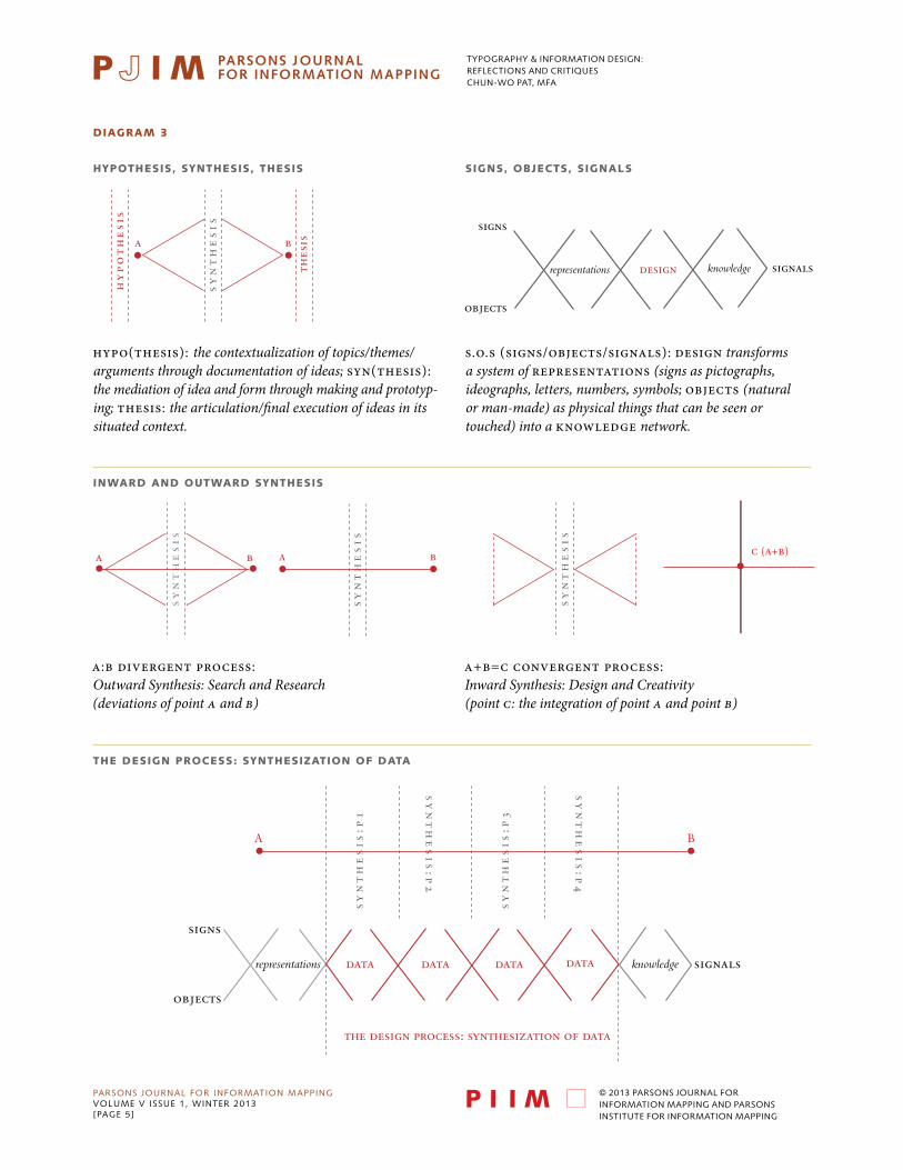
diAgRAm 3
hypo(thesis): the contextualization of topics/themes/arguments through documentation of ideas; syn(thesis): the mediation of idea and form through making and prototyp-ing; thesis: the articulation/final execution of ideas in its situated context.
s.o.s (signs/objects/signals): Design transforms a system of representations (signs as pictographs, ideographs, letters, numbers, symbols; objects (natural or man-made) as physical things that can be seen or touched) into a knowledge network.
hy
po
th
es
is
thes
isa b
HYPOTHESIS, SYNTHESIS, THESIS SIGNS, OBJECTS, SIGNALS
INWARD AND OUTWARD SYNTHESIS
THE DESIGN PROCESS: SYNTHESIZATION OF DATA
sy
nt
he
sis
sy
nt
he
sis
sy
nt
he
sis
sy
nt
he
sis
a ba b c (a+b)
sy
nt
he
sis
:p1
sy
nt
he
sis
:p2
sy
nt
he
sis
:p4
sy
nt
he
sis
:p3
A B
objects
representations
signs
data data data
the design process: synthesization of data
data signalsknowledge
a:b divergent processOutward Synthesis: Search and Research (deviations of point A and point B)
a+b=c convergent processInward Synthesis: Design and Creativity (point C: the integration of point A and point B)
DIAGRAM 3:
hypo(thesis): the contextualization of topics/themes/arguments through documenta-tion of ideas; syn(thesis): the mediation of idea and form through making and prototyping; thesis: the articulation/final execution of ideas in its situated context.
objects
representations
signs
design signalsknowledge
S.O.S (signs/objects/signals)Design transforms a system of representations (signs as pictographs, ideographs, letters, num-bers, symbols; objects (natural or man-made) as physical things that can be seen or touched) into a knowledge network.
inwARd And ouTwARd SynTheSiS
hypoTheSiS, SynTheSiS, TheSiS SignS, oBjeCTS, SignAlS
a:b divergent process: Outward Synthesis: Search and Research(deviations of point A and B)
a+b=c convergent process: Inward Synthesis: Design and Creativity(point C: the integration of point A and point B)
The deSign pRoCeSS: SynTheSizATion of dATA

typography & information design:reflections and critiqueschun-wo pat, mfa
PARSONS JOURNAL FOR INFORMATION MAPPINGvOLUME v ISSUE 1, wINTER 2013[PAGE 6]
© 2013 PARSONS JOURNAL FOR INFORMATION MAPPING AND PARSONS INSTITUTE FOR INFORMATION MAPPING
DIAGRAM 4:
SYNTHESIZATION: PHASE 1: CONTEXTUALIZATION OF RESEARCH
SYNTHESIZATION: PHASE 2: IDENTIFICATION OF CONTSTANTS AND VARIABLE
SYNTHESIZATION: PHASE 3: INTEGRATION OF CONTSTANTS AND VARIABLE
SYNTHESIZATION: PHASE 4: ARTICULATION OF DESIGN
sy
nt
he
sis
sy
nt
he
sis
sy
nt
he
sis
a ba b c (a+b)
hy
po
th
es
is
thes
isa b
sy
nt
he
sis
mapculturemap
map
time
time
map
culture
time
variable
constant A constant B
pt. cpt. a pt. b
objects
representations
signs
design
design process
signalsknowledge
time
map culture
dot
line plane
a: type as dot b: dot as time
map
culturetime
c: time as map
diAgRAm 4
SynTheSizATion: phASe 1: ConTexTuAlizATion of ReSeARCh
SynTheSizATion: phASe 2: idenTifiCATion of ConTSTAnTS And vARiABle
SynTheSizATion: phASe 3: inTegRATion of ConTSTAnTS And vARiABle
SynTheSizATion: phASe 4: ARTiCulATion of deSign

typography & information design:reflections and critiqueschun-wo pat, mfa
PARSONS JOURNAL FOR INFORMATION MAPPINGvOLUME v ISSUE 1, wINTER 2013[PAGE 7]
© 2013 PARSONS JOURNAL FOR INFORMATION MAPPING AND PARSONS INSTITUTE FOR INFORMATION MAPPING
CRiTique 1
time
map culture
dot
line plane
a: type as dot b: dot as time
map
culturetime
c: time as map
time
map culture
plane
dot line
a: type as graph b: graph as time
map
culturetime
c: time as map
time
map culture
line
dot plane
a: type as line b: line as time
map
culturetime
c: time as map
time
map culture
dot
line plane
a: dot as type b: type as time
map
culturetime
c: time as map
time
map culture
dot
line plane
a: dot as graph b: graph as time
map
culturetime
c: time as map
time
map culture
line
dot plane
a: type as image b: image as type
time
map culture
line
dot plane
a: type as image b: image as type
time
map culture
line
dot plane
a: type as line b: line as time
© k
AyA
kIM
ON
O,
IND
Ex O
F T
hE
DEv
ELO
PM
ENT
OF
EvO
LUT
ION
AR
y T
hEO
Ry
The process of design is a set ofrelational, associative combinationsof the constants and variables (see p.2) evolving over time. It generates a new kind of meaningful relationship (type as dot: dot as time: time as map), a successive visual pattern to allow data to be synthesized and transformed into a new source of knowledge.
© c
hR
IST
IAN
Sc
hM
IDT,
A c
hR
ON
OLO
Gy
OF
T
hE
bER
LIN
wA
LL 1
94
4–1
99
1
© 2
00
5 N
A k
yO
UN
G k
AN
G,
DM
z
© h
EE h
yU
NG
kII
M &
DA
ISy
kIM
, k
OD
Ak
© A
UG
UST
INE
ch
UN
G,
Th
E D
IAM
ON
D T
RA
DE
IN 1
99
9
© 2
00
5 c
hA
NT
EL
zA
PA
TA,
Th
E O
RIG
IN
OF
SM
AL
LP
Ox
© G
ILLE
AN
yU
EN,
PI
ShEN
G v
S G
UT
ENb
ERG
:A
hIS
TO
Ry
OF
PR
INT
ING
© k
Az
UM
A S
EO,
Th
E b
AT
TLE
OF
SEk
IGA
hA
RA

typography & information design:reflections and critiqueschun-wo pat, mfa
PARSONS JOURNAL FOR INFORMATION MAPPINGvOLUME v ISSUE 1, wINTER 2013[PAGE 8]
© 2013 PARSONS JOURNAL FOR INFORMATION MAPPING AND PARSONS INSTITUTE FOR INFORMATION MAPPING
CRiTique 2
Typography provides visual strategies for spatial organization. It intersects the visual plane into a dynamic movement of the horizontal axis (left-to-right reading direction, baseline alignment) with that of the vertical axis (type arrangements: justified, fl/rr, centered, fr/rl), creating a geometric pathway or plane to anchor the design elements.
Typography provides visual strategies for spatial organization. It intersects the visual plane into a dynamic movement of the horizontal axis (left-to-right reading direction, baseline alignment) with that of the vertical axis (type arrangements: justified, fl/rr, centered, fr/rl), creating a geometric pathway or plane to anchor the design elements.
CRITIQUE #2
© 2
00
5 N
A k
yO
UN
G k
AN
G,
DM
z
© G
ILLE
AN
yU
EN,
PI
ShEN
G v
S G
UT
ENb
ERG
:A
hIS
TO
Ry
OF
PR
INT
ING
© k
Az
UM
A S
EO,
Th
E b
AT
TLE
OF
SEk
IGA
hA
RA
© T
Ak
AA
kI
Ok
AD
A,
RO
bER
T E
. P
EAR
y A
ND
Th
E R
Ac
E
TO
Th
E N
OR
Th
PO
LE 1
89
2–1
90
9
typography & information design:reflections and critiqueschun-wo pat, mfa
PARSONS JOURNAL FOR INFORMATION MAPPINGvOLUME v ISSUE 1, wINTER 2013[PAGE 9]
© 2013 PARSONS JOURNAL FOR INFORMATION MAPPING AND PARSONS INSTITUTE FOR INFORMATION MAPPING
BiogRAphy
Chun-wo Pat is a professor teaching Information Design and Typography within Parsons The New School for Design, New York, and assistant lecturer in CityTech, CUNY and has lectured widely. Pat has been actively involved with the international design communities as curator/exhibition designer for DMY/Berlin, Germany, Danish Design Center, Copenhagen, Denmark, as well as visiting lecturer/professor in Xue Xue Institute and YunTech, Taiwan and Hong Kong Design Centre, Hong Kong.
Pat is the principal and owner of Whitespace Integrated Design, formed in 1996. His creative services intersect cultural institutions, community-based organizations and business corporations. Formerly, Pat served as the first Executive Director in Hong Kong Ambassadors of Design. He worked at de Harak & Poulin Associates and the Pushpin Group as senior designer prior to his own practice.
Living in the context of increasing flow of cultural interactions around the world, Pat has researched, and developed theories, on an ideographic-based principle in typography and information design as a tool for both teaching and professional practice—a East-West synthesis to transcend linguistic barriers in global communications. His work has earned him national as well as international recognitions in the area of cross-cultural design.
Pat’s vision of design is diffused in various publications. Among them were Ming Pao Monthly (Hong Kong), Typefaces, Print magazi ne, ID magazine, East magazine (Hong Kong). He was also involved with architectural and monument design projects to engage the public with the force of written words. Such projects include the bilingual stele for Nelson Ying family graveyard, Albany; the trilin-gual memorial marker for the holocaust hero Ho Feng Shan in Shanghai Jewish Refugees Museum, China; and the multilingual banner system for Charled B. Wang Center, SUNY Stonybrook.
Chun-wo Pat, holds an MFA from Yale University, and a BFA from the Cooper Union. He has been actively engaged as an instructor, professor and lecturer for over fifteen years.