Typographic Book Jackets
15
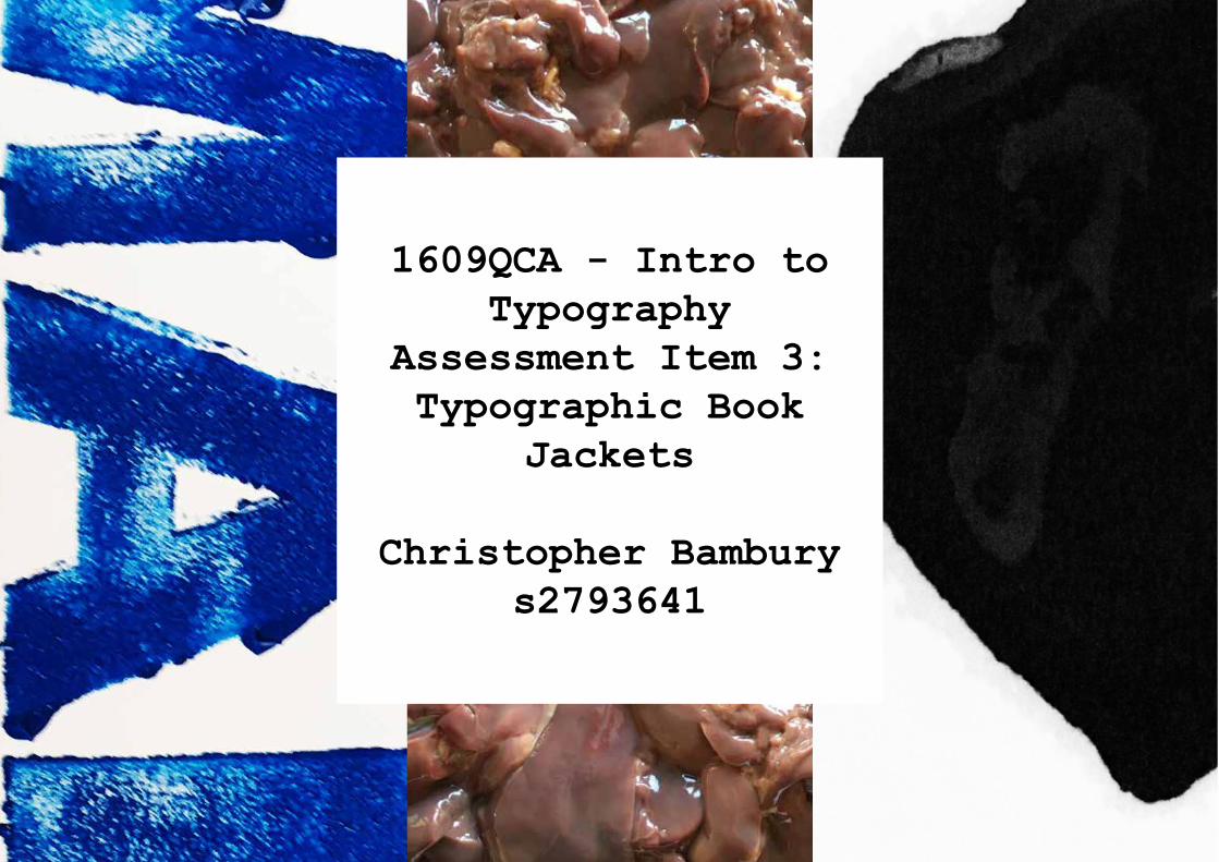
1609QCA - Intro to Typography Assessment Item 3: Typographic Book Jackets Christopher Bambury s2793641
-
Upload
christopher-bambury -
Category
Documents
-
view
223 -
download
2
description
1609QCA - Introduction to Typography: Assessment 3, Typographic Book Jackets
Transcript of Typographic Book Jackets
1609QCA - Intro to Typography
Assessment Item 3: Typographic Book
Jackets
Christopher Bamburys2793641
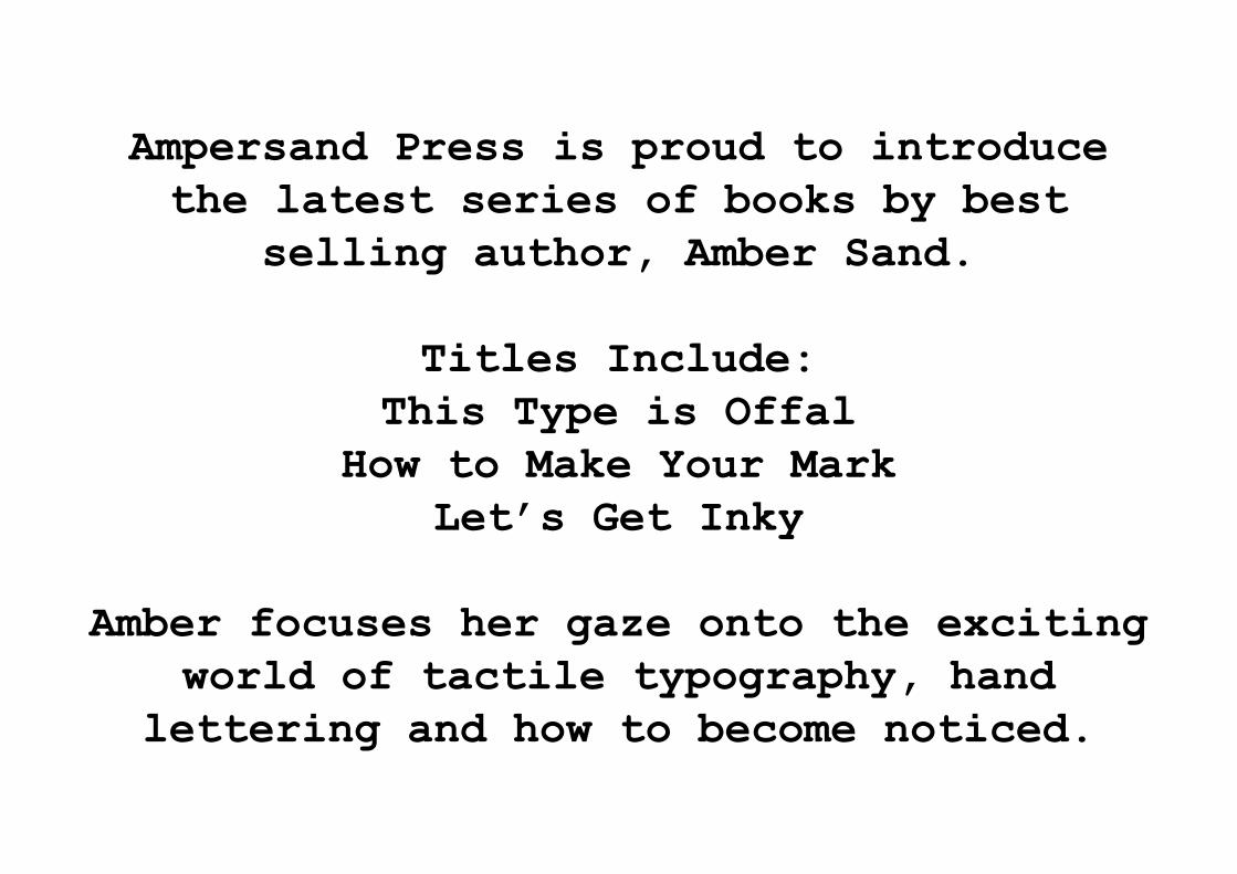
Ampersand Press is proud to introduce the latest series of books by best
selling author, Amber Sand.
Titles Include:This Type is Offal
How to Make Your MarkLet’s Get Inky
Amber focuses her gaze onto the exciting world of tactile typography, hand
lettering and how to become noticed.
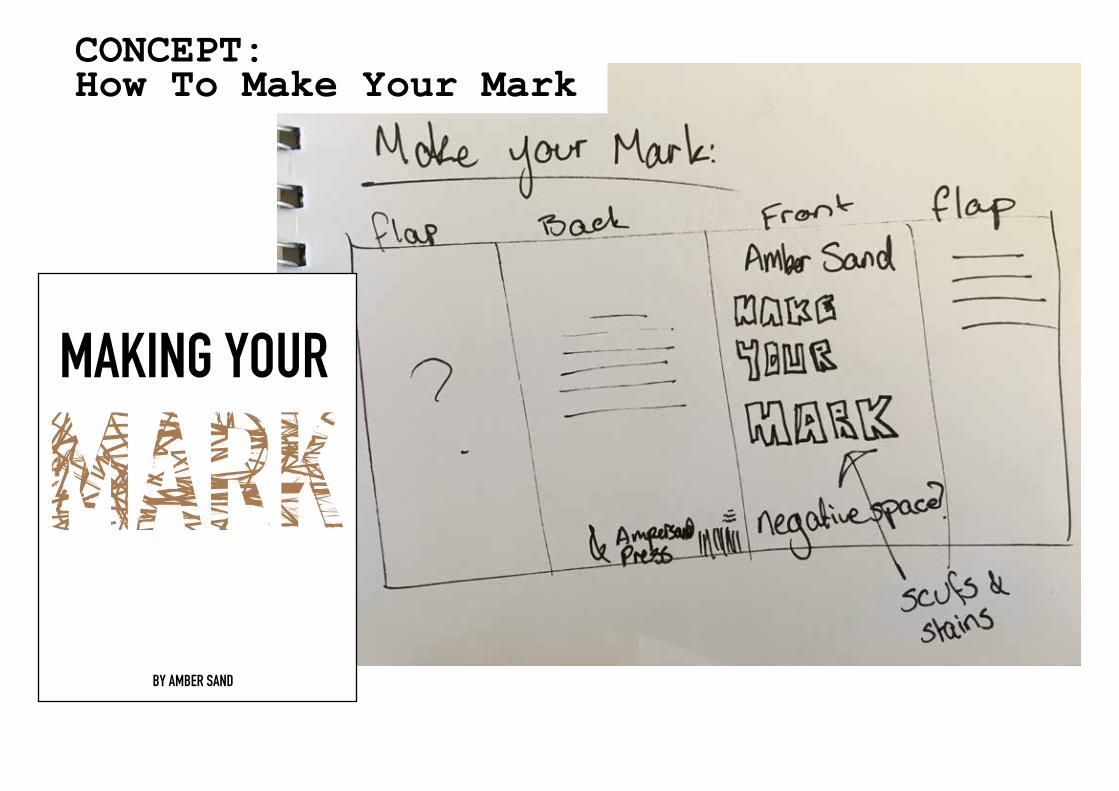
About: Becoming noticed in the world of Typography
Font will be comprised of various stains and marks
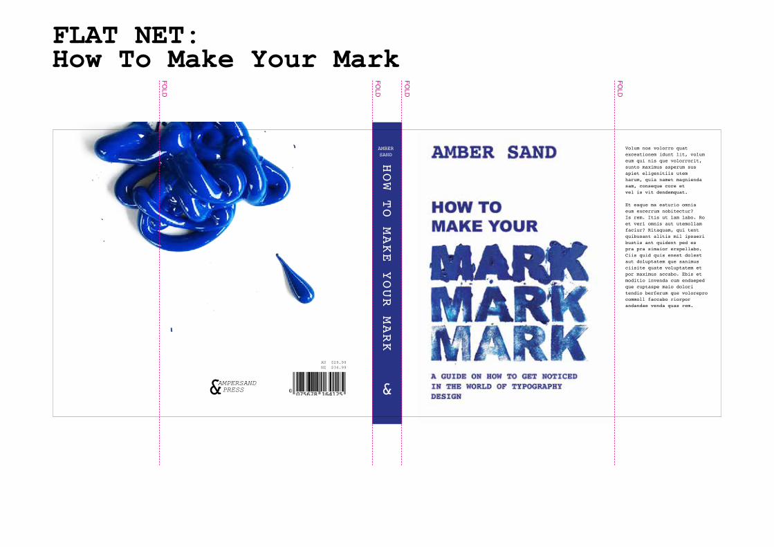
CONCEPT: How To Make Your Mark
Volum nos volorro quat exceationem idunt lit, volum eum qui nis que volorrorit, sunto maximus asperum sus apiet eligenitiis utem harum, quia namet magnienda sam, conseque core et vel is vit dendemquat.
Et eaque ma eaturio omnia eum excerrum nobitectur?Is rem. Itis ut lam labo. Ro et veri omnis aut utemollam faciur? Ritaquam, qui tent quibusant alitis mil ipsaeri bustis ant quident ped es pra pra simaior erspellabo. Ciis quid quis enest dolest aut doluptatem que sanimus ciisite quate voluptatem et por maximus accabo. Ebis et moditio invenda cum endaeped que cuptaspe maio dolori tendio berferum que volorepro commoll faccabo riorpor andandae venda quas rem.
HOW TO MAKE YOUR MARK
AMBERSAND
AU $29.99NZ $34.99
FLAT NET: How To Make Your Mark
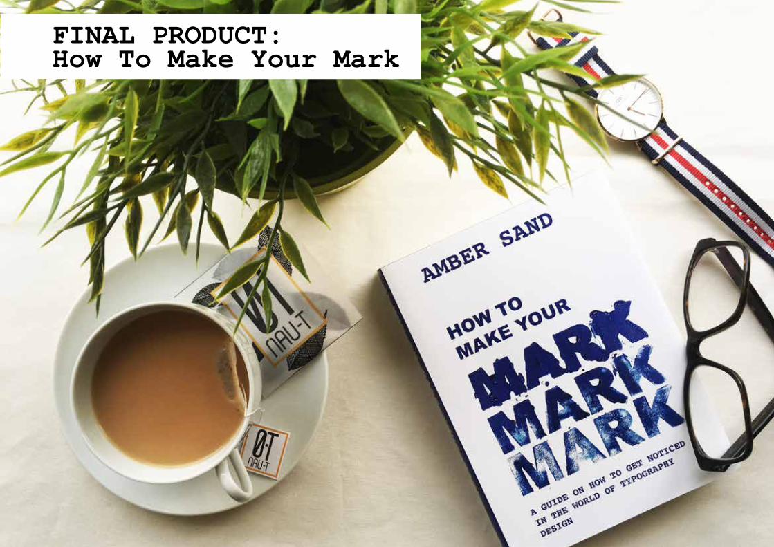
FINAL PRODUCT: How To Make Your Mark
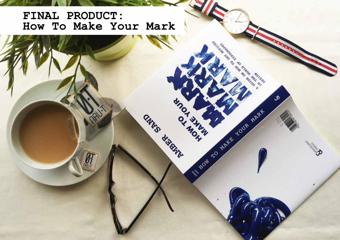
FINAL PRODUCT: How To Make Your Mark
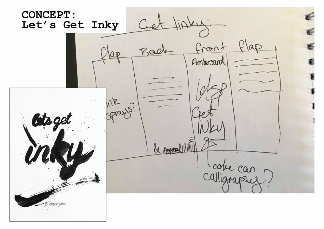
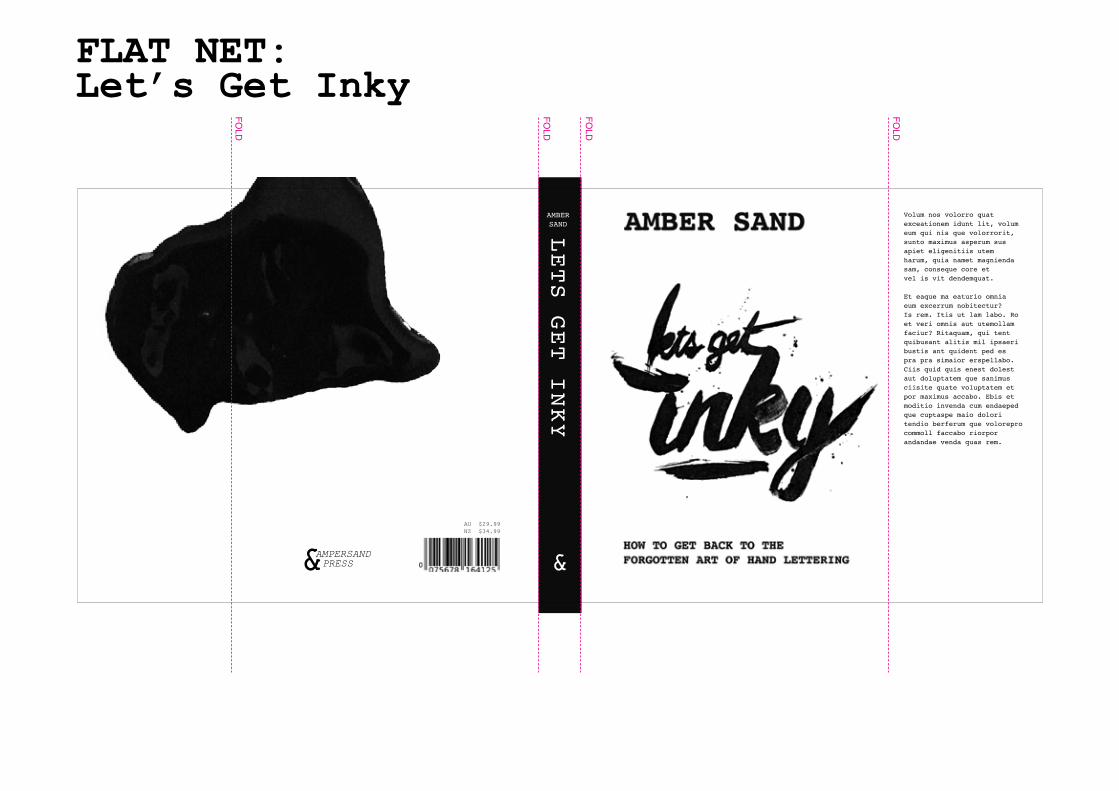
About: Getting back to calligraphy
Font will be rough messy script with ink splatters.
CONCEPT: Let’s Get Inky
Volum nos volorro quat exceationem idunt lit, volum eum qui nis que volorrorit, sunto maximus asperum sus apiet eligenitiis utem harum, quia namet magnienda sam, conseque core et vel is vit dendemquat.
Et eaque ma eaturio omnia eum excerrum nobitectur?Is rem. Itis ut lam labo. Ro et veri omnis aut utemollam faciur? Ritaquam, qui tent quibusant alitis mil ipsaeri bustis ant quident ped es pra pra simaior erspellabo. Ciis quid quis enest dolest aut doluptatem que sanimus ciisite quate voluptatem et por maximus accabo. Ebis et moditio invenda cum endaeped que cuptaspe maio dolori tendio berferum que volorepro commoll faccabo riorpor andandae venda quas rem.
LETS GET INKY
AMBERSAND
AU $29.99NZ $34.99
FLAT NET: Let’s Get Inky
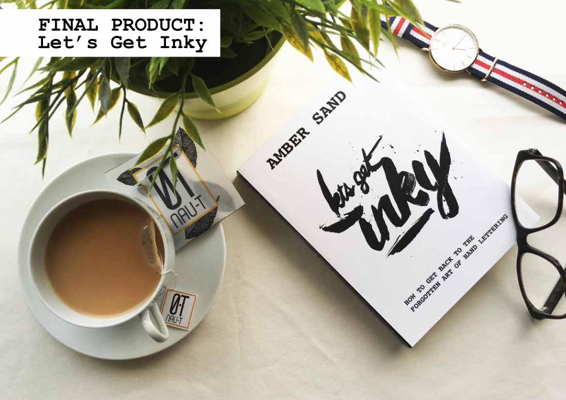
FINAL PRODUCT: Let’s Get Inky
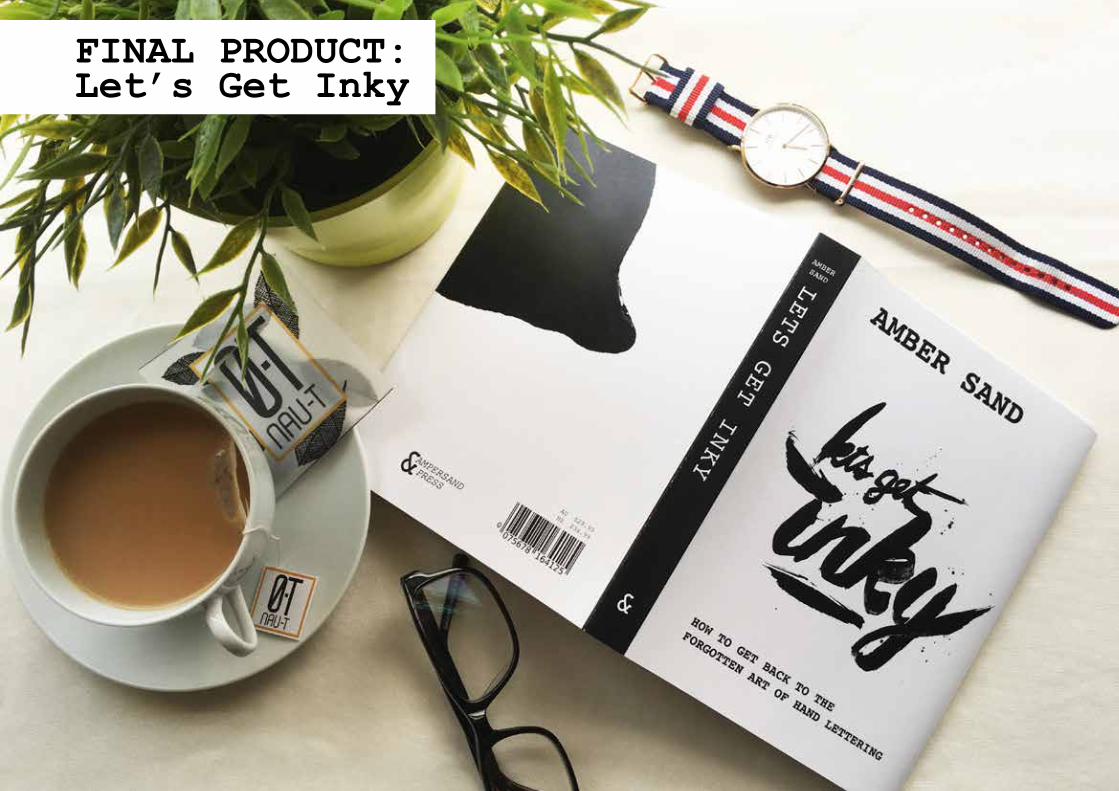
FINAL PRODUCT: Let’s Get Inky
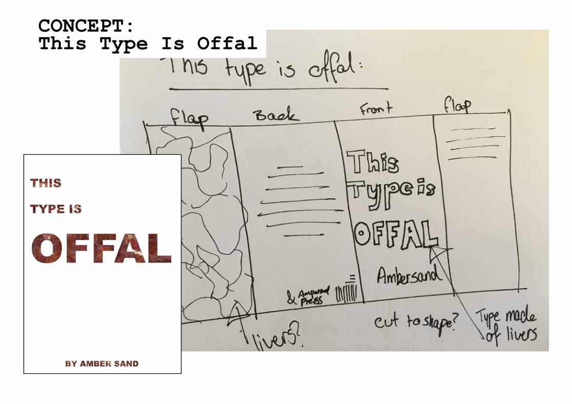
About: Tactile Type
Font will be made out of chicken livers.Back cover will be covered in livers with a white box for a digital type blurb.
CONCEPT: This Type Is Offal
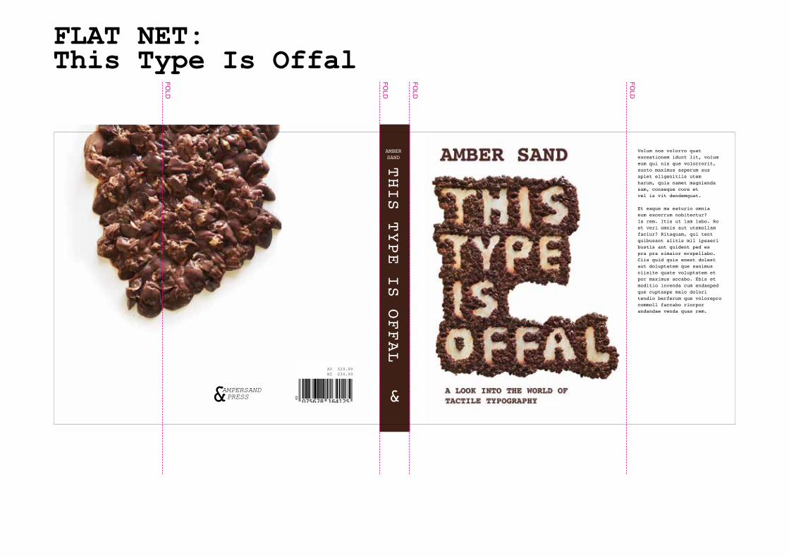
Volum nos volorro quat exceationem idunt lit, volum eum qui nis que volorrorit, sunto maximus asperum sus apiet eligenitiis utem harum, quia namet magnienda sam, conseque core et vel is vit dendemquat.
Et eaque ma eaturio omnia eum excerrum nobitectur?Is rem. Itis ut lam labo. Ro et veri omnis aut utemollam faciur? Ritaquam, qui tent quibusant alitis mil ipsaeri bustis ant quident ped es pra pra simaior erspellabo. Ciis quid quis enest dolest aut doluptatem que sanimus ciisite quate voluptatem et por maximus accabo. Ebis et moditio invenda cum endaeped que cuptaspe maio dolori tendio berferum que volorepro commoll faccabo riorpor andandae venda quas rem.
THIS TYPE IS OFFAL
AMBERSAND
AU $29.99NZ $34.99
FLAT NET: This Type Is Offal
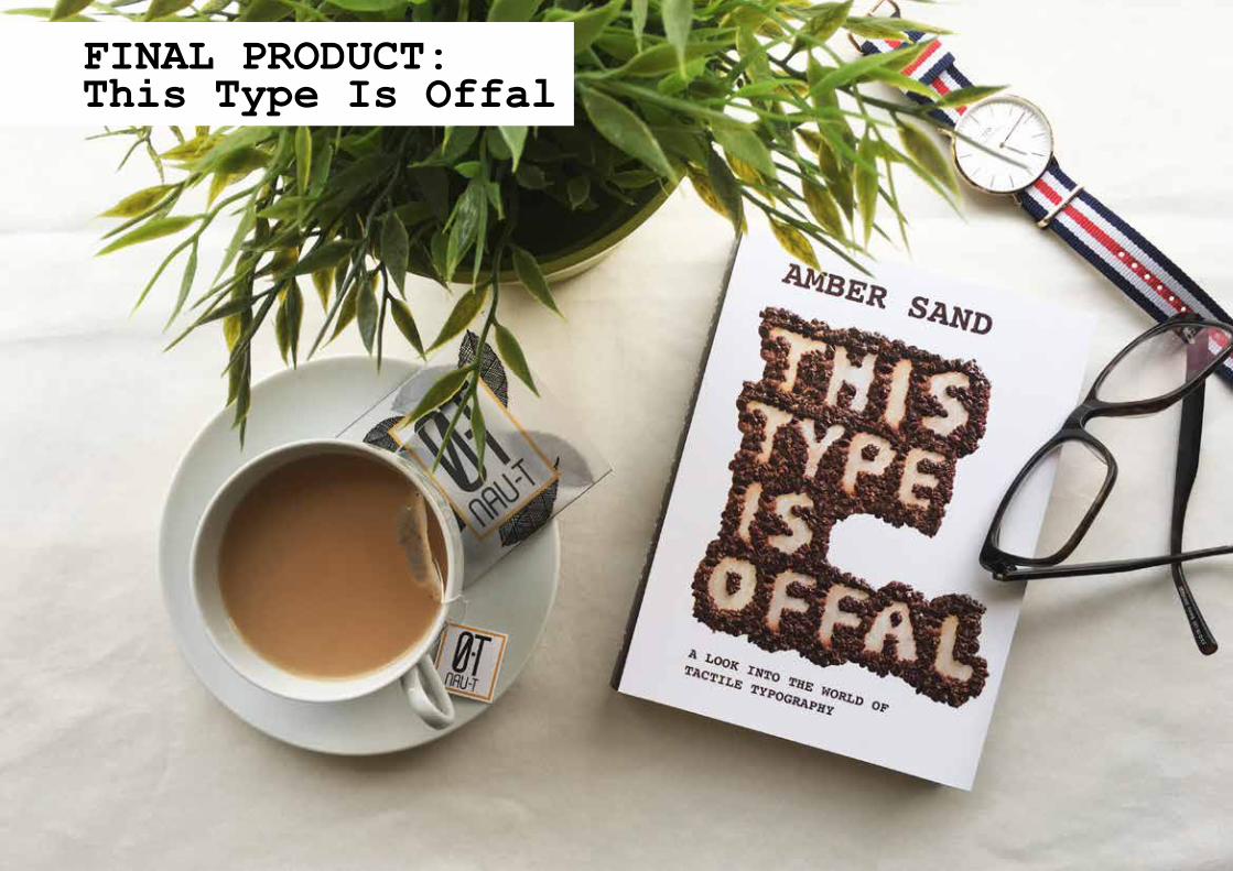
FINAL PRODUCT: This Type Is Offal
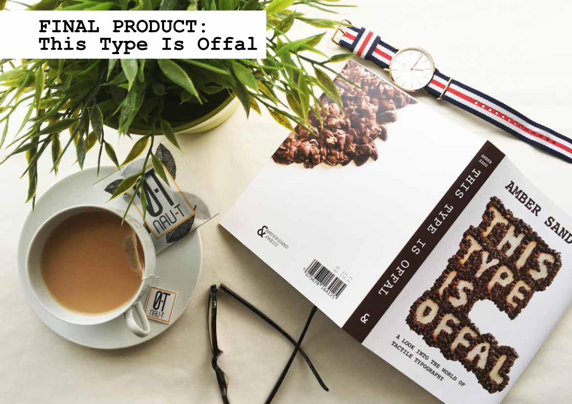
FINAL PRODUCT: This Type Is Offal
Throughout the course of this assessment item, it was clear to me that this was a fantastic opportunity to push my boundaries and try to create something quite unique. As somebody who loves puns, I knew I wanted to do a book series that involved a play on words. The topic of my book series is typography. These books are “designed” to help grasp a better knowledge and understanding about the world of typography.
A common theme of tactility exists throughout my book jackets. Being a digital submission, I knew that the way the type was constructed would deliver depth and texture, which is why tactile typography was employed. A feeling that is consistent throughout the book jackets, is that of a rough and handmade fashion. That’s not to say careful thought and consideration wasn’t put into this assignment.
This rough and rustic style, in my opinion, allows the audience to engage on a level where they believe they can produce the same results as those on the cover of the book jackets. The audience are those with a loose understanding of typography and are looking to broaden their knowledge.
The relationship between the type and the typefaces is strong as all handmade type was done in a San-serif style, therefore allowing the font “Courier New” to compliment them.
Colours chosen, where based on the materials of the type. For example, the chicken livers used to create “This type is offal”, are a burgundy colour, so the supporting type was sampled to the same colour. The same goes for the other two titles. These colours provide a strong, bold and authentic feel and help deliver the rough and rustic feeling.
The type created for the Amber Sand collection, was created using various techniques and materials. Some of these materials include sheets of foam, paint, ink & chicken livers. The book jackets themselves, were printed on 200gsm gloss stock to provide a suitable protective barrier for the hard covered book underneath.
MANIFESTO: